
Qt’s 2D graphics engine is based on the QPainter class. QPainter can draw geometric shapes (points, lines, rectangles, ellipses, arcs, chords, pie segments, polygons, and Bézier curves), as well as pixmaps, images, and text. Furthermore, QPainter supports advanced features such as antialiasing (for text and shape edges), alpha blending, gradient filling, and vector paths. QPainter also supports linear transformations, such as translation, rotation, shearing, and scaling.
QPainter can be used to draw on a “paint device”, such as a QWidget, a QPixmap, a QImage, or a QSvgGenerator. QPainter can also be used in conjunction with QPrinter for printing and for generating PDF documents. This means that we can often use the same code to display data on-screen and to produce printed reports.
By reimplementing QWidget::paintEvent(), we can create custom widgets and exercise complete control over their appearance, as we saw in Chapter 5. For customizing the look and feel of predefined Qt widgets, we can also specify a style sheet or create a QStyle subclass; we cover both of these approaches in Chapter 19.
A common requirement is the need to display large numbers of lightweight arbitrarily shaped items that the user can interact with on a 2D canvas. Qt 4.2 introduced a completely new “graphics view” architecture centered on the QGraphicsView, QGraphicsScene, and QGraphicsItem classes. This architecture offers a high-level interface for doing item-based graphics, and supports standard user actions on items, including moving, selecting, and grouping. The items themselves are drawn using QPainter as usual and can be transformed individually. We cover this architecture later in the chapter.
An alternative to QPainter is to use OpenGL commands. OpenGL is a standard library for drawing 3D graphics. In Chapter 20, we will see how to use the QtOpenGL module, which makes it easy to integrate OpenGL code into Qt applications.
To start painting to a paint device (typically a widget), we simply create a QPainter and pass a pointer to the device. For example:
void MyWidget::paintEvent(QPaintEvent *event)
{
QPainter painter(this);
...
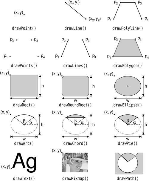
}We can draw various shapes using QPainter’s draw...() functions. Figure 8.1 lists the most important ones. The way the drawing is performed is influenced by QPainter’s settings. Some of these are adopted from the device, whereas others are initialized to default values. The three main painter settings are the pen, the brush, and the font:
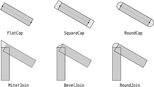
The pen is used for drawing lines and shape outlines. It consists of a color, a width, a line style, a cap style, and a join style. The pen styles are shown in Figures 8.2 and 8.3.
The brush is the pattern used for filling geometric shapes. It normally consists of a color and a style, but it can also be a texture (a pixmap that is repeated infinitely) or a gradient. The brush styles are shown in Figure 8.4.
The font is used for drawing text. A font has many attributes, including a family and a point size.


These settings can be modified at any time by calling setPen(), setBrush(), and setFont() with a QPen, QBrush, or QFont object.
Let’s see a few examples in practice. Here’s the code to draw the ellipse shown in Figure 8.5 (a):
QPainter painter(this);
painter.setRenderHint(QPainter::Antialiasing, true);
painter.setPen(QPen(Qt::black, 12, Qt::DashDotLine, Qt::RoundCap));
painter.setBrush(QBrush(Qt::green, Qt::SolidPattern));
painter.drawEllipse(80, 80, 400, 240);

The setRenderHint() call enables antialiasing, telling QPainter to use different color intensities on the edges to reduce the visual distortion that normally occurs when the edges of a shape are converted into pixels. The result is smoother edges on platforms and devices that support this feature.
Here’s the code to draw the pie segment shown in Figure 8.5 (b):
QPainter painter(this);
painter.setRenderHint(QPainter::Antialiasing, true);
painter.setPen(QPen(Qt::black, 15, Qt::SolidLine, Qt::RoundCap,
                    Qt::MiterJoin));
painter.setBrush(QBrush(Qt::blue, Qt::DiagCrossPattern));
painter.drawPie(80, 80, 400, 240, 60 * 16, 270 * 16);
The last two arguments to drawPie() are expressed in sixteenths of a degree.
Here’s the code to draw the cubic Bézier curve shown in Figure 8.5 (c):
QPainter painter(this);
painter.setRenderHint(QPainter::Antialiasing, true);

QPainterPath path;
path.moveTo(80, 320);
path.cubicTo(200, 80, 320, 80, 480, 320);

painter.setPen(QPen(Qt::black, 8));
painter.drawPath(path);
The QPainterPath class can specify arbitrary vector shapes by connecting basic graphical elements together: straight lines, ellipses, polygons, arcs, Bézier curves, and other painter paths. Painter paths are the ultimate drawing primitive in the sense that any shape or combination of shapes can be expressed as a painter path.
A path specifies an outline, and the area described by the outline can be filled using a brush. In the example in Figure 8.5 (c), we didn’t set a brush, so only the outline is drawn.
These three examples use built-in brush patterns (Qt::SolidPattern, Qt::DiagCrossPattern, and Qt::NoBrush). In modern applications, gradient fills are a popular alternative to monochrome fill patterns. Gradients rely on color interpolation to obtain smooth transitions between two or more colors. They are frequently used to produce 3D effects; for example, the Plastique and Cleanlooks styles use gradients to render QPushButtons.
Qt supports three types of gradients: linear, conical, and radial. The Oven Timer example in the next section combines all three types of gradients in a single widget to make it look like the real thing.
Linear gradients are defined by two control points and by a series of “color stops” on the line that connects these two points. For example, the linear gradient in Figure 8.6 is created using the following code:
QLinearGradient gradient(50, 100, 300, 350);
gradient.setColorAt(0.0, Qt::white);
gradient.setColorAt(0.2, Qt::green);
gradient.setColorAt(1.0, Qt::black);
We specify three colors at three different positions between the two control points. Positions are specified as floating-point values between 0 and 1, where 0 corresponds to the first control point and 1 to the second control point. Colors between the specified stops are linearly interpolated.
Radial gradients are defined by a center point (xc, yc), a radius r, and a focal point (xf, yf), in addition to the color stops. The center point and the radius specify a circle. The colors spread outward from the focal point, which can be the center point or any other point inside the circle.
Conical gradients are defined by a center point (xc, yc) and an angle a. The colors spread around the center point like the sweep of a watch’s seconds hand.

So far, we have mentioned QPainter’s pen, brush, and font settings. In addition to these, QPainter has other settings that influence the way shapes and text are drawn:
The background brush is used to fill the background of geometric shapes (underneath the brush pattern), text, or bitmaps when the background mode is
Qt::OpaqueMode(the default isQt::TransparentMode).The brush origin is the starting point for brush patterns, normally the top-left corner of the widget.
The clip region is the area of the device that can be painted. Painting outside the clip region has no effect.
The viewport, window, and world transform determine how logical
QPaintercoordinates map to physical paint device coordinates. By default, these are set up so that the logical and physical coordinate systems coincide. We cover coordinate systems in the next section.The composition mode specifies how the newly drawn pixels should interact with the pixels already present on the paint device. The default is “source over”, where drawn pixels are alpha-blended on top of existing pixels. This is supported only on certain devices and is covered later in this chapter.
At any time, we can save the current state of a painter on an internal stack by calling save() and restore it later on by calling restore(). This can be useful if we want to temporarily change some painter settings and then reset them to their previous values, as we will see in the next section.
With QPainter’s default coordinate system, the point (0, 0) is located at the top-left corner of the paint device, x-coordinates increase rightward, and y-coordinates increase downward. Each pixel occupies an area of size 1 × 1 in the default coordinate system.
Conceptually, the center of a pixel lies on “half-pixel” coordinates. For example, the top-left pixel of a widget covers the area between points (0, 0) and (1, 1), and its center is located at (0.5, 0.5). If we tell QPainter to draw a pixel at, say, (100, 100), it will approximate the result by shifting the coordinate by +0.5 in both directions, resulting in the pixel centered at (100.5, 100.5) being drawn.
This distinction may seem rather academic at first, but it has important consequences in practice. First, the shifting by +0.5 occurs only if antialiasing is disabled (the default); if antialiasing is enabled and we try to draw a pixel at (100, 100) in black, QPainter will actually color the four pixels (99.5, 99.5), (99.5, 100.5), (100.5, 99.5), and (100.5, 100.5) light gray, to give the impression of a pixel lying exactly at the meeting point of the four pixels. If this effect is undesirable, we can avoid it by specifying half-pixel coordinates or by translating the QPainter by (+0.5, +0.5).
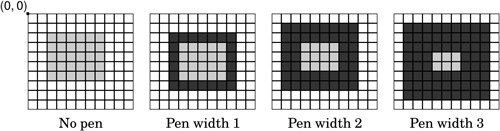
When drawing shapes such as lines, rectangles, and ellipses, similar rules apply. Figure 8.7 shows how the result of a drawRect(2, 2, 6, 5) call varies according to the pen’s width, when antialiasing is off. In particular, it is important to notice that a 6 × 5 rectangle drawn with a pen width of 1 effectively covers an area of size 7 × 6. This is different from older toolkits, including earlier versions of Qt, but it is essential for making truly scalable, resolution-independent vector graphics possible. Figure 8.8 shows the result of drawRect(2, 2, 6, 5) when antialiasing is on, and Figure 8.9 shows what happens when we specify half-pixel coordinates.


Now that we understand the default coordinate system, we can take a closer look at how it can be changed using QPainter’s viewport, window, and world transform. (In this context, the term “window” does not refer to a window in the sense of a top-level widget, and the “viewport” has nothing to do with QScrollArea’s viewport.)
The viewport and the window are tightly bound. The viewport is an arbitrary rectangle specified in physical coordinates. The window specifies the same rectangle, but in logical coordinates. When we do the painting, we specify points in logical coordinates, and those coordinates are converted into physical coordinates in a linear algebraic manner, based on the current window–viewport settings.
By default, the viewport and the window are set to the device’s rectangle. For example, if the device is a 320 × 200 widget, both the viewport and the window are the same 320 × 200 rectangle with its top-left corner at position (0, 0). In this case, the logical and physical coordinate systems are the same.
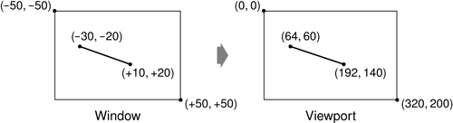
The window–viewport mechanism is useful to make the drawing code independent of the size or resolution of the paint device. For example, if we want the logical coordinates to extend from (-50, -50) to (+50, +50), with (0, 0) in the middle, we can set the window as follows:
painter.setWindow(-50, -50, 100, 100);
The (-50, -50) pair specifies the origin, and the (100, 100) pair specifies the width and height. This means that the logical coordinates (-50, -50) now correspond to the physical coordinates (0, 0), and the logical coordinates (+50, +50) correspond to the physical coordinates (320, 200). This is illustrated in Figure 8.10. In this example, we didn’t change the viewport.
Now comes the world transform. The world transform is a transformation matrix that is applied in addition to the window–viewport conversion. It allows us to translate, scale, rotate, or shear the items we are drawing. For example, if we wanted to draw text at a 45° angle, we would use this code:
QTransform transform;
transform.rotate(+45.0);
painter.setWorldTransform(transform);
painter.drawText(pos, tr("Sales"));
The logical coordinates we pass to drawText() are converted by the world transform, then mapped to physical coordinates using the window–viewport settings.
If we specify multiple transformations, they are applied in the order in which they are given. For example, if we want to use the point (50, 50) as the rotation’s pivot point, we can do so by translating the window by (+50, +50), performing the rotation, and then translating the window back to its original position:
QTransform transform;
transform.translate(+50.0, +50.0);
transform.rotate(+45.0);
transform.translate(-50.0, -50.0);
painter.setWorldTransform(transform);
painter.drawText(pos, tr("Sales"));
A simpler way to specify transformations is to use QPainter’s translate(), scale(), rotate(), and shear() convenience functions:
painter.translate(-50.0, -50.0);
painter.rotate(+45.0);
painter.translate(+50.0, +50.0);
painter.drawText(pos, tr("Sales"));
If we want to use the same transformations repeatedly, it is more efficient to store them in a QTransform object and set the world transform on the painter whenever the transformations are needed.
To illustrate painter transformations, we will review the code of the OvenTimer widget shown in Figures 8.11 and 8.12. The OvenTimer widget is modeled after the kitchen timers that were used before it was common to have ovens with clocks built-in. The user can click a notch to set the duration. The wheel automatically turns counterclockwise until 0 is reached, at which point OvenTimer emits the timeout() signal.


class OvenTimer : public QWidget
{
    Q_OBJECT

public:
    OvenTimer(QWidget *parent = 0);

    void setDuration(int secs);
    int duration() const;
    void draw(QPainter *painter);

signals:
    void timeout();

protected:
    void paintEvent(QPaintEvent *event);
    void mousePressEvent(QMouseEvent *event);

private:
    QDateTime finishTime;
    QTimer *updateTimer;
    QTimer *finishTimer;
};
The OvenTimer class is derived from QWidget and reimplements two virtual functions: paintEvent() and mousePressEvent().
const double DegreesPerMinute = 7.0;
const double DegreesPerSecond = DegreesPerMinute / 60;
const int MaxMinutes = 45;
const int MaxSeconds = MaxMinutes * 60;
const int UpdateInterval = 5;
In oventimer.cpp, we start by defining a few constants that control the oven timer’s look and feel.
OvenTimer::OvenTimer(QWidget *parent)
    : QWidget(parent)
{
    finishTime = QDateTime::currentDateTime();
    updateTimer = new QTimer(this);
    connect(updateTimer, SIGNAL(timeout()), this, SLOT(update()));

    finishTimer = new QTimer(this);
    finishTimer->setSingleShot(true);
    connect(finishTimer, SIGNAL(timeout()), this, SIGNAL(timeout()));
    connect(finishTimer, SIGNAL(timeout()), updateTimer, SLOT(stop()));

    QFont font;
    font.setPointSize(8);
    setFont(font);
}
In the constructor, we create two QTimer objects: updateTimer is used to refresh the appearance of the widget every five seconds, and finishTimer emits the widget’s timeout() signal when the oven timer reaches 0. The finishTimer needs to time out only once, so we call setSingleShot(true); by default, timers fire repeatedly until they are stopped or destroyed. The last connect() call is an optimization to stop updating the widget when the timer is inactive.
At the end of the constructor, we set the point size of the font used for drawing the widget to 9 points. This is done to ensure that the numbers displayed on the timers have approximately the same size everywhere.
void OvenTimer::setDuration(int secs)
{
    secs = qBound(0, secs, MaxSeconds);

    finishTime = QDateTime::currentDateTime().addSecs(secs);

    if (secs > 0) {
        updateTimer->start(UpdateInterval * 1000);
        finishTimer->start(secs * 1000);
    } else {
        updateTimer->stop();
        finishTimer->stop();
    }
    update();
}
The setDuration() function sets the duration of the oven timer to the given number of seconds. Using Qt’s global qBound() function means that we can avoid writing code such as this:
if (secs < 0) {
    secs = 0;
} else if (secs > MaxSeconds) {
    secs = MaxSeconds;
}
We compute the finish time by adding the duration to the current time (obtained from QDateTime::currentDateTime()) and store it in the finishTime private variable. At the end, we call update() to redraw the widget with the new duration.
The finishTime variable is of type QDateTime. Since the variable holds both a date and a time, we avoid a wrap-around bug when the current time is before midnight and the finish time is after midnight.
int OvenTimer::duration() const
{
    int secs = QDateTime::currentDateTime().secsTo(finishTime);
    if (secs < 0)
        secs = 0;
    return secs;
}
The duration() function returns the number of seconds left before the timer is due to finish. If the timer is inactive, we return 0.
void OvenTimer::mousePressEvent(QMouseEvent *event)
{
    QPointF point = event->pos() - rect().center();
    double theta = std::atan2(-point.x(), -point.y()) * 180.0 / M_PI;
    setDuration(duration() + int(theta / DegreesPerSecond));
    update();
}
If the user clicks the widget, we find the closest notch using a subtle but effective mathematical formula, and we use the result to set the new duration. Then we schedule a repaint. The notch that the user clicked will now be at the top and will move counterclockwise as time passes until 0 is reached.
void OvenTimer::paintEvent(QPaintEvent * /* event */)
{
    QPainter painter(this);
    painter.setRenderHint(QPainter::Antialiasing, true);

    int side = qMin(width(), height());

    painter.setViewport((width() - side) / 2, (height() - side) / 2,
                        side, side);
    painter.setWindow(-50, -50, 100, 100);

    draw(&painter);
}
In paintEvent(), we set the viewport to be the largest square area that fits inside the widget, and we set the window to be the rectangle (-50, -50, 100, 100), that is, the 100 × 100 rectangle extending from (-50, -50) to (+50, +50). The qMin() template function returns the lowest of its two arguments. Then we call the draw() function to actually perform the drawing.
If we had not set the viewport to be a square, the oven timer would be an ellipse when the widget is resized to a non-square rectangle. To avoid such deformations, we must set the viewport and the window to rectangles with the same aspect ratio.
Now let’s look at the drawing code:
void OvenTimer::draw(QPainter *painter)
{
    static const int triangle[3][2] = {
        { -2, -49 }, { +2, -49 }, { 0, -47 }
    };
    QPen thickPen(palette().foreground(), 1.5);
    QPen thinPen(palette().foreground(), 0.5);
    QColor niceBlue(150, 150, 200);

    painter->setPen(thinPen);
    painter->setBrush(palette().foreground());
    painter->drawPolygon(QPolygon(3, &triangle[0][0]));
We start by drawing the tiny triangle that marks the 0 position at the top of the widget. The triangle is specified by three hard-coded coordinates, and we use drawPolygon() to render it.
What is so convenient about the window–viewport mechanism is that we can hard-code the coordinates we use in the draw commands and still get good resizing behavior.
    QConicalGradient coneGradient(0, 0, -90.0);
    coneGradient.setColorAt(0.0, Qt::darkGray);
    coneGradient.setColorAt(0.2, niceBlue);
    coneGradient.setColorAt(0.5, Qt::white);
    coneGradient.setColorAt(1.0, Qt::darkGray);

    painter->setBrush(coneGradient);
    painter->drawEllipse(-46, -46, 92, 92);
We draw the outer circle and fill it using a conical gradient. The gradient’s center point is located at (0, 0), and the angle is -90°.
    QRadialGradient haloGradient(0, 0, 20, 0, 0);
    haloGradient.setColorAt(0.0, Qt::lightGray);
    haloGradient.setColorAt(0.8, Qt::darkGray);
    haloGradient.setColorAt(0.9, Qt::white);
    haloGradient.setColorAt(1.0, Qt::black);

    painter->setPen(Qt::NoPen);
    painter->setBrush(haloGradient);
    painter->drawEllipse(-20, -20, 40, 40);
We fill the inner circle using a radial gradient. The center point and the focal point of the gradient are located at (0, 0). The radius of the gradient is 20.
    QLinearGradient knobGradient(-7, -25, 7, -25);
    knobGradient.setColorAt(0.0, Qt::black);
    knobGradient.setColorAt(0.2, niceBlue);
    knobGradient.setColorAt(0.3, Qt::lightGray);
    knobGradient.setColorAt(0.8, Qt::white);
    knobGradient.setColorAt(1.0, Qt::black);

    painter->rotate(duration() * DegreesPerSecond);
    painter->setBrush(knobGradient);
    painter->setPen(thinPen);
    painter->drawRoundRect(-7, -25, 14, 50, 99, 49);

    for (int i = 0; i <= MaxMinutes; ++i) {
        if (i % 5 == 0) {
            painter->setPen(thickPen);
            painter->drawLine(0, -41, 0, -44);
            painter->drawText(-15, -41, 30, 30,
                                 Qt::AlignHCenter | Qt::AlignTop,
                                 QString::number(i));
        } else {
            painter->setPen(thinPen);
            painter->drawLine(0, -42, 0, -44);
        }
        painter->rotate(-DegreesPerMinute);
    }
}
We call rotate() to rotate the painter’s coordinate system. In the old coordinate system, the 0-minute mark was on top; now, the 0-minute mark is moved to the place that is appropriate for the time left. We draw the rectangular knob handle after the rotation, since its orientation depends on the rotation angle.
In the for loop, we draw the tick marks along the outer circle’s edge and the numbers for each multiple of five minutes. The text is drawn in an invisible rectangle underneath the tick mark. At the end of each iteration, we rotate the painter clockwise by 7°, which corresponds to one minute. The next time we draw a tick mark, it will be at a different position around the circle, even though the coordinates we pass to the drawLine() and drawText() calls are always the same.
The code in the for loop suffers from a minor flaw, which would quickly become apparent if we performed more iterations. Each time we call rotate(), we effectively multiply the current world transform with a rotation transform, producing a new world transform. The rounding errors associated with floating-point arithmetic gradually accumulate, resulting in an increasingly inaccurate world transform. Here’s one way to rewrite the code to avoid this issue, using save() and restore() to save and reload the original transform for each iteration:
    for (int i = 0; i <= MaxMinutes; ++i) {
        painter->save();
        painter->rotate(-i * DegreesPerMinute);

        if (i % 5 == 0) {
            painter->setPen(thickPen);
            painter->drawLine(0, -41, 0, -44);
            painter->drawText(-15, -41, 30, 30,
                              Qt::AlignHCenter | Qt::AlignTop,
                              QString::number(i));
        } else {
            painter->setPen(thinPen);
            painter->drawLine(0, -42, 0, -44);
        }
        painter->restore();
    }
Another way of implementing an oven timer would have been to compute the (x, y) positions ourselves, using sin() and cos() to find the positions along the circle. But then we would still need to use a translation and a rotation to draw the text at an angle.
When drawing, we may be faced with a trade-off between speed and accuracy. For example, on X11 and Mac OS X, drawing on a QWidget or QPixmap relies on the platform’s native paint engine. On X11, this ensures that communication with the X server is kept to a minimum; only paint commands are sent rather than actual image data. The main drawback of this approach is that Qt is limited by the platform’s native support:
On X11, features such as antialiasing and support for fractional coordinates are available only if the X Render extension is present on the X server.
On Mac OS X, the native aliased graphics engine uses different algorithms for drawing polygons than X11 and Windows, with slightly different results.
When accuracy is more important than efficiency, we can draw to a QImage and copy the result onto the screen. This always uses Qt’s own internal paint engine, giving identical results on all platforms. The only restriction is that the QImage on which we paint must be created with an argument of either QImage::Format_RGB32 or QImage::Format_ARGB32_Premultiplied.
The premultiplied ARGB32 format is almost identical to the conventional ARGB32 format (0xAARRGGBB), the difference being that the red, green, and blue channels are “premultiplied” with the alpha channel. This means that the RGB values, which normally range from 0x00 to 0xFF, are scaled from 0x00 to the alpha value. For example, a 50%-transparent blue color is represented as 0x7F0000FF in ARGB32 format, but 0x7F00007F in premultiplied ARGB32 format, and similarly a 75%-transparent dark green of 0x3F008000 in ARGB32 format would be 0x3F002000 in premultiplied ARGB32 format.
Let’s suppose we want to use antialiasing for drawing a widget, and we want to obtain good results even on X11 systems with no X Render extension. The original paintEvent() handler, which relies on X Render for the antialiasing, might look like this:
void MyWidget::paintEvent(QPaintEvent *event)
{
    QPainter painter(this);
    painter.setRenderHint(QPainter::Antialiasing, true);
    draw(&painter);
}
Here’s how to rewrite the widget’s paintEvent() function to use Qt’s platform-independent graphics engine:
void MyWidget::paintEvent(QPaintEvent *event)
{
    QImage image(size(), QImage::Format_ARGB32_Premultiplied);
    QPainter imagePainter(&image);
    imagePainter.initFrom(this);
    imagePainter.setRenderHint(QPainter::Antialiasing, true);
    imagePainter.eraseRect(rect());
    draw(&imagePainter);
    imagePainter.end();

    QPainter widgetPainter(this);
    widgetPainter.drawImage(0, 0, image);
}
We create a QImage of the same size as the widget in premultiplied ARGB32 format, and a QPainter to draw on the image. The initFrom() call initializes the painter’s pen, background, and font based on the widget. We perform the drawing using the QPainter as usual, and at the end we reuse the QPainter object to copy the image onto the widget. This approach produces identical high-quality results on all platforms, with the exception of font rendering, which depends on the installed fonts.
One particularly powerful feature of Qt’s graphics engine is its support for composition modes. These specify how a source and a destination pixel are merged together when drawing. This applies to all painting operations, including pen, brush, gradient, and image drawing.
The default composition mode is QImage::CompositionMode_SourceOver, meaning that the source pixel (the pixel we are drawing) is blended on top of the destination pixel (the existing pixel) in such a way that the alpha component of the source defines its translucency. Figure 8.13 shows the result of drawing a semi-transparent butterfly (the “source” image) on top of a checker pattern (the “destination” image) with the different modes.

Composition modes are set using QPainter::setCompositionMode(). For example, here’s how to create a QImage containing the XOR of the butterfly and the checker pattern:
QImage resultImage = checkerPatternImage;
QPainter painter(&resultImage);
painter.setCompositionMode(QPainter::CompositionMode_Xor);
painter.drawImage(0, 0, butterflyImage);
One issue to be aware of is that the QImage::CompositionMode_Xor operation also applies to the alpha channel. This means that if we XOR the color white (0xFFFFFFFF) with itself, we obtain a transparent color (0x00000000), not black (0xFF000000).
Drawing using QPainter is ideal for custom widgets and for drawing one or just a few items. For graphics in which we need to handle anything from a handful up to tens of thousands of items, and we want the user to be able to click, drag, and select items, Qt’s graphics view classes provide the solution we need.
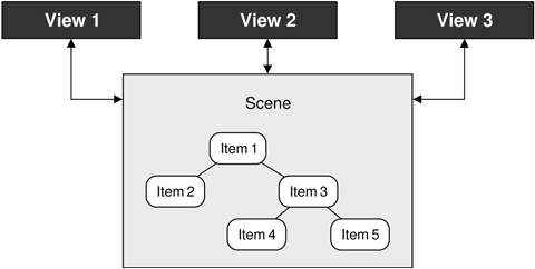
The graphics view architecture consists of a scene, represented by the QGraphicsScene class, and items in the scene, represented by QGraphicsItem subclasses. The scene (along with its item) is made visible to users by showing them in a view, represented by the QGraphicsView class. The same scene can be shown in more than one view—for example, to show different parts of a large scene, or to show the scene under different transformations. This is illustrated schematically in Figure 8.14.
Several predefined QGraphicsItem subclasses are provided, including QGraphicsLineItem, QGraphicsPixmapItem, QGraphicsSimpleTextItem (for styled plain text), and QGraphicsTextItem (for rich text); see Figure 8.15. We can also create our own custom QGraphicsItem subclasses, as we will see later in this section.[*]

A QGraphicsScene holds a collection of graphics items. A scene has three layers: a background layer, an item layer, and a foreground layer. The background and foreground are normally specified by QBrushes, but it is possible to reimplement drawBackground() or drawForeground() for complete control. If we want to use a pixmap as a background, we could simply create a texture QBrush based on that pixmap. The foreground brush could be set to a semi-transparent white to give a faded effect, or to be a cross pattern to provide a grid overlay.
The scene can tell us which items have collided, which are selected, and which are at a particular point or in a particular region. A scene’s graphics items are either top-level (the scene is their parent) or children (their parent is another item). Any transformations applied to an item are automatically applied to its children.
The graphics view architecture provides two ways of grouping items. One is to simply make an item a child of another item. Another way is to use a QGraphicsItemGroup. Adding an item to a group does not cause it to be transformed in any way; these groups are convenient for handling multiple items as though they were a single item.
A QGraphicsView is a widget that presents a scene, providing scroll bars if necessary and capable of applying transformations that affect how the scene is rendered. This is useful to support zooming and rotating as aids for viewing the scene.
By default, QGraphicsView renders using Qt’s built-in 2D paint engine, but it can be changed to use an OpenGL widget with a single setViewport() call after it has been constructed. It is also easy to print a scene, or parts of a scene, as we will discuss in the next section where we see several techniques for printing using Qt.
The architecture uses three different coordinate systems—viewport coordinates, scene coordinates, and item coordinates—with functions for mapping from one coordinate system to another. Viewport coordinates are coordinates inside the QGraphicsView’s viewport. Scene coordinates are logical coordinates that are used for positioning top-level items on the scene. Item coordinates are specific to each item and are centered about an item-local (0, 0) point; these remain unchanged when we move the item on the scene. In practice, we usually only care about the scene coordinates (for positioning top-level items) and item coordinates (for positioning child items and for drawing items). Drawing each item in terms of its own local coordinate system means that we do not have to worry about where an item is in the scene or what transformations have been applied to it.
The graphics view classes are straightforward to use and offer a great deal of functionality. To introduce some of what can be done with them, we will review two examples. The first example is a simple diagram editor, which will show how to create items and how to handle user interaction. The second example is an annotated map program that shows how to handle large numbers of graphics objects and how to render them efficiently at different zoom levels.
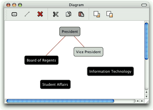
The Diagram application shown in Figure 8.16 allows users to create nodes and links. Nodes are graphics items that show plain text inside a rounded rectangle, whereas links are lines that connect pairs of nodes. Nodes that are selected are shown with a dashed outline drawn with a thicker pen than usual. We will begin by looking at links, since they are the simplest, then nodes, and then we will see how they are used in context.
class Link : public QGraphicsLineItem
{
public:
    Link(Node *fromNode, Node *toNode);
    ~Link();

    Node *fromNode() const;
    Node *toNode() const;

    void setColor(const QColor &color);
    QColor color() const;

    void trackNodes();

private:
    Node *myFromNode;
    Node *myToNode;
};
The Link class is derived from QGraphicsLineItem, which represents a line in a QGraphicsScene. A link has three main attributes: the two nodes it connects and the color used to draw its line. We don’t need a QColor member variable to store the color, for reasons that will become apparent shortly. QGraphicsItem is not a QObject subclass, but if we wanted to add signals and slots to Link, there is nothing to stop us from using multiple inheritance with QObject.
The trackNodes() function is used to update the line’s endpoints, when the user drags a connected node into a different position.
Link::Link(Node *fromNode, Node *toNode)
{
    myFromNode = fromNode;
    myToNode = toNode;

    myFromNode->addLink(this);
    myToNode->addLink(this);

    setFlags(QGraphicsItem::ItemIsSelectable);
    setZValue(-1);

    setColor(Qt::darkRed);
    trackNodes();
}
When a link is constructed, it adds itself to the nodes it connects. Each node holds a set of links, and can have any number of connecting links. Graphics items have several flags, but in this case we only want links to be selectable so that the user can select and then delete them.
Every graphics item has an (x, y) position, and a z value that specifies how far forward or back it is in the scene. Since we are going to draw our lines from the center of one node to the center of another node, we give the line a negative z value so that it will always be drawn underneath the nodes it connects. As a result, links will appear as lines between the nearest edges of the nodes they connect.
At the end of the constructor, we set an initial line color and then set the line’s endpoints by calling trackNodes().
Link::~Link()
{
    myFromNode->removeLink(this);
    myToNode->removeLink(this);
}
When a link is destroyed, it removes itself from the nodes it is connecting.
void Link::setColor(const QColor &color)
{
    setPen(QPen(color, 1.0));
}
When the link’s color is set, we simply change its pen, using the given color and a line width of 1. The setPen() function is inherited from QGraphicsLineItem. The color() getter simply returns the pen’s color.
void Link::trackNodes()
{
    setLine(QLineF(myFromNode->pos(), myToNode->pos()));
}
The QGraphicsItem::pos() function returns the position of its graphics item relative to the scene (for top-level items) or to the parent item (for child items).
For the Link class, we can rely on its base class to handle the painting: QGraphicsLineItem draws a line (using pen()) between two points in the scene.
For the Node class, we will handle all the graphics ourselves. Another difference between nodes and links is that nodes are more interactive. We will begin by reviewing the Node declaration, breaking it into a few pieces since it is quite long.
class Node : public QGraphicsItem
{
    Q_DECLARE_TR_FUNCTIONS(Node)

public:
    Node();
For the Node class, we use QGraphicsItem as the base class. The Q_DECLARE_TR_FUNCTIONS() macro is used to add a tr() function to this class, even though it is not a QObject subclass. This is simply a convenience that allows us to use tr() rather than the static QObject::tr() or QCoreApplication::translate().
    void setText(const QString &text);
    QString text() const;
    void setTextColor(const QColor &color);
    QColor textColor() const;
    void setOutlineColor(const QColor &color);
    QColor outlineColor() const;
    void setBackgroundColor(const QColor &color);
    QColor backgroundColor() const;
These functions are simply getters and setters for the private members. We provide control of the color of the text, the node’s outline, and the node’s background.
    void addLink(Link *link);
    void removeLink(Link *link);
As we saw earlier, these functions are called by the Link class to add or remove themselves from a node.
    QRectF boundingRect() const;
    QPainterPath shape() const;
    void paint(QPainter *painter,
               const QStyleOptionGraphicsItem *option, QWidget *widget);
When we create QGraphicsItem subclasses that we want to draw manually, we normally reimplement boundingRect() and paint(). If we don’t reimplement shape(), the base class implementation will fall back on the boundingRect(). In this case, we have reimplemented shape() to return a more accurate shape that takes into account the node’s rounded corners.
The graphics view architecture uses the bounding rectangle to determine whether an item needs to be drawn. This enables QGraphicsView to display arbitrarily large scenes very quickly, when only a fraction of the items are visible at any given time. The shape is used for determining whether a point is inside an item, or whether two items collide.
protected:
    void mouseDoubleClickEvent(QGraphicsSceneMouseEvent *event);
    QVariant itemChange(GraphicsItemChange change,
                        const QVariant &value);
In the Diagram application, we will provide a Properties dialog for editing a node’s position, colors, and text. As an added convenience, we will let the user change the text by double-clicking the node.
If a node is moved, we must make sure that any associated links are updated accordingly. We reimplement the itemChange() handler to take care of this; it is called whenever the item’s properties (including its position) change. The reason we don’t use mouseMoveEvent() for this purpose is because it is not called when the node is moved programmatically.
private:
    QRectF outlineRect() const;
    int roundness(double size) const;

    QSet<Link *> myLinks;
    QString myText;
    QColor myTextColor;
    QColor myBackgroundColor;
    QColor myOutlineColor;
};
The outlineRect() private function returns the rectangle drawn by the Node, whereas roundness() returns an appropriate roundness coefficient based on the width or height of the rectangle.
Just as a Link keeps track of the nodes it connects, a Node keeps track of its links. When a node is deleted, all the links associated with the node are deleted as well.
We are now ready to look at Node’s implementation, starting as usual with the constructor.
Node::Node()
{
    myTextColor = Qt::darkGreen;
    myOutlineColor = Qt::darkBlue;
    myBackgroundColor = Qt::white;

    setFlags(ItemIsMovable | ItemIsSelectable);
}
We initialize the colors, and make node items both movable and selectable. The z value will default to 0, and we leave the node’s position in the scene to be set by the caller.
Node::~Node()
{
    foreach (Link *link, myLinks)
        delete link;
}
The destructor deletes all the node’s links. Whenever a link is destroyed, it removes itself from the nodes it is connected to. We iterate over (a copy of) the set of links rather than use qDeleteAll() to avoid side effects, since the set of links is indirectly accessed by the Link destructor.
void Node::setText(const QString &text)
{
    prepareGeometryChange();
    myText = text;
    update();
}
Whenever we change a graphics item in a way that affects its appearance, we must call update() to schedule a repaint. And in cases such as this where the item’s bounding rectangle might change (because the new text might be shorter or longer than the current text), we must call prepareGeometryChange() immediately before doing anything that will affect the item’s bounding rectangle.
We will skip the text(), textColor(), outlineColor(), and backgroundColor() getters since they simply return their corresponding private member.
void Node::setTextColor(const QColor &color)
{
    myTextColor = color;
    update();
}
When we set the text’s color, we must call update() to schedule a repaint so that the item is painted using the new color. We don’t need to call prepareGeometryChange(), because the size of the item is not affected by a color change. We will omit the setters for the outline and background colors since they are structurally the same as this setter.
void Node::addLink(Link *link)
{
    myLinks.insert(link);
}

void Node::removeLink(Link *link)
{
    myLinks.remove(link);
}
Here we simply add or remove the given link to the node’s set of links.
QRectF Node::outlineRect() const
{
    const int Padding = 8;
    QFontMetricsF metrics = qApp->font();
    QRectF rect = metrics.boundingRect(myText);
    rect.adjust(-Padding, -Padding, +Padding, +Padding);
    rect.translate(-rect.center());
    return rect;
}
We use this private function to calculate a rectangle that encompasses the node’s text with an 8-pixel margin. The bounding rectangle returned by the font metrics function always has (0, 0) as its top-left corner. Since we want the text centered on the item’s center point, we translate the rectangle so that its center is at (0, 0).
Although we think and calculate in terms of pixels, the unit is in a sense notional. The scene (or the parent item) may be scaled, rotated, sheared, or simply affected by antialiasing, so the actual number of pixels that appears on the screen may be different.
QRectF Node::boundingRect() const
{
    const int Margin = 1;
    return outlineRect().adjusted(-Margin, -Margin, +Margin, +Margin);
}
The boundingRect() function is called by QGraphicsView to determine whether the item needs to be drawn. We use the outline rectangle, but with a bit of additional margin, since the rectangle we return from this function must allow for at least half the width of the pen if an outline is going to be drawn.
QPainterPath Node::shape() const
{
    QRectF rect = outlineRect();

    QPainterPath path;
    path.addRoundRect(rect, roundness(rect.width()),
                      roundness(rect.height()));
    return path;
}
The shape() function is called by QGraphicsView for fine-grained collision detection. Often, we can omit it and leave the item to calculate the shape itself based on the bounding rectangle. Here we reimplement it to return a QPainterPath that represents a rounded rectangle. As a consequence, clicking the corner areas that fall outside the rounded rectangle but inside the bounding rectangle won’t select the item.
When we create a rounded rectangle, we can pass optional arguments to specify the roundedness of the corners. We calculate suitable values using the roundness() private function.
void Node::paint(QPainter *painter,
                 const QStyleOptionGraphicsItem *option,
                 QWidget * /* widget */)
{
    QPen pen(myOutlineColor);
    if (option->state & QStyle::State_Selected) {
        pen.setStyle(Qt::DotLine);
        pen.setWidth(2);
    }
    painter->setPen(pen);
    painter->setBrush(myBackgroundColor);

    QRectF rect = outlineRect();
    painter->drawRoundRect(rect, roundness(rect.width()),
                           roundness(rect.height()));

    painter->setPen(myTextColor);
    painter->drawText(rect, Qt::AlignCenter, myText);
}
The paint() function is where we draw the item. If the item is selected, we change the pen’s style to be a dotted line and make it thicker; otherwise, the default of a solid 1-pixel line is used. We also set the brush to use the background color.
Then we draw a rounded rectangle the same size as the outline rectangle, but using the rounding factors returned by the roundness() private function. Finally, we draw the text centered within the outline rectangle on top of the rounded rectangle.
The option parameter of type QStyleOptionGraphicsItem is an unusual class for Qt because it provides several public member variables. These include the current layout direction, font metrics, palette, rectangle, state (selected, “has focus”, and many others), the transformation matrix, and the level of detail. Here we have checked the state member to see whether the node is selected.
QVariant Node::itemChange(GraphicsItemChange change,
                          const QVariant &value)
{
    if (change == ItemPositionHasChanged) {
        foreach (Link *link, myLinks)
            link->trackNodes();
    }
    return QGraphicsItem::itemChange(change, value);
}
Whenever the user drags a node, the itemChange() handler is called with ItemPositionHasChanged as the first argument. To ensure that the link lines are positioned correctly, we iterate over the node’s set of links and tell each one to update its line’s endpoints. At the end, we call the base class implementation to ensure that it also gets notified.
void Node::mouseDoubleClickEvent(QGraphicsSceneMouseEvent *event)
{
    QString text = QInputDialog::getText(event->widget(),
                           tr("Edit Text"), tr("Enter new text:"),
                           QLineEdit::Normal, myText);
    if (!text.isEmpty())
        setText(text);
}
If the user double-clicks the node, we pop up a dialog that shows the current text and allows them to change it. If the user clicks Cancel, an empty string is returned; therefore, we apply the change only if the string is non-empty. We will see how other node properties (such as the node’s colors) can be changed shortly.
int Node::roundness(double size) const
{
    const int Diameter = 12;
    return 100 * Diameter / int(size);
}
The roundness() function returns appropriate rounding factors to ensure that the node’s corners are quarter-circles with diameter 12. The rounding factors must be in the range 0 (square) to 99 (fully rounded).
We have now seen the implementation of two custom graphics item classes. Now it is time to see how they are actually used. The Diagram application is a standard main window application with menus and a toolbar. We won’t look at all the details of the implementation, but instead concentrate on those relevant to the graphics view architecture. We will begin by looking at an extract from the QMainWindow subclass’s definition.
class DiagramWindow : public QMainWindow
{
    Q_OBJECT

public:
    DiagramWindow();

private slots:
    void addNode();
    void addLink();
    void del();
    void cut();
    void copy();
    void paste();
    void bringToFront();
    void sendToBack();
    void properties();
    void updateActions();

private:
    typedef QPair<Node *, Node *> NodePair;

    void createActions();
    void createMenus();
    void createToolBars();
    void setZValue(int z);
    void setupNode(Node *node);
    Node *selectedNode() const;
    Link *selectedLink() const;
    NodePair selectedNodePair() const;

    QMenu *fileMenu;
    QMenu *editMenu;
    QToolBar *editToolBar;
    QAction *exitAction;
    ...
    QAction *propertiesAction;

    QGraphicsScene *scene;
    QGraphicsView *view;

    int minZ;
    int maxZ;
    int seqNumber;
};
The purpose of most of the private slots should be clear from their names. The properties() slot is used to pop up the Properties dialog if a node is selected, or a QColorDialog if a link is selected. The updateActions() slot is used to enable or disable actions depending on what items are selected.
DiagramWindow::DiagramWindow()
{
    scene = new QGraphicsScene(0, 0, 600, 500);

    view = new QGraphicsView;
    view->setScene(scene);
    view->setDragMode(QGraphicsView::RubberBandDrag);
    view->setRenderHints(QPainter::Antialiasing
                         | QPainter::TextAntialiasing);
    view->setContextMenuPolicy(Qt::ActionsContextMenu);
    setCentralWidget(view);

    minZ = 0;
    maxZ = 0;
    seqNumber = 0;

    createActions();
    createMenus();
    createToolBars();

    connect(scene, SIGNAL(selectionChanged()),
            this, SLOT(updateActions()));

    setWindowTitle(tr("Diagram"));
    updateActions();
}
We begin by creating a graphics scene, with an origin of (0, 0), a width of 600, and a height of 500. Then we create a graphics view to visualize the scene. In the next example, instead of using QGraphicsView directly, we will subclass it to customize its behavior.
Selectable items can be selected by clicking them. To select more than one item at a time, the user can click the items while pressing Ctrl. Setting the drag mode to QGraphicsView::RubberBandDrag means that the user can also select items by dragging a rubber band over them.
The minZ and maxZ numbers are used by the sendToBack() and bringToFront() functions. The sequence number is used to give a unique initial text to each node the user adds.
The signal–slot connection ensures that whenever the scene’s selection changes, we enable or disable the application’s actions so that only actions that make sense are available. We call updateActions() to set the actions’ initial enabled states.
void DiagramWindow::addNode()
{
    Node *node = new Node;
    node->setText(tr("Node %1").arg(seqNumber + 1));
    setupNode(node);
}
When the user adds a new node, we create a new instance of the Node class, give it a default text, and then pass the node to setupNode() to position and select it. We use a separate function to finish adding a node because we will need this functionality again when implementing paste().
void DiagramWindow::setupNode(Node *node)
{
    node->setPos(QPoint(80 + (100 * (seqNumber % 5)),
                 80 + (50 * ((seqNumber / 5) % 7))));
    scene->addItem(node);
    ++seqNumber;

    scene->clearSelection();
    node->setSelected(true);
    bringToFront();
}
This function positions a newly added or pasted node in the scene. The use of the sequence number ensures that new nodes are added in different positions rather than on top of each other. We clear the current selection and select just the newly added node. The bringToFront() call ensures that the new node is farther forward than any other node.
void DiagramWindow::bringToFront()
{
    ++maxZ;
    setZValue(maxZ);
}
void DiagramWindow::sendToBack()
{
    --minZ;
    setZValue(minZ);
}

void DiagramWindow::setZValue(int z)
{
    Node *node = selectedNode();
    if (node)
        node->setZValue(z);
}
The bringToFront() slot increments the maxZ value, and then sets the currently selected node’s z value to maxZ. The sendToBack() slot uses minZ and has the opposite effect. Both are defined in terms of the setZValue() private function.
Node *DiagramWindow::selectedNode() const
{
    QList<QGraphicsItem *> items = scene->selectedItems();
    if (items.count() == 1) {
        return dynamic_cast<Node *>(items.first());
    } else {
        return 0;
    }
}
The list of all selected items in the scene is available by calling QGraphicsScene::selectedItems(). The selectedNode() function is designed to return a single node if just one node is selected, and a null pointer otherwise. If there is exactly one selected item, the cast will produce a Node pointer if the item is a Node, and a null pointer if the item is a Link.
There is also a selectedLink() function, which returns a pointer to the selected Link item if there is exactly one selected item and it is a link.
void DiagramWindow::addLink()
{
    NodePair nodes = selectedNodePair();
    if (nodes == NodePair())
        return;

    Link *link = new Link(nodes.first, nodes.second);
    scene->addItem(link);
}
The user can add a link if exactly two nodes are selected. If the selectedNodePair() function returns the two selected nodes, we create a new link. The link’s constructor will make the link line’s endpoints go from the center of the first node to the center of the second node.
DiagramWindow::NodePair DiagramWindow::selectedNodePair() const
{
    QList<QGraphicsItem *> items = scene->selectedItems();
    if (items.count() == 2) {
        Node *first = dynamic_cast<Node *>(items.first());
        Node *second = dynamic_cast<Node *>(items.last());
        if (first && second)
            return NodePair(first, second);
    }
    return NodePair();
}
This function is similar to the selectedNode() function we saw earlier. If there are exactly two selected items, and they are both nodes, the pair of them is returned; otherwise, a pair of null pointers is returned.
void DiagramWindow::del()
{
    QList<QGraphicsItem *> items = scene->selectedItems();
    QMutableListIterator<QGraphicsItem *> i(items);
    while (i.hasNext()) {
        Link *link = dynamic_cast<Link *>(i.next());
        if (link) {
            delete link;
            i.remove();
        }
    }

    qDeleteAll(items);
}
This slot deletes any selected items, whether they are nodes, links, or a mixture of both. When a node is deleted, its destructor deletes any links that are associated with it. To avoid double-deleting links, we delete the link items before deleting the nodes.
void DiagramWindow::properties()
{
    Node *node = selectedNode();
    Link *link = selectedLink();

    if (node) {
        PropertiesDialog dialog(node, this);
        dialog.exec();
    } else if (link) {
        QColor color = QColorDialog::getColor(link->color(), this);
        if (color.isValid())
            link->setColor(color);
    }
}
If the user triggers the Properties action and a node is selected, we invoke the Properties dialog. This dialog allows the user to change the node’s text, position, and colors. Because PropertiesDialog operates directly on a Node pointer, we can simply execute it modally and leave it to take care of itself.
If a link is selected, we use Qt’s built-in QColorDialog::getColor() static convenience function to pop up a color dialog. If the user chooses a color, we set that as the link’s color.
If a node’s properties or a link’s color were changed, the changes are made through setter functions, and these call update() to ensure that the node or link is repainted with its new settings.
Users often want to cut, copy, and paste graphics items in this type of application, and one way to support this is to represent items textually, as we will see when we review the relevant code. We only handle nodes, because it would not make sense to copy or paste links, which only exist in relation to nodes.
void DiagramWindow::cut()
{
    Node *node = selectedNode();
    if (!node)
        return;

    copy();
    delete node;
}
The Cut action is a two-part process: Copy the selected item into the clipboard and delete the item. The copy is performed using the copy() slot associated with the Copy action, and the deletion uses C++’s standard delete operator, relying on the node’s destructor to delete any links that are connected to the node and to remove the node from the scene.
void DiagramWindow::copy()
{
    Node *node = selectedNode();
    if (!node)
        return;

    QString str = QString("Node %1 %2 %3 %4")
                  .arg(node->textColor().name())
                  .arg(node->outlineColor().name())
                  .arg(node->backgroundColor().name())
                  .arg(node->text());
    QApplication::clipboard()->setText(str);
}
The QColor::name() function returns a QString that contains an HTML-style color string in “#RRGGBB” format, with each color component represented by a hexadecimal value in the range 0x00 to 0xFF (0 to 255). We write a string to the clipboard, which is a single line of text starting with the word “Node”, then the node’s three colors, and finally the node’s text, with a space between each part. For example:
Node #aa0000 #000080 #ffffff Red herring
This text is decoded by the paste() function:
void DiagramWindow::paste()
{
    QString str = QApplication::clipboard()->text();
    QStringList parts = str.split(" ");
    if (parts.count() >= 5 && parts.first() == "Node") {
        Node *node = new Node;
        node->setText(QStringList(parts.mid(4)).join(" "));
        node->setTextColor(QColor(parts[1]));
        node->setOutlineColor(QColor(parts[2]));
        node->setBackgroundColor(QColor(parts[3]));
        setupNode(node);
    }
}
We split the clipboard’s text into a QStringList. Using the preceding example, this would give us the list [“Node”, “#aa0000”, “#000080”, “#ffffff”, “Red”, “herring”]. To be a valid node, there must be at least five elements in the list: the word “Node”, the three colors, and at least one word of text. If this is the case, we create a new node, setting its text to be the space-separated concatenation of the fifth and subsequent elements. We set the colors to be the second, third, and fourth elements, using the QColor constructor that accepts the names returned by QColor::name().
For completeness, here is the updateActions() slot that is used to enable and disable the actions in the Edit menu and the context menu:
void DiagramWindow::updateActions()
{
    bool hasSelection = !scene->selectedItems().isEmpty();
    bool isNode = (selectedNode() != 0);
    bool isNodePair = (selectedNodePair() != NodePair());

    cutAction->setEnabled(isNode);
    copyAction->setEnabled(isNode);
    addLinkAction->setEnabled(isNodePair);
    deleteAction->setEnabled(hasSelection);
    bringToFrontAction->setEnabled(isNode);
    sendToBackAction->setEnabled(isNode);
    propertiesAction->setEnabled(isNode);

    foreach (QAction *action, view->actions())
        view->removeAction(action);

    foreach (QAction *action, editMenu->actions()) {
        if (action->isEnabled())
            view->addAction(action);
    }
}
We have now finished the review of the Diagram application and can turn our attention to the second graphics view example, Cityscape.
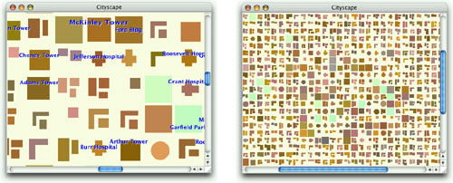
The Cityscape application shown in Figure 8.17 presents a fictitious map of the major buildings, blocks, and parks in a city, with the most important ones annotated with their names. It allows the user to scroll and zoom the map using the mouse and the keyboard. We will begin by showing the Cityscape class, which provides the application’s main window.
class Cityscape : public QMainWindow
{
    Q_OBJECT

public:
    Cityscape();

private:
    void generateCityBlocks();

    QGraphicsScene *scene;
    CityView *view;
};
The application has no menus or toolbars; it simply displays the annotated map using a CityView widget. The CityView class is derived from QGraphicsView.
Cityscape::Cityscape()
{
    scene = new QGraphicsScene(-22.25, -22.25, 1980, 1980);
    scene->setBackgroundBrush(QColor(255, 255, 238));
    generateCityBlocks();

    view = new CityView;
    view->setScene(scene);
    setCentralWidget(view);

    setWindowTitle(tr("Cityscape"));
}
The constructor creates a QGraphicsScene and calls generateCityBlocks() to generate a map. The map consists of about 2000 blocks and 200 annotations.
We will first look at the CityBlock graphics item subclass, then the Annotation graphics item subclass, and finally the CityView graphics view subclass.
class CityBlock : public QGraphicsItem
{
public:
    enum Kind { Park, SmallBuilding, Hospital, Hall, Building, Tower,
                LShapedBlock, LShapedBlockPlusSmallBlock, TwoBlocks,
                BlockPlusTwoSmallBlocks };

    CityBlock(Kind kind);

    QRectF boundingRect() const;
    void paint(QPainter *painter,
               const QStyleOptionGraphicsItem *option, QWidget *widget);

private:
    int kind;
    QColor color;
    QPainterPath shape;
};
A city block has a kind, a color, and a shape. Since the city blocks are not selectable, we have not bothered to reimplement the shape() function like we did for the Node class in the previous example.
CityBlock::CityBlock(Kind kind)
{
    this->kind = kind;

    int green = 96 + (std::rand() % 64);
    int red = 16 + green + (std::rand() % 64);
    int blue = 16 + (std::rand() % green);
    color = QColor(red, green, blue);

    if (kind == Park) {
        color = QColor(192 + (std::rand() % 32), 255,
                       192 + (std::rand() % 16));
        shape.addRect(boundingRect());
    } else if (kind == SmallBuilding) {
        ...
    } else if (kind == BlockPlusTwoSmallBlocks) {
        int w1 = (std::rand() % 10) + 8;
        int h1 = (std::rand() % 28) + 8;
        int w2 = (std::rand() % 10) + 8;
        int h2 = (std::rand() % 10) + 8;
        int w3 = (std::rand() % 6) + 8;
        int h3 = (std::rand() % 6) + 8;
        int y = (std::rand() % 4) - 16;
        shape.addRect(QRectF(-16, -16, w1, h1));
        shape.addRect(QRectF(-16 + w1 + 4, y, w2, h2));
        shape.addRect(QRectF(-16 + w1 + 4,
                             y + h2 + 4 + (std::rand() % 4), w3, h3));
    }
}
The constructor sets a random color and generates a suitable QPainterPath depending on what kind of block the node represents.
QRectF CityBlock::boundingRect() const
{
    return QRectF(-20, -20, 40, 40);
}
Each block occupies a 40 × 40 square, with its center at (0, 0).
void CityBlock::paint(QPainter *painter,
                      const QStyleOptionGraphicsItem *option,
                      QWidget * /* widget */)
{
    if (option->levelOfDetail < 4.0) {
        painter->fillPath(shape, color);
    } else {
        QLinearGradient gradient(QPoint(-20, -20), QPoint(+20, +20));
        int coeff = 105 + int(std::log(option->levelOfDetail - 4.0));
        gradient.setColorAt(0.0, color.lighter(coeff));
        gradient.setColorAt(1.0, color.darker(coeff));
        painter->fillPath(shape, gradient);
    }
}
In paint(), we draw the shape using the given QPainter. We distinguish two cases:
If the zoom factor is less than 4.0, we use a solid color to fill the shape.
If the zoom factor is 4.0 or more, we use a
QLinearGradientto fill the shape to give a subtle lighting effect.
The levelOfDetail member of the QStyleOptionGraphicsItem class stores a floating-point value that tells us what the zoom factor is. A value of 1.0 means that the scene is being viewed at its natural size, a value of 0.5 means that the scene has been zoomed out to half its natural size, and a value of 2.5 means that the scene has been zoomed in to two and a half times its natural size. Using the “level of detail” information allows us to use faster drawing algorithms for scenes that are zoomed out too much to show any detail.
The CityBlock graphics item class works perfectly, but the fact that the items are scaled when the scene is zoomed raises the question of what happens to items that draw text. Normally, we don’t want the text to scale with the scene. The graphics view architecture provide a general solution to this problem, through the ItemIgnoresTransformations flag. This is what we use in the Annotation class:
class Annotation : public QGraphicsItem
{
public:
    Annotation(const QString &text, bool major = false);

    void setText(const QString &text);
    QString text() const;

    QRectF boundingRect() const;
    void paint(QPainter *painter,
               const QStyleOptionGraphicsItem *option, QWidget *widget);

private:
    QFont font;
    QString str;
    bool major;
    double threshold;
    int y;
};
The constructor takes a text and a bool flag, called major, that specifies whether the annotation is a major or a minor annotation. This will affect the size of the font.
Annotation::Annotation(const QString &text, bool major)
{
    font = qApp->font();
    font.setBold(true);
    if (major) {
        font.setPointSize(font.pointSize() + 2);
        font.setStretch(QFont::SemiExpanded);
    }

    if (major) {
        threshold = 0.01 * (40 + (std::rand() % 40));
    } else {
        threshold = 0.01 * (100 + (std::rand() % 100));
    }

    str = text;
    this->major = major;
    y = 20 - (std::rand() % 40);

    setZValue(1000);
    setFlag(ItemIgnoresTransformations, true);
}
In the constructor, we begin by setting the font to be bigger and bolder if this is a major annotation, presumably one that refers to an important building or landmark. The threshold below which the annotation will not be shown is calculated pseudo-randomly, with a lower threshold for major annotations, so less important ones will disappear first as the scene is zoomed out.
The z value is set to 1000 to ensure that annotations are on top of everything else, and we use the ItemIgnoresTransformations flag to ensure that the annotation does not change size no matter how much the scene is zoomed.
void Annotation::setText(const QString &text)
{
    prepareGeometryChange();
    str = text;
    update();
}
If the annotation’s text is changed, it might be longer or shorter than before, so we must notify the graphics view architecture that the item’s geometry may change.
QRectF Annotation::boundingRect() const
{
    QFontMetricsF metrics(font);
    QRectF rect = metrics.boundingRect(str);
    rect.moveCenter(QPointF(0, y));
    rect.adjust(-4, 0, +4, 0);
    return rect;
}
We get the font metrics for the annotation’s font, and use them to calculate the text’s bounding rectangle. We then move the rectangle’s center point to the annotation’s y offset, and make the rectangle slightly wider. The extra pixels on the left and right sides of the bounding rectangle will give the text some margin from the edges.
void Annotation::paint(QPainter *painter,
                       const QStyleOptionGraphicsItem *option,
                       QWidget * /* widget */)
{
    if (option->levelOfDetail <= threshold)
        return;

    painter->setFont(font);

    QRectF rect = boundingRect();

    int alpha = int(30 * std::log(option->levelOfDetail));
    if (alpha >= 32)
        painter->fillRect(rect, QColor(255, 255, 255, qMin(alpha, 63)));

    painter->setPen(Qt::white);
    painter->drawText(rect.translated(+1, +1), str,
                      QTextOption(Qt::AlignCenter));
    painter->setPen(Qt::blue);
    painter->drawText(rect, str, QTextOption(Qt::AlignCenter));
}
If the scene is zoomed out beyond the annotation’s threshold, we don’t paint the annotation at all. And if the scene is zoomed in sufficiently, we start by painting a semi-transparent white rectangle; this helps the text stand out when drawn on top of a dark block.
We draw the text twice, once in white and once in blue. The white text is offset by one pixel horizontally and vertically to create a shadow effect that makes the text easier to read.
Having seen how the blocks and annotations are done, we can now move on to the last aspect of the Cityscape application, the custom QGraphicsView subclass:
class CityView : public QGraphicsView
{
    Q_OBJECT

public:
    CityView(QWidget *parent = 0);
protected:
    void wheelEvent(QWheelEvent *event);
};
By default, the QGraphicsView class provides scroll bars that appear automatically when needed, but does not provide any means of zooming the scene it is being used to view. For this reason, we have created the tiny CityView subclass to provide the user with the ability to zoom in and out using the mouse wheel.
CityView::CityView(QWidget *parent)
    : QGraphicsView(parent)
{
    setDragMode(ScrollHandDrag);
}
Setting the drag mode is all that is required to support scrolling by dragging.
void CityView::wheelEvent(QWheelEvent *event)
{
    double numDegrees = -event->delta() / 8.0;
    double numSteps = numDegrees / 15.0;
    double factor = std::pow(1.125, numSteps);
    scale(factor, factor);
}
When the user rolls the mouse wheel, wheel events are generated; we simply have to calculate an appropriate scaling factor and call QGraphicsView::scale(). The mathematical formula is a bit tricky, but basically we scale the scene up or down by a factor of 1.125 for every mouse wheel step.
That completes our two graphics view examples. Qt’s graphics view architecture is very rich, so bear in mind that it has a lot more to offer than we have had the space to cover. There is support for drag and drop, and graphics items can have tooltips and custom cursors. Animation effects can be achieved in a number of ways—for example, by associating QGraphicsItemAnimations with the items that we want to animate and performing the animation using a QTimeLine. It is also possible to achieve animation by creating custom graphics item subclasses that are derived from QObject (through multiple inheritance) and that reimplement QObject::timerEvent().
Printing in Qt is similar to drawing on a QWidget, QPixmap, or QImage. It consists of the following steps:
Create a
QPrinterto serve as the paint device.Pop up a
QPrintDialog, allowing the user to choose a printer and to set a few options.Create a
QPainterto operate on theQPrinter.
On Windows and Mac OS X, QPrinter uses the system’s printer drivers. On Unix, it generates PostScript and sends it to lp or lpr (or to the program set using QPrinter::setPrintProgram()). QPrinter can also be used to generate PDF files by calling setOutputFormat(QPrinter::PdfFormat).[*]
Let’s start with some simple examples that print on a single page. The first example, illustrated in Figure 8.18, prints a QImage:
void PrintWindow::printImage(const QImage &image)
{
    QPrintDialog printDialog(&printer, this);
    if (printDialog.exec()) {
        QPainter painter(&printer);
        QRect rect = painter.viewport();
        QSize size = image.size();
        size.scale(rect.size(), Qt::KeepAspectRatio);
        painter.setViewport(rect.x(), rect.y(),
                            size.width(), size.height());
        painter.setWindow(image.rect());
        painter.drawImage(0, 0, image);
    }
}
We assume that the PrintWindow class has a member variable called printer of type QPrinter. We could simply have created the QPrinter on the stack in printImage(), but then it would not remember the user’s settings from one print run to another.
We create a QPrintDialog and call exec() to show it. It returns true if the user clicked the OK button; otherwise, it returns false. After the call to exec(), the QPrinter object is ready to use. (It is also possible to print without using a QPrintDialog, by directly calling QPrinter member functions to set things up.)
Next, we create a QPainter to draw on the QPrinter. We set the window to the image’s rectangle and the viewport to a rectangle with the same aspect ratio, and we draw the image at position (0, 0).
By default, QPainter’s window is initialized so that the printer appears to have a similar resolution as the screen (usually somewhere between 72 and 100 dots per inch), making it easy to reuse widget painting code for printing. Here, it doesn’t matter, because we set our own window.
In the example, we chose to print an image, but printing graphics view scenes is also very simple. To print the entire scene, we can call either QGraphicsScene::render() or QGraphicsView::render(), passing a QPrinter as the first parameter. If we want to print just part of the scene, we can use the render() functions’ optional arguments to specify the target rectangle to paint on (where on the page the scene should be painted) and the source rectangle (what part of the scene should be painted).
Printing items that take up no more than a single page is simple, but many applications need to print multiple pages. For those, we need to paint one page at a time and call newPage() to advance to the next page. This raises the problem of determining how much information we can print on each page. There are two main approaches to handling multi-page documents with Qt:
We can convert our data to HTML and render it using
QTextDocument, Qt’s rich text engine.We can perform the drawing and the page breaking by hand.
We will review both approaches in turn. As an example, we will print a flower guide: a list of flower names, each with a textual description. Each entry in the guide is stored as a string of the format “name: description”, for example:
Miltonopsis santanae: A most dangerous orchid species.
Since each flower’s data is represented by a single string, we can represent all the flowers in the guide using one QStringList. Here’s the function that prints a flower guide using Qt’s rich text engine:
void PrintWindow::printFlowerGuide(const QStringList &entries)
{
    QString html;

    foreach (QString entry, entries) {
        QStringList fields = entry.split(": ");
        QString title = Qt::escape(fields[0]);
        QString body = Qt::escape(fields[1]);
        html += "<table width="100%" border=1 cellspacing=0>
"
                "<tr><td bgcolor="lightgray"><font size="+1">"
                "<b><i>" + title + "</i></b></font>
<tr><td>" + body
                + "
</table>
<br>
";
    }
    printHtml(html);
}
The first step is to convert the QStringList into HTML. Each flower becomes an HTML table with two cells. We use Qt::escape() to replace the special characters ‘&’, ‘<’, and ‘>’ with the corresponding HTML entities (“&”, “<”, and “>”). Then we call printHtml() to print the text.
void PrintWindow::printHtml(const QString &html)
{
    QPrintDialog printDialog(&printer, this);
    if (printDialog.exec()) {
        QTextDocument textDocument;
        textDocument.setHtml(html);
        textDocument.print(&printer);
    }
}
The printHtml() function pops up a QPrintDialog and takes care of printing an HTML document. It can be reused “as is” in any Qt application to print arbitrary HTML pages. The resulting pages are shown in Figure 8.19.

Converting a document to HTML and using QTextDocument to print it is by far the most convenient alternative for printing reports and other complex documents. In cases where we need more control, we can do the page layout and the drawing by hand. Let’s now see how we can use this approach to print a flower guide. Here’s the new printFlowerGuide() function:
void PrintWindow::printFlowerGuide(const QStringList &entries)
{
    QPrintDialog printDialog(&printer, this);
    if (printDialog.exec()) {
        QPainter painter(&printer);
        QList<QStringList> pages;

        paginate(&painter, &pages, entries);
        printPages(&painter, pages);
    }
}
After setting up the printer and constructing the painter, we call the paginate() helper function to determine which entry should appear on which page. The result of this is a list of QStringLists, with each QStringList holding the entries for one page. We pass on that result to printPages().
For example, let’s suppose that the flower guide contains six entries, which we will refer to as A, B, C, D, E, and F . Now let’s suppose that there is room for A and B on the first page; C, D, and E on the second page; and F on the third page. The pages list would then have the list [A, B] at index position 0, the list [C, D, E] at index position 1, and the list [F ] at index position 2.
void PrintWindow::paginate(QPainter *painter, QList<QStringList> *pages,
                           const QStringList &entries)
{
    QStringList currentPage;
    int pageHeight = painter->window().height() - 2 * LargeGap;
    int y = 0;

    foreach (QString entry, entries) {
        int height = entryHeight(painter, entry);
        if (y + height > pageHeight && !currentPage.empty()) {
            pages->append(currentPage);
            currentPage.clear();
            y = 0;
        }
        currentPage.append(entry);
        y += height + MediumGap;
    }
    if (!currentPage.empty())
        pages->append(currentPage);
}
The paginate() function distributes the flower guide entries into pages. It relies on the entryHeight() function, which computes the height of one entry. It also takes into account the vertical gaps at the top and bottom of the page, of size LargeGap.
We iterate through the entries and append them to the current page until we come to an entry that doesn’t fit; then we append the current page to the pages list and start a new page.
int PrintWindow::entryHeight(QPainter *painter, const QString &entry)
{
QStringList fields = entry.split(": ");
QString title = fields[0];
QString body = fields[1];
int textWidth = painter->window().width() - 2 * SmallGap;
int maxHeight = painter->window().height();
painter->setFont(titleFont);
QRect titleRect = painter->boundingRect(0, 0, textWidth, maxHeight,
Qt::TextWordWrap, title);
painter->setFont(bodyFont);
QRect bodyRect = painter->boundingRect(0, 0, textWidth, maxHeight,
Qt::TextWordWrap, body);
return titleRect.height() + bodyRect.height() + 4 * SmallGap;
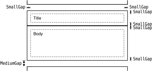
}The entryHeight() function uses QPainter::boundingRect() to compute the vertical space needed by one entry. Figure 8.20 shows the layout of a flower entry and the meaning of the SmallGap and MediumGap constants.
void PrintWindow::printPages(QPainter *painter,
                             const QList<QStringList> &pages)
{
    int firstPage = printer.fromPage() - 1;
    if (firstPage >= pages.size())
        return;
    if (firstPage == -1)
        firstPage = 0;

    int lastPage = printer.toPage() - 1;
    if (lastPage == -1 || lastPage >= pages.size())
        lastPage = pages.size() - 1;

    int numPages = lastPage - firstPage + 1;
    for (int i = 0; i < printer.numCopies(); ++i) {
        for (int j = 0; j < numPages; ++j) {
            if (i != 0 || j != 0)
                printer.newPage();

            int index;
            if (printer.pageOrder() == QPrinter::FirstPageFirst) {
                index = firstPage + j;
            } else {
                index = lastPage - j;
            }
            printPage(painter, pages[index], index + 1);
        }
    }
}
The printPages() function’s role is to print each page using printPage() in the correct order and the correct number of times. The result it produces is shown in Figure 8.21. Using the QPrintDialog, the user might request several copies, specify a print range, or request the pages in reverse order. It is our responsibility to honor these options—or to disable them using QPrintDialog::setEnabledOptions().

We start by determining the range to print. QPrinter’s fromPage() and toPage() functions return the page numbers selected by the user, or 0 if no range was chosen. We subtract 1 because our pages list is indexed from 0, and set firstPage and lastPage to cover the full range if the user didn’t set any range.
Then we print each page. The outer for loop iterates as many times as necessary to produce the number of copies requested by the user. Most printer drivers support multiple copies, so for those, QPrinter::numCopies() always returns 1. If the printer driver can’t handle multiple copies, numCopies() returns the number of copies requested by the user, and the application is responsible for printing that number of copies. (In the QImage example earlier in this section, we ignored numCopies() for the sake of simplicity.)
The inner for loop iterates through the pages. If the page isn’t the first page, we call newPage() to flush the old page and start painting on a fresh page. We call printPage() to paint each page.
void PrintWindow::printPage(QPainter *painter,
                            const QStringList &entries, int pageNumber)
{
    painter->save();
    painter->translate(0, LargeGap);
    foreach (QString entry, entries) {
        QStringList fields = entry.split(": ");
        QString title = fields[0];
        QString body = fields[1];
        printBox(painter, title, titleFont, Qt::lightGray);
        printBox(painter, body, bodyFont, Qt::white);
        painter->translate(0, MediumGap);
    }
    painter->restore();

    painter->setFont(footerFont);
    painter->drawText(painter->window(),
                      Qt::AlignHCenter | Qt::AlignBottom,
                      QString::number(pageNumber));
}
The printPage() function iterates through all the flower guide entries and prints them using two calls to printBox(): one for the title (the flower’s name) and one for the body (its description). It also draws the page number centered at the bottom of the page. The page layout is shown schematically in Figure 8.22.
void PrintWindow::printBox(QPainter *painter, const QString &str,
                           const QFont &font, const QBrush &brush)
{
    painter->setFont(font);

    int boxWidth = painter->window().width();
    int textWidth = boxWidth - 2 * SmallGap;
    int maxHeight = painter->window().height();

    QRect textRect = painter->boundingRect(SmallGap, SmallGap,
                                           textWidth, maxHeight,
                                           Qt::TextWordWrap, str);
    int boxHeight = textRect.height() + 2 * SmallGap;

    painter->setPen(QPen(Qt::black, 2.0, Qt::SolidLine));
    painter->setBrush(brush);
    painter->drawRect(0, 0, boxWidth, boxHeight);
    painter->drawText(textRect, Qt::TextWordWrap, str);
    painter->translate(0, boxHeight);
}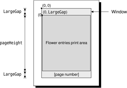
The printBox() function draws the outline of a box, then draws the text inside the box.
This completes our review of 2D graphics and printing. We will cover 3D graphics later, in Chapter 20.