CHAPTER 3
Forecasting Performance Evaluation and Reporting
Process improvement begins with process measurement. But it can be a challenge to find the right metrics to motivate the desired behavior. A simple example is provided by Steve Morlidge (in an article later in this chapter) for the case of intermittent demand:
When 50% or more of the periods are zero, a forecast of zero every period will generate the lowest average absolute error—irrespective of the size of the nonzero values. Yet forecasting zero every period is probably the wrong thing to do for inventory planning and demand fulfillment.
There are dozens of available forecasting performance metrics. Some, like mean absolute percent error (MAPE), represent error as a percentage. Others, like mean absolute error (MAE), are scale dependent; that is, they report the error in the original units of the data. Relative-error metrics (such as Theil’s U or forecast value added (FVA)) compare performance versus a benchmark (typically a naïve model). Each metric has its place—a situation where it is suitable to use and informative. But there are also countless examples (many provided in the articles below) where particular metrics are unsuitable and lead decision makers to inappropriate conclusions.
After Len Tashman’s opening overview and tutorial on forecast accuracy measurement, this chapter provides a critical exploration of many specific metrics and methods for evaluating forecasting performance. It covers some innovative approaches to performance reporting—including the application of statistical process control methods to forecasting. And it concludes with the most fundamental—yet frequently unasked—question in any performance evaluation: Can you beat the naïve forecast?
3.1 Dos and Don’ts of Forecast Accuracy Measurement: A Tutorial1
Len Tashman
As a forecaster, you’ve acquired a good deal of knowledge about statistical measurements of accuracy, and you’ve applied accuracy metrics alongside a large dose of common sense. This tutorial is designed to confirm your use of appropriate practices in forecast accuracy measurement, and to suggest alternatives that may provide new and better insights.
Perhaps most important, we warn you of practices that can distort or even undermine your accuracy evaluations. You will see these listed below as taboos—errors and omissions that must be avoided.
The Most Basic Issue: Distinguish In-Sample Fit from Out-of-Sample Accuracy
Using a statistical model applied to your sales history of daily, weekly, monthly, or quarterly data, possibly modified by judgmental adjustments, you generate forecasts for a certain number of periods into the future. We’ll use month as the general time interval. The question, “How accurate is your model?”—a question that contributes to decisions on whether the model is reliable as a forecasting tool—has two distinct components:
- In-Sample or Fitting Accuracy: How closely does the model track (fit, reproduce) the historical data that were used to generate the forecasts? We call this component in-sample accuracy. If you used the most recent 36 months of history to fit your model, the metrics of in-sample fit reveal the proximity of the model’s estimates to the actual values over each of the past 36 months.
- Out-of-Sample or Forecasting Accuracy: How closely will the model predict activity for the months ahead? The essential distinction from fitting accuracy is that you are now predicting into an unknown future, as opposed to predicting historical activity whose measurements were known to you. This forecasting accuracy component is often called out-of-sample accuracy, since the future is necessarily outside the sample of historical data we have about the past.
The best practice is to calculate and report measurements of both fitting and forecasting accuracy. The differences in the figures can be dramatic, and the key is to avoid taboo #1.
Volumes of research tell us that you cannot judge forecasting accuracy by fitting accuracy. For example, if your average error in-sample is found to be 10%, it is very probable that forecast errors will average substantially more than 10%. More generally put, in-sample errors are liable to understate errors out of sample. The reason is that you have calibrated your model to the past but you cannot calibrate to a future that has yet to occur.
How serious can violation of Taboo #1 be? If in-sample errors average 10%, how much larger than 10% will forecast errors be? A bit, twice the 10% figure, five times this figure, or 100 times this figure? That depends upon how closely the near future tracks the recent past, but it would not be surprising to find that out-of-sample errors are more than double the magnitude of in-sample errors.
The point to remember is this: The use of in-sample figures as a guide to forecasting accuracy is a mistake (a) that is of a potentially major magnitude; (b) that occurs far too often in practice; and (c) that is perpetuated by omissions in some, and perhaps most, forecasting software programs (think Excel, for example). The lack of software support is one reason that this mistake persists.
So how do you keep the distinction between fitting and forecasting accuracy clearly delineated?
Assessing Forecast Accuracy
There are at least three approaches that can be used to measure forecasting accuracy. These are:
- Wait and see in real time
- Use holdout samples
- Create retrospective evaluations
While there are variations on these themes, it is worthwhile understanding their basic similarities and differences.
Real-Time Evaluations
A company commits to a forecast for “next month” on or before the last day of the current month. This is a forecast with a one-month lead-time, or one-month horizon. We call it a one-month-ahead forecast.
Suppose the May forecast is presented by April 30. Soon after May has elapsed, the activity level for this month is a known fact. The difference between that level and what had been forecast on April 30 is the forecast error for the month of May, a one-month-ahead forecast error.
The company has developed worksheets that show the actuals, forecasts, and errors-by-month over the past few years. They use these figures to compare alternative forecasting procedures and to see if accuracy is improving or deteriorating over time.
The real-time evaluation is “pure” in that forecasts for the next month do not utilize any information that becomes known after the month (May) begins. One disadvantage here is that there is more than a month’s lag before the next accuracy figure can be calculated.
The most critical lead-time for judging forecast accuracy is determined by the order/replenishment cycle. If it takes two months, on average, to obtain the resources to produce the product or service, then forecasting accuracy at two months ahead is the critical lead-time.
There is also an inconvenience to real-time evaluations. These normally must be done outside the forecasting tool, requiring creation of worksheets to track results. If the company wishes to learn how accurately it can forecast more than one month ahead—for example, forecasting with lead-times of two months, three months, or longer—it will need to create a separate worksheet for each lead-time.
Holdout Samples
Many software tools support holdout samples. They allow you to divide the historical data on an item, product, or family into two segments. The earlier segment serves as the fit or in-sample period; the fit-period data are used to estimate statistical models and determine their fitting accuracy. The more recent past is held out of the fit period to serve as the test, validation, or out-of-sample period: Since the test-period data have not been used in choosing or fitting the statistical models, they represent the future that the models are trying to forecast. Hence, a comparison of the forecasts against the test-period data is essentially a test of forecasting accuracy.
Peeking
Holdout samples permit you to obtain impressions of forecast accuracy without waiting for the future to materialize (they have another important virtue as well, discussed in the next section). One danger, however, is peeking, which is what occurs when a forecaster inspects the holdout sample to help choose a model. You can’t peek into the future, so peeking at the held-out data undermines the forecast-accuracy evaluation.
Another form of the peeking problem occurs when the forecaster experiments with different models and then chooses the one that best “forecasts” the holdout sample of data. This overfitting procedure is a no-no because it effectively converts the out-of-sample data into in-sample data. After all, how can you know how any particular model performed in the real future, without waiting for the future to arrive?
In short, if the holdout sample is to provide an untainted view of forecast accuracy, it must not be used for model selection.
Single Origin Evaluations
Let’s say you have monthly data for the most recent 4 years, and have divided this series into a fit period of the first 3 years, holding out the most recent 12 months to serve as the test period. The forecast origin would be the final month of year 3. From this origin, you forecast each of the 12 months of year 4. The result is a set of 12 forecasts, one each for lead-times 1–12.
What can you learn from these forecasts? Very little, actually, since you have only one data point on forecast accuracy for each lead-time. For example, you have one figure telling you how accurately the model predicted one month ahead. Judging accuracy from samples of size 1 is not prudent. Moreover, this one figure may be “corrupted” by occurrences unique to that time period.
Further, you will be tempted (and your software may enable you) to average the forecast errors over lead-times 1–12. Doing so gives you a metric that is a mélange of near-term and longer-term errors that have ceased to be linked to your replenishment cycle.
Rolling Origin Evaluations
The shortcomings of single-origin evaluations can be overcome in part by successively updating the forecast origin. This technique is also called a rolling-origin evaluation. In the previous example (4 years of monthly data, the first 3 serving as the fit period and year 4 as the test period), you begin the same way, by generating the 12 forecasts for the months of year 4 . . . but you don’t stop there.
You then move the first month of year 4 from the test period into the fit period, and refit the same statistical model to the expanded in-sample data. The updated model generates 11 forecasts, one each for the remaining months of year 4.
The process continues by updating the fit period to include the second month of year 4, then the third month, and so forth, until your holdout sample is exhausted (down to a single month). Look at the results:
- 12 data points on forecast accuracy for forecasting one month ahead
- 11 data points on forecast accuracy for forecasting two months ahead
- . . .
- 2 data points on forecast accuracy for forecasting 11 months ahead
- 1 data point on forecast accuracy for forecasting 12 months ahead.
If your critical lead-time is 2 months, you now have 11 data points for judging how accurately the statistical procedure will forecast two months ahead. An average of the 11 two-months-ahead forecast errors will be a valuable metric and one that does not succumb to Taboo #3.
Performing rolling-origin evaluations is feasible only if your software tool supports this technique. A software survey that Jim Hoover and I did in 2000 for the Principles of Forecasting project (Tashman and Hoover, 2001) found that few demand-planning tools, spreadsheet packages, and general statistical programs offered this support. However, dedicated business-forecasting software packages do tend to provide more adequate support for forecasting-accuracy evaluations.
How Much Data to Hold Out?
There are no hard and fast rules. Rather, it’s a balancing act between too large and too small a holdout sample. Too large a holdout sample and there is not enough data left in-sample to fit your statistical model. Too small a holdout sample and you don’t acquire enough data points to reliably judge forecasting accuracy.
If you are fortunate to have a long history—say, 48 months of data or more—you are free to make the decision on the holdout sample based on common sense. Normally, I hold out the final year (12 months), using the earlier years to fit the model. This gives a picture of how that model would have forecast each month of the past year.
If the items in question have a short replenishment cycle—2 months, let’s say—you’re interested mainly in the accuracy of 2-months-ahead forecasts. In this situation, I recommend holding out at least 4 months. In a rolling-origin evaluation, you’ll receive 4 data points on accuracy for one month ahead and 3 for two months ahead. (Had you held out only 2 months, you’d receive only 1 data point on accuracy for your 2-months-ahead forecast.) I call this the H+2 rule, where H is the forecast horizon determined by your replenishment cycle.
When you have only a short history, it is not feasible to use a holdout sample. But then statistical accuracy metrics based on short histories are not reliable to begin with.
Retrospective Evaluations
Real-time evaluations and holdout samples are two approaches to assessment of forecasting accuracy. Retrospective evaluation is a third. Here, you define a target month, say the most recent December. Then you record the forecasts for the target month that were made one month ago, two months ago, three months ago, and so forth. Subtracting each forecast from the actual December value gives you the error in a forecast made so many months prior. So-called backtracking grids or waterfall charts are used to display the retrospective forecast errors. An example can be seen at www.mcconnellchase.com/fd6.shtml.
It would be a good sign if the errors diminish as you approach the target month.
The retrospective evaluation, like the rolling-origin evaluation, allows you to group errors by lead-time. You do this by repeating the analysis for different target months and then collecting the forecast errors into one month before, two months before, and so forth. If your replenishment cycle is short, you need go back only a few months prior to each target.
Accuracy Metrics
The core of virtually all accuracy metrics is the difference between what the model forecast and the actual data point. Using A for the actual and F for the forecast, the difference is the forecast error.
The forecast error can be calculated as A – F (actual minus forecast) or F – A (forecast minus actual). Most textbooks and software present the A – F form, but there are plenty of fans of both methods. Greene and Tashman (2008) summarize the preferences between the two forms. Proponents of A – F cite convention—it is the more common representation—while advocates of F – A say it is more intuitive, in that a positive error F > A represents an overforecast and F < A an underforecast. With A – F, an overforecast is represented by a negative error, which could be confusing to some people.
However, the form really doesn’t matter when the concern is with accuracy rather than bias. Accuracy metrics are calculated on the basis of the difference between actual and forecast without regard to the direction of the difference. The directionless difference is called the absolute value of the error. Using absolute values prevents negative and positive errors from offsetting each other and focuses your attention on the size of the errors.
In contrast, metrics that assess bias—a tendency to misforecast in one direction—retain the sign of the error (+ or –) as an indicator of direction. Therefore, it is important to distinguish metrics that reveal bias from those that measure accuracy or average size of the errors.
The presence and severity of bias is more clearly revealed by a graph rather than a metric.
Pearson (2007) shows you how to create a Prediction-Realization Diagram. This single graphic reveals whether your forecasts are biased (and in what direction), how large your errors are (the accuracy issue), and if your forecasts are better than a naïve benchmark. Seeing all this in one graphic reveals patterns in your forecast errors and insights into how to improve your forecasting performance.
Classification of Accuracy Metrics
Hyndman (2006) classifies accuracy metrics into 4 types, but here I’m going to simplify his taxonomy into 3 categories:
- Basic metrics in the original units of the data (same as Hyndman’s scale dependent)
- Basic metrics in percentage form (same as Hyndman’s percentage error)
- Relative-error metrics (Hyndman’s relative and scale-free metrics)
I use the term basic metric to describe the accuracy of a set of forecasts for a single item from a single procedure or model. In a basic metric, aggregation is not an issue; that is, we are not averaging errors over many items.
In contrast to basic metrics, relative-error metrics compare the accuracy of a procedure against a designated benchmark procedure.
Aggregate-error metrics can be compiled from both basic and relative-error metrics.
Basic Metrics in the Original Units of the Data
Basic metrics reveal the average size of the error. The “original units” of the data will normally be volume units (# cases, # widgets) or monetary units (value of orders or sales).
The principal metric of this type is the mean of the absolute errors, symbolized normally as the MAD (mean absolute deviation) or MAE (mean absolute error). Recall that by “absolute” we mean that negative errors are not allowed to offset positive errors (that is, over- and underforecasts do not cancel). If we permitted negatives to offset positives, the result could well be an average close to zero, despite large errors overall.
A MAD of 350 cases tells us that the forecasts were off by 350 cases on the average.
An alternative to the MAD (MAE) that prevents cancellation of negatives and positives is the squared-error metric, variously called the RMSE (root mean square error), the standard deviation of the error (SDE), or standard error (SE). These metrics are more popular among statisticians than among forecasters, and are a step more challenging to interpret and explain. Nevertheless, they remain the most common basis for calculations of safety stocks for inventory management, principally because of the (questionable) tradition of basing safety-stock calculations on the bell-shaped Normal distribution.
MAPE: The Basic Metric in Percentage Form
The percentage version of the MAD is the MAPE (the mean of the absolute percentage errors).
A MAPE of 3.5% tells us that the forecasts were off by 3.5% on the average.
There is little question that the MAPE is the most commonly cited accuracy metric, because it seems so easy to interpret and understand. Moreover, since it is a percentage, it is scale free (not in units of widgets, currency, etc.) while the MAD, which is expressed in the units of the data, is therefore scale dependent.
A scale-free metric has two main virtues. First, it provides perspective on the size of the forecast errors to those unfamiliar with the units of the data. If I tell you that my forecast errors average 175 widgets, you really have no idea if this is large or small; but if I tell you that my errors average 2.7%, you have some basis for making a judgment.
Secondly, scale-free metrics are better for aggregating forecast errors of different items. If you sell both apples and oranges, each MAD is an average in its own fruit units, making aggregation silly unless the fruit units are converted to something like cases. But even if you sell two types of oranges, aggregation in the original data units will not be meaningful when the sales volume of one type dominates that of the other. In this case, the forecast error of the lower-volume item will be swamped by the forecast error of the higher-volume item. (If 90% of sales volume is of navel oranges and 10% of mandarin oranges, equally accurate procedures for forecasting the two kinds will yield errors that on average are 9 times greater for navel oranges.)
Clearly, the MAPE has important virtues. And, if both MAD and MAPE are reported, the size of the forecast errors can be understood in both the units of the data and in percentage form.
Still, while the MAPE is a near-universal metric for forecast accuracy, its drawbacks are poorly understood, and these can be so severe as to undermine the forecast accuracy assessment.
MAPE: The Issues
Many authors have warned about the use of the MAPE. A brief summary of the issues:
- Most companies calculate the MAPE by expressing the (absolute) forecast error as a percentage of the actual value A. Some, however, prefer a percentage of the forecast F; others, a percentage of the average of A and F; and a few use the higher of A or F. Greene and Tashman (2009) present the various explanations supporting each form.
- The preference for use of the higher of A or F as the denominator may seem baffling; but, as by Hawitt (20102010), this form of the MAPE may be necessary if the forecaster wishes to report “forecast accuracy” rather than “forecast error.” This is the situation when you wish to report that your forecasts are 80% accurate rather than 20% in error on the average.
- Kolassa and Schutz (2007) describe three potential problems with the MAPE. One is the concern with forecast bias, which can lead us to inadvertently prefer methods that produce lower forecasts; a second is with the danger of using the MAPE to calculate aggregate error metrics across items; and the third is the effect on the MAPE of intermittent demands (zero orders in certain time periods). The authors explain that all three concerns can be overcome by use of an alternative metric to the standard MAPE called the MAD/MEAN ratio. I have long felt that the MAD/MEAN ratio is a superior metric to the MAPE, and recommend that you give this substitution serious consideration.
- The problem posed by intermittent demands is especially vexing. In the traditional definition of the MAPE—the absolute forecast error as a percentage of the actual A—a time period of zero orders (A = 0) means the error for that period is divided by zero, yielding an undefined result. In such cases, the MAPE cannot be calculated. Despite this, some software packages report a figure for the “MAPE” that is potentially misleading. Hoover (2006) proposes alternatives, including the MAD/MEAN ratio.
- Hyndman’s (2006) proposal for replacing the MAPE in the case of intermittent demands is the use of a scaled-error metric, which he calls the mean absolute scaled error or MASE. The MASE, he notes, is closely related to the MAD/MEAN ratio.
- Another issue is the aggregation problem: What metrics are appropriate for measurement of aggregate forecast error over a range (group, family, etc.) of items. Many companies calculate an aggregate error by starting with the MAPE of each item and then weighting the MAPE by the importance of the item in the group, but this procedure is problematic when the MAPE is problematic. Again, the MAD/MEAN ratio is a good alternative in this context as well.
Relative Error Metrics
The third category of error metrics is that of relative errors, the errors from a particular forecast method in relation to the errors from a benchmark method. As such, this type of metric, unlike basis metrics, can tell you whether a particular forecasting method has improved upon a benchmark. Hyndman (2006) provides an overview of some key relative-error metrics including his preferred metric, the MASE.
The main issue in devising a relative-error metric is the choice of benchmark. Many software packages use as a default benchmark the errors from a naïve model, one that always forecasts that next month will be the same as this month. A naïve forecast is a no-change forecast (another name used for the naïve model is the random walk). The ratio of the error from your forecasting method to that of the error from the naïve benchmark is called the relative absolute error. Averaging the relative absolute errors over the months of the forecast period yields an indication of the degree to which your method has improved on the naïve.
Of course, you could and should define your own benchmark; but then you’ll need to find out if your software does the required calculations. Too many software packages offer limited choices for accuracy metrics and do not permit variations that may interest you. More generally, the problem is that your software may not support best practices.
A relative-error metric not only can tell you how much your method improves on a benchmark; it provides a needed perspective for bad data situations. Bad data usually means high forecast errors, but high forecast errors do not necessarily mean that your forecast method has failed. If you compare your errors against the benchmark, you may find that you’ve still made progress, and that the source of the high error rate is not bad forecasting but bad data.
Benchmarking and Forecastability
Relative-error metrics represent one form of benchmarking, that in which the forecast accuracy of a model is compared to that of a benchmark model. Typically, the benchmark is a naïve model, one that forecasts “no change” from a base period.
Two other forms are more commonly employed. One is to benchmark against the accuracy of forecasts made for similar products or under similar conditions. Frequently, published surveys of forecast accuracy (from a sample of companies) are cited as the source of these benchmarks. Company names of course are not disclosed. This is external benchmarking.
In contrast, internal benchmarking refers to comparisons of forecasting accuracy over time, usually to determine whether improvements are being realized.
External Benchmarking
Kolassa (2008) has taken a critical look at these surveys and questions their value as benchmarks. Noting that “comparability” is the key in benchmarking, he identifies potential sources of incomparability in the product mix, time frame, granularity, and forecasting process. This article is worth careful consideration for the task of creating valid benchmarks.
Internal Benchmarking
Internal benchmarking is far more promising than external benchmarking, according to Hoover (2009) and Rieg (2008). Rieg develops a case study of internal benchmarking at a large automobile manufacturer in Germany. Using the MAD/MEAN ratio as the metric, he tracks the changes in forecasting accuracy over a 15-year period, being careful to distinguish organizational changes, which can be controlled, from changes in the forecasting environment, which are beyond the organization’s control.
Hoover provides a more global look at internal benchmarking. He first notes the obstacles that have inhibited corporate initiatives in tracking accuracy. He then presents an eight-step guide to the assessment of forecast accuracy improvement over time.
Forecastability
Forecastability takes benchmarking another step forward. Benchmarks give us a basis for comparing our forecasting performance against an internal or external standard. However, benchmarks do not tell us about the potential accuracy we can hope to achieve.
Forecastability concepts help define achievable accuracy goals.
Catt (2009) begins with a brief historical perspective on the concept of the data-generating process, the underlying process from which our observed data are derived. If this process is largely deterministic—the result of identifiable forces—it should be forecastable. If the process is essentially random—no identifiable causes of its behavior—it is unforecastable. Peter uses six data series to illustrate these fundamental aspects of forecastability. Now the question is what metrics are there to assess forecastability.
Several books, articles, and blogs have proposed the coefficient of variation as a forecastability metric. The coefficient of variation is the ratio of some measure of variation (e.g., the standard deviation) of the data to an average (normally the mean) of the data. It reveals something about the degree of variation around the average. The presumption made is that the more variable (volatile) the data series, the less forecastable it is; conversely, the more stable the data series, the easier it is to forecast.
Catt demonstrates, however, that the coefficient of variation does not account for behavioral aspects of the data other than trend and seasonality, and so has limitations in assessing forecastability. A far more reliable metric, he finds, is that of approximate entropy, which measures the degree of disorder in the data and can detect many patterns beyond mere trend and seasonality.
Yet, as Boylan (2009) notes, metrics based on variation and entropy are really measuring the stability-volatility of the data and not necessarily forecastability. For example, a stable series may nevertheless come from a data-generating process that is difficult to identify and hence difficult to forecast. Conversely, a volatile series may be predictable based on its correlation with other variables or upon qualitative information about the business environment. Still, knowing how stable-volatile a series is gives us a big head start, and can explain why some products are more accurately forecast than others.
Boylan argues that a forecastability metric should supply an upper and lower bound for forecast error. The upper bound is the largest degree of error that should occur, and is normally calculated as the error from a naïve model. After all, if your forecasts can’t improve on simple no-change forecasts, what have you accomplished? On this view, the relative-error metrics serve to tell us if and to what extent our forecast errors fall below the upper bound.
The lower bound of error represents the best accuracy we can hope to achieve. Although establishing a precise lower bound is elusive, Boylan describes various ways in which you can make the data more forecastable, including use of analogous series, aggregated series, correlated series, and qualitative information.
Kolassa (2009) compares the Catt stability metric with the Boylan forecastability bounds. He sees a great deal of merit in the entropy concept, pointing out its successful use in medical research, quantifying the stability in a patient’s heart rate. However, entropy is little understood in the forecasting community and is not currently supported by forecasting software. Hopefully, that will change, but he notes that we do need more research on the interrelation of entropy and forecast-error bounds.
These articles do not provide an ending to the forecastability story, but they do clarify the issues and help you avoid simplistic approaches.
Costs of Forecast Error
Forecast accuracy metrics do not reveal the financial impact of forecast error, which can be considerable. At the same time, we should recognize that improved forecast accuracy does not automatically translate into operational benefits (e.g., improved service levels, reduced inventory costs). The magnitude of the benefit depends upon the effectiveness of the forecasting and the planning processes. Moreover, there are costs to improving forecast accuracy, especially when doing so requires upgrades to systems, software, and training.
How can we determine the costs of forecast error and the costs and benefits of actions designed to reduce forecast error? A good starting point is the template provided by Catt (2007a). The cost of forecast error (CFE) calculation should incorporate both inventory costs (including safety stock) and the costs of poor service (stockouts).
The calculation requires (1) information or judgment calls about marginal costs in production and inventory, (2) a forecast-error measurement that results from a statistical forecast, and (3) the use of a statistical table (traditionally the Normal Distribution) to translate forecast errors into probabilities of stockouts.
The potential rewards from a CFE calculation can be large. First, the CFE helps guide decisions about optimal service level and safety stock, often preventing excessive inventory. Additionally, CFE calculations could reveal that systems upgrades may not be worth the investment cost.
Clarifications and enhancements to this CFE template are offered by Boylan (2007) and Willemain (2007). Boylan recommends that service-level targets be set strategically—at higher levels of the product hierarchy—than tactically at the item level. John also shows how you can get around the absence of good estimates of marginal costs by creating tradeoff curves and applying sensitivity analysis to cost estimates.
Willemain explains that the use of the normal distribution is not always justifiable, and can lead to excessive costs and poor service. Situations in which we really do need an alternative to the normal distribution—such as the bootstrap approach—include service parts, and short and intermittent demand histories. He also makes further suggestions for simplifying the cost assumptions required in the CFE calculation.
Catt’s (2007b) reply is to distinguish the cost inputs that can usually be extracted from the accounting system from those that require some subjectivity. He concurs with Boylan’s recommendation of the need for sensitivity analysis of the cost estimates and shows how the results can be displayed as a CFE surface plot. Such a plot may reveal that the CFE is highly sensitive to, say, the inventory carrying charge, but insensitive to the service level.
Software could and should facilitate the CFE calculation; however, Catt sadly notes that he has yet to find a package that does: “Vendors often promise great benefits but provide little evidence of them.”
And this leads us to our final taboo:
REFERENCES
- Boylan, J. (2007). Key assumptions in calculating the cost of forecast error. Foresight: International Journal of Applied Forecasting 8, 22–24.
- Boylan, J. (2009). Toward a more precise definition of forecastability. Foresight: International Journal of Applied Forecasting 13, 34–40.
- Catt, P. (2007a). Assessing the cost of forecast error: A practical example. Foresight: International Journal of Applied Forecasting 7, 5–10.
- Catt, P. (2007b). Reply to “Cost of Forecast Error” commentaries. Foresight 8, 29–30.
- Catt, P. (2009). Forecastability: Insights from physics, graphical decomposition, and information theory. Foresight: International Journal of Applied Forecasting 13, 24–33.
- Greene, K., and Tashman, L. (2008). Should we define forecast error as E = F – A or E = A – F? Foresight 10, 38–40.
- Greene, K., and Tashman, L. (2009). Percentage Error: What Denominator? Foresight 12, 36–40.
- Hawitt, D. (2010), Should you report forecast error or forecast accuracy? Foresight 19, Summer 2010, p. 46.
- Hoover, J. (2006). Measuring forecast accuracy: Omissions in today’s forecasting engines and demand planning software. Foresight: International Journal of Applied Forecasting 4, 32–35.
- Hoover, J. (2009). How to track forecast accuracy to guide forecast process improvement. Foresight 14, 17–23.
- Hyndman, R. (2006). Another look at forecast-accuracy metrics for intermittent demand. Foresight 4, 43–46.
- Kolassa, S., and Schütz, W. (2007). Advantages of the MAD/MEAN ratio over the MAPE. Foresight: International Journal of Applied Forecasting 6, 40–43.
- Kolassa, S. (2008). Can we obtain valid benchmarks from published surveys of forecast accuracy? Foresight 11, 6–14.
- Kolassa, S. (2009). How to assess forecastability. Foresight: International Journal of Applied Forecasting 13, 41–45.
- Pearson, R. (2007). An expanded prediction-realization diagram for assessing forecast errors. Foresight 7, 11–16.
- Rieg, R. (2008). Measuring improvement in forecast accuracy, a case study. Foresight: International Journal of Applied Forecasting 11, 15–20.
- Tashman, L., and Hoover, J. (2000). Diffusion of forecasting principles through software. In J. S.Armstrong (ed.), Principles of Forecasting 651–676.
- Willemain, T. (2007). Use of the normal distribution in calculating the cost of forecast error. Foresight: International Journal of Applied Forecasting 8, 25–26.
3.2 How to Track Forecast Accuracy to Guide Forecast Process Improvement2
Jim Hoover
Introduction
One of the more important tasks in supply-chain management is improving forecast accuracy. Because your investment in inventory is tied to it, forecast accuracy is critical to the bottom line. If you can improve accuracy across your range of SKUs, you can reduce the safety-stock levels needed to reach target fill rates.
I have seen a great deal of information in the forecasting literature on measuring forecasting accuracy for individual items at a point in time but see very little attention paid to the issues of tracking changes in forecasting accuracy over time, especially for the aggregate of items being forecast. Foresight has begun to address this topic with a case study from Robert Rieg (2008).
In practice, the portion of firms tracking aggregated accuracy is surprisingly small. Teresa McCarthy and colleagues (2006) reported that only 55% of the companies they surveyed believed that forecasting performance was being formally evaluated. When I asked the same question at a recent conference of forecasting practitioners, I found that approximately half of the participants indicated that their company tracked forecast accuracy as a key performance indicator; less than half reported that financial incentives were tied to forecast-accuracy measurement.
Obstacles to Tracking Accuracy
Why aren’t organizations formally tracking forecast accuracy? One reason is that forecasts are not always stored over time. Many supply-chain systems with roots in the 1960s and 1970s did not save prior-period forecasts because of the high cost of storage in that era. Technology advances have reduced storage costs and, while the underlying forecast applications have been re-hosted on new systems, they have not been updated to retain prior forecasts, thus forfeiting the possibility of tracking performance over time.
A second reason is that saving the history in a useful manner sometimes requires retention of the original customer-level demand data. These are the data that can later be rebuilt into different levels of distribution center activity, when DCs are added or removed. This additional requirement creates a much larger storage challenge than saving just the aggregated forecasts.
Third, there are companies that haven’t settled on a forecast-accuracy metric. While this may seem to be a simple task, the choice of metric depends on the nature of the demand data. For intermittent demands, popular metrics such as the Mean Absolute Percentage Error (MAPE) are inappropriate, as pointed out in Hoover (2006).
Finally, some companies don’t have processes in place that factor forecast-accuracy metrics into business decisions. So they lack the impetus to track accuracy.
Multistep Tracking Process
A process for effective tracking of forecasting accuracy has a number of key steps, as shown in Figure 3.1.

Figure 3.1 Key Steps in the Tracking Process
Step 1. Decide on the Forecast-Accuracy Metric
For many forecasters, the MAPE is the primary forecast-accuracy metric. Because the MAPE is scale-independent (since it is a percentage error, it is unit free), it can be used to assess and compare accuracy across a range of items. Kolassa and Schutz (2007) point out, however, that this virtue is somewhat mitigated when combining low- and high-volume items.
The MAPE is also a very problematic metric in certain situations, such as intermittent demands. This point was made in a feature section in Foresight entitled “Forecast-Accuracy Metrics for Inventory Control and Intermittent Demands” (Issue 4, June 2006). Proposed alternatives included the MAD/Mean ratio, a metric which overcomes many problems with low-demand SKUs and provides consistent measures across SKUs. Another metric is the Mean Absolute Scaled error, or MASE, which compares the error from a forecast model with the error resulting from a naïve method. Slightly more complex is GMASE, proposed by Valentin (2007), which is a weighted geometric mean of the individual MASEs calculated at the SKU level. Still other metrics are available, including those based on medians rather than means and using the percentage of forecasts that exceed an established error threshold.
In choosing an appropriate metric, there are two major considerations. The metric should be scale-independent so that it makes sense when applied to an aggregate across SKUs. Secondly, the metric should be intuitively understandable to management. The popularity of the MAPE is largely attributable to its intuitive interpretation as an average percentage error. The MAD-to-Mean is nearly as intuitive, measuring the average error as a percent of the average volume. Less intuitive are the MASE and GMASE.
I would recommend the more intuitive metrics, specifically MAD-to-Mean, because they are understandable to both management and forecasters. Using something as complicated as MASE or GMASE can leave some managers confused and frustrated, potentially leading to a lack of buy-in or commitment to the tracking metric.
Step 2. Determine the Level of Aggregation
The appropriate level of aggregation is the one where major business decisions on resource allocation, revenue generation, and inventory investment are made. This ensures that your forecast-accuracy tracking process is linked to the decisions that rely on the forecasts.
If you have SKUs stored both in retail sites and in a distribution center (DC), you will have the option to track forecast error at the individual retail site, at the DC, or at the overall aggregate level. If key business decisions (such as inventory investment and service level) are based on the aggregate-level SKU forecasts and you allocate that quantity down your supply chain, then you should assess forecast accuracy at the aggregate level. If you forecast by retail site and then aggregate the individual forecasts up to the DC or at the overall SKU aggregate, then you should be measuring forecasting accuracy at the individual site level. Again, the point is to track accuracy at the level where you make the important business decisions.
Additionally, you should consider tracking accuracy across like items. If you use one service-level calculation for fast-moving, continuous-demand items, and a second standard for slower- and intermittent-demand items, you should calculate separate error measures for the distinct groups.
Table 3.1 illustrates how the aggregation of the forecasts could be accomplished to calculate an average aggregate percent error for an individual time period.
Step 3. Decide Which Attributes of the Forecasting Process to Store
There are many options here, including:
- the actual demands
- the unadjusted statistical forecasts (before override or modifications)
- when manual overrides were made to the statistical forecast, and by whom
- when outliers were removed
- the method used to create the statistical forecast and the parameters of that method
- the forecaster responsible for that SKU
- when promotions or other special events occurred
- whether there was collaboration with customers or suppliers
- the weights applied when allocating forecasts down the supply chain
Table 3.1 Calculation of an Aggregate Percent Error
| SKUs at Store Location 1 | History Current Period | Forecast for Current Period | Error (History −Forecast) | Absolute Error | Absolute Percent Error |
| SKU 1 | 20 | 18 | 2 | 2 | 10.0% |
| SKU 2 | 10 | 15 | −5 | 5 | 50.0% |
| SKU 3 | 50 | 65 | −15 | 15 | 30.0% |
| SKU 4 | 5 | 2 | 3 | 3 | 60.0% |
| SKU 5 | 3 | 8 | −5 | 5 | 166.7% |
| SKU 6 | 220 | 180 | 40 | 40 | 18.2% |
| Average Error = 55.8% | |||||

Figure 3.2 Flowchart for Storing Attributes of a Forecasting Process
Choosing the right attributes facilitates a forecasting autopsy, which seeks explanations for failing to meet forecast-accuracy targets. For example, it can be useful to know if forecast errors were being driven by judgmental overrides to the statistical forecasts. To find this out requires that we store more than just the actual demands and final forecasts.
Figure 3.2 presents a flowchart illustrating the sequence of actions in storing key attributes. Please note that the best time to add these fields is when initially designing your accuracy-tracking system. It is more difficult and less useful to add them later, it will cost more money, and you will have to baseline your forecast autopsy results from the periods following any change in attributes. It is easier at the outset to store more data elements than you think you need, rather than adding them later.
Step 4. Apply Relevant Business Weights to the Accuracy Metric
George Orwell might have put it this way: “All forecasts are equal, but some are more equal than others.” The simple truth: You want better accuracy when forecasting those items that, for whatever reason, are more important than other items.
The forecast-accuracy metric can reflect the item’s importance through assignment of weights. Table 3.2 provides an illustration, using inventory holding costs to assign weights.
Table 3.2 Calculating a Weighted Average Percent
| SKUs at Store Location 1 | History Current Period | Forecast for Currant Period | Error (History-Forecast) | Absolute Error | Absolute Percent Error | Cost of Item | Inventory Holding Cost | Percentage of Total Holding Costs | Weighted APE Contribution | |
| SKU 1 | 20 | 18 | 2 | 2 | 10.0% | $50.00 | $900.00 | 5.3% | 0.5% | |
| SKU 2 | 10 | 15 | −5 | 5 | 50.0% | $50.00 | $750.00 | 4.4% | 2.2%. | |
| SKU 3 | 50 | 65 | −15 | 15 | 30.0% | $25.00 | $1,625.00 | 9.6% | 2.9% | |
| SKU 4 | 5 | 2 | 3 | 3 | 60.0% | $5.00 | $10.00 | 0.1% | 0.0% | |
| SKU 5 | 3 | 8 | −5 | 5 | 166.7% | $15.00 | $120.00 | 0.7% | 1.2% | |
| SKU 6 | 220 | 180 | 40 | 40 | 18.2% | $75.00 | $13,500.00 | 79.9% | 14.5% | |
| Weighted summary APE calculated from individual weights applied to SKU’s based on holding costs | Summarized Monthly APE = 21.4% Unweighted MAPE = 55.8% | |||||||||
As shown in this example, SKUs 3 and 6 have the larger weights and move the weighted APE metric down from the average of 55.8% (seen in Table 3.1) to 21.4%.
Use the weighting factor that makes the most sense from a business perspective to calculate your aggregated periodic forecast-accuracy metric. Here are some weighting factors to consider:
- Inventory holding costs
- Return on invested assets
- Expected sales levels
- Contribution margin of the item to business bottom line
- Customer-relationship metrics
- Expected service level
- “Never out” requirements (readiness-based)
- Inventory
Weighting permits the forecaster to prioritize efforts at forecast-accuracy improvement.
Step 5. Track the Aggregated Forecast-Accuracy Metric over Time
An aggregate forecast-accuracy metric is needed by top management for process review and financial reporting. This metric can serve as the basis for tracking process improvement over time. Similar to statistical process-control metrics, the forecast-accuracy metric will assess forecast improvement efforts and signal major shifts in the forecast environment and forecast-process effectiveness, both of which require positive forecast-management action.
Figure 3.3 illustrates the tracking of a forecast-error metric over time. An improvement process instituted in period 5 resulted in reduced errors in period 6.
Step 6. Target Items for Forecast Improvement
Forecasters may manage hundreds or thousands of items. How can they monitor all of the individual SKU forecasts to identify those most requiring improvement? Simply put, they can’t, but the weighting factors discussed in Step 4 reveal those items that have the largest impact on the aggregated forecast-accuracy metric (and the largest business effect). Table 3.3 illustrates how to identify the forecast with the biggest impact from the earlier example.
You can see that SKU 6 has the largest impact on the weighted APE tracking metric. Even though SKU 4 has the second-highest error rate of all of the SKUs, it has very little effect on the aggregated metric.

Figure 3.3 Illustration of a Tracking Signal
Step 7. Apply Best Forecasting Practices
Once you have identified those items where forecast improvement should be concentrated, you have numerous factors to guide you. Did you:
- Apply the principles of forecasting (Armstrong, 2001)?
- Try automatic forecasting methods and settings?
- Analyze the gains or losses from manual overrides?
- Identify product life-cycle patterns?
- Determine adjustments that should have been made (e.g., promotions)?
- Evaluate individual forecaster performance?
- Assess environmental changes (recession)?
As Robert Reig reported in his case study of forecast accuracy over time (2008), significant changes in the environment may radically affect forecast accuracy. Events like the current economic recession, the entry of new competition into the market space of a SKU, government intervention (e.g., the recent tomato salmonella scare), or transportation interruptions can all dramatically change the accuracy of your forecasts. While the change might not be the forecaster’s “fault,” tracking accuracy enables a rapid response to deteriorating performance.
Table 3.3 Targets for Forecast Improvement

Step 8. Repeat Steps 4 through 7 Each Period
All of the factors in Step 7 form a deliberative, continuous responsibility for the forecasting team. With the proper metrics in place, forecasters can be held accountable for the items under their purview. Steps 4–7 should be repeated each period, so that the aggregated forecast-accuracy metric is continually updated for management and new targets for improvement emerge.
Conclusions and Recommendations
Forecast accuracy has a major impact on business costs and profits. The forecasting process must be evaluated by individual and aggregated forecast-accuracy metrics. Tracking these metrics over time is critical to driving process improvement.
See if your company has included forecast accuracy as a key performance indicator for management. If it has not, create a plan to begin recording accuracy at the aggregated level, and sell the idea to management. Build a tracking database that saves the key attributes of the forecasting process. Doing so will permit forecasting autopsies, which drive improvement efforts and prioritization of forecaster workload. See if you have weighted the forecasts to include the relative business impact, and make sure you have a structured approach to improving the individual and aggregated forecast accuracy over time. The data gathered in a good tracking process should lead to any number of improved business outcomes.
REFERENCES
- Armstrong, J. S. (ed.) (2001). Principles of Forecasting. Boston: Kluwer Academic Publishers.
- Hoover, J. (2006). Measuring forecast accuracy: Omissions in today’s forecasting engines and demand planning software. Foresight: International Journal of Applied Forecasting 4, 32–35.
- Kolassa, S., and W. Schütz (2007). Advantages of the MAD/Mean ratio over the MAPE. Foresight: International Journal of Applied Forecasting 6, 40–43.
- McCarthy, T., D. Davis, L. Glolicic, and J. Mentzer (2006). The evolution of sales forecasting management: A 20-year longitudinal study of forecasting practices. Journal of Forecasting 25, 303–324.
- Rieg, R. (2008). Measuring improvement in forecast accuracy, a case study. Foresight: International Journal of Applied Forecasting 11, 15–20.
- Valentin, L. (2007). Use scaled errors instead of percentage errors in forecast evaluations. Foresight: International Journal of Applied Forecasting 7, 17–22.
3.3 A “Softer” Approach to the Measurement of Forecast Accuracy3
John Boylan
The Complement of Mean Absolute Percent Error
Recently, I was invited to talk on new developments in forecasting to a Supply-Chain Planning Forum of a manufacturing company with facilities across Europe. I had met the group supply-chain director previously, but not the senior members of his team. To get better acquainted, I arrived on the evening before the forum.
In informal discussion, it soon became clear that forecast-accuracy measurement was a hot topic for the company. Documentation was being written on the subject, and the managers thought my arrival was very timely. I made a mental note to add some more slides on accuracy measurement and asked if they had already prepared some draft documentation. They had, and this was duly provided for me just before I turned in for the night.
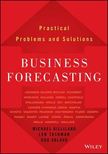
In the documents, there was a proposal to define forecast accuracy (FA) as the complement of mean absolute percentage error (MAPE):
where MAPE is found by working out the error of each forecast as a percentage of the actual value (ignoring the sign if the error is negative), and then calculating the overall mean. If the value of FA was negative, it would be forced to zero, to give a scale of 0 to 100.
What would your advice be?
Forecast Researchers and Practitioners: Different Needs and Perspectives
I know how some feel about this topic, as there’s been a recent discussion thread on forecast accuracy in the International Institute of Forecasters “Linked In” group. Keenan Wong, demand-planning analyst at Kraft Food, Toronto, wondered, “If 1 – Forecast Error gives me forecast accuracy, does 1 – MAPE give me mean absolute percent accuracy?” The question sparked a lively discussion, with over 20 comments at the time of this writing. I want to focus on just two, as they summarize the tensions in my own mind:
- Len Tashman responded: “Both forms of the ‘1 minus’ offer only very casual meanings of accuracy. Technically, they mean nothing—and 1 –MAPE is frequently misunderstood to mean the percentage of time the forecast is on the mark.”
- Alec Finney commented: “A very powerful way of defining forecast accuracy is to agree on a written definition with key stakeholders. Ultimately, it’s not about formulae, numerators, denominators, etc., but about an easy-to-understand, transparent indicator.”
Both of these comments contain significant truths, and yet they come from very different perspectives. Can these viewpoints possibly be reconciled? I believe that they can.
A good starting point is a comment by Hans Levenbach, also from the discussion group: “Accuracy needs to be defined in terms of the context of use, with practical meaning in mind for users.” I think it is instructive to look at the needs of two groups of users—forecasting researchers and forecasting practitioners—to see how they are similar and how they vary.
The first requirement for the forecasting researcher is that accuracy metrics should not be unduly influenced by either abnormally large or small observations (outliers). If they are so influenced, then research results do not generalize to other situations. Instead, the results would depend on the vagaries of outliers being present or absent from datasets. This is an example of where the needs of researchers and practitioners coincide. The practitioner may not need to generalize from one collection of time series to another, but does need to generalize from findings in the past to recommendations for the future.
A second requirement for the forecasting researcher is scale independence. After the first M-Competition, which compared a range of forecasting methods on 1,001 real-world time-series, it was found that the overall results according to some measures depended very heavily on less than 1% of the series, typically those with the highest volumes. From a researcher’s perspective, this is a real issue: Again, the results may not generalize from one collection of time series to another. Researchers typically get around this problem by dividing errors by actual values (or means of actual values). Thus, an error of 10% for a very low-volume item receives the same weight as an error of 10% for a very high-volume item.
This is a good example of where the needs of researchers and practitioners may not coincide. The practitioner is likely to say that the forecast error of a high-value, high-volume item should not receive the same weight as the forecast error of a low-value, low-volume item. (Exceptions arise when the forecast accuracy of a low-value item is important because its availability allows the sale of a related high-value item.) Consideration of value-related importance of forecast accuracy has led some practitioners to seek alternative measures, such as weighted MAPEs.
This discussion leads me to two conclusions:
- When designing forecast-accuracy measures for practical application, we should not ignore the insights that have been gained by forecasting researchers.
- Nevertheless, the requirements of forecasting researchers and practitioners are not identical. We must begin with the needs of the practitioner when choosing an error measure for a particular practical application.
The Soft Systems Approach
An insightful way of looking at forecasting-systems design is through the lens of Soft Systems Methodology (SSM), an approach developed principally by Peter Checkland. It is well known in the UK operational research community, but less so in other countries. A good introduction can be found in the book Learning for Action (Checkland and Poulter, 2006).
A summary of the SSM approach, in the context of forecasting systems, is shown in Figure 3.4.

Figure 3.4 Soft Systems Methodology Applied to Forecasting
Relevant Systems and Root Definitions
SSM starts by asking a group of managers, “What relevant systems do you wish to investigate?” This simple question is worth pondering. I was involved in a study a decade ago (Boylan and Williams, 2001) in which the managers concluded there were three systems of interest: (i) HR Planning System; (ii) Marketing Planning System; and (iii) Financial Planning System. It then became clear to the managers that all three systems need the support of a fourth system, namely a Forecasting System.
SSM requires managers to debate the intended purpose of systems and to describe the relevant systems in a succinct root definition. The managers agreed that the root definition for HR Planning would be:
A system, owned by the Board, and operated out of Corporate Services, which delivers information about production and productivity to team leaders, so that new employees can be started at the right time to absorb forecasted extra business.
Root definitions may appear bland, rather like mission statements. However, the main benefit is not the end product but the process by which managers debate what a system is for, how it should be informed by forecasts, and then come to an agreement (or at least some accommodation) on the system and its purpose. In the HR planning example, the implication of the root definition is that planning should be informed by forecasts of extra business, production, and productivity. The root definition was a product of its time, when demand was buoyant, but could be easily adapted to take into account more difficult market conditions, when decisions need to be made about not replacing departing employees or seeking redundancies.
Effectiveness Measures and Accuracy Measures
The root definition offers a guide not only to the required forecasts, but also to the purpose of the forecasts. For HR planning, the purpose was “so that new employees can be started at the right time to absorb forecasted extra business.” In Soft Systems Methodology, this statement of purpose helps to specify the metrics by which the system should be measured, in three main categories:
- System effectiveness measures whether the system is giving the desired effect. In the example, the question is whether the HR planning system enables extra business to be absorbed. Appropriate effectiveness metrics would reflect the managers’ priorities, including measures like “business turned away,” “delays in completing business orders,” and “cost of employees hired.” These measures are influenced by forecast accuracy and have been described as “accuracy implication metrics” (Boylan and Syntetos, 2006).
- System efficiency measures the cost of resources to make the system work (strictly, the ratio of outputs to inputs). This has received relatively little attention in the forecasting literature but is an important issue for practitioners. Robert Fildes and colleagues (2009) found that small adjustments had a negligible effect on the accuracy of computer-system-generated forecasts. The proportion of employee time spent on such small adjustments would offer a useful measure of efficiency (or inefficiency!).
- System efficacy measures whether the system works at an operational level. In our HR example, efficacy measures would include the timeliness and accuracy of forecasts. The accuracy metrics should be chosen so that they have a direct bearing on the system-performance measures. The exact relationship between forecast accuracy measures and effectiveness measures often cannot be expressed using a simple formula. However, computer-based simulations can help us understand how different error metrics can influence measures of system effectiveness.
It is sometimes asked why measures of forecast accuracy are needed if we have measures of system effectiveness. After all, it’s the business impact of forecasts that is most important to the practitioner. While this is true, forecast accuracy is vital for diagnosis of system problems. Suppose we find that additional staff is being taken on, but not quickly enough to absorb the new business. Then we can turn to measures such as the mean error (which measures forecast bias) to see if the forecasts are consistently too low, and whether another forecast method would be able to detect and predict the trend more accurately.
In a supply chain context, the first type of monitor often relates to stock-holding or service-level measures. These may be expressed in terms of total system cost or service-level measures such as fill rates, reflecting the priorities of the company. When system performance begins to deteriorate in terms of these metrics, then diagnosis is necessary. If the reason for poorer system performance relates to forecasting, rather than ordering policy, then we need to examine forecast accuracy. Suppose that stock levels appear to be too low, with too many stock-outs, and that the system is based on order-up-to levels set at the 95% quantile of demand, calculated from forecasts of the mean and standard deviation of demand. A diagnostic check of forecast accuracy relating to these quantities may reveal why the quantile estimates are too low, and remedial action can be taken.
Using a Structured Approach in Practice
I should stress that Soft Systems Methodology is just one structured approach that can be used by managers to think through their needs and to specify forecast-accuracy measures accordingly. Others are available, too. The main benefit of a participative, structured approach is to encourage managers to gain greater understanding of effectiveness measures and forecast-accuracy measures that are most appropriate for their organization.
Let’s return here to our quotations from Len Tashman and Alec Finney. They both have understanding at the heart of their comments. Len is concerned about managers’ misunderstanding of metrics, and Alec wants to promote easy-to-understand indicators. From my experience, the greater the participation by managers in the high-level designs of systems, the better their understanding.
Soft Systems Methodology is quite demanding and challenging of the managers who participate in the process. They must agree on the relevant systems, hammer out written root definitions, and specify measures of system effectiveness. This requires open debate, which may or may not be facilitated by an independent party familiar with SSM. The stage of debating metrics of forecast accuracy poses an additional challenge: understanding how accuracy metrics have a bearing on effectiveness. If the managers are already savvy in such matters, they will be ready to face this additional challenge. If not, it may be beneficial to use a facilitator who is an expert in forecasting methods and error metrics. The facilitator should desist from playing a dominant role, but be well placed to challenge the specification of measures that would be unduly affected by outliers, suffer from “division by zero” problems, or have other technical shortcomings.
This approach allows for genuine growth in understanding and ownership of measures that have been agreed on by managers, as suggested by Alec. The involvement of an expert facilitator will avoid the sort of problems highlighted by Len.
Postscript: Advice on the Complement of MAPE
Returning to the incident prompting these reflections, I thought long and hard about how to advise a company intending to use the “Complement of MAPE” as its error measure. There was insufficient time to go back to first principles, and to ask them to specify the relevant systems, root definitions, and measures of effectiveness. It would be inappropriate for me, as a visiting speaker not acting in a full consulting capacity, to propose a set of alternative measures, especially without the necessary background of the systems supported by the company’s forecasts. Still, I felt that I should not let the proposed measure go unchallenged.
In my talk, I gave examples where the forecast error was so large as to be greater than the actual value itself. I asked if this was realistic for some stock-keeping units in the company and was assured that it was. I then pointed out that using their definition would result in a forecast accuracy of zero, whether the error was just greater than the actual value or far exceeded it. This gave the group pause, and they are currently reviewing their metrics.
My recommendation for this company—indeed, for any company—is not to adopt standard recommendations such as “use Mean Absolute Percentage Error.” Rather, by working backwards from first principles, involving the key stakeholders in the process, it should be possible to agree on system-effectiveness measures that are relevant to the company and, in turn, to forecast-error measures that have a direct bearing on system effectiveness.
REFERENCES
- Boylan J. E., and A. A. Syntetos (2006). Accuracy and accuracy-implication metrics for intermittent demand. Foresight 4 (Summer), 39–42.
- Boylan, J. E., and Williams, M. A. (2001). Introducing forecasting and monitoring systems to an SME: The role of Soft Systems Methodology. In M. G. Nicholls, S. Clarke, and B. Lehaney (Eds.), Mixed-Mode Modelling: Mixing Methodologies for Organizational Intervention. Dordrecht: Kluwer Academic Publishers.
- Checkland, P., and J. Poulter (2006). Learning for Action: A Short Definitive Account of Soft Systems Methodology and Its Use for Practitioners, Teachers and Students. Hoboken, NJ: John Wiley & Sons.
- Fildes, R. A., P. Goodwin, M. Lawrence, and K. Nikolopoulos (2009). Effective forecasting and judgmental adjustments: An empirical evaluation and strategies for improvement in supply-chain planning. International Journal of Forecasting 25, 3–23.
- Hawitt, D. (2010). Should you report forecast error or forecast accuracy? Foresight 18 (Summer), 46.
- Hoover, J., and M. Little (2011). Two commentaries on forecast error vs. forecast accuracy. Foresight 18 (Spring), 45–46.
3.4 Measuring Forecast Accuracy4
Rob Hyndman
Everyone wants to know how accurate their forecasts are. Does your forecasting method give good forecasts? Are they better than the competitor methods?
There are many ways of measuring the accuracy of forecasts, and the answers to these questions depends on what is being forecast, what accuracy measure is used, and what data set is used for computing the accuracy measure. In this article, I will summarize the most important and useful approaches.
Training and Test Sets
It is important to evaluate forecast accuracy using genuine forecasts. That is, it is invalid to look at how well a model fits the historical data; the accuracy of forecasts can only be determined by considering how well a model performs on new data that were not used when estimating the model. When choosing models, it is common to use a portion of the available data for testing, and use the rest of the data for estimating (or “training”) the model. Then the testing data can be used to measure how well the model is likely to forecast on new data.

Figure 3.5 A time series is often divided into training data (used to estimate the model) and test data (used to evaluate the forecasts).
The size of the test data set is typically about 20% of the total sample, although this value depends on how long the sample is and how far ahead you want to forecast. The size of the test set should ideally be at least as large as the maximum forecast horizon required.
The following points should be noted:
- A model that fits the data well does not necessarily forecast well.
- A perfect fit can always be obtained by using a model with enough parameters.
- Overfitting a model to data is as bad as failing to identify the systematic pattern in the data.
Some references describe the test data as the “hold-out set” because these data are “held out” of the data used for fitting. Other references call the training data the “in-sample data” and the test data the “out-of-sample data.”
Forecast Accuracy Measures
Suppose our data set is denoted by y1 , . . . , yT, and we split it into two sections: the training data (y1 , . . . , yN) and the test data (yN+1 , . . . , yT ). To check the accuracy of our forecasting method, we will estimate the parameters using the training data, and forecast the next T − N observations. These forecasts can then be compared to the test data.
The h-step-ahead forecast can be written as N+h|N. The “hat” notation indicates that it is an estimate rather than an observed value, and the subscript indicates that we are estimating N+h using all the data observed up to and including time N.
The forecast errors are the difference between the actual values in the test set and the forecasts produced using only the data in the training set. Thus
These errors are on the same scale as the data. For example, if yt is sales volume in kilograms, then et is also in kilograms. Accuracy measures that are based directly on et are therefore scale-dependent and cannot be used to make comparisons between series that are on different scales. The two most commonly used scale-dependent measures are based on the absolute errors or squared errors:
When comparing forecast methods on a single data set, the MAE is popular as it is easy to understand and compute. The percentage error is given by pt = 100et/yt. Percentage errors have the advantage of being scale-independent, and so are frequently used to compare forecast performance between different data sets. The most commonly used measure is:
Measures based on percentage errors have the disadvantage of being infinite or undefined if yt = 0 for any observation in the test set, and having extreme values when any yt is close to zero. Another problem with percentage errors that is often overlooked is that they assume a scale based on quantity. If yt is measured in dollars, or kilograms, or some other quantity, percentages make sense. On the other hand, a percentage error makes no sense when measuring the accuracy of temperature forecasts on the Fahrenheit or Celsius scales, because these are not measuring a quantity. One way to think about it is that percentage errors only make sense if changing the scale does not change the percentage. Changing yt from kilograms to pounds will give the same percentages, but changing yt from Fahrenheit to Celsius will give different percentages. Scaled errors were proposed by Hyndman and Koehler (2006) as an alternative to using percentage errors when comparing forecast accuracy across series on different scales. A scaled error is given by qt = et/Q where Q is a scaling statistic computed on the training data. For a nonseasonal time series, a useful way to define the scaling statistic is the mean absolute difference between consecutive observations:
That is, Q is the MAE for naïve forecasts computed on the training data. Because the numerator and denominator both involve values on the scale of the original data, qt is independent of the scale of the data. A scaled error is less than one if it arises from a better forecast than the average naïve forecast computed on the training data. Conversely, it is greater than one if the forecast is worse than the average naïve forecast computed on the training data. For seasonal time series, a scaling statistic can be defined using seasonal naïve forecasts:
The mean absolute scaled error is simply
The value of Q is calculated using the training data because it is important to get a stable measure of the scale of the data. The training set is usually much larger than the test set, and so allows a better estimate of Q. Figure 3.6 shows forecasts for quarterly Australian beer production (data source: Australian Bureau of Statistics, Cat. No. 8301.0.55.001). An ARIMA model was estimated on the training data (data from 1992 to 2006), and forecasts for the next 14 quarters were produced. The actual values for the period 2007–2010 are also shown. The forecast accuracy measures are computed in Table 3.4. The scaling constant for the MASE statistic was Q = 14.55 (based on the training data 1992–2006). Figure 3.6 Forecasts of Australian quarterly beer production using an ARIMA model applied to data up to the end of 2006. The thin line shows actual values (in the training and test data sets) while the thick line shows the forecasts. Table 3.4 Accuracy Measures Computed from ARIMA Forecasts for the 14 Observations in the Test DataScale-Dependent Errors
![]()

Percentage Errors
![]()
Scaled Errors


![]()
Example: Australian Quarterly Beer Production

Actual
Forecast
Error
Percent Error
2007 Ql
427
423.69
3.31
0.78
2007 Q2
383
386.88
−3.88
−1.01
2007 Q3
394
404.71
−10.71
−2.72
2007 Q4
473
483.59
−10.59
−2.24
200S Ql
420
423.81
−3.81
−0.91
200S Q2
390
385.42
4.58
1.17
200S Q3
410
403.25
6.75
1.65
2008 Q4
488
482.13
5.87
1.20
2009 Ql
415
422.35
−7.35
−1.77
2009 Q2
398
383.96
14.04
3.53
2009 Q3
419
401.79
17.21
4.11
2009 Q4
488
480.67
7.33
1.50
2010 Ql
414
420.89
−6.89
−1.66
2010 Q2
374
382.50
−8.50
−2.27
MAE
7.92
RMSE
8.82
MAPE
1.89%
MASE
0.54
Time-Series Cross-Validation
For short time series, we do not want to limit the available data by splitting some off in a test set. Also, if the test set is small, the conclusions we draw from the forecast accuracy measures may not be very reliable. One solution to these problems is to use time-series cross-validation.
In this approach, we use many different training sets, each one containing one more observation than the previous one. Figure 3.7 shows the series of training sets (in black) and test sets (in gray). The forecast accuracy measures are calculated on each test set and the results are averaged across all test sets (adjusting for their different sizes).
A variation on this approach focuses on a single forecast horizon for each test set. Figure 3.8 shows a series of test sets containing only one observation in each case. Then the calculation of accuracy measures is for one-step forecasts, rather than averaging across several forecast horizons.

Figure 3.7 In time series cross-validation, a series of training and test sets are used. Each training set (black) contains one more observation than the previous one, and consequently each test set (gray) has one fewer observations than the previous one.

Figure 3.8 Time-series cross-validation based on one-step forecasts. The black points are training sets, the gray points are test sets, and the light-gray points are ignored.
In any of these cross-validation approaches, we need a minimum size for the training set because it is often not possible to do any meaningful forecasting if there is not enough data in the training set to estimate our chosen model. The minimum size of the training set depends on the complexity of the model we want to use.
Suppose k observations are required to produce a reliable forecast. Then the process works as follows:
- Select the observation at time k + i for the test set, and use the observations at times 1, 2, . . . , k + i − 1 to estimate the forecasting model. Compute the error on the forecast for time k + i.
- Repeat the above step for i = 1, 2, . . . , T − k where T is the total number of observations.
- Compute the forecast accuracy measures based on the errors obtained.
This procedure is sometimes known as evaluation on a “rolling forecasting origin” because the “origin” (k + i − 1) at which the forecast is based rolls forward in time.
With time-series forecasting, one-step forecasts may not be as relevant as multistep forecasts. In this case, the cross-validation procedure based on a rolling forecasting origin can be modified to allow multistep errors to be used. Suppose we are interested in models that produce good h-step-ahead forecasts:
- Select the observation at time k + h + i − 1 for the test set, and use the observations at times 1, 2, . . . , k + i − 1 to estimate the forecasting model. Compute the h-step error on the forecast for time k + h + i − e.
- Repeat the above step for i = 1, 2 , . . . , T − k − h + 1 where T is the total number of observations.
- Compute the forecast accuracy measures based on the errors obtained. When h = 1, this gives the same procedure as outlined above.
Example: Australian Quarterly Beer Production
To illustrate the above procedure (for one-step forecasts only), we will use the Australian beer data again, with an ARIMA model estimated for each training set. We will select a new ARIMA model at each step using the Hyndman–Khandakar (2006) algorithm, and forecast the first observation that is not in the training data. The minimum size of the training data is set to k = 16 observations, and there are T = 74 total observations in the data. Therefore, we compute 58 = 74 − 16 models and their one-step forecasts. The resulting errors are used to compute some accuracy measures:
To calculate the MASE we need to compute the scaling statistic Q, but we do not want the value of Q to change with each training set. One approach is to compute Q using all the available data. Note that Q does not affect the forecasts at all, so this does not violate our rule of not using the data we are trying to forecast when producing our forecasts. The value of Q using all available data is Q = 13.57, so that MASE = 11.14/13.57 = 0.82. This shows that, on average, our forecasting model is giving errors that are about 82% as large as those that would be obtained if we used a seasonal naïve forecast.
Notice that the values of the accuracy measures are worse now than they were before, even though these measures are computed on one-step forecasts and the previous calculations were averaged across 14 forecast horizons. In general, the further ahead you forecast, the less accurate your forecasts should be. On the other hand, it is harder to predict accurately with a smaller training set because there is greater estimation error. Finally, the previous results were on a relatively small test set (only 14 observations) and so they are less reliable than the cross-validation results, which are calculated on 58 observations.
Table 3.5 Error Measures Calculated on One-Step Forecasts Computed Using a Time-Series Cross-Validation Beginning with 16 Observations in the Training Data, and Finishing with 73 Observations in the Training Data
| MAE | 11.14 |
| RMSE | 14.66 |
| MAPE | 2.57% |
Conclusions
- Always calculate forecast accuracy measures using test data that was not used when computing the forecasts.
- Use the MAE or RMSE if all your forecasts are on the same scale.
- Use the MAPE if you need to compare forecast accuracy on several series with different scales, unless the data contain zeros or small values, or are not measuring a quantity.
- Use the MASE if you need to compare forecast accuracy on several series with different scales, especially when the MAPE is inappropriate.
- Use time series cross-validation where possible, rather than a simple training/test set split.
REFERENCES
- Hyndman, R. J., and G. Athanasopoulos (2012). Forecasting: Principles and Practice. OTexts. http://otexts.com/fpp.
- Hyndman, R. J., and Y. Khandakar (2008). Automatic time series forecasting: The forecast package for R. Journal of Statistical Software 26(3), 1–22.
- Hyndman, R. J., and A. B. Koehler (2006). Another look at measures of forecast accuracy. International Journal of Forecasting 22(4), 679–688.
3.5 Should We Define Forecast Error as e = F – A or e = A – F?5
Kesten Green and Len Tashman
The Issue
Suppose we forecast sales of 900 units for the month just gone (F), and actual sales (A) were recorded as 827 units. The difference between the two figures, 73 units, is the magnitude of the forecast error.
One way to express the forecast error is as A minus F (A – F), which yields an error of:
Alternatively, the forecast error can also be expressed as F minus A (F – A). Using this formulation, the forecast error for the month just gone is:
Does it matter which formula we use?
The Survey
In March of this year, Kesten Green sent the following message to the membership of the International Institute of Forecasters (IIF):
By the time of writing, eleven responses had been received, with more than half preferring to calculate error as A – F.
Respondents who preferred F – A all reasoned that it was more intuitive that a positive error represented an over-forecast and a negative error an under-forecast. F – A is also more consistent with concepts of bias.
Respondents who preferred the A – F formulation argued that statistical convention, ease of statistical calculation, investment in software that adhered to statistical convention, and plain pragmatism provided justification. Two fans of A – F also suggested that this version is intuitive when assessing performance against a budget or plan, because a positive value indicates that a budget has been exceeded or a plan has been surpassed.
Here is an edited sampling of the individual responses:
Support for A – F
1. Can’t say I’ve ever thought of “why,” since the statistical measure is always A – F, with the basic idea being:
This basic concept provides the justification. Obviously, there is no mathematical reason why it could not be forecast model minus forecast error, but that would be more complex and therefore not sensible.
2. I use Actual minus Forecast. I am a pragmatist and do not believe there is a right answer—merely a need to settle the answer by convention. I am saying that there is, as a matter of fact, no basis for finding a right answer, and seeking one is fruitless; thus the need for a convention. Of course, all of us will be attached to the method we frequently use and will easily find justifications for its correctness.
3. In statistical terms, the forecast is an expected value. A deviation in statistical computations is actual minus mean or other expected value. Thus, error = A – F is consistent with standard statistical calculations, actual minus mean.
In planning and control settings, the sign of the deviation can be important in the context of a negative feedback control loop.
There are other explanations; however, none preclude the opposite definition, but an additional operation (subtraction) would be necessary to make e = F – A operable in the planning and control settings.
4. In seismology, where the sign of prediction error does matter (model) forecasted travel time comes with “–,” i.e., we use error = A – F. Effectively, when actual seismic wave arrives before the time predicted by model we have negative travel time residual (error).
5. I agree that A – F is counterintuitive in that a positive error means that a forecast was too low.
However, A – F makes sense for people using forecasts to set budgets or make plans (e.g., a positive value would show that the budget or plan has been exceeded).
Exponential smoothing corrects for its past errors. In its specification A – F arguably makes life a bit simpler as we have Ft+1 = Ft + alpha * error, rather than Ft+1 = Ft – alpha * error, which may be a bit more difficult to explain.
In regression, fitted residuals and forecast errors are measured in the same way if we stick to A – F. If we were also to start using F – A for residuals, then the whole of regression analysis and its associated software would need to be revised.
6. I use A – F, and I do feel this is the mathematically correct answer. [Respondent #5] has already provided an excellent defense of this position, so I won’t bother to elaborate further.
But since both formulae appear to be commonly used, how does a forecaster communicate a signed forecast error to someone else?
Obviously, if both parties know the convention being used, then there is not an issue. Unfortunately, I feel that even if the participants in this discussion were to decide upon a convention, it is unlikely to be universally adopted in the near future. So what’s a forecaster to do when confronted with having to communicate a signed forecast error to someone who is ignoring this thread? I would suggest that we teach our students to use the words “overforecasted” and “underforecasted.”
Stating “I overforecasted by 200 units” is unambiguous, and conveys the same information as “my forecast error was –200” (to an A – F type like me).
7. I think that A – F makes a lot more sense; as in common financial terms, F would be budget (B) and a positive Actual minus Budget would be over budget while a negative would be under budget.
Support for F – A
1. The one advantage of F – A is that it fits intuition that a positive error is an over-forecast and a negative error an underforecast.
2. I would prefer and use forecast error as F – A since it is easy to explain that positive bias means forecast is higher than actual and negative bias means forecast is lower than actual.
3. It makes intuitive sense to express error in the same way that bias is interpreted, i.e., F – A, where positive indicates “over.”
More important: From a business point of view, it only really matters that you track it against history as a relative point of reference to gauge improvement (or not). So it’s really up to the users.
Most error (not bias) measures discard the sign in favor of working with absolute or standardized data, so the effect is minimal there.
4. When I’m in a training session and one of the students says, “My error was too high (or too big or too positive),” this means that it was the forecast that was too high; forecast bigger than the observed value means that the error in popular vernacular is positive.
If, on the other hand, he says his error was very negative, then what he means to say is that the forecast was lower than the observed value. In common vernacular, the reference point is the observed value and the forecast is compared to it, either too high or too low, either too positive or too negative.
Mathematically, it’s better (or easier or more consistent) to use A = F + e for the few in the human race who believe that mathematical propositions are more reasonable (or scientific, or structured). To understand what this means—that F = A + e doesn’t work very well for mathematical formulations—I had to go to graduate school.
3.6 Percentage Error: What Denominator?6
Kesten Green and Len Tashman
The Issue
This is our second survey on the measurement of forecast error. We reported the results of our first survey in the Summer 2008 issue of Foresight (Green and Tashman, 2008). The question we asked in that survey was whether to define forecast error as Actual minus Forecast (A – F) or Forecast minus Actual (F – A). Respondents made good arguments for both of the alternatives.
In the current survey, we asked how percentage forecast error should be measured. In particular: What should the denominator be when calculating percentage error (See Figure 3.9)?
We posed the question to the International Institute of Forecasters discussion list as well as to Foresight subscribers, in the following way:
The first two options in the questionnaire have each been used when calculating the mean absolute percentage error (MAPE) for multiple forecast periods. The first option is the more traditional form.
One popular alternative to using either A or F as the denominator is to take an average of the two: (A + F)/2. Calculated over multiple forecast periods, this measure is most commonly called the symmetric MAPE (sMAPE) and has been used in recent forecasting competitions to compare the accuracy of forecasts from different methods. See, for example, www.neural-forecasting-competition.com/index.htm.

Figure 3.9 Survey Question
Survey Results
We received 61 usable responses: 34 of these (a majority of 56%) preferred option 1, using the Actual as the denominator for the percentage error; 15% preferred option 2, using the Forecast as the denominator; while 29% chose option 3, something other than the actual or the forecast.
One respondent wrote: “For our company, this issue led to a very heated debate with many strong points of view. I would imagine that many other organizations will go through the same experience.”
Option 1: Percentage Error = Error / Actual * 100
Of the 34 proponents of using the Actual value for the denominator, 31 gave us their reasons. We have organized their responses by theme.
A. The Actual is the forecaster’s target.
Actual value is the forecast target and therefore should represent the baseline for measurement.
The measure of our success must be how close we came to “the truth.”
Actual is the “stake in the ground” against which we should measure variance.
Since forecasting what actually happened is always our goal, we should be comparing how well we did to the actual value.
We should measure performance against reality.
B. The Actual is the only consistent basis for comparing forecast accuracy against a benchmark or for judging improvement over time.
Actual is the only acceptable denominator because it represents the only objective benchmark for comparison.
Without a fixed point of reference quantity in the denominator, you will have trouble comparing the errors of one forecast to another.
You want to compare the forecast to actuals and not the other way around. The actuals are the most important factor. It drives safety stock calculations that are based on standard deviation of forecast error calculations that use actuals as the denominator.
Forecast error is measured here as (Actual – Forecast)/Actual, for comparability to other studies.
C. The Actuals serve as the weights for a weighted MAPE.
Using the Actuals is more consistent for calculating a weighted average percentage error (WAPE) for a group of SKUs or even for the full product portfolio. Using actual value as denominator is providing the weight for the different SKUs, which is more understandable—one is weighting different SKUs based on their actual contribution. If we use F (forecast), this means we will weigh them based on the forecast—but this can be challenged as subjective. Someone may calculate the single SKU accuracy based on F as denominator, and then weigh according to Actual sales of each SKU, but this unnecessarily complicates the formula.
D. The Actual is the customary and expected denominator of the MAPE.
I would argue that the standard definition of “percent error” uses the Actual. The Actual is used without any discussion of alternatives in the first three textbooks I opened, it is used in most forecasting software, and it is used on Wikipedia (at least until someone changes it).
If you are creating a display that reads “percent error” or “MAPE” for others to read without further explanation, you should use Actual—this is what is expected.
Actual is the generally used and accepted formula; if you use an alternative, such as the Forecast, you might need to give it a new name in order to avoid confusion.
E. Use of the Actual gives a more intuitive interpretation.
If the forecast value is > the actual value, then the percentage error with the forecast in the denominator cannot exceed 100%, which is misleading. For example, if the Actual is 100 and the Forecast is 1,000, the average percentage error with Actual is 900% but with Forecast is only 90%. (Ed. note: See Table 3.6 (1a) for an illustrative calculation.)
The reason is pragmatic. If Actual is, say, 10 and Forecast is 20, most people would say the percentage error is 100%, not 50%. Or they would say forecast is twice what it should have been, not that the actual is half the forecast.
Table 3.6 Illustrative Calculations
| A | F | Absolute Error | % Error with A | % Error with F | Avg A&F | % Error w/Avg |
| 1a. If the Forecast exceeds the Actual, the % error cannot exceed 100% | ||||||
| 100 | 200 | 100 | 100% | 50% | 150 | 67% |
| 100 | 1000 | 900 | 900% | 90% | 550 | 164% |
| 100 | 10000 | 9900 | 9900% | 99% | 5050 | 196% |
| 1b. Illustration of the symmetry of the sMAPE | ||||||
| 100 | 50 | 50 | 50% | 100% | 75 | 67% |
| 50 | 100 | 50 | 100% | 50% | 75 | 67% |
| 1c. When the Actual equals zero, use of sMAPE always yields 2O0% | ||||||
| 0 | 50 | 50 | #DIV/0! | 100% | 25 | 200% |
| 0 | 100 | 100 | #DIV/0!! | 100% | 50 | 200% |
By relating the magnitude of the forecast error to an Actual figure, the result can be easily communicated to non-specialists.
From a retail perspective, explaining “overforecasting” when Forecast is the denominator seems illogical to business audiences.
F. Using the Forecast in the denominator allows for manipulation of the forecast result.
Utilizing the Forecast as the benchmark is subjective and creates the opportunity for the forecaster to manipulate results.
Use of the Actual eliminates “denominator management.”
Using Forecast encourages high forecasting.
G. Caveats: There are occasions when the Actual can’t be used.
Use of Actual only works for non-0 values of the Actual.
If you are trying to overcome difficulties related to specific data sets (e.g., low volume, zeroes, etc.) or biases associated with using a percentage error, then you may want to create a statistic that uses a different denominator than the Actual. However, once you do so, you need to document your nonstandard definition of “percentage error” to anyone who will be using it.
For me, the Actual is the reference value. But in my job I deal with long-term (5–10 years+) forecasts, and the Actual is seldom “actually” seen. And since you’re asking this question, my suspicion tells me the issue is more complicated than this.
Option 2: Percentage Error = Error / Forecast * 100
Eight of the 9 respondents who preferred to use the Forecast value for the denominator provided their reasons for doing so. Their responses fell into two groups.
A. Using Forecast in the denominator enables you to measure performance against forecast or plan.
For business assessment of forecast performance, the relevant benchmark is the plan—a forecast, whatever the business term. The relevant error is percent variation from plan, not from actual (nor from an average of the two).
For revenue forecasting, using the Forecast as the denominator is considered to be more appropriate since the forecast is the revenue estimate determining and constraining the state budget. Any future budget adjustments by the governor and legislature due to changing economic conditions are equal to the percentage deviations from the forecasted amounts initially used in the budget. Therefore, the error as a percent of the forecasted level is the true measure of the necessary adjustment, instead of the more commonly used ratio of (actual – forecast)/actual.
It has always made more sense to me that the forecasted value be used as the denominator, since it is the forecasted value on which you are basing your decisions.
The forecast is what drives manufacturing and is what is communicated to shareholders.
You are measuring the accuracy of a forecast, so you divide by the forecast. I thought this was a standard approach in science and statistics.
If we were to measure a purely statistical forecast (no qualitative adjustments), we would use Actual value (A) as the denominator because statistically this should be the most consistent number. However, once qualitative input (human judgment) from sales is included, there is an element that is not purely statistical in nature.
For this reason, we have chosen to rather divide by forecast value (F) such that we measure performance to our forecast.
B. The argument that the use of Forecast in the denominator opens the opportunity for manipulation is weak.
The politicizing argument is very weak, since the forecast is in the numerator in any case. It also implies being able to tamper with the forecast after the fact, and that an unbiased forecast is not a goal of the forecasting process.
Option 1 or 2: Percentage Error = Error / [Actual or Forecast: It Depends] * 100
Several respondents indicated that they would choose A or F, depending on the purpose of the forecast.
Actual, if measuring deviation of forecast from actual values. Forecast, if measuring actual events deviated from the forecast.
If the data are always positive and if the zero is meaningful, then use Actual. This gives the MAPE and is easy to understand and explain. Otherwise we need an alternative to Actual in the denominator.
The actual value must be used as a denominator whenever comparing forecast performance over time and/or between groups. Evaluating performance is an assessment of how close the forecasters come to the actual or “true” value. If forecast is used in the denominator, then performance assessment is sullied by the magnitude of the forecasted quantity.
If Sales and Marketing are being measured and provided incentives based on how well they forecast, then we measure the variance of the forecast of each from the actual value. If Sales forecast 150 and Marketing forecast 70 and actual is 100, then Sales forecast error is (150–100)/150 = 33% while Marketing forecast error is (70–100)/70 = 43%. When Forecast is the denominator, then Sales appears to be the better forecaster—even though their forecast had a greater difference to actual.
When assessing the impact of forecast error on deployment and/or production, then forecast error should be calculated with Forecast in the denominator because inventory planning has been done assuming the forecast is the true value.
Option 3: Percentage Error = Error / [Something Other Than Actual or Forecast] * 100
One respondent indicated use of Actual or Forecast, whichever had the higher value. No explanation was given.
Three respondents use the average of the Actual and the Forecast.
Averaging actual and forecast to get the denominator results in a symmetrical percent-error measure. (See Table 3.6 (1b) for an illustration, and the article by Goodwin and Lawton (1999) for a deeper analysis of the symmetry of the sMAPE.)
There likely is no “silver bullet” here, but it might be worthwhile to throw into the mix using the average of F and A—this helps solve the division-by-zero issues and helps take out the bias. Using F alone encourages high forecasting; using A alone does not deal with zero actuals. (Ed. note: Unfortunately, the averaging of A and F does not deal with the zero problem. When A is zero, the division of the forecast error by the average of A and F always results in a percentage error equal to 200%, as shown in Table 3.6 (1c) and discussed by Boylan and Syntetos [2006].)
I find the corrected sMAPE adequate for most empirical applications without implying any cost structure, although it is slightly downward biased. In company scenarios, I have switched to suggesting a weighted MAPE (by turnover, etc.) if it is used for decision making and tracking.
Four respondents suggest use of some “average of Actual values” in the denominator.
Use the mean of the series. Handles the case of intermittent data, is symmetrical, and works for cross section. (This recommendation leads to use of the MAD/Mean, as recommended by Kolassa and Schutz [2007].)
My personal favorite is MAD/Mean. It is stable, even for slow-moving items, it can be easily explained, and it has a straightforward percentage interpretation.
A median baseline, or trimmed average, using recent periods, provides a stable and meaningful denominator.
I prefer a “local level” as the denominator in all the error % calculations. (Ed. note: The local level can be thought of as a weighted average of the historical data.) When using Holt-Winters, I use the level directly, as it is a highly reliable indication of the current trading level of the time series. In addition, it isn’t affected by outliers and seasonality. The latter factors may skew readings (hence, interpretations) dramatically and lead to incorrect decisions.
With other types of forecasting—such as multivariate—there’s always some “local constant” that can be used. Even a median of the last 6 months would do. The main problem that arises here is what to do when this level approaches zero. This—hopefully—does not happen often in any set of data to be measured. It would rather point, as a diagnostic, to issues other than forecasting that need dire attention.
Two Respondents Recommend that the Denominator Be the Absolute Average of the Period-Over-Period Differences in the Data, Yielding a MASE (Mean Absolute Scaled Error)
The denominator should be equal to the mean of the absolute differences in the historical data. This is better, for example, than the mean of the historical data, because that mean could be close to zero. And, if the data are nonstationary (e.g., trended), then the mean of the historical data will change systematically as more data are collected. However, the mean of the absolute differences will be well behaved, even if the data are nonstationary, and it will always be positive. It has the added advantage of providing a neat, interpretable statistic: the MASE. Values less than 1 mean that the forecasts are more accurate than the in-sample, naïve, one-step forecasts. (See Hyndman, 2006.)
Mean absolute scaled error, which uses the average absolute error for the random walk forecast (i.e., the absolute differences in the data).
REFERENCES
- Boylan, J., and A. Syntetos (2006). Accuracy and accuracy-implication metrics for intermittent demand. Foresight: International Journal of Applied Forecasting 4, 39–42.
- Goodwin, P., and R. Lawton (1999). On the asymmetry of the symmetric MAPE. International Journal of Forecasting 15, 405–408.
- Green, K. C., and L. Tashman (2008). Should we define forecast error as e = F – A or e = A – F ? Foresight: International Journal of Applied Forecasting 10, 38–40.
- Hyndman, R. (2006). Another look at forecast-accuracy metrics for intermittent demand. Foresight: International Journal of Applied Forecasting 4, 43–46.
- Kolassa, S., and W. Schutz (2007). Advantages of the MAD/MEAN ratio over the MAPE. Foresight: International Journal of Applied Forecasting 6, 40–43.
3.7 Percentage Errors Can Ruin Your Day 7
Stephan Kolassa and Roland Martin
Introduction
The accuracy of forecasts needs to be measured in order to decide between different forecasting models, methods, or software systems or even to decide whether monies for forecast improvements will be well spent. Many different forecast accuracy metrics are available, each with its own advantages and disadvantages.
In supply chain forecasting, where we usually forecast demands, orders or sales, the most common accuracy measurement is the absolute percentage error (APE)—the percentage gap between the actual demand and the forecast of it for one time period. When we average the APEs across time periods, we obtain the MAPE, the mean absolute percentage error.
If yi represents actual demands by time period or by item and associated forecasts, the APE of an individual forecast is

and the MAPE of these forecasts is the mean of the APEs,

The APE/MAPE yields an easy interpretation of the error as a percentage of the actual value. As such, it is scale free (not measured in units or currency) and thus can be used to compare forecasting accuracy on time series with different sales levels. These two advantages have led to the MAPE being the best known and most widely used key performance indicator in supply chain forecasting, at least among practitioners.
The MAPE is also used to compare different forecasting methods, to decide between different forecasting software packages in a forecasting competition or to measure a forecaster’s performance. In all these cases, the MAPE allows such comparisons to be made across the multiple products or services to be forecast. In contrast, scaled error metrics such as the MAD—the mean absolute deviation—cannot provide a basis for comparison between items measured in different units.
However, the MAPE has shortcomings. For instance, it is undefined if one or more of the actual demands are zero, and it explodes if there are demands which are very small compared to the forecast, even though these demands may be outliers, and the forecast may be sensible.
One consequence of these problems is that choosing among options based on which has the lowest MAPE will likely lead to forecasts that are badly biased on the low side. This downward bias is usually not what the forecast user expects or wants. Even a user who has little knowledge of statistics usually expects the forecasts to be “on target,” not systematically too high or too low but on average close to the actual values.
This problem is poorly understood both among academic forecasters and practitioners in industry and retail. One reason is that it is difficult to explain the concept of bias and the problem of biased forecasts to nontechnical consulting clients—and most consumers of forecasts as well as managers overseeing forecasters are nontechnical. Consequently, it appears difficult to counterbalance the (obvious) benefits of the MAPE—easy interpretability and scale freeness—with its (less obvious) drawbacks, leading to what we believe to be an overreliance on the MAPE.
So we devised a simple experiment to better explain the problem to non-experts, one that might be of interest to other practitioners, as well as academic forecasters in consulting or teaching engagements.
All the claims made below can be proved rigorously. Please refer to our white paper (Kolassa and Martin, 2011) for the details.
Rolling Dice
The Basic Demonstration
Take a standard six-sided die and tell the audience that you are going to simulate demands by rolling this die. Explain that the die roll could represent natural variations in demand for an item with no trend, seasonality, or causal factors to influence sales. The die rolls can stand for successive monthly demands of a single product, or for the demands for multiple products during a single month.
Ask the audience what the “best” forecast for the die roll would be. A favorite, almost certainly, would be 3.5—this is the expected value of the die roll: That is, if we roll the die often enough, the result will average 3.5, and over- and underforecasts will be roughly equal. In addition, the audience will understand that using the same forecast for each die roll makes sense, instead of having different forecasts for the first, the second, the third roll, etc.
Tell the audience that you will now compare the forecast of 3.5 to a forecast of 2 and see which has the better (lower) MAPE. It should be obvious that a forecast of 2—far below the expected value of 3.5—makes little sense.
Roll the die (even better, have someone from the audience roll the die) ten times and record the “demands” generated. Calculate the MAPEs of a forecast of 3.5 and of a forecast of 2. What you will find is that, in about 80% of cases, the MAPE for a forecast of 2 will be lower than the MAPE for a forecast of 3.5.
Thus, if we select forecasts based on the MAPE, we would wind up with a biased and probably worthless forecast of 2 instead of an unbiased forecast of 3.5. This should convince the audience that selections based on the MAPE can lead to counterintuitive and problematic forecasts.
Note that we still have a 20% chance that a forecast of 3.5 will yield a MAPE lower than a forecast of 2. If this happens, the audience could be confused about our point. But there is a way to deal with this by slightly bending the rules. Instead of rolling exactly ten times, we can use a stopping rule to determine the number of rolls. When rolling the die, keep a running tally (without telling the audience). Start with 0. If the die roll is 1, subtract 9 from the tally. If the roll is 2, subtract 4. On a rolled 3, add 1, on a 4, add 3, on a 5, add 2, and on a 6, add 2. Only stop rolling the die if the tally is negative.
The Problem with the MAPE
Where does the problem with the MAPE come from? A percentage error explodes if the actual value turns out to be very small compared to the forecast. This, in turn, stems from the inherent asymmetry of percentage errors for under- vs. overforecasts. The most extreme illustration of this asymmetry is that the average percentage error (APE) for an underforecast must be between 0 and 100%—while the APE for an overforecast can easily exceed 100% by far.
For instance, we know that 3.5 on average is the correct forecast for our die roll. If the actual die face turns out to be 2, the forecast of 3.5 yields an APE of 75%. On the other hand, if the actual die face is 5, the APE of our forecast is only 30%. Thus, the APE will differ widely depending on whether we over- or underforecast, even though the absolute error of the forecast is the same in both cases, namely 1.5.
If we for now concentrate only on the outcomes 2 and 5, since 2 and 5 are equally likely actual outcomes (as in throwing dice), we expect an APE of 52.5% (the average of 75% and 30%) on average to result from our forecast of 3.5. What happens if we reduce the forecast slightly to 3? An actual of 2 now yields an APE of 50% (down from 75%), while an actual of 5 yields an APE of 40% (up from 30%). Thus, the improvement in the APE with respect to a low actual was 25%, while the deterioration in APE with respect to a high actual is only 10%. On average, reducing the forecast from 3.5 to 3 will therefore reduce the expected APE from 52.5% to 45%. If our goal is to minimize the APE, we will therefore prefer a forecast of 3 to 3.5—even although 3 is biased downward.
Suppose we have a very good forecasting team that delivers unbiased forecasts, i.e., forecasts that are not systematically too high or too low. If this forecasting team has its yearly performance bonus depend on the MAPE it achieves, we now know that it can improve its MAPE by adjusting its forecasts downward. The resulting forecasts will not be unbiased any more (and thus, probably be worse for downstream planning), but the MAPEs will be lower. Thus, the MAPE will lead to biased forecasts, especially for time series that vary a lot relative to the average—i.e., where there is a high coefficient of variation. In this case, we will see many demands that are a small fraction of the mean, and the MAPE will again lead to forecasts that are biased low.
Is Bias Ever Desirable?
In some cases it may appear that a biased forecast is what the user wants. Normally, we prefer to have too much stock on hand rather than too little, since unsatisfied demands are usually more costly than overstocks. This could be taken to mean that we should aim at forecasts that are higher than the expected value of sales. Conversely, in stocking very perishable and expensive items, such as fresh strawberries, a supermarket would rather go out of stock in mid-afternoon than risk having (expensive) overstock at the end of the day, which would need to be thrown away. In this situation, one could argue that we really want a forecast that errs on the low side (i.e., is biased downward).
And while choosing a forecasting method to minimize the MAPE will lead to downward biased forecasts, doing so to minimize overstock is mistaken. The degree of underforecasting that results from minimizing the MAPE may not correspond to a specifically desired degree of bias. It is much better practice to aim for an unbiased point forecast and for understanding the distribution of demand, from which one can extract a forecast and safety stock that is consistent with the supply chain cost factors. This leads to considering the loss function and a “Cost of Forecast Error” calculation (Goodwin, 2009).
Variants of the APE
A recent survey reported in Foresight (Green and Tashman, 2009) found that practitioners use a variety of variants of the APE in order to deal with some of its shortcomings. Do any of these variants reward unbiased forecasts? That is, in the case of rolling the die, does a forecast of 3.5 lead to the lowest APE-type metric?
Variant 1: Using the Forecast Rather than the Actual in the Denominator
While one usually calculates the APE by dividing the absolute forecasting error by the actual value, it is quite common among practitioners to use the forecast instead of the actual as the denominator This “APE with respect to the forecast” (APEf ) can also lead to strongly biased forecasts, but this time the forecasts are biased upward, and by the same amount as forecasts obtained by minimizing the standard APE are biased downward.
For our roll of the die, the forecast that minimizes this variant of the APE is 5 (see Table 3.7 and Figure 3.10). Forecasters who understand this but are incentivized to minimize this variant of the APE may engage in “denominator management” (Gilliland, 2010).
Table 3.7 Variants of the APE and the Forecast Yielding the Minimal Expected Error When Rolling a Standard Six-Sided Die
| APE Variant | Formula | Forecast That Minimizes the Expected Error in Rolling Dice |
| Original APE |
 |
2 |
| APEf (APE with respect to the forecast) |
 |
5 |
| sAPE (Symmetric APE) |
 |
4 |
| maxAPE (Max of Actual and Forecast) |
 |
4 |
| tAPE (Truncated APE) |
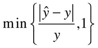 |
3 |
Variant 2: Using the Average of the Actual and Forecast—the sAPE
A second variant is the sAPE, which stands for “symmetric APE” and is calculated by using the average of the forecast and the actual for the denominator of the percentage error measurement. The sAPE has been recommended as a remedy to the asymmetry of the APE in dealing with over- vs. underforecasts (O’Connor and colleagues, 1997; O’Connor and Lawrence, 1998; Makridakis and Hibon, 2000).
However, the nature of the sAPE’s symmetry is not always understood. While the sAPE is symmetric with regard to the forecast and the actual being exchanged, it is not symmetric with regard to over- and underforecasts for the same actual: For a given actual demand, an underforecast and overforecast of the same amount will yield a different sAPE (Goodwin and Lawton, 1999; Koehler, 2001).
Regarding its potential to select unbiased forecasts, the sAPE lies between the APE (which biases low) and the APEf (which biases high): The sAPE-optimal forecast for a die roll is 4, leading to a slight upward bias, but all forecasts between 3 and 4 are similar in expected sAPE. Thus, the sAPE seems to make the best of a bad situation and may be a better choice than either the “normal” APE or the APEf.

Figure 3.10 Expected Percentage Errors When Rolling a Standard Six-Sided Die, for Variations in APE
Variant 3: Using the Maximum of the Actual and Forecast
Using the maximum of the forecast and the actual as the denominator of the APE was suggested by David Hawitt (20102010) as a way of providing an error metric that ranges between 0 and 100%. For our roll of the die, the forecast that yields the lowest “maxAPE” is 4, which is a slight upward bias. Thus, the maxAPE is better than using either the forecast or the actual in the denominator, similar to the sAPE.
Variant 4: Truncating the Maximum Percentage Error at 100%
As discussed above, while the APE of an underforecast can be at most 100%, there is no upper limit to the APE for an overforecast. Jim Hoover (2011) has recommended that the possible explosion of the APE for overforecasts be prevented by truncating the APE at 100%. Thus, the truncated APE (trAPE) will never be above 100%, no matter how badly we overforecast.
This does not completely eliminate the problem of bias. For the roll of the die, the forecast that yields the best trAPE is 3, a slight downward bias. More problematically, we lose discriminatory power—forecasts of 5 and 50 for an actual of 2 both yield a percentage error of 100%, although an extreme overforecast of 50 will probably have far more serious consequences than a lower overforecast of 5.
Alternatives to the APE and Its Variants
The problems with the APE and the variants described in the previous section can be reduced in one of two ways: Either choose a denominator that is independent of both the forecast and the actual value in the forecast horizon, or average the percentage errors in a way that minimizes the problem.
The ASE and the APES
An example of the first approach was suggested by Hyndman and Koehler (2006). Divide an absolute forecasting error by the mean absolute error (across the sample time periods used to build the forecasting model) of a random walk model. The random walk model forecasts each demand as unchanged from the previous time period. The resulting statistic is the absolute scaled error (ASE). Alternatively, Billah and colleagues (2006) suggested dividing the absolute error by the in-sample standard deviation (APES).
Both of these metrics are really the absolute error of the forecast, scaled by some factor that is independent of the forecasts or the actuals in the evaluation period. As the expected absolute error is minimized by an unbiased forecast as long as errors are symmetric, these two measures are too. For the roll of the die, the forecast that yields the lowest expected scaled error is 3.5, right on target.
Weighted MAPEs and the MAD/MEAN
The second approach is to average the percentage errors across forecasting periods (or multiple time series) by a weighted average, using the corresponding actual demands as weights. This contrasts with the (unweighted) MAPE and the variants discussed in the prior section which all are averaged without weights. In fact, a very short calculation shows that the weighted MAPE (wMAPE) is equivalent to dividing the mean absolute error (MAD or MAE) of the forecasts by the mean of the actuals in the forecast period (Kolassa and Schütz, 2007). The result is the ratio: MAD/Mean. If we summarize a large number of APEs, the wMAPE’s denominator will thus tend toward the expectation of the actual, i.e., 3.5 and be less and less influenced by the actual realizations encountered, which will reduce but not eliminate the problem of bias.
All these measures are still scale free and lead to natural interpretations of the error as a percentage: of the in-sample random walk MAD, of the in-sample standard deviation, or of the mean of the actuals during the evaluation period. The wMAPE still rewards biased forecasts but to a lesser degree than the MAPE. Moreover, its interpretation as a percentage of averaged actuals makes it attractive and easy to understand. Thus, although these alternative measures are conceptually slightly more complicated than the MAPE, they have a good chance of adoption by forecast users who understand the problems the MAPE suffers from.
Conclusion
We have given a simple illustration, suitable for non-technical audiences, of one of the main problems of the MAPE as a forecast quality measure: It systematically rewards biased forecasts. We recommend that forecasters examine the time series they are asked to forecast and counsel students, users, or consulting clients against using the MAPE as a Key Performance Indicator if the series fluctuates strongly. Rolling dice as explained above may help others understand the problem with the MAPE.
Instead, one of the alternatives described above should be used, ideally combined with some measure of the cost of forecast error. In the end, using KPIs to assess forecast quality without considering how the forecast will be used in subsequent processes will quite probably lead to perverse incentives. Thus, quality control of forecasts should always entail understanding what the forecasts will be used for.
REFERENCES
- Billah, B., M. L. King, R. D. Snyder, and A. B. Koehler (2006). Exponential smoothing model selection for forecasting. International Journal of Forecasting 22(2), 239–247.
- Gilliland, M. (2010). The Business Forecasting Deal. Hoboken, NJ: John Wiley & Sons.
- Goodwin, P. (2009). Taking stock: Assessing the true cost of forecast error. Foresight: International Journal of Applied Forecasting 15 (Fall), 8–11.
- Goodwin, P., and R. Lawton (1999). On the asymmetry of the symmetric MAPE. International Journal of Forecasting 15(4), 405–408.
- Green, K., and L. Tashman (2009). Percentage error: What denominator. Foresight: International Journal of Applied Forecasting 12 (Winter), 36–40.
- Hawitt, D. (2010). Should you report forecast error or forecast accuracy? Foresight: International Journal of Applied Forecasting 18 (Summer), 46.
- Hoover, J. (2011). Commentary on forecast error vs. forecast accuracy. Foresight: International Journal of Applied Forecasting 21.
- Hyndman, R. J., and A. B. Koehler (2006). Another look at measures of forecast accuracy. International Journal of Forecasting 22(4), 679–688.
- Koehler, A. B. (2001). The asymmetry of the sAPE measure and other comments on the M3-Competition. International Journal of Forecasting 17(4), 570–574.
- Kolassa, S., and R. Martin (2011). Rolling dice: A simple illustration of the bias induced by minimizing the MAPE. White Paper No. 08, SAF AG, Tägerwilen, Switzerland.
- Kolassa, S., and W. Schütz (2007). Advantages of the MAD/Mean ratio over the MAPE. Foresight 6 (Spring), 40–43.
- Makridakis, S., and M. Hibon (2000). The M3-Competition: Results, conclusions and implications. International Journal of Forecasting 16(4), 451–476.
- O’Connor, M., and M. Lawrence (1998). Judgmental forecasting and the use of available information. In G.Wrightand P.Goodwin (Eds.), Forecasting with Judgment (pp. 65–90). Hoboken, NJ: John Wiley & Sons.
- O’Connor, M., W. Remus, and K. Griggs (1997). Going up—going down: How good are people at forecasting trends and changes in trends? Journal of Forecasting 16(3), 165–176.
3.8 Another Look at Forecast-Accuracy Metrics for Intermittent Demand 8
Rob Hyndman
Introduction: Three Ways to Generate Forecasts
There are three ways we may generate forecasts (F) of a quantity (Y) from a particular forecasting method:
- We can compute forecasts from a common origin t (for example, the most recent month) for a sequence of forecast horizons Fn+1, . . . , Fn+m based on data from times t = 1, . . . , n. This is the standard procedure implemented by forecasters in real time.
- We can vary the origin from which forecasts are made but maintain a consistent forecast horizon. For example, we can generate a series of one-period-ahead forecasts F1+h, . . . , Fm+h where each Fj+h is based on data from times t = 1, . . . , j. This procedure is done not only to give attention to the forecast errors at a particular horizon but also to show how the forecast error changes as the horizon lengthens.
- We may generate forecasts for a single future period using multiple data series, such as a collection of products or items. This procedure can be useful to demand planners as they assess aggregate accuracy over items or products at a location. This is also the procedure that underlies forecasting competitions, which compare the accuracy of different methods across multiple series.
While these are very different situations, measuring forecast accuracy is similar in each case. It is useful to have a forecast accuracy metric that can be used for all three cases.
An Example of What Can Go Wrong
Consider the classic intermittent-demand series shown in Figure 3.11. These data were part of a consulting project I did for a major Australian lubricant manufacturer.
Suppose we are interested in comparing the forecast accuracy of four simple methods: (1) the historical mean, using data up to the most recent observation; (2) the naïve or random-walk method, in which the forecast for each future period is the actual value for this period; (3) simple exponential smoothing; and (4) Croston’s method for intermittent demands (Boylan, 2005). For methods (3) and (4) I have used a smoothing parameter of 0.1.
I compared the in-sample performance of these methods by varying the origin and generating a sequence of one-period-ahead forecasts—the second forecasting procedure described in the introduction. I also calculated the out-of-sample performance based on forecasting the data in the hold-out period, using information from the fitting period alone. These out-of-sample forecasts are from one to twelve steps ahead and are not updated in the hold-out period.
Table 3.8 shows some commonly used forecast-accuracy metrics applied to these data. The metrics are all defined in the next section. There are many infinite values occurring in Table 3.8. These are caused by division by zero. The undefined values for the naïve method arise from the division of zero by zero. The only measurement that always gives sensible results for all four of the forecasting methods is the MASE, or the mean absolute scaled error. Infinite, undefined, or zero values plague the other accuracy measurements.

Figure 3.11 Three Years of Monthly Sales of a Lubricant Product Sold in Large Containers
Table 3.8 Forecast-Accuracy Metrics for Lubricant Sales
| Mean | Nalve | SES | Croston | ||||||
| In | Out | In | Out | In | Out | In | Out | ||
| GMAE | Geometric Mean Absolute Error | 1.65 | 0.96 | 0.00 | 0.00 | 1.33 | 0.09 | 0.00 | 0.99 |
| MAPE | Mean Absolute Percentage Error | ∞ | ∞ | — | — | ∞ | ∞ | ∞ | ∞ |
| sMAPE | Symmetric Mean Absolute | 1.73 | 1.47 | — | — | 1.82 | 1.42 | 1.70 | 1.47 |
| Percentage Error | |||||||||
| MdRAE | Median Relative Absolute Error | 0.95 | ∞ | 0.98 | ∞ | 0.93 | ∞ | ||
| GMRAE | Geometric Mean Relative Absolute Error | ∞ | ∞ | — | — | ∞ | ∞ | ∞ | ∞ |
| MASE | Mean Absolute Scaled Error | 0.86 | 0.44 | 1.00 | 0.20 | 0.78 | 0.33 | 0.79 | 0.45 |
In this particular series, the out-of-sample period has smaller errors (is more predictable) than the in-sample period because the in-sample period includes some relatively large observations. In general, we would expect out-of-sample errors to be larger.
Measurement of Forecast Errors
We can measure and average forecast errors in several ways:
Scale-Dependent Errors
The forecast error is simply, et =Y t − F t, regardless of how the forecast was produced. This is on the same scale as the data, applying to anything from ships to screws. Accuracy measurements based on et are therefore scale-dependent.
The most commonly used scale-dependent metrics are based on absolute errors or on squared errors:
where gmean is a geometric mean.
The MAE is often abbreviated as the MAD (“D” for “deviation”). The use of absolute values or squared values prevents negative and positive errors from offsetting each other.
Since all of these metrics are on the same scale as the data, none of them are meaningful for assessing a method’s accuracy across multiple series.
For assessing accuracy on a single series, I prefer the MAE because it is easiest to understand and compute. However, it cannot be compared between series because it is scale dependent.
For intermittent-demand data, Syntetos and Boylan recommend the use of GMAE, although they call it the GRMSE. (The GMAE and GRMSE are identical; the square root and the square cancel each other in a geometric mean.) Boylan and Syntetos (2006) point out that the GMAE has the flaw of being equal to zero when any error is zero, a problem which will occur when both the actual and forecasted demands are zero. This is the result seen in Table 3.8 for the naïve method.
Boylan and Syntetos claim that such a situation would occur only if an inappropriate forecasting method is used. However, it is not clear that the naïve method is always inappropriate. Further, Hoover indicates that division-by-zero errors in intermittent series are expected occurrences for repair parts. I suggest that the GMAE is problematic for assessing accuracy on intermittent-demand data.
Percentage Errors
The percentage error is given by pt = 100et /Yt. Percentage errors have the advantage of being scale independent, so they are frequently used to compare forecast performance between different data series. The most commonly used metric is
Measurements based on percentage errors have the disadvantage of being infinite or undefined if there are zero values in a series, as is frequent for intermittent data. Moreover, percentage errors can have an extremely skewed distribution when actual values are close to zero. With intermittent-demand data, it is impossible to use the MAPE because of the occurrences of zero periods of demand.
The MAPE has another disadvantage: It puts a heavier penalty on positive errors than on negative errors. This observation has led to the use of the “symmetric” MAPE (sMAPE) in the M3-competition (Makridakis and Hibon, 2000). It is defined by
However, if the actual value Yt is zero, the forecast Ft is likely to be close to zero. Thus the measurement will still involve division by a number close to zero. Also, the value of sMAPE can be negative, giving it an ambiguous interpretation.
Relative Errors
An alternative to percentages for the calculation of scale-independent measurements involves dividing each error by the error obtained using some benchmark method of forecasting. Let rt = et/et* denote the relative error where et* is the forecast error obtained from the benchmark method. Usually the benchmark method is the naïve method where Ft is equal to the last observation. Then we can define
Because they are not scale dependent, these relative-error metrics were recommended in studies by Armstrong and Collopy (1992) and by Fildes (1992) for assessing forecast accuracy across multiple series. However, when the errors are small, as they can be with intermittent series, use of the naïve method as a benchmark is no longer possible because it would involve division by zero.
Scale-Free Errors
The MASE was proposed by Hyndman and Koehler (2006) as a generally applicable measurement of forecast accuracy without the problems seen in the other measurements. They proposed scaling the errors based on the in-sample MAE from the naïve forecast method. Using the naïve method, we generate one-period-ahead forecasts from each data point in the sample. Accordingly, a scaled error is defined as

The result is independent of the scale of the data. A scaled error is less than one if it arises from a better forecast than the average one-step, naïve forecast computed in-sample. Conversely, it is greater than one if the forecast is worse than the average one-step, naïve forecast computed in-sample.
The mean absolute scaled error is simply
The first row of Table 3.9 shows the intermittent series plotted in Figure 3.11. The second row gives the naïve forecasts, which are equal to the previous actual values. The final row shows the naïve-forecast errors. The denominator of qt is the mean of the shaded values in this row; that is the MAE of the naïve method.
Table 3.9 Monthly Lubricant Sales, Naïve Forecast
| In-sample | Out-of-sample | |
| Actual Yt | 020101000020630000070000 | 000310010100 |
| Naïve forecast
|
02010100002063000007000 | 000000000000 |
Error
 |
22111100022633000077000 | 000310010100 |
The only circumstance under which the MASE would be infinite or undefined is when all historical observations are equal.
The in-sample MAE is used in the denominator because it is always available and it effectively scales the errors. In contrast, the out-of-sample MAE for the naïve method may be zero because it is usually based on fewer observations. For example, if we were forecasting only two steps ahead, then the out-of-sample MAE would be zero. If we wanted to compare forecast accuracy at one step ahead for 10 different series, then we would have one error for each series. The out-of-sample MAE in this case is also zero. These types of problems are avoided by using in-sample, one-step MAE.
A closely related idea is the MAD/Mean ratio proposed by Hoover (2006) which scales the errors by the in-sample mean of the series instead of the in-sample mean absolute error. This ratio also renders the errors scale free and is always finite unless all historical data happen to be zero. Hoover explains the use of the MAD/Mean ratio only in the case of in-sample, one-step forecasts (situation 2 of the three situations described in the introduction). However, it would also be straightforward to use the MAD/Mean ratio in the other two forecasting situations.
The main advantage of the MASE over the MAD/Mean ratio is that the MASE is more widely applicable. The MAD/Mean ratio assumes that the mean is stable over time (technically, that the series is “stationary”). This is not true for data that show trend, seasonality, or other patterns. While intermittent data are often quite stable, sometimes seasonality does occur, and this might make the MAD/Mean ratio unreliable. In contrast, the MASE is suitable even when the data exhibit a trend or a seasonal pattern.
The MASE can be used to compare forecast methods on a single series, and, because it is scale-free, to compare forecast accuracy across series. For example, you can average the MASE values of several series to obtain a measurement of forecast accuracy for the group of series. This measurement can then be compared with the MASE values of other groups of series to identify which series are the most difficult to forecast. Typical values for one-step MASE values are less than one, as it is usually possible to obtain forecasts more accurate than the naïve method. Multistep MASE values are often larger than one, as it becomes more difficult to forecast as the horizon increases.
The MASE is the only available accuracy measurement that can be used in all three forecasting situations described in the introduction, and for all forecast methods and all types of series. I suggest that it is the best accuracy metric for intermittent demand studies and beyond.
REFERENCES
- Armstrong, J. S., and F. Collopy (1992). Error measures for generalizing about forecasting methods: Empirical comparisons. International Journal of Forecasting 8, 69–80.
- Boylan, J. (2005). Intermittent and lumpy demand: A forecasting challenge. Foresight: International Journal of Applied Forecasting 1, 36–42.
- Boylan, J., and A. Syntetos (2006). Accuracy and accuracy-implication metrics for intermittent demand. Foresight: International Journal of Applied Forecasting 4, 39–42.
- Fildes, R. (1992). The evaluation of extrapolative forecasting methods. International Journal of Forecasting 8, 81–98.
- Hoover, J. (2006). Measuring forecast accuracy: Omissions in today’s forecasting engines and demand-planning software. Foresight: International Journal of Applied Forecasting 4, 32–35.
- Hyndman, R. J., and A. B. Koehler (2006). Another look at measures of forecast accuracy. International Journal of Forecasting 22(4), 679–688.
- Makridakis, S., and M. Hibon (2000). The M3-competition: Results, conclusions and implications. International Journal of Forecasting 16, 451–476.
- Makridakis, S. G., S. C. Wheelwright, and R. J. Hyndman (1998). Forecasting: Methods and Applications, 3rd ed. New York: John Wiley & Sons.
- Syntetos, A. A., and J. E. Boylan (2005). The accuracy of intermittent demand estimates. International Journal of Forecasting 21, 303–314.
3.9 Advantages of the MAD/Mean Ratio over the MAPE 9
Stephan Kolassa and Wolfgang Schütz
The MAD, the MAPE, and the MAD/Mean
In selecting and evaluating forecasting methods, metrics to assess the accuracy of forecasts are essential. One of the best-known and most intuitive metrics is the mean absolute deviation (MAD; Figure 3.12), also called the mean absolute error (MAE). The MAD is the arithmetic mean of the absolute differences between the forecast and the true demand over the forecasting horizon.
Apart from its role in comparing forecasting methods, the MAD has a direct application in inventory control systems. A frequently used inventory control policy is the order-up-to policy, in which one orders sufficient product to satisfy forecast demand plus an appropriate safety margin. One simple way to calculate this safety margin is to multiply historical (or exponentially smoothed) MADs with a prespecified safety stock factor.
However, the MAD suffers from a serious shortcoming when we wish to compare forecasting methods across a group of series: Because it is a scaled metric, it is not comparable across series. A forecast with a MAD of 10 is quite accurate when the mean of the true demands is 100, but much less so if the mean is 10. Thus, the MAD cannot be meaningfully averaged over different time series. To do so would be tantamount to comparing apples and oranges.
One alternative and well-known metric that can be used to compare accuracy across series is the Mean Absolute Percentage Error (MAPE, Figure 3.13). The absolute error between the forecast and true value is calculated, a relative error is computed by dividing the absolute error by the true demand, and finally these relative errors are averaged over the periods of the forecast horizon.
A MAPE of 20% tells us that on average our forecasts over- or underestimate the true values by 20%. The MAPE has the critical advantage of being scale-free: An error of 1 with a true demand of 10 yields a MAPE of 10%, just as an error of 10 with a true demand of 100. This allows the comparison of MAPEs across multiple time series with different levels.

Figure 3.12 Calculation of the Mean Absolute Deviation (MAD)

Figure 3.13 Calculation of the Mean Absolute Percentage Error (MAPE)

Figure 3.14 Calculation of the MAD/Mean
However, when there are zeroes in the data series, as is the case for intermittent demands, the MAPE cannot be calculated (Hoover, 2006). An alternative metric to compare the accuracy of methods across series is the ratio of the MAD to the mean of the series, MAD/Mean (Figure 3.14).
We may have MAD = 10 and Mean= 100, and MAD = 1 and Mean = 10 for two series, but both are forecast with comparable accuracy, and in both cases, we have MAD/Mean = 10%. Not only is the MAD/Mean comparable across series but it can be calculated for intermittent series as well. We discuss this case in our final section.
The MAD/Mean Ratio as a Weighted MAPE
Recall that the MAPE is simply the mean of the absolute percentage errors. The MAD/Mean, however, can be viewed as a weighted analog of the MAPE: a weighted mean of the APEs, where each APE is weighted by the corresponding true value (Figure 3.15). In this way, MAD/Mean can be called a weighted MAPE, or WMAPE for short. As the classical MAPE sets absolute errors in relation to the actual values, the WMAPE considers percentage errors and again weighs them by actual values. Thus, the WMAPE is a generalization of the ordinary MAPE.
The MAD/Mean or WMAPE avoids a problem inherent in the MAPE when forecasting for inventories in face of widely fluctuating demands. If the demand for an item is either 10 or 100 units per period, a 10% MAPE means lost sales (if the forecast was too low) or storage requirements (if the forecast was too high) of either 1 or 10 units per period. The inventory implications of 1 vs. 10 unit errors are very different. In this situation, the MAD remains important to draw attention to large absolute errors associated with large demands. As Figure 3.16 shows, the WMAPE calculation gives high weight to high demands, and therefore errors associated with high demands are given greater influence on the WMAPE than are errors corresponding to smaller demands.

Figure 3.15 MAD/Mean as a Weighted Mean of APEs

Figure 3.16 For Constant True Demands, WMAPE = MAPE
Thus, the WMAPE takes widely fluctuating demands into account. What does the picture look like when the actual values exhibit little fluctuation? In the case of constant actual values, WMAPE simply turns into the ordinary MAPE (Figure 3.16), and for actual values with low fluctuations, the difference is small, emphasizing that the MAD/Mean, or WMAPE, is a generalization of the MAPE.
The Issue of Forecast Bias
Armstrong (1985) notes another problem with the MAPE, that an underforecast error can be no larger than 100% while an overforecast error has no upper bound. For example, a forecast of 0 will have an APE of 100% for any nonzero demand, while the APE can be larger than 100% for forecasts that overshoot the true demand. Thus, methods generating lower forecasts will tend to produce lower MAPEs, and selecting a method based on MAPE will favor methods that supply lower forecasts.
In contrast, selecting methods on the basis of MAD/Mean does not lead to bias. Assume that we are dealing with a deseasonalized and detrended series where the values are uniformly distributed between 10 and 50, as in Figure 3.17. Because we are considering a single series, minimizing the MAD/Mean is the same as minimizing the MAD.

Figure 3.17 Forecasts Minimizing the MAPE and MAD/Mean
One could reasonably call a forecast of 30 the “best” forecast, and a constant forecast of 30 leads to MAD/Mean ratio of 34%. There is no other constant forecast that achieves a lower MAD/Mean. However, if we focus on the MAPE, we would select a constant forecast of 22 rather than 30. With the forecast of 22, the MAPE is 39% while, with a forecast of 30, the MAPE is 46%. Thus, when we minimize the MAPE, 22 is a “better” forecast than 30, which runs counter to our intuition. The MAD/Mean is much closer to our intuitive understanding of forecast accuracy.
The MASE
In an earlier issue of Foresight, Rob Hyndman (2006) examines another error measure that is scale free, the Mean Absolute Scaled Error (MASE; see Figure 3.18). To calculate a MASE, you divide the MAD during the forecasting period by the MAD attained on the historical sales from a naive forecasting method that simply projects today’s demands to the next period. Because it is scale-free, the MASE can be averaged across series, and it remains suitable for intermittent demands.
Hyndman writes that MAD/Mean has a disadvantage in that the mean of the series may not be stable, e.g., if the series exhibits a trend or a seasonal pattern. The MASE, in contrast, captures the trend or seasonality in the series and is thus more suitable to measure errors for trended or seasonal series.
One feature of the MASE that may need getting used to is using the in-sample MAD of the naive method as the denominator. As Hyndman (2006) explains, this in-sample MAD is always available and more reliably non-zero than any out-of-sample measures. However, a consequence of the in-sample MAD in the denominator of the MASE is that the MASE is vulnerable to outliers or structural breaks in the historical time series. Thus the MASE of two time series with identical forecasts and identical true demands during the forecast horizon will differ if the two series differed in their historical demands. While it is easy to understand and explain to users that forecasts depend on historical behavior of time series, it may be harder to communicate the dependence of the MASE metric on the historical data.
The MASE is thus a slightly more complicated metric to interpret. Having only recently been introduced, it is not yet widely reported in forecasting software. It will be interesting to see whether the MASE will be accepted by forecasting software developers and reported in future forecasting software releases.

Figure 3.18 Calculation of the Mean Absolute Scaled Error (MASE)
The Case of Intermittent Series
Intermittent demand occurs when some time periods exhibit zero demand, as is common in daily, weekly, and even monthly orders for SKUs such as spare parts and fashion items. Intermittent demands not only pose significant challenges to forecasting methods (Boylan, 2005) but also undermine traditional accuracy metrics, such as the MAPE. (See the series of illuminating articles on the topic in Foresight 4, 2006.) Indeed, whenever the true values during some periods are zero, the MAPE is mathematically undefined, since we would need to divide the error by zero. Hence, the MAPE loses its value as a metric in situations of intermittent demand.
As Hoover (2006) points out, many commercial software packages report a “MAPE” even when the true values of the series contain zeros, although the MAPE is undefined in this case. The software does this by simply excluding periods with zero sales. Needless to say, this software-calculated MAPE does not reflect the true errors of a forecast.
On the other hand, both MAD/Mean and MASE are well-defined for forecasts of intermittent demand series, so long as not every demand is zero (in which case the Mean would also be zero and MAD/Mean would entail a division by zero). Still another option for intermittent demands is the Percentage Better metric (Boylan, 2005).
Many demand series are not intermittent but contain occasional values very close to zero. For a near-zero demand, a small error in absolute terms can translate into a large percentage error, which can make the MAPE explode. For example, in a demand series that normally fluctuates between 10 and 20 units per period, an error of 5 units in one period becomes an APE of 25–50%. However if demand dropped to 1 unit in a period, a 5-unit error would yield an APE of 500% and would lead to a sharply increased MAPE. In such circumstances the MAD/Mean is a safer alternative in that it is less sensitive to errors on demands close to zero. Still another attractive option is to calculate the median of the absolute percentage errors (MdAPE, see Armstrong and Collopy, 1992) but MdAPEs are not typically reported in forecasting software.
We should note that, when applied to intermittent demands, the MAD/Mean ratio, while still defined, can no longer be viewed as a WMAPE. Indeed, Figure 3.15 shows that once again divisions by zero would occur in this interpretation. Nevertheless, it remains a useful metric for intermittent demands.
Recap
In conclusion, the ratio MAD/Mean has many advantages to recommend it to forecasting practitioners. It can be interpreted as a weighted alternative to ordinary MAPE for non-intermittent series. It is very close to the MAPE for demands with a low degree of fluctuation, but is better than the MAPE at taking large fluctuations into account. It avoids a bias in the method-selection process that afflicts the MAPE. And it remains useful for intermittent series, in contrast to the MAPE.
REFERENCES
- Armstrong, J. S. (1985). Long-Range Forecasting, 2nd ed. New York: John Wiley & Sons. http://www.forecastingprinciples.com/Long-Range%20Forecasting/contents.html.
- Armstrong, J. S., and F. Collopy (1992). Error measures for generalizing about forecasting methods: Empirical comparisons. International Journal of Forecasting 8, 69–80.
- Boylan, J. E. (2005). Intermittent and lumpy demand: A forecasting challenge. Foresight: International Journal of Applied Forecasting 1, 36–42.
- Hoover, J. (2006). Measuring forecast accuracy: Omissions in today’s forecasting engines and demand planning software. Foresight: International Journal of Applied Forecasting 4, 32–35.
- Hyndman, R. J. (2006). Another look at forecast accuracy metrics for intermittent demand. Foresight: International Journal of Applied Forecasting 4, 43–46.
3.10 Use Scaled Errors Instead of Percentage Errors in Forecast Evaluations 10
Lauge Valentin
Evaluating Forecasts in the LEGO Group
Percentage errors have been the intuitive basis for evaluating forecasts. When you want to know how good a forecast is, you ask, “By how many percentage points is the forecast off?” To evaluate a set of forecasts, percentage errors are averaged, giving us statistics such as the mean absolute percentage error (MAPE).
Although intuitive, the use of percentage errors is problematic. In this article I will build the case for abandoning use of percentage errors in forecast evaluations and replacing them by scaled errors.
Let’s first define the terms error measurements and accuracy statistic (Figure 3.19). Error measurements form the basis for an accuracy statistic. The simplest way to measure an error is to calculate the difference between the actual and the forecast. This measurement can be expressed as a percentage of the actual (a percentage error), as a ratio to the error measurement from a benchmark method (a scaled error), or other alternatives. An accuracy statistic is a calculation that takes all of the error measurements into account. The usual way of doing this is to calculate the average of the error measurements.
In 2006, I began work on a forecasting performance index for the LEGO Group that could form the basis for forecasting evaluation at the item level. We wanted the index to be based on error measurements that had the following properties:
- Symmetrical. Overforecasting and underforecasting would be equally penalized.
- Unidirectional. The larger the forecast error, the larger the value of the error measurement.
- Comparable. Evaluations of forecast errors at different levels should be directly comparable and hence valid for benchmarking.
Comparability is the key to benchmarking. If an error index is comparable across business units, it allows the forecasting performance of different branches of the forecasting organization to be compared. In turn, analysts in the branches can learn from each other’s successes and failures.

Figure 3.19 Error Measurement and Accuracy Statistics
Initially, we had believed that percentage errors, as used in the MAPE, were a suitable choice. According to Mentzer and Kahn (1995), the MAPE is the most widely used forecast accuracy statistic. However, we began to realize that percentage errors were problematic in some respects and we eventually abandoned them in favor of scaled error measurements.
Problems with Percentage Errors
The drawbacks of percentage error measurements are threefold: asymmetry, ambiguity, and instability.
- Asymmetry. Percentage errors are bound on the low side, since the maximum error in an under forecast is 100%. But on the high side there is no limit to the percentage error. Hence, over forecasts and under forecasts are measured across different scales.
- Ambiguity. A percentage error shows the relationship between the forecast and the actual value, not the size of the error. It is not possible to determine whether an error in one period is better or worse than an error in the next period by studying the percentage error. The problem is that the denominator in the percentage error changes from period to period. As we shall see, this ambiguity prevents measurements from being unidirectional and comparable.
- Instability. Percentage errors are undefined when the actual is zero, which can occur when demands are intermittent. Hoover (2006) discusses this problem in detail. Moreover, percentage errors can explode if the actual value is very close to zero.
Example of Asymmetry
The error asymmetry occurs because under forecasting is penalized less than over forecasting. Both calculations below reflect an absolute error of 50, but the percentage errors differ widely. In the first calculation, the actual is 50 and the forecast is 100; in the second, the actual is 100 and the forecast is 50.

To deal with the asymmetry, studies such as the M3-Competitions (Makridakis and Hibon, 2000) have used a symmetric variant of the percentage error: sPE for symmetric percentage error. In an sPE measurement, the denominator is not the actual value but the average of the actual and the forecast. With this measurement, the same absolute error (50 in the above example) yields the same sPE. But the interpretation of the sPE is not as intuitive as the percentage errors.

The accuracy statistic based on the sPE measurements is called the sMAPE.
Example of Ambiguity
When you have an actual of 50 in one period and a forecast of 450, you have an 800% error.
However, if you have an actual of 5,000 pieces in the next period, a forecast of 600 will be evaluated as an 88% error.

The size of the error in the second period is much larger at 4,400 than the error of 400 in the first period; but this is not evident from the percentages. If we did not know the actual values, we would conclude that the error in the first period is a more serious error than the error in the second.
The conclusion is that in order for the percentage errors to be unidirectional, the actual values must have approximately the same level, which is not the case in the industry in which the LEGO Group operates.
Example of Instability
When the actual in one period is a very small value, the percentage error “explodes.” For example, when the actual is 1 and the forecast is 100.

The sPE is less explosive, since the actual is averaged with the forecast.

When there is a period of zero demand, the percentage error cannot be calculated for this period, and the sPE is of no help since it will always be equal to 200%.

Hoover (2006) proposed an alternative to the MAPE for small volume items: the MAD/Mean ratio. The MAD/Mean is an example of an accuracy statistic that is based on scaled error measurements. Kolassa and Schütz (2007) show that the MAD/Mean ratio can often be interpreted as a weighted MAPE, and that it overcomes many of the shortcomings of the MAPE. But as I explain in the next section, scaling can be done in a different way, one that better facilitates the benchmarking of forecasting performance.
Scaled Errors
The concept of scaled errors was introduced by Hyndman and Koehler (2006) and summarized for Foresight readers by Hyndman (2006). As opposed to percentage errors, scaled errors are formed by dividing each forecast error by a figure that represents the scale of the time series, such as its mean. Alternatively the denominator can represent the mean absolute error MAE from a benchmark forecasting method (b).
Scaled Error SE: Error in Relation to the MAE of a Benchmark Method Hyndman-Koehler called their accuracy statistic based on scaled error measurements the MASE, for mean absolute scaled error:
MASE: Average (Arithmetic Mean) of the Scaled Errors Their particular benchmark method is the naïve, which assumes that the forecast for any one period is the actual of the prior period. As Pearson (2007) notes in his accompanying article in this issue of Foresight2007, the naïve is the standard benchmark against which the accuracy of a particular forecast method is evaluated. The use of the naïve as the benchmark, however, can be inappropriate for seasonal products, providing a benchmark that is too easy to beat. In this case, analysts sometimes use a seasonal naïve benchmark—essentially a forecast of no change from the same season of the prior year. However, for products with less than a 1-year life span, the seasonal naïve benchmark cannot be used. Many seasonal LEGO products have short life spans. So we decided to keep things simple and use the standard naïve method for all products, including the seasonal ones. A MASE = 1 indicates that the errors from a forecast method on average are no better or worse than the average error from a naïve method. A MASE less than 1 means there has been an improvement on the naïve forecasts and a MASE greater than 1 reflects forecast errors that are worse on average than those of the naïve. For the denominator of the MASE, Hyndman and Koehler use the MAE of the fitting error; that is the in-sample error, rather than the out-of-sample errors. In the LEGO Group, however, there is no distinction between in-sample and out-of-sample in time series because the forecast methods used are not statistical but judgmental; we use the entire data series for evaluation. In this context, the MASE is equivalent to the ratio of the MAE from the judgmental forecasts to the MAE of the naïve forecasts. The MASE is independent of scale and has the property of comparability, which enables benchmarking. Hyndman (2006) shows that the MASE works well for intermittent demand products, when the MAPE and sMAPE break down, and it does not explode when the actual values drop close to zero. Table 3.10 compares scaled and percentage errors for two periods in which the levels of both the actual values and the forecast values are widely divergent. In Period 1, the actual volume is 600 but falls to 10 in period 2. The LEGO forecasts were 900 for Period 1 (we overshot by 300) and 300 for Period 2 (we overshot by 290). The naïve forecast was 50 for Period 1—this was the volume in the period prior to Period 1—and 600 in Period 2 (the actual volume in Period 1). Table 3.10 Percentage vs. Scaled Errors The absolute percentage error in Period 2 (2900%) is much larger than that in Period 1 (50%) despite the fact that the absolute errors in the LEGO forecast are about the same (290 and 300). In addition, the percentage error in Period 2 exploded due to the small actual value. Hence the MAPE of near 1500% is essentially useless. In contrast, the scaled errors—the errors divided by the MAE of the naïve method—are proportional to the absolute size of the error, because they are scaled with a constant, which is the MAE = 570 of the naïve method. We see that the error in the first period is only slightly larger than the error in the second period. The MASE indicates that the LEGO forecasts improved on the naïve forecasts—the LEGO forecast errors were slightly more than half (0.52) of the average error of the naïve method. The MAD/Mean can be viewed as a special case of a MASE in which the benchmark method is not the naïve method but a method that forecasts all values as equal to the mean of the time series. However, the naïve forecast is the standard benchmark, which provides us with a natural definition of good or bad performance. Hence the MASE comes with built-in benchmarking capabilities, which means that the MASE always can be used as a performance indicator. In the LEGO Group, we seek to compare forecasting performance between product groups: We ask if the forecasting performance in one group of products is better or worse than the forecasting performance in another group of products. Within any product group, individual product turnover varies, and products with a higher turnover are more important to LEGO Group revenues. So in calculating a forecasting accuracy statistic for a product group, we assign weights to each product based on turnover. It is necessary to calculate a weighted average of the MASEs within groups. For each product within a group, we calculate the MASE and assign a weight. Then we calculate a weighted average of the individual-product MASEs to obtain a group-average MASE. But in taking the product-group average, we believe it makes mathematical sense to calculate a geometric mean rather than an arithmetic mean. The MASE is a statistic based on ratios—each scaled error is a ratio—and geometric means are more appropriate as averages of ratios. Hence, our product-group average MASE is a weighted geometric mean of scaled errors. We call it the GMASE. Like the MASE, a GMASE = 1 indicates that the forecasts are no more accurate than the naïve forecasts. Suppose we have a group with two products and that the MASE is 0.05 for product 1 and 20 for product 2. In this example, the performance of the first forecast is 20 times better than the naïve method and the performance of the second forecast is 20 times worse than the naïve method. What is the average forecasting performance? If you take an arithmetic mean of the two MASEs, you would obtain a result of approximately 10: (20+0.05)/2, which would signify that the forecasting performance is, on average, 10 times worse than the naïve method. Use of the geometric mean, however, yields the sensible result of 1, Sqrt(20 * 0.05), indicating that forecasting performance was no better or worse than the naïve on average. Figure 3.20 GMASE as an Average of Individual Product MASEs Figure 3.20 summarizes the sequence of calculations leading to the GMASE. The MASE may fail to recognize a forecast that is clearly bad when the benchmark forecast is even worse. In other words, it can turn a blind eye to some unacceptable forecasts. Our solution follows the advice offered by Armstrong (2001), to use multiple accuracy statistics. We developed a simple segmentation technique that flags those bad forecasts that have acceptable MASE evaluations. We do so by calculating a pair of statistics: the MASE and the AFAR (Accumulated Forecast to Actual Ratio). The AFAR is defined as the ratio of the sum of the forecasts to the sum of the actual values. It is an indicator of bias toward over forecasting (AFAR > 1) or under forecasting (AFAR < 1). An AFAR ratio of 2, for example, signifies that the cumulative forecast is twice as large as the cumulative actual, a severe bias of over forecasting.
Note that the AFAR is reset once a year, in order to avoid potential effects from the previous year’s bias. In the LEGO Group, we initially chose the bounds 0.75 to 1.5 to define an acceptable range for the AFAR. This is illustrated in Figure 3.21 for a sample of data. Figure 3.21 Segmentation of MASE by AFAR For these sample data, 81% were acceptable, 19% unacceptable. The segmentation can get more detailed as illustrated in Figure 3.22. The MASE and the GMASE are used in the LEGO Group for intracompany benchmarking. The business units compete for the best evaluation. This allows the business units to exchange ideas for improvements and to diagnose good and bad behaviors. Figure 3.22 Advanced Segmentation of MASE The GMASE can also be used for intercompany benchmarking, which would reveal whether the forecasting performance in Company X is better or worse than in Company Y. Using a statistic based on MAPE for this purpose is not prudent. For one, consider comparing a company that tends to over forecast with a company that tends to under forecast: The result is an unfair comparison, since the asymmetry property of percentage errors gives the under forecasting company a potential advantage. The LEGO Group would be interested in knowing how its average forecasting performance compares to that in similar companies. The GMASE can be used for this kind of benchmarking. There is a risk in using unfamiliar statistics like MASE and GMASE in presentations to management, who may distrust statistics they view as exotic. Statistics based on percentage errors have the virtue that they are intuitive for people who don’t work with the details. Statistics based on scaled errors are not so intuitive. What is the solution? Perhaps the second most common medium for business measurements, after percentages, is an index. When interpreting an index, you only need to know whether larger is better or worse (the direction of the index) and what the index value of 100 signifies. The MASE and the GMASE can easily be turned into indices. We have created an index we call the LEGO Forecasting Performance Index (LFPI). Its avowed purpose is to hide the technical bits of the MASE and the GMASE from the sight of the managers. The index is simply 100 times the MASE or the GMASE, rounded to the nearest integer. If the index is greater than 100, the forecasts are less accurate than those of the benchmark. If the index is smaller than 100, the forecasts improve upon the benchmark. We show managers an LFPI Barometer as a nice graphical representation. See Figure 3.23. The initial reception in the LEGO Group has been very favorable. Figure 3.23 The LFPI Barometer Percentage error statistics are not adequate for evaluating forecasts in the LEGO Group. Instead, we introduced statistics based on scaled errors, since they are symmetrical, unidirectional, and comparable. We calculate the mean absolute scaled error, MASE, for each product and a geometric mean of weighted MASEs for each product group. We convert the MASE and GMASE statistics into indices for presentations to management. To deal with situations in which the benchmark forecast is so bad it turns a blind eye to bad forecasts, we calculate an accumulated forecast to actual ratio, AFAR. In conjunction with a MASE, the AFAR defines a region of acceptable forecasts—those with low bias and accuracy that improves on the benchmark method.![]()
PERIOD
1
2
MEAN STATISTICS
Actual volume
Mean = 305
LEGO forecast
Naïve forecast
Abs(E) of LEGO forecast
295 (MAD or MAE)
Abs(E) of Naive forecast
570 (MAD or MAE)
Abs(PE) of LEGO forecast
MAPE = 1,475 %
Abs(sPE) of LEGO forecast
sMAPE = 114 %
Scaled error of LEGO forecast
MASE = 0.52
MAD/Mean of LEGO forecast
The GMASE
The Problem of Bad Forecasts

AFAR: Accumulated Forecast to Actual Ratio

Perspectives for Intercompany Benchmarking

How to Make MASE and GMASE Management Friendly

Summary
REFERENCES
3.11 An Expanded Prediction-Realization Diagram for Assessing Forecast Errors 11
Roy Pearson
Introduction
A very useful tool to add to your forecast accuracy dashboard is the prediction-realization diagram [PRD] devised over 40 years ago by Henri Theil (Theil, 1966, pp. 19–26). This diagram tells you, quickly and comprehensively, how your predicted changes compare with the actual results. In my expanded version, the PRD charts 17 categories of outcomes, showing the size and direction of the errors and whether the forecasts were more accurate than those produced by a naïve (no-change) model.
The PRD can be set up in Excel as a custom, user-defined chart and then used to visualize patterns in the outcomes for up to about 50 forecasts.
The Prediction-Realization Plot
The PRD plots the actual percentage changes on the horizontal axis and the predicted percentage changes on the vertical axis (Figure 3.24).

Figure 3.24 The Expanded Prediction-Realization Diagram
The 45° line through the origin is the line of perfect forecasts (LoPF). Points on this line reflect forecasts that predicted the actual changes without error.
I have added another line, labeled U = 1. This line has a slope of two times the actual change. Predictions falling on this line have the same error as predictions from a no-change forecast, which is frequently referred to as a naïve or naïve 1 forecast. Points along the horizontal axis (other than the origin itself) also are outcomes where U = 1, since the forecaster is predicting no change, exactly the same as a naive forecast.
Henri Theil created the U statistic, which he called the inequality coefficient (Theil, 1966, pp. 26–29), a scale-free ratio that compares each error produced by a forecast method with that produced by a naïve method. If the two errors are equal, Theil’s U is equal to 1. When the forecasts are perfect, U = 0. When U < 1, your forecasts are more accurate than those of the naïve model, and when U > 1, your errors are larger than those of a no-change forecast.
You can find the U formula in most forecasting textbooks. However, its weakness is that U is undefined if all of the actual percentage changes are zero. Hyndman (2006) has proposed an alternative form of the statistic, the MASE (mean absolute scaled error), which avoids this weakness, but requires knowing the in-sample errors for the naïve forecast method. Still another alternative form is the GMASE (geometric mean absolute scaled error) proposed by Valentin (2007).
In Figure 3.24, the shaded areas represent the region where U > 1, the region you hope will not contain your forecasts. Your goal is for U to be small, at least less than 1 and preferably less than 0.5. At this point your efforts will have reduced the error to less than half of the error that would have resulted from the naïve forecast.
I have labeled the four quadrants in Figure 3.24. Points falling in Quadrant 1 indicate that the actual change is an increase and that you correctly forecast an increase. However, within Quadrant 1 you want your forecast point to be below the U = 1 line and of course as close to the LoPF as possible. Quadrant 1 points below the LoPF indicate that you underforecast the amount of change.
Now look at Quadrant 3, where the actual change is a decrease, and you have forecast a decrease. Within Quadrant 3, you want the outcomes to be above the U = 1 line.
Points in Quadrants 2 and 4 reveal that you have forecast the wrong direction of change—either you forecast an increase when a decrease actually occurred (Quadrant 2) or a decrease when an increase actually occurred (Quadrant 4).
The 17 Possible Outcomes
This expanded PRD above contains more information than is described in most textbooks, including Theil (1966) and Levenbach and Cleary (2006, pp. 177–178). In Theil’s original version—without the U =1 line—there were 13 possible outcomes. In my expanded version, which includes the U = 1 line, there are 17 possible outcomes for any forecast: 5 each in Quadrants 1 and 3, 1 each in Quadrants 2 and 4, and 5 falling on the axes. The 4 added outcomes result from identifying in Quadrants 1 and 3 whether U values for the predicted increases or decreases were >, <, or = to 1.
Zero error occurs in only 3 of the 17 possibilities (in italics below), while there are 10 ways your forecast error can be equal to or worse than that of a no-change forecast. If getting the direction right is what counts most, 11 (including a no-change forecast) of the 17 reveal that the direction of change was predicted correctly. Table 3.11 provides a summary.
For any points lying along the horizontal axis, Theil’s U = 1. As the outcomes move toward the LoPF, U declines toward zero. Moving beyond the LoPF, U increases again, reaching 1 when the predicted percentage change is equal to two times the actual and then rising above 1 and remaining above 1 throughout Quadrants 2 and 4.
Predicted Changes vs. Predicted Levels
Any outcome on the line of perfect forecasts indicates that the forecast predicted the actual percentage change without error. These points also imply that the forecast also predicted the level of the variable without error. For any outcome above the LoPF, the forecast overestimated the level, and for any outcome below the LoPF, the forecast underestimated the level.
Table 3.11 The 17 Possible Forecast Outcomes
Quadrant 1: Correctly Predicted Increase
|
Strictly speaking, that analysis holds only if the predicted percentage change, as well as the actual percentage change, had the previous actual value as the denominator. For published predicted percentage changes made before the base actual values were known (or revised), that will not be the case—but the distortion will be minimal if errors in estimating the base value are small.
Applying the PRD to Energy Price Forecasts
The points in Figure 3.25 are 25 one-year-ahead energy-price forecasts, five forecasts for each of five types of fuel. The overall U for the 25 forecasts is 0.74, indicating that the forecast errors were smaller than those of the naïve forecast. The figure shows the forecasted changes by year, which is appropriate if you wish to see when particular errors occurred.
Figure 3.26 shows the same forecasts plotted by category instead of by year, to see how the forecasts for the individual series compare.
Both figures show at a glance that the forecasts underestimated the actual price changes most of the time (20 out of 25 forecasts). From Figure 3.25, we can see that all five forecasts for 2000 and for 2003 were too low, and all five forecasts for 2004 erroneously predicted a decrease in energy prices when in fact they rose. The year 2002 was the best year for forecasting, with all five forecasts close to the LoPF.

Figure 3.25 Energy Price Forecasts, by Year 2000–2004

Figure 3.26 2000–2004 Energy Price Forecasts, by Type
For me, what stands out is the need to explore why the forecasts had the wrong sign in 2004, and how, in the future, you could avoid the general tendency to underestimate energy price increases.
In Figure 3.26, no group of the five forecasts for any one type of fuel is off to itself, clustered away from the other forecasts, so the types of errors do not appear to be unique for any one fuel category.
Table 3.12 shows a useful numerical way to summarize the plots on energy price forecasts. The prediction-realization section at the left side of the table is the prediction-realization table used by Theil (Ibid., pp. 361–363) to describe how well the forecaster predicted direction. The ideal distribution is for all forecasts to be in the diagonal from upper left to lower right, in which case the row sums for the predictions will be identical to the column sums for the realizations. The actual outcomes here show that when an increase was forecasted, that was the correct direction (reading across the row). A forecast user could treat a predicted increase as useful information about the probable direction of change. However, when a decrease was predicted (which was over half the time), it frequently was the wrong direction. If I were the forecast user, I would not place high faith in this forecaster being right when predicting a decrease.
Theil’s prediction-realization table does not identify where correct predictions of an increase or decrease fell with respect to the U = 1 line. Some with correct direction still could have larger errors than those produced by a naïve forecast. Adding the section with the distribution relative to the U values completes the picture. Here the distribution of the U values shows all predicted increases had U < 1, enhancing their credibility. However, Theil’s U was greater than 1 for one-half of the predicted decreases, accounting for all 28% of the outcomes where the predictions were no better than those of a no-change forecast. In sum, seeing the forecast distributions summarized in tables points out the asymmetry between forecasting increases and decreases, which the forecaster needs to correct before the two types of forecasts will be equally credible.
Payroll Employment Forecasts: The Difficulty of Improving on a Naïve Forecast
The points in Figure 3.27 are 30 forecasts for nonagricultural payroll employment in the U.S. and five of its Census regions. The U = 1.21 tells us that the overall error is 21% higher than if we had always predicted no-change. The actual values were taken from the following year’s forecast report (before future benchmark revisions).
Table 3.12 Distribution of the 25 Energy Price Forecasts by Direction and U Values


Figure 3.27 U.S. and Eastern Regions Payroll Job Forecasts, by Year 2000–2004
A major weakness in these forecasts is the substantial number that falls in Quadrant 2, predictions of increases when decreases occurred. In addition, several points (5) are in Quadrant 1 above the U = 1 line: forecasted increases more than twice as large as the actual increases.
By year, we see that the 2004 forecasts were very accurate (U = .22), and the 2000 forecasts were relatively good, even though the increases were underestimated. However, in 2001 and 2003, all forecast errors were worse than those provided by no-change forecasts (calculated U’s were well above 2).
Table 3.13 shows in this case the forecasts of increases were not very credible. When an increase was predicted, decreases frequently occurred; and being wrong on the sign or size of predicted increases caused over half (53%) of the 30 forecasts to be worse than those from a no-change forecast. By comparison, the prediction of a decrease was more credible. To me, the chart and table indicate a substantial bias toward forecasting job increases.
The overall U statistic was much smaller for the energy price forecasts (U = .74) than for the payroll employment forecasts (U = 1.21). A reason is revealed by looking at the scales for the actual changes in the two diagrams. The annual fuel price changes have been much larger than those for payroll employment. If you plotted the employment forecasts in the energy price chart, the employment forecasts would show up as a small solid blob at the origin.
For variables with small percentage changes, a naïve (no-change) forecast will yield low percent errors, making it a real challenge to beat. Hence a U close to or even above 1 is a disappointment but not startling. For such variables, the forecaster’s main contribution may be to provide insight about the future direction of change, instead of the amount, and to focus on a forecasting process that predicts direction well, such as leading indicator approaches. If you can avoid outcomes in Quadrants 2 and 4, giving wrong directional signals, your prediction of an increase or decrease will be much more credible.
Table 3.13 Distributions of the 30 Employment Forecasts by Direction and U Values

Summary and Recommendation
The prediction-realization diagram shows at a glance how well you did in getting the direction right. For me, that feature alone makes the PRD a worthwhile component of my accuracy dashboard, using either my expanded version here or Theil’s original version.
The common measures of forecast error reported for rolling out-of-sample forecasts in most software packages, such as mean absolute percent error and mean absolute deviation, reveal only magnitude of error, offering no information about direction. The PRD thus is a useful addition to the error-magnitude statistics, worth trying in your personal accuracy dashboard.
I say personal dashboard, because you may not wish to include it in forecast reports to management, especially with the Theil’s U information. A no-change forecast beats most forecasters (including me) on the size of the error more often than we forecasters expect, and management will realize that such forecasts are much cheaper to produce than ours.
The summary tables here are relatively simple ones. You can customize them as you see fit to include more information about the nature and quality of your forecasts. Two versions with more emphasis on the direction of change are in Pearson et al. (2000), evaluating establishment forecasts of employment three-months-ahead, where no-change was the actual outcome 30% of the time.
REFERENCES
- Hyndman, R. J. (2006). Another look at forecast-accuracy metrics for intermittent demand. Foresight: International Journal of Applied Forecasting 4 (June 2006), 43–46.
- Levenbach, H., and J. P. Cleary (2006). Forecasting: Practice & Process for Demand Management. Belmont, CA: Thomson Brooks/Cole.
- Pearson, R. L., G. W. Putnam, and W. K. Almousa (2000). The accuracy of short-term employment forecasts obtained by employer surveys: The State of Illinois experience. Federal Forecasters Conference 2000 Papers and Proceedings, District of Columbia: U.S. Department of Education Office of Educational Research and Improvement.
- Theil, H. (1966). Applied Economic Forecasting. Amsterdam: North-Holland Publishing.
- Valentin, L. (2007). Use scaled errors instead of percentage errors in forecast evaluations. Foresight: International Journal of Applied Forecasting 7 (June 2007), 17–22.
3.12 Forecast Error Measures: Critical Review and Practical Recommendations 12
Andrey Davydenko and Robert Fildes
1. Introduction
The choice of a measure to assess the accuracy of forecasts across time series is of wide practical importance, since the forecasting function is often evaluated using inappropriate measures distorting the link to economic performance (Armstrong and Fildes, 1995). Despite the continuing interest in the topic, the choice of the most suitable measure still remains controversial. Due to their statistical properties, popular measures do not always ensure easily interpretable results when applied in practice (Hyndman and Koehler, 2006). Surveys show that the proportion of firms tracking the aggregated accuracy is surprisingly small (55% as reported by McCarthy et al., 2006). One apparent reason for this is the inability to agree on appropriate accuracy metrics (Hoover, 2006).
We look at the behaviors of commonly used measures when measuring accuracy across many series (e.g., when dealing with SKU-level data). After identifying the desirable properties of an error measure (including robustness and ease of interpretation), we show that traditional measures may lead to confusing and even misleading results. Some popular measures (such as the popular, mean absolute percentage error: MAPE) are extremely vulnerable to outliers. Limitations of popular error measures have been widely discussed (e.g., see Hyndman and Koehler, 2006). Here we systemize well-known problems and identify a number of additional important limitations of existing measures that have not yet been given enough attention.
Hyndman and Koehler (2006) proposed the MASE (mean absolute scaled error) to overcome the problems of percentage-based measures by scaling errors using the MAE (mean absolute error) of a naïve forecast. We show that MASE (i) introduces a bias toward overrating the performance of the benchmark as a result of arithmetic averaging and (ii) is vulnerable to outliers as a result of dividing by small benchmark MAEs. So even the latest measures have serious disadvantages.
To overcome the above difficulties, we propose an enhanced measure that shows an average relative improvement under linear loss. In contrast to MASE, our measure averages relative MAEs using the weighted geometric mean.
Our empirical analysis uses SKU-level data containing statistical forecasts and corresponding judgmental adjustments. We look at the task of measuring the accuracy of such adjustments. Some studies of accuracy of judgmental adjustments have produced conflicting results (e.g., Fildes et al., 2009; Franses and Legertee, 2010, with one arguing that judgmental adjustments add value with the other concluding the opposite). This is an important issue for organizations in managing their demand planning function. Different measures were applied to different data and this led to different conclusions. Several studies reported an interesting picture where adjustments improved MdAPE, while harming MAPE (Fildes et al., 2009; Trapero et al., 2011). These confusing results require better understanding about what lies behind different error measures. We discuss the appropriateness of various measures used and demonstrate the use of the measure we recommend.
The next section describes the data employed for empirical illustrations. Section 3 illustrates the limitations of well-known measures. Section 4 introduces the enhanced measure. Section 5 contains the results of applying different measures. The concluding section summarizes our findings and offers recommendations as to which of the different measures can be employed safely.
2. Data
We employ monthly data from a fast-moving consumer goods (FMCG) manufacturer collected over three years. For each SKU and each month we have:
- The one-step-ahead forecast computed automatically by a software system (the system forecast);
- The corresponding judgmentally adjusted forecast obtained from experts after their revision of the statistical forecast (Fildes et al., 2009) (the final forecast); and
- Actual sales (actuals).
In total, our data contain 412 series and 6,882 observations. The data are representative for companies dealing with many series of different lengths relating to different SKUs. The frequency of zero demand and zero error observations for our data was not high. However, our further discussion will also consider situations when small counts and zeroes occur frequently, as is common with intermittent demand.
3. Critical Review of Existing Measures
3.1 Desirable Properties
What are the properties of an ideal error measure? There have been different attempts in literature to identify the most important properties by which the adequacy of an error measure should be judged. In particular, Fildes (1992) justifies the properties of interpretability and sensitivity to outliers (robustness).
Some authors (e.g., Zellner, 1986) argue that the criterion by which we evaluate forecasts must correspond to the criterion by which we optimize our estimates when producing forecasts. In other words, if we optimize our estimates using some given loss function, we must use the same loss function for empirical evaluation in order to find out which model is better.
Typically, if our density forecast is symmetric, fitting a statistical model gives forecasts optimal under both linear and quadratic loss. However, if we log-transform series and then transform back forecasts by exponentiation, we get forecasts that are optimal only under linear loss. If we use another loss, we must first obtain the density forecast, and then adjust our estimate given our specific loss function (see examples of doing this in Goodwin, 2000).
Given the above consideration, we will focus on evaluating the accuracy in terms of the symmetric linear loss. Let’s assume we want to empirically compare two methods and find out which method is better. If we have only one time series, it seems natural to use a mean absolute error (MAE). Also, MAE is attractive as it is simple to understand and calculate (Hyndman, 2006). Potentially, MAE has the following limitation: Absolute errors follow a highly skewed distribution with a heavy right tail, which means that MAE is not robust (in other words, it is a highly inefficient estimate). But there is a more important problem: When comparing accuracy across series, MAE becomes unsuitable as it is not scale-independent—it is a case of comparing apples and oranges.
In this paper we address the question of how to adequately represent forecasting performance under symmetric linear loss when measuring accuracy across many time series. We aim for the following properties: (1) easy-to-interpret, (2) robust, (3) applicable in a wide range of settings (e.g., allows zero errors or forecasts/actuals, negative forecasts/actuals, etc.), (4) informative (i.e., brings valuable information), (5) uses the same loss function that was used for optimization and producing forecasts, and (6) scale-independent.
3.2 Percentage Errors
Although MAPE is very popular, it has many problems:
- Problem 1: Zero and negative actuals cannot be used. MAPE is therefore unsuitable for intermittent demand data.
- Problem 2: Extreme percentages. The sample mean of APEs due to the skewed and diffuse distribution gives a highly inefficient estimate and is severely affected by extreme cases. The distribution of APEs for our data is illustrated by Figure 3.28. APEs are often larger than 100%. Such extremes do not allow for a meaningful interpretation since corresponding forecasting errors are not necessarily very harmful or damaging in practice. Large percentages often arise merely due to the relatively low actual values. Due to the large influence of outliers the sample mean in a highly skewed distribution becomes inefficient. In other words, for highly skewed distributions it can take a very big sample size before the most likely value of the sample mean approaches the true population mean (Fleming, 2008).
- Problem 3: MAPE-based comparisons do not reflect accuracy in terms of a symmetric loss. Percentage errors put a heavier penalty on positive errors than on negative errors when the forecast is taken as fixed. This leads to a serious bias when trying to average APEs using the arithmetic mean. Kolassa and Schutz (2007) provide the following example. Assume that we have a series containing values distributed uniformly between 10 and 50. If we are using a symmetrical loss, the best forecast would be 30. However, a forecast of 22 produces better MAPE. Thus, MAPE is not indicative of accuracy in terms of a symmetric loss even for a single series.
- Problem 4: Misleading when errors correlate with actuals. The comparison of forecasting performance based on percentage errors can give misleading results when the improvement in accuracy correlates with actual value on the original scale (Davydenko and Fildes, 2013).
Various improvements have been proposed in the literature (see Table 3.14), but none of them solves the problems.
Figure 3.28 Box-plot for APEs (log scale)
Table 3.14 Proposed Improvements
| Trimmed/Winsorized MAPE | This approach aims to improve robustness, but introduces another problem. Since the distribution of APEs is non-symmetric, the use of trimmed or Winsorized means makes the resulting estimates biased (they do not reflect the MAPE value). Moreover, this does not solve problems 1, 3, and 4. |
| Symmetric MAPE, SMAPE | As shown in literature, SMAPE does not solve problem 2 at all (Goodwin & Lawton, 1999). In fact, this approach does not solve any of the above problems whatsoever. The only correct approach to average ratios is through the use of logarithms (Fleming & Wallace, 1986), but see the next comments. |
| Geometric mean APE, GMAPE | This is equivalent to the mean of log-transformed APEs as suggested by (Swanson et al., 2000). This solves problems 2 and 3, but does not solve problems 1 and 4. Also, zero errors are not allowed. |
| MdAPE | MdAPE-based comparisons are not easily interpretable, especially when forecasting methods have different shapes of error distributions. Essentially, MdAPE is a special case of the trimmed MAPE and has the corresponding disadvantages. The sample median of APEs is resistant to the influence of extreme cases, but is insensitive to large errors even if they are not outliers or extreme percentages. This means that MdAPE will not show the best method in terms of the linear loss. Additionally, the sample median of APEs is a biased estimate of the population median of APEs, and the bias depends on the sample size. It is also difficult to assess statistical significance of differences in accuracy when using MdAPEs. |
3.3 Relative Errors (REs)
Well-known RE-measures include mean relative absolute error (MRAE), median relative absolute error (MdRAE), and geometric mean relative absolute error (GMRAE).
When averaging benchmark ratios, the geometric mean has the advantage over the arithmetic mean (Fleming and Wallace, 1986). The geometric mean produces rankings that are invariant to the choice of the benchmark. Suppose method A is compared with method B. Let method A be used as the benchmark and the arithmetic mean of absolute REs indicates that method B is superior. Then, if method B is used as a benchmark instead of method A, the arithmetic mean can indicate that now method A is superior. Such results are ambiguous and can lead to confusion in their interpretation. Of the measures based on REs, GMRAE is the only measure that has the property of not changing the ranking depending on what method is used as the benchmark. But GMRAE has its limitations:
- Problem 1: Zero errors are not allowed. When using intermittent demand data, the use of relative errors becomes impossible due to the frequent occurrences of zero errors (Hyndman, 2006).
- Problem 2: GMRAE generally does not reflect changes in accuracy under linear or quadratic loss. For instance, for a particular time series GMAE can compare methods in favor of a method producing errors with a heavier tailed-distribution, while for the same series MAE or MSE can suggest the opposite ranking.
Consider the following example. Suppose that for a particular time series, method A produces errors
![]() that are independent and identically distributed variables following a heavy-tailed distribution. More specifically, let
that are independent and identically distributed variables following a heavy-tailed distribution. More specifically, let
![]() follow the t-distribution with ν = 3 degrees of freedom:
follow the t-distribution with ν = 3 degrees of freedom:
![]() tν. Also, let method B produce independent errors that follow the normal distribution:
tν. Also, let method B produce independent errors that follow the normal distribution:
 . Let method B be the benchmark method. It can be shown analytically that the variances for
![]() and
and
![]() are equal (methods have the same performance under quadratic loss):
are equal (methods have the same performance under quadratic loss):
 However, GMRAE shows method A as better than method B: GMRAE ≈ 0.69.
Thus, even for a single series, a statistically significant improvement of GMRAE is not equivalent to a statistically significant improvement under quadratic or linear loss.
3.4 Percent Better
A simple approach to compare forecasting accuracy of methods A and B is to calculate the percentage of cases when method A was closer to actual than method B. This measure, known as percent better (PB), was recommended by some authors as a fairly good indicator (e.g., Chatfield, 2001). It has the advantage of being immune to outliers and scale-independent. Although PB seems to be easy to interpret, the following important limitations should be taken into account:
- Problem 1: PB does not show the magnitude of changes in accuracy (Hyndman and Koehler, 2006). Thus, it becomes hard to assess the consequences of using one method instead of another.
- Problem 2: PB does not reflect changes under linear loss. As was the case for the GMRAE, we can show that if shapes of error distributions are different for different methods, PB becomes nonindicative of changes under linear loss even for a single series.
- Problem 3: Many equal forecasts lead to confusing results. When methods A and B frequently produce equal forecasts (this often happens with intermittent demand data), obtaining PB < 50% is not necessarily a bad result. But, without additional information, we cannot draw any conclusions about the changes in accuracy.
3.5 Scaled Errors
When forecasts are produced from varying origins but with a constant horizon, the MASE is calculated as

where
![]() is forecasting error for period t for time series i, qi,t is the scaled error, and
is forecasting error for period t for time series i, qi,t is the scaled error, and
![]() is the in-sample MAE of naïve forecast for series i.
is the in-sample MAE of naïve forecast for series i.
It is possible to show that, in this scenario, MASE is equivalent to the weighted arithmetic mean of relative MAEs, where the number of available values of
![]() is used as the weight:
is used as the weight:

where m is the total number of series, ni is the number of available values of
![]() for series i, is the MAE of the benchmark forecast for series i, and
for series i, is the MAE of the benchmark forecast for series i, and
![]() is the MAE of the forecast being evaluated against the benchmark.
is the MAE of the forecast being evaluated against the benchmark.
-
Problem 1: Bias toward overrating the benchmark. As noted previously, the arithmetic mean is not appropriate for averaging observations representing relative quantities. In such situations the geometric mean should be used instead. As a result of using the arithmetic mean of
 , equation (1) introduces a bias toward overrating the accuracy of a benchmark forecasting method. In other words, the penalty for bad forecasting becomes larger than the reward for good forecasting.
For example, suppose that the performance of some forecasting method is compared with the performance of the naïve method across two series (
 ), which contain equal numbers of forecasts and observations. For the first series, the MAE ratio is
 , and for the second series, the MAE ratio is the opposite:
 . The improvement in accuracy for the first series obtained using the forecasting method is the same as the reduction for the second series. However, averaging the ratios gives
 , which indicates that the benchmark method is better. While this is a well-known point, its implications for error measures, with the potential for misleading conclusions, are widely ignored.
Figure 3.29 Box-plot for Absolute Scaled Errors (log scale)
- Problem 2: Skewed, heavy-tailed, left-bounded distribution. In addition to the above effect, the use of MASE (like MAPE) may result in unstable estimates, as the arithmetic mean is severely influenced by extreme cases arising from dividing by relatively small values (see Figure 3.29). In case of MASE, outliers occur when dividing by relatively small benchmark MAEs. Such MAEs are likely to appear in short series. At the same time, attempts to trim or Winsorize MASE lead to biased results.
Thus, while the use of the standard MAPE has long been known to be flawed, the newly proposed MASE also suffers from some of the same limitations, and may also lead to an unreliable interpretation of the empirical results.
3.4 MAD/MEAN Ratio
In contrast to the MASE, the MAD/MEAN ratio assumes that the forecasting errors are scaled by the mean of series actuals instead of by the in-sample MAE of naïve forecast. This reduces the risk of dividing by a small denominator (see Kolassa and Schutz, 2007), however:
- Problem 1: MAD/MEAN assumes stable mean. Hyndman (2006) notes that the MAD/MEAN ratio assumes the series mean is stable over time, which may make it unreliable when the data exhibit trends or seasonal patterns.
- Problem 2: Outliers. Figure 3.30 shows that the MAD/MEAN scheme is prone to outliers for the dataset we consider here. Again, attempts to trim/Winsorize lead to biases. Generally, MAD/MEAN ratio introduces the risk of producing unreliable estimates that are based on highly skewed left-bounded distributions.

Figure 3.30 Box-plot for Absolute Scaled Errors Found by the MAD/MEAN Scheme (log scale)
4. Recommended Scheme for Measuring the Accuracy of Point Forecasts across Many Series
To ensure a reliable evaluation of forecasting accuracy under symmetric linear loss, we recommend using the following scheme. Suppose we want to measure the accuracy of h-step-ahead forecasts produced with some forecasting method A across m time series. Firstly, we need to select a benchmark method. This, in particular, can be the naïve method. Let ni denote the number of periods for which both the h-step-ahead forecasts and actual observations are available for series i. Then the accuracy measurement procedure is as follows:
- For each time series i in

- Calculate the relative MAE as
 where
where
 and
and
 denote out-of-sample h-step-ahead MAEs for method A and for the benchmark, respectively.
 - Calculate the weighted log relative MAE as
 .
.
- Calculate the relative MAE as
-
Calculate average relative MAE:

If there is evidence for a nonnormal distribution of li, use the following procedure to ensure more efficient estimates:
- Find the indices of
 that correspond to the 5% of largest and 5% of lowest values. Let R be a set that contains the remaining indices.
 -
Calculate trimmed AvgRelMAE:

- Find the indices of
- Assess the statistical significance of changes by testing the mean of li against zero. For this purpose, the Wilcoxon’s one-sample signed rank test can be used (assuming that the distribution of li is symmetric, but not necessarily normal). If the distribution of li is nonsymmetric, the binomial test can be used to test the median of li against zero. If the distribution has a negative skew, then it is likely that the negative median will indicate negative mean as well.
Notes
- In theory, the following effect may complicate the interpretation of AvgRelMAE. Let
 be error from method A for series i and time period t. Let
 be error from the benchmark. If the kurtosis of the distribution of
 differs from that of the distribution of
 , then
 becomes a biased estimate of
 . In fact, when
 for each i, the AvgRelMAE becomes equivalent to the GMRAE, which has the limitations described in Section 3.3. However, in practice this effect usually becomes negligible when
 . If necessary, well-known correction methods for ratio estimators can be used to improve the measure.
 - If the distribution of absolute errors is heavily skewed, MAE becomes a very inefficient estimate of the expected value of the absolute error. A productive way to improve the efficiency of estimates without introducing substantial bias is to use asymmetric trimming. See, for example (Alkhazeleh and Razali, 2010) for the details of how this can be done.
- In step 2, the optimal trim depends on the shape of the distribution of
 . Our experiments suggest that the efficiency of the trimmed mean is not highly sensitive to the choice of the trim level. Any trim between 2% and 10% gives reasonably good results. Generally, when the underlying distribution is symmetrical and heavy-tailed relative to Gaussian, the variance of the trimmed mean is quite a lot smaller than the variance of the sample mean. Therefore, we highly recommend the use of the trimmed mean for symmetrical distributions.
5. Results of Empirical Evaluation
The results of applying the measures described above are shown in Table 3.15. When calculating the AvgRelMAE we used statistical forecast as the benchmark.
For the empirical dataset, the analysis has shown that judgmental adjustments improved accuracy in terms of the AvgRelMAE, but for the same dataset, a range of well-known error measures, including MAPE, MdAPE, GMRAE, MASE, and the MAD/MEAN ratio, indicated conflicting results. The analysis using MAPE, MASE, and the MAD/MEAN was affected by the highly skewed underlying distribution.
Table 3.15 Accuracy of Adjustments According to Different Error Measures

The AvgRelMAE result shows improvements from both positive and negative adjustments, whereas, according to MAPE and MASE, only negative adjustments improve the accuracy. For the whole sample, adjustments improve the MAE of statistical forecast by 10%, on average. Positive adjustments are less accurate than negative adjustments and provide only minor improvements. To assess the significance of changes in accuracy in terms of MAE, we applied the two-sided Wilcoxon test to test the mean of the weighted relative log-transformed MAEs against zero. The p-value was < 0.01 for the set containing the adjustments of both signs, < 0.05 for only positive adjustments, and <
![]() for only negative adjustments.
for only negative adjustments.
6. Conclusions
Since analyses based on different measures can lead to different conclusions, it is important to have a clear understanding of the statistical properties of any error measure used. We showed that in practice many well-known error measures become inappropriate. The consequences of a poor choice of error measure are potentially severe: The wrong statistical method can be chosen to underpin the demand forecasting activity. In addition, there can easily be misjudgments as to the value added that demand planners are making to forecasting accuracy, whether collectively or individually.
In order to overcome the disadvantages of existing measures, we recommend the use of the average relative MAE (AvgRelMAE) measure, which is calculated as the geometric mean of relative MAE values.
In practice, the adoption of a new error measure may present difficulties due to organizational factors. If the organization insists on using percentages, we recommend using geometric mean APE instead of MAPE because it helps overcome some of the problems, as described in Section 3.2. And it remains interpretable, a crucial organizational requirement.
REFERENCES
- Alkhazaleh, A. M. H., and A. M. Razali (2010). New technique to estimate the asymmetric trimming mean. Journal of Probability and Statistics doi:10.1155/2010/739154.
- Armstrong, J. S., and R. Fildes (1995). Correspondence on the selection of error measures for comparisons among forecasting methods. Journal of Forecasting 14, 67–71.
- Chatfield, C. (2001) Time-series Forecasting. Boca Raton, FL: Chapman & Hall.
- Davydenko, A., and R. Fildes (2013). Measuring forecasting accuracy: The case of judgmental adjustments to SKU-level demand forecasts. International Journal of Forecasting 29, 510–522.
- Davydenko, A., and R. Fildes (2014). Measuring forecasting accuracy: Problems and recommendations (by the example of SKU-level judgmental adjustments). In Intelligent Fashion Forecasting Systems: Models and Applications (pp. 43–70). Berlin: Springer Berlin Heidelberg.
- Fildes, R. (1992). The evaluation of extrapolative forecasting methods. International Journal of Forecasting 8, 81–98.
- Fildes, R., P. Goodwin, M. Lawrence, and K. Nikolopoulos (2009). Effective forecasting and judgmental adjustments: An empirical evaluation and strategies for improvement in supply-chain planning. International Journal of Forecasting 25, 3–23.
- Fleming, G. (2008). Yep, we’re skewed. Variance 2, 179–183.
- Fleming, P. J., and J. J. Wallace (1986). How not to lie with statistics: The correct way to summarize benchmark results. Communications of the ACM 29, 218–221.
- Franses, P. H., and R. Legerstee (2010). Do experts’ adjustments on model-based SKU-level forecasts improve forecast quality? Journal of Forecasting 29, 331–340.
- Goodwin, P., and Lawton, R. (1999). On the asymmetry of the symmetric MAPE. International Journal of Forecasting 4, 405–408.
- Goodwin, P. (2000). Improving the voluntary integration of statistical forecasts and judgment. International Journal of Forecasting 16, 85–99.
- Hyndman, R. J. (2006). Another look at forecast-accuracy metrics for intermittent demand. Foresight: International Journal of Applied Forecasting 4, 43–46.
- Hyndman, R., and A. Koehler (2006). Another look at measures of forecast accuracy. International Journal of Forecasting 22, 679–688.
- Kolassa, S., and W. Schutz (2007). Advantages of the MAD/MEAN ratio over the MAPE. Foresight: International Journal of Applied Forecasting 6, 40–43.
- McCarthy, T. M., D. F. Davis, S. L. Golicic, and J. T. Mentzer (2006). The evolution of sales forecasting management: A 20-year longitudinal study of forecasting practice. Journal of Forecasting 25, 303–324.
- Trapero, J. R., R. A. Fildes, and A. Davydenko (2011). Nonlinear identification of judgmental forecasts at SKU-level. Journal of Forecasting 30, 490–508.
- Zellner, A. (1986). A tale of forecasting 1001 series: The Bayesian knight strikes again. International Journal of Forecasting 2, 491–494.
3.13 Measuring the Quality of Intermittent Demand Forecasts: It’s Worse than We’ve Thought! 13
Steve Morlidge
Introduction
In most businesses, there are products that do not register a sale in every period, a fact that complicates the lives of forecasters. Many practitioners are aware that intermittent demand needs to be forecast in a different way from normal demand, using methods like Croston’s. (See Boylan (2005) for a tutorial introduction to the forecasting of intermittent demand.)
Indeed, forecasters often realize it is tricky to apply conventional forecasting metrics like MAPE (mean absolute percentage error) in this area, because of the small or zero denominator in the equation. But few will be aware that the problem goes deeper than this: Conventional accuracy metrics like MAD (mean absolute deviation) and MAPE can give misleading signals about forecasting performance and steer us to select poor models; this has potentially severe implications for inventory management, where forecasts are used to drive replenishment orders in a supply chain.
The Problems with Intermittent Demand
Intermittent demand has always presented problems for forecasters.
The main difficulty arises because the data that forecasters rely on to make predictions are sparse: Periods with positive values are often separated by a number of periods with zero values. As a result, it is difficult to identify trends and other patterns. And because it is also difficult to estimate which periods in the future will register some activity and which will be empty, most forecasters don’t even try; instead, they seek to forecast an average (mean) value over time.
Many businesses deal almost exclusively in products that exhibit intermittent patterns of demand, and even those with more consistent demand patterns will encounter this problem if the choice is made to use narrower time buckets (e.g., weekly or even daily) for forecasting.
The difficulty in forecasting intermittent demand is compounded by the problem of measuring the quality of the results. It has long been recognized that intermittent levels of demand undermine the usefulness of traditional forecast error metrics, like MAPE. Because the denominator in the MAPE is the actual demand, a zero denominator will yield an infinite value for this metric. This is the denominator problem. In his 2006 article in Foresight, Jim Hoover describes just how poorly software solutions deal with the problem, some of which exclude the periods of zero actual demand for the MAPE calculation.
Suggestions to address this problem include:
- A denominator-adjusted MAPE (DAM), in which each period of zero demand is represented by a 1, as if one unit had been demanded (Hoover, 2006). Still, with a small quantity in the denominator, small absolute errors can translate into extremely large percentage errors, exploding the MAPE, thus giving a distorted picture of forecast accuracy.
- Substituting the MAD/MEAN for the MAPE (Kolassa and Schütz, 20102007). The two are similar in interpretation: While the MAPE is the mean of the absolute percentage errors, the ratio MAD/MEAN is the mean absolute error as a percentage of mean demand. However, in the MAD/ MEAN, periods of zero actual demand are averaged in the denominator with the positive demands of other periods, avoiding the exploding MAPE.
- Using the mean absolute scaled error (MASE) in lieu of the MAPE (Hyndman, 2006). The MASE differs from the MAPE in that it calculates the forecast errors made as a percent of the in-sample (rather than forecast) errors from a naive model. It is similar to the MAD/ MEAN in that both use the MAD in the numerator. The denominator elements of the MAD/MEAN, however, are the actual demands and not the errors from the naïve model.
- The relative absolute error metric (Morlidge, 20132013) is similar to the MASE, but uses the naïve error as the denominator from the same range of periods as the numerator—the range, as applied, being the out-of-sample (i.e., the forecast) periods.
All of these MAPE alternatives work by changing the denominator so that zeros do not explode the metric.
And there is an even bigger problem than this, one that has largely escaped the notice of practitioners and researchers: the numerator problem.
The Numerator Problem
To understand the numerator problem, consider this simple example of an intermittent demand series.
Take the sequence of demands shown in Table 3.16.
What is the best forecast for this sequence?
On average, it would be best to forecast the mean = 3 for each period, since total demand over the 5 periods is 15 units. And, as shown in Table 3.17, the average absolute error for this forecast is 3.6.
But look what happens if we make what seems to be an unthinkable forecast: zero for each period, an example proposed by Teunter and Duncan (2009). As shown in Table 3.18, the average absolute error is now just 3.0!
Table 3.16 An Example of Intermittent Demand
| Period 1 | Period 2 | Period 3 | Period 4 | Period 5 | Mean |
| 0 | 5 | 0 | 10 | 0 | 3.0 |
Table 3.17 Errors Associated with a “Perfect” Forecast
| Period 1 | Period 2 | Period 3 | Period 4 | Period 5 | Mean | |
| Actual | 0 | 5 | 0 | 10 | 0 | 3.0 |
| Unbiased Forecast | 3 | 3 | 3 | 3 | 3 | 3.0 |
| Absolute Error | 3 | 2 | 3 | 7 | 3 | 3.6 |
Table 3.18 Errors Associated with a Zero Forecast
| Period 1 | Period 2 | Period 3 | Period 4 | Period 5 | Mean | |
| Actual | 0 | 5 | 0 | 10 | 0 | 3.0 |
| Zero Forecast | 0 | 0 | 0 | 0 | 0 | 0.0 |
| Absolute Error | 0 | 5 | 0 | 10 | 0 | 3.0 |
So it appears that the zero forecast is better than that which correctly forecasts the mean demand of 3.0. This would be true regardless of how large the nonzero demands were in periods 2 and 5. How can this be?
The reason we get these apparently nonsensical results is because of a fundamental misconception: Most of us probably assume that the average absolute forecast error metric (MAD) will guide us to select the best forecast method, the one that gives us a forecast closest to the mean demand pattern. But alas, this is not the case: instead of guiding us to the mean of a distribution, it guides us to the median, which is the most common value in the intermittent demand series. If more than half of all periods exhibit zero demand, then the median will be zero.
So the average absolute error metric optimizes on the median—not the mean—of the probability distribution. The mean and the median are the same if the probability distribution is symmetric—like the normal distribution—but not if the distribution is skewed, as is the case with intermittent demand series: If 50% or more of the values are zero, the “optimum forecast” will be a forecast of zero, irrespective of the size of the nonzero values.
As you would suppose, the consequences of the numerator problem can be significant.
The main implication for forecasting practitioners is that it means we cannot judge how good our intermittent demand forecasts actually are by using metrics like the MAD or MAPE. And it also means that we cannot rely on forecast algorithm selection methods that use the absolute error, when it comes to selecting the best forecast model.
Given this problem, one that is well known to statisticians (Hanley et al., 2001; Syntetos and Boylan, 2005), it will probably surprise practitioners to discover that the majority of academic research into different methods for forecasting intermittent demand—where the consequences are most acute—uses absolute error measures to analyze the results. Indeed, it has recently been suggested that this may be the reason why there has been so little consistency in the findings of research in this area (Teunter and Duncan, 2009).
Solutions to the Numerator Problem
Since no business that has a significant number of products displaying intermittent demand can ignore the problem, what are the solutions?
Table 3.19 Squared Errors for the Forecasts in Tables 3.17 and 3.18
| Period 1 | Period 2 | Period 3 | Period 4 | Period 5 | MSE | |
| Actual | 0 | 5 | 0 | 10 | 0 | 3.0 |
| Unbiased Forecast = 3 | 9 | 4 | 9 | 49 | 9 | 16.0 |
| Zero Forecast | 0 | 25 | 0 | 100 | 0 | 25.0 |
A good solution should generate a forecast that optimizes on the mean demand—not median demand. At a practical level, it is also important that the chosen metric is simple to calculate and easy to understand and explain. It should also work for ordinary (nonintermittent) demand since it is impractical to have different metrics for the two classes of demand, particularly since the dividing line between them is not easy to define.
Use the Mean Squared Error (MSE)
One option is to compare methods using mean squared error instead of the mean absolute error. As shown in Table 3.19, use of the MSE for the intermittent series in Table 3.16 would have correctly selected the best forecast of mean demand (3.0) rather than the median of 0. The MSE for this unbiased forecast is 16.0, while that for the zero forecast is 25.0.
While this metric correctly finds the unbiased forecast at the mean (3) to be better than the zero forecast at the median (0), it comes with a major concern. Because of the squaring of errors, the MSE gives great if not extreme weight to “faraway” errors, with the potential to create a distorted impression of the impact of forecast error on the business (excessive safety stock). This is a particular problem for intermittent demand series, which are by definition more volatile than “normal” data series and carry greater risk of outliers.
Direct Measurement of Inventory Costs and Service Levels
Another option involves measuring the impact of error on inventory or service levels directly (Teunter and Duncan, 2009; Wallstrom and Segerstedt, 2010). Doing so, however, is complicated and problematic since the relationship between error and the business impact will vary from product to product.
For example, the business impact of overforecasting will be very high if the product is perishable (e.g., fresh salads) or the cost of production is high (e.g., personal computers). In these circumstances, the impact of forecast error on stock levels is the primary concern. If the margin on a product is high or it is not perishable, and there is a risk of losing sales to competition, then the business is likely to be very sensitive to underforecasting (e.g., ice cream). Here, the impact of error on service levels is the most significant factor.
As a result, to measure the business impact of forecast error directly in a satisfactory manner, one needs a way of recognizing those product characteristics that matter. It would be desirable to find a single metric that enables us to strike a balance between different types of impact—for example, the tradeoff between the cost of higher stocks with the benefits of having a better service level.
Lastly, while it is easy enough to add up error to arrive at a measure of forecast quality for a group of products, it is less easy to do the same for a metric such as service level, particularly if different products have different target service levels.
Mean-Based Error Metric
Some authorities (Wallstrom and Segerstedt, 2010; Kourentzes, 2014; Prestwich and colleagues, 2014) have proposed calculating forecast errors by comparing a forecast with the series mean over a range of actual values rather than the actual for each period.
This has the merit of simplicity and solves the denominator problem (unless every period demand is zero). However, while it successfully captures how well a forecast reflects the actual values on average—that is, it effectively measures bias—it ignores how far adrift the forecast is on a period-by-period basis. In effect, it assumes that all deviations from the mean demand represent noise.
This view can lead us astray when forecasts are equally biased, as the highly simplified example in Table 3.20 demonstrates.
Both forecasts are similarly biased over the range (both overforecast by an average of 1). Using this mean-based metric, however, the flat forecasts (= 4) look significantly better because they are consistently close to the period average. On the other hand, the bottom set of forecasts looks mediocre (the absolute error against the mean being 4.6 compared to 1 for the first forecast) despite better capturing the period-by-period change in the demand pattern. The relative superiority of this bottom set of forecasts can be demonstrated without working through the detailed safety stock calculations: In the case of the flat forecasts, additional safety stock would need to be held to avoid stockouts in periods that were underforecast (periods 2 and 4).
Table 3.20 Comparing Forecasts to the Mean Can Create a Misleading Impression of Forecast Performance

The Bias-Adjusted Error
The approach I propose involves separately measuring the two components of forecast error—bias and dispersion of error—and then appropriately combining them. Minimizing bias is important because it ensures that, over time, we will not have consistently too much or too little stock on hand to meet demand. Dispersion of error has a direct impact on the safety stock needed to meet service-level targets.
In contrast, conventional metrics lump together bias and dispersion because they measure variation of the errors from zero, rather than from the mean of the errors. It can be enlightening to distinguish and separately report these two components:
- First, calculate bias by the mean net error (MNE).
- Second, calculate the magnitude of variation of error around the MNE.
- Finally, add the MNE (expressed in absolute terms) and dispersion measurement.
Table 3.21 illustrates the calculations. The appendix has a fuller explanation of the calculation method.
In these calculations, I’ve assumed that the bias and variation components of error are of equal importance, so they can simply be added together. Of course, weights can be assigned to represent the relative importance of bias and variation.
By disaggregating the error calculation into a bias component and variation component, we ensure that the resulting metric picks a forecast pattern with a lower or lowest sum of bias and variation. In this example, the second forecast is now correctly identified as a better fit than the constant forecast at the mean of 4.
For completeness, we show the bias-adjusted error for the zero forecasts in the lowest frame in Table 3.21. The ME is –3, reflecting the tendency to underforecast by a total of 15 units and mean value of 3. Variation about this mean averages 3.6 units, and so adding the mean bias and variation yields a bias-adjusted error of 6.6 units, clearly inferior to the other two sets of forecasts.
Table 3.21 The Bias-Adjusted Error Metric Correctly Reflects Both Bias and Variation

Bias-adjusted error therefore successfully measures the error associated with intermittent demand forecasts in a meaningful manner, thereby solving the numerator problem—the biggest problem that most practitioners didn’t even realize they had!
To aggregate error metrics across products, we need a scale-free metric: To this end, the bias-adjusted error can serve as the numerator over any denominator that is not exploded by a sequence of zeros, such as the mean of the actual demand. Doing so yields a metric formally analogous to the MAD/MEAN—except that, while the MAD does not adjust for bias, the bias-adjusted variation metric builds this adjustment in.
While the bias-adjusted variation metric provides a solution to the numerator problem arising from intermittent demands, it has the added advantage of readily generalizing to situations of normal demand.
Conclusion
The bias-adjusted error metric solves the numerator problem experienced when measuring the performance of intermittent demand forecasts, a problem that has dogged academic work for many years. It is also relatively straightforward for forecasting practitioners to calculate and explain to their clients—and, as already mentioned, it properly reflects the manner in which forecast error has an impact on inventory levels. In principle, this means that it should be possible to apply it to the calculation of error where there is no intermittency of demand.
Appendix
How to Calculate Bias-Adjusted Mean Absolute Error
The formula for bias-adjusted mean absolute error (BAMAE) is calculated as follows, where t is a period, n the number of periods, and e the error (forecast less the actual value):
-
Step 1: calculate bias (mean error):

-
Step 2: calculate variation (mean absolute error excluding bias):

-
Step 3: calculate BAMAE by adding bias expressed in absolute terms to the variation:

REFERENCES
- Boylan, J. (2005). Intermittent and lumpy demand: A forecasting challenge. Foresight 1 (June 2005), 36–42.
- Hanley, J., L. Joseph, R. Platt, M. Chung, and P. Belisle (2001). Visualizing the median as the minimum-deviation location. The American Statistician 55 (2), 150–152.
- Hoover, J. (2006). Measuring forecast accuracy: Omissions in today’s forecasting engines and demand-planning software. Foresight 4 (June 2006), 32–35.
- Hyndman R. J. (2006). Another look at forecast accuracy metrics for intermittent demand. Foresight 4 (June 2006), 43–46.
- Kolassa, S., and Schutz, W. (2010). Advantages of the MAD/MEAN ratio over the MAPE. Foresight 6 (Spring 2007), 40–43.
- Kourentzes, N. (2014). On intermittent demand model optimization and selection. International Journal of Production Economics 156, 180–190.
- Morlidge, S. (2013). How good is a “good” forecast? Forecast errors and their avoidability. Foresight 30 (Summer 2013), 5–11.
- Prestwich, S., R. Rossi, A. Trim, and B. Hench, (2014). Mean-based error measures for intermittent demand forecasting. International Journal of Production Research 52 (August), 6782–6791.
- Syntetos, A., and J. Boylan (2005). The accuracy of intermittent demand forecasts. International Journal of Forecasting 21, 303–314.
- Teunter, R., and L. Duncan (2009). Forecasting intermittent demand: A comparative study. Journal of the Operational Research Society 60 (3), 321–329.
- Wallstrom, P., and A. Segerstedt (2010). Evaluation of forecasting error: Measurements and techniques for intermittent demand. International Journal of Production Economics 128, 625–630.
3.14 Managing Forecasts by Exception14
Eric Stellwagen
Human review of a statistically generated forecast is an important step in the forecast process. Ideally, every statistical forecast should be inspected for plausibility. At times, the sheer volume of the forecasts being generated precludes exhaustive individual inspection. In these instances, exception reports are an effective tool to help you sift through the forecasts and focus on the items where human attention is most needed.
What Is an Exception Report?
An exception report compares a value “A” to a value “B” and creates an entry for every item where the difference between A and B exceeds a defined threshold. In the example (Table 3.22), an exception report lists all items where the current forecast for the next month has changed by more than 25% compared to the last forecast generated for the same period. Reviewing exception reports is essentially a form of monitoring. In this example, the report allows us to immediately spot items for which our forecasts have changed significantly and thus human attention may be warranted.
Table 3.22 Sample Exception Report
| Total | Category | Customer | SKU | Lower Bound | Upper Bound | Date | Forecast | Archive Period(1) | Deviation | % Deviation |
| Total | Cakes | Food-King | CA-20-01 | −25% | 25% | 2009-Jul | 6,185 | 3,375 | 2,810 | 83% |
| Total | Cakes | Stuff-Mart | CO-20-01 | −25% | 25% | 2009-Jul | 1,916 | 4,958 | (3,042) | -61% |
| Total | Cakes | Sids-Club | LF-20-02 | −25% | 25% | 2009-Jul | 10,599 | 7,187 | 3,412 | 47% |
| Total | Muffins | Stuff-Mart | COR-12-11 | −25% | 25% | 2009-Jul | 6,545 | 4,800 | 1,745 | 36% |
| Total | Cakes | Food-King | CH-20-01 | −25% | 25% | 2009-Jul | 11,774 | 18,187 | (6,413) | −35% |
| Total | Cakes | Food-King | CO-20-01 | −25% | 25% | 2009-Jul | 11,204 | 14,974 | (3,770) | −25% |
Monitoring forecasts to spot potential problems prior to finalizing the numbers is a very common application of exception reporting. Typically, the forecasts would be monitored against previously generated forecasts (as in the above example) or against historic values (e.g., against the last historic point or the same period last year).
Another application of exception reporting is to monitor forecasts that you’ve generated in the past against what actually happened. This allows you to spot problem areas where changes in your forecasting approach might be considered.
Some forecasters monitor within-sample error statistics such as the MAPE and MAD. This type of exception reporting is often misused by individuals who assume that large within-sample errors indicate poor forecasting models—usually they don’t. More commonly, large within-sample errors reflect the scale and volatility of the data rather than the accuracy of the forecasting model. Highly volatile data sets always generate large within-sample errors because they are volatile—not because the forecasting model is doing a poor job. Similarly, high-volume series generate larger MADs (unit errors) than low-volume series because they are higher volume—not because the forecasting model is inferior. Thus, monitoring within-sample statistics can be useful to understand the scale and volatility in the data, but since it is not monitoring the actual forecasts, it is not very useful in terms of finding potentially poor forecasts where action may be needed.
How Do I Select the Thresholds?
An important consideration when running exception reports is setting proper values for the thresholds. Let’s consider our previous example, where we set the exception thresholds to flag any forecast that changed by more than 25%.
Clearly, if we had selected a lower threshold (say, 10%), we would have generated more exceptions, and if we had selected a higher threshold (say, 50%), we would have generated fewer exceptions. Thus, the thresholds control the sensitivity of the monitor (i.e., how many exceptions are detected) and by extension, the number of forecasts that will need to be manually reviewed.
When forecasters manually review the forecast for an item on an exception report they either decide that the forecast is not acceptable and change it, or they decide that the forecast is acceptable and leave it as is. Items that fall into the latter category are sometimes referred to as false positives (i.e., they were flagged as exceptions; however, no action was required).
Lowering the threshold values will generate more exceptions and a higher fraction of these exceptions will be false positives. There is a cost to lower thresholds—reviewing additional false positives requires time and resources and does not improve the final forecasts. On the other hand, there is also a benefit to lower thresholds—they can generate additional true positives where taking action improves forecast accuracy and saves money. Thus, the thresholds need to be set to values that balance the cost of reviewing the false positives with the cost of missing true positives. This is usually accomplished by some up-front experimentation to understand the relationship between the size of the thresholds and the number of false positives generated.
It should also be noted that thresholds should rarely be “one-size-fits-all.” High-value items warrant lower thresholds (and thus more weeding through false positives) than low-value items, by virtue of the higher cost of missing the true positives. A good practice is to categorize your items based on their importance and vary the thresholds for your different categories accordingly.
3.14 Using Process Behavior Charts to Improve Forecasting and Decision Making15
Martin Joseph and Alec Finney
Introduction
We are presented with data every day. We look at the data for relevance, information, and, if we are lucky, insight. Our subsequent behaviors and the decisions we make are closely linked to the way we see that information. By adapting a proven technique from manufacturing process control we can present forecasting and planning data in a more understandable way, show meaningful context, and differentiate between noise and important signals.
Our discussion has four parts. The first, “Data to Information to Insight,” shows the way reports have evolved from simple, tabulated data, through time series presentations—which provide some historical context—and finally to PBCs, which set the boundary conditions for detecting real change (signals) among the ever-present noise. From the original applications of PBCs in linear process control, we extend the technique to a trended process—making it suitable for much of our work in forecasting and planning.
The second part, “Control Limits and Signals of Change,” shows how to create a PBC and use it to identify significant changes.
The third part, “Application of PBCs to Forecasting,” shows how using PBCs can significantly improve forecast quality and target forecasting resources.
The fourth part, “Application of PBCs to Planning,” consists of vignettes describing how PCBs provide focus and aid decision making set in an S&OP environment.
Data to Information to Insight
Data to Information
Most companies manage their businesses by means of tabular reports, often comparing one month, quarter, or year with the previous period as well as with their internal targets or budget. Figure 3.31 shows a simplified example; these data are used subsequently for most of our tables and charts.
These comparisons can mislead an organization because:
- Important information, upon which decisions need to be taken, cannot be distinguished from the unremarkable.
- The tabular format encourages binary comparisons: When only two data points are considered, historical or future context is ignored.
- The use of percentage differences can mislead, depending on the base—the reader’s eye is naturally drawn to the largest number.
- There frequently is no accompanying narrative.

Figure 3.31 A Tabular Management Report (SPLY = same period last year)
While tabular formats are commonplace, most organizations are also familiar with time series, a sequence of data points over time, usually plotted as simple line charts with or without trend as shown in Figure 3.32.
The time plot has clear advantages over the tabular style: It provides context while eliminating the temptation to make binary comparisons. However, it lacks boundary conditions that distinguish real change from background noise.
Information to Insight
Control Charts, otherwise known as Statistical Process Control Charts, Shewhart Charts, or Process Behavior Charts, have been in use since the 1920s, particularly in the manufacturing arena. They have been a mainstay of the Six Sigma system of practices, originally developed by Motorola to eliminate process defects, and are latterly closely associated with lean manufacturing approaches. An example with upper and lower control limits is shown in Figure 3.33.

Figure 3.32 Time Series with Trend
We like the term process behavior charts (PBCs) as most descriptive of the application of statistical process control techniques to sales, sales forecasting, and business planning processes. It is frequently human behavior that introduces bias and the confusion between forecasts and plans and between those plans and targets (Finney and Joseph, 2009).

Figure 3.33 Example of a PBC
The published works of W. Edwards Deming, Walter Shewhart, and Donald J. Wheeler are familiar in the production setting but not in the commercial arena. Wheeler’s book Understanding Variation: The Key to Managing Chaos (Wheeler, 2000) stimulated our thinking on the applications of statistical process control to forecasting and planning. Here are his key ideas, each of which we apply in this article:
- Data have no meaning apart from their context. PBCs provide this context both visually and in a mathematically “honest” way, avoiding comparisons between pairs of numbers.
- Before you can improve any system, you must listen to the voice of the process.
- There is a crucial distinction between noise, which is routine and is to be expected even in a stable process, and signals, which are exceptional and therefore to be interpreted as a sign of a change to the process. The skill is in distinguishing signal from noise, determining with confidence the absence or presence of a true signal of change.
- PBCs work. They work when nothing else will work. They have been developed empirically and thoroughly proven. They are not on trial.
In manufacturing, PBCs are employed mainly to display the outcomes of a process, such as the yield of a manufacturing process, the number of errors made, or the dimensions of what is produced. In this context, a signal identifies a deviation from a control number and indicates a potential concern. We have found that signals in sales data can indicate real changes in the commercial environment.
Control Limits to Distinguish Signals from Noise
Our focus is now on the application of PBCs to the forecasting process and the monitoring of sales. There are some unexpected benefits, too, which we will describe later.
The major innovation here involves the application of PBCs to trended data. Although doubtless done in practice, we are not aware of any publication covering the systematic application of PBCs to sales, forecasts, and planning in a business setting.
Control Limits
There are several methods described in the literature for calculating process control limits, and we have found that applying the experiential methods described in Wheeler’s 2000 book will give organizations a very adequate platform to implement PBCs.
We have slightly modified Wheeler’s method in order to allow for the trend in sales data. Wheeler calculates moving ranges from the absolute differences between successive sales data points; for example, for monthly data we’d calculate the differences, February minus January, March minus February, and so on. Figure 3.34 shows this applied to the sales data in Figure 3.31. The sequence of these absolute values is the moving range. We then calculate the moving range average and use this to calculate upper and lower process limits to represent the range of “normal variation” to be expected in the process. We use Wheeler’s experiential factor of 2.66 (as opposed to others who use 3 σ) to calculate the upper and lower limits as follows:

Figure 3.34 Data for Calculation of Upper and Lower Process Limits
* We use the average moving range at the start of the trend to avoid the complication of diverging process limits, which in our view only adds unnecessary complexity.
We now have the data in the correct format in the PBC and have introduced a set of controls that will help us distinguish signal from noise. What we need now is to be able to recognize signals as they appear.
Types of Signals
The literature also contains many examples of different criteria for identifying signals but in our experience the ones recommended by Wheeler (Types 1, 2, and 3) work well in practice. Examples of these are shown in Figure 3.35, Figure 3.36, and Figure 3.37.

Figure 3.35 Type 1 Signal—Single Data Point Outside the Process Control Limits

Figure 3.36 Type 2 Signal—Three or Four out of Four Consecutive Points Closer to One of the Limits than to the Trend

Figure 3.37 Type 3 Signal—Eight or More Successive Points Falling on the Same Side of the Trend
The framework of the PBC is now established, as are the types of signal we need to recognize. Before we can use the PBC as a forecasting tool, however, we need to understand the nature of the back data for all the items we wish to forecast.
The Historical Sales Data
First, it is necessary to specify what sales behavior is being evaluated: factory shipments or retail store sales, for example. We then examine the historical sales data in order to establish the current trend and the point at which it began. This analysis may well reveal historical changes to either or both the trend and the limits. As illustrated in Figure 3.38, identification of these signals enables analysis of the historic sales patterns for any item, product, or brand. A key component of the analysis is an understanding of the stability—the inherent volatility—of the item.

Figure 3.38 Illustrative Historical Sales Analysis
Stability Classification
Identification of these signals enables analysis of the historic sales patterns for any item, product, or brand. A key component of the analysis is an understanding of the stability—the inherent volatility—of the item. The familiar bullwhip effect can introduce drastically different volatility at different stages in the supply chain (Gilliland, 2010, p. 31).
How do we define stable? First, we suggest accumulating 12 data points to provide a reliable identification of signals (although Wheeler suggests that useful average and upper and lower limits may be calculated with as few as 5 to 6 data points).
We classify items based on the stability as determined by the signals detected.
Insights
- Group 1: Items determined to be stable (all values within the process limits) based on at least 12 data points
- Group 2: Items that might be stable (no signals) but are not yet proven to be so because we have less than 12 data points within control limits
- Group 3: Unstable items (those showing signals within the previous 12 data points)
In many industries, stable items represent the majority, typically 80% of the items, and include commercially important items. Unstable situations result from lack of data (including new products), sporadic data, or genuine rapid changes to product noise or trend caused by changes to the commercial environment.
When two or more years of stable data are available, PBCs can also detect seasonal patterns. Forecasts go awry if seasonality is present and not accounted for.
We could also create an archive or “library” of historical trends, rates of change to those trends, and similarly for noise levels ideally coupled with associated information on cause.
Application of PBCs to Forecasting
The three groups of items have to be treated differently for forecast generation.
Group 1: Stable Trend Items
These items are ideal for automated forecasting, which extrapolates the trend in the best-fitting way. Using PBCs, the trend and control limits can be “locked” after 12 points and then extrapolated. Only after a signal should they be “unlocked” and recalculated.
Since most organizations have statistical forecasting systems, generating these forecasts is essentially free. If there is no commercial intelligence about the items (for example, no known changes to competitive profile, pricing, resource levels), then there is no basis for tampering with the forecast. Indeed, such “tampering” may be wasted effort in that its forecast value added is zero or even negative (Gilliland, 2013). Organizations find it irresistible to “adjust” forecasts especially of business critical products in the light of progress against budgets or targets. Many organizations waste time and scarce resources making minor adjustments to forecasts (Fildes and Goodwin, 2007).
With the exception of adjustments for seasonality, there is no forecast value added if the amended forecasts still follow the trend and the individual point forecasts sit within the upper and lower process limits.
Group 2: Stable until Proved Otherwise
The approach to these items is essentially the same as for Group 1 except that we recommend a rolling recalculation of the trend and limits until 12 points have been accumulated. This results in periodic adjustments to the limits but signals are still evident. With the exception of some one-off type 1 signals, any signal occurring will indicate that items move to Group 3.
Group 3: Unstable
These are the “problem children” from a forecasting point of view. While there are statistical methods that attempt to deal with the problem children (e.g., Croston’s method for intermittent data), it is our experience that software suppliers make exaggerated claims about the application of statistical methods to unstable data sets. Other techniques such as econometric methods (applied at a brand rather than SKU level) are often needed and are not within scope of this paper. In the absence of alternative valid forecasting methods we usually recommend handling the inherent uncertainty of these situations on a tactical basis, for example, by holding increased stock.
Applying PBCs for Decision Making
Now we are in a position to evaluate forecasts based on the context of sales history and with the aid of a library of what changes are reasonable.
Evaluating a New Marketing Plan
Figure 3.39 shows a situation in which a product manager has a new marketing plan the implementation of which he is convinced will increase market share. Using the very best methods available, let’s say he produces a forecast that we label most likely forecast, or MLF.

Figure 3.39 New Marketing Plan Forecast
If his projections are correct, we should expect a type 2 signal (three out of four consecutive points closer to one of the limits than they are to the average) by month 23.
Without the control limits to provide context, any departure of actual from trend will tend to elicit a response from the business. There should be no euphoria (or bonuses) if the sales track the existing trend to month 23, as this is within expected noise level!
However, if there is material market intelligence that projects that a signal will appear, use a new forecast and monitor closely—looking for the expected signal.
Adding a Budget or Target
Building on Figure 3.39, things get more interesting if we add a budget or target. We now have a discussion that is informed by historical trend and noise levels, the automatic extrapolative forecast, the forecast assumptions associated with the new marketing plan, and some context of historical trend changes from our reference library.
The PBC (Figure 3.40) can provide the transparency necessary to assess uncertainty in meeting the budget/target and appropriate acceptance of the level of risk. Businesses often use their budgets to set stretch targets and don’t consider the inherent downside risk. Then along comes an ambitious marketing person who sees that sales might be below budget and who also is enthusiastic about the positive effect of his new plan (MLF). (We label this as MLF because it’s the most likely forecast based on his rather optimistic assumptions!)

Figure 3.40 New Marketing Plan Forecast with Budget and Trend through Historical Sales
Bringing PBCs into S&OP and Other Planning Activities
PBCs have a valuable contribution to make in the sales and operations planning environment as well as in budget/business review setting. The classification of products into the three groups can help organizations decide tactics. (Group 2 (stable until proved otherwise) can be subsumed within Group 1 (stable) items until such time as instability is detected.)
We use the terms business critical and non–business critical to represent the importance of the item/brand to the business and consequently when reliable commercial intelligence is likely to be available.
Figure 3.41 offers a simplified tactical classification for S&OP deliberations.

Figure 3.41 Tactical Classification for Decision Making
Here are three vignettes describing how PCBs provide focus and aid decision making in this simplified S&OP environment.
Item One: “We Had a Bad Month Last Month—We Need to Do Better.”
By month 17 (Figure 3.42), there were two consecutive months of below-average sales. In previous S&OP meetings, this may have led to a search for the culprits, a beating and a message that implied the need to “continue the beatings until morale improves.” Now there is context to understand what is really happening. First, the slightly lower month is within the control boundary conditions; it is not a signal. Second, there is not (at this time) any evidence of a potential trend change.
Figure 3.43 shows what happened to sales in the ensuing months: There was no change to the sales trend and the item remained stable with no signals!

Figure 3.42 A Bad Month

Figure 3.43 A Bad Month 2
Outcome using PBC: Maintain a watching brief and bring to next meeting. If the numbers are above the mean but within the limits, avoid the conclusion that there is a causal link between the beating and the improvement!
Item Two: “This Is a Type One Signal—What Shall We Do?”
In trying to understand why the signal occurred, we should first ask if the team knew of any reason for its appearance. It could have resulted from an unexpected (and maybe unforecasted) event like a one-off order or an out-of-stock. Competitor activity could provide the answer. If it were considered to be a singular event, then actions are identified as appropriate. Alternatively, if the signal was considered to be the start of a new trend, then forecasts should be amended to manage the risk associated with this change.
Outcome using PBC: The signal provides the basis for a discussion—not an unreasoned reaction to a potential change.
Item Three: “It Looks Like the Start of a Type 3 Signal—Do I Have to Wait for Eight Data Points?”
If one point appears above the average trend line, then there is no change to the trend—one point cannot constitute a change. If the next point is also above the average trend, then there is a 1 in 2 probability of this happening by chance. If we take this logic all the way to 8 successive points—the risk that this is not a signal of real change is less than 1 in 250. But intervention can take place at any time. The probability that 5 successive points will lie outside the control limits when there is no real signal is 1 in 32.
Outcome using PBC: PBC has given context, this time about the cost of missing an opportunity to act. But these signals should not always be seen as warnings—they highlight opportunities as well.
The outcome in these examples is better, more informed decision making. As Donald Wheeler says, “Process behavior charts work. They work when nothing else will work. They have been thoroughly proven. They are not on trial.”
We have shown that they work equally well when applied to the sales forecasting and business-planning processes.
REFERENCES
- Finney, A., and M. Joseph (2009). The forecasting mantra: An holistic approach to forecasting and planning. Foresight 12 (Winter).
- Gilliland, M. (2010). The Business Forecasting Deal. Hoboken, NJ: John Wiley & Sons.
- Gilliland, M. (2013). Forecast value added: A reality check on forecasting practices. Foresight 29 (Spring).
- Goodwin, P., and R. Fildes (2007). Good and bad judgment in forecasting: Lessons from four companies. Foresight 8 (Fall).
- Wheeler, D. J. (2000). Understanding Variation: The Key to Managing Chaos. Knoxville, TN: SPC Press.
3.16 Can Your Forecast Beat the Naïve Forecast?16
Shaun Snapp
Background
In a recent article, I described how companies don’t know how much they can improve their forecast accuracy (Snapp, 2012). In the article I described that companies find themselves in this position because they don’t draw a distinction in their forecast accuracy measurements between manual adjustments and the system generated result.
However, there are other reasons for this problem as well. If we limit the discussion to just the statistical forecast, companies also don’t know how much the forecasting models that they are using improve, or degrade, the forecast over the simplest model that they could use. This simple forecast model is called a naive forecast. A naive forecast can be simply the sales from the last period, a moving average, or for seasonal items, what was sold last year in the same period.
What to Expect?
The results of a naive forecast comparison are often surprising. When the naive forecast is tested against experts in the financial industry, the naive forecast often wins. In the article “History of the Forecasters” (Brooks and Grey, 2004), expert consensus opinion was compared against a naive forecast, and the very expensive Wall Street experts lost out to the naive forecast. A quote from this research is listed below:
Our analysis of semi-annual Treasury bond yield forecasts as presented in the Wall Street Journal shows that the consensus forecast is poor. Over the past 43 forecast periods, the consensus estimate of the yield change has been in the wrong direction 65% of the time. A naive forecast of the current yield results in 11% reduction in the standard derivation of forecast error.
It has been proposed that beating a naive forecast is more difficult than most people generally assume.
Also, be aware that naïve forecasts can be surprisingly difficult to beat. When you report your results, they may be rather embarrassing to those participants who are failing to add value. Therefore, present the results tactfully. Your objective is to improve the forecasting process—not to humiliate anyone. You may also want to present initial results privately, to avoid public embarrassment for the non-value adders (Gilliland, 2008).
People generally don’t like admitting that there is no value to what they are doing, so they reflexively push back on the idea that the naive forecast can work better than their models.
If a forecast model cannot beat the naive forecast, or if can do so, but the effort put into creating the naive forecast is not worth the improvement, then the naive forecast should be used. Comparing a method against the naive forecast is how a forecast method is determined if it adds value. For instance, many people are very positive on Croston’s as a method for improving lumpy demand forecasting. However, a number of tests have not shown that Croston’s is more accurate than more simple methods.
How Long Should You Test the Naïve Forecast Against the Current Live Forecast?
Gilliland makes the additional point that one should give it time when evaluating a forecasting step.
The Forecast Value Added (FVA) approach is intended to be objective and scientific, so you must be careful not to draw conclusions that are unwarranted by the data. For example, measuring FVA over one week or one month does not provide enough data to draw any valid conclusions. Period to period, FVA will go up and down, and over short time frames FVA may be particularly high or low simply due to randomness. When you express the results . . . be sure to indicate the time frame reported, and make sure that time frame has been long enough to provide meaningful results.
However, while this is necessary for many improvements made to the forecast, within statistical forecasting it’s possible to turn the clock back and make a forecasting application think that it is six months prior to the current date. When this is done, a naive forecast can be compared against the forecast that was generated by the company versus the actuals to determine if the naive forecast performed better. However, what often cannot be accomplished is to be able to differentiate between the system generated forecasting and the naive forecast, because the manual changes are saved as the final forecast. When this comparison is being made, unless the system generated forecast is known, this test will not tell you if the naive forecast was inferior or superior to the system generated forecast, and that is a problem.
System Implications
In order to be able to perform a naive forecast the application must be able to create a forecast, and store it in a location that does not interact with the final forecast. This naive forecast can be created offline in the production application without affecting the live forecast. This naive forecast is therefore kept separate from the forecast (called the final forecast), which is sent to the supply planning system. It is not necessarily the best approach to perform the naive forecast in the same system as is used for production if that system is not a good prototype environment. It simply depends on the system that is being used.
This is essentially a forecast simulation, a term which is very rarely used with forecasting. (Note that scmfocus.com has an entire sub-blog dedicated to simulation.) However, it is increasingly apparent that in order to gain more knowledge of how to improve forecasting, companies must begin to perform forecasting simulations.
Conclusion
It is important to “baseline” the forecast by performing a naive forecast for all products because this allows the company to understand how much value is being added with the current forecasting process. It also helps provide an impression of how difficult the products are to forecast, and when a better forecasting method is applied, it can be understood how much value that method is adding to the forecast.
REFERENCES
- Brooks, R., and J. B. Gray (2004). History of the forecasters. Journal of Portfolio Man- agement 31(1), 113–117.
- Gilliland, M. (2008). Forecast value added analysis: Step-by-step, SAS Institute whitepaper.
- Snapp, S. (2012). How much can your forecast accuracy be improved? http://www.scmfocus.com/demandplanning/2012/02/how-much-can-your-forecasting-accuracy-be-improved/.