
Chapter 5. Machine Learning: Models and Training
In this chapter, Mikio Braun looks at how data-driven recommendations are computed, how they are brought into production, and how they can add real business value. He goes on to explore broader questions such as what the interface between data science and engineering looks like. Michelle Casbon then discusses the technology stack used to perform natural language processing at startup Idibon, and some of the challenges they’ve tackled, such as combining Spark functionality with their unique NLP-specific code. Next, Ben Lorica offers techniques to address overfitting, hyperparameter tuning, and model interpretability. Finally, Marco Tulio Ribeiro, Sameer Singh, and Carlos Guestrin introduce local interpretable model-agnostic explanations (LIME), a technique to explain the predictions of any machine-learning classifier.
What Is Hardcore Data Science—in Practice?
You can read this post on oreilly.com here.
During the past few years, data science has become widely accepted across a broad range of industries. Originally more of a research topic, data science has early roots in scientists’ efforts to understand human intelligence and to create artificial intelligence; it has since also proven that it can add real business value.
As an example, we can look at the company I work for—Zalando, one of Europe’s biggest fashion retailers—where data science is heavily used to provide data-driven recommendations, among other things. Recommendations are provided as a backend service in many places, including product pages, catalogue pages, newsletters, and for retargeting (Figure 5-1).

Figure 5-1. Data-driven recommendations. Credit: Mikio Braun.
Computing Recommendations
Naturally, there are many ways to compute data-driven recommendations. For so-called collaborative filtering, user actions like product views, actions on a wish list, and purchases are collected over the whole user base and then crunched to determine which items have similar user patterns. The beauty of this approach lies in the fact that the computer does not have to understand the items at all; the downside is that one has to have a lot of traffic to accumulate enough information about the items. Another approach only looks at the attributes of the items; for example, recommending other items from the same brand, or with similar colors. And of course, there are many ways to extend or combine these approaches.
Simpler methods consist of little more than counting to compute recommendations, but of course, there is practically no limit to the complexity of such methods. For example, for personalized recommendations, we have been working with learning to rank methods that learn individual rankings over item sets. Figure 5-2 shows the cost function to optimize here, mostly to illustrate the level of complexity data science sometimes brings with it. The function itself uses a pairwise weighted ranking metric, with regularization terms. While being very mathematically precise, it is also very abstract. This approach can be used not only for recommendations in an ecommerce setting, but for all kinds of ranking problems, provided one has reasonable features.

Figure 5-2. Data complexity. Credit: Antonio Freno, from “One-Pass Ranking Models for Low-Latency Product Recommendations,” KDD 2015. Used with permission.
Bringing Mathematical Approaches into Industry
So, what does it take to bring a quite formal and mathematical approach like what we’ve described into production? And what does the interface between data science and engineering look like? What kind of organizational and team structures are best suited for this approach? These are all very relevant and reasonable questions, because they decide whether the investment in a data scientist or a whole team of data scientists will ultimately pay off.
In the remainder of this article, I will discuss a few of these aspects, based on my personal experience of having worked as a machine-learning researcher as well as having led teams of data scientists and engineers at Zalando.
Understanding Data Science Versus Production
Let’s start by having a look at data science and backend production systems, and see what it takes to integrate these two systems (Figure 5-3).

Figure 5-3. Data science and backend production systems. Credit: Mikio Braun.
The typical data science workflow looks like this: the first step is always identifying the problem and then gathering some data, which might come from a database or production logs. Depending on the data-readiness of your organization, this might already prove very difficult because you might have to first figure out who can give you access to the data, and then figure out who can give you the green light to actually get the data. Once the data is available, it’s preprocessed to extract features, which are hopefully informative for the task to be solved. These features are fed to the learning algorithm, and the resulting model is evaluated on test data to get an estimate of how well it will work on future data.
This pipeline is usually done in a one-off fashion, often with the data scientist manually going through the individual steps using a programming language like Python, which comes with many libraries for data analysis and visualization. Depending on the size of the data, one may also use systems like Spark or Hadoop, but often the data scientist will start with a subset of the data first.
Why Start Small?
The main reason for starting small is that this is a process that is not done just once but will in fact be iterated many times. Data science projects are intrinsically exploratory, and to some amount, open-ended. The goal might be clear, but what data is available, or whether the available data is fit for the task at hand, is often unclear from the beginning. After all, choosing machine learning as an approach already means that one cannot simply write a program to solve the problem. Instead, one resorts to a data-driven approach.
This means that this pipeline is iterated and improved many times, trying out different features, different forms of preprocessing, different learning methods, or maybe even going back to the source and trying to add more data sources.
The whole process is inherently iterative, and often highly exploratory. Once the performance looks good, one is ready to try the method on real data. This brings us to production systems (Figure 5-4).

Figure 5-4. Production systems. Credit: Mikio Braun.
Distinguishing a Production System from Data Science
Probably the main difference between production systems and data science systems is that production systems are real-time systems that are continuously running. Data must be processed and models must be updated. The incoming events are also usually used for computing key performance indicators like click-through rates. The models are often retrained on available data every few hours and then loaded into the production system that serve the data via a REST interface, for example.
These systems are often written in programming languages like Java for performance and stability reasons.
If we put these two systems side by side, we get a picture like the Figure 5-5. On the top right, there is the data science side, characterized by using languages like Python or systems like Spark, but often with one-shot, manually triggered computations and iterations to optimize the system. The outcome of that is a model, which is essentially a bunch of numbers that describe the learned model. This model is then loaded by the production system. The production system is a more classical enterprise system, written in a language like Java, which is continually running.

Figure 5-5. Production systems and data science systems. Credit: Mikio Braun.
The picture is a bit simplistic, of course. In reality, models have to be retrained, so some version of the processing pipeline must also be put into place on the production side to update the model every now and then.
Note that the A/B testing, which happens in the live system, mirrors the evaluation in the data science side. These are often not exactly comparable because it is hard to simulate the effect of a recommendation—for example, offline—without actually showing it to customers, but there should be a link in performance increase.
Finally, it’s important to note that this whole system is not “done” once it is set up. Just as one first needs to iterate and refine the data analysis pipeline on the data science side, the whole live system also needs to be iterated as data distributions change and new possibilities for data analysis open up. To me, this “outer iteration” is the biggest challenge to get right—and also the most important one, because it will determine whether you can continually improve the system and secure your initial investment in data science.
Data Scientists and Developers: Modes of Collaboration
So far, we have focused on how systems typically look in production. There are variations in how far you want to go to make the production system really robust and efficient. Sometimes, it may suffice to directly deploy a model in Python, but the separation between the exploratory part and production part is usually there.
One of the big challenges you will face is how to organize the collaboration between data scientists and developers. “Data scientist” is still a somewhat new role, but the work they do differs enough from that of typical developers that you should expect some misunderstandings and difficulties in communication.
The work of data scientists is usually highly exploratory. Data science projects often start with a vague goal and some ideas of what kind of data is available and the methods that could be used, but very often, you have to try out ideas and get insights into your data. Data scientists write a lot of code, but much of this code is there to test out ideas and is not expected to be part of the final solution (Figure 5-6).

Figure 5-6. Data scientists and developers. Credit: Mikio Braun.
Developers, on the other hand, naturally have a much higher focus on coding. It is their goal to write a system and to build a program that has the required functionality. Developers sometimes also work in an exploratory fashion—building prototypes, proof of concepts, or performing benchmarks—but the main goal of their work is to write code.
These differences are also very apparent in the way the code evolves over time. Developers usually try to stick to a clearly defined process that involves creating branches for independent work streams, then having those reviewed and merged back into the main branch. People can work in parallel but need to incorporate approved merges into the main branch back into their branch, and so on. It is a whole process around making sure that the main branch evolves in an orderly fashion (Figure 5-7).

Figure 5-7. Branches for independent work streams. Credit: Mikio Braun.
While data scientists also write a lot of code, as I mentioned, it often serves to explore and try out ideas. So, you might come up with a version 1, which didn’t quite do what you expected; then you have a version 2 that leads to versions 2.1 and 2.2 before you stop working on this approach, and go to versions 3 and 3.1. At this point you realize that if you take some ideas from 2.1 and 3.1, you can actually get a better solution, leading to versions 3.3 and 3.4, which is your final solution (Figure 5-8).

Figure 5-8. Data scientist process. Credit: Mikio Braun.
The interesting thing is that you would actually want to keep all those dead ends because you might need them at some later point. You might also put some of the things that worked well back into a growing toolbox—something like your own private machine-learning library—over time. While developers are interested in removing “dead code“ (also because they know that you can always retrieve that later on, and they know how to do that quickly), data scientists often like to keep code, just in case.
These differences mean, in practice, that developers and data scientists often have problems working together. Standard software engineering practices don’t really work out for data scientist’s exploratory work mode because the goals are different. Introducing code reviews and an orderly branch, review, and merge-back workflow would just not work for data scientists and would slow them down. Likewise, applying this exploratory mode to production systems also won’t work.
So, how can we structure the collaboration to be most productive for both sides? A first reaction might be to keep the teams separate—for example, by completely separating the codebases and having data scientists work independently, producing a specification document as outcome that then needs to be implemented by the developers. This approach works, but it is also very slow and error-prone because reimplementing may introduce errors, especially if the developers are not familiar with data analysis algorithms, and performing the outer iterations to improve the overall system depends on developers having enough capacity to implement the data scientists’ specifications (Figure 5-9).

Figure 5-9. Keep the teams separate. Credit: Mikio Braun.
Luckily, many data scientists are actually interested in becoming better software engineers, and the other way round, so we have started to experiment with modes of collaboration that are a bit more direct and help to speed up the process.
For example, data science and developer code bases could still be separate, but there is a part of the production system that has a clearly identified interface into which the data scientists can hook their methods. The code that communicates with the production system obviously needs to follow stricter software development practices, but would still be in the responsibility of the data scientists. That way, they can quickly iterate internally, but also with the production system (Figure 5-10).

Figure 5-10. Experiment with modes of collaboration. Credit: Mikio Braun.
One concrete realization of that architecture pattern is to take a microservice approach and have the ability in the production system to query a microservice owned by the data scientists for recommendations. That way, the whole pipeline used in the data scientist’s offline analysis can be repurposed to also perform A/B tests or even go in production without developers having to reimplement everything. This also puts more emphasis on the software engineering skills of the data scientists, but we are increasingly seeing more people with that skill set. In fact, we have lately changed the title of data scientists at Zalando to “research engineer (data science)” to reflect the fact.
With an approach like this, data scientists can move fast, iterate on offline data, and iterate in a production setting—and the whole team can migrate stable data analysis solutions into the production system over time.
Constantly Adapt and Improve
So, I’ve outlined the typical anatomy of an architecture to bring data science into production. The key concept to understand is that such a system needs to constantly adapt and improve (as almost all data-driven projects working with live data). Being able to iterate quickly, trying out new methods and testing the results on live data in A/B-tests, is most important.
In my experience, this cannot be achieved by keeping data scientists and developers separate. At the same time, it’s important to acknowledge that their working modes are different because they follow different goals—data scientists are more exploratory and developers are more focused on building software and systems. By allowing both sides to work in a fashion that best suits these goals and defining a clear interface between them, it is possible to integrate the two sides so that new methods can be quickly tried out. This requires more software engineering skills from data scientists, or at least support by engineers who are able to bridge both worlds.
Training and Serving NLP Models Using Spark MLlib
You can read this post on oreilly.com here.
Identifying critical information amidst a sea of unstructured data and customizing real-time human interaction are a couple of examples of how clients utilize our technology at Idibon, a San Francisco startup focusing on natural language processing (NLP). The machine-learning libraries in Spark ML and MLlib have enabled us to create an adaptive machine intelligence environment that analyzes text in any language, at a scale far surpassing the number of words per second in the Twitter firehose.
Our engineering team has built a platform that trains and serves thousands of NLP models, which function in a distributed environment. This allows us to scale out quickly and provide thousands of predictions per second for many clients simultaneously. In this post, we’ll explore the types of problems we’re working to resolve, the processes we follow, and the technology stack we use. This should be helpful for anyone looking to build out or improve their own NLP pipelines.
Constructing Predictive Models with Spark
Our clients are companies that need to automatically classify documents or extract information from them. This can take many diverse forms, including social media analytics, message categorization and routing of customer communications, newswire monitoring, risk scoring, and automating inefficient data entry processes. All of these tasks share a commonality: the construction of predictive models, trained on features extracted from raw text. This process of creating NLP models represents a unique and challenging use case for the tools provided by Spark (Figure 5-11).

Figure 5-11. Creating NLP models. Credit: Idibon.
The Process of Building a Machine-Learning Product
A machine-learning product can be broken down into three conceptual pieces: the prediction itself, the models that provide the prediction, and the data set used to train the models (Figure 5-12).

Figure 5-12. Building a machine-learning product. Credit: Michelle Casbon.
Prediction
In our experience, it’s best to begin with business questions and use them to drive the selection of data sets, rather than having data sets themselves drive project goals. If you do begin with a data set, it’s important to connect data exploration with critical business needs as quickly as possible. With the right questions in place, it becomes straightforward to choose useful classifications, which is what a prediction ultimately provides.
Data set
Once the predictions are defined, it becomes fairly clear which data sets would be most useful. It is important to verify that the data you have access to can support the questions you are trying to answer.
Model training
Having established the task at hand and the data to be used, it’s time to worry about the models. In order to generate models that are accurate, we need training data, which is often generated by humans. These humans may be experts within a company or consulting firm; or in many cases, they may be part of a network of analysts.
Additionally, many tasks can be done efficiently and inexpensively by using a crowdsourcing platform like CrowdFlower. We like the platform because it categorizes workers based on specific areas of expertise, which is particularly useful for working with languages other than English.
All of these types of workers submit annotations for specific portions of the data set in order to generate training data. The training data is what you’ll use to make predictions on new or remaining parts of the data set. Based on these predictions, you can make decisions about the next set of data to send to annotators. The point here is to make the best models with the fewest human judgments. You continue iterating between model training, evaluation, and annotation—getting higher accuracy with each iteration. We refer to this process as adaptive learning, which is a quick and cost-effective means of producing highly accurate predictions.
Operationalization
To support the adaptive learning process, we built a platform that automates as much as possible. Having components that auto-scale without our intervention is key to supporting a real-time API with fluctuating client requests. A few of the tougher scalability challenges we’ve addressed include:
- Document storage
- Serving up thousands of individual predictions per second
- Support for continuous training, which involves automatically generating updated models whenever the set of training data or model parameters change
- Hyperparameter optimization for generating the most performant models
We do this by using a combination of components within the AWS stack, such as Elastic Load Balancing, Auto Scaling Groups, RDS, and ElastiCache. There are also a number of metrics that we monitor within New Relic and Datadog, which alert us before things go terribly awry.
Figure 5-13 a high-level diagram of the main tools in our infrastructure.

Figure 5-13. Main tools. Credit: Michelle Casbon.
Spark’s Role
A core component of our machine-learning capabilities is the optimization functionality within Spark ML and MLlib. Making use of these for NLP purposes involves the addition of a persistence layer that we refer to as IdiML. This allows us to utilize Spark for individual predictions, rather than its most common usage as a platform for processing large amounts of data all at once.
What are we using Spark for?
At a more detailed level, there are three main components of an NLP pipeline (Figure 5-14):
- Feature extraction, in which text is converted into a numerical format appropriate for statistical modeling.
- Training, in which models are generated based on the classifications provided for each feature vector.
- Prediction, in which the trained models are used to generate a classification for new, unseen text.

Figure 5-14. Core components of our machine learning capabilities. Credit: Michelle Casbon.
A simple example of each component is described next:
Feature extraction
In the feature extraction phase, text-based data is transformed into numerical data in the form of a feature vector. This vector represents the unique characteristics of the text and can be generated by any sequence of mathematical transformations. Our system was built to easily accommodate additional feature types such as features derived from deep learning, but for simplicity’s sake, we’ll consider a basic feature pipeline example (Figure 5-15):
- Input: a single document, consisting of content and perhaps metadata.
- Content extraction: isolates the portion of the input that we’re interested in, which is usually the content itself.
- Tokenization: separates the text into individual words. In English, a token is more or less a string of characters with whitespace or punctuation around them, but in other languages like Chinese or Japanese, you need to probabilistically determine what a “word” is.
- Ngrams: generates sets of word sequences of length n. Bigrams and trigrams are frequently used.
- Feature lookup: assigns an arbitrary numerical index value to each unique feature, resulting in a vector of integers. This feature index is stored for later use during prediction.
- Output: a numerical feature vector in the form of Spark MLlib’s
Vectordata type (org.apache.spark.mllib.linalg.Vector).

Figure 5-15. Feature extraction pipeline. Credit: Michelle Casbon.
Training
During the training phase, a classification is appended to the feature vector. In Spark, this is represented by the LabeledPoint data type. In a binary classifier, the classification is either true or false (1.0 or 0.0) (Figure 5-16):
- Input: numerical feature
Vectors. - A
LabeledPointis created, consisting of the feature vector and its classification. This classification was generated by a human earlier in the project lifecycle. - The set of
LabeledPointsrepresenting the full set of training data is sent to theLogisticRegressionWithLBFGSfunction in MLlib, which fits a model based on the given feature vectors and associated classifications. - Output: a
LogisticRegressionModel.
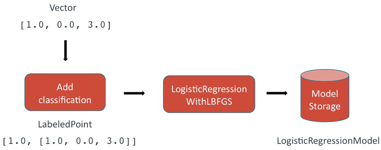
Figure 5-16. Training phase. Credit: Michelle Casbon.
Prediction
At prediction time, the models generated during training are used to provide a classification for the new piece of text. A confidence interval of 0–1 indicates the strength of the model’s confidence in the prediction. The higher the confidence, the more certain the model is. The following components encompass the prediction process (Figure 5-17):
- Input: unseen document in the same domain as the data used for training.
- The same featurization pipeline is applied to the unseen text. The feature index generated during training is used here as a lookup. This results in a feature vector in the same feature space as the data used for training.
- The trained model is retrieved.
- The feature
Vectoris sent to the model, and a classification is returned as a prediction. - The classification is interpreted in the context of the specific model used, which is then returned to the user.
- Output: a predicted classification for the unseen data and a corresponding confidence interval.

Figure 5-17. The prediction process. Credit: Michelle Casbon.
Prediction data types
In typical Spark ML applications, predictions are mainly generated using RDDs and DataFrames: the application loads document data into one column, and MLlib places the results of its prediction in another. Like all Spark applications, these prediction jobs may be distributed across a cluster of servers to efficiently process petabytes of data. However, our most demanding use case is exactly the opposite of big data: often, we must analyze a single, short piece of text and return results as quickly as possible, ideally within a millisecond.
Unsurprisingly, DataFrames are not optimized for this use case, and our initial DataFrame-based prototypes fell short of this requirement.
Fortunately for us, MLlib is implemented using an efficient linear algebra library, and all of the algorithms we planned to use included internal methods that generated predictions using single Vector objects without any added overhead. These methods looked perfect for our use case, so we designed IdiML to be extremely efficient at converting single documents to single Vectors so that we could use Spark MLlib’s internal Vector-based prediction methods.
For a single prediction, we observed speed improvements of up to two orders of magnitude by working with Spark MLlib’s Vector type as opposed to RDDs. The speed differences between the two data types are most pronounced among smaller batch sizes. This makes sense considering that RDDs were designed for processing large amounts of data. In a real-time web server context such as ours, small batch sizes are by far the most common scenario. Since distributed processing is already built into our web server and load balancer, the distributed components of core Spark are unnecessary for the small-data context of individual predictions. As we learned during the development of IdiML and have shown in Figure 5-18, Spark MLlib is an incredibly useful and performant machine-learning library for low-latency and real-time applications. Even the worst-case IdiML performance is capable of performing sentiment analysis on every Tweet written, in real time, from a mid-range consumer laptop (Figure 5-19).

Figure 5-18. Measurements performed on a mid-2014 15-inch MacBook Pro Retina. The large disparity in single-document performance is due to the inability of the test to take advantage of the multiple cores. Credit: Michelle Casbon.

Figure 5-19. Processing power of IdiML. Credit: Rob Munro. Used with permission.
Fitting It Into Our Existing Platform with IdiML
In order to provide the most accurate models possible, we want to be able to support different types of machine-learning libraries. Spark has a unique way of doing things, so we want to insulate our main code base from any idiosyncrasies. This is referred to as a persistence layer (IdiML), which allows us to combine Spark functionality with NLP-specific code that we’ve written ourselves. For example, during hyperparameter tuning we can train models by combining components from both Spark and our own libraries. This allows us to automatically choose the implementation that performs best for each model, rather than having to decide on just one for all models (Figure 5-20).

Figure 5-20. Persistence layer. Credit: Michelle Casbon.
Why a persistence layer?
The use of a persistence layer allows us to operationalize the training and serving of many thousands of models. Here’s what IdiML provides us with:
- A means of storing the parameters used during training. This is necessary in order to return the corresponding prediction.
- The ability to version control every part of the pipeline. This enables us to support backward compatibility after making updates to the code base. Versioning also refers to the ability to recall and support previous iterations of models during a project’s lifecycle.
- The ability to automatically choose the best algorithm for each model. During hyperparameter tuning, implementations from different machine-learning libraries are used in various combinations and the results evaluated.
- The ability to rapidly incorporate new NLP features by standardizing the developer-facing components. This provides an insulation layer that makes it unnecessary for our feature engineers and data scientists to learn how to interact with a new tool.
- The ability to deploy in any environment. We are currently using Docker containers on EC2 instances, but our architecture means that we can also take advantage of the burst capabilities that services such as Amazon Lambda provide.
- A single save and load framework based on generic
InputStreams&OutputStreams, which frees us from the requirement of reading and writing to and from disk. - A logging abstraction in the form of slf4j, which insulates us from being tied to any particular framework.
Faster, Flexible Performant Systems
NLP differs from other forms of machine learning because it operates directly on human-generated data. This is often messier than machine-generated data because language is inherently ambiguous, which results in highly variable interpretability—even among humans. Our goal is to automate as much of the NLP pipeline as possible so that resources are used more efficiently: machines help humans, help machines, help humans. To accomplish this across language barriers, we’re using tools such as Spark to build performant systems that are faster and more flexible than ever before.
Three Ideas to Add to Your Data Science Toolkit
You can read this post on oreilly.com here.
I’m always on the lookout for ideas that can improve how I tackle data analysis projects. I particularly favor approaches that translate to tools I can use repeatedly. Most of the time, I find these tools on my own—by trial and error—or by consulting other practitioners. I also have an affinity for academics and academic research, and I often tweet about research papers that I come across and am intrigued by. Often, academic research results don’t immediately translate to what I do, but I recently came across ideas from several research projects that are worth sharing with a wider audience.
The collection of ideas I’ve presented in this post address problems that come up frequently. In my mind, these ideas also reinforce the notion of data science as comprising data pipelines, not just machine-learning algorithms. These ideas also have implications for engineers trying to build artificial intelligence (AI) applications.
Use a Reusable Holdout Method to Avoid Overfitting During Interactive Data Analysis
Overfitting is a well-known problem in statistics and machine learning. Techniques like the holdout method, bootstrap, and cross-validation are used to avoid overfitting in the context of static data analysis. The widely used holdout method involves splitting an underlying data set into two separate sets. But practitioners (and I’m including myself here) often forget something important when applying the classic holdout method: in theory, the corresponding holdout set is accessible only once (as illustrated in Figure 5-21).

Figure 5-21. Static data analysis. Credit: Ben Lorica.
In reality, most data science projects are interactive in nature. Data scientists iterate many times and revise their methods or algorithms based on previous results. This frequently leads to overfitting because in many situations, the same holdout set is used multiple times (as illustrated in Figure 5-22).

Figure 5-22. Interactive data analysis. Credit: Ben Lorica.
To address this problem, a team of researchers devised reusable holdout methods by drawing from ideas in differential privacy. By addressing overfitting, their methods can increase the reliability of data products, particularly as more intelligent applications get deployed in critical situations. The good news is that the solutions they came up with are accessible to data scientists and do not require an understanding of differential privacy. In a presentation at Hardcore Data Science in San Jose, Moritz Hardt of Google (one of the researchers) described their proposed Thresholdout method using the following Python code:
fromnumpyimport*defThresholdout(sample,holdout,q):# function q is what you’re “testing” - e.g., model losssample_mean=mean([q(x)forxinsample])holdout_mean=mean([q(x)forxinholdout])sigma=1.0/sqrt(len(sample))threshold=3.0*sigmaif(abs(sample_mean-holdout_mean)<random.normal(threshold,sigma)):# q does not overfit: your “training estimate” is goodreturnsample_meanelse:# q overfits (you may have overfit using your# training data)returnholdout_mean+random.normal(0,sigma)
Details of their Thresholdout and other methods can be found in this paper and Hardt’s blog posts here and here. I also recommend a recent paper on blind analysis—a related data-perturbation method used in physics that may soon find its way into other disciplines.
Use Random Search for Black-Box Parameter Tuning
Most data science projects involve pipelines that involve “knobs” (or hyperparameters) that need to be tuned appropriately, usually on a trial-and-error basis. These hyperparameters typically come with a particular machine-learning method (network depth and architecture, window size, etc.), but they can also involve aspects that affect data preparation and other steps in a data pipeline.
With the growing number of applications of machine-learning pipelines, hyperparameter tuning has become a subject of many research papers (and even commercial products). Many of the results are based on Bayesian optimization and related techniques.
Practicing data scientists need not rush to learn Bayesian optimization. Recent blog posts (here and here) by Ben Recht of UC Berkeley highlighted research that indicates when it comes to black-box parameter tuning, simple random search is actually quite competitive with more advanced methods. And efforts are underway to accelerate random search for particular workloads.
Explain Your Black-Box Models Using Local Approximations
In certain domains (including health, consumer finance, and security), model interpretability is often a requirement. This comes at a time when black-box models—including deep learning and other algorithms, and even ensembles of models—are all the rage. With the current interest in AI, it is important to point out that black-box techniques will only be deployed in certain application domains if tools to make them more interpretable are developed.
A recent paper by Marco Tulio Ribeiro and colleagues hints at a method that can make such models easier to explain. The idea proposed in this paper is to use a series of interpretable, locally faithful approximations. These are interpretable, local models that approximate how the original model behaves in the vicinity of the instance being predicted. The researchers observed that although a model may be too complex to explain globally, providing an explanation that is locally faithful is often sufficient.
A recent presentation illustrated the utility of the researchers’ approach. One of the co-authors of the paper, Carlos Guestrin, demonstrated an implementation of a related method that helped debug a deep neural network used in a computer vision application.
Related Resources
- “Introduction to Local Interpretable Model-Agnostic Explanations (LIME)”
- “6 reasons why I like KeystoneML”—a conversation with Ben Recht
- “The evolution of GraphLab”—a conversation with Carlos Guestrin
- The Deep Learning Video Collection: 2016—a collection of talks at Strata + Hadoop World
Introduction to Local Interpretable Model-Agnostic Explanations (LIME)
You can read this post on oreilly.com here.
Machine learning is at the core of many recent advances in science and technology. With computers beating professionals in games like Go, many people have started asking if machines would also make for better drivers or even better doctors.
In many applications of machine learning, users are asked to trust a model to help them make decisions. A doctor will certainly not operate on a patient simply because “the model said so.” Even in lower-stakes situations, such as when choosing a movie to watch from Netflix, a certain measure of trust is required before we surrender hours of our time based on a model. Despite the fact that many machine-learning models are black boxes, understanding the rationale behind the model’s predictions would certainly help users decide when to trust or not to trust their predictions. An example is shown in Figure 5-23, in which a model predicts that a certain patient has the flu. The prediction is then explained by an “explainer” that highlights the symptoms that are most important to the model. With this information about the rationale behind the model, the doctor is now empowered to trust the model—or not.
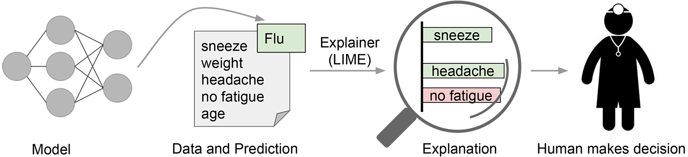
Figure 5-23. Explaining individual predictions to a human decision-maker. Credit: Marco Tulio Ribeiro.
In a sense, every time an engineer uploads a machine-learning model to production, the engineer is implicitly trusting that the model will make sensible predictions. Such assessment is usually done by looking at held-out accuracy or some other aggregate measure. However, as anyone who has ever used machine learning in a real application can attest, such metrics can be very misleading. Sometimes data that shouldn’t be available accidentally leaks into the training and into the held-out data (e.g., looking into the future). Sometimes the model makes mistakes that are too embarrassing to be acceptable. These and many other tricky problems indicate that understanding the model’s predictions can be an additional useful tool when deciding if a model is trustworthy or not, because humans often have good intuition and business intelligence that is hard to capture in evaluation metrics. Assuming a “pick step” in which certain representative predictions are selected to be explained to the human would make the process similar to the one illustrated in Figure 5-24.

Figure 5-24. Explaining a model to a human decision-maker. Credit: Marco Tulio Ribeiro.
In “‘Why Should I Trust You?' Explaining the Predictions of Any Classifier,” a joint work by Marco Tulio Ribeiro, Sameer Singh, and Carlos Guestrin (which appeared at ACM’s Conference on Knowledge Discovery and Data Mining -- KDD2016), we explore precisely the question of trust and explanations. We propose local interpretable model-agnostic explanations (LIME), a technique to explain the predictions of any machine-learning classifier, and evaluate its usefulness in various tasks related to trust.
Intuition Behind LIME
Because we want to be model-agnostic, what we can do to learn the behavior of the underlying model is to perturb the input and see how the predictions change. This turns out to be a benefit in terms of interpretability, because we can perturb the input by changing components that make sense to humans (e.g., words or parts of an image), even if the model is using much more complicated components as features (e.g., word embeddings).
We generate an explanation by approximating the underlying model by an interpretable one (such as a linear model with only a few non-zero coefficients), learned on perturbations of the original instance (e.g., removing words or hiding parts of the image). The key intuition behind LIME is that it is much easier to approximate a black-box model by a simple model locally (in the neighborhood of the prediction we want to explain), as opposed to trying to approximate a model globally. This is done by weighting the perturbed images by their similarity to the instance we want to explain. Going back to our example of a flu prediction, the three highlighted symptoms may be a faithful approximation of the black-box model for patients who look like the one being inspected, but they probably do not represent how the model behaves for all patients.
See Figure 5-25 for an example of how LIME works for image classification. Imagine we want to explain a classifier that predicts how likely it is for the image to contain a tree frog. We take the image on the left and divide it into interpretable components (contiguous superpixels).

Figure 5-25. Transforming an image into interpretable components. Credit: Marco Tulio Ribeiro, Pixabay.
As illustrated in Figure 5-26, we then generate a data set of perturbed instances by turning some of the interpretable components “off” (in this case, making them gray). For each perturbed instance, we get the probability that a tree frog is in the image according to the model. We then learn a simple (linear) model on this data set, which is locally weighted—that is, we care more about making mistakes in perturbed instances that are more similar to the original image. In the end, we present the superpixels with highest positive weights as an explanation, graying out everything else.

Figure 5-26. Explaining a prediction with LIME. Credit: Marco Tulio Ribeiro, Pixabay.
Examples
We used LIME to explain a myriad of classifiers (such as random forests, support vector machines (SVM), and neural networks) in the text and image domains. Here are a few examples of the generated explanations.
First, an example from text classification. The famous 20 newsgroups data set is a benchmark in the field, and has been used to compare different models in several papers. We take two classes that are hard to distinguish because they share many words: Christianity and atheism. Training a random forest with 500 trees, we get a test set accuracy of 92.4%, which is surprisingly high. If accuracy was our only measure of trust, we would definitely trust this classifier. However, let’s look at an explanation in Figure 5-27 for an arbitrary instance in the test set (a one-liner in Python with our open source package):
exp = explainer.explain_instance(test_example, classifier
.predict_proba, num_features=6)

Figure 5-27. Explanation for a prediction in the 20 newsgroups data set. Credit: Marco Tulio Ribeiro.
This is a case in which the classifier predicts the instance correctly, but for the wrong reasons. Additional exploration shows us that the word “posting” (part of the email header) appears in 21.6% of the examples in the training set but only two times in the class “Christianity.” This is also the case in the test set, where the word appears in almost 20% of the examples but only twice in “Christianity.” This kind of artifact in the data set makes the problem much easier than it is in the real world, where we wouldn’t expect such patterns to occur. These insights become easy once you understand what the models are actually doing, which in turn leads to models that generalize much better.
As a second example, we explain Google’s Inception neural network on arbitrary images. In this case, illustrated in Figure 5-28, the classifier predicts “tree frog” as the most likely class, followed by “pool table” and “balloon” with lower probabilities. The explanation reveals that the classifier primarily focuses on the frog’s face as an explanation for the predicted class. It also sheds light on why “pool table” has nonzero probability: the frog’s hands and eyes bear a resemblance to billiard balls, especially on a green background. Similarly, the heart bears a resemblance to a red balloon.

Figure 5-28. Explanation for a prediction from Inception. The top three predicted classes are “tree frog,” “pool table,” and “balloon.” Credit: Marco Tulio Ribeiro, Pixabay (frog, billiards, hot air balloon).
In the experiments in our research paper, we demonstrate that both machine-learning experts and lay users greatly benefit from explanations similar to Figures 5-27 and 5-28, and are able to choose which models generalize better, improve models by changing them, and get crucial insights into the models’ behavior.
Conclusion
Trust is crucial for effective human interaction with machine-learning systems, and we think explaining individual predictions is an effective way of assessing trust. LIME is an efficient tool to facilitate such trust for machine-learning practitioners and a good choice to add to their tool belts (did we mention we have an open source project?), but there is still plenty of work to be done to better explain machine-learning models. We’re excited to see where this research direction will lead us. More details are available in our paper.