
Chapter 7
Using Selectiosn Widgets
Back in Chapter 5, you saw how fields could have constraints placed on them to limit possible input, such as only digits. These sorts of constraints help users “get it right” when entering information, particularly on mobile devices with cramped keyboards.
Of course, the ultimate in constrained input is to allow selection only from a set of items, such as a radio button group (also discussed in Chapter 5). Classic UI toolkits have list boxes, combo boxes, drop-down lists, and the like for that very purpose. Android provides many of the same sorts of widgets, plus others of particular interest for mobile devices (e.g., the Gallery for examining saved photos).
Moreover, Android offers a flexible framework for determining which choices are available in these widgets. Specifically, Android offers a framework of data adapters that provide a common interface for selection lists, ranging from static arrays to database contents. Selection views—widgets for presenting lists of choices—are handed an adapter to supply the actual choices.
This chapter begins with a look at Android's adapters, and then introduces its selection widgets.
Adapting to the Circumstances
In the abstract, adapters provide a common interface to multiple disparate APIs. More specifically, in Android's case, adapters provide a common interface to the data model behind a selection-style widget, such as a list box. This use of Java interfaces is fairly common (e.g., Java/Swing's model adapters for JTable), and Java is far from the only environment offering this sort of abstraction (e.g., Flex's XML data-binding framework accepts XML inlined as static data or retrieved from the Internet).
Android's adapters are responsible for providing the roster of data for a selection widget, as well as for converting individual elements of data into specific views to be displayed inside the selection widget. The latter facet of the adapter system may sound a little odd, but in reality, it is not that different from other GUI toolkits' ways of overriding default display behavior. For example, in Java/Swing, if you want a JList-backed list box to actually be a checklist (where individual rows are a check box plus label, and clicks adjust the state of the check box), you inevitably wind up calling setCellRenderer() to supply your own ListCellRenderer, which in turn converts strings for the list into JCheckBox-plus-JLabel composite widgets.
The easiest adapter to use is ArrayAdapter. All you need to do is wrap one of these around a Java array or java.util.List instance, and you have a fully functioning adapter:
String[] items={"this", "is", "a",

                "really", "silly", "list"};

new ArrayAdapter<String>(this,

  android.R.layout.simple_list_item_1, items);
The ArrayAdapter constructor takes three parameters:
- The
Contextto use (typically this will be your activity instance) - The resource ID of a view to use (such as a built-in system resource ID, as shown in the preceding example)
- The actual array or list of items to show
By default, the ArrayAdapter will invoke toString() on the objects in the list and wrap each of those strings in the view designated by the supplied resource.android.R.layout.simple_list_item_1 simply turns those strings into TextView objects. Those TextView widgets, in turn, will be shown in the list, spinner, or whatever widget uses this ArrayAdapter. In Chapter 8, you'll see how to subclass Adapter and override row creation, to give you greater control over how rows appear.
Here are two other adapters in Android that you may want to use:
CursorAdapter: Converts aCursor, typically from a content provider, into something that can be displayed in a selection view. (We'll look atCursorAdapterin greater detail in Chapter 22, which covers databases.)SimpleAdapter: Converts data found in XML resources.
Lists of Naughty and Nice
The classic list box widget in Android is known as ListView. Include one of these in your layout, invoke setAdapter() to supply your data and child views, and attach a listener via setOnItemSelectedListener() to find out when the selection has changed. With that, you have a fully functioning list box.
However, if your activity is dominated by a single list, you might consider creating your activity as a subclass of ListActivity, rather than the regular Activity base class. If your main view is just the list, you do not even need to supply a layout; ListActivity will construct a full-screen list for you. If you do want to customize the layout, you can, as long as you identify your ListView as @android:id/list, so ListActivity knows which widget is the main list for the activity.
For example, here is a layout pulled from the Selection/List sample project, which is simply a list with a label on top to show the current selection:
<?xml version="1.0" encoding="utf-8"?>

<LinearLayout

  xmlns:android="http://schemas.android.com/apk/res/android"

  android:orientation="vertical"

  android:layout_width="fill_parent"

  android:layout_height="fill_parent" >

  <TextView

    android:id="@+id/selection"

    android:layout_width="fill_parent"

    android:layout_height="wrap_content"/>

  <ListView

    android:id="@android:id/list"

    android:layout_width="fill_parent"

    android:layout_height="fill_parent"

    android:drawSelectorOnTop="false"

    />

</LinearLayout>
The Java code to configure the list and connect the list with the label is as follows:
public class ListViewDemo extends ListActivity {

  TextView selection;

  String[] items={"lorem", "ipsum", "dolor", "sit", "amet",

          "consectetuer", "adipiscing", "elit", "morbi", "vel",

          "ligula", "vitae", "arcu", "aliquet", "mollis",

          "etiam", "vel", "erat", "placerat", "ante",

          "porttitor", "sodales", "pellentesque", "augue", "purus"};


  @Override
public void onCreate(Bundle icicle) {super.onCreate(icicle);setContentView
(R.layout.main);setListAdapter
(new ArrayAdapter<String>(this,android.R.layout.simple_list_item_1,items));selection=(TextView)findViewById(R.id.selection);}public void onListItemClick(ListView parent, View v, int position,long id) {selection.setText
(items[position]);}
}
With ListActivity, you can set the list adapter via setListAdapter()—in this case, providing an ArrayAdapter wrapping an array of nonsense strings. To find out when the list selection changes, override onListItemClick() and take appropriate steps based on the supplied child view and position—in this case, updating the label with the text for that position. The results are shown in Figure 7–1.
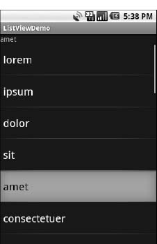
Figure 7–1. The ListViewDemo sample application
The second parameter to our ArrayAdapter, android.R.layout.simple_list_item_1, controls the appearance of the rows. The value used in the preceding example provides the standard Android list row: big font, a lot of padding, and white text.
By default, ListView is set up to simply collect clicks on list entries. If you want a list that tracks a user's selection, or possibly multiple selections, ListView can handle that as well, but it requires a few changes:
- Call
setChoiceMode()on theListViewin Java code to set the choice mode, supplying eitherCHOICE_MODE_SINGLEorCHOICE_MODE_MULTIPLEas the value. You can get yourListViewfrom aListActivityviagetListView(). - Rather than using
android.R.layout.simple_list_item_1as the layout for the list rows in yourArrayAdapterconstructor, use eitherandroid.R.layout.simple_list_item_single_choiceorandroid.R.layout.simple_list_item_multiple_choicefor single-choice (see Figure 7–2) or multiple-choice (see Figure 7–3) lists. - To determine which ones the user checked, call
getCheckedItemPositions()on yourListView.
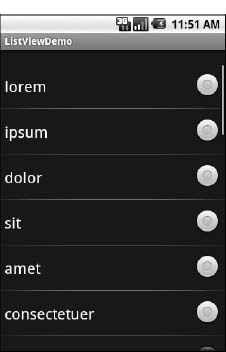
Figure 7–2. Single-select mode
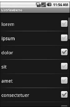
Figure 7–3. Multiple-select mode
Spin Control
In Android, the Spinner is the equivalent of the drop-down selector you might find in other toolkits (e.g., JComboBox in Java/Swing). Pressing the center button on the D-pad pops up a selection dialog box from which the user can choose an item. You basically get the ability to select from a list without taking up all the screen space of a ListView, at the cost of an extra click or screen tap to make a change.
As with ListView, you provide the adapter for data and child views via setAdapter(), and hook in a listener object for selections via setOnItemSelectedListener().
If you want to tailor the view used when displaying the drop-down perspective, you need to configure the adapter, not the Spinner widget. Use the setDropDownViewResource() method to supply the resource ID of the view to use.
For example, culled from the Selection/Spinner sample project, here is an XML layout for a simple view with a Spinner:
<?xml version="1.0" encoding="utf-8"?>

<LinearLayout

  xmlns:android="http://schemas.android.com/apk/res/android"

  android:orientation="vertical"

  android:layout_width="fill_parent"

  android:layout_height="fill_parent"

  >

  <TextView

    android:id="@+id/selection"

    android:layout_width="fill_parent"

    android:layout_height="wrap_content"

    />

  <Spinner android:id="@+id/spinner"

    android:layout_width="fill_parent"

    android:layout_height="wrap_content"

    android:drawSelectorOnTop="true"

  />

</LinearLayout>
This is the same view as shown in the previous section, but with a Spinner instead of a ListView. The Spinner property android:drawSelectorOnTop controls whether the arrow is drawn on the selector button on the right side of the Spinner UI.
To populate and use the Spinner, we need some Java code:
public class SpinnerDemo extends Activity

  implements AdapterView.OnItemSelectedListener {

  TextView selection;

  String[] items={"lorem", "ipsum", "dolor", "sit", "amet",

          "consectetuer", "adipiscing", "elit", "morbi", "vel",

          "ligula", "vitae", "arcu", "aliquet", "mollis",

          "etiam", "vel", "erat", "placerat", "ante",

          "porttitor", "sodales", "pellentesque", "augue", "purus"};


  @Override

public void onCreate(Bundle icicle) {
super.onCreate(icicle);
setContentView(R.layout.main);
selection=(TextView)findViewById(R.id.selection);
Spinner spin=(Spinner)findViewById(R.id.spinner);
spin.setOnItemSelectedListener(this);
    ArrayAdapter<String> aa=new ArrayAdapter<String>(this,

                             android.R.layout.simple_spinner_item,

                             items);


aa.setDropDownViewResource(
android.R.layout.simple_spinner_dropdown_item);
spin.setAdapter(aa);
}
public void onItemSelected(AdapterView<?> parent,
View v, int position, long id) {
selection.setText(items[position]);
}
public void onNothingSelected(AdapterView<?> parent) {
selection.setText("");
}
}
Here, we attach the activity itself as the selection listener (spin.setOnItemSelectedListener(this)). This works because the activity implements the OnItemSelectedListener interface. We configure the adapter not only with the list of fake words, but also with a specific resource to use for the drop-down view (via aa.setDropDownViewResource()). Also notice the use of android.R.layout.simple_spinner_item as the built-in View for showing items in the spinner itself.
Finally, we implement the callbacks required by OnItemSelectedListener to adjust the selection label based on user input. Figures 7–4 and 7–5 show the results.
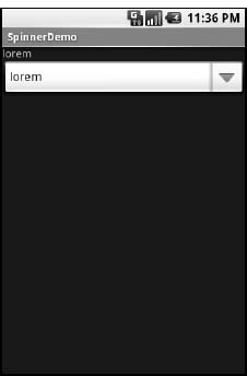
Figure 7–4. The SpinnerDemo sample application, as initially launched
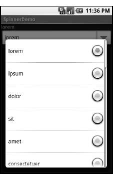
Figure 7–5. The same application, with the spinner drop-down list displayed
Grid Your Lions (or Something Like That...)
As the name suggests, GridView gives you a two-dimensional grid of items from which to choose. You have moderate control over the number and size of the columns; the number of rows is dynamically determined based on the number of items the supplied adapter says are available for viewing.
When combined, a few properties determine the number of columns and their sizes:
android:numColumns: Specifies how many columns there are, or, if you supply a value ofauto_fit, Android will compute the number of columns based on the available space and the following properties.android:verticalSpacingandandroid:horizontalSpacing: Indicate how much whitespace there should be between items in the grid.android:columnWidth: Indicates how many pixels wide each column should be.android:stretchMode: Indicates, for grids withauto_fitforandroid:numColumns, what should happen for any available space not taken up by columns or spacing. This can becolumnWidth, to have the columns take up available space, orspacingWidth, to have the whitespace between columns absorb extra space.
For example, suppose the screen is 320 pixels wide, and you have android:columnWidth set to 100px and android:horizontalSpacing set to 5px. Three columns would use 310 pixels (three columns of 100 pixels and two whitespace areas of 5 pixels). With android:stretchMode set to columnWidth, the three columns will each expand by 3 to 4 pixels to use up the remaining 10 pixels. With android:stretchMode set to spacingWidth, the two whitespace areas will each grow by 5 pixels to consume the remaining 10 pixels.
Otherwise, the GridView works much like any other selection widget: use setAdapter() to provide the data and child views, invoke setOnItemSelectedListener() to register a selection listener, and so on.
For example, here is a XML layout from the Selection/Grid sample project, showing a GridView configuration:
<?xml version="1.0" encoding="utf-8"?>

<LinearLayout

  xmlns:android="http://schemas.android.com/apk/res/android"

  android:orientation="vertical"

  android:layout_width="fill_parent"

  android:layout_height="fill_parent"

  >

  <TextView

    android:id="@+id/selection"

    android:layout_width="fill_parent"

    android:layout_height="wrap_content"

    />

  <GridView

    android:id="@+id/grid"

    android:layout_width="fill_parent"

    android:layout_height="fill_parent"

    android:verticalSpacing="35px"

    android:horizontalSpacing="5px"

    android:numColumns="auto_fit"

    android:columnWidth="100px"

    android:stretchMode="columnWidth"

    android:gravity="center"

    />

</LinearLayout>
For this grid, we take up the entire screen except for what our selection label requires. The number of columns is computed by Android (android:numColumns = "auto_fit") based on 5-pixel horizontal spacing (android:horizontalSpacing = "5px") and 100-pixel columns (android:columnWidth = "100px"), with the columns absorbing any “slop” width left over (android:stretchMode = "columnWidth").
The Java code to configure the GridView is as follows:
public class GridDemo extends Activity

  implements AdapterView.OnItemSelectedListener {

  TextView selection;

  String[] items={"lorem", "ipsum", "dolor", "sit", "amet",

          "consectetuer", "adipiscing", "elit", "morbi", "vel",

          "ligula", "vitae", "arcu", "aliquet", "mollis",

          "etiam", "vel", "erat", "placerat", "ante",

          "porttitor", "sodales", "pellentesque", "augue", "purus"};


  @Override

public void onCreate(Bundle icicle) {
super.onCreate(icicle);
setContentView(R.layout.main);
selection=(TextView)findViewById(R.id.selection);
GridView g=(GridView) findViewById(R.id.grid);
g.setAdapter(new FunnyLookingAdapter(this,
android.R.layout.simple_list_item_1,
items));
g.setOnItemSelectedListener(this);
}
public void onItemSelected(AdapterView<?> parent, View v,
int position, long id) {
selection.setText(items[position]);
}
public void onNothingSelected(AdapterView<?> parent) {
selection.setText("");
}
private class FunnyLookingAdapter extends ArrayAdapter {
Context ctxt;
FunnyLookingAdapter(Context ctxt, int resource,
String[] items) {
super(ctxt, resource, items);
this.ctxt=ctxt;
}
public View getView(int position, View convertView,
ViewGroup parent) {
TextView label=(TextView)convertView;
if (convertView==null) {
convertView=new TextView(ctxt);
label=(TextView)convertView;
}
label.setText(items[position]);
return(convertView);
}
}
}
For the grid cells, rather than using autogenerated TextView widgets as in the previous sections, we create our own views, by subclassing ArrayAdapter and overriding getView(). In this case, we wrap the funny-looking strings in our own TextView widgets, just to be different. If getView() receives a TextView, we just reset its text; otherwise, we create a new TextView instance and populate it.
With the 35-pixel vertical spacing from the XML layout (android:verticalSpacing = "35"), the grid overflows the boundaries of the emulator's screen, as shown in Figures 7–6 and 7–7.
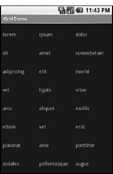
Figure 7–6. The GridDemo sample application, as initially launched
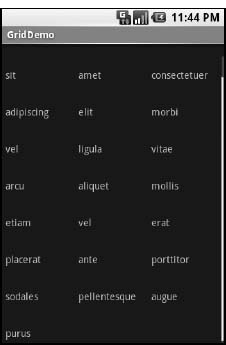
Figure 7–7. The same application, scrolled to the bottom of the grid
Fields: Now with 35% Less Typing!
The AutoCompleteTextView is sort of a hybrid between the EditText (field) and the Spinner. With autocompletion, as the user types, the text is treated as a prefix filter, comparing the entered text as a prefix against a list of candidates. Matches are shown in a selection list that, as with Spinner, drops down from the field. The user can either type the full entry (e.g., something not in the list) or choose an item from the list to be the value of the field.
AutoCompleteTextView subclasses EditText, so you can configure all the standard look-and-feel aspects, such as font face and color. In addition, AutoCompleteTextView has an android:completionThreshold property, to indicate the minimum number of characters a user must enter before the list filtering begins.
You can give AutoCompleteTextView an adapter containing the list of candidate values via setAdapter(). However, since the user could type something that is not in the list, AutoCompleteTextView does not support selection listeners. Instead, you can register a TextWatcher, as you can with any EditText widget, to be notified when the text changes. These events will occur either because of manual typing or from a selection from the drop-down list.
The following is a familiar XML layout, this time containing an AutoCompleteTextView (pulled from the Selection/AutoComplete sample application):
<?xml version="1.0" encoding="utf-8"?>

<LinearLayout

  xmlns:android="http://schemas.android.com/apk/res/android"

  android:orientation="vertical"

  android:layout_width="fill_parent"

  android:layout_height="fill_parent"

  >

  <TextView

    android:id="@+id/selection"

    android:layout_width="fill_parent"

    android:layout_height="wrap_content"

    />

  <AutoCompleteTextView android:id="@+id/edit"

      android:layout_width="fill_parent"

      android:layout_height="wrap_content"

      android:completionThreshold="3"/>

</LinearLayout>
The corresponding Java code is as follows:
public class AutoCompleteDemo extends Activity

  implements TextWatcher {

  TextView selection;

  AutoCompleteTextView edit;

  String[] items={"lorem", "ipsum", "dolor", "sit", "amet",

          "consectetuer", "adipiscing", "elit", "morbi", "vel",

          "ligula", "vitae", "arcu", "aliquet", "mollis",

          "etiam", "vel", "erat", "placerat", "ante",

          "porttitor", "sodales", "pellentesque", "augue", "purus"};


  @Override

public void onCreate(Bundle icicle) {
super.onCreate(icicle);
setContentView(R.layout.main);
selection=(TextView)findViewById(R.id.selection);
edit=(AutoCompleteTextView)findViewById(R.id.edit);
edit.addTextChangedListener(this);
edit.setAdapter(new ArrayAdapter<String>(this,
android.R.layout.simple_dropdown_item_1line,
items));
}
public void onTextChanged(CharSequence s, int start, int before,
int count) {
selection.setText(edit.getText());
}
public void beforeTextChanged(CharSequence s, int start,
int count, int after) {
// needed for interface, but not used
}
public void afterTextChanged(Editable s) {
// needed for interface, but not used
}
}
This time, our activity implements TextWatcher, which means our callbacks are onTextChanged() and beforeTextChanged(). In this case, we are interested in only the former, and we update the selection label to match the AutoCompleteTextView's current contents.
Figures 7–8, 7–9, and 7–10 show the results.
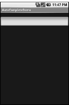
Figure 7–8. The AutoCompleteDemo sample application, as initially launched
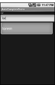
Figure 7–9. The same application, after a few matching letters were entered, showing the autocomplete drop-down
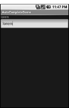
Figure 7–10. The same application, after the autocomplete value was selected
Galleries, Give or Take the Art
The Gallery widget is not one ordinarily found in GUI toolkits. It is, in effect, a list box that is horizontally laid out. One choice follows the next across the horizontal plane, with the currently selected item highlighted. On an Android device, the user rotates through the options via the left and right D-pad buttons.
Compared to the ListView, the Gallery takes up less screen space, while still showing multiple choices at one time (assuming they are short enough). Compared to the Spinner, the Gallery always shows more than one choice at a time.
The quintessential example use for the Gallery is image preview. Given a collection of photos or icons, the Gallery lets people preview the pictures in the process of choosing one.
Code-wise, the Gallery works much like a Spinner or GridView. In your XML layout, you have a few properties at your disposal:
android:spacing: Controls the number of pixels between entries in the list.android:spinnerSelector: Controls what is used to indicate a selection. This can either be a reference to aDrawable(see Chapter 20) or an RGB value in#AARRGGBBor similar notation.android:drawSelectorOnTop: Indicates if the selection bar (orDrawable) should be drawn before (false) or after (true) drawing the selected child. If you choosetrue, be sure that your selector has sufficient transparency to show the child through the selector; otherwise, users will not be able to read the selection.