
Chapter 9
Big Data Metrics for Big Performance
Fail fast—fail cheap. That mantra is becoming popular among business people as a way to promote Dynamic Customer Strategy because the idea is to accelerate learning through better experimentation.
But how do you know when something went wrong? How quickly can you get the right data that tells you what has happened or is happening?
In this chapter, we'll explore the application of Big Data to metrics, because Big Data can make metrics more complicated. At the same time, however, visualization techniques are simplifying Big Data–based metrics to ease decision making. So first we'll discuss metrics in the Big Data world and conclude with a primer on visualization.
The Big Data of Metrics
One of the themes of this book is that strategy is about making choices, and the power of Big Data is in how you can use it for making informed choices. Metrics are designed to establish two factors: the effectiveness of your marketing activity and the efficiency of your marketing spend, or to put it another way, how much you are earning and how fast.
Efficiency is also a standardized measure, meaning that you are able to compare across settings. The most common efficiency measure is return on investment, or ROI. By converting earnings into a percentage of investment, we can compare across investments.
Other efficiency measures include such things as average sales per catalog or per square foot (if you're Cabela's), average sales per salesperson (if you're Microsoft), or average leads per trade show day. I point out the latter to illustrate that efficiency isn't always about sales. You may also want to measure such things as cpm, or cost per thousand people who see an ad, number of click-throughs per e-mail campaign (or, more likely, as a percentage of how many e-mails were opened), and other conversion metrics, such as illustrated in Figure 9.1. A conversion metric is any measure that reports how many moved to the next stage in the path to purchase. When standardized, it becomes an efficiency measure; when not standardized, the same metric can be an effectiveness measure. So click-throughs are a measure of effectiveness, but click-throughs per thousand e-mails (a conversion metric standardized to 1,000 e-mails) is an efficiency measure.
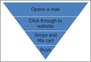
Figure 9.1 Example of Conversions
Cabela's sends out an e-mail and tracks conversions through the process of opening the e-mail, clicking through, filling the cart, and actually buying. Conversion rates for each of these stages help Cabela's identify how well each phase of the campaign is working.
How efficient is your Web advertising? Some measures would be eyeballs per dollar spent (how many people saw the ad divided by the cost), transactions per dollar spent (an ROI measure), and so forth. Now you can compare two options even if the cost is twice that for one versus the other.
If we are to accelerate learning so we can fail fast, velocity of Big Data is an important characteristic. There is also, however, the velocity of the strategy, or how quickly we see returns, and measuring that is a form of efficiency. Understanding the cycle time from concept to cash, for example, is important. No matter how fast you are able to gain insight, if you can't act quickly, you lose velocity. Introducing a new product? How quickly will sales start, and at what rate? Similarly, we may want to track payback, in this case, the amount of time needed to recover the marketing cost of acquiring the customer. This metric is useful when we have a significant customer acquisition cost that may not be fully recovered on the first transaction. The question then is, how quickly can we recover that cost? Put another way, how quickly do we begin to generate a profit on a new customer?
Share of wallet (SOW) is an effectiveness measure that, when converted to a percentage, can be compared across strategies, segments, and businesses. Some 20 years ago, research showed that account share (SOW in a B2B environment) is more important than market share because economies of scale are more easily enjoyed at the account level. Cost to serve (including shipping costs, sales costs, and so forth) is much lower as a percentage of sales for larger customers, positively improving profit.
Yes, this discussion has been fairly basic; however, think about this question: How many metrics does your organization use because that's what they can easily get? Or because these are the ones they've always used? Are there new measures, like SOW or account share, that can give us a clearer picture of what is happening and help us learn more quickly?
Once you start to consider questions like that, data strategy implications begin to arise. For example, I was on the board of a manufacturing company, and in one meeting I heard the manufacturing VP say, “We aren't making money on [our biggest customer] because we discount so much!” The reality was, though, that we had no idea if we were making money or not on that account. Contrast my experience to that of Cathy Burrows at Royal Bank of Canada. When her organization added cost-to-serve information to individual-level revenue, they realized they had grossly miscalculated the value of three out of four customers. With the better data, they were able to select activities with higher return and apply those to customers where the return was likely to be greatest.
Since one of the most important decisions you make is how much to spend on activities, it makes sense to track those costs on a per-activity basis. Otherwise, how can you determine the return on your investment?
Variation and Performance
We want to figure out what is working and what is not. Okay, figuring out what isn't working is pretty easy. The real challenge is to recognize what is only working moderately well and what is better.
First, think of your customer strategy as a process. A cascading campaign, for example, is a process, like a machine. Salespeople use a sales process that they repeat from one customer to the next. So let's borrow from machine management by going to one of the leaders in process quality, W. Edwards Deming, and examining his theory of variation.
Using your car as an example, miles per gallon is a measure of how efficiently your car operates. If you measured your mpg on a regular basis, you'd find that it varies somewhat. Highway versus in-town mpg is variation caused by how fast and how far you can drive without interruption. If your car is operating well, you should observe the mpg between those two numbers. If something is wrong, your mpg will fall below.
That range of variance is called the tolerance range, a term that really means the range in which we'll tolerate results and assume everything is working as it should. The upper level, or upper bound, is the maximum you can expect from that process. If we're talking about a sales process or strategy, that process can yield a maximum outcome and no more. If one salesperson is using that sales process appropriately, sales will be limited only by the amount of time available for making sales calls and the quality of leads into the process.
The bottom, however, can vary based on how well that process or strategy is being applied—how well the engine is working. In Figure 9.2, you can see the range of performance for a series of marketing campaigns. As you can see, the tolerance range for each campaign varies, because no two campaigns will yield the same variance. However, I have illustrated the overall tolerance range with the solid black lines.
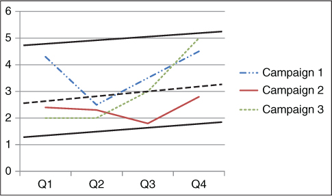
Figure 9.2 Tolerance Range for Campaign Performance
Tolerance range, or normal range of variation, is between the heavy dark lines for all campaigns. Note, however, that Campaign 2 has a significantly tighter tolerance range, the top of which is marked by a dashed line. Note, also, that the tolerance range varies, in this instance with time.
What causes variation? There are essentially four causes, two of which you have some control over. External factors, such as seasonality and economic conditions, are one class of causes for which you don't have control but that you can account for. Looking at Figure 9.2, you can see an external effect, as the tolerance ranges are rising. The second class of causes is random effects, which can include such things as weather or other things that just cause a little variation and are not enough to worry about.
Monitoring your marketing automation and all of your sales and marketing processes is really about making sure that the results are within the tolerance range. If they break out above, then you've got some external factor like economic conditions that is changing the level of the range. If the results break out below the lower bound, then you may have something broken in the process.
Two other causes of variation are controllable. The first is called tweaking, or tuning, and is the set of actions you take to fine-tune the process. If you are testing personalization, for example, you could call that tweaking. If a salesperson tries a different opening statement, that's another example of tweaking. Tweaking should raise the lower bound of the tolerance range, assuming that you are tweaking in a way that improves and doesn't degrade performance.
The second controllable cause is when you change machines, or in our case, change the strategy. So you might think of tactical change as tweaking, and strategic change as what Deming calls a systematic cause of variance. For example, we've worked with Konica-Minolta Business Solutions (KMBS) to help move from a product-oriented transactional sales process to something that is more about solutions and deep engagement with the customer, not unlike the Challenger Sale.1 That is a systematic change that results in new conversion rates and even new stages for which to consider conversions.
What this means is that the dashboards you create to monitor results should reflect the tolerance range. If you have a dial with a green zone and a red zone, the needle is in the green zone when results are in the tolerance range. When that needle drops into the red zone, then you should ask these questions:
- Is something broken? Or did someone “tune” the system and actually degrade its performance?
- Was there an environmental disturbance?
- Is this campaign or strategy worn out and needs replacing?
Creating a Tolerance Range
Statistically, you can determine the tolerance range in the same way you create a confidence interval.* A simple method is to set top and bottom three standard deviations away from the mean. In either case, you also need to adjust for seasonality or any other external factor that affects the outcomes you are tracking. In the example provided in Figure 9.2, we see an upward trend that could reflect seasonality or some other market factor.
Note, too, in the figure that I marked the top and bottom bounds of the tolerance range based on what was actually observed, not based on standard deviations or confidence intervals. That's because I don't have the data to support that—there aren't enough observations to be able to estimate standard deviations. One method, then, for determining a tolerance range is what I call executive fiat, which is essentially just using your judgment. In some instances, a tolerance range involves setting only a minimum standard for performance and looks something like this: “As long as we convert 10 percent of leads into sales, things are great. Fall below that and you're in trouble!” Executive fiat can be based on experience, a kind of personal experimentation that can prove valuable. Or it may simply be based on what someone thinks is possible or on what is needed—that is, given a marketing budget, the bottom of the tolerance range is set at the conversion rate needed to hit sales targets. That's fine too. Whatever the basis for determining what level of performance will be tolerated, you'll know whether it is reasonable by also determining the statistical tolerance range.
If your go-to-market strategy is to use a sales force, then you know that you have rate busters, those salespeople who consistently exhibit performance well above the normal range. Recall the salesperson who told his boss he was able to sell more because he didn't do what she told him to do. He was a rate buster and an example of systematic variance because his system (process) was different. To really understand a tolerance range, you have to pull out those people who operate way above the rest.
First, let's assume a normal distribution of variance within the tolerance range. If that is the case, then three standard deviations in either direction should mean a significant change in performance. If your system yields a high volume of observations, the tolerance range created by simply looking three standard deviations below the mean should be sufficient. But if you have few observations (if you sell something with a long sales cycle and you don't sell that many), then you need something else, such as executive fiat.
Alternatively, your distribution may be skewed right—meaning that the mean is not in the middle of the range but rather near the top. That's often the case when you have a sales force, for example, that generally performs very well—most of them will have sales performance within a fairly narrow band if they are all using the same sales model and same quality of input. Given that the upper level is bounded by the capability of the system (the sales model or sales process) while the bottom is not (meaning you can only go up so far but you can fall all the way to zero), skewed right (or up, depending on how you display the data) is likely. In this instance, a statistically significant difference won't necessarily be three standard deviations below the mean. Rather, you have to adjust for the skewed distribution first, but the principle is the same—you can set the lower bound of acceptable performance based on statistical significance.
What happens when the statistical range falls below an executive's comfort level? If executive fiat says 90 percent of the highest value is the bottom of the tolerance range and statistical analysis suggests it is 80 percent, what do you do? You only have a few choices. First, look for a better system—one that will yield 90 percent or better more regularly. That truly is your first choice. If you have a sales force, look for your rate busters, those salespeople consistently performing above the upper bound of the tolerance range, because they are doing something different. Your other choices are to try to change the mind of the exec, go through the motions of looking for causes to keep the system above 90 percent, and then look for a new job when you fail—because you will fail. No matter what the movies say, old Hayburner isn't going to win the Kentucky Derby.
Visualization
Identifying the tolerance range is the second step in creating a monitoring system, the first being to decide what to monitor. The final step is to create a system of displaying the results so that monitoring can occur (think red light/green light and Homer Simpson in the nuclear power plant).
Visualization of data provides three primary benefits:2
- Efficiency. Great visualization allows the viewer to grasp the point quickly, without having to sort through mounds of data.
- Alignment. Just as the concept map does, visualization of data accomplishes a form of group efficiency. When all viewers quickly grasp the point, they are able to share what they know and gain agreement on the needed actions.
- Insight. Sometimes, that sharing then leads to additional insight.
This efficiency is achieved through the reduction of data to one or two dimensions. That's a critical point and one being argued about among data scientists as you read this. Visualization is data reduction—that is, a process of reducing data to one or two dimensions (there are other methods of data reduction, such as cluster analysis, which creates market segments). What data scientists argue about is whether that is analysis and just how valuable visualization can be. I'm staying out of that argument because I think it is a personal preference based on how we learn as individuals. Since you are going to serve people who are not statistically inclined, I think it is important to understand visualization anyway, so here we go.
In Figure 9.2, we reduced sales data to volume and time, the two dimensions. If we chose to illustrate that line graph as a bar chart, it is still just two dimensions. We could have done a pie chart (though that would be silly for the two dimensions we have selected, as each slice would represent one month), but the point is that even a pie chart is just data reduced to two dimensions.
Because visualization is data reduction, static displays, or those visualization systems that generate a report without access to the underlying data, are becoming obsolete for monitoring purposes. You still need static displays to put into a report or into a presentation. But on an ongoing basis, you need something different, something that is not only up to the minute but that also gives you access to underlying data. If something is broken, you need to be able to find and fix it.
Real-time displays are those that allow the user to drill down into the data to understand more if needed, and provide up-to-the-minute (or thereabouts) data. You may need only daily updates but want the drill-down option, which still qualifies as real-time displays. The frequency of updating is optional, but at least daily, or you're really dealing with a static display.
Rand Categorization of Displays
How best to display your data depends on two factors—the decisions you're trying to make and the nature of the data you have to work with. Bill Rand, my colleague at the University of Maryland, has developed what I call the Rand categorization3 of data-based visual images. Bill and his colleagues divide visual images into three categories: conventional, structured, and unstructured. Conventional displays use images with which we're already familiar, like bar charts, pie charts, and the like, as illustrated in Figure 9.3. In this display, you can see a bar chart representing sales for various product lines by customer segment.
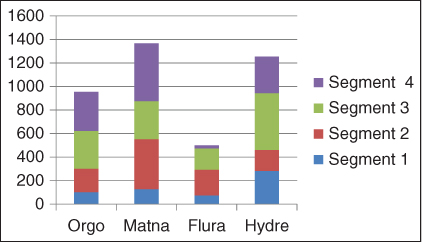
Figure 9.3 Sales by Market Segment and Product Type
This bar chart is an example of a conventional display of data, using the Rand categorization.
Structured displays will use unconventional images but in patterns that make sense. Heat maps, which use color to show frequency, are one form of structured display. We use heat maps for obvious decisions like site location (one application we use heat mapping for is to decide where to locate summer feeding programs for low-economic-status children). In Figure 9.4, however, we see a heat map illustrating where visitors click on a website.

Figure 9.4 A Heat Map of Where People Click on a Landing Page
Heat maps illustrate a frequency distribution on a spatial element like a landing page, showing the frequency of clicks or mouse movement on a page, for example. The dark areas indicate high frequency; the lighter, almost white areas indicate very low frequency.
Source: Clicky (http://clicky.com), used with permission.
Unstructured displays show data in ways that can be intuitive but in irregular spatial dimensions. An example is presented in Figure 9.5. This particular image is a three-dimensional scatter plot. You are probably having difficulty interpreting the display, and that's to be expected: These displays are best understood by viewers who are trained to understand that particular type of image. So if someone were using a three-dimensional scatter plot display, it would be because to that user it is like a conventional display; he or she is familiar enough with that type of image to understand and interpret it. The value, though, is that you can gain another dimension to the data. If you look at Figure 9.5, you can see that it looks more like a 3D graphic. The three dimensions here are time, latitude, and longitude for tweets regarding Hurricane Sandy, which damaged the Eastern Seaboard in 2012.
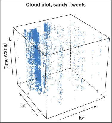
Figure 9.5 Three-Dimensional Display of Hurricane Sandy Tweets
This cube represents tweets based on location (latitude and longitude) and time. As an unstructured display, it takes some training to understand the data.
Source: Chen Wang and Bill Rand (2013), used with permission.
The choice of what display to use is a function of both data and decision. However, you may find it helpful to display the same data in different ways when trying to understand relationships among the variables. Visual displays should help you recognize patterns in the data more quickly; otherwise, they have limited value. When we show sales over time, we know or expect to find a trend. Consider, however, using visualization when you aren't sure what to expect.
The Dynamic Display Process
Figure 9.6 illustrates the process by which you should design and evaluate dynamic displays, beginning with deciding what it is you want to display and then iteratively simplifying to clarify what you intend to explain.
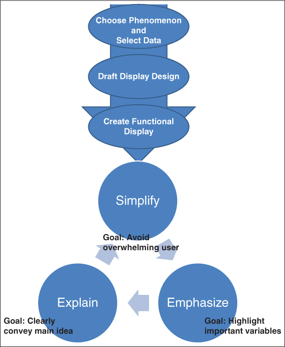
Figure 9.6 The Process of Creating Visual Displays of Data
Source: Adapted from Daniel Kornhauser, Uri Wilensky, and William Rand, “Design Guidelines for Agent Based Model Visualization,” Journal of Artificial Societies and Social Stimulation 12, no. 2 (2009).
The figure emphasizes several important aspects to consider. The first is that there are three goals when creating dynamic displays: simplify, emphasize, and explain. Earlier, you read that displays are really a form of data reduction, because complex models can be reduced to simple visual representations. Simplifying complex models is the raison d'être of visualization, but we've all seen the charts that lull us to sleep with too much data.
While a very different scenario, this true story illustrates the need for simplicity. Theo Schaars is an old friend who is in the diamond business. When we were both young and he was just starting out, he would sell loose diamonds to people in their homes. He would cover a table with a purple damask tablecloth and scatter it with diamonds. Theo quickly realized, though, that potential buyers were dazzled by too much choice. His sales went up dramatically when he only presented two diamonds at a time.
Visual displays of data can also be overwhelming if there is too much presented. The point you want to emphasize (the second objective of visualization) can get lost. The question is whether you want the display to support your story or to discover new insight. When you create a dynamic display with those variables that operationalize your concept map, you can use the visualization to identify new potential opportunities. But when you are telling someone else a story, you can use visualization to emphasize your point.
Explain is the third aspect of the display and calls to mind the reality that the user is not always the designer. While you may create a display that makes sense to you, that display will be used by people who may not know you or have the ability to fill in the gaps that you left in the display because you are close to the data. The display has to tell the story when you aren't there. Frankly, that's one concern I have with Figure 9.4. Though that chart isn't a dynamic display, at least not in this book, a sophisticated user aware of how it was created is required for understanding.
Finally, we distinguished earlier between static and dynamic displays, with “dynamic” meaning that the display is created with live data and you can drill down into the data to get a deeper understanding. Fully dynamic displays add two additional dimensions: real-time data and motion. For example, if you were viewing a display of last month's sales in Excel, you could click on the chart and look at the data. That's not very dynamic. More useful would be to be able to look at current data—to drill down into sales data that reflect today's activity. Even more useful would be to put that data into motion; that is, to view in motion how it changed from last month to now. Think of a weather map. You can see where the storm is now, but you can also click on a link and put that map into motion. Now you can see how fast the storm is moving and in what direction. The same is true of a fully dynamic display, and you can do that with conventional, structured, and unstructured displays.
Creating the Right Metrics
Teradata's 2013 study of marketing executives' use of data pointed out some interesting aspects. First, the top-priority uses of data were to increase efficiency and to prove effectiveness, in that order. I suspect that when economic conditions make top-line growth challenging, such order is likely the case. Stronger economic conditions probably make performance more important. Either way, what was startling about the study wasn't the two most important priorities; rather, it was that of the top six priorities, only one, proving effectiveness, was being accomplished with data. Other priorities, such as increasing efficiency, increasing cross-channel selling, and so forth, were not being accomplished through leveraging data.
In other words, the biggest use of data is simply tracking performance. So let's spend some time looking at the metrics we have available and thinking about how to create the metrics we need to make the right decisions.
Assumptions
We all make assumptions. We have to. In spite of the huge increase in data available to us, there are gaps that we have to fill in with guesses. In addition, there are things we just can't measure very well or account for as completely as we'd like.
When creating metrics, one important assumption often made is ceteris paribus—“all other things being equal.” Territories are assumed to have equal potential, at least for comparison purposes. This year's economy is equivalent to a year ago. Yet we know there are many differences between one Black Friday and the next, between urban territories and rural, and so on.
Making the ceteris paribus assumption may be entirely appropriate. Then again, with the right data strategy, you can avoid misreading results that were influenced by external factors by including those factors in your model. Just make that decision as to ceteris paribus, don't let it get made for you.
Assumptions can also sneak in when we aren't really thinking about them. For example, when calculating customer lifetime value, how long is a life? Further, how is that life changing? Dish Network, the satellite TV people, knows that when people move, they often change TV providers. Perhaps in the new location, consumers can select a better cable package. To lengthen the life, Dish created an offer designed to make it simpler and more likely that a customer would take Dish along. But the length of a life, then, could be based on average time between moves, something that would change with the economy and other factors.
Further, there is the problem of averages and the assumptions to which they lead. For example, if you measure satisfaction and find that the average satisfaction is 90 percent, you may think that is fine. But that's made up of 90 percent no-brainers where everything went as it should, while that 10 percent of dissatisfied customers ate up all of your customer service resources, cost you 20 percent of your margins in returns, and who knows what else. A similar pitfall is to assume that if your numbers are better than the industry, you are fine. Customers may switch regularly in an industry that's underperforming (like cell carriers), a practice that increases your marketing costs, increases your cost to serve, and decreases your profit. Every percentage point improvement in satisfaction in that situation can be worth up to five times that in additional profit. I'm not saying to forget about industry averages, I'm simply arguing that you consider the opportunities that market conditions like industry average performance can provide.
Creating (New) Metrics
Customer lifetime value (CLV) is a pretty important metric, as is share of wallet. By now, I think everyone would agree that these may be the two most important customer metrics.
CLV
Wouldn't it be great to know how valuable a customer could possibly be? The true value of a customer over a lifetime isn't just what she spends with you, but the value of recommendations, information she provides that helps you develop new products or methods of marketing, and other nonmonetary sources of value. But predicting that value is tough—and that's what CLV really represents, a prediction.
Most of the time, we think of CLV as an individual customer score. This customer is worth x, that one is worth y. This one is a Platinum customer, that one is Gold. But at the same time, we also need to know aggregate CLV, or the CLV for each segment. So you could determine CLV for all of your Platinum customers, for example, or you could determine CLV for all of your fishing customers versus your camping customers, if you were Cabela's.
Cohort and Incubate
One method to determine aggregate CLV is the cohort and incubate approach. This approach begins by selecting a cohort, or group, of customers acquired in the past. Let's say, for example, that you believe the average useful life to be five years. Go back five years ago and select a group of customers who were new customers that year. You take that one year's worth of customers and add up all of their purchases since they were acquired five years ago. You now have CLV for that cohort. You can also use that as an estimate for CLV for customers you are acquiring now.
The benefit to this approach is that it gives you an estimate of group-level CLV, which you can use to determine if the investment spent on customer acquisition will be worthwhile. You can also use this estimate to make decisions about which segments are worth your efforts.
Did you catch the assumptions that are made with cohort and incubate? One assumption is ceteris paribus, or that the conditions over the last five years will continue over the next five. But don't forget that CLV is affected by the marketing decisions you make. Your cohort used to determine CLV got one set of marketing strategies, your new cohort will get another. And they are being marketed to by competitors in different ways, each of whom has their own share of wallet.
If what you want is the total potential of a segment, you have to use a different approach. Cohort and incubate doesn't tell us what they bought from our competitors. Total CLV has to be measured via surveys. Further, you're unlikely to survey the entire cohort; instead, you'll survey a sample and then estimate for the full cohort.
Your choice of cohort and incubate or survey depends on the decisions you want to make. American Airlines, for example, uses both. They use their own transactional records to determine the relative value of both segments and individual customers, but they also use surveys to estimate their share of wallet and the segment's total value. Depending on whether the situation calls for increasing account share or driving retention or some other outcome, American can select which CLV score is appropriate.
Another factor to consider is whether you want to measure gross or net CLV—in other words, whether you want to calculate CLV based on revenue or contribution margin. Contribution margin, in this instance, is revenue minus cost to serve. CLV based on margin is the better approach but requires that you have good cost-to-serve data. In my experience, few companies can adequately determine cost to serve because of challenges in allocating costs appropriately.
RFM, or recency, frequency, and monetary value, is often used as a surrogate for CLV. The assumption is that high-value customers are those who spent a lot recently; if they haven't bought recently, then perhaps their life as a customer is over or their value is falling. A recency-of-purchase metric can answer that question for you. Then add in the frequency with which someone purchased, as well as how much was purchased. eBay considers a customer to be a customer if activity occurred in the previous twelve months; however, you could weight more recent purchases more heavily if you were trying to understand or monitor retention.4
RFM scoring's appeal lies in its simplicity and the ability to determine a customer's value in real time. Customers change categories on a daily basis, depending on their behavior, triggering responses from your marketing automation. You also don't have to control for external variables like you do with CLV scoring.
Most companies break their customers down into five groups, based on RFM. Royal Bank of Canada (RBC) is one example. They use an aggregated RFM score for total customer value across all RBC products. Cabela's is different. They also have five groups, but they score RFM within each of 18 product categories. For example, I might be high RFM in hunting and in fishing, but low in camping. Of course, Cabela's can also calculate my total RFM by simply combining my scores across all of the product categories, depending on the nature of the decision they're trying to make. They do that when they send out their entire catalog; not all customers get the entire catalog because their RFM doesn't justify the cost.
RBC, while often using the total RFM score, can also break it down into categories. Says Cathy Burrows, RBC's director of strategic initiatives and infrastructure, “It's not just the calculation of a single number that is useful. We're able to drill down into each of the components that make up that number—direct and indirect expenses, for example. That richness of data really helps us understand what drives customer value.” As she notes, “What's important is having the framework (the conceptual map) to work against—are you measuring the right things, can you get the right data?”5 Choosing what form of RFM score to use is based on your decision, but a good Big Data strategy gives the decision maker the option of selecting the right score.
Customer Satisfaction
Customer satisfaction is a longtime mainstay in performance metrics. Recently, the most popular method of measuring customer satisfaction has been Fred Reichheld's Net Promoter Score (NPS), which is the difference between the proportion of customers willing to recommend you and the proportion of customers who are unwilling to recommend you or who even recommend that potential customers avoid you. While Reichheld and others argue that this metric is the single most important satisfaction measure known to humankind, recent research suggests otherwise.
Limitations to the measure hinder its usefulness across all settings. For example, willingness to recommend may give you an overall reading on a customer's satisfaction, but there's nothing specific about it. If the score is poor, why?
One advantage that the measure does offer, though, is that it is a global measure of satisfaction. In the attempt to improve customer service, many companies will measure satisfaction after each touchpoint or service encounter. But recent research suggests that while the sum of such scores may be positive, the overall perception of the experience may be poor. Often, I find that the problem is in the measures—the person I'm dealing with did a good job and I dutifully report that when asked, but the problem wasn't fixed or my needs met. This outcome is not uncommon.
Another challenge with NPS is the wear-out factor. I get the same NPS survey from Hotels.com after every stay. Actually, this problem isn't limited to NPS but any customer satisfaction measurement process. Why not use progressive profiling (described back in Chapter 5)? Focus on one or two key aspects but vary those aspects and randomly assign different surveys to different customers. You'll get a higher overall participation rate and more questions answered. Further, apply Taguchi Block Design or some other multifactorial design (Chapter 7) and you can still get a full picture of your population.
Selecting Metrics
The velocity of data that is Big Data means we can create dynamic displays with real-time data. That doesn't mean, however, that we are making better decisions.
The first step to making better decisions is to create metrics that fit the decision. Far too often, we use the metrics we can get without thought of whether they represent the best operational definition of our conceptual variable. Is NPS a better operational definition of customer satisfaction or is met expectations the better definition? Such a question isn't an idle academic exercise. You can purchase NPS comparisons so that you can compare your performance to others, but is NPS the best universal measure for all of your decisions?
The second step is to recognize assumptions. That's hard, because we don't always know when we make assumptions. But if you can identify the assumptions that are necessary to make the metric applicable to the decision, you may be able to get the data you need to replace that assumption with facts. And you also get a better perspective on accuracy and precision.
Finally, use statistics in your decision. Knowing the tolerance range is an example of how you can use statistics to detect real changes that are worthy of decisive action. Judgment has its place, but when you can couple judgment with data, insight and opportunity will surely follow.
Summary
In general, metrics help us identify how effective our strategy is or how efficiently we've carried it out. Total sales is an effectiveness measure; average sales per sales call is an efficiency measure. Since sales and marketing involve processes, we can use Deming's Theory of Variation to understand when our systems are working as they should.
Visualization of data can be useful in quickly understanding complex systems, both individually and across a group. Data visualization can also lead to new insight. Types of displays include conventional, structured, and unstructured, though special training and understanding of the data is really needed for unstructured.
Choosing metrics is a balance between what is easily and affordably available and what best represents the operational definitions you need to measure. Recognizing the limitations of what is easily available can be difficult, particularly if you don't know the assumptions used when creating the metric. But in general, it is best to choose the metric that fits the decision to be made, not just the one that fits the budget.