
Lesson 11: Using Effects and Transparency
Using the Appearance panel you can gain more control over properties that are applied to individual components of an object, or the entire object. You can then store combinations of properties as graphic styles, making it easy for you to make updates, or apply the styles to other objects.
What you’ll learn in this lesson:
- • Applying effects using the Appearance panel
- • Learning how to edit effects
- • Saving graphic styles
- • Applying a graphic style to a symbol
- • Working with blending modes and opacity
Starting up
Before starting, make sure that your tools and panels are consistent by resetting your workspace. See “Resetting Adobe Illustrator CC Preferences” in the Starting up section of this book.
You will work with several files from the ai11lessons folder in this lesson. Make sure that you have loaded the ailessons folder onto your hard drive from www.digitalclassroombooks.com/epub/illustratorcc. See “Loading lesson files” in the Starting up section of this book.
Working with the Appearance panel and effects
In this exercise, you will work with a series of text logos for the masthead of an imaginary magazine called Vector Magazine. You will explore various looks for this logo using Illustrator’s effects and working with the Appearance panel and graphic styles.
1 Open Adobe Illustrator CC, if it is not already open. You will work with a pre-existing file in this exercise.
2 Choose File > Open. In the Open dialog box, navigate to the ai11lessons folder and select the ai1101.ai file. Click Open.
3 Choose File > Save As. In the Save As dialog box, navigate to the ai11lessons folder and type ai1101_work.ai in the Name text field. Click Save. The Illustrator Options dialog box appears. Leave the settings at their defaults and click OK.
You will be applying different effects to the same text in order to compare the results.

The file contains a few example logos.
4 Choose Window > Appearance or click the Appearance button (![]() ) in the dock on the right side of the workspace to open the Appearance panel. The Appearance panel allows you to determine what the attributes of an object, group, or layer are. As your files become more complex, the Appearance panel becomes increasingly useful.
) in the dock on the right side of the workspace to open the Appearance panel. The Appearance panel allows you to determine what the attributes of an object, group, or layer are. As your files become more complex, the Appearance panel becomes increasingly useful.
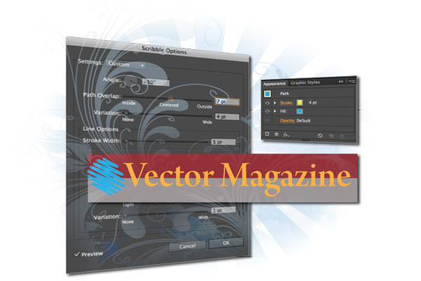
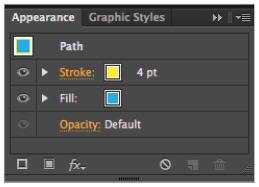
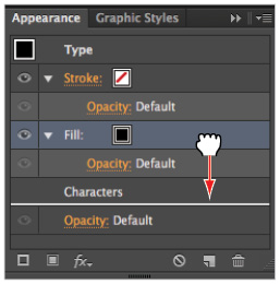
5 Choose the Direct Selection tool (![]() ) from the Tools panel and select the blue and yellow hexagon to the left of the Vector Magazine text at the top of the page. When you select an object, group, or layer, the selection’s attributes are listed in the Appearance panel. There are currently three attributes for this object: Stroke, Fill, and Default Opacity.
) from the Tools panel and select the blue and yellow hexagon to the left of the Vector Magazine text at the top of the page. When you select an object, group, or layer, the selection’s attributes are listed in the Appearance panel. There are currently three attributes for this object: Stroke, Fill, and Default Opacity.
Attributes affect the look or style of an object but they do not affect the structure. Attributes in Illustrator are strokes, fills, transparency, and effects. The order in which the appearance attributes appear in the panel affects the appearance of the object. For an overview of the Appearance panel, review Lesson 1, “Adobe Illustrator CC Jumpstart.”
Attributes in the Appearance panel.
6 Select the text to the right of the object. The appearance attributes for the text object are Characters and Default opacity.
7 Double-click the Characters attribute in the Appearance panel. Stroke and Fill attributes now appear listed in the panel, indicating that they are nested inside.
8 Select the Type: No Appearance attribute at the top of the Appearance panel to return to the default view.
Applying effects
As you saw in the last exercise, the Appearance panel is a convenient location to view and modify the fill and stroke of an object. When you add an effect to an object, the effect name is also listed in the Appearance panel and you are able to modify the effect by double-clicking it.
1 Choose the Selection tool (![]() ) from the Tools panel and select the blue and yellow hexagon to the left of the Vector Magazine text at the top of the page. You will now add an effect to the entire object.
) from the Tools panel and select the blue and yellow hexagon to the left of the Vector Magazine text at the top of the page. You will now add an effect to the entire object.
2 Choose the Effect menu at the top of the workspace, and in the Illustrator Effects portion of the drop-down menu, choose Stylize > Scribble. The Scribble Options dialog box appears. Click and drag the window to the side, if necessary, in order to see the original object.

Open the Scribble Options dialog box by choosing Effect > Stylize > Scribble.
3 Make sure the Preview check box on the left side of the dialog box is selected so you can view any applied effect in real time. The default scribble effect is visible and is currently being applied to the entire object.
4 Choose Loose from the Settings drop-down menu. The appearance of the shape changes, based on the values of this preset. Click OK.
In the Appearance panel, note the order of the attributes. The top of the panel reads Path (which is the path of the hexagon), and listed below are Stroke, Fill, and Scribble. (You might need to extend the panel to see all of the attributes). These three attributes apply to the path. You will now apply the Scribble effect to the fill only.
5 In the Appearance panel, click the Scribble effect and drag it on top of the Fill. When you see the Fill attribute highlighted, release the mouse to apply the effect.

Move the Scribble attribute onto the Fill attribute.
The Scribble effect is now nested inside the Fill attribute (with the Opacity attribute) and the stroke is unaffected.
6 Click the arrow next to the Fill attribute to collapse it. You might find that collapsing these nested attributes makes it easier to understand the hierarchy within the Appearance panel.
7 Select the Stroke attribute in the Appearance panel. Click the arrow to the right of the Stroke box in the Control panel and select None (![]() ) to remove the 4 pt yellow stroke.
) to remove the 4 pt yellow stroke.
In a later exercise, you will learn how reordering effect attributes allows you to create more complex effects.
8 Choose File > Save to save your work.
Editing effects
Once you have added an effect, it is fairly easy to modify it through the Appearance panel.
1 In the document window, click the object with the scribble applied to it to select it. If necessary, choose Window > Appearance or click the Appearance button (![]() ) in the dock to open the Appearance panel, then click the arrow to the left of the Fill attribute to expand it.
) in the dock to open the Appearance panel, then click the arrow to the left of the Fill attribute to expand it.
2 Double-click the Scribble effect, and the Scribble Options dialog box appears. Any visible effect in the Appearance panel can be modified directly from within the Appearance panel.
3 Choose Sketch from the Settings drop-down menu.
4 Move the Path Overlap slider to the right, or type 7 pt into the Path Overlap field. This demonstrates how the shape’s original structure, including the anchor points, is constant; only the shape’s appearance has been modified. Notice also that when you change one of the values in the Scribble Options dialog box, the Settings drop-down menu changes to Custom.
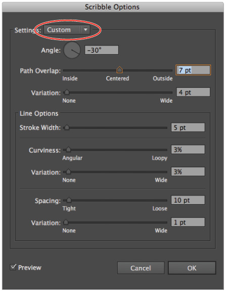
The Settings drop-down menu changes to Custom once you modify a setting in the Scribble Options dialog box.
5 Click OK to close the dialog box and modify the effect.
Using graphic styles
In the previous exercise, you created and modified an effect, but what if you wanted to apply this same effect to different objects? For example, what if you were creating multiple headers in the same style as the first? Or perhaps you would like to use the same effect in another project. In all these cases you would use Illustrator CC’s Graphic Styles feature.
Graphic styles allow you to reuse common styles within a single document or between documents. In this exercise, you will add a preset graphic style and then create and save your own.
1 Using the Selection tool (![]() ), select the second Vector Magazine headline located above the title Using Graphic Styles (the second heading from the top of the document).
), select the second Vector Magazine headline located above the title Using Graphic Styles (the second heading from the top of the document).
2 Click the Graphic Styles button (![]() ) in the dock or choose Window > Graphic Styles to open the Graphic Styles panel.
) in the dock or choose Window > Graphic Styles to open the Graphic Styles panel.
3 Click the panel menu button (![]() ) in the upper-right corner of the Graphic Styles panel and select Open Graphic Style Library, then choose Type Effects. The Type Effects panel appears with a series of thumbnails representing the various type styles. Illustrator CC comes pre-installed with a number of Graphic Style Libraries.
) in the upper-right corner of the Graphic Styles panel and select Open Graphic Style Library, then choose Type Effects. The Type Effects panel appears with a series of thumbnails representing the various type styles. Illustrator CC comes pre-installed with a number of Graphic Style Libraries.
4 Click the panel menu button of the Type Effects panel and choose Large List View. This allows you to view the names of the graphic styles, as well as the styles’ corresponding thumbnails.
5 Scroll down to select the Shadow style, and the appearance of the type changes to a white fill with a gray shadow. This is an example of a graphic style preset. The original orange color of your text has been overwritten, since the graphic style’s fill color was saved as white. Close the Type Effects panel.
6 Click the Appearance button (![]() ) in the dock or click the Appearance tab to open the Appearance panel, and scroll down if necessary to see the two fill colors and the Shadow effects that make up the Shadow text style. While many of the preset styles in Illustrator are fairly sophisticated, they often will not match your project. While it is possible to modify graphic styles, it is usually more efficient to create your own. You will now do just that.
) in the dock or click the Appearance tab to open the Appearance panel, and scroll down if necessary to see the two fill colors and the Shadow effects that make up the Shadow text style. While many of the preset styles in Illustrator are fairly sophisticated, they often will not match your project. While it is possible to modify graphic styles, it is usually more efficient to create your own. You will now do just that.
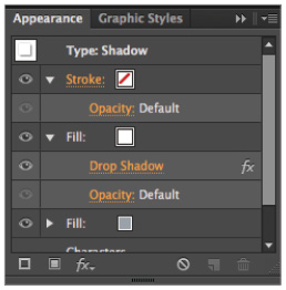
The Appearance panel with updated attributes.
Creating and saving graphic styles
Creating your own graphic styles gives you the most flexibility and allows you to easily reuse your own assets. In this exercise, you will add an extra fill and the transform effect to create a custom outline style for your logo.
1 Select the third Vector Magazine headline (the one above the Creating and Saving Graphic Styles title).
2 Click the panel menu button (![]() ) in the Appearance panel and choose Add New Fill. By default, the fill is black. Because this new fill is located above the content, it overrides the original orange color. You will now reorder the attributes, placing the new fill below the Characters attribute. Note that there is also a Stroke attribute of None that was automatically added in the last step. When you add a new fill, a stroke is necessary as well.
) in the Appearance panel and choose Add New Fill. By default, the fill is black. Because this new fill is located above the content, it overrides the original orange color. You will now reorder the attributes, placing the new fill below the Characters attribute. Note that there is also a Stroke attribute of None that was automatically added in the last step. When you add a new fill, a stroke is necessary as well.
3 Click and drag the black fill so that it is below the Characters attribute and the headline’s fill reverts to orange. Reordering appearance attributes is very similar to the way you reorder layers in Illustrator. The attributes closer to the top are displayed first. You will now add an effect to this new fill to create an outlined appearance.
Re-order the attributes in the Appearance panel.
4 Click to the right of the new black fill to select it. From the bottom of the Appearance panel, choose Effect > Path > Offset Path. The Offset Path dialog box appears. The value for the Offset should be 10 pt (which is the default). If it is not, type 10 in the Offset text field. Select the Preview check box to see the effect.
5 Choose Round from the Joins drop-down menu and click OK.
6 In the Appearance panel, notice the Offset Path effect listed under the Fill attribute. Select the Fill attribute and click the built-in color swatch to see the color options. Select the yellow swatch in the top row, CMYK Yellow.
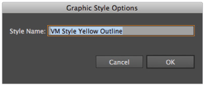
7 Click the Graphic Styles button (![]() ) in the dock to open the Graphic Styles panel. Alt+click (Windows) or Option+click (Mac OS) the New Graphic Style button (
) in the dock to open the Graphic Styles panel. Alt+click (Windows) or Option+click (Mac OS) the New Graphic Style button (![]() ) at the bottom of the panel. When the Graphic Style Options dialog box appears, type VM Style Yellow Outline in the Style Name text field and click OK.
) at the bottom of the panel. When the Graphic Style Options dialog box appears, type VM Style Yellow Outline in the Style Name text field and click OK.
The Graphic Style Options dialog box.
8 Notice the last thumbnail in the Graphic Styles panel. The style you just created is listed last and is ready to be used on other objects.
Applying and modifying graphic styles
Now that you have created a graphic style, you can apply that style to objects, groups, and even entire layers. Additionally, you can share graphic styles between documents.
1 Select the smaller Vector Magazine headline, located at the bottom of the document. You will now apply and modify the graphic style you created in the last exercise.
2 Select the VM Style Yellow Outline style in the Graphic Styles panel. For obvious reasons, the effect doesn’t work when applied to a smaller object. However, it’s easy to modify the size using the Appearance panel.
3 Click the Appearance button (![]() ) in the dock, or click the Appearance tab, if necessary, to open the Appearance panel. If necessary, click the arrow to the left of the Fill attribute to expand it and double-click the Offset Path effect to open the Offset Path dialog box. Highlight the value in the Offset text field, then type 2 pt.
) in the dock, or click the Appearance tab, if necessary, to open the Appearance panel. If necessary, click the arrow to the left of the Fill attribute to expand it and double-click the Offset Path effect to open the Offset Path dialog box. Highlight the value in the Offset text field, then type 2 pt.
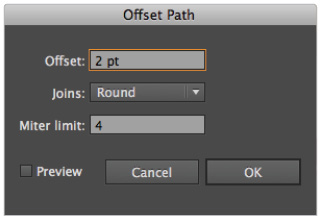
The Offset Path dialog box.
4 Click OK to apply the change.
5 Choose File > Save to save your work.
Working with object transparency
If you have worked with Illustrator or other image editing applications before you might have worked with transparency (also called opacity). Objects in Illustrator are 100 percent opaque by default, meaning that the fill and stroke of an object cover underlying objects. Reducing the opacity of an object reveals the underlying objects and can be used to create interesting layered effects. As you have seen in this lesson, objects in Illustrator can have multiple attributes in the Appearance panel, such as the extra Fill attributes and the Offset Path effect in the previous exercise. These attributes can be selected and their transparencies independently controlled using the Appearance panel. For this exercise, it might be useful to undock both the Appearance and Transparency panels so they are easily accessible.
1 Select the VM logo at the very bottom of the document. Click the Graphic Styles button (![]() ) in the dock to open the Graphic Styles panel.
) in the dock to open the Graphic Styles panel.
2 Select the VM Style Yellow Outline graphic style you created in the previous exercise to apply it to the VM logo.
3 Click the Appearance button (![]() ) in the dock or click the Appearance tab to open the Appearance panel. The attributes from your graphic style have been applied.
) in the dock or click the Appearance tab to open the Appearance panel. The attributes from your graphic style have been applied.
4 Choose Window > Transparency or click the Transparency button (![]() ) in the dock to open the Transparency panel. The opacity value is 100 percent.
) in the dock to open the Transparency panel. The opacity value is 100 percent.
5 Highlight the value in the Opacity text field, type 30, then press Enter (Windows) or Return (Mac OS). The entire object is now set to 30 percent opacity. Notice that the colored square behind the type now shows through. Additionally, the opacity value of 30 percent is visible in the Appearance panel.
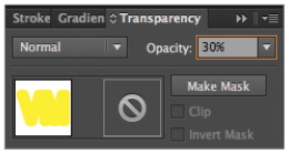
Change the opacity in the Transparency panel.
6 Click inside the Opacity text field and press the up arrow on your keyboard. The opacity value begins to increase by 1 percent increments. Stop when you reach 50 percent. Press and hold the Shift key and press the up arrow; the value now increases by 10 percent. Stop increasing the value when you get to 100 percent, the original opacity.
Working with multiple opacities
You can also control each of an object’s many attributes independently, which gives you precise control over the object’s appearance.
1 Select the VM logo, if it is not already selected. Open the Appearance panel and double-click the Characters attribute. This expands the characters, allowing you to view and modify the fill and stroke of the text object. Set the Fill color of the text to the first orange swatch in the second row of the Swatches panel.
 Text is different from other Illustrator objects such as shapes. Because a single word is composed of multiple characters, Illustrator nests the Fill, Stroke, and Transparency attributes inside the Characters attribute.
2 Click once on Opacity (the default attribute at the bottom of the Appearance panel) to open the Transparency panel, then click inside the Opacity field. Press and hold the Shift key and press the down arrow until the value is 50 percent. Press Enter (Windows) or Return (Mac OS).
3 In the Appearance panel, select the Type attribute listed at the top to return to the standard attribute list. The orange fill of the text is set to 50 percent but the yellow fill still has its default 100 percent opacity.
4 Select the Fill attribute in the Appearance panel. Open the Transparency panel, highlight the value in the Opacity text field, type 20, then press Enter (Windows) or Return (Mac OS). This fades the yellow fill and the offset effect to 20 percent, while the fill of the characters remains at 50 percent.
5 In the Appearance panel, click the arrow to the left of the Fill attribute and scroll down if necessary; notice the opacity is set to 20 percent. Click the arrow again to hide the Fill attributes.
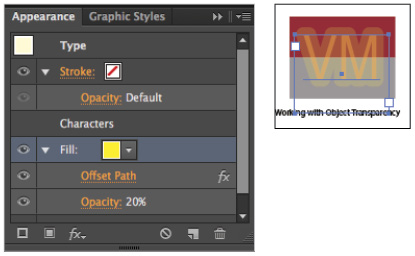
The Appearance panel reflects the opacity that was set.
6 Click once on the word Opacity at the bottom of the Appearance panel and notice that the opacity is still set to 100 percent. Change the value to 75%, then press Enter (Windows) or Return (Mac OS). The entire object now fades. There are three levels of opacity in this object: the opacity of the characters themselves, the opacity of the separate yellow fill and effect, and the opacity of the entire object.
7 Choose File > Save to save your work.
Working with blending modes
Blending modes are another feature you might be familiar with from other applications, particularly Photoshop. Blending modes let you change the ways in which the objects’ colors blend with the colors of underlying objects. When a blending mode is applied to an object, the effect of the blending mode is seen on any objects that lie beneath the object’s layer or group. Like opacity, you can control the blending modes of the separate attributes in an object.
1 Using the Selection tool, click to select the blue and yellow object in the bottom-right corner of the document. Open the Appearance panel. This object has a yellow stroke of 4 points and a blue fill. You will now apply a blending mode to this object. First, you will magnify your view of the object. This will help you to better understand blending modes.
2 Select the Zoom tool (![]() ) from the Tools panel and click the object until the magnification is 300 percent. The magnification value is listed in the document’s title bar, and in a drop-down menu in the lower-left corner of the workspace.
) from the Tools panel and click the object until the magnification is 300 percent. The magnification value is listed in the document’s title bar, and in a drop-down menu in the lower-left corner of the workspace.
3 Click the Transparency button (![]() ) to open the Transparency panel. Choose Darken from the Blending mode drop-down menu. The hexagon blends with the background behind it.
) to open the Transparency panel. Choose Darken from the Blending mode drop-down menu. The hexagon blends with the background behind it.
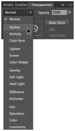
Choose Darken from the Blending mode drop-down menu.
Understanding blending modes is easier when you use the following terminology: the blend color is the original color of an object; in this case, the yellow stroke and blue fill. The base color refers to the underlying color(s); in this case, the maroon and gray. The resulting color is how it appears to the eye.
For specific details on the various blending modes, refer to the Transparency and Blending Modes section in the Painting section of the Illustrator CC Help Viewer.
4 Choose Normal from the Blending mode drop-down menu in the Transparency panel to return the object to its original state.
5 Return to the Appearance panel and select the Stroke attribute. Open the Transparency panel again and choose Multiply from the drop-down menu. Notice how the stroke now interacts with not only its background, but also the fill color. This is because it is located above the fill in the hierarchy of the Appearance panel.
6 In the Appearance panel, click and drag Stroke (in the list) below the Fill. Notice the change in the hexagon’s coloring. Since the stroke is now below the fill, it is only blending with the underlying colors.

Move the Stroke attribute beneath the Fill attribute.
7 Select the Fill attribute, and in the Transparency panel, choose Overlay from the Blending Mode drop-down menu. Because the fill is above both the stroke and the underlying colors, it blends with both.
Saving and importing graphic styles
Earlier in the lesson, you created the VM Style Yellow Outline graphic style. You can apply that style to objects, groups, and even entire layers. You will apply the style to groups and layers shortly, but first you will learn how to share graphic styles between documents.
1 Press Ctrl+Shift+A (Windows) or Command+Shift+A (Mac OS) to deselect everything in the document.
2 Open the Graphic Styles panel. Ctrl+click (Windows) or Command+click (Mac OS) on all the default graphic styles except the VM Style Yellow Outline style.
3 With the default styles selected, click the Delete Graphic Style button (![]() ) at the bottom of the Graphic Styles panel. When the warning message appears, click Yes. You are deleting these styles because you do not want them to be saved as part of your new Graphic Style library.
) at the bottom of the Graphic Styles panel. When the warning message appears, click Yes. You are deleting these styles because you do not want them to be saved as part of your new Graphic Style library.
4 Click the panel menu button (![]() ) in the upper-right corner of the Graphic Styles panel and choose Save Graphic Style Library.
) in the upper-right corner of the Graphic Styles panel and choose Save Graphic Style Library.
The Save Graphic Styles as Library dialog box appears. Normally, you are directed to save libraries in your system folder. For this exercise, navigate to the ai11lessons folder. In the Name text field, type ai1101_styles.ai and click Save.
5 Choose File > Save to save your work, then choose File > Close.
6 Choose File > Open. In the Open dialog box, navigate to the ai11lessons folder and select the ai1102.ai file. Click Open.
7 Choose File > Save As. In the Save As dialog box, navigate to the ai11lessons folder and type ai1102_work.ai in the Name text field. Click Save. When the Illustrator Options dialog box appears, leave the settings at their defaults and click OK. You will now import the Graphic Style library you just saved.
8 Click the Graphic Styles button in the dock (![]() ) to open the Graphic Styles panel. Click the panel menu button and choose Open Graphic Style Library > Other Library. The Select a library to open dialog box appears. Navigate to the ai11lessons folder, select the ai1101_styles.ai file, then click OK (Windows) or Open (Mac OS). The ai1101_styles.ai graphic styles open in a separate panel.
) to open the Graphic Styles panel. Click the panel menu button and choose Open Graphic Style Library > Other Library. The Select a library to open dialog box appears. Navigate to the ai11lessons folder, select the ai1101_styles.ai file, then click OK (Windows) or Open (Mac OS). The ai1101_styles.ai graphic styles open in a separate panel.
Applying graphic styles to layers and symbols
In addition to applying graphic styles to a single object, you can also apply them to all objects in a layer. In this example, there are three different examples of the same logotype, and you are interested in seeing how the same effect looks on each of them.
1 Click the Layers button (![]() ) in the dock to open the Layers panel. Click in the empty area just to the right of the Click to Target button (
) in the dock to open the Layers panel. Click in the empty area just to the right of the Click to Target button (![]() ) to the right of the Three logos layer name to target the entire layer. All three objects on the artboard are on the same layer and are automatically selected.
) to the right of the Three logos layer name to target the entire layer. All three objects on the artboard are on the same layer and are automatically selected.
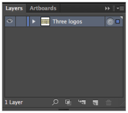
Click where you see the blue dot to target and thus apply attributes to the entire layer.
2 Select the VM Style Yellow Outline style from the ai1101_styles panel. All three objects now have the same style applied to them.
3 Choose Window > Symbols or click the Symbols button (![]() ) in the dock to open the Symbols panel. From the default group of symbols, click and drag the Cloud symbol onto the artboard. Notice that the graphic style is automatically applied to the cloud symbol instance you just added to the document. Since you targeted the entire layer, all objects on the layer with a graphic style applied inherit the style’s properties.
) in the dock to open the Symbols panel. From the default group of symbols, click and drag the Cloud symbol onto the artboard. Notice that the graphic style is automatically applied to the cloud symbol instance you just added to the document. Since you targeted the entire layer, all objects on the layer with a graphic style applied inherit the style’s properties.
If you want to add a new object without the graphic style, the best idea is to place it on a new layer. In this case, you will remove the graphic style from the layer and then reapply it to the three logos as a group.
4 Open the Appearance panel and select the Layer: VM Style Yellow Outline attribute at the top of the panel to select all the objects on your artboard. At the bottom of the Appearance panel, click the Clear Appearance button (![]() ) to remove the graphic style.
) to remove the graphic style.
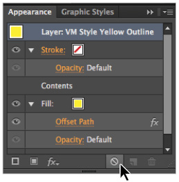
Click the Clear Appearance button.
5 Using the Selection tool, click anywhere in the background of the document to deselect the objects. Place your cursor above the three logos, then click and drag downwards making a selection marquee that crosses into them. Release to select them (but not the cloud illustration).
6 Click the VM Style Yellow Outline graphic style in the ai1101_styles panel to apply it to the group of three logos.
7 Choose File > Save to save your work, then choose File > Close.
Self study
You can create unique graphic styles for your projects by combining combinations of effects, fills, strokes, and transparencies. Experiment with the following combinations; when you find ones that you like, be sure to save them into a library for reuse.
1 Open a new Graphic Style library in the Graphic Style panel. The Image Effects and Artistic Effects libraries are good places to start. Apply a complex graphic style preset to an object and break down the way it was created by looking at the order and properties of the attributes in the Appearance panel. Reverse-engineering the Illustrator CC presets is an excellent way to learn useful combinations for your own projects.
2 Create a graphic style that uses a gradient as a fill color. Applying this graphic style to rectangles or circles will allow you to make buttons for the Web, for example. Also try applying gradients to text for interesting effects, being sure to save the graphic style.
3 Create a bull’s-eye graphic. Use a basic circle shape with a large stroke. Add multiple strokes using the Appearance panel and apply the Transform effect, increasing the horizontal and vertical scale as necessary.
Review
Questions
1 What are the attributes of an object and where are they located in Illustrator?
2 After you add an effect to an object, what are the steps you need to take to modify the effect?
3 What are graphic styles? Name at least one advantage and disadvantage to using preset graphic styles.
4 True or False: The attributes of an object in Illustrator can have multiple levels of transparency.
5 How are graphic styles shared between documents?
Answers
1 The attributes of an object can be broken down into four categories: Fill attributes, Stroke attributes, Transparency attributes, and Effects attributes. These attributes are editable and are located in the Appearance panel, where they can also be modified.
2 You can edit an effect by double-clicking the effect name in the Appearance panel. Double-clicking the effect name opens an effect dialog box, allowing you to make changes.
3 Graphic styles are combinations of attributes that have been saved into a library. An advantage of graphic styles is the ability to quickly apply a complex style to an object or multiple objects. A disadvantage to using preset styles is that the style might not match the design of your project.
4 True. An object in Illustrator, such as a circle, might have attributes such as a stroke, a fill, and an applied effect. The transparency of these attributes can be controlled independently of each other. Additionally, each of the attributes has a blending mode that can be controlled.
5 After you create a custom graphic style, you can save it by clicking the panel menu button in the Graphic Styles panel and choosing Save Graphic Style Library. In another document, choose Open Graphic Style Library > Other Library from the Graphic Styles panel menu and select the custom library. Once this library is available in the new document, you can use the graphic styles.