
Lesson 14: Implementing the Checkout Process
In this lesson, you will:
• Use states as the basis for implementing navigation
• Learn about two-way binding
• Work with the Form class
Imperative to any application is a navigation system. Users should be able to move easily around in an application and locate the functionality they need. Some navigation will be completely at the user’s discretion, such as clicking a button to move to the home page or the checkout process. Other navigation can be tightly controlled by the developer—for example, a checkout process in which users cannot proceed to the next screen until certain conditions are met on an existing screen.

The checkout process will be controlled by states.
Introducing Navigation with States
In Lesson 3, “Laying Out the Interface,” you learned how you can use states to change the appearance of a component at runtime. In this lesson, you’ll take the same states idea, but instead of just changing the appearance, you’ll change which of several components are shown to the user, so that they can see only one child at a time. To implement this, you’ll use a container with a basic layout (so the children can all be positioned at the 0, 0 point), and use the includeIn property, so only one of the children is available in each state.
Introducing Two-Way Bindings
In Lesson 8, “Using Data Binding and Collections,” you learned about data binding, which updates the view components when data changes. Flex 4 introduces a second type of data binding called two-way binding. Two-way binding is most effective when combined with user input forms.
In this type of data binding, view components are updated when data changes; however, the data is also updated when the component changes. You can think of regular data binding as moving in one direction: When the data changes, the view changes. You can think of two-way binding as bidirectional: If either changes, the other updates.
In practice, two-way binding is extremely easy to use. There is simply a syntax difference when declaring a control as bound to data.
To bind a TextInput to a piece of data using traditional data binding, your code would look like this:
<s:TextInput text="{someData}"/>
To use two-way binding, you simply prepend the expression with the @ symbol:
<s:TextInput text="@{someData}"/>
Two-way binding does have one limitation at this time: The types of both the source and destination must be the same. With traditional data binding, you can bind a variable declared as a Number to the text input of a Label, even though that Label is expecting a String instance. Traditional data binding will attempt to convert the Number to a String on your behalf. Two-way data binding cannot work unless both the source and destination are the same.
Creating the OrderInfo valueObject
Throughout this chapter, you’ll be building the checkout process for the FlexGrocer application. In this process, users will be presented with a series of components to allow them to enter various types of information (shipping info, billing info) and a confirmation screen. The information users enter will be stored in a value object. Using two-way data binding, the value object can be populated automatically as the user fills out the form. The first step in this process is to create the OrderInfo object.
- Open the FlexGrocer.mxml file that you created in the previous lesson.
Alternatively, if you didn’t complete the previous lesson or your code is not functioning properly, you can import the FlexGrocer.fxp project from the Lesson14/start folder. Please refer to the appendix for complete instructions on importing a project should you skip a lesson or if you have a code issue you cannot resolve.
- In the declarations section, create an instance of the ShoppingCart class, and give it an
idofshoppingCart.<fx:Declarations>
<!-- Place non-visual elements (e.g., services, value objects) here -->
<services:CategoryService id="categoryService"/>
<services:ProductService id="productService"/>
<cart:ShoppingCart id="shoppingCart"/>
</fx:Declarations>You’ll need access to the same shopping cart from both the shopping and checkout experience, so you’ll create it here in the main application, and pass it into the places where it is used.
- Find the place where the ShoppingView is instantiated; populate its
shoppingCartproperty with a binding to theshoppingCartinstance you created in the previous step.<views:ShoppingView id="bodyGroup"
width="100%" height="100%"
groceryInventory="{productService.products}"
shoppingCart="{shoppingCart}" /> - Open ShoppingView.mxml. Find the property declaration for the public
shoppingCartproperty. Remove the equal sign and everything after it, so the property is declared, but not instantiated:public var shoppingCart:ShoppingCart;
Since the cart is now passed in from the main application, you no longer want to create it here.
- Right-click on the valueObjects package, and choose New ActionScript Class. Leave the package as valueObjects, and name the class OrderInfo. Leave the other elements with the default values, and click Finish.
- Decorate the class with the Bindable metadata.
package valueObjects {
[Bindable]
public class OrderInfo {
public function OrderInfo() {
}
}
} - Before the constructor, define public properties for
billingName,billingAddress,billingCity,billingState,billingZip,cardType,cardNumber,cardExpirationMonth, andcardExpirationYear. Define all nine of these properties to use a String as a data type.package valueObjects {
[Bindable]
public class OrderInfo {
public var billingName:String;
public var billingAddress:String;
public var billingCity:String;
public var billingState:String;
public var billingZip:String;
public var cardType:String;
public var cardNumber:String;
public var cardExpirationMonth:String;
public var cardExpirationYear:String;
public function OrderInfo() {
}
}
} - Save and close the OrderInfo.
This completes the OrderInfo class. In the next exercise, you’ll create the CheckoutView component, which will use an instance of this class.
Creating CheckoutView
Next, you’ll create the CheckoutView component, which contains the views a user will experience in the checkout process.
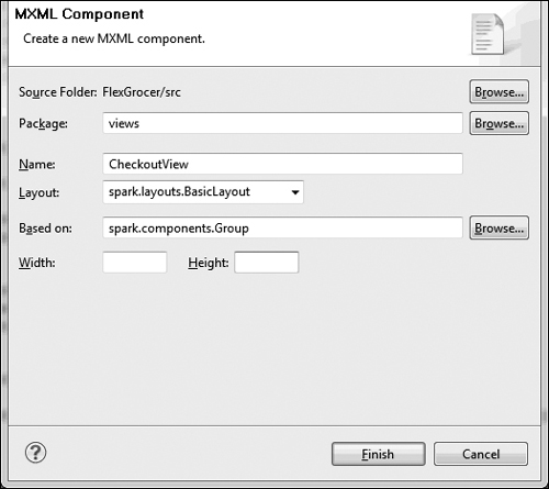
- Right-click the views package and create a new MXML Component. Leave the Package set as views, give the component a Name of CheckoutView, set the Layout to be spark.layouts.BasicLayout, leave the Based on value as spark.components.Group, and remove the values from the Width and Height fields.
- After the end of the layout block, create a states block to hold the states. You’ll use the
<s:states>tag (with a lower casesin states), as you are addressing thestatesproperty of this new component.<s:layout>
<s:BasicLayout/>
</s:layout>
<s:states>
</s:states> - Add three
<s:State>(capitalS) instances to define the states for the component. The first should have a name ofcustomerInfo, the secondbillingInfo, and the thirdreview.<s:states>
<s:State name="customerInfo"/>
<s:State name="billingInfo"/>
<s:State name="review"/>
</s:states>Here you are defining the three states of this component, which will show the individual views of the Checkout process.
- In the Declarations block, create an instance of the
valueObjectof OrderInfo. Give the instance anidoforderInfo.<fx:Declarations>
<!-- Place non-visual elements (e.g., services, value objects) here -->
<valueObjects:OrderInfo id="orderInfo"/>
</fx:Declarations>You now have an instance of the OrderInfo class that can be populated by the views to which it is passed. Next you’ll add a few methods to ease the process of navigating between the views.
- Create a Script block, and a private variable named
currentView, data typed as anint, with a default value of0.</s:states>
<fx:Script>
<![CDATA[
private var currentView:int=0;
]]>
</fx:Script>
<fx:Declarations>This will be used to keep track of which views users are on, so when they click a next button, you know what view to show them next.
- Create a private method named
setViewByIndex, which accepts an integer as a parameter and returnsvoid. In the method, create aswitchstatement that will set thecurrentStatetocustomerInfoif the value 1 is passed,billingInfoif a 2 is passed, andreviewif 3 is passed in.private function setViewByIndex(index:int):void{
switch(index){
case 0:
currentState="customerInfo";
break;
case 1:
currentState="billingInfo";
break;
case 2:
currentState="review";
break;
}
} - Create a private method called
handleProceedthat accepts aneventas an argument, and returnsvoid. In this method, increment the value ofcurrentView, and then passcurrentViewto thesetViewByIndexmethod.private function handleProceed( event:Event ):void {
currentView++;
setViewByIndex(currentView);
}Now, whenever a proceed event is heard, the currentState will be changed to the next state in the order. Next, you’ll create the CustomerInfo view, and set it to be shown in the proper state.
- Right-click the views package and choose new MXML Component. Set the Package to be views.checkout, set the Name to be CustomerInfo, set the Layout to spark.layouts.VerticalLayout, and leave the Based on as spark.components.Group. Remove the Width and Height values. Click Finish.

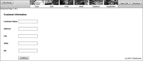
- Add a Label after the closing Declaration tag. Set the text of the Label to be Checkout Page 1 of 3.
- Add a Script block after the declarations but before the Label. Declare a public bindable property named
orderInfodata typed asvalueObjectof the OrderInfo.<fx:Declarations>
<!-- Place non-visual elements (e.g., services, value objects) here -->
</fx:Declarations>
<fx:Script>
<![CDATA[
import valueObjects.OrderInfo;
[Bindable]
public var orderInfo:OrderInfo;
]]>
</fx:Script>
<s:Label text="Checkout Page 1 of 3"/> - Open Checkout.mxml from the default package. Copy the entire form from the component. Switch back to CustomerInfo.mxml, and paste the form after the Label tag. Remove the x and y values from the
<s:Form>tag.<s:Label text="Checkout Page 1 of 3"/>
<s:Form >
<s:FormHeading label="Customer Information"/>
<s:FormItem label="Customer Name">
<s:TextInput/>
</s:FormItem>
<s:FormItem label="Address">
<s:TextInput/>
</s:FormItem>
<s:FormItem label="City">
<s:TextInput/>
</s:FormItem>
<s:FormItem label="State">
<s:TextInput/>
</s:FormItem>
<s:FormItem label="Zip">
<s:TextInput/>
</s:FormItem>
<s:FormItem>
<s:Button label="Continue"/>
</s:FormItem>
</s:Form> - Find the TextInput, which is a child of the first form item (which has a label Customer Name). Set the
textproperty of this TextInput to be a two-way binding to thebillingNameproperty of the orderInfo object.<s:TextInput text="@{orderInfo.billingName}"/>
As discussed earlier in the lesson, this syntax will create a two-way binding, so the control will initially be populated with the value of the
billingNameproperty of the orderInfo object, and if the user makes a change, the change will be stored automatically back in the orderInfo object. - Add similar two-way bindings for the text inputs in the Address, City, State, and Zip FormItems. The values you’ll bind to are
billingAddress,billingCity,billingState, andbillingZip.<s:Form >
<s:FormHeading label="Customer Information"/>
<s:FormItem label="Customer Name">
<s:TextInput text="@{orderInfo.billingName}"/>
</s:FormItem>
<s:FormItem label="Address">
<s:TextInput text="@{orderInfo.billingAddress}"/>
</s:FormItem>
<s:FormItem label="City">
<s:TextInput text="@{orderInfo.billingCity}"/>
</s:FormItem>
<s:FormItem label="State">
<s:TextInput text="@{orderInfo.billingState}"/>
</s:FormItem>
<s:FormItem label="Zip">
<s:TextInput text="@{orderInfo.billingZip}"/>
</s:FormItem>
<s:FormItem>
<s:Button label="Continue"/>
</s:FormItem>
</s:Form>Now your whole form is set to be bound to the billing properties of orderInfo.
- Add a
clickhander on the Continue button, which calls thehandleProceedmethod and passes theeventas an argument. With your cursor after the closing parentheses, which are after the word event, press Ctrl-1 and choose Generate event handler.
- In the newly created event handler, dispatch an event with the type
proceed.protected function handleProceed(event:MouseEvent):void{
dispatchEvent( new Event( "proceed" ) );
} - As a final step for this component, add metadata indicating that this class is capable of broadcasting an event with the name
proceedand a type offlash.events.Event.<fx:Metadata>
[Event(name="proceed", type="flash.events.Event")]
</fx:Metadata> - Save your file.
This completes the CustomerInfo component. The complete source for this component should appear like the following code.
<?xml version="1.0" encoding="utf-8"?>
<s:Group xmlns:fx="http://ns.adobe.com/mxml/2009"
xmlns:s="library://ns.adobe.com/flex/spark">
<s:layout>
<s:VerticalLayout/>
</s:layout>
<fx:Declarations>
<!-- Place non-visual elements (e.g., services, value objects) here -->
</fx:Declarations>
<fx:Metadata>
[Event(name="proceed", type="flash.events.Event")]
</fx:Metadata>
<fx:Script>
<![CDATA[
import valueObjects.OrderInfo;
[Bindable]
public var orderInfo:OrderInfo;
protected function handleProceed(event:MouseEvent):void{
dispatchEvent( new Event( "proceed" ) );
}
]]>
</fx:Script>
<s:Label text="Checkout Page 1 of 3"/>
<s:Form >
<s:FormHeading label="Customer Information"/>
<s:FormItem label="Customer Name">
<s:TextInput text="@{orderInfo.billingName}"/>
</s:FormItem>
<s:FormItem label="Address">
<s:TextInput text="@{orderInfo.billingAddress}"/>
</s:FormItem>
<s:FormItem label="City">
<s:TextInput text="@{orderInfo.billingCity}"/>
</s:FormItem>
<s:FormItem label="State">
<s:TextInput text="@{orderInfo.billingState}"/>
</s:FormItem>
<s:FormItem label="Zip">
<s:TextInput text="@{orderInfo.billingZip}"/>
</s:FormItem>
<s:FormItem>
<s:Button label="Continue" click="handleProceed(event)"/>
</s:FormItem>
</s:Form>
</s:Group>Next, you’ll instantiate this component in the CheckoutView component.
- Open CheckoutView.mxml. After the closing Declarations tag, add an instance of the CustomerInfo component. Assign a
widthandheightof 100%, bind the orderInfo object to theorderInfoproperty of the component, listen for theproceedevent, and call thehandleProceedmethod you wrote in a previous exercise. Lastly, set this component to be shown only in the customerInfo state, by using theincludeInattribute. The final code for CheckoutView should read like this:<?xml version="1.0" encoding="utf-8"?>
<s:Group xmlns:fx="http://ns.adobe.com/mxml/2009"
xmlns:s="library://ns.adobe.com/flex/spark" width="400" height="300" xmln
s:valueObjects="valueObjects.*" xmlns:checkout="views.checkout.*">
<s:layout>
<s:BasicLayout/>
</s:layout>
<s:states>
<s:State name="customerInfo"/>
<s:State name="billingInfo"/>
<s:State name="review"/>
</s:states>
<fx:Script>
<![CDATA[
private var currentView:int=0;
private function setViewByIndex(index:int):void{
switch(index){
case 0:
currentState="customerInfo";
break;
case 1:
currentState="billingInfo";
break;
case 2:
currentState="review";
break;
}
}
private function handleProceed( event:Event ):void {
currentView++;
setViewByIndex(currentView);
}
]]>
</fx:Script>
<fx:Declarations>
<!-- Place non-visual elements (e.g., services, value objects) here -->
<valueObjects:OrderInfo id="orderInfo"/>
</fx:Declarations>
<checkout:CustomerInfo width="100%" height="100%"
orderInfo="{orderInfo}"
proceed="handleProceed( event )"
includeIn="customerInfo"/>
</s:Group> - Save your file. CheckoutView is now equipped to work with your new component. The next step is to instantiate CheckoutView in the main application.
- Open FlexGrocer.mxml. After the closing declarations tag, add two states: one called shopping and the other called checkout.
<s:states>
<s:State name="shopping"/>
<s:State name="checkout"/>
</s:states> - Just after the bodyGroup instance of the ShoppingView component, create an instance of your CheckoutView component. Set the
widthandheightto 100%. Set theincludeInattribute to only show this component in the checkout state. Set theincludeInfor the ShoppingView to beshopping.<views:ShoppingView id="bodyGroup"
width="100%" height="100%"
groceryInventory="{productService.products}"
shoppingCart="{shoppingCart}"
includeIn="shopping"/>
<views:CheckoutView width="100%" height="100%"
includeIn="checkout"/> - Create a new method called
startCheckoutthat accepts aMouseEventas a parameter and returnsvoid. The body of the function should set the currentState to checkout. Call this function from theclickhandler ofbtnCheckout.protected function startCheckout(event:MouseEvent):void{
this.currentState="checkout";
}
...
<s:Button id="btnCheckout" y="10" right="10" label="Checkout"
click="startCheckout(event)"/> - Save and run the application. Now, if you click the Checkout button, the application will change states to show the CustomerInfo component.
Now your shopping application allows the user to add products to the shopping cart and to move to the checkout process.
Creating CreditCardInfo
The next step is to add a second page to the checkout process, which will allow the user to enter their billing info.
- Right-click the checkout package, and choose new MXML Component. Leave the Package as views.checkout, assign a name of CreditCardInfo, set the Layout to spark.layouts.VerticalLayout, and leave the Based on as spark.components.Group. Remove the Width and Height values. Click Finish.
- Copy the Metadata and Script block from the CustomerInfo component, and paste them in the CreditCardInfo component, after the Declarations block.
<fx:Metadata>
[Event(name="proceed", type="flash.events.Event")]
</fx:Metadata>
<fx:Script>
<![CDATA[
import valueObjects.OrderInfo;
[Bindable]
public var orderInfo:OrderInfo;
protected function handleProceed(event:MouseEvent):void{
dispatchEvent( new Event( "proceed" ) );
}
]]>
</fx:Script>Both components will use the orderInfo object, and both will broadcast a
proceedevent to indicate the user has finished with this page. - After the closing Script tag, add a label with its
textproperty set to “Checkout Page 2 of 3”.<s:Label text="Checkout Page 2 of 3"/>
- Add a Form tag after the label. Add a FormHeading that reads “Billing Information”. Add four form items. Their labels should be Credit Card Type, Card Number, and Expiration. The final FormItem should have no label.
<s:Label text="Checkout Page 2 of 3"/>
<s:Form>
<s:FormHeading label="Billing Information"/>
<s:FormItem label="Credit Card Type">
</s:FormItem>
<s:FormItem label="Card Number">
</s:FormItem>
<s:FormItem label="Expiration">
</s:FormItem>
<s:FormItem>
</s:FormItem>
</s:Form> - In the first FormItem, create a DropDownList. Use two-way binding to bind the
selectedItemproperty to the orderInfo’scardTypeproperty. Set therequireSelectionproperty totrue. Add a child tag to the DropDownList to address thedataProviderproperty. Inside the dataProvider, create an ArrayList that contains these five strings: American Express, Diners Club, Discover, Mastercard, and Visa.<s:FormItem label="Credit Card Type">
<s:DropDownList selectedItem="@{orderInfo.cardType}"
requireSelection="true">
<s:dataProvider>
<s:ArrayList>
<fx:String>American Express</fx:String>
<fx:String>Diners Club</fx:String>
<fx:String>Discover</fx:String>
<fx:String>MasterCard</fx:String>
<fx:String>Visa</fx:String>
</s:ArrayList>
</s:dataProvider>
</s:DropDownList>
</s:FormItem> - In the second FormItem (the one with the Card Number label), create a TextInput whose
textproperty has a two-way binding to thecardNumberproperty of orderInfo:<s:FormItem label="Card Number">
<s:TextInput text="@{orderInfo.cardNumber}"/>
</s:FormItem> - The third FormItem will have two DropDownLists: one to display months, and one to display years. To allow these to be horizontally next to each other, first add a HorizontalLayout to the FormItem.
<s:FormItem label="Expiration">
<s:layout>
<s:HorizontalLayout/>
</s:layout>
</s:FormItem> - Next, add the months DropDownList. Use two-way binding to bind the
selectedItemproperty to thecardExpirationMonthproperty of orderInfo. SetrequireSelectiontotrue. For a dataProvider, create an array list that contains strings for the names of the twelve months.<s:DropDownList selectedItem="@{orderInfo.cardExpirationMonth}"
requireSelection="true">
<s:dataProvider>
<s:ArrayList>
<fx:String>January</fx:String>
<fx:String>February</fx:String>
<fx:String>March</fx:String>
<fx:String>April</fx:String>
<fx:String>May</fx:String>
<fx:String>June</fx:String>
<fx:String>July</fx:String>
<fx:String>August</fx:String>
<fx:String>September</fx:String>
<fx:String>October</fx:String>
<fx:String>November</fx:String>
<fx:String>December</fx:String>
</s:ArrayList>
</s:dataProvider>
</s:DropDownList> - Still in the Expiration FormItem, add a second DropDownList. Use two-way binding to bind the
selectedItemproperty to thecardExpirationYearproperty of orderInfo. SetrequireSelectiontotrue. For a dataProvider, create an array list that contains strings with the years 2011 through 2016.<s:DropDownList selectedItem="@{orderInfo.cardExpirationYear}"
requireSelection="true">
<s:dataProvider>
<s:ArrayList>
<fx:String>2011</fx:String>
<fx:String>2012</fx:String>
<fx:String>2013</fx:String>
<fx:String>2014</fx:String>
<fx:String>2015</fx:String>
<fx:String>2016</fx:String>
</s:ArrayList>
</s:dataProvider>
</s:DropDownList> - In the final FormItem, add a button with the label
Proceed, and aclickHandlerthat calls thehandleProceedmethod and passes the event as an argument. The full CreditCardInfo component should read like this:<?xml version="1.0" encoding="utf-8"?>
<s:Group xmlns:fx="http://ns.adobe.com/mxml/2009"
xmlns:s="library://ns.adobe.com/flex/spark">
<s:layout>
<s:VerticalLayout/>
</s:layout>
<fx:Declarations>
<!-- Place non-visual elements (e.g., services, value objects) here -->
</fx:Declarations>
<fx:Metadata>
[Event(name="proceed", type="flash.events.Event")]
</fx:Metadata>
<fx:Script>
<![CDATA[
import valueObjects.OrderInfo;
[Bindable]
public var orderInfo:OrderInfo;
protected function handleProceed(event:MouseEvent):void{
dispatchEvent( new Event( "proceed" ) );
}
]]>
</fx:Script>
<s:Label text="Checkout Page 2 of 3"/>
<s:Form>
<s:FormHeading label="Billing Information"/>
<s:FormItem label="Credit Card Type">
<s:DropDownList selectedItem="@{orderInfo.cardType}"
requireSelection="true">
<s:dataProvider>
<s:ArrayList>
<fx:String>American Express</fx:String>
<fx:String>Diners Club</fx:String>
<fx:String>Discover</fx:String>
<fx:String>MasterCard</fx:String>
<fx:String>Visa</fx:String>
</s:ArrayList>
</s:dataProvider>
</s:DropDownList>
</s:FormItem>
<s:FormItem label="Card Number">
<s:TextInput text="@{orderInfo.cardNumber}"/>
</s:FormItem>
<s:FormItem label="Expiration">
<s:layout>
<s:HorizontalLayout/>
</s:layout>
<s:DropDownList selectedItem=
"@{orderInfo.cardExpirationMonth}" requireSelection="true">
<s:dataProvider>
<s:ArrayList>
<fx:String>January</fx:String>
<fx:String>February</fx:String>
<fx:String>March</fx:String>
<fx:String>April</fx:String>
<fx:String>May</fx:String>
<fx:String>June</fx:String>
<fx:String>July</fx:String>
<fx:String>August</fx:String>
<fx:String>September</fx:String>
<fx:String>October</fx:String>
<fx:String>November</fx:String>
<fx:String>December</fx:String>
</s:ArrayList>
</s:dataProvider>
</s:DropDownList>
<s:DropDownList selectedItem="@{orderInfo.cardExpirationYear}"
requireSelection="true">
<s:dataProvider>
<s:ArrayList>
<fx:String>2011</fx:String>
<fx:String>2012</fx:String>
<fx:String>2013</fx:String>
<fx:String>2014</fx:String>
<fx:String>2015</fx:String>
<fx:String>2016</fx:String>
</s:ArrayList>
</s:dataProvider>
</s:DropDownList>
</s:FormItem>
<s:FormItem>
<s:Button label="Proceed" click="handleProceed( event )"/>
</s:FormItem>
</s:Form>
</s:Group> - Save CreditCardInfo. Open CheckoutView and add an instance of CreditCardInfo after the instance of CustomerInfo. Set the
widthandheightto be100%. Bind theorderInfoproperty to theorderInfoinstance. Add an event listener for theproceedevent that calls thehandleProceedmethod, and passes theeventobject. Set theincludeInto bebillingInfo.<checkout:CreditCardInfo width="100%" height="100%"
orderInfo="{orderInfo}"
proceed="handleProceed( event )"
includeIn="billingInfo"/>
- Save the files, then open and run FlexGrocer. Now when you click checkout, you should be able to navigate from Page 1 to Page 2 of the checkout process.
Creating Review
There is just one page left to create for the checkout process: the page that will let the user see their information and choose to either complete the order or go back and make changes.
- Right-click the checkout package, and choose new MXML Component. Leave the Package to be views.checkout, assign a name of Review, set the Layout to spark.layouts. VerticalLayout, and leave the Based on as spark.components.Group. Remove the Width and Height values. Click Finish.
- Add a Script block with a public bindable property called
orderInfoof typeOrderInfo<fx:Script>
<![CDATA[
import valueObjects.OrderInfo;
[Bindable]
public var orderInfo:OrderInfo;
]]>
</fx:Script> - After the Script block, create a label with the text “Checkout Page 3 of 3”.
<s:Label text="Checkout Page 3 of 3"/>
- Below the label, add an HGroup with a
widthof 100% and aheightof 90%<s:Label text="Checkout Page 3 of 3"/>
<s:HGroup width="100%" height="90%">
</s:HGroup>This HGroup will show the customer and billing information on the left and the shopping cart on the right.
- As a first child of the HGroup, add a Form that contains a FormHeading with a label Review and Checkout. The form should also contain four FormItems, with the labels Name, Address, and Card Type. The fourth FormItem should have no label.
<s:HGroup width="100%" height="90%">
<s:Form>
<s:FormHeading label="Review and Checkout"/>
<s:FormItem label="Name">
</s:FormItem>
<s:FormItem label="Address">
</s:FormItem>
<s:FormItem label="Card Type">
</s:FormItem>
<s:FormItem>
</s:FormItem>
</s:Form>
</s:HGroup> - In the first FormItem, add a Label, whose text is bound to the
billingNameproperty of the orderInfo object.<s:FormItem label="Name">
<s:Label text="{orderInfo.billingName}"/>
</s:FormItem>You don’t need a two-way binding here, because the user is not able to edit the object.
- In the second FormItem, add two labels. The first should be bound to orderInfo.billingAddress. The second will concatenate
orderInfo.billingCitywith a comma, space,orderInfo.billingState, space, and thenorderInfo.billingZip.<s:FormItem label="Address">
<s:Label text="{orderInfo.billingAddress}"/>
<s:Label text="{orderInfo.billingCity}, {orderInfo.billingState}
{orderInfo.billingZip}"/>
</s:FormItem> - The third FormItem will have a label, whose text is showing the
orderInfo.cardType.<s:FormItem label="Card Type">
<s:Label text="{orderInfo.cardType}"/>
</s:FormItem> - The final FormItem will have two buttons. The first should have a label of “Complete Order”, and the second label should read “Edit Information”. Add
clickhandlers for both to call methods you’ll write shortly calledhandleCompleteandhandleEdit.<s:FormItem>
<s:Button label="Complete Order" click="handleComplete( event )"/>
<s:Button label="Edit Information" click="handleEdit( event )"/>
</s:FormItem>If you prefer, you can use quick assist (Ctrl+1) to create these methods for you, as you have done in previous exercises.
Next, you’ll add an instance of CartGrid to show the user the items in their shopping cart. But first you’ll need to have a shopping cart property that will contain the data for their cart.
- In the Script block, just below the
orderInfoproperty, create a bindable public property namedshoppingCartof typeShoppingCart.import cart.ShoppingCart;
import valueObjects.OrderInfo;
[Bindable]
public var orderInfo:OrderInfo;
[Bindable]
public var shoppingCart:ShoppingCart;Don’t forget to ensure that cart.ShoppingCart is imported.
- After the closing Form tag, add a VGroup with a
widthandheightof 100%. Inside the VGroup, add an instance of your CartGrid component. Assign the CartGrid awidthandheightof 100%, and bind theshoppingCartproperty of the grid to theshoppingCartproperty of the Review class.<s:VGroup width="100%" height="100%">
<components:CartGrid width="100%" height="100%"
dataProvider="{shoppingCart.items}"/>
</s:VGroup> - Listen for a
removeProductevent from the cartGrid. Add an event handler that calls a function namedremoveProductHandlerand pass it the event object as an argument. Use quick assist to generate the function for you.<s:VGroup width="100%" height="100%">
<components:CartGrid width="100%" height="100%"
dataProvider="{shoppingCart.items}"
removeProduct="removeProductHandler(event)"/>
</s:VGroup> - In the Script block, find the newly generated method. In the method, create a new instance of the ShoppingCartItem class, passing the
event.productto its constructor. Then call theremoveItemmethod of the shoppingCart and pass it your newly created ShoppingCartItem.protected function removeProductHandler(event:ProductEvent):void
{
var sci:ShoppingCartItem = new ShoppingCartItem( event.product );
shoppingCart.removeItem( sci );
}Be sure you add an import for the ShoppingCartItem class.
- After the CartGrid, add a Label, whose text shows “Total:” followed by a binding to the shoppingCart.total property.
<s:VGroup width="100%" height="100%">
<components:CartGrid width="100%" height="100%"
dataProvider="{shoppingCart.items}"
removeProduct="removeProductHandler(event)"/>
<s:Label text="Total: {shoppingCart.total}"/>
</s:VGroup> - In the Script block, find the
handleCompletemethod. Create and dispatch a new Event with the typecompleteOrder.protected function handleComplete(event:MouseEvent):void
{
dispatchEvent( new Event( 'completeOrder' ) );
} - In the Script block, find the
handleEditmethod. Create and dispatch a newEventwith the typeeditInformation.protected function handleEdit(event:MouseEvent):void
{
dispatchEvent( new Event( 'editInformation' ) );
} - Create a Metadata block that defines the
completeOrderandeditInformationevents.<fx:Metadata>
[Event(name="editInformation", type="flash.events.Event")]
[Event(name="completeOrder", type="flash.events.Event")]
</fx:Metadata> - Save and close Review.mxml. This completes the Review component. Next you need to add it to the CheckoutView, and handle its events.
- Open CheckoutView.mxml. In the Script block, add a public bindable property called
shoppingCartof typeShoppingCart.[Bindable]
public var shoppingCart:ShoppingCart; - Create an instance of the Review component below the CreditCardInfo component. Set the
widthandheightto be 100%. Bind theorderInfoattribute to theorderInfo valueObject. Bind theshoppingCartattribute to the shoppingCart valueObject. Add event handlers for theeditInformationandcompleteOrderevents, and use quick assist to create those methods. Lastly, set theincludeInattribute to be review.<checkout:Review width="100%" height="100%"
orderInfo="{orderInfo}"
shoppingCart="{shoppingCart}"
editInformation="handleEdit( event )"
completeOrder="handleComplete( event )"
includeIn="review"/> - In the Script block, find the
handleEditmethod. In the body of the method, set the currentView to 0, and callsetViewByIndex, passing in the currentView.protected function handleEdit(event:Event):void
{
currentView=0;
setViewByIndex(currentView);
}Earlier, you built the currentView and setViewByIndex to allow for easily switching between states. By telling the CheckoutView component to go to view 0, you are sending them back to the CustomerInfo screen.
- Open FlexGrocer.mxml. Find the instantiation of the CheckoutView. Bind the
shoppingCartproperty toshoppingCart.<views:CheckoutView width="100%" height="100%"
includeIn="checkout"
shoppingCart="{shoppingCart}"/>
Completing the Order
The checkout process is almost complete. You still need an OrderEvent object to pass the OrderInfo back to the main application. You’ll create that in this next exercise. For now, if you save the files and run the application, you’ll see that you can add items to the cart, enter your information, step through to the confirmation page, and go back to edit the information.
- Right-click the events package and choose new ActionScript Class. Leave the Package as events, set the Name to be OrderEvent, and add flash.events.Event as the Superclass. Click Finish.
- In your new class, add a public property named
orderof typeOrderInfo.public var order:OrderInfo;
Be sure to import the valueObjects.OrderInfo class.
- Modify the constructor, so that an order object, of type OrderInfo, is passed as the second argument, between the type and bubbles parameters. In the body of the method, set
this.orderequal to theorderparameter, just after the call to the super class.public function OrderEvent(type:String, order:OrderInfo, bubbles:Boolean=false, cancelable:Boolean=false)
{
super(type, bubbles, cancelable);
this.order = order;
} - Override the clone method, so it returns a new instance of the OrderEvent. Your completed class should look like this:
package events
{
import flash.events.Event;
import valueObjects.OrderInfo;
public class OrderEvent extends Event
{
public var order:OrderInfo;
public function OrderEvent(type:String, order:OrderInfo, bubbles:Boolean=false, cancelable:Boolean=false)
{
super(type, bubbles, cancelable);
this.order = order;
}
public override function clone():Event{
return new OrderEvent(type, order, bubbles, cancelable);
}
}
} - Save and close the OrderEvent class.
- Open CheckoutView.mxml. Find the
handleCompletemethod. In this method, create and dispatch an OrderEvent, with the type set toplaceOrder, and using theorderInfoobject to populate itsorderproperty.protected function handleComplete(event:Event):void
{
dispatchEvent( new OrderEvent( 'placeOrder', orderInfo ) );
}Remember that you’ll need to import the OrderEvent class.
- Still in the
handleCompletemethod, reset the checkout process by setting thecurrentViewto 0 and passingcurrentViewtosetViewByIndex. The final step of the method is to clear out theorderInfoproperty by setting it equal to a newOrderInfo()instance:protected function handleComplete(event:Event):void
{
dispatchEvent( new OrderEvent( 'placeOrder', orderInfo ) );
currentView=0;
setViewByIndex(currentView);
orderInfo = new OrderInfo();
} - Add a Metadata tag block and declare the placeOrder event.
<fx:Metadata>
[Event(name="placeOrder",type="events.OrderEvent")]
</fx:Metadata> - Save CheckoutView, and open FlexGrocer. Find the instantiation of the CheckoutView, and add an event handler for the placeOrder event, which will call a method named
handlePlaceOrderand pass along the event object. Use the quick assist feature to have Flash Builder build this method for you. - Find the newly created
handlePlaceOrdermethod. Inside the method, reset the shopping cart (by instantiating a new ShoppingCart in its place) and set thecurrentStateto shopping:protected function handlePlaceOrder(event:OrderEvent):void
{
shoppingCart = new ShoppingCart();
this.currentState="shopping";
} - Find the button with the Flex Grocer label, and add a click handler, which calls a method named
returnToShopping. Pass an event object to the method. Use code assist to create this method. - In the newly created
returnToShoppingmethod, set thecurrentStateto shopping:protected function returnToShopping( event:MouseEvent ):void
{
this.currentState="shopping";
} - Save and run the application.
The only remaining problem is that users can start the checkout process even if they have no items in their cart. Although this isn’t really a problem, it can lead to user confusion. In the final step, you’ll dynamically enable/disable the checkout button, based on the contents of the cart.
- Back in FlexGrocer.mxml, find the btnCheckout button and use a binding expression to enable the button only if the cart’s total isn’t $0:
<s:Button id="btnCheckout" y="10" right="10" label="Checkout" click="startCheckout(event)" enabled="{shoppingCart.total != 0}"/>
- Save and run the application. This time it should be clearer to users that the checkout button is disabled until after they have added an item to the cart.
What You Have Learned
In this lesson, you have:
• Created a navigation structure to the application using states (pages 337–345)
• Used two-way binding to ease the process of sharing and editing data (pages 334–336)
• Implemented a full checkout process (pages 346–358)