
Chapter 2. AI-Powered Descriptive Analytics
In this chapter we will explore two different use cases and look at how AI can help us to do descriptive analytics faster and provide a more intuitive and seamless way to interact with large datasets - even for non-technical people. We will also find out how natural language capabilities of modern BI tools - in our particular example Power BI - will take away some of the mundane tasks from us.
Use Case 1: Querying Data with Natural Language
The typical analytical thinking process of a business user often starts with a simple question such as:
-
How were my sales last month?
-
Did we sell more this year than last year?
-
What’s the top selling product?
These questions are mostly descriptive in nature: Users first need to understand the status quo before they can dive deeper into the analysis or even anticipate future events.
The “classical” way to solve this problem would be for an analyst to generate a bunch of static reports for the most common questions. Another way to answer this problem is with self-service BI. Instead of pre-generating all important reports and visualisations, the business users themselves could slice and dice data and create the visualisations they need on their own.
However, there are two problems with the self-service approach:
First, for a business analyst or BI designer, it is immensely difficult to anticipate all of the most common questions with static reports or visualisations. The problem is, depending on which problem you look at and which people you ask, the exact area of interest can be fundamentally different. In corporate settings, this typically leads to long end exhaustive meetings with different business stakeholders discussing which plots to show in a dashboard.
And second, it is simply not possible to enable every possible thinking pathway through customizable drill-downs or additional dimensions. One topic often leads to one another and high level reports are often only the beginning to a plethora of more questions. These factors lead to complex dashboards just to show descriptive analytics from the past. Also, not all business users understand how to drill down or slice data. Dragging together different measures and dimensions to custom reports still means too much friction for non-technical consumers who are not trained data analysts.
What business users do instead is ask questions. This is where they would typically call in a data analyst for help, solving the problem of technical friction by looping in human support. Of course, this approach does naturally not scale well since in most corporate settings you will typically have more business users than data analysts. And even if you can afford having a lot of analytical know-how in house, you don’t want to keep your analysts busy with repetitive, easy-to-solve tasks.
Let’s now lay out the scenario for our example use case.
Problem Statement
We are looking at sales data in Power BI. Sales management has approached the BI team because they recognized a positive revenue trend and want to get some deeper understanding of what’s currently going on. As BI analysts, we were tasked to provide support to sales staff and help them to get insights with regards to revenue development in their particular areas of interest. In the same sense of self-service BI, we want to provide “help for self-help” and give sales people the possibility to interact with the data set seamlessly and without any technical friction.
Solution Overview
A more convenient way to get answers from data in an intuitive fashion is to simply let users ask questions against the data using natural language and have them answered automatically without any, or with very little, human assistance. Most people don’t realize that they’ve been trained in this method for years, or for however long they have been using an internet search engine like Google.
For example, if a business user wants to compare sales figures for a certain country with the numbers from last year, they might want to shoot off a query such as:
“Show me sales in the USA last year vs this year”
In fact, AI-powered Natural Language features let users just do that. What is happening under the hood is that an AI-powered Natural language model is interpreting the user input and tries to map it to available data in the dataset and come up with an appropriate visualisation for it. The experience should be quick, interactive, and frictionless.
We are using Power BI as our BI tool and we will leverage the built-in AI capabilities that Power BI has for our purpose. Other BI tools such as Tableau offer similar functionalities, but the details might be different. In any case, choosing a good BI front-end for this task is key, since you cannot add NLP capabilities to a BI software if there is no native support for this (or add-ons that are offering this).
In Power BI the NLP feature is called the Q&A visual. The Q&A visual lets you use natural language to explore your data in your own words. Q&A is interactive, and can be even fun. It seems like a good candidate for our problem statement.
The Q&A visual can be dragged onto a report just like any other visual so the user can perform custom queries against the data. The Q&A tool can also be added as a button in the ribbon, independent from a report and also be integrated into dashboards. The Q&A visual is free and available in both Power BI desktop and Power BI service. Mobile devices are supported with the Power BI apps on iOS and Android. The Q&A tool works with the following data sources: Imported data, live connection to Azure Analysis Services and SQL Server Analysis Services (via gateway) as well as Power BI datasets.
Power BI Walkthrough
To follow along with the following example, you will first need to download the Sales & Marketing sample PBIX file.
The dataset contains various sales and marketing data from a fictitious manufacturing company. The dataset comes pre-populated with some reports to keep track of the company’s market share, product volume, sales figures and sentiment scores. For our case study, we assume that all manufacturers in this dataset belong to one holding group so that we can analyse the total revenue as a metric of interest. In return, we are not so interested in the individual manufacturers’ market share as highlighted in the original scenario. You can learn more about the dataset from the website.
Let’s start to load the dataset into Power BI. You can either use Power BI Desktop or Power BI Service to follow along.
In the upper left section of Power BI, select File > Open report > Browse reports. Then,
select the Sales & Marketing sample PBIX file.
You should see the intro screen of this report file, as shown in Figure 4-1.
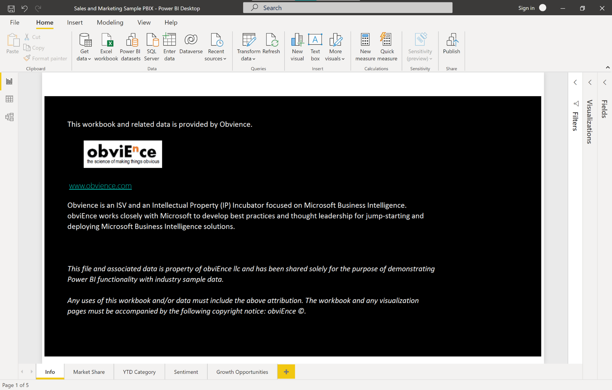
Figure 2-1. Sample Power BI Report
For now, we won’t bother with the pre-written reports and dashboards. Instead, we will start from scratch to explore revenues and sales figures.
We first need to add a new blank page to the report by clicking the plus sign at the bottom of the screen.
Select the Q&A visual icon from the visualizations pane (Figure 4-2) and drag it onto the canvas or simply double click the icon.

Figure 2-2. Q&A Visual
Drag the border so the visual fills the whole width of your report. Your report screen should now look similar to Figure 4-3.
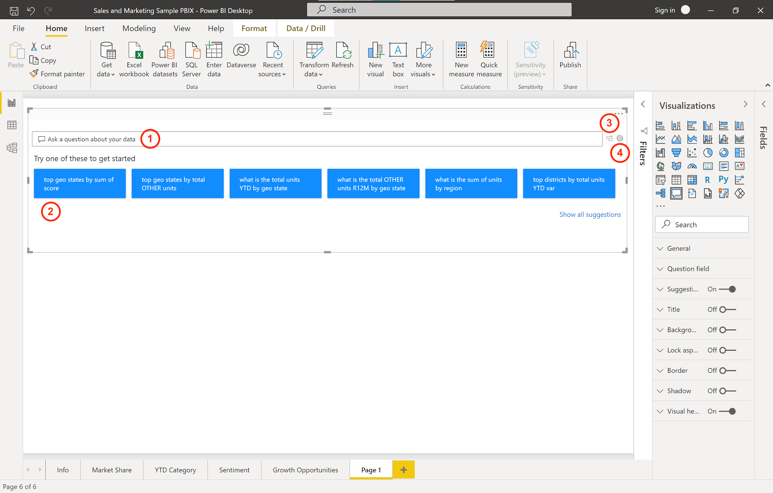
Figure 2-3. Q&A Visual Default Screen
Now, let’s explore this visual in a bit more detail. The Q&A visual consists of four core components:
-
The text box (1): this is where users type their questions or queries and where they will see autocomplete and auto suggest features.
-
The list of suggested questions (2): This pre-populated list will contain some sample questions the user can run by a single click.
-
The convert icon (3): This will convert the output from the Q&A tool into a standard Power BI visual.
-
The Q&A cog icon (4): This will open a settings menu which allows designers to configure the underlying natural language engine.
Let’s give this visual a try by selecting the first suggested question for us. Click on the first sample question:
“top geo states by sum of score”
Power BI will respond with the visual which seems most appropriate for this analysis. In this case it is presenting a map visual to us, showing the top states. We can change this to be almost any visual by making it part of our query. Try:
“top geo states by sum of score as bar chart”
This query will present a horizontal bar chart instead of a map.
Now, let’s head over to the text box and explore how users would input questions here. The Q&A tool can answer a variety of queries, including but not limited to those listed in Table 4-1.
| Type | Example |
| Ask natural questions | Which sales has the highest revenue? |
| Relative date filtering | Sales in the last year |
| Filter by variables | Sales in the USA |
| Filter by conditions | Sales where product category is Category A or Category B |
| Show a specific visual | Sales by product as pie chart |
| Show aggregations | Median sales by product |
| Sorting | Top 10 countries by sales ordered by country code |
| Comparisons | Date by total sales vs total cost |
| Time | Sales over time |
Since we are interested in revenue trends, we want to create a simple line chart showing the total revenue over time, ideally broken down by year. To achieve this, let’s ask Power BI a simple query:
“Show me revenue over time”
Wait, the result we see in figure 4-4 isn’t quite what we expected. The output simply shows some dates from 1999. What’s going on here?
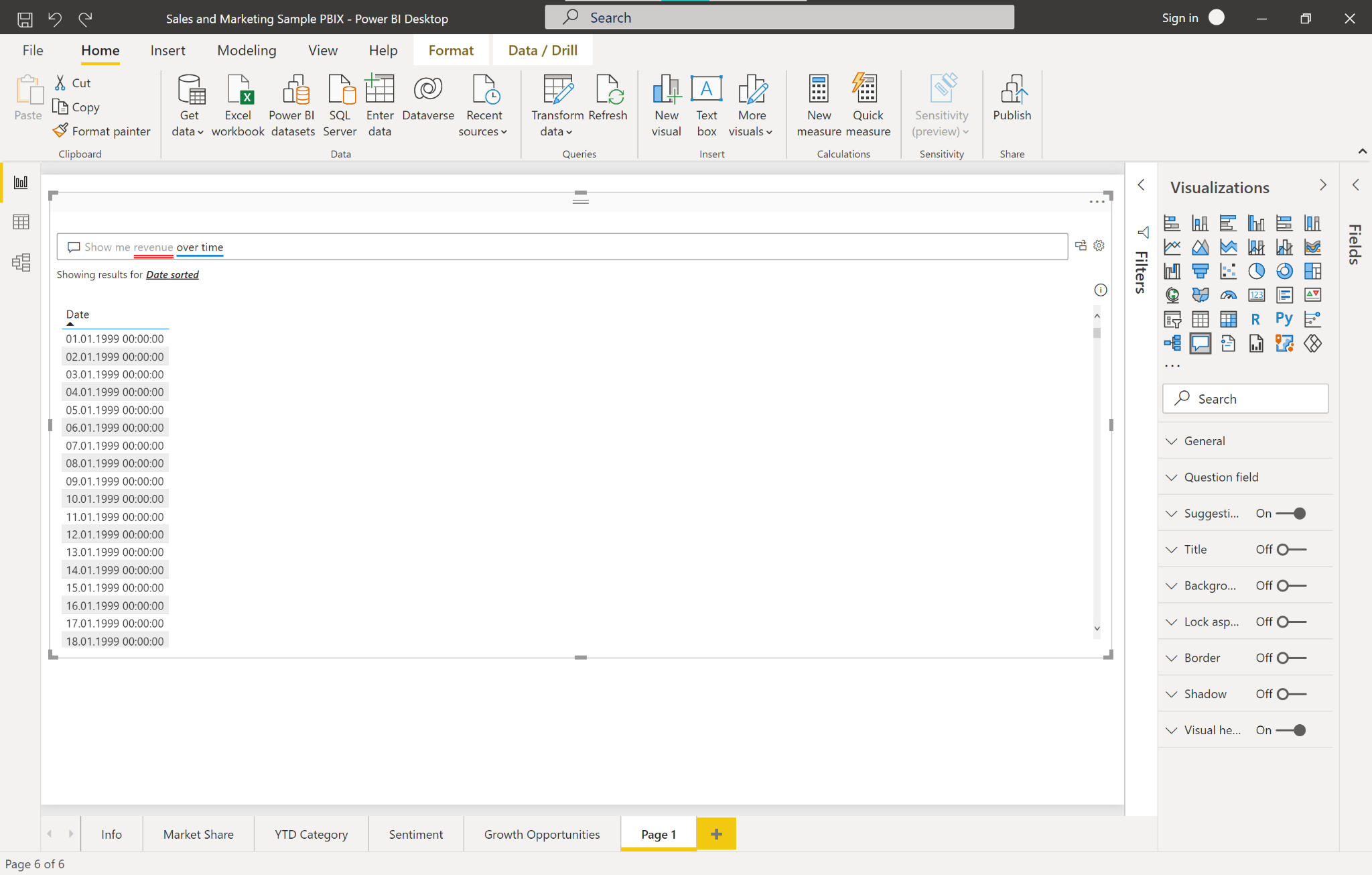
Figure 2-4. Showing revenue over time
We can find out more by looking at the text area box where Power BI helps us to identify problematic phrases in our query: The red line below “revenue” tells us that Power BI could not interpret this variable. In fact, the underlining here follows a distinct color code:
-
A solid blue underline indicates that the system successfully matched the word to a field or value in the data-model.
-
An orange underline indicates that the expression was matched with low confidence. This happens if the expression is ambiguous, for example because there are multiple fields that contain an expression like “sales''.
-
A red underline means that the Q&A tool could not match the word at all with anything in the data model.
If you click on an underlined word you will see some suggestions how Power BI would solve the conflict. In the case of the “revenue” expression Power BI will come up with the following suggestion:
“Did you mean: Show me sum of revenue over time”.
As you can see, you have to be specific with the query if you rely on the default values. We’ll fix this later, but for now, let’s accept the suggestion and see what happens in Figure 4-5.
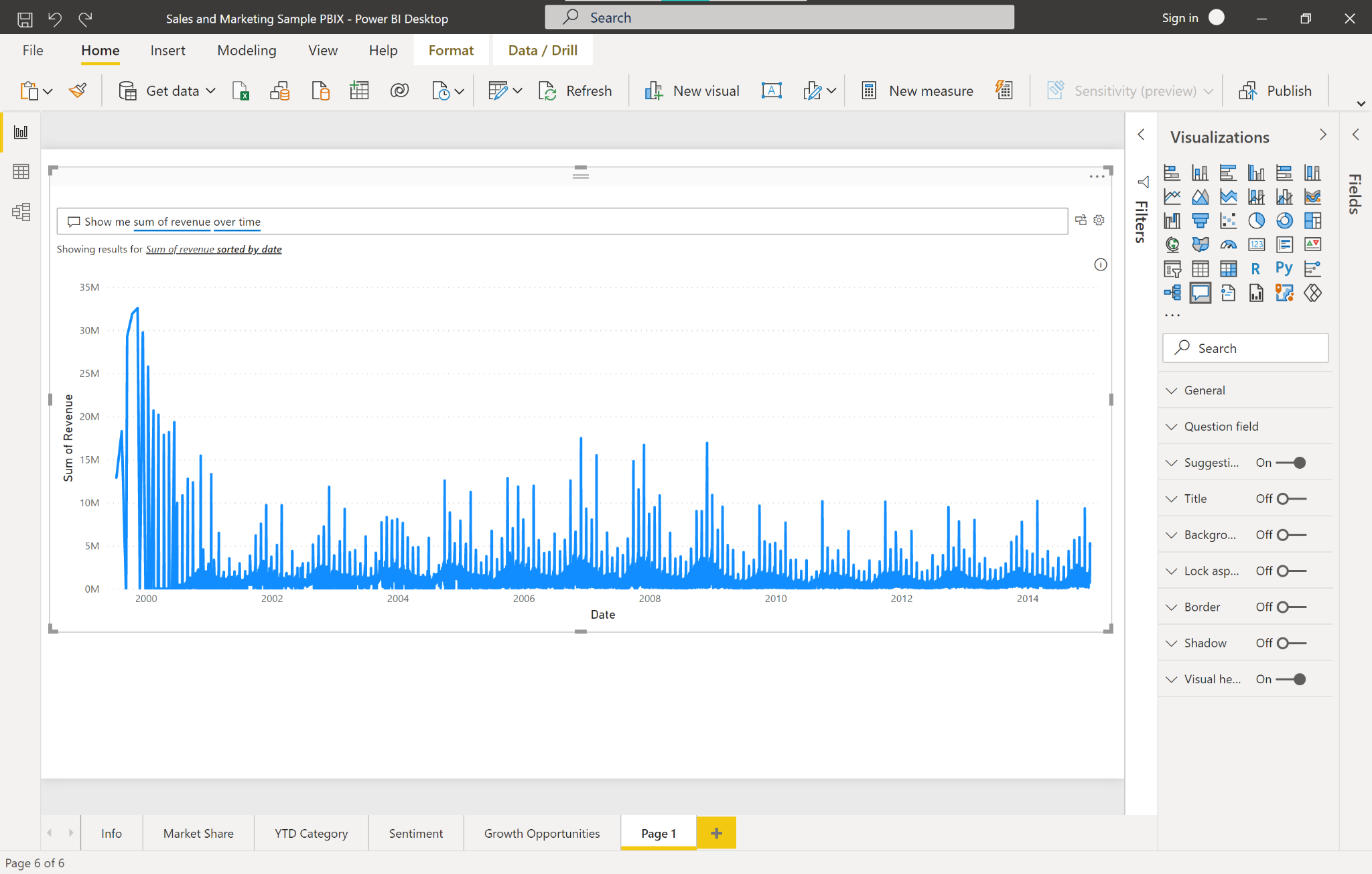
Figure 2-5. Showing sum of revenue over time
This looks more to what we expect. Power BI shows a line chart listing the total revenue over time, splitted up by day. Although this is not bad, it is hard for us to see the big trends.
So let’s be even more specific and ask:
“Show me sum of revenue over time by year”
There we go. Power BI shows us a clean line chart where we can instantly see that the revenue spiked in 2006 and then saw a negative trend afterwards (see Figure 4-6). Since 2010 the trend seems to be again positive.
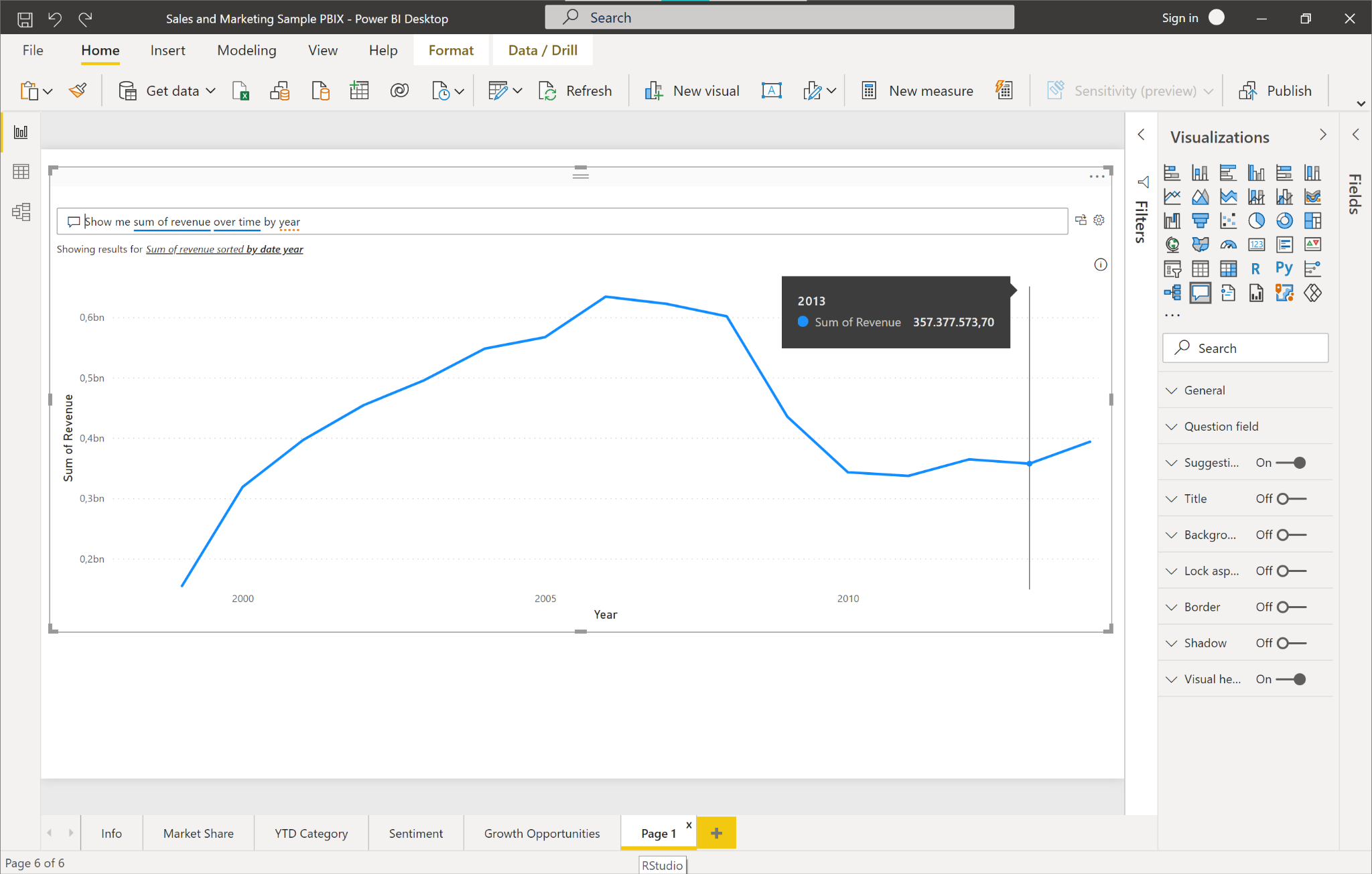
Figure 2-6. Showing sum of revenue over time by year
We want to keep this visual as our high level visual for consumers, so let’s save this to a static visual by using the icon “Turn this Q&A visual into a standard visual”. Power BI will convert the Q&A visual into a plain line chart.
Now it is a good time to make our report look a little nicer.
Shrink the revenue visual horizontally to make a little more space below. Add a headline on top of it reading “Self-Service Revenue Analysis”. Rename this report sheet from “Page 1” to “Total Revenue by Year”
Drag and drop another Q&A visual from the visualizations pane so it appears below the total revenue line chart. Your report should now look similar to Figure 4-7:

Figure 2-7. Q&A report layout
The idea is that we provide business users with a standardized high level overview of current trends or business metrics. Below we allow them to query the data with custom questions.
To do this we will edit the Q&A visual to suggest more meaningful questions relevant to the revenue.
Click the cog icon to the right of the text box to edit the settings of the Q&A visual. You will see four options here: Field synonyms, review questions, teach Q&A and suggest questions.
Head over to the field synonyms section first (see Figure 4-8). Power BI will present you with a list of your data dimensions and allow you to add synonyms to the different fields in the business lingo that your users speak. For our purpose, open the SalesFact list. You will see all measures in this list together with some auto-suggestions for synonyms and a toggle button whether this field should be included in the Q&A widget or not.
Scroll down to Sum of Revenue. Hit the “Add” button and include “total revenue” here as a synonym. Also add “total of revenue”, “revenue”, “total income” and “total of revenue” to the synonyms. We could go through the other fields as well, but for now let’s end this exercise.

Figure 2-8. Q&A field synonyms
Click “Manage terms” in the left menu and you will see a list of all the terms and definitions that were added to the Q&A visual. You can see an example in figure 4-9. This way, you can easily keep track of any changes you made and delete terms which are not appropriate.
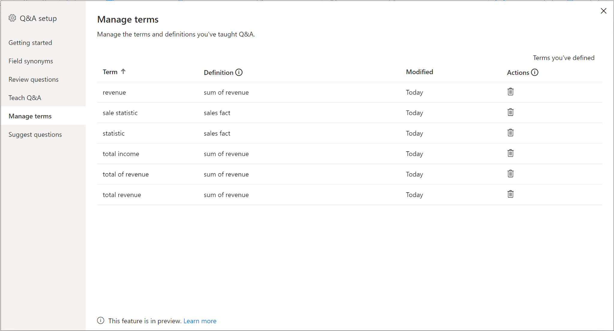
Figure 2-9. Q&A manage terms
Head over to “Suggest questions” in the left menu now. This section allows us to edit the questions which are suggested to users by default, which you can see in Figure 4-10.
Let’s start with a revenue breakdown by region. Type in:
“Show me revenue by region”
This should yield a plot in the preview window, as shown in Figure 4-10.

Figure 2-10. Q&A suggest questions
Fine, let’s add that to our suggestions by clicking the “Add” button.
Business users are usually very good at learning by examples. To give users more intuition on how they can use the Q&A tool, let’s add a variation to the previous question. Business users later should be comfortable replacing things like region with “product” or whatever it is that is on their mind.
Add the following suggestion:
“Show me revenue by region by year”
This will produce three line charts and leads over to the idea of comparing data points. So let’s add an example of how business users can compare sales performance between different products. Let’s add this slightly more complex suggested question:
“Show me revenue of Maximus UM-01 vs. Maximus UM-02 by year”
This will result in this very insightful chart, showing us that Maximus UM-01 had decreasing revenues since its peak in 2005 and the new product Maximus UM-02 seems to slowly take off after its initial release in 2007. By 2012, the new product contributed more revenue than its predecessor as you can see in figure 4-11.
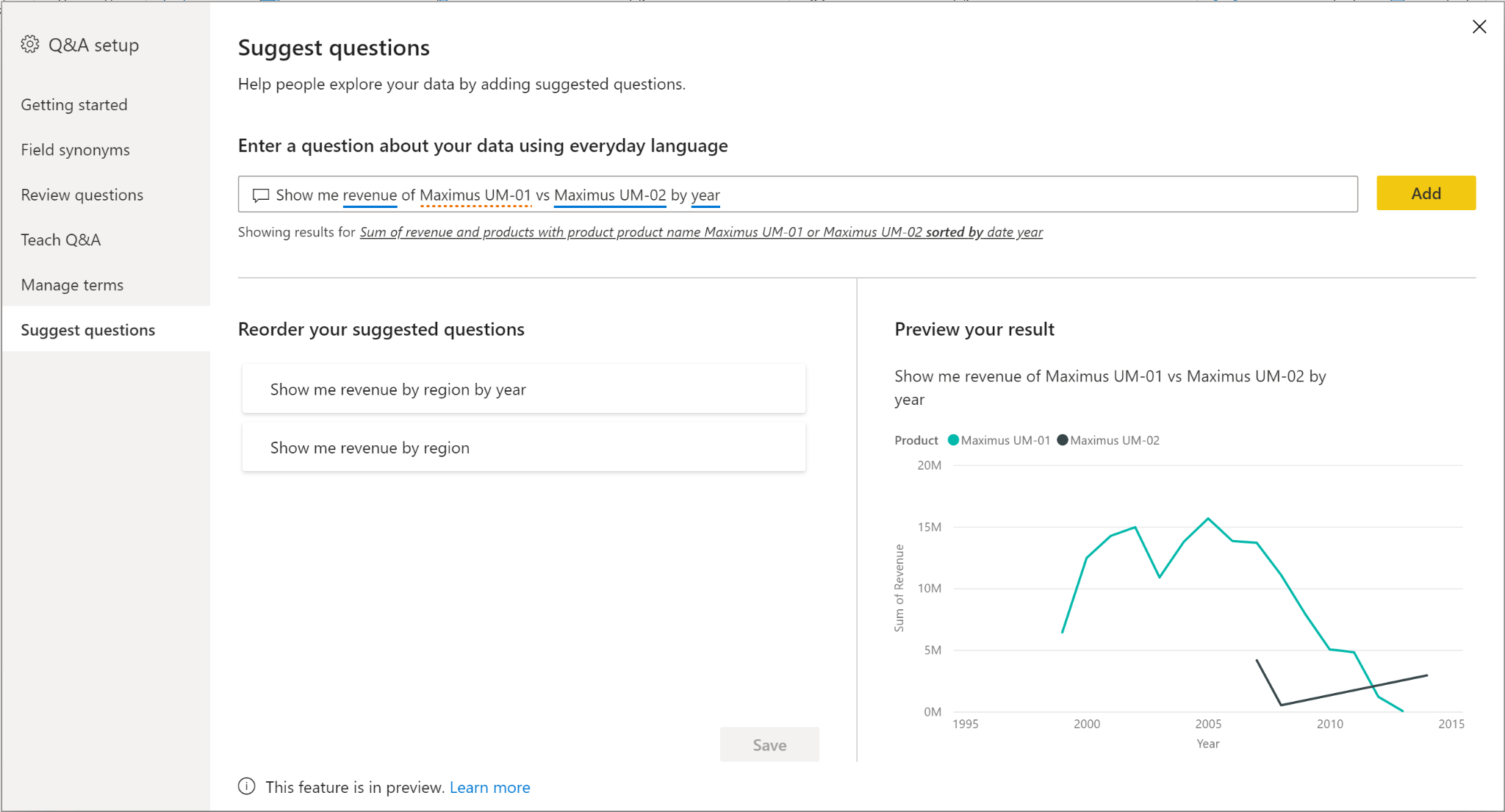
Figure 2-11. Q&A revenue comparison
To organize the list of suggested questions, you can drag the questions into the order you want. Let’s put the most simple query to the first position and the most complex one to the last. Save the suggestions. Close the Q&A setup window.
Taking a look again at our report we can now see the three suggestions we just created now show up in the Q&A visual. Business users can start their data exploration by simply clicking on a suggestion and then modifying the query as they like, for example by replacing region with “geo state”. You can see the final example in figure 4-12.
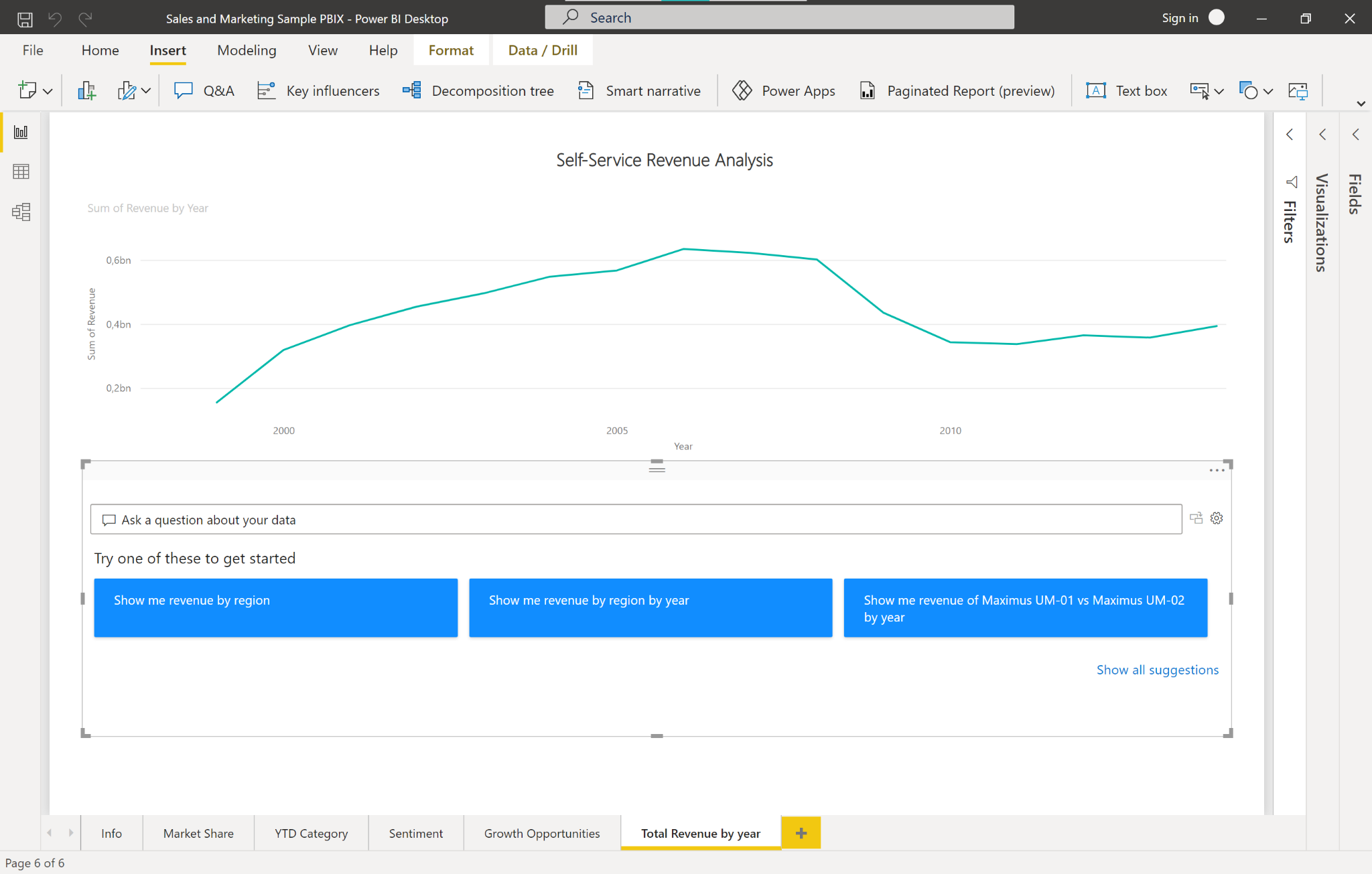
Figure 2-12. Final report with Q&A visual
This basic setup would be sufficient enough to ship an early prototype of this report to a sample of beta business users. You have the chance to collect valuable feedback, see if this is accepted and also find out where there are areas for improvement.
In the settings of the Q&A tool you can find an option to review questions asked in the last 28 days and thus see exactly how people intend to use your report and which synonyms, suggestions or fields might be still missing. This is a great place to start iterating over your product and building it so far that you can scale to more users. If you want to share this report you will need a Power BI Pro licence.
If you like to read more about how the Q&A tool and its administration work in detail, you might find the following resources quite useful from the documentation:
Use Case 2: Summarizing data with natural language
Business analysts often have to craft data stories to communicate insights to business stakeholders. While most of their time is typically spent on creating compelling visuals, the process of annotating with conclusions can be cumbersome and tedious. Too often, analysts therefore skip the step of adding verbal comments to their visuals since the charts speak for themselves, don’t they? No, in fact, many charts can get interpreted the wrong way, especially when it comes to more complex visualisations.
Let’s imagine the following scenario.
Problem Statement
Building off the visuals we created in Use Case 1 we now want to add captions to assist non-technical stakeholders in interpreting the data. We want to provide captions to make insights clear, but we don’t want to spend much time writing them out manually.
Solution Overview
Natural Language capabilities do not only let us analyse and interpret human language with machines, but also generate text based on defined inputs.
In our case, we can use AI technology to create captions or annotations for a given plot and its underlying data. The annotations should address key takeaways, point out trends and allow editing the language and format tailored to a specific audience. In Power BI this feature is called Smart narration and it is available in both Power BI Desktop and Power BI service for designers & developers. The feature is available for all licence types and does not require a Pro or Premium licence.
We will explore how we can use these auto-generated captions to generate a data story for our visuals we created in Use Case 1.
Power BI Walkthrough
Open the Sales & Marketing PBIX file from Use Case 1. Create a new report page and call it “Story”.
We want to create the following four visualisations:
-
Revenue by year
-
Revenue by state
-
Revenue by segment
-
Revenue by year and segment
You can use the Q&A tool to quickly create these graphs. Just convert them to standard visuals after entering the query and you’re all done. Do you see how fast it is to create these visuals with the AI NLP capabilities in Power BI compared to the traditional approach of manually choosing a visual in combination with mapping data and filtering by hand?
Arrange the visuals on the page in a way so that there is some space to the right for the narratives. Your page should look similar to Figure 4-13.
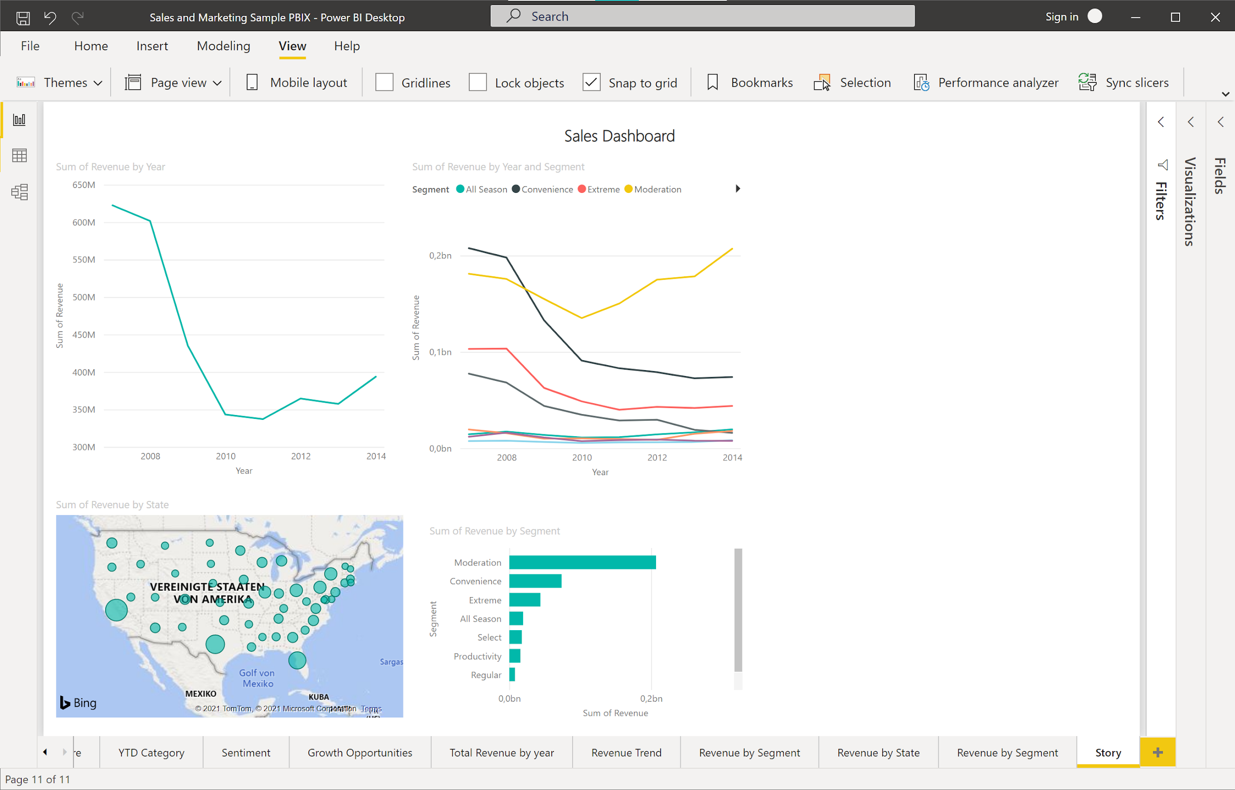
Figure 2-13. Sales Dashboard
Open the Visualizations pane. You should see the “Smart narrative” visual here as in Figure 4-14.
Note
If you don’t see “Smart Narrative” in the visualization pane, you may be using an older version of Power BI and will need to turn on the smart narrative option. Go to File > Options and Settings > Options > Preview feature and make sure the Smart Narrative visual is turned on.
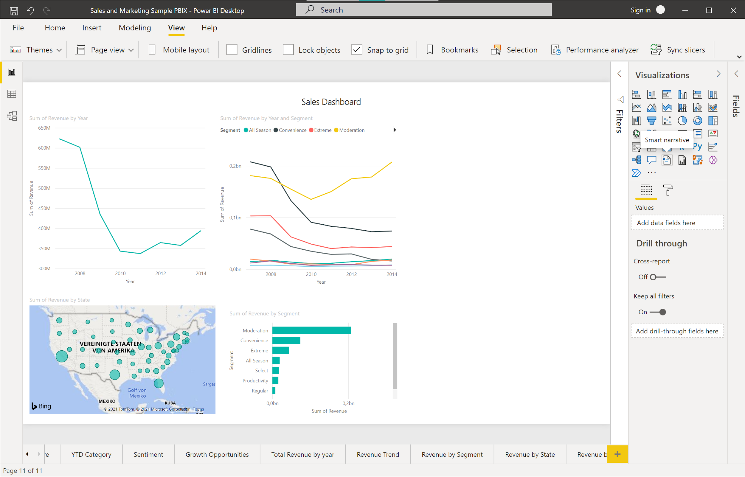
Figure 2-14. Smart narrative visualization
A double click on the Smart narrative visual should add a text box to the right side of your page. Alternatively, you can drag and drop the visual to a place on the page you like. This text box will contain the description that Power BI suggests for all visualisations on the page. In our case the description will look like the output in Figure 4-15. If you click on the text box you will see the highlighted values that Power BI calculated here.
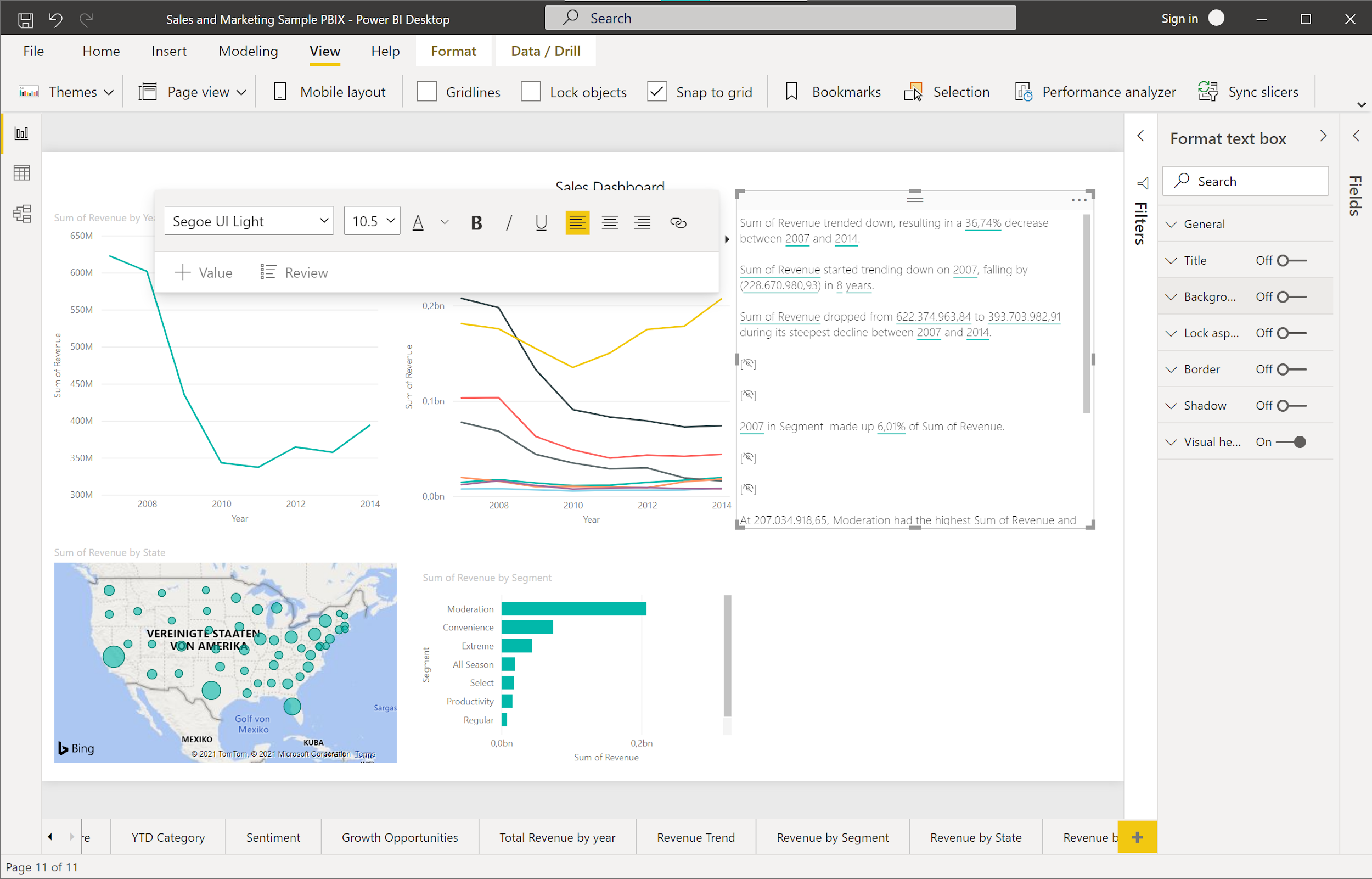
Figure 2-15. Smart narrative output
There are a couple of interesting things to note here.
On the first line, see how Power BI recognized that the revenue trended down and calculated the percentage of the beginning and the end of the revenue time series (see Figure 4-16). It also suggests that the product segment “Moderation” accounted for 52.59% of the total revenue in 2014. When you find that a statement is not relevant enough or even redundant, you can simply delete this line from the summary. You can also explore the calculated values in more detail and apply some formatting to them. For example, click the values that calculate the revenue figures. In the context menu, we can select that this value is displayed as a currency without any decimals after the comma.

Figure 2-16. Smart narrative formatting
Formatting the automated text output will make it more accessible to the reader and overall look much nicer.
When we look at the summary, however, we realize that no information was given about the regional sales breakdown. Maybe they were not important enough to Power BI? To add them manually, right click on the map plot that shows the sales figures by state and click “Summarize” in the context menu. Power BI will add another text box that shows descriptions for just the plot which you selected. Again, you can delete or modify the descriptions as you like.
One important thing to note about the automated captions is that they are fully dynamic and respond to changes in the underlying graphs. To demonstrate this, let’s add a page filter to our dashboard to only show data from after 2010 as shown in figure 4-17. To do this, open up the Fields pane and then drag and drop the field “year” to the “Filters on this page” option pane. Once you apply the filter, see how the content of the text box changes. Power BI recognizes that the revenue trend is now going upwards and updates the corresponding percentages accordingly.

Figure 2-17. Smart narrative responds to global filtering and data changes
What is still missing is an explanation for one of the most important charts on this dashboard: The revenue breakdown by segment. You can clearly see that the segment “Moderation” is the only segment with a relevant positive trend—this is something that should be easy to recognize by the Smart narrative tool, isn’t it? Right click on the plot and click “Summarize” from the context menu. But what happens? Power BI just responds with a single line of text in the smart narrative box which is very hard to interpret.
We have hit the boundaries of the Smart narrative feature here. As of the time of this writing, it is not possible to summarize very complex charts with many different categories or underlying trends. Other limitations are that the Smart narrative tool cannot generate summaries of visuals whose columns are grouped by other columns and for visuals that are built on a data group field. Also, renaming dynamic values or editing automatically generated dynamic values is currently not supported and summaries cannot be produced for visuals that contain on-the-fly calculations like complex measures or percentages.
Since the Smart narrative feature was initially released only in 2021 it will be exciting to see which of these limitations are going to disappear. You can find a full documentation on the Smart narration tool using this Microsoft resource document
For this time, let’s just add the final conclusion for our dashboard by hand. Add a new line to the last text box and type: “Conclusion: Sales from product segment Moderation were the main reason for the positive revenue trend between 2011 and 2014.” Your final sales dashboard should now look similar to figure 4-18.
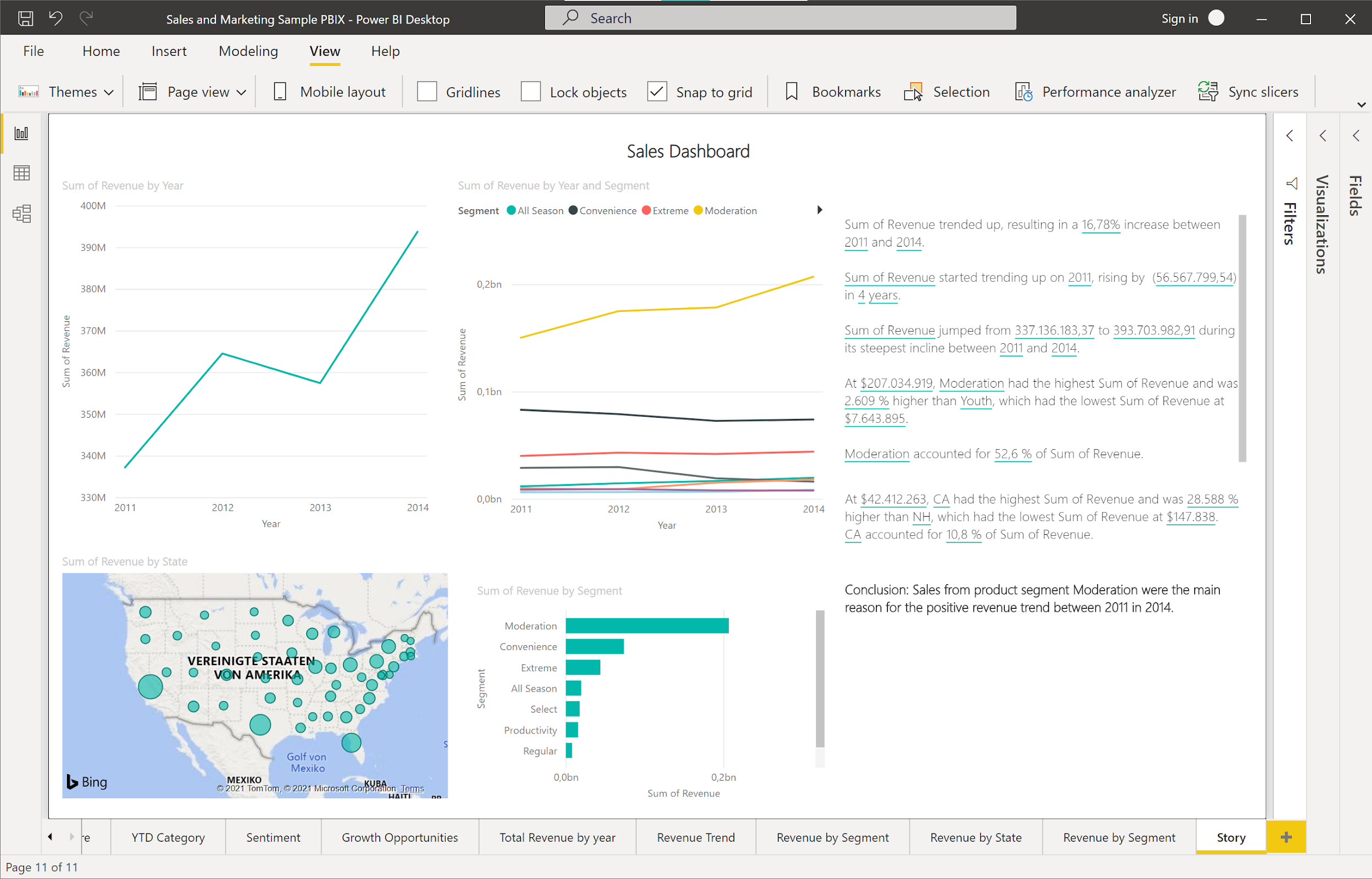
Figure 2-18. Final sales dashboard with annotations
You could easily export this page to a PDF document or publish it to a Power BI server.
While there are many more customizations and configurations for the Smart narration tool than this book could cover (for example, defining custom values using the Q&A-style language queries), we will leave it like this.
If you like to find more about the Smart narration tool, check out this video tutorial from Microsoft.
Summary
In this chapter you have learned how to use the AI-powered Natural Language capabilities in the form of the Q&A tool in Power BI to create visualisations faster and give your users a better BI experience. You have also learned how to automate the annotation process of your visualisations and add descriptions on the fly using the Smart narrative tool in Power BI. In the next chapter we will explore our data further and find out which factors affect the revenue trend in our data. We will use AI-powered tools to reduce our time to insights and comb through the data automatically for interesting patterns.