
2.1 Describing Qualitative Data
Consider a study of aphasia published in the Journal of Communication Disorders. Aphasia is the “impairment or loss of the faculty of using or understanding spoken or written language.” Three types of aphasia have been identified by researchers: Broca’s, conduction, and anomic. The researchers wanted to determine whether one type of aphasia occurs more often than any other and, if so, how often. Consequently, they measured the type of aphasia for a sample of 22 adult aphasics. Table 2.1 gives the type of aphasia diagnosed for each aphasic in the sample.
Teaching Tip
Use data collected in the class to illustrate the techniques for describing qualitative data. Collect data such as year in school, major discipline, and state of residency. Use these data to illustrate class frequency and class relative frequency.
For this study, the variable of interest, type of aphasia, is qualitative in nature. Qualitative data are nonnumerical in nature; thus, the value of a qualitative variable can only be classified into categories called classes. The possible types of aphasia—Broca’s, conduction, and anomic—represent the classes for this qualitative variable. We can summarize such data numerically in two ways: (1) by computing the class frequency—the number of observations in the data set that fall into each class—or (2) by computing the class relative frequency—the proportion of the total number of observations falling into each class.
A class is one of the categories into which qualitative data can be classified.
The class frequency is the number of observations in the data set that fall into a particular class.
The class relative frequency is the class frequency divided by the total number of observations in the data set; that is,
[&~rom~class relative frequency|=|~normal~*frac*{~rom~class frequency~normal~}{n}~norm~ &]
Table 2.1 Data on 22 Adult Aphasics

Alternate View
| Subject | Type of Aphasia | Subject | Type of Aphasia |
|---|---|---|---|
| 1 | Broca’s | 12 | Broca’s |
| 2 | Anomic | 13 | Anomic |
| 3 | Anomic | 14 | Broca’s |
| 4 | Conduction | 15 | Anomic |
| 5 | Broca’s | 16 | Anomic |
| 6 | Conduction | 17 | Anomic |
| 7 | Conduction | 18 | Conduction |
| 8 | Anomic | 19 | Broca’s |
| 9 | Conduction | 20 | Anomic |
| 10 | Anomic | 21 | Conduction |
| 11 | Conduction | 22 | Anomic |
Based on Li, E. C., Williams, S. E., and Volpe, R. D. “The effects of topic and listener familiarity of discourse variables in procedural and narrative discourse tasks.” The Journal of Communication Disorders, Vol. 28, No. 1, Mar. 1995, p. 44 (Table 1).
 Data Set: APHASIA
The class percentage is the class relative frequency multiplied by 100; that is,
[&~rom~class percentage|=||pbo|class relative frequency|pbc||multi|~normal~100~norm~ &]
Examining Table 2.1, we observe that 10 aphasics in the study were diagnosed as suffering from anomic aphasia, 5 from Broca’s aphasia, and 7 from conduction aphasia. These numbers—10, 5, and 7—represent the class frequencies for the three classes and are shown in the summary table, Figure 2.1, produced with SPSS.

Figure 2.1
SPSS summary table for types of aphasia
Figure 2.1 also gives the relative frequency of each of the three aphasia classes. From the class relative frequency definition, we calculate the relative frequency by dividing the class frequency by the total number of observations in the data set. Thus, the relative frequencies for the three types of aphasia are
[&*AS*~rom~Anomic:|thn|~normal~*frac*{10}{22}*AP*|=|.455 &]
[&*AS*~rom~Broca’s:|thn|~normal~*frac*{5}{22}*AP*|=|.227 &]
[&*AS*~rom~Conduction:|thn|~normal~*frac*{7}{22}*AP*|=|.318 &]
These values, expressed as a percent, are shown in the SPSS summary table of Figure 2.1. From these relative frequencies, we observe that nearly half (45.5%) of the 22 subjects in the study are suffering from anomic aphasia.
Teaching Tip
Use an illustration to show that the sum of the frequencies of all possible outcomes is the sample size n and the sum of all the relative frequencies is 1.
Although the summary table of Figure 2.1 adequately describes the data of Table 2.1, we often want a graphical presentation as well. Figures 2.2 and 2.3 show two of the most widely used graphical methods for describing qualitative data: bar graphs and pie charts. Figure 2.2 shows the frequencies of the three types of aphasia in a bar graph produced with SAS. Note that the height of the rectangle, or “bar,” over each class is equal to the class frequency. (Optionally, the bar heights can be proportional to class relative frequencies.)

Figure 2.2
SAS bar graph for type of aphasia

Figure 2.3
MINITAB pie chart for type of aphasia
In contrast, Figure 2.3 shows the relative frequencies of the three types of aphasia in a pie chart generated with MINITAB. Note that the pie is a circle (spanning 360°) and the size (angle) of the “pie slice” assigned to each class is proportional to the class relative frequency. For example, the slice assigned to anomic aphasia is 45.5% of 360°, or .
Before leaving the data set in Table 2.1, consider the bar graph shown in Figure 2.4, produced with SPSS. Note that the bars for the types of aphasia are arranged in descending order of height, from left to right across the horizontal axis. That is, the tallest bar (Anomic) is positioned at the far left and the shortest bar (Broca’s) is at the far right. This rearrangement of the bars in a bar graph is called a Pareto diagram. One goal of a Pareto diagram (named for the Italian economist Vilfredo Pareto) is to make it easy to locate the “most important” categories—those with the largest frequencies.

Figure 2.4
SPSS Pareto diagram for type of aphasia
Biography Vilfredo Pareto (1843–1923)
The Pareto Principle
Born in Paris to an Italian aristocratic family, Vilfredo Pareto was educated at the University of Turin, where he studied engineering and mathematics. After the death of his parents, Pareto quit his job as an engineer and began writing and lecturing on the evils of the economic policies of the Italian government. While at the University of Lausanne in Switzerland in 1896, he published his first paper, Cours d’économie politique. In the paper, Pareto derived a complicated mathematical formula to prove that the distribution of income and wealth in society is not random, but that a consistent pattern appears throughout history in all societies. Essentially, Pareto showed that approximately 80% of the total wealth in a society lies with only 20% of the families. This famous law about the “vital few and the trivial many” is widely known as the Pareto principle in economics.
Summary of Graphical Descriptive Methods for Qualitative Data
Bar Graph: The categories (classes) of the qualitative variable are represented by bars, where the height of each bar is either the class frequency, class relative frequency, or class percentage.
Pie Chart: The categories (classes) of the qualitative variable are represented by slices of a pie (circle). The size of each slice is proportional to the class relative frequency.
Pareto Diagram: A bar graph with the categories (classes) of the qualitative variable (i.e., the bars) arranged by height in descending order from left to right.
Now Work Exercise 2.6
Let’s look at a practical example that requires interpretation of the graphical results.
 Example 2.1 Graphing and Summarizing Qualitative Data—Drug Designed to Reduce Blood Loss
Problem
A group of cardiac physicians in southwest Florida has been studying a new drug designed to reduce blood loss in coronary bypass operations. Blood loss data for 114 coronary bypass patients (some who received a dosage of the drug and others who did not) are saved in the BLOOD file. Although the drug shows promise in reducing blood loss, the physicians are concerned about possible side effects and complications. So their data set includes not only the qualitative variable DRUG, which indicates whether or not the patient received the drug, but also the qualitative variable COMP, which specifies the type (if any) of complication experienced by the patient. The four values of COMP are (1) redo surgery, (2) post-op infection, (3) both, or (4) none.

Figure 2.5, generated by SAS, shows summary tables for the two qualitative variables, DRUG and COMP. Interpret the results.
Interpret the MINITAB and SPSS printouts shown in Figures 2.6 and 2.7, respectively.

Figure 2.5
SAS summary tables for DRUG and COMP

Figure 2.6
MINITAB side-by-side bar graphs for COMP by value of DRUG

Figure 2.7
SPSS summary tables for COMP by value of drug
Solution
The top table in Figure 2.5 is a summary frequency table for DRUG. Note that exactly half (57) of the 114 coronary bypass patients received the drug and half did not. The bottom table in Figure 2.5 is a summary frequency table for COMP. The class percentages are given in the Percent column. We see that about 69% of the 114 patients had no complications, leaving about 31% who experienced either a redo surgery, a post-op infection, or both.
Figure 2.6 is a MINITAB side-by-side bar graph of the data. The four bars in the left-side graph represent the frequencies of COMP for the 57 patients who did not receive the drug; the four bars in the right-side graph represent the frequencies of COMP for the 57 patients who did receive a dosage of the drug. The graph clearly shows that patients who did not receive the drug suffered fewer complications. The exact percentages are displayed in the SPSS summary tables of Figure 2.7. Over 56% of the patients who got the drug had no complications, compared with about 83% for the patients who got no drug.
Look Back
Although these results show that the drug may be effective in reducing blood loss, Figures 2.6 and 2.7 imply that patients on the drug may have a higher risk of incurring complications. But before using this information to make a decision about the drug, the physicians will need to provide a measure of reliability for the inference. That is, the physicians will want to know whether the difference between the percentages of patients with complications observed in this sample of 114 patients is generalizable to the population of all coronary bypass patients.
Now Work Exercise 2.17
Statistics in Action Revisited
Interpreting Pie Charts for the Body Image Data
In the Body Image: An International Journal of Research (Jan. 2010) study, Brown University researchers measured several qualitative (categorical) variables for each of 92 body dysmorphic disorder (BDD) patients: Gender (M or F), Comorbid Disorder (Major Depression, Social Phobia, Obsessive Compulsive Disorder—OCD, or Anorexia/Bulimia Nervosa), and Dissatisfied with Looks (Yes or No). [Note: “Yes” values for Dissatisfied with Looks correspond to total appearance evaluation responses of 20 points (out of 35) or less. “No” values correspond to totals of 21 points or more.] Pie charts and bar graphs can be used to summarize and describe the responses for these variables. Recall that the data are saved in the BDD file. We used MINITAB to create pie charts for these variables.

Figure SIA2.1 shows individual pie charts for each of the three qualitative variables, Gender, Disorder, and Dissatisfied with Looks. First, notice that of the 92 BDD patients, 65% are females and 35% are males. Of these patients, the most common comorbid disorder is major depression (42%), followed by social phobia (35%) and OCD (20%). The third pie chart shows that 77% of the BDD patients are dissatisfied in some way with their body.


Figure SIA2.1
MINITAB pie charts for Gender, Disorder, and Dissatisfied with Looks

Figure SIA2.2
MINITAB side-by-side pie charts for Dissatisfied with Looks by Gender
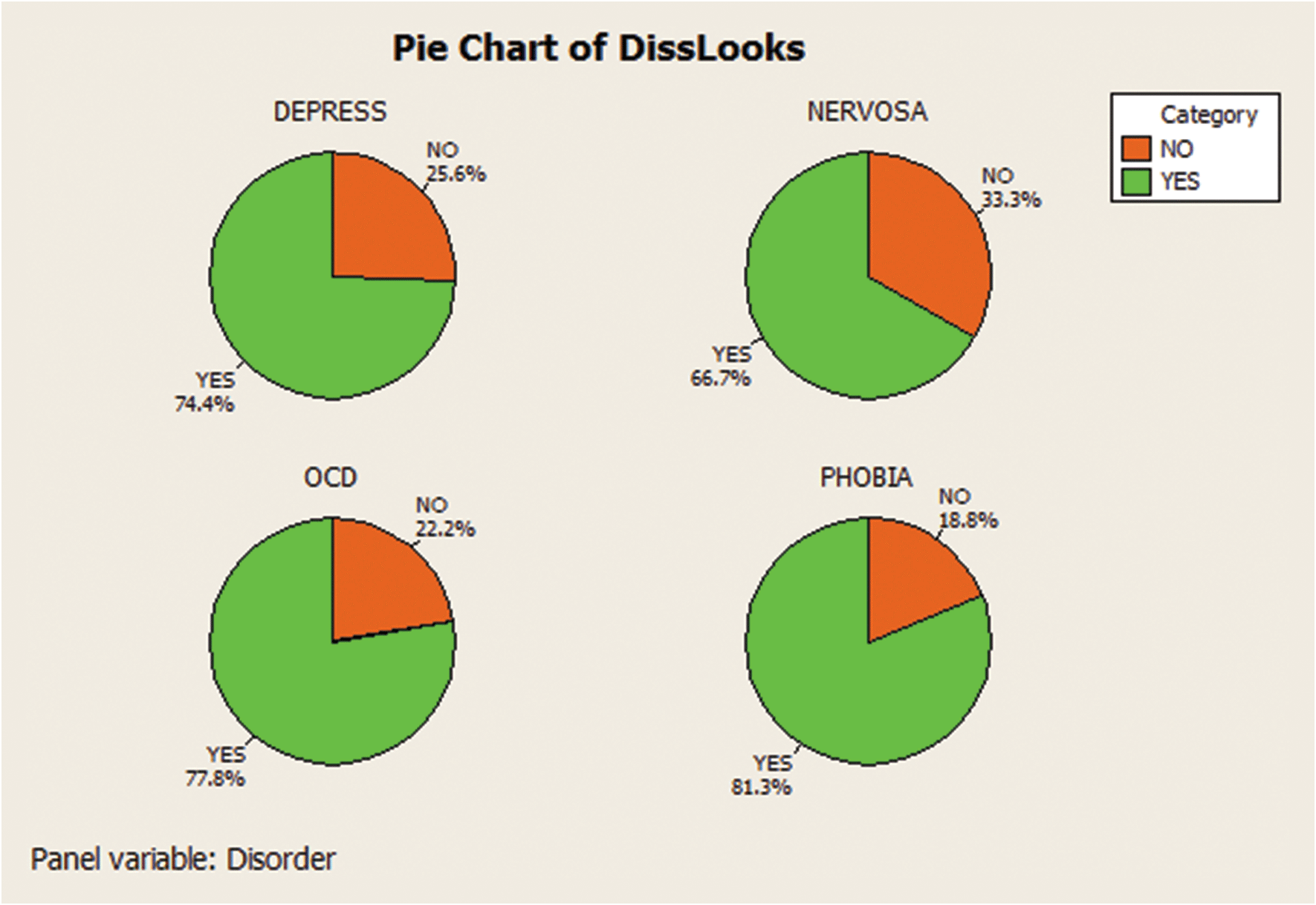
Figure SIA2.3
MINITAB side-by-side pie charts for Dissatisfied with Looks by Comorbid Disorder
Of interest in the study is whether BDD females tend to be more dissatisfied with their looks than BDD males. We can gain insight into this question by forming side-by-side pie charts of the Dissatisfied with Looks variable, one chart for females and one for males. These pie charts are shown in Figure SIA2.2. You can see that about 82% of the females are dissatisfied in some way with their body as compared to about 69% of the males. Thus, it does appear that BDD females tend to be more dissatisfied with their looks than males, at least for this sample of patients.
Also of interest is whether certain comorbid disorders lead to a higher level of dissatisfaction with body appearance. Figure SIA2.3 is a set of side-by-side pie charts for Dissatisfied with Looks, one chart for each of four comorbid disorders. The graphs show that the percentage of BDD patients who are dissatisfied in some way with their body image range from about 67% for those with a nervosa disorder to about 81% for those diagnosed with a social phobia.
Data Set: BDD
 Caution
The information produced in these pie charts should be limited to describing the sample of 92 BDD patients. If one is interested in making inferences about the population of all BDD patients (as were the Brown University researchers), inferential statistical methods need to be applied to the data. These methods are the topics of later chapters.
Exercises 2.1–2.24
Understanding the Principles
2.1 Explain the difference between class frequency, class relative frequency, and class percentage for a qualitative variable.
2.2 Explain the difference between a bar graph and a pie chart.
2.3 Explain the difference between a bar graph and a Pareto diagram.
Learning the Mechanics
2.4 Complete the following table:
Grade on Statistics Exam Frequency Relative Frequency A: 90–100 .08 B: 80–89 36 C: 65–79 90 D: 50–64 30 F: Below 50 28 Total 200 1.00 - L02005 2.5 A qualitative variable with three classes (X, Y, and Z) is measured for each of 20 units randomly sampled from a target population. The data (observed class for each unit) are as follows:

Alternate View
Y X X Z X Y Y Y X X Z X Y Y X Z Y Y Y X Compute the frequency for each of the three classes.
Compute the relative frequency for each of the three classes.
Display the results from part a in a frequency bar graph.
Display the results from part b in a pie chart.
Applying the Concepts—Basic
 2.6 Study of importance of libraries. In The Canadian Journal of Information and Library Science (Vol. 33, 2009), researchers from the University of Western Ontario reported on mall shoppers’ opinions about libraries and their importance to today’s society. Each in a sample of over 200 mall shoppers was asked the following question: “In today’s world, with Internet access and online and large book sellers like Amazon, do you think libraries have become more, less, or the same in importance to their community?” The accompanying graphic summarizes the mall shoppers’ responses.
What type of graph is shown?
Identify the qualitative variable described in the graph.
From the graph, identify the most common response.
Convert the graph into a Pareto diagram. Interpret the results.

2.7 Do social robots walk or roll? According to the United Nations, social robots now outnumber industrial robots worldwide. A social (or service) robot is designed to entertain, educate, and care for human users. In a paper published by the International Conference on Social Robotics (Vol. 6414, 2010), design engineers investigated the trend in the design of social robots. Using a random sample of 106 social robots obtained through a Web search, the engineers found that 63 were built with legs only, 20 with wheels only, 8 with both legs and wheels, and 15 with neither legs nor wheels. This information is portrayed in the accompanying graphic.
What type of graph is used to describe the data?
Identify the variable measured for each of the 106 robot designs.
Use the graph to identify the social robot design that is currently used the most.
Compute class relative frequencies for the different categories shown in the graph.
Use the results from part d to construct a Pareto diagram for the data.

- MUSIC 2.8 Paying for music downloads. If you use the Internet, have you ever paid to access or download music? This was one of the questions of interest in a recent Pew Internet & American Life Project Survey (October 2010). Telephone interviews were conducted on a representative sample of 1,003 adults living in the United States. For this sample, 248 adults stated that they do not use the Internet, 249 revealed that they use the Internet but have never paid to download music, and the remainder (506 adults) stated that they use the Internet and have paid to download music. The results are summarized in the MINITAB pie chart shown.
According to the pie chart, what proportion of the sample use the Internet and pay to download music? Verify the accuracy of this proportion using the survey results.
Now consider only the 755 adults in the sample that use the Internet. Create a graph that compares the proportion of these adults that pay to download music with the proportion that do not pay.

- MOLARS 2.9 Cheek teeth of extinct primates. The characteristics of cheek teeth (e.g., molars) can provide anthropologists with information on the dietary habits of extinct mammals. The cheek teeth of an extinct primate species were the subject of research reported in the American Journal of Physical Anthropology (Vol. 142, 2010). A total of 18 cheek teeth extracted from skulls discovered in western Wyoming were analyzed. Each tooth was classified according to degree of wear (unworn, slight, light-moderate, moderate, moderate-heavy, or heavy). The 18 measurements are listed here.
Data on Degree of Wear Unknown Slight Unknown Slight Unknown Heavy Moderate Unworn Slight Light-moderate Unknown Light-moderate Moderate-heavy Moderate Moderate Unworn Slight Unknown Identify the variable measured in the study and its type (quantitative or qualitative).
Count the number of cheek teeth in each wear category.
Calculate the relative frequency for each wear category.
Construct a relative frequency bar graph for the data.
Construct a Pareto diagram for the data.
Identify the degree of wear category that occurred most often in the sample of 18 cheek teeth.
2.10 Humane education and classroom pets. In grade school, did your teacher have a pet in the classroom? Many teachers do so in order to promote humane education. The Journal of Moral Education (Mar. 2010) published a study designed to examine elementary school teachers’ experiences with humane education and animals in the classroom. Based on a survey of 75 elementary school teachers, the following results were reported:
Survey Question Response Number of Teachers Q1: Do you keep classroom pets? Yes 61 No 14 Q2: Do you allow visits by pets? Yes 35 No 40 Q3: What formal humane education program does your school employ? Character counts 21 Roots of empathy 9 Teacher designed 3 Other 14 None 28 Based on Journal of Moral Education, Mar. 2010.
Explain why the data collected are qualitative.
For each survey question, summarize the results with a graph.
For this sample of 75 teachers, write two or three sentences describing their experience with humane education and classroom pets.
2.11 Estimating the rhino population. The International Rhino Foundation estimates that there are 28,933 rhinoceroses living in the wild in Africa and Asia. A breakdown of the number of rhinos of each species is reported in the accompanying table:
Rhino Species Population Estimate African Black 5,055 African White 20,405 (Asian) Sumatran 100 (Asian) Javan 40 (Asian) Greater One-Horned 3,333 Total 28,933 Source: International Rhino Foundation, 2014.
Construct a relative frequency table for the data.
Display the relative frequencies in a bar graph.
What proportion of the 28,933 rhinos are African rhinos? Asian?
2.12 STEM experiences for girls. The National Science Foundation (NSF) sponsored a study on girls’ participation in informal science, technology, engineering, and mathematics (STEM) programs (see Exercise 1.13 ). The results of the study were published in Cascading Influences: Long-Term Impacts of Informal STEM Experiences for Girls (Mar. 2013). The researchers questioned 174 young women who recently participated in a STEM program. They used a pie chart to describe the geographic location (urban, suburban, or rural) of the STEM programs attended. Of the 174 STEM participants, 107 were in urban areas, 57 in suburban areas, and 10 in rural areas. Use this information to construct the pie chart. Interpret the results.
Applying the Concepts—Intermediate
2.13 Microsoft program security issues. The dominance of Microsoft in the computer software market has led to numerous malicious attacks (e.g., worms, viruses) on its programs. To help its users combat these problems, Microsoft periodically issues a security bulletin that reports the software affected by the vulnerability. In Computers & Security (July 2013), researchers focused on reported security issues with three Microsoft products: Office, Windows, and Explorer. In a sample of 50 security bulletins issued in 2012, 32 reported a security issue with Windows, 6 with Explorer, and 12 with Office. The researchers also categorized the security bulletins according to the expected repercussion of the vulnerability. Categories were Denial of service, Information disclosure, Remote code execution, Spoofing, and Privilege elevation. Suppose that of the 50 bulletins sampled, the following numbers of bulletins were classified into each respective category: 6, 8, 22, 3, 11.
Construct a pie chart to describe the Microsoft products with security issues. Which product had the lowest proportion of security issues in 2012?
Construct a Pareto diagram to describe the expected repercussions from security issues. Based on the graph, what repercussion would you advise Microsoft to focus on?
MINITAB Output for Exercise 2. 14
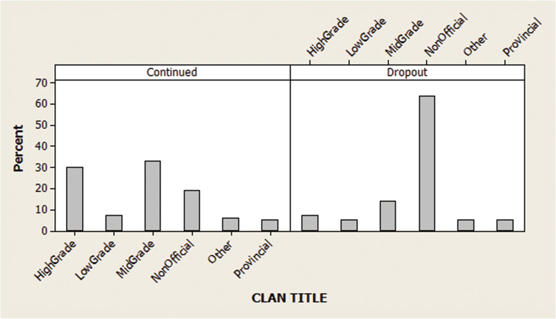
2.14 Genealogy research. The Journal of Family History (Jan. 2010) investigated the genealogy of a certain Korean clan. Of interest was whether or not a family name continued into the next generation in the clan genealogy (called a continued line) or dropped out (called a dropout line). Side-by-side pie charts were used to describe the rate at which certain occupational titles of clan individuals occurred within each line type. Similarly constructed MINITAB bar charts are shown on p. 39.
Identify the two qualitative variables graphed in the side-by-side pie charts.
Give a full interpretation of the charts. Identify the major differences (if any) between the two line groups.
Based on Sangkuk Lee, Journal of Family History (Jan 2010).
- PONDICE 2.15 Characteristics of ice melt ponds. The National Snow and Ice Data Center (NSIDC) collects data on the albedo, depth, and physical characteristics of ice melt ponds in the Canadian Arctic. Environmental engineers at the University of Colorado are using these data to study how climate affects the sea ice. Data on 504 ice melt ponds located in the Barrow Strait in the Canadian Arctic are saved in the PONDICE file. One variable of interest is the type of ice observed for each pond, classified as first-year ice, multiyear ice, or landfast ice. An SAS summary table and a horizontal bar graph that describe the types of ice of the 504 melt ponds are shown below.
Of the 504 melt ponds, what proportion had landfast ice?
The University of Colorado researchers estimated that about 17% of melt ponds in the Canadian Arctic have first-year ice. Do you agree?
Convert the horizontal bar graph into a Pareto diagram. Interpret the graph.
2.16 Railway track allocation. One of the problems faced by transportation engineers is the assignment of tracks to trains at a busy railroad station. Overused and/or underused tracks cause increases in maintenance costs and inefficient allocation of resources. The Journal of Transportation Engineering (May 2013) investigated the optimization of track allocation at a Chinese railway station with 11 tracks. Using a new algorithm designed to minimize waiting time and bottlenecks, engineers assigned tracks to 53 trains in a single day as shown in the accompanying table. Construct a Pareto diagram for the data. Use the diagram to help the engineers determine if the allocation of tracks to trains is evenly distributed and, if not, which tracks are underutilized and overutilized.
Track Assigned Number of Trains Track #1 3 Track #2 4 Track #3 4 Track #4 4 Track #5 7 Track #6 5 Track #7 5 Track #8 7 Track #9 4 Track #10 5 Track #11 5 Total 53 Source: Wu, J., et al. “Track allocation optimization at a railway station: Mean-variance model and case study.” Journal of Transportation Engineering, Vol. 139, No. 5, May 2013 (extracted from Table 4).
- 2.17 Satellites in orbit. According to the Union of Concerned Scientists (www.ucsusa.org), there are 502 low earth orbit (LEO) and 432 geosynchronous orbit (GEO) satellites in space. Each satellite is owned by an entity in either the government, military, commercial, or civil sector. A breakdown of the number of satellites in orbit for each sector is displayed in the accompanying table. Use this information to construct a pair of graphs that compare the ownership sectors of LEO and GEO satellites in orbit. What observations do you have about the data?
LEO Satellites GEO Satellites Government 229 59 Military 109 91 Commercial 118 281 Civil 46 1 Total 502 432 Source: Union of Concerned Scientists, Nov. 2012.
SAS output for Exercise 2.15


2.18 Curbing street gang gun violence. Operation Ceasefire is a program implemented to reduce street gang gun violence in the city of Boston. The effectiveness of the program was examined in the Journal of Quantitative Criminology (Mar. 2014). Over a 5-year period (2006–2010), there were 80 shootings involving a particular Boston street gang (called the Lucerne Street Doggz). The information in the table breaks down these shootings by year and by who was shot (gang members or non-gang members). Note: The Ceasefire program was implemented at the end of 2007.

Alternate View
Year Total Shootings Shootings of Gang Members Shootings of Non-Gang Members 2006 37 30 7 2007 30 22 8 2008 4 3 1 2009 5 4 1 2010 4 3 1 Totals 80 62 18 Source: Braga, A. A, Hureau, D. M., and Papachristos, A. V. “Deterring gang-involved gun violence: Measuring the impact of Boston’s Operation Ceasefire on street gang behavior.” Journal of Quantitative Criminology, Vol. 30, No. 1, Mar. 2014 (adapted from Figure 3).
Construct a Pareto diagram for the total annual shootings involving the Boston street gang.
Construct a Pareto diagram for the annual shootings of the Boston street gang members.
Based on the Pareto diagrams, comment on the effectiveness of Operation Ceasefire.
2.19 Interactions in a children’s museum. The nature of child-led and adult-led interactions in a children’s museum was investigated in Early Childhood Education Journal (Mar. 2014). Interactions by visitors to the museum were classified as (1) show-and-tell, (2) learning, (3) teaching, (4) refocusing, (5) participatory play, (6) advocating, or (7) disciplining. Over a 3-month period, the researchers observed 170 meaningful interactions, of which 81 were led by children and 89 were led by adult caregivers. The number of interactions observed in each category is provided in the accompanying table. Use side-by-side bar graphs to compare the interactions led by children and adults. Do you observe any trends?
Type of Interaction Child-Led Adult-Led Show-and-tell 26 0 Learning 21 0 Teaching 0 64 Refocusing 21 10 Participatory Play 12 9 Advocating 0 4 Disciplining 1 2 Totals 81 89 Source: McMunn-Dooley, C., and Welch, M. M. “Nature of interactions among young children and adult caregivers in a children’s museum.” Early Childhood Education Journal, Vol. 42, No. 2, Mar. 2014 (adapted from Figure 2).
2.20 Motivation and right-oriented bias. Evolutionary theory suggests that motivated decision makers tend to exhibit a right-oriented bias. (For example, if presented with two equally valued brands of detergent on a supermarket shelf, consumers are more likely to choose the brand on the right.) In Psychological Science (November 2011), researchers tested this theory using data on all penalty shots attempted in World Cup soccer matches (a total of 204 penalty shots). The researchers believe that goalkeepers, motivated to make a penalty shot save but with little time to make a decision, will tend to dive to the right. The results of the study (percentages of dives to the left, middle, or right) are provided in the table. Note that the percentages in each row, corresponding to a certain match situation, add to 100%. Construct side-by-side bar graphs showing the distribution of dives for the three match situations. What inferences can you draw from the graphs?

Alternate View
Match Situation Dive Left Stay Middle Dive Right Team behind 29% 0% 71% Tied 48% 3% 49% Team ahead 51% 1% 48% Source: Roskes, M., et al. “The right side? Under time pressure, approach motivation leads to right-oriented bias.” Psychological Science, Vol. 22, No. 11, Nov. 2011 (adapted from Figure 2).
2.21 Do you believe in the Bible? Each year the National Opinion Research Center conducts the General Social Survey (GSS), eliciting opinions of Americans on a wide variety of social topics. One question in the survey asked about a person’s belief in the Bible. A sample of 4,826 respondents selected from one of the following answers: (1) The Bible is the actual word of God, to be taken literally—1,527 respondents; (2) the Bible is the inspired word of God, but not everything is to be taken literally—2,231 respondents; (3) the Bible is an ancient book of fables legends, history, and moral precepts—996 respondents; and (4) the Bible has some other origin—72 respondents.
Summarize the responses to the Bible question in the form of a relative frequency table.
Summarize the responses to the Bible question in a pie chart.
Write a few sentences that give a practical interpretation of the results shown in the summary table and graph.
Applying the Concepts—Advanced
- MMC 2.22 Museum management. What criteria do museums use to evaluate their performance? In a worldwide survey reported in Museum Management and Curatorship (June 2010), managers of 30 leading museums of contemporary art were asked to provide the performance measure used most often. The data are provided in the table on p. 42. The researcher concluded that “there is a large amount of variation within the museum community with regard to… performance measurement and evaluation.” Do you agree? Use a graph to support your conclusion.
Museum Number Performance Measure 1 Total visitors 2 Paying visitors 3 Funds raised 4 Big shows 5 Funds raised 6 Total visitors 7 Total visitors 8 Big shows 9 Members 10 Funds raised 11 Funds raised 12 Members 13 Big shows 14 Paying visitors 15 Paying visitors 16 Paying visitors 17 Total visitors 18 Big shows 19 Big shows 20 Total visitors 21 Funds raised 22 Total visitors 23 Members 24 Paying visitors 25 Big shows 26 Funds raised 27 Members 28 Total visitors 29 Funds raised 30 Total visitors - MTBE 2.23 Groundwater contamination in wells. In New Hampshire, about half the counties mandate the use of reformulated gasoline. This has led to an increase in the contamination of groundwater with methyl tert-butyl ether (MTBE). Environmental Science & Technology (Jan. 2005) reported on the factors related to MTBE contamination in public and private New Hamsphire wells. Data were collected on a sample of 223 wells. These data are saved in the MTBE file. Three of the variables are qualitative in nature: well class (public or private), aquifer (bedrock or unconsolidated), and detectable level of MTBE (below limit or detect). [Note: A detectable level of MTBE occurs if the MTBE value exceeds .2 microgram per liter.] The data on 11 selected wells are shown in the accompanying table.
Use graphical methods to describe each of the three qualitative variables for all 223 wells.
Use side-by-side bar charts to compare the proportions of contaminated wells for private and public well classes.
(11 selected observations from 223)
Well Class Aquifer Detect MTBE? Private Bedrock Below Limit Private Bedrock Below Limit Public Unconsolidated Detect Public Unconsolidated Below Limit Public Unconsolidated Below Limit Public Unconsolidated Below Limit Public Unconsolidated Detect Public Unconsolidated Below Limit Public Unconsolidated Below Limit Public Bedrock Detect Public Bedrock Detect Based on Ayotte, J. D., Argue, D. M., and McGarry, F. J. “Methyl tert-Butyl ether occurrence and related factors in public and private wells in southeast New Hampshire.” Environmental Science & Technology, Vol. 39, No. 1, Jan. 2005, pp. 9–16.
Use side-by-side bar charts to compare the proportions of contaminated wells for bedrock and unconsolidated aquifiers.
What inferences can be made from the bar charts of parts a–c?
- NZBIRDS 2.24 Extinct New Zealand birds. Refer to the Evolutionary Ecology Research (July 2003) study of the patterns of extinction in the New Zealand bird population, Exercise 1.20 (p. 21). Data on flight capability (volant or flightless), habitat (aquatic, ground terrestrial, or aerial terrestrial), nesting site (ground, cavity within ground, tree, or cavity above ground), nest density (high or low), diet (fish, vertebrates, vegetables, or invertebrates), body mass (grams), egg length (millimeters), and extinct status (extinct, absent from island, or present) for 132 bird species that existed at the time of the Maori colonization of New Zealand are saved in the NZBIRDS file. Use a graphical method to investigate the theory that extinct status is related to flight capability, habitat, and nest density.