
4.3. Uncovering Relationships
Given their goal to identify projects, Alex and Alice will not need to work through all six steps in the Visual Six Sigma Data Analysis Process. They nonetheless follow the guidance that the Visual Six Sigma Roadmap provides for the Uncover Relationships step. They will use dynamic linking to explore their variables one at a time and several at a time. Given the nature of their data, they will often need to connect anomalous behavior that they identify using plots to the records in their data table. This connection is made easy by dynamic linking. Their exploration will also include an analysis of missing records.
4.3.1. Visualizing the Variables One at a Time
Alex and Alice begin to explore their data. Their first step consists of obtaining Distribution reports for the seven variables. To do this, following Alex's direction, Alice selects Analyze > Distribution. She populates the launch dialog as shown in Exhibit 4.5.
Figure 4.5. Launch Dialog for Distribution

When Alice clicks OK, the report that is partially shown in Exhibit 4.6 appears. Alice notes that Account and Description are nominal variables with many levels. The bar graphs are not necessarily helpful in understanding such variables.
Figure 4.6. Partial View of Distribution Report

So, for each of these, Alice clicks on the red triangle associated with the variable in question, chooses Histogram Options, and unchecks Histogram (see Exhibit 4.7). This leaves only the Frequencies for these two variables in the report.
Figure 4.7. Disabling the Bar Graph Presentation

Alice is confused by the results under Discharge Date and Charge Date shown in Exhibit 4.8. The data for these two variables consist of dates in a month/day/year format. However, the values that appear under Quantiles and Moments are numeric.
Figure 4.8. Reports for Discharge Date and Charge Date

Alex explains to Alice that in JMP dates are stored as the number of seconds since January 1, 1904. When Distribution is run on a column that has a date format, the number-of-seconds values appear in the Quantiles and Moments panels. These number-of-seconds values can be converted to a typical date using a JMP date format. To illustrate, Alex right-clicks on the Discharge Date column header and selects Column Info. In that dialog, he shows Alice that JMP is using m/d/y as the Format to display the dates.
Alex explains that to change the Quantiles to a date format, Alice should double-click on the number-of-seconds values in the Quantiles panel. This opens a pop-up menu. From the Format options, Alice chooses Date > m/d/y. Alice does this for both Quantiles panels. Then she clicks on the disclosure icons for the Moments panels to close them, since the Moments report for the dates is not of use to her. The new view, shown in Exhibit 4.9, makes her much happier.
Figure 4.9. Discharge Date and Charge Date with Date Format for Quantiles

Alex and Alice are both amazed that JMP can create histograms for date fields. Seeing the distribution of discharge dates involved in the January 2008 late charge data is very useful. They like the report as it now appears, and so they save the script to the data table as Distributions for All Variables. (See the "Scripts" section in Chapter 3 for details on how to save a script.)
By studying the output for all seven columns in the report, Alex and Alice learn that:
Account: There are 390 account numbers involved, none of which are missing.
Discharge Date: The discharge dates range from 9/15/2006 to 1/27/2008, with 50 percent of the discharge dates ranging from 12/17/2007 to 12/27/2007 (see Exhibit 4.9). None of these are missing.
Charge Date: As expected, the charge dates all fall within January 2008 (see Exhibit 4.9). None of these are missing.
Description: There are 414 descriptions involved, none of which are missing.
Charge Code: There are 46 distinct charge codes, but 467 records are missing charge codes.
Charge Location: There are 39 distinct charge locations, with 81 records missing charge location.
Amount: The amounts of the late charges range from −$6,859 to $28,280. There appears to be a single, unusually large value of $28,280 and a single outlying credit of $6,859. About 50 percent of the amounts are negative, and so constitute credits. (See Exhibit 4.10, where Alice has chosen Display Options > Horizontal Layout from the menu obtained by clicking the red triangle next to Amount.) None of these are missing.
Figure 4.10. Distribution Report for Amount

4.3.2. Understanding the Missing Data
The missing values in the Charge Code and Charge Location columns are somewhat troublesome, as they represent a fairly large proportion of the late charge records. Alex reminds Alice that JMP has a way to look at the missing value pattern across a collection of variables. He suggests that she select Tables > Missing Data Pattern. Here, he tells her to enter all seven of her columns in the Add Columns column box. She does this, clicks OK, and obtains the new data table shown in Exhibit 4.11. (The script Missing Data Pattern in the data table LateCharges.jmp creates the Missing Data Pattern table.)
Figure 4.11. Missing Data Pattern Report
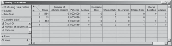
A value of one in a column indicates that there are missing values, while the number of missing values for that pattern is shown in the Count column. Alice sees that:
There are 1,491 records with no missing values.
There are 74 records with missing values only in the Charge Location column.
There are 460 records with missing values only in the Charge Code column.
There are 7 records with missing values in both the Charge Code and Charge Location columns.
So, 534 records contain only one of Charge Location or Charge Code. Are these areas where the other piece of information is considered redundant? Or would the missing information actually be needed? These 534 records represent over 25 percent of the late charge records for January 2008. Alex and Alice agree that improving or refining the process of providing this information is worthy of a project. If the information is redundant, or can be entered automatically, then this could simplify the information flow process. If the information is not input because it is difficult to do so, the project might focus on finding ways to facilitate and mistake-proof the information flow.
Just to get a little more background on the missing data, Alex suggests checking to see which locations have the largest numbers of missing charge codes. While holding down the control key, Alice selects rows 3 and 4 of the Missing Data Pattern table, thereby selecting the 467 rows in LateCharges.jmp where Charge Code is missing. In the LateCharges.jmp data table, Alice right-clicks on Selected in the rows panel and selects Data View (see Exhibit 4.12).
Figure 4.12. Selection of Data View from Rows Panel

This produces a new data table consisting of only the 467 rows where Charge Code is missing. Alice sees that all rows in this new data table are selected since they are linked to the main data table. So she deselects the rows in her Data View table by clicking in the bottom triangle in the upper left corner of the data grid (see Exhibit 3.18).
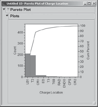
With this 467-row table as the current data table, Alice constructs a Pareto chart by selecting Graph > Pareto Plot and entering Charge Location as Y, Cause (Exhibit 4.13).
Figure 4.13. Launch Dialog for Pareto Plot of 467-Row Data Table

When she clicks OK, Alice sees the Pareto Plot in Exhibit 4.14. The plot shows that Charge Locations LB1 and T2 have the highest occurrence of missing data for Charge Code. Hmmm! Now Alex is wondering about the percentage of Charge Code entries that are missing for these areas. Is the percentage much higher than for other areas?
Figure 4.14. Pareto Plot of Charge Location
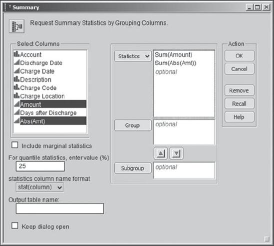
To address Alex's question, Alice would like to construct a table containing a row for each of the 39 different values of Charge Location; each row should show the Charge Location and the percentage of rows that are missing Charge Code for that location. Alice thinks she can do this using Tables > Summary.
First, she closes the Data View table and makes sure that LateCharges.jmp is the active window. She selects Tables > Summary and enters Charge Location into the Group panel. For each Charge Location, she wants JMP to compute the percent missing for Charge Code. To that end, she selects Charge Code in the Select Columns list. Then she clicks the Statistics button and selects N Missing from the drop-down menu (see Exhibit 4.15). She clicks OK.
Figure 4.15. Populated Summary Launch Dialog

The resulting data table, which JMP automatically names LateCharges By (Charge Location), is shown in Exhibit 4.16. Each of the 39 Charge Location values has a row. Row 1 corresponds to the value that indicates that Charge Location is missing. The N Rows column indicates how many rows in the data table LateCharges.jmp assume the given value of Charge Location. The third column gives the number of rows for which Charge Code is missing.
Figure 4.16. Summary Data Table

To obtain the percentage of rows with missing values of Charge Code, Alice needs to construct a formula, which she does with Alex's help. She creates a new column in the data table LateCharges By (Charge Location) by double-clicking in the column header area to the right of the third column, N Missing(Charge Code). She names the new column Percent Missing Charge Code. Alice clicks off the column header and then right-clicks back on it. This opens a context-sensitive menu, from which she selects Formula (Exhibit 4.17).
Figure 4.17. Menu with Formula Selection

This has the effect of opening the formula editor (Exhibit 4.18).
Figure 4.18. Formula Editor

To write her formula, Alice clicks on N Missing(Charge Code) in the Table Columns list at the top left of the formula editor. This enters that column into the editor window. Then Alice clicks the division symbol on the keypad. This creates a fraction and opens a highlighted box for the denominator contents. Now Alice selects N Rows from the Table Columns list. Since the denominator box was highlighted, the column N Rows is placed in that box. To turn this ratio into a percentage, she clicks the outer rectangle to highlight the entire fraction, selects the multiplication symbol from the keypad, and enters the number 100 into the highlighted box that appears. The formula appears as shown in Exhibit 4.19.
Figure 4.19. Formula for Percent Missing Charge Code

Clicking OK closes the formula editor and populates the new column with these calculated values (Exhibit 4.20).
Figure 4.20. Table with Percent Missing Charge Code Column

Alice notices that some percents are given to a large number of decimal places, while others have no decimal places. In order to obtain a uniform format, she right-clicks on the column header again. This time, Alice chooses Column Info. This opens the column information window. Under Format, Alice chooses Fixed Dec and indicates that she would like one decimal place (Exhibit 4.21). (Another approach to constructing this column would have been for Alice to have entered the fraction only, without multiplying by 100. Then, under Column Info, she could have chosen Percent from the Format list.)
Figure 4.21. Column Info Dialog Showing Alice's Selected Format

This looks much better. Now Alice would like to see these percentages sorted in decreasing order. Again she right-clicks in the column header area where she selects Sort. This sorts the Percent Missing Charge Code column in ascending order. However, Alice repeats this and sees that the second Sort sorts in decreasing order. She obtains the data table partially shown in Exhibit 4.22.
Figure 4.22. Partial View of Sorted Summary Data Table with New Column

This data table indicates that for the January 2008 data LB1 and OR1 are always missing Charge Code for late charges, while T2 has missing Charge Code values about 25 percent of the time. This is useful information, and Alex and Alice decide that this will provide a good starting point for a team whose goal is to address the missing data issue.
With Alex's help, Alice figures out how to capture the script that JMP has written to recreate this sorted table. She saves this script to the data table LateCharges.jmp with the name Percent Missing Charge Code Table. This will make it easy for her to recreate her work at a later date. She closes all open data tables other than LateCharges.jmp.
4.3.3. Analyzing Amount
Alex would like to look more carefully at the two outliers in the histogram for Amount. With LateCharges.jmp as the active window, Alice runs Analyze > Distribution with Amount as Y, Columns. She clicks OK. From the menu obtained by clicking the red triangle next to Distribution, she chooses Stack to obtain the report in Exhibit 4.23. Alice saves this script as Distribution of Amount.
Figure 4.23. Distribution Report for Amount Showing One Outlier Selected
She selects the outlier to the left by clicking, holding the click, and drawing a rectangle around the point (shown in Exhibit 4.23). Then Alice holds down the shift key to add the outlier to the right to her selection, drawing a rectangle around it as well. In the rows panel in the data table, she looks at the number Selected to verify that both points are selected.
Alice would like to see the data records corresponding to these two points in a separate data table. To do this, she right-clicks in the rows panel on Selected. From the context-sensitive menu, she selects Data View. This creates the data table shown in Exhibit 4.24.
Figure 4.24. Data View of the Two Outliers on Amount

Alice looks more closely at the two outlying amounts. The first record is a credit (having a negative value). She examines the late charge data for several prior months and eventually finds that this appears to be a credit against an earlier late charge for an amount of $6859.30. The second record corresponds to a capital equipment item, and so Alice makes a note to discuss this with the group that has inadvertently charged it here, where it does not belong.
For now, Alex and Alice decide to exclude these two points from further analysis. So, Alice closes the data table created by Data View and makes the data table LateCharges.jmp active. Then she selects Rows > Exclude and Rows > Hide; this has the effect of both excluding the two selected rows from further calculations and hiding them in all graphs. Alice checks the rows panel to verify that the two points are Excluded and Hidden. Alex saves a script to the data table to recreate the outlier exclusion. He calls the script Exclude Two Outliers.
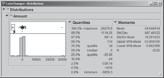
Alice reruns the Distribution report by running the script Distribution of Amount. This gives her the report shown in Exhibit 4.25. Note that N is now 2,030, reflecting the fact that the two rows containing the outlying values are excluded.
Figure 4.25. Distribution Report for Amount with Two Outliers Removed

The symmetry of the histogram for Amount about zero is striking. Alice notes that the percentiles shown in the Quantiles report are nearly balanced about zero, so many late charges are in fact credits. Are these credits for charges that were billed in a timely fashion? The fact that the distribution is balanced about zero raises the possibility that this is not so, and that they are actually credits for charges that were also late. Alex and Alice agree that this phenomenon warrants further investigation.
4.3.4. Visualizing the Variables Two at a Time: Days after Discharge
Alice is rather surprised that late charges are being accumulated in January 2008 for patients with discharge dates in 2006. In fact, 25 percent of the late charges are for patients with discharge dates preceding 12/17/2007, making them very late indeed.
To get a better idea of how delinquent these are, Alice defines a new column called Days after Discharge. She defines this column by a formula that takes the difference, in days, between Charge Date and Discharge Date. She chooses Formula from Column Info and asks Alex how she should write the required formula.
Alex reminds Alice that JMP saves dates as numeric data, defined as the number of seconds since January 1, 1904. The date formats convert such a value in seconds to a readable date. For example, the value 86400, which is the number of seconds in one day, will convert to 01/02/1904 using the JMP m/d/y format. With his coaching, Alice enters the formula shown in Exhibit 4.26.
Figure 4.26. Formula for Days after Discharge

Alice reasons that Charge Date – Discharge Date gives the number of seconds between these two dates. This means that to get a result in days she needs to divide by the number of seconds in a day, namely, 60*60*24. Alice clicks OK and the difference in days appears in the new column. (This column can also be obtained by running the script Define Days after Discharge.)
Now, both Alice and Alex are aware that this difference is only an indicator of lateness and not a solid measure of days late. For example, a patient might be in the hospital for two weeks, and the late charge might be the cost of a procedure done on admittance or early in that patient's stay. For various reasons, including the fact that charges cannot be billed until the patient leaves the hospital, the procedure date is not tracked by the hospital billing system. Thus, Discharge Date is simply a rough surrogate for the date of the procedure, and Days after Discharge undercounts the number of days that the charge is truly late.
Alice obtains a distribution report of Days after Discharge using the Distribution platform, choosing Stack from the Distributions red triangle menu. This report is shown in Exhibit 4.27. (The script is saved as Distribution of Days after Discharge.)
Figure 4.27. Distribution Report for Days after Discharge
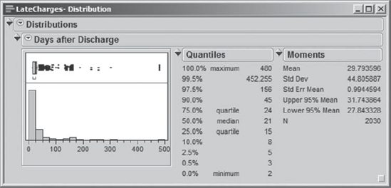
Alex and Alice see that there were some charges that were at least 480 days late. By selecting the points corresponding to the 480 days in the box plot above the histogram, Alice and Alex proceed to view the ten relevant records using Data View (see Exhibit 4.28).
Figure 4.28. Data View of Rows with 480 Days after Discharge

They notice that only two Account numbers are involved, and they suspect, given that there is only one value of Discharge Date, that these might have been for the same patient. Alice deselects the rows. To arrange the charges by account number, Alice sorts on Account by right-clicking on its column header and choosing Sort (Exhibit 4.29).
Figure 4.29. Data View of Rows with 480 Days after Discharge Grouped by Account

They notice something striking: Every single charge to the first Account (rows 1 to 5) is credited to the second Account (rows 6 to 10)! This is very interesting. Alice and Alex realize that they need to learn more about how charges make it into the late charges database. Might it be that a lot of these records involve charge and credit pairs, that is, charges along with corresponding credits?
4.3.5. Visualizing the Variables Two at a Time: A View by Entry Order
At this point, Alice and Alex close this Data View table. They are curious as to whether there is any pattern to how the data are entered in the data table. They notice that the entries are not in time order—neither Discharge Date nor Charge Date is in order. They consider constructing control charts based on these two time variables, but neither of these would be particularly informative about the process by which late charges appear.
To simply check if there is any pattern in how the entries are posted, Alex decides that they should construct an Individual Measurement chart, plotting the Amount values as they appear in row order. Alice selects Graph > Control Chart > IR and populates the launch dialog as shown in Exhibit 4.30. Note that Alice unchecks the box for Moving Range; they simply want to see a plot of the data by row number.
Figure 4.30. Launch Dialog for Individual Measurement Control Chart

The control chart for Amount is shown in Exhibit 4.31. (The script is called Control Chart of Amount.)
Figure 4.31. Individual Measurement Chart for Amount by Row Number

There is something going on that is very interesting. There are many positive charges that seem to be offset by negative charges (credits) later in the data table. For example, Alice notes that, as shown by the ellipses in Exhibit 4.31, there are several large charges that are credited in subsequent rows of the data table.
Alice selects the points in the ellipse with positive charges using the arrow tool, drawing a rectangle around these points. This selects ten points. Then, while holding down the shift key, she selects the points in the ellipse with negative charges. Alternatively, you can select Tools > Lasso or go to the tool bar to get the Lasso tool, which allows you to select points by enclosing them with a freehand curve. Holding the shift key while you select a second group of points retains the previous selection. (The script Selection of Twenty Points selects these points.)
In all, Alice has selected 20 points, as she can see in the rows panel of LateCharges.jmp. Alice right-clicks on Selected in the rows panel and selects Data View. She obtains the table in Exhibit 4.32. The table shows that the first ten amounts were charged to a patient who was discharged on 12/17/2007 and credited to a patient who was discharged on 12/26/2007.
Figure 4.32. Data View of Ten Positive Amounts That Are Later Credited

Is this just an isolated example of a billing error? Or is there more of this kind of activity? This finding propels Alex and Alice to take a deeper look at credits versus charges.
4.3.6. Visualizing the Variables Two at a Time: Amount and Abs(Amt)
To investigate these apparent charge-and-credit occurrences more fully, Alex suggests constructing a new variable representing the absolute Amount of the late charge. This new variable will help them investigate the amount of money tied up in late charges. It will also allow them to group the credits and charges.
At this point, Alex and Alice close all open data tables except for LateCharges.jmp. Alice creates a new column to the right of Days after Discharge, calling it Abs(Amt). As before, she right-clicks in the header area and selects Formula to open the formula editor. She selects Amount from the list of Table Columns. With Amount in the editor window, she chooses Numeric under Functions (grouped) and selects Abs (Exhibit 4.33). This applies the absolute value function to Amount. She clicks OK to close the formula editor and to evaluate the formula. (This column can also be obtained by running the script Define Abs(Amt).)
Figure 4.33. Construction of Absolute Amount Formula

To calculate the amount of money tied up in the late charge problem, Alex suggests that Alice use Tables > Summary. Alice fills in the launch dialog as shown in Exhibit 4.34, first selecting Amount and Abs(Amt) as shown and then choosing Sum from the drop-down list obtained by clicking the Statistics button.
Figure 4.34. Summary Dialog for Calculation of Total Dollars in Amount and Abs(Amt)
When she clicks OK, she obtains the data table shown in Exhibit 4.35, which shows that the total for Abs(Amt) is $186,533, while the sum of actual dollars involved, Sum(Amount), is $27,443. The only thing that Alex and Alice can conclude is that a high dollar amount is being tied up in credits. (The script for this summary table is called Summary Table for Amounts.)
Figure 4.35. Summary Table Showing Sum of Amount and Abs(Amt)

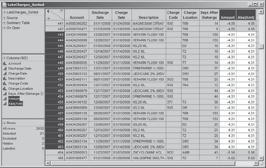
To better understand the credit and charge situation, Alice closes the Summary data table, goes back to her LateCharges.jmp table, and constructs a new data table using Tables > Sort. She sorts on Abs(Amt), with a secondary sort on Amount (see Exhibit 4.36).
Figure 4.36. Launch Dialog for Sort on Abs(Amt) and Amount

Once you have constructed this sorted data table, we suggest that you close it and work with the table LateCharges_Sorted.jmp instead. In that data table, the Days after Discharge column has been moved in order to juxtapose Amount and Abs(Amt) for easier viewing.
The new table reveals that 82 records have $0 listed as the late charge amount. Alice and Alex make note that someone needs to look into these records to figure out why they are appearing as late charges. Are they write-offs? Or are the zeros errors?
Moving beyond the zeros, Alice and Alex start seeing interesting charge-and-credit patterns. For an example, see Exhibit 4.37. There are 21 records with Abs(Amt) equal to $4.31. Seven of these have Amount equal to $4.31, while the remaining 14 records have Amount equal to −$4.31. Alex and Alice notice similar patterns repeatedly in this table—one account is credited, another is charged.
Figure 4.37. Partial Data Table Showing Charges Offset by Credits
To get a better handle on the extent of the charge-and-credit issue, Alice decides that she wants to compare actual charges to what the revenue would be if there were no credits. The table LateCharges_Sorted.jmp is still her current table. She constructs a table using Tables > Summary, where she requests the sum of the Amount values for each value of Abs(Amt) by selecting Abs(Amt) as a group variable (see Exhibit 4.38). She clicks OK.
Figure 4.38. Summary Dialog for Comparison of Net Charges to Revenue If No Credits

In the summary data table that is created, Alice defines a new column called Sum If No Credits, using the formula Abs(Amt) × N Rows. This new variable gives the total amount of the billed charges, were there no credits. She saves a script to recreate this data table, called Summary Table, to LateCharges_Sorted.jmp. A portion of the table is shown in Exhibit 4.39. For example, note the net credit of $30.17 shown for the 21 charges with Abs(Amt) of $4.31 in row 10 of this summary table; one can only conclude that a collection of such transactions belies a lot of non-value-added time and customer frustration.
Figure 4.39. Summary Table Comparing Net Charges to Revenue If No Credits

This table by itself is interesting. But Alice wants to go one step further. She wants a plot that shows how the actual charges compare to the charges if there were no credits. Alex suggests a scatterplot. So Alice selects Analyze > Fit Y by X to construct a scatterplot of Sum(Amount) by Sum if No Credits. She enters Sum(Amount) as Y, Response and Sum if No Credits as X, Factor. When she clicks OK, she obtains the report in Exhibit 4.40.
Figure 4.40. Bivariate Fit of Sum(Amount) by Sum if No Credits

The scatterplot shows some linear patterns, which Alice surmises represent the situations either where there are no credits at all or where all instances of a given Abs(Amt) are credited. To see better what is happening, she fits three lines to the data on the plot. She does this by clicking on the red triangle at the top of the report and choosing Fit Special (see Exhibit 4.41).
Figure 4.41. Fit Special Selection

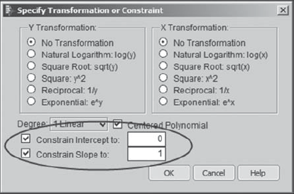
This opens a dialog that allows Alice to choose among various special fits. What Alice wants to do is to fit three specific lines, all with intercept 0:
The line with slope 1 covers points where the underlying Amount values are all positive.
The line with slope 0 covers points where the charges are exactly offset with credits.
The line with slope −1 covers points where all of the underlying late charge Amount values are negative (credits).
To fit the first line, Alice checks the two boxes at the bottom of the dialog to constrain the intercept and the slope, and enters the values 0 and 1, respectively, as shown in Exhibit 4.42. The other lines are fit in a similar fashion.
Figure 4.42. Dialog Choices for Line with Slope 1
Alice's final plot is shown in Exhibit 4.43. She saves the script as Bivariate.
Figure 4.43. Scatterplot of Sum(Amount) by Sum If No Credits
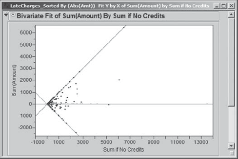
The graph paints a striking picture of how few values of Abs(Amt) are unaffected by credits. Only those points along the line with slope 1 are not affected by credits. The points on or near the line with slope 0 result from a balance between charges and credits, while the points on or near the line with slope −1 reflect almost all credits. The graph shows many charges being offset with credits. From inspection of the data, Alex and Alice realize that these often reflect credits to one account and charges to another. This is definitely an area where a green belt project would be of value.
4.3.7. Visualizing the Variables Two at a Time: Revisiting Days after Discharge
Alex raises the issue of whether there is a pattern in charges, relating to how long it has been since the patient's discharge. For example, do credits tend to appear early after discharge, while overlooked charges show up later? To address this question, Alice closes all of her open reports and data tables, leaving only LateCharges.jmp open. She selects Analyze > Fit Y by X, entering Amount as Y, Response and Days after Discharge as X, Factor. Alice clicks OK.
In the resulting plot, she adds a horizontal reference line at the $0 Amount. To do this, she moves her cursor to the vertical axis until it becomes a hand, as shown in Exhibit 4.44.
Figure 4.44. Accessing the Y Axis Specification Menu from a Double-Click

Then, she double-clicks to open the Y Axis Specification menu shown in Exhibit 4.45. In the dialog box, Alice simply clicks Add to add a reference line at 0.
Figure 4.45. Adding a Reference Line to the Scatterplot

The resulting plot is shown in Exhibit 4.46. Alice saves the script that produced this plot to LateCharges.jmp as Bivariate. The resulting scatterplot shows no systematic relationship between the Amount of the late charge and Days after Discharge. However, the plot does show a pattern consistent with charges and corresponding credits. It also suggests that large dollar charges and credits are dealt with sooner after discharge, rather than later.
Figure 4.46. Scatterplot of Amount versus Days after Discharge
