
4. Using Layers
This chapter introduces you to the details involved in using Layers to edit photographs and other images.
A lot of image editing done in GIMP requires creating and manipulating layers. Layers enable you to create rich graphics used in icons, buttons, avatars, and signatures commonly used on the Web. All images you open in GIMP have at least one layer: the background layer. Think of it as similar to a physical drawing created with paper and pencil. Now imagine having an overhead transparency that contains an image; the sort you’d use with an overhead projector to display an image on a wall or screen. If you placed the transparency on top of your drawing, both the image on the transparency and at least part of the original image on the drawing paper would be visible. In essence, they would make up a single image.
In a nutshell, that’s how layers work, but in GIMP the layers are virtual. Layers can have color or transparent backgrounds and, in addition to color, can contain images, text, and effects. Layers are very handy for being able to deconstruct and compartmentalize the elements of an image, letting you manipulate a single element, without affecting other components or the overall image.
Some of the tasks you’ll learn in this chapter are creating logos, banners, web buttons, and abstract images. Layers allow you to create a complete image out of a “stack” of elements. You can make some or all of the layers visible and invisible, to see the different effects they’ll create. You can remove layers you don’t want, and merge several layers into a single layer.
Learning to Use Layers
The best way to start understanding how to work with layers is to work with layers. In the next series of exercises, besides the Layer tool, you’ll work with features in GIMP you’ve been exposed to so far, such as the Change Foreground Color dialog, Ellipse Select tool, and Move tool, among others. You’ll also be introduced to utilities in GIMP that will be addressed in more detail in subsequent chapters.
Show Me: Media 4.1—Creating a Logo with Layers
You can watch a free video about creating a logo using layers when you log on to my.safaribooksonline.com/9780132174602/media.
![]() LET ME TRY IT
LET ME TRY IT
Creating a Logo with Layers
You can use a variety of methods and techniques to create a logo or emblem in GIMP, depending on your goals. The following steps make good use of layering and give you the opportunity to hone other skills. If you don’t have GIMP open already, open it on your computer now.
- On the Image Windows toolbar, click File and then click New.
- In the Create a New Image dialog, under Image Size, adjust the Width and Height values to 400 each, and then click OK.
- Click Image, Guides, and then New Guide.
- When the New Guide dialog opens, configure the dialog to place a guide horizontally at 100 pixels.
- Repeat this process and place a horizontal guide at 300 pixels.
- Repeat the process twice more, placing a vertical guide at 100 pixels and another vertical guide at 300 pixels. This creates a framework of specific dimensions in order to control the size and shape of the object being created.
- If the Foreground color is not black, use the Change Foreground color dialog to change the color to black.
- Select the Bucket Fill tool, and then place your cursor over the Image Window and mouse click to fill the empty canvas with the color black.
- Select the Ellipse Select tool.
- Place your cursor directly above the upper-left corner of the box you created with the guides, click the mouse, drag the cursor to the lower-right corner, and then release the mouse button.
- Click Image, Guides, Remove All Guides to remove the box.
- Select the Blend tool and then, in Toolbox Options, click Gradient and select Brushed Aluminum, as shown in Figure 4.1.
Figure 4.1. The Blend tool lets you select a gradient in which to fill a selection in a drawing.

- Place your cursor inside the selected circle near the upper left, click, drag down to the lower right, and then release the button, filling the selection with the gradient.
- On the Image Window toolbar, click Layer and then click New Layer.
- When the Create a New Layer dialog appears, in the Layer Name field give the layer the name ring or circle to identify it.
- Under Layer Fill Type, select Transparency and then click OK.
- Open the Change Foreground Color dialog and change the RGB values to R = 73, G = 55, B = 27 (I’m using a bronze color, which can also be created using HTML notation 49371b but you can feel free to choose other colors), and then click OK.
- After verifying that the ring layer is selected on the Layers tab, in the Main Toolbox, drag the foreground color over the still selected circle to fill the circle with the metallic bronze color.
- Click Layer, New Layer and add another transparent layer named something like logo face.
- In the Image Window toolbar, click Select and then click Shrink.
- In the Shrink Selection dialog, change the numeric value to 15, leave the scale to the default pixels, leave the Shrink from Image Border check box selected, and then click OK.
- Click Select and then Feather, accept the default value in the Feather Selection dialog (usually 5.000 pixels), and click OK.
You should now see that a somewhat smaller circle has been selected inside the larger brown disk, as shown in Figure 4.2.
Figure 4.2. The selected ring has been reduced inside the original disk by 15 pixels and the three layers in the drawing are visible on the Layers tab.

- Open the Change Foreground Color dialog and change the RGB values to R = 125, G = 158, B = 192 (I’m using a metallic-looking blue, which can also be created by using the HTML notation 7d9ec0), and then click OK.
- Make sure the “logo face” layer is selected on the Layers tab; drag the foreground color into the selected circle to change its color to a metallic blue.
- Add a new transparent layer, naming it something like metallic.
- On the Image Window toolbar, click Filters, Noise and Hurl, which changes the affected pixels to a random color producing “noise”, and when the Random Hurl dialog appears, accept the default values and click OK.
- Click Filters and then click Repeat Hurl, repeating this action three more times to increase the amount of noise present.
- With the metallic layer selected on the Layers tab in Toolbox Options, use the Mode drop-down menu, select Multiply, and set the Opacity to 40.
- On the Layers tab, click the ring layer to select it, and then set the Opacity to 60.
- In the Layers tab, click the logo face layer to select it.
- On the Image Window toolbar, click Colors and then click Invert.
- With the logo face layer still selected on the Layers tab, use the Mode drop-down menu to select Grain Extract.
- Select the Text tool in the Main Toolbox and on the Text tool tab in Toolbox Options, change the font to 130 pixels, select a bold font such as Tahoma Bold, and change the text color to black.
- Click the cursor in the middle of the selected circle to open the GIMP Text Editor, type in a single letter, and then click Close.
- If necessary, use the Move tool to center the text inside the selected circle.
- With the text layer still selected on the Text tab in Toolbox Options, in the Image Window click Colors and then click Invert to get the result seen in Figure 4.3.
Figure 4.3. The color of the text layer has been inverted.

- Click Filters, Blur, and then click Gaussian Blur.
- In the Gaussian Blur dialog, accept the default settings and click OK.
- With the Text layer still selected, click Filters, Map, and then click Bump Map.
- On the Bump Map dialog, use the appropriate sliders to change the Azimuth to 40.00 and the Elevation to 25.00, accept the rest of the default settings, and click OK.
- Click Select and then click None to remove the circle selection.
- Add another transparent layer to the image and then save your work in GIMP’s native .xcf format, which should appear like Figure 4.4.
Figure 4.4. The image represents the end product you’ll achieve at the end of the tutorial.

Although the process involved in creating the logo may have seemed rather long, constructing a logo or any quality image typically involves a large number of individual steps. In fact, it took five separate layers, including the background layer, to manufacture the effect required for the metallic button logo.
Tell Me More: Media 4.2—What Is a Layer Mode?
You can listen to a free audio recording about layer modes when you log on to my.safaribooksonline.com/9780132174602/media.
Tell Me More: Media 4.3—What Is a Layer Mask?
You can listen to a free audio recording about layer masks when you log on to my.safaribooksonline.com/9780132174602/media.
Show Me: Media 4.4—Creating a Simple Banner with Layers
You can watch a free video about creating a simple banner using layers when you log on to my.safaribooksonline.com/9780132174602/media.
![]() LET ME TRY IT
LET ME TRY IT
Creating a Simple Banner with Layers
There are all manner of ways to create a stylized banner for a website in GIMP that involves manipulating text and other layers. As you saw from the previous exercise, filters can also be used to make helpful modifications. This tutorial shows you a fairly simple method of creating an effect with a banner.
- Open a blank canvas with a white background with the dimensions Width: 600 px, Height: 150 px.
- Open the Change Foreground Color dialog and select the color of your choice.
- Select the Bucket Fill tool and fill the canvas with the selected color.
- Select the Text tool and then select the font of your choice, setting the font size to about 100 pixels and choosing a color for the text that you desire.
- Click in the canvas and when the Text tool dialog opens, enter a word such as Banner and then click Close.
- If necessary, use the Move tool to center the text in the Image Window.
- With the text layer selected, on the Image Window toolbar click Filters, Light and Shadow, and then click Drop Shadow.
- When the Drop Shadow dialog opens, as in Figure 4.5, accept the default values and then click OK.
Figure 4.5. The Drop Shadow dialog lets you add a shadow effect to a banner.

- Save your banner.
You used fewer layers and steps in this exercise than in the preceding task, but you achieve a very simple and attractive banner, suitable for adding to a web page or document. Keep in mind that when you added text, you also added a layer, and when you used the Drop Shadow filter, you added a drop shadow layer.
By now you are probably beginning to see how you might combine different techniques to achieve new effects. For instance, what if you had used a Drop Shadow filter to modify the text layer in the single letter logo you designed in the first exercise? As you progress through subsequent tasks, your repertoire of skills using layers and other GIMP techniques will expand, letting you create increasingly involved and dynamic images.
Show Me: Media 4.5—Creating a Layered Image Using Multiple Images
You can watch a free video about creating a layered image using multiple images when you log on to my.safaribooksonline.com/9780132174602/media.
![]() LET ME TRY IT
LET ME TRY IT
Creating a Layered Image from Multiple Images
So far, you’ve been working with layers in images you’ve created directly in GIMP, but you can also manipulate layers in multiple photographs to create a new image. For this exercise, you’ll need to either have access to a file of free photos or images, or search for them on the Web.
This exercise uses three specific photos or images: a spaceship, a planet, and a view of space to be used as the background. You may have to resize some of your images to give the correct proportions. If you don’t have GIMP open already, open it now.
- Open the image of space and, if necessary, resize the image to the desired dimensions.
- Open the image of the planet and, if necessary, resize the image to the desired dimensions.
- If the planet image does not have a transparent background, make the background transparent and leave the planet selected at the end of the process.
- Open the image of the spaceship, resize if necessary, and if need be, make the background of the planet image transparent and leave the spaceship selected at the end of the process.
- With both the planet and spaceship images still selected from the background transparency process, click Select and then click Feather to make the edges of the two objects slightly indistinct.
- For both the planet and spaceship, click Select and then click None to remove the selection from the objects.
- On the space image, add a new transparent layer and call it something like “planet”.
- On the planet image, click Edit, Copy. In the space image, click Edit, Paste to paste in the planet; then use the Move tool to position the planet as desired.
- On the space image, add another transparent image and call it something like spaceship.
- Perform the same copy-and-paste action on the spaceship, pasting it into the space image and then using the Move tool to position it as desired.
- Click your cursor outside the pasted-in areas to remove the selections, and then save the space image, as shown in Figure 4.6.
Figure 4.6. The image is the finished product of the tutorial.

- If desired, save the planet and spaceship images before closing.
Although the image may not seem perfectly integrated, you should have a fairly passable “photo” of a spaceship apparently intent on visiting Earth or some alien planet (depending on which planet image you originally selected). In my case, it could be an alien invasion, or ET could finally be returning home.
Show Me: Media 4.6—Making a Web Page Button with Layers
You can watch a free video about making a web page button with layers when you log on to my.safaribooksonline.com/9780132174602/media.
![]() LET ME TRY IT
LET ME TRY IT
Making a Web Page Button with Layers
You undoubtedly click buttons on web pages all the time, but you may not realize where they came from, particularly if they are images inserted into the page. Although you can probably find ready-made buttons on the Web for free, if you want something special, you’ll have to make it yourself.
This tutorial will show you how to create a single button and apply different colors resulting in a collection of buttons to be used on the Web.
- On the Image Window toolbar, click File, New, and when the Create a New Image dialog appears, set Width: 400 and Height: 200. Then click Advanced Options.
- Use the Fill With drop-down menu to select Transparency, and then click OK.
- Add a transparent layer and call it something like button.
- Insert four guides: two vertical guides at 40 and 360 pixels and two horizontal guides set at 40 and 160 pixels.
- Select the Rectangle Select tool in the Main Toolbox.
- On the Rectangle tool tab in Toolbox Options, select the Rounded Corners check box and use the Radius slider to set the value to 90.0.
- Put the cursor over the upper-left corner of the box made of guides and drag down to the lower-right corner of the box to select a rectangle with oval ends.
- Remove the guides.
- With the Foreground and Background color set to their default values of black and white, respectively, select the Blend tool in the Main Toolbox.
- On the Blend tool tab, click the Gradient button and from the list of options that appears, select FG to BG (RGB), use the Shape drop-down menu to select Linear, and then use the Offset slider to set the value to 20.0.
- Put the cursor just inside the upper-left area of the selected rectangle and drag down to the lower right. Then release the mouse button to fill the selection with the gradient.
- Add a new transparent layer and call it something like dark top.
- On the Blend tab, return the Offset value to 0.0, click the Gradient button, and select FG to Transparent.
- Place the cursor just inside the top of the selected area, drag it halfway down the rectangle, and then release the mouse button.
- Add a new transparent layer and call it something like dark top small.
- With the top dark layer selected on the Layers tab, click Select from the image window toolbar and then click Shrink.
- When the Shrink Selection dialog appears, set the value to 5 pixels and then click OK.
- Making sure the Blend tool is still active, place the cursor just inside the top of the new rectangle, select and drag it halfway down the rectangle, and then release the mouse button, as shown in Figure 4.7.
Figure 4.7. The new layer has the resized selected area used for the latest gradient fill.

- On the Layers tab, with the dark top small layer still selected, use the Opacity slider to set the value to 60.0.
- With the same layer still selected, click Filters from the image window toolbar, select Blur, Gaussian Blur.
- When the Gaussian Blur dialog appears, set the Horizontal and Vertical values to 10.0 and then click OK.
- On the Layers tab, select the button layer, click Colors from the image window toolbar, and then click Colorize.
- When the Colorize dialog appears, use the Hue, Saturation, and Lightness sliders to create a red button with three-dimensional qualities, as shown in Figure 4.8.
Figure 4.8. The Hue, Saturation, and Lightness dialog is the key to letting you create different colored buttons based on a single image.

- Click OK and then save the button image as red using the xcf file format.
- Click Edit and then click Undo Colorize to remove the red color.
- Repeat the steps to Colorize the button but choose a green color this time, saving the button as green, then undoing the Colorize effect.
- Create several other buttons of different colors, such as orange, blue, and purple, or whatever colors you want, saving each one with an identifying name.
You now have a collection of different colored rounded buttons you can use on a website. These buttons are quite large, so you’ll probably want to resize them to smaller dimensions to fit within your web page layout. During the creation process, you can also manipulate the level of shadow at the different layers by controlling the Blend tool’s Gradient Offset values, the number of pixels to shrink the selection, and so on. The effect can also be significantly modified just by how you set the different values in the Colorize dialog.
Tell Me More: Media 4.7—What Is a Gradient?
You can listen to a free audio recording about gradients when you log on to my.safaribooksonline.com/9780132174602/media.
Show Me: Media 4.8—Creating a Layered Photo
You can watch a free video about creating a layered photo when you log on to my.safaribooksonline.com/9780132174602/media.
![]() LET ME TRY IT
LET ME TRY IT
Creating Another Layered Photo
Earlier in this chapter, you used a few different photographs to create a copy-and-paste image of a planet in space being visited by a spaceship. There are an almost-inexhaustible number of images that can be created using that technique, just by varying a few steps.
For this exercise, you’ll need some sort of background and a figure to place on the background. The background of the figure itself must be transparent, so if you select a figure with a background, you must remove it before proceeding. The tutorial uses a metallic wall and a stylized running figure.
- Open the background image in GIMP and, if necessary, resize it to fit your requirements.
- Making sure the foreground and background colors are set to their default values, click Layer, New Layer, give the layer a name, such as black. Under Layer Fill Type, select Foreground Color, and then click OK.
- In the Main Toolbox, click the Free Select tool (it looks like a lasso), and then draw an irregular shape, as shown in Figure 4.9.
Figure 4.9. The Free Select tool lets you draw a selection of any shape freehand.

- Click Edit and then click Clear to remove the selected portion of the black layer.
- Click Select and then click None to remove the selection.
- With the black layer selected, click Filters, Blur, and then click Gaussian Blur.
- When the Gaussian Blur dialog appears, set the Horizontal and Vertical values to 100.0 and then click OK.
- Add a transparent layer and call it something like figure.
- Open your figure image and paste it onto the figure layer of your background image, using the Move tool to adjust its position, if necessary.
- On the Layers tab, drag the figure layer so it is in between the black and background layers, as shown in Figure 4.10.
Figure 4.10. Positioning the figure layer beneath the black layer creates the effect of a person running through a patch of light in an otherwise dark area.

- If the amount of black in the image seems too heavy or overpowering, select the Crop tool in the Main Toolbox (it looks like a blade) and crop the excess black down to suit your requirements.
- When finished, save the image.
The tutorial example resulted in a fugitive-like figure running against a rough background and framed as if a light were shining on him. Blurring the cutout in the black layer can be used to project a sense of mystery in an image, depending on the message you are trying to convey. This image can be modified for use as a graphic signature for a discussion forum, a computer desktop wallpaper, or some other web-related image. As you are working with these tutorials, keep in mind that you can adapt anything you’ve learned to create original images for your own specific purposes.
At this point, you are likely becoming familiar with the tools typically used with layering to create and modify images. So far Gaussian Blur has been used a number of times to achieve a desired effect.
Show Me: Media 4.9—Creating an Abstract Image
You can watch a free video about creating an abstract image when you log on to my.safaribooksonline.com/9780132174602/media.
Creating an Abstract Image
There are all manner of images available on the Web. Some of them are very functional, and others fall into the category of pure art. As previously mentioned, some of this art can be adapted for discussion forum avatars, graphic signatures, computer desktop wallpapers, and other web-related images. The next exercise involves a more abstract image than you’ve worked with previously.
For this exercise, you can either download a free image or create an image of an object you would like to appear “radioactive.” The exercise uses a stylized sphere, but you can use any object you want. Just make sure that the object has a transparent background.
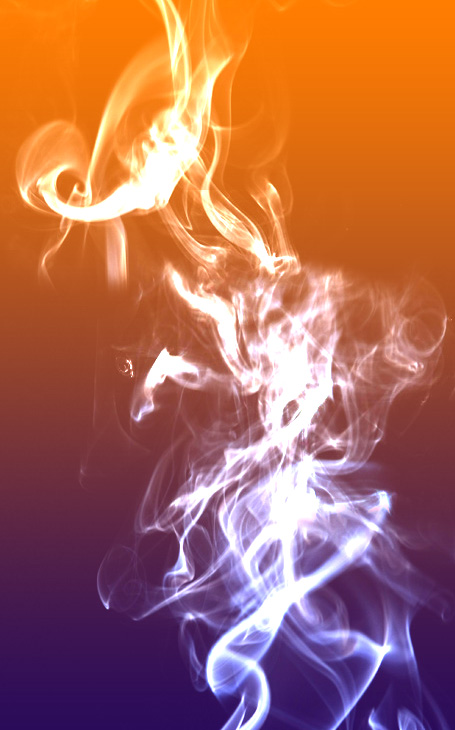
The second element used was a free smoke image downloaded from www.bijusubhash.com/wp-content/uploads/2010/01/Download-75-Free-Smoke-Pack-Images.jpg. To follow the tutorial as closely as possible, you should acquire a similar image.
With the object and the watercolor sampler available, perform the following steps:
- Create a new, blank image using the default dimensions of 400 by 400 and using a black background.
- Add a new transparent layer, and call it something like sphere.
- Open the sphere or other object image, resize it as necessary, copy and paste it onto the transparent layer of your new image, and then click outside the pasted image to remove the selection.
- With the sphere layer selected, click Select and Feather, and when the Feather dialog appears, set the value to 100 pixels, and then click OK.
- With the sphere layer still selected, click Layer, Transparency, and then click Alpha to Selection to select the sphere.
- Click Filters, Light and Shadow, and then click Drop Shadow.
- In the Drop Shadow dialog, set the Offset X and Offset Y values to zero and set the Blur Radius to 25.
- Set the color to a shade of green you believe communicates “radioactivity,” set Opacity to about 80, clear the Allow Resizing check box, and then click OK to produce a glowing effect.
- Repeat the previous step but on the Drop Shadow dialog, set the Blur Radius to 50 to produce an effect similar to what is shown in Figure 4.11.
Figure 4.11. The Drop Shadow feature allows you to create a colored glowing effect around a selected object.

- Open the free smoke image and resize it to have the same width as your primary image.
- On the free image, click Colors and Desaturate, and when the Desaturate dialog appears, click OK.
- On the smoke image, click Colors. Then click Brightness-Contrast, and when the Brightness-Contrast dialog appears, use the Brightness slider to set a value of about -90 and drag the Contrast slider to the far right to set it at its maximum value of 127. Then click OK.
- Add a new transparent layer to the main image, calling it something like smoke.
- Copy and paste the smoke image into the transparent layer you just created.
- Right click the pasted layer and in the menu, select Anchor layer so it merges with the transparent smoke layer.
- On the smoke layer, use the Mode menu to select Overlay, and then set the Opacity to 80.
- Add one last transparent layer to the image and then save it so it appears similar to Figure 4.12.
Figure 4.12. Setting a layer to Overlay and adjusting its Opacity creates the effect shown in this image.

As you can see, you could have modified the steps in this tutorial to create different effects or variations on the effect described. For example, you could have resized the watercolor sampler image differently and rotated it to provide an alternative orientation to the overlay pattern.
As you continue to progress through the rest of the chapters in this book, you’ll still work with layers, but you’ll add more tools to your experiences that build on what you’ve learned and that will increase your confidence in creating and editing graphics.