
Chapter 2: Getting Started With Design And Development For iOS
When designing software, we always focus on the features or, put another way, on what the software lets you do. I strongly believe that how the software makes you feel is just as important. Is finishing a particular task painful and time-consuming? Or is it effortless because the software is intuitive and easy to use? These different experiences are critical to our perceptions of software.
When the iPad was first released, I purchased it immediately (for work, of course). That evening, my wife and I were playing with the new toy (I mean tool), exploring the applications that were available. We spent several hours playing puzzle games, browsing photos and exploring vacation destinations in the Maps application. All of these things could have been done on the computer, so the iPad doesn’t enable new functionality. But we loved the time spent sharing this new device. So, what exactly was new?
Google Maps doesn’t offer any new features on the iPad, but it does offer a completely different experience. We could pinch and zoom to explore old neighborhoods, and we could pass the iPad back and forth as we visited new destinations. Then, we played the puzzle game in which you have to free one car from a crowded parking lot. As we reached over each other to try out possible solutions, I realized how different this experience was from playing a game on the desktop. Both of us could interact with the device at the same time.

FIGURE 2.1. The experience of browsing Google Maps is different on iPad than it is on desktop. The functionality is the same, but the interaction is entirely different.
This is what I mean by how software makes you feel. What I love about designing for iOS is being able to create those feelings that make users love software. So, why don’t you come with me and we’ll learn what makes some of these experiences truly great.
Download Xcode and the SDK
OK, I lied. We can’t get started quite yet: we need some software first. To deploy your code to devices or to the App Store, you will need to sign up for Apple’s iOS Developer Program. This costs $99 per year and includes everything you need to develop iOS apps. If you want to get started for free, go to the App Store and download Xcode, and then register as a free developer on Apple’s developer website. This will give you access to the SDK and simulator, but you won’t be able to deploy your apps to the App Store or run them on devices.

FIGURE 2.2. Xcode, the building tool for iOS applications.
As new versions of iOS are released, you will need to update both Xcode and the SDK so that you can continue developing for the latest operating system. Also, note that Xcode and the SDK will only run on a Mac. Sorry, Windows and Linux users!
While Xcode is being installed, let’s briefly look at particular features of the iOS platform.
iOS Design Patterns
Up to this point in this book, you’ve learned about general mobile design principles and guidelines for building rich mobile experiences. Now, let’s get into the design patterns and challenges that are unique to iOS.
The Hardware
The first thing you’ll notice when picking up an iPhone or iPad is the high-density display. It really is the key feature of the devices, and everything else is designed around it. Unlike most other smartphones, iOS devices don’t have a physical keyboard, a “Back” button or any other physical buttons with which you can interact with applications. The two main buttons on iOS devices are the Home and Lock buttons. Because both of them end the user’s engagement with an app, they are not factors in your designs.
Because there aren’t hardware buttons, users expect everything to happen on the screen. This includes all navigation, data inputting and notifications. The advantage of this approach is that you can display exactly the right control for the type of action being requested from the user. For example, for an email field, iOS will customize the keyboard to display an @ symbol prominently. Other customizations are available for numbers, URLs and other types that would benefit from a custom keyboard. The user simply notices that the key they want is readily available to them.
The Experience
John Gruber of Daring Fireball posted a question asking, “If you could have only Apple hardware or Apple software, but not both, which would you choose?”1 My first instinct was that I love the quality and design of the hardware, so I would choose that. After more thought, I came to the opposite conclusion: software is what you spend most of your time interacting with, so extra effort put into the user experience goes a long way.
Take the bounce scrolling feature built into iOS. Imagine a user reaching the bottom of a list and the scrolling just stops while their finger keeps moving. Has the device locked up? The user has told the app to scroll, but for some reason it is no longer responding to that input.
With bounce scrolling, the list continues to move with the finger but yields blank space. This makes it obvious that the end of the list has been reached, without having to display a message of any kind.
Direct Manipulation
Imagine that you’re moving a piece of paper sitting on a desk. You place your hand on it and slide to the right, but the paper doesn’t start moving until you finish your swiping gesture. Then it catches up to where your hand is. That would be strange, right?
On touchscreens, direct manipulation is critical to achieving a great user experience. In the Weather app, the city cards move side to side directly with your finger, rather than move only after a gesture has been completed. If you don’t move the card far enough to trigger the next card, it simply bounces back into place. This is direct manipulation in action.
In the Clear app by Realmac Software, you check off a to-do item by swiping to the right. Fixing the item in place and having it change to a completed state after the finger swipes across it would have been easier. Instead, with direct manipulation, the to-do item is pulled along with your finger until it hits a tipping point, and then the item is marked as completed. Always move an object directly with the gesture that controls it. This type of experience is what really makes multitouch applications shine.
 FIGURE 2.3. Direct manipulation is crucial for good iOS apps. Clear app moves the to-do item with the gesture that controls it.
Minimum Touch Size
On iOS, you are dealing with users with pudgy fingers, rather than precise mouse cursors. Because of this, you need to make sure that any element you want users to interact with is large enough, so that selecting it won’t be a challenge. Apple recommends 44 points wide by 44 points tall as a minimum size (for now, assume that points map directly to pixels—I’ll explain later). This keeps the user from having to try to select a simple button multiple times.
Now, just because your tap target needs to be 44 points square doesn’t mean that the button’s outline has to be. You can make the target area larger than the button itself to increase the likelihood that an inaccurate tap will still trigger the button. If your button isn’t sitting right next to other elements with tap actions, then the button could actually be quite a bit larger without the visual design needing to be changed.
Hardware Features
To me, the most exciting thing about iOS devices is the hardware features—all waiting for you, the designer, to piece them together in a new way. With the multitouch display, camera, GPS, accelerometer, microphone, speaker, camera flash and many more features, the iPhone becomes a blank slate just waiting for your new idea. This new world of smartphones enables us to create entirely new things.
So, what could you do? Let’s look at a couple examples:
•The Level app by Stanley, a hardware tool company, lets you use the iPhone’s accelerometer as a level to hang pictures.
•State Farm, an insurance company, uses the GPS and accelerometer to grade driving habits. It monitors how quickly you accelerate, the speed at which you drive around turns, and whether you follow the speed limit, and then it gives you a score.
•Word Lens, one of my favorites, is an app that translates real-world text seen through the camera, right in place. (It began with translation from Spanish to English but now supports many languages.) So, point it at a road sign, and the newly translated words follow the basic look and placement of the text they are replacing.
•Shazam listens to the music playing in a room and tells you the song and artist. Then you can easily purchase the song or mark it as a favorite. The app uses the microphone and an Internet connection together to help you discover new music.
•Flipboard turns the iPad into a personal magazine, curated by all of your friends on Twitter and Facebook. The reading experience is excellent, made possible by the large display and form factor of the tablet.
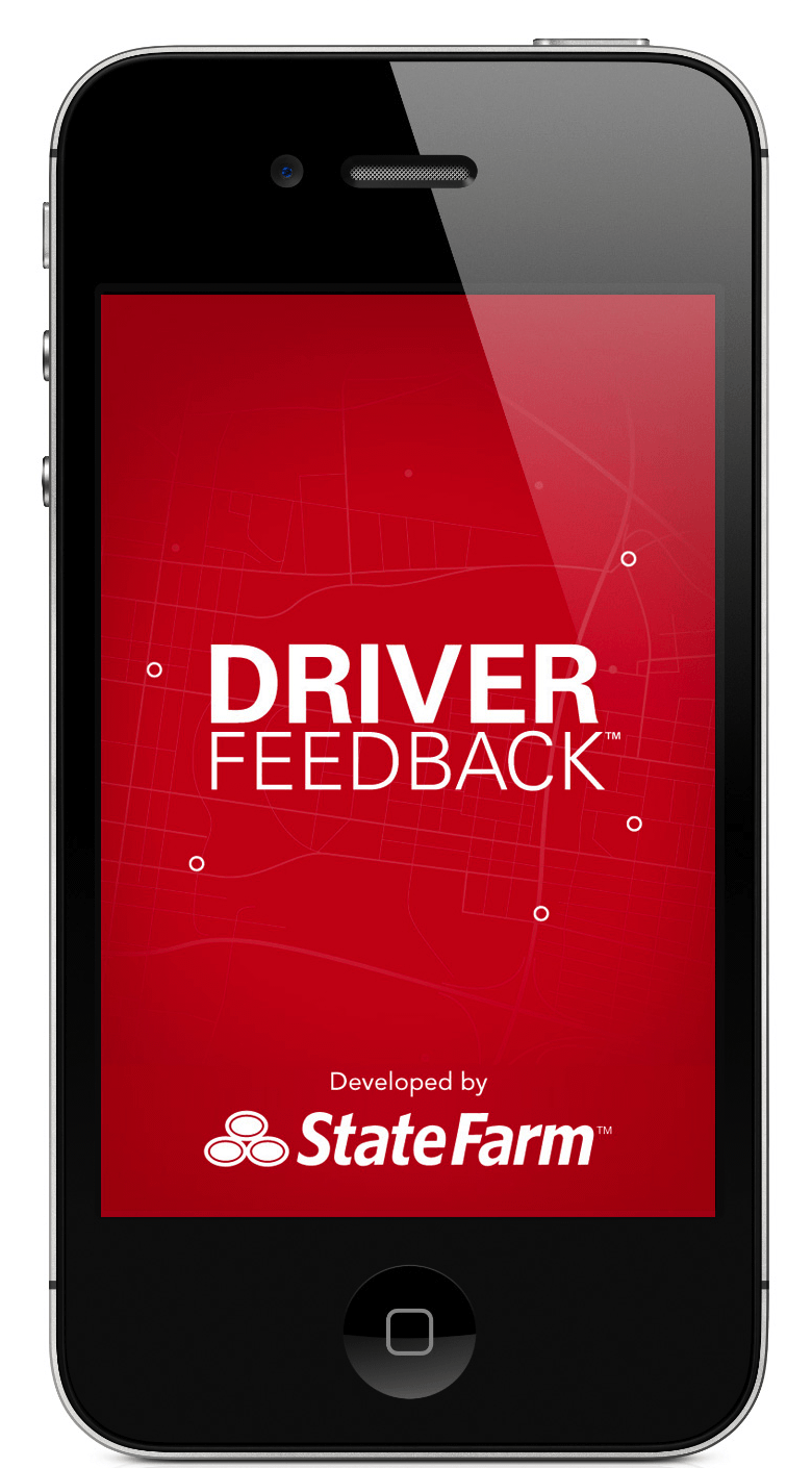


FIGURE 2.4. The hardware makes it possible for designers to leverage the potential of mobile environment in mobile apps. Examples: State Farm, Shazam, Wordlens.

FIGURE 2.5. Flipboard, a beautiful example of an app that transforms regular content, RSS-feeds and tweets into a personal magazine experience.
These are just a few of the many great possibilities. Their hardware features make iOS devices a blank slate, just waiting for your latest idea.
Finding Your Way Around Xcode
Is Xcode installed yet? Cool. Let’s walk through it. All of your development for iOS will take place in Xcode, so spend some time up front familiarizing yourself with the program. I’ll just cover the most common features that you’ll need to get started, but continue exploring on your own to really learn the application.

FIGURE 2.6. When creating a new project in Xcode, a list of templates will be provided.
Creating a Project
When you create a new project, Xcode provides you with a list of templates to choose from. These make great starting points for different kinds of applications. For now, choose a “Single View Application”; but next time, create sample projects with each of these templates to become familiar with them.
For the sample project we are creating right now, select “iPhone” as the “Device Family,” and uncheck “Use Storyboards” and “Include Unit Tests.”
Xcode will use these options to create a template application that is a good starting point for your application. The next step is to find a place to save your new app. Now, let’s walk through Xcode’s interface.
The Top Bar
In the top left are the controls for building and running your application. The functionality of play and stop is pretty obvious. Next to that is a drop-down menu for selecting the destination of your code. This should show “iOS Device,” “iPhone Simulator,” “iPad Simulator.” If you have a device plugged in, then it will display the device’s name, instead of just “iOS Device.”
If you select any option with the simulator, it will open the separate iOS Simulator application when you run your app.
On the right side are your view controls. Use them to switch editing layouts or to show any of the sidebars or the bottom tray. If you aren’t sure what a button or icon does, just place your cursor over it and wait a second for a tooltip to appear. They are usually quite descriptive and will help you discover new functionality.

FIGURE 2.7. The functionality of the top bar is pretty obvious.
Left Sidebar: Navigators
The left sidebar contains all of the navigators. The first and most important is your project’s navigator, which shows all of the files in your project. This is my most commonly used tab. The other tabs are for easily navigating symbols, issues, breakpoints and the log.
If any errors or warnings come up when you run your project, Xcode will switch to the “Issues” tab to show them.

FIGURE 2.8. The left sidebar provides an overview of your project’s navigators.
Right Sidebar
The right sidebar’s content changes according to the type of file you have selected. For most code files, it will display the “File Inspector” with another tab for help.
The “File Inspector” includes identity, localization, source control and other information. I don’t use it heavily in code files. You will find yourself using the right sidebar a lot when editing view files (i.e. XIB files). We’ll cover that in the “Interface Builder” section.

FIGURE 2.9. The right sidebar displays settings of the current file.
Project Settings and Targets
When the “Project Navigator” is open (in the left sidebar), you can click on the project at the top to display its targets. This is where you can change your application’s name, supported device orientations, which frameworks to include and which devices to support (iPhone, iPad or both).
Later on, you will use this section to select provisioning profiles when pushing your application to a device or to the App Store.
Xcode can do so much more than what we’ve covered here, but this should serve as a quick guide to getting started. If you find something confusing, Google it. There are so many great blog posts and Stack Overflow questions that you will have an answer in seconds.

FIGURE 2.10. The “Project Navigator” allows you to change supported devices, its orientation, which frameworks to include and many things more.
Introducing Interface Builder
The visual parts of a view are contained in XIB files (pronounced “nib”).2 These are edited with the Interface Builder, the visual design and layout tool included with Xcode. Designing your views with it is very convenient, so spend some time becoming familiar with it.
We are going to add a button to our ViewController.xib file and then connect it to our code so that we can style it and hook up an action to be called when the button is pressed.
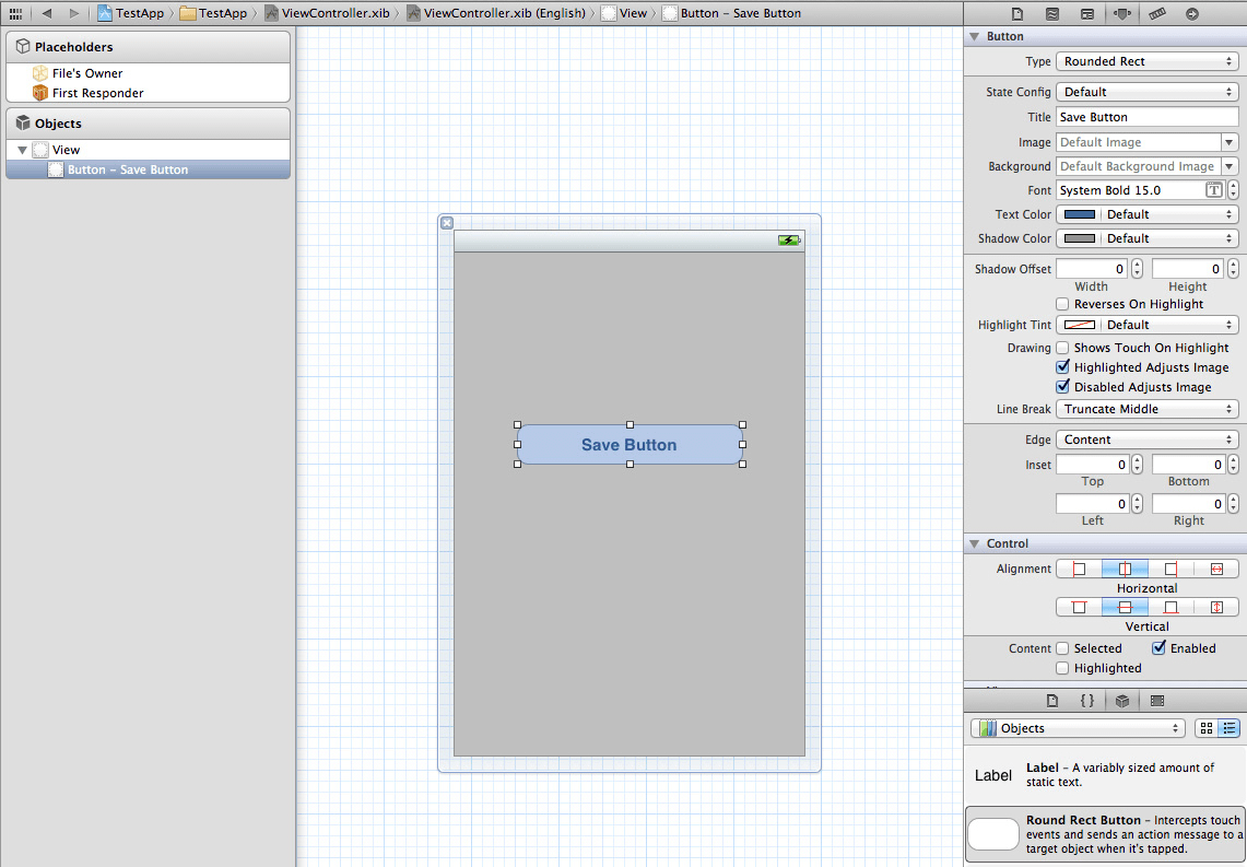
FIGURE 2.11. The visual elements of the interface are defined in XIB files. You can edit them with the Interface Builder, a tool integrated into Xcode.
Getting Elements on Screen
To add a new element to the screen, select ViewController.xib and then find the “Objects” library in the right sidebar. Then scroll through the list until you find the object to add. Let’s start with a UIButton. Simply drag the button from the list and drop it onto your canvas. You can grab either side of the button to resize it. Double-click on the button to change its label.
Alignment and Layout
Laying out elements is where the Interface Builder really shines. Normally you have to tweak values in code and run the project to make sure that everything has consistent alignment and spacing.
In the Interface Builder, this becomes a visual process of dragging an element to the correct place on screen. To fine-tune the positioning, you can select an element and use the arrow keys to nudge one point at a time. Or you could always switch over to the “Size Inspector” to type in precise size and position values.
If you are using UILabels in Interface Builder, long strings of text will stay on a single long line (often going off the screen). You can fix this by setting the number of lines in the settings panel (on the right). A value of 2 will put your text on two lines. But if you want Interface Builder to automatically figure out the correct number of lines set the value to 0. I know it’s not very intuitive, but it works.
Connecting to Your Code
This visual design you’ve created currently exists outside of the flow of the rest of your application. We need to use IBActions and IBOutlets to connect these elements to our code.
An IBAction is what we use to connect the “action” of an element, such as a button press, to a method in our code. So, IBActions are critical to actually integrating our XIB file in our code.
IBOutlets are how we make an element itself available in code. So, if we’ve created a button in Interface Builder, we would need to map it to an IBOutlet so that we can change its properties, such as font size and color, in code. It’s confusing at first but should make more sense once we’ve gone through an example.
In your Xcode project, open up your header file (ViewController.h) and enter in this code:
@Interface ViewController : UIViewController {
    IBOutlet UIButton *submitButton;
}
@Property (nonatomic, retain) IBOutlet UIButton *submitButton;
Then, in your ViewController.m file, add this line near the top:
@synthesize submitButton;
If you are using “ARC” (automatic resource counting), available in iOS 5, then you won’t need to release the memory for the button. Otherwise, you’ll need to release it in your dealloc method.
(void) dealloc {
    [submitButton release];
}
These next steps can be confusing, so we’ll work through them carefully.
•Go back to your XIB file and select the button.
•Select the “Connections inspector” tab in the top right.
•Find the small circle next to “New Referencing Outlet”.
•Click in that circle and drag to the “File’s Owner” section in the left sidebar. Let go of the mouse button once the cursor is over “File’s Owner.”
•Then select submitButton from the menu that appears.

FIGURE 2.12. In the Interface Builder, you can set up events by connecting the placeholders from the left sidebar with the events in the right sidebar.
Now our UIButton in the XIB file is connected to the submitButton referenced in our code. We can go back to our .m file and find the viewDidLoad method (which will run after our view has finished loading). In viewDidLoad, add the following lines:
(void) viewDidLoad {
    UIImage *buttonImage = [UIImage
imageNamed:@”orangeButton.png”]
    [saveButton setBackgroundImage:buttonImage
forState:UIControlStateNormal];
}
Here we are setting a new background image on our saveButton element. You can follow this same process to access any other Interface Builder element through code. You will need to add an image named orangeButton.png to your project for it to display the image.
Now let’s talk about IBActions. At the most basic level, IBActions let you call a method when the user interacts with an Interface Builder element. So, let’s set up an IBAction to run when the user taps a button.
Just before the @end in the .h file add:
(IBAction) buttonPress;
Then inside the .m file add in a method for the IBAction to trigger:
(IBAction) buttonPress {
    // Run this code
}•Now go back to your XIB file and select the UIButton.
•Then select the “Connections” tab.
•Under “Sent Events” look for “Touch Up Inside.”
•Drag from that circle to “File’s Owner.” Get used to drawing these connection lines—you’ll be using them a lot in the Interface Builder.
•Then, select buttonPress from that menu. Now, when a user lifts their finger after touching inside the button, any code contained in our buttonPress IBAction will run.
As you can see, other methods are available to use. Experiment with them, but “Touch Up Inside” is the most common.
Autosizing
iOS apps supports portrait and landscape models (or both), so Interface Builder includes a feature called “Autosizing.” With this, you can set how an element resizes itself when its surroundings change. If the view rotates from portrait to landscape, should the button’s width increase to match?
Use the visual diagram in the autosizing view to see how your current settings will cause the element to appear.

FIGURE 2.13. With autosizing, you can set how an element will resize itself when its surroundings change.
Keeping XIB Files Organized
In a complicated XIB file, distinguishing between your many UIViews or UIButtons can be difficult. Try adding Xcode-specific labels under the “Identity” tab in the right sidebar. This will make finding the correct object in the “Objects” panel so much more efficient.
A Note on Storyboards
Storyboards came out in iOS 5, promising an easy way to build out the entire flow of your application in a single document. A storyboard consists of multiple “scenes,” each of which makes up a screen of your application. You can drop new view controllers onto your storyboards and then use segues to connect them together.
I took an unscientific poll of app designers, who are normally the first to jump on new features like this. All of them had used storyboards in the past, and all of them have decided not to use storyboards in new projects. While storyboards work for simple navigation structures, I don’t think they work well for apps that need more custom features.
Over the next year or two, I expect storyboards to improve considerably, so it is worth learning how to use them and then deciding for yourself. As a starting point, I recommend Ray Wenderlich’s tutorial on “Beginning Storyboards in iOS 5.”3
Having experimented with Xcode a bit, let’s get back to more general design considerations for iOS—and probably one of the most important ones: navigation.
Choosing a Navigation Style
How we display content and enable users to navigate around our application is crucial to the experience. Most of that is determined by the navigation style we choose. A navigation style determines how the multiple views of our application interact with each other. For me, the first step is to map out the content and actions that I need to include, and then look through the available navigation styles to find the right one. If none of them match, I’d create an entirely new style.
When choosing a navigation style, I ask myself whether the user would want to access any features or sections more frequently than others. Selecting a navigation style has all to do with the organization of your app’s content as well as knowing the value of screen real estate. We’ll walk through the options available and help you find the best for your application.
iPhone View Controllers
Users are already familiar with quite a few standard navigation styles for the iPhone, so you have plenty of options to choose from. You could always invent your own style, of course, and there are good examples of innovative navigation structures, which we’ll look at in the section on custom styles below.
Single View: Flashlight app
This is the most basic option available. It doesn’t have settings or options on another page—just one view with everything you need in order for the app to function. Many flashlight apps work well with this because they really only need an on/off switch.
Utility View: Voice Memos
A utility view application has one primary view where most of the interactions take place, but also a secondary settings view. The additional view is usually accessed through an “i” icon or info button in the corner. Then, the entire screen flips around to reveal the settings. This is great when your app is simple but you need settings or want to include information about your company.
On the iPad, the settings view is accessed from a button in the top-right corner and appears in a popover, taking up only a small portion of the screen.


FIGURE 2.14. Flashlight App has only one single button. Voice Memos has one primary view, but also a secondary one.
Push View Controller: Mail
The push view controller is in most iPhone applications. We’ll use Mail as an example. Each time you select an email message, the screen slides to the left, revealing the details view—in this case, the email’s contents.
A button with a back arrow then appears in the top-left corner, taking you back to the previous view. With a push view controller, you can keep adding views as needed, without limit.
This is often used along with a UITableView for navigation. This method is so common that it appears in some form in most iOS applications. Learn it well because you will definitely use it at some point.

FIGURE 2.15. Apple’s Mail application uses the push view controller, with screens sliding to the left or to the right side.
Tab Bar Controller: Clock, Music
The black navigation bar across the bottom of an interface is called a tab bar. Tab bars are great for applications that have several distinct features or content areas that need to be kept separate. The Clock application has separate tabs for the world clock, alarm, stopwatch and timer. All of these features are related to time, which is why they are in the same application, but each one could be a standalone application. In your application, the sections don’t need to be quite so distinct.
A tab bar allows for up to five visible items at any time. If you need additional icons, the final tab could be a “More” button that provides access to a customizable list of additional tabs. The Music app, for instance, offers many tab bar options for users to prioritize their favorite methods of finding music.
Every tab has a small monochromatic icon and a short text label to describe the icon. Using clear icons and descriptions for your labels is incredibly important for easy navigation. Find simple, short words that define the feature or content they refer to. If you use a common label, such as “Featured,” “Search” or “History,” then use the default UIKit icon that goes with that label to be consistent.
Your icons should be simple shapes and outlines, without shading or shadows. UIKit will automatically add gradients and styles to make them match, as well as generate a selected state that has a nice blue glow.
In recent iOS versions, you can customize the UIKit tab bar to make it better match your application, rather than use the default black bar. Find My Friends adds a leather texture and style to the tab bar, helping to make Apple’s application unique and playful.
Within each section, you can use lists and push view controllers to display even more content. This will give your app a considerable number of views and features, without overwhelming the user. Each view would be neatly organized in its respective tab.
Tab bars are mostly permanent, meaning they should appear in almost every view of your application. The only time to hide them is when you have a modal overlay for adding or editing content that lives outside of the standard navigational structure.
You should have only one tab bar at the highest level of your application’s navigation. In my experience, more than one tab bar will just confuse users.
As you organize the content in a tab bar, put the most dynamic and most frequently used content on the left and the least used and least frequently updated content on the right. Your app should default to loading the left-most tab.
For many applications, it is a good idea to store the tab that the user had open before quitting and then restore the application to that tab. This is especially important when you have different views or styles for displaying the same information. The user most likely prefers one over another, and you should remember their selection.
The tab bar controller also works well on the iPad.

FIGURE 2.16. The World Clock application uses a tab bar to provide several distinct features that need to be kept separate.
Page View Controller: Commit, Weather
A page view controller uses a series of cards that slide side to side with a swipe. Small white dots on the bottom of the view indicate where the active card is in the set. The Weather app on the iPhone uses this method. It works well when you have a series of equal items (cities in the Weather app) that need to be quickly moved between.

FIGURE 2.17. The Weather app enables users to navigate content cards with a swipe.
Commit, my reminder and habit-building application, uses this method as well. When the application launches for the first time, it immediately has useful content to display (in this case, a screen for creating a commitment). In addition, the content is readily available on subsequent launches. This is a great way to make an app that has only a bit of content feel full and complete.
The content should not scroll. The card metaphor would be lost if the content scrolled beyond the screen.
Because swiping is not an explicit action (like tapping a button), you need to provide visual indicators that swiping is possible. The most common method is to display small white dots below each item. Each dot represents one card, and the relevant dot is highlighted to show where the user is in the list.

FIGURE 2.18. Commit App uses the page view The Weather app enables users to navigate content cards with a swipe-pattern for navigation.
If you can’t or don’t want to use dots, you could try another method, such as showing a bit of the previous and next items, which serves as a small visual indicator to teach the user to swipe side to side.
Slide-Out Panel(s): Facebook, Path
In early 2012, Facebook released a version of its application with an entirely new navigation style. All of the navigation was hidden away in a slide-out panel, accessible from a button in the top-left corner (swiping from left to right would also display the menu). In this pattern, when the navigation panel is displayed, it covers up most of the screen but still displays a portion of the main view for context.
Path later expanded on this concept by adding two panels, one on each side of the main view, also accessible with a swipe gesture to either side. Path uses one side for navigation and the other side for the “Your Friends” list.
This navigation style is great for applications that have a lot of different content and that also need to maximize screen space. Because the panel is off screen most of the time, there is no need for a bottom bar (as with a tab bar controller), although you still retain the benefit of being able to use a push view controller.


FIGURE 2.19. Facebook App and Path app utilize a slide-out panel pattern.
Custom Designs: Clear, Convertbot
Some applications do really well in throwing out all conventions and prebuilt elements and starting from scratch with a completely custom interface.
Convertbot has a radial interface for picking different units to convert between. It does not use any standard navigation method, but it is still easy to use. The user not only is able to make their selection quickly, but can even have fun spinning the wheel to find the correct measurement.

FIGURE 2.20. Sometimes it’s worth to be creative. Convertbot app uses a custom radial interface.
Clear is a to-do list application that avoids buttons. The only buttons in the entire app are on the keyboard. Instead, you navigate with pinches and swipes. This also requires an entirely custom navigation method.
Apps with custom navigation styles stand out in the user’s memory, either as effective and fun or as hard to use and a complete flop. The risk is much higher than with using elements that users are familiar with.
If your navigation style is new to users, you will most likely have to teach them how to use the app. If this is an acceptable trade-off for a great experience, then consider a custom controller. Just know that it will be more work in every way, because you don’t get anything for free.
Mix and Match
In many cases, you will combine several view controllers to complete your application. For example, most applications that use a tab bar controller to divide their main sections also use a push view controller within those sections to provide access to additional content. Only a few applications have a single navigation style.
Your content will determine which navigation style is best for your app. In general, if you have several distinct sections, then a tab bar is a great choice. If you have many pages with detailed subviews, then you might consider a push view controller. Finally, if you have a lot of sections, then try a slide-out menu like the one used by Facebook and Path.
Just remember not to overcomplicate things. A simple single or utility style might be all your app needs.
Secondary Information
Sometimes content doesn’t fit perfectly with the rest of your navigational structure or you don’t want it to fill the screen. Let’s work through a couple of solutions for these cases. The biggest benefit of these methods is that they maintain the context of the previous screen while displaying new content or actions.
Slide-Out Panel
Both Twitter and Facebook use a slide-out panel for small amounts of content. Neither of their solutions is built into iOS by default, but implementing them isn’t too difficult. Twitter and Facebook show that you can find the most appropriate use for your application.

FIGURE 2.21. Secondary information can appear in a slide-out panel as well. Example: Twitter iPad App.
Popover
The popover was introduced with the iPad, but has since become a popular interface element on both the iPhone and iPad. It’s great for simple contextual menus. When a popover appears, it points back to the element that created it. Apple allows only one popover to be displayed at a time, so make sure to close any open popover before displaying a new one.

FIGURE 2.22. The popover arrow at the top points to the element that it’s related to.
Modal View Controller
A modal view covers the entire screen on the iPhone and most of the screen on the iPad. Whatever portion of the view underneath isn’t covered gets shaded out with a transparent black, as with the “New Post” screen in WordPress’ iPad app. This makes a modal view great for editing, settings and anything else that requires an action before moving forward.
iPad View Controllers
Because of its large screen, the iPad has so many more options for navigation styles than the iPhone. Because of this, more and more applications are using entirely custom navigation styles. That’s not to say you can’t use something more conventional, but often the most compelling experiences are innovative and custom-built. We’ll start with what is available off the shelf and then work through some custom solutions.

FIGURE 2.23. Whatever portion of the view underneath isn’t covered gets shaded out with a transparent black, as with the “New Post” screen in WordPress’ iPad app.
Split View Controller
For a simple iPad application, this is probably the most common. When in landscape orientation, the split view controller features a UITableView in a left column, with a detail view on the right.
When the device is rotated to portrait view, the UITableView hides in a slide-out menu. This is very effective for browsing content and quickly previewing each option, and it’s a great starting point for content-heavy iPad apps.
While it feels pretty basic, you can add more elements to make it better match your application. For my app, OneVoice, I added a grid view in the details section, along with photos for each row in the UITableView. This makes the default element (the split view controller) feel unique in OneVoice.

FIGURE 2.24. Split view controller in action in the Mail app on iPad. This is the most common pattern in iPad apps.
Grid view: Movies, Photos
A grid of items is very common in iOS. You first encounter it on the home screen, where all apps are displayed in a grid. Photos, one of the most commonly used apps on the iPad, displays albums in a grid. When an album is selected, the enclosed photos are also laid out in a grid. Simple, but it works.
The Movies app also uses a grid (on the same black background) to list all of the movies and TV shows on your iPad. It is simple, easy and very visual. Grids are best when the content is accompanied by thumbnails (such as for photos or album artwork). If your content doesn’t have thumbnails, you could make the items in the grid mimic real-world objects (such as books or note cards), so that their tappable area is larger and so that they make sense visually.

FIGURE 2.25. Photos displayed in a grid view. This pattern is common when it comes to displaying a list of items, be it photos, documents or videos.
Custom iPad Controllers
The best way to illustrate the following navigation styles is through the apps that use them. They don’t have official names and don’t come standard with iOS, but plenty of open-source libraries will help you implement them. Knowing the distinct navigation styles that other successful apps use is important.
Twitter: Stacked Panels
Twitter created its own navigation style for its iPad app, which turned out beautifully. With the multiple fluid panels that slide in from the right, you can see detailed information while maintaining the context of where you’ve come from. You can even continue reading tweets while a website loads in another panel. Everything feels fluid and dynamic, allowing you to interact with the elements like real-world objects. You really have to try the app to know what I mean.

FIGURE 2.26. Multiple fluid panels slide in from the right in the Twitter’s iPad app. Users are always aware of the context they are in but also have access to additional navigation options.
iBooks: Page flip, Grid
iBooks is a classic example of several different navigation styles that work together seamlessly. It starts with a grid of books on shelves, just like the grid found in the Photos app, but with a completely different visual style.
Once you tap on a book, iBooks allows you to flip between pages. In this case, we have a soft page-turning animation, but this side-to-side navigation of content is essentially the same as in the Photos application, where a simple swipe moves from one photo to the next. Oddly enough, iBooks and Photos combine the same two navigation styles in pretty much the same way, but because their design styles differ, they still feel like completely different applications. This is a great method to follow because it keeps your app unique, but borrows conventions that users are familiar with.

FIGURE 2.27. iBooks combines the page flip pattern and the grid pattern to allow users to flip between pages.
Flipboard, like iBooks, uses a grid to display content, but rather than each element being of the same size, it uses a “masonry” layout, where some elements are larger than others. This takes rather mundane-looking content (such as tweets and Facebook posts) and lays them out dynamically to look like a magazine. It also enables side swiping for flipping between pages. Both iBooks and Flipboard are good demonstrations that if you start with a metaphor, such as a book or a magazine, you should carry it all the way through.
FIGURE 2.28. Flipboard uses a grid to display content and a “masonry” layout where some elements are larger than others.
Note: Apple recommends not using a springboard style for your navigation since the user just came from the home screen, which is also a grid of icons. Take this advice with a grain of salt since that is almost exactly what they do in iBooks. Sometimes you have to break the rules.
Garageband, Paper: Browsing Files
Garageband and Apple’s iWork suite for iPad all use a similar style for browsing files. Because iOS doesn’t show the user a file system, all songs are displayed with large previews in a side-scrolling list.
This enables the user to visually preview each song before selecting the one they want to edit. This is a bit like the page view controller (used in the Weather app), but without the white dots to indicate the active page. If you choose not to use the dots, as Apple does in some of its iPad apps, then show part of the next and previous items so that the user knows to swipe sideways to navigate the list.
Paper by FiftyThree uses this same navigation style for selecting sketch books. GarageBand also uses the same interface for selecting instruments. As you can see, it can be used in a wide variety of circumstances with great results.

FIGURE 2.29. Paper provides a large preview of available sketch books in a side-scrolling list.

FIGURE 2.30. GarageBand uses a side-scrolling list to let users select instruments.
Pages, Numbers: Top Toolbar
For a content-creation app like Pages and Numbers, you might need to use the toolbar style common on the desktop. With this toolbar, common settings (bold, italics, font size, etc.) can be changed quickly while still maintaining context. Further, more detailed settings can be hidden in popovers that are accessed from toolbar buttons. This is a great way to focus on content while allowing for many options and settings to be quickly accessible.

FIGURE 2.31. The toolbar is used often in content-creation apps like Pages. More detailed settings can be hidden in popovers.
Garageband: Custom Instruments
The beauty of the iPad is that it can be turned into anything you want. Sometimes you need to think beyond standard interface elements and navigation styles to create what is best for your app. The guitar and drum instruments in Garageband are great examples, proof that your interface should resemble what makes the most sense for your users. Only use a default style when it makes sense.
In most applications, a combination of navigation styles is needed.
Hopefully, this overview has helped you recognize what makes the most sense in each case. With so many options available, choosing what is intuitive for your users is vital.
So Many Choices!
Speaking from experience, I find choosing a navigation style for the iPad even more difficult than for the iPhone. The extra screen real estate opens up so much potential.
I prefer to get out a pen and paper and sketch small thumbnails of my application’s content in each of these navigation styles. What would my app look like if it had stacked panels like Twitter? Some of these ideas might never work, but to create something unique you need to experiment with a lot of options. Quick sketches on paper are the best way to do that.

FIGURE 2.32. Conventions and defaults are good, but sometimes a good interface is a custom interface. Example: Garageband.
Deciding Which Devices to Support
Having your app on every platform would be great, but the fact is that each new device you add takes more time, energy and money to support. So, I recommend starting with the device that makes the most sense for your app and then considering expanding from there.
First, know that all iPhone apps will run on the iPad without any additional effort. Unfortunately, they will be at a small size, surrounded by a large black area on the iPad’s display. There is a button in the lower-right to double the size, but that just pixelates the interface. While it is functional, it is not a good experience and should be only a temporary measure.
You have four options for your app:
•Designed for iPhone: On the iPad, the app will display poorly but still be functional.
•iPad only: The app will not run at all on the iPhone.
•Two separate applications: Users will need to purchase separate copies if they want the app on both their iPhone and iPad.
•Universal: A single app binary includes interfaces for both the iPad and iPhone. Purchase it once, use it everywhere. In most cases, this is the best option.
Paper by FiftyThree is a drawing and painting application that takes advantage of the iPad’s large display. Because of this, FiftyThree released only an iPad version, ignoring the smaller devices. Would a drawing app be that great on the iPhone’s screen? Probably not. Focus on the device for which you can create the best experience.
By contrast, Commit, an app to help you form and maintain habits, has very simple functionality, but the user has to keep it close to them to receive reminder messages. While it could have been developed as a universal app (designed for both the iPhone and iPad), an iPad-specific interface wouldn’t add much value and would entail a considerable amount of work.
As mentioned, a universal application (which runs on both screen sizes) is the best option, but also the most work. The devices you support will depend on your project’s deadline, your team’s size and your budget. Determine whether the improvement in experience would be enough to justify the added work.
iCloud
iCloud is a data storage and syncing platform that keep all of the user’s data current on all of their devices. Take a photo with your iPhone and watch it appear moments later on your iPad and Mac. Edit a slideshow on your Mac, and it will automatically update, ready to present, on your iPad.
This seamless syncing is built into most of Apple’s software, but it is also available to app developers. Instead of having to write your own Web services to sync your to-do lists across devices, you can have iCloud do most of the hard work for you.
Giving the user access to their data without any additional effort makes for a great experience. While implementing iCloud is beyond the scope of this chapter, consider adding it to your application. Tim Roadley has a great article on making iCloud work with Core Data.4
Finding Your Style
Unlike the Metro design language for Windows Phone, iOS does not restrict the style of your application’s design. You can use default elements such as the header and tab bars, as well as standard buttons and sliders. Or you can create an entirely custom interface, as Apple does with the instruments in Garageband.
In general, when designing for iOS, use realism to add dimension to your interface; use gradients and shading to add depth, subtle highlights to show selected states, and patterns and textures to replicate real-life objects. The light source on iOS is 90° (top down), so follow that for all of your icons and shadows to maintain consistency.
While iOS allows us to create anything we want, remember that users spend the majority of their time in other apps. The more closely their experience with your app resembles their experience with other apps, the less time they will need to spend learning your interface.
Entertainment or Utility?
When designing an iOS app, the first thing I do is thinking about where the application falls on this spectrum:
Entertainment <——-o——-> Utility
The Compass application on the iPhone is an entertainment application. Without a lot of features, the designer was able to design a realistic compass with wood textures and other elements, without needing to worry that those elements would inhibit regular use.

FIGURE 2.33. The Compass app, an entertainment application.
At the utility end of the spectrum is Mail. Because Mail is used so often and is a core part of most iOS users’ workflow, any extra design elements would inhibit usability. The designers of Mail could have added paper textures, a handwritten-style font, stamps and much more. But doing so would have made reading and writing emails harder and slower.
FIGURE 2.34. Mail is a utility application.
Designing for the Retina Display
With the release of the third-generation iPad, all of the latest iOS devices have a high-resolution display, which Apple calls a Retina display. Because this display is now on both the iPhone and iPad, you must design for it in your application.
When designing iOS apps, you will notice that Apple uses the term “points,” rather than pixels, when talking about sizes. This is because the iPhone’s resolution is 320 points wide; no matter which generation of the device you are using, the point value always stays the same. However, the pixel value changes with the different versions. The iPhone 4 and 4S have a width of 640 pixels, whereas the earlier (non-Retina) versions have a pixel width of 320. Note that the Retina display has exactly double the pixels of previous displays.
Understanding the distinction between points and pixels is critical to designing your graphics for iOS. When you’re developing your app, all dimensions will be in points. So, if you draw a new UIView and give it dimensions of 100 × 100, it will be automatically set in points and will display the same on both Retina and non-Retina displays.
Images, on the other hand, are entirely pixel-based and will need to be drawn at two sizes in order to avoid blurriness on Retina displays. A title bar image would be 320 points wide by 44 points high; you would need to create two images at different pixel dimensions, one twice the size of the other. So, the standard image would be 320 × 44 pixels, and the second would be exactly double the size, at 640 × 88 pixels.
Note that the iPhone 5 maintains the same width as previous Retina versions but has a taller screen. This results in an increase in both points and underlying pixel values. The new screen is 640 × 1136 pixels, or 320 × 568 points.
Naming Images
Name standard-sized images myImage.png and double-resolution images [email protected]. These names need to be identical, except for the @2x at the end. Any difference in the names would result in this not working, so double-check!
Once you have saved the images, include them both in the app bundle.
Linking to Images
From Interface Builder or your app’s code, you would reference only the standard-sized image (i.e. myImage.png). Once you do that, iOS will detect whether the device has a Retina display and then serve the appropriate image, either the @2x version or the standard version. If a Retina version of an image is needed, iOS will search the app bundle for a file whose name is the same but with a @2x at the end. If it is available, that image will be used. If not, the standard version is scaled up to double its size. This will fill the space and keep the app from looking broken. Unfortunately, identifying designers who haven’t taken the time to design custom graphics for the Retina display is pretty easy because their images are blurry around the edges.
The Retina display makes it nearly impossible to distinguish individual pixels. The consequence is that if your graphics are scaled up, they will look pixelated.
Retina Design Tips
Planning your designs for both displays from the beginning will save you considerable hassle when the time comes to save the graphics. In Photoshop (or whichever design application you prefer), you will want to use resolution-independent design methods. Even though Photoshop is raster-based (i.e. pixel-based), it has features that are vector-based (or resolution-independent), such as shapes and layer styles, meaning they scale well between non-Retina and Retina displays.

FIGURE 2.35. Photoshop’s shapes can be utilized to make sure that the design scales well between non-Retina and Retina displays.
Shapes are drawn with paths, meaning they are vector graphics that sit on the raster canvas. Combined with layer styles for shadows, gradients and glows, shapes are the building blocks of your interface. By using these resolution-independent tools, you are able to draw your graphics once and export them at the two sizes needed.

FIGURE 2.36. Combined with layer styles for shadows, gradients, and glows, shapes become the building blocks of your interface.
Scaling Graphics
To scale graphics, I like to use Photoshop’s “Image size” feature, setting it either to 200% or down to 50%, depending on the direction I am going in. My preference is to design graphics at the standard size and then create Retina versions when it’s time to save them.
You can create Photoshop actions to move between the two sizes with a single click—assuming that your graphics are resolution-independent. If you don’t want to record your own simple actions, you can download some created by Marc Edwards of Bjango.5
Using Vector Graphics Inside Your App
Using vector graphics in iOS applications is possible. The advantage of this method is that you need to save only a single version of each image, rather than one Retina and one non-Retina. To do this, save your files as a Photoshop PDF. Just make sure your document doesn’t have any raster layers before saving.
Supporting the 4” iPhone 5 Display
For a long time, iOS developers only had to worry about two screen sizes: the standard iPhone and iPad screens. Apple then added the variation of Retina displays, but that just required saving second higher-resolution images.
Now with the iPhone 5, designers have to create a version of their interface that is 88 points taller. Note that the width is the same, but the height has increased. For many designers, this simply requires showing one more row of items in a list. It also means that the keyboard will cover less content when users are filling out forms and that movies can be presented in the true 16:9 resolution without the black bars.
Testing and Debugging Your Application
Let’s go back to Xcode. Of course, the quickest way to make a user hate your app is to let it crash. So, testing is critical. First, test everything in the simulator, and then test on actual hardware as well. Breakpoints, which we’ll cover next, will help you in both cases.
Using Breakpoints for Debugging in Xcode
Sometimes code just doesn’t behave as you would expect. Thankfully, Xcode makes basic debugging quite easy with some of its simple tools. First, you can set breakpoints to point to any line in your code. When that line is reached, the application pauses and allows you to look around to try to figure out what went wrong.
You can hover your cursor over any object or variable to see what value it has at that exact point in the code. Often, Xcode will show that the object hasn’t been properly initialized or will show any number of other things that could have gone wrong. Breakpoints are also a great way to quickly see whether a block of code is even being run at all.
To set a breakpoint, click in the gray bar next to the line of code where you want to stop. You can disable the breakpoint by clicking on it, or delete it by right-clicking and selecting “Delete Breakpoint.” Of course, you can set as many breakpoints as you need to get a complete picture of how your code is being executed. You can also click a button in the top bar to disable all breakpoints at once.
There are also commands to step through line by line, to step into a method, and to continue past a breakpoint. Just remember when you are trying to debug and are confused: your code is doing precisely what you’ve told it to do.
Testing on Devices
Once the basic functionality of your application is in place, you’ll want to test on the actual devices that you plan to support. While the iOS Simulator is pretty accurate, you will find some differences between the renderings on the simulator and on the actual device. For example, the simulator isn’t case-sensitive with image links, but the devices themselves are. So, if your image is named myImage.png and you refer to it as myimage.png in the code (note the lowercase “i”), then the image will display fine in the simulator but not appear on the device.
Testing gestures and how the app really functions is also very hard until you are holding the app in your hand, using your fingers as the display was intended.
Profiles and Certificates
To get your code onto the device, you will need both a developer certificate and a provisioning profile. Both are available from Apple’s Developer Portal, but you need to be a paying member of the iOS Developer Program (that’s the $99 per year that we talked about earlier).
Without signing up, you can’t test on a device or submit the app to the store.
Development Certificate
The Development Certificate essentially describes how each developer has signed an app binary, showing who created it. Every member of your team who wants to provision devices will need to have their own Development Certificate. The team member who will publish the app to the store will also need a Distribution Certificate. The process for creating them both is the same. To get your Development Certificate, visit the iOS Provisioning Portal6 and log in with your account.
The process of setting up can be complicated, but Apple’s on-screen documentation really does make sense. Read it (don’t just skim) and follow the steps exactly and you will be just fine.
Once you get your certificate, make sure to back it up. If you lose this file, you will have to recreate it and all of the provisioning profiles that reference it. Seriously, don’t lose it.

FIGURE 2.37. You can get your Development Certificate in the iOS Provisioning Portal.
Devices
The next step is to gather the ID of every device you would like to test your application on. You are allowed up to 100 devices per developer account, so it doesn’t hurt to submit an ID even if you don’t think you will use the device.
To find the ID of a device, plug it into your computer and open Xcode. Find the “Organizer” icon in the top-right corner (also accessible from Window --> Organizer), and then select your device in the left sidebar. When you select “Use for Development” and then “Add to Portal,” your device’s ID will be added to iTunes Connect.
As an alternative, find the device’s ID, and copy and paste it into the name field for new devices in your developer account. Clearly name each device; otherwise, finding it later will be hard.
App IDs
An ID is used to uniquely identify your application across the App Store ecosystem. It is especially important for in-app purchases and push notifications. Create and configure them under the “App IDs” tab in the Provisioning Portal.
For a description, I just type in the displayed name of the app (e.g. “Angry Birds”). This name will only be used in the developer portal, so it may be anything that is easily recognizable to you.
The “Bundle Identifier” needs to be unique across the entire App Store. So, Apple recommends a reverse domain format: com.domainname.appname. One of my apps would be com.nathanbarry.commit. Makes sense?
After saving your App ID, you can then select “Configure” to enable push notifications and iCloud support. This is optional.
Provisioning Profiles
Once your certificate, devices and app ID are in place, it’s time to create a provisioning profile. This is done under the “Provisioning” tab. Start by creating a development profile (you will need a distribution profile later as well).
Once you’ve developed a few iOS apps, getting profiles mixed up is really easy, so name each profile so that you can keep it organized (e.g. “Nathan’s Development Profile”).
Each profile needs to include which certificates and devices will work with the profile. These can be changed later, but you will have to re-download the profile after each change. Selecting the wildcard App ID is best, so that this one profile will work with all of your apps. Once you’ve saved the profile and downloaded it, you just need to double-click on it to open it in Xcode.
Every time you want to put your code on a new device, you will need to add the device’s ID and then update the provisioning profile to include the new device.
Some provisioning profiles expire after three months. When one does expire, all you have to do is make a change to it (such as adding a new device), and then it’s good for another three months.
That’s all you need to do to test your app on an iPhone or iPad. The next time you visit the Provisioning Portal will be to create your distribution certificates and profiles.
Tip: Try a Web app like TestFlight7 to make gathering device info, managing team members, and distributing builds much easier.
Creating Your App Store Listing
Once your application has been thoroughly tested, you can get ready to submit it to the App Store. First, you will need to go through the steps in the provisioning profile again, but this time for distribution, rather than development.
Everything related to actually selling your application is contained in iTunes Connect8. This is where you fill in your bank account information, sign any contracts, create your app’s listing and, ultimately, sell your app. Log in with the same Apple ID that you used for your developer account.
Contracts and Banking
Let’s start the set-up process with contracts and banking information. You will need to fill out a series of contracts in order to sell in the App Store. If you aren’t using the iAd network in your application, then you can ignore that contract. Start by filling out the contacts section.
Then, add one or more contacts to your account and specify who will fill each role: legal, marketing, technical, etc. One person may have all of these roles. If Apple needs to contact you about a featured listing or a legal issue, it will use the contact information submitted for that role.

FIGURE 2.38. An overview of contracts, tax and banking information in iTunes Connect.
Banking Information
At the beginning of each month, you will receive a payment from Apple by direct deposit. The payments are sent approximately 30 days after a payment period has ended. For example, you will be paid for June sales in the first couple days of August.
In the banking section, you need to set up a bank account to receive direct deposits from Apple. This is pretty straightforward; the information needed can be found on one of your bank checks.
Tax Information
Filling out US tax forms is required for anyone who sells in the App Store, regardless of their country of residence. There are specific forms for Australia, Canada and Japan, but anyone not based in those countries only has to worry about the US forms.
Basically, fill out your name, business name and taxpayer identification number (TIN). If you don’t have a US Social Security number (SSN), then you can apply for a TIN from the Internal Revenue Service (IRS). Just call the IRS, and it will assign you a number over the phone.
Many people say they have been told by Apple that they can just fill in nine zeros, but I can’t find this in the official documentation. If you don’t have an SSN or TIN, this may be worth trying.
Set aside the income that you will need to pay taxes because Apple doesn’t withhold it for you. If you don’t, the massive tax bill at the end of the year will be a big surprise. Every country is different, so follow the rules of your own.
Creating your App’s Listing
Once the boring information is out of the way, we can set up our app’s actual listing. You’ll find the link to add a new app in the “Manage Your Applications” section.
Naming your App
Choosing an effective name is important. Of course, you’ll want something short and easy to remember and also unique across the App Store. When your app is installed on an iPhone, it will show the display name, which is limited to 13 characters. Your display name and your App Store name may be different, but they should be closely related.
If you can’t get the name you want, consider just appending your company’s name to the end. FiftyThree did this with its hit drawing application. Because “Paper” wasn’t available, it went with “Paper by FiftyThree.” Just don’t do this if the short name is already a popular and well-known app. Note that the display name when FiftyThree’s app is installed is simply “Paper.”
With this in mind, choose a name based on the domain names that are available, rather than on whether the exact name you want is available in the App Store.
Price and Availability
On the next screen, you can set the availability date. If the date is left at today (the default), then the app will go live as soon as it is approved. You can set the date well into the future; it will still go right into the review queue, but then you can make it live any time after it has been approved.
The right price for your application will depend on your business model. I’ve seen apps ranging from free to $200 succeed. The questions to ask are, How much value does your application deliver, and to how large of a market?
A free app with advertising will make you money only if you have a lot of users who launch the app nearly every day. Many developers choose $0.99 as the price of their app. I’ve heard several consumers say that this is the price at which they are willing to try out an app.
But remember that more customers isn’t always the goal; usually, more profit is. If you think you can double your price to $1.99 and lose less than 50% of your purchases, that is worth trying. The same goes for even higher prices.
The Djay application turns your iPad into fully functional DJ turntables. Algoriddim chose a “premium” price of $19.99 for its app.
Sure, it would get more purchases at $0.99, but its revenue would be much lower. Also, fewer customers means fewer support requests. Once you’ve decided on a price, set it in iTunes Connect. The pricing tier shows your prices across the App Stores in all countries.
Because of currency conversions, you can’t just set a flat price like $0.99 USD. Instead, you would select Tier 1, and it would show you how that converts across all currencies. It also shows your proceeds after Apple takes its 30%.
You can also set whether to offer a 50% discount to educational institutions that purchase 20 or more copies.

FIGURE 2.39. You can’t set a flat price for your app, but you can select a price tier.
The Listing itself
The aforementioned screens were for setting up; now you get to edit the actual listing. Fill out the version information and description of the app’s content.
It is important that you report any potentially mature content in your app. If you have a question, you can select what you think is best and then ask your question in the review notes. The review staff will be happy to clarify what a rating should be.
For the meta data, spend a lot of time on your app’s description. Focus on the value that your app delivers, rather than on reiterating a feature list. Why should someone buy your app? That’s the question you should be answering when writing the description.
For the keywords, find relevant terms that you want to rank for. Don’t try to spam the keywords. I’ve heard stories of apps being rejected for using trademarked terms in their keywords. Use a service like AppCod.es to do keyword research on your competitors.
Uploads
The final step is to upload all of your graphics, starting with the App Store icon. Because of the high resolution of the Retina display, you will need to design your icon at 1024 × 1024 pixels. This might seem unnaturally large, but given the pixel density of the iPad 3, the icon needs to be this large in order to look crisp. So, design your icon at this size from the beginning in order to avoid having to redesign it later.
Screenshots
Next, add screenshots for your application. These also need to be at a high resolution for both the iPhone and iPad. You are allowed five screenshots per device, so choose the shots that best represent and best convey the functionality of your application.
To take screenshot, run your app either in the iOS Simulator or on a Retina device (a non-Retina device won’t give you a high enough resolution). In the simulator, press Command + S to save a screenshot to the desktop. On a device, press the home and power buttons at the same time to save a screenshot to your Camera Roll.
You can go back and edit this information until you are comfortable displaying it publicly. When you are done editing the meta data, find “Ready to Upload Binary.” This will make your app appear in the “Application Loader” in Xcode so that you can upload the app’s actual binary.
Publishing Your Application
With your app’s code finished and tested (You did test thoroughly, right?) and the App Store listing set up, you are ready to upload your binary. Follow the steps in the tutorial on iDev1019 to set up the required distribution profiles and to submit your binary.
Once your app’s binary has been validated, you can start uploading it through Xcode. Supply your iTunes Connect information to log in, and then select the app listing that you are uploading to.
App Review
After the upload has finished, you will receive an email saying that your app is “Waiting for review.” The review period could last any time from a few days to a few weeks. Expect 10 to 15 days.
If you have a valid reason, you could request an expedited review, which usually speeds that up to under 24 hours. Valid reasons include an urgent bug fix or a date that coincides with a major media release or launch event. I’ve never had a request denied, but any time you request an expedited review, Apple will remind you that this is a one-time favor. So, save it for the times when you really, really need the quick approval.
Use the time that you’re waiting for a review to work on marketing and promotion.
Dealing with Rejection
Unfortunately, chances are that your app will be rejected the first time around. It will come in an email with a seemingly innocent title, like “Application Submission Feedback,” but it is still a rejection. Usually, the app will have been rejected for something small and easily fixable. In my iPad app OneVoice, I failed to close a popover when another popover opened. Allowing two popovers open at the same time is a violation of Apple’s “Human Interface Guidelines” and will get your application rejected. Here are the most common reasons for rejection:
•The app crashes. This is incredibly common and results just from a lack of testing. Make sure to test on multiple devices and in every major version of iOS that you plan to support.
•The meta data has issues. If you’ve included names of other applications in your keywords, or iAd errors appear in your screenshots, your app will be rejected.
•You’ve violated the Human Interface Guidelines. Apple demands strict adherence to its design guidelines. This doesn’t mean your app will be rejected for having an ugly design, but rather because it violates one of many particular rules. Reading the Human Interface Guidelines is worth your time. You will learn a lot and save yourself considerable headaches later.
For more examples, read Apple’s App Store approval guidelines.10 You can also read other developers’ rejection letters.11
App Approval
Once your app has finally been approved (however many rounds of fixes and resubmissions that takes), it will take a couple hours for a direct link to appear in the App Store and up to 24 hours for it to show up in search results.
Then you can watch the money roll in (depending on how much time you’ve spent on marketing and promotion).
Financial Reports
iTunes Connect has a “Sales and Trends” section that tells you how many copies you’ve sold the previous day (it’s updated each morning). The only data you’ll get are the number of copies downloaded and the countries where they were download. The interface and data are so limited that I avoid them entirely now. Instead, I use App Annie12 for all of my financial reports.
Getting your app published to the App Store can be a real pain, but ultimately it is worth it in the end. It enables you to sell your software to millions of users without having to manage the check-out process at all. And it costs only 30%, which on a $0.99 app would otherwise almost entirely go to credit card fees anyway.
Ready to Begin?
Despite its annoying quirks, such as the provisioning and certificates process, I genuinely love designing for iOS. Apple’s dedication to giving the user a quality experience on iOS from end to end constantly pushes me to improve my own applications. I am always looking for new experiences to create on the iPhone and iPad. The best part is, when your beautiful, useful and carefully and thoroughly designed app is finished, you can make it available to a huge community of users who are quite willing to pay for your creation.
Your experience may vary from mine, but I think you’re really going to like designing for iOS.
Footnotes
2 “xib” is indeed pronounced as “nib”. Originally, the files were .nib files but nowadays they are XML files and so are called “xib” but the old pronunciation stuck—probably because no one could figure out how to pronounce “xib.” smashed.by/xib-gui.
About the Author

Nathan Barry is a user interface designer and app developer with a passion for Web standards. He loves creating usable software, and pushing WordPress to do far more than it was ever intented to do. In 2010 he founded the UX and software design firm Legend where he is designing and releasing iOS and Web applications and doing consulting work. Nathan previously led the software design team at a local startup. He studied Marketing and Graphic Design at Boise State University. Apart from his work he enjoys spending time with his wife and son, snowboarding, ballroom dancing, and especially traveling. Nathan lives in Boise, Idaho.