
7
COLOR GROUPING
Landscape painters are explorers, especially in the realm of color where options are nearly infinite. One of the paradoxes of the artistic practice, however, is that narrowing our options often leads to better results. We use limited values to simplify value relationships and differentiate shapes. We build stronger compositions by using a limited focus that eliminates extraneous information. Limits are also helpful when working with color.
Because color can be so seductive, painters can be tempted to infuse their work with a range of hues from every part of the spectrum. But even a novice will recognize that harmony isn’t achieved by using every color. As Sir Kenneth Clark said, “All color is no color.” In fact, our paintings will have more landscape-like harmonies if instead of drawing from too many color families, we work within a limited number of color groups.
In this chapter, we will learn how color groups work by analyzing them in several paintings. We will also do an exercise that will help you identify color groups in your own work.
Colley Whisson, English Rooftops, Staithes, England Color grouping is a way of achieving harmony by organizing colors into a limited number of families. All the colors in Whisson’s painting fall into three groups, as shown in the swatches: the dominant blue group (in the upper houses and hillside shadow); orange (in the lower houses); and a light warm yellow-green group.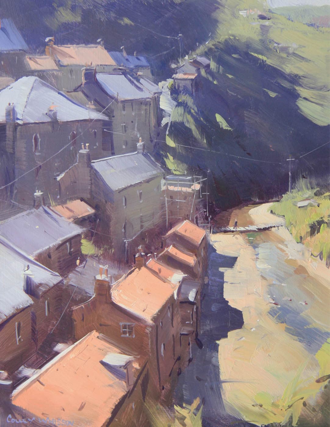
Oil on panel, 12" × 9" | 30.5 × 23 cm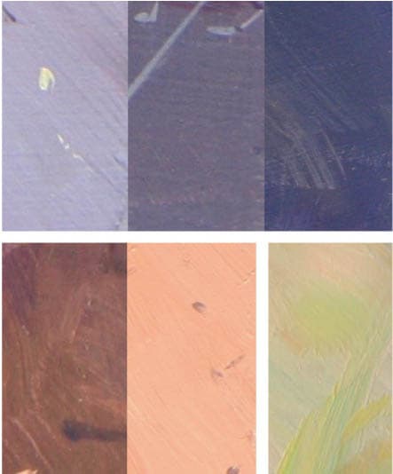
When we examine color strategies in the most successful paintings—those with unified color and landscape-like harmonies—we usually find that all the colors fall into a limited number of color families. One family is often dominant. Painters sometimes refer to this as the color “key” or color “chord” of the painting. There may be a single chord (as in a monochromatic painting), but more commonly, there is a dominant chord and a few minor chords. These are the color groups.
The idea behind color grouping is this: a painting made with fewer groups has a better chance of producing unified harmonies than one made with a large number of divergent colors and groups.
Grouping imposes no limits on the many individual colors there may be in a painting, but it does ask that those colors fall into a small number of color groups.
Grouping doesn’t inhibit coloristic expression. Rather, it allows us to focus on that expression and allows it to better simulate the way color behaves in the natural world. Once you begin looking at landscape paintings through the lens of color grouping, you will see that color groups are used all the time. In fact, every painting in this book uses color grouping.

Like a musical chord, in which related notes combine to form a unified sound, a color group contains individual “notes” of color, related in hue, that collectively form a unified and harmonious impression. The greens in this group are different values, temperatures, and saturation levels, yet all belong to a single green group.
COLOR GROUPING BY NATURE
Color grouping may sound like a specialized theory or practice, but it is simply a way of taking what occurs naturally in the landscape and carrying it into our paintings. The natural world routinely groups its colors. Certain types of scenes, such as gardens or urban landscapes, may be an exception. They can present a variety of colors from every part of the spectrum. In such cases, a painter must be prepared to impose color groups by organizing all the colors into fewer groups.
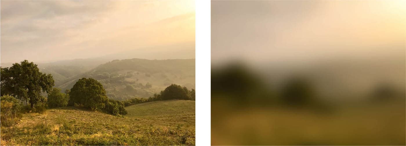
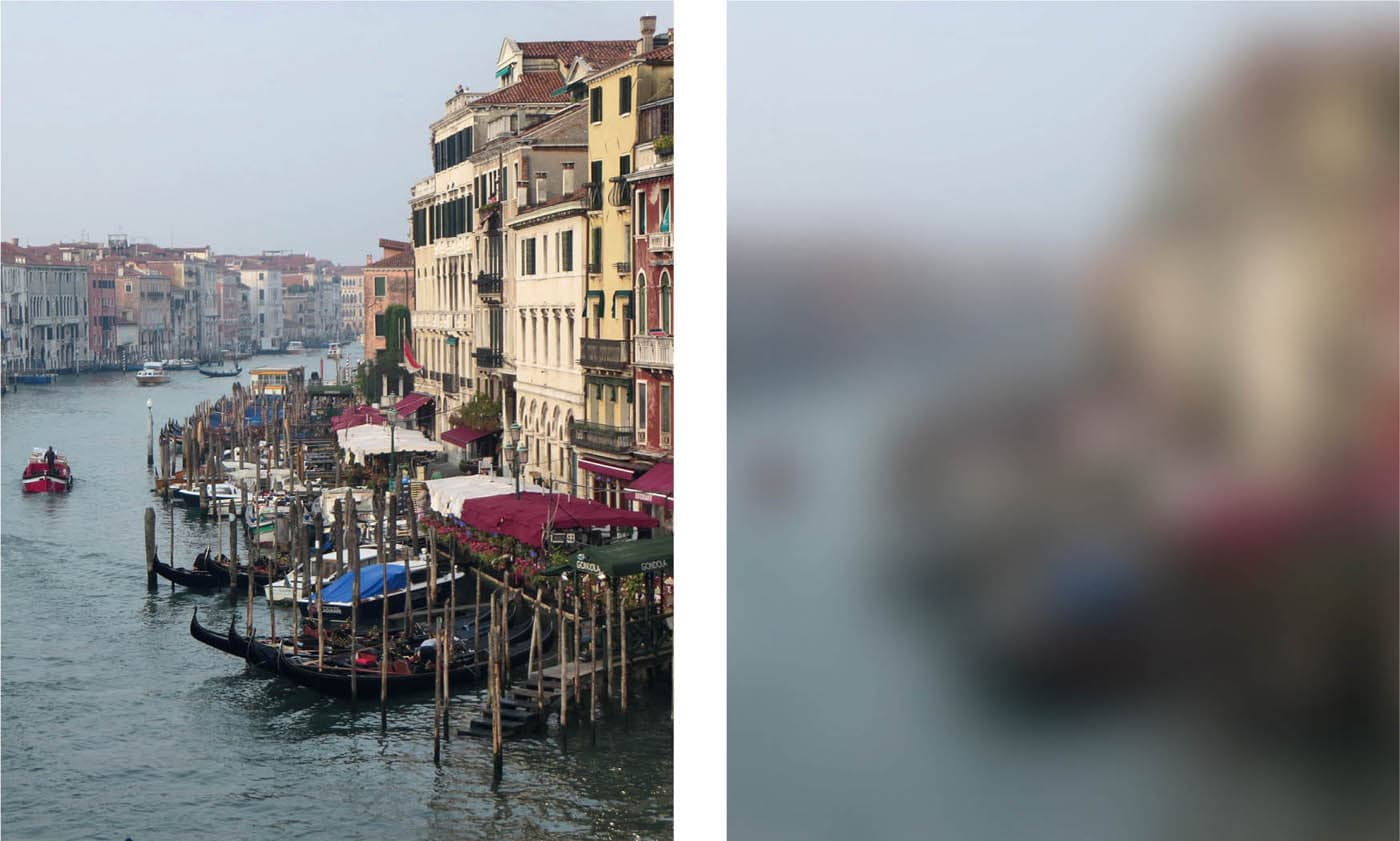
When a subject is blurred, small differences of color melt into their component groups, leaving only the average of all the colors. Blurring like this is similar to the squinting we do when reading values and looking for simplified masses, except here, we are trying to reduce all the colors to their component groups.
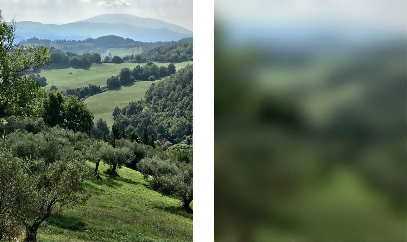
Many subjects consist of a single color group, as in this verdant Italian scene. When color groups are this closely related (especially when they are green), the painter makes an effort to insert more color variety than they may actually see. Here, they might add more yellow to the sunlit portions or bring out the blues and violets within the shadows.
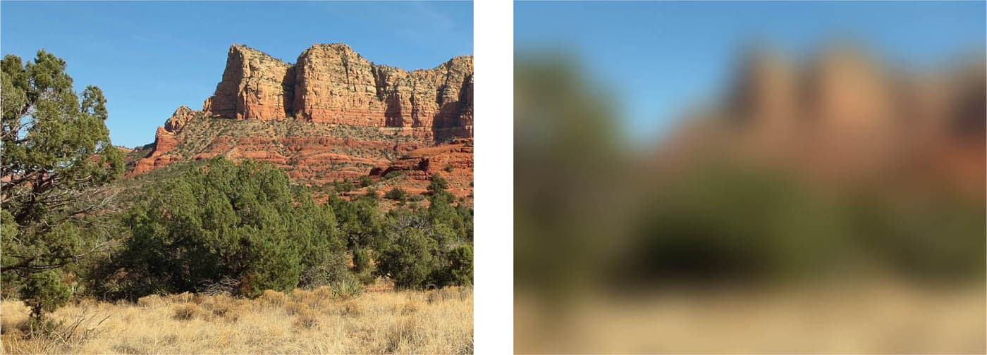
This scene has several color groups: the light ochre in the foreground grasses, the green foliage, the blue sky, and the red rocks. The foreground grass and the ochre color in the distant rocks, though separate elements of the landscape, are related colors and so form a single group.
The most lyrical type of color grouping occurs when the color of the light itself casts a unifying veil across the entire scene. Here, each color family—yellows, greens, blues—are all tinged with the warmth of the morning light. We often find this kind of grouping at sunrise and sunset or in scenes with deep atmospheric perspective.
This scene has a wider variety of color, yet still appears well-grouped. This is because the colors are unified through a common association to the gray tonality that runs through the entire scene. Neutral colors naturally harmonize with other neutral colors. (Also see “The Harmony of Neutrals”.)
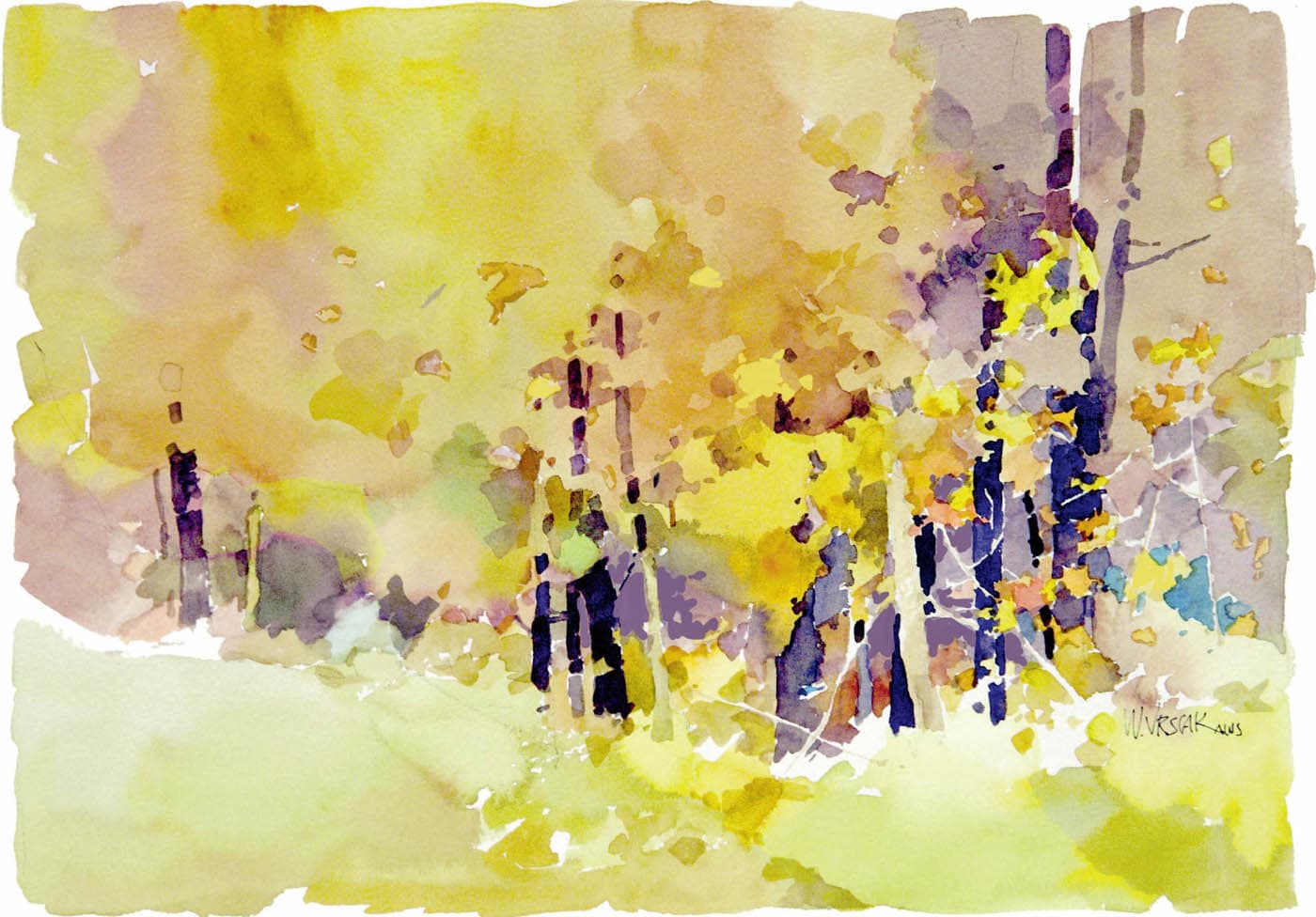
Marilyn Simandle, Swan Hotel, England A single color group often dominates the color composition. In Simandle’s Swan Hotel, yellow ochre is clearly the ruling hue. A second dark, black-green color group is found in the front of the hotel, behind it, and under the bridge. The red strokes in the middle add a lively accent. Ordinarily, such a small amount of color would not qualify as a group, but in this case, it plays such a key role in spicing up the color composition that it can be considered a group in its own right. Barbara Jaenicke, Remembering Spring There are three main color groups in Remembering Spring. Blue-violet is the dominant hue. The yellow-green in the trees and the pale orange in the foreground rocks are secondary groups. The painting has many small strokes of broken color, each one a particular temperature, value, and saturation level. If you look carefully, you can see that all the individual colors fall comfortably into one of the three main color groups. (Also see Jaenicke’s color groups in Golden Light of Winter Day’s End on this page.) Bill Vrscak, Woodland Autumn Woodland Autumn is a semi-abstract tapestry of many different hues, all of which fall into three main groups. The large tree in the upper left forms the dominant group, yellow. There are subtle hue and temperature shifts within the main body of the yellow, but all are closely related to the yellow. A smaller but related group is the dominant yellow-green foreground. Separating those two groups is an area of pale violet that arcs across the entire picture. Its violet hues complement the yellow within the other two groups. Tiny red and turquoise accents in the lower right add sparks of interest, but are used judiciously, so as not to overpower the main groups.COLOR GROUPING IN ACTION

Oil on canvas, 9" × 12" | 23 × 30.5 cm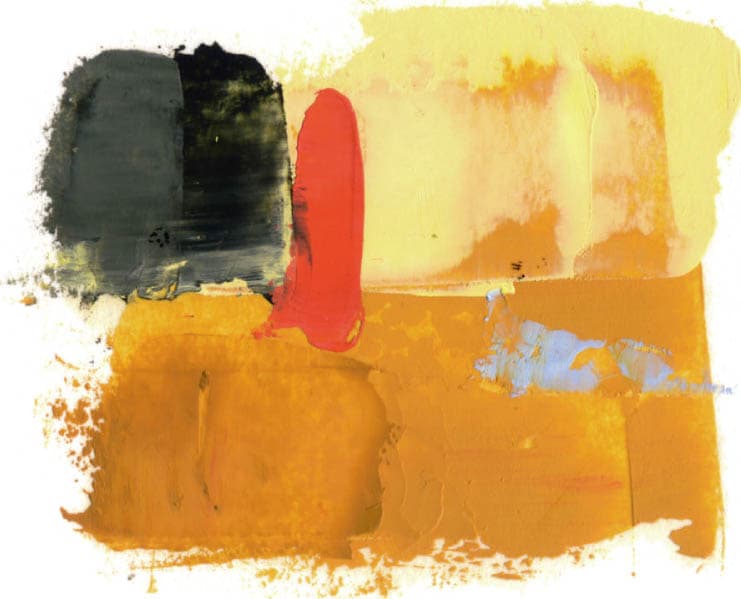
Pastel on mounted paper 8" × 10" | 20.5 × 25.5 cm
Watercolor, 17" × 23" | 43 × 58.5 cm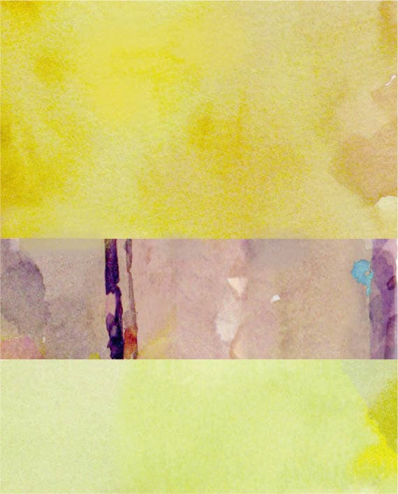
THE COLOR STUDY: TESTING COLOR GROUPS AND THE STRATEGY
As we develop a painting, we will naturally fine-tune color relationships, but the better idea we have of our color direction at the start, the better chance we have of hitting our color target. Whether painting outdoors or in the studio, there’s no better way to pretest our color plan than with a simple color study. Which colors and mixtures form the strategy and the color groups?
Color studies are practical and fun. They are also a low- pressure exercise. You are less likely to be invested in a quick “disposable” study than you would be with a larger “precious” painting. The color study is a safe avenue to explore (and get lost) without a large commitment of time or attachment to the outcome. Of course, color studies sometimes come out very well and can stand as small gems in their own right.
Mitchell Albala, Peak Study, Orange
Oil on paper, 4" × 3½" | 10 × 9 cm
THE PAINTED THUMBNAIL
Mitchell Albala, Study, Copper Morning
Watercolor, 3½" × 3½" | 9 × 9 cm
A color study is like a painted thumbnail. It doesn’t have to be tight or polished to tell whether or not the colors are working well together.

IN SUPPORT OF PAINTERLINESS
Mitchell Albala, Study, Camano Farm
Oil on paper, 3" × 4" | 7.5 × 10 cm
The smaller the study, the more painterly and gestural it often is, as seen in each of the studies shown here. Many painters strive for expressive mark-making, but find it difficult to translate into larger pieces. A gestural, painterly study like this can serve as an inspiration, a reminder of the more expressive strokes they aspire to in larger work.

COLOR GROUP SWATCHES AS A STUDY
Color groups are the most basic expression of a color strategy. This makes color group swatches, like those we’ve seen throughout this chapter, small but powerful color studies in their own right. A color study typically depicts the subject—but it doesn’t have to. Sometimes, a simple arrangement of colors is all that’s needed to assess the color relationships.
EXPLORING YOUR OPTIONS: EXPANDING YOUR RANGE
We are so used to trying to paint the colors we see (especially when referencing photos) that it’s easy to become restricted in our ability to be experimental with color. By doing a series of studies like those below, you’ll discover more color options than you ever thought possible. Don’t tell yourself that you shouldn’t try certain color combinations. Try each of the hue interactions. Explore neutral palettes. What colors will turn day into night? If you run out of ideas, find a color strategy in another’s painting and apply it to your own study. (Also see the exercise “One Subject, Different Strategies”.)
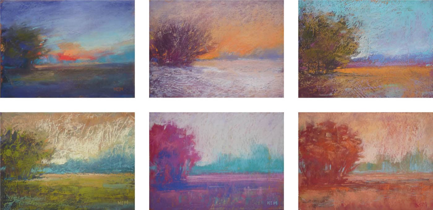
Karen Margulis, Landscape Variations
Pastels on paper, 3½" × 5" | 9 × 13 cm
These six studies are from over one hundred Margulis did of this motif. Each one suggests light at a different time of day or under different atmospheric conditions. “In this series, I wanted to explore how many ways I could interpret a simple landscape,” says Margulis. “I pushed myself to go beyond local color to discover how color changed the emotional tone of the painting.”
REVIEW QUESTIONS: COLOR GROUPING
Are there naturally occurring color groups in the subject?
With few exceptions, the natural world routinely groups its colors. Can you identify the groups in the scene? What are the colors of each group?
How many color groups are there in the subject?
The fewer groups there are, the greater the chance that the strategy will convey landscape-like and unified harmonies.
How do the color groups in the painting relate?
How the color groups relate is an expression of the color strategy in its most basic form. Are there hue interactions at play? Are the groups similar in hue or do they contrast? How strong are the value differences? How saturated are the colors? Does the arrangement of colors form the impression you are after?
Are the color groups used in differing proportions?
A color strategy works best when the color groups are not used in equal proportion. There is often a dominant group and a few smaller groups. Which group is dominant, and which ones play a lesser role?
Are you distinguishing between individual colors and groups?
A painting can have dozens or even hundreds of individual colors. This is never discouraged. However, you should always ask, How can the many colors be organized into a small number of groups?
Have you done a color study or swatch test to evaluate the groups?
A color study is a reliable way to test the efficacy of your color groups and, in turn, the color strategy. It’s also a way to determine which pigment colors and mixtures will form the groups.
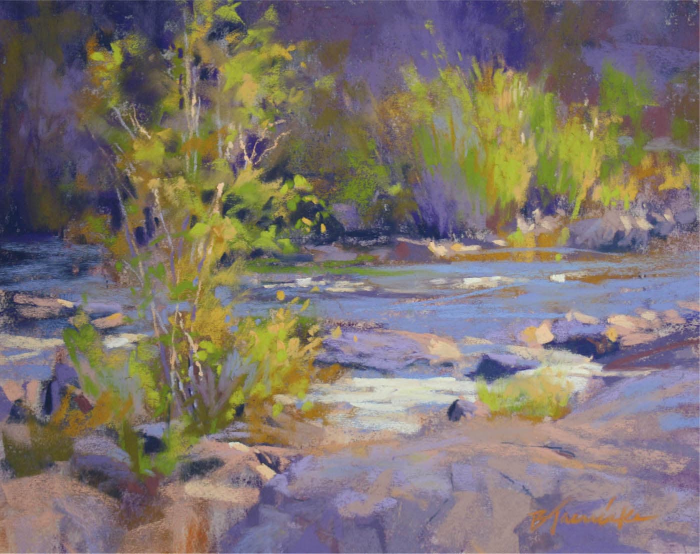
Catherine Gill, Lake Cle Elum Road
Watercolor and pastel on paper, 11" × 15" | 28 × 38 cm
EXERCISE: IDENTIFYING COLOR GROUPS
OVERVIEW: There’s no better way to get a firm grasp of color groups than to analyze them in the works of others. In this exercise, you will create a set of color swatches that represent the color groups in an existing painting. There is more to this exercise than simply matching colors. A painting may consist of dozens or even hundreds of individual colors. Identifying a color group often means finding the average of several related colors.
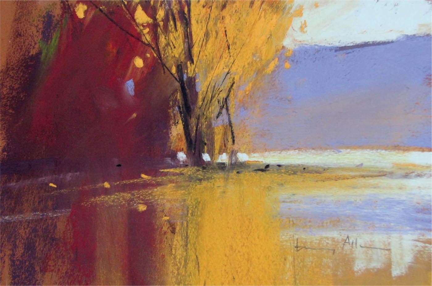
Tony Allain, Autumn
Pastel on sanded paper, 10" × 12" | 25.5 × 30.5 cm
The color groups in some paintings are very easy to identify. Allain’s bold, decisive shapes each correspond to their own color group: dark magenta, golden yellow, blue, and a small amount of black. Doing the exercise with a painting like this is very straightforward. It is much more challenging when the painting has many colors woven together in a complex tapestry.
STEP 1: SELECT A PAINTING WITH GOOD COLOR GROUPING
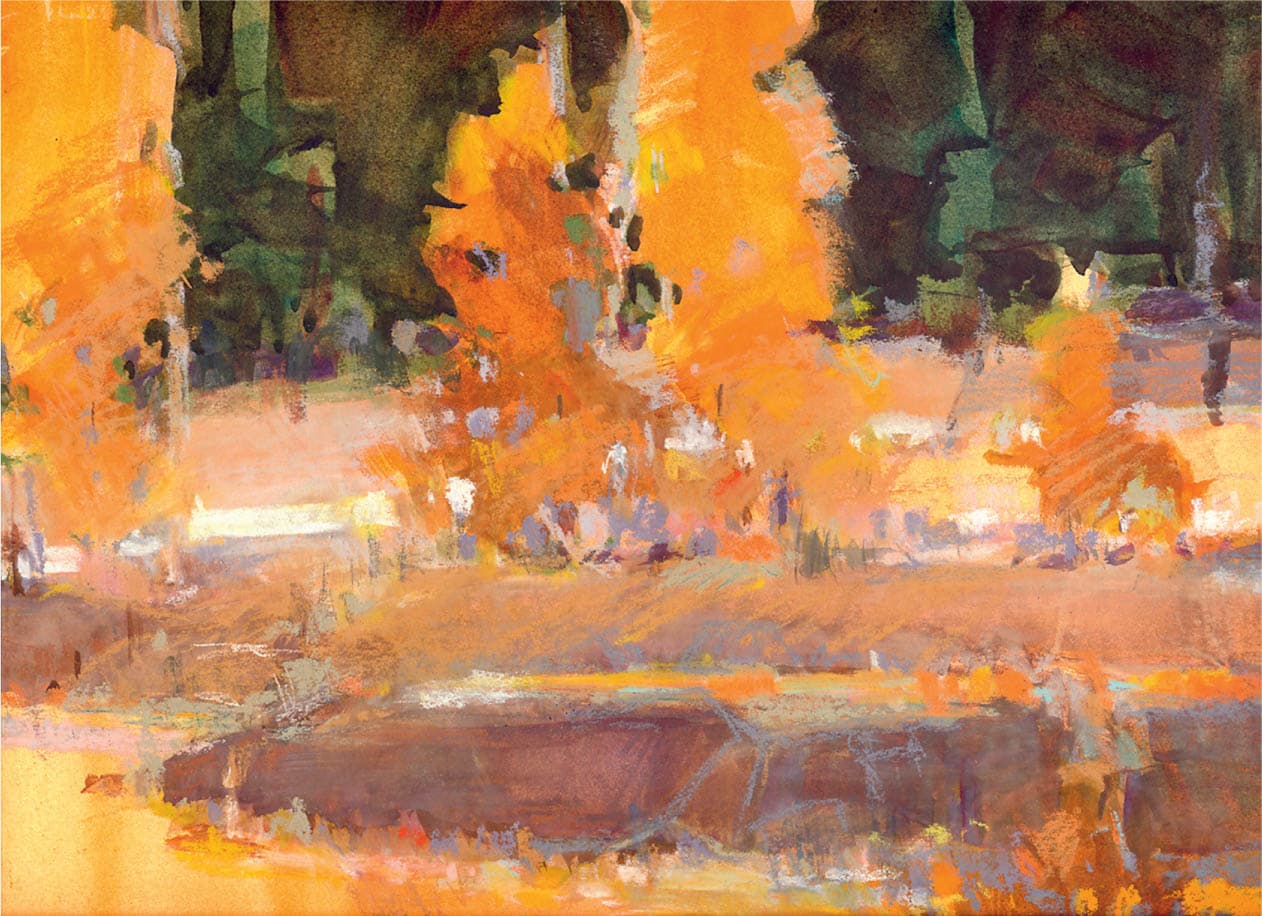
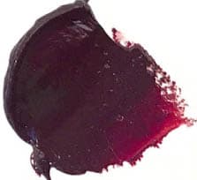
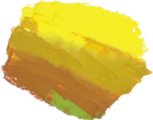
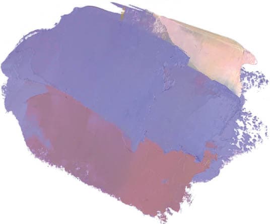
You can find many good examples of color grouping throughout this book. In this painting, I see three major groups. The dominant group is formed by the autumn yellows and golds in the trees. A smaller but important group is the violet mountain, which complements the yellow. The third group is a set of blue-grays, found in the sky and in the shadows at the very bottom of the painting. There are certainly more than three colors in the painting, but they all fit into one of these three groups.

Bill Cramer, Moment in the Sun
Oil on linen, 16" × 12" | 40.5 × 30.5 cm
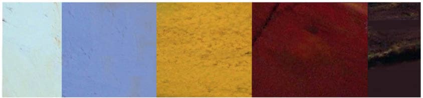
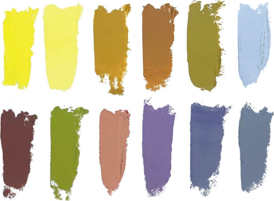
STEP 2: SELECT COLORS AND CREATE GROUPS
The next step is to select the colors that will best form the color groups found in the painting. Selecting colors according to how they fit the strategy is called targeting and is discussed fully in the next chapter. With just four pigments (plus white), I have a limited palette, which will help keep color mixtures more cohesive.
LEMON YELLOW + YELLOW OCHRE: The yellows in this painting range from full saturation (in the sunlit areas) to neutral (in the shadows), so I select two yellows that reflect this. They are also very close to the colors seen in the painting.
ALIZARIN is a magenta-like red that, when mixed with ULTRAMARINE, will create the violet in the mountain. It is also used for the red accents in the mountain and in the shadows of the trees.
ULTRAMARINE, when mixed with red and yellow in the right proportions, will create the blue-gray color in the sky. ULTRAMARINE is a much better fit for the color harmony in the painting than a warm blue like PHTHALO, CERULEAN, or MANGANESE.
OBSERVE: There are more individual colors in this painting than color groups. Although you are matching colors to some degree, a single color group is often formed by the average of several related colors. On this palette, there are three yellow mixes that vary in temperature, saturation, and value, but they all form one yellow-gold group.

TITANIUM WHITE

LEMON YELLOW

YELLOW OCHRE
ALIZARIN CRIMSON

ULTRAMARINE BLUE
YELLOW-GOLD GROUP
VIOLET GROUP

BLUE-GRAY GROUP
STEP 3: CREATE YOUR SWATCHES
Once your groups are mixed, begin building the swatch set. Place each color down on your surface with a palette knife. (A quality painting surface is not necessary; paper from your sketchbook is adequate.) If a color doesn’t appear correct when you place it alongside another color, adjust the mixture on the palette and reapply the swatch. (This is why you use the palette knife; it allows you to easily reapply colors.) You may indicate small accent colors—as I did here with the light orange accent in the violet and the green accent in the golds—but the main color groups are the priority.

IMPROPER SWATCHING
A common mistake in creating swatches is to sample the individual colors from the painting, creating nine, ten, or more swatches. The goal is to create swatches that roughly correspond to the few color groups in the painting.
STEP 4: FINAL COLOR SWATCH
The final swatch set should have the same color “flavor” as the painting and be unmistakably recognizable as belonging to that painting.

