
1
SHAPE INTERPRETATION
One of the recurring themes throughout this book is that landscape painting is an art of interpretation. Our goal is not to reproduce what we see exactly as we see it. Rather, all we observe—every color, shape, and detail—is filtered through an interpretive lens. The painting we produce may resemble a landscape, but is now a painting, a unique interpretation of the world in its own visual language. This process of translation is never more demanding than when trying to interpret the landscape at its most fundamental level: shape.
Nature is terribly complex. It has innumerable shapes, from the minute to the monumental, and in its raw, unedited state, can seem quite overwhelming. The key to translating all this into a painting is not to capture every bit of it but to reduce it into a simpler set of shapes and masses. This is the landscape painter’s first and most important task. Remarkably, this reductionist approach doesn’t detract from the overall impression—it enhances the painting, making it more comprehensible to the viewer.
Hester Berry, Bosley Mere A landscape painter’s first and most important task is to reduce nature’s vastness and complexity into clearer, more visually concise shapes. Each of Berry’s expressive brushstrokes is a distinct shape, defined from adjacent strokes through value and color differences.
Oil on board, 12" × 8½" | 30.5 × 21.5 cm
A REDUCTIONIST APPROACH TO SHAPE
When we observe the natural world, in all its depth and breadth, we are able to apprehend its many values and colors, and all its parts and pieces, with no thought at all. Trying to paint that subject, however, requires us to look through a different visual lens. To convert such an overwhelming amount of information into the language of painting, we must begin to see the subject in simpler terms.
Every painting, even a complicated one, has a foundation that is built upon simplified shapes. Yet, this isn’t necessarily what we see first. We are distracted by a sea of details, colors, and narrative content. To simplify, we have to see through all the layers of complexity and busyness. We have to interpret and extrapolate.
Our goal isn’t to include everything we see, but to know what to leave out. One of the most satisfying “ah-ha!” moments a painter can experience is when they discover that a simplified picture structure captures the essence of a subject more effectively than small parts and details.

A LESSON IN REDUCTIONISM
Mitchell Albala, First Easel
Oil on paper, 12" × 9" | 30.5 × 23 cm
One of my formative lessons in painting took place many years ago in New York City’s Central Park. I had just bought my first French easel. On my first day, after an hour or so, I had lost my way and disappointment was setting in. The shapes were spotty and the tree unconvincing. With a few furious strokes of the rag, I wiped out the painting. To my surprise, the hazy image that remained was a great improvement. My overworked and spotty tree had been consolidated into a more simplified mass. The frustrated wipes of my rag turned out to be the best strokes in my painting.

Frank Hobbs, Augusta County, VA, Near Staunton, Winter
Oil on canvas, 18" × 24" | 46 × 61 cm
Through a simplified approach, the whole truly becomes greater than the sum of its parts. Hobbs’ Augusta County is composed of just a few major shapes: the sky, the background hill, and the foreground tree and shadow. Smaller elements, like the trees in the background and the grasses in the foreground, are only hinted at. “We know that a tree is composed of millions of tiny leaves and branches,” Hobbs writes. “This knowledge alone nearly overwhelms us. Luckily, the eye is more intelligent than the mind, and in the end, it’s the eye that enables the painter to sift out the essential masses of nature into something that actually makes sense on the canvas.” (Also see Hobbs’ simplified shape painting on this page).
THE BENEFITS OF SIMPLIFICATION
If you’ve taken workshops or read other books on landscape painting, you have certainly heard the common refrain: Simplify, simplify, simplify! Why is a reductionist approach to shape so important?
- Simplification Is Practical. The natural world presents so much information, across such a wide field, that to create a clear and visually concise picture of nature, we have no choice but to simplify. Simplification is a visual imperative.
- Simplification Is Our Starting Point. A painting develops in stages from the general to the specific. We always begin a painting with simplified foundational shapes; smaller elements or details are integrated into the foundational shapes later.
- Simplification Is Beautiful. A subject that undergoes the translation from complex to simple is elegant, a demonstration of the visual poetry of a landscape painting.
Sue Charles, Smoldering
Oil on panel, 12" × 12" | 30.5 × 30.5 cm
Sue Charles is a true shape master. Each of her shapes defines structure and form—even forms as seemingly amorphous and unstructured as clouds. Each shape is defined by a single stroke, and each stroke is a distinct color and value. Charles was inspired by her early experiences as a stained glass artist. “At the core of my work is a love of pattern and the way everything in nature fits together perfectly like a puzzle,” she explains. “Each stroke is a carefully considered shape of a specific color, placed in relationship to the whole design.” Smoldering can be appreciated on the level of a cloudscape and as a visual shape poem.
SIMPLIFICATION IS PRACTICAL
The natural world and our paintings of that world are made up of the same fundamental building blocks—shapes. Yet the shapes that end up in our final painting don’t necessarily correspond to everything we see in the subject. Even the most highly detailed paintings don’t replicate the scene exactly, shape for shape. Our goal is not to transcribe every shape we see. There are too many of them. We must be selective. We combine smaller shapes into larger ones. We decide which shapes are essential to the composition and which ones are superfluous.
We place greater emphasis on some shapes, while downplaying others or even eliminating them altogether, until we can convey the essence of the subject in the most visually concise way possible.

Lisa Snow Lady, Palm Garden
Acrylic on canvas, 30" × 30" | 76 × 76 cm
Snow Lady’s style is one that translates natural forms into flat, crisply defined shapes, almost like cut paper. Palm Garden includes landscape elements of all types—earth, sky, ground, vegetation, and man-made—yet all are reduced to decisive shapes that snugly fit together. “I believe a good painting starts with a strong composition and strong shapes,” says Snow Lady. “If I am going to invest a lot of time in the work, the design has to hold my interest throughout.”
SIMPLIFICATION IS OUR STARTING POINT
The stages of a painting have a logical flow that moves from the general (basic foundational shapes) to the specific (additional details, values, and colors). Just as a builder first lays the foundation of a house, so does a painter begin with a foundation that establishes the basic structure and composition of a painting. We never begin a painting with details, even if the painting will ultimately include many.
A painting always begins with basic, foundational shapes—which are always simple. Small parts, details, and colors are attached to those basic shapes later.

Tibor Nagy, The Lazy Afternoon
Oil on linen, 12" × 16" | 30.5 × 40.5 cm
When you watch experienced painters work, you see them establish the simplest and most basic shapes first. Sometimes, this is done monochromatically, with only one pigment tone; sometimes, it’s done with a combination of values and colors, as we see in Nagy’s first stage. His block-in captures the general placement of shapes and is heading toward defining the broad areas of value. Only later does he build in detail and smaller strokes. “At the start, the most important thing for me is the position of the main shapes,” says Nagy. “In the later stages, I try not to lose this foundation, as it forms the basis of the whole painting.”
SIMPLIFICATION IS BEAUTIFUL
A poet expresses an idea or emotion in a metered string of carefully chosen words, which is far more eloquent than the same idea expressed in a long, wordy paragraph. Similarly, when the painter converts nature’s “wordy” excesses into more visually concise and meaningful shapes, it is nothing less than visual poetry. Indeed, what makes a painting special—what makes it a painting—is the visual poetry of the shape interpretation.
When simplified shapes become the primary impression, viewers are often touched in a place that is beyond words and thought.
A painting simplified in this way doesn’t tell the whole story. An observer must fill in the gaps in their mind’s eye, which evokes a different kind of response than a painting that tells the viewer everything. Viewer participation is required.
Tom Hoffmann, Long Day
Watercolor, 15" × 22" | 38 × 56 cm
Simplification not only liberates us from nature’s excesses, it lends greater poetry to the painting itself. “Simplification involves letting go of everything that doesn’t matter, of discovering what is enough for the viewer to connect the dots,” says Hoffmann. “The artist begins with zero, then adds as little as possible, and stops while the illusion still feels incomplete.” When a painting is this simplified, one is able to apprehend the primary shapes in an instant—in one visual sweep—without needing to assemble the small parts and pieces in the mind’s eye. Such an immediate, holistic impression elicits a different emotional response than a painting that leads with narrative and detail.

David Grossmann, Sunset Light Over the Grand Canyon
Oil on linen panel, 40" × 30" | 101.5 × 76 cm
The landscape painter aspires to communicate to the viewer their emotional response to a subject. One powerful way to do this is through simplification. In Sunset Light, all details, such as the subtle textures on the canyon walls, are subordinated in favor of a few large shapes. When interpreted this way, the viewer’s experience of the canyon at sunset is sublime.
THE ROLE OF VALUE IN SHAPE INTERPRETATION
Every painting workshop and every art book discusses values—and for good reason. The differences between values are largely responsible for our ability to achieve separation between shapes. Wherever there is a difference in value, we are at an edge, at the border between two shapes or planes.
Value is the single most important key to seeing and interpreting shapes.
The range between light and dark values is also responsible for conveying a believable sense of light, depth, volume, and atmosphere.
CONSIDER: Value can exist independent of color (as in a drawing), but color can never exist independent of value because value is one of the three basic attributes of color. Every color is also a particular value.

THE RELATIVITY OF VALUE
Value describes the relative lightness or darkness of a color. Is an area “light” (closer to white) or is it “dark” (closer to black)? Or somewhere in between? A value is never light or dark on its own; it is only lighter than or darker than something else. We assess each value by comparing it to an adjacent value. In these swatches, value B is darker than A. But when B is placed in a different context, alongside C, it appears lighter. And of course, all four are darker than the white of the page.
LIMITED VALUES AND SHAPE DEFINITION
Defining shapes through value differences is not as easy as it might seem. This is in large part because there are so many values to contend with. There may be as many as 25, 50, or 100 values in any given subject—far too many to effectively discriminate. Painters get around this problem by restricting themselves to working with a much narrower range of values than they actually see, with as few as 5 values.
When we limit our values, the differences between those values becomes more apparent, which in turn helps distinguish one shape from another.
LIMITED VALUES: SAYING MORE WITH LESS
ORIGINAL: FULL VALUE
The original scene has a full range of values, from very light in the sky and water to very dark in the shadows of the trees to intermediate tones in the middle ground. Can the character of the subject be conveyed with fewer values?

5 VALUES
When the scene is converted to 5 values, it’s remarkable how much structure, light, and depth can still be conveyed. This is because the essence of a subject lies not in capturing every detail but in its foundational shapes, which are each a specific value.

10 VALUES
When the subject is converted to 10 values, there is greater nuance of value and articulation of detail, but in terms of composition, it is not appreciably stronger than the 5-value study. In most instances, more than 9 or 10 values does little to enhance the fidelity that can be achieved with fewer values.
VALUE SCALES AND ENDPOINTS
To better help identify values, painters often refer to a value scale. Scales can have different numbers of steps: usually 5, 7, or 10. Each scale has white on one end and black on the other, with evenly stepped gradations in between. The 5- and 7-step scales are limited value scales. The 10-step scale is not as limited; it offers a wider range of values, but not so many that one can’t discriminate between them.
CONSIDER: A value scale is only a guide, not a hard and fast value-matching system. Ultimately, you have to judge a value in the context of the painting where you can compare it alongside other values.
CONSIDER: Scales can also be divided into segments of light, middle, and dark. This serves as a reminder of the values typically associated with areas of light and shadow. Painters often place a printed version of the scale on their palette so they can better evaluate the values of their color mixtures.
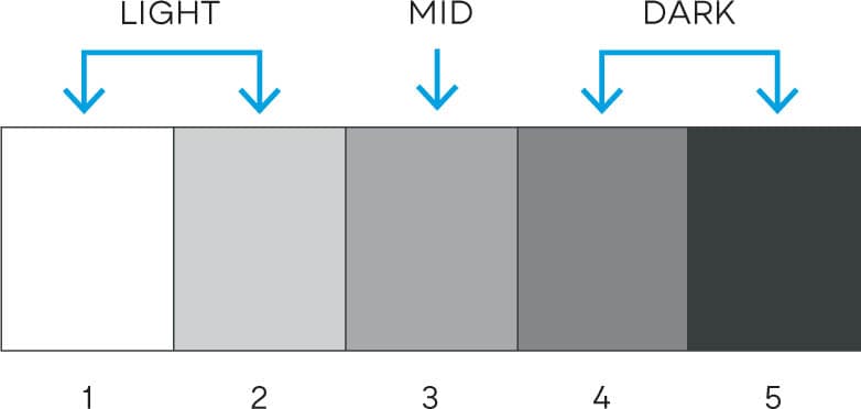
THE 5-STEP SCALE
The fewer values used, the more differentiated each value will be from the other. This makes the 5-step scale useful for those first learning to identify values. It is ideal for subjects that have a range of values from full light (white) to full dark (black). However, it doesn’t work as well for subjects with values only in the midrange. Without using the white and black, you would only have three middle values to work with, which is usually not enough for a complete value study.
THE 7-STEP SCALE
The 7-step scale is a bit more flexible than the 5-step. It has few enough steps to make managing values easier, yet enough to adequately render any subject. In subjects with a full range of values, from white to black, you have all seven values to work with. If the subject has a more compressed value range, and you eliminated the white and black endpoints, you would still have a full five values (2 to 6) to work with.

Mitchell Albala, Ascension, Winter
Oil on panel, 18" × 18" | 46 × 46 cm
Ascension has a compressed tonal range. None of its values correspond to full light (white) or full dark (black). The lightest values in the painting, in the upper left, are about a 3 on the 10-step scale. The darkest passages in the lower right are equivalent to an 8. A compressed value range is key to conveying atmospheric effects like fog, humidity, and atmospheric perspective.

WORKING WITH A COMPRESSED VALUE RANGE

Earlier in this chapter, we saw how every painting begins with a simplified foundation. (“Simplification Is Our Starting Point”.) Of course, as we develop a painting, we will want to add additional values, colors, and details. How can we do this without losing the basic foundation we established at the start? By working within value zones.
The broad shapes and planes in landscape form value zones. We can maintain the foundational value structure of our painting by making sure that any modulations of value we make within a zone never vary so much as to break with the overall continuity of that zone.
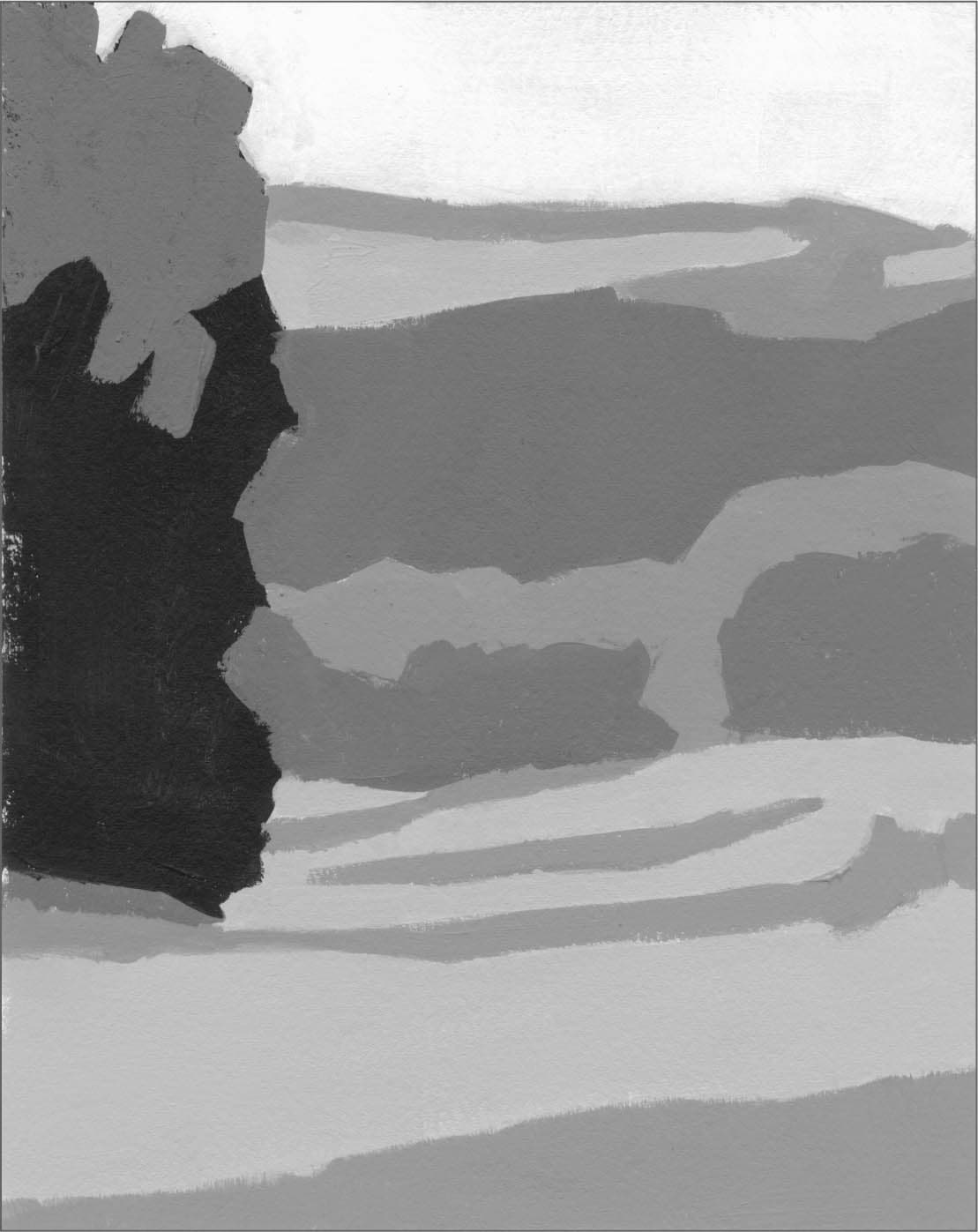
VALUE ZONES IN NATURE

Bill Cramer, Canyon Fortress
Oil on canvas, 36" × 36" | 91.5 × 91.5 cm
Value zones are formed by shapes and planes of consistent value. Three of the zones in Canyon Fortress are called out in the circles. The sunny ground plane in the lower right and the sky also form zones. Cramer maintains tight control by allowing only small modulations of value within each zone. This is the key to maintaining the cohesiveness of a zone.
VALUE ZONES IN THE URBAN SETTING

Chien Chung Wei, Shantou in the Rain
Watercolor, 29½" × 22" | 75 × 56 cm
The urban landscape is the most complex and drawing-intensive subject a painter can work with. With so many planes and lines and details, the only way a painter can keep their structure and values organized is to work within clearly defined zones. Within each of the zones indicated, there are only small variations of tone and color. If these variations become too great, they will stand out too much and disrupt the overall continuity of the zone.
BALANCING SIMPLIFIED SHAPES AND DETAIL WITH THE 80/20 RULE
When first learning to translate nature’s forms into painting, it’s easy to go overboard with detail. It takes a lot of experience before one realizes “simplified shapes capture the essence of a subject more effectively than small parts and details.”
Yet, those small parts and details do matter. They hold information that may be essential to the visual story. They also provide a compelling visual counterpoint to the larger elements within the subject. How do we know how much detail is too much or how much is too little? The answer can be found by considering the balance between the larger foundational shapes and the details. As a general rule of thumb, the main masses should occupy around 80 percent of our visual focus and the details around 20 percent.
The 80/20 rule reminds us that large foundational shapes and details exist within a visual hierarchy. Viewers should identify with the large shapes and masses first and the details second.
If we experience the opposite, if we notice details first, then the viewer will have a different kind of perceptual experience. As important as details may be, they must always remain subordinate to the dominant masses.
80/20 IN THE NATURAL WORLD
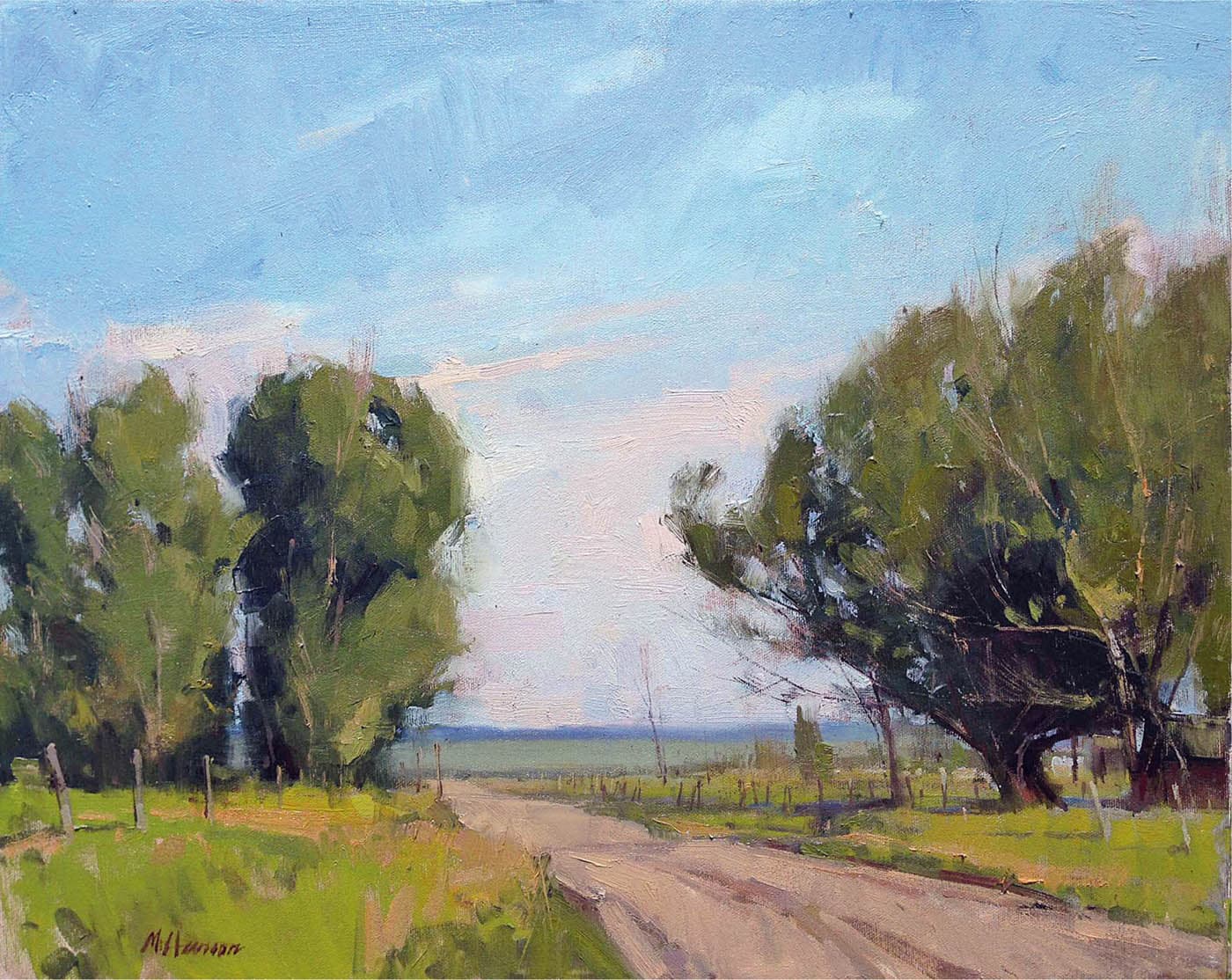
Marc Hanson, Mormon Row
Oil on board, 16" × 20" | 40.5 × 51 cm
Trees are among nature’s most detailed forms. This makes them an excellent subject for the 80/20 rule. A tree has many leaves, fine branches, and small perforations (sky holes). They are essential parts of the tree, but do we need to paint every one of them to convey its essential character? No. In Mormon Row, around 85 percent of our attention is directed toward the basic three-dimensional masses of the trees and only 15 percent to the leaves, branches, and sky holes. It is surprising how little detail it actually take to portray a particular tree.

80/20 IN THE URBAN LANDSCAPE
William Hook, Going Up, 2020
Watercolor, 21" × 14" | 53.5 × 35.5 cm
Sketch, 4" | 10 cm wide
By any measure, Going Up is a detailed painting. As important as those details are to an urban landscape, Hook’s dominant foci are the large dark and light masses. Details can be embedded into every square inch of a painting as long as they remain subordinate to the dominant masses.

Hook’s thumbnail study for Going Up shows his interest in prioritizing the main masses. “I am very interested in the shape of the light and dark masses in my paintings,” Hook says. “I often make a small study to remind me of that pattern as I develop the image.”
REVIEW QUESTIONS: SHAPE INTERPRETATION
SIMPLIFICATION
Are you beginning the painting with large foundational shapes?
Or are you starting with small shapes and details that distract from the picture’s foundational structure? Regardless of how much detail you will ultimately include, always begin with a foundation of simplified light and dark masses.
Are you squinting to help yourself see basic light and dark patterns?
Details and small value differences evaporate when you squint, revealing the basic light and dark structure of the composition. This basic structure is your starting point.
Are more shapes needed or fewer?
Which shapes are essential to the visual story and which ones are superfluous? Will the picture suffer if you eliminate a particular shape or if you combine several shapes into one?
How are you managing detail?
Detail is an important part of a landscape painting, but too much can be overwhelming to you, who has to paint it all, and to the viewer. Use the 80/20 rule to strike the right balance between foundational shapes and details (here). Use value zones to contain detail (here).
VALUES AND DIFFERENTIATION
Are the shapes in your subject well-differentiated?
Whether working from life or from a photo, are there passages where it is hard to tell where one shape begins and another ends? The separation of shapes must be emphasized. Value and color differences are the primary means of doing so.
Are you using limited values?
Limited values are a reliable means of differentiating shapes. The more you stick to a limited value plan, the more clearly defined the shapes will be.
Have you targeted the endpoints of your value range?
Not every subject has values that stretch from full light (white) to full dark (black). What is the lightest light and the darkest dark in the painting? Find those on your value scale. These are the endpoints that you will work between.
Are you working with value zones to help maintain control of your values?
Broad shapes and planes in landscape form value zones. You can better control your values by making sure that any shifts of value you make within a zone never vary so much as to break with the overall continuity of that zone.
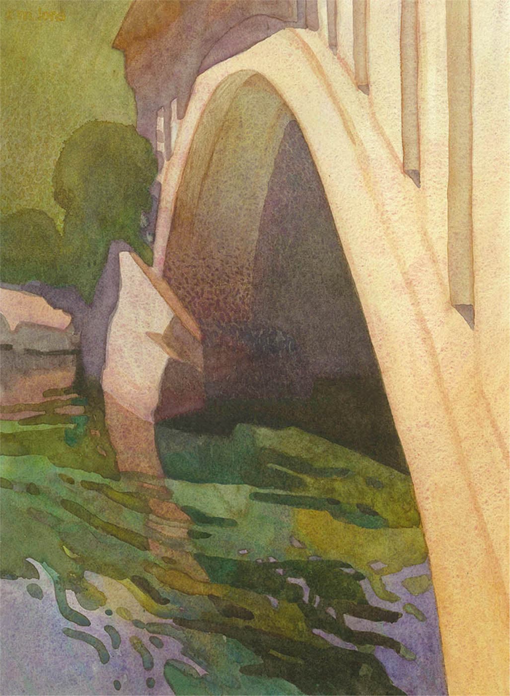
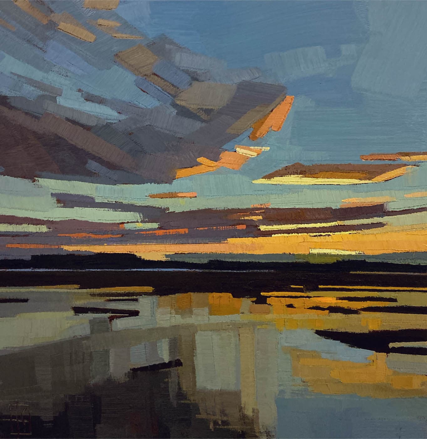
Carolyn Lord, Bridge Over Calm Water, American River
Watercolor on paper, 15" × 11" | 38 × 28 cm
Lord’s rigorous approach to shape definition not only gives the subject its structure and form, but also lends a distinctive style to her work.
EXERCISE: SIMPLIFY AND DIFFERENTIATE WITH LIMITED VALUES
OVERVIEW: In this exercise, you will do a painting in black and white, using just five values. This is the most powerful of all the shape exercises because it exposes you to three essential keys of shape interpretation. First, you’ll learn to control value mixtures by mixing five evenly stepped values. Second, working with limited values will force you to differentiate shapes and to simplify. And finally, the exercise reinforces your awareness of value zones because each discrete shape in the painting corresponds to a zone.
MEDIA: This exercise can be done in any medium, but it works best with acrylics, even if you’re not an acrylic painter. It’s easier to alter shapes and values with acrylics because they dry fast and lend themselves to quick revisions.
MATERIALS: Photo reference | Acrylic paint | Brushes | Paper palette (white) | Palette knife | Painting surface (paper, canvas, or panel)
STEP 1: PHOTO SELECTION
Select a photo and print it out in both black and white and color. Make sure it has well-differentiated shapes and clear patterns of light and shadow.


STEP 2: MIX VALUES
The white and black values can be used straight from the tube. But you will have to mix the three intermediary values (2, 3, and 4). If you haven’t mixed values like this before, you’ll find that it’s not as easy as it looks. It takes fine control to get all five values evenly stepped without any two being too close to each other. If, say, values 4 and 5 are too close, you effectively lose one of your values. Even steps assures that each value is well-differentiated from the other.

STEP 3: DRAWING
Work small, around 8 × 10 inches (20.5 × 25.5 cm). Begin by blocking in the main shapes—those that are foundational to the composition. This step is a challenge in itself, as the temptation will be to delineate minor shapes like branches, fenceposts, or leaves. Use a small brush or a pencil.

STEP 4: INITIAL BLOCK-IN
Begin blocking in the value zones. Squinting will help you see these zones. Because the photo has so many values, and you’re limited to just five, you won’t have every value you need. You’ll be forced to make choices, which is part of the exercise. Keep the shapes and value zones as distinct as possible. This will encourage differentiation. Avoid a lot of blending. The acrylics will help with this because they dry so quickly.
STEP 5: DEVELOPMENT AND FINISH
In order to achieve the necessary differentiation, you may have to make certain elements a different value than they appear in the photo. Here, the sky in the photo is value 2. If it were 2 in the painting, however, it wouldn’t separate enough from the adjacent hills, so it becomes a 1 and the lightest value the painting. In the photo, the sunny foreground is nearly white, but as a 1 in the painting, it would have appeared too bright and competed with the sky, so it becomes a 2.
When you’re done, ask yourself: If there is one additional value I could add that is not 1 to 5, which value would that be? Here, I would make the sun-struck foreground a little lighter, closer to a 1.5 than a 2.

EXERCISE: SIMPLIFIED SHAPE PAINTING
OVERVIEW: One of the best ways to get a feel for shape interpretation is to work in a style of painting that simplifies in the extreme and defines shapes with distinct edges. Whether or not this is your preferred style, emulating it can be very instructive. You can experience how much can be conveyed through a small number of well-chosen shapes. For many, this must be experienced to be believed. In Part 1, you will do a master copy. In Part 2, you will try applying the same type of simplification and rigorous shape definition to your own painting.
PART 1: MASTER COPY
Do a copy of one or more of the paintings shown here by Sue Charles, Tony Allain, or Frank Hobbs. You can find additional examples of Charles’ and Allain’s work on this page and here, respectively, or online. Also look at the work of Fairfield Porter, a representational painter of the 20th century who worked in a similar shape-oriented way.
Work small, approximately 8 × 10 inches (20.5 × 25.5 cm). You may wish to capture the color, although color accuracy in this exercise is less important than experiencing what it is like to think in reductionist terms.
CONSIDER: The three examples shown here are in different media: oil, gouache, and pastel. But you can copy any painting regardless of your medium.

Sue Charles, Fields in Summer
Oil on cradled wood panel 10" × 10" | 25.5 × 25.5 cm
The degree of simplification in Charles’ painting is the result of radical shape translation. The details of the original scene are consolidated into a much smaller number of clearly defined shapes. Despite the degree of consolidation, Charles conveys the essence of the original scene.

Tony Allain, Sunburst
Pastel on Canson paper, 11" × 14" | 28 × 35.5 cm
Allain handles his pastels like a painter using a very large brush. He uses the side of the pastel to create broad strokes, many of which correspond to the dominant shapes of the picture.
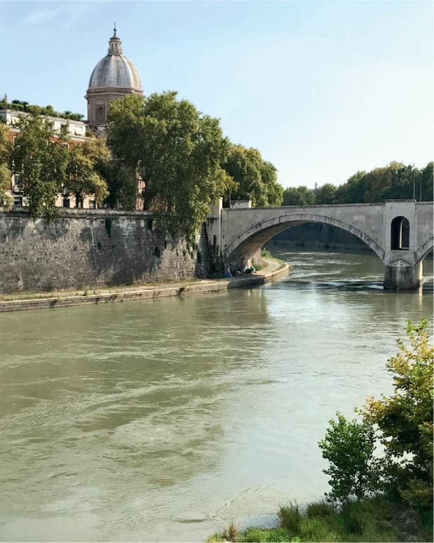
PART 2: TRANSLATION FROM LIFE
OVERVIEW: In the master copy you did in Part 1 of this exercise, the shapes were already simplified and differentiated for you. Now, you will try interpreting the shapes in the same way on your own. Although this style of painting appears very graphic and simple, it is demanding. You are not performing a direct translation of every shape you see in the source. You are leaving out some shapes and perhaps combining several smaller shapes into one. Think of this study as a visual puzzle. What are the fewest number of shapes and strokes you can use to express the essence of the subject?
CONSIDER: Although you can do this exercise from life or a photo, you may want to do it from a photo first. This will give you extra time to consider your choices and perhaps revise the painting over the course of a few days.

Frank Hobbs, Monticchiello
Gouache on rag paper, 9" × 6" | 23 × 15 cm
There are, of course, similarities between the painting and the photo reference. Yet, it is the differences that are enlightening. Allow your eye to jump back and forth between the painting and the photo, carefully comparing each area. What did Hobbs leave out? In complex areas, like the foreground trees and houses, how did he state them more simply? What details were absorbed into larger masses? “Simplification is about distillation,” says Hobbs. “It’s a search for the essential visual hierarchy—the main structural events; the strongest contrasts of darks and lights; the largest, most telling masses of color. An astute study can have a sense of completeness and unity that a more labored, detail-laden painting can lack.”
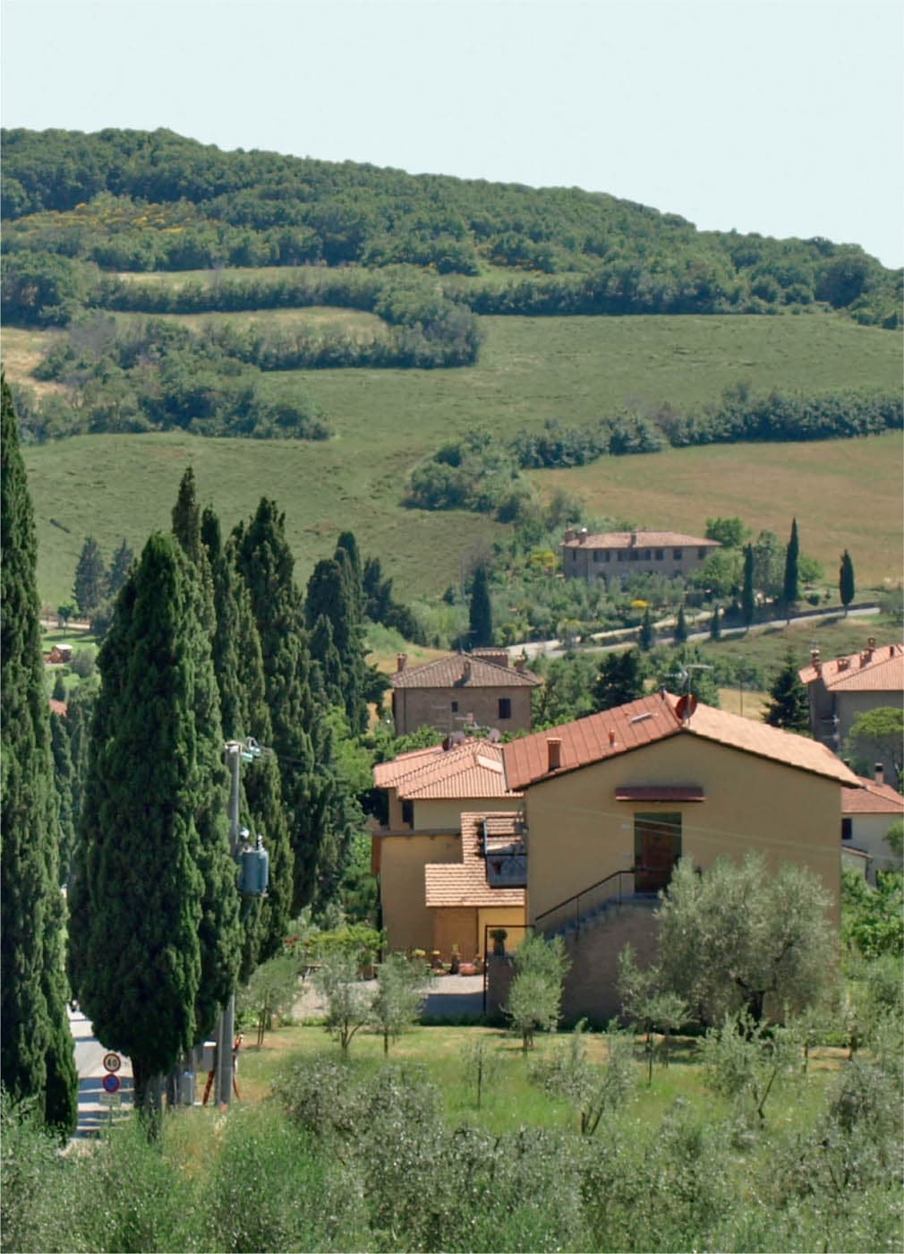
CONSIDER: Hobbs’ crisp shapes are also the result of his media. Gouache, which dries quickly, allows him to work wet over dry. If you are working in oil and struggling to achieve crisp shapes, consider trying the exercise with faster-drying media like acrylic or gouache.