Overview
By the end of this chapter, you will be able to identify the most suitable heading element for a web page; use the most common text-based HTML elements; develop common web page features such as navigation and breadcrumbs; explain the importance of semantic markup; and convert a design into semantic markup.
This chapter introduces the text-based elements used for web page content. We will first take a tour through the text-based HTML elements. We will then look into the styling of these elements and finally put this into practice with some exercises to do with building common web page components.
Introduction
In the previous chapter, you may have been frustrated that our web pages only dealt with the page structure and didn't contain any actual content. In this chapter, we will look at the HTML elements, that are used for text-based page content. You are probably familiar with most of these elements from using word processing applications when writing documents. These HTML elements include elements such as headings, paragraphs, and lists.
As you are aware, when building web pages, the markup is only one aspect. We also need to style elements of the page. We will take a look at issues concerning the styling of these text-based elements. We will look into concerns such as cross-browser consistency. Finally, we will walk through some exercises on developing common web page components such as navigation bars and breadcrumbs.
Text and typography are very important as a visually appealing web page will ensure that a web user spends more time on it (as this may be good for business conversion).
A highly functional, fast, and efficient website may not attract users if the text/typography is of poor quality. Thus, these are crucial elements while designing a web page, and this chapter equips you with the necessary tool in HTML/CSS to create visually appealing and aesthetic web pages.
Text-Based Elements
HTML provides us with a variety of elements that are used for text-based content. While browsing the web, you might notice that web pages typically have similar text-based content. Most web pages will contain a page heading. The content will typically comprise headings, paragraphs, and lists. HTML equips you with tools to format such elements within a web page.
In this section, we will be looking at the following HTML text-based elements:
- Headings
- Paragraphs
- Inline text elements
- Lists
Headings
Heading elements in HTML offer six levels of hierarchy, ranging from h1 to h6. Now, h1 is typically only used once on a page as it is the topmost heading for the document as a whole. The following code snippet shows how all of these headings are used and what they look like in the browser by default:
<h1>Heading level 1</h1>
<h2>Heading level 2</h2>
<h3>Heading level 3</h3>
<h4>Heading level 4</h4>
<h5>Heading level 5</h5>
<h6>Heading level 6</h6>
A web page from the preceding code would appear as follows:

Figure 3.1: Headings shown in a browser
Paragraphs
Paragraphs in HTML can be represented using the p tag. On a web page, you might have chunks of the core content of a topic presented to the reader. Such content is included under a p tag in HTML. The following code snippet shows how you would include paragraphs in a document and what they look like by default in the browser:
<p>Horatio says 'tis but our fantasy,
And will not let belief take hold of him
Touching this dreaded sight, twice seen of us.
Therefore I have entreated him along,
With us to watch the minutes of this night,
That, if again this apparition come,
He may approve our eyes and speak to it.</p>
<p>Tush, tush, 'twill not appear.</p>
<p>Sit down awhile, And let us once again assail your ears,
That are so fortified against our story,
What we two nights have seen.</p>
Note
The text used for the preceding code is a work of Shakespeare sourced from the following: https://packt.live/2Cmvni4.
A web page for the preceding code will appear as follows:

Figure 3.2: Paragraphs shown in a browser
Inline Text Elements
As a designer of web pages, you may often find yourself in a situation where you need to highlight special terms in a paragraph. Fortunately, HTML provides a solution to this.
It is possible to add what are called inline elements around text contained within paragraphs. Think of using a word processor: you are able to make words bold, underlined, italicized, and so on. HTML provides developers with this ability, and we will now look at some of the most common examples.
If you want to emphasize some text, you can use the em tag. An example of how you would use this and what it would look like in a browser is shown here:
<p>I need to wake up <em>now</em>!</p>
A web page for the preceding code would appear as follows:
Figure 3.3: The em tag as it appears on a web page
When you want to show some text as having serious importance, you can use the strong tag. An example of how you would use this and what it would look like in a browser is shown here:
<p>Before leaving the house <strong>remember to lock the front door</strong>!</p>
A web page for the preceding code would appear as follows:
Figure 3.4: The strong tag as it appears on a web page
Perhaps the most important of all the inline text-based elements is the anchor element, which allows you to add hyperlinks. To inline a link, you use an a tag wrapped around some text. An example of how you would use this and what it would look like in a browser is shown here:
<p>Please click <a href="http://www.google.com">here</a> to go to google</p>
A web page for the preceding code would appear as follows:
Figure 3.5: Anchor as it appears on a web page
Another important inline element for you to learn to use is the span tag. This is similar to the div tag but is used for inline elements. The span tag is used as a generic way to divide up content and has no inherent meaning, unlike the other inline tags mentioned previously in this chapter. A common use case is when styling a part of an element's content differently to the rest of the content. The following code shows an example of this:
/* styles */
.red {
color: red;
}
.green {
color: green;
}
.blue {
color: blue;
}
<!-- markup -->
<p>My favorite colors are <span class="red">red</span>, <span class="green">green</span> and <span class="blue">blue</span>.</p>
A web page for the preceding code would appear as follows:
Figure 3.6: Paragraph with highlighted words as it appears on a web page
Lists
Another common type of text-based element that you will be very familiar with is the list. In HTML, these come in three different types: an unordered list, an ordered list, and a definition list. We will take a look at the differences between these types of lists and when you should use them.
Let's begin by taking a look at by far the most common type of list, the unordered list, which is expressed in HTML as ul, with li being used for the list items. You will most likely be very familiar with this type of list in your everyday life. A common example of this type of list could be a shopping list or a list of things you need to pack before going on holiday. What makes this type of list unordered is the fact that the order of the items in the list isn't important. The following code shows an example of this type of list as you would use it in HTML:
<!-- Shopping list -->
<ul>
<li>Ice Cream</li>
<li>Cookies</li>
<li>Salad</li>
<li>Soap</li>
</ul>
A web page for the preceding code would appear as follows:

Figure 3.7: Unordered list as it appears on a web page
Following the unordered list, we have the ordered list, which is expressed in HTML as ol, with li being used for the list items. You are probably also quite familiar with this type of list in your everyday life. A common use case for the ordered list could be a recipe shown in a list of sequential steps. With this type of list, the ordering is important, unlike in the unordered list we just looked at. The following code shows an example of this type of list as you would use it in HTML:
<!-- Cheese on toast recipe -->
<ol>
<li>Place bread under grill until golden brown</li>
<li>Flip the bread and place cheese slices</li>
<li>Cook until cheese is golden brown</li>
<li>Serve immediately</li>
</ol>
A web page for the preceding code would appear as follows:

Figure 3.8: Ordered list as it appears on a web page
If you want to use an ordered or unordered list but don't want to show bullet points or numbers, you have a range of options. Using CSS, you can customize the style of list using the list-style property:
/* Alternative styles for unordered lists */
.square {
list-style: square;
}
.circle {
List-style: circle;
}
/* Alternative styles for ordered lists */
.upper-alpha {
list-style: upper-alpha;
}
.upper-roman {
List-style: upper-roman;
}
The following figure shows the output of the preceding code:

Figure 3.9: Unordered list shown with the different list styles
It is also possible to nest lists and use different list styles for each list. In the following HTML code, you will see that we have different lists being nested:
<ol>
<li>Numbered</li>
<ol class="alphabetic">
<li>Alphabetic</li>
<ol class="roman">
<li>Roman</li>
<li>Roman</li>
</ol>
<li>Alphabetic</li>
</ol>
<li>Numbered</li>
</ol>
We just need to add two class names to style the two nested lists with alphabetic and Roman list styles as shown here:
.alphabetic {
list-style: upper-alpha;
}
.roman {
list-style: upper-roman;
}
The following figure shows the output of the preceding code:

Figure 3.10: Nested lists shown with different list styles
The third type of list is the definition list, which is expressed in HTML as dl. Although this type of list is used less frequently than the two other types of lists, you will probably still be familiar with it. The definition list is used when you want to list out pairs of terms and descriptions. The most common use of this type of list is probably dictionary entries. You have the word you are interested in, which is the term, dt, followed by the definition, which is the description, dd. The following is an example of this type of list as you would use it in HTML:
<!-- Dictionary -->
<dl>
<dt>HTML</dt>
<dd>Hypertext markup language</dd>
<dt>CSS</dt>
<dd>Cascading style sheets</dd>
</dl>
A web page for the preceding code would appear as follows:

Figure 3.11: Definition list as it appears on a web page
Exercise 3.01: Combining Text-Based Elements
In this exercise, we will use the following screenshot from the Packt website and write the HTML to match it as closely as possible. This will give us some practice of creating text-based content and recreating the correct HTML for it.
The following figure shows the sample piece of content that we will recreate from the Packt website:

Figure 3.12: Screenshot from the Packt website
Let's complete the exercise with the following steps:
- First, start by creating a new file in VSCode called text.html and use the following code as a starting point:
<!DOCTYPE html>
<html>
<head>
<title>Combining text based elements</title>
</head>
<body>
<!-- your code will go here -->
</body>
</html>
- Looking at the preceding screenshot, we can see that we will need a heading. Since the heading is not the top-level heading for the page, we will use h2 in this instance. We will wrap the tag around the text in between the opening and closing body tags as follows:
<body>
<h2>eBook Support</h2>
</body>
- Below the heading, we have a list of bullet points. We can assume that these are unordered and, hence, use a ul tag for them. Notice that each list item contains a link as well, so we need to include an anchor tag for each. We will place our code just below the h2 heading as follows:
<body>
<h2>eBook Support</h2>
<ul>
<li>If you experience a problem with using or installing Adobe Reader, the contact Adobe directly at <a href="www.adobe.com/support">www.adobe.com/support</a></li>
<li>To view the errata for the book, see <a href="www.packtpub.com/support">www.packtpub.com/support</a> and view the pages for the title you have.
</li>
<li>To view your account details or to download a new copy of the book go to <a href="www.packtpub.com/account">www.packtpub.com/account
</a></li>
</ul>
</body>
If you now right-click on the filename in VSCode on the left-hand side of the screen and select open in default browser, you will see the web page in your browser:

Figure 3.13: Output of combining text-based elements
You are now getting a feel for the various different text-based HTML elements and when you should use them. Before we start looking into how we will go about styling the HTML elements we have just learned, we will take a look at semantic markup.
Semantic Markup
You will hear the word "semantic" used often when you read or hear about HTML. The core concept behind semantic markup is to ensure that you use the most meaningful HTML element available to describe the content you are marking up. For example, it would be possible for you to wrap the top-level page heading in a div tag, however, the h1 tag conveys the meaning that the content represents, that is, heading level 1. The HTML you write needs to be understandable to both humans and machines, and by using the most meaningful element for each piece of content, you improve the meaning of both.
Ensuring that the HTML you write is as semantic as possible also has additional important benefits. The first being that it will make your web pages more easily searchable by search engines. You will also be helping out users who view your websites using a screen reader.
The following code shows some examples of semantic and non-semantic markup:
<!-- Semantic markup -->
<h1>I am a top level page heading</h1>
<p>This is a paragraph which contains a word with <strong>strong</strong> significance</p>
<!-- Non semantic markup -->
<div>I am a top level page heading</div>
<div>This is a paragraph which contains a word with <span>strong</span> significance</div>
Hopefully, you should now understand the differences between semantic and non-semantic markup. Now that we have some knowledge of the most commonly used HTML elements used for content, we can turn to the more fun part of styling.
Styling Text-Based Elements
Until now, we have seen some of the basic text formattings that HTML allows you to implement on a web page. However, depending on the function and the purpose a web page serves, we might need some styling applied to the text-based elements. Here, we will introduce the common issues surrounding the styling of web page content. We will introduce the different units of measurement, including pixel and relative units. We will then walk through some examples of how to style common web components such as breadcrumbs and navigation bars.
CSS Resets
As you begin styling web pages, you will soon realize that different browsers render your pages slightly differently from each other. This can be very frustrating and makes the task of developing websites that look the same across different browsers a nightmare.
Luckily, there is a well-known solution to alleviate at least some of this frustration. A CSS reset is a style sheet whose sole purpose is to level the playing field across browsers. This file will be loaded before any of your page-specific styles are added. The following is an example of the most basic form of CSS reset code:
* {
margin: 0;
padding: 0;
}
What this will ensure is that all HTML elements will have zero margin and padding before you apply your custom styles to your page. This gets around the issue of different browsers by default adding varying amounts of padding and margin to certain elements.
Although using this reset would be better than having no reset at all, there are more sophisticated CSS resets available. The following shows a popular CSS reset developed by Eric Meyer:
/* http://meyerweb.com/eric/tools/css/reset/
v2.0 | 20110126
License: none (public domain)
*/
html, body, div, span, applet, object, iframe, h1, h2, h3, h4, h5, h6, p, blockquote, pre, a, abbr, acronym, address, big, cite, code, del, dfn, em, img, ins, kbd, q, s, samp, small, strike, strong, sub, sup, tt, var, b, u, i, center,
dl, dt, dd, ol, ul, li, fieldset, form, label, legend, table, caption, tbody, tfoot, thead, tr, th, td, article, aside, canvas, details, embed, figure, figcaption, footer, header, hgroup, menu, nav, output, ruby, section, summary,
time, mark, audio, video {
margin: 0;
padding: 0;
border: 0;
font-size: 100%;
font: inherit;
vertical-align: baseline;
}
/* HTML5 display-role reset for older browsers */
article, aside, details, figcaption, figure, footer, header, hgroup, menu, nav, section {
display: block;
}
body {
line-height: 1;
}
ol, ul {
list-style: none;
}
blockquote, q {
quotes: none;
}
blockquote:before, blockquote:after,
q:before, q:after {
content: '';
content: none;
}
table {
border-collapse: collapse;
border-spacing: 0;
}
As you can see, this is more detailed than our first example and would give us a better chance of reducing cross-browser inconsistencies in our web pages.
CSS Text Properties
When styling text-based elements with CSS, there are two main groupings of properties you will see used over and over. These are groups of properties that are based around text and font. We will begin by looking at the most commonly used text-based CSS properties that you will need to become familiar with.
The first property we will look at is color, which, as the name suggests, is used to set the text color. You will typically set the color value using either hexadecimal, RGB, or a name.
For hexadecimal values, you specify two hexadecimal integers for the colors red, green, and blue. The values you provide range from 00 to FF, with FF being the most intense version of the specific color and 00 being the least intense. For example, #FF0000 will be the highest intensity of the color red.
RGB-based colors are different to hexadecimal values because you provide a value between 0 and 255 for each color, with 0 being the lowest intensity and 255 being the maximum intensity.
The following shows some examples of what this would look like in code form:
h1 {
color: green;
}
p {
color: #00ff00;
}
span {
color: rgb(0, 255, 0);
}
We will learn more about text colors and background colors in Chapter 5, Themes, Colors, and Polish.
You may have noticed that all the text we have seen so far aligns to the left by default. With CSS, we have the power to change this using the text-align property. You can style your text to be left-aligned, centered, or right-aligned. The following shows some examples of what this would look like in code form:
p {
text-align: center;
}
A web page for the preceding code would appear as follows:

Figure 3.14: Centrally aligned text as it appears on a web page
Note
The text used for explaining the CSS text properties is a work of Shakespeare sourced from the following: http://www.opensourceshakespeare.org/views/plays/play_view.php?WorkID=hamlet&Act=1&Scene=1&Scope=scene.
If you want to underline some text, you can use the text-decoration property, which gives you the ability to strikethrough text as well:
.underline {
text-decoration: underline;
}
A web page for the preceding code would appear as follows:

Figure 3.15: Underlined text as it appears on a web page
The following code shows how you would use the line-through property:
.line-through {
text-decoration: line-through;
}
A web page for the preceding code would appear as follows:

Figure 3.16: Strikethrough text as it appears on a web page
Another common styling requirement for text is the ability to control how it is capitalized. For this, we have the text-transform property, which gives you the ability to transform the text. By default, the text is set to lowercase, but with this property, you can set the text to all caps or title case. The following code shows how you would use this property:
.uppercase {
text-transform: uppercase;
}
A web page for the preceding code would appear as follows:

Figure 3.17: All-caps text as it appears on a web page
The following code shows how you would use the lowercase property:
.lowercase {
text-transform: lowercase;
}
A web page for the preceding code would appear as follows:

Figure 3.18: Lowercase text as it appears on a web page
The following code shows how you would use the capitalize property:
.capitalize {
text-transform: capitalize;
}
A web page for the preceding code would appear as follows:

Figure 3.19: Title case text as it appears on a web page
Finally, on our tour of the most used text-based CSS properties, we have the line-height property, which is used to control the amount of vertical spacing between lines of text. This is a property you will see used over and over as different types of copy will require different line heights. We will see two extreme examples of how a small and large line-height value affects the readability of the text:
.small-line-height {
line-height: .5;
}
A web page for the preceding code would appear as follows:

Figure 3.20: Small line-height as it appears on a web page
The following code shows how you would use the line-height property:
.large-line-height {
line-height: 1.5;
}
A web page for the preceding code would appear as follows:

Figure 3.21: Large line-height as it appears on a web page
CSS Font Properties
The second group of CSS properties we are concerned with is the font-based properties. These are responsible for defining the font family, the size of the font, and the weight. We will now take a quick tour of the most commonly used CSS font properties that you should become familiar with.
The first property we will look at is the font-family property, which, as you might have guessed, sets the font family. When using this property, you will usually provide a list of different font families in order of priority. If the web browser doesn't support your first choice of font, it will default to the second or until it finds a font family it can load. The following code shows how this property can be used:
body {
font-family: "Times New Roman", Times, serif;
}
The browser will attempt to load the "Times New Roman" font from the user's computer first. If it cannot load the font, then it will try "Times," and, if this fails, it will load the generic "serif" font family.
Now that we know how to set the correct font family for our text, we will need to control the size. For this, we can use the font-size property. You can set the value of the size using pixels or relative units such as ems. The following shows examples of this property's use:
/* pixels */
h1 {
font-size: 50px;
}
p {
font-size: 16px;
}
/* ems */
h1 {
font-size: 3.125em;
}
p {
font-size: 1em;
}
The benefit of using ems for the unit of measurement is that it allows the user to control the font size. By default, a browser's font size is set to 16px, but if a user wants to increase their default font size, they can. With em units, the font sizes will scale according to the base font size. With pixels used as units, you give the user less flexibility in controlling font sizes.
The last font-based CSS property we will look at is the font-weight property. This is used to control the weight of a font, typically to make a font bold as, by default, the weight is set to normal. The following shows you how this would look in code:
span {
font-weight: bold;
}
We now have all the knowledge we require to build a realistic-looking web page. We will put this theory into practice by building components for web pages one by one.
The display Property
Before we move onto the next exercise, we need to look into a new CSS property called display. By default, elements are either set to block or inline. Now, block elements will take up all horizontal space, while inline elements only take up as much horizontal space as their content. An example of a block-level element is a div tag and an example of an inline element is span. Sometimes, you need to style a block element as an inline element and vice versa. You will do this by using the following CSS:
div {
display: inline;
}
span {
display: block;
}
Video Store Product Page (Revisited)
Remember the video store product page examples from Chapter 2, Structure and Layout, where we stepped through several CSS layout techniques? We are going to be using a more detailed version of this page to work through some exercises demonstrating how to code some of the key components on the page. By doing this, we should be able to put most of the theory from this chapter into practice. The following figure is the revised wireframe for the page:

Figure 3.22: Video store product page revisited
Exercise 3.02: Navigation
In this exercise, we will step through the process of writing the HTML and CSS for the navigation component shown in the preceding wireframe. The following figure shows the navigation component in more detail:

Figure 3.23: Navigation
The following are the steps to complete this exercise:
- First, let's create a file called nav.html in VSCode using the following HTML code as a starter file:
<!DOCTYPE html>
<html>
<head>
<title>Exercise 3.02</title>
<style>
/* your CSS will go here */
</style>
</head>
<body>
<!-- your HTML will go here -->
</body>
</html>
- First, we need to decide on how we should semantically mark up this component. We will start with the nav tag, which we learned about in the previous chapter. We will place this in between the opening and closing body tags as follows:
<body>
<nav></nav>
</body>
- For the actual list of navigation links, using ul would be most appropriate as the order isn't of any significance. We will place the code for ul in between our nav tags as follows:
<body>
<nav>
<ul>
<li>Videos to rent</li>
<li>Videos to buy</li>
<li>Used DVDs</li>
<li>Offers</li>
</ul>
</nav>
</body>
- Since users of the web page will want to be able to click on each of the navigation items, we must add anchors for each item. We will place the anchors around the text contained in our list items as follows:
<body>
<nav>
<ul>
<li><a href="">Videos to rent</a></li>
<li><a href="">Videos to buy</a></li>
<li><a href="">Used DVDs</a></li>
<li><a href="">Offers</a></li>
</ul>
</nav>
</body>
- We will now have a look in the browser at what this will look like by default without any custom styling. To do this, right-click on the filename in VSCode on the left-hand side of the screen and select open in default browser. You should see something that resembles the following screenshot:

Figure 3.24: Default navigation
- This is very different from what we want the navigation to look like. To correct this, we will now add some CSS to more closely match the navigation component shown in the wireframe. We will start by adding a basic CSS reset, which will be placed in between the opening and closing style tags as follows:
<style>
* {
margin: 0;
padding: 0;
}
</style>
- We will use the flex layout technique we learned about in Chapter 2, Structure and Layout. We will also remove the default bullets shown to the left of the list items:
<style>
* {
margin: 0;
padding: 0;
}
nav ul {
display: flex;
list-style: none;
}
</style>
- We will now add some styling to the links so that they are no longer blue and more closely resemble the links shown in the wireframe. We will make the text bold, remove the default underline that gets applied to the links, and give the link some padding:
nav a {
color: black;
font-weight: bold;
display: block;
padding: 15px;
text-decoration: none;
}
The following figure shows the output of the web page so far:

Figure 3.25: Output without hover
- Finally, to apply the hover selector on the anchor elements and to set the link text to underline when the user hovers over the text, we will add the following code:
nav a:hover {
text-decoration: underline;
}
If you now right-click on the filename in VSCode on the left-hand side of the screen and select open in default browser, you will see the navigation component in your browser.
You should now see something that looks like the following screenshot:
Figure 3.26: Styled navigation
Breadcrumbs
On websites that have lots of pages, it is common for pages to contain what is called breadcrumbs. This is a list of links that easily allow the user to see the context of the current page within the website structure and to easily navigate to the parent pages. The following screenshot shows a breadcrumb taken from the Packt website, https://packt.live/2q0AbGZ:

Figure 3.27: Breadcrumb from the Packt web page
As you can see in the preceding figure, web pages can contain many parent pages or categories. The breadcrumbs of the current page are for a book in the Packt online store. Moving from right to left, the breadcrumb links get more specific, moving from the home page to the closest parent page. The user is free to click on any link, which will take them back to a page related to the current page.
Exercise 3.03: Breadcrumb
In this exercise, we will step through the process of writing the HTML and CSS for the breadcrumb component shown in Figure 3.22. The following figure shows it in more detail:
Figure 3.28: Breadcrumb
The following are the steps to complete this exercise:
- First, let's create a file called breadcrumb.html in VSCode using the following HTML code as a starter file:
<!DOCTYPE html>
<html>
<head>
<title>Exercise 3.03</title>
<style>
/* your CSS will go here */
</style>
</head>
<body>
<!-- your HTML will go here -->
</body>
</html>
- First, we need to decide what the best HTML tag will be for the breadcrumb. Since this is a list of links and the ordering is important, we will use ol. We will place this in between the body tags as follows:
<body>
<ol class="breadcrumb">
<li>Home</li>
<li>Used DVDs</li>
<li>Less than £10</li>
</ol>
</body>
- We will then add anchors to all but the last item because the last item represents the current page the user is viewing so doesn't need to be clickable:
<body>
<ol class="breadcrumb">
<li><a href="">Home</a></li>
<li><a href="">Used DVDs</a></li>
<li>Less than £10</li>
</ol>
</body>
- Let's now take a look at what this will look like in the browser:

Figure 3.29: Default breadcrumb
- We will now start adding our styling. Again, we will start with a basic CSS reset and we will add the styles in between the opening and closing style tags as follows:
<style>
* {
margin: 0;
padding: 0;
}
</style>
- We will use the flex layout technique again, which we learned about in the previous chapter, and remove the default numbers from the ordered list:
<style>
* {
margin: 0;
padding: 0;
}
.breadcrumb {
display: flex;
list-style: none;
}
</style>
- Let's style the list items in the ordered list. We will first add some padding to the list items. Then, we will add a forward slash at the end of all the list items except the last one. We will add some margin to the left to ensure our list items are nicely separated:
.breadcrumb li {
padding: 10px;
}
.breadcrumb li:after {
content: '/';
margin-left: 20px;
}
.breadcrumb li:last-child:after {
content: '';
}
- Finally, we will style the anchors, making sure the color of the text is black and only showing an underline when the user hovers over the link:
.breadcrumb a {
color: black;
text-decoration: none;
}
.breadcrumb a:hover {
text-decoration: underline;
}
If you now right-click on the filename in VSCode on the left-hand side of the screen and select open in default browser, you will see the breadcrumb component in your browser.
You should now see something similar to the following figure in your browser:
Figure 3.30: Styled breadcrumb
Exercise 3.04: Page Heading and Introduction
We will now write the HTML and CSS for the heading and introduction section of the wireframe. The following figure shows it in more detail:

Figure 3.31: Introduction section
The steps to complete the exercise are as follows:
- First, let's create a file called text.html in VSCode using the following HTML code as a starter file:
<!DOCTYPE html>
<html>
<head>
<title>Exercise 3.04</title>
<style>
/* your CSS will go here */
</style>
</head>
<body>
<!-- your HTML will go here -->
</body>
</html>
- First, let's decide on the correct markup to use. Since the heading represents the top-level heading for the page, we will use h1 and we will use a plain p for the introduction. We will place the HTML in between the opening and closing body tags:
<body>
<section class="intro">
<h1>Videos less than £10</h1>
<p>Lorem ipsum dolor sit amet, consectetur adipiscing elit. In bibendum non purus quis vestibulum. Pellentesque ultricies quam lacus, ut tristique sapien tristique et.</p>
</section>
</body>
- Let's now take a look at what this looks like in the browser:

Figure 3.32: Default introduction section
- This is actually pretty close to how we want these elements to look. We will just adjust the heading margin and the line height for the paragraph to make the text more readable. We will place the CSS in between the opening and closing style tags as follows:
<style>
.intro {
margin: 30px 0;
padding-left: 10px;
width: 50%;
}
.intro h1 {
margin-bottom: 15px;
}
.intro p {
line-height: 1.5;
}
</style>
If you now right-click on the filename in VSCode on the left-hand side of the screen and select open in default browser, you will see the heading and paragraph.
You should now see something similar to the following figure in your browser:

Figure 3.33: Styled introduction section
Exercise 3.05: Product Cards
In this exercise, we will step through the process of writing the HTML and CSS for the product card component shown in the wireframe. The following figure shows the product card in more detail:

Figure 3.34: Product card
The steps to complete the exercise are as follows:
- First, let's create a file called product.html in VSCode using the following starter file:
<!DOCTYPE html>
<html>
<head>
<title>Exercise 3.05</title>
<style>
/* your CSS will go here */
</style>
</head>
<body>
<!-- your HTML will go here -->
</body>
</html>
- Next, let's use a div tag with a class name for the outer wrapper of the component. We will place this in between the opening and closing body tags as follows:
<body>
<div class="product-card">
</div>
</body>
- Now, let's add an image tag; we will add the image URL and some alt text:
<body>
<div class="product-card">
<img src="https://dummyimage.com/300x300/7EC0EE/000&text=Product+Image+1" alt="Product image 1" />
</div>
</body>
- We will then use h2 for the heading. Notice how we wrap the text in an anchor so that the user will be able to click on the card:
<body>
<div class="product-card">
<img src="https://dummyimage.com/300x300/7EC0EE/000&text=Product+Image+1" alt="Product image 1" />
<h2><a href="">Video title 1</a></h2>
</div>
</body>
- Now we will add the markup for the pricing information. Note that we will add a class name to allow us to style the information individually:
<body>
<div class="product-card">
<img src="https://dummyimage.com/300x300/7EC0EE/000&text=Product+Image+1" alt="Product image 1" />
<h2><a href="">Video title 1</a></h2>
<p class="original-price">RRP: £18.99</p>
<p class="current-price">Price you pay <span>£9.99</span></p>
<p class="saving">Your saving £9</p>
</div>
</body>
- Let's now take a look at what this looks like in the browser without any styling added:

Figure 3.35: Default product card
- Now, let's add some styling for the product card container in between the style tags as follows. Notice how we give the product card a black border and some padding:
<style>
.product-card {
display: inline-block;
border: 1px solid black;
padding: 15px;
}
</style>
- Then, we will add some styling for the individual elements of the product card. Starting with the image element, we will ensure the width of the image stretches to 100% by adding the following code:
.product-card img {
width: 100%;
}
We will add margin to the level 2 header using the following code:
.product-card h2 {
margin: 30px 0 15px;
}
The following code styles the links:
.product-card a {
color: black;
text-decoration: none;
}
With the help of the following code we will style the paragraph element:
.product-card p {
line-height: 1.5;
}
We will add the following code to style the original price, current price, and your savings as per our expected wireframe shown in Figure 3.34:
.original-price {
color: gray;
text-transform: uppercase;
}
.current-price span {
font-weight: bold;
text-decoration: underline;
}
.saving {
color: green;
}
If you now right-click on the filename in VSCode on the left-hand side of the screen and select open in default browser, you will see the product component in your browser.
You should now see something similar to the following figure in your browser:

Figure 3.36: Styled product cardExercise 3.06: Putting It All Together
Now that we have built the individual parts of the product page, we have the fun task of putting them all together to assemble a web page. We will be able to reuse the code we have written already and will just need to make minor tweaks to the CSS to get the page looking good. Our aim will be to produce a web page that resembles the wireframe as shown in the following figure:
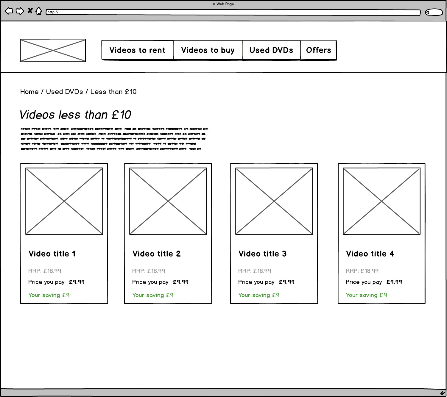
Figure 3.37: Wireframe of the expected output
The steps to complete the exercise are as follows:
- First, let's create a file called product-page.html in VSCode. We will use the following HTML page template, noting we will use an inline style sheet to make things easier:
<!DOCTYPE html>
<html>
<head>
<title>Video product page</title>
<style type="text/css">
* {
margin: 0;
padding: 0;
}
body {
font-family: sans-serif;
margin: 0 auto;
width: 1200px;
}
header {
align-items: center;
display: flex;
margin-bottom: 25px;
}
nav {
margin-left: 30px;
}
.product-cards {
display: grid;
grid-template-columns: auto auto auto;
margin-bottom: 30px;
}
/* your styles will go here */
</style>
</head>
<body>
<header>
<img src="https://dummyimage.com/200x100/000/fff&text=Logo" alt="" />
<!-- navigation will go here -->
</header>
<section>
<!-- breadcrumb will go here -->
</section>
<!-- introduction section will go here -->
<section class="product-cards">
<!-- product cards will go here -->
</section>
</body>
</html>
- Now, let's add the navigation CSS, same as the code used in Exercise 3.02, Navigation, for the following HTML from the same exercise:
<nav>
<ul>
<li><a href="">Videos to rent</a></li>
<li><a href="">Videos to buy</a></li>
<li><a href="">Used DVDs</a></li>
<li><a href="">Offers</a></li>
</ul>
</nav>
- Then, we will add the styles for the breadcrumb component same as that of Exercise 3.03, Breadcrumb, for the following HTML from the same exercise:
<section>
<ol class="breadcrumb">
<li><a href="">Home</a></li>
<li><a href="">Used DVDs</a></li>
<li>Less than £10</li>
</ol>
</section>
- We will then add the introduction section's CSS same as that of Exercise 3.04, Page Heading and Introduction, for the following HTML from the same exercise:
<section class="intro">
<h1>Videos less than £10</h1>
<p>Lorem ipsum dolor sit amet, consectetur adipiscing elit. In bibendum non purus quis vestibulum. Pellentesque ultricies quam lacus, ut tristique sapien tristique et.</p>
</section>
- Finally, we will add the product card's CSS same as that of Exercise 3.05, Product Cards, for the following HTML from the same exercise:
<section class="product-cards">
<div class=»product-card»>
<img src="https://dummyimage.com/300x300/000/fff&text=Product+Image+1" alt="" />
<h2><a href="">Video title 1</a></h2>
<p class=»original-price»>RRP: £18.99</p>
<p class=»current-price»>Price you pay <span>£9.99</span></p>
<p class=»saving»>Your saving £9</p>
</div>
<-- Similar to the above product card 1 that is video title 1, the product cards for video titles 2, 3, and 4 can be copied from Exercise 3.05, Product Cards -->
</section>
If you now right-click on the filename in VSCode on the left-hand side of the screen and select open in default browser, you will see the web page.
You should now see something similar to the following figure in your browser:

Figure 3.38: Styled product page
Activity 3.01: Converting a Newspaper Article to a Web Page
Using a copy of a recent newspaper, choose a particular article and note down what HTML elements would be used if the paper were a web page. Now create a web page version of the newspaper article using semantic markup and CSS to recreate the layout as closely as possible:
- Get a copy of a newspaper article and annotate it with a pen to label the individual HTML elements.
- Create a file named home.html in VSCode. You can use the starter HTML from a previous exercise as a starting point.
- Start writing out the HTML for the news article.
- Now style the text and layout using CSS.
An example of how you could annotate a newspaper article to distinguish the different page elements can be seen in the following figure:

Figure 3.39: Sample annotated article
Note
You can find the complete solution in page 585.
Summary
In this chapter, we have continued our journey into building web pages. We first looked at the most common text-based HTML elements such as headings, paragraphs, and lists. We then looked into the most common styling methods available for text-based content. To put this new knowledge into practice, we then walked through building a complete web page.
We took some time to understand the concept and importance of writing semantic HTML. We were also introduced to some common web page components such as navigation and breadcrumbs.
In the next chapters, we will learn how to take our web pages to the next level. We will learn how to make our web pages far more interesting by adding forms, animation, and videos.