
EXAMPLE 11 Using Company Logos in Graphs
Purpose: Put a company logo at the top of a graph (as well as a few other tricks!).
I often get my inspiration for new graphs from real life. For example, when my electric utility company started printing a little bar chart on my monthly power bill, I thought that was a pretty useful thing. I decided to see if I could do the exact same graph with SAS/GRAPH. It wasn’t quite as easy as I first thought, and now I am even including it in my book of tricky examples.
In this example, we need 13 months of power consumption values. Here is the data we will work with:
data my_data;
format kwh comma5.0;
format date mmyy5.;
input date date9. kwh;
datalines;
15sep2002 800
15oct2002 550
15nov2002 200
15dec2002 190
15jan2003 250
15feb2003 200
15mar2003 225
15apr2003 190
15may2003 325
15jun2003 350
15jul2003 675
15aug2003 775
15sep2003 875
;
run;
Why 13, rather than 12, you might ask? By showing 13 months, it allows you to not only see the 12-month trend, but also to compare the current month to the same month a year ago. Using some minimal code, we can easily plot this data, and get a basic bar chart:
goptions gunit=pct htitle=6 ftitle="albany amt/bold" htext=4.5 ftext="albany amt/bold";
title1 ls=1.5 "kWh Usage History";
pattern1 v=s c=graydd;
axis1 label=none offset=(5,5) value=(angle=90);
axis2 label=none minor=none major=(number=5);
proc gchart data=my_data;
vbar date / discrete type=sum sumvar=kwh
maxis=axis1 raxis=axis2 noframe
autoref cref=graydd clipref;
run;
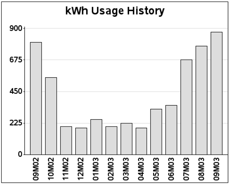
Although this is a reasonably good graph, it still does not look like the graph in my monthly electric bill. This is where the customizing comes into play.
First, let’s make the current month have a different fill color and pattern than the other months. This way it is easy to see which one is the current (that is, the most important) month. You can do this by creating a variable (BILLMONTH) and assigning it one value for the current month and a different value for all previous months, and then specify that variable in PROC GCHART’s SUBGROUP= option. I am using crosshatch patterns (x1 and x2) to fill the bars, since this is the way they were in my power bill. Some consider crosshatching a bit “old school,” but it is probably preferable to shades of gray when using low-quality black-and-white printing.
%let targetdate=15sep2003;
data my_data; set my_data;
if date eq "&targetdate"d then billmonth=1;
else billmonth=0;
run;
pattern1 v=x1 c=graybb;
pattern2 v=x2 c=black;
proc gchart data=my_data;
vbar date / discrete type=sum sumvar=kwh
subgroup=billmonth nolegend
maxis=axis1 raxis=axis2 noframe
autoref cref=graydd clipref;
run;

And for the next enhancement, we need to print the customer’s address in the top-left area of the page. There are several ways to do this using notes, annotation, and so on, but I think the easiest way is to use title statements. To get the spacing right, I first put a blank title at the top, followed by several left-justified titles (with the three lines of the address), followed by another blank title for spacing, and then a final (centered) title to label the graph. Notice that I am specifying justification (such as j=l for left-justified) and plain (non-bold) fonts for the address text. Otherwise, they would default to being centered and bold (since my FTEXT is using a bold font).
title1 h=8 " ";
title2 j=l h=4 f="albany amt" " JOHNNY LIGHTNING";
title3 j=l h=4 f="albany amt" " 123 TREADMILL WAY";
title4 j=l h=4 f="albany amt" " CARY NC 27513";
title5 h=6 " ";
title6 j=c h=6 "kWh Usage History";
{same gchart code as before}

And now for the monthly bar labels: the built-in SAS mmyy5. format works fine, but is not so user-friendly to the person reading the graph. Also, the bill from my electric company used three-character text month names, and my goal was to create a graph like that one. We would normally use the monname3. format that is built into SAS, but that causes some undesirable interactions (because with 13 months, two of them have the same name). Therefore, we have to get a little tricky.
In this case, we will hardcode the text values for the bars, via the value= option of the axis statement. But rather than hardcoding the monthly values directly (which would have to be re-hardcoded each month), we will create these values from the data. The following code loops through the data, appending the month name to the value list each time through, for each of the 13 months (note that the RETAIN statement is important here!). The ‘t= specifies which tick mark (that is, bar), and the text in quotes is the text value to print under that bar. Since the graph in my electric bill leaves out every other month’s text value (so the axis is not cluttered), I make the value blank for every other bar, using some trickery with mod(_n_,2) to determine which bars are odd and even.
data my_data; set my_data;
length axis_text $200;
retain axis_text;
if mod(_n_,2)=1 then
axis_text=trim(left(axis_text))||' t='||trim(left(_n_))||' '||quote(put(date,monname3.));
else
axis_text=trim(left(axis_text))||' t='||trim(left(_n_))||' '||quote(' '),
run;
Here is a portion of the resulting data set. Note that axis_text gets longer with each observation.
Obs kwh date axis_text
1 800 09M02 t=1 "Sep"
2 550 10M02 t=1 "Sep" t=2 " "
3 200 11M02 t=1 "Sep" t=2 " " t=3 "Nov"
4 190 12M02 t=1 "Sep" t=2 " " t=3 "Nov" t=4 " "
{and so on...}
I then convert the final value—the value of the last (MAX) date—into a macro variable, so that I can use it in the axis statement. I use AXIS_TEXT as the name of the macro variable (same as the variable name in the data set).
proc sql;
select axis_text into :axis_text from my_data having date=max(date);
quit; run;
axis1 label=none offset=(5,5) value=( &axis_text );
Now the bars are labeled with the three-character month name, and every other one is blank. Note that the first and last bars are both labeled as “Sep” and that causes no problem using this technique.
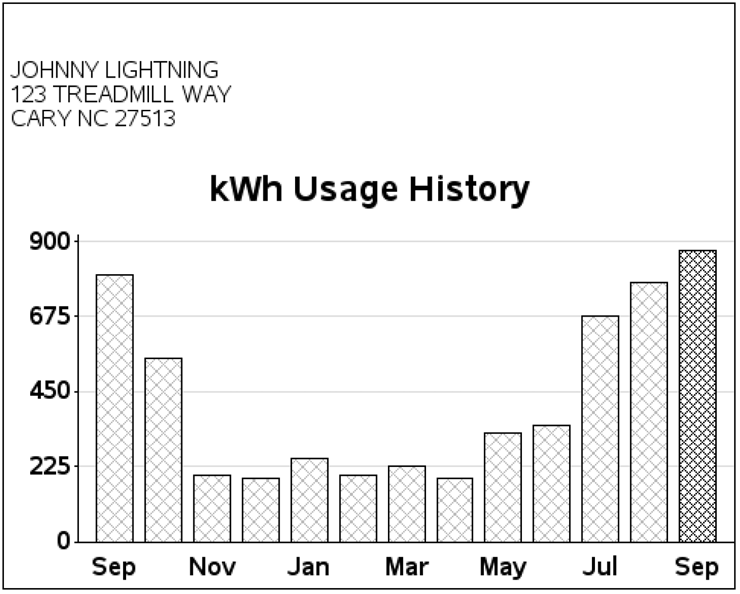
For the finishing touch, we need a power company logo at the top of the page! You can do this fairly easily using two annotate commands. First, use function='move' to move the x and y coordinates of the bottom-left corner where you want the image, and then use function='image' specifying the coordinates of the top-right corner. See Example 12, “Annotated Map Borders,” for another example of annotating an image. Note that this time I am positioning the image in the blank space created by the title1. If you need more blank space for a larger logo, you can increase the height of the blank title1.
data logo_anno;
length function $8;
xsys='3'; ysys='3'; when='a';
function='move'; x=0; y=92; output;
function='image'; x=x+36.4; y=y+7; imgpath='power_logo.png'; style='fit'; output;
run;
proc gchart data=my_data anno=logo_anno;
vbar date / discrete type=sum sumvar=kwh
subgroup=billmonth nolegend
maxis=axis1 raxis=axis2 noframe
width=5 space=2.25 coutline=black
autoref cref=graydd clipref;
run;
