
Audience researchers use a variety of methods to study people’s media use. We have mentioned many of these in the preceding pages. In this chapter, we go more deeply into issues of sampling, measurement, and how audience estimates are actually produced. These concerns go directly to the quality of the data. Do different methods have different biases and limitations? How accurate are the estimates available to ratings users? A savvy consumer of audience ratings should know how the data are created.
As we noted in the last chapter, there are two basic strategies for gathering audience data: user-centric approaches and server-centric approaches. Either way, researchers are typically working on one of three major activities. The first is identifying who is to be studied. Historically, this has involved defining the relevant population and then drawing a sample for study. The second is figuring out exactly what you want to measure and how you are going to measure it. The third is gathering the data and processing them into a product that your clients want. So sampling, measurement, and production are activities that cut across the basic strategies for gathering data.
It also bears repeating that no method for measuring audiences is perfect. Researchers often identify and categorize their imperfections into different sources of error. In this context, the word “error” has a special meaning. “Error” is the extent to which a method produces a result that is different from reality. Sometimes the source of error is just what you would expect, a mistake. But often, error is a foreseeable consequence of the method being used. Being able to discern possible sources of error will make you better able to judge the quality of research products.
There are four major sources of error in audience measurement. Each tends to crop up at different points in the research process. The first is sampling error. Even if you do everything right, this is an inevitable consequence of using samples to estimate populations. In theory, server-centric methods can avoid sampling error. In practice, sampling and its pitfalls can inform our thinking about server-centric data. The second source is nonresponse error. This occurs when the nonresponders are different from those who provide data. Sampling and nonresponse error affect the quality of the sample, so we discuss them at length in the section on sampling. The third is response error. Among those who do provide data, are there errors or biases in their responses? As you will see in the section on measurement, different techniques are associated with different types of response error. Finally, there is production error. Data must be collected, aggregated, and processed, often using mathematical adjustments. Sometimes mistakes are made. Sometimes the math introduces distortions.
If you manage to study every member of a population, you are conducting a census. If the population you are interested in is too big, or your resources too limited, you can study a subset of the population, called a sample, and use it to make inferences about the population. The methods for designing and drawing proper samples were developed in the early twentieth century. When, in the 1930s, it became necessary to describe radio audiences, sampling was used for the job, and it is still an indispensible tool for most ratings services. In fact, sampling is standard operating procedure in all kinds of surveys, ranging from public opinion polling to marketing research.
In any survey research, the quality of the sample has a tremendous impact on the accuracy with which you can describe the population. All samples can be divided into one of two classes: probability and nonprobability samples. They differ in the way researchers identify who they are studying. Probability samples, sometimes called random samples, use a process of random selection in which every member of the population has an equal, or known, chance of being drawn into the sample. This approach minimizes the odds of drawing an unrepresentative subset of the population. Probability samples can be expensive and time-consuming to construct. But researchers generally have more confidence in them than in nonprobability samples, which depend on happenstance or convenience to determine participation.
Most ratings companies try to achieve, or at least to approximate, the benefits of probability sampling. Their technical documents are laced with the language of probability samples. To develop the needed working vocabulary, therefore, one must be familiar with the principles of probability sampling. The following discussion is designed to provide that familiarity, in a way that does not assume a background in quantitative methods on the part of the reader. Those already familiar with sampling may wish to skip to the section on measurement.
Sampling begins with a definition of the population that the researcher wants to study. This requires a decision about what kind of things will be studied; researchers call these things elements or units of analysis. In ratings research, the units of analysis are typically people or households. Because the use of radio is individualistic, radio ratings have long used people as the unit of analysis. We still speak of television households as units of analysis, although the buying and selling of advertising time are usually done on the basis of populations of people who are defined by demographics (e.g., women 18–34 years old) or other individual traits that are of interest to advertisers.
Researchers must have a precise definition of the population (or universe) they want to study. This lets everyone know which elements are members of the population and, so, qualify for study. For example, if we were attempting to create national television ratings, all households in the United States with one or more sets might be appropriate. Local markets within countries can be more problematic, because households might receive signals from two or more cities. In the United States, Nielsen calls local markets Designated Market Areas (DMAs) and defines them by assigning every county to one and only one such market. Assignments are based on which television stations are watched by the people in a particular county.
Once the population is defined, the researcher could try to obtain a complete list of all elements in a population. From this list, called a sampling frame, specific elements are chosen for the sample. For example, if we have a sampling frame of 1 million television households in Amsterdam, and randomly pick one home, we would know that it had a one-in-a-million chance of selection—just like every other home in the population. Hence, we would have met the basic requirement of probability sampling. All we would have to do, then, is repeat the process until we have a sample of the desired size.
The procedure we have just described produces a simple random sample. Despite its conceptual elegance, this sort of sampling technique is seldom used in audience measurement because the real world is less cooperative than this approach to sampling assumes. It is virtually impossible to compile a list of each and every television home in an entire country. Researchers use more efficient and powerful sampling designs. The most common sampling techniques of the ratings companies are described here.
Systematic Random Sampling. One probability sampling technique that involves only a minor variation on simple random sampling is called systematic random sampling. Like a simple random sample, this approach requires the use of a sampling frame. Usually, audience measurement firms buy sampling frames from companies whose business it is to maintain and sell such lists. Historically, these frames were lists of telephone households. Homes with unlisted numbers were included through the use of randomly generated numbers. Today, some households—especially younger or lower-income households—have dropped land line phones in favor of cell phones. That could bias audience estimates, so some companies have begun using sampling frames of addresses rather than phone numbers.
Once an appropriate frame is available, systematic sampling is straightforward. Because you have a list of the entire population, you know how large it is. You also know how large a sample you want from that population. Dividing population size by sample size lets you know how often you have to pull out a name or number as you go down the list. For example, suppose you had a population of 10,000 individuals and you wanted to have a sample of 1,000. If you started at the beginning of the list and selected every 10th name, you would end up with a sample of the desired size. That “nth” interval is called the sampling interval. The only further stipulation for systematic sampling—an important one—is that you pick your starting point at random. In that way, everyone has had an equal chance of being selected, again meeting the requirement imposed by probability sampling.
Multistage Cluster Sampling. Fortunately, not all probability samples require a complete list of every single element in the population. One sampling procedure that avoids that problem is called multistage cluster sampling. Cluster sampling repeats two processes: listing the elements and sampling. Each two-step cycle constitutes a stage. Systematic random sampling is a one-stage process. Multistage cluster sampling, as the name implies, goes through several stages.
A ratings company might well use multistage sampling to identify a national sample. After all, coming up with a list of every single household in the nation would be quite a chore. However, it would be possible to list larger areas in which individual households reside. In the United States, a research company could list all counties then draw a random sample of counties. In fact, this is essentially what Nielsen does to create a national sample of television households. After that, block groups within those selected counties could be listed and randomly sampled. Third, specific city blocks within selected block groups could be listed and randomly sampled. Finally, with a manageable number of city blocks identified, researchers might be placed in the field, with specific instructions, to find individual households for participation in the sample.
Because the clusters that are listed and sampled at each stage are geographic areas, this type of sampling is sometimes called a multistage area probability sample. Despite the laborious nature of such sampling techniques, compared with the alternatives, they offer important advantages. Specifically, no sampling frame listing every household is required, and researchers in the field can contact households even if they do not have a telephone.
However, a multistage sample is more likely to be biased than is a single-stage sample. This is because, through each round of sampling, a certain amount of error accompanies the selection process—the more stages, the higher is the possibility of error. For example, suppose that during the sampling of counties described earlier, areas from the Northwestern United States were overrepresented. That could happen just by chance, and it would be a problem carried through subsequent stages. Now suppose that bias is compounded in the next stage by the selection of block groups from a disproportionate number of affluent areas. Again, that is within the realm of chance. Even if random selection is strictly observed, a certain amount of sampling error creeps in. We discuss this more fully later in this chapter when we cover sources of error.
Stratified Sampling. Using a third kind of sampling procedure, called stratified sampling, can minimize some kinds of error. This is one of the most powerful sampling techniques available to survey researchers. Stratified sampling requires the researcher to group the population being studied into relatively homogeneous subsets, called strata. Suppose we have a sampling frame that indicates the gender of everyone in the population. We could then group the population into males and females and randomly sample the appropriate number from each strata. By combining these subsamples into one large group, we would have created a probability sample that has exactly the right proportions of men and women. Without stratification, that factor would have been left to chance. Hence, we have improved the representativeness of the sample. That added precision could be important if we are studying behaviors that might correlate with gender, such as watching sports on television, or making certain product purchases like cosmetics and tires.
Stratified sampling obviously requires that the researcher have some relevant information about the elements in a sampling frame (e.g., the gender of everyone in the population). In single-stage sampling, that is sometimes not possible. In multistage sampling, there is often an abundance of information because we tend to know more about the large clusters we begin with. Consider, again, the process that began by sampling counties. Not only could we list all U.S. counties, but we could group them by the state or region of the country they are in, the size of their populations, and so forth. If we drew a systematic sample from that stratified list, we would have minimized error on those stratification variables. Other sorts of groupings, such as the concentration of people with certain demographic characteristics, could be used at subsequent stages in the process. By combining stratification with multistage cluster sampling, therefore, we could increase the representativeness of the final sample. That is what many ratings services do.
Cross-Sectional Surveys. All of the sample design issues we have discussed thus far have dealt with how the elements in the sample are identified. Another aspect of sample design deals with how long the researcher actually studies the population or sample. Cross-sectional surveys occur at a single point in time. In effect, these studies take a snapshot of the population. Much of what is reported in a single ratings report could be labeled cross-sectional. Such studies may use any of the sampling techniques just described. They are alike insofar as they tell you what the population looks like now but not how it has changed over time. Information about those changes can be quite important. For instance, suppose the ratings book indicates that your station has an average rating of 5. Is that cause for celebration or dismay? The answer depends on whether that represents an increase or a decrease in the size of your audience, and true cross-sectional studies will not tell you that.
Longitudinal Studies. These studies are designed to provide you with information about changes over time. Instead of a snapshot, they’re more like a movie. In ratings research, there are two kinds of longitudinal designs in common use: trend studies and panel studies. A trend study is one in which a series of cross-sectional surveys, based on independent samples, is conducted on a population over some period of time. The definition of the population remains the same throughout the study, but individuals may move in and out of the population. In the context of ratings research, trend studies can be created simply by considering a number of market reports done in succession. For example, tracing a station’s performance across a year’s worth of ratings books constitutes a trend study. People may have moved to or from the market in that time, but the definition of the market (i.e., the counties assigned to it) has not changed. Most market reports, in fact, provide some trend information from past reports. Panel studies draw a single sample from a population and continue to study that sample over time. The best example of a panel study in ratings research involves the metering of people’s homes. This way of gathering ratings information, which we describe later in the chapter, may keep a household in the sample for years.
Sampling error is an abstract statistical concept that is common to all survey research that uses probability samples. Basically, it is a way to recognize that as long as we try to estimate what is true for a population by studying something less than the entire population, there is a chance that we will miss the mark. Even if we use very large, perfectly drawn random samples, it is possible that they will fail to accurately represent the populations from which they were drawn. This is inherent in the process of sampling. Fortunately, if we use random samples, we can, at least, use the laws of probability to make statements about the amount of sampling error we are likely to encounter. In other words, the laws of probability will tell us how likely we are to get accurate results.
The best way to explain sampling error, and a host of terms that accompany the concept, is to work our way through a hypothetical study. Suppose that the Super Bowl was played yesterday and we wanted to estimate what percentage of households actually watched the game (i.e., the game’s rating). Let us also suppose that the “truth” of the matter is that exactly 50 percent of U.S. homes watched the game. Of course, ordinarily we would not know that, but we need to assume this knowledge to make our point. The true population value is represented in the top of Figure 3.1.

FIGURE 3.1. A Sampling Distribution
To estimate the game’s rating, we decide to draw a random sample of 100 households from a list of all the television households in the country. Because we have a complete sampling frame (unlikely, but convenient!), every home has had an equal chance to be selected. Next, we call each home and ask if they watched the game. Because they all have phones, perfect memories, and are completely truthful (again, convenient), we can assume we have accurately recorded what happened in these sample homes. After a few quick calculations, we discover that only 46 percent of those we interviewed saw the game. This result is also plotted in the top of Figure 3.1.
Clearly, we have a problem. Our single best guess of how many homes saw the game is 4 percentage points lower than what was, in fact, true. In the world of media buying, 4 ratings points can mean a lot of money. It should, nevertheless, be intuitively obvious that even with our convenient assumptions and strict adherence to sampling procedures, such a disparity is entirely possible. It would have been surprising to hit the nail on the head the first time out. That difference of 4 ratings points does not mean we did anything wrong; it is just sampling error.
Because we have the luxury of a hypothetical case here, let’s assume that we repeat the sampling process. This time, 52 percent of the sample say they watched the game. This is better, but still in error, and still a plausible kind of occurrence. Finally, suppose that we draw 1,000 samples, just like for the first two. Each time, we plot the result of that sample. If we did this, the result would look something like the bottom of Figure 3.1.
The shape of this figure reveals a lot and is worth considering for a moment. It is a special kind of frequency distribution that statisticians call a sampling distribution. In our case, it forms a symmetrical, bell-shaped curve indicating that, when all was said and done, more of our sample estimates hit the true population value (i.e., 50 percent) than any other single value. It also indicates that although most of the sample estimates clustered close to 50 percent, a few were outliers. In essence, this means that, if you use probability sampling, reality has a way of anchoring your estimates and keeping most of them fairly close to what is true. It also means that sooner or later, you are bound to hit one that is way off the mark.
What is equally important about this sampling distribution is that it will assume a known size and shape. The most frequently used measure of that size and shape is called the standard error (SE). In essence, this is the average “wrong guess” we are likely to make in predicting the ratings. For those familiar with introductory statistics, this is essentially a standard deviation. It is best conceptualized as a unit along the baseline of the distribution. Figure 3.2 gives the simplest formula for calculating the SE with ratings data.
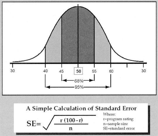
FIGURE 3.2. Relationship of Standard Error to Sampling Distribution
What is remarkable about the SE, and what you will have to accept on faith unless you want to delve much more deeply into calculus, is that when it is laid out against its parent sampling distribution, it will bracket a precise number of samples. Specifically, ±1 SE will always encompass 68 percent of the samples in the distribution; ±2 SEs (technically, that should be 1.96) encompasses 95 percent of all samples. In our example, the SE works out to be approximately 5 ratings points, which means that 68 percent of the hypothetical samples will have produced results between 45 percent and 55 percent (i.e., 50 percent ±5 percentage points). That relationship between SE and the sampling distribution is depicted in Figure 3.2.
None of this would be of interest to anyone other than a mathematician were it not for the fact that such reasoning provides us with a way to make statements about the accuracy of audience data. Remember that in our first sample, we found 46 percent watching the Super Bowl. Ordinarily, that would be our single best guess about what was true for the population. We would recognize, however, that there is a possibility of sampling error, and we would want to know the odds of the true population value being something different than our estimate. We could state those odds by using our estimated rating (i.e., 46) to calculate SE and placing a bracket around our estimate, just like the one in Figure 3.2. Because we know that 95 percent of all sample means would fall between ±2 SEs, we know that 95 percent of all sample means will fall between ±10 points in this example. The resulting statement would sound like this, “We estimate that the Super Bowl had a rating of 46, and we are 95 percent confident that the true rating falls between 36 and 56.”
The range of values given in that statement (i.e., 36–56) is called the confidence interval. Confidence intervals are often set at ±2 SEs and will therefore have a high probability of encompassing the true population value. When you hear someone qualify the results of a survey by saying something like, “These results are subject to a sampling error of plus or minus 3 percent,” they are giving you a confidence interval. What is equally important, but less often heard, is how much confidence should be placed in that range of values. To say we are “95 percent confident,” is to express a confidence level. At the 95 percent level, we know that in 95 of 100 times, the range we report will include the population value. Of course, that means that 5 percent of the time we will be wrong, because it is always possible our sample was one of those that was way off the mark. But at least we can state the odds and satisfy ourselves that an erroneous estimate is a remote possibility.
Such esoteric concepts take on practical significance, because they go to the heart of ratings accuracy. For example, reporting that a program has a rating of 15, ±10, leaves a lot of room for error. Even fairly small margins of error (e.g., SE +/−1 can be important if the estimates they surround are themselves small (e.g., a rating of 3). That is one reason why ratings services will routinely report relative standard error (i.e., SE as a percentage of the estimate) rather than the absolute level of error. In any event, it becomes critically important to reduce sampling error to an acceptable level. Three factors affect the size of that error: complexity of the population, sample size, and sample design. One is beyond the control of researchers; two are not.
The source of sampling error that we cannot control has to do with the population itself. Some populations are just more complicated than others. A researcher refers to these complexities as variability or heterogeneity in the population. To take an extreme case, if everyone in the population were exactly alike (i.e., perfect homogeneity), then a sample of one person would suffice. Unfortunately, media audiences are not homogeneous, and to make matters worse, they are getting more heterogeneous all the time. Think about how television has changed over the years. It used to be that people could watch the three or four networks and that was it. Today, most homes have cable or satellite, not to mention DVRs and video on demand (VOD). Now think about the complexities that the Internet introduces with services like YouTube. All other things being equal, that makes it more difficult to estimate who is watching what.
The two factors that researchers can control are related to the sample itself. Sample size is the most obvious and important of these. Larger samples reduce the magnitude of sampling error. It is just common sense that we should have more confidence in results from a sample of 1,000 than 100. What is counterintuitive is that sample size and error do not have a one-to-one relationship. That means doubling the size of the sample does not cut the SE in half. Instead, you must quadruple the sample size to reduce the SE by half. You can satisfy yourself of this by looking back at the calculation of SE in Figure 3.2. To reduce the SE from 5 to 2.5, you must increase the sample size from 100 to 400. You should also note that the size of the population you are studying has no direct impact on the error calculations. All other things being equal, small populations require samples just as big as large populations.
These aspects of sampling theory are more than just curiosities; they have a substantial impact on the conduct and economics of the ratings business. Although it is always possible to improve the accuracy of the ratings by increasing the size of the samples on which they are based, you very quickly reach a point of diminishing returns. This was nicely demonstrated in research conducted by CONTAM, an industry group formed in response to the U.S. congressional hearing of the 1960s. That study collected viewing records from over 50,000 households around the country. From that pool, eight sets of 100 samples were drawn. Samples in the first set had 25 households each. Sample sizes for the following sets were 50, 100, 250, 500, 1,000, 1,500, and 2,500. The results are shown in Figure 3.3.

FIGURE 3.3. Effect of Sample Size on Sampling Error
At the smallest sample sizes, individual estimates of the cartoon show the Flintstones audience varied widely around the actual rating of 26. Increasing sample sizes from these low levels produced dramatic improvements in the consistency and accuracy of sample estimates, as evidenced in tighter clustering. For example, going from 100 to 1,000 markedly reduced sampling error and only required adding 900 households. Conversely, going from 1,000 to 2,500 resulted in a modest improvement, yet it required an increase of 1,500 households. Such relationships mean the suppliers of syndicated research and their clients have to strike a balance between the cost and accuracy of audience data.
In practice, several other factors determine the sample sizes used by a research provider. As we suggested earlier, more-complex populations will require larger samples to achieve a certain level of sampling error. This is how the problem of audience fragmentation, which we described in the preceding chapter, comes back to haunt us. As media users spread their attention across more and more outlets, or as we want to measure smaller segments of the audience (e.g., men 18–21 years old), we need larger samples just to keep pace. This can sometimes be done if we are studying large national populations, even though larger populations do not, theoretically, require bigger samples. It happens because larger populations typically have a larger volume of media dollars available, and so justify the investment. In smaller markets, which could be just as complex, it might not be feasible.
The only other factor that the researcher can use to reduce sampling error is to improve the sample design. For reasons that we have already discussed, certain kinds of probability samples, like stratified samples, are more accurate than others. This strategy is commonly used, but there is a limit to what can be achieved. We should also note that when these more complex sample designs are used, the calculation of SE becomes a bit more involved than Figure 3.3 indicates. We address those revised computations later.
Nonresponse error is the second major source of error we encounter in the context of sampling. It occurs because not everyone we might wish to study will cooperate or respond. Remember that our entire discussion of sampling error assumed everyone we wanted to include in the sample gave us the information we desired. In the real world, that just does not happen. To the extent that those who do not respond are different from those who do, there is a possibility that the samples we actually have to work with may be biased. Many of the procedures that the ratings services use represent attempts to correct nonresponse error.
The magnitude of nonresponse error varies from one ratings report to the next. The best way to get a sense of it is to look at the response rates reported by the ratings service. Every ratings company will identify an original sample of people or households that it wishes to use in the preparation of its ratings estimates. This ideal sample is usually called the initially designated sample. Some members of the designated sample, however, will refuse to cooperate. Others will agree to be in the sample but will for one reason or another fail to provide information. In other words, many will not respond. Obviously, only those who do respond can be used to tabulate the data. The latter group constitutes what is called the in-tab sample. The response rate is simply the percentage of people from the initially designated sample who actually gave the ratings company useful information. Various techniques for gathering ratings data are associated with different response rates. Telephone surveys, for example, have tended to have relatively high response rates, although these have declined in recent years. The most common measurement techniques, like placing diaries, often produce response rates in the neighborhood of 20 percent. Furthermore, different measurement techniques work better with some kinds of people than others. The non-response errors associated with measurement are discussed in the next section.
Because nonresponse error has the potential to bias the ratings, research companies use one of two general strategies to minimize or control it. First, you can take action before the fact to improve the representativeness of the in-tab sample. Second, you can make adjustments in the sample after data have been collected. Often, both strategies are used. Either way, you need to know what the population looks like in order to judge the representativeness of your in-tab sample and to gauge the adjustments that are to be made.
Population or universe estimates, therefore, are essential in correcting for nonresponse error. Determining what the population looks like (i.e., age and gender breakdowns, etc.) often begins with U.S. Census information from the government, although these data are not always up to date. Ratings companies often buy more current universe estimates from other research companies. Occasionally, certain attributes of the population that have not been measured by others, like cable penetration, must be estimated. To do this, it may be necessary to conduct a special study, called either an enumeration or establishment survey, that determines universe estimates.
Once you known what targets to shoot for, corrections for nonresponse error can be made. Before-the-fact remedies include the use of special recruitment techniques and buffer samples. The most desirable solution is to get as many of those in the originally designated sample as possible to cooperate. Doing so requires a deeper understanding of the reasons for nonresponse and combating those with counteractive measures. For example, ratings services will often provide sample members with some monetary incentive. Perhaps different types of incentives will work better or worse with different types of people. Following up on initial contacts or making sure that interviewers and research materials are in a respondent’s primary language will also improve response rates. The major ratings companies are aware of these alternatives and, on the basis of experience, know where they are likely to encounter nonresponse problems. They sometimes use special recruitment techniques to improve, for example, minority representation in the sample.
If improved recruitment fails to work, additional sampling can increase underrepresented groups. Buffer samples are simply lists of additional households that have been randomly generated and held in reserve. If, as sampling progresses, it becomes apparent that responses in one county are lagging behind expectations, the appropriate buffer sample can be enlisted to increase the size of the sample drawn from that area. Field workers might use a similar procedure if they encounter a noncooperating household. In such an event, they would probably have instructions to sample a second household in the same neighborhood, perhaps even matching the noncooperator on key household attributes.
Once the data are collected, another technique can be used to adjust for nonresponders. Sample weighting, sometimes called sample balancing, is a statistical procedure that gives the responses of certain kinds of people more influence over the ratings estimates than their numbers in the sample would suggest. Basically, the ratings companies compare the in-tab sample and the universe estimates (usually on geographic, ethnic, age, and gender breakdowns) and determine where they have too many of one kind of person and not enough of another. Suppose, for example, that 18- to 24-year-old men accounted for 8 percent of the population but only 4 percent of the in-tab sample. One remedy for this would be to let the responses of each young man in the in-tab count twice. Conversely, the responses of overrepresented groups would count less than once. The way to determine the appropriate weight for any particular group is to divide their proportion in the population by their proportion in the sample (e.g., 8 percent/4 percent = 2).
For years, Nielsen used an unweighted sample to project its national ratings in the United States. But when it introduced the same measurement technology in local markets (i.e., LPMs) that it used nationally, it could greatly increase the size of its national sample, hence reducing sampling error, by folding in LPMs. To do that, however, it had to apply weights so the local data did not swamp the national estimates.
If you think the use of buffer samples or weighting samples is not a completely adequate solution to problems of nonresponse, you are right. Although these procedures may make in-tab samples look like the universe, they do not eliminate nonresponse error. The people in buffer samples who do cooperate or those whose responses count more than once might still be systematically different from those who did not cooperate. That is why some people question the use of these techniques. The problem is that failing to make these adjustments also distorts results. For example, if you programmed a radio station that catered to 18- to 24-year-old men, you would be unhappy that they tend to be underrepresented in most in-tab samples and probably welcome the kind of weighting just described, flaws and all. Today, the accepted industry practice is to weight samples. We return to this topic when we discuss the process of producing the ratings.
The existence of nonresponse error, and certain techniques used to correct for such error, means that samples the ratings services actually use are not perfect probability samples. That fact, in combination with the use of relatively complex sample designs, means that calculations of SE are a bit more involved than our earlier discussion indicated. Without going into detail, error is affected by the weights in the sample, whether you are dealing with households or persons and whether you are estimating the audience at a single point in time or the average audience over a number of time periods. Further, actual in-tab sample sizes are not used in calculating error. Rather, the ratings services derive what they call effective sample sizes for purposes of calculating SE. These take into account the fact that their samples are not simple random samples. Effective sample sizes may be smaller than, equal to, or larger than actual sample sizes. No matter the method for calculating SE, however, the use and interpretation of that number are as described earlier.
Using servers to collect data is often touted as providing a census of media use. That is, it promises to measure every member of the population. If that were true, it would eliminate all of the sampling issues we have just spent several pages describing. Servers can, indeed, “see” the actions of all people who use the server, and by doing so they collect information on enormous numbers of people. But it is not necessarily a census. Google, for example, can see what millions of people around the world are searching for. If the population you wanted to describe were Google users, that data would be a census. But people use other search engines, so if the population you really wanted to describe were everyone conducting searches on the World Wide Web, Google would just have a very big sample. In this case, you would have to ask, “Are Google users systematically different from people who use other services like Bing or the Chinese search engine Badiu?” If so, the problems of sampling and their remedies reemerge.
This has been an important issue in efforts to use digital set-top boxes (STBs) to measure television audiences. A great many households now receive television via cable or satellite services. In the United States, roughly 90 percent of homes are now in that category. Often the signal being served to the television set is managed by an STB, which assembles digital input into programs. If the STB is running the right software, it can detect and report the channels being viewed on a continuous basis. That information, potentially from millions of homes, can be collected by the service provider and aggregated to estimate the size of television audiences.
Proponents of STB measurement sometimes describe this as a census of the television audience. It is not. Remember, ratings companies want to describe the viewing of all homes with television. The first problem is STBs are not in all households. And those with STBs are different from those without. They are often more affluent, and they certainly have more viewing options. Further, even in homes with STBs, some sets are not connected. For example, the main set in the living room might use an STB, while the set in the kitchen or bedroom just gets over-the-air (OTA) signals. In other words, STBs capture some, but not all, television viewing. Add to this the fact that cable and satellite providers who could collect the data might not want to share it. The end result is that STB measurement is typically based on very large samples and these are almost certainly systematically different from the total population you want to describe.
That said, STB data offer an important way to solve the problem of measurement in a world of audience fragmentation. Because STBs collect data from so many homes, they can record very small audiences. But to describe the total audience, the data have to be adjusted, in just the way you would address problems of nonresponse in an ordinary sample. For example, Rentrak is a company that sells STB-derived audience estimates in the United States. It collects data from different platforms or “strata” (e.g., cable, satellites, telephone companies, and OTA), but it rarely has data from all the households in a particular category. It assigns various mathematical weights to these datasets to project total audience size. Hence, even when you have the luxury of “census-like” data, you often have to treat it like a big sample and proceed accordingly.
Sampling has an important bearing on the quality of audience measurement, but methods of measurement are just as important. It is one thing to create a sample that identifies whom you want to study; it is quite another to measure audience activity by recording what they see on television, hear on radio, or use on the Internet. While the sampling procedures used by audience measurement companies are common to all survey research operations, their measurement techniques are often highly specialized.
Technically, measurement is defined as a process of assigning numbers to objects, according to some rule of assignment. The “objects” that the audience research companies are usually measuring are people, although, as we have seen, households can also be the unit of analysis. The “numbers” simply quantify the characteristics or behaviors that we wish to study. This kind of quantification makes it easier to manage the relevant information and to summarize the various attributes of the sample. For example, if a person saw a particular football game last night, we might assign him or her a “1.” Those who did not see the game might be assigned a “0.” By reporting the percentage of 1s we have, we could produce a rating for the game. The numbering scheme that the ratings services actually use is a bit more complicated than that, but in essence, that is what happens.
Researchers who specialize in measurement are very much concerned with the accuracy of the numbering scheme they use. After all, anyone can assign numbers to things, but capturing something meaningful with those numbers is more difficult. Researchers express their concerns about the accuracy of a measurement technique with two concepts: reliability and validity. Reliability is the extent to which a measurement procedure will produce consistent results in repeated applications. If what you are trying to measure does not change, an accurate measuring device should end up assigning it the same number time after time. If that is the case, the measure is said to be reliable. Just because a measurement procedure is reliable, however, does not mean that it is completely accurate; it must also be valid. Validity is the extent to which a measure actually quantifies the characteristic it is supposed to quantify. For instance, if we wanted to measure a person’s program preferences, we might try to do so by recording which shows he or she watches most frequently. This approach might produce a very consistent, or reliable, pattern of results. However, it does not necessarily follow that the program a person sees most often is their favorite. Scheduling, rather than preference, might produce such results. Therefore, measuring preferences by using a person’s program choices might be reliable but not particularly valid.
One of the first questions that must be addressed in any assessment of measurement techniques is, “What are you trying to measure?” Confusion on this point has led to a good many misunderstandings about audience measurement. At first glance, the answer seems simple enough. As we noted in the first chapter, historically ratings have measured exposure to electronic media. But even that definition leaves much unsaid. To think this through, two factors need to be more fully considered: (a) What do we mean by “media”? (b) What constitutes exposure?
Defining the media side of the equation raises a number of possibilities. It might be, for example, that we have no interest in the audience for specific content. Some effects researchers are only concerned with how much television people watch overall. Although knowing the amount of exposure to a medium might be useful in some applications, it is not terribly useful to advertisers. Radio station audiences and, to a certain extent, cable network audiences have been reported this way. Here, the medium may be no more precisely defined than use of an outlet during a broad time period or an average quarter hour.
In television ratings, exposure is usually tied to a specific program. Here, too, however, questions concerning definition can be raised. How much of a program must people see before they are included in that program’s audience? If a few minutes are enough, then the total audience for the show will probably be larger than the audience at any one point in time. Some of the measurement techniques we discuss in the following section are too insensitive to make such minute-to-minute determinations, but for other approaches, this consideration is very important.
Advertisers are, of course, most interested in who sees their commercials. So, a case can be made that the most relevant way to define the media for them is not program content but rather commercial content. We noted in the last chapter that in the United States, commercial ratings, called C3 ratings, were now the currency in the national television marketplace. These report the average rating for all commercials in a program, plus 3 days of replay. Some companies now report the ratings for specific commercials, not just the program average. Internet advertisers have a similar concern. One common way to measure the audience for a display ad on a website is to count “served impressions.” That is a server-centric measure of the number of times the ad was served to users. But advertisers know that not all ads that are inserted in web pages are actually viewed. Some fail to load before the user goes to another page, or they are placed on the page such that the user never sees them. Hence, regular served impressions tend to overstate the audiences of Internet ads. Because of that, many advertisers would prefer a new commercial rating called “viewable impressions.”
Sometimes the medium we want to measure, like a television program or an ad, can be seen across multiple platforms. So another puzzle in describing the audience for such media is whether to aggregate viewers across all those platforms to produce a single “extended screen” rating. To do that accurately, it would be best to measure the same people across platforms (e.g., television, Internet, smartphones, tablets, etc.). Some measurement services are moving in that direction. Whether the industry wants that kind of aggregated estimate is another question.
The second question we raised had to do with determining what is meant by exposure. Since the very first radio surveys in 1930, measuring exposure has been the principal objective of ratings research. Balnaves et al. (2011) noted that Archibald Crossley
decided to measure ‘exposure’ in his radio ratings analysis—who listens, for how long and with what regularity…. This did not mean that audience researchers did not collect data on whether people did or did not like the radio programmes. But for the purpose of buying and selling radio airtime, or programmes, a metric that showed the fact of tuning in to a programme and the amount of time listening to a programme had a simplicity that was essential for bargaining in highly competitive environments. All competitors, though, had to agree on the measure being used. (p. 22)
Simple as it might seem, even defining exposure raises a number of possibilities. Exposure is often assumed when a user chooses a particular station, program, or website. Under this definition, exposure means that the user was present in the room or car when the computer or radio was in use. At best, this represents a vaguely defined opportunity to see or hear something. Once it has been determined that audience members have tuned to a particular station, further questions about the quality of exposure are left unanswered.
It is well documented, however, that much of our media use is accompanied by other activities. People may talk, eat, play games, or do the dishes while the set is in use. Increasingly, they engage in “concurrent media use,” like having the television on while they look at a laptop or tablet. Whatever the case, it is clear that during a large portion of the time that people are “in the audience,” they are not paying much attention. This has led some researchers to argue that defining exposure as a matter of choice greatly overstates people’s real exposure to the media. An alternative, of course, would be to stipulate that exposure must mean that a person is paying attention to the media, or perhaps even understanding what is seen or heard. Interactive technologies that require someone to “click” on a message or icon offer some evidence that they are paying attention, but for most media, measuring a person’s level of awareness or perception is extremely difficult to do in an efficient, valid way.
Obviously, these questions of definition help determine what the data really measure and how they are to be interpreted. If different ratings companies used vastly different definitions of exposure to media, their cost structures and research products might be quite different as well. The significance of these issues has not been lost on the affected industries. In 1954, the Advertising Research Foundation (ARF) released a set of recommendations that took up many of these concerns. In addition to advocating the use of probability samples, ARF recommended that “tuning behavior” be the accepted definition of exposure. That standard has been the most widely accepted and has effectively guided the development of most of the measurement techniques we use today.
Another shortcoming that critics of ratings research have raised for some time is that operational definitions of exposure tell us nothing about the quality of the experience in a more affective sense. For example, do people like what they see? Do they find it enlightening or engaging? These types of measures are sometimes called qualitative ratings, not because they are devoid of numbers but because they attempt to quantify “softer” variables like emotions and cognitions. Many European countries, with strong traditions of noncommercial public broadcasting, have produced such ratings. In the United States, they have been produced on an irregular basis, not so much as a substitute for existing services but rather as a supplement. In the early 1980s, the Corporation for Public Broadcasting, in collaboration with Arbitron, conducted field tests of such a system. Another effort was initiated by an independent Boston-based company named Television Audience Assessment, which tried selling qualitative ratings information. These efforts failed because there simply was not enough demand in the United States to justify the expense of a parallel qualitative ratings service.
Today, that disinterest in the qualitative dimensions of audience measurement is changing. This is happening for two reasons. First, in an abundant and fragmented media environment, where media users are free to indulge wants and loyalties, simple measures of the size and demographic composition of audiences seem impoverished. Certainly outlets or programs with small audiences would like to demonstrate to advertisers that their users have an unusual level of engagement that makes them attractive prospects. Second, the growth of social media like Facebook and Twitter now offers a low-cost way to capture data on what people talk about and share with their friends. Some established measurement companies, like Nielsen, and a great many smaller start-up companies are harvesting such data to produce measures of engagement or “buzz.” These are already being used to supplement media buying once done exclusively with measures of exposure. It may be that these new sources of data eventually produce a “basket of currencies” (Napoli, 2011, p. 149). But the wealth of possibilities also makes it hard to forge any industry consensus on what the new metrics actually measure and how they are to be used (Napoli, 2012). For now, it appears that measures of exposure, or measures derived from those data, will continue to be the principal focus of audience analysis.
There are several techniques that the ratings services use to measure people’s exposure to electronic media, and each has certain advantages and disadvantages. The biases of these techniques contribute to the third kind of error we mentioned earlier. Response error includes inaccuracies contained in the responses generated by the measurement procedure. To illustrate these biases, we discuss each major approach to audience measurement in general terms. To avoid getting too bogged down in details, we may gloss over differences in how each ratings company operationalizes a particular scheme of measurement. The reader wishing more information should see each company’s description of methodology.
Questionnaires. Asking questions is one of the oldest ways to collect data on audiences or, for that matter, any one of countless social phenomena. There are many books on questionnaire design, so we will not elaborate on their strengths and weaknesses here. We will, however, comment briefly on how question-asking techniques have been used in audience measurement. As we noted in chapter 2, telephone surveys were the mainstay of the ratings industry at its inception. While telephone interviews are no longer the workhorse of audience measurement, it is important to understand the potential and limitations of recall and coincidental surveys.
Telephone recall, as the name implies, requires a respondent to remember what he or she has seen or heard over some period of time. Generally speaking, two things affect the quality of recalled information. One is how far back a person is required to remember. Obviously, the further removed something is from the present, the more it is subject to “memory error.” Second is the salience of the behavior in question. Important or regular occurrences are better remembered than trivial or sporadic events. Because most people’s radio listening tends to be regular and involves only a few stations, the medium is more amenable than some to measurement with telephone recall techniques.
Like all other methods of data collection, however, telephone recall has certain limitations. First, the entire method is no better than a respondent’s memory. Even though people are only expected to recall yesterday’s media use, there is no guarantee that they can accurately do so. There is, for example, good evidence that people overestimate their use of news (Prior, 2009). As more people screen their calls or rely on primarily on cell phones, they may be less willing to talk to an interviewer. Finally, the use of human interviewers, while sometimes a virtue, can also introduce error. Although interviewers are usually trained and monitored in centralized telephone centers, they can make inappropriate comments or other errors that bias results.
Telephone coincidental can offer a way to overcome problems of memory. These surveys work very much like phone recall techniques, except that they ask respondents to report what they are seeing or listening to at the moment of the call. Because respondents can verify exactly who is using what media at the time, errors of memory and reporting fatigue are eliminated. For these reasons, telephone coincidentals were, for some time, regarded as the “gold standard” against which other methods of measurement should be evaluated.
Despite these acknowledged virtues, no major ratings company routinely conducts telephone coincidental research. There are two problems with coincidentals that militate against their regular use. First, a coincidental interview only captures a glimpse of a person’s media use. In effect, it sacrifices quantity of information for quality. As a result, to describe audiences hour to hour, day to day, and week to week, huge numbers of people would have to be called around the clock. That becomes a very expensive proposition. Second, as with all telephone interviews, there are practical limitations on where and when calls can be made. Much radio listening occurs in cars, much television viewing occurs late at night, and much media use is moving to portable devices like tablets. These behaviors are difficult to capture with traditional coincidental techniques.
Just as telephone technology ushered in new methods of data collection in the early twentieth century, the Internet has opened the door for new methods of question asking in the early twenty-first century. A number of firms routinely gather information about media use by presenting questions to web users. Of course, these samples are limited to those with access to the Internet. In fact, many could be considered “opt-in” samples, so generalizing results to larger populations should be done with caution. Still web-based surveys allow for innovation in question asking. For example, respondents needing supplementary material or clarification might have the benefit of drop-down windows. Certain kinds of responses might automatically trigger different kinds of follow-up questions (Walejko, 2010). Even more radical approaches, like building surveys on the model of a wiki, are being developed (Salganik & Levy, 2012). Web-based surveys can take advantage of large samples and offer very quick turnaround times. But, to the extent that these techniques deviate from the well-understood methods of traditional questionnaire design, they might best be thought of as works in progress.
Diaries. Since their introduction in the 1940s, diaries have been widely used to measure media use. Today, they are still the mainstay of radio and television audience measurement in many markets around the world. As we mentioned in the previous chapter, the weeks when diaries are being collected are referred to as “sweeps.” During one 4-week sweep, Nielsen alone will gather diaries from over 100,000 respondents to produce audience estimates in local U.S. television markets.
A diary is a small paper booklet in which the diary keeper records his or her media use, generally for 1 week. To produce television ratings, one diary is kept for each television set in the household. The exact format of diaries varies from company to company. Figure 3.4 is an instruction page from a Nielsen television diary. The viewing day begins at 5 A.M., and thereafter it is divided into quarter-hour segments (ending at 4:59 A.M.). Each day of the week is similarly divided. During each quarter hour that the set is in use, the diary keeper is supposed to note what is being watched, as well as which family members and/or visitors are watching. The diary also includes a few additional questions about household composition and the channels that are received in the home. One major limitation to this method is that the viewing is tied to a set rather than to a person, so out-of home viewing may be significantly understated.
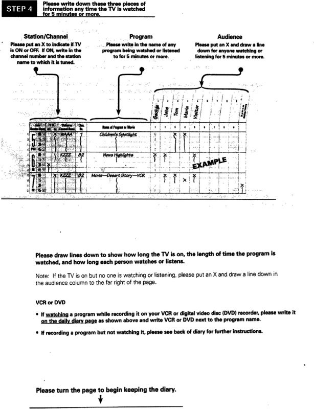
FIGURE 3.4. Sample Page from Nielsen Television Diary
Reprinted by permission of Nielsen Media Research.
Radio audiences are also measured with diaries, but these diaries are supposed to accompany people rather than sets. That way, an individual can record listening that occurs outside the home. Figure 3.5 is an instruction page from an Arbitron radio diary. It begins at 5 A.M. and divides the day into broader dayparts than the rigid quarter-hour increments of the television diary. Because a radio diary is a personal record, the diary keeper does not note whether other people were listening. The location of listening, however, is recorded. Keep in mind, though, that the diary as a method of data collection in radio is being replaced in more and more markets by the portable peoplemeter (PPM).

FIGURE 3.5. Sample of Arbitron Diary
Reprinted by permission of Arbitron.
Diary placement and retrieval techniques vary, but the usual practice goes something like this. The ratings company calls members of the originally designated sample on the phone to secure the respondent’s cooperation and collect some initial information. Those who are excluded (e.g., people living in group quarters) or those who will receive special treatment (e.g., those needing a diary in a special language) are identified at this stage. Follow-up letters may be sent to households that have agreed to cooperate. Diaries are, then, either mailed or delivered to the home in person by field personnel. Incidentally, although respondents are asked to cooperate, diaries can be distributed to those who say they are not interested in cooperating. Quite often, a modest monetary incentive is provided as a gesture of goodwill, but the incentive may change in markets with traditionally lower response rates. During the week, another letter or phone call may encourage the diary keeper to note his or her media use. Diaries are often designed to be sealed and placed directly in the mail, which is typically how the diary is returned to the ratings company at the end of the week. Occasionally, a second monetary reward follows the return of the diary. In some special cases, homes are called and the diary information is collected over the telephone.
Diaries have some significant advantages that account for their continued popularity. They are a relatively inexpensive method of data collection. Considering the wealth of information that a properly filled-out diary contains, few of the other techniques we discuss here are as cost-effective. Most importantly, they report which people were actually in the audience. In fact, until the introduction of peoplemeters in the 1980s, diaries had to be used in conjunction with more expensive metering techniques to determine the demographic composition of national television audiences. In some places, that meter/diary combination is still in use. And in many smaller markets, with less advertising money at stake, diary-only data collection may be the only method that makes economic sense.
Despite their popularity, there are a number of problems associated with the use of diaries—problems of both nonresponse and response error. We have already discussed nonresponse error in the context of sampling. It should be noted, however, that diaries are particularly troublesome in this regard. Response rates on the order of 20 percent are common, and in some markets the rate will drop below that. These might be improved with larger incentives or more elaborate recruitment, but that would drive up costs. Obviously, diary keepers must be literate, but methodological research undertaken by the industry suggests that those who fill out and return diaries are systematically different in other ways. Younger people, especially younger males, are less responsive to the diary technique. Some minorities, too, are less likely to complete and return a diary. There is also some evidence that those who return a television diary are heavier users of the medium than are nonrespondents.
There are a number of response errors typical of diary data as well. Filling out a diary properly is a good deal of work. There is a fair amount of anecdotal evidence that diary keepers frequently do not note their media use as it occurs but instead try to recollect it at the end of the day or the week. To the extent that entries are delayed, errors of memory are more likely. Similarly, it appears that diary keepers are more diligent in the first few days of diary keeping than the last. This diary fatigue may artificially depress viewing or listening levels at the end of the week. Children’s use of television is also likely to go unreported if they watch at times when an adult diary keeper is not present. Using media late at night, using media for short durations (e.g., surfing channels with a remote), and using secondary sets (e.g., in bedrooms, etc.) are typically underreported. Conversely, people are more apt to overstate watching or listening to popular programs or stations.
These are significant, if fairly benign, sources of response error. There is less evidence on the extent to which people deliberately distort reports of their viewing or listening behavior. Most people seem to have a sense of what ratings data are and how they can affect programming decisions. Again, anecdotal evidence suggests that some people view their participation in a ratings sample as an opportunity to “vote” for deserving programs, whether they are actually in the audience or not. While diary data may be more susceptible to such distortions than data of other methods, instances of deliberate, systematic deception, although real, are probably limited in scope.
A more serious problem with diary-based measurement techniques has emerged in recent years. As we noted earlier, the television viewing environment has become increasingly complex. Homes that subscribe to cable or satellite services have hundreds of channels, and often a DVR or an STB with VOD is available. In addition, remote control devices are in virtually all households. These technological changes make the job of keeping an accurate diary more burdensome than ever. A viewer who has flipped through dozens of channels to find something of interest may not know or report the network he or she is watching. Compared with more accurate methods, diaries report longer periods of continuous viewing but detect fewer sources or channels being viewed. Hence, diary-based measurement is likely to favor larger, more-established outlets at the expense of smaller, less-popular cable outlets.
Meters. Meters have been used to measure audiences as long as any technique except telephone surveys. The first metering device was Nielsen’s Audimeter, which went into service in 1942. Today they are several kinds of meters in use around the world, and they are generally preferred to other measure techniques when resources allow.
Modern household meters are essentially small computers that are attached to all of the television sets in a home. They perform a number of functions, the most important of which is monitoring set activity. The meter records when the set is on and the channel to which it is tuned. This information is typically stored in a separate unit that is hidden in some unobtrusive location. The data it contains can be retrieved through a telephone line and downloaded to a central computer.
For years, that was the scope of metering activity. And as such, it had enormous advantages over diary measurement. It eliminated much of the human error inherent in diary keeping. Viewing was recorded as it occurred. Even exposure of brief duration could be accurately recorded. Members of the sample did not have to be literate. In fact, they did not have to do anything at all, so no fatigue factor entered the picture. Because information was electronically recorded, it could also be collected and processed much more rapidly than paper-and-pencil diaries. Reports on yesterday’s program audiences, called the overnights, could be delivered.
There were two major shortcomings to this sort of metering. First, it was expensive. It cost a lot to manufacture, install, and maintain the hardware necessary to make such a system work. Second, household meters could provide no information on who was watching, save for what could be inferred from general household characteristics. The fact that the television could be on with no one watching meant that household meters then overreport total television viewing. More importantly, they provided no “people information,” with which to describe the composition of audience. This has caused most audience measurement companies to opt for peoplemeters whenever the revenues can justify the expense.
With that, you might imagine that the use of household meters was quickly becoming a thing of the past. But, as we noted in the section on sampling, digital STBs (including devices like TiVo) are now in a great many homes. If they are properly programmed, they can be turned into the functional equivalent of household meters. In principle, they can record when a set is turned on and the channel to which it is tuned. The good news, from a measurement perspective, is that it is possible to do this in millions of homes. The bad news is that, just like conventional household meters, STBs have a number of limitations. For example, they cannot measure who is watching, just that the set is in use. STBs also have no way to determine what content is on the screen, although scheduling information can be added to behavioral data after the fact. STBs also have a unique limitation, sometimes called the “TV-Off” problem. People frequently turn their television set off without turning off the STB, which falsely continues to report viewing. All of these problems can be addressed in one way or another, which we discuss in the section on production.
Peoplemeters are the only pieces of hardware that affirmatively measure exactly who within households is viewing the set. They were introduced in the United States and much of Europe in the 1980s and have since been adopted as the preferred method of television audience measurement in much of the world. These devices do everything that conventional household meters do, and more. Although the technology and protocols for its use may vary from one measurement company to another, peoplemeters essentially work like this. Every member of the sample household is assigned a number that corresponds to a push button on the metering device. When a person begins viewing, he or she is supposed to press a preassigned button on the meter. The button is again pressed when the person leaves the room. When the channel is changed, a light on the meter might flash until viewers reaffirm their presence. Most systems have hand-held units, about the size of a remote control device, that allow people to button push from some remote location in the room.
These days, television sets are often display devices for a variety of media. They show regular linear programming, on-demand video, DVDs, video games, and, increasingly, content from the Internet. State-of-the-art meters often identify that content directly, rather than relying on scheduling information. For example, Nielsen uses an active/passive, or “A/P,” meter. Electronic media frequently carry an identifying signature, or “watermark.” Often, this is an unobtrusive piece of code embedded in the audio or video signal. If it has that identifying piece of code, the A/P meter will passively detect it. If the material is uncoded, the meter will actively record a small piece of the signal and try to identify it against a digital library. Modern peoplemeters report that information, along with a minute-by-minute record of what each member of the household (and visitors) watched, over telephone or wireless connections.
Peoplemeters have also been designed to go beyond these “basic” functions. Figure 3.6 shows a peoplemeter developed by GfK Telecontrol, a Swiss company with peoplemeters in many countries around the world. This particular model has a remote control and a display unit. The remote features the usual buttons for people to signal their presence in front of the set, but it has another set of buttons on the right. These allow respondents to rate what they are seeing in response to a prompt or question on the display unit. Of course, these functions might make the peoplemeter even more obtrusive than it ordinarily would be. But it does demonstrate how the technology could be used to measure something other than exposure.
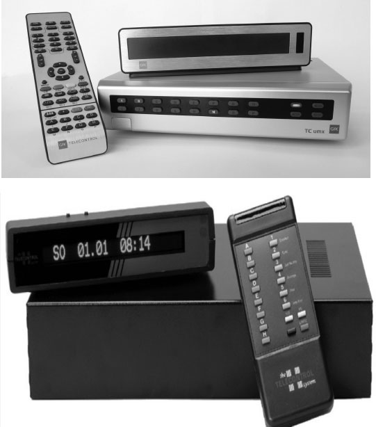
FIGURE 3.6. Telecontrol Peoplemeter
Peoplemeters can suffer from response error. Most notably, the meters are believed to underrepresent the viewing of children. Youngsters, it turns out, are not terribly conscientious button pushers. But even adults sometimes fail to push buttons. A ratings company can, for example, see instances when a set is in use and no one has indicated they are watching. Depending on the edit rules of the company, that household might need to be temporarily eliminated from the sample. If that happens, the home is said to fault out, which effectively reduces the size of the in-tab sample. Generally, these problems can be corrected with a little coaching. Still, button-pushing fatigue can be a problem. Nielsen used to keep household meters in homes for 5 years. Because of the extra effort required by peoplemeters, Nielsen turns these households over every 2 years.
For a long time, the “Holy Grail” of television measurement has been what is called a passive peoplemeter. Such a device would require no effort on the part of sample participants. The meter would be unobtrusive but somehow know which people were in the audience. In the late 1980s, Nielsen began work on a passive peoplemeter. It used a “facial image recognition” system to identify family members. The system worked, but it was never deployed, perhaps because it was too intrusive for many people’s tastes. However, some of the newest television sets now have a front-facing camera, just like many computer screens. They are intended to recognize viewers so they can offer appropriate programming. But, some industry observers claim the image recognition technology could be used to see who is actually watching a program or an ad and, by reading expressions, determine how they reacted. So, passive peoplemeters might once again be on the horizon.
So far, all of the meters we have described—passive or not—are tied to particular sets in particular locations. As such, they cannot see what users are doing in other locations or on other platforms. To address that problem, measurement companies have developed PPMs that overcome some of the limitations of household-bound meters. Arbitron has the most widely deployed PPM system, which it uses to produce radio ratings in the 50 largest U.S. cities. Arbitron’s PPM is also licensed for use in several countries around the world.
PPMs are small devices that a sample of willing participants wear or carry with them throughout the day. Arbitron’s PPM looks like a pager. Another device by Telecontrol looks like a wristwatch. The PPM “listens” for the audio portion of a television or radio program, trying to pick up an inaudible code that identifies the broadcast. If it detects the code, the participant is assumed to be in the audience. At night, the PPM is put in a docking station, where it is recharged and its record of media exposure is retrieved electronically. Figure 3.7 shows the Arbitron “PPM 360,” a name that connotes comprehensiveness in measuring audiences for all available platforms.
PPMs have also been adapted in an effort to measure exposure to print media. One strategy is to embed RFID chips in print media that the meter can detect. Another is design the meter in such a way that respondents can simply report what they have read. Figure 3.8 shows the Telecontrol Mediawatch with a screen for entering such information.
Much of the functionality we associate with PPMs need not be built into dedicated devices. In principle, smartphones can be programmed to do most of the same things. They can be “instructed” to listen for those inaudible codes and report what they hear. They can ping users at various times to ask questions about media use. And users typically carry their smartphones around all the time. Some companies have tried to harness these tempting possibilities to turn them into PPMs, but the practical problems are considerable. First, smartphone users might not want you tampering with their device. Second, you could not measure those without smartphones unless you gave them a device, which might alter their behavior and drive up expenses. Third, smartphones use many different operating systems, so developing and updating programs for all those devices would be quiet a chore. Nonetheless, smartphones remain a resource that might be tapped in the future.
With the growth of the Internet as an advertising medium, it has become important to track who is visiting which sites and seeing which pages. What we call computer meters are a way for organizations like comScore and Nielsen to monitor online computer use. This is still a user-centric approach to measurement. Respondents agree to load software on their own machines that will record Web and other Internet activity. These data are sent back to a central location for processing. Because this method of data collection is relatively inexpensive, it allows companies to create very large samples. That’s a good thing, because no medium offers more possibilities for audience fragmentation than the Internet. Between the big samples and the click-by-click granularity of the information being collected, these systems generate an enormous amount of information, which is condensed into a variety of reports for subscribers.

FIGURE 3.7. Arbitron’s PPM 360

FIGURE 3.8. Telecontrol’s Mediawatch
One disadvantage of this method is that users might be reluctant to allow software to run on their computers. Privacy is a significant concern when every action is monitored with such precision. It is very likely that people who would allow this technology on their computer will differ from people who do not want it installed. And even if they do not differ in terms of demographic profile, the presence of this monitoring technology might influence their choices when they use the Internet. Another problem is that a great deal of Internet use occurs in the workplace. If employers are reluctant to allow this software to run on their equipment, then truly random samples of workplace or university users are compromised.
Nonetheless, with the Internet serving as the platform for more and more media services, like YouTube or Hulu, measurement companies have been hard pressed to figure out how to capture information on Internet use and tie it to other forms of media consumption, especially television. Toward that end, Nielsen has introduced installed computer monitoring software in the households of people in the national U.S. peoplemeter panel. By doing so, they can track individuals as they move back and forth between those platforms. That kind of measurement makes possible the “extended screen” ratings we mentioned earlier.
Servers. Servers are a relatively new tool with which to measure audiences. Servers power the Internet and other broadband distribution systems, offering new ways to see and quantify audiences. Some servers offer content or services directly to users. These include web “publishers” like YouTube or NYTimes.com, as well as most cable and satellite systems that serve digital content to subscribing households. We have seen, for example, how STBs are used to describe the size and composition of television audiences. Some servers manage people’s access to the Internet, allowing a company like Hitwise to aggregate all the traffic reported by Internet service providers to estimate how many people visit different websites. Still other servers, operated by ad networks, deliver advertising to other websites and are able to count the number of clicks or impressions to provide a kind of commercial rating.
Server-centric data need not be confined to describing audience behavior. Analyses can also focus on how users navigate within a particular website. In fact, there is an entire field of study called web analytics devoted to this subject. Among other things, these researchers are in a position to mount unobtrusive experiments, referred to as A/B testing, that can manipulate site content to see how users react to different offers, recommendations, and page layouts (Christian, 2012). Google, for example, is constantly experimenting with how to deliver search results in an effort to refine its search algorithm. Still other server-centric analyses are attempts to target just the right message to just the right people at just the right time. This happens on large websites like Facebook, Amazon, or Google, which keep track of user information and activities, and so provide marketers with powerful tools to sell goods and services. Any one of these uses of server-centric data could be, and often is, the subject of a book-length treatment. But to conclude our discussion of measurement techniques, we make a few generalizations.
Servers collect enormous amounts of data. This is the product of tracking millions of users as they click their way through websites, sometimes offering up additional information as they go. Servers record all of these actions with ease, at virtually no cost to the operator and in a way that probably goes unnoticed by most users. One result is a phenomenon that is sometimes called “big data.” As one study reported:
In July 2011, Facebook’s 750 million worldwide users uploaded approximately 100 terabytes of data every day to the social media platform. Extrapolated against a full year, that’s enough data to manage the U.S. Library of Congress’ entire print collection—3,600 times over. (Winterberry, 2011, p. 3, emphasis in original)
To some it seems like a treasure trove of information just waiting to be mined. But before you can really make sense of it, you have to be clear about the answers to two familiar questions: Who is it you are studying? What exactly are you measuring?
Every time a server receives a request for a file (e.g., a web page), it is called a hit. In the 1990s, that was one of the principal metrics used to describe site use. Unfortunately, it is difficult to interpret. One hundred hits could mean an audience of 100 people, or just one person who had made 100 requests. It was hard to know who was a return visitor. In 1994, Netscape addressed that problem by using a cookie, which was a small text file that the server placed on each visitor’s browser. With cookies, servers could not only recognize return visitors, but they could also see what they did on their last visit. That information gave researchers a better idea of who they were studying. However, using cookies to track users has several limitations; we discuss these in chapter 6. But cookies are an important tool for tracking web use. And they are not the only way researchers learn about the identity of users.
Servers will typically note the IP address of the visitor, which can sometimes reveal their location. People using apps on their mobile phones are often leaving a rather precise record of their locations throughout the day. Researchers will often begin to make inferences about the visitor based on their actions. What do they look at? Is it characteristic of someone young or old, rich or poor? Google has been described as collecting a “database of intentions” (Batelle, 2005, p. 1). Searches may indicate a person’s interests or intentions to buy. That says a lot about visitors and is one reason why “paid search” has been so lucrative for Google. There are also ways to entice users to divulge personal information in exchange for free services or special privileges. Social media sites often know an enormous about their users. The key to Facebook’s value is its data on users. As the New York Times noted:
Every time a person shares a link, listens to a song, clicks on one of Facebook’s ubiquitous “like” buttons, or changes a relationship status to “engaged,” a morsel of data is added to Facebook’s vast library. It is a siren to advertisers hoping to leverage that information to match their ads with the right audience. (Sengupta & Rusli, 2012)
Server operators might also share or buy data from other sources, to construct more complete dossiers on users, although these practices can run afoul of privacy policies—a topic we address later. In any event, even though users may think of their web use as anonymous, their identities may be more apparent than they realize, giving researchers a pretty good idea of whom they are studying.
The second question to answer is exactly what is being measured. For the most part, servers record behaviors. These include site visits, page views, time spent viewing, click-throughs, downloading, linking, buying, voting, “retweeting”—the list goes on and on. Many of these behaviors can be construed as exposure, in the same less-than-perfect way that tuning in is construed as exposure with more traditional electronic media (see MRC, 2007). So much of what we know about people’s exposure to the Internet comes from harnessing these measures. It might also be possible to infer something beyond mere exposure. A look at behaviors over time might reveal people’s loyalties and levels of engagement. Measures of time spent viewing or repeat viewing have been interpreted as indications of liking, involvement, or stickiness. Rentrak, for instance, uses STB data to construct a “stickiness index” for programs, which is the average percentage of a program viewed divided by the average for all programs of similar duration.
Using behaviors to reveal preferences is a common practice in the social sciences, especially economics. However, it is not without its problems. For example, maybe you do not like everything you buy. You might purchase a book on Amazon only to decide it is awful. But Amazon only has a record of you buying a book, which it takes as indicative of liking and then causes it to recommend it to other people “like you.” Unfortunately, for researchers, behaviors are not always simple reflections of preferences.
Servers also capture more “qualitative” declarations from users. Voting for or against something, often in the form of a “like” button, is arguably measuring some sort of affect. Social media sites like Twitter or Facebook are often full of text-based commentaries that tell others what the writer thinks. A number of companies now harvest these data and quantify them to provide some indication of social buzz. Some are able to automatically scan the text to measure the incidence of positive or negative comments. These kinds of analyses have the potential to offer new insights into engagement. But once again, some caution is merited. For example, is the volume of tweets about some topic the result of a few fanatics or a broadly based phenomenon? Researchers are still trying to figure out what exactly is being measured and reach some consensus on how the data are best used (Proulx & Shepatin, 2012).
Beyond these questions of interpretation, servers have other limitations. Quite often, the server has no way of seeing what users are doing on other platforms. Cookies might reveal something about movement from one server to another, but they will not tell you what television, radio, and print media are consumed—at least until everything migrates to the Internet. Therefore, server-centric measurement can often create a “siloed” kind of information. It is easier to design user-centric approaches to capture anytime/anywhere media use. Servers also raise thorny legal, ethical, and business issues about privacy. Typically, people do not affirmatively “opt-in” to measurement. Yet vast amounts of information can be collected and used without their knowledge. Many companies offer privacy policies that provide users some protections, but the ultimate question is who should own and control that data. The answer varies by country. At this writing, the United States has begun using “do-not-track” buttons that can be enabled in a user’s browser (Angwin, 2012). European nations have been the most protective of user privacy. In fact, some have advocated for a “right to be forgotten,” which would oblige companies to purge the data of such a person. As servers become ever more central to modern life, these issues of privacy are likely to be a continuing source of consternation for all involved.
The principal methods of audience measurement in the electronic media are summarized in Table 3.1. Obviously, the chart does not exhaust the possibilities for data collection. New techniques, or refinements of old ones, are being introduced and tested all the time.
The issues that arise in sampling and measurement are well known to survey researchers. We have, in these areas, some well-established criteria with which to judge the quality of the ratings data. But sampling and measurement alone do not make audience estimates. The data that are collected must undergo a production process, just as any other raw material is turned into a product. Here, standards of what is or is not appropriate may be harder to come by. Yet, no discussion of audience research methods would be complete without mention of the production process. Every research company processes data a little differently, but generally production involves three activities. First, companies must edit the data, cleaning up errors and putting it into a form that can be analyzed. Second, they often adjust the data to correct for known defects. Third, they supplement the data by combining it with other sources of information.
Audience measurement companies are continually flooded with data that must be summarized and turned into a useful product. Servers and metered panels can generate information by the terabyte, but it inevitably contains glitches that need to be identified and reconciled. The process of getting clean, accurate, complete data ready to be processed is called editing. It can be a laborious activity, and, despite efforts at quality control, editing is one place where production error can occur.
Diaries are one of the messier sources of data. Hundreds of thousands of hand-written diaries arrive at audience measurement companies each year. They must be checked for accuracy, logical inconsistencies, and omissions. Diary editing involves a number of activities. First, diaries must be evaluated for inclusion in the tabulations. They are excluded if respondents filled them out during the wrong week, mailed them back too late, or submitted excessively incomplete or inconsistent information. Measurement companies often capture a digital image of all the pages in a diary and then keystroke the information into a machine-readable form. Computers can then screen the data for logical inconsistencies like reports of nonexistent stations or programs on the wrong channel. Strict editing procedures usually prescribe a way to resolve these discrepancies.
TABLE 3.1
Summary of the Major Methods of Audience Measurement
Metered data can also suffer from errors or omissions. These are sometimes referred to as faults in the data and they can be of two sorts. First, there may be a hardware failure. In some parts of the world, power outages or surges make meters especially prone to faulting. In late October 2012, Hurricane Sandy caused prolonged power outages on the eastern seaboard of the United States. The disruption was so severe that Nielsen decided not to produce any November ratings for New York. Because this DMA is so large, these power outages also affected national ratings.
The second source of faulting occurs when respondents fail to do their part. For example, a peoplemeter might record that a set was in use with no one entering a corresponding button push. In either event, editing rules may cause the offending household to fault out, at least until the problem can be corrected. Fault rates compound the problem of nonresponse and have the effect of further lowering the in-tab sample. Ratings companies sometimes measure the combined effect of nonresponse and faulting with a statistic called a sample performance indicator (SPI). The lower the SPI, the more concern you should have that the sample does not represent the population.
While measurement companies try to automate as much of the data collection process as possible, people are still involved in the process of entering and judging data. Diaries must be deciphered and typed into computerized records. Even digital media record keeping and data management involve a surprising amount of manual labor. With that comes the possibility of error. As one expert on digital media noted:
First, every time a human touches a piece of data, the chances of human error go up. Second, manual labor is slower than machine labor—which means there are orders of magnitude fewer computations that can happen when you don’t have machines doing the grunt work. Combine those two points, and you get media management that’s less data-rich, and more accident-prone, than is good for gathering good metrics. (Wise, 2011)
Editing also can involve more subjective questions of definition. As data-gathering techniques capture ever-more-granular behaviors, different definitions of something as basic as program viewing or website usage become possible. We alluded to these in the section on what’s being measured. For example, should a person who watches a channel for 1 minute be included in the audience? Should a person who looks at a website for 5 seconds be considered a visitor? Similarly, should a program audience include people who see replays across other nonlinear platforms? If so, must that viewing occur within a certain period of time? Sometimes ratings services provide relatively unedited data streams to customers and let them decide. But to produce industry-wide estimates, which might function as currency, someone has to decide what constitutes exposure. Typically there are no clear right or wrong answers, only what the affected industries accept as the agreed-on definition.
Audience data can contain known defects or biases. These could include missing values or in-tab samples that deviate from the composition of the population they are supposed to represent. Measurement companies often apply mathematical adjustments in an effort to address these potential problems. Here, too, we can encounter production error. Usually, these are not mistakes like misreading a diary, although data-processing errors sometimes occur. Rather, these adjustments are used to remedy problems and make estimates more accurate. But they are essentially educated guesses, and to the extent that they produce results that deviate from reality, they are technically introducing error.
Suppose, for example, that someone sent in a diary that was almost complete but was missing one or two variables. Rather than throw out an otherwise usable diary, research companies often “fill in the blanks” through a process called ascription. These procedures typically use computer routines to determine an answer with the highest probability of being correct. If, for example, Nielsen receives a diary reporting a 31-year-old male head of household with no age recorded for female head of household, an algorithm might “guess” that her age would be 3 years less than her husband’s (i.e., 28).
Ascription techniques are also used to reconcile household meters with diary data. In many markets, television use is still measured by household meters that do not collect people information. Under these circumstances, meters, which provide a more accurate measure of tuning behavior, tell us what is being viewed. Diaries are used to tell us who is viewing. The problem is, meters typically identify more sources being viewed and for shorter periods of time. That means you have instances where meters indicate viewing but there’s no corresponding record in the diaries, a phenomenon called the “zero-cell” problem. Ascription techniques can be used to fill as many of those blank cells as possible. While these practices may seem suspect, ascription is a standard procedure in virtually all survey work and is typically based on systematic methodological research. But once again, it is an educated guess.
Ultimately, the research services must publish estimates of audience size and composition. They usually project these estimates from samples. Although the process is complex, we can illustrate the basic logic with a simple example of diary measurement. Suppose we choose a sample of 1,000 individuals from a population of one million. Each respondent would represent 1,000 people. If 50 people in our sample watch a news program, we could project the show’s actual audience to be 50,000. That is essentially what the ratings services do. They determine the number of people represented by one in-tab diary and assign that diary an appropriate number. If people are the unit of analysis, the number is called persons per diary value (PPDV). If households are the unit of analysis, the number is labeled households per diary value (HPDV).
This illustration works quite well if we have perfect probability samples, in which all members of the population are proportionately represented. But as we have seen, that is never the case. Nonresponse can mean that some kinds of people are overrepresented, while others are underrepresented. Remember, also, that the most common remedy for this problem is to weight the responses of some sample members more heavily than others. Suppose, in the illustration above, that 18- to 24-year-old men were underrepresented in the in-tab sample. Let’s say they constitute 4 percent of the sample but are known to be 8 percent of the population. Men in this group would receive a weight of 2.0 (i.e., 8 percent/4 percent = 2.0). Therefore, to project total audience size for this group, each young man should have a PPDV of 2,000 (i.e., 1,000 × 2.0), instead of 1,000. Conversely, overrepresented groups should have PPDVs of less than 1,000.
In practice, the weights that are assigned to different groups are rarely as extreme as in our illustration (i.e., they come closer to 1.0). Further, ratings services weight a single respondent on a number of variables besides age and gender to make a final determination. Although adjusting the data with mathematical weights can introduce error, it is very commonly done to make samples better conform to the known parameters of the population being described. But it is not uncontroversial. In 2010, Nielsen believed its peoplemeter sample overrepresented households with computers and broadband access. It wanted to give them less weight in audience estimates, but some networks feared that this change might favor some programs over others. As one client noted, “Even fractional declines in ratings can become costly over time” (Mandese, 2010).
Despite the enormous amounts of data collected by diaries, meters, and servers, such information alone might not be sufficient to produce audience estimates. Other information is often added to these data to make a complete, research product. Historically, ratings companies have had to add information on program scheduling to their data. More recently, with the growth of server-centric measurement, researchers have used a variety of techniques to impute user characteristics that are not directly measured. And with the growing need for cross-platform data, measurement companies are combining different data sets in a process called data fusion.
Until relatively recently, most metered measurement systems had no way of knowing what exactly was being displayed on a television set. That is still true of at least some meters and most STB-based measurement. To attribute tuning behavior to a particular program, measurement companies have added program scheduling information collected in some other way. As more and more sources of both linear and nonlinear programming have become available, this approach has become increasingly burdensome and error prone. Moreover, in systems that produce commercial ratings like C3s, one needs to know the exact instant when a commercial appears. Fortunately, state-of-the-art meters now identify program content using embedded electronic codes or other means of detection. Even so, supplemental information about when programs and commercials air is still used to produce audience estimates.
While some sources of server-centric information, like Facebook, have a lot of information about individual user traits, most do not. These user characteristics can make an important difference in the value of a research product. Therefore, companies that do not directly measure user traits will often use techniques to estimate what those traits might be. We have noted STBs do not measure who is viewing. But STB systems can estimate the composition of the audience in other ways. For example, outside data suppliers know a lot about the characteristics of the homes in particular zip codes (size, income, owners’ occupations, etc.). By combining that information with the home zip code of each STB household, it is possible to make an estimate of audience composition. Similarly, companies that record and summarize the buzz on social media like Twitter will sometimes estimate the characteristics of those making comments. For example, a Cambridge, Massachusetts–based company called Bluefin Labs uses each person’s first name and tweet history to infer their gender. So, if someone named Henry refers to himself as a “dad,” chances are good he is a male. Of course, not every case is so clear-cut. Systems that impute user traits with an algorithm can be pretty accurate, but they can also introduce error into the production process.
We have noted that, increasingly, people are consuming media across a variety of platforms. Most advertisers and media companies would like to be able to track the same users across television, radio, print, mobile devices, and the Internet. But true single source systems that accurately measure all forms of media use, product purchases, and other desirable users characteristics are expensive and uncommon. Most media measurement is still specific to a particular medium. To overcome that limitation in a cost-effective manner, research companies sometimes use a technique called data fusion. It has been widely used in Europe since the late 1980s and is now common in the United States as well. Basically, it is a way to integrate two or more separate sets of data with “linking variables” that are common to different respondents in each database. For example, Nielsen’s peoplemeter panel has been fused with both its online Internet measurement sample and MRI’s survey of print use and product purchase data. Successful data fusion depends on finding the right linking variables, which are often some combination of demographic and media use variables. It is a statistically complex process that results in something that looks like a single source set of data. But even its proponents recognize it is not the ideal. As Nielsen’s primer on data fusion concludes, “No human endeavor is perfect and all research contains the potential for error and bias. Data fusion works within the realm of the possible, not the unattainable” (Nielsen, 2009, p. 8).
The same might be said of all the research methods we have reviewed in this chapter. Nothing is perfect, although some techniques clearly have advantages over others. If you can recognize good research practices, you will be better able to judge the quality of the information you have and how best to use it.
Babbie, E. (2009). The practice of social research (12th ed.). Belmont, CA: Wadsworth.
Beville, H. M. (1988). Audience ratings: Radio, television, cable (rev. ed.). Hillsdale, NJ: Lawrence Erlbaum Associates.
Gunter, B. (2000). Media research methods: Measuring audiences, reactions and impact. London: Sage.
Iachobucci, D., & Churchill, G. A. (2009). Marketing research: Methodological foundations (10th ed.). Belmont, CA: South-Western College Pub.
Kaushik, A. (2010). Web analytics 2.0: The art on online accountability & science of customer centricity. Indianapolis, IN: Wiley.
Sissors, J. Z., & Baron, R. B. (2010). Advertising media planning (7th ed.). New York: McGraw Hill.
Russell, M. A. (2011). Mining the social web: Analyzing data from Facebook, Twitter, LinkedIn, and other social media sites. Sebastapol, CA: O’Reilly.
Turow, J. (2011). The daily you: How the new advertising industry is defining your identity and your worth. New Haven, CT: Yale University Press.
Wimmer, R., & Dominick, J. (2010). Mass media research: An introduction (9th ed.). Belmont, CA: Wadsworth.