
Chapter 15. Basic Statistics
Some of the most common tools used in statistics are means, variances, correlations and t-tests. These are all well represented in R with easy-to-use functions such as mean, var, cor and t.test.
15.1. Summary Statistics
The first thing many people think of in relation to statistics is the average, or mean, as it is properly called. We start by looking at some simple numbers and later in the chapter play with bigger datasets. First we generate a random sampling of 100 numbers between 1 and 100.
> x <- sample(x = 1:100, size = 100, replace = TRUE)
> x
[1] 93 98 84 62 18 12 40 13 30 4 95 18 55 46 2 24
[17] 54 91 9 57 74 6 11 38 67 13 40 87 2 85 4 6
[33] 61 28 37 61 10 87 41 10 11 4 37 84 54 69 21 33
[49] 37 44 46 78 6 50 88 74 76 31 67 68 1 23 31 51
[65] 22 64 100 12 20 56 74 61 52 4 28 62 90 66 34 11
[81] 21 78 17 94 9 80 92 83 72 43 20 44 3 43 46 72
[97] 32 61 16 12
sample uniformly draws size entries from x. Setting replace=TRUE means that the same number can be drawn multiple times.
Now that we have a vector of data we can calculate the mean.
> mean(x)
[1] 44.51
This is the simple arithmetic mean.
Simple enough. Because this is statistics, we need to consider cases where some data are missing. To create this we take x and randomly set 20% of the elements to NA.
> # copy x
> y <- x
> # choose a random 20 elements, using sample, to set to NA
> y[sample(x = 1:100, size = 20, replace = FALSE)] <- NA
> y
[1] 93 98 84 62 18 12 40 NA 30 4 95 18 55 46 2 24
[17] 54 91 NA 57 NA 6 11 38 67 NA 40 87 2 NA 4 6
[33] 61 28 37 NA 10 NA 41 10 11 4 37 84 54 69 21 33
[49] 37 44 46 78 6 50 88 74 76 NA 67 68 NA 23 31 51
[65] 22 64 100 12 20 56 74 NA 52 4 NA 62 90 NA 34 11
[81] 21 78 17 NA 9 80 NA 83 NA NA 20 44 NA NA 46 NA
[97] 32 61 NA 12
Using mean on y will return NA. This is because, by default, if mean encounters even one element that is NA it will return NA. This is to avoid providing misleading information.
> mean(y)
[1] NA
To have the NAs removed before calculating the mean, set na.rm to TRUE.
> mean(y, na.rm = TRUE)
[1] 43.5875
To calculate the weighted mean of a set of numbers, the function weighted.mean takes a vector of numbers and a vector of weights. It also has an optional argument, na.rm, to remove NAs before calculating; otherwise, a vector with NA values will return NA.
> grades <- c(95, 72, 87, 66)
> weights <- c(1/2, 1/4, 1/8, 1/8)
> mean(grades)
[1] 80
> weighted.mean(x = grades, w = weights)
[1] 84.625
The formula for weighted.mean is in Equation 15.2, which is the same as the expected value of a random variable.

Another vitally important metric is the variance, which is calculated with var.
> var(x)
[1] 865.5049
This calculates variance as
which can be verified in R.
> var(x)
[1] 865.5049
> sum((x - mean(x))^2)/(length(x) - 1)
[1] 865.5049
Standard deviation is the square root of variance and is calculated with sd. Like mean and var, sd has the na.rm argument to remove NAs before computation; otherwise, any NAs will cause the answer to be NA.
> sqrt(var(x))
[1] 29.41947
> sd(x)
[1] 29.41947
> sd(y)
[1] NA
> sd(y, na.rm = TRUE)
[1] 28.89207
Other commonly used functions for summary statistics are min, max and median. Of course, all of these also have na.rm arguments.
> min(x)
[1] 1
> max(x)
[1] 100
> median(x)
[1] 43
> min(y)
[1] NA
> min(y, na.rm = TRUE)
[1] 2
The median, as calculated before, is the middle of an ordered set of numbers. For instance, the median of 5, 2, 1, 8 and 6 is 5. In the case when there is an even amount of numbers, the median is the mean of the middle two numbers. For 5, 1, 7, 4, 3, 8, 6 and 2 the median is 4.5.
A helpful function that computes the mean, minimum, maximum and median is summary. There is no need to specify na.rm because if there are NAs, they are automatically removed and their count is included in the results.
> summary(x)
Min. 1st Qu. Median Mean 3rd Qu. Max.
1.00 17.75 43.00 44.51 68.25 100.00
> summary(y)
Min. 1st Qu. Median Mean 3rd Qu. Max. NA's
2.00 18.00 40.50 43.59 67.00 100.00 20
This summary also displayed the first and third quantiles. These can be computed using quantile.
> # calculate the 25th and 75th quantile
> quantile(x, probs = c(0.25, 0.75))
25% 75%
17.75 68.25
> # try the same on y
> quantile(y, probs = c(0.25, 0.75))
Error: missing values and NaN's not allowed if 'na.rm' is FALSE
> # this time use na.rm=TRUE
> quantile(y, probs = c(0.25, 0.75), na.rm = TRUE)
25% 75%
18 67
> # compute other quantiles
> quantile(x, probs = c(0.1, 0.25, 0.5, 0.75, 0.99))
10% 25% 50% 75% 99%
6.00 17.75 43.00 68.25 98.02
Quantiles are numbers in a set where a certain percentage of the numbers are smaller than that quantile. For instance, of the numbers one through 200, the 75th quantile—the number that is larger than 75% of the numbers—is 150.25.
15.2. Correlation and Covariance
When dealing with more than one variable, we need to test their relationships with each other. Two simple, straightforward methods are correlation and covariance. To examine these concepts we look at the economics data from ggplot2.
> require(ggplot2)
> head(economics)
date pce pop psavert uempmed unemploy year month
1 1967-06-30 507.8 198712 9.8 4.5 2944 1967 Jun
2 1967-07-31 510.9 198911 9.8 4.7 2945 1967 Jul
3 1967-08-31 516.7 199113 9.0 4.6 2958 1967 Aug
4 1967-09-30 513.3 199311 9.8 4.9 3143 1967 Sep
5 1967-10-31 518.5 199498 9.7 4.7 3066 1967 Oct
6 1967-11-30 526.2 199657 9.4 4.8 3018 1967 Nov
In the economics dataset, pce is personal consumption expenditures and psavert is the personal savings rate. We calculate their correlation using cor.
> cor(economics$pce, economics$psavert)
[1] -0.9271222
This very low correlation makes sense because spending and saving are opposites of each other. Correlation is defined as
where ![]() and
and ![]() are the means of x and y, and sx and sy are the standard deviations of x and y. It can range between -1 and 1, with higher positive numbers meaning a closer relationship between the two variables, lower negative numbers meaning an inverse relationship and numbers near zero meaning no relationship. This can be easily checked by computing Equation 15.4.
are the means of x and y, and sx and sy are the standard deviations of x and y. It can range between -1 and 1, with higher positive numbers meaning a closer relationship between the two variables, lower negative numbers meaning an inverse relationship and numbers near zero meaning no relationship. This can be easily checked by computing Equation 15.4.
> # use cor to calculate correlation
> cor(economics$pce, economics$psavert)
[1] 0.9271222
>
> ## calculate each part of correlation
> xPart <- economics$pce - mean(economics$pce)
> yPart <- economics$psavert - mean(economics$psavert)
> nMinusOne <- (nrow(economics) - 1)
> xSD <- sd(economics$pce)
> ySD <- sd(economics$psavert)
> # use correlation formula
> sum(xPart * yPart) / (nMinusOne * xSD * ySD)
[1] -0.9271222
To compare multiple variables at once, use cor on a matrix (only for numeric variables).
> cor(economics[, c(2, 4:6)])
pce psavert uempmed unemploy
pce 1.0000000 -0.92712221 0.5145862 0.32441514
psavert -0.9271222 1.00000000 -0.3615301 -0.07641651
uempmed 0.5145862 -0.36153012 1.0000000 0.78427918
unemploy 0.3244151 -0.07641651 0.7842792 1.00000000
Because this is just a table of numbers, it would be helpful to also visualize the information using a plot. For this we use the ggpairs function from the GGally package (a collection of helpful plots built on ggplot2) shown in Figure 15.1. This shows a scatterplot of every variable in the data against every other variable. Loading GGally also loads the reshape package, which causes namespace issues with the newer reshape2 package. So rather than load GGally, we call its function using the :: operator, which allows access to functions within a package without loading it.
> GGally::ggpairs(economics[, c(2, 4:6)], params = list(labelSize = 8))

Figure 15.1 Pairs plot of economics data showing the relationship between each pair of variables as a scatterplot with the correlations printed as numbers.
This is similar to a small multiples plot except that each pane has different x- and y-axes. While this shows the original data, it does not actually show the correlation. To show that we build a heatmap of the correlation numbers, as shown in Figure 15.2. High positive correlation indicates a positive relationship between the variables, high negative correlation indicates a negative relationship between the variables and near zero correlation indicates no strong relationship.
> # load the reshape package for melting the data
> require(reshape2)
> # load the scales package for some extra plotting features
> require(scales)
> # build the correlation matrix
> econCor <- cor(economics[, c(2, 4:6)])
> # melt it into the long format
> econMelt <- melt(econCor, varnames=c("x", "y"),
+ value.name="Correlation")
> # order it according to the correlation
> econMelt <- econMelt[order(econMelt$Correlation), ]
> # display the melted data
> econMelt
x y Correlation
2 psavert pce -0.92712221
5 pce psavert -0.92712221
7 uempmed psavert -0.36153012
10 psavert uempmed -0.36153012
8 unemploy psavert -0.07641651
14 psavert unemploy -0.07641651
4 unemploy pce 0.32441514
13 pce unemploy 0.32441514
3 uempmed pce 0.51458618
9 pce uempmed 0.51458618
12 unemploy uempmed 0.78427918
15 uempmed unemploy 0.78427918
1 pce pce 1.00000000
6 psavert psavert 1.00000000
11 uempmed uempmed 1.00000000
16 unemploy unemploy 1.00000000
> ## plot it with ggplot
> # initialize the plot with x and y on the x and y axes
> ggplot(econMelt, aes(x=x, y=y)) +
+ # draw tiles filling the color based on Correlation
+ geom tile(aes(fill=Correlation)) +
+ # make the fill (color) scale a three color gradient with muted
+ # red for the low point, white for the middle and steel blue
+ # for the high point
+ # the guide should be a colorbar with no ticks, whose height is
+ # 10 lines
+ # limits indicates the scale should be filled from -1 to 1
+ scale fill gradient2(low=muted("red"), mid="white",
+ high="steelblue",
+ guide=guide colorbar(ticks=FALSE, barheight=10),
+ limits=c(-1, 1)) +
+ # use the minimal theme so there are no extras in the plot
+ theme minimal() +
+ # make the x and y labels blank
+ labs(x=NULL, y=NULL)

Figure 15.2 Heatmap of the correlation of the economics data. The diagonal has elements with correlation 1 because every element is perfectly correlated with itself. Red indicates highly negative correlation, blue indicates highly positive correlation and white is no correlation.
Missing data is just as much a problem with cor as it is with mean and var, but it is dealt with differently because multiple columns are being considered simultaneously. Instead of specifying na.rm=TRUE to remove NA entries, one of "all.obs", "complete.obs", "pairwise.complete.obs", "everything" or "na.or.complete" is used. To illustrate this we first make a five-column matrix where only the fourth and fifth columns have no NA values; the other columns have one or two NAs.
> m <- c(9, 9, NA, 3, NA, 5, 8, 1, 10, 4)
> n <- c(2, NA, 1, 6, 6, 4, 1, 1, 6, 7)
> p <- c(8, 4, 3, 9, 10, NA, 3, NA, 9, 9)
> q <- c(10, 10, 7, 8, 4, 2, 8, 5, 5, 2)
> r <- c(1, 9, 7, 6, 5, 6, 2, 7, 9, 10)
> # combine them together
> theMat <- cbind(m, n, p, q, r)
The first option for use is "everything", which means that the entirety of all columns must be free of NAs, otherwise the result is NA. Running this should generate a matrix of all NAs except ones on the diagonal—because a vector is always perfectly correlated with itself—and between q and r. With the second option—"all.obs"—even a single NA in any column will cause an error.
> cor(theMat, use = "everything")
m n p q r
m 1 NA NA NA NA
n NA 1 NA NA NA
p NA NA 1 NA NA
q NA NA NA 1.0000000 -0.4242958
r NA NA NA -0.4242958 1.0000000
> cor(theMat, use = "all.obs")
Error: missing observations in cov/cor
The third and fourth options—"complete.obs" and "na.or.complete"—work similarly to each other in that they keep only rows where every entry is not NA. That means our matrix will be reduced to rows 1, 4, 7, 9 and 10, and then have its correlation computed. The difference is that "complete.obs" will return an error if not a single complete row can be found, while "na.or.complete" will return NA in that case.
> cor(theMat, use = "complete.obs")
m n p q r
m 1.0000000 -0.5228840 -0.2893527 0.2974398 -0.3459470
n -0.5228840 1.0000000 0.8090195 -0.7448453 0.9350718
p -0.2893527 0.8090195 1.0000000 -0.3613720 0.6221470
q 0.2974398 -0.7448453 -0.3613720 1.0000000 -0.9059384
r -0.3459470 0.9350718 0.6221470 -0.9059384 1.0000000
> cor(theMat, use = "na.or.complete")
m n p q r
m 1.0000000 -0.5228840 -0.2893527 0.2974398 -0.3459470
n -0.5228840 1.0000000 0.8090195 -0.7448453 0.9350718
p -0.2893527 0.8090195 1.0000000 -0.3613720 0.6221470
q 0.2974398 -0.7448453 -0.3613720 1.0000000 -0.9059384
r -0.3459470 0.9350718 0.6221470 -0.9059384 1.0000000
> # calculate the correlation just on complete rows
> cor(theMat[c(1, 4, 7, 9, 10), ])
m n p q r
m 1.0000000 -0.5228840 -0.2893527 0.2974398 -0.3459470
n -0.5228840 1.0000000 0.8090195 -0.7448453 0.9350718
p -0.2893527 0.8090195 1.0000000 -0.3613720 0.6221470
q 0.2974398 -0.7448453 -0.3613720 1.0000000 -0.9059384
r -0.3459470 0.9350718 0.6221470 -0.9059384 1.0000000
> # compare "complete.obs" and computing on select rows
> # should give the same result
> identical(cor(theMat, use = "complete.obs"),
+ cor(theMat[c(1, 4, 7, 9, 10), ]))
[1] TRUE
The final option is "pairwise.complete", which is much more inclusive. It compares two columns at a time and keeps rows—for those two columns—where neither entry is NA. This is essentially the same as computing the correlation between every combination of two columns with use set to "complete.obs".
> # the entire correlation matrix
> cor(theMat, use = "pairwise.complete.obs")
m n p q r
m 1.00000000 -0.02511812 -0.3965859 0.4622943 -0.2001722
n -0.02511812 1.00000000 0.8717389 -0.5070416 0.5332259
p -0.39658588 0.87173889 1.0000000 -0.5197292 0.1312506
q 0.46229434 -0.50704163 -0.5197292 1.0000000 -0.4242958
r -0.20017222 0.53322585 0.1312506 -0.4242958 1.0000000
> # compare the entries for m vs n to this matrix
> cor(theMat[, c("m", "n")], use = "complete.obs")
m n
m 1.00000000 -0.02511812
n -0.02511812 1.00000000
> # compare the entries for m vs p to this matrix
> cor(theMat[, c("m", "p")], use = "complete.obs")
m p
m 1.0000000 -0.3965859
p -0.3965859 1.0000000
To see ggpairs in all its glory, look at tips data from the reshape2 package in Figure 15.3. This shows every pair of variables in relation to each other building either histograms, boxplots or scatterplots depending on the combination of continuous and discrete variables. While a data dump like this looks really nice, it is not always the most informative form of exploratory data analysis.
> data(tips, package = "reshape2")
> head(tips)
total_bill tip sex smoker day time size
1 16.99 1.01 Female No Sun Dinner 2
2 10.34 1.66 Male No Sun Dinner 3
3 21.01 3.50 Male No Sun Dinner 3
4 23.68 3.31 Male No Sun Dinner 2
5 24.59 3.61 Female No Sun Dinner 4
6 25.29 4.71 Male No Sun Dinner 4
> GGally::ggpairs(tips)
No discussion of correlation would be complete without the old refrain, “Correlation does not mean causation.” In other words, just because two variables are correlated does not mean they have an effect on each other. This is exemplified in xkcd1 comic number 552. There is even an R package, RXKCD, for downloading individual comics. Running the following code should generate a pleasant surprise.
1. xkcd is a Web comic by Randall Munroe, beloved by statisticians, physicists, mathematicians and the like. It can be found at http://xkcd.com.
> require(RXKCD)
> getXKCD(which = "552")
Similar to correlation is covariance, which is like a variance between variables; its formula is in Equation 15.5. Notice the similarity to correlation in Equation 15.4 and variance in Equation 15.3.

The cov function works similarly to the cor function, with the same arguments for dealing with missing data. In fact, ?cor and ?cov pull up the same help menu.
> cov(economics$pce, economics$psavert)
[1] -8412.231
> cov(economics[, c(2, 4:6)])
pce psavert uempmed unemploy
pce 6810308.380 -8412.230823 2202.786256 1573882.2016
psavert -8412.231 12.088756 -2.061893 -493.9304
uempmed 2202.786 -2.061893 2.690678 2391.6039
unemploy 1573882.202 -493.930390 2391.603889 3456013.5176
> # check that cov and cor*sd*sd are the same
> identical(cov(economics$pce, economics$psavert),
+ cor(economics$pce, economics$psavert) *
+ sd(economics$pce) * sd(economics$psavert))
[1] TRUE
15.3. T-Tests
In traditional statistics classes, the t-test—invented by William Gosset while working at the Guinness brewery—is taught for conducting tests on the mean of data or for comparing two sets of data. To illustrate this we continue to use the tips data from Section 15.2.
> head(tips)
total_bill tip sex smoker day time size
1 16.99 1.01 Female No Sun Dinner 2
2 10.34 1.66 Male No Sun Dinner 3
3 21.01 3.50 Male No Sun Dinner 3
4 23.68 3.31 Male No Sun Dinner 2
5 24.59 3.61 Female No Sun Dinner 4
6 25.29 4.71 Male No Sun Dinner 4
> # sex of the server
> unique(tips$sex)
[1] Female Male
Levels: Female Male
> # day of the week
> unique(tips$day)
[1] Sun Sat Thur Fri
Levels: Fri Sat Sun Thur
15.3.1. One-Sample T-Test
First we conduct a one-sample t-test on whether the average tip is equal to $2.50. This test essentially calculates the mean of data and builds a confidence interval. If the value we are testing falls within that confidence interval then we can conclude that it is the true value for the mean of the data; otherwise, we conclude that it is not the true mean.
> t.test(tips$tip, alternative = "two.sided", mu = 2.5)
One Sample t-test
data: tips$tip
t = 5.6253, df = 243, p-value = 5.08e-08
alternative hypothesis: true mean is not equal to 2.5
95 percent confidence interval:
2.823799 3.172758
sample estimates:
mean of x
2.998279
The output very nicely displays the setup and results of the hypothesis test of whether the mean is equal to $2.50. It prints the t-statistic, the degrees of freedom and p-value. It also provides the 95% confidence interval and mean for the variable of interest. The p-value indicates that the null hypothesis2 should be rejected, and we conclude that the mean is not equal to $2.50.
2. The null hypothesis is what is considered to be true, in this case that the mean is equal to $2.50.
We encountered a few new concepts here. The t-statistic is the ratio where the numerator is the difference between the estimated mean and the hypothesized mean and the denominator is the standard error of the estimated mean. It is defined in Equation 15.6.
Here, ![]() is the estimated mean, μ0 is the hypothesized mean and
is the estimated mean, μ0 is the hypothesized mean and ![]() is the standard error of
is the standard error of ![]() .3
.3
3. s![]() is the standard deviation of the data and n is the number of observations.
is the standard deviation of the data and n is the number of observations.
If the hypothesized mean is correct, then we expect the t-statistic to fall somewhere in the middle—about two standard deviations from the mean—of the t distribution. In Figure 15.4 we see that the thick black line, which represents the estimated mean, falls so far outside the distribution that we must conclude that the mean is not equal to $2.50.
> ## build a t distribution
> randT <- rt(30000, df=NROW(tips)-1)
>
> # get t-statistic and other information
> tipTTest <- t.test(tips$tip, alternative="two.sided", mu=2.50)
>
> # plot it
> ggplot(data.frame(x=randT)) +
+ geom_density(aes(x=x), fill="grey", color="grey") +
+ geom_vline(xintercept=tipTTest$statistic) +
+ geom_vline(xintercept=mean(randT) + c(-2, 2)*sd(randT), linetype=2)

Figure 15.4 t distribution and t-statistic for tip data. The dashed lines are two standard deviations from the mean in either direction. The thick black line, the t-statistic, is so far outside the distribution that we must reject the null hypothesis and conclude that the true mean is not $2.50.
The p-value is an often misunderstood concept. Despite all the misinterpretations, a p-value is the probability, if the null hypothesis were correct, of getting as extreme, or more extreme, a result. It is a measure of how extreme the statistic—in this case, the estimated mean—is. If the statistic is too extreme, we conclude that the null hypothesis should be rejected. The main problem with p-values, however, is determining what should be considered too extreme. Ronald A. Fisher, the father of modern statistics, decided we should consider a p-value that is smaller than either 0.10, 0.05 or 0.01 to be too extreme. While those p-values have been the standard for decades, they were arbitrarily chosen, leading some modern data scientists to question their usefulness. In this example, the p-value is 5.0799885 × 10⁻⁸; this is smaller than 0.01 so we reject the null hypothesis.
Degrees of freedom is another difficult concept to grasp but is pervasive throughout statistics. It represents the effective number of observations. Generally, the degrees of freedom for some statistic or distribution is the number of observations minus the number of parameters being estimated. In the case of the t distribution, one parameter, the standard error, is being estimated. In this example, there are nrow(tips)-1=243 degrees of freedom.
Next we conduct a one-sided t-test to see if the mean is greater than $2.50.
> t.test(tips$tip, alternative = "greater", mu = 2.5)
One Sample t-test
data: tips$tip
t = 5.6523, df = 243, p-value = 2.54e-08
alternative hypothesis: true mean is greater than 2.5
95 percent confidence interval:
2.852023 Inf
sample estimates:
mean of x
2.998279
Once again, the p-value indicates that we should reject the null hypothesis and conclude that the mean is greater than $2.50, which coincides nicely with the confidence interval.
15.3.2. Two-Sample T-Test
More often than not the t-test is used for comparing two samples. Continuing with the tips data, we compare how female and male servers are tipped. Before running the t-test, however, we first need to check the variance of each sample. A traditional t-test requires both groups to have the same variance, whereas the Welch two-sample t-test can handle groups with differing variances. We explore this both numerically and visually in Figure 15.5.

> # first just compute the variance for each group;
> # using the the formula interface
> # calculate the variance of tip for each level of sex
> aggregate(tip ~ sex, data=tips, var)
sex tip
1 Female 1.3444282
2 Male 2.217424
> # now test for normality of tip distribution
> shapiro.test(tips$tip)
Shapiro-Wilk normality test
data: tips$tip
W = 0.8978, p-value = 8.2e-12
> shapiro.test(tips$tip[tips$sex == "Female"])
Shapiro-Wilk normality test
data: tips$tip[tips$sex == "Female"]
W = 0.9568, p-value = 0.005448
> shapiro.test(tips$tip[tips$sex == "Male"])
Shapiro-Wilk normality test
data: tips$tip[tips$sex == "Male"]
W = 0.8759, p-value = 3.708e-10
> # all the tests fail so inspect visually
> ggplot(tips, aes(x=tip, fill=sex)) +
+ geom histogram(binwidth=.5, alpha=1/2)
Since the data do not appear to be normally distributed, neither the standard F-test (via the var.test function) nor the Bartlett test (via the bartlett.test function) will suffice. So we use the nonparametric Ansari-Bradley test to examine the equality of variances.
> ansari.test(tip ~ sex, tips)
Ansari-Bradley test
data: tip by sex
AB = 5582.5, p-value = 0.376
alternative hypothesis: true ratio of scales is not equal to 1
This test indicates that the variances are equal, meaning we can use the standard two-sample t-test.
> # setting var.equal=TRUE runs a standard two sample t-test whereas
> # var.equal=FALSE (the default) would run the Welch test
> t.test(tip ~ sex, data = tips, var.equal = TRUE)
Two Sample t-test
data: tip by sex
t = -1.3879, df = 242, p-value = 0.1665
alternative hypothesis: true difference in means is not equal to 0
95 percent confidence interval:
-0.6197558 0.1074167
sample estimates:
mean in group Female mean in group Male
2.833448 3.089618
According to this test, the results were not significant, and we should conclude that female and male workers are tipped roughly equally. While all this statistical rigor is nice, a simple rule of thumb would be to see if the two means are within two standard deviations of each other.
> require(plyr)
> tipSummary <- ddply(tips, "sex", summarize,
+ tip.mean=mean(tip), tip.sd=sd(tip),
+ Lower=tip.mean - 2*tip.sd/sqrt(NROW(tip)),
+ Upper=tip.mean + 2*tip.sd/sqrt(NROW(tip)))
> tipSummary
sex tip.mean tip.sd Lower Upper
1 Female 2.833448 1.159495 2.584827 3.082070
2 Male 3.089618 1.489102 2.851931 3.327304
A lot happened in that code. First, ddply was used to split the data according to the levels of sex. It then applied the summarize function to each subset of the data. This function applied the indicated functions to the data, creating a new data.frame.
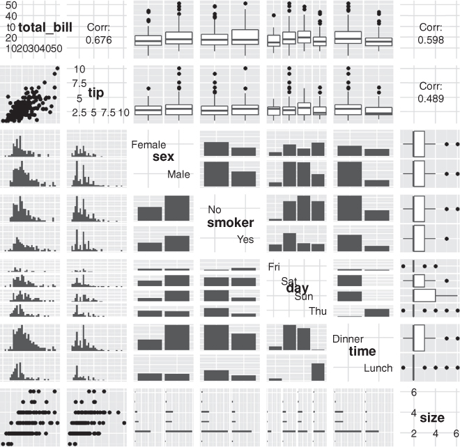
As usual, we prefer visualizing the results rather than comparing numerical values. This requires reshaping the data a bit. The results, in Figure 15.6, clearly show the confidence intervals overlapping, suggesting that the means for the two sexes are roughly equivalent.
> ggplot(tipSummary, aes(x=tip.mean, y=sex)) + geom point() +
+ geom errorbarh(aes(xmin=Lower, xmax=Upper), height=.2)
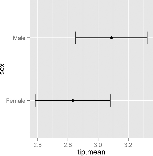
Figure 15.6 Plot showing the mean and two standard errors of tips broken down by the sex of the server.
15.3.3. Paired Two-Sample T-Test
For testing paired data (for example, measurements on twins, before and after treatment effects, father and son comparisons) a paired t-test should be used. This is simple enough to do by setting the paired argument in t.test to TRUE. To illustrate, we use data collected by Karl Pearson on the heights of fathers and sons that is located in the UsingR package. Heights are generally normally distributed, so we will forgo the tests of normality and equal variance.
> require(UsingR)
> head(father.son)
fheight sheight
1 65.04851 59.77827
2 63.25094 63.21404
3 64.95532 63.34242
4 65.75250 62.79238
5 61.13723 64.28113
6 63.02254 64.24221
> t.test(father.son$fheight, father.son$sheight, paired = TRUE)
Paired t-test
data: father.son$fheight and father.son$sheight
t = -11.7885, df = 1077, p-value < 2.2e-16
alternative hypothesis: true difference in means is not equal to 0
95 percent confidence interval:
-1.1629160 -0.8310296
sample estimates:
mean of the differences
-0.9969728
This test shows that we should reject the null hypothesis and conclude that fathers and sons (at least for this dataset) have different heights. We visualize this data using a density plot of the differences, as shown in Figure 15.7. In it we see a distribution with a mean not at zero and a confidence interval that barely excludes zero which agrees with the test.
> heightDiff <- father.son$fheight - father.son$sheight
> ggplot(father.son, aes(x=fheight - sheight)) +
+ geom_density() +
+ geom_vline(xintercept=mean(heightDiff)) +
+ geom_vline(xintercept=mean(heightDiff) +
+ 2*c(-1, 1)*sd(heightDiff)/sqrt(nrow(father.son)),
+ linetype=2)
15.4. ANOVA
After comparing two groups, the natural next step is comparing multiple groups. Every year, far too many students in introductory statistics classes are forced to learn the ANOVA (analysis of variance) test and memorize its formula, which is

where ni is the number of observations in group i, ![]() i is the mean of group i,
i is the mean of group i, ![]() is the overall mean, Yij is observation j in group i, N is the total number of observations and K is the number of groups.
is the overall mean, Yij is observation j in group i, N is the total number of observations and K is the number of groups.
Not only is this a laborious formula that often turns off a lot of students to statistics, it is also a bit of an old-fashioned way of comparing groups. Even so, there is an R function—albeit rarely used—to conduct the ANOVA test. This also uses the formula interface where the left side is the variable of interest and the right side contains the variables that control grouping. To see this we compare tips by day of the week, which has levels Fri, Sat, Sun, Thur.
> tipAnova <- aov(tip ~ day - 1, tips)
In the formula the right side was day - 1. This might seem odd at first but will make more sense when comparing it to a call without -1.
> tipIntercept <- aov(tip ~ day, tips)
> tipAnova$coefficients
dayFri daySat daySun dayThur
2.734737 2.993103 3.255132 2.771452
> tipIntercept$coefficients
(Intercept) daySat daySun dayThur
2.73473684 0.25836661 0.52039474 0.03671477
Here we see that just using tip ~ day includes only Saturday, Sunday and Thursday, along with an intercept, while tip ~ day - 1 compares Friday, Saturday, Sunday and Thursday with no intercept. The importance of the intercept is made clear in Chapter 16, but for now it suffices that having no intercept makes the analysis more straightforward.
The ANOVA tests whether any group is different from any other group but it does not specify which group is different. So printing a summary of the test just returns a single p-value.
> summary(tipAnova)
Df Sum Sq Mean Sq F value Pr(>F)
day 4 2203.0 550.8 290.1 <2e-16 ***
Residuals 240 455.7 1.9
---
Signif. codes: 0 '***' 0.001 '**' 0.01 '*' 0.05 '.' 0.1 ' ' 1
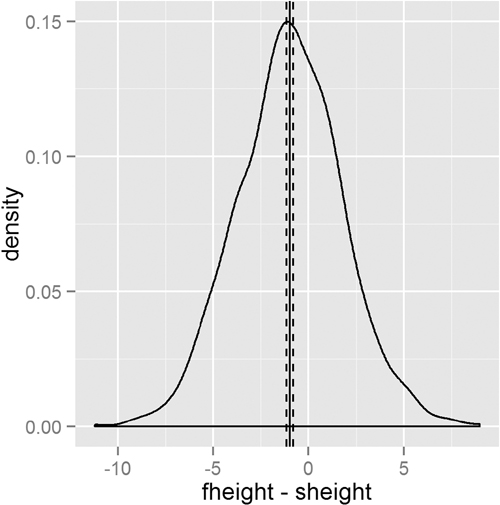
Since the test had a significant p-value, we would like to see which group differed from the others. The simplest way is to make a plot of the group means and confidence intervals and see which overlap. Figure 15.8 shows that tips on Sunday differ (just barely, at the 90% confidence level) from both Thursday and Friday.
Figure 15.8 Means and confidence intervals of tips by day. This shows that Sunday tips differ from Thursday and Friday tips.
> tipsByDay <- ddply(tips, "day", summarize,
+ tip.mean=mean(tip), tip.sd=sd(tip),
+ Length=NROW(tip),
+ tfrac=qt(p=.90, df=Length-1),
+ Lower=tip.mean - tfrac*tip.sd/sqrt(Length),
+ Upper=tip.mean + tfrac*tip.sd/sqrt(Length)
+ )
>
> ggplot(tipsByDay, aes(x=tip.mean, y=day)) + geom point() +
+ geom errorbarh(aes(xmin=Lower, xmax=Upper), height=.3)
The use of NROW instead of nrow is to guarantee computation. Where nrow works only on data.frames and matrices, NROW returns the length of objects that have only one dimension.
> nrow(tips)
[1] 244
> NROW(tips)
[1] 244
> nrow(tips$tip)
NULL
> NROW(tips$tip)
[1] 244
To confirm the results from the ANOVA, individual t-tests could be run on each pair of groups just like in Section 15.3.2. Traditional texts encourage adjusting the p-value to accommodate the multiple comparisons. However, some professors, including Andrew Gelman, suggest not worrying about adjustments for multiple comparisons.
An alternative to the ANOVA is to fit a linear regression with one categorical variable and no intercept. This is discussed in Section 16.1.1.
15.5. Conclusion
Whether computing simple numerical summaries or conducting hypothesis tests, R has functions for all of them. Means, variances and standard deviations are computed with mean, var and sd, respectively. Correlation and covariance are computed with cor and cov. For t-tests t.test is used, while aov is for ANOVA.