We saw how to map a color to a categorical variable using qplot. Now we map symbol color to the three levels of ETH using ggplot. In ggplot, we map color, size, and shape within aes(); also, as we did in qplot, we select our own color scheme using scale_color_manual(), as follows:
P + geom_point(aes(color = factor(ETH)), size=I(5)) + scale_color_manual(values = c("red", "yellow", "blue"))
Now the scatterplot looks like this:
Each level of ETH now has a different color. In ggplot, we can also map symbol size and shape to factor levels, again using aes(). Try the following code yourself:
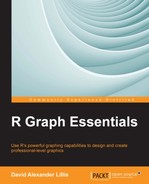
P + geom_point(aes(size = factor(ETH)))
You will get this scatterplot:
Another way of mapping symbol size is through scale_size_area(). Try the following code yourself:
P + geom_point(aes(size = WEIGHT_2)) + scale_size_area()
The scale_size_area() layer maps symbol area onto continuous variables by dividing the continuous variable into levels. Try the following syntax yourself. It uses another function called scale_shape(). In this example, we create a nice effect by including two sets of symbols:
P + geom_point(aes(shape = factor(TREATMENT)), size = 3) + scale_shape(solid = FALSE)
You can change the appearance of the plotting background using various themes. The default theme is theme_grey(), which gives a gray background with white grid lines. Let's create a white background using theme_bw(), which by default produces black grid lines:
P + theme_bw()
Here is the resulting scatterplot:
You can change both your panel and plot attributes using theme(). For example, if you want the ivory color for the background, you can get it using theme(panel.background = element_rect(fill = "ivory")), as shown:
P + theme(panel.background = element_rect(fill = "ivory"))
This syntax gives us the following scatterplot:
Again, you require some complex syntax, but you can use this syntax to provide any color you like for your plotting background. Of course, ggplot allows you to control almost every aspect of a graph. For example, you can perform the following actions:
- Color the plotting margin using
plot.background. - Modify gridlines using
panel.grid.majorandpanel.grid.minor. - Introduce transparency using the
alphaargument within thegeomfunction. - Control the legend position using
theme(legend.position...). - Change your legend keys using
theme(legend.key...). For example, you can change the legend labels, create a nice box around your legend, color the legend space, or write the legend title in italics. - Modify tick marks and tick labels using
theme(axis.text...). - Create horizontal and vertical lines using
geom_hline()andgeom_vline().
The website given in the introduction to this chapter (http://docs.ggplot2.org/current/) provides links that assist you with all of the previous techniques and many others.
As we saw with qplot, mapping an aesthetic to a factor variable can change the legend name by introducing the word factor. To fix this problem, use the name argument in one or other of the many scale options. We can also modify the legend labels using labels. In the next example, we create our own legend name and assign particular ethnicities to the levels of ETH. At the same time, we encounter a very useful function, scale_color_brewer(). This function allows you to select from a wide range of color palettes (the default option is a range of blue hues). The syntax is as follows:
P + geom_point(aes(color = factor(ETH)), size= I(4)) + scale_color_brewer(name = "Ethnicity", labels=c("European","Asian","Other"))
The scatterplot looks as follows:
We have succeeded in naming our legend as we wished, and we have met a new function that allows you to choose attractive color schemes. Note that we used scale_color_brewer() only after mapping color to ETH within aes.
Both scale_x_continuous() and scale_y_continuous() are very useful functions. They provide many options for modifying axes. For example, you can use these functions to control axis limits, reverse the axes, and introduce logarithmic or other axis scales. In addition, they provide yet another way of creating axis labels. Try the following syntax yourself:
P + scale_x_continuous("Centimetres") + scale_y_continuous("Kilograms")
However, these two functions can do a lot more. For example, let's use scale_x_continuous and scale_y_continuous to modify our axis limits.
P + scale_y_continuous(limits=c(60, 100)) + scale_x_continuous(limits=c(140, 180))
We get this graph:
Within these two functions, you can select locations for tick marks using breaks. Try this syntax yourself:
P + scale_x_continuous(breaks=c(150, 160, 180)) + scale_y_continuous(breaks=c(70, 90, 120))
You can label the ticks as you wish using labels:
P + scale_x_continuous(breaks=c(150, 160, 180), labels=c("SMALL", "MEDIUM", "LARGE"))