Modern Windows applications come complete with extensive toolbars that serve as quick access to various menu choices. In the early days of Windows, these toolbars were nothing but buttons, but today they may include drop downs, combo boxes, and other advanced controls.
Visual Studio .NET makes creating toolbars for your application very easy. The steps are as follows:
Create an image list.
Create a toolbar and associate the image list with the toolbar.
Set up event handlers for the buttons on the toolbar.
Optionally, add additional controls programmatically.
To keep the example simple, start with the OwnerDraw menu you completed earlier and add a simple toolbar.
Begin by dragging an ImageList onto the form. Notice that one of the properties, Images, is marked as a collection. Click on the ellipsis (...) to open the image list. This opens the Image Collection Editor. Click the Add button.
This step opens a dialog for identifying the image you want to add from images you may have stored on disk. Navigate to Program FilesMicrosoft Visual Studio .NET 2003Common7GraphicsBitmaps. In this directory, there are two directories with useful icons: OffCtlBr and Assorted. For this example, navigate into OffCtlBr, into Large, and then Color.
Choose the New.bmp file, which adds the bitmap to your collection. Notice that the righthand side of the dialog, with the bitmap properties, is read-only. Add a few more bitmaps, as shown in Figure 18-16.

You now have a collection of bitmaps, and you are ready to create your toolbar. Drag a Toolbar control onto the form. It docks under your menu, although you will be free to change that later.
Navigate to the ImageList property of the new toolbar and set the property to the ImageList you've just created.
Click on the Buttons property of the Toolbar to open the ToolBarButton Collection Editor. Click on the Add button to add a button. In the Properties window of the ToolBarButton Collection Editor, set the Button name to btnNew, and set the ImageIndex to the index for the New file icon (index 0). Set the Text to New and set the ToolTip text to "Create new File." Finally, set the Tag property to New as well.
The Tag property does not affect the display of the menu, but it helps identify which button was pressed, as all buttons on a toolbar share a common event handler.
Your ToolBarButton Collection Editor should look like Figure 18-17.

Go ahead and add an Open button and a Save button. You do not have to use all the images in your image list; which one you use is up to you.
If you double-click on one of the buttons, Visual Studio .NET will create an event handler for the toolbar. Notice that the event handler is not per button. You'll have to figure out which button was pressed, but this task is simplified when the ToolBarButtonClickEventArgs parameter is passed in to the event handler.
private void toolBar1_ButtonClick(
   object sender,
   System.Windows.Forms.ToolBarButtonClickEventArgs e)
{
   switch ( e.Button.Tag.ToString(  ) )
   {
      case "New":
         mnuNew.PerformClick(  );
         break;
      case "Open":
         mnuFileOpen.PerformClick(  );
            break;
      case "Save":
         mnuFileSave.PerformClick(  );
         break;
   }

}
Private Sub ToolBar1_ButtonClick( _
ByVal sender As System.Object, _
ByVal e As System.Windows.Forms.ToolBarButtonClickEventArgs) _
Handles ToolBar1.ButtonClick
Dim tag As String = e.Button.Tag
Select Case tag
Case "New"
mnuNew.PerformClick( )
Case "Open"
mnuFileOpen.PerformClick( )
Case "Save:"
mnuFileSave.PerformClick( )
End Select
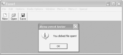
End SubClicking on the New button now opens an MDI window, and clicking on Open or Save evokes the same event handler as the menu choices, as shown in Figure 18-18.
Notice that one of the properties you set on your toolbar was the ToolTipText property. If the user hovers over one of your buttons, the tool tip will appear to provide additional information about the button, as shown in Figure 18-19.

Several toolbar properties can help you tailor the appearance of your buttons. For example, you can change the TextAlign property from Underneath to Right, and put the text next to the icon to make wider, but shorter buttons, as shown in Figure 18-20.

Another example is the Appearance property, which can be set to either Flat or Normal. If you change the appearance to Flat, the buttons look flat except when you hold the cursor over the button, as shown in Figure 18-21. You have to look closely and compare the New button (for example) in Figure 18-21 with the New button shown in Figure 18-19.

Dozens of properties can set the appearance of the Toolbar. Some of the most important and common properties are listed in Table 18-8.
Table 18-8. Toolbar properties
|
Property |
Type |
Description |
|---|---|---|
|
Appearance |
ToolBarAppearance |
Read/Write. Valid values are members of the ToolBarAppearance enumeration, which has two values: Flat and Normal. The default value is ToolBarAppearance.Normal. If the appearance is set to ToolBarAppearance.Flat, the buttons are flat until the mouse is held over them. |
|
AutoSize |
Boolean |
Read/write. Will the Toolbar adjust its size automatically? The
default is |
|
BorderStyle |
BorderStyle |
Read/write. Specifies the style of border around the toolbar. Valid values are members of the BorderStyle enumeration, which has three values: Fixed3D, FixedSingle, and None. The default value is BorderStyle.None. |
|
Buttons |
ToolBarButtonCollection |
Read-only. The collection of ToolBarButton objects contained by the Toolbar. |
|
ButtonSize |
Size |
Read/write. The size of the buttons on the toolbar (typically 16 x 16). |
|
Divider |
Boolean |
Read/write. If |
|
DropDownArrows |
Boolean |
Read/write. If |
|
ImageList |
ImageList |
Read/write. The image list containing the images to be displayed by the buttons on the Toolbar. |
|
ShowToolTips |
Boolean |
Read/write. If |
|
TextAlign |
ToolBarTextAlign |
Read/write. Specifies the alignment of the text associated with a Toolbar button. Valid values are members of the ToolBarTextAlign enumeration: Right and Underneath. The default is ToolBarTextAlign.Underneath. |
|
Wrappable |
Boolean |
Read/write. If |
You can do much more with toolbars. For example, while the IDE will not help you add more complex controls, you are free to add them programmatically.
To add a combo box to the Toolbar, add code to the constructor of the form that creates a combo box, initializes its members, and then adds it to the Toolbar:
public Form1(  )
{
   InitializeComponent(  );

   ComboBox cb = new ComboBox(  );
                  cb.Left = 150;
                  cb.Top = 5;
                  cb.Items.Add("Alabama");
                  cb.Items.Add("Alaska");
                  cb.Items.Add("Arizona");
                  cb.Items.Add("Arkansas");
                  toolBar1.Controls.Add(cb);
}
Public Sub New(  )
    MyBase.New(  )

    InitializeComponent(  )

    Dim cb As New ComboBox(  )
                  cb.Left = 150
                  cb.Top = 5
                  cb.Items.Add("Alabama")
                  cb.Items.Add("Alaska")
                  cb.Items.Add("Arizona")
                  cb.Items.Add("Arkansas")
                  ToolBar1.Controls.Add(cb)
End Sub
The Combo box is added to the Toolbar, as shown in Figure 18-22.
