
CHAPTER 5
Creating Visual Support
You have been there. You are in a conference room. A project team is reporting. They have PowerPoint slides, lots of slides with lots of words on each slide. The slides are like giant note cards, and each speaker can-not resist turning his body toward the screen, reading the words, and talking to the slides. There are charts and graphs, too—loaded with colored lines and bars with tiny legends that you have to turn your head sideways to interpret. While you are trying to figure out which region is the orange line (the one with the steepest decline), you are not listening to the speaker. Your attention begins to wander, and you are feeling slightly annoyed. Afterwards, you hear the jokes from members of the audience, phrases such as “Death by PowerPoint” and “Power Pointless.”
From our own experience, we know that business people have little patience for slide after slide of boring bullet points and lots of “chart junk.” We also know that decision makers, in particular, prefer clean, simple slides that quickly enhance their understanding of the important points. They are interested in you, your story, and your interpretation of the big ideas, not deciphering obtuse visuals and sitting through technical circuses.
Yet, we continue to see slide presentations that distract and handouts that confuse. Why? One answer is because the software lets us. Most people do not have ready access to graphic design experts. They are on deadline and do the best they can, without being aware of some basic design principles and techniques that would save them time and enhance their presentations. In addition, we load our slides with words because we are afraid we will forget something and look foolish. Then we talk to our slides because we made them, we are comfortable with them, and they do not judge us. It feels safer to talk to the slides than to the people.1
Therefore, this chapter explores a few powerful principles that will help you support and reinforce your content with appropriate visuals and handouts and make it easier to talk to your audience rather than your slides. First, I will review some interesting research on how humans process and comprehend multimedia messages. Knowledge of this research will change the way you think about and design the visuals for your presentations. Second, I will share five simple principles for creating effective visuals and provide some examples. I will conclude this chapter by addressing the handout component, a key element in the question and discussion session that follows your presentation. In addition to the “takeaway” summary at the end of the chapter, I have also included an annotated list of “how to” resources on visual support for those who are interested in some technical help.
Tips from the Experts:
The single most important thing you can do to dramatically improve your presentations is to have a story to tell before you work on your PowerPoint file.
Cliff Atkinson
Beyond Bullet Points
Our discussion will focus on principles and be independent of the presentation software. In addition to PowerPoint (Microsoft) and Keynote (Apple), there are a number of new presentation tools in the market, including the “zoomables,” such as Prezi, which is growing in popularity. Any of the programs can create stunning presentations, and all have strengths and weaknesses. But it’s not the tool, it’s how you use the tool to support your message that’s important. If the audience is amazed at your use of nifty software, you are focusing on the wrong thing.
How People Process Words and Visuals
In his book, Multimedia Learning, Richard Mayer pulls together the research on how human brains process verbal and visual media.2 His cognitive theory of multimedia learning provides important insights into the design of visual support for our presentations. Although Mayer’s theory can be somewhat complex, the following paragraphs summarize the elements most relevant to our business presentation context.3
Humans have two separate information channels in the brain for auditory and visual processing.4 Presentations target these processing systems through two of our senses, the eyes and the ears. The ears serve as the delivery path for the presenter’s oral narrative, processing in the auditory/verbal channel in the brain. The eyes serve as the delivery path for the visual component of the message. The accompanying picture or image on the screen processes in a separate area of the brain, called the visual/pictorial channel. According to Mayer, “In the process of building the connections between words and picture, learners are able to create a deeper understanding than from words or pictures alone.”5
The problem occurs when we put words on the screen in the form of sentences or long bullet points. The processing of the text goes through the eyes into the visual/pictorial channel of the brain. Then the words transfer to the auditory/verbal center of the brain for translation. Do you see the problem? Each channel has a limited capacity for processing. While you are talking, sending messages through my ears to my brain’s verbal channel, I am also simultaneously trying to read and translate the text on the screen, working extra hard moving the text through the visual channel to the verbal channel center. The result is verbal and cognitive overload! I cannot read what is on the screen and listen to you at the same time. Thinking about this phenomenon is sobering. By putting a lot of text on the screen, we are actually making it harder for the audience to follow and understand our presentation.
So what are the implications of Mayer’s research for presenters? The answer is that we need to design the visual support for our presentations in the light of how the human mind works. Use pictures to reinforce your verbal points and minimize or eliminate words on the screen. If you want to include a word or two with the picture, make it short and descriptive, reinforcing the slide’s message (Figure 5.1). Give the audience a moment to process the slide, then elaborate on your point. If you must use bullet points, keep them short and progressively disclose each one using the PowerPoint animation function. Otherwise, people are reading ahead, processing all the words on the screen and not listening to you.

Figure 5.1. Use images to convey your message and minimize the words.
One of my top MBA students provided a good example application of Mayer’s research. She developed a persuasive presentation aimed at senior adults. The purpose was to persuade seniors to incorporate at least 30 minutes of brisk walking into their daily activity. After making the case for walking as a beneficial exercise, she provided some examples of how the seniors could incorporate more walking into their week. She could have supported her presentation with a bullet point slide, containing, for example, three points:
• Park your car further from the entrance to the grocery store
• Take the stairs instead of the elevator
• Put your car in the garage; then walk back to the mail box
Instead, she used three photos, each a separate slide, showing a car parked a distance from the store entrance, stairs adjacent to an elevator, and a mailbox at the end of a driveway. In other words, she “spoke” the bullet points, elaborating as appropriate, and she reinforced her words with the images on the screen. She closed with another full-screen photograph, showing an elderly gentleman holding his granddaughter’s hand as they walked down a country path. She told a story of how her grandfather had taken her along for his daily “constitution” walk when she was a little girl and the memories that made. The message was clear and meaningful, touching the hearts of her target audience.
We can apply the same principles to our Serv-Pro presentation. For example, one of Carson’s possible “hooks” for his presentation opening was to raise the issue of the cost of employee turnover by posing a thought question. The supporting image could be an employee leaving through a revolving door, with the word “Cost of Turnover?” on the screen (Figure 5.2). After posting the slide, Carson might say:

Figure 5.2. Use images to reinforce the message.
Have you ever thought about what the revolving door of employee turnover is costing our company? (Pause.)
I think you will be surprised when you hear the answer.
My purpose today is ….
Tips from the Experts:
Data slides are not really about the data. They are about the meaning of the data.
Nancy Duarte
Slide:ology
The same approach applies to data slides, including tables and charts. We have a tendency to overload the slide with information. A common issue, for example, is to put a bar chart on the screen showing multiple columns, in multiple colors, over multiple periods with a little legend on the side that keys the various colors. Again, I cannot decipher the slide and listen to you at the same time. The handout is the place for this level of detail. Any table or chart designed for the oral presentation needs to be big and simple—intended to reinforce a specific point.
With a transition sentence, introduce and project the slide on the screen, then pause. Your audience should be able to look at the slide and, within two or three seconds, comprehend the message in the data. Then they can turn their attention back to you for interpretation, explanation, and analysis.
Figure 5.3 provides an example chart designed to support Carson’s point that turnover of salaried employees at Serv-Pro is significantly above the norm and trending the wrong way.

Figure 5.3. Keep charts big and simple.
Abbreviation: NAWD, National Association of Wholesale Distributors.
Remember, the presentation is about your ideas and the needs of the audience, not your slides. The visuals should help support and reinforce your key points. That is all they are meant to do.
The Five C’s of Visual Support
To help keep your visuals big, bold, simple, and easy for your audience to comprehend, follow the “Five C’s”—my basic principles for visual support.
1. Concentration: Each visual should represent one idea and support a specific point you want to make.
For example, I recently attended a presentation where the presenter was reporting on survey responses about a change in tipping policy for a restaurant chain. It was an opinion survey of three different groups—employees, customers, and managers. For the key question in the survey (an agree/disagree, not sure response), the presenter put up a slide showing three sets of bar charts representing the number of responses for each group for each option. It was too much information to digest at a glance. While she talked about the employee response, I found myself looking at the customer data bars, which had a very high number of disagrees, and thinking about the implications. I stopped listening to the presenter.
Following the concentration principle, the better approach would be a separate slide for each reporting group, allowing the presenter to interpret the data and draw conclusions for the audience before discussing the results of the next group. At the end of the series, the presenter could then provide a summary conclusion about the overall survey data. In addition, a pie chart with percentages would be a better chart type, making it easier to interpret visually (Figure 5.4).
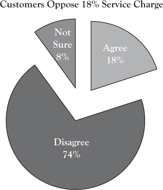
Figure 5.4. Focus on one point and reduce the chart to essentials.
In Figure 5.4, note that the chart has been stripped to its essentials. The title communicates the message of the slide. I removed the legend and incorporated the text into the pie slices. The pie colors are logical for the data and subliminally support the message. The disagree pie is red (stop), agree is green (go), and the “not sure” pie is gray, for neutral. Avoid three-dimensional (3D) effects, which create distortions in scale. Again, the audience should be able to quickly grasp the message of the chart and then turn their attention back to the speaker for interpretation and development of the message. The slide concentrates on one idea and supports a specific point.
2. Clarity: Each visual should be perfectly clear from the back of the room; no “mice type.”
You have heard people say, as they put a slide on the screen: “I know you probably can’t see this.” If that is the case, do not do it! Save it for the handout. As part of being big and simple (and clear from a distance), you need to bump up your font size on any text or numbers in your slides. Here is my recommended scheme for minimum font sizes:
º 36 points for topic headers
º 32 points for bullets
º 28 points for sub-bullets
If you must use bullet points, this scheme will limit the amount of text you can put on the screen and, in the case of data tables, will force you to be very selective with any numbers you present—no more Excel spreadsheets copied into slides!
As part of clarity, keep your color scheme simple and business-like. Avoid decoration in the background of the template or in the corners (do you really need your company logo on every slide?). Given the power of today’s data projectors and the preference for a lighted room, use a white background with black or dark navy letters. The white background also provides maximum flexibility for blending in photos and making color selections for charts.
Finally, don’t be afraid of a little “white space.” You do not have to fill every inch of a slide. Give the audience some visual “breathing room.”
Tips from the Experts:
It’s O.K. to have clear space—clutter is a failure of design.
Nancy Duarte
Slide:ology
3. Consistency: Each visual should be consistent in style and tone and support the overall theme and message of the presentation.
Maintain a professional look by being consistent with your type font and use of upper and lower case. For slides, use a single, legible sans-serif font, such as Arial or Verdana, along with variations in its style such as bold and italic. Titles should be title case (first letter of each major word capitalized), and bullets should be short (less than seven words), left justified, and in sentence case for readability.
Maintain consistency in image style also. We all have access to huge banks of clip art and photos, but mixing clip art cartoons of various designs and photographs of different styles and tones is a mistake. Such lack of consistency suggests the presentation has been “thrown together” in haste and undermines the professional image you want to promote.
Concerning clip art, resources, such as Microsoft Office’s library of clip art, often provide a style number for a clip art “family.” Once you find an image you like, you can click on the details to find the style number to use in the search box or click on a search option for “similar images.” This procedure provides you a selection of topical clip art drawn by the same artist in the same style.
In the same manner, consider using a professional source, such as istockphoto.com or shutterstock.com, for photographs. When you find a photo that helps support and reinforce your specific point for a slide or the theme of your presentation, you can search for additional images from the same photographer that are congruent in setting and tone. Although the images from professional sources can be somewhat pricey compared to what is “free” in sources such as Google Images, the quality and the consistency, which contribute to the professionalism of your presentation, will be worth it.
4. Correctness: Double-check your visuals for correctness and accuracy.
Nothing destroys credibility more than having a six-foot image on the screen with spelling errors, grammatical miscues, typos, or math mistakes.
For example, I often see bullet point lists with faulty parallel structure, which means the bullets are not consistent with each other in tense and part of speech. Most people in your audience are not expert grammarians, but when they read a bulleted list with faulty parallel structure, they will sense that something is not quite right. Compare the two lists below. Read each bullet aloud. Which is easier to read and has more impact?
| Three solutions: | Three solutions: |
|---|---|
| • Customer reps need training | • Train customer reps |
| • System to track customer complaints | • Track customer complaints |
| • Performance rewards developed | • Reward good performance |
The list on the right maintains parallel structure, with each bullet beginning with a strong, active verb. The list has fewer words and reads with power and punch. Although attention to this level of detail may appear a little picky, be assured there will be at least one person in your audience who cares about issues such as grammar and spelling. To that person, the little details add up and contribute to your professional persona and credibility. In other words, the person may be thinking, “How can I trust your ideas if you do not pay attention to details like grammar and proofing your work?”
The lesson here is clear. Ask multiple associates to proof your slides.
We all have difficulty proofing our own work; we are too close to it, seeing what we meant instead of what is there.
5. Control: Use a variety of visual techniques to control the delivery of information and focus the attention of your audience.
The animation function in PowerPoint and other presentation software is a powerful tool. Use animation to progressively disclose bullet points when you have commentary to add to each point, preventing the audience from reading ahead.
Use animation also to build a diagram or chart, section by section, as you explain the elements. By sequencing information and bringing the audience along at a comfortable pace, you enhance understanding as you tell your story.
For example, Figure 5.5 reproduces Figure 5.3, the “Turnover Gap” slide, but with some additional information that could be added with animation. Although the initial chart itself was simple enough, after Carson explains the chart and tells the story of the data, he can reinforce the big point with animation. He can display the percentage point difference and translate the difference into the number of employees lost above the norm—the number the company should not have lost. This information sets the stage for the financial argument that follows regarding the cost of turnover.

Figure 5.5. Make your point with animation.
Abbreviation: NAWD, National Association of Wholesale Distributors.
As a word of caution, when using animation: keep it simple— dissolve, fade, or wipe will do. All the other spectacular motions such as crawls, wedges, and wheels are for amateurs who do not know any better. Use animation only to direct attention and help audience understanding; call attention to your message, not the tool.
In addition, be open and willing to experiment with other methods of controlling audience attention. For example, passing out a physical object for the audience to examine (“show and tell”) can help emphasize a particular point. Sometimes, even a single-sheet handout, perhaps a drawing or illustration that works better in print than in projection, can be a way to vary the pace of the presentation and support a key idea. Remember, also, the power of a flip chart or whiteboard, which allows you to develop an idea with the audience interactively.
When you switch to other media, you need to make the screen go dark to refocus the audience’s attention. For example, in PowerPoint slideshow mode, you can use the “B” key as a toggle on your computer to turn the screen black temporarily. A second tap on the “B” key will return to the last image on the screen as you continue.
Finally, sometimes the best visual is no visual, just you as the speaker making a critical point. You can insert a “black” slide in your deck that allows you to step to the center of the room or in front of the screen, make your point and interact with the audience, and then continue with the next slide at the appropriate point.
In summary, applying the five principles—concentration, clarity, consistency, correctness, and control—will give you the simple, professional visual support that decision makers like.
Remember, the focus should be on you and your ideas, not your slides. Your slides and other visual media simply support and reinforce your message. Your purpose is to deliver a clear, concise, and persuasive summary of your idea, proposal, or recommendation in a way that connects with and meets the needs of your audience.
The decision makers in the audience will be making a gut judgment about you as you speak. Have you done your homework? Do you know your stuff? Can you be trusted to follow through on details? Effective design and use of your visuals, applying the “Five C’s,” will contribute positively to their conclusion.
Designing the Handout
As a reminder, our discussion about persuasive business presentations assumes a conference room setting. Our premise for the presentation design is that we want to deliver a short oral presentation, about 10 but no more than 15 minutes in length, in the style of an executive summary. Our goal is to present clearly and concisely our key points and “big ideas.” This synopsis sets the stage for discussion and audience involvement, one of the keys to persuasion. A key element in this approach is the supporting document, or handout, which you distribute after the presentation.
Although the document could be in traditional report format, I prefer a “flip-book,” a spiral-bound document in horizontal format constructed with PowerPoint or other presentation media (Figure 5.6).6 I call the document a flip-book because the format and binding makes it easy for the audience to flip to a particular page for discussion versus a bound or stapled document.

Figure 5.6. Flip-book example (cover page).
During my corporate years, I had the privilege of working with a number of major consulting firms on various projects. They all used flip-books as part of their presentation support, and I found the tool to be quite effective in facilitating discussion.
To be clear, I am not talking about merely printing and stapling together your presentation slides. Remember, your presentation slides are big, bold, and simple. Without your verbal commentary, they would not be very meaningful for reference after the meeting.
So yes, I am talking about extra work to build not only presentation slides, but also a more detailed handout. But, the extra effort pays benefits. A well-designed flip-book not only provides the text and background data to support your persuasive argument but also serves several additional purposes, such as:
• Promoting audience interaction and discussion
• Enhancing audience recall after the meeting
• Allowing people who did not attend the meeting access to your ideas
• Helping “brand” your image as a competent professional
• Providing backup if equipment fails
In the chapter on delivery and how to manage the Q&A session, we will discuss how to use the flip-book. In the context of this chapter on visual support, I will conclude by reviewing some guidelines for good flip-book design. Designing a report-style handout using presentation software is a different genre of writing and requires some different ways of thinking.
Because the flip-book will be used interactively in the Q&A section, the document needs to be easy to read and well organized. Like any report, an effective flip-book will include a table of contents, organized by sections, and labeled with page numbers. An executive summary section is also a good idea.
Design each page to communicate a clear point. Think of each page as consisting of three parts:
1. The headline states the main point of the slide. Compose the headline as if it were the topic sentence of a paragraph. In effect, the flip-book pages are a logical series of headlines that tell your audience a story.
2. Although the headline tells the story, the body of the page explains the story, using text, tables, examples, diagrams, and graphs.
3. The “So What” box at the bottom of the page summarizes the implications of the story in one short sentence; it is concise and to the point.
Figure 5.7 provides an example page from Carson’s flip-book on the tuition reimbursement plan (TRP) presentation.
Referring to Figure 5.7, here are some checkpoints for the design of effective flip-book pages:7

Figure 5.7. Example flip-book page.
![]() Use a simple design, without background graphics or gradations, to avoid competition with your text and graphics.
Use a simple design, without background graphics or gradations, to avoid competition with your text and graphics.
I prefer a plain white background with black text and a grayscale color scheme. Although the cover of the flip-book might be in color, black and white is fine for the body of the report and in keeping with today’s concern for cost economy. In addition, reports today often circulate electronically and print locally on black and white printers. The goal is clarity and readability.
Choose a basic, readable font such as Verdana or Calibri. You can use italic and bold for variations in style and points of emphasis. Be consistent in using left justification and sentence case.
![]() Adapt the title box to accommodate a two-line headline, left justified.
Adapt the title box to accommodate a two-line headline, left justified.
Set the font size to bold head, 24 points. This title box layout will allow you to use a newspaper-style headline for each slide.
![]() Use the body of your page to explain the headline.
Use the body of your page to explain the headline.
For text, use font sizes 18 and 16. Avoid using bullets for all your text (boring!). Instead, place text in tables or shapes and arrange to show the relationship between ideas. Take advantage of the graphic features of the presentation software to build diagrams and charts to support your messages. Remember to leave some blank space on each page, allowing your audience to breathe visually. Avoid whole paragraphs of text.
![]() At the base of the body, include an outlined text box the width of the page, containing font size bold 15.
At the base of the body, include an outlined text box the width of the page, containing font size bold 15.
This section is sometimes called the “So what?” box. It is a place holder for a one-sentence summary of the implications of the content.
![]() Include a footer at the bottom of the slide.
Include a footer at the bottom of the slide.
The footer usually contains the copyright date, an abbreviated title, and a page number. Make the page number bold and prominent. The page numbers are how you guide your audience to a specific page during the discussion.
Note that the example flip-book page presents content that is too detailed for a presentation slide (remember Mayer’s research). The corresponding slide used in the presentation might consist of a reinforcing image and text boxes with the words “Hidden Costs” along with the four category words “separation, replacement, learning, and transition” (Figure 5.8). As Carson reveals the category words progressively, he would orally provide examples of the four category costs. He could conclude by adding, using animation, the 90% to 200% cost of annual salary metric to drive home his point, referencing the source.

Figure 5.8. Example slide on cost of turnover.
In summary, flip-book pages have a different purpose than slides—to help you navigate through the Q&A session, provide additional detail, and support post meeting discussion.
Table 5.1 provides an annotated list of my favorite resources for those who would like to explore in more detail how to design bold and simple slides and prepare flip-books using presentation software. Although some of these references are PowerPoint specific, the principles taught apply to all visual presentations.
Table 5.1. Resources for Designing Effective Visual Support
| Resource | Comments |
|---|---|
| Beyond Bullet Points: Using Microsoft PowerPoint to Create Presentations that Inform, Motivate, and Inspire by Cliff Atkinson | Shows how to engage audiences by combining classic storytelling with clean visuals; great discussion and application of Mayer’s research principles. |
| Graphics and Visual Communication for Managers by Robert Sedlack, Jr., Barbara Shwom, and Karl Keller | Explains the fundamental principles of graphic and visual design for both print and oral presentations; clear, practical, and applied. |
| Guide to PowerPoint 2010 by Mary Munter and Dave Paradi | Provides excellent “how to” technical instructions for creating effective PowerPoint slides; useful guides on chart selection and design. |
| Slide:ology: The Art and Science of Creating Great Presentations by Nancy Duarte | Teaches how to think visually while modeling the principles of good design; beautiful and inspirational. |
| Why Most PowerPoint Presentations Suck and How You Can Make Them Better by Rick Altman | Delivers no-nonsense advice and provides many examples; the best source for instruction on proper use of the animation function. |
In the next chapter, we will look at the processes for managing the logistical preparation, conducting rehearsals, and calming nerves.
Creating Visual Support
• People cannot read what is on the screen and listen to you at the same time. Use more images to reinforce your verbal points; reduce (or eliminate) the number of words on the screen.
• Make charts big, bold, and simple. Like highway billboards, the audience must be able to glean the message in a glance, and then turn to you for explanation and nuance.
• Apply the “Five C’s”—concentration, clarity, consistency, correctness, and control. Each visual should
º represent one idea and concentrate on a specific point,
º be perfectly clear from the back of the room,
º be consistent in style and tone,
º be correct and error-free, and
º control delivery of information and focus attention.
• Use the animation function selectively to sequence and tell your story, but don’t overdo.
• Do not use your slides for a handout. Design your handout in flip-book style to provide the details to back up your presentation and to facilitate the Q&A session.
• Remember, the presentation is about your ideas, not your slides. Your task is to engage the audience on a personal level, meeting their need for logic, emotional connection, and assurance of your credibility.