Another method of assessing a model's performance is by evaluating the model's growth of learning or the model's ability to improve learning (obtain a better score) with additional experience (for example, more rounds of cross-validation).
The information indicating a model's result or score with a data file population can be combined with other scores to show a line or curve, which is known as a model's learning curve.
A learning curve is a graphical representation of the growth of learning (the scores shown in a vertical axis) with practice (the individual data files or rounds shown in the horizontal axis).
This can also be conceptualized as:
- The same task repeated in a series
- A body of knowledge learned over time
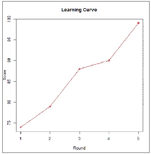
The following figure illustrates a hypothetical learning curve, showing the improved learning of a predictive model using resultant scores by cross-validation round:
Source link: https://en.wikipedia.org/wiki/File:Alanf777_Lcd_fig01.png
Learning curves relating model performance to experience are commonly found to be used when performing model assessments.
As we have mentioned earlier in this section, performance (or the scores) is meant to be the accuracy of a model while experience (or round) may be the number of training examples, datasets, or iterations used in optimizing the model parameters.
Using two generic R functions, we can demonstrate a simple learning curve visualization. Ping will open an image file which will hold our learning curve visualization so we can easily include it in a document later, and plot will draw our graphic.
The following are our example R code statements:
# -- 5 rounds of numeric test scores saved in a vector named "v"
v <-c(74,79, 88, 90, 99)

# -- create an image file for the visualization for later use
png(file = "c:/simple example/learning curve.png", type = c("windows", "cairo", "cairo-png"))

# -- plot the model scores round by round
plot(v, type = "o", col = "red", xlab = "Round", ylab = "Score", main = "Learning Curve")

# -- close output
dev.off()
The preceding statements create the following graphic as a file: