
6
Detecting and Analyzing Anomalies
The short definition of an anomaly is something that you don’t expect—something strange, out of the ordinary, or simply a deviation from the norm. You don’t expect to see values outside a specific numeric range when reviewing data—these values often called outliers because they lie outside the expected range. However, anomalies occur in all sorts of ways, many of which don’t fall into the category of outliers. For example, the data may simply not meet formatting requirements, or it may appear inconsistently, as with state names that are correct but presented in different ways.
Some people actually enjoy seeking anomalies, finding them amusing or at least interesting. The point is anomalies occur all the time, and they may appear harmless, but they have the potential to affect your business in various ways. The point of this chapter is to help you discover what anomalies are with regard to ML, how to determine what sort of anomaly it is, and how to mitigate its effects when necessary. It’s not possible or even required to deal with rare events caused by cosmic radiation, for example. With these issues in mind, this chapter discusses the following topics:
- Defining anomalies
- Detecting data anomalies
- Using anomaly detection effectively in ML
- Considering other mitigation techniques
Technical requirements
This chapter requires that you have access to either Google Colab or Jupyter Notebook to work with the example code. The Requirements to use this book section of Chapter 1, Defining Machine Learning Security, provides additional details on how to set up and configure your programming environment. When testing the code, use a test site, test data, and test APIs to avoid damaging production setups and to improve the reliability of the testing process. Testing on a non-production network is highly recommended but not absolutely necessary. Using the downloadable source code is always highly recommended. You can find the downloadable source on the Packt GitHub site at https://github.com/PacktPublishing/Machine-Learning-Security-Principles or my website at http://www.johnmuellerbooks.com/source-code/.
Defining anomalies
In the ML realm, anomalies represent data that lies outside of the expected range. The anomaly may occur accidentally, or someone may have put it there, but an anomaly is usually unexpected and potentially unwanted. Anomalies come in two forms:
- Outliers: When the data doesn’t fit in with the rest of the data, it’s an outlier. An outlier can come in many forms, but the defining characteristic is that it’s definitely not wanted because it skews any sort of analysis performed with it in place.
- Novelties: Sometimes, the data is outside the normal range, but it actually does fit in with the rest of the data. In this case, the data represents a new example that must be considered as part of any analysis. Otherwise, the analysis will fail to represent the true state of whatever the analysis is supposed to bring to light.
Part of the problem, then, is that both kinds of anomaly lie outside the normal range, but one is wanted and the other isn’t. Before any mitigation can occur, the ML application must provide some means of determining whether the data is an outlier or a novelty. In some cases, making a correct decision may actually require that a human review the data to make the determination.
Specifying the causes and effects of anomaly detection
Before you can know that an anomaly exists, you must detect it. Anomaly detection is a mix of the following methods:
- Engineering: Using known rules and laws, which can be done using ML techniques.
- Science: Defining a hypothesis and then proving it. Science requires a human to define the hypothesis but can depend on ML to help prove it.
- Art: Simply getting a feeling that something is wrong, which is most definitely, exclusively, the realm of humans.
It’s important to detect anomalies as soon as possible when they occur. Unlike many areas of security, there aren’t any methods of predicting an anomaly will occur because anomalies are, by nature, completely unexpected and unpredicted. Previous chapters discussed purposeful attacks by hackers to change data in ways that cause problems for every security element on your network, but anomalies usually happen in a different manner; they aren’t usually planned. When they are planned, they’re exceptionally hard to detect because hackers can simply hide the attack within all of the other data. Consequently, this chapter looks at the engineering and science aspects of anomaly detection from the perspective of the unexpected event that could be perpetrated by a hacker but could be caused by a vast number of other sources. You’ll have to develop your own sixth sense to feel that an anomaly has occurred (and most people do develop one with experience).
Part of the problem with detecting anomalies is that humans have a tendency toward bias, which means having an inclination not to see the unexpected if it doesn’t make enough of an impression. As a real-world example, one person is focused entirely on work, while another repaints the house. The first person comes home from work and doesn’t see that the house is painted because bias prevents them from doing so. Their focus is on work; nothing else matters. The same thing happens with anomalies that affect the business environment, especially data. It’s possible to look at the data and yet not really see it because the focus is on something else at the time. This is where ML can come to the rescue by providing that extra impression to their human counterparts that something is apparently wrong.
Fortunately, you have other methods of anomaly detection that you can use to prevent break-ins and issues like model stealing. These methods fill in where visual observation and the use of ML tools don’t quite fill in all of the gaps. Discovering precisely how you can add these tools to the measures you already have in place is an essential part of discovering anomalies early and mitigating them quickly after discovery.
Considering anomaly sources
Anomalies occur in different situations, and it isn’t always the fault of the data source, which is something that many texts forget to mention. Novelties do occur as part of a change in source data, but outliers aren’t so limited. With this in mind, the following list provides some sources to check when you see anomalies in your data:
- Dataset damage: Any data source is subject to damage. Users can enter incorrect data, a network outage can corrupt data, hackers can change data, nature can modify data, or the data could simply become outdated to the point that it’s not useful any longer. This source of anomalies is always associated with outliers.
- Concept drift: The meaning of data can change over time based on physical, political, economic, social, or other external forces, such that the interpretation of the data changes. You often see this kind of anomaly as a novelty, but it can also be an outlier.
- Environmental change: Sensors are especially sensitive to this issue and will likely generate anomalies in the form of novelties. However, this sort of anomaly can also appear as an outlier when hackers or other individuals purposely modify the environment to create unusable data.
- Source data change: Any data source that you use that isn’t under your personal control is subject to unexpected change. Your application will likely detect changes in format or other physical factors. However, it won’t detect issues such as policy changes by the organization that creates and manages the data. Data that suddenly uses a different perspective to express ideas or suddenly includes various biases will produce outliers that you need to either remediate or account for in your application.
- Man-in-the-middle (MITM): It’s happening more often that the data source hasn’t changed, and your code for accessing it hasn’t changed, but at some point between sending the information from the source and your receipt of the data, the data gets changed, usually in a subtle manner. The concept of the MITM attack has been around for a long time now and you can find plenty of guides about it, such as The Ultimate Guide to Man in the Middle (MITM) Attacks and How to Prevent them at https://doubleoctopus.com/blog/the-ultimate-guide-to-man-in-the-middle-mitm-attacks-and-how-to-prevent-them/. This is simply a new twist on a tried and tested method used by hackers to cause problems.
- User error: It’s not possible to train humans to perform tasks with complete correctness all of the time. If humans always made the same sorts of errors, it might be possible to detect the errors and fix them with relative ease, but humans are also quite creative in the way they make errors, so detection of human errors is hard, and there is no silver bullet solution.
There are many other sources of anomalies. The best advice to consider is that you can’t trust any data at any time. All data is subject to anomalies, even if it comes from a well-known source and is supposedly clean. Of course, you can’t just wait for anomalies to come along to train your models, so it’s also necessary to know about data sources you can use for testing purposes. Figure 6.1 provides some commonly used sources that you may want to try while training your model. The Checking data validity section of this chapter discusses the all-important topic of detecting anomalies in the data stream, which is where you’ll likely see them first:
|
Dataset |
Training Type |
Description |
Location |
|
Cifar-10 |
Image |
A set of datasets containing smallish 32x32 images that would prove useful in certain types of anomaly detection training. The datasets come in a variety of sizes, with Cifar-10 containing 60,000 images in 10 classes and Cifar-100 containing 60,000 images in 100 classes. | |
|
ImageNet |
Image |
An immense dataset at 150 GB that holds 1,281,167 images for training and 50,000 images for validation, organized into 1,000 categories. The dataset is so popular that the people who manage it recently had to update their servers and reorganize the website. All of the images are labeled, making them suitable for supervised learning. | |
|
Imagenette and Imagewoof |
Image |
A set of datasets containing images of various sizes, including 160-pixel and 320-pixel sizes. These datasets aren’t to be confused with ImageNet (and the site makes plenty of fun of the whole situation). The Imagenette datasets consist of 10 classes using easily recognizable images, while the Imagewoof dataset consists of a single class, all dogs that can be incredibly tough to recognize. This series of datasets also include noisy images and purposely changed labels in various proportions to the correct labels. | |
|
Modified National Institute of Standards and Technology (MNIST) |
Image |
Handwritten digits with 60,000 training and 10,000 testing examples. The digits are already size normalized and centered in a fixed-size image. Many Python packages include this dataset, such as scikit-learn (https://scikit-learn.org/stable/auto_examples/classification/plot_digits_classification.html). | |
|
Numenta Anomaly Benchmark (NAB) |
Streaming anomaly detection |
Contains 58 labeled real-world and artificial time-series data files you can use to test your anomaly detection application in a streamed environment. The data files show anomalous behavior but not on a consistent basis, making it possible to train a model to recognize the anomalous behavior. This dataset isn’t officially supported on Windows 10 or (theoretically) 11. | |
|
One Billion Word Benchmark |
Natural Language Processing (NLP) |
A truly immense dataset taken from a news commentary site. The dataset consists of 829,250,940 words with 793,471 unique words. The problem with this dataset is that the sentences are shuffled, so the ability to determine context is limited. | |
|
Penn Treebank |
NLP |
Contains 887,521 training words, 70,390 validation words, and 78,669 test words with the text preprocessed to make it easy to work with. | |
|
WikiText-103 |
NLP |
A much larger version of the WikiText-2 dataset contains 103,227,021 training words, 217,646 validation words, and 245,569 testing words taken from Wikipedia articles. |
https://blog.einstein.ai/the-wikitext-long-term-dependency-language-modeling-dataset/ |
|
WikiText-2 |
NLP |
Contains 2,088,628 training words, 217,646 validation words, and 245,569 test words taken from Wikipedia articles. This dataset provides a significantly improved environment over Penn Treebank for training models because preprocessing is kept to a minimum. |
https://blog.einstein.ai/the-wikitext-long-term-dependency-language-modeling-dataset/ |
Figure 6.1 – Datasets that work well for anomaly training
Even though most of these datasets fall into either the image or NLP categories, you can use them for a variety of purposes. As time progresses, you’ll likely find other well-defined, labeled, and vetted datasets suitable for security use in other categories, such as streaming anomaly detection. However, it’s hard to find such datasets today. It’s not that other datasets are lacking, but they haven’t received the scrutiny that these datasets have.
Understanding when anomalies occur
Anomalies occur all the time, 24 hours a day, 7 days a week. However, determining when anomalies occur can help in determining whether the anomaly represents a threat, whether it’s a benign outlier, or whether it’s a novelty to include as part of your data. The perception that hackers get up at odd hours of the night to attack your network is simply wrong. The article Website Hacking Statistics You Should Know in 2021 at https://patchstack.com/website-hacking-statistics/ points out that it’s nearly impossible to define solid statistics anymore, but it does provide you with guidelines on what to expect. For example, the FBI reported a 300 percent increase in the number of cybercrimes during COVID-19. When a hacker attacks your site, network, application, API, or any other part of your infrastructure, the act generates anomalies that you can detect and act upon.
The frequency of occurrence can also tell you a lot. Users may lose a password and try to log into the network five or six times before giving up and finding an administrator, but hackers are far more persistent. To be successful, the hacker has to keep trying, which means that you’ll see a lot of login attempts for a particular account.
The benefits of freezing an account after so many password tries
It almost seems archaic because the technique has been around for so long, since before the internet. However, allowing a user to make a specific number of tries to input the correct name and password has at least three benefits. First, it means that the user is going to have to alert the administrator to the password loss sooner, which may mean looking for any account irregularities sooner before a hacker has a chance to act. The user may not have actually lost their password; a hacker may have accessed their account and changed it for them. Second, it tends to thwart a hacker’s use of automation or at least slow it down. If a hacker has to wait 20 minutes (as an example) after every four tries, many of the common forms of automation that hackers rely upon will be far less efficient. Third, if you have a really determined hacker, that pattern of logins will become a lot more noticeable.
Thinking through anomalies can also help a lot. An anomaly that occurs during the day when users are logged in has a higher probability of being benign in most cases. Of course, this line of thought assumes that your business isn’t running three shifts. You should also consider the ebb and flow of data that occurs as customers check in to determine when products will ship or new products are available for purchase. By looking for patterns based on reasonable activity, you can begin to see the activities of those who are purposely trying to break into your business for some reason, which isn’t always apparent until the break-in occurs.
Using anomaly detection versus supervised learning
Anomaly detection, by definition, uses unsupervised (most often) or possibly semi-supervised (rarely today) learning techniques by definition. It allows the model to robustly handle unknown situations, which is often a requirement when dealing with data from an unknown or alternative source. Supervised learning (the focus of Chapter 5, on detecting network hacks) relies on labeled data to correctly train a model to recognize good and bad data. It allows the model to make decisions with fewer false positives and false negatives but can misclassify outliers.
In some cases, a setup designed to detect anomalies and then classify them will start with an unsupervised anomaly detection model. When the model detects an anomaly, it passes it on to the supervised learning model. Since the supervised model is more adept at classifying good versus bad data, it can often detect whether an anomaly is an outlier or simply novel data.
Using and combining anomaly detection and signature detection
Many forms of Network Intrusion Detection Systems (NIDS) rely on a combination of anomaly detection and signature detection today. The reason for using both approaches is to create a defense in depth (DiD) scenario where one detection method or the other is likely to detect any sort of problem. Anomaly detection is flexible and brings with it the ability to handle new threats almost immediately. Signature detection provides a robust solution to known threats because it detects those threats based on a specific signature.
The main advantage of using the combination is that anomaly detection is prone to high false positives in some situations, while signature detection is known to provide very low false positives in precisely the same situations. Anomaly detection is also slower than signature detection in most cases because the data must go through the analysis process before making a decision. However, anomaly detection excels in locating zero-day exploits and is indispensable for advanced hackers who know how to modify the signature of an attack vector enough to fool a signature detection setup.
In order to see an actual threat, the two detection systems must actually receive the data that requires analysis. This means placing such systems in more than one location in the organization:
- Network interface: A network interface connects your network to the outside world, to other entities in your organization, or to other segments on the same network. You need protection wherever a boundary exists because hackers are adept at locating these boundaries and exploiting them.
- Endpoints: Any endpoint can receive or send anomalous data. Detecting the anomaly before it leaves the endpoint can keep your data safe. Of course, you need different kinds of detection for different kinds of endpoints:
- Verification: User systems are especially prone to generating anomalous data, so you need to verify what the user is doing at all times.
- Monitoring: Any data generator can create anomalous data accidentally, as an act of nature, as a system failure, or as some other cause, so you need to track what sort of data the generator is creating for you.
- Filtering: A disk server is unlikely to generate anomalous data, but it can be damaged by it, so you need to filter the data before the disk server receives it.
- Web application firewall: Every web application, whether it’s an end-user application or an API called on by other entities, requires constant monitoring. This is a major source of hacker intrusion into your system, so it needs to be locked down as much as possible.
- Other: Systems are so interconnected now that even if you have a map of the system, it likely has missing elements, such as Internet of Things (IoT) devices and various sensors. Hackers will access your system through any opening you provide, so locking these other entry points down is important.
This list likely isn’t complete for your organization. Brainstorming the locations that require detection and ascertaining the kind of detection required is important. Make sure you include items outside the normal purview of developers, such as sensors and IoT devices. The next section moves from defining what an anomaly is to how to detect anomalies using various techniques.
Detecting data anomalies
Anomaly (and its novelty counterpart) detection is a never-ending, constant requirement because anomalies happen all the time. However, with all this talk of detecting and removing anomalies, you need to consider something else. If you remove the novelties from the dataset (thinking that they are anomalies), then you may not see an important trend. Consequently, detection and research into possible novelties go hand in hand. Of course, the most important place to start is with the data itself, looking for values that don’t obviously belong. Figure 6.2 provides a list of common techniques to detect outliers (the table is definitely incomplete because there are many others):
|
Method |
Type |
Description |
|
Cook’s distance |
Model-specific |
This estimates the variations in regression coefficients after removing each observation one at a time. The main goal of this method is to determine the influence exerted by each data point, with data points having undue influence being outliers or novelties. This technique is explored in the Relying on Cook’s distance section of the chapter. |
|
Interquartile range (IQR) |
Univariate |
This considers the placement of data points within the first and third quartiles normal. All data points 1.5 or more times outside of these quartiles are considered outliers. This technique is usually displayed graphically using a box plot. It was created by John Tukey, an American scientist best known for creating the fast Fourier transform (FFT). This technique is explored in the Relying on the interquartile range section of the chapter. |
|
Isolation Forest |
Multivariate |
This detects outliers using the anomaly score of the Isolation Forest (a type of random forest). The article at https://towardsdatascience.com/outlier-detection-with-isolation-forest-3d190448d45e provides additional insights into this approach. |
|
Mahalanobis distance |
Multivariate |
This measures the distances between points in multivariate space. It detects outliers by accounting for the shape of the data observations. The threshold for declaring a data point an outlier normally relies on either standard deviation (STDEV) or mean absolute deviation (MAD). You can find out more about this technique at https://www.statisticshowto.com/mahalanobis-distance/. |
|
Minimum Covariance Determinant (MCD) |
Multivariate |
Based on the Mahalanobis distance, this technique uses the mean and covariance of all data, including the outliers, to determine the difference scores between data points. This approach is often considered far more accurate than the Mahalanobis distance. You can find out more about this approach in the article at https://onlinelibrary.wiley.com/doi/full/10.1002/wics.1421. |
|
Pareto |
Model-specific |
This assesses the reliability and approximate convergence of Bayesian models using estimates for the k shape parameter of the generalized Pareto distribution. This method is named after Vilfredo Pareto, the Italian civil engineer, economist, and sociologist. It’s the source of the 80/20 rule. The article at https://www.tandfonline.com/doi/abs/10.1080/009496 55.2019.1586903?journalCode=gscs20 provides additional information about this method. |
|
Principle component analysis (PCA) |
Multivariate |
This restructures the data, removing redundancies and ordering newly obtained components according to the amount of the original variance that they express. Using this approach makes multivariate outliers particularly evident. This technique is explored in the Relying on principle component analysis section of the chapter. |
|
Z-score |
Univariate |
This describes a data point as a deviation from a central value. To use this approach, you must calculate the z-scores one column at a time. Different sources place different scores as the indicator of an outlier—as low as 1.959 and as high as 3.00. This technique is explored in the Relying on z-score section of the chapter. |
Figure 6.2 – Common methods for detecting outliers
The common techniques in Figure 6.2 are those that you will use most often, and you may not ever need any other method unless your data is structured oddly or contains patterns that don’t work well with the kinds of analysis these methods perform. In this case, you need to look for algorithms that meet your specific need rather than try to force a common algorithm to provide an answer that it can’t provide to you. For example, the article 5 Anomaly Detection Algorithms in Data Mining (With Comparison) at https://www.intellspot.com/anomaly-detection-algorithms/ bases anomaly detection on data mining techniques.
Checking data validity
One of the things you need to ask with regard to anomalies is whether the data you’re using is valid. If there are too many outliers, any results from the data analysis you perform will be skewed, and you’ll derive erroneous results. In most cases, the outliers you want to find are those that relate to some sort of data entry error. For example, it’s unlikely that someone who is age 2 will somehow have a PhD. However, outliers can also be subtle. For example, a hacker could boost the prices of homes in a certain area by a small amount so that a confederate with homes to sell can get a better asking price. The point is that data tends to have certain characteristics and fall within certain ranges, so you can use an engineering approach to finding potential outliers. You must then resort to intuition to decide whether the errant values are novelties or actual outliers that you then research and fix.
The real problem is the outlier that deviates from the norm by a wide margin. Depending on the ML algorithms you use, and the method used to determine errors, a carefully placed outlier can cause the model to change the weights it uses for making decisions by a large amount. The K-means algorithm is just one of many that fall into this category. Fortunately, not all algorithms are sensitive to a few outliers with unbelievable values. If you use the K-medoids clustering variant instead, one or two outliers will have much less of an effect. That’s because K-medoids clustering uses the actual point in the cluster to represent a data item, rather than the mean point as the center of a cluster. Some algorithms, such as random forest, are supposedly less affected by outliers, according to some people (see https://heartbeat.fritz.ai/how-to-make-your-machine-learning-models-robust-to-outliers-44d404067d07) and not so robust according to others (see https://stats.stackexchange.com/questions/187200/how-are-random-forests-not-sensitive-to-outliers).
The safe assumption is that outliers create problems and that you should remove them from your data. A number of methods exist to detect outliers. Some of them work with one feature (univariate); others focus on multiple features (multivariate). The approach you use depends on what you suspect is wrong with the data. The examples in this section all rely on the California housing dataset, which is easily available from scikit-learn and provides well-known values for the comparison of techniques. The MLSec; 06; Check Data Validity.ipynb file contains source code and some detailed instructions for performing validity checks on your data. You can learn more about the California housing dataset, which is part of sklearn.datasets (https://scikit-learn.org/stable/modules/generated/sklearn.datasets.fetch_california_housing.html), at https://www.kaggle.com/datasets/camnugent/california-housing-prices.
Relying on the interquartile range
The univariate approach to locating outliers was originally proposed by John Tukey as Exploratory Data Analysis (EDA) IQR. You use a box plot to see the median, 25 percent, and 75 percent values. By subtracting the 25 percent value from the 75 percent value to obtain the IQR and multiplying by 1.5, you obtain the anticipated range of values for a particular dataset feature. The extreme end of the range appears as whiskers on the plot. Any values outside this range are suspected outliers. Use these steps to see how this process works:
- Import the required libraries:
from sklearn.datasets import fetch_california_housingimport pandas as pd
%matplotlib inline
- Manipulate the dataset so that it appears in the proper form:
california = fetch_california_housing(as_frame = True)X, y = california.data, california.data
X = pd.DataFrame(X, columns=california.feature_names)
print(X)
The example prints the resulting dataset so that you can see what it looks like, as shown in Figure 6.3. Across the top, you can see the features used for the dataset:

Figure 6.3 – The data manipulation creates a tabular view with columns labeled with feature names
- Create the box plot:
X.boxplot('MedInc',return_type='axes')
The box plot specifically shows the median income (MedInc) feature values. The output shown in Figure 6.4 indicates that the full range of values runs from about $9,000 to $80,000. The median value is around $35,000, with a 25 percent value of $25,000 and a 75 percent value of $50,000 (for an IQR of $25,000). However, some values are above $80,000 and are suspected of being outliers:

Figure 6.4 – The box plot provides details about the data range and indicates the presence of potential outliers
The next section relies on the same variable, X, to perform the next outlier detection process, PCA. It shows you the potential outliers in the MedInc feature in another way.
Relying on principle component analysis
In viewing the output shown in Figure 6.4, you can see that there are potential outliers, but it’s hard to tell how many outliers, and how they relate to other data in the dataset. The need to understand outliers better is one of the reasons you resort to a multivariate approach such as PCA. The actual math behind PCA can be daunting if you’re not strong in statistics, but you don’t actually need to understand it well to use PCA successfully.
The number of variables you choose depends on the scenario that you’re trying to understand. In this case, the example looks for a correlation between median income and house age. When working through a similar security problem, you might look for a correlation between unsuccessful login attempts and time of day or less-used API calls and network load. It’s all about looking for patterns in the form of anomalies that you can use to detect hacker activity.
This example also relies on a scatterplot to show the results of the analysis. A scatterplot will tend to emphasize where outliers appear in the data. The following steps will lead you through the process of working with PCA using the California housing dataset, but the same principles apply to other sources of data, such as API access logs:
- Import the libraries needed for this example:
from sklearn.decomposition import PCAfrom sklearn.preprocessing import scale
import matplotlib.pyplot as plt
- Consider the need to scale your example by running the following code:
print(X[["MedInc", "HouseAge"]][0:5])print(scale(X[["MedInc", "HouseAge"]])[0:5])
The output shown in Figure 6.5 shows how the original data is scaled in the MedInc and HouseAge columns so that it’s the same relative size. Scaling is an essential part of working with PCA because it makes the comparison of two variables possible. Otherwise, you have an apples-to-oranges comparison that will never provide you with any sort of solid information:
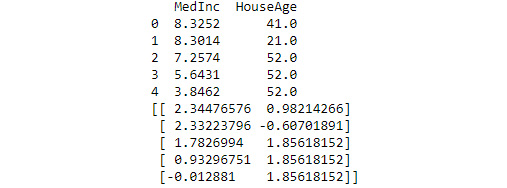
Figure 6.5 – Scaling is an essential part of the multivariate analysis process
- Use PCA to fit a model to the scaled data:
pca = PCA(n_components=2)pca.fit(scale(X))
C = pca.transform(scale(X))
print(C)
print("Original Shape: ", X.shape)
print("Transformed Shape: ", C.shape)
The pca.transform() method performed dimensionality reduction. You can see the result of the fitting process and dimensionality reduction in Figure 6.6:

Figure 6.6 – Fitting the data and then transforming it provides data you can plot
- Plot the data to see the result of the analysis:
plt.title('PCA Outlier Detection')plt.xlabel('Component 1')
plt.ylabel('Component 2')
plt.scatter(C[:,0],C[:,1], s=2**7, edgecolors='white',
    alpha=0.85, cmap='autumn')
plt.grid(which='minor', axis='both')
plt.show()
The output in Figure 6.7 clearly shows the outliers in the upper-right corner of the plot. The x- and y-axis data appears first in the call to plt.scatter(). The remainder of the arguments affects presentation: s for the marker size, edgecolors for the line around each marker (to make them easier to see), alpha to control the marker transparency, and cmap to control the marker colors:
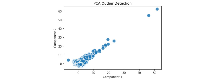
Figure 6.7 – The outliers appear in the upper right corner of the plot
To use this method effectively, you need to try various comparisons to find the correlations that will make the security picture easier for you to discern. In addition, you may find that you need to use more than just two features, as this example has done. Perhaps there is a correlation between invalid logins, IP addresses, and time of day. Until you model the data for your particular network, you really don’t know what the anomalies you suspect will tell you about your security picture.
Going overboard with analysis
It would be quite easy to go overboard with the analysis you want to perform by testing a ridiculous number of combinations and looking for patterns that aren’t there. Human intuition is extremely important in determining which combinations to try and figuring out what data actually is an anomaly and which is a novelty. The computer can’t perform this particular task for you. PCA only works when the human performing it makes decisions based on previous experience, current trends, network uniqueness, and anticipated or viewed behaviors.
Relying on Cook’s distance
Cook’s distance is all about measuring influence. It detects the amount of influence that a particular observation has on a model. When it comes to anomalies, a very influential observation is likely an outlier or novelty. Using Cook’s distance properly will help you see specifically where the outliers reside in the dataset. Removing these outliers can help you create a better baseline of what is normal for the dataset and makes anomaly detection easier.
Note that before you can run this example, you need to have Yellowbrick (https://www.scikit-yb.org/en/latest/) installed. The following command will perform the task for you:
conda install -c districtdatalabs yellowbrick
However, if you don’t have Anaconda installed on your system, you can also add this code to a cell in your notebook to install it:
modules = !pip list
installed = False
for item in modules:
    if ('yellowbrick' in item):
        print('Yellowbrick installed: ', item)
        installed = True
if not installed:
    print('Installing Yellowbrick...')
    !pip install yellowbrick
In this second case, the code checks for the presence of Yellowbrick on your system and installs it if it isn’t installed. This is a handy piece of code to keep around because you can use it to check for any dependency and optionally install it when not present. In addition, this piece of code will work with alternative IDEs, such as Google Colab. Using this check will make your code a little more bulletproof. If Yellowbrick is already installed, you will see an output similar to this showing the version you have installed:
Yellowbrick installed: yellowbrick 1.5
Once you have Yellowbrick installed, you can begin working with the example code using the following steps:
- Import the required dependencies:
from yellowbrick.regressor import CooksDistance
- Import a new copy of the California housing dataset that’s formed in a specific way as show in the following code snippet:
california = fetch_california_housing(as_frame = True)X = california.data["MedInc"].values.reshape(-1, 1)
y = range(len(X))
- Printing the result of the import shows how X is formatted for use with Yellowbrick. The y variables are simply values from 0 through the length of the data to act as an index for the output:
print(X)
Figure 6.8 shows a sample of the output you should see:

Figure 6.8 – Ensure your data is formatted correctly for the visualizer
- Create a CooksDistance() visualizer to see the data, use fit() to fit the data to it, and then display the result on screen using show():
visualizer = CooksDistance()visualizer.fit(X, y)
visualizer.show()
The stem plot output you see should look similar to that shown in Figure 6.9. Notice that the anomalies are readily apparent and that you know areas that contain records with anomalous data. In addition, the red dashed line tells you the average of the records so that you can see just how far out of range a particular value is:
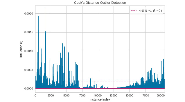
Figure 6.9 – The Cook’s distance approach gives you specific places to look for anomalies
Cook’s distance reduces the work you need to perform to determine where anomalies occur so that you aren’t searching entire datasets for them. If this were a data stream, the y value could actually be time increments so that you’d know when the anomalies occur. By slicing and dicing your data in specific ways, you can quickly check for anomalies in a number of useful ways.
Relying on the z-score
Obtaining the z-score for data points in a dataset can help you detect specific instances of outliers. There are a number of ways to do this, but the basic idea is to determine when a particular data point value falls outside of a specific range, normally beyond the third deviation. Fortunately, the math for performing this task is simplified by using NumPy (https://numpy.org/), rather than calculating it manually.
Using seaborn (https://seaborn.pydata.org/) greatly reduces the amount of work you need to do to visualize your data distribution. This example relies on seaborn version 0.11 and above. If you see an error message stating that module 'seaborn' has no attribute 'displot', it means that you have an older version installed. You can update your copy of seaborn using this command:
pip install --upgrade seaborn
The following example shows a technique for actually listing the records that fall outside of the specified range and understanding how the records in the dataset fall within a particular distribution:
- Import the required dependencies:
import numpy as npimport seaborn as sns
- Obtain an updated copy of the California housing data for median income:
X = california.data["MedInc"]
- Determine the mean and standard deviation for the data:
mean = np.mean(X)std = np.std(X)
print('Mean of the dataset is: ', mean)
print('Standard deviation is: ', std)
You’ll see an output like this when you run the code:
Mean of the dataset is:  3.8706710029070246
Standard deviation is:  1.899775694574878
- Create a list of precisely which records fall outside the third deviation:
threshold = 3record = 1
z_scores = []
for i in X:
    z = (i - mean) / std
    z_scores.append(z)
    if z > threshold:
        print('Record: ', record, ' value: ', i)
    record = record + 1
Figure 6.10 shows the results of performing this part of the task. Notice the method for calculating the z-score, z, is simplified by using NumPy. The resulting data tells you where each record falls in the expected range. The output is the records that fall outside the third standard deviation and may be an outlier:

Figure 6.10 – You now have a precise list of the records that could contain outliers
- Plot the standard distribution of the z-scores:
axes = sns.displot(z_scores, kde=True)axes.fig.suptitle('Z-Scores for MedInc')
axes.set(xlabel='Standard Deviation')
Figure 6.11 shows you how this data fares. This graph shows that not many of the values are significantly out of range (the third deviation, either plus or minus), but that a few are and that some of them are quite a bit outside the range (up to six deviations):

Figure 6.11 – Viewing the distribution plot can tell you just how much the data is outside of the expected range
By now, you should be seeing a progression with the various examples presented in this and the three previous sections. A simple box plot can tell you whether your data is solid, PCA can tell you where the data is outside of the range, the Cook’s distance can help you narrow down the record areas and show patterns of outliers, and the z-score can be very specific in telling you precisely which records are potential outliers. The danger in all of this analysis is that you are faced with too much information of any sort. You don’t want to become mired in too much detail, so use the level of detail that satisfies the need at the time.
Forecasting potential anomalies example
As mentioned earlier in the chapter, it’s not really possible to predict anomalies. For example, you can’t write an application that predicts that a certain number of users will enter incorrect data in a particular way today. You also can’t create an application that will automatically determine what a hacker will attack today. However, you can predict, within a reasonable amount of error, what will likely happen in certain situations.
When you start a new project, you should be able to predict certain outcomes. If the prediction turns out to be completely false, then there might be something more than bad luck causing problems; you might be encountering outside influences, a lack of training, bad data, bad assumptions, or something else, but it all boils down to dealing with some sort of anomaly. One way to predict the future is to rely on a product such as BigML (https://bigml.com/) that provides an easy method of creating predictive models for all sorts of uses, such as those shown at https://bigml.com/gallery/models. Of course, you have to pay for the privilege of using such a product in many cases (there are also free models that may fit your needs).
Time series data provides a particularly interesting problem because the data is serialized. What occurs in the past affects the now and the future. However, because each data point in a time series is individual, it also violates many of the rules of statistics. From a security perspective, this individuality makes it hard to determine whether the increase in user input today, as contrasted to yesterday or last week on the same day, is a matter of an anomaly, a general trend, or simply random variance.
Fortunately, you can forecast many problems without using exotic solutions when you have historical data. The example in this section forecasts future passenger levels on an airline based on historical passenger levels. The MLSec; 06; Forecast Passengers.ipynb file contains source code and some detailed instructions for performing predictions on your data.
Obtaining the data
If you use the downloadable source, the code automatically downloads the data for you (as shown here) and places it in the code folder for you. Otherwise, you can download it from https://raw.githubusercontent.com/jbrownlee/Datasets/master/airline-passengers.csv. The file is only 2.18 KB, so the download won’t take long:
import urllib.request
import os.path
filename = "airline-passengers.csv"
if not os.path.exists(filename):
    url = "https://raw.githubusercontent.com/
        jbrownlee/Datasets/master/airline-passengers.csv"
    urllib.request.urlretrieve(url, filename)
Viewing the airline passengers data
One of the things that make the airline passengers dataset so useful for seeing how predictions can work is that it shows a definite cycle in values. The following steps show how to see this cycle for yourself:
- Import the required dependencies. Note that you may see a warning message when working with this example and using matplotlib versions greater than 3.2.2. You can ignore these warnings as they don’t affect the actual output:
import pandas as pdimport numpy as np
import matplotlib.pyplot as plt
import matplotlib.ticker as ticker
%matplotlib inline
- Read the dataset into memory and obtain specific values from it:
apDataset = pd.read_csv('airline-passengers.csv')passengers = apDataset['Passengers']
months = apDataset['Month']
What the example is most interested in is the number of passengers per month. To put this into security terms, you could use the same technique to see the number of suspect API calls per month or the number of invalid logins per month. It also doesn’t have to be a monthly interval. You can use any equally spaced interval you want, perhaps hourly, perhaps by the minute.
- Plot the data on screen:
fig = plt.figure()ax = fig.add_axes([0.0, 0.0, 1.0, 1.0])
ax.plot(passengers)
ticks = months[0::12]
ticks = pd.concat([pd.Series([' ']), ticks])
ax.xaxis.set_major_locator(ticker.MultipleLocator(12))
ax.set_xticklabels(ticks, rotation='vertical')
start, end = ax.get_ylim()
ax.yaxis.set_ticks(np.arange(100, end, 50))
ax.grid()
plt.show()
The output is a simple line plot using the ax.plot(passengers) call. Here, ticks are simply the first month of each year, which are displayed on the x axis. The y axis starts at a value of 100 and ends at 650 using ax.yaxis.set_ticks(np.arange(100, end, 50)). To make the values easier to read, the code calls ax.grid() to display grid lines. As you can see from Figure 6.12, the data does have a specific cycle to it as the number of passengers increases year by year.

Figure 6.12 – A line chart of the airline passengers dataset shows a definite pattern
This is the sort of pattern you need to see in security data as well to make useful predictions. There has to be some sort of pattern, or it will be quite hard to create any sort of accurate prediction. The better the pattern, the better the prediction.
Showing autocorrelation and partial autocorrelation
This part of the example comes in two parts: autocorrelation and partial autocorrelation. Both help you make predictions about the future state of data based on both historical and current information.
Autocorrelation is a statistical measure that shows the similarity between observations as a function of time lag. It looks at how an observation correlates with a time lag (previous) version of itself. Using autocorrelation helps you see patterns in the data so that you can understand the data better. This example reviews the autocorrelation for 3 years (36 months) of airline passenger data. The time interval is a month in this case, so each lag is 1 month, and there are 36 lags. Since all of the points in the graph are above 0, there is a positive correlation between all of the entries. The pattern shows that the data is seasonal. Here are the steps needed to perform an autocorrelation with the air passenger dataset:
- Import the required dependencies. Note that NumPy may complain about certain data types in the statsmodels package (https://www.statsmodels.org/stable/index.html). There is nothing you can do about this warning and can safely ignore it. The statsmodels package developer should fix the problem soon:
from statsmodels.graphics import tsaplots
- Create the plot:
fig = tsaplots.plot_acf(passengers, lags=36)fig.set_size_inches(9, 4, 96)
plt.show()
The code relies on a basic plot found in the statsmodels package, plot_acf(). All you supply is the data and the number of lags. Figure 6.13 shows the autocorrelations and associated confidence cone:

Figure 6.13 – An example of an autocorrelation plot with a confidence cone
The cone drawn as part of the plot is a confidence cone and shows the confidence in the correlation values, which is about 80 percent in this case near the end of the plot. More importantly, data with a high degree of autocorrelation isn’t a good fit for certain kinds of regression analysis because it fools the developer into thinking there is a good model fit when there really isn’t.
The partial autocorrelation measurement describes the relationship between an observation and its lag. An autocorrelation between an observation and a prior observation consists of both direct and indirect correlations. Partial autocorrelation tries to remove the indirect correlations. In other words, the plot shows the amount of each data point that isn’t predicted by previous data points so that you can see whether there are obvious extremes (data points that don’t quite fit properly). Ideally, none of the data points after the first two or three should exceed 0. You use the following code to perform the partial autocorrelation using another standard statsmodel package plot, plot_pacf():
fig = tsaplots.plot_pacf(passengers, lags=36)
fig.set_size_inches(9, 4, 96)
plt.show()
When you run this code, you will see the output shown in Figure 6.14:

Figure 6.14 – A partial autocorrelation plot shows the relationships between an observation and its lag
The plot shows two lags that are quite high, which provides the term for any autoregression you perform of 2 (any predictions made by an autoregressive model rely on the previous two data points). If there were three high lags, then you’d use an autoregression term of 3. Look at month 13: it has a higher value due to some inconsistency. The gray band shown across the plot is the 95 percent confidence band.
By the time you’ve got to this point in the chapter, you may be wondering how you’ll ever write enough code to cover all of the techniques you find here, much less study the output of all of the applications you seemingly need to write. The fact is that no one can write that much code or study that much output. The next section of the chapter is essential because it helps you put everything into perspective so that you can create an effective detection and mitigation strategy that you’ll actually be able to follow.
Making a prediction
Now that you’ve looked at the autocorrelation for the data, it’s time to use the data to create a predictive model. The following steps show how to perform this process using the statsmodel package used earlier (there are obviously many other ways to perform the same task using other techniques, such as XGBoost):
- Import the required dependencies:
from statsmodels.tsa.ar_model import AutoRegfrom sklearn.metrics import mean_squared_error
from math import sqrt
- Import the data and split it into training and testing data:
series = pd.read_csv('airline-passengers.csv',    header=0, index_col=0,
    parse_dates=True, squeeze=True)
X = series.values
train, test = X[1:len(X)-7], X[len(X)-7:]
print("Training Set: ", train)
print("Testing Set: ", test)
The data is read using a different technique this time because you need to format it in a different way for analysis. The resulting data appears as simply a list, as shown in Figure 6.15:

Figure 6.15 – The data is formatted using a different approach to meet the needs of the model software
- Create a model based on the training data:
model = AutoReg(train, lags=29)model_fit = model.fit()
print('Coefficients: %s' % model_fit.params)
Remember that you’ve split the 36 lags defined in earlier sections into a training set of 29 lags and a testing set of 7 lags, so you only have 29 lags to train the model. The example prints the coefficients for the model, which indicate the direction of the relationship between a predictor variable and the response variable, as shown in Figure 6.16:
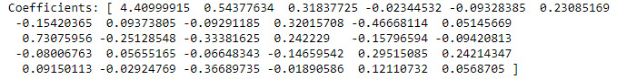
Figure 6.16 – The coefficients for the predictive model
- Make a prediction and compare that prediction to the test data:
predictions = model_fit.predict(start=len(train),    end=len(train)+len(test)-1,
    dynamic=False)
for i in range(len(predictions)):
    print('predicted=%f, expected=%f'
        % (predictions[i], test[i]))
rmse = sqrt(mean_squared_error(test, predictions))
print('Test RMSE: %.3f' % rmse)
The example computes the root-mean-square error (RMSE) of the difference between the predicted value and the actual value and then outputs it, as shown in Figure 6.17. In this case, the RMSE is 18.165 percent, which is a little high but would be better with more data:

Figure 6.17 – Show the predictions, the expected values, and the RSME
- Plot the prediction (in red) versus the actual data (in blue):
plt.plot(test)plt.plot(predictions, color='red')
plt.show()
Figure 6.18 shows that despite a somewhat high RSME, the prediction follows the test data pretty well:

Figure 6.18 – The model’s ability to predict the future closely matches the actual data
Now that you’ve created a model and tested it, you can use it to predict the future within a certain degree of accuracy, as defined by the RSME, and also take into account that the prediction will become less accurate the further you go into the future. The next section will take the next steps and discuss how you can use anomaly detection in an ML environment in an effective way. It’s not really enough to simply detect what may appear as anomalies; they need to be identified as true anomalies instead of novelties or possibly noise.
Using anomaly detection effectively in ML
Everyone has their own opinion of how to work effectively with ML; they can even back up their opinion with favorable statistics. Making things worse, you can find new techniques appearing on a daily basis, adding to the already burgeoning pile of strategies that will likely work within a certain range of probability. The one word that you need to keep in mind is effective. An anomaly detection strategy is only effective if you can use it regularly, and therein lies the problem for most overworked security professionals. So, here are some methods you can employ to make whatever ML strategy you use to detect anomalies effective:
- Ensure you actually use the strategy on a regular basis; daily is best
- Use the simplest approach that will work for your organization and you as an individual
- Look for anomalies that are actually likely to affect your organization
- Keep in mind that most anomalies will end up being novelties that you can hand off to someone else and keep your focus on hackers
- Rely on pre-built models only when the model is built specifically for your industry by professionals that understand it
Ultimately, this list is about people and not necessarily about software. The software will do what you tell it to do, computers are faithful in that manner. What you need to do is come up with the correct questions for the software to answer, which means knowing as much about potential anomalies as possible and understanding how these anomalies can lead you to hacker activities.
The next section of the chapter considers other mitigation techniques. A major problem with most approaches to security is that the people involved are looking for a simple fix and security is anything but simple. There is no amount of automation that will solve every issue, which is why you keep seeing reports of breaches in the news. These other techniques may seem to be outside the purview of the security professional and are definitely things you can’t write an application to accomplish, but they’re still necessary, and, unfortunately, they’re neglected far too often.
Considering other mitigation techniques
The Using anomaly detection versus supervised learning and Using and combining anomaly detection and signature detection sections of this chapter look at anomaly detection when combined with supervised learning techniques and signature detection. These two sections broach the topic of finding a way to create a defense in-depth strategy for your infrastructure. Developing multiple layers of detection is a strategy that most security experts see as crucial for stemming the tide of hacker attacks, at least to some extent. However, it’s also important to understand that combining ML anomaly detection with other software strategies won’t completely fix the problem because the issue is one of automation. In order to have the greatest chance of success, you need humans to help see the patterns in data creation, usage, and modification that are anomalous in nature. When considering anomaly detection, also include these human-based observations and mitigation strategies:
- Track behavioral changes. Security personnel should be involved with the people at your workplace enough that they can see patterns in how people act, and they should be authorized to question changes in established patterns.
- Review dashboard data frequently for changes in the way that users, customers, trusted third parties, and the like interact with your system.
- Ensure that security checks actually are run and that references actually are checked. If you don’t make the required checks, then you have no idea who is accessing the network or what they’re doing with it.
- Set aside time to actually look for trouble rather than relying on it hitting the people you trust in the face.
- Ask everyone to look for potential problems. Security personnel will look for a certain class of problems, but they won’t see it all. Someone working in accounting may see an anomaly that the security people may not even understand.
In 2020, Gartner established a new category of cybersecurity tools called network detection and response (NDR) (https://www.gartner.com/en/documents/3986225/market-guide-for-network-detection-and-response). Unfortunately, the report comes at a cost, so you either need to pay up or find an alternative, such as IronNet (https://www.ironnet.com/what-is-network-detection-and-response), where the essence of the report is explained. Essentially, it comes down to a third party monitoring your network (in addition to the monitoring you provide for yourself) and then acting when the vendor detects a threat. Some of the focuses of these vendors cover areas where your organization may not have the required personnel, such as monitoring your IoT devices. These organizations also keep up with the latest threats—something that your own personnel may not have time to do well.
Summary
The important takeaway of this chapter is about being observant but not being paranoid. An anomaly is always unexpected, but it’s not always malicious or an indicator of impending doom. Some anomalies are actually welcome because they’re novelties that signify a trend toward something positive. The techniques that this chapter contains help you to differentiate between novelties and hacker attacks so that you don’t waste time chasing data that doesn’t matter in security matters.
A large part of this chapter focused on showing various techniques for discovering anomalies so that you can mitigate them. Even though the univariate approach may seem weak, it also has the benefit of being both fast and simple. You should first try the univariate approach before moving on to the more complex techniques used for multivariate analysis. When it comes to security, speed and simplicity do matter, and some advice you might find in data science texts for fully discovering your data may not apply as much when you need an answer now rather than allow that hacker time with your data, applications, and network.
Predicting anomalies isn’t feasible. However, predicting when the conditions are ripe for an anomaly to occur can be done with some amount of accuracy. Just how accurate such a prediction will be depends on your reading of your security environment. However, it’s essential to remember that just because conditions indicate that an anomaly could happen, doesn’t mean that the event will occur. What it really means is that there is a need for additional vigilance on your part.
The next chapter moves on to malware, which is code that is designed to do something harmful to your data, applications, network, or personnel. Malware may not always make itself known. In fact, from the hacker’s perspective, the longer the malware remains hidden, the better. Of course, there are exceptions, such as ransomware, when the hacker most definitely wants you to know something terrible has happened, but there is a fix for a price. Chapter 7 will take more of a global view of malware rather than focus on one particular aspect, as is done in some books. Yes, monitoring individual machines for malware is important (and the chapter will provide you with resources to do so), but Chapter 7 has a strong emphasis on web-based applications and users relying on multiple machines to perform their work today; a global approach is both valuable and necessary.
Further reading
The following list will provide you with some additional reading that you may find useful in further understanding the materials in this chapter.
- A subset of the ImageNet dataset that is easier to use for experimentation: Tiny ImageNet: https://paperswithcode.com/dataset/tiny-imagenet
- This paper provides some interesting ideas on how to create an anomaly detection setup based on supervised methods: Toward Supervised Anomaly Detection: https://arxiv.org/ftp/arxiv/papers/1401/1401.6424.pdf
- This article provides additional information on the differences between MAD and STDEV: Relationship Between MAD and Standard Deviation for a Normally Distributed Random Variable: https://blog.arkieva.com/relationship-between-mad-standard-deviation/
- Understand the math behind PCA a little better: A Step-by-Step Explanation of Principal Component Analysis (PCA): https://builtin.com/data-science/step-step-explanation-principal-component-analysis
- Learn more about autocorrelation and time series: Autocorrelation in Time Series Data: https://dzone.com/articles/autocorrelation-in-time-series-data
- Understand the difference between autocorrelation and partial autocorrelation better: What’s The Difference Between Autocorrelation & Partial Autocorrelation For Time Series Analysis?: https://besmarv.medium.com/interpreting-autocorrelation-partial-autocorrelation-plots-for-time-series-analysis-23f87b102c64