Chapter 3. Composing components
In the previous chapter, you learned the fundamentals of Vue and how to write a Vue component with common directives using Options API. You are now ready to deep dive into the next level: composing more complex Vue components with reactivity and hooks.
This chapter introduces the Vue Single File Component (SFC) standard, component lifecycle hooks, and other advanced reactive features such as computed properties, watchers, methods, and refs. You will also learn to use slots to dynamically render different parts of the component while maintaining the component’s structure with styles. By the end of this chapter, you will be able to write complex Vue components in your application.
Vue single file component structure
Vue introduces a new file format standard - Vue SFC1, denoted by the .vue extension. With SFC, you can write the HTML template code, the JavaScript logic, and the CSS stylings for a component in the same file, each in its dedicated code section. A Vue SFC contains three essential code sections, including:
-
template - This HTML code block renders the UI view of the component. It should only appear once per component.
-
script - This JavaScript code block contains the component’s main logic and only appears a maximum of once per component file.
-
style - This CSS code block contains the stylings for the component. It is optional and can appear as many times as required per component file.
Below is an example of an SFC file structure for a Vue component named MyFirstComponent:
Example 3-1. Example of SFC structure of MyFirstComponent component
<template><h2class="heading">I am a a Vue component</h2></template><scriptlang="ts">exportdefault{name:'MyFistComponent',};</script><style>.heading{font-size:16px;}</style>
We can also refactor a non-SFC component code into SFC, as shown in Figure 3-1 below:
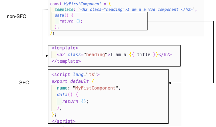
Figure 3-1. Creating the component from non-SFC format to SFC format
In the above screenshot (Figure 3-1), we perform the following refactoring:
-
Move the HTML code presented as the string value of the
templatefield into the<template>section of the single file component. -
Move the rest of
MyFirstComponentlogic into the<script>section of the single file component, as part of theexport default {}object.
Tip Using TypeScript
You should add the attribute lang="ts" for TypeScript to the <script> syntax, as <script lang="ts"> , so the Vue engine knows to handle the code format accordingly.
Since .vue file format is a unique extension standard, you need to use a special build tool (compiler/transpiler) such as Webpack, Rollup, etc., to pre-compile the relevant files into proper JavaScript and CSS for serving on the browser side. When creating a new project with Vite, Vite already sets up these tools as part of the scaffolding process for you. You then can import the component as an ES module and declare it as internal components to use in other component files.
Below is an example of importing MyFirstComponent located in components directory to use in App.vue component:
<scriptlang="ts">importMyFirstComponentfrom'./components/MyFirstComponent.vue';exportdefault{components:{MyFirstComponent,}}</script>
And you can use the imported component by referring to its name, either by CamelCase or snake-case, in the template section:
Example 3-2. How to use the imported component
<template><my-first-component/><MyFirstComponent/></template>
The above code generates the MyFirstComponent component’s content twice, as shown in Figure 3-2
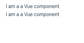
Figure 3-2. MyFirstComponent output
Note
A component’s template in Example 3-2 contains two root elements. This fragmentation capability is available only in Vue 3.x onwards.
We learned how to create and use a Vue component using the SFC format. As you notice, we define lang="ts" in the script tag to inform the Vue engine about our usage of TypeScript. And thus, the Vue engine will apply stricter type validation on any code or expressions presented in the script and template sections of the component.
However, to fully enjoy TypeScript’s benefits in Vue, we need to use the defineComponent() method when defining a component. We will learn more about this in the next section.
Using defineComponent() for TypeScript support
The defineComponent() method is a wrapper function that accepts an object of configurations and returns the same thing with type inference for defining a component.
Note
The defineComponent() method is only available in Vue 3.x onwards and only relevant when TypeScript is required.
Below is an example of using defineComponent() to define a component:
Example 3-3. Defining a component with defineComponent()
<template><h2class="heading">{{ message }}</h2></template><scriptlang="ts">import{defineComponent}from'vue';exportdefaultdefineComponent({name:'MyMessageComponent',data(){return{message:'Welcome to Vue 3!'}}});</script>
If you use VSCode as your IDE, and have Volar extension installed, you will see the type of message as string when hovering on message in the template section, as shown in Figure 3-3.
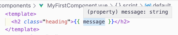
Figure 3-3. Generated type for message property of MyMessageComponent displayed on hover
You should only consider to use defineComponent() for TypeScript support in complex components such as accessing a component’s properties through this instance. Otherwise, you can use the standard method for defining an SFC component.
Note
In this book, you will see a combination of the traditional component definition approach and defineComponent() when suitable. You are free to decide whichever method is acceptable to you.
Next, we will explore the lifecycle of a component and its hooks.
Component Lifecycle Hooks
The lifecycle of a Vue component starts when Vue instantiates the component and ends when destroying the component instance (or unmounting).
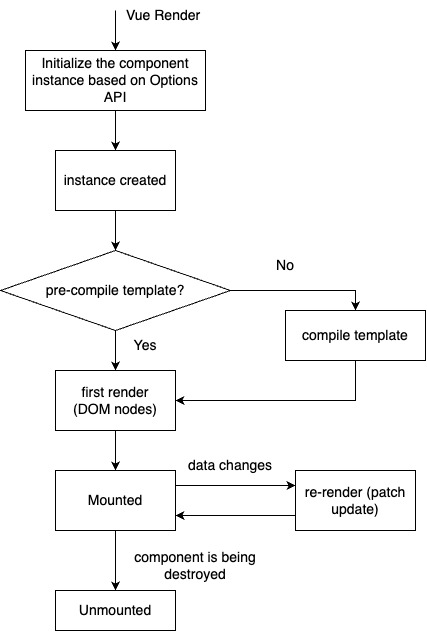
Figure 3-4. Flow graph of a Vue component lifecycle
Vue divides the component’s lifecycle into the phases(Figure 3-4):
-
Initialize phase - the Vue renderer loads the component’s option configurations and prepares for the component instance creation.
-
Creating phase - the Vue renderer creates the component instance. If the template requires compiling, there will be an additional step to compile it before moving forward to the next phase.
-
First render phase - the Vue renderer creates and inserts the DOM nodes for the component in its DOM tree.
-
Mounting phase - The component’s nested elements are already mounted and attached to the component’s DOM tree, as seen in Figure 3-5. The Vue renderer then attaches the component to its parent container. From this phase onwards, you have access to the component’s
$elproperty, representing its DOM node. -
Updating phase - only relevant if the component’s reactive data changes. Here the Vue renderer re-renders the DOM nodes for the component with the new data and performs a patch update. Similar to the mounting phase, the update process finishes with the child elements first and then the component itself.
-
Unmounting phase - the Vue renderer detaches the component from the DOM and destroys the instance and all its reactive data effects. This phase is the last phase of the lifecycle, happening when the component is no longer in use in the application. Similar to the updating and mounting stages, a component can only unmount itself after all its children are unmounted.
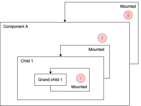
Figure 3-5. An example demonstrates the mounting order for a component and its children
Vue allows you to attach some events to specific transitions between these lifecycle phases for better component flow control. We call these events lifecycle hooks. The following are the lifecycle hooks available in Vue:
setup
setup is the first event hook before the component’s lifecycle starts. This hook runs once before Vue instantiates the component. At this phase, no component instance exists; hence there is no access to this.
exportdefault{setup(){console.log('setup hook')console.log(this)// undefined}}
Note
An alternative to the setup hook is adding the setup attribute to the script tag section of the component (<script setup>).
The setup hook is mainly for use with the Composition API (we will learn more in Chapter 6). Its syntax is as below:
setup(props, context) {
  // ...
}
setup() takes two arguments, including:
-
props- an object that contains all the props passed to the component, declared using thepropsfield of the component’s options object. Each ofprops’s properties is reactive data. You don’t need to returnpropsas part of thesetup()return object.
Note
If you use <script setup>, you need to use defineProps() to define and access these props. See “Declaring props using defineProps() and withDefaults()”.
-
context- a non-reactive object that contains the component’s context, such asattrs,slots,emit, andexpose.
setup() returns an object that contains all the references to the component’s internal reactive state and methods and any static data. Suppose you use <script setup>; you don’t need to return anything. In that case, Vue will automatically translate all the variables and functions declared within this syntax into the appropriate setup() return object during compilation. You then can access them in the template or other parts of the component’s options object using the this keyword.
Below is an example of using setup() hook to define a component that prints out a static message:
Example 3-4. Defining a component with setup() hook
import{defineComponent}from'vue';exportdefaultdefineComponent({setup(){constmessage='Welcome to Vue 3!'return{message}}})
Note here that message is not reactive data. To make it reactive, you must wrap it with the ref() function from the Composition API. We will learn more about this later. Also, we don’t need to define message as part of the data() object anymore, reducing the amount of undesired reactive data in a component.
Alternatively, you can write the above component using the <script setup> syntax:
Example 3-5. Defining a component with <script setup> syntax
<scriptsetuplang='ts'>constmessage='Welcome to Vue 3!'</script>
One great thing about using <script setup> instead of setup() is that it has built-in TypeScript support. Hence there is no need for defineComponent() anymore, and writing components takes less code.
When using setup() hook, you can also combine with the h() render function to return a renderer for the component based on the props and context arguments, as seen below:
Example 3-6. Defining a component with setup() hook and h() render function
import{defineComponent,h}from'vue';exportdefaultdefineComponent({setup(props,context){constmessage='Welcome to Vue 3!'return()=>h('div',message)}})
It is helpful to use setup() with h() when you want to create a component that renders a different static DOM structure based on the props passed to it or a stateless functional component (see Figure 3-6 for the output of Example 3-6 above in the Vue tab of Chrome Devtools).
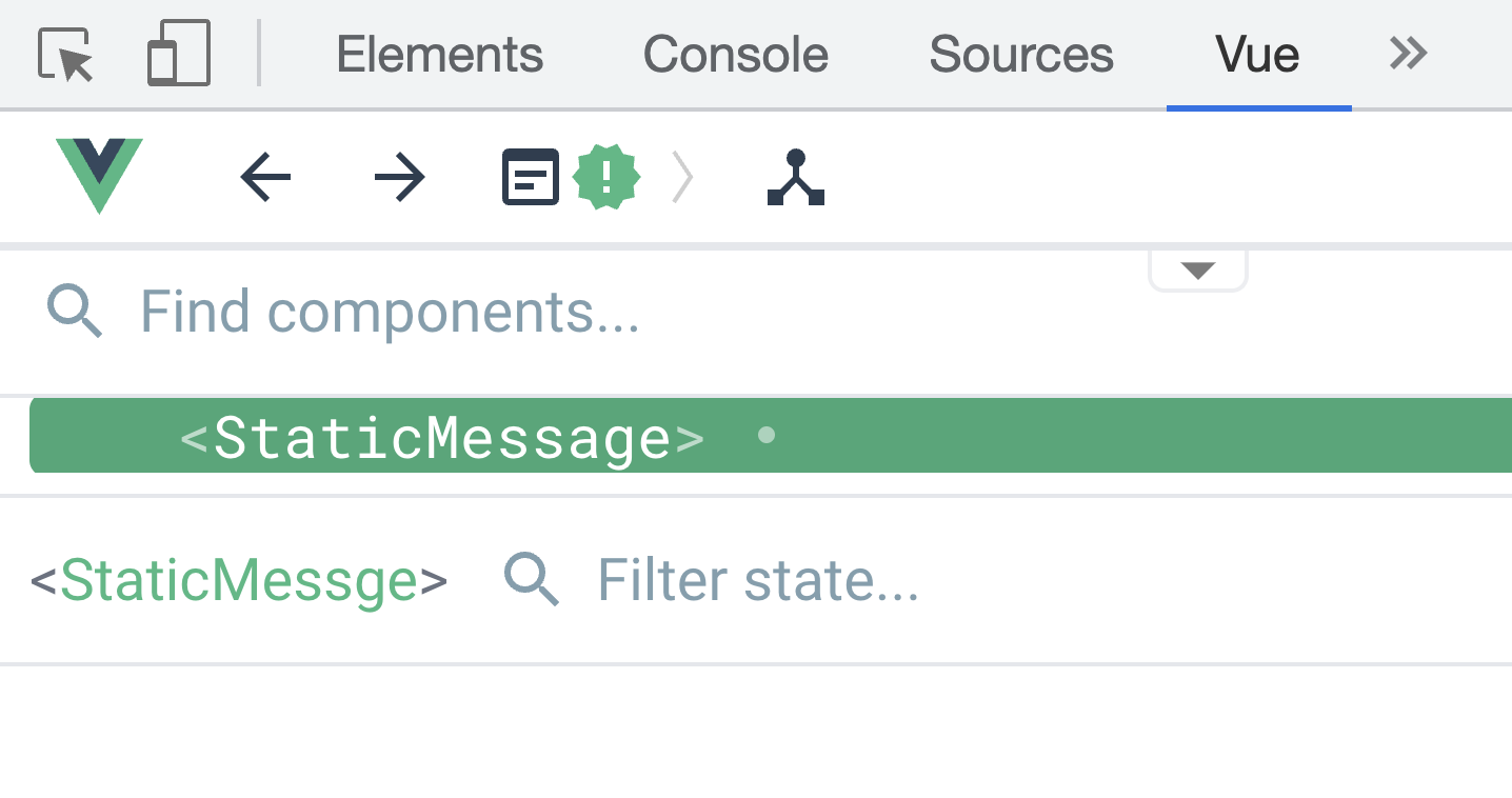
Figure 3-6. How the stateless component using h() render function looks in Vue Devtools
Note
From this point onwards, we will use <script setup> syntax to demonstrate use cases component’s setup() hook due to its simplicity, whenever applicable.
beforeCreate
beforeCreate runs before the Vue renderer creates the component instance. Here the Vue engine has initialized the component but hasn’t triggered the data() function or calculated any computed properties yet. Thus there is no reactive data available.
created
This hook runs after the Vue engine creates the component instance. At this stage, the component instance exists with reactive data, watchers, computed properties, and defined methods. However, the Vue engine hasn’t mounted it to the DOM yet.
created hook runs before the first render of the component. It helps perform any task that requires this to be available, such as loading data from an external resource into the component.
beforeMount
This hook runs after created. Here the Vue render has created the component instance and compiled its template for rendering before the first render of the component.
mounted
This hook runs after the first render of the component. At this phase, the component’s rendered DOM node is available for you to access through the $el property. You can use this hook to perform additional side effect calculations with the component’s DOM node.
beforeUpdate
The Vue renderer updates the component’s DOM tree when the local data state changes. This hook runs after the update process starts and you can still use it to modify the component’s state internally.
updated
This hook runs after the Vue renderer updates the component’s DOM tree.
Note
updated, beforeUpdate, beforeMount and mounted hooks are not available in Server-Side Rendering (SSR).
It would be best if you used this hook with caution since it runs after any DOM update occurs to the component.
Warning
You must not mutate the component’s local data state in this hook.
beforeUnmount
This hook runs before the Vue renderer starts unmounting the component. At this point, the component’s DOM node $el is still available.
unmounted
This hook runs after the unmounting process completes successfully and the component instance is no longer available. This hook can clean up additional observers or effects, such as DOM event listeners.
Note
In Vue2.x, you should use beforeDestroy and destroyed in place of beforeUnmount and mounted respectively.
Both beforeUnmounted and unmounted hooks are not available in Server-Side Rendering (SSR).
In summary, we can redraw our component’s lifecycle diagram with the life cycle hooks, as in the following figure (Figure 3-7):
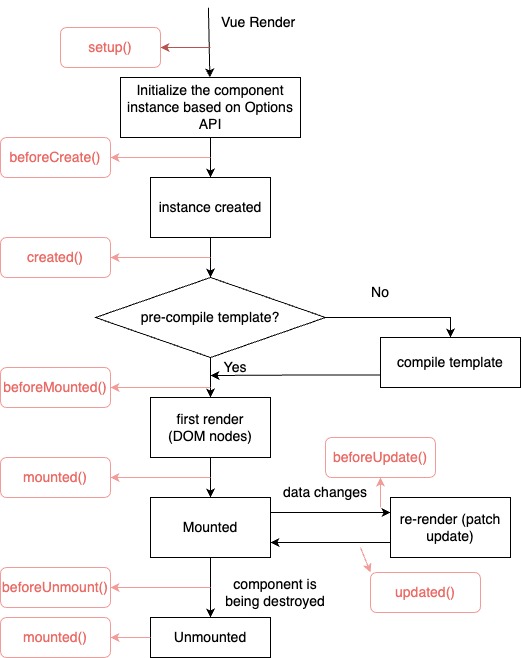
Figure 3-7. Flow graph of a Vue component lifecycle with hooks
We can experiment with the execution order for each lifecycle hook with the following component example:
Example 3-7. Console log the lifecycle hooks
<template><h2class="heading">I am {{message}}</h2><inputv-model="message"type="text"placeholder="Enter your name"/></template><script>import{defineComponent}from'vue'exportdefaultdefineComponent({name:'MyFistComponent',data(){return{message:'',},},setup(){console.log('setup hook triggered!')return{}},beforeCreate(){console.log('beforeCreate hook triggered!')},created(){console.log('created hook triggered!')},beforeMount(){console.log('beforeMount hook triggered!')},mounted(){console.log('mounted hook triggered!')},beforeUpdate(){console.log('beforeUpdate hook triggered!')},updated(){console.log('updated hook triggered!')},beforeUnmount(){console.log('beforeUnmount hook triggered!')},});</script>
When we run the above code in the browser’s inspector console, we will see the following output(Figure 3-8):
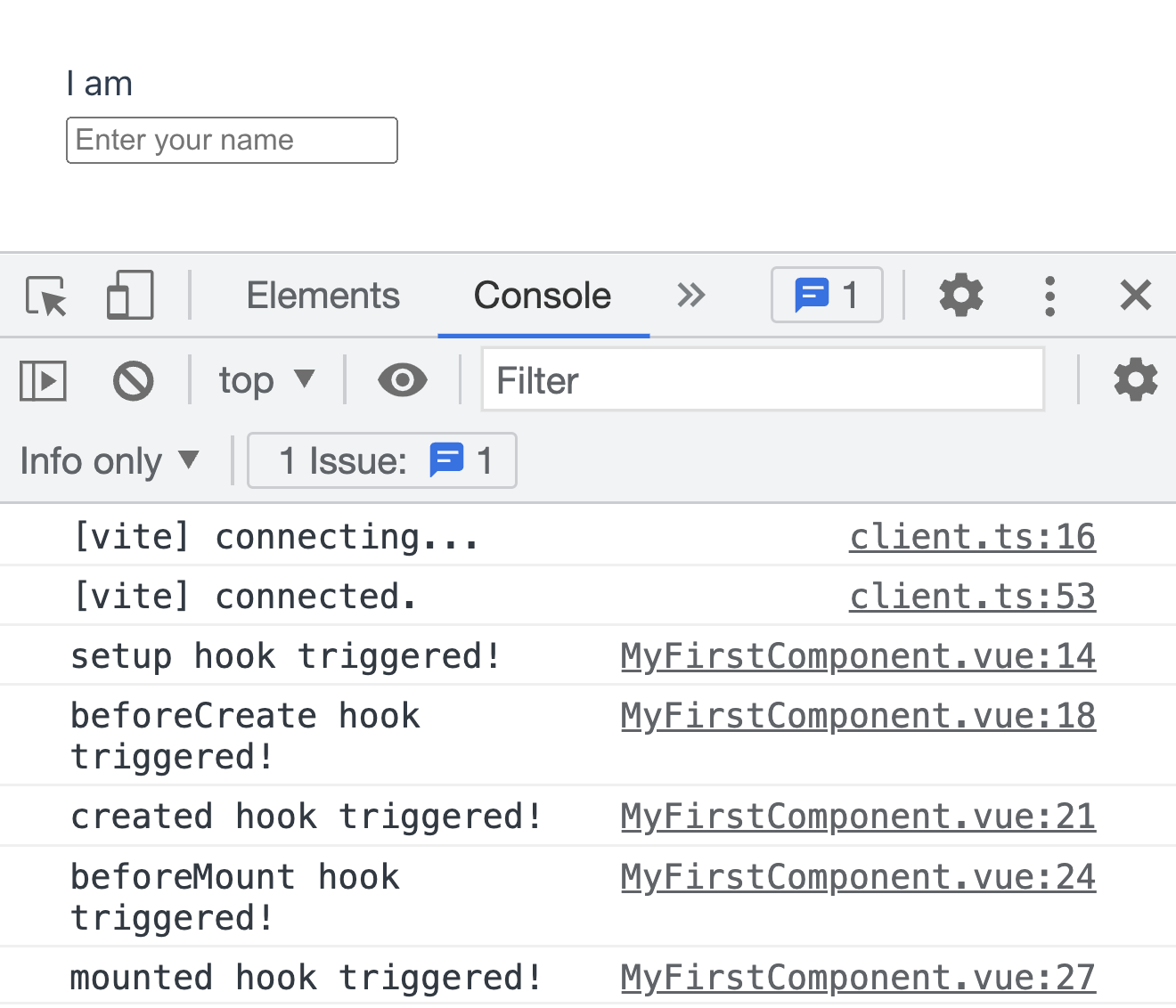
Figure 3-8. Console log output hook order for MyFirstComponent in the first render
When we change the value of the message property, the component re-renders, and the console outputs as follows(Figure 3-9):
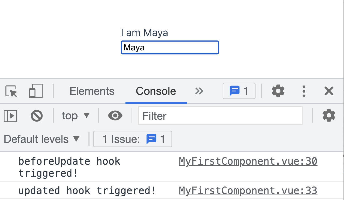
Figure 3-9. Only beforeUpdate and updated hooks are triggered on the second render
We can also review this lifecycle order in the Timeline tab - Performance section of the Vue Devtools, as in Figure 3-10 for the first render:
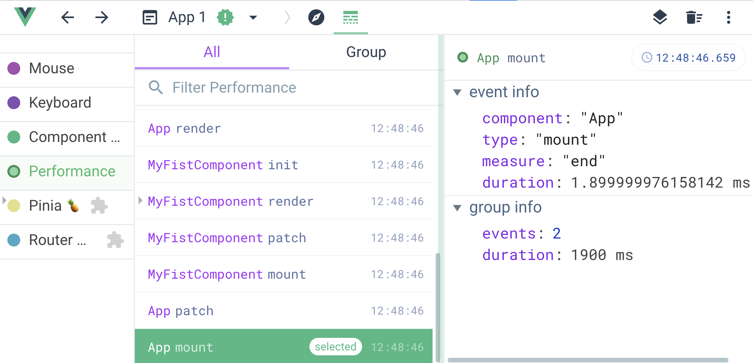
Figure 3-10. Timeline for MyFirstComponent in the first render
And when the component re-renders, the Vue Devtools tab displays the timeline event records as in the below Figure 3-11:
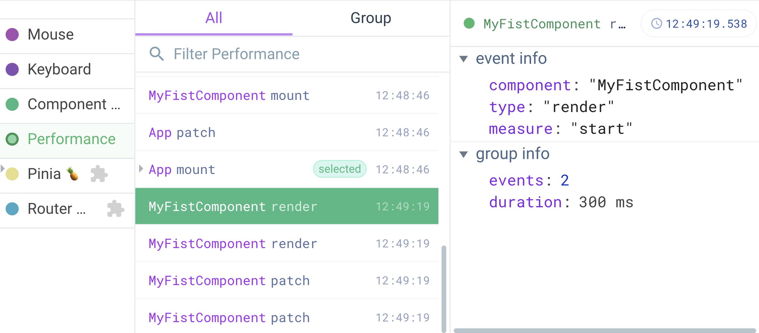
Figure 3-11. Timeline for MyFirstComponent in the second render
Each of the above lifecycle hooks can be beneficial when used accordingly. In the table below, you will find the most common use cases per hook:
| Lifecyle Hook | Use case |
|---|---|
| When you need to load external logic without modifying the component’s data. |
| When there is a need for external loading data into the component. This hook is preferable to the |
| When you need to perform any DOM manipulation or access the component’s DOM node |
At this point, we have learned the component’s lifecycle order and its available hooks. Next, we will look at how to create and organize common component logic into methods with the method property.
Methods
Methods are logic that is not necessary to depend on the component’s data, even though we can access the component’s local state using this instance within a method. Component’s methods are functions defined within the methods property. For example, we can define a method to reverse the message property as follows:
Example 3-8. Defining a method to reverse the message property
<scriptlang="ts">import{defineComponent}from'vue'exportdefaultdefineComponent({name:'MyFistComponent',data(){return{message:'',};},methods:{reverseMessage():string{returnthis.message.split('').reverse().join('')},},});</script>
We can use the reverseMessage method in the component’s template as follows:
Example 3-9. Output the reversed message on the template
<template><h2class="heading">I am {{reversedMessage()}}</h2><inputv-model="message"type="text"placeholder="Enter your message"/></template>
When a user inputs a message’s value in the browser, we can see the following output(Figure 3-12):
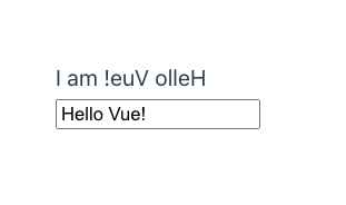
Figure 3-12. Reversed message based on the value of message
You can also modify the reverseMessage method to accept a string argument, making it more reusable and less depending on this.message, as seen below:
Example 3-10. Defining a method to reverse a string
<scriptlang="ts">import{defineComponent}from'vue'exportdefaultdefineComponent({name:'MyFistComponent',data(){return{message:'',};},methods:{reverseMessage(message:string):string{returnmessage.split('').reverse().join('')},},});</script>
And in the template section, we refactor Example 3-9 and pass message as input parameter the reverseMessage method as follows:
<template><h2class="heading">I am {{reverseMessage(message)}}</h2><inputv-model="message"type="text"placeholder="Enter your message"/></template>
The output stays the same as in Figure 3-12.
Also, we can trigger a component’s method within its other properties or lifecycle hooks using this instance. For example, we can split reverseMessage into two smaller methods - reverse() and arrToString(), as in the following code:
/**... */methods:{reverse(message:string):string[]{returnmessage.split('').reverse()},arrToString(arr:string[]):string{returnarr.join('')},reverseMessage(message:string):string{returnthis.arrToString(this.reverse(message))},},
Methods are beneficial in keeping your component’s logic organized. Vue only triggers a method when it is relevant (such as being called in the template as in Example 3-9), allowing us to compute a new data value from local data dynamically. However, for method Vue does not cache the result of its every trigger, and it will always re-run the method whenever a re-render happens. Thus, in scenarios where you need to calculate new data, it is better to use computed properties, which we will explore next.
Computed properties
Computed properties are Vue’s unique features that allow you to calculate new reactive data properties from any reactive data of a component. Each computed property is a function that returns a value and resides within the computed property field.
Below is an example of how we define a newly computed property reversedMessage, which returns the component’s local data message in reversed order:
Example 3-11. A computed property that returns the component’s local message in reversed order
import{defineComponent}from'vue'exportdefaultdefineComponent({name:'MyFirstComponent',data(){return{message:'Hello Vue!'}},computed:{reversedMessage(){returnthis.message.split('').reverse().join('')}}})
You can access reversedMessage computed in the same approach as any component’s local data. The below code shows how we can output the calculated reversedMessage based on the input value of message:
Example 3-12. Computed property example
<template><h2class="heading">I am {{ reversedMessage }}</h2><inputv-model="message"type="text"placeholder="Enter your message"/></template>
Example 3-12 has the same output as in Figure 3-12.
You can also track the computed property in the Component tab of the Vue Devtools (Figure 3-13):
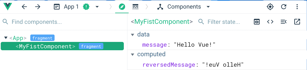
Figure 3-13. Computed properties reversedMessage in the Vue Devtools - Component tab
Similarly, you can access a computed property’s value in the component’s logic through the this instance as its local data property. You can also calculate a new computed property based on the computed property’s value. For example, we can add the length of the reversedMessage property value into a new property reversedMessageLength as in the following code:
Example 3-13. Adding reversedMessageLength computed property
import{defineComponent}from'vue'exportdefaultdefineComponent({/**... */computed:{reversedMessage(){returnthis.message.split('').reverse().join('')},reversedMessageLength(){returnthis.reversedMessage.length}}})
The Vue engine automatically caches the value of computed properties and re-computes the value only when related reactive data changes. In our example (Example 3-12), Vue will only update the value of reversedMessage computed property when message changes. If you want to display or reuse the reversedMessage value in another location within the component, Vue will not need to re-calculate its value.
Using computed properties is very helpful in organizing any complex data modification into reusable data blocks. Thus it reduces the amount of code required and keeps your code clean while improving your component’s performance. Using computed properties also allows us to quickly set up an automatic watcher for any reactive data property, by having them appear in the implementation logic of the computed property function.
However, in some scenarios, this automatic watcher mechanism can be overhead to keep the component’s performance stable. In such cases, we may consider using watchers through the watch property field of the component.
Watchers
Watchers allow you to programmatically watch for changes in any reactive data property of a component and handle them. Each watcher is a function that receives two arguments - the new value (newValue) and the current value (oldValue) of the observed data, respectively. It then performs any logic based on these two input parameters. We define a watcher for reactive data by adding it to the watch property field of the component’s options, following the below syntax:
watch: {
  'reactiveDataPropertyName'(newValue, oldValue) {
    // do something
  }
}
You need to replace the reactiveDataPropertyName with the name of the target component’s data that we want to observe.
Below is an example of how we define a newly watcher to observe for changes in the component’s local data message:
Example 3-14. A watcher that observes for changes in the component’s local message
exportdefault{name:'MyFirstComponent',data(){return{message:'Hello Vue!'}},watch:{message(newValue:string,oldValue:string){console.log(`new value:${newValue}, old value:${oldValue}`)}}}
In the above example, we have defined a message watcher that observes changes in the message property. The Vue engine triggers the watcher whenever the value of message changes. The below Figure 3-14 shows the console log output for the above watcher:
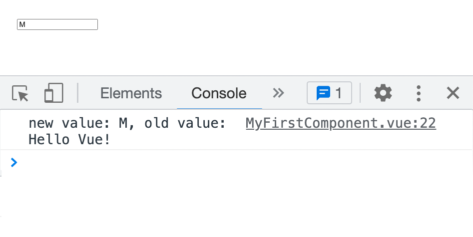
Figure 3-14. Console log output whenever the message changes
We can implement the reservedMessage in Example 3-11 using a watcher on message and data() field instead of computed properties, as seen in the below example:
Example 3-15. A watcher that observes for changes in the component’s local message and updates the value of reversedMessage
import{defineComponent}from'vue'exportdefaultdefineComponent({name:'MyFirstComponent',data(){return{message:'Hello Vue!',reversedMessage:'Hello Vue!'.split('').reverse().join('')}},watch:{message(newValue:string,oldValue:string){this.reversedMessage=newValue.split('').reverse().join('')}}})
The output remains the same as in Figure 3-12. However, I don’t recommend this approach in this specific case, as it is less efficient than using computed properties.
Note
We call any additional logic triggered by the watcher or within the computed property side effects. Side effects can impact the component’s performance; you should handle them with caution.
You can assign the handler function directly to the watcher name. The Vue engine will automatically call the handler with a set of default configurations for watchers. However, you can also pass an object to the watcher’s name to customize the watcher’s behavior, with the following fields:
| Watcher’s field | Description | Accepted type | Default value | Required? |
|---|---|---|---|---|
| The callback function to trigger whenever the target data’s value changes. | Function | N/A | Yes |
| Indicates whether Vue should observe for changes in the nested properties of the target data (if any). | boolean |
| No |
| Indicates whether to trigger the handler immediately after mounting the component. | boolean |
| No |
| Indicates the timing order of the handler’s execution. By default, Vue triggers the handler before updating the Vue component. | pre, post |
| No |
Observing for changes in nested properties
The deep option field allows you to observe changes in all nested properties. Take a user object data in a UserWatcherComponent component with two nested properties - name and age, for instance. We define a user watcher that observes for changes in the user object’s nested properties using the deep option field, as below:
Example 3-16. A watcher that observes for changes in the user object’s nested properties
import{defineComponent}from'vue'typeUser={name:stringage:number}exportdefaultdefineComponent({name:'UserWatcherComponent',data():{user:User}{return{user:{name:'John',age:30}}},watch:{user:{handler(newValue:User,oldValue:User){console.log({newValue,oldValue})},deep:true}}})
In the template section the UserWatcherComponent component, we receive the input for user object’s fields name and age as follows:
Example 3-17. Template section for the UserWatcherComponent
<template><div><div><labelfor="name">Name:<inputv-model="user.name"placeholder="Enter your name"id="name"/></label></div><div><labelfor="age">Age:<inputv-model="user.age"placeholder="Enter your age"id="age"/></label></div></div></template>
In this case, the Vue engine triggers the user watcher whenever the value of user.name or user.age changes. The below Figure 3-15 shows the console log output for the above watcher when we change the value of user.name:
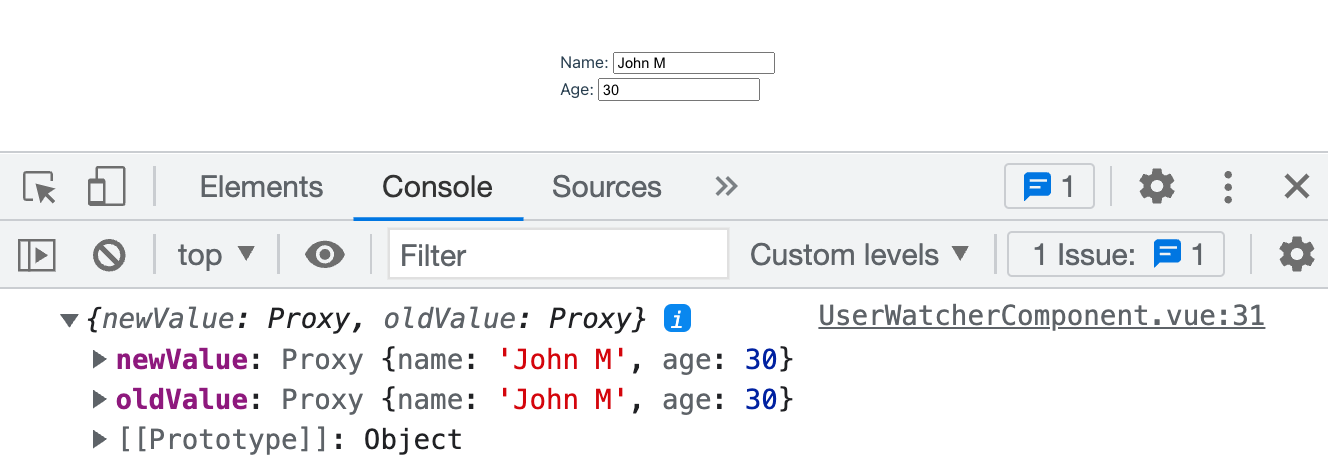
Figure 3-15. Console log output whenever the user object’s nested properties change
As you notice in Figure 3-15, the new and old value of user is identical. This behavior happens because the user object is still the same instance and only its name field’s value changed.
Also, once we turn on the deep flag, the Vue engine will traverse all the properties of the user object and their nested properties, then observe for changes in them. Hence it may cause performance issues when the user object structure contains a more complex internal data structure. In this case, it’s better to specify which nested properties you wish to monitor, as shown in Example 3-18:
Example 3-18. A watcher that observes for changes in the user’s name
import{defineComponent}from'vue'typeUser={name:stringage:number}exportdefaultdefineComponent({name:'UserWatcherComponent',data():{user:User}{return{user:{name:'John',age:30}}},watch:{'user.name':{handler(newValue:string,oldValue:string){console.log({newValue,oldValue})},},}});
Here we only observe changes in user.name property. The below Figure 3-16 shows the console log output for the above watcher:
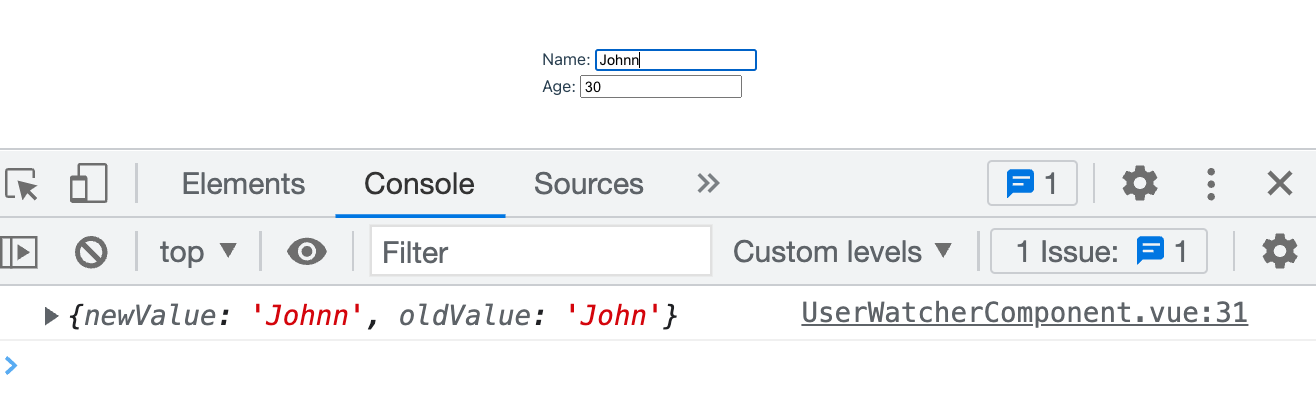
Figure 3-16. Console log output only when the user object’s name changes
You can use the dot-delimited path approach to enable watching a specific child property, regardless of how deeply nested they are. For instance, if the user has the following structure:
type User = {
  name: string
  age: number
  address: {
    street: string
    city: string
    country: string
    zip: string
  }
}
Suppose you need to watch for changes in user.address.city, you can do so by using user.address.city as the watcher name, and so on. By taking this approach, you can avoid undesired performance issues on deep watching, and narrow down the scope of the watcher to only the properties you need.
Using this.$watch() method
In most cases, the watch option is good enough to handle your watcher needs. However, there are scenarios where you don’t want to enable certain watchers when not necessary. For instance, you may want to enable the user.address.city watcher only when the user object’s address property is not null. In this case, you can use the this.$watch() method to create the watcher upon creating the component conditionally.
The this.$watch() method accepts the following parameters:
-
Name of the target data to watch as a string
-
The callback function as a watcher’s handler to trigger whenever the target data’s value changes
And this.$watch() returns a function you can call to stop the watcher. The following code shows how to use the this.$watch() method to create a watcher that observes for changes in user.address.city:
Example 3-19. A watcher that observes for changes in user’s address city
import{defineComponent}from"vue";importtype{WatchStopHandle}from"vue";typeUser={name:string;age:number;address:{street:string;city:string;country:string;zip:string;};};exportdefaultdefineComponent({name:"UserWatcherComponent",data():{user:User;stopWatchingAddressCity?:WatchStopHandle}{return{user:{name:"John",age:30,address:{street:"123 Main St",city:"New York",country:"USA",zip:"10001",},},stopWatchingAddressCity:undefined,};},created(){if(this.user.address){this.stopWatchingAddressCity=this.$watch("user.address.city",(newValue:string,oldValue:string)=>{console.log({newValue,oldValue});});}},beforeUnmount(){if(this.stopWatchingAddressCity){this.stopWatchingAddressCity();}},});
In Example 3-19, we create a watcher for user.address.city only when the user object’s address object property is available. We also store the returned function from this.$watch() in the stopWatchingAddressCity property. Then before unmounting the component, we trigger the stopWatchingAddressCity function within the beforeUnmount hook to stop the watcher if relevant. Using this approach, we can limit the number of unnecessary watchers created, such as the watcher for user.address.city when user.address doesn’t exist.
Next, we will look at another interesting feature of Vue, which is the slot component.
The power of slots
Building a component is about more than just its data and logic. We often want to maintain the current component’s sense and existing design but still allow users to modify parts of the UI template. This flexibility is crucial when building a customizable component library in any framework. Fortunately, Vue offers the <slot> component to allow us dynamically replace the default UI design for an element when needed.
For instance, let’s build a layout component ListLayout to render a list of items, with each item having the following type:
interfaceItem{id:numbername:stringdescription:stringthumbnail?:string}
For each item in the list, by default, the layout component should render its name and description, as shown in the following code example:
Example 3-20. The first template implementation of the ListLayout component
<template><ulclass="list-layout"><liclass="list-layout__item"v-for="item in items":key="item.id"><divclass="list-layout__item__name">{{ item.name }}</div><divclass="list-layout__item__description">{{ item.description }}</div></li></ul></template>
We also define a sample list of items to render for ListLayout in its script section, as follows:
Example 3-21. The script section of the ListLayout component
import{defineComponent}from'vue'typeItem={id:numbername:stringdescription:stringthumbnail?:string}exportdefaultdefineComponent({name:'ListLayout',data():{items:Item[]}{return{items:[{id:1,name:"Item 1",description:"This is item 1",thumbnail:"https://res.cloudinary.com/mayashavin/image/upload/v1643005666/Demo/supreme_pizza",},{id:2,name:"Item 2",description:"This is item 2",thumbnail:"https://res.cloudinary.com/mayashavin/image/upload/v1643005666/Demo/hawaiian_pizza",},{id:3,name:"Item 3",description:"This is item 3",thumbnail:"https://res.cloudinary.com/mayashavin/image/upload/v1643005666/Demo/pina_colada_pizza",},]}}})
Figure 3-17 below shows the default rendered UI of a single item using the above template (Example 3-20) and data (Example 3-21).
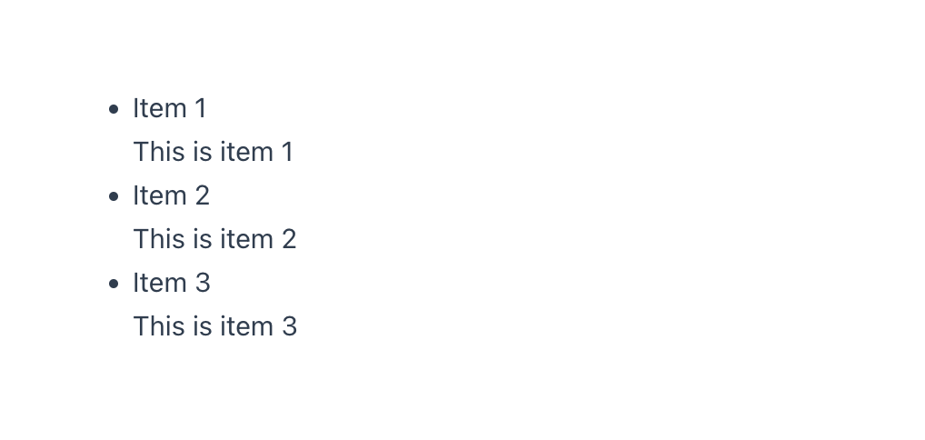
Figure 3-17. A sample UI layout of the item in the ListLayout component
Based on this default UI, we can then offer users an option to customize each item’s UI. To do so, we wrap the code block within a li element with a slot element, as shown in the following code example:
Example 3-22. ListLayout component with slot
<template><ulclass="list-layout"><liclass="list-layout__item"v-for="item in items":key="item.id"><slot:item="item"><divclass="list-layout__item__name">{{ item.name }}</div><divclass="list-layout__item__description">{{ item.description }}</div></slot></li></ul></template>
Notice how we bind the item variable received for each v-for iteration to the same item prop attribute of the slot component using : syntax. By doing so, we ensure the slot provides access to the same item data to its descendants.
Note
The slot component doesn’t share the same data context with its host component (such as ListLayout). Hence if you want to access any data property of the host component, you need to pass it as a prop to slot using v-bind syntax. We will learn more about giving props to nested elements in “Nested component and data flow in Vue”.
However, we need more than having item available for the custom template content to make it work. In the parent component of ListLayout, we add v-slot directive to <ListLayout> tag to get access to the item passed to its slot component, following the below syntax:
<ListLayoutv-slot="{ item }"><!-- Custom template content --></ListLayout>
Here we use the object destructuring syntax { item } to create scoped slot reference to the data property we want to access. And then, we can use item directly on our custom template content, as seen in the code below:
Example 3-23. Compose ProductItemList from ListLayout
<!-- ProductItemList.vue --><template><divid="app"><ListLayoutv-slot="{ item }"><imgv-if="item.thumbnail"class="list-layout__item__thumbnail":src="item.thumbnail":alt="item.name"width="200"/><divclass="list-layout__item__name">{{ item.name }}</div></ListLayout></div></template>
In Example 3-23 above, we change the UI to display a thumbnail image and the item’s name only. You can see the result in the following Figure 3-21:
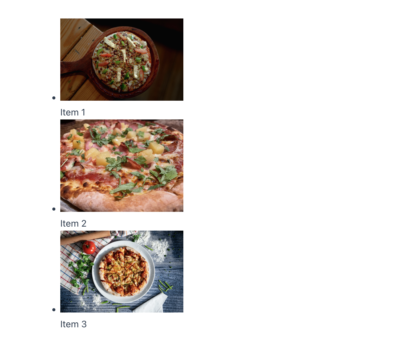
Figure 3-18. The UI layout of ProductItemList component
The above example is the most straightforward use case for the slot component when we want to enable customization in a single slot in the element. What about more complex scenarios like a product card component containing a thumbnail, the main description area, and an area of actions, each of which requires customization? For such a case, we still can take advantage of the power of slot, with naming capability.
Using named slots with template tag and v-slot attribute
In Example 3-22, we only enable customization for the UI of the item’s name and description as a single slot. To split the customization into several slot sections for a thumbnail, the main description area, and a footer of actions, we use slot with the attribute name, as in the Example 3-24:
Example 3-24. ListLayout component with named slots
<template><ulclass="list-layout"><liclass="list-layout__item"v-for="item in items":key="item.id"><slotname="thumbnail":item="item"/><slotname="main":item="item"><divclass="list-layout__item__name">{{ item.name }}</div><divclass="list-layout__item__description">{{ item.description }}</div></slot><slotname="actions":item="item"/></li></ul>
We assigned each slot with the names - thumbnail, main and actions respectively. And for the main slot, we add a fallback content template to display the item’s name and description.
When we want to pass the custom content to a specific slot, we wrap the content with a template tag. Then we pass the name declared the desired slot (slot_name for example) to the v-slot directive of the template, following the below syntax:
<templatev-slot:slot-name><!-- Custom content --></template>
We can also use the shorthand syntax # instead of v-slot, as follows:
<template#slot-name><!-- Custom content --></template>
Note
From here onwards, we will use the syntax # to denote v-slot when using with template tag.
Like using v-slot on the component tag, we can also give access to the slot’s data, as in the example below:
<template#slot-name="mySlotProps"><!--<div> Slot data: {{ mySlotProps }}</div>--></template>
Warning
For multiple slots, you must use the v-slot directive each relevant template tag, and not on the component tag. Otherwise, Vue will throw an error.
Let’s go back to our ProductItemList component (Example 3-23) and refactor the component to render the following custom content sections for the product item:
-
A thumbnail image
-
An action button for adding the product to the cart
Example 3-25 below shows how we implement that using template and v-slot.
Example 3-25. Compose ProductItemList with named slot
<!-- ProductItemList.vue --><template><divid="app"><ListLayout><template#thumbnail="{ item }"><imgv-if="item.thumbnail"class="list-layout__item__thumbnail":src="item.thumbnail":alt="item.name"width="200"/></template><template#actions><divclass="list-layout__item__footer"><buttonclass="list-layout__item__footer__button">Add to cart</button></div></template></ListLayout></div></template>
The above code results in the following output:
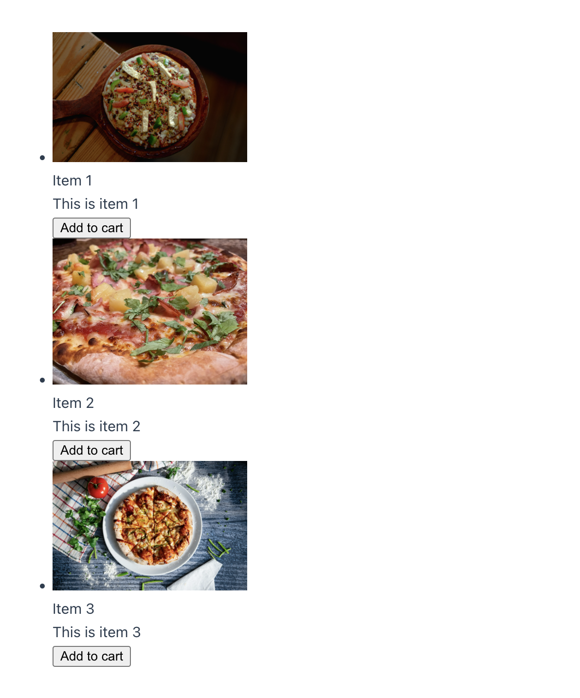
Figure 3-19. Output of ProductItemList with customized slot content
And that’s it. You are ready to use slots to customize your UI components. With slots, you can now create some basic standard reusable layouts for your application, such as a page layout with a header and footer, a side panel layout, or a modal component that can be a dialog or notification. You will then find how might slots are in keeping your code organized and reusable.
Note
Using the slot also means the browser won’t apply all relevant scoped styles defined in the component. To enable this functionality, see “Applying scoped styles to slot content”.
Next, we will learn how to access the mounted component instance or a DOM element using refs.
Understanding refs
While Vue typically handles most of the DOM interactions for you, there are still scenarios where you find the need to directly access a DOM element within a component for further manipulation. For instance, you may want to open a modal dialog when the user clicks a button or focus on a specific input field when mounting the component. In such cases, you can use the ref attribute to access the target DOM element instance.
The ref is a Vue built-in attribute that allows you to receive a direct reference to a DOM element or a mounted child instance. In the template section, you assign the value of the ref attribute to a string representing the reference name on the target element. The following example shows how you create messageRef, which refers to the DOM element input:
Example 3-26. An input component with a ref attribute assigned to messageRef
<template><div><inputtype="text"ref="messageRef"placeholder="Enter a message"/></div></template>
You can then access the messageRef in the script section to manipulate the input element through this.$refs.messageRef instance. The reference instance messageRef will have all the properties and methods of the input element. For instance, you can use this.$refs.messageRef.focus() to focus on the input element programmatically.
Warning
The ref attribute is only accessible after mounting the component.
The reference instance contains all the properties and methods of a specific DOM element or the child component instance, depending on the target element type. In a scenario where you use the ref attribute on a looped element using v-for, the reference instance will be the array containing the looped elements without order.
Take a list of tasks, for instance. You can use the ref attribute to access the list of tasks, as seen in the following code:
Example 3-27. A list of tasks with a ref attribute assigned to taskListRef
<template><div><ul><liv-for="(task, index) in tasks":key="task.id"ref="tasksRef">{{title}} {{index}}: {{task.description}}</li></ul></div></template><scriptlang="ts">import{defineComponent}from"vue";exportdefaultdefineComponent({name:"TaskListComponent",data(){return{tasks:[{id:'task01',description:'Buy groceries',},{id:'task02',description:'Do laundry',},{id:'task03',description:'Watch Moonknight',}],title:'Task',};}});</script>
Once Vue mounts the TaskListComponent, you can see the tasksRef contained three li DOM elements and nested in refs property of the component instance, as seen in the Vue Devtools screenshot below:
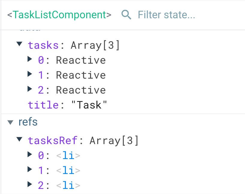
Figure 3-20. Vue Devtools showing the tasksRef reference instance
You can now use this.$refs.tasksRef to access the list of the task elements and perform further modification when needed.
Note
ref can also accept a function as its value, by adding a prefix : to it (:ref). The function accepts the reference instance as its input parameter.
We have learned about the ref attribute and how it can be helpful in many real-world challenges, such as building a reusable modal system (see “Implementing a modal with Teleport and <dialog> element” ). The following section will explore how to create and share standard configurations across components with mixins.
Sharing component configuration with mixins
In reality, it is not uncommon to have some components share similar data and behaviors, such as a cafe and a dining restaurant component. Both elements share the logic of making reservations and accepting payments, but each has unique features. In such scenarios, you can use the mixins property to share the standard functionalities across these two components.
For instance, you can create a restaurantMixin object that contains the standard functionalities of the two components - DiningComponent and CafeComponent, as seen below:
Example 3-28. A restaurantMixin mixin object
/** mixins/restaurantMixin.ts */import{defineComponent}from'vue'exportconstrestaurantMixin=defineComponent({data(){return{menu:[],reservations:[],payments:[],title:'Restaurant',};},methods:{makeReservation(){console.log("Reservation made");},acceptPayment(){console.log("Payment accepted");},},created(){console.log(`Welcome to${this.title}`);}});
You can then use the restaurantMixin object in the mixins property of DiningComponent, as seen in the following code:
Example 3-29. Using restaurantMixin mixins property of the DiningComponent
<template><!-- components/DiningComponent.vue --><h1>{{title}}</h1><button@click="getDressCode">getDressCode</button><button@click="makeReservation">Make a reservation</button><button@click="acceptPayment">Accept a payment</button></template><scriptlang='ts'>import{defineComponent}from'vue'import{restaurantMixin}from'@/mixins/restaurantMixin'exportdefaultdefineComponent({name:'DiningComponent',mixins:[restaurantMixin],data(){return{title:'Dining',menu:[{id:'menu01',name:'Steak'},{id:'menu02',name:'Salad'},{id:'menu03',name:'Pizza'},],};},methods:{getDressCode(){console.log("Dress code: Casual");},},created(){console.log('DiningComponent component created!');}});</script>
And similar to the CafeComponent:
Example 3-30. Using restaurantMixin mixins property of the CafeComponent
<template><!-- components/CafeComponent.vue --><h1>{{title}}</h1><p>Open time: 8am - 4pm</p><ul><liv-for="menu in menu":key="menu.id">{{menu.name}}</li></ul><button@click="acceptPayment">Pay</button></template><scriptlang='ts'>import{defineComponent}from'vue'import{restaurantMixin}from'@/mixins/restaurantMixin'exportdefaultdefineComponent({name:'CafeComponent',mixins:[restaurantMixin],data(){return{title:'Cafe',menu:[{id:'menu01',name:'Coffee',price:5,},{id:'menu02',name:'Tea',price:3,},{id:'menu03',name:'Cake',price:7,}],};},created(){console.log('CafeComponent component created!');}});</script>
Upon creating the components, the Vue engine will merge the mixin logic into the component, with the component’s data declaration taking precedence. In the above Example 3-29 and Example 3-30, the DiningComponent and CafeComponent will have the same properties menu, reservations, payments, title but with different values. Also, the methods and hooks declared in restaurantMixin will be available to both components. It is similar to the inheritance pattern, though the component doesn’t override the mixin’s hooks’ behavior. Instead, the Vue engine calls the mixin’s hooks first, then the component’s hooks.
When Vue mounts the DiningComponent, you will see the following output in the browser console:

Figure 3-21. Output order of console log of the DiningComponent
Similarly, when Vue mounts the CafeComponent, you will see the following output in the browser console:

Figure 3-22. Output order of console log of the CafeComponent
Notice here title value has changed between the two components, while Vue triggers the created hook of the restaurantMixin first, followed by the one declared on the element itself.
Note
The order of merging and triggering the hooks for multiple mixins is according to the order of the mixins array. And Vue always calls the component’s hooks last. You should consider this order when putting multiple mixins together.
If you open the Vue Devtools, you will see the restaurantMixin is not visible, and the DiningComponent and CafeComponent are with their own data properties, as shown in Figure 3-23 and Figure 3-24 below.
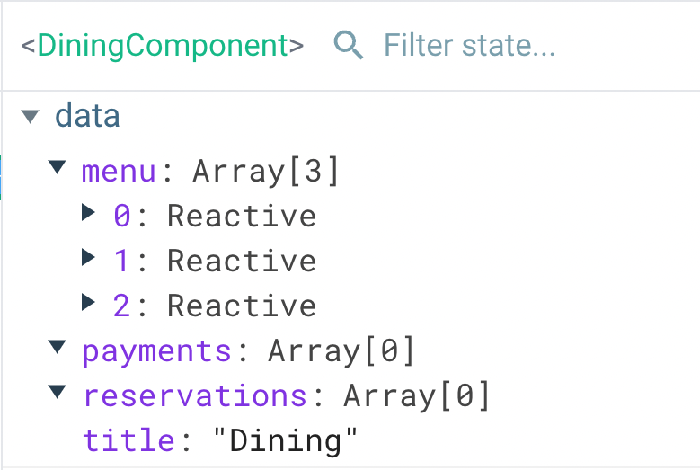
Figure 3-23. The Vue Devtools showing the DiningComponent
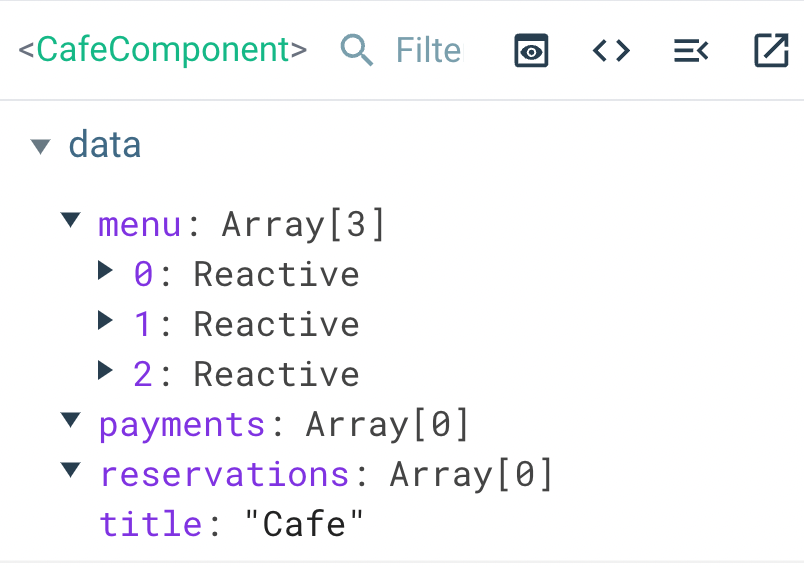
Figure 3-24. The Vue Devtools showing the CafeComponent
Mixins are great for sharing common logic between components and keeping your code organized. However, too many mixins can confuse other developers in understanding and debugging. So, I’d recommend validating your use case before choosing mixins over alternatives, such as the composition API (Chapter 6).
At this point, we explored how to compose components’ logic using advanced features in template and script sections. Next, let’s learn how to make your component beautiful with Vue’s built-in styling features in the style section.
Scoped styling components
Like a regular HTML page structure, we can define CSS stylings for an SFC component using the <style> tag, as shown in the example below:
<style>h1{color:red;}</style>
<style> section usually comes last in the order of a Vue SFC component and can appear multiple times. Upon mounting the component to DOM, the Vue engine will apply the CSS styles defined within the <style> tag to all the elements or matched DOM selectors within the application. In other words, all CSS rules that appeared in <style> of a component apply globally once mounted. Take the following HeadingComponent, which renders a heading title with some stylings, for instance:
Example 3-31. Using <style> tag in HeadingComponent
<template><h1class="heading">{{title}}</h1><pclass="description">{{description}}</p></template><scriptlang='ts'>exportdefault{name:'HeadingComponent',data(){return{title:'Welcome to Vue Restaurant',description:'A Vue.js project to learn Vue.js',};},};</script><style>.heading{color:#178c0e;font-size:2em;}.description{color:#b76210;font-size:1em;}</style>
In Example 3-31 above, we created two CSS class selectors - heading and description for h1 and p elements of the component respectively. When Vue mounts the component, the browser will paint these elements with the appropriate styles, as seen in Figure 3-25 below.
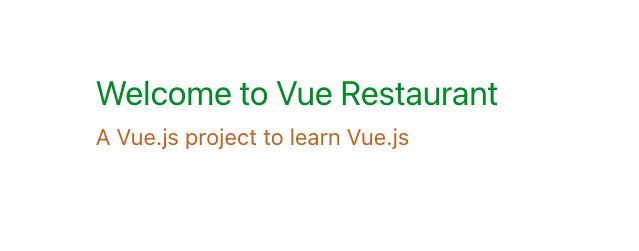
Figure 3-25. The HeadingComponent with styles applied
If you add a span element with the same heading class selector outside HeadingComponent, such as in the below parent component App.vue:
Example 3-32. Adding the same class selector to the parent component App.vue
<!-- App.vue --><template><sectionclass="wrapper"><HeadingComponent/><spanclass="heading">This is a span element in App.vue component</span></section></template>
The browser then still applies the same styles to the span element, as shown in Figure 3-26 below.
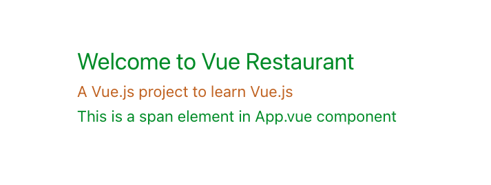
Figure 3-26. The span element in App.vue has the same CSS styles as the h1 element in HeadingComponent
But if we don’t use the HeadingComponent, or it does not yet exist in the application, the span element will not have the CSS rules of the heading class selector.
To avoid such scenario and better control our style rules and selectors, Vue offers a unique feature - scoped attribute. With <style scoped> tag, Vue ensures the CSS rules will apply to relevant elements within the component and do not leak them to the rest of the application. Vue achieved this mechanism by performing the following:
-
Add some randomly generated data attribute on the target element tag with the prefix syntax
data-v, -
Transform the CSS selectors defined in the
<style scoped>tag to include the generated data attribute
Let’s see how this works in practice. In the below Example 3-33, we add the scoped attribute to the <style> tag of the HeadingComponent:
Example 3-33. Adding the scoped attribute to the <style> tag of HeadingComponent
<!-- HeadingComponent.vue --><!--...--><stylescoped>.heading{color:#178c0e;font-size:2em;}.description{color:#b76210;font-size:1em;}</style>
The span element defined in App.vue (Example 3-32) will not have the same CSS styles as the h1 element in HeadingComponent anymore, as shown in Figure 3-27 below.
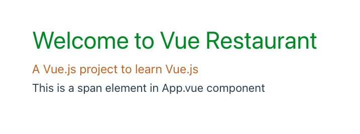
Figure 3-27. The span element in App.vue now has default black color
When you open the Elements tab in the browser developer tools, you can see the h1 and p elements now have the data-v-xxxx attribute, as shown in Figure 3-28 below.
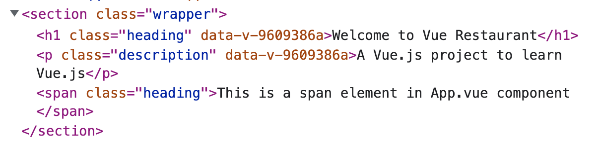
Figure 3-28. The h1 and p elements in HeadingComponent have the data-v-xxxx attribute
And if you select the h1 element and look at its Styles on the right panel, you can our CSS selector .heading now become .heading[data-v-xxxx], as shown in Figure 3-29 below.
![The CSS selector .heading is transformed to .heading[data-v-xxxx]](https://imgdetail.ebookreading.net/2023/10/9781492098812/9781492098812__9781492098812__files__assets__03_17.png)
Figure 3-29. The CSS selector .heading is transformed to .heading[data-v-xxxx]
I strongly recommend you to start working with the scoped attribute in your components as a good coding habit and avoid undesired CSS bugs when your project grows.
Note
The browser follows the CSS specificity when deciding which order to apply the styles. Because Vue’s scoped mechanism uses attribute selectors [data-v-xxxx], using the .heading selector solely is not enough to override the component’s styles from the parent.
Applying CSS to child component in a scoped styles
Starting from Vue 3.x, you can override or extend the styles of a child component from the parent with a scoped style by using the :deep() pseudo-class. For example, we can override the scoped styles of paragraph element p in the HeadingComponent from its parent App with the following:
Example 3-34. Overriding the scoped styles of paragraph element p in the HeadingComponent from its parent App
<!-- App.vue --><template><sectionclass="wrapper"><HeadingComponent/><spanclass="heading">This is a span element in App.vue component</span></section></template><stylescoped>.wrapper:deep(p){color:#000;}</style>
The p element in the HeadingComponent will have the color of black instead of its scoped color #b76210, as shown in Figure 3-30 below.
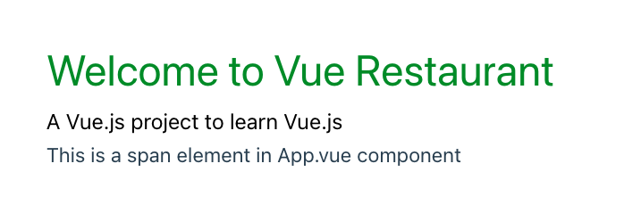
Figure 3-30. The p element in HeadingComponent has the color of black
Note
The browser will apply the newly defined CSS rules to any p elements nested in any child component of App and its children.
Applying scoped styles to slot content
By design any styles defined in <style scope> tag is only relevant to the component’s default template itself. Vue won’t be able to transform any slotted content to include the data-v-xxxx attribute. To style any slotted content, you can use :slot([CSS selector]) pseudo-class or create a dedicated style section for them on the parent’s level and keep the code organized.
Accessing component’s data value in style tag with v-bind() pseudo-class
We often need to access the component’s data value and bind that value to a valid CSS property, such as changing dark or light mode or theme color for an application based on the user’s preference. For such use cases, we use the pseudo-class v-bind().
v-bind() accept component’s data property and JavaScript expressions as a string for its only argument. For example, we can change the color of the h1 element in the HeadingComponent based on the value of the titleColor data property, as shown in Example 3-35 below:
Example 3-35. Changing the color of the h1 element based on the value of the titleColor
<!-- HeadingComponent.vue --><template><h1class="heading">{{title}}</h1><pclass="description">{{description}}</p></template><scriptlang='ts'>exportdefault{name:'HeadingComponent',data(){return{title:"Welcome to Vue Restaurant",description:"A Vue.js project to learn Vue.js",titleColor:'#178c0e',};},};</script><stylescoped>.heading{color:v-bind(titleColor);font-size:2em;}</style>
The v-bind() pseudo-class then transforms the value of the titleColor data property into an inline hashed CSS variable, as shown in Figure 3-31 below.
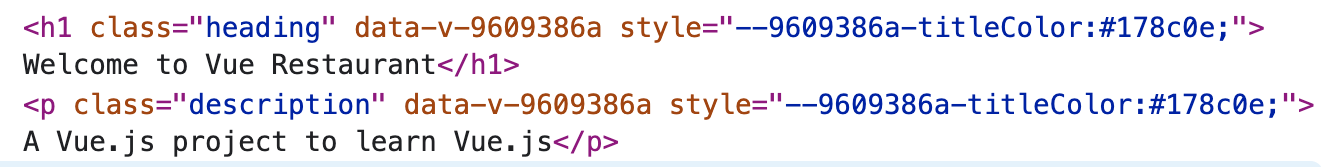
Figure 3-31. The value of the titleColor data property is now a hashed CSS property in inline style
Let’s open the Elements tab in the browser developer tools and look at the element’s Styles. You can see the generated color property for the .heading selector remain static and has the same value as the developed hashed CSS property of titleColor (Figure 3-32):
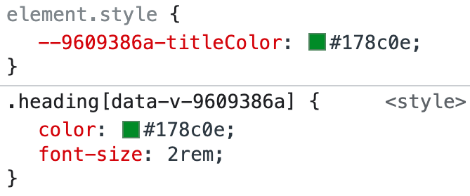
Figure 3-32. The generated color property for the .heading selector has the same value as the generated hashed CSS property of titleColor
v-bind() helps retrieve a component’s data value and then bind desired CSS property to that dynamic value. However, this is only one-way binding. If you want to retrieve the defined CSS styles in the template for binding to the template’s elements, you need to use CSS Modules, which we will cover in the next section.
Styling component with CSS Modules
Another alternative to scope your CSS styles per component is to use CSS Modules2. CSS Modules is an approach that allows you to write CSS styles regularly and then consume them as a JavaScript object (module) in our template and script sections.
To start using CSS Modules in a Vue SFC Component, you need to add module attribute to the style tag, as shown in our HeadingComponent in Example 3-36 below:
Example 3-36. Using CSS Modules in HeadingComponent
<!-- HeadingComponent.vue --><stylemodule>.heading{color:#178c0e;font-size:2em;}.description{color:#b76210;font-size:1em;}</style>
Now you will have access to these CSS selectors as fields of $style property object of the component. We can remove the static class names heading and description assigned for h1 and p respectively in the template section. Instead, we will bind the classes of these elements to the relevant fields of the $style object (Example 3-37):
Example 3-37. Binding classes dynamically with $style object
<!-- HeadingComponent.vue --><template><h1:class="$style.heading">{{title}}</h1><p:class="$style.description">{{description}}</p></template>
The output on the browser stays the same as Figure 3-27. However, when looking at the relevant elements on the Elements tab in the browser developer tools, you will see Vue has hashed the generated class names to keep the styles scoped within the component, as shown in Figure 3-33 below.
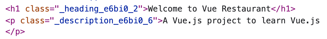
Figure 3-33. The generated class names heading and description are now hashed
Additionally, you can rename the CSS style object $style by assigning a name to the module attribute, as shown in Example 3-38 below:
Example 3-38. Renaming the CSS style object $style to headerClasses
<!-- HeadingComponent.vue --><stylemodule="headerClasses">.heading{color:#178c0e;font-size:2em;}.description{color:#b76210;font-size:1em;}</style>
And in the template section, you can bind the classes of the h1 and p elements to the headerClasses object instead (Example 3-39):
Example 3-39. Binding classes dynamically with headerClasses object
<!-- HeadingComponent.vue --><template><h1:class="headerClasses.heading">{{title}}</h1><p:class="headerClasses.description">{{description}}</p></template>
Note
If you are using <script setup> or setup() function in your component (Chapter 6), you can use useCssModule() hook to access the instance of the style object. This function accepts the name of the style object as its only argument.
The component now has a more isolated design than using the scoped attribute in the style tag. The code now looks more organized, and it is more challenging to override this component’s styles from outside since Vue hashes the relevant CSS selectors randomly. Nevertheless, depending on your project’s requirements, one approach may be better than the other, or it’s crucial to combine both scoped and module attributes to achieve the desired result.
Summary
In this chapter, we learned how to create a Vue component in the SFC standard and use defineComponent() to fully enable TypeScript support for our Vue application. We also learned how to use the slots to create a reusable component in different contexts with isolated styles and shared mixins configurations. We have explored further composing components using the component’s lifecycle hooks, computed, methods, and watch properties in the Options API. Next, we will use these foundations to create custom events and build the interactions between components with the provide/inject patterns.
1 Single File Component
2 CSS Modules starts as an open-source project for React.