2.0
Location

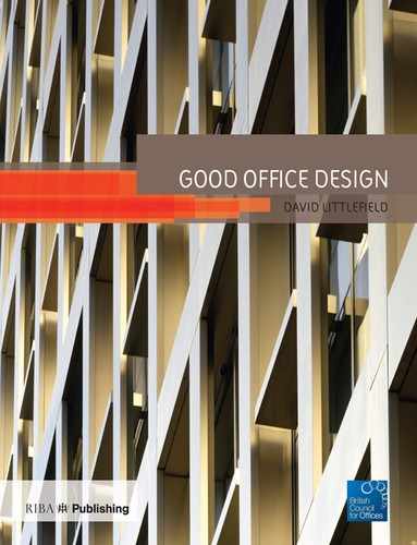
View of Exterior, One Hanover Street, London
© Stanhope plc by Hufton + Crowe

© Will Pryce
The response to context is variable, and this book contains examples of facadism, a polite acknowledgment of neighbours in terms of composition and scale, and a determination to prove that contemporary buildings can work well in historic areas if executed to a high standard. The result is that the term ‘context’ becomes one of many factors with which the architect works, rather than the single dominating consideration which can lead to the architectural dead-end of pastiche. It is worth noting that other sections in this book contain interesting approaches to context and location, but they appear elsewhere because they also have other stories to tell in regard to matters such as structure or sustainability. Office buildings are rarely exemplars of a single idea or technique – they are, in a way, multi-disciplinary.
What becomes clear when looking into the programmes behind many of these projects is that architects and clients have often produced exemplary work by liaising closely with conservation officials; older buildings have been brought back into use and given a new lease of life, while entire neighbourhoods have been reinvented because of the rescue of a single building. In this sense, meeting the demands of context and location has a strong link with the sustainability agenda, if economic and social sustainability is part of the overall equation.

© Will Pryce
Architects have also cleverly used the arts of composition to insert an unashamedly new building into an elderly context. Broadly, historic heights and massing have been respected while architectural language and the use of materials have been thoroughly reinvented. When executed thoughtfully, this approach is entirely appropriate and successful. Even a leafy suburb can benefit from a commercial development in a broadly Modernist language, as this section demonstrates.
Architects and interior designers also make an effort to maximise views when they can. Gone are ideas that cityscapes and distant rural vistas are distractions; rather, they provide people with stimulation and a sense of identity and belonging. Offices are an intrinsic part of national life, not separate from it, and the best developments put people directly in touch with what surrounds them.

© Nigel Young / Foster + Partners
Intriguingly, this section also includes an example of an existing building (38 Finsbury Square) changing its address by moving its front door – the position of the building remains unchanged but its ‘face’ has been brought around the corner to generate a more prestigious address and provide occupants with a grander approach and entrance. Quite apart from that, the building itself has been considerably improved.
Things become particularly interesting when the building itself responds to its context in such a way that it veers far away from the standard rectilinear box and becomes characterised by acute angles, setbacks and voids which respect ancient street patterns and neighbours’ right to light. Buildings like these test the designers’ ingenuity – it is so much simpler to organise staff in even rows without being compromised by awkward plans and floor plates of unequal area. But, done well, buildings like these gain a personality that would otherwise have been absent; they become rooted to their site as if they belong there.

© Calthorpe Estates
Quartermile One
Edinburgh
Building Team
- CLIENT/DEVELOPER: GLADEDALE CAPITAL
- OWNER: NORWICH PROPERTY TRUST, MORLEY FUND MANAGEMENT
- ARCHITECT: FOSTER + PARTNERS
- INTERIOR DESIGNER: FOSTER + PARTNERS
- STRUCTURAL ENGINEER: ARUP SCOTLAND
- SERVICES ENGINEER: HULLEY & KIRKWOOD
- QUANTITY SURVEYOR: THOMAS & ADAMSON
- PROJECT MANAGER: GLADEDALE CAPITAL
- CONTRACTOR: SIR ROBERT MCALPINE
Building Data
- COMPLETED: OCTOBER 2007
- NET: 9,833 m2
- GROSS: 12,640 m2
- EFFICIENCY: 78%
- FLOORS: 7
- COST: £21,612, 771
This building is yet another demonstration of Foster’s ability to take a brief, subject it to the closest examination and deliver a building that is a simple and intelligent interpretation of client need. Prior to embarking on the project, the practice carried out a benchmarking exercise in order to identify the characteristics of successful, recently completed office projects. Such offices encompassed, they determined: flexibility for multiple tenancies; flexibility for tenant fit-out options; column-free floor plates; floor-to-ceiling glazing; dramatic reception spaces; and high-quality materials in landlord areas.
The completed building contains enough flexibility to accommodate up to 19 separate office tenancies and two retail outlets; the structural system provides clear spans, while high-performance glazing admits generous daylight, offers stimulating views and reflects the colours and textures of adjacent buildings. At night, the building glows as any glass box would – although this is unusual for central Edinburgh which is characterised by solid facades. The heights and depths of the blocks which comprise Quartermile One have also been

The Building is Not a Monolithic Mass; Rather, it Comprises a Number of Interlinked Volumes Which Respect Their Neighbours. Nonetheless, the Most is Made of the Remarkable Views.
© Neil Young / Foster + Partners
modulated to reduce the degree of shadowing over neighbouring residential buildings.

Section Through the Building, Illustrating the Staggered Nature of The Floorplates, Which Eventually Span the Depth of the Structure.
© Foster + Partners
Much of the success of this building was down to the cladding solution, and Fosters put rival cladding firms through their paces before making an appointment. The architects and the client commissioned two cladding companies to provide advanced design and cost advice, and a final decision was made after a series of workshops. This process gave the client greater cost certainty over a key component of the project, and allowed the Austrian manufacturer to get a head start on the final design solution, once appointed.
The positive relationship that emerged between architect, client and cladding provider led to the same team working on further projects across the old Royal Infirmary site, providing cost efficiencies, shorter construction programmes, reduced lead-in times and higher confidence in the end product. Furthermore, a large number of elements within the building were prefabricated (including large portions of the facade, internal stonework and precast stairs) while strict standards were set up for both factory and on-site benchmarking; defects were therefore spotted early and eliminated, reducing snagging times and remedial works, and further enhancing the overall impression of a high-quality finish to the building.
This highly transparent, open building is anchored by solid cores (arranged to permit subdivision of the floor plates with relative ease) clad in Romano Classico Travertine marble. This solidity contrasts with the frameless glazing of the central atrium space, which in turn is countered by the expressed steel framing of the two accommodation wings. Glass cubes are sited on each side of the building as ‘modern turrets’. The whole composition is one of interlocking blocks of different heights and volumes; a cascade of setbacks reduces the danger of Quartermile One becoming a monolithic presence. The open, column-free spaces are made possible by the use of deep, very long cellular beams of steel; services are distributed through the holes within the beams in long straight runs.

The Glazed Building, Unusual in a City of Solid Facades, Glows at Night. It is the Impeccable Detailing Whch Makes this Project a Success.
© Neil Young / Foster + Partners
The original consented scheme (of July 2004) included two atria and three cores. Post planning, the scheme continued to be subjected to analysis to ensure the most efficient use of space. The cores came to be rationalised and reduced to just two, increasing the net area while reducing the number of stairs and lifts. Also, the two atria were combined into one larger volume, adding gravitas to the northern entrance. Floor plates cut into this void increase in depth storey by storey, further adding space while preserving a certain drama on arrival. ‘The entrance is one of the finest in town,’ said Magnus P. Swanson, chief executive and corporate partner of law firm Maclay Murray & Spens LLP, one of the building’s chief tenants.
Landscaping is also an important part of the way that this building occupies its plot. In fact, the building sits on a sloping site, so primary and secondary entrances have been located in its north and south elevations respectively. Limited car parking (21 spaces) has been located underground, along with refuse and recycling facilities and a delivery zone – all located beneath a lawn. Granite surfaces, planting and mature trees surround the building.
‘Office buildings are more than machines, or empty vessels. They are elements of our cities, and settings for people’s lives,’ said a statement from the architects. ‘Quartermile One was designed as the flagship office within the Quartermile master plan. Although it is an unashamedly modern building, it is constructed with crisp details and beautiful materials of its time, in the same way that its neighbours were designed in their time.’
Quartermile One started on site in October 2005 (after receiving a revised planning application the previous month). Practical completion was achieved in October 2007.
38 Finsbury Square
London
Building Team
- CLIENT/OWNER: HENDERSON CENTRAL LONDON OFFICE FUND
- ARCHITECT: GAUNT FRANCIS
- INTERIOR DESIGNER: GAUNT FRANCIS
- STRUCTURAL ENGINEER: PELL FRISCHMANN
- SERVICES ENGINEER: LONG & PARTNERS
- QUANTITY SURVEYOR: RIDER HUNT
- PROJECT MANAGER: GVA GRIMLEY
- CONTRACTOR: SKANSKA KONTOR
Building Data
- COMPLETED: DECEMBER 2006
- NET: 4,535 m2
- GROSS: 6,246 m2
- EFFICIENCY: 73%
- FLOORS: 7
- COST: £5,735,500 TO CAT A
Henderson purchased the building in November 2004 and aimed to put it back on the market, fully refurbished, by January 2007 to take advantage of predicted increases in office rental rates. Leases had expired, and the building was vacant apart from one ground-floor tenant who insisted on remaining in place; contractors had to work around this tenant, causing as little disruption as possible, which included isolating their services from those of the rest of the building, allowing them to operate as an independent unit. By engaging a contractor very early in the design process, the aim was to achieve a high-quality, contemporary and realigned building with a ‘very good’ BREEAM rating at a cost of no more than £1,000 per m2.
Moving the entrance was not a simple task, largely because of a 1 m difference in height between Wilson Street and Sun Street, meaning that floor levels and structural arrangements had

The Main Entrance to the Building Was Originally on Wilson Street (Seen Left). The New Entrance, Which Involved Cutting Into the Facade on Sun Street, Meant Rethinking the Entire Ground Floor of The Building and Re-Grading the External Paving.
© Will Pryce
The Building’s Reception is Enlivened by a Glass wall in Which are Embedded Diachroic Layers – Colours Change Depending on the angle of View. The Screen was Developed by Gaunt Francis Architects and Fusion Glass Systems.
© Will Pryce
Ground Floor Plan. The new Entrance is Shown at the Right of the Drawing. Originally, It Appeared at the Bottom. The New Reception Area is more Generous, Spatially.
© Gaunt Francis
to change. Nonetheless, a double-height opening was carved through the Sun Street facade and a relocated reception area was provided with a generous 3.2 m ceiling height after carefully rethreading services through the structure. A retail unit was created around the corner on Wilson Street, and the remaining tenant provided with its own independent entrance.
Thankfully, negotiations with the district surveyor resulted in an agreement that the firefighting lift could be replaced and made accessible to tenants (while still retaining a firefighting function), thereby improving the vertical circulation by 50%. The building was stripped out and provided with new 150 mm raised floor systems and replacement ceiling units while maintaining the floor-to-ceiling height of 2.6 m. Additionally, ceiling and M&E systems were configured to allow the open floor plates to be easily subdivided into cellular offices on a 4.5 m grid, subdivisible on a 1.5 m module. The WCs are characterised by a similar flexibility: installed as unisex ‘super-loos’, they can be grouped into male and female clusters through the addition of a simple screen.
The client is particularly proud of the partnering approach brought to the project. Because the contractor was appointed early, elements such as detailing and ‘buildability’ were on the agenda from the very start. Surprises were kept to a minimum. ‘The client, design team and construction team wanted clean lines, simple forms and high-quality finishes. [But] it is often the most simple ideas that are the hardest to achieve,’ said a statement from Henderson. Tight construction tolerances and the reduction of snagging problems were dealt with by the construction of full-scale mock-ups of key elements, notably ceiling details, the WCs and the glass feature wall which animates the reception area. The changes that resulted from the mock-up exercise were minor but important, mainly over coordination and detailing.

The Building’s Reception. The Feature Wall Conceals an Accessible Wc and Store Area. The Light Wall Also Reduces the Amount of Ceiling-Mounted Lighting Needed, Cutting the Number of Access Panels and Electrical Installations.
© Will Pryce
Henderson got what they wanted. The building reached a state of practical completion on 18 December 2006 at a cost of £990 per m2. Furthermore, 38 Finsbury Square received its ‘very good’ energy rating. The BCO has called this project ‘a classic tale of the ugly duckling turned into a swan … Major surgery on the entrance and a “massaged” core have created a modern and reinvigorated space.’
85 Southwark Street
London
Building Team
- CLIENT: ALLIES AND MORRISON
- ARCHITECT: ALLIES AND MORRISON
- LANDSCAPE ARCHITECT: SCHOENAICH REES
- STRUCTURAL ENGINEER: WHITBYBIRD
- QUANTITY SURVEYOR: BARRY TANKEL PARTNERSHIP; DAVIS LANGDON
- SERVICES ENGINEER: WSP
- CONTRACTOR: MANSELL
- FIT-OUT CONTRACTOR: SPECTRUM PROJECTS
Building Data
- COMPLETED: JUNE 2003
- NET: 1,700 m2
- GROSS: 2,295 m2
- EFFICIENCY: 74%
- FLOORS: 6
- COST: £5,827,000
The site is shaped like the letter ‘k’, as the dogleg of a road to the rear pushes towards the very linear Southwark Street. It was acquired in June 2000, and planning permission was granted for a six-storey building (including basement) in January 2001. The result is a 2,295 m2 building that has two very different faces: a highly glazed 36 m northern facade which emphasises the architectural grids at work, and a stepped, rendered southern elevation which respects complex rights-to-light issues. The wider area is something of a hotchpotch of styles (although massive regeneration, assisted by the proximity of Tate Modern and the Millennium Bridge) is tidying things up somewhat. Allies and Morrison’s building was a brave attempt to bring a crisp and confident architectural language to the area, while working within local scales and constraints.
‘In taking on a difficult and awkward-shaped site, this building has more than exceeded our hopes and aspirations for it,’ said the architects. ‘As a creative organisation we were seeking flexibility, openness and connectivity. We also hoped to achieve an inspiring contemporary studio feel, but within a mature and competent building which could, if necessary, be sublet or sold on. We feel all of this has been achieved, together with a well-judged restraint and quality of detailing which allows the building to act as a showcase for our business.’

The Atrium of the Building, Over Which Office Spaces Look. This Building, of Reinforced Concrete with 250 mm Thick Slabs, Was Designed for an Occupational Density of 12 m2 Per Person. Over 99% of the Office Space is Within 7.5 m of a Window.
© Dennis Gilbert / VIEW
The Home of Allies and Morrison Architects, This Building Projects a Sophisticated Glass Frontage to Busy Southwark Street, But a Softer, Terraced, Planted Aspect to the Rear.
© Dennis Gilbert / VIEW
Of course, the architects could not be expected to say anything else, but the BCO agrees with them: ‘This is a gem of a building set in what was a dreary backwater, south of the Thames. This is a breath of 21st-century air which has helped lead the regeneration of a Victorian enclave.’
The building didn’t come cheap. At £6.6 million (including demolition and enabling works) the studio came in at £2,884 per m2 – but they have packed a lot in, and the building is delightful at every turn. The facade reveals the build-up of layers from which the building is composed, including the colourful, internal aluminium fins that animate the streetscape and provide solar control and privacy when required. The fully glazed ground floor of the building has been kept free, as a generous reception and informal meeting space that also doubles as an exhibition area for the practice’s work – giving passers-by a sense of breadth and space on an otherwise unremarkable pavement.
The elevation facing Farnham Street to the south adopts a more intimate scale, and openings are cut into solid surfaces to control light and frame specific views. Basement-level workshops receive light from a light well which runs along the length of the site, while the rest of the building benefits from a triple-height atrium which gives the entire office a feeling of space and interconnectivity. The amount of office floor space that is within 7.5 m of a window and natural light is virtually 100%. The southern face of the building comprises a series of stepped terraces, the upper of which is a natural extension to the fourth-floor conference room. Materials are simple and robust, and the concrete columns, walls and soffits are exposed, achieving a fine balance between no-nonsense strength and a certain finesse. Colour is emphasised by being used on a limited basis: against the grey of the concrete, yellows and oranges appear as sudden bursts.

Upper Level Plan. The Architects Had to Work Hard to Deal With the Awkward Site Plan Southwark Street Runs Along the Bottom.
© Allies and Morrison
The approach to environmental control discounted natural ventilation – which seems obvious for a building with a narrow plan – because of the noise and traffic pollution from Southwark Street. Several windows to the south are openable, but the overall approach is one of creating a sealed, glazed northern facade and minimising windows to the south, controlling heat gain. A mechanical-displacement ventilation system was selected for its ability to provide a high level of comfort (with good levels of air distribution) as well as being less energy-intensive than many other mechanical air-conditioning options available. This system provides ventilation via a pressurised floor plenum, with air introduced through perimeter trench convectors supplemented by circular aluminium floor grilles.

This Concrete Building is Given Sudden Bursts of Colour, in Yellows and Oranges, Via Panels, Furniture and Vertical Louvres. It is A Clear Statement of the Architects’ vision, Aesthetic and Capability.
© Dennis Gilbert / VIEW
19 George Road
Birmingham
Building Team
- CLIENT: CALTHORPE ESTATES
- DEVELOPER: CALTHORPE ESTATES
- ARCHITECT: REID ARCHITECTURE (NOW 3DREID)
- STRUCTURAL ENGINEER: WATERMAN PARTNERSHIP
- SERVICES ENGINEER: ESC CONSULTING
- QUANTITY SURVEYOR: DBK BACK GROUP
- PROJECT MANAGER: DBK BACK
- CONTRACTOR: COSTAIN
Building Data
- COMPLETED: MARCH 2007
- NET: 1,161 m2
- GROSS: 1,655 m2
- EFFICIENCY: 82%
- FLOORS: 3
- COST: £1,754,400 TO CAT B (SHELL AND CORE £969,000)
‘This will help set a tone for the shape of regeneration by rebranding what had become a tired estate,’ said the BCO. ‘The key aspirations and brief have evidently paid off well, with full occupancy and a good level of positive feedback from the occupier. It has an exceptional “feel good” factor.’
The mixed-mode ventilated development is based on the architect’s concept of a ‘floating’ office box, centred around a semi-private courtyard and set within a landscaped clearing. The tenant required a design that enhanced their public profile while simultaneously preserving a sense of privacy. ‘Attention has been paid to creating a comfortable environment with an emphasis on quality and discipline rather than opulence,’ said a statement from 3DReid (formerly REID Architecture). The building is a neat composition of solid and void, raising a good portion of the office off the ground and anchoring it with masonry. The building, in plan, is assembled from two primary elements: L-shaped office accommodation and a street-facing ‘core’ containing reception, circulation and services. This core has been pulled away from the main office wing, leaving a central courtyard between the two main building components to provide a focus to the entire ensemble.

This 1,655 m2 Headquarters Building was Designed for a Specific end User but with the Flexibility to Subdivide the Two Floors Should the Tenant Decide to Move on.
© Calthorpe Estates
A Sophisticated Digital Control System is Used to Maintain Heating, Ventilating and Cooling Systems, Which AIDS in the Conservation of Energy. High-Efficiency Lamps are Combined with Movement Detection, While Water Consumption is Strictly Controlled by Flow Regulators Which Come With a Leak-Detection System.
© Calthorpe Estates
The New Office Building Does Not Mimic the Architecture Found on this Suburban Street; Rather, it Employs a Polite Modernist Aesthetic Which is Compositionally Elegant and Restrained.
© Calthorpe Estates
The main body of the office complex has been designed to appear lightweight, so large glazing units contrast with the ground-level masonry walls which conceal the parking area. ‘The core is the only element which appears to touch the ground and is treated, architecturally, quite differently to the office component, to draw attention to itself as the entrance but also to become a strong object in its own right,’ said the architects. Although the building was designed with a single client in mind, the two-storey development can be adapted for a twin tenancy. The air supply system is run in zones that can be operated independently.
This is hardly a low-key building, but it is polite and contextual without making uncomfortable sacrifices to the heritage lobby. It is modern, efficient and graceful enough to stand as an advert for how a clean, broadly Modernist language can enhance a leafy suburb while meeting the needs of a commercial tenant.
One Hanover Street
London
Building Team
- CLIENT: THE CROWN ESTATE (PRINCIPAL TENANT: APPLE)
- DEVELOPER: STANHOPE
- ARCHITECT: SHEPPARD ROBSON
- INTERIOR DESIGN: GENSLER
- STRUCTURAL ENGINEER: WATERMAN PARTNERSHIP
- SERVICES ENGINEER: FABER MAUNSELL
- QUANTITY SURVEYOR: DAVIS LANGDON
- PROJECT MANAGER: GENSLER
- CONTRACTOR: BOVIS LEND LEASE
Building Data
- COMPLETED: NOVEMBER 2004
- NET: 18,427 m2
- GROSS: 24,469 m2
- EFFICIENCY: 75%
- FLOORS: 7
- COST: £45,171,620 TO CAT A
The building is, really, brand new. The listed facade was retained and the 11 buildings behind it demolished to make way for a retail, office and residential development of column-free spaces and large floor plates. The building actually takes up most of a city block, flanking Hanover Street and Princes Street as well as Regent Street. Numbers 3–5 Hanover Street were demolished to make way for a new building and facade (incorporating a Bruce McLean sculpture) which functions as the principal entrance and circulation facility for the office accommodation. Next door, 6–7 Hanover Street was restored and converted into five apartments; on the other side of the block, 20–21 Princes Street was demolished to make way for a further five apartments, this time decorated with a piece of public art by Alex Beleschenko. The sixth floor, comprising offices, is a new addition and retreats modestly behind the parapet.
‘Sheppard Robson’s plans and Gensler’s interiors conjure a perfect balance between old and new, which was made all the more complicated by having to include a mix of residential, offices and

This Project, Which Contains an Important Facade Running Along Regent Street (Seen Here) Provides the Key Uk Store for Apple Computers, Along with Other Prestigious Tenants. Regent Street Was Redeveloped in the 1920S with 80-Year Leases, Which Provided an Opportunity for Wholesale Upgrading When They Began to Expire.
© Stanhope plc by Hufton+Crowe
retail without disturbing the exterior elegance,’ said the BCO judging panel in 2006. ‘The Crown Estate wanted this to be a hallmark for 21st-century developments on the rest of its Regent Street estate, and [this project] has certainly achieved that aim.’

This Reinvention of a Difficult Site Involved Preserving a Listed Facade and Creating Large Commercial Floorplates, with Some Residential Elements on A Plot Formerly Occupied by II Buildings.
© Sheppard Robson
The construction of large, 2,400 m2 floor plates and the inclusion of a central atrium (bringing daylight deep into the building from above) allowed the space planners of the Apple HQ to ‘flip’ the conventional office arrangement. Typically, prestigious executive offices would be ranged around the perimeter, granting senior staff the best views and generous daylight; instead, however, general functions such as human resources and finance have been located at the edges, while glass-walled, cellular spaces are clustered in the centre of the building towards the atrium. Rather than being an inversion of usual corporate hierarchies, this design aims to be non-hierarchical. Indeed, the second floor of Apple’s HQ is equipped with display spaces and relaxing areas in the style of coffee bars; meeting spaces are open and semi-open, while many staff employ the ‘hotelling’ (i.e. temporary, bookable) approach to using a desk.

View Through the Atrium Which Pierces the Remade Building. Office Floors are Provided with Floor-to-Ceiling Heights of 2.7 m, While the Retail Units Benefit From Heights of 4–5 m.
© Stanhope plc by Hufton+Crowe
What makes this project particularly worthy of note is the speed and efficiency with which it was all managed, partly helped by some off-site fabrication. In fact, local retailers noted that the large hoardings and building works had little or no effect on their businesses, and may even have improved trade. In spite of the busy central location and the technical issues associated with retaining a complex facade – plus the obvious interest of the heritage lobby – this project went from enabling works to practical completion in just 21 months (January 2003 to November 2004). The entire £52.5 million building was available for occupation by August 2005, and the retail units had begun trading the previous October. The building (of structural steel with composite floor slabs of concrete and profiled metal deck) even managed to achieve a ‘very good’ BREEAM rating.