GLOSSARY OF CHART TYPES

2 × 2 matrix: Box bisected horizontally and vertically to create four quadrants. Often used to illustrate a typology based on two variables. (Also called a matrix.)
+ Easy-to-use organizing principle for categorizing elements and creating “zones”
− Plotting items within quadrants at different spatial intervals suggests a statistical relationship that likely doesn’t exist

Alluvial diagram: Nodes and streams show how values move from one point to another. Often used to show changes over time or details in how values are organized, such as how budget allocations are spent month by month. (Also called a flow diagram.)
+ Exposes detail in value changes or exposes detailed breakdowns in broad categories of data
− Many values and changes in flow make for complex, crisscrossed visuals that, while pretty, may be difficult to interpret

Bar chart: Height or length of bars shows relationship between categories (“categorical data”). Often used to compare discrete groups on the same measure, such as salaries of ten different CEOs. (Also called a column chart when bars are vertical.)
+ Familiar form that’s universally understood; great for simple comparisons between categories
− Many bars may create the impression of a trend line rather than highlight discrete values; multiple groups of bars may become difficult to parse

Bubble chart: Dots scattered along two measures that add a third (size of bubble) and sometimes fourth (color of bubble) dimension to the data to show distributions of several variables. Often used to show complex relationships, such as multiple pieces of demographic data plotted by country. (Also called, erroneously, a scatter plot.)
+ One of the simplest ways to incorporate a “z-axis”; bubble sizes can add crucial context to distribution visuals
− Sizing bubbles proportionally is tricky (area is not proportional to radius); by their nature, three- and four-axis charts require more time to parse, so are less ideal for at-a-glance presentation

Bump chart: Lines show change in ordinal rank over time. Often used to show popularity, such as box office rankings week to week. (Also called a bumps chart.)
+ Simple way to express popularity, winners, and losers
− Changes aren’t statistically significant (values are ordinal, not cardinal); many levels and more change make for eye-catching skeins but may make it difficult to follow rankings

Dot plot: Shows several measures along a single axis. Often used in place of a bar chart when the comparison that matters is not the height of each bar but the difference in height between bars.
+ Compact form that works vertically or horizontally in a small space; makes comparison much easier than the traditional form (bar chart) along a single measure
− With many dots to plot, can be difficult to label effectively; removes any sense of trend across categories if that’s important

Flow chart: Polygons and arrows arranged to show a process or workflow. Often used to map out decision making, how data moves through a system, or how people interact with systems, such as the process a user goes through to buy a product on a website. (Also called a decision tree, which is one type of flow chart.)
+ Formalized system, universally accepted, for representing a process with many decision points
− Must understand established syntax (e.g., diamonds represent decision points; parallelograms represent input/output, etc.)

Geographical chart: Maps used to represent values attributed to locations in the physical world. Often used to compare values between countries or regions, such as a map showing political affiliations. (Also called a map.)
+ Familiarity with geography makes it easy to find values and compare them at multiple levels (i.e., comparing data by country and region simultaneously)
− Using the size of places to represent other values can over- or underrepresent the value encoded in those places

Hierarchical chart: Lines and points used to show the relationship and relative rank of a collection of elements. Often used to show how an organization is structured, such as a family or a company. (Also called an org chart, a family tree, or a tree chart, all of which are types of hierarchies.)
+ Easily understood method for documenting and illustrating relationships and complex structures
− Line-and-box approach limited in the amount of complexity it can show; harder to show less formal relationships such as how people work together outside the bounds of a corporate hierarchy
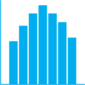
Histogram: Bars show distribution based on the frequency of occurrences for each value in a range. Often used to show probability, such as the results of a risk-analysis simulation. (Also called, erroneously, a bar chart, which compares values between categories, whereas a histogram shows the distribution of values for one variable.)
+ A fundamental chart type used to show statistical distribution and probability
− Audiences sometimes mistake a histogram for a bar chart

Line chart: Connected points show how values change, usually over time (continuous data). Often used to compare trends by plotting multiple lines together, such as revenues for several companies. (Also called a fever chart or a trend line.)
+ Familiar form that’s universally understood; great for at-a-glance representation of trends
− Focusing on the trend line makes it harder to see and talk about discrete data points; too many trend lines make it difficult to see any individual line

Lollipop chart: Similar to a dot plot, but plots two points on a single measure connected by a line to show some relationship between the two values. Plotting several lollipops can create an effect similar to a floating bar chart, in which values aren’t all anchored to the same point. (Also called a double lollipop chart.)
+ Compact form that works horizontally and vertically; great for making multiple comparisons between two variables when the difference between the two is what matters most
− When variables “flip” (the high value was the low value in a previous lollipop), it can be confusing to read across multiple lollipops; multiple lollipops of similar value make it hard to evaluate individual items in the chart

Metaphorical chart: Arrows, pyramids, circles, and other well-recognized figures used to show a nonstatistical concept. Often used to represent abstract ideas and processes, such as business cycles.
+ Can simplify complex ideas; universal recognition of metaphors makes understanding feel innate
− Easy to mix metaphors, misapply them, or overdesign them

Network diagram: Nodes and lines connected to show the relationship between elements within a group. Often used to show interconnectedness of physical things, such as computers or people.
+ Helps illustrate relationships between nodes that might otherwise be hard to see; highlights clusters and outliers
− Networks tend to get complex quickly. Some network diagrams, while beautiful, can become difficult to interpret

Pie chart: A circle divided into sections that each represent some variable’s proportion of the whole value. Often used to show simple breakdowns of totals, such as population demographics. (Also called a donut chart, a variation shown as a ring.)
+ Ubiquitous chart type; shows dominant versus nondominant shares well
− People don’t estimate the area of pie wedges very well; more than a few slices makes values hard to distinguish and quantify

Sankey diagram: Arrows or bars show how values are distributed and transferred. Often used to show the flow of physical quantities, such as energy or people. (Also called a flow diagram.)
+ Exposes detail in system flows; helps identify dominant components and inefficiencies
− Complex systems with many components and flow paths make for complex diagrams

Scatter plot: Dots plotted against two variables show the relationship between those two variables for a particular set of data. Often used to detect and show correlation, such as a plot of people’s ages against their incomes. (Also called a scatter diagram, scatter chart, or scatter.)
+ A basic chart type that most people are familiar with; spatial approach makes it easy to see correlation, negative correlation, clusters, and outliers
− Shows correlation so well that people may make a causal leap even though correlation doesn’t imply causation

Slope chart: Lines show a simple change in values. Often used to show dramatic change or outliers that run counter to most of the slopes, such as revenues falling in one region while rising in all others. (Also called a line chart.)
+ Creates a simple before-and-after narrative that’s easy to see and grasp either for individual values or as an aggregate trend for many values
− Excludes all detail of what happened to the values between the two states; too many crisscrossing lines may make it hard to see changes in individual values

Small multiples: A series of small charts, usually line charts, that show different categories measured on the same scale. Often used to show simple trends dozens of times over, such as GDP trends by country. (Also called grid charts or trellis charts.)
+ Makes simple comparisons across multiple, even dozens, of categories more accessible than if all the lines were stacked in one chart
− Without dramatic change or difference, can be hard to find meaning in the comparison; some “events” you’d see in a single chart, such as crossover points between variables, are lost

Stacked area chart: Lines plot a particular variable over time, and the area between lines is filled with color to emphasize volume or cumulative totals. Often used to show multiple values proportionally over time, such as product sales volume for several products over the course of a year. (Also called an area chart.)
+ Shows changing proportions over time well; emphasizes a sense of volume or accumulation
− Too many “layers” create slices so thin it’s hard to see changes or differences or track values over time

Stacked bar chart: Rectangles divided into sections that each represent some variable’s proportion to the whole. Often used to show simple breakdowns of totals, such as sales by region. (Also called a proportional bar chart.)
+ Some consider it a superior alternative to a pie chart; shows dominant versus nondominant shares well; may effectively handle more categories than a pie chart; works horizontally and vertically
− Including too many categories or grouping multiple stacked bars together may make it difficult to see differences and changes

Table: Information arranged in columns and rows. Often used to show individual values over time across multiple categories, such as quarterly financial performance.
+ Makes every individual value available; easier to read and compare values than a prose version of the same information
− Difficult to get an at-a-glance sense of trends or to make quick comparisons between groups of values

Treemap: A rectangle divided into smaller rectangles that each represent some variable’s proportion to the whole value. Often used to show hierarchical proportions, such as a budget divided into categories and subcategories.
+ Compact form for showing detailed proportional breakdowns; overcomes some limitations of pie charts with many slices
− Detail-oriented form not optimal for at-a-glance understanding; too many categories make for a stunning but harder-to-parse visual; usually requires software capable of accurately arranging the squares

Unit chart: Dots or icons arranged to represent collections of individual values associated with categorical variables. Often used to show tallies of physical items, such as dollars spent or people stricken in an epidemic. (Also called a dot chart or dot plot.)
+ Represents values in a way that feels more concrete, less abstract than some statistical representations
− Too many unit categories may make it hard to focus on central meaning; strong design skills needed to make arrangement of units most effective