Chapter 10
Surface Shading
To make objects appear to have more volume, it can help to use shading, i.e., the surface is “painted” with light. This chapter presents the most common heuristic shading methods. The first two, diffuse and Phong shading, were developed in the 1970s and are available in most graphics libraries. The last, artistic shading, uses artistic conventions to assign color to objects. This creates images reminiscent of technical drawings, which is desirable in many applications.
10.1 Diffuse Shading
Many objects in the world have a surface appearance loosely described as “matte,” indicating that the object is not at all shiny. Examples include paper, unfinished wood, and dry, unpolished stones. To a large degree, such objects do not have a color change with a change in viewpoint. For example, if you stare at a particular point on a piece of paper and move while keeping your gaze fixed on that point, the color at that point will stay relatively constant. Such matte objects can be considered as behaving as Lambertian objects. This section discusses how to implement the shading of such objects. A key point is that all formulas in this chapter should be evaluated in world coordinates and not in the warped coordinates after the perspective transform is applied. Otherwise, the angles between normals are changed and the shading will be inaccurate.
10.1.1 Lambertian Shading Model
A Lambertian object obeys Lambert’s cosine law, which states that the color c of a surface is proportional to the cosine of the angle between the surface normal and the direction to the light source (Gouraud, 1971):
or in vector form,
where n and l are shown in Figure 10.1. Thus, the color on the surface will vary according to the cosine of the angle between the surface normal and the light direction. Note that the vector l is typically assumed not to depend on the location of the object. That assumption is equivalent to assuming the light is “distant” relative to object size. Such a “distant” light is often called a directional light, because its position is specified only by a direction.

A surface can be made lighter or darker by changing the intensity of the light source or the reflectance of the surface. The diffuse reflectance cr is the fraction of light reflected by the surface. This fraction will be different for different color components. For example, a surface is red if it reflects a higher fraction of red incident light than blue incident light. If we assume surface color is proportional to the light reflected from a surface, then the diffuse reflectance cr—an RGB color—must also be included:
The right-hand side of Equation (10.1) is an RGB color with all RGB components in the range [0, 1]. We would like to add the effects of light intensity while keeping the RGB components in the range [0, 1]. This suggests adding an RGB intensity term cl which itself has components in the range [0, 1]:
This is a very convenient form, but it can produce RGB components for c that are outside the range [0, 1], because the dot product can be negative. The dot product is negative when the surface is pointing away from the light as shown in Figure 10.2.

When a surface points away from the light, it should receive no light. This case can be verified by checking whether the dot product of l and n is negative.
The “max” function can be added to Equation (10.2) to test for that case:
Another way to deal with the “negative” light is to use an absolute value:
While Equation (10.4) may seem physically implausible, it actually corresponds to Equation (10.3) with two lights in opposite directions. For this reason it is often called two-sided lighting (Figure 10.3).

Using Equation (10.4), the two-sided lighting formula, is equivalent to assuming two opposing light sources of the same color.
10.1.2 Ambient Shading
One problem with the diffuse shading of Equation (10.3) is that any point whose normal faces away from the light will be black. In real life, light is reflected all over, and some light is incident from every direction. In addition, there is often skylight giving “ambient” lighting. One way to handle this is to use several light sources. A common trick is to always put a dim source at the eye so that all visible points will receive some light. Another way is to use two-sided lighting as described by Equation (10.4). A more common approach is to add an ambient term (Gouraud, 1971). This is just a constant color term added to Equation (10.3):
Intuitively, you can think of the ambient color ca as the average color of all surfaces in the scene. If you want to ensure that the computed RGB color stays in the range [0, 1]3, then ca + cl ≤ (1, 1, 1). Otherwise your code should “clamp” RGB values above one to have the value one.
10.1.3 Vertex-Based Diffuse Shading
If we apply Equation (10.1) to an object made up of triangles, it will typically have a faceted appearance. Often, the triangles are an approximation to a smooth surface. To avoid the faceted appearance, we can place surface normal vectors at the vertices of the triangles (Phong, 1975), and apply Equation (10.3) at each of the vertices using the normal vectors at the vertices (see Figure 10.4). This will give a color at each triangle vertex, and this color can be interpolated using the barycentric interpolation described in Section 8.1.2.

A circle (left) is approximated by an octagon (right). Vertex normals record the surface normal of the original curve.
One problem with shading at triangle vertices is that we need to get the normals from somewhere. Many models will come with normals supplied. If you tessellate your own smooth model, you can create normals when you create the triangles. If you are presented with a polygonal model that does not have normals at vertices and you want to shade it smoothly, you can compute normals by a variety of heuristic methods. The simplest is to just average the normals of the triangles that share each vertex and use this average normal at the vertex. This average normal will not automatically be of unit length, so you should convert it to a unit vector before using it for shading.
10.2 Phong Shading
Some surfaces are essentially like matte surfaces, but they have highlights. Examples of such surfaces include polished tile floors, gloss paint, and whiteboards. Highlights move across a surface as the viewpoint moves. This means that we must add a unit vector e toward the eye into our equations. If you look carefully at highlights, you will see that they are really reflections of the light; sometimes these reflections are blurred. The color of these highlights is the color of the light—the surface color seems to have little effect. This is because the reflection occurs at the object’s surface, and the light that penetrates the surface and picks up the object’s color is scattered diffusely.
10.2.1 Phong Lighting Model
We want to add a fuzzy “spot” the same color as the light source in the right place. The center of the dot should be drawn where the direction e to the eye “lines” up with the natural direction of reflection r as shown in Figure 10.5. Here “lines up” is mathematically equivalent to “where σ is zero.” We would like to have the highlight have some nonzero area, so that the eye sees some highlight wherever σ is small.

The geometry for the Phong illumination model. The eye should see a highlight if σ is small.
Given r, we’d like a heuristic function that is bright when e = r and falls off gradually when e moves away from r. An obvious candidate is the cosine of the angle between them:
There are two problems with using this equation. The first is that the dot product can be negative. This can be solved computationally with an “if” statement that sets the color to zero when the dot product is negative. The more serious problem is that the highlight produced by this equation is much wider than that seen in real life. The maximum is in the right place and it is the right color, but it is just too big. We can narrow it without reducing its maximum color by raising to a power:
Here p is called the Phong exponent; it is a positive real number (Phong, 1975). The effect that changing the Phong exponent has on the highlight can be seen in Figure 10.6.
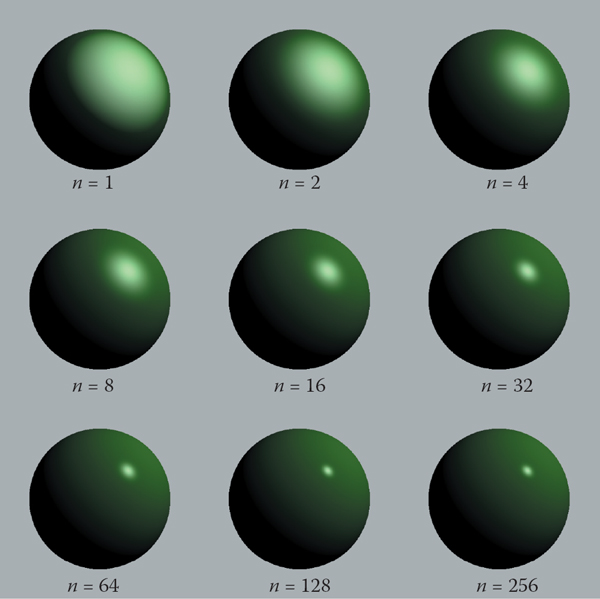
The effect of the Phong exponent on highlight characteristics. This uses Equation (10.5) for the highlight. There is also a diffuse component, giving the objects a shiny but non-metallic appearance.
Image courtesy Nate Robins.
To implement Equation (10.5), we first need to compute the unit vector r. Given unit vectors l and n, r is the vector l reflected about n. Figure 10.7 shows that this vector can be computed as

where the dot product is used to compute cos θ.
An alternative heuristic model based on Equation (10.5) eliminates the need to check for negative values of the number used as a base for exponentiation (Warn, 1983). Instead of r, we compute h, the unit vector halfway between l and e (Figure 10.8):

The highlight occurs when h is near n, i.e., when cos ω = h · n is near 1. This suggests the rule:
The exponent p here will have analogous control behavior to the exponent in Equation (10.5), but the angle between h and n is half the size of the angle between e and r, so the details will be slightly different. The advantage of using the cosine between n and h is that it is always positive for eye and light above the plane. The disadvantage is that a square root and divide is needed to compute h.
In practice, we want most materials to have a diffuse appearance in addition to a highlight. We can combine Equations (10.3) and (10.7) to get
If we want to allow the user to dim the highlight, we can add a control term cp:
The term cp is a RGB color, which allows us to change highlight colors. This is useful for metals where cp = cr, because highlights on metal take on a metallic color. In addition, it is often useful to make cp a neutral value less than one, so that colors stay below one. For example, setting cp = 1 – M where M is the maximum component of cr will keep colors below one for one light source and no ambient term.
10.2.2 Surface Normal Vector Interpolation
Smooth surfaces with highlights tend to change color quickly compared to Lambertian surfaces with the same geometry. Thus, shading at the normal vectors can generate disturbing artifacts.
These problems can be reduced by interpolating the normal vectors across the polygon and then applying Phong shading at each pixel. This allows you to get good images without making the size of the triangles extremely small. Recall from Chapter 3, that when rasterizing a triangle, we compute barycentric coordinates (α, β, γ) to interpolate the vertex colors c0, c1, c2:
We can use the same equation to interpolate surface normals n0, n1, and n2:
And Equation (10.9) can then be evaluated for the n computed at each pixel. Note that the n resulting from Equation (10.11) is usually not a unit normal. Better visual results will be achieved if it is converted to a unit vector before it is used in shading computations. This type of normal interpolation is often called Phong normal interpolation (Phong, 1975).
10.3 Artistic Shading
The Lambertian and Phong shading methods are based on heuristics designed to imitate the appearance of objects in the real world. Artistic shading is designed to mimic drawings made by human artists (Yessios, 1979; Dooley & Cohen, 1990; Saito & Takahashi, 1990; L. Williams, 1991). Such shading seems to have advantages in many applications. For example, auto manufacturers hire artists to draw diagrams for car owners’ manuals. This is more expensive than using much more “realistic” photographs, so there is probably some intrinsic advantage to the techniques of artists when certain types of communication are needed. In this section, we show how to make subtly shaded line drawings reminiscent of human-drawn images. Creating such images is often called non-photorealistic rendering, but we will avoid that term because many non-photorealistic techniques are used for efficiency that are not related to any artistic practice.
10.3.1 Line Drawing
The most obvious thing we see in human drawings that we don’t see in real life is silhouettes. When we have a set of triangles with shared edges, we should draw an edge as a silhouette when one of the two triangles sharing an edge faces toward the viewer, and the other triangle faces away from the viewer. This condition can be tested for two normals n0 and n1 by
Here e is a vector from the edge to the eye. This can be any point on the edge or either of the triangles. Alternatively, if fi(p) = 0 are the implicit plane equations for the two triangles, the test can be written
We would also like to draw visible edges of a polygonal model. To do this, we can use either of the hidden surface methods of Chapter 12 for drawing in the background color and then draw the outlines of each triangle in black. This, in fact, will also capture the silhouettes. Unfortunately, if the polygons represent a smooth surface, we really don’t want to draw most of those edges. However, we might want to draw all creases where there really is a corner in the geometry. We can test for creases by using a heuristic threshold:
This combined with the silhouette test will give nice-looking line drawings.
10.3.2 Cool-to-Warm Shading
When artists shade line drawings, they often use low intensity shading to give some impression of curve to the surface and to give colors to objects (Gooch, Gooch, Shirley, & Cohen, 1998). Surfaces facing in one direction are shaded with a cool color, such as a blue, and surfaces facing in the opposite direction are shaded with a warm color, such as orange. Typically these colors are not very saturated and are also not dark. That way, black silhouettes show up nicely. Overall this gives a cartoon-like effect. This can be achieved by setting up a direction to a “warm” light l and using the cosine to modulate color, where the warmth constant kw is defined on [0,1]:
The color c is then just a linear blend of the cool color cc and the warm color cw:
There are many possible cw and cb that will produce reasonable looking results. A good starting place for a guess is
Figure 10.9 shows a comparison between traditional Phong lighting and this type of artistic shading.

Left: a Phong-illuminated image. Middle: cool-to-warm shading is not useful without silhouettes. Right: cool-to-warm shading plus silhouettes.
Image courtesy Amy Gooch.
Frequently Asked Questions
All of the shading in this chapter seems like enormous hacks. Is that true?
Yes. However, they are carefully designed hacks that have proven useful in practice. In the long run, we will probably have better-motivated algorithms that include physics, psychology, and tone-mapping. However, the improvements in image quality will probably be incremental.
I hate calling pow(). Is there a way to avoid it when doing Phong lighting?
A simple way is to only have exponents that are themselves a power of two, i.e., 2, 4, 8, 16, . . . . In practice, this is not a problematic restriction for most applications. A look-up table is also possible, but will often not give a large speed-up.
Exercises
- The moon is poorly approximated by diffuse or Phong shading. What observations tell you that this is true?
- Velvet is poorly approximated by diffuse or Phong shading. What observations tell you that this is true?
- Why do most highlights on plastic objects look white, while those on gold metal look gold?