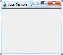
We have created our sample window and now we go on customizing it with some features for our needs. For each customization, we add a new function under the SampleWindow class in the previous program to define its properties and call that our main function to apply those properties on the sample window. In this section, we define an icon to be set on the window that we created. An icon is a small image that is created to visually emphasize the purpose of the program. It is displayed in the top-left corner of the application window. The same is also displayed in the taskbar when the application is minimized. As a prerequisite for this program, you might need an icon image with the dimensions similar to the image used here (72 X 72). You can create your own image or download it from the book site if you wish to use the one used in this program:
# Import required modules
import sys
from PySide.QtGui import QApplication, QWidget, QIcon

class SampleWindow(QWidget):
   """ Our main window class
    """
    def __init__(self):
        """ Constructor Function
        """
        QWidget.__init__(self)
        self.setWindowTitle("Icon Sample")
        self.setGeometry(300, 300, 200, 150)

    def setIcon(self):
        """ Function to set Icon
        """
        appIcon = QIcon('pyside_logo.png')
        self.setWindowIcon(appIcon)

if __name__ == '__main__':
    # Exception Handling
    try:
        myApp = QApplication(sys.argv)
        myWindow = SampleWindow()
        myWindow.setIcon()
        myWindow.show()
        myApp.exec_()
        sys.exit(0)
    except NameError:
        print("Name Error:", sys.exc_info()[1])
    except SystemExit:
        print("Closing Window...")
    except Exception:
        print(sys.exc_info()[1])
In the preceding program, we have included a class to set the application icon and we call that function from our main program to set it. Remember to place the image in the same location as the program. On executing this program, we would get the output as shown in the following screenshot:
As we have seen the basics of setting an application icon, we move on to explore more about the PySide.QtGui.QIcon class. This class provides a set of functions that provides scalable icons in different modes and states. By using this class, we can create various types of icons differing in their size and mode, say; smaller, larger, active, and disabled from the set of pixmaps it is given. Such pixmaps are used by the Qt widgets to show an icon representing a particular action.
The QIcon class has the following different forms of constructors:
QIcon()
QIcon(engine)
QIcon(other)
QIcon(pixmap)
QIcon(filename)
The first form constructs a null icon. The second form takes PySide.QtGui.QIconEngine as a parameter. This class provides an abstract base class for the QIcon renderers. Each icon has a corresponding engine that is responsible for drawing the icon with the requested size, mode, and state. The third form simply copies from the other QIcon object and it is considered to be the fastest method of all. The fourth form constructs the icon from the PySide.QtGui.QPixmap class. This class is an off-screen image representation that can be used as a paint device. A pixmap can be easily displayed on the screen using PySide.QtGui.QLabel or one of the two button classes, PySide.QtGui.QPushButton or PySide.QtGui.QToolButton. QLabel has a pixmap property whereas QPushButton/QToolButton has an icon property. The last form constructs an icon from the given filename. If filename contains relative path, it must be relative to the runtime working directory.
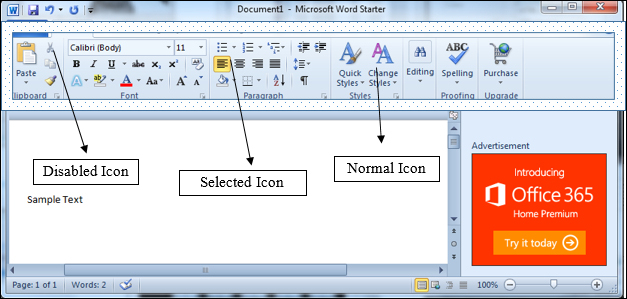
Icons are not only used for showing as application icon but also in various places as tool representation in the toolbars. Consider, we are creating a toolbar in our application where we display icons to represent functionalities in pictorial form. A sample toolbar may appear like the one shown in the following screenshot:
The QIcon class provides various modes to display the icon by the state it is defined by using the pixmap function applied to the QIcon class. The syntax of the pixmap function is PySide.QtGui.QIcon.pixmap(width, height[, mode=Normal[, state=Off]]). The parameters width and height represents the icon size. The modes can be any of the following four modes depending on the action:
The state parameter can be used to describe the state for which pixmap is intended to be used. It can take any of the following two values.
|
Constant |
Description |
|---|---|
|
QIcon.Off | |
|
QIcon.On |
The following function will provide you with an example of various modes of icons that we create from setting the modes in the pixmap function. Add the following function from the previous program inside the SampleWindow class.
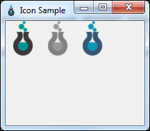
def setIconModes(self):
    myIcon1 = QIcon('pyside_logo.png')
    myLabel1 = QLabel('sample', self)
    pixmap1 = myIcon1.pixmap(50, 50, QIcon.Active, QIcon.On)
    myLabel1.setPixmap(pixmap1)

    myIcon2 = QIcon('pyside_logo.png')
    myLabel2 = QLabel('sample', self)
    pixmap2 = myIcon2.pixmap(50, 50, QIcon.Disabled, QIcon.Off)
    myLabel2.setPixmap(pixmap2)
    myLabel2.move(50, 0)

    myIcon3 = QIcon('pyside_logo.png')
    myLabel3 = QLabel('sample', self)
    pixmap3 = myIcon3.pixmap(50, 50, QIcon.Selected, QIcon.On)
    myLabel3.setPixmap(pixmap3)
    myLabel3.move(100, 0)
Now, add the following line in the main program to call this function:
...
myWindow.setIcon()
myWindow.setIconModes()
myWindow.show()
...
You might have noted a new widget QLabel used in this program. The QLabel widget is used to provide a text or image display. Running this program will output a window containing different modes of the same icon as shown in the following screenshot: