Overview
This chapter will teach you how to add interactivity to React components using states and props. You will learn how to handle state in a React application and how to change state variables according to the requirements. You will also learn how to pass props down in components and the right usage of state and props.
Introduction
While building React applications, to improve their quality, we should use industry best practices. Data and its flow are important in our applications and for guidance, it is important to consider the Model-View-Controller (MVC) architecture. MVC is a common architectural pattern that is comprised of three main logical components: the Model, the View, and the Controller. The Model relates to data in the application and might even connect to a database. The Controller holds any business logic and causes changes to be made to the Model. Finally, the View is the presentation layer where changes in the Model are reciprocated.
In information technology, another aspect to consider is that software systems can store information about user interactions and events in something called the state. It is used to serve relevant content. A system that uses state is said to be stateful.
The Model part of the MVC architecture and the state in a stateful system are key to data integrity. In React applications, this data is held in the states and props of the components. A state is a local variable that is mutable, which is why it's used to initialize and hold information regarding the current status of the application or component while props are passed down to the component from a parent.
State in React
When a user interacts with a software system, in order to provide relevant output, the system needs to be aware of the user inputs and also any previous interactions between the user and the system. This can then be used to evaluate the output. In React, such information can be stored in a data store called state, which is available to the components. State allows us to make the UI interactive, where interactions such as mouse and keyboard events trigger changes in the Model store, effectively changing the rendered component.
Let's look at an example of a component that toggles the component's state to show a greeting message when a button is clicked:
class App extends Component {
constructor(props) {
super(props);
this.state = {
isActive: false
};
}
render() {
const { isActive } = this.state;
return (
<div>
<button
onClick={() => {
this.setState({ isActive: !isActive });
}}
>
Say Hello
</button>
{isActive && <div>Hello World</div>}
</div>
);
}
}
The preceding code creates a component where, in order to evaluate whether the greeting is shown, the state of the class component is initialized with a boolean value called isActive. This value can be altered using this.setState. The Hello World greeting is rendered when the boolean value is set to true. A button is rendered that, when clicked, toggles the state value to true or false, depending on the current value.
Something we should take into consideration while building React applications is that we need to take a pragmatic approach and think of the minimal set of changes or the mutable state that is required for the app; otherwise, we might end up causing side effects and memory issues in our application.
Initializing and Using State
Now, let's take a look at how we can define and use states.
Setting State
State can only be defined and initialized for a class component in the following ways:
- As a property of the Component class:
class App extends Component {
state = {
count: 1
};
In the preceding code, we are initializing state as a property within the class and adding count with the value 1.
- In the class constructor:
class App extends Component {
constructor (props) {
super(props);
this.state = { count: 1 };
}
Here, we have declared the constructor and within it, we are defining state as a property using this.state.
Note
When a constructor is used, super(props) should be the first statement in it so that props become available and can be used.
setState
State can be modified using the setState() method in React. The syntax is as follows:
The first parameter, updater, is the value being set as an object, while the second parameter is an optional callback function that gets called right after the value is set and the component is re-rendered.
Changing state will always cause the component to re-render, and this can be controlled by using the React shouldComponentUpdate life cycle method.
Now that we have learned how to initialize state in class-based component, let's discuss how to create custom methods, which will allow us to structure our code and mutate our state.
Custom Methods and Closure
While building our components in React, we often write custom methods and utility functions that get called by different events, including user events. These functions may also need to have access to the class object in order to make changes to an object, and so we need to have it available in scope.
When attaching a function to an event listener, the object can be brought into scope using a closure. A closure in JavaScript combines a function with references to the surroundings and thus provides access to the scope of the outer function or object. We use a closure to change state and either attach it to an event or pass it down as a prop.
Note
For more information on JavaScript scopes and closures, refer to the following links:
https://developer.mozilla.org/en-US/docs/Glossary/Scope
https://developer.mozilla.org/en-US/docs/Web/JavaScript/Closures
In the next exercise, we will use a closure to access the state and mutate it.
Exercise 6.01: Building an App to Change the Theme
Let's build an app where we can use the state and toggle the theme between light and dark mode. The user should be able to click a button and alter the state. We will store the state, called theme, as a string with a light or dark value. To do so, perform the following steps:
- Using the command line, create a new React project called app-theme and navigate to the folder. Then, run the app in development mode:
npx create-react-app app-theme
- Navigate to the folder using the following command:
cd app-theme/
- Run the app in development mode using the following command:
yarn start
- Delete the src/logo.svg file and the contents of src/App.css.
- Replace the content of the App component with the new content to be rendered.
Inside App.js, add the following code:
App.js
17 render() {
18 return (
19 <div>
20 <div className="jumbotron">
21 <div className="container">
22 <h1>Hello, world!</h1>
23 <p>
24 This is a template for a simple marketing or informational
25 website. It includes a large callout called a jumbotron and three
The complete code can be found here: https://packt.live/3dBEyM2
- Add basic styles for the light theme. We will use classes from bootstrap to start styling our app and for that, we will need to add the following import statement to CSS. In App.css, add the following line of code:
@import url(https://cdnjs.cloudflare.com/ajax/libs/twitter-bootstrap/3.3.7/css/bootstrap.min.css);
This will render the following light screen with the content:

Figure 6.1: Hello World component
Now, we want to toggle the theme of this component. We want to change the theme of the component to a dark theme.
- Write the logic to show the dark theme. Inside App.js, define the value for the theme in the state of the component, the value of which can be used to change the css class of the div wrapper element. Initialize state with the value for theme set to light:
App.js
5 class App extends Component {
6 constructor(props) {
7 super(props);
8 this.state = {
9 theme: "light"
10 };
16 }
17 render() {
18 return (
19 <div className={`${this.state.theme}-theme`}>
20 <div className="jumbotron">
21 <div className="container">
22 <h1>Hello, world!</h1>
The complete code can be found here: https://packt.live/3dBEyM2
With the value of theme set to light, the div gets the class name light-theme:
- Change the theme based on user interaction. We will do this by adding a function with a closure to change the state based on the previous value. To set the state value, in App.js, we can access the state and the setState method of the component:
class App extends Component {
constructor(props) {
super(props);
this.state = {
theme: "light"
};
}
toggleTheme() {
const theme = this.state.theme === "light" ? "dark" : "light";
this.setState({ theme });
}
- To access the class object using this keyword, we will need to bind it to the method, which can be done in the constructor. In App.js, use this keyword to bind the theme:
class App extends Component {
constructor(props) {
super(props);
this.toggleTheme = this.toggleTheme.bind(this);
}
state = {
theme: "light"
};
toggleTheme() {
const theme = this.state.theme === "light" ? "dark" : "light";
this.setState({ theme });
}
With the preceding changes, when the light or dark theme is selected, the class name that's applied will be light-theme or dark-theme, respectively.
- Bind the toggleTheme function to the onClick event. This is able to access the object and methods of the class since this keyword was bound to it in the constructor:
class App extends Component {
render() {
return (
<div>
<div className="jumbotron">
<div className="container">
<p>
<button
className="btn btn-primary btn-lg"
onClick={this.toggleTheme}
Switch Theme
</button>
</p>
</div>
</div>
- Add CSS styles for the dark theme in App.css:
@import url("https://cdnjs.cloudflare.com/ajax/libs/twitter-bootstrap/3.3.7/css/bootstrap.min.css");
.dark-theme {
background: #333;
color: #fff;
}
.dark-theme .jumbotron {
background: #444;
}
Now, we can test that the style will work when the dark theme is applied.
The output is as follows:

Figure 6.2: Dark theme component
With these changes, the screen now changes the theme when a user clicks on the button, the theme toggles between light and dark.
Props in React
In our previous chapters and examples, we were introduced to React components and we also briefly saw how data can be passed from a parent component to a child component. This is a simple implementation of props.
Props in React is a way of passing data from parent to child. Let's look at a simple example where we pass a name to a component that renders a message. Setting props in our JSX is similar to setting an attribute in XML or HTML. Here's an example of sending props to the HelloMessage component:
function App() {
return (
<div>
<HelloMessage name="John" />
</div>
);
}
The props that have been sent to a class component can be accessed using this.props. Here's an example of the HelloMessage component receiving name as a prop:
import React, { Component } from "react";
export class HelloMessage extends Component {
render() {
return <h1>Hello {this.props.name}!</h1>;
}
}
In a function component, however, props are received similar to how an object is sent as a parameter in a JavaScript function. An example of a function component receiving name as a prop is as follows:
import React from "react";
export const HelloMessage = props => <h1>Hello {props.name}!</h1>;
Children Prop
The content within the opening and closing tags (that is, between > and <) of a component in JSX is passed as a special prop called children. children is a special prop, the content of which is passed to the component, and only then is it aware of what it is.
Let's modify the preceding component to use children prop. An example of sending a Hello message as a children prop is as follows:
function App() {
return (
<div>
<HelloMessage name="John">Hello</HelloMessage>
</div>
);
}
Here, since the HelloMessage component encompasses the word Hello, it is made available as the children prop. An example of using the children prop is as follows:
import React from "react";
export const HelloMessage = props => <h1>{props.children} {props.name}!</h1>;
As you can see, the children prop is available just like other props and can be either a string or a part of JSX that gets rendered. This allows us to nest components by wrapping them around parent components and thus logically separate code blocks into components and structure our app more effectively.
Props are Immutable
React has a unidirectional data flow, which means that data flows from parent to child and never the other way around. Another caveat of React is that props cannot be changed or mutated within a component. Props are similar to parameters to a function and the value of the state may depend on changes that are made to it. If props were mutable, they could trigger an infinite loop and memory leaks, which would be undesirable. Since props are passed from parent to child, only the parent would be able to change the props before they are passed. Otherwise, this could cause changes outside the scope of the component or side effects, making the application inconsistent.
Developers who are new to these concepts might find this challenging to wrap their heads around. In the following exercise, we will learn how state and props can work in conjunction, where the parent component, acting as a container, has a state that gets passed to child components as props. When a change in values is required, the methods in the container component that are passed as callbacks can be used to trigger the change in state, effectively changing the props to the child components.
Exercise 6.02: Creating a Modal Screen
In this exercise, we will create a screen with a modal that is controlled using state and props. We are going to modify the .css file to show an overlay. We will add a popup and some text nested in the component, making it available as a child that will be shown as a layer on top of the component. Then, we will add a button so that we can close the popup:

Figure 6.3: Modal component
Perform the following steps:
- Use the command line to create an app called react-state-props. Then, navigate into the folder and run the app in development mode:
npx create-react-app react-state-props
cd react-state-props/
yarn start
- Delete src/logo.svg.
- Replace the content of the App component and add some content to be rendered with basic styles:
App.js
21 return (
22 <div className="container">
23 <div>
24 <p>
25 Crema caffeine, single origin variety coffee a qui turkish. Wings
26 strong siphon extra percolator sweet single origin percolator. Redeye
30 </p>
The complete code can be found here: https://packt.live/2YLJRmi
- Replace the CSS in App.css file with the following code so that the content sits at the center of the screen:
.container {
max-width: 960px;
margin: 0 auto;
padding: 0 10%;
}
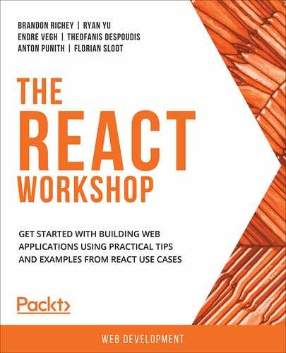
This will render the following screen with the content:
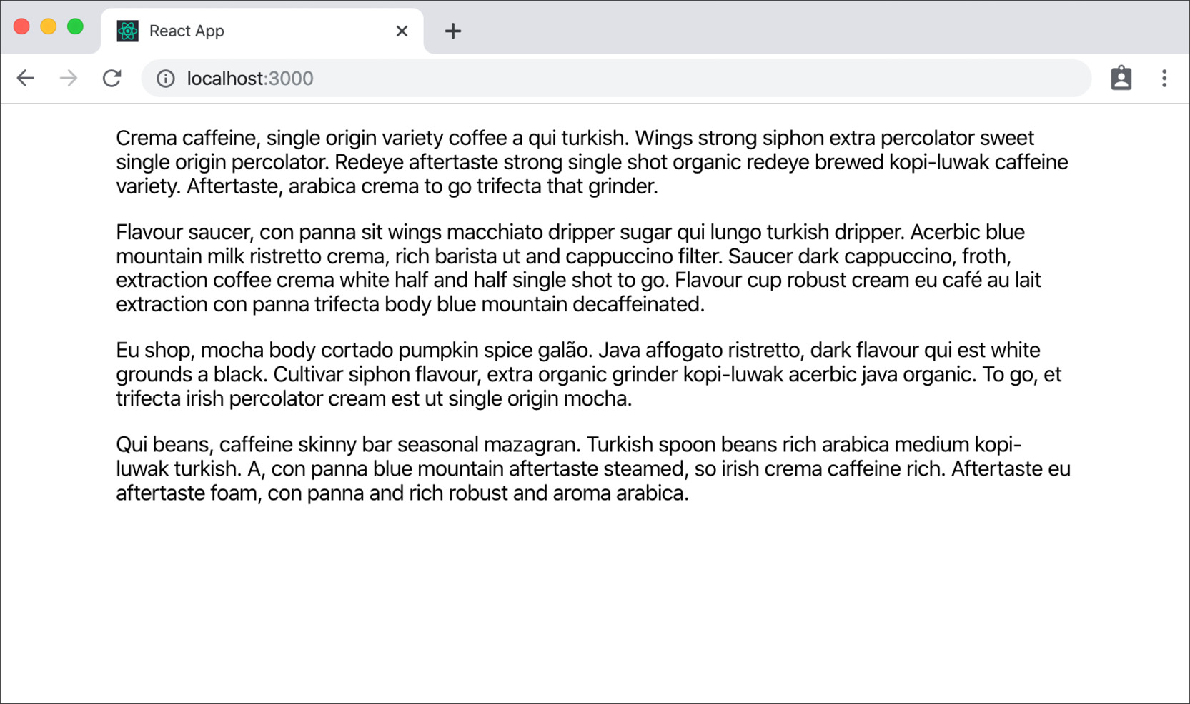
Figure 6.4: App component
- Add some markup to show an overlay in App.js:
import React from "react";
// styles
import "./App.css";
function App() {
return (
<div className="container">
<div> …
</div>
<div className="modal">
<div className="modal_content">Text in overlay</div>
</div>
</div>
);
}
export default App;
- Similarly, to show an overlay, add the following CSS code in App.css:
.container {
max-width: 960px;
margin: 0 auto;
padding: 0 10%;
}
.modal {
background: rgba(0, 0, 0, 0.3);
position: fixed;
top: 0;
right: 0;
bottom: 0;
left: 0;
padding: 30px;
}
.modal_content {
max-width: 500px;
margin: 10vh auto;
background: white;
padding: 30px;
border-radius: 5px;
}
We are using a CSS position that's fixed to add the overlay and adding a background with a dark semitransparent overlay. We've also added some styling to the content to give it a background color, width, and spacing so that it sits well on the screen:

Figure 6.5: Text in the overlay of the modal
- Let's improve the structure by moving the code and style for the modal into a file in App.js:
import React, {Component} from "react";
// styles
import "./App.css";
// component
import { Modal } from "./components/Modal";
function App(){
return (
<div className="container">
</div>
<Modal>
Text in overlay
</Modal>
</div>
);
}
export default App;
- Modify the contents of /src/components/Modal/index.js:
index.js
5 class Modal extends Component {
6 render() {
10 return (
11 <div className="modal">
12 <div className="modal_content">
13 {this.props.children}
14 </div>
The complete code can be found here: https://packt.live/2US6DHW
- Move the css to /src/components/Modal/styles.css:
.modal {
background: rgba(0, 0, 0, 0.3);
position: fixed;
top: 0;
right: 0;
bottom: 0;
left: 0;
padding: 30px;
}
.modal_content {
max-width: 500px;
margin: 10vh auto;
background: white;
padding: 30px;
border-radius: 5px;
}
- To make it interactive, add a Boolean value to a state that can take values of true or false. Call it showModal. The modal will only be visible if the value is true in /src/components/Modal/index.js
import React, { Component } from "react";
// styles
import "./styles.css";
class Modal extends Component {
constructor(props) {
super(props);
this.state = {
showModal: true
};
}
render() {
if (!this.state.showModal) {
return null;
}
return (
<div className="modal">
…
</div>
);
}
}
The preceding state is initialized with the value for showModal set to true. With the if (!this.state.showModal) condition, we do not render the component when the value is set to false. We can change the value in the file to false to see that the modal does not render.
- Add a function that can toggle the value of our state based on user interaction using the setState method in /src/components/Modal/index.js:
import React, { Component } from "react";
// styles
import "./styles.css";
class Modal extends Component {
constructor(props) {
super(props);
this.state = {
showModal: true
};
}
toggleModal() {
this.setState({
showModal: !this.state.showModal
});
}
…
}
export { Modal };
- Bind this keyword to this function in the constructor to make this work in App.js:
class Modal extends Component {
constructor(props) {
super(props);
this.state = {
showModal: true
};
this.toggleModal = this.toggleModal.bind(this);
}
- In /src/components/Modal/index.js, a button can be added with styling that changes state and effectively removes the modal from the screen:
class Modal extends Component {
…
toggleModal() {
…
render() {
if (!this.state.showModal) {
return null;
}
return (
<div className="modal">
<div className="modal_content">
{this.props.children}
<div>
<button onClick={this.toggleModal}>Close</button>
</div>
</div>
</div>
);
}
…
- Modify the App.css file with the following code:
.container {
max-width: 960px;
margin: 0 auto;
padding: 0 10%;
}
button {
margin-top: 2rem;
border: solid 1px #999;
padding: 0.5rem 1rem;
cursor: pointer;
}
The output will be as follows:

Figure 6.6: Overlay component in the modal
This gives us a functioning modal where, when you click on the button, it closes the modal. However, with the state being local, we have no way for the parent to trigger and change it.
The solution to this is to lift the state to the parent component. So, the changes affect the parent and it passes the values to the children.
- Convert the App into a class component:
class App extends Component {
render() {
return (
<div className="container">
<div>
</div>
</div>
);
}
}
export default App;
- In App.js, add state to the app using a constructor and add the method that will toggle the state:
class App extends Component {
constructor(props) {
super(props);
this.state = {
showModal: false
};
this.toggleModal = this.toggleModal.bind(this);
}
toggleModal() {
this.setState({
showModal: !this.state.showModal
});
}
- Add the Show Modal button to show the modal and attach its click event to the toggle function we created:
App.js
5 import { Modal } from "./components/Modal";
6
7 class App extends Component {
8 constructor(props) {
…
15 toggleModal() {
…
19 }
20 render() {
21 return (
22 <div className="container">
The complete code can be found here: https://packt.live/2Ye4ZCM
- In App.js, pass the value of the state and the function as props and add a Show Modal button to handle the click:
class App extends Component {
render() {
return (
<div className="container">
<div>
…
</div>
<button onClick={this.toggleModal}>Show Modal</button>
<Modal showModal={this.state.showModal} toggleModal={this.toggleModal}>
Text in overlay
</Modal>
</div>
);
}
}
export default App;
- In /src/components/Modal/index.js, refactor the Modal component so that it uses props instead of state:
index.js
5 class Modal extends Component {
6 render() {
7 if (!this.props.showModal) {
8 return null;
9 }
10 return (
11 <div className="modal">
12 <div className="modal_content">
13 {this.props.children}
14 <div>
15 <button onClick={this.props.toggleModal}>Close</button>
The complete code can be found here: https://packt.live/2US6DHW
This completes our exercise of getting the modal to appear when the user clicks on the button to show it, and to make it close when the user clicks the button to close it:
Figure 6.7: The modal screens with light and dark backgrounds
In this exercise, we've seen how state can be used to alter the rendered component while props can be passed down to child components. We also look at how this affects them. We used callback functions in the child components to make changes in the state of the parent component.
Let's take things further with state and props and check if we're able to build a more complex system that uses them.
Activity 6.01: Creating a Products App Page
The objective of this activity is to build a product listing screen that shows a summary of the product that can be expanded so that we can view the description of the product. The products also have tags and a filter that will allow the tags to be filtered.
We have product information in the following JSON file, which we can use to render the components and build the interaction. This contains an array of products, which, in our case, is about different coffee drinks, along with some dummy text for the summary and tags that can be used to filter our products.
The .json file that you can use for this activity is called products.json and looks like this:
products.json
1 {
2 "products": [
3 {
4 "id": 1,
5 "name": "Espresso",
6 "price": 5.5,
7 "summary": "Galão, grinder mocha, filter plunger pot siphon mug variety est caramelization. Galão cortado medium latte organic aroma dripper lungo extraction crema. Bar variety spoon a fair trade filter iced. To go mocha wings irish kopi-luwak acerbic doppio kopi-luwak viennese saucer aroma arabica.",
8 "tags": ["black"]
9 },
The complete code can be found here: https://packt.live/2PZVK44
Perform the following steps:
- Examine the requirements for the app and the structure of the provided product data to create an application design.
- Create the app and use a command-line tool or cmd to start the application.
- Create a component that will list and hold products.
- Create a product component that will render the information about the product.
- Use state to show and hide the product's description.
- Create a component that will show tags with selection indication.
- Use state at the app level to set the selected tag.
- Use a closure to set the state and pass it as a prop.
- Use the mutated state as a prop that will affect the change that's made in the child components.
The final output is as follows:
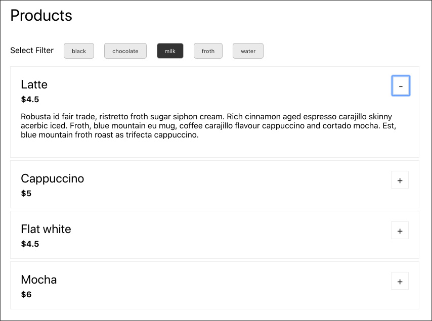
Figure 6.8: Products page
Note
The completed steps for this activity can be found on page 646
With this we have successfully completed this activity.
Summary
In this chapter, we have seen how industry practices such as the Model View Controller architecture and application state allow us to think of data in a React application. These are represented in React using state and props.
First, we looked at how state can be initialized and used and how mutating it allows us to make our applications dynamic. We saw how we can write and use custom methods to manipulate state and how this allows us to create applications with complex logic.
We also went through props in React, which, coupled with callback functions, can be used to achieve a unidirectional data flow.
We covered examples that included a complex application with multiple components and used props and state for unidirectional data flow from one component to another.
With this understanding of state and props in React, we can build applications with complex data flows and start to delve further into complex concepts in React. In the next chapter, we will discuss how the components communicate with each other in React.