This chapter will explain the context and the reasons for using React framework and Create React App by utilizing the different options and scripts available for Create React App. The Create React App CLI tool will enable you to bootstrap a React project quickly. You will learn how to build a React component entirely with functional and class syntax using basic JSX. You will also be able to use components together to better structure your code. In this chapter, you will learn about the context and history of the React JS framework and be able to bootstrap your first React project.
Introduction
React is a frontend JavaScript framework. Its design principles take into consideration a lot of the common problems that developers used to face while building the user-facing components in their web projects. React doesn't exist to fix server problems or database problems, but rather to fix the common design and development problems of the frontend that exist in more complex and stateful web applications.
React is a framework that was created during the frenzy of frontend JavaScript frameworks. React by itself isn't just JavaScript that you can use to build elements on a page. After all, the problem of adding Document Object Model(DOM) elements to a web page has had solutions since the early days of Prototype and jQuery (or even further back than that). Instead, it is helpful to think of React as existing in a world that bridges the gap between JavaScript and HTML or, more specifically, the code and the browser.
Let's look at the problems that existed before the React JavaScript framework came into the picture.
Problems before React
Web development is a trade that can sometimes be incredibly confusing and complex. The act of getting the buttons, pictures, and text that we see on a website is not always a simple endeavor.
Think about a web page with a little form to log into your account. You have at least two text boxes, usually for your username and your password, where you need to enter your details. You have a button or link that allows you to log in after the details have been entered, with maybe at least one extra little link in case you forget your password. You probably also have a logo for this site you are logging into, and maybe some sort of branding or otherwise compelling visual elements. Here is an example of a simple login page:

Figure 1.1: Login form
All of that doesn't just exist, though. A web developer needs to sit down and build each of these pieces and put them together in such a way so that the audience visiting that site can interact with each component individually. The real problem here is that all of that can be incredibly complicated to put together. For example, you might have multiple form inputs that all interact with each other depending on the values you entered and selected. Each piece needs to be able to interact with the next, and there are multiple different types of complex interactions that need to occur that go beyond just something happening as a result of a button being clicked.
For example, let's go back to our Packt login form example and examine some of the intricacies of interaction that exist even in such a simple and commonplace element. We will start off with the simplest example:
- Data needs to be entered into the username field.
- Data needs to be entered into the password field.
- The user needs to click the login button.
- The user is now logged in.
That's enough to make this work, but it's not a great user experience, is it? There's no validation, and nothing to help the user to get through the process smoothly or gracefully to let them know beforehand when the form fails to show the desired output.
So, we need to expand with additional use cases:
- If the user's username and password do not work, the user should see a failed login message.
- If the user fails to enter a username, the user should see a message reminding them to fill in the username field.
- If the user fails to enter a password, the user should see a message reminding them to fill in the password field.
These cases increase the complexity of the code pretty significantly.
Additionally, a few more elements for this web page are necessary:
- A message box displaying information if a username/password combination is incorrect, which evidently requires interaction with the server
- A message box displaying information if either of the username/password fields is left blank
The web page will get progressively more complicated as you move further along in improving the user experience.
For example, if we want to break it down further:
- What if we want to progressively check the username field to make sure it matches an email format if we are using emails for usernames?
- What if we want to validate whether each field has been filled (either for format or if the values have been filled) as we move through each of the fields, displaying a red box around input fields that are blank or skipped as we move along?
At each step, we are introducing new and increasingly complex levels of interaction between different UI elements and the collective state of each component.
Now, let's break the state of each component into:
- Their visual state (how the field is displayed to the user)
- Their data state (what is entered into the field)
- Their state in relation to other UI elements (how the login form knows about the data state of the username and password fields)
- Their interaction state (can the button be clicked if either the username or password fields are blank?)
Suddenly, you will realize that a few lines of HTML just will not cut it anymore. Now you need more complex blocks of JavaScript code, with state management both for visual and data states for each component, and a way to tie them all together.
You need to represent all of it in a way that won't require it to be rewritten every time someone needs to implement a similar form, and in a way that does not make a developer groan every time they have to touch the code. Let's see where React fits into all of this and how it addresses this problem.
Introducing React
While the example in the previous section is a complex problem, the good news is that with React, the solution isn't terribly complex.
Instead of thinking about each element your browser sees and displays for the user as separate from your HTML code and JavaScript code (and thus separate from the states that each exhibits at any given point in time), React allows you to think of all of the code as part of the same data structure, all intertwined and working together:
- The component
- The state
- The display (or render)
This reduces a lot of the complexity and overhead while trying to amalgamate component state and component display with a mixture of CSS and JavaScript along the way. React represents a more elegant way to allow the developer to think holistically about what is on the browser and what the user is interacting with, and how that state changes along the way.
By itself, all of that is a great help to us as developers but React also introduces a full scaffold for setting things up quickly and easily in a way that lets us get to development faster and fiddle less with configuration along the way.
React introduces a way for us to set up how to represent the states and display of components, but additional tools make the setup and configuration process even easier. We can further optimize the process for getting started by introducing a special command-line tool for React projects called Create React App.
This tool minimizes the amount of time a developer needs to spend getting everything set up and allows developers to instead focus on the most important part of building your web application: the development.
Getting Started with Create React App
Create React App introduces a scaffold to React applications. Through this, configuration and setup are minimized around opinionated configuration (a set of configurations where a lot of the decisions have been made for you) and pre-built structures. Your directories, input, and output are all handled for you.
What is a scaffold? A scaffold in the development world is something that sets up boilerplate (that is, often-repeated bits of code or configuration) details for you with the idea that you will be using the same configuration, setup, and directory structure that the project is using. A scaffold allows you to get to development significantly faster, with the drawback that it may be harder to break away from decisions made in the scaffold later on in your development process, or that you may end up with more dependencies or structure than you need.
The Create React App scaffold is designed around the idea of the developer experience: that setting up a new project should be seamless and painless. If you want to start developing right now and not have to worry about how you are going to test your application, or how you are going to structure your application, or what libraries you are going to include in your application, then a scaffold such as Create React App is the way to go.
Try to think of a time that you had to do something that required a lot of setup (baking a cake, painting a picture, exercising, or whatever). Think of a scaffold you could use to bootstrap that process and speed it up for the next time that you want to repeat that activity. What would you do? What stuff would you include with it? Are there any parts of the process that might differ from person to person (these would indicate "opinionated" scaffolds or frameworks)?
Since we are trying to minimize friction at the starting point of our project, we are going to use this scaffold to get up and running quickly and painlessly.
Setting Up a Development Environment
Having digested the context of React, Create React App, and the problem at hand, it's time to start diving into getting everything ready for us to start writing our code. To do that, though, we will need to make sure that our development environment is ready for us to start using Create React App.
The first thing we will need to do is install Node.js (instructions can be found in the Preface of this book) to make sure we can use the command-line tool to create new React projects, and to make sure we can do so in a best-practices manner.
If you visit https://packt.live/34FodRT, you will see download links for your platform front and center, with a choice to either download the LTS version or the current version.
Note
LTS is the long-term support version of the Node.js runtime. This is designed more for things that are running on the server side in production environments and specifically need to not change over time, whether for security or stability reasons.
We will opt for the current version just to make sure we are using the latest and greatest for everything React along the way.
You will then need to follow the instructions to download and install Node.js via the installer. Each platform has a different way to get everything properly installed and set up, but for the most part, it's either a simple installer or a simple package-download to get started.
After getting everything installed, your next step should be to open a command-line/terminal window to verify that you can run Node.js. If you run the command node -v, you should see the version you just downloaded and installed:

Figure 1.2: Verifying whether Node.js is installed
Installing Node.js will also give us npm (the Node Package Manager) as well, which we will also want to verify with the command npm -v:
Figure 1.3: Verifying the version of Node.js
We can now start using another utility, npx, to execute Create React App and get started quickly.
Note
npx is a utility that executes npm package binaries (such as Create React App) with a minimal amount of fuss.
Instead of just running create-react-app, let's take a look at the help documentation instead with the --help flag in our call to npx .The output will be as shown below (the output will slightly vary for different operating systems):
$ npx create-react-app --help
Usage: create-react-app <project-directory> [options]
Options:
-V, --version output the version number
--verbose print additional logs
--info print environment debug info
--scripts-version <alternative-package> use a non-standard version of react-scripts
--use-npm
--use-pnp
--typescript
-h, --help output usage information
Only <project-directory> is required.
A custom --scripts-version can be one of the following:
- a specific npm version: 0.8.2
- a specific npm tag: @next
- a custom fork published on npm: my-react-scripts
- a local path relative to the current working directory: file:../my-react-scripts
- a .tgz archive: https://mysite.com/my-react-scripts-0.8.2.tgz
- a .tar.gz archive: https://mysite.com/my-react-scripts-0.8.2.tar.gz
It is not needed unless you specifically want to use a fork. If you have any problems, do not hesitate to file an issue: https://github.com/facebook/create-react-app/issues/new
Note
Take a look at the output from the help page to figure out what you need to pass to create-react-app.
Let's check the React app version using the command --version:
Figure 1.4: Checking the Create React App version
In the next section, we will discuss how we can tweak the options in Create React App.
Tweaking Create React App's Options
We need to dive a little bit deeper to better understand the different options that are available when we are using Create React App to generate our new React project structure. We can use it with no options and only declare the project name, but if we wanted to tweak our default configuration at all (for example, if we wanted to use a specific version of react-scripts or use something like TypeScript with our project), we would need to use one of the other options available to us.
We already talked about getting the version, but we can also pass some additional flags to change what we see or change how our project structure is generated along the way:
If we pass --verbose (by running npx create-react-app --verbose), for example, we will see a lot more information (and more detailed information) about each step along the way as the project is created and structured. You will want to use something like this if your project has the chance of running into issues during the creation step and you need to figure out, in greater detail, what's happening along the way. You can use this and --info to really understand all of the things that might be influencing the creation process if you are running into any issues.
We have the --scripts-version flag, which can tell Create React App to use a custom version of react-scripts, which is a helpful collection of scripts, dependencies, and utilities that facilitate the React app creation process. For the purposes of our first projects, however, we will leave this alone for now.
The --use-npm and --use-pnp flags exist because by default, Create React App will use yarn as its default package manager. If you pass in the --use-npm flag, Create React App will avoid the dependency on yarn, similar to the --use-pnp flag. Again, we are fine with the default settings here, so we will not be using either of those flags in our early projects.
Finally, the last non-help option we can pass is --typescript, which generates a Create React App scaffold with TypeScript hooked in appropriately (more on this in detail in the following chapters). You might use Typescript if you are looking to implement more development structure or stricter adherence to types in your React projects.
Using Create React App to Create Our Project
It's finally time to roll up our sleeves and get to work. You should have a very thorough understanding of Create React App's offerings, but now it's time to actually put that understanding to use.
Again, remember that Create React App creates a project for us, and that includes a lot of extras that act as the main scaffolding for our project. Much like a painter's scaffold, from far away it can seem like a lot of things have been added just to begin working, but the beauty is that it is all work that we would have to do anyway. This allows us to bypass that step and go right into getting some work done!
We will create our first project, which we will call hello-react, by running the following command:
$ npx create-react-app hello-react
The output will be as follows(truncated output):
npx: installed 91 in 23.129s
Creating a new React app in /home/brandon/code/hello-react.
Installing packages. This might take a couple of minutes.
Installing react, react-dom, and react-scripts...
…
Done in 151.99s.
Done in 49.76s.
Initialized a git repository.
Success! Created hello-react at /Users/brandon.richey/Development/react-book-2/chapter1/code/hello-react
Inside that directory, you can run several commands:
yarn start
Starts the development server.
yarn build
Bundles the app into static files for production.
yarn test
Starts the test runner.
yarn eject
Removes this tool and copies build dependencies, configuration files and scripts into the app directory. If you do this, you can't go back.
We suggest that you begin by typing:
cd hello-react
yarn start
Happy hacking!
This will give us our initial project, scaffolding and all, and allow us to jump right into coding.
Before we do that, we can see the output from our npx create-react-app command that tells us some of the other scripts we can run via yarn: start, build, test, and eject. We will be using start, build, and test the most, so we will focus on those and skip eject for now.
Each of the commands is broken down into a very specific and common scenario of application development and maintenance:
- start spins up a server listening locally on your computer on a specific port, where it watches for any changes made in the project, and then, when those changes are made and saved to the filesystem, it automatically reloads the appropriate project files. This gives you the ability to see changes that you make in your code as you save each file and make tweaks and modifications as necessary along the way. This is something that by itself could take a lot of time and effort to set up, so we are using Create React App just to avoid having to do this every time. Almost immediately, this makes the app scaffold worth it.
- Next, we have build, which is used to produce an optimized production build of our code. This takes all of the project's code (not just the JavaScript, but other file types, such as CSS) and optimizes as much as possible for use in a production environment. This includes minification (the process of stripping code files down to be as small as they possibly can be) and any other major optimizations that allow the code to download faster and execute quicker when it's out and serving real production traffic.
- Finally, of the most common commands, we have test. Now, test will run all of the tests for your code and display the results in an easy-to-read manner. It will also automatically run unit tests for each code change, including just the tests that failed when related code was modified, resulting in a broken test suite.
- eject is not often used but is invaluable when you start hitting certain limitations of the Create React App scaffold. eject is a command that pulls the covers off all of the configuration and scripts behind the scenes in your project, allowing you to edit and tweak any configuration detail that you will like. This also removes the safety net of the scaffolding, so it becomes easier to accidentally change something in your project and potentially break things or negatively impact the reliability of your production builds. Also, when you run this command, there is no turning back, so this is definitely something that you only want to do when you are good and ready and understand the potential impact on your project.
Now, let's start exploring the crated project.
Exploring the Created Project
We have run the command to generate our project, but now it's time to take a deeper look and understand a little more of the scaffold and what we have been provided with. Here is an example of the files that are automatically generated in a new project:

Figure 1.5: Files generated in a new react project
We will start off by just exploring the top levels and then look more closely at any noteworthy individual files along the way. You'll find that even the starter project includes quite a few files, and while we will not go into extreme detail on each individual file, we will talk a little bit about how they all fit together overall.
README.md
The first notable file, right in the project root, is our README.md file. This is a markdown file that tells people how to use and interact with your project. Usually, this should include instructions, a brief synopsis of the project, how to start the project, how to run the tests, and any additional dependencies or common catches that someone will need to know to use the code base you have created. Think of this as the first official piece of documentation for the project that you are building.
The next notable file in the root directory is the package.json file. package.json exists to tell Node.js more details about this project. This could be anything from metadata about the project (name, description, author, and more) to dependency lists.
Let's take a look at a sample generated package file:
package.json
1 {
2 "name": "hello-react",
3 "version": "0.1.0",
4 "private": true,
5 "dependencies": {
6 "react": "^16.8.6",
7 "react-dom": "^16.8.6",
8 "react-scripts": "3.0.1"
9 },
The complete code can be found here: https://packt.live/2y121qR
Here, we have some notable keys and some more metadata-style keys combined together:
- We have a name key, which is basically just the name of your project itself.
- Next, we have the version, which should be used to indicate the semantic versioning for your project.
Note
Semantic versioning is a numbering system used for a large number of software projects. It typically follows a numbering scheme where the numbers, separated by periods, indicate the major version, the minor version, and the patch version. In our example, 0.10.0 indicates a major version of 0, a minor version of 10, and a patch version of 0. The major version is used for major rewrites or backward compatibility-breaking changes, the minor version is used for large changes that may not dramatically affect backward compatibility, and the patch version is typically used for tiny fixes, usually hotfixes or security updates, that don't affect backward compatibility at all.
- We also see a private flag, which tells npm (our package and dependency management system when using Create React App) if our project is public or private. If it is private, then it is not published to npm with any sort of public visibility.
Note
When private is set to false, the project instead gets public visibility.
- Moving on, we have our dependencies section. The dependencies list is critical to your project, as this is what is used to tell Node.js what other libraries your project depends on. This could be major dependencies, such as React in our example, or sometimes less critical sets of dependencies such as utilities to make writing your tests a little easier. Here's the dependencies section of our example:
"dependencies": {
"react": "^16.8.6",
"react-dom": "^16.8.6",
"react-scripts": "3.0.1"
},
If you look at our dependencies list, you'll just see three entries in there: react, react-dom, and react-scripts. Each of those dependencies includes their own sets of dependencies, and in the case of react-scripts, a lot of those dependencies are related to the functionality for example, live changes of development server, auto reload of those changes. Create React App provides functionalities which are found in one of those tucked-away dependencies.
- Next, we have our list of scripts:
"scripts": {
"start": "react-scripts start",
"build": "react-scripts build",
"test": "react-scripts test",
"eject": "react-scripts eject"
}
These are commands that you can run via npm or yarn. Create React App provides the four that we have already talked about: start, build, test, and eject. Each of these can be executed either via npm run [script] or yarn [script]. If you wanted to add your own (for example, you can add something like a clean script to clean out temporary files during development and testing), you would just add it there.
- Moving on, we have our eslintConfig setting, which tells our code linter to use create-react-app style linting:
"eslintConfig": {
"extends": "react-app"
},
Note
Code linting is the process of looking through the code files in your project and highlighting things that may violate best practices, either for security or developer sanity. You may find things such as whitespace violations, problems with naming conventions, or a myriad of other possible things to highlight and warn against. This is a great thing to include in your project (or alternatively, you can use something like Prettier, an automatic code formatter, instead).
- We also have browserslist, which tells Create React App which browsers to target for our projects to work with:
"browserslist": {
"production": [
">0.2%",
"not dead",
"not op_mini all"
],
The list is broken down into two subsections that specify for the build process whether we should be building things for production or for development. These are relatively sane defaults and don't tend to be modified or tweaked very often.
We have a pretty good idea of the package.json file and its contents, so we can safely move on to exploring the rest of the scaffold.
Note
yarn and npm are two different package managers in the JavaScript world. yarn sits on top of npm and installs npm packages. However, yarn manages its dependencies differently and adds those dependencies to your project differently than npm typically does. These are almost entirely internal differences that you typically do not need to think about during the build process, but that is why you see both yarn and npm dependencies listed in your Create React App project.
Exploring the Rest of the Scaffold
yarn.lock provides a way to lock in the dependencies of our project, preventing a scenario where major changes might be introduced in the production stage due to an upgrade to the library version.
We also have a hidden file hanging out in our scaffold, .gitignore. The .gitignore file tells Git what files to ignore when you are committing to avoid them showing up when other people clone or fork your repository. Typically, you will use this to hide files that contain any sort of secrets or keys, or anything else that you don't want committed into the project's repository (node_modules, for example, is typically ignored).
We also have the node_modules directory, which stores all of the Node.js dependencies for your project; everything your project needs to run will go here. create-react-app has a lot of dependencies that are included for running the project for different environments and settings that allow you to use the latest and greatest in JavaScript syntax additions. This is typically ignored from committing to the code base via an entry in .gitignore (more on that later).
There is the public directory, which includes all the files that you will want to interact with after the build process is completed. This is a good place to put certain types of assets, such as images, movies, or any kind of documents or downloads you'd want to include in your project. For example, our favicon.ico file would be found here, along with an index.html file, which is used to pull in the built application when served from that directory, and the manifest.json file, which is used to describe Progressive Web Apps. Progressive Web Apps are apps that can be downloaded and used offline as well and may have faster startup times if cached appropriately by your browser.
Finally, we have the directory we are going to spend the most time in: src. Now, src contains all of your actual application code. All your React code will be located here, which is then built and output into public/ after being combined, minified, and turned into files that make it easier for the browser to download, consume, and interpret the project you have built, all in the name of further optimization.
With all this knowledge, we need to now understand how to code an element or a component of a web page in React.
Introduction to JSX
To be able to write components in React, we need to understand the primary templating language that React uses to build a component: JSX. The best way to describe JSX is as a type of hybrid between HTML and JavaScript.
JSX represents the easiest way to break down the boundaries between the HTML that you use as a basic markup for your web page, basically the UI of your app and the JavaScript that you need to make your app interactive. Ultimately, the JSX gets turned into JavaScript function calls behind the scenes, which enables you to write your components in a way that is comfortable and familiar for people used to working with writing HTML for a browser.
You can use most of the standard HTML tags and syntax that you already know (with a few notable exceptions), but you can also intersperse JavaScript into your templates to better approach laying things out programmatically. The idea is that if you can read HTML and JavaScript, you should be able to read JSX immediately.
For example, the following code is valid JSX:
<div>
<strong>Hello {"World"}</strong>
</div>
The only real new thing in there if you are expecting to just see HTML is the curly braces, which indicate some JavaScript code that is to be executed and returned as a value.
Diving Deeper into JSX
It's easier to take each part of JSX apart piece by piece to make it easier to write our own React components, so let's do exactly that.
As mentioned before, JSX shares a lot of similarities with both JavaScript and HTML syntax, so a large number of tags that you are expecting to use (such as the block provided in the last example) will work just fine.
Any HTML tag that isn't a React component will work exactly the way you would expect it to: strong tags give you bold, header tags give you header text, and so on. It gets a little more complicated when you move down into things such as script tags or the various attributes in HTML, but we will talk about that a little further on.
So, if you want to use HTML inside a React component, you just use the tag you will expect.
<div>Hello World</div> does the same thing in React and HTML. As mentioned before, things get trickier with the class attribute in HTML. Since class is a reserved word in JavaScript, we instead have to use className as a substitute:
<div className="greeting">Hello World!</div>
Moving forward, what if we want to declare styles on a particular HTML element? This gets a little trickier, since it requires you to write a little bit of JavaScript inside of your element. We can't just declare our style as a string inside of our element, as in the following example:
<div className="greeting" style="color:red;">
Hello World!
</div>
Instead, you will need to embed a JavaScript object inside the style attribute that returns whatever CSS properties you need to include, as in the following:
<div className="greeting" style={ { "color": "red" } }>
Hello World!
</div>
Following this example to its logical conclusion, what if we want to declare something else, such as an id attribute? We would follow the same rules we've been following along the way.
But what about those curly braces, {{ "color": "red" } }, that show up in the code? Those curly braces denote JavaScript code that should be evaluated and embedded inside your JSX code. In the preceding example, we can't represent an object in HTML or JSX without a little help, so we rely on JSX to interpret the return of the statement inside the curly braces and then turn it into something the browser can understand.
Now that you have learned a little bit of JSX, let's put it together.
Exercise 1.01: Implementing JSX
In this exercise, we will use JSX to create a popup that will show a hello message. To do so, let's go through the following steps:
- Create a new div element in JSX. Give it a CSS class of Example and give it an id of my-element.
In App.js, remove the old div element and add the following code in its place:
<div className="Example" id="my-element">
</div>
- Using the style attribute,
- give the div element a black background and white text:
<div
className="Example"
style={{ background: "white", color: "white" }}
>
</div>
- Next, fill the body with the text of Hello World:
<div className="greeting" style={{ background: "black", color: "white" }}>
Hello World
</div>
- Finally, add an onClick handler that will display a hello alert when the div is clicked on:
<div
className="greeting"
style={{ background: "black", color: "white" }}
onClick={() => alert('hello')}
>
Hello World
</div>
If we open up a browser and point it at the code for the exercise (which should be happening automatically if you are running your project via npm start), we will see this:

Figure 1.6: Implementing JSX
Think about one of the main uses for JavaScript in a web application: we need to be able to interact with the application, right? In fact, a pretty big part of any modern web application nowadays is how the DOM and the JavaScript interact with each other in rich, seamless ways. So, by adding an onClick to the div tag, we can provide a little bit of JavaScript interactivity into our React component (as you can see in the exercise).
As we have seen a few times before, there isn't 100% parity with HTML, but it's very close (at least close enough that you can read it pretty easily). Instead of onclick (all lowercase), we need to write it as onClick. In addition, you cannot just write the JavaScript for the onClick handler without wrapping it in another function. Without wrapping it inside a function, the code will instead execute immediately instead of waiting until the user actually clicks on it.
Creating a React Component
Now that we have a strong grasp of JSX and React, we have everything that we need to be able to start building out our own React components. We now need to cover the work of actually writing a component. When creating new components in React, you have a few options that are commonly used, and they each serve slightly different purposes.
Sometimes you need a small, lightweight declaration of a component to just display something simply and easily where you are not worried about a lot of state modification or user interaction. The easiest way to declare a component in React is with functional syntax.
Preparing Our Code to Start Writing Our Component
Remember that when creating a new project with create-react-app, we start off with a bunch of starter components and a lot of extra code pre-written for us. The best course for us is to wipe out the starter Create React App code and begin rewriting it with our own component. We will start off with a simple functional component and then move on to the class syntax for declaring more complex components. Let's take a look at the list of all of the files that we get in src/ when we create a new app:
src/
App.css
App.js
App.test.js
index.css
index.js
logo.svg
serviceWorker.js
setupTests.js
This is all great, but there is a lot of code in these that we don't really need, and it will make our lives a little easier to keep things managed if we start clearing things out. We do not quite want to delete everything since some of the boilerplate code is actually pretty useful, but some of the files we also very much don't need.
First off, delete src/logo.svg, since we don't need that file at all anymore. We will leave src/index.css and src/index.js alone, as well as src/serviceWorker.js. Anything outside of src We will just leave alone as well. You will also want to remove any references to the files you deleted, like src/logo.svg, from src/App.js.
The next step is for us to delete the CSS file for the App component: src/App.css since we are not going to use it.
Understanding Props
Props is just a shorthand name for properties, and you can think of them similarly to how you will think about passing in HTML attributes to modify the behavior of an HTML tag. Passing in props allows components to take in information along the way and change how the component is rendered to the end user.
An example of passing props to a component is moving the Greeting from the code snippet used in Exercise 1.01, Implementing JSX into its own component and then including that in our base App component:
<div
className="greeting"
style={{ background: "black", color: "white" }}
>
We will declare this new Greeting component in the same src/App.js file, and then we will pass down a name prop to the Greeting component. In our Greeting component, we will have it display the Hello React message from before, but we will replace the React message with the passed-in name prop. Let's see an example of how to implement props in React.
First, the code for our Greeting component will change to this:
const Greeting = props => <p>Hello {props.name}!</p>;
Next, we will need to use this new component in our App component and pass the new props down. Let's head back to our previous multiline component and modify it to instead call the Greeting component and pass a name prop:
const App = props => (
<div>
<h1>My App</h1>
<br />
<Greeting name="User" />
</div>
);
Now, save and reload your app (which usually happens automatically), and you should see this:
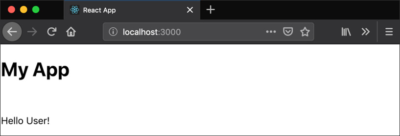
Figure 1.7: First React component created
Let's explore props with an exercise.
Exercise 1.02: Creating Our First React Component
In this exercise, we will clean up the src/App.js file. We will follow a similar path as mentioned in Exercise 1.01, Implementing JSX by opening up src/App.js and replacing its contents with the component we will be building in this exercise:
- Add an import statement and an export statement to the top and bottom of the file, respectively, to include the React library and export the component (named App, like the filename) as the default export:
import React from 'react';
export default App;
There are a few things here we need to talk about before we start building out the component in full, though.
First off, we need to import the React library into our file so that we can actually start building out our component. Without this statement, the rest of the component building would fail as JavaScript and Node.js would have no idea how to interpret the code.
The next line will end up actually being the last line of our code file; this allows JavaScript to import code in this file into other files in a clean way. We have not actually created the app that we are exporting, but don't worry about that. We will have that built in just a minute.
- Next, we will want to build out the initial component. This will start off very simple and should just be a div with the text Hello React! in it:
import React from 'react';
const App = () => <div>Hello React!</div>;
export default App;
As mentioned back at the start, there is a lightweight method of declaring your components in React, and that will be the strategy that we use to start writing this all out. Declaring a functional component in React is incredibly simple since it is just a function declaration that returns some JSX. In fact, when we get right down to it, there is not really any other major difference. So, in our code, we are going to create a new function called App, and we are going to have it return a div with some Hello React code in it.
We will have a component that looks like this when the browser refreshes:

Figure 1.8: Simple component in React
By default, this gives us a pretty basic component with no frills, and if you are aiming to just create a quick and easy component used to display something, this is probably what you would use. There is also an option to pass in props to functional components by passing them in as a function argument, which would change our function to this.
- Let's write the following code:
const App = props => <div>Hello React!</div>;
This would allow you to use this with a parent component, for example, that is passing details down to a child (but we will talk about that a little more later). You can also use standard function syntax if you prefer that.
This is the ES6 arrow function syntax:
const App = props => <div>Hello React!</div>
and it becomes:
function App(props) {
return <div>Hello React!</div>;
}
The arrow syntax is much cleaner and is more preferable. In addition, if you have a component that spans multiple lines, you will need to wrap your JSX inside parentheses instead.
- Let's expand our component from the previous example and add an h1 header to the app, in addition to our Hello React! message:
import React from 'react';
const App = props => (
<div>
<h1>My App</h1>
<br />
Hello React!
</div>
);
The resulting component should look like this:

Figure 1.9: React component
With all this knowledge, let's move onto the next section.
Understanding React Rendering
We have created two separate React components here but only with a cursory understanding of what is happening behind the scenes, so it's worth spending a little time unpacking what is happening in these functional components, especially in relation to the concept of rendering in React.
The reason that just returning JSX in a functional component works is that ultimately, anything returned by a function is a valid target for React to render if it is called from React code. It is pretty easy to see in the Greeting function how this plays out: when you use the JSX tag for a function, it basically turns whatever the function returns into usable JSX code. If we return JSX in our function, then it all gets rendered appropriately.
Let's also explore what happens higher up in the React call stack when rendering is involved. It's one thing to understand rendering at the level of the components we write, but we should also understand how those get from the code we write to the actual browser page.
Back in src/index.js, one of the files that we did not modify, if you look through it, you will see a call to ReactDOM.render():
ReactDOM.render(
<React.StrictMode>
<App />
</React.StrictMode>,
document.getElementById('root')
);
ReactDOM is a library that provides interaction with the DOM layer of the browser, and we use it specifically to place our React components into the browsers, available to be viewed and interacted with by the user.
In this case, we are taking our App component, represented by the JSX code <App />, and we are rendering the output of that (which must be valid JSX code) to the browser, converting everything from JSX into code the browser can understand and interpret.
This is why our functional component needs to return JSX, and why (as you will see later) our class-based components need to return JSX in their render function calls. If we return something JSX cannot interpret, then we will get an error message instead.
Verify the results of the preceding statement by changing the Greeting function to instead return anything else that's non-JSX and verify what happens for each.
Note
StrictMode helps to spot potential errors in advance. It performs code checks only during development time. It does not work in the production run.
Building Components with Classes
You can build your components using functional syntax, but there is another way to declare your React components that allows better state management in your components. You will be introduced to the basics of using classes. This topic will be covered in more detail in the later chapters.
In addition, the functional components of React have no real sense of utility functions or internal state; everything must be represented via props or not at all.
Instead, let's shift our focus to the other common method of building out React components: using classes. We will want to add one more addition to our React import statement at the top of our file because not only do we now want to import React, but we would also like to include the Component class from the React import.
Exercise 1.03: Implementing a Click Counter in React Using Classes
In this exercise, we will create a click counter for a web page. Here, we will convert the component we built previously as a functional component into a class component. Perform the following steps:
- First, change the import statement to also include Component from the React library.
We can import both at the same time with the following line:
import React, { Component } from 'react';
This tells us that we are going to import the React library as a whole, but that we also specifically want to pull Component out from the named exports.
This gives us everything we need to start modifying our App component to instead be a class-based component. We will start off by writing out the class definition and then build it up as we go along.
- Next, convert the functional declaration of the component to a class declaration that extends the Component import:
class App extends Component {
}
Here, we define what was previously our functional App component as a class-based component (still called App).
The next bit of this uses that Component named import that we specified at the top of the file. The extends keyword here tells JavaScript that our App component has a parent class, Component, and that its behavior should act as an extension to that parent class.
- Next, add a render function, since we can't just return JSX in a class directly, and include what used to be the body of the component before:
render() {
return (
<div>
<h1>My App</h1>
<br />
<Greeting name="User" />
</div>
);
}
This is mostly identical to our functional component, with the addition of needing to specifically declare the render function itself (without this, React doesn't know how specifically to deal with this class and render it out appropriately via JSX). We also need an explicit return statement since we are not using arrow syntax here, but otherwise this function remains identical.
Now, what if we wanted to go deeper? As mentioned previously, a critical reason to use this style of component declaration is the ability to manage state, and if you look at our render function, we are also missing any references to props.
The easiest way to define our class component in a way that allows us access to both state and props is to define a constructor function. The constructor function acts as the way for JavaScript to instantiate our new class (turn it from a class definition into an object) and set up any sort of default or initial values or state that we may need to think about.
- Define this by creating a new function in our class called constructor and pass a props argument. You will also need to include a call to the constructor via super and pass in the props argument:
constructor(props) {
super(props);
}
We can flesh this out even further. For example, maybe your class has some sort of code-configurable option to it that you do not necessarily want to expose to the user as part of its state.
- In the constructor function, let's add a new variable to the object that will keep track of the title of the app:
this.title = 'React App';
- Now change the render() function so that the header displays the value we just set instead of the hard-coded My App:
<h1>{this.title}</h1>
Finally, let's set up some internal state for our object. Do not worry too much about some of the specifics here (such as the onClick handler), as We will be going into these in much greater detail in later chapters.
We will start off by describing what it is that we want our component to do. In our case, we want to keep track of the number of times a particular button is clicked, and we want to display that count to the user.
Note
The button does not exist in the code. The clickCounter has been hard-coded.
- Start off by adding an initial state declaration into our constructor function:
this.state = { clickCounter: 0 };
- Next, use a helper function to render the click count display to the user.
As mentioned previously, React and JSX can handle rendering any function that returns JSX. That means that writing helper methods inside a class is an incredibly simple thing to do.
renderClickCount() {
return <p>I've been clicked {this.state.clickCounter} times!</p>;
}
The even better news is that adding this display to our component is a simple matter of calling the function inside curly braces in our JSX.
- Add these lines beneath the Greeting line in our render function:
<br />
{this.renderClickCount()}
If you were following along, the final state of our code for the src/App.js function should look something like this:
App.js
3 const Greeting = props => <p>Hello {props.name}!</p>;
4
5 class App extends Component {
6 constructor(props) {
7 super(props);
8 this.title = 'React App';
9 this.state = { clickCounter: 0 };
10 }
The complete code can be found here: https://packt.live/2WsVTkA
The final display of the component should look like this:

Figure 1.10: Click counter in a React component
With a firm grasp of the fundamentals of bootstrapping your first project in React, let's expand this and build a new project. Your project will allow you to demonstrate the early skills you have learned so far and put them into action while building a practical React example.
Activity 1.01: Design a React Component
Let's say we want to start building a new e-commerce site, and we need to start off by building a skeleton for the main store page. We will call our project buystuff. In this project, you'll need to create a new project, create a header React component, create an inventory template React component, and then put everything together in our main React application project.
The following steps will help you to achieve the goal:
- Verify that Node.js and Create React App are installed on your machine.
- Create your project, called buystuff, via the Create React App CLI.
- Delete all of the unnecessary files for our project.
- Build the App React component as a class component but leave it blank.
- Build the Header React component as a functional component. Its only prop should be title, which contains the store's name.
- Build the InventoryItem React component as a functional component. It should contain props that consist of the item name and price.
- Change the App component to have a constructor and a starting state with two items in it, and include your InventoryItem component in the render() function twice and your Header component once.
The end result should give us a React application that looks like this:

Figure 1.11: BuyStuff React component
Note
The solution of this activity can be found on page 606.
Summary
It is important to understand the many moving pieces involved in building React projects, as each one lends itself well to the context and decisions made when building React. Understanding the historical context helps frame the questions around why implementing some things in React is the way it is. In addition, understanding how to use the Create React App framework helps you get moving faster and building new projects with less fuss and effort, making it a critical part of your development workflow.
We also now have a strong understanding of the basic building blocks of any React component, regardless of the level of complexity. We can define small, lightweight components using functional syntax, which is a very common idiom in modern React development. We can also define larger, stateful components using class syntax, which also helps us plan for and architect our more complicated React components in ways that are easy to develop on, maintain, and support over the long term.
Ultimately, the hardest part is just knowing when to use one or the other, and that decision just boils down to if you need helper functions or state. If so, you should probably use a class-based component and not a functional component, otherwise, use the lighter components. In the next chapter, we will build upon this base layer in much greater detail, creating a strong foundation on which we will build some very complex React projects from start to finish on top of the knowledge that you have gained here.