
5
The Page Builder
In this chapter, we’ll discuss the page builder in the Betty Blocks platform. We’ll go over what exactly the page builder is and what you can do with it. We’ll create our first page by using a template and add some components to our page with the template to explore the components. And lastly, we’ll discuss how you can create a simple prototype by using a page template, so you can showcase your ideas by giving them form through the page builder.
These are the main sections to be covered in this chapter:
- What is the page builder?
- Our first page, based on a page template
- Modifying a page template
- Creating a prototype page
After this chapter, you should have a basic knowledge of what kind of pages you can build with the page builder and an understanding of the first set of components in the page builder, which will help you to build your first pages.
We’ll also explore the page templates, which can help you quickly build a page with minimal effort. We’ll discuss the different types of pages that are currently available. And to practice some more with some of the components, we’ll make some modifications to the page template. Lastly, we’ll create a page from scratch for a prototype, so you can learn how to build a page that can help you get your ideas across without having to build any actual functionality behind the page yet.
Let’s get started by discussing what the page builder actually is.
What is the page builder?
The page builder is a drag-and-drop editor used to create web pages. It allows you to do most of the things with it that you are allowed to do with code, just in a much simpler way because you don’t have to remember all the code for creating a page. It also allows you to integrate with the data model that you’ve created so you can display all the data on your application’s pages. Backend logic is handled by the actions part of the Betty Blocks platform. We haven’t touched this part yet, but it basically allows you to create backend logic with drag and drop as well. This will be covered in another chapter.
With most no-code tools, you can get stuck because they don’t support something that you might want to do. In the Betty Blocks platform, you can add functionality and extend the functionality provided by the platform by using code. This doesn’t mean that someone who can write code needs to create this part by adding code to your page; instead, they can create a no-code block using code to enable other developers to use it. This allows the citizen developer or no-code developer to build the application they want without making sacrifices in functionality. And this new functionality can be shared across different applications as well, so it becomes part of their whole Betty Blocks environment.
For this chapter, we will use the application that we created in the previous chapter.
So, let’s get back to the page builder. Let’s explore some of the basics first since most of what I just mentioned is meant for when we can actually build an application.
Opening the page builder
In the builder menu on the left side of your screen, you’ll see a little white paper icon, which, when you hover over it, should turn blue, just like the following screenshot:

Figure 5.1 – The page builder in the builder bar
Click on this paper icon, and the quick view of the Page overview page should open. This quick overview is great for quickly opening the page you are looking for or quickly creating a new page, but in this case, we want to go to the Page overview page. So, we need to click on the overview button. This is the gray button with a list view icon next to the search bar, and you can see an example of this button in Figure 5.2:

Figure 5.2 – The page overview button
On the Page overview page, you get an overview of all the pages you’ve created so far. In our case, this page is empty since we haven’t created any pages yet. There are three categories of pages, as you can see at the top: All, Public pages, and Authenticated pages. These three types just differentiate your pages, so it’s easier to find them. Public pages are pages that anyone can see without being logged in, while Authenticated pages require users to be logged in first before they can access the page. And of course, on the All page, you can find both types of pages.
There is also an option to search for your page based on its name. This makes it easier to find your page once you start creating more pages. And then, there is the New page button, which allows you to create a new page. So, let’s start there next.
Our first page, based on the page template
Let’s click on the New page button in the top-right corner. This should open the Page creation page (see Figure 5.3). On this page, you’ll get an overview of all the public page templates that Betty Blocks offers out of the box. The Start from scratch button allows you to create a blank new page if none of the templates are what you are looking for.

Figure 5.3 – The Page creation page
There is also an option to create your own page templates, which you can find in the My Templates tab. Right now, these templates are probably empty. There is also a button in the top-right corner for requesting templates. You can use the Request template button to request a specific template that you think is a good addition to the platform.
But we are here to explore our first page, so let’s use a template to do so. This should help you understand some of the basics of the page builder without having to build a whole page yourself. Scroll down until you see the Inspirational Dashboard template; this template has no data on it from a data model. First, we want to explore the page builder with a static page to help you understand it better, which is why we are going to use the Inspirational dashboard template. Hover over the Inspirational dashboard template with your mouse and click on the Use button. This should open up a dialog box that asks you to name the page and set the path of the page (Figure 5.4).
The name of the page can be anything you want it to be; of course, it would better to give it a descriptive name, so you can find it easily later. The PAGE PATH field is the name of the link your page will get when you want to visit it through your browser. By default, this is going to be derived from the value you enter in the PAGE NAME field. If your page name is very long, you can make changes to the path to keep it simple and more understandable in the browser. Let’s name our page Example, and let’s leave the path as the default value.

Figure 5.4 – The create new page dialog
The third option that we see is the TYPE OF PAGE option, which decides whether the page is going to be publicly available or behind an authentication. Since we haven’t set up any authentication yet, let’s choose Public. You’ll see that the AUTHENTICATION PROFILE option disappears, so we don’t have to decide this in this case. Let’s hit the Create page button, which redirects us to the second part of the creation of this page (Figure 5.5). For now, we’ll skip this part, as we’ll discuss this in more detail in the ToDo Application chapter. Let’s click on Add without configuration to skip this section. Our page should be created for us now.

Figure 5.5 – Step 2 of the page creation
Your page should now look something like the screenshot shown in Figure 5.6. You’ve now arrived at the page builder.

Figure 5.6 – Inspirational dashboard in the page builder
So, what exactly can we see here? Because, right now, this might be a bit overwhelming. Let’s go over some of the basics of the page builder first. We’ll go step by step, so you’ll know how to use all parts of the platform.
The page builder side menu
Let’s start on the left side of the screen, next to the builder bar. In Figure 5.7, we see the tabs that make up the menu of the page builder, together with the components under them.

Figure 5.7 – Page builder tabs and components
The four tabs are as follows:
- Components
- Variables
- Component tree
- Page settings
In the Components tab, you will find all the components that you can use to create your pages. You can drag a component from here onto the canvas and drop it in the place where you would like it to appear.
The Variables tab allows you to set up variables that can help you to send over data from one page to another. I understand that right now, this might not make a lot of sense. We won’t go into this right now; just be aware that it exists. We’ll get back to this in Chapter 8, ToDo Application.
The Component tree tab is very important because you’ll be using a lot of different components on your page, which may overlap each other. This could mean that some components might be harder to select later on. The component tree allows you to see all components on your page in a nice tree hierarchical overview and select them from there, so you don’t have to visually search through your page.
The Page settings tab allows you to make changes to the name of your page and the path that we set up earlier when we were creating the page. Among other things, they are more technical.
Components
Components are the basic elements that make up a page in the page builder. They can be small and simple, such as a column. For example, a column is a component that you can use to create the layout of your page by adding different columns and sizing them according to your design. Components can also be more extensive, such as a dialog, which consists of more than one component essentially. It’s like a pop-up window where you can inform your users by showing some info. The difference between these two examples is that the dialog is basically a set of different, smaller components that makes up the dialog. For example, with the dialog, you have the dialog itself but also a header inside it and a few buttons to close the dialog by default, whereas the column is exactly what it says it is, a column that allows you to set up the basic layout of the page. But we’re getting into a lot of detail already. Let’s focus first on what types of components there are.
There are a few types of components that make up the page builder. They are divided into the following different sections:
- Layout
- Navigation
- Content
- Button
- Data
- Form
- List
- Card
- Logic
Each section is there to make it easier to find a specific component that you might need on your page. Of course, there is a search option as well that can help you find the correct component.
You can drag and drop each of these components, and the part where you drop the components is what is called the canvas. In our example right now, we already have components on our canvas. We can add more by grabbing one from the components section and dragging it onto the canvas, but there might be some components that can only be dropped in a specific component. For example, most components expect at least a column to be on the page first before they can be dropped on the page. An empty page can only have layout components first before you can, for example, drop text onto the page. We’ll explore the different options of which components to drop first in the next section of this chapter.
Now, let’s take a look at the components that are currently on your canvas. If you click on the YourLogo image at the top of the canvas, you can select the AppBar component (Figure 5.8):

Figure 5.8 – The AppBar component selected
You’ll see that the selected component has a purple box around it, indicating the area of the AppBar component on the canvas. You’ll also notice that on the left side of your screen, the components are gone and have been replaced with the options for this specific component (Figure 5.9):

Figure 5.9 – The AppBar options
These options allow you to make modifications to this component so that it suits your needs. You can change colors, change the image, adjust the height, and many other things. We’ll not be going over each component’s options in this book because that would take too much time. Most of these options speak for themselves, but in the different chapters, we will go over the most important options. For now, it’s important to know where to find the options for your components. So, if you click on a component, it will show you its options on the left side of your screen.
Let’s click on the TITLE dashboard on the canvas to see what options will appear for a title. As you can see, other options appear for the title, such as the option to set the title itself. You can change the type of title you want in order to make it smaller or larger, and there are options for the alignment of your text as well. If you have some familiarity with the basics of the web, most of these options should be easy to understand.
The component tree
Now, let’s have a look at what the structure of the page looks like. To do this, we’ll need to open the Component tree tab. It’s located on the left side of the screen and is the third tab (Figure 5.10).

Figure 5.10 – The component tree tab selected
The component tree shows you the structure of a page on the canvas by showing you all the components on it in a hierarchical structure. Since a lot of components live in other components, it’s easy to get lost or not be able to select or find the component you might want to edit. This is where the component tree comes in handy. It allows you to see all the components and easily select them (Figure 5.11).

Figure 5.11 – The component tree
In the Component tree tab, as shown in Figure 5.11, you can see a part that represents the dashboard title until the first orange visitors’ box. If you hover over the components in the component tree, you’ll see all the components highlighted in the canvas, so you’ll know exactly where they are located. In Figure 5.12, we are hovering over the column component in the component tree, while on the canvas, you can see it highlighted.

Figure 5.12 – Highlighted column
If you look at the visitor’s box, it looks like one simple box, but when you look at the component tree, you can see it consists of multiple components. Let’s break this down to get a better understanding.
A row helps you to order all your columns, and you can have multiple columns in a row. And when set up properly, those columns should be on one line. In this case, each of these boxes, Visitors, Sales, Subscribers, and Orders, has its own column, so they are separated easily. Then we use Paper, which creates an effect that makes the box appear to be lifted a bit on the canvas. Inside Paper, we have another Row because want to show the icon and the Visitors with the numbers on each side. A row with two columns makes it easy to split those evenly. Then, inside these columns, we have an icon and the other two Text components. It sounds like a lot, but once you get into creating your own pages, this will all make sense very quickly. I hope this gives you some idea of how to organize components on your page.
In the next section, let’s add some components of our own to the canvas and modify them to get a better feeling of how you can drag and drop to create your own page.
Creating a layout
In this section, we’re going to create our page layout to get a feeling of the drag-and-drop functionality and explain some of the layout components and their options.
Before we get started, let’s create a new page, so we have a blank page to get started with. Click on the page builder icon in the builder bar on the left side and when the sliding pane opens, click on the blue cross button in the top-right corner. This should bring you to the Choose a template page, and here we can create a new page based on a template or create one from scratch. We’ll start from scratch now to play around with some of the layout components. You’ll see a gray Start from scratch button at the top (Figure 5.13). Press it and name the page Layout Test, set it to Public, and click on Create a page. You should see an empty canvas now in the page builder.
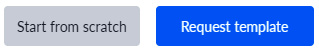
Figure 5.13 – The Start from scratch and Request template buttons
The most important component in the page builder is the Column component. This component is used for a few important things:
- It’s the primary component used to be able to drop other components into
- It allows you to create your page layout
- It allows you to set up the different page layouts for desktop, tablet, and mobile
Why is it the primary component used to drop other components into? Because without the Layout component first on your canvas, you can’t drop any other component on the page. Give it a try by grabbing a text component and dragging it onto the canvas. You’ll see that nothing happens because it can only be dropped into other components, such as the column component. A column is based on the 12-column principle. The reason why it’s 12 is that 12 can be divided by 1, 2, 3, 4, 6, and 12, so it is very flexible.
Our first columns
You can create a layout with the columns, and, as you might have noticed, there are four different column components. Each component has a specific number of columns, from one to four. These aren’t the only possibilities, but they are the most common, so that’s why they are offered by default. We’ll explore how to change them to your liking in this section. For starters, let’s drag 1 Column onto our canvas. Click on the component and hold your mouse button and release it once you are over the canvas. Your page should now look like Figure 5.14. A single column is displayed at the top of your canvas.

Figure 5.14 – The column component on your canvas
Let’s also drag a 2 Columns component under our first Column component onto the canvas. Now that we have two columns, we have a little bit of a layout but this layout won’t be visible on the page, since the gray part in the column is just a placeholder so that you know where you can put your other components in an empty column. In our top column let’s place some text, so we can see what the column will look like with another component placed inside. Search for the Text component in your component library on the left (Figure 5.15) and drag it into the top Column component.

Figure 5.15 – Searching for the Text component
Your page should now look like Figure 5.16.

Figure 5.16 – Column with text and two empty columns
Now click on the Text component on your page. The left side of your screen should now display the Text component options. Type some random text in the CONTENT box so we have some text in the column. As you can see, it will appear immediately after entering the text in the CONTENT box (Figure 5.17). As you can see, the gray placeholder area is now gone, and since it now has some text inside, it shows the true column. Officially a column has no height or border, so on the page itself, it will just appear as white space without any other component inside it or without changing the options of the column to show a color or give it a specific height.

Figure 5.17 – Text added to the first column
To see what happens when you change the height of a column, let’s change the background color and the height of the two columns that are at the bottom of the page right now. Select the first column and on the left-side menu, click on Styling; now you should see Height and Background color. We can use these settings to change the height and the background color. For the first column, let’s choose a height of 100 pixels. Enter 100 in the height box and change the second dropdown to px. Then set the Background color field to success, and you should see that the outer part of the column changes to green. The gray part will also be green, but since we don’t have any other component inside the column, it will still show us the placeholder. When we go to the live page, we’ll see that it is completely green.
Let’s do the same for the second column, but set it to a height of 50 pixels and set the Background color field to danger, so it turns red. Now, in order to see our page live, we need to hit the play button in the builder menu. You can find it at the top of the builder menu on the left. Your page should look like Figure 5.18.

Figure 5.18 – The live page
As you can see, the gray placeholders are gone, and the columns show as green and red bars now. You can play around a little by changing the height and the background color and maybe placing a text component inside the colored components to practice.
Desktop, tablet, and mobile mode
The page builder has modes for desktop, tablet, and mobile views. This should help you to develop more quickly for each of these modes. If you don’t want to develop one of them, you don’t have to do anything. Just turn on the mode you want to develop for and make sure it looks good in that specific mode. You might be wondering, How do I change the page builder to that specific mode? At the time of writing this book, the options for changing the layout in the page builder were in the bottom left corner of the page builder, but this might have changed to be on the top center of the page builder. The different modes are shown in Figure 5.19.
Figure 5.19 – The different modes in the page builder
From left to right, we see the phone, tablet vertical, tablet horizontal, laptop, and full-screen mode. By default, it’s set to full screen. Try changing the mode, and you’ll see that the screen turns into a phone or tablet, for example.
Let’s see how we can change our current page, so it works well on a desktop and on a phone. We’ve got the text and the two colored columns. We’ll use the phone and the full-screen option for this. When you change it to the phone option, your screen will look something like Figure 5.20.

Figure 5.20 – Our page on a phone screen
As you can see, it automatically changes to look better on a phone. So, out of the box, it’s already taking care of your phone screen, but what if this was not the case? If you click on one of the columns and look at the options that appear on the left side of the screen, you’ll see four options for the column width so that for each type of device, you can set it up differently. A column in the page builder is always measured from 1 to 12. Why is this 12? That’s because 12 allows you to easily divide your screen. For example, if you want 4 identical columns, you set them to 3, and since 4 * 3 = 12, they fill the whole width of the screen. This is something that a lot of frameworks use for websites, so this standard is also used in Betty Blocks.
So, let’s make a change to our columns so that we can see it in action. Stay in mobile mode and change the options on the left for the mobile to 6 for both columns (left and right).

Figure 5.21 – Our columns with a width of 6 in mobile mode
As you can see, this wouldn’t support much text on a mobile phone. So, the 12 on the phone would be much better. Let’s change it back to 12 for mobile. Let’s drag in a 4 Columns component from the Components tab (Figure 5.22).

Figure 5.22 – The 4 Columns component
As you can see, in mobile mode, it is automatically set to a width of 6, while in desktop mode, it’s set to a width of 3. If we change the mode to full screen, you can see that it will span the whole screen with four columns. If you select one of the columns and look at the column width options on the left side, you’ll see there are fifteen different options there to choose from. We won’t go through all of them, but you can play around with these options a little on your own once you’ve finished this chapter to get a feel for how to set up your columns.
Columns in columns
You can also drag another column into an existing column, this will allow you to make even more precise layouts. Let’s drag a 2 Columns component onto our canvas in full-screen mode. And in the first column of this 2 Columns component, let’s drag another 2 Columns component. Your page should now look like Figure 5.23.

Figure 5.23 – Your page set up with different columns
Now you have two columns and one large column next to it. Of course, there are many other ways to achieve this, but for now, this should give you an idea of how to work with columns and set up your page layout.
Summary
In this chapter, we started using the page builder for the first time. The page builder helps you to create pages by dragging and dropping components onto a canvas. You learned how to get to the page builder by selecting the page icon from the builder bar and then selecting the overview icon. This took us to the page builder overview page. Next, we created our first page based on a template, which taught you how to create a page, how to name your page, and what options you can use while creating a page from a template. We then went through some of the basics of the page builder and the components in this template to get a feeling of the page builder. We touched on the components, the component tree, and the options of a component.
Then we created a new page that was completely empty. Here, we learned about creating layouts with a column. We used different options in columns to set up a page and also learned how we can change our view mode from full screen to mobile or tablet so you can also develop mobile or tablet pages.
In the next chapter, we’ll create our first page as a prototype, which can be used to demo your idea for an application before you start building it.
Questions
- What can you do with the page builder?
- What is a page template?
- What is the component tree?
- Can you also build mobile sites?
Answers
- With the page builder, you can build the frontend part of your application. It allows you to drag and drop your page together and style it from there.
- A page template is a predefined page that already has the page set up for you. It also allows you to add data to it from a data model and make other configurations, so you don’t have to manually set up a lot of the page.
- The component tree allows you to quickly navigate through the components on your page. Some components might be hidden on your page because other components are overlapping them. With the component tree, you can easily access them.
- With the page builder, you can build websites for desktops, mobiles, and tablets.