
Drawing graphics by overriding drawRect is not very performant, because all the drawing routines are executed on the CPU. Offloading the graphics drawing to the GPU is both more performant and more power efficient.
iOS has a concept of layers, which are Core Graphics optimized drawing contents. Operations composed on a layer, including adding a path, can be translated into code that can execute on the GPU and be rendered efficiently. In addition, Core Animation can be used to animate changes on layers efficiently.
The download progress icon on iOS can be recreated as a ProgressView containing layers for the circular outline, a layer for the square stop button in the middle, and a layer for the progress arc. The final view will composite these three layers together to provide the finished view.
Every UIView has an implicit associated layer, which can have sublayers added to it. As with views, newly added layers overlay existing layers. There are several core animation layer classes that can be used, which are subclasses of CALayer:
- The
CAEAGLLayerclass provides a way to embed OpenGL content into a view - The
CAEmitterLayerclass provides a mechanism to generate emitter effects, such as smoke and fire - The
CAGradientLayerclass provides a way to create a background with a gradient color - The
CAReplicatorLayerclass provides a means to replicate the existing layers with different transformations, which allows effects such as reflections and coverflow to be shown - The
CAScrollLayerclass provides a way to perform scrolling - The
CAShapeLayerclass provides a means to draw and animate a single path - The
CATextLayerclass allows text to be displayed - The
CATiledLayerclass provides a means to generate tiled content at different zoom levels, such as a map - The
CATransformLayerclass provides a means to transform layers into 3D views, such as a coverflow style image animation
Create another view class called ProgressView, which extends UIView. Set it up with the default init methods, a setupUI and an updateUI method:
import UIKit
class ProgressView: UIView {
  required init(coder: NSCoder) {
    super.init(coder:coder)
    setupUI()
  }
  override init(frame: CGRect) {
    super.init(frame:frame)
    setupUI()
  }
  func setupUI() {
    updateUI()
  }
  func updateUI() {
  }
}
Create a new Layers Scene in the Main.storyboard by dragging a View Controller from the object library onto the storyboard. Connect it to the tab bar controller by dragging a relationship segue to the newly created layers view controller. Add the ProgressView by dragging a View from the object library and giving it a Custom Class of ProgressView. Size it with an approximate location of the middle of the screen.
Now add an instance variable to the ProgressView class called circle and create a new instance of CAShapeLayer. In setupUI set the strokeColor as black and the fillColor as nil. Finally, add the circle layer to the view's layer so that it is shown:
let circle = CAShapeLayer()
func setupUI() {
  circle.strokeColor = UIColor.blackColor().CGColor
  circle.fillColor = nil
  self.layer.addSublayer(circle)
  updateUI()
}
A CAShapeLayer has a path property, which is used to perform all the drawing. The easiest way to use this is to create a UIBezierPath and then use the CGPath accessor to convert it to a CGPath. Unlike the UIGraphics* methods, there are no separate draw* and fill* operations; instead, either the fillColor or strokeColor is set and then the path is filled or stroked (drawn). The UIBezierPath can be constructed by adding segments, but there are several initializers that can be used to draw specific shapes. For example, circles can be drawn with the ovalInRect initializer:
func updateUI() {
let rect = self.bounds
circle.path = UIBezierPath(ovalInRect: rect).CGPath
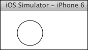
}Now when the application is run, a small black circle will be seen on the layers tab:
The stop square can be added by creating another layer. This will allow the stop button to be turned on or off as necessary. (For example, during a download, the stop button can be shown, and when the download is completed, it can be animated away.)
Add a new constant called square of type CAShapeLayer. It will help to create a constant black as well, since it will be used again elsewhere in the class:
class ProgressView: UIView {
  let circle = CAShapeLayer()
  let square = CAShapeLayer()
  let black = UIColor.blackColor().CGColor
}
The setupUI method can now be updated to deal with additional layers. Since it is common to set them up in the same way, using a loop is a quick way to set up multiple layers:
func setupUI() {
  for layer in [square, circle] {
    layer.strokeColor = black
    layer.fillColor = nil
    self.layer.addSublayer(layer)
  }
  updateUI()
}
The path for the square can be created using the rect initializer of UIBezierPath. To create a rectangle that will be centered inside the circle, use the rectByInsetting method with an appropriate value:
func updateUI() {
let rect = self.bounds
let sq = rect.rectByInsetting(
dx: rect.width/3, dy: rect.height/3)
square.fillColor = black
square.path = UIBezierPath(rect: sq).CGPath
circle.path = UIBezierPath(ovalInRect: rect).CGPath
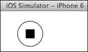
}Now when the application is run, the following will be seen:
The progress bar can be drawn as an arc representing the amount of data downloaded so far. On other iOS applications, the progress bar starts at the 12 o'clock position and then moves clockwise.
There are two ways to achieve this: using an arc that is drawn up to some particular amount, or by setting a single path that represents the entire circle and then using strokeStart and strokeEnd to define which segment of the path should be drawn. The advantage of using strokeStart and strokeEnd is that they are animatable properties, which allow some animated effects.
The arc needs to be drawn from the top, moved clockwise to the right, and then back up again. The strokeStart and strokeEnd are CGFloat values between 0 and 1, so these can be used to represent the progress of the download.
There is a UIBezierPath convenience initializer that can draw an arc; the center and radius are specified along with a startAngle and endAngle point. The start and end point are both specified in radians, with 0 being the 3 o'clock position and going clockwise or anticlockwise as specified.

To draw progress starting from the top of the circle, the start point must be specified as -pi/2. Drawing clockwise from here around the complete circle takes it to -pi/2 + 2pi, which is 3 * pi/2.
The middle of the diagram can be calculated by accessing self.center, and the radius of the circle will be half the minimum width or height. To add the path, create a new CAShapeLayer called progress, and optionally give it a different width and
color to distinguish it from the background:
class ProgressView: UIView {
  let progress = CAShapeLayer()
  var progressAmount: CGFloat = 0.5
  …
  func setupUI() {
    for layer in [progress, square, circle] {
      …
    }
    progress.lineWidth = 10
    progress.strokeColor = UIColor.redColor().CGColor
    updateUI()
  }
  func updateUI() {
    …
    let radius = min(rect.width, rect.height) / 2
    let center = CGPoint(x:rect.midX, y:rect.midY)
    progress.path = UIBezierPath(
      arcCenter: center,
      radius: radius,
      startAngle: CGFloat(-M_PI_2),
      endAngle: CGFloat(3*M_PI_2),
      clockwise: true
    ).CGPath
    progress.strokeStart = 0
    progress.strokeEnd = progressAmount
  }
}
When this is run, the progress bar will be seen behind the circle:

The problem with the progress line is that it extends beyond the circular boundary of the progress view. A simple approach might be to try and calculate a half-width distance from the radius and redraw the circle, but this is fragile as changes to the line width might result in the diagram not looking right in the future.
A better approach is to mask the graphics area so that the drawing does not go outside a particular shape. By specifying a mask, any drawing that occurs within the mask is shown; graphics that are drawn outside the mask are not shown.
A mask can be defined as a rectangular area or the result of a filled layer. Creating a circular mask requires creating a new mask layer and then setting a circular path as before.
Create a new CAShapeLayer that can be used for the mask, and create a path based on the UIBezierPath with an ovalInRect. The mask can then be assigned to the mask layer of the progress layer:
class ProgressView: UIView {
  let mask = CAShapeLayer()
  func updateUI() {
    …
    mask.path = UIBezierPath(ovalInRect:rect).CGPath
    progress.mask = mask
  }
}
Now when the display is shown, the progress bar does not bleed over the edge:

To test the view in interface builder directly, the class can be marked as @IBDesignable. This gives permission for Xcode to instantiate and run the view as well as update it for any changes that are made. If the class is marked as @IBDesignable, then Xcode will attempt to load the view and display it in storyboard and xib files.
However, when the class loads the UI will not be displayed properly, because the frame size needs to be initialized correctly. Override the layoutSubviews method to call updateUI, which ensures that the view is properly redrawn when the view changes size or is shown for the first time:
@IBDesignable class ProgressView: UIView {
  …
  override func layoutSubviews() {
    setupUI()
  }
}
Now when the ProgressView is added or shown in interface builder, it will be rendered in place. Build the project, then open the Main.storyboard, and click on the progress view; after a brief delay, it will be drawn.
Xcode can also be used to edit different attributes of an object in interface builder. This allows the view to be tested without running the application.
To allow interface builder to edit properties, they can be marked as @IBInspectable:
@IBDesignable class ProgressView: UIView {
  @IBInspectable var progressAmount: CGFloat = 0.5
  …
}
After building the project, open the storyboard, select the Progress View, and go to the Attributes Inspector. Just above the View section will be a Progress View section with the Progress Amount field based on the @IBInspectable field of the same name.

If a UISlider is added to the Layers View, changes can be triggered by adding an @IBAction to allow the valueChanged event to propagate the value to the caller.
Create an @IBAction function setProgress, which takes a sender, and then depending on the type of that sender, extract a value:
@IBAction func setProgress(sender:AnyObject) {
  switch sender {
    case let slider as UISlider: progressAmount =
      CGFloat(slider.value)
    case let stepper as UIStepper: progressAmount =
      CGFloat(stepper.value)
    default: break
  }
}The valueChanged event on the UISlider can now be connected to the setProgess on the ProgressView.
Assigning the progressAmount value alone has no visible effect, so a property observer can be used to trigger display changes whenever the field is modified. A property observer is a block of code that gets called before (willSet) or after (didSet) a property is changed:
@IBInspectable var progressAmount: CGFloat = 0.5 {
  didSet {
    setNeedsLayout()
  }
}
Now when the application is run and the slider value is moved, the download amount will be updated in the view. Observe that the changes to the progressAmount are animated automatically, so if the slider is quickly moved from one end to the other, the download arc will smoothly animate.
Tip
The property observer uses setNeedsLayout to trigger a call to layoutSubviews in order to achieve the change in display. Since changes only need to be picked up when a size change occurs or when a property is changed, this is more efficient than implementing other methods such as drawRect, which will be called every time the display needs to be updated.