
Bar, line, and pie charts are some of the most common ways of representing data. Though originally devised by William Playfair at the end of the 18th century, these classic visualizations are as valuable today as they were decades ago. Their simplicity and high visual impact have positioned them among the most popular objects in dashboard design. Additionally, they served as inspiration to create new chart styles, such as combo, slope, and radar charts. With that in mind, in the next pages we will talk about:
- Bar, line, and pie chart usage
- Labeling and color encoding
- Best practices, tips, and tricks
In previous chapters, we pointed out that bars work great for comparisons, lines are the best way to represent trends over time, and pies help us visualize parts of a whole. However, there is much more behind these classics…
The majority of objects in QlikView are capable of handling several dimensions and expressions without any trouble. Unfortunately, we cannot say the same about our brain. When dealing with numerous items cluttered in the same area, it is quite easy for us to lose focus, so try to limit the amount of data you display in a single chart.
Most of the time, keeping the number of dimensions and expressions under four will work fine (1 expression and 1 dimension, 2 dimensions and 1 expression, 1 dimensions and 2 expressions, and so on). In this regard, there are three notable exceptions. The first one refers to combo charts. Since they work with different representations at once (bar, lines, and symbols), they can handle more expressions than the average chart. In contrast, pivot tables only make sense while using multiple dimensions as each item adds a new level to the hierarchy. Finally, pie charts are only useful while working with one dimension and one expression, so they are better kept simple.
Some visualizations—such as top 10 rankings—work well in either orientation. Most of the time, the decision to use a vertical or a horizontal graph has more to do with style than functionality. However, horizontal representations are often preferred because they can display long labels clearly, and you can add the values at the end of the bars without the fear of overlapping numbers.
Conversely, there are some scenarios where the orientation does affect the chart's readability. For example, when representing a trend over time, it is better to stick to the classic horizontal orientation because our brain is accustomed to reading from left to right, so it is natural for us to interpret the oldest point on the left-hand side and the newest elements on the right-hand side.
Depending on the context of the data, it may be beneficial to remove the axes lines in order to maximize the data-ink ratio and present a leaner design to the users. For instance, the following graph already shows the values at the end of each bar, so it may be redundant to include a scale on the axis as well. In addition, the gray line between the labels and the bars doesn't add any value to the visualization, so we can delete it without remorse:

In the same manner, remember that intense colors are to be reserved for the most important elements of a chart. If you use lighter tones on axes lines, grids, and labels, your visualizations will benefit at both the aesthetic and functional ends.
It is always important to consider whether the axes will have an impact on the interpretation of a chart. If your main focus is to show a comparison of magnitudes, you should force the axis to zero (Axes tab). This option will display each element as big as it is and will usually make your charts look steadier. On the other hand, if you need to focus on the variances amongst the items—even if they are small in comparison to the total magnitude—it is better to let QlikView adapt the scale so that the differences are more evident.
Forcing the axis to zero in a bar or line chart is neither good nor bad; it all depends on what you want to highlight. Just watch out for charts like this one (yes, I am using a 9GAG post as an example):

Occasionally, in-chart selections are undesirable due to the nature of the expressions or the dashboard's navigation schema. If you need to disable the selections in a specific object, go to the General tab and activate the Read Only box.

Cluttered charts are rarely useful, so be careful when working with high cardinality dimensions (fields with many distinct values). Most of the time, it is better to limit the number of elements displayed for readability's sake. If it is enough to show only the top (or bottom) items, you can work with the Dimension Limits tab. On the other hand, if it is valuable for the analysis to see all the elements, it is better to add a scrollbar in the Presentation tab.
Again, it all depends on your visualization's objective. Generally, grouped charts foster the comparison between individual items, while stacked representations highlight the composition of the bars. In either case, you should be careful while dealing with high cardinality dimensions as your chart might turn into an unreadable stained glass.

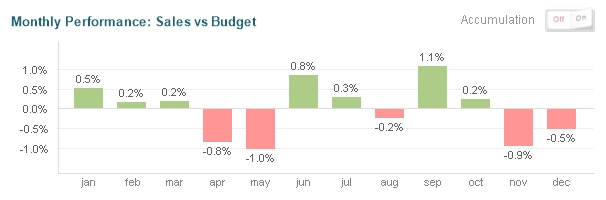
Don't be afraid of changing old-fashioned charts with innovative alternatives that help the user better visualize the data. For example, using a bar chart with two expressions is a common way of comparing KPIs. However, if both calculations are too similar, it can be hard to see the variances over time. Take, for instance, the following graph representing the new credits positioned by a bank against its budget:

As you can see, the magnitudes are so big (and the gaps between the metrics are so small) that it is difficult to draw conclusions in this regard. If your goal is to highlight the small differences between the actual and expected figures, you can change the perspective of the visualization and plot the variances instead of the actual numbers:
Actually, mixing both objects (maybe using a container) will give the user a better perspective of the situation. In this way, they will be able to see trends in the global magnitudes but also dive into the details and make precise comparisons.
If you research data visualization, you will soon realize that there are plenty of detractors of pie charts. While it is true that they have some downsides, a good designer knows how and when to use each tool, so do not throw them away just yet.
Pie charts are mainly used to represent parts of a whole, so they work best with percentages. However, as our brain is not very good at measuring areas, sometimes it is hard to distinguish which slices are bigger without the help of a legend (sorting the values can help too!). Hence, the pie chart is a bad choice for situations that require a detailed comparison.
Likewise, avoid this visualization with high cardinality dimensions. In other words, don't use it if you will end up with too many slices. If you are dealing with several small items, it is better to restrict the number of values shown by including an Others slice (Dimension Limits tab).

One of the hidden charms of pies is their shape. While lines usually require a horizontal, rectangular area and bar charts demand an elongated space, pie charts can adapt a little better to difficult spaces.

Albeit that it is a little difficult to master this type of chart, they are quite popular amongst business users, so it may be nearly impossible to get rid of them. Remember that there are no bad tools, only misapplications (well, maybe the radar chart IS a bad tool, but you get the point).
Have you ever printed a QlikView object using the caption icon? Well, neither has the vast majority of users around the globe. Even though all charts include multiple icons in the caption bar by default, it is better to include only the relevant ones. By doing this, you will also reduce the chartjunk and create a leaner visualization. In this regard, don't forget that most of these functions are available through the contextual menu (that is, by right-clicking it); so, it is possible to hide most of the icons without reducing the object's functionality.
When used adequately, color can greatly improve your visualization by making it easier to read or adding valuable information. There are several ways of taking advantage of colors within a chart, for instance:
- Data association: As we have mentioned before, using consistent colors for the dimensions and expressions across all the objects in a dashboard makes the users feel more comfortable and increases the overall usability.
- Highlight: Just as a traffic light gauge inside a table, changing the color of a bar or slice can highlight certain elements in a chart. The Gestalt principles of consistency and similarity will immediately isolate the items in contrasting colors disregarding their size. Color functions such as
RGBandARGBare frequently used for this purpose.
- Using color as a metric: Although less accurate than size or position, color can represent a KPI based on its intensity or hue. Usually, this effect is accomplished using the
ColorMix()function.
Time to talk about one of the most relevant parts of a chart: the legends. The correct usage of labels boosts the usability of any dashboard by adding context to each visualization (the type of information being displayed, units of measurement, or the base of comparison, just to name a few). There are several ways of labeling a chart, and it is your job as a QlikView designer to decide which ones to include, their position, and their format.

These are the most common ways to include labels inside a chart:
- Window title: It is included in the caption bar and usually contains the title of the chart. You can configure it in the Caption tab.
- Title in Chart: An alternative to displaying the chart title when you hide the caption or when a subtitle is necessary. To edit or delete it, go to General | Show Title in Chart | Title Settings.
- Dimension Axis: This represents each element of the dimension. If it is not necessary, you can hide it by disabling the Show Legend option in the Dimensions tab.
- Expression Axis: These are the reference numbers along the y-axis. You can delete them by selecting Hide Axis or using a transparent font in the Axes tab.
- Dimension Label: This is the name of the dimension. It is often dispensable as the dimension elements explain themselves. Change its content or completely delete it with the Label box in the Dimension tab.
- Expression Label: This is the name of the expression. Even though you do not see it in the chart, it is vital to include it because it will appear on the popups.
- Values on Data Points: These are the numbers shown at the end of the corresponding bar, line, or slice. To include them, go to Expressions | Values on Data Points.
- Values on Axis: These are the numbers shown next to each item along the axis. To include them, go to Expressions | Text on axis.
- Values as Popups: These only appear when the cursor hovers over a value. You can build new expressions to display customized messages by going to Expressions | Text as Pop-up.
- Text in Chart: Whenever you need an extra label, you can rely on the Text in Chart grouping inside the Presentation tab.
- Reference Lines: If you need to include a label that explains what a reference line means, check the Show Label in Chart box while creating it.
- Legend: It usually appears on the right-hand side of a chart when a color reference is needed. If you want to delete or format it, just look for the Legend grouping in the Presentation tab (it contains many appealing options).
Here are some tips that might be useful when working with chart labels:
- Add all the information required to fully understand the message behind a chart. This includes titles, axes, legends, or even explanatory text blocks for complex visualizations.
- Increase the data-ink ratio by removing redundancy. For example, if Window Title is enough to give context to a chart, you can omit the Title in Chart along with other labels.
- Avoid the vertical or diagonal axis labels when possible (their readability is much lower as compared to the horizontal ones).
- Be concise and clear. An obnoxiously long title is as bad as an oversimplified one. Avoid references like
Nt. Pr. p/Cust. - The titles should be located near the data, but be careful while positioning them; a selection could make your labels overlap with the chart contents.
- If possible, avoid staggering labels (Axes | Stagger Labels). For example, while working with dates, people can assume that the point without text between January and March is February even if it is not displayed along the axis.
