
In the previous chapters, we discussed how to build a dashboard that is not only engaging, but also functional, maintainable, and easy to use so as to promote insights that derive in tangible value for the business. Now, it is time to talk about the activities that should be undertaken before the official release of the app in order to ensure that everything is okay. Throughout this final chapter, we will discuss:
- Activities before the rollout
- The 10 commandments of QlikView design
- After the go-live
You have built an amazing dashboard in QlikView, and you are ready to publish it. However, before your masterpiece sees the light, some deeds must be done, and these are explained in the following sections.
Before finishing an application, it might be a good idea to lock the objects in order to prevent the users from moving or resizing them. You can accomplish this chart by chart by going to the Layout tab and unselecting the Allow Move / Size box:

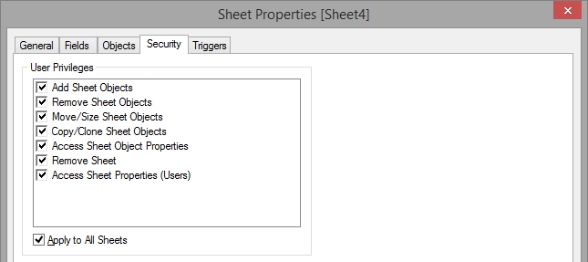
If you want to lock all the objects inside a sheet, it is easier to open the Sheet Properties window and go to the Security tab. Here, you can restrict not only the Move/Size privilege, but also some others such as Remove Sheet or Remove Sheet Objects:
Though locking all the objects at once is clearly more comfortable for the designer, leaving this feature active in certain charts can be beneficial for the users. Take for instance the following dashboard:

Locking the objects in the upper part of the dashboard ensures that the filters and the process chain built with text objects always remain the same. However, if the user is working on a bigger screen, he might benefit from resizing the two tables at the bottom in order to see more elements, so it is better to leave these objects unrestricted.
While wrapping up a QlikView dashboard, don't forget to create an application datasheet with useful information about the data sources such as the reload frequency, common abbreviations, business rules, or KPI calculation criteria. This sheet can help the users better understand the dashboard and make the most out of their QlikView experience:

Speaking of enhancing the user's experience, it is also advisable to include help texts wherever they are necessary. This feature allows the designer to add notes about the calculations or other business rules in any chart:

In order to add this icon to an object, just go to the Caption tab and type out your comments in the Help Text field:

You cannot judge a book by its cover, but have your ever heard anyone complain about having a nice coating? Before releasing a QlikView document, take a minute to create an image so that, instead of having barely visible snapshots of the first sheet as the thumbnail, you have representative icons that help the users easily spot the dashboard they are looking for in the AccessPoint:

When you need to define the document thumbnail, navigate to Settings | Document Properties | Opening and select Image, as shown in the following screenshot:

There are quite a lot of recommended tests to be performed before deploying an application. However, when it comes to QlikView Dashboard Design, these cannot be forgotten:
- App performance: The goal of this test is to assess how your new dashboard behaves in the Access Point. Several times, the performance varies between the development and production environments, so it is better to ensure that all the objects are displayed within a reasonable amount of time (no one likes to wait several minutes for a pivot table to load). In addition, if you use the AJAX client—which is advisable due to some awesome features such as session collaboration and extension objects—ensure that you double-check whether all the objects are working properly. On occasions, certain elements don't work or look exactly the same in QlikView or the IE plugin and AJAX, so some minor tweaks might be necessary to tune up your design or regain full functionality.

- Usability tests: These evaluations go further than just gathering some opinions about a dashboard and can be real eye-openers for designers. In order to create a truly stunning dashboard, you must realize how the users understand and interact with it so that you can make all the necessary adjustments to improve its navigation, data distribution, and ease of use. It is advisable to undertake multiple tests throughout the development so that you can identify the problems early and reduce the chances of rework.
While conducting these evaluations, pay special attention to how the user approaches the dashboard and interacts with each object (what he expects, what he gets, and what he does afterwards). It is also important to take note of the most (and least) used filters and charts in order to maximize the screen usage. In the end, take some time to ask the user about the story that the dashboard told her or the conclusions that could be drawn out of it. Thus, you can ensure that the information is clear and that there aren't any misleading visualizations.
- Number validation: This might not be directly related to the dashboard's design, but it certainly has a great impact on the user's acceptance level. While in the early stages of the development you can work with dummy or not-so-accurate data, before the application is released, every single figure must be validated. The dashboard's structure, navigation schema, filters, and well-applied visualizations will be completely futile if the information displayed is wrong. Additionally, once an app is released and the users realize that the data isn't accurate, the road to regain their trust will be long and thorny; so, it is better to take one or two extra days before the rollout to ensure the quality of the data.
They are not exactly the most fun activities that a QlikView expert could undertake, but they are indisputably relevant to maintaining a robust environment. Every time a dashboard is on the verge of being released, ensure that you back up the previous versions and write the corresponding documentation.