


I couldn’t think of a better name for this chapter other than Bonus. I guess that fits, though, because this is where I want to share a bunch of techniques that I either use on a regular basis or that have helped me out BIG TIME in the past. Truth be told, because these techniques are so varied they didn’t really fit elsewhere in the book, so I thought I’d add in this chapter as an excuse to give you more.
Let’s face it—everyone loves a bonus, right?!
CONTENT-AWARE FILL TRICK
Imagine a scenario where you take a group photograph, and then a short time later, the company that hired you asks if you can remove someone from the final photograph. For example, in Figure 5.1, let’s say we need to remove the guy in the back row, second from the left.

FIGURE 5.1
My first thought would be to use Content-Aware Fill to see how well that works. We’d need to start by making a selection of the man to be removed, which we could do using the Quick Selection Tool (W) (Figure 5.2).

FIGURE 5.2
- 1. Open the group.psd file in Photoshop. I’ve already created a selection for you, so just go to Select > Load Selection, select male from the Channel menu, and click OK.
- 2. With the marching ants selection visible, go to Edit > Fill, choose Content-Aware from the Contents menu, and click OK (Figure 5.3).

FIGURE 5.3

Download all the files you need to follow along step-by-step at: http://rockynook.com/pstoolbox
That doesn’t seem to work too well, does it? Although, the guy sitting down in the front might think otherwise now that he’s developed a full head of hair (Figure 5.4).

FIGURE 5.4
So why didn’t that work? Basically, when we had a selection around the man that we wanted to remove and then tried to use Content-Aware to fill it, Photoshop looked outside of the selection and thought it was okay to use any other parts of the photograph to cover the man.
This technique might work if the person or object we want to remove is on its own, but in this case, the man is mixed in closely with other people. We somehow need to be able to tell Photoshop what it can and can’t use to fill the selection, and here’s the trick to doing exactly that:
- 1. Let’s start over with the original group picture. This time, before loading the selection, press Ctrl + J (PC) or Command + J (Mac) to duplicate the picture. Then go to go to Select > Load Selection, choose male from the Channel menu, and click OK. With the marching ants selection visible around the man, grab the Lasso Tool (L), hold down the Shift key (to add to the selection), and drag out a line around the areas you want Photoshop to use when we try Content-Aware again (Figure 5.5).

FIGURE 5.5
NOTEIf you were doing this from scratch and didn’t have a selection already made (like the one I have saved for you), you would need to make a selection of the man (or object) you want to remove on the duplicate layer, and save it by going to Select > Save Selection, giving it a relevant name, and clicking OK.
- 2. With this new marching ants selection visible, click to add a layer mask, and then make sure you click on the thumbnail of the group picture in Layer 1 so that the layer mask doesn’t have the frame around it (Figure 5.6).

FIGURE 5.6
Now here’s the clever bit . . .
In theory, now that we’ve added a layer mask, Photoshop can only see the areas of that layer that are white on the layer mask (remember, white reveals, black conceals). This means that when Photoshop tries to use parts of the photograph to hide the man, it can only use those visible areas of the photograph. Are you with me? Let’s try it.
- 3. Go to Select > Load Selection, choose male from the Channel menu, and click OK. This loads the original selection around the man we want to remove (Figure 5.7). Now go to Edit > Fill, choose Content-Aware from the Contents menu, and click OK. Go to Select > Deselect to remove the marching ants. This is a much better result, right (Figure 5.8)?

FIGURE 5.7

FIGURE 5.8
- 4. All we need to do now is tidy up and remove some of the remaining parts or areas that didn’t blend so well. Use the Lasso Tool to select them (Figure 5.9), and then use Content-Aware Fill again to remove them. This can be done very quickly.

FIGURE 5.9

FIGURE 5.10Before

FIGURE 5.11After
HOW TO MATCH COLOR
One thing I didn’t mention about the picture in the previous section was that when I was first hired, the company assured me that the seating the staff would be using was all the same color; however, as you can see in the “out of camera” image, that wasn’t the case (Figure 5.12).

FIGURE 5.12
So, I needed to change the color of the sofa to match that of the armchair. Let me show you the technique I used.
- 1. With the wrongcolor.psd file open in Photoshop, we’ll start off by making a selection of the yellow sofa. You can do this using whatever method you prefer (I used a combination of the Quick Selection Tool and Quick Mask), but I’ve created a selection for you to make life a little easier. Go to Select > Load Selection, choose sofa from the Channel menu, and click OK. You will now see an active selection around the sofa (Figure 5.13).

FIGURE 5.13
- 2. This selection needs to be placed on its own layer, so press Ctrl + J (PC) or Command + J (Mac) or go to Layer > New > Layer via Copy to add the selection (cutout) of the sofa onto the layer above the Background layer in the Layers panel. Double-click on the Layer 1 name and rename it sofa (Figure 5.14).

FIGURE 5.14
At this point, you could try to use a variety of color adjustments to make the sofa match the color of the armchair, but that would be very challenging, to say the least. Here’s how to make the process a lot easier:
- 3. Click on the sofa layer in the Layers panel so that it is highlighted—this is the layer we are working on. Zoom in on the image, and then grab the Rectangular Marquee Tool and drag out a small selection on the arm of the sofa (Figure 5.15). Hold down Ctrl + Alt (PC) or Command + Option (Mac) as you click on the selected area and drag it over onto the brown armchair (Figure 5.16). Go to Select > Deselect to remove the active selection around the swatch.

FIGURE 5.15

FIGURE 5.16
The reason we have made this swatch and kept it on the same layer as the sofa is so we can match the color of the swatch to the color of the armchair. We want it to blend in and almost disappear completely. When we do this, the adjustments we make to the swatch will also be made to the sofa.
Now we’re going to use grayscale values to change the color of the swatch. That may sound difficult, but believe me, it isn’t.
This image is in the Adobe RGB color space, and when we click on the Channels tab we can see how the image is made up (Figure 5.17). At the top of the Channels panel is the RGB full-color version of our picture. Underneath that we see the Red, Green, and Blue channels. The RGB channel at the top is a combination of these three.

FIGURE 5.17
The Red, Green, and Blue channels are represented as grayscale values. If you click on a channel thumbnail, it is reflected in the image in the main workspace, and you can see how the three channels vary (Figures 5.18–5.20). So how is this going to help? I’ll show you.

FIGURE 5.18Red

FIGURE 5.19Green

FIGURE 5.20Blue
- 4. Click on the Red channel thumbnail and then zoom in to concentrate on the armchair and swatch area. Basically, the idea is to match the Red channel values of the swatch with the Red channel values of the armchair so that the swatch pretty much disappears.
Go to Image > Adjustments > Curves and you’ll see that the Red channel is already selected in the Curves dialog (Figure 5.21). Click on the Target Adjustment Tool in the bottom-left corner of the dialog (looks like a hand with a pointed index finger and arrows above and below). Position the dropper just above the swatch in the image, click down, and slowly start dragging downward (Figure 5.22).

FIGURE 5.21

FIGURE 5.22
As you drag slowly downward you’ll see that the swatch starts to darken. You may need to take short pauses as you drag to see the swatch change, but don’t release the cursor when you pause. Drag down until the swatch pretty much disappears, and then release (Figure 5.23). (You might find it useful to either squint or look away and look back as you do this; otherwise, you can become fixated on the swatch and you’ll see it no matter what you do). Click OK when you’re happy with the results.

FIGURE 5.23Dragging down with the Target Adjustment Tool adjusts the Red channel
This process needs to be repeated on the Green and Blue channels.
- 5. Click on the Green channel thumbnail and go to Image > Adjustments > Curves. Grab the Target Adjustment Tool, position the cursor just above the swatch, and click and drag downward until the swatch blends in and is as close to disappearing as you can get it (Figure 5.24)

FIGURE 5.24Adjusting the Green channel
- 6. Click on the Blue channel thumbnail and go to Image > Adjustments > Curves. Grab the Target Adjustment Tool, position the cursor just above the swatch, and click and drag downward until the swatch blends in (Figure 5.25).
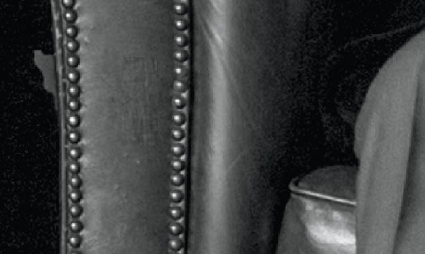
FIGURE 5.25Adjusting the Blue channel
- 7. Now that we have matched the red, green, and blue values of the swatch to the red, green, and blue values of the sofa, click on the RGB channel to go back to the normal full-color view (Figure 5.26). Zoom back out to see how the adjustments have affected the yellow sofa (Figure 5.27).

FIGURE 5.26

FIGURE 5.27
At this point we no longer need the swatch, so just use the Eraser Tool to remove it from the armchair.
By using this technique we’ve managed to change the original color of the sofa to something extremely close to that of the armchair. The other challenge I faced with this image was the difference in material; unlike the sofa, the armchair was leather. I have a video on my YouTube channel showing this whole process, and at the end I show how to use the Plastic Wrap Filter to mimic the look of the armchair and finish up with a fantastic result: bit.ly/tptb_sofa.
FAKE CATCH LIGHTS
Do you remember the Never-Ending Lighting Rig technique I went through in chapter 4? Well, we can use the same principles to create fake catch lights, which again is an example of how one technique can be used in many ways.
- 1. Open the lewis_seat.jpg file in Photoshop, zoom in on the face (Figure 5.28), and add a new blank layer to the top of the layer stack. Name this layer eye-left (Figure 5.29).

FIGURE 5.28

FIGURE 5.29
- 2. Grab the Elliptical Marquee Tool from the toolbar (Figure 5.30) and while holding down the Shift key, click and drag out an ellipse around the eye on the left side of the image (Figure 5.31).

FIGURE 5.30

FIGURE 5.31
|
TIPTo move the selection around as you click and drag, hold down the space bar. |
- 3. Once you have drawn an ellipse, hold down the Alt (PC) or Option (Mac) key and draw out another ellipse on the top of the previous ellipse, but leave out an area in the lower portion. This removes the top area of the selection (Figure 5.32).

FIGURE 5.32
- 4. Go to Edit > Fill, choose White from the Contents menu, and click OK. This fills the selection with white. Remove the selection by going to Select > Deselect (Figure 5.33).

FIGURE 5.33
- 5. Now we need to blur this white catch light by going to Filter > Blur > Gaussian Blur. Dial in a Radius of around 2 Pixels and click OK (Figure 5.34).

FIGURE 5.34
- 6. To blend the catch light into the eye, change the blend mode of the eye-left layer to Overlay, just like we did with the Never-Ending Lighting Rig in chapter 4. Use Opacity to dial in the strength of the effect according to your preference. In this case, I used an Opacity of 70% (Figure 5.35).

FIGURE 5.35
- 7. Create a duplicate of the eye-left layer by pressing Ctrl + J (PC) or Command + J (Mac) and rename this layer eye-right (Figure 5.36). Use the Move Tool (V) to drag the catch light across the image and position it over the right eye.

FIGURE 5.36
- 8. With the eye-right layer highlighted in the Layers panel, hold down the Shift key and click on the layer beneath (eye-left) so that both layers are highlighted. Then go to Layer > New > Group from Layers, name the group eyes, and click OK. Add a layer mask to this group by clicking on the Add Layer Mask icon at the bottom of the Layers panel (Figure 5.37).

FIGURE 5.37
- 9. With a normal round, soft-edged brush and a black foreground color, paint over any areas of the catch lights that you don’t want to appear in the final image. That’s it!

FIGURE 5.38Before

FIGURE 5.39After
REPLACING SKY SUPER FAST
In chapter 2 I shared a technique for replacing the sky. In this section I want to show you another technique that you can add to your Photoshop toolbox for doing the same thing super fast! Of course, with Photoshop being Photoshop, this might not work on every picture, but as we know, it’s great to have a number of techniques you can turn to.
What we want to do here is to replace the sky in Figure 5.40—which you’ll recognize as the image with the tree we cut out in chapter 4—with something a bit more interesting (Figure 5.41).

FIGURE 5.40

FIGURE 5.41
- 1. Open the tree.jpg file in Photoshop and go to File > Place Embedded (or File > Place if you’re using an earlier version of Photoshop). Navigate to the new-sky.jpg file and click OK. Press Enter (PC) or Return (Mac) to confirm the placement. This places the new-sky file at the top of the layer stack above the tree (Figure 5.42).

FIGURE 5.42
- 2. Unlock the tree layer by clicking on the padlock attached to that layer (Figure 5.43), and then drag the tree layer above the new-sky layer in the layer stack (Figure 5.44).

FIGURE 5.43

FIGURE 5.44
- 3. With the tree layer highlighted in the layer stack, double-click to the right of the layer name to bring up the Layer Style properties (Figure 5.45). In the Blending Options tab, you’ll see the Blend If area toward the bottom of the dialog. The Blend If sliders are a superb and incredibly fast way to blend images together based on their color. In our example, we want to replace the blue sky on the tree layer with the sky on the layer below.

FIGURE 5.45
To do this we don’t need to make any selections or use layer masks, we can simply change the Blend If menu from Gray to Blue, and then use the This Layer slider (Figure 5.46). When you drag the marker on the far right of the This Layer slider to the left, Photoshop will remove the blue from the layer. As you do this, the sky disappears, revealing the sky on the layer below (Figure 5.47).

FIGURE 5.46

FIGURE 5.47
- 4. If you see areas where the blend looks obvious and the transition is very defined, you can help to blend these areas by holding down the Alt (PC) or Option (Mac) key, clicking on the This Layer slider marker to split it in two, and then moving the two marker halves apart (Figure 5.48). When you’re satisfied with the blend, click OK.

FIGURE 5.48
There will always be images on which this technique does not work so well, but when it does work, it works great and is super quick. In our example image, even the sky that is visible through the branches has been replaced (Figure 5.49).

FIGURE 5.49
To see exactly what moving the This Layer slider has done to the tree layer, click the eye icon of the new-sky layer to turn it off. When you do this, you can see all the transparent areas of the tree layer (Figure 5.50). We achieved that without making ANY selections!

FIGURE 5.50
REALISTIC SKIN SMOOTHING
Figure 5.51 is a portrait of actress Sarah Elizabeth Lewis that I took for my ongoing 1940s project. I want to show you a couple of techniques that I used during the retouching process, the first of which is my favorite way to smoothen skin. This is a superb technique that adds realistic skin smoothing, but also maintains the skin texture.

FIGURE 5.51
- 1. Open the sarah.tiff file in Photoshop and create a duplicate layer by pressing Ctrl + J (PC) or Command + J (Mac). Rename the layer smooth skin (Figure 5.52). We do this so that the original image is safe, but also so that we can use it to control exactly how smooth we make the skin.
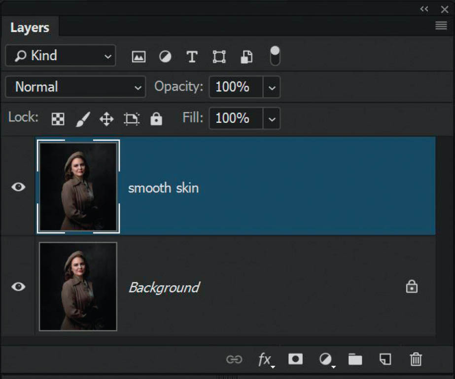
FIGURE 5.52
- 2. With the smooth skin layer selected in the Layers panel, change the blend mode to Vivid Light (Figure 5.53). This will create what looks like a very high-contrast version of our picture. Next, go to Image > Adjustments > Invert (Figure 5.54) or use the keyboard shortcut Ctrl + I (PC) Command + I (Mac).

FIGURE 5.53

FIGURE 5.54
- 3. Go to Filter > Other > High Pass. For a high-resolution picture, a Radius of 20 Pixels will be perfect (Figure 5.55). For a lower-resolution picture, just dial in a lower amount. Click OK.

FIGURE 5.55
- 4. Next we need to add a small amount of blur, so go to Filter > Blur > Gaussian Blur, and for a high-resolution image a Radius of around 3 Pixels is all you need (less for a lower-resolution image) (Figure 5.56). Click OK.

FIGURE 5.56
Ordinarily, High Pass might be what you’d use for adding contrast to an image or creating an intense sharpening effect; however, we inverted our file so this means the opposite happens (i.e., instead of sharpening the image, High Pass softens or smooths it).
- 5. The actual smoothing has now been applied, but at this stage our picture doesn’t look quite right and we’ve lost the highlights and blacks in the important areas (Figure 5.57). The next step is to click on the fx icon at the bottom of the Layers panel and choose Blending Options from the pop-up menu (Figure 5.58).

FIGURE 5.57

FIGURE 5.58
This is another way that we can access the Blending Options, as opposed to double-clicking on the layer like we did in the previous “Replacing Sky Super Fast” section.
- 6. This time, again, we’ll use the This Layer slider to make the picture look more natural, while still retaining the smoothness. Hold down the Alt (PC) or Option (Mac) key and click on the black marker on the far-left side of the This Layer slider to split it in two. Drag the right half to around the 0/221 point (Figure 5.59).

FIGURE 5.59
- 7. The previous step brought back some of the lighter parts of the image, so now we need to bring back some of the darker parts, particularly around the eyes, nose, and mouth. Hold down the Alt (PC) or Option (Mac) key and click on the white marker on the far-right side of the This Layer slider to split it in two. Drag the left side of the marker to around the 70/255 point (Figure 5.60). Click OK.

FIGURE 5.60
- 8. At this stage we’ve applied smoothing to the entire picture, but we only want it to appear on Sarah’s skin. To restrict where the smoothing appears, we’ll add a layer mask. This needs to be a black layer mask, so hold down the Alt (PC) or Option (Mac) key and click on the Add Layer Mask icon at the bottom of the Layers panel. With a normal round, soft-edged brush and white foreground color, paint over the face at 100% Opacity to reveal the skin smoothing. If you think the effect is too strong, simply lower the Opacity of the layer (Figure 5.61).

FIGURE 5.61
|
TIPIf you can’t see where you have painted on the layer mask, press the backslash key. The areas you’ve painted on are not covered in the red overlay, so if you see red overlay on the skin, simply paint over it with the brush. When you’re done, press the backslash key to return to the normal view. |

FIGURE 5.62Before

FIGURE 5.63After
SKIN GLOW
Techniques don’t get any simpler than this one for adding a romantic glow to your pictures. This works well for both portraits and landscapes.
- 1. Create a duplicate of your picture in the Layers panel by pressing Ctrl + J (PC) or Command + J (Mac). Rename this layer glow (Figure 5.64).

FIGURE 5.64
- 2. Go to Filter > Blur > Gaussian Blur, dial in a Radius of around 10 Pixels, and click OK (Figure 5.65).

FIGURE 5.65
- 3. Lower the Opacity of the glow layer to around 40%. At this point you could add a layer mask and paint the effect off the eyes; however, I tend to find that at such low settings, I very rarely, if at all, feel the need to do this because there is still enough sharpness.

FIGURE 5.66Before

FIGURE 5.67After

FIGURE 5.68
COMPOSITING TECHNIQUE
When I first started using Photoshop I created a lot of composite images, blending elements of several pictures together to create one final image. I worked on a series of pictures where I would photograph animals in captivity and then cut them out from their backgrounds and add them into new scenes that resembled their natural habitats. I guess it was my way of setting them free. Actually, writing this makes me want to get back into creating some more composites for this project.
One such image I created of a rhino is a perfect example to use to walk you through two simple techniques that I used to make it look believable that the rhino was part of the natural habitat scene. These techniques involve the Color blend mode and Opacity.
- 1. Open the rhino.psd file in Photoshop. In it you’ll see that there is a Background layer (which is itself a composite of elements blended together) and above that the Rhino layer, with the Rhino already cut from its original background (Figure 5.69).

FIGURE 5.69
- 2. Click on the Background layer and create a duplicate by pressing Ctrl + J (PC) or Command + J (Mac). Rename this layer Color and drag it to the top of the layer stack (Figure 5.70).

FIGURE 5.70
- 3. Click on the Color layer, go to Filter > Blur > Average, and click OK. The Average filter looks at the layer and mixes it all together so that we end up with an average color of the scene across the entire layer. Go to Layer > Create Clipping Mask, and now the color layer is only visible on the visible parts of the layer directly below, which in this case is the rhino (Figures 5.71 and 5.72).

FIGURE 5.71

FIGURE 5.72
TIPYou can also create a clipping mask by holding down the Alt (PC) or Option (Mac) key, positioning the cursor between the Color and Rhino layers until you see an icon appear that looks like a square with an angled down arrow attached to it, and clicking your cursor. |
- 4. Change the blend mode of the Color layer to Color. This keeps the color of the layer, but also allows us to see the details of the rhino on the layer below. Lower the Opacity of this Color layer to around 20% (Figure 5.73).

FIGURE 5.73
As was described in chapter 4, the Color blend modes uses the color from the BLEND layer and the luminosity and detail from the BASE layer. This is why when we use the Color blend mode, we see the color of the BLEND layer (the Color layer) as well as the rhino below (the BASE layer).
Blending with Opacity
Yet again, this is an incredibly simple technique that can make a big difference.
Continuing on with the final rhino image from step 4 in the previous section, click on the Rhino layer and simply lower the Opacity to 90%. Don’t go any lower because you will make the rhino (or whatever element you’re using this technique on) become too transparent. However, just reducing the opacity of the layer a very small amount definitely helps to blend the rhino into the scene (Figure 5.74). Thanks to digital artist Uli Steiger for this little gem.

FIGURE 5.74
WHITEN TEETH—FAST!
When I first started using Photoshop and was buying every magazine I could find to go through all the techniques, I remember seeing several articles showing how to whiten teeth. These techniques would go on for several pages, showing how to select the teeth using the Pen Tool, sample colors, and making all manner of color adjustments. This seemed to take way too long, which is why I love the technique covered in this section.
- 1. With the geek.jpg file open in Photoshop, grab the Lasso Tool (L) and draw out a rough selection around Dave’s (fake) teeth (Figure 5.75).

FIGURE 5.75
- 2. With the selection in place, we’re basically telling Photoshop to ignore everything except for what is within the selection—i.e., the teeth. Click to add a Hue/Saturation Adjustment Layer (Figure 5.76) and choose Yellows from the Master drop-down menu (Figure 5.77), since we want to remove the yellow from the teeth.

FIGURE 5.76

FIGURE 5.77
Notice how because we made a selection of the teeth and then added the Hue/Saturation Adjustment, this is represented in the layer mask thumbnail in the Layers panel. The area we selected is white and everything else is black, meaning the area outside of the selection will be ignored when we make adjustments.
- 3. Now all you need to do is to drag the Lightness slider across to the right to lighten the yellow and brighten the teeth. In this example, I’ve moved the slider to +60, which has the desired effect (Figure 5.78).

FIGURE 5.78

FIGURE 5.79Before

FIGURE 5.80After
PERFECT LIGHTING CHEAT (KIND OF)
I call this a cheat, but it’s actually more of an enhancement to what has already been captured in-camera. I use this technique on pretty much on every portrait and yet again, it’s simple but incredibly effective and often results in me getting questions about how I did the lighting for the shoot.
We’ll use a portrait of one of my closest friends, Anthony Crothers, as an example (Figure 5.81). I explain the lighting style at the time of the photo shoot in a video on my YouTube channel: bit.ly/tptb-anthony.

FIGURE 5.81
Here’s the simplest technique I use to finesse the lighting on the subject’s face:
- 1. With the anthony.jpg file open in Photoshop, duplicate the layer by pressing Ctrl + J (PC) or Command + J (Mac). Rename this layer lighting, and then go to Filter > Convert for Smart Filters (Figure 5.82).

FIGURE 5.82The icon in the bottom-right corner of the lighting layer shows it is a Smart Object
- 2. Go to Filter > Camera RAW Filter. In the Camera RAW workspace, grab the Adjustment Brush (Figure 5.83) and set the Exposure slider to around +0.10. Leave all other adjustments at their defaults of 0. Put a check mark in the Mask checkbox at the bottom of the Adjustment Brush panel so that you can see where you are adjusting (Figure 5.84).

FIGURE 5.83

FIGURE 5.84
- 3. Brush over the face so that it’s covered with the red overlay (mask) (Figure 5.85). (Your mask overlay may be set to a color other than red. You can change the color by clicking on the little color square next to the Mask checkbox and selecting a new color from the Color Picker.) If the overlay spills onto other areas, turn on Erase and brush over those areas to remove it (Figure 5.86).

FIGURE 5.85

FIGURE 5.86
- 4. When you feel that the overlay covers the correct area, click on the Mask checkbox to turn it off, adjust the Exposure to around +0.45, and click OK.
That’s all there is to it—simple, but effective!

FIGURE 5.87Before

FIGURE 5.88After
SKIN TEXTURE
Back in chapter 4 I went through a technique for reducing skin shine and I mentioned that I followed that up with a technique for maintaining skin texture. Sometimes when you reduce skin shine on a larger area using the method I covered in chapter 4, the results can look a little flat and smudged, lacking the original texture of the skin. Here is a technique for bringing back the skin texture so that the result is much more realistic:
- 1. With the john.jpg file open in Photoshop, add a new blank layer and rename it skin shine.
- 2. Grab the Healing Brush (J) from the toolbar, and in the options bar at the top of the screen, set Mode to Darken and click on the Make Canvas Sample as Source for Heal icon next to Source (Figure 5.89). (The Source options may look slightly different for you, depending on whether you’re using the current version of Photoshop, but when you hover over the icon momentarily, a description of its function will appear. Just don’t choose the Use Pattern as Source for Heal option.) Finally, set Sample to All Layers.

FIGURE 5.89
- 3. The area of shiny skin we want to remove is on John’s forehead (Figure 5.90). As I explained in chapter 4, hold down the Alt (PC) or Option (Mac) key and click to sample any area of non-shiny skin, then use this sample to brush over the shine. Because this is quite a large area, continue to sample areas of non-shiny skin as you work around the shiny patch until it is covered.

FIGURE 5.90
- 4. You can see how the result looks a bit too obvious—the area has a smudged, low-contrast appearance (Figure 5.91). To fix this, hold down the Ctrl (PC) or Command (Mac) key and click on the thumbnail of the skin shine layer in the Layers panel. This loads the content of this layer as a selection (Figure 5.92).

FIGURE 5.91

FIGURE 5.92
With this selection now active, click on the Background layer in the Layers panel (Figure 5.93) and go to Layer > New > Layer Via Copy to put a copy of the selected area of John’s forehead onto it’s own layer. Rename this layer skin texture and drag it to the top of the layer stack (Figure 5.94).

FIGURE 5.93

FIGURE 5.94
- 5. Now we’re going to use a filter to show the texture only, so first go to Filter > Convert for Smart Filters, and then change the blend mode of the skin texture layer to Overlay. Now go to Filter > Other > High Pass and drag the Radius slider down to 0.1 Pixels. All you need to do now is to increase the settings by slowly dragging the slider to the right until the texture in what was the shiny area matches the texture of the surrounding skin as closely as possible. In this case I increased the settings to 3.2 (Figure 5.95). When you’re satisfied, click OK.

FIGURE 5.95
- 6. To finish off, lower the Opacity of the skin texture layer to around 60% to allow some of the original to show through.

FIGURE 5.96Before

FIGURE 5.97After
REDUCING REDNESS IN SKIN
This is my favorite technique for reducing skin reddening. Whether you’re working with the natural tone of the skin or a sunburn, this technique works a treat. What I love about it the most, apart from the great results you get with it, is that it uses what is considered to be a basic method to adjust colors.
Figure 5.98 shows a portrait of Rosa that I took for a full-length tutorial covering photography and retouching. The retouching process included removing some red patches from her legs (Figure 5.99), and that’s what we’ll do now.

FIGURE 5.98

FIGURE 5.99
- 1. With the rosa.jpg file open in Photoshop, zoom into the red area on Rosa’s legs. Click to add a Hue/Saturation adjustment layer (Figure 5.100).

FIGURE 5.100
In Figure 5.101 we see the properties for the Hue/Saturation Adjustment layer. At the bottom of the Hue/Saturation Properties are two multicolored bars, which are like a stretched-out color wheel. The top bar remains static, but if you drag the Hue slider to the left or right you’ll notice that the colors on the lower bar move. This is showing that when you move the Hue slider, the colors in the upper static colored bar (which represent the original colors in the image) are changing to the colors that are directly below them. So for example, in Figure 5.102 the reds in the picture would change to blue/cyan, greens would change to red, and so on.

FIGURE 5.101

FIGURE 5.102
- 2. In the Hue/Saturation Properties, change the Master menu to Reds. When you do this you’ll notice that four markers appear underneath the colored bars: two outer markers and two inner markers (Figure 5.103). These markers represent the range of reds that Photoshop is saying you will alter now that you have selected Reds from the Master menu. The area directly above the two middle markers is the main red you’ll be altering, and the two outer markers represent colors on either side of the red that will also be altered.

FIGURE 5.103
The question is how do we know that the reds Photoshop is saying we will be altering are the reds on Rosa’s legs?
We can check to see what reds will be affected by drastically increasing their saturation to make them stand out. Drag the Saturation slider all the way across to the right to +100 (Figure 5.104). The result here is that the area of color in the picture represented above the four markers is highly saturated (Figure 5.105).

FIGURE 5.104

FIGURE 5.105
- 3. Clearly the range of reds that Photoshop chose when we changed the Master menu to Reds isn’t quite where we need it to be. To change it, position your cursor in between the two middle markers underneath the colored bars and drag to the left. As you do this, a different range of colors will be targeted and the area on Rosa’s legs that we want to change remains saturated (Figure 5.106). This is telling us that the markers are now positioned correctly—the color directly above them is the color we need to change. Are you with me?

FIGURE 5.106
There are other areas in the picture that are still saturated but we can deal with those by using the layer mask in a moment. Now that we know the markers are correctly positioned we can reduce the Saturation back to its default setting of 0.
- 4. When it comes to reducing a color in an image, we need to think of the color wheel (Figure 5.107). In the simplest terms, the opposite of red is cyan, the opposite of green is magenta, and the opposite of blue is yellow. If we want to reduce the reddening in Rosa’s skin, we simply add in the opposite color to cancel it out—i.e., we need to add in more cyan. To do this, drag the Hue slider marker slowly to the right toward cyan, while at the same time watching the reddening on Rosa’s legs until it eventually disappears. In my case this meant taking the Hue slider to +43 (Figure 5.108).

FIGURE 5.107

FIGURE 5.108
- 5. We’ve removed the reddening on Rosa’s legs; however, this change in color will also affect other areas of the picture, such as her lips. To correct this, all we need to do is to click on the layer mask attached to the Hue/Saturation adjustment layer, and then go to Image > Adjustments > Invert to change it from white to black. This hides the changes we just made behind the black mask (remember, white reveals, black conceals).
Now simply choose a normal round, soft-edged brush with a white foreground color and brush at 100% Opacity over the red area on Rosa’s legs so that the Hue/Saturation adjustment is only visible in that area (Figure 5.110).

TIPTo help the change in color blend in you could also click on the layer mask and apply a small amount of Gaussian Blur (2 – 3 pixel radius).

FIGURE 5.109 Before – reddening

FIGURE 5.110 After – no reddening
COLORIZING LIKE THE MOVIES (CREATIVE CLOUD ONLY)
This technique is a perfect example of taking a “what would happen if . . . ?” approach to using Photoshop and, in this case, Premiere Pro CC as well.
While I was working on this book an update was released across the Creative Cloud for Premiere Pro CC (which is the software I use for editing my videos). This update introduced a function called Color Match, which is different in so many ways from the Match Color command in Photoshop. It not only works different, but the results are way better.
In chapter 2 I explained how I use LUTs (Look Up Tables) to colorize my images; well, this takes it a step further. The idea behind Color Match in Premiere Pro CC is to be able to make video footage from a number of different cameras look similar in the final edit. For example, the main footage for a short video may have been filmed with one camera, such as a Canon, but other angles and B-roll footage may have been filmed with a GoPro or maybe even a mobile phone. Therefore, the ability to make the footage from each camera match (as much as possible) provides much more continuity and creates a better viewing experience.
Sounds great, right? What if we approach this update with the mindset of “What would happen if . . . ?” If it works with moving images, what about still images? For example, what if we could make one of our own pictures match the look of a still from a movie?
Well, let’s see . . .
- 1. With Premiere Pro CC open, go to File > Import. Navigate to a flattened version of the file you are currently working on and also to a still from a film or TV show and click Open. To follow along with this tutorial, import the peter.jpg file (which is a photograph from my World War 2 Project) as well as the film.jpg file (which is a screen grab from a film trailer on YouTube).
- 2. Drag the peter.jpg file onto the timeline and then drag the film.jpg file onto the timeline. Position the files so that film.jpg is first and peter.jpg follows (Figure 5.111).

FIGURE 5.111
- 3. Drag the play head onto the peter.jpg file in the timeline so that it’s visible (Figure 5.112). Click on Color in the toolbar at the top of the screen, and then click on Comparison View in the panel on the right (Figure 5.113).

FIGURE 5.112

FIGURE 5.113
- 4. Click on Apply Match (Figure 5.114), and see how Premiere Pro CC does a great job of looking at the film.jpg file (Reference) and giving our peter.jpg file a very similar coloring (Figure 5.115)—all with just one click!

FIGURE 5.114

FIGURE 5.115
Of course, we’re experimenting here so this isn’t perfect. We can adjust the shadow, midtone, and highlight areas to fine-tune the color a bit more, but I think just seeing this is incredibly exciting. And it gets better . . .
- 5. Click on the Lumetri Color menu icon at the top of the panel on the right and choose Export .cube from the menu (Figure 5.116). Navigate to where you’d like to save the file, name it something like film, and click OK (Figure 5.117). I saved mine to my Desktop.

FIGURE 5.116

FIGURE 5.117
Now comes the magic part . . .
- 6. In Photoshop, open the peter.jpg file and add a Color Lookup adjustment layer (Figure 5.118).

FIGURE 5.118
- 7. In the Properties, click on Load 3D LUT in the uppermost drop-down menu (Figure 5.119), and then navigate to where you saved the file from Premiere Pro CC. Select the file and click LOAD, and the coloring created from the film.jpg file is now applied to the image of Peter (Figure 5.120). Isn’t that cool?!

FIGURE 5.119

FIGURE 5.120
Of course, it doesn’t stop here. We could add more Color Lookup adjustment layers, use Opacity or blend modes, or add any other color adjustments, but it’s stuff like this that really excites me and gets me thinking about future possibilities.
At the time of discovering this there is third-party software available that permits you to do something similar, but you’ll have pay for most programs. This technique makes use of what you already have!
If you do give this a try I’d love to hear how it goes. Maybe try using it to match the color or tone of other pictures you’ve seen? Will it work with black-and-white images?
What about using this technique when you’re creating composite images? One of the most important things to do when creating composites is to match the coloring and tone of the background scene with that of the person or object being added to the scene. This makes the final image much more believable.
I’ve already covered a technique earlier in this chapter that I use to match color in composites, and it works great (see the “Compositing Technique” section). But what about using this Look Up Table creation technique in Premiere Pro CC to create a LUT of the background that you can then apply to the person or object being added to the scene in Photoshop? Once you’ve created the LUT in Premiere Pro and imported it into Photoshop, you could add the Color Lookup adjustment layer, and then create a clipping mask so that the LUT only affects the layer directly below it (i.e., the layer that contains the cutout).
The possibilities you can discover just by experimenting with these techniques are incredibly exciting. And hey, if they work they work and if they don’t, well, at least you tried it.
Remember, “what would happen if . . . ?!”