
Section III
OIL & ACRYLIC

Tools & Materials
Sketch Pads
Some of the textures demonstrated in this section start with a basic sketch; however before putting paint to canvas, it’s best to work out your textures on paper. Sketch pads are ideal for this purpose. They come in all shapes and sizes, and they are easy to carry. Whenever you see an interesting texture that you’d like to paint, draw a quick sketch. Then use your sketch as a reference to draw the texture directly on your support, or transfer it using tracing or transfer paper. Just make sure to choose paper that will support the weight of your paint without too much buckling. When working in acrylic, use watercolor, acrylic, or mixed-media paper; when working in oil, use paper designed to hold oil paint and its mediums.

Tracing & Transfer Paper
Tracing and transfer paper are used to transfer the outlines of a work to a support. Transfer paper is coated on one side with graphite (similar to carbon paper). Simply place the transfer paper facedown on your support; then place the artwork you wish to transfer faceup on the transfer paper. Use a pencil to trace over the lines of the artwork, pressing firmly. The outlines will transfer to your support. To use tracing paper, coat one side of the tracing paper with graphite and follow the same process.

Drawing Pencils
Artist’s pencils contain a graphite center and are sorted by hardness, or grade, from very soft (9B) to very hard (9H). Pencil grade is not standardized, so it’s best to have a set of pencils from the same brand for consistency.
• Very hard: 5H–9H
• Hard: 3H–4H
• Medium hard: H–2H
• Medium: HB-F
• Medium soft: B–2B
• Soft: 3B–4B
• Very soft: 5B–9B

Paintbrushes
Paintbrushes are classified by hair type (soft or stiff and natural or synthetic), style (flat, filbert, and round), and size. Flat brushes are great for producing straight, sharp edges. Medium and large flats are good for quickly filling in large areas. Small round and small filbert brushes have pointed tips that are suitable for adding details, and larger rounds and filberts are perfect for sketching rough outlines and general painting. When purchasing round or pointed brushes, opt for those with particularly long hairs or bristles.
Use the following brushes to create the examples in this section:
• 1/8-inch, 1/4-inch, 1/2-inch, 3/4-inch, and 1-inch flat brushes
• #1 round, #2 round, #3 round, #4 round, and #6 round brushes
• 1-inch #2 striper brush
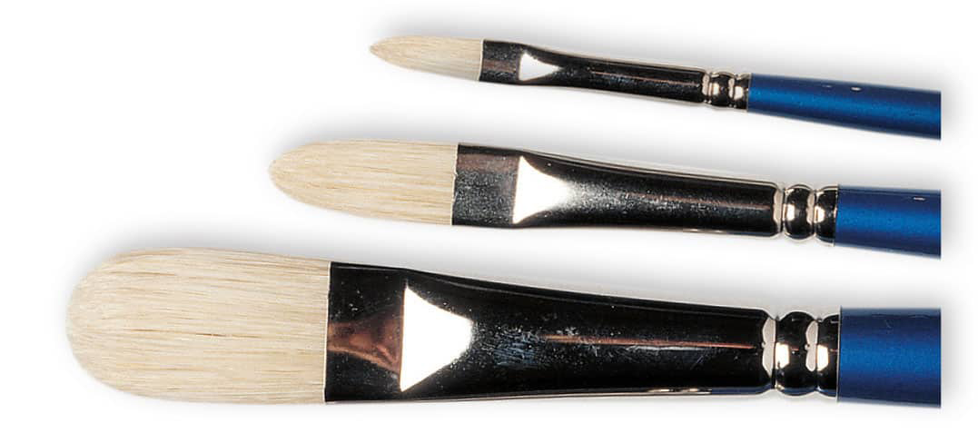
Filberts

Flats

Rounds
HAKE BRUSH A hake brush is handy for blending large areas. While the area is still wet, use a clean, dry hake to lightly stroke back and forth over the color. Be sure to remove any stray hairs before the paint dries and never clean your hake in thinner until you’re done painting, as it will take a long time to dry.

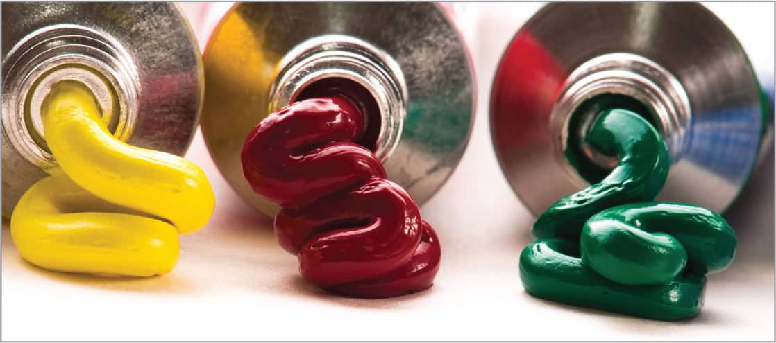
Selecting Paints
There are different grades of oil and acrylic paint, including “student grade” and “artist grade.” Artist-grade paints are a little more expensive, but they contain better-quality pigment and fewer additives. The colors are also more vibrant and will stay true longer than student-grade paints.
Acrylic paints are water-based, so they clean up easily with warm water and soap. You can also use water to thin the paints. Oil paints are oil-based and require solvents, such as turpentine or mineral spirits, for cleaning up and thinning the paint. Oils also call for a well-ventilated work area and specific ways of disposing of materials, such as solvent-soaked rags.
Painting & Palette Knives
Palette knives can be used to mix paint on your palette or as tools for applying paint to your support. Painting knives usually have a smaller, diamond-shaped head; palette (mixing) knives usually have a longer, more rectangular blade. Some knives have raised handles, which help prevent you from getting paint on your hand as you work.

Mixing Palettes
Whatever type of mixing palette you choose—glass, wood, plastic, or paper—make sure it’s easy to clean and large enough for mixing your colors. You can purchase an airtight plastic box to keep your leftover paint fresh between sessions.

Varnishes
Varnishes are used to protect your painting—spray-on varnish temporarily sets the paint, and brush-on varnish permanently protects your work.

Supports
The surface on which you paint is called the support. Ready-made canvases are available in a variety of sizes and come pre-primed and either stretched on a frame or glued over a board. Watercolor illustration boards work well with acrylic paint, providing a smoother surface. When working with oil paint, artists generally use canvas or wood. When using wood or any other porous material, you will need to prime the surface first (see below) to keep the paint from soaking through.

Additional Supplies
Paper towels and lint-free cotton rags are invaluable for cleaning your tools and brushes. They can also be used as painting tools to scrub in washes or soften edges. In addition, you may want to use a mahlstick to help you steady your hand when working on a large support. Silk sea sponges, old toothbrushes, drawing stumps, and cotton swabs are also useful for rendering special effects. You will also want to wear old clothes and an apron when working with paints.

Painting Techniques
The way you apply paint to your support contributes to the overall mood and style of a piece. Arm yourself with a variety of effects by getting to know the following techniques. You’ll also need to use many of them to recreate the textures in this section.

PAINTING THICKLY Load your brush or knife with thick, opaque paint and apply it liberally to create texture.

THINNING PAINT Dilute your color with water (if using acrylic) or medium (if using oil) to create transparent layers of paint.

DRYBRUSH Load a brush, wipe off excess paint, and lightly drag it over the surface to create irregular effects.

SCUMBLING Lightly brush semi-opaque color over dry paint, so the underlying colors show through.

SCRAPE Use the tip of a palette knife to scrape color away. This can create an interesting texture or represent grasses.

LIFTING OUT For subtle highlights, wipe paint off with a paper towel or blot it with a tissue. To lighten the color or fix mistakes, use a moistened rag (use thinner with oil paint).

SPONGING Apply paint with a natural sponge to create mottled textures for subjects such as rocks, trees, or foliage.

BLENDING Lay in the base colors, and lightly stroke the brush back and forth to pull the colors together.
WET-INTO-WET Apply color next to another color that is still wet. Blend the two by lightly stroking over the area where they meet. Use your brush to soften the edge, producing a smooth transition.

STIPPLING For highlights, use a stiff-bristle brush and hold it straight, bristle-side down. Dab on color quickly, creating a series of dots.

WIPING AWAY To create subtle highlights or simply remove paint from canvas, wipe away the paint using a paper towel, tissue, or soft cloth.

SPATTERING To spatter, load a brush—or toothbrush—with paint and tap your finger against the handle. The splattered paint creates the appearance of rocks or sand.
Glazing
Glazes are thin mixes of paint and water or medium applied over a layer of existing dry color. An important technique in painting, glazing can be used to darken or alter colors in a painting. Glazes are transparent, so the previous color shows through to create rich blends. They can be used to accent or mute the base color or alter the perceived color temperature of the painting. When you start glazing with acrylic, create a mix of about fifteen parts water and one part paint. When working with oil, use equal parts paint and turpentine to start. Add more turpentine as needed until the paint is the consistency you desire. It’s better to begin with glazes that are weak than ones that are overpowering, as you can always add more glazes after the paint dries. Occasionally, you can use semi-glazes, which are more opaque and slightly thicker than traditional glazes.

GLAZING GRID In this chart, transparent glazes of 13 different colors are layered over opaque strokes of the same colors. Notice how the vertical opaque strokes are altered by the horizontal translucent strokes.
Applying an Underpainting
An underpainting is a thin wash of color applied to the support at the beginning of the painting process. An underpainting can be used to tone the support to help maintain a desired temperature in a final painting. For example, a burnt sienna wash would establish a warm base for your painting; a blue wash would create a cool base. An underpainting can also provide a base color that will “marry with” subsequent colors to create a unified color scheme. You can also use an underpainting to create a visual color and value “map,” giving you a guideline for applying future layers. An underpainting can help provide harmony and depth in your paintings. Experiment with various underpaintings to discover which colors you prefer.

Magenta

Burnt sienna
Purple

Phthalo violet
Pounce Technique
The pounce technique is an easy way to eliminate visible brushstrokes to achieve smooth, even areas of color. To begin, cut a square of soft cotton cloth (such as jersey or T-shirt material). Ball up the cloth by folding back the edges to create a creaseless round pad. Use this pad to dab at an area of color on your canvas. For best results, work in an up-and-down motion and avoid smearing paint to the side.

Impasto Strokes
Impasto strokes are thickly applied brushstrokes that add dimension and textural variation to your work. You can apply impasto strokes with a heavily loaded brush, or you can apply them with painting knives. To use a painting knife, scoop up your paint with the flat blade and spread a thick layer of paint over the surface. The resulting texture is great for mimicking rough elements, like stone walls or rocky landscapes.

Working from Dark to Light
A common approach to oil painting involves working from dark to light, which refers simply to applying the darks and shadows first and leaving the lights and highlights for the later stages. This eliminates the need to apply each intricate shadow individually, allowing you to focus on the illuminated areas and saving brushstrokes in the long run.
Transparent vs Opaque Paints
Pigments are classified according to their transparency. Transparent pigments allow light to pass through, whereas opaque pigments blocking light from passing through. Working with this quality can help you suggest depth in your textures. Transparent paints tend to recede, so they are ideal for building shadows. Opaque paints appear to come forward, so they are ideal for painting highlights and the raised areas of a texture.
PEOPLE
178 | Smooth Skin

Soft skin has a fine texture with smooth gradations of warm and cool tones. Create a mix of two parts burnt sienna to one part sap green, and thin it down on your palette. Cover your drawing with this transparent mixture using a 1/2-inch flat brush, spreading the color smoothly. Use the pounce technique to remove all brushmarks, leaving as smooth a surface as possible. (See “Pounce Technique,” shwon here.) Finally, roll a small piece of soft cloth and wipe off paint from the lightest areas of the image, such as the background and neck.

Mix equal parts burnt sienna, black, and white to create a cool skin tone. Using a 1/4-inch flat brush, paint the shadow and middle-value areas of the back, under the chin, and over the back of the neck with short, impressionistic strokes to simulate the texture of skin. To lighten and warm the color, slowly add more white and reduce the black for the lighter areas of the skin.

To add subtle texture and build up the middle values, use a 1/2-inch flat brush to apply mixes of burnt sienna and white. Wipe off the excess paint from your brush onto a cotton rag before laying on short, impressionistic drybrush marks that give the impression of skin texture. Next lay a painterly layer of white in the background areas, and use a fine, soft, dry brush to trace the lines of the front and back of the neck. This will soften and blur the edges to create more depth.
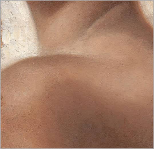
Continue to work from dark to light using short, impressionistic strokes. Slowly build up the light layer by layer with a simple mix of burnt sienna and white. The lightest area will eventually have the thickest paint, which is a traditional way to build depth in a painting. For the lightest skin tones, cool the mix with a touch of phthalo blue to complement the warm shadows.
179 | Aged Skin

Aged skin features deep wrinkle lines with strong contrast between the lights and shadows. To capture this, create a mix of one part burnt sienna to two parts sap green, and thin it down on your palette. Use a 1/2-inch flat brush to cover your drawing with this transparent mixture, and use the pounce technique to thin out your color until you can see your drawing through the paint. Next, using an old 1/4-inch flat brush that has splayed out slightly from use, dab the end of the brush into the same paint mixture and then dab it into the shadow areas of your drawing, leaving a stippled texture that resembles pores in skin. (See “Stippling,” shown here.)

Mix burnt sienna with a small amount of black to create a dark skin tone. With a small round brush, paint the darkest areas, including the deepest parts of the wrinkles, the shadows under the nose, and where the nose and cheek meet. Trace over the wrinkle lines with a clean brush to soften the lines and blend the color out into the softer shadow areas, such as the dimple on the nose.

To begin building the middle values of this rough, wrinkled skin, mix equal parts of purple lake and raw sienna and varying amounts of white to lighten. Working with a value very close to your darkest shadow color, slowly dab in spots of color, working from the shadows into the light. Both a 1/4-inch flat brush and a small pointed brush would work well, depending on the size of the area you are working on. Do not blend the colors together on the painting, but rather leave separate marks, which add to the detail in the wrinkles and pores.

In this final layer, focus on bringing up the light hitting the nose, cheek, and lips, in addition to the light edges of the wrinkles. Using a very neutral, cool skin tone mixed with purple lake, burnt sienna, and white, continue to work from the previous middle value toward the lightest highlights using a 1/4-inch flat brush. Wipe most of the excess paint off your brush onto a cloth. Use the flat edge for larger strokes and the corners for tiny areas, using the drybrush technique to pull out the texture of the canvas or board to mimic the roughness of aged skin. (See “Drybrush,” shown here.)
180 | Straight Hair

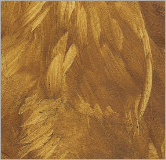
To create long, flowing red hair, start with equal parts of burnt sienna and sap green to create a warm, golden, transparent brown for the middle to dark values. Rotate a flat brush and use the long, thin edge to paint long, smooth strokes from top to bottom in the direction of the hair.
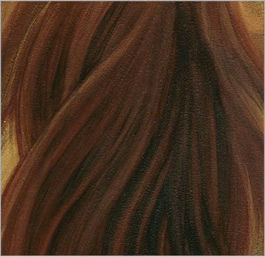
Paint the deep shadows with a mix of equal parts of black and burnt sienna, using the thin edge of the same brush and long strokes from the top to the bottom. Use pure burnt sienna to paint in the middle-value areas of the hair to achieve a warm, rich red tone. Go over your strokes for smooth, silky lines.

Continue building the middle and lighter strands of red hair using a long, fine-pointed brush loaded with a mix of burnt sienna, cadmium yellow medium, and white. If needed, thin the paint for better flow. Use a darker mix of equal parts burnt sienna and ultramarine blue to redefine shadows.

Bring up the values where the light is strongest, such as the sides of the head. For light strands of hair, use a red-orange mix of white, cadmium yellow medium, and burnt sienna. For the cool reflective lights on the back, use crimson and burnt sienna with white to lighten or ultramarine to cool.
181 | Curly Hair

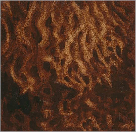
For “dirty” blonde curls, mix burnt sienna and sap green for a warm, transparent, middle-value brown. Use a flat brush to cover the drawing; then pounce to thin the color until you can see your drawing through the paint. Use an eraser cloth to remove color where the light is strongest.

Using a flat brush and equal parts black and burnt sienna, paint the darkest shadows and curls. Stiff bristles create wiry hair, whereas soft brush hairs yield silky strands. Soften the brushmarks by wiping the brush and retracing your strokes. Distant curl edges should be softer for depth.
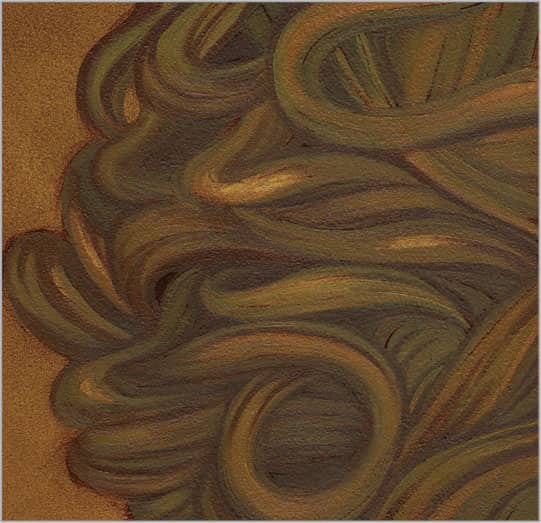
Continue building middle values using a fine-pointed brush and varying blends of ultramarine blue, burnt sienna, and white. Redefine shadows and darken the ends of the curls where they move in and out of shadow. Keep your edges soft to create a general impression of curls rather than strands.

Highlights on curls are brighter than those on straight hair because the light is concentrated on smaller sections. Use blends of yellow ochre and white to detail the curls. Use a light touch and thin paint to bring individual hairs into focus. Hit the brightest highlights with thicker paint.
182 | Wavy Hair

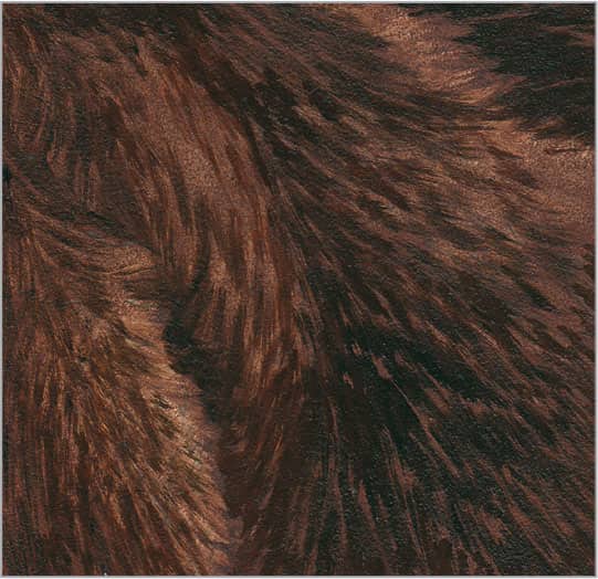
Mix a warm, golden, transparent brown for the middle-to-dark values. Cover your drawing with this transparent color mixture and pounce the color until you can see your drawing through the paint. Wipe away some of the color from the negative space and from areas where the light hits most.
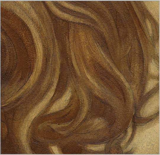
For the shadow areas, mix equal parts raw sienna and black. A 1/4-inch flat brush and long, sweeping strokes work well to create smoothness while giving you enough control for the smaller negative spaces between the waves and at the ends of loose strands around the edges.

Build middle and light brown values using varying blends of burnt sienna and cadmium yellow medium. Use sweeping strokes with a long, fine-pointed brush. Redefine shadows with a dark mix of sap green and burnt sienna, blurring the edges. To paint negative space, use white and green gold hue.

Build up middle values using a long pointed brush. Each stroke should start with a point (less pressure) and widen (more pressure) as you reach the center of the wave. Use less pressure again as you near the shadow end of the wave. For the highlights, use equal parts raw sienna and white.
183 | Facial Hair
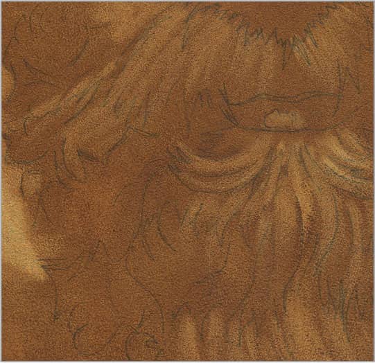
Mix two parts burnt sienna to one part sap green, and thin the paint on your palette. Using a 1/2-inch flat brush, cover your drawing with this transparent color mixture, spreading the color as smoothly as possible. Use the pounce technique to remove all brushmarks. Next use your eraser cloth to remove some of the color from the areas where the light hits the mustache and beard, or where there is more gray hair.

Create the darkest shadow areas, including under the lips and nose and between the mustache and beard, with the thin edge of a 1/4-inch flat brush and a mixture of equal parts burnt sienna and black. By adding a small amount of alizarin crimson and white to lighten, you can create a dark pink lip color that still integrates with the beard and other skin tones.
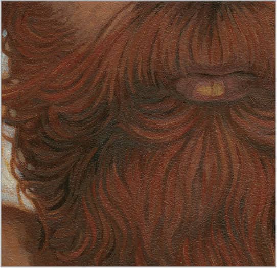
Fill in the middle value of this red beard and mustache using a fine-pointed brush and a thinned mix of equal parts raw sienna and burnt sienna. With burnt sienna and sap green, redefine your shadows and soften edges where needed. For the cheek, lighten burnt sienna with varying amounts of white and use your small pointed brush to create fine, impressionistic strokes that disappear as they merge with the beard along the hairline.

Start by adding lighter whiskers on the cheek and lower parts of the beard with a fine-pointed brush and variations of raw sienna, burnt sienna, and white. To capture the variation of hair growth in longer, untrimmed beards and mustaches, paint in short strands against the direction of the main hair growth, especially in the shadow areas and over the lips. Finally, add the lightest strands, starting at the end of the hair and stroking back toward the follicle for a thick-to-thin line, creating the illusion that it is disappearing into the beard.
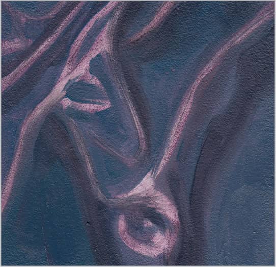
184 | Eye

The iris of the eye has intricate detail and soft, stringy areas that can be treated almost like hair at the beginning. There is so much depth and color variation, but the edges of these areas need to be kept defined yet soft to retain the watery effect in the eye. Start by laying a smooth layer of two parts burnt sienna mixed with one part sap green using your soft 1/2-inch flat brush. Use the pounce technique to smooth out the brushstrokes and follow up with the eraser cloth, removing color along the light edges of the gold area that flares out from the pupil. Do the same with the circular highlight, as it is difficult to achieve a bright white over dark color.
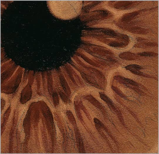
The pupil comes to life with a simple mix of black warmed up with burnt sienna. After painting in this area with your 1/4-inch flat brush, use the same brush to drag this color outward in loose, squiggly lines that radiate from the center of the pupil. This will soften the edge of the circle and begin to establish the warm brownish areas of the iris pattern. With a small pointed brush and a lighter mix of equal parts black and burnt sienna, paint the remaining dark parts of the iris using loose, painterly lines with soft edges. Wipe off your brush and trace over your strokes to make the eye appear smooth and moist.

To introduce the blue tones in the iris, use a long, fine-pointed brush and various blends of white with Payne’s gray for a more neutral color, or ultramarine blue for brighter eyes. Thin this color so your marks flow smoothly to retain a blurred, watery affect. Working from the center outward toward the edges of the iris, create loose, squiggly lines in varying opacities to replicate the complex patterns and depth of the iris.
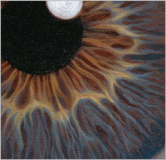
For the final touches on the iris, fill in the white of the circular highlight with a #3 round brush. Then punch up the color on the golden rays fanning out from the pupil using a #1 or #2 round brush and a mixture of yellow ochre, burnt sienna, and white.
ANIMALS
185 | Smooth Canine Fur
To create long, smooth canine fur, lay in a medium value of thinned burnt sienna and sap green using a flat brush. This mix will show through the fur as you paint layers. Remove color in the lightest areas by picking out color with a dry pointed brush.

To build a good base for rendering the soft, light fur, darken the shadows with equal parts of raw sienna and black using a soft flat brush. For the background, add white to create a warm gray and work from the edges toward the fur, lessening your stroke pressure for blurred ends.

To build the middle tones, start by mixing cadmium yellow medium, yellow ochre, and a bit of black. Using a pointed brush, twist and turn your wrist as you stroke in the direction of hair growth. Go over your brushmarks with a soft, dry brush to minimize texture.

For the final layer, mix raw sienna, white, and cadmium yellow medium to create a lighter color. Load a pointed brush and wipe off the excess paint onto a dry cloth. Start with the bottom layers of fur and work upward so each brushstroke lays over the previous.
186 | Curly Canine Fur

The easiest way to capture the depth of curly canine fur is to work from dark to light, beginning with a base of shadows. Create a thin mix of burnt sienna and black; then use a flat brush to lay in a flat area of color. Pounce to smooth out the brushmarks.
To create the soft edges of curly hair, start by painting a thin layer of medium (if using oil) or water (if using acrylic) directly over the dried underpainting. For shadows, dab black and burnt sienna into the spaces between the curls and under the ear, using squiggly marks. Allow the paint to dry.

For softer brushstrokes, wet your entire painting again. Mix equal parts yellow ochre, burnt sienna, and black for the middle values of this curly fur. Using a flat brush, build the lighter values with random, squiggly lines that vary in thickness, moving from top to bottom. Repaint shadows if needed.

For the last layers, mix equal parts raw sienna and white. Using the corner of a flat brush, gently and loosely build up the lighter areas of hair. Build from dark to light slowly for a soft effect. Add a small amount of cadmium red light to warm the fur or white to lighten. Remember to work loosely.
187 | Coarse Canine Fur

Start by painting your darkest shadow color using burnt sienna darkened with black. Thin the color until it’s soft and smooth. Apply the wash with a flat brush and pounce to eliminate brushmarks. Define the fur along the edges by lifting color with a dry, fine-pointed brush and short strokes.
Short, choppy strokes with the edge of a flat brush work well for capturing coarse hair. Always work in the direction of hair growth and allow some underpainting to show through to start building depth and detail with minimal effort. Use a darker version of your mix of black and burnt sienna.

Mix equal parts yellow ochre, cadmium red light, and cadmium yellow medium for the middle values of the fur. Use the palette knife point and its edge to lay in the color for a coarse texture. Scratch into the paint with the tip of the palette knife to spread the color in the direction of hair growth.

Now use the drybrush technique. Load your flat brush and wipe off excess paint on a rag. Then, with your brush on its side, stroke lightly across the texture marks so you only pick up the raised parts. Then use a palette knife to build up more texture in the light areas, working in the direction of hair growth.
188 | Long Cat Hair

Start colorful fur for a long-haired cat simply by establishing a warm undertone that provides depth and contrast under the cooler gray and white of the longer hairs. Use a thin mixture of two parts raw sienna to one part black and a 1/2-inch flat brush to paint long, smooth strokes in the direction of fur growth. Clean your brush and pull up some of this color along the lighter areas. This will make it easier to build up your white later.

Using a mix of two parts black to one part raw sienna, start to define the fur by building up the shadows between the individual sections. Use long, thin strokes with a small pointed brush, and vary your pressure or spin the brush slightly in your hand to create thicker and thinner lines that add variation and a sense of realism.

Now create the warm white and gray tones in the fur with various mixtures of black, white, and yellow ochre. Continue using the long strokes of a pointed brush, varying the pressure for more interesting marks that suggest the soft, flowing nature of long hair.

Now that you have established the middle values, simply continue to build up the lighter values by adding more white to black and yellow ochre. Using the same pointed brush, wipe off the excess paint, and hold your brush from the very tip to ensure more natural, varied strokes. Twist and turn your brush and use varying pressure to create thick and thin lines. By adding a touch of black, you can create cooler, darker grays along the outer edges and anywhere you want the fur to recede. Trace over your strokes with your brush as many times as it takes to achieve your desired softness.
189 | Short Cat Hair

When painting hair or fur, work from dark to light and leave the detail work for the lightest areas. First apply the warm shadows using a 1/2-inch flat brush and a thin mix of two parts raw sienna to one part black. This transparent layer will provide a dark underpainting while allowing the drawing to show through. Clean your brush and pat it dry, and then use it to lift color from the lightest areas of the fur. This will make it easier for you to build clean, bright whites over the dark background.

To create soft edges within the fur, apply quick, soft marks that you can build on. Use the flat edge of your 1/2-inch flat brush to loosely paint the darker parts of the fur with 1/2-inch to 1-inch long strokes and a blend of two parts raw sienna and one part black.

To create the multiple layers of fur in short-haired cats, use the thin edge of a 1/2-inch flat brush in a zigzag pattern and work your way down the canvas. Build up the basic middle value areas with cadmium yellow medium, a small amount of cadmium red light, and raw sienna to create an orange color. For the white fur, use white mixed with a little bit of black and yellow ochre.

Lastly, address the fine detail and brighter lights, switching to a small pointed brush. Thin equal parts white, cadmium orange, and raw sienna just enough to make your color flow smoothly. Use short, delicate strokes that flow in the direction of the hair growth to pull up the highlights in the orange fur. Reload your brush when your marks begin to get rough. Add new brushstrokes to fill in the gaps and suggest depth in your painting. To lighten the white areas of fur, add a small amount of your mixed orange to white, and continue to build up short marks.
190 | Horse Coat
Using raw sienna with a small amount of black and a 1/2-inch flat brush, lay down your underpainting with short strokes in the direction of the hair growth. Unlike cat or dog fur, horse hair is very short and lays flat on the muscle, creating a smooth texture. To achieve this, do not leave too many visible brushstrokes.

To build up the darkest shadow values of this horse coat, use a 1/2-inch flat brush and a mixture of equal parts burnt sienna and sap green. With a light touch, apply your brushstrokes in the direction of the hair growth. Keeping your dark values transparent helps them to recede, resulting in the illusion of more depth.
Next build up the reddish middle values of this chestnut coat using an old, stiff #5 round brush. This is where those old, roughly handled brushes come in handy! Mix variations of cadmium orange and burnt sienna lightened with white, and dab your brush into the paint as you spread the bristles apart. This helps create lines in your strokes that resemble hair. Work in the direction of the hair growth, paying close attention to the various muscles and vascular areas under the skin.

To bring up the lightest areas, use a #1 round brush and various mixtures of burnt sienna, cadmium orange, and white. Work from dark to light and use short, delicate strokes in the direction of the hair growth to add detail and give volume to the muscles and veining prevalent in the lean contours of the horse’s anatomy.
191 | Horse Mane

To create the long, somewhat coarse texture of this mane, start by painting the darkest shadows, using a 1/2-inch brush loaded with two parts burnt sienna and one part black. Apply the paint in long, full-length strokes that start at the ridge and move toward the ends of the hairs. Use a soft, dry blending brush to trace over the strokes to blur and soften the edges. Clean your brush and pat it dry and then use it to pick out color from the lightest areas. Use the edge of the brush and less pressure as you reach the ends of the hairs to create fine-pointed tips. Wipe your brush clean after every few strokes.
Use the same 1/2-inch brush to paint the middle value of reddish brown in the mane and on the neck, using a mix of equal parts raw sienna, black, and burnt sienna. Cut into this color with a darker color mixed from equal parts black and burnt sienna to define the dark negative spaces between sections of hair.

The only difference between the hair of a horse’s mane and human hair is that horse hair is coarser. Using the same long, fine-pointed brush you would use for human hair, apply a mix of raw sienna, cadmium red light, and white to create the reddish colors in the mane. Turn your painting whichever direction is most comfortable for you to paint the entire length of the individual hairs with long, soft, smooth brushstrokes. Work back and forth, arcing your hand to delicately create the curves of the flowing mane.
Now add the final highlights. Mix two parts white to one part cadmium yellow medium, and add a small amount of raw sienna to neutralize. Thin the mixture to create longer, smoother lines. Rotate your painting in whatever direction allows you to get the most natural arch. Start at the origin of the hair growth—in this case, the lightest area—and reduce the pressure of your brush as you reach the ends, lifting your brush right off the painting to achieve fine, soft, wispy ends. If you find that these marks contrast too much with the darks, darken the mix with burnt sienna. Work your way up into the lightest areas gradually.
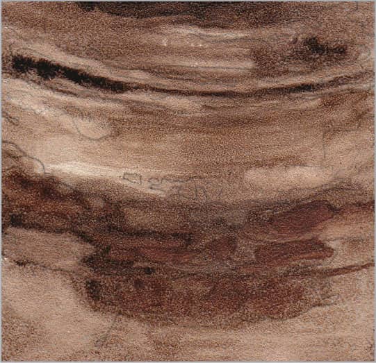
192 | Dolphin Skin

Dolphin skin is smooth, wet, and reflective. Lay in a smooth, transparent layer of phthalo blue, darkened and neutralized with a bit of black. Apply this middle value using a soft brush. Use the pounce technique to eliminate any brushmarks and soften all the edges of color.

To build the dark values, mix phthalo blue with a very small amount of black. Using a flat brush, work in long, smooth, sweeping strokes. For the lighter, pinkish-gray areas, mix burnt umber with white in varying amounts and retrace your strokes until smoothly blended.

Add middle values of blue in the lower left with a flat brush and a mix of phthalo blue, white, and cobalt blue. This cool blue is found where the skin reflects the water below. For warmer, lighter areas, add more white and a touch of Venetian red. Blend the edges between colors using long strokes.

Using a round brush, loosely create reflections of water on the dolphin’s smooth, wet skin with a mix of alizarin crimson and phthalo blue, brightened with white. Thin the color so it glides on smoothly. Recreate the appearance of water patterns in the darkest shadow areas where most clearly seen.
193 | Elephant Skin
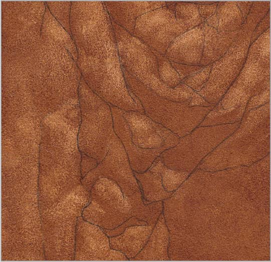
To paint rough, deep wrinkles, start by painting an even layer of burnt sienna cooled down with sap green. These are transparent colors, so they’ll allow the drawing to show through while creating a warm undertone. Using an eraser cloth, remove color from the lightest areas of skin.
For the deepest creases and shadows, mix equal parts black and burnt sienna, with a bit of white to increase opacity. Using a flat brush, render the lines and shadows with loose, drybrush texture and soft edges. Wipe off excess paint from your brush before you stroke to help achieve texture.

For the middle-value gray that makes up the bulk of elephant skin, mix white with a bit of black. Using a flat brush and short, square strokes, gently paint the rest of the skin. Use a light touch and capture the texture of your surface, allowing bits of the warm underpainting to show through.
Once your previous layers are dry, add more white to the gray mix and warm it with yellow ochre. Continue using your flat brush and wipe off excess paint to add the lightest highlights. Build texture by drybrushing short, impressionistic strokes. Don’t blend; leave your marks very painterly.
194 | Zebra Coat
Before you begin, create a warm, dark underpainting using black and burnt sienna. This adds variety and depth to the overlaying values. Use a fan brush moistened with mineral spirits (if using oil) or water (if using acrylic) to pull out color in the white stripes for a scratchy texture.
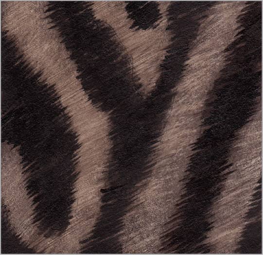
Warm some black with raw sienna and use the edge of a flat brush to paint the darkest areas of the stripes. Apply short, thin strokes in the direction of hair growth to produce the fine, lighter hairs of the black stripes. The pattern will appear integrated because they share the same warm underpainting.

Mix black with a bit of white and use the brush edge to create straight marks that move from the black areas into the white areas. For the white stripes, use the same brush and a mix of white with a bit of yellow ochre. Follow the hair growth and stretch your marks into the surrounding areas.

Add highlights in the white stripes. Mix white with a bit of black and cadmium yellow medium to create a light, warm gray. Build up the whites in several layers. Let the previous layer of paint dry before adding another. Also, make sure your lines extend into the black stripes a bit to create soft edges.
195 | Leopard Coat
To add warmth to the leopard pattern, start with a wash of three parts raw sienna to one part black. Thin the color so you can still see your drawing through the paint.
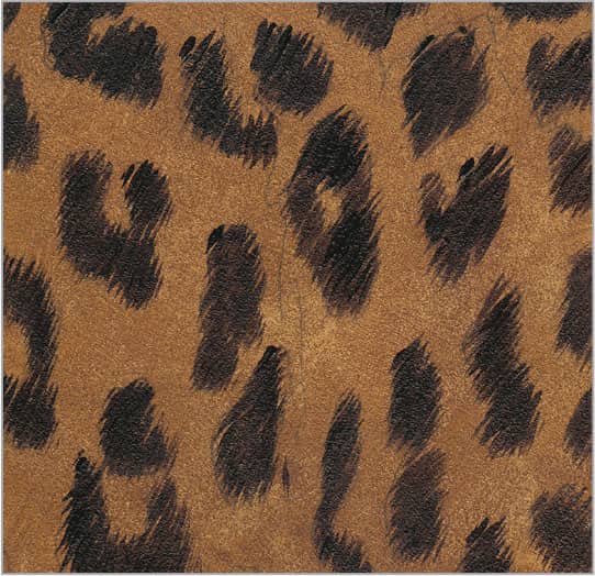
Warm up black with a bit of raw sienna and use a pointed brush to create the dark spots of the pattern. Working in the direction of hair growth, use a light touch at the beginning and end of each stroke to create fine hairs. Allow some underpainting to show through.

With a fine-pointed brush, create highlights in the black fur using black lightened with a bit of white. For the middle values of the white fur, use white with a bit of yellow ochre and black to create short, fine marks in the direction of hair growth.
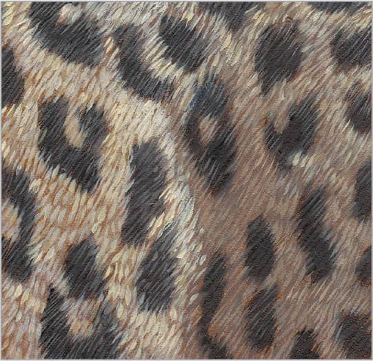
Enhance the brightest highlights with your finest pointed brush. Add a bit of raw sienna to white and use small, short, pointed brushstrokes to paint the highlights in the fur, working in the direction of hair growth. For the dark shadows, add black to the mix and more raw sienna, if needed.
196 | Snakeskin

To paint this raised snakeskin pattern, apply an even layer of transparent burnt sienna with a flat brush. Pounce to remove any brushmarks. Darken the burnt sienna with a bit of black and, using a small pointed brush, paint the dark shadow area between each scale.

Next focus on creating the shadow side on the left and bottom of each individual scale. Use a fine-pointed brush loaded with a mix of equal parts burnt sienna and black. To blur the edges and start modeling the roundness of the scales, lightly brush over the scales with a soft, dry brush.

Snakeskin texture is shiny and often colorful with hard edges. Using a flat brush and a mix of yellow ochre and cadmium red light, lay in the middle value of each scale. Use a mix of raw sienna and cadmium yellow medium between the raised scales. Round any corners that have become angular.

Add the final highlights. Mix black and white, adding yellow ochre or raw sienna for warmth. Using a small pointed brush, wipe off excess paint and apply highlights along the top and right edge of each scale. If the white is too strong, tap down the color with your finger to blend it.
197 | Starfish

Begin by using a flat brush to lay down an even, reddish layer made from burnt sienna and black. Pounce to eliminate brushmarks. Dampen the end of a cotton swab with mineral spirits (if using oil) or water (if using acrylic) and pat it dry. Then gently dab to lift out circular areas of color.
Create the shadows found on the right sides of the raised bumps by using the corner of a small flat brush or a cotton swab to dab on a darker mix of black and raw sienna. Build the texture in the flatter areas with this same technique, allowing some marks to be more subtle than others.
For the raised round bumps, mix yellow ochre, cadmium red, and white. Dab a cotton swab into the mixture and onto your painting. Each time you dab with the swab, the mark will be softer. Dab over spots with a dry swab to soften and suggest depth. Add more white to the mix and add lighter values.
To create the lightest bumps, use cotton swabs or switch to a small round brush. Mix white with a small amount of cadmium yellow medium to create warm highlights. Try not to cover up previously applied colors. Keep the brightest whites and sharpest edges where you want to attract the viewer’s eye.
198 | Feathers

First, establish the shadow colors. Mix a neutral purple of alizarin crimson and Payne’s gray. Thin it enough to create a transparent middle value wash. With a flat brush, work in the direction of the feather’s pattern with long, smooth strokes.
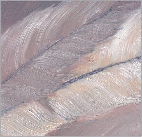
Create a thin mix of white and yellow ochre for the lightest feather. Tap a small fan brush into the mix and work from the center stem outward. Finish each stroke with a quick sweep to the right as you lift the brush off the canvas. Add burnt umber for darker feathers, and overlap the feathers wet-into-wet.
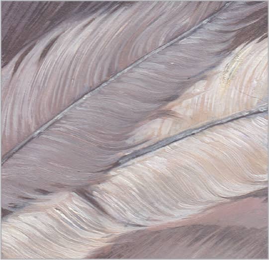
To clean up the edges and add more specific detail, use a round brush and a mix of black and white to paint shadows between and around the separated parts of the feather. Use the same mix to paint the stems before adding final highlights with pure white.
199 | Butterfly Wing

Start with a semi-transparent orange mixed from cadmium yellow light and cadmium red light. Thin the paint while retaining its vibrance, and paint over the entire wing. Use a cotton swab or piece of cloth to pick out white areas of the wing. Use the pounce technique to eliminate your brushmarks.
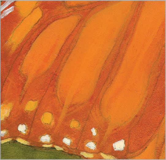
Next focus on the lightest oranges and whites. You may need to apply multiple layers of white for brightness. Let each layer dry before adding another. Add cadmium yellow light to your orange mix to increase the opacity and build up variation in lighter orange sections.

Load a round brush with a mix of black, cadmium orange, and cadmium red light. Trace around the colored sections with soft, drybrush lines that act as a transition edge between the darkest blacks and the bright colors. Add more black to the mix and fill in the remaining black areas.
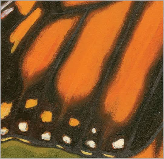
Once you’ve finished massing in the warm blacks, add a touch of white to the mix and use a round brush to add the fine detail along the veining between each section of color and along the edge of the wing. Keep these lines soft and subtle so they read as highlights falling on raised areas.
200 | Spiderweb
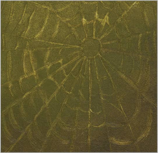
First, lay in the background. Use a flat brush to paint an even layer of green made of sap green and yellow ochre. Pounce to remove any brushmarks. Pull out some of this green with a round brush that is damp with mineral spirits (if using oil) or water (if using acrylic). Wipe off the color on a cloth.

Before painting the brightest lights of the spiderweb, establish lines with a bright green mix of cadmium yellow light and green gold hue (or an equivalent). Thin it so you can draw fine lines with a round brush. Note how the strands sag toward the web’s bottom to make it feel more natural.

To capture the effect of dew resting on the web, use a fine round brush with a very delicate touch. Use a thin mixture of white and a bit of cadmium yellow light to retrace some of the lines, especially where they meet and reflect sunlight. Dab tiny spots at random places along the threads for dew.
FABRICS & TEXTILES
201 | Burlap

Mix burnt sienna and sap green for a warm brown underpainting. Once dry, use a stronger version of this color to block in the weave. Use a flat brush on its edge to paint a gridlike pattern of shadows between the threads.

Begin painting the weave of burlap by applying short, organic strokes that cross over two squares of the grid. Use a 1/4-inch brush and a mixture of equal parts burnt sienna and yellow ochre. As you lay down the strokes, stagger each row by one square, as shown.
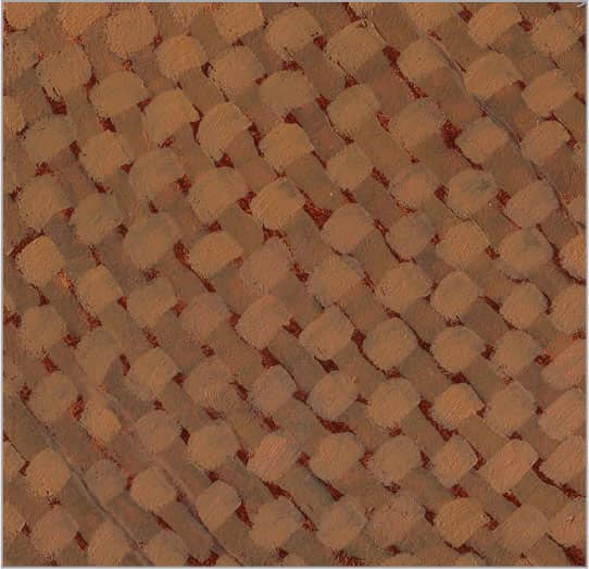
To create the cross sections of the weave, mix burnt sienna, white, and yellow ochre. Use a flat brush to create short strokes across the mid sections of the opposing threads. Work in the opposite direction of your first set of marks.

The final details and highlights bring the separate weaves together to appear more cohesive. Using white and yellow ochre, hatch in one direction so the strokes line up. Then rotate the painting and hatch in the opposite direction to form a cross on top of each section.
202 | Wool

Wool features a signature pattern. Mix burnt sienna with sap green and thin the paint. With a flat brush, paint an even, transparent layer of color over the surface. Then establish the pattern using a round brush. Wipe off the excess paint from the brush and loosely draw lines between threads.
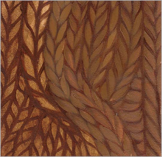
Use a round brush and a mix of burnt sienna and sap green to redraw shadows. Mix yellow ochre into the shadow color for a warm middle value. For each braid thread, place the brush tip in the top corner and apply pressure to thicken the stroke; then lift to end the stroke.
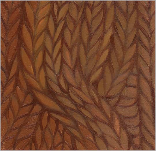
Blend and soften the edges and reestablish the shadows by tracing over the drawing with a round brush and a thin mixture of burnt sienna and sap green.

Once dry, use the same brush to add brighter highlights and more texture to your pattern. Mix yellow ochre with a touch of white, and wipe off the excess paint from your brush before stroking. Add two or more strokes on some sections to create the look of yarn.
203 | Tweed

To start the herringbone pattern of classic tweed, begin with a dark, transparent layer of burnt umber and ultramarine blue. Pounce to eliminate brushstrokes and even out the color until your drawing shows through. With a round brush, draw shadow lines between the rows of the pattern.

Working in the opposite direction of the pattern you created in step one, use a round brush loaded with pure white to paint the cool light areas of the herringbone pattern. Any color combination will work, depending on how traditional you want to be. Reload your brush after each stroke.

For the neutral yellow threads, use a round brush loaded with a mix of two parts yellow ochre to one part white. Reload for every section, and keep your strokes loose and organic, allowing the dark underpainting to peek between the stripes.
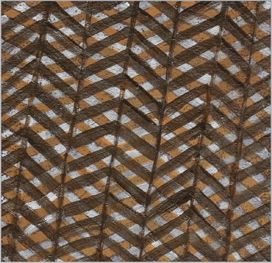
For the final dark sections, mix a glaze of black and ultramarine blue brightened with a bit of yellow ochre or white. Use a round brush to paint stripes in the opposite direction of the previous gold and white stripes. Clean up the rows between sections with fine strokes of the dark glaze.
204 | Plaid

Painting plaid patterns calls for layering transparent colors. Begin with the blue base color. Use ultramarine neutralized with a bit of Payne’s gray, thinned to a light-to-medium value. Using flat brushes, lay in the color, stroking in the direction of the stripes. Allow this layer to dry.

Use the same brush to establish the red stripes. Thin cadmium red light to a medium-to-light consistency, and load your brush with enough paint to complete one whole stripe with a single brushstroke. If you must retrace your stripe, do so softly and quickly to avoid overworking and pulling out color.

Bring the plaid pattern into focus by painting the finer stripes. Using a round brush loaded with a glaze of ultramarine blue and alizarin crimson, work from one end to the other, painting over the other colors. Avoid overworking glazes, and let them dry between each layer.
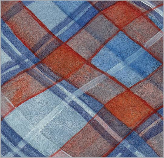
Add one more diagonal stripe using a thinned version of the glaze from step three. Then use a fine-pointed brush loaded with thin white paint to add a few final strokes. Plaids can be as complex as you want; keep adding stripes, colors, and layers to achieve any desired combination.
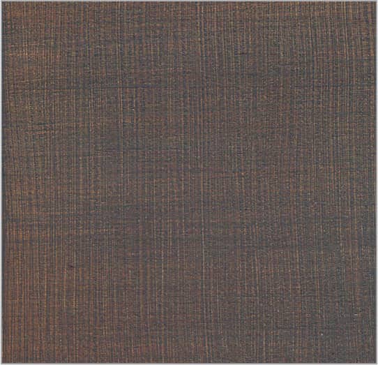
205 | Denim

Apply a layer of gesso to your board with a bristle brush. Use long strokes to create a texture of vertical lines that will show up later as the thread texture. Once dry, stain the surface with a wide flat brush and a transparent mix of thin raw sienna, painting in the opposite direction of your surface’s texture.
For the blue cross-weave, use a thin mix of ultramarine and black. Use a large flat brush to sweep across the grain of the surface texture, covering the underpainting. Then use the edge of a large, flat sponge to lift some of the blue glaze, exposing warm tones and creating horizontal striations.

To build the texture and lighter blue threads of the denim, add more ultramarine and white to your previous mix. Wipe off the excess paint from a flat brush and softly drag it across the support in horizontal strokes. Lay your brush as flat as you can. The paint will catch only the tops of the texture.

For the lighter, worn areas around the stitching, add more white and yellow ochre to the mix. Use a round brush to carefully add detail with the drybrush technique to emphasize the texture and avoid covering the colors from your first layers. Use yellow ochre lightened with white for the stitching.
206 | Cotton

To create simple, white cotton cloth, start with a warm gray underpainting made from a mix of equal parts black, ultramarine blue, alizarin crimson, and white. Using a soft rag, paper towels, or cotton swabs, wipe off some of the color in the lightest areas.
For middle values, mix black, ultramarine, and white. Use a flat brush to work from light areas in long strokes that follow the folds. Work toward shadows, blending into the darkest parts of the underpainting without fully covering it. Keep shadows semi-transparent and lights thicker.

Continue to build your lighter values by adding more white to your mixture and using a 1/4-inch flat brush to cover the rest of your drawing and underpainting. As you move into the lighter values, don’t be afraid to use more paint and allow for more texture.
For bright light along the folds, use pure white with a touch of yellow ochre. Use a flat brush to work in long strokes, keeping your brush flat in relation to the support for more texture. Drybrush over the bottom of each fold in the shadows to enhance the reflected light.
207 | Silk
For this bright purple silk, start with a thin underpainting of ultramarine blue and alizarin crimson. Use a balled-up cotton cloth to pounce out the brushstrokes without removing color. To establish the highlights on the folds, roll up a small piece of cloth into a point and gently wipe away color.
For cool purple midtones, mix ultramarine blue, phthalo blue, and alizarin crimson. Use a flat brush and work in the direction of the folds in long strokes, avoiding the lights. Add more alizarin crimson and black to your mix for the darkest shadows. Work wet-into-wet to create transitions.

Cover the lightest areas with a bluer mixture of phthalo blue, alizarin crimson, and white. Use a flat brush on its side and edge, depending on the width you need. Keep your turns more angular with less blending at this stage.

For the final reflective highlights, mix phthalo blue with white. Use a flat brush to create quick, unblended marks across the curves of the folds, switching to a round for the ridges. Leave your marks painterly and allow the lines of your brush hairs to suggest light hitting the silk’s weave.
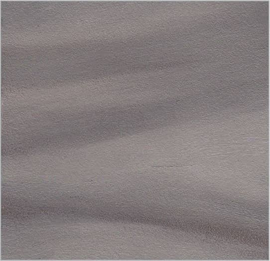
208 | Satin
Using a flat brush, create a thin mix with equal parts cadmium orange and cadmium red light for the underpainting. Pick out the lighter areas with a small cotton cloth rolled to a point. Be careful not to let the rest of your cloth touch the wet paint on your canvas.

For the pinkish middle values, mix cadmium orange, alizarin crimson, and white. Use a flat brush and work in the direction of the folds, avoiding the lights. Darken the mix with alizarin crimson for shadows. Work wet-into-wet for soft, blended edges between the midtones and shadows.
Continue building lighter values by adding white to the previous mix and creating a base for the final highlights, which will bring out the shine of the satin. Cover the remaining areas of the underpainting, tracing over your long strokes to blend the edges into the darker areas.

To finish the lightest areas, add white in various amounts to your previous mixture and, using a round brush, build up impasto strokes along the ridges of the folds with long, soft, blended marks. Keep your curves round and smooth to illustrate the heavy weight and thickness of satin.
209 | Velvet
Using a 1/2-inch flat brush, apply the deep, rich shadows of this blood-red velvet with an even layer of equal parts black, Venetian red, and alizarin crimson. Use the pounce technique to eliminate brushstrokes and create a soft, even texture similar to that of velvet.

To create the tones of velvet while capturing its texture, work from dark to light with variations of black and Venetian red. Add more red after you have completed the shadows and move toward the highlight areas, working wet-into-wet for soft, blended edges.
Next add more Venetian red and white to continue building your values from dark to light using the drybrush technique for a velvety effect. Keep all your forms very curvy and soft, blending smoothly between values.

Use equal parts cadmium red light, Venetian red, and white for the final highlights. After wiping the excess paint from your #3 round brush, softly brush across the tops of your support’s texture to capture the graininess of velvet and to build depth and contrast.
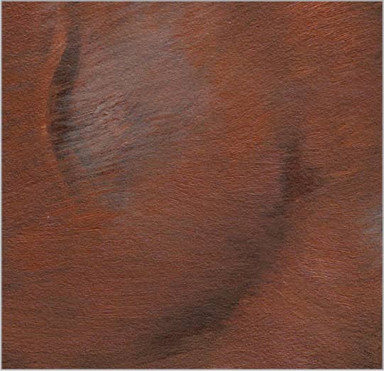
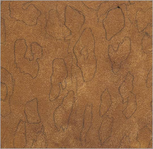
210 | Leather

Lay down a thin but rich blend of equal parts burnt umber and burnt sienna with a 1-inch flat brush. Go over your marks to eliminate the brushstrokes. To create the texture of the leather, use a smooth, damp sponge to lift color from the surface. A flat sponge with holes of various sizes works best.

Because the creases in leather suggest realistic wear and tear, take some time to pull out their details with a #3 round brush and thin burnt umber. Keep the lines organic and natural, varying the thickness. If they are too strong, simply use your finger to soften them.

To enhance the light falling on the mottled surface, mix a reddish gray with burnt sienna, black, and white. Using a round brush, add highlights to the bottom and left edge of each line. Drybrush where the light source is strongest.

For the lightest lights, mix burnt sienna and white grayed with a bit of black. With a flat brush, drybrush to add light to the areas of leather that reflect the most light. Highlight the top and right edges of the creases. Allow the warm underpainting to show through.
211 | Patent Leather
Lay down a layer of solid black. Let this dry, and then use a white colored pencil to sketch the main shapes on the black.

To build reflections of light, add a bit of white to your black. Using a flat brush, wipe off excess paint and fill in the reflections. Pay close attention to their shapes and blend the edges by swiping an almost-dry brush from the center of the reflection out into the black, lifting the brush for a gradation.

Once dry, continue to build up the lighter highlights with a 1/4-inch flat brush, and add more detail to the seams with a #2 round brush. This will create a base for your final highlights.

Using pure white, add the final highlights to the thin piping of the patent leather with a #2 round brush. Use a 1/4-inch flat brush for the larger areas after wiping the excess paint from your brush. Apply a thick dab of white for the brightest highlight, softening it with a dry brush.
212 | Sequins

Establish your middle value first with a thin, even layer of equal parts ultramarine blue and alizarin crimson. Use a 1/2-inch flat brush and then eliminate the brushstrokes with the pounce technique or by softly stroking over them with a very soft, dry 1-inch flat brush.

Cut the pointed end off a blending stump to create a flat, round end. Use this tool to create repeated circles of paint, starting with the darks. Mix black, alizarin crimson, and ultramarine, and spread a thin layer on a palette. Roll the edges of the stump in the paint, and then roll it on your painting.

Once dry, mix a lighter purple with ultramarine and alizarin crimson lightened with white. Dab the end of the stump in the paint, roll the excess paint off the edges, and press it on the center of each ring made in step two. Before they dry, use a round brush to remove texture from each circle center.

Add highlights along the upper edges using mixes of alizarin crimson, phthalo blue, and white. The greater the contrast, the more reflective they’ll look. Use a fine round brush and dark purple mixed from ultramarine and alizarin crimson to add threads from the center to the edge of each sequin.
213 | Lace

Semi-transparent colors will allow the base color to show through, resulting in a more integrated pattern. For this white floral lace, paint a skin tone with black, cadmium red light, and white. To hint at the netting shadow, lift color with a dry piece of paper towel.
Paint a thin, semi-transparent layer of white over the underpainting and let it dry. Add a small amount of black to the base color and, using a fine round brush, draw the basic outlines of the lace. These darker lines should be soft but clear, acting as subtle shadows cast around the thicker parts of the lace.

Once the previous layer is dry, use a round brush and thin white paint to mass in the flat, medium-value white of the primary lace detail.

Bring out the final details by enhancing the thicker, whiter stitched edges within the lace. Use a round brush loaded with white to trace over these edges and add dimension within the pattern.
214 | Straw Hat

Start by applying a thin, even layer of burnt umber with a 1/2-inch flat brush. Use a soft, dry brush to blend your brushstrokes until you can see your drawing through the paint.

Next add more detail to the shadows between the rows in the weave using a #3 round brush and thin burnt sienna. Hold your brush toward the end of its handle, and allow it to make natural lines of varying thickness and density.

Now paint the gray shadows of the hat and the individual rows of woven straw using equal parts of raw sienna and black, lightened with a small amount of white. Wipe excess paint off your brush before working row by row in a zigzag motion, allowing the browns to show through.

Create various mixes of yellow ochre, burnt sienna, and white. Use a round brush to dab thick spots of loose color where the light hits the rows. Create the impression of woven straw by using the end of a palette knife to scratch into the dabs of paint, spreading them and blending them into the grays.
215 | Woven Basket

Create a detailed drawing that will act as a guide for the darks. Use a flat brush to lay in an underpainting of black, ultramarine blue, cadmium red medium, and white. Thin the paint until you can see the drawing through the color. Next use a dry flat brush to pull color off the weave’s lightest areas.

After your underpainting is dry, create a mix of one part ultramarine blue, two parts alizarin crimson, and six parts white. Lay in the middle values of the purple in each individual section of the pattern using a flat brush.
Next lighten your mixture with more alizarin crimson and white to add warmer, lighter values to each section using a flat brush. Darken the shadows between sections using thin burnt umber and a round brush.

Now mix alizarin crimson, ultramarine blue, and white for the highlights. Use a round brush to add this color along the lightest edges. Add striations to suggest detail. Start at the top of each section and complete each highlight in one smooth stroke.
HARD SURFACES
216 | Beveled Crystal
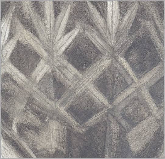
For beveled crystal, pay close attention to the shapes etched into the surface, and build your painting from a transparent background to a more opaque foreground. Start with a transparent glaze of gray mixed from black and very small amounts of alizarin crimson and ultramarine blue. Loosely lay in the shadow areas. Retrace your strokes to eliminate any visible brushmarks, but allow variations in the values to create depth and suggest light coming through the glass.

Continue to build the cuts of the glass with thin washes of black. A small 1/8-inch flat brush or #4 round brush will give you the control you need, but don’t worry about being too meticulous at this point; you can always clean up your edges in the last layers of detail work.

With the background in place, switch to a smaller 1/8-inch flat brush or #2 round brush to begin painting the darker sides of the glass cuts. Create a purple-gray using white tinted with small amounts of black and Venetian red, thinning the mixture to ensure a fluid line as you work from one end of the cut to another.
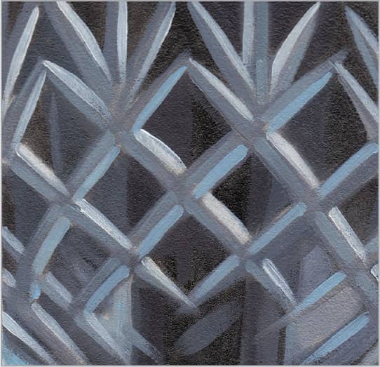
Finally, using a #2 round brush, add a light blue mix to the light side of each cut, cleaning up the shape of each beveled edge as you go. Create each section in one clean stroke from the top to bottom, resulting in a natural gradation as the paint becomes thinner on your brush.
217 | Clear Glass

For clear glass, start with a wash of ultramarine blue, a touch of alizarin crimson, and Payne’s gray. Thin down this mixture to a medium-value wash. Use a large, soft flat brush to quickly lay in the midtones using long strokes that follow the contour of the glass. Note: If you would like to eliminate drying time in the early stages of an oil painting, you can always paint your first layers with acrylic, then add oils on top of them. However, you can’t paint acrylics over oils.

Before you move on to the lighter values and reflections of the glass, create a dark background that will contrast with these details. Various mixtures of black, white, and ultramarine blue are perfect for the neutral blue-grays of this glass. Thin your mixtures and use a 1/2-inch flat brush to sweep smooth color onto your surface in long, broad strokes that follow the curves of the glass. Retrace your marks to knock down the brushstrokes to achieve clean, blended edges that recede into the darker background.

Glass is purely the sum of its reflections, which respond to the surrounding environment. Any colors that are nearby or behind will reflect in the glass. Mix brighter versions of your background colors and thin them to create semi-transparent glazes. When painted over the glass surface, these semi-glazes will allow the underlying colors to show through. Study the reflections in your glass and use a 1/2-inch or 1/4-inch flat brush to capture them with long, smooth strokes that originate at the top edge of the glass.

After all your previous layers dry, add more white to your colors and stroke in a few stronger, more opaque reflections. A few well-placed dabs of dramatic color will also add to the reflective quality of the glass.
218 | Amber Glass
To lay the foundation for the golden-brown oranges of amber glass, mix equal parts burnt sienna and yellow ochre, darkening with a small amount of sap green. Then use a 1-inch flat brush to sweep your color in full-length bands across the subject, creating smooth color without brushmarks. You can use a soft, dry brush to soften the edges left behind.

Next add the darker browns found in the shadows of your form using a mixture of equal parts burnt sienna and black. Then lighten your mixture with more burnt sienna and yellow ochre, and use your 1/2-inch flat brush to mass in the rest of the oranges that make up the foundation color of the amber glass. Work in long, broad strokes from side to side, and smooth out the brushmarks by retracing them or using a soft, dry brush to lightly knock them down.

With the shadow and middle values of the amber in place, focus on the highlights and final details. Mix equal parts yellow ochre, white, and cadmium orange, thinning the mixture for a smooth flow. With a 1/2-inch flat brush, fill in the center area with long, smooth, seamless strokes from side to side, overlapping and blending them with the darker neighboring values. Add more defined reflections on the surfaces facing your light source with a smaller 1/4-inch flat brush.

Finally, after your previous layers dry, add a few strong opaque highlights mixed from cadmium yellow and white. Stroke where the light bounces off the curved surfaces to really bring the glass to life and enhance its reflective quality. Hold a #2 round brush by the end and lightly add a few squiggly lines with thick paint. Do not blend the edges; instead, allow them to be dramatic and bright against the more subtle colors and textures beneath.
219 | Cobalt Glass
Begin this cobalt glass with a wash of ultramarine blue to create a middle value that will serve as a foundation for building deeper layers and reflections.

With the base color in place, continue to mass in the entire surface using dark, cool ultramarine blues warmed with a touch of phthalo blue and thinned for flow. Work wet-into-wet and allow your 1/2-inch flat brush to create loose brushmarks that mimic the natural surface variations found in cobalt glass.

Continue to add lighter values of blue mixed with cobalt blue and small amounts of white. Using a 1/2-inch flat brush will help you keep your brushstrokes loose and not overworked. Bring reflected light onto the sides of the glass and where the light shows through the dense areas.

To give the cobalt glass its reflective surface, add strong, white highlights with a #2 round brush where the light hits the object directly. Also, add more white to your cobalt blue mixture and, using a 1/2-inch flat brush, intensify the large reflection across the center of the glass to finish your painting.
220 | Porcelain

Most porcelain is milky white with a reflective surface. It is a good idea to build your values and opacity slowly so that you can create depth and variety by controlling the transparency and temperature of the paint. Using a 1-inch flat brush and long, curved strokes that extend from the top to the bottom, apply a thin underpainting with equal parts black and white.
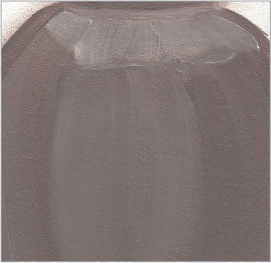
Once your initial layers dry, add more white to your paint and continue to build the lighter values where the light source hits the surfaces more directly. Also, indicate where the strongest white highlights will be added later using a 1/2-inch flat brush.
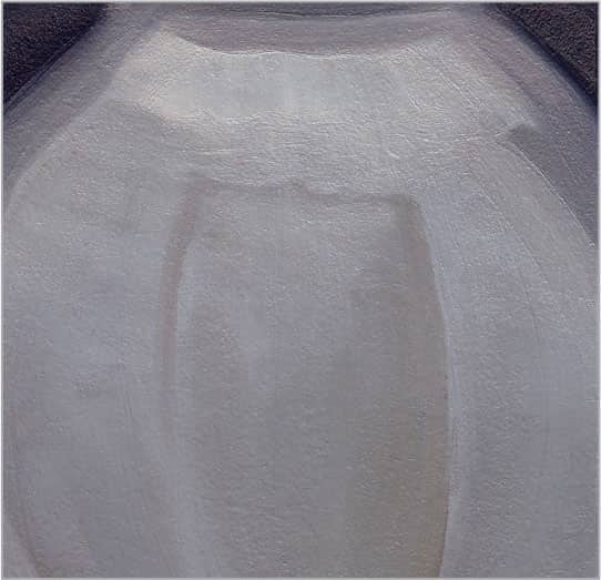
Continue the process of building the lighter values of each separate surface with a lighter variation of thinned white mixed with a touch of black. By building your whites with semi-glazes that are allowed to dry between layers, you will achieve a very translucent surface that resembles porcelain. Pay attention to how the separate sides of your object relate to the light source.

After your previous layer dries, finish your porcelain by adding another more opaque layer of white where the reflections are the strongest along the top edge. Work your strokes down toward the center of the vase to show its form. It may take many layers to achieve bright whites, so add as many as needed for the desired value.
221 | Gold

Smooth, shiny gold is highly reflective with very dramatic reflections that follow the contours of your form. To start establishing the light logic of your object, create a thin mixture of greenish orange with equal parts cadmium orange and sap green. Use a 1/4-inch flat brush to achieve the large, flat areas and thin, linear sections. Paint along the flow of the reflections—not against them—and retrace your marks until you have knocked down the texture and blended the edges.

Now that you have gotten to know your subject and its patterns, continue to mass in the different sections of reddish and darker greenish oranges with mixes of sap green, cadmium orange, cadmium yellow, and cadmium red. A 1/8-inch flat brush gives good coverage while offering enough control for detail. Twist and turn your brush to create thicker and thinner marks that flow smoothly along the curves of the reflections.

Having established the darkest reflections and midtones of the gold, start adding and refining the lighter values on the surfaces that are affected most strongly by the light source. Use variations of cadmium yellow and cadmium orange lightened with small amounts of white. Wipe off the excess paint from your #2 round brush and then apply color to the top edges of each curved section, blending the edges of your marks by retracing them.
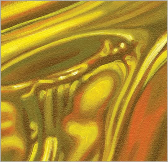
To really bring the gold to life, use pure cadmium yellow and white to highlight the spots that reflect the strongest light. Wipe the excess from your brush and then lay down the paint in long, smooth strokes that blend with the underlying colors at the edges. The more contrast you have between your light and dark values, the shinier and more reflective the gold will appear.
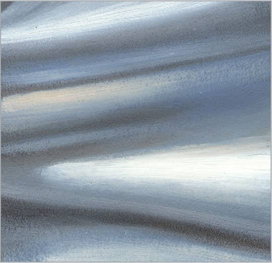
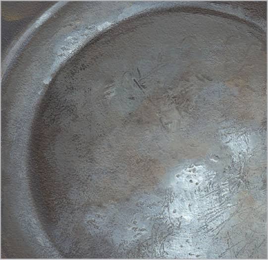
222 | Polished Silver

The most important characteristics of polished sterling silver are its reflectivity and bright silver color. The strongest reflections respond to the detailing and shapes of the silver, while the softer gradations are reflections of the surrounding environment. Start with a mix of three parts black, one part white, and one part ultramarine blue, thinned slightly for flow. Apply these to the darkest shadows and reflections using a 1/2-inch flat brush and follow along the contours of the form. Keep your edges soft at this stage.

Unless you have colors from surrounding objects reflecting onto the surface, basic variations of black and white work well for the grays found in silver. Equal parts black and white create a medium value that is ideal for massing in the midtone areas. Use a 1/4-inch brush and work in long strokes that follow the curve of your subject.

Next add more white to your color, and using a 1/4-inch flat brush, begin to paint the lighter middle values along the rim and on the flat center of the plate. Hold your brush at the end of its handle to create loose, organic marks. Your brushstrokes should follow the curves of your form.

Finally, with either a #2 round or 1/4-inch flat brush and pure white paint, add the final layer of highlights on the surface of the silver and along its detailed edges. Carefully observe the patterns that reflect within the silver, and add some to your painting to make it more realistic. Finally, mix a dark gray from black, white, and raw sienna to liven up your shadows and add depth.
223 | Pewter

Pewter has a dense, soft appearance that is much less reflective than stainless steel or silver. Also, pewter tends to show quite a bit of wear; the older the object is, the more pock marks and scratches it will have on its surface. Begin by mixing a basic warm, dark gray using black and small amounts of white and burnt sienna. Then use a 3/4-inch flat brush to paint the darkest areas with strokes that follow the curves of the form. On the flatter surface areas, drybrush short, impressionistic strokes in various directions to simulate transitions between light and shadow.

After your underpainting dries, switch to a 1/2- or 1/4-inch flat brush and continue to build up the dark to middle values of gray. Use a mixture of three parts black to one or two parts raw sienna, lightened with a small amount of white. Start building the irregular surface texture of the pewter with short, impressionistic strokes that vary in direction. Scratch and tap into the paint with the pointed end of your brush handle to simulate the scratches found on most antique pewter.

Next bring up the values in the lighter areas of the pewter with various blends of ultramarine blue, white, and small amounts of yellow ochre. Add more texture to these areas with short, impressionistic strokes in random directions. Scratch and stab into the wet paint to give the illusion of wear and tear. These marks will become more obvious as you add highlights over them in the next step.
After your paint dries, finish by painting the light reflecting off the surface. Add more white to the previous gray mixes on your palette and use a 1/4-inch flat brush to drybrush the paint onto the surface, turning the marks and scratches from step three into dark details. The edges of light should be soft due to the rough surface of old pewter. Add more scratches to the lightest areas, working over them until you’re satisfied with the texture.
224 | Copper
The older the copper, the more varied and reflective the surface. Start with a rich reddish brown underpainting of burnt sienna darkened with black. To create the watery transitions indicative of copper, first apply a thin layer of medium (if using oil) or water (if using acrylic) to your surface; then apply the underpainting with loose, impressionistic strokes using a 1/2-inch or 1/4-inch flat brush. Your strokes will melt into the prepared surface.
Mass in the burnt oranges that make up the bulk of the middle values. Create a mixture of equal parts burnt sienna, cadmium orange, yellow ochre, and sap green. If this is too dark, reduce the sap green to brighten. Use a 1/4-inch flat brush and medium-length, impressionistic strokes from side to side along the curve of your form. Work wet-into-wet to keep your transitions soft.
The lighter reflections that fall on copper are either cool, light oranges or saturated yellows and whites. First add the cooler reflective lights found on the undersides, where color is bouncing onto the surface from the surrounding environment. Simply cool down your orange mix from step two by adding a little white, and then use a 1/4-inch flat brush to add squiggly reflections over the uneven copper surface.

Now bring out the reflective quality of the copper by dabbing on the lightest highlights where the light source hits the surface most directly and where other objects may be reflecting onto the surface. With a #2 round brush, apply small, impressionistic strokes along the contours of the forms with cadmium orange, bits of cadmium red light, and mixes of cadmium yellow and pure white.
225 | Hammered Brass
To capture the depth and color variety of hammered brass, use a 1/2-inch flat brush to apply a smooth, transparent underpainting of sap green mixed with a touch of cadmium red light. Then remove all the brushmarks with a soft, dry brush. Wrap a small piece of cloth tight over your index finger to pull out rounded sections of paint.

Now that you have established the dappled texture of hammer marks in the underpainting, soften it by glazing various combinations of yellow ochre, cadmium red light, green gold hue, and sap green (to darken) over the entire surface. This will partially cover your underpainting and integrate it with the middle values.

Next apply a more opaque layer of color that gradates from warmer, lighter golds (top) to cooler, darker burnt oranges (bottom) using white and yellow ochre darkened with burnt sienna and sap green. Blend this layer with a soft, dry fan brush. Then mix slightly darker variations of your colors and use a 1/4-inch flat brush to accentuate the recessed areas with single brushstrokes. These shapes should vary in shape and size.

The final layers will bring your hammered brass to life. The more dramatic your color variations, the more reflective the surface will appear. For example, if your brass is next to a red object, add a bit of red into the divots with a 1/4-inch flat brush. If your brass is next to a blue object, reflect blues into the brass. Push these reflected colors randomly into the darker divots with soft, round marks. Finally, punch up the light hitting the raised areas around the divots using the thin brushstrokes of a 1/4-inch flat brush and light values of white and yellow ochre.
226 | Clay Pottery

Clay pottery comes in grays and oranges, and—unless it has been glazed—it features a somewhat chalky surface texture. The older and more weathered the pottery, the more variation you will find in its patina. Begin by applying a cool gray underpainting using a 1/2-inch flat brush and thinned black. Use a slightly stronger wash to define the shadowed ridges and details.

Using various mixtures of Venetian red, white, and black, create the cool red midtones of the clay with the drybrush technique. Wipe off the excess paint from your flat brush and then drag the bristles across the surface of your image, holding the brush handle as low to the support as possible to pick up the texture of the painting surface. Work in short sections of color and stroke in different directions to build more visible texture.

With your cooler shadows in place, start to suggest the pattern of light by drybrushing lighter, warmer blends of cadmium orange, white, and small amounts of Venetian red over the surface. Again, wipe off the excess paint from your brush before dragging the brush over the surface, creating a coarse texture and allowing the colors beneath to show through.

Finally, with a mix of two parts white, one part yellow ochre, and one part cadmium orange, use a 1/4-inch flat brush and a #2 round brush to add brighter color where the light hits your object most directly. Be careful not to cover the colors beneath as they will lend a natural sense of texture and depth to the overall painting.
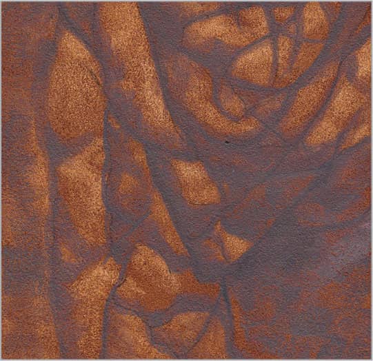
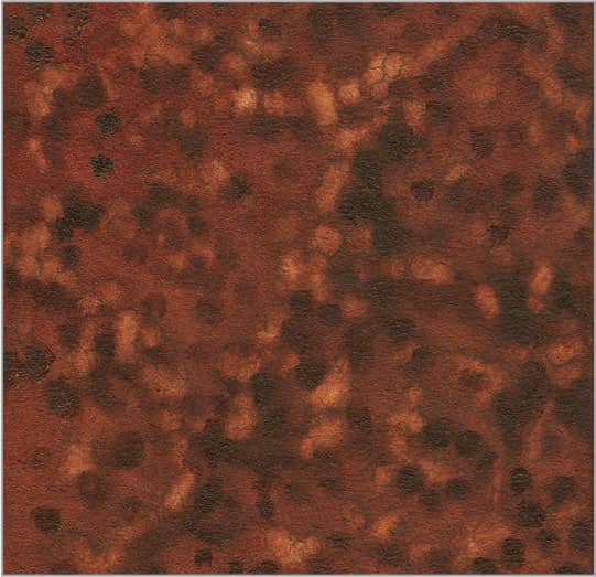
227 | Rusted Steel

Begin by creating a thin mix of burnt sienna darkened with black for the reddish-brown areas of rust. Dab an old, worn round brush into the color and stipple it onto your surface.

Next build up the rust-colored spots with various mixtures of cadmium orange and yellow ochre for the lighter oranges, adding black for the darker areas. Then create a gray mix of black and white and loosely brush it into the areas of steel. Use a small, worn round brush or the corner of a 1/4-inch flat brush to stipple more rust colors into the gray steel to suggest the spreading of the rust. Rust also features small dots of white oxidation, which you can create with a simple mix of white and a bit of black.

At this point, work on filling in the grays of the steel and creating the transitions between the steel and rust. Using a mix of black and white, dab small spots of medium gray wherever the steel shows through the rust.

Now that you have created the subtle colors of rust as it creeps into the grays of the steel, smooth out some of the areas of gray steel and clean up their edges. Use a small #3 round brush and a light gray mixture.
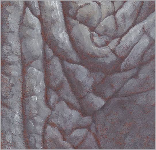
228 | Smooth Concrete

To make realistic looking concrete, build a mottled gray color that has some minor cracks and holes in it. A palette knife is perfect for creating the rough edges and smooth surfaces found in concrete. To begin, mix one part white to two parts black and add a small amount of raw sienna for warmth. Using a small palette knife, scrape paint across your surface in various directions. Be careful to knock down all the texture so you won’t have trouble adding layers later. If you do have problems, you can always try sanding down the paint, which can create interesting effects that add to your texture.

Once your first layer dries completely, use your palette knife to continue building up the surface with a mixture of black and white warmed with a touch of raw sienna. Allow the palette knife to determine the texture as you scrape thin layers of paint across your surface in various directions using different pressures. Lay on the paint and scrape it off until you like what you see.

When your previous layer dries, add more white to your mixture and use your palette knife to burnish color onto your surface. The lightest areas should be where the light is strongest and where the concrete moves into the distance, as this area shows less detail and texture. Work the paint back and forth or in a circular motion to blend and thin the layer.
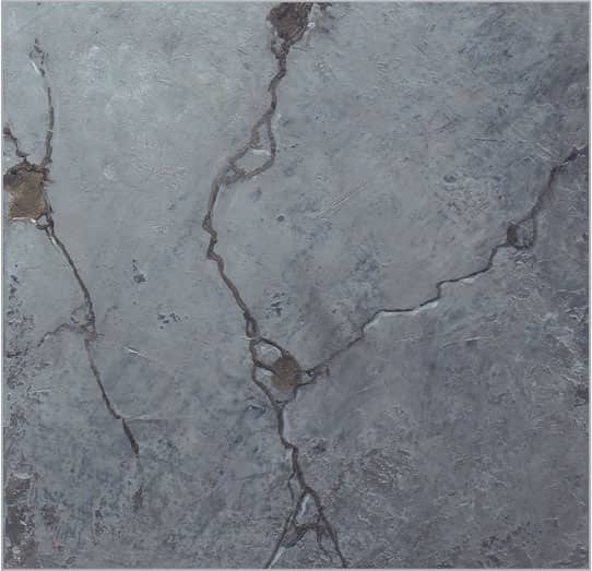
Now that you have completed the main texture of your concrete surface, all you need to do is add the fine line cracks and pits. Create a dark, warm gray mix and load a long striper brush. Hold the brush at the end of its handle to create natural lines and add a few simple, thin cracks to the surface. Apply sparse white highlights along the light edge of each crack to increase realism and depth.
229 | Stucco
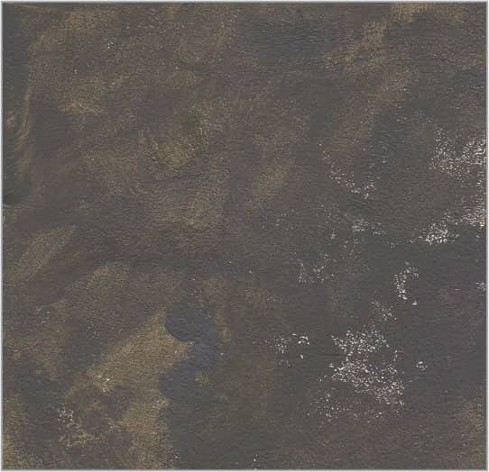
Basic stucco is a very muddy, greenish gray and can feature various textures depending on how it is applied. Generally, it has a mix of smooth and bumpy areas throughout. Start with the darkest areas and build the rougher texture with a mixture of equal parts black, sap green, and white. Thin the mixture and stain your surface using a 1/2-inch flat brush, creating texture with loose variations of light and dark values.

Real stucco is applied with trowels, which are essentially large palette knives. To recreate this texture, switch to a small rounded palette knife to scrape and spread the color across your surface. Apply a mix of equal parts black, white, and raw sienna, allowing the raw edges to remain. Add a few dark patches to break up the surface.

After the painting dries, add more white to your previous color and continue to build the surface texture with a light gray. Use a light touch and allow the palette knife to create natural edges as you dab color onto the surface.
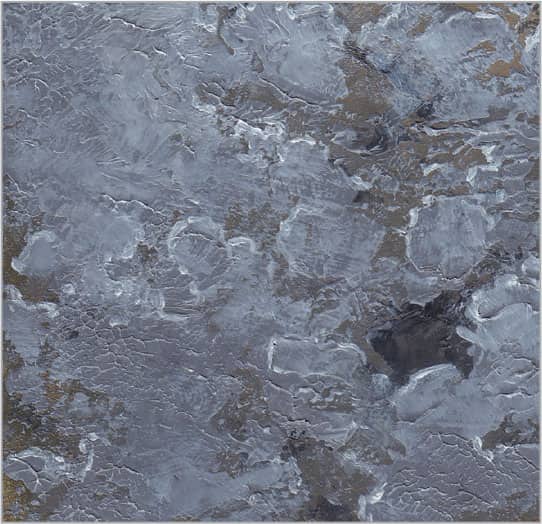
In this final step, focus on adding highlights along the upper edges of the thicker sections to make them stand out from the base layers. Use a very fine round brush loaded with pure white, being careful not to overwork your strokes. Another way to pull up the texture is to drybrush white over the surface by laying your flat brush almost parallel to your image and lightly pulling it across the tops of the highest edges.
230 | Brick

Painting brick is easy by building color and light over the darkest shadows. Begin by painting the rough mortar between the individual bricks using the edge of a 1/4-inch flat brush and thin black paint. Keep your marks sketchy and round the corners of the bricks to suggest wear.
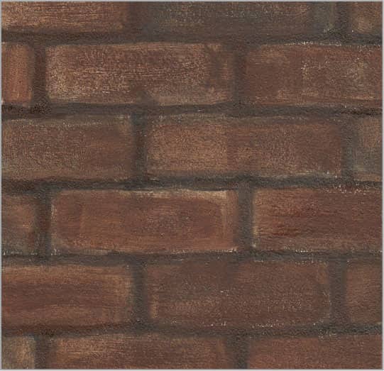
Using various mixtures of black, Venetian red, and white, paint the basic middle values of the bricks with a 1/2-inch flat brush. Lay the brush flat on its side and drag it across your surface to achieve the coarse texture of natural brick.
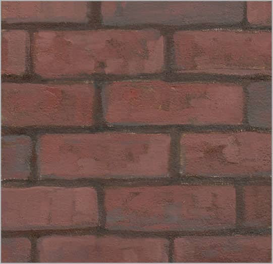
To add characteristic rustic reds and grays to the brick surface, use variations of Venetian red lightened with small amounts of white and cadmium red light. Then apply Venetian red darkened and grayed down with small amounts of black. With a 1/4-inch flat brush, paint loose, short, impressionistic strokes that allow the underpainting to show through in areas. Each brick should feature variations of color and value.

Now add the lightest reds to the face of each brick using equal parts Venetian red, cadmium red light, and white. Use short drybrush marks that add to the natural texture of the surface. To finish, add highlights on the top and left side of each brick. Use a #2 round brush with white to add thin, broken lines along the edges, allowing some color beneath to show through.
231 | Cobblestone

Begin by using a 1/4-inch flat brush to paint the darkest shadows between the cobblestones. Create a thin mix of equal parts black and burnt sienna. Apply an even layer of transparent color; then reload and wipe the excess paint from your brush before loosely sketching the grid of shadows. Continue to blend around the edges of the stones, rounding the edges to suggest years of wear.

In this step, simply mass in the middle values of dark, warm gray with a 1/4-inch flat brush and a mixture of one part burnt sienna, three parts black, and a touch of white. Keep the gray strokes soft as they roll over the edges and into the shadows.

Now mix equal parts black and burnt sienna and use the corner of a 1/4-inch flat brush or a #6 round brush to darken the sides and bottom of each cobblestone. Then add white to this mix to create a middle-value gray for the top surfaces. Keep the cobblestones rustic and textured, varying the values to suggest the worn, irregular surfaces of the stones.

Finally, add more white to the gray mixture from step three and use a 1/4-inch flat brush to stroke highlights over the raised areas of each cobblestone. The more texture you add, the older the stones will look.
232 | Marble

Marble features soft, mottled textures and stronger striations that cut across its surface. To achieve soft transitions, work wet-into-wet or blend with a very soft, dry brush—or use a combination of the two techniques. Use a thin, milky gray mixture of black and white to stipple your surface with an old, worn round brush.

With the darker variations in place, build the whites of the marble. Create a semi-opaque glaze by thinning white. Paint it over your entire surface using a large flat brush. Add as many layers as you desire, but let them dry between applications and avoid completely covering the grays below.

Now that you have created the luminous, transparent whites over the darker variations, add some of the darker veins that run through the marble. Use a long striper brush and a thin black glaze to paint long, thin lines diagonally across the surface. Use a soft, dry brush to softly blend and integrate them with the previous layers.

Finally, once your painting dries, evaluate your texture. Determine whether you want to bring up the value of any of the whites and add layers where needed. Also, if any gray details are too strong, simply glaze over them with a thin layer of white. The more layers you add, the more depth the marble will have.
233 | Pearl

The most unique qualities of pearls are their iridescent, swirling colors. First establish a cool, semi-transparent underpainting of reddish purple mixed with equal parts black, alizarin crimson, and white. Thin this color and use a 1/2-inch flat brush to create long curves that follow the form. Add more white for lighter values, and blend everything softly at this stage.

Pearls reflect many different colors, including pinks, blues, golds, and many variations of white. Begin with a soft 1/2-inch flat brush and mass in the primary base colors of salmon pink using blends of Venetian red and yellow ochre lightened with small amounts of white. Then create the more purple sections by mixing ultramarine blue with small amounts of Venetian red and white. Thin the paint so you can create long, smooth, sweeping strokes.

Pearls are basically white with other soft pastel colors reflected onto their semi-translucent surfaces. Mix various lighter values of pink and purple with mixtures of white tinted with yellow ochre, cobalt blue, or alizarin crimson; then add these where the light is strongest. Enhance the subtle pattern that swirls around the natural variations in the pearl surface.

Once everything dries, focus on adding the brightest highlights. Add more white to your mixtures and, with a #2 round brush, accentuate the lines and nodules that receive the most light.
234 | Diamond
Diamonds come in many different types of cuts, but all of them reflect various colors from their surroundings. After carefully drawing the multifaceted surface, start by painting the darkest facets with cool purple-grays mixed with various blends of black, alizarin crimson, ultramarine blue, and white. Thin your colors to create semi-glazes that you can easily control with a #4 round brush. Eliminate your brushmarks using a small, soft, dry brush.

With variations of blue and purple-grays, continue to carefully paint the triangles that make up the individual facets of the diamond with a small #2 round brush. Mix any other colors that may be reflecting onto them from surrounding objects or light sources. Remember to keep the top face of the diamond lightest and clearest, with darker shadows around the edges.

In this step, continue to fill in the various facets with whatever colors you desire. If the darks on the face of the diamond compete with those on the receding sides, tone them down with a light bluish-white mixed from cobalt blue and white.

For the final details, load a long striper brush loaded with pure white that has been thinned slightly for flow. Clean up the edges of each facet by adding a fine highlight line between each section. This will integrate the facets to create the illusion of one diamond, rather than a collection of individual cuts.
235 | Wrought Iron
Although wrought iron is black or dark gray, make it more interesting by adding a little color from the surrounding environment. This will help you integrate the colors in your painting for a sense of color unity. Begin by using a 1/2-inch flat brush to lay in a middle-value gray wash of thinned black.

Next paint the darkest gray areas of the wrought iron with a #4 round brush and a mixture of black and small amounts of burnt sienna, lightened with a touch of white. Build as much texture as you’d like.

With the darkest grays complete, add small amounts of white to the mix to create various lighter grays. Use a #4 round brush to fill in the rest of the iron, paying close attention to the location of your light source and how the light hits the various forms of the wrought iron. Now clean your brush and create various mixtures of sap green, white, and a bit of black for the neutral green background.

Now add the final lights and highlights to the wrought iron using a #2 round brush and mixes of white and black. Include trace amounts of sap green and burnt sienna in your gray mixes to unify the painting and give life to the wrought iron.
236 | Smooth Wood

Quickly capture the look of smooth wood using a flat brush and layers of semi-glazes. Start with a mix of burnt sienna and yellow ochre, thinned to a milky consistency. Work side to side with soft, horizontal lines that mimic the wood grain. Paint one stripe at a time, overlapping for soft edges.

Now build lighter middle values using a thin mix of yellow ochre, burnt sienna, and white. Keep your marks loose. Sweep side to side in curving bands that simulate wood. Work from top to bottom, with each row responding to the previous row.

After the paint dries, use the same 1/2-inch flat and a mixture of equal parts burnt sienna, yellow ochre, and white to add lighter details to the wood pattern.

Lighten areas of the wood grain. Add more white and yellow ochre to your previous mixture and thin the paint. Use your flat brush to stroke over the highest parts of the grain with a layer of color, punching up the highlights.
237 | Aged Wood

The texture and neutral color variations of aged wood call for a loose, impressionistic style. Lay in the underpainting and dark horizontal bands with a 1/2-inch flat brush and a thin mixture of equal parts black and burnt sienna. Work from side to side in long, continuous strokes.

Next build up the base colors with texture using the edge of a 1/4-inch flat brush. Mix equal parts ultramarine blue, black, and white for the cool gray areas of the wood, and mix burnt sienna with yellow ochre for the warmer, lighter areas. Work from side to side in choppy, horizontal strokes.

After the paint dries on your canvas, add more white or yellow ochre to the mixture from step two and continue to paint the lighter areas with short, organic strokes from one side to the other. Keep your strokes coarse and broken to let the darker colors beneath show through.
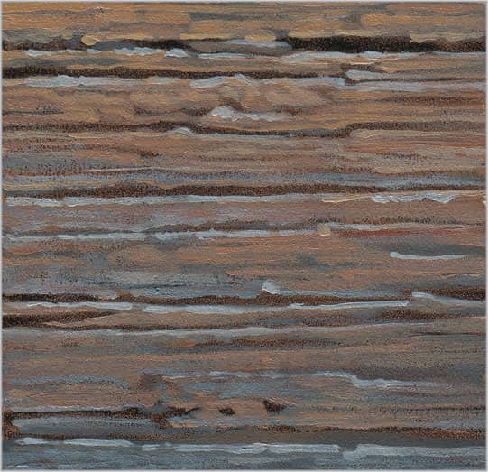
The most important details of your aged wood are the highlights found along the top edge of each plank. Add these highlights carefully using a fine #2 round brush and a thin mix of equal parts white and yellow ochre.
238 | Wooden Barrel
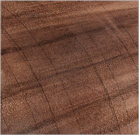
When painting a wooden barrel, begin painting the wood first and the metal banding second; this ensures that your wood grain flows realistically. Build the middle values of the wood with a thin mix of burnt sienna and black. Loosely lay down a layer of glaze, keeping your curved brushstrokes parallel.

Add light grays and browns over the aged wood using various mixes of black, white, and burnt sienna. Use the edge of a flat brush to work in horizontal stripes, using lighter grays near the top and warmer middle values near the bottom.
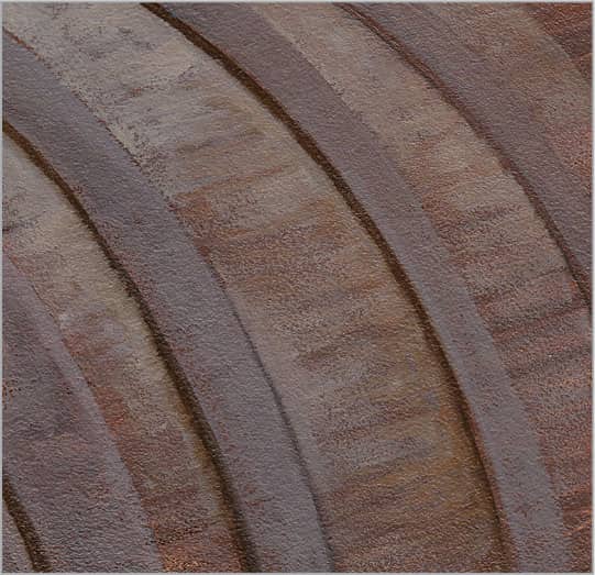
Next load a round brush with a thin mix of burnt sienna and a bit of black, and draw thin, curved shadows behind each metal band. Add white to this mix and use a flat brush to paint the top surface of each band, stroking from top to bottom. For light values of wood, add more white and burnt sienna.

Add color accents to the metal bands by drybrushing with raw sienna. Then use the tip of a round brush to stroke in plank separations with a mix of burnt sienna and black. Drybrush light values over the wood, stroking along the grain. Finally, add highlights below the plank separations and along the metal bands.
NATURE
239 | Tree Bark

Start with a warm, dark underpainting to quickly establish a middle tone that you can build upon. Use burnt sienna darkened with a bit of black. Pounce out the brushstrokes to even out the color without lifting it off your support, which will allow your drawing to show through the underpainting.

Build your underpainting by adding the dark shadows between the raised areas of bark. Create a thin mix of burnt sienna and black. Use a flat brush to apply the paint, holding the brush at the end of the handle to create loose, spontaneous marks.
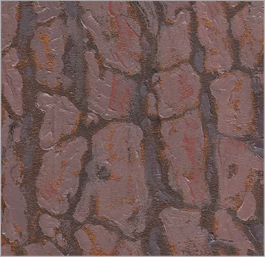
Build up the thick parts of the bark using a small, triangular palette knife with a narrow but rounded tip. Add white to the previous mix for cooler browns and reddish grays, and carefully place thick color onto the raised areas of bark. Work from the edges toward the centers.
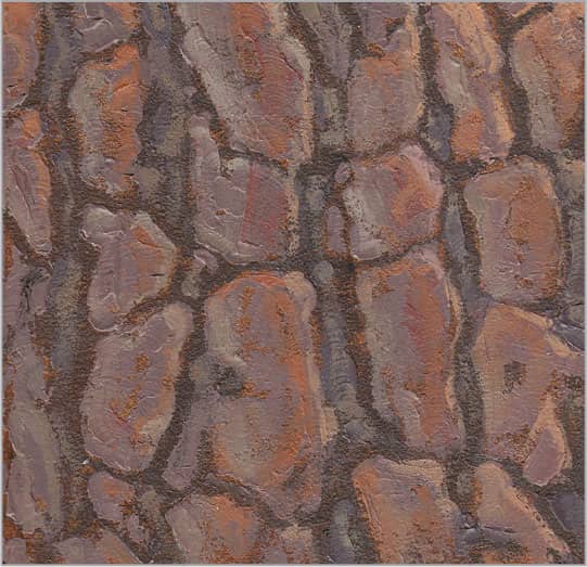
To add the final details to the edges of the bark, indicate the areas where the light is strongest. Mix more white into your previous mixtures and use a round brush to loosely add touches of color on the edges and tops of the raised sections.
240 | Pine Tree Needles
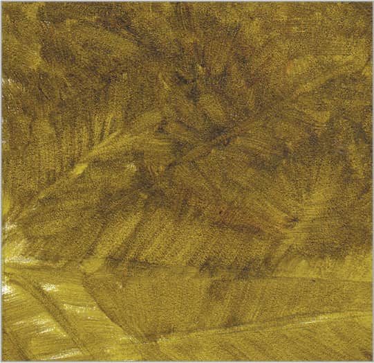
Aim to capture the general look of needles, saving the finest detail for the closest elements. An old, stiff brush with splayed bristles is a good choice. Create a soft background using a thin mix of sap green and a bit of burnt sienna. Use a flat brush and short strokes to suggest needles.
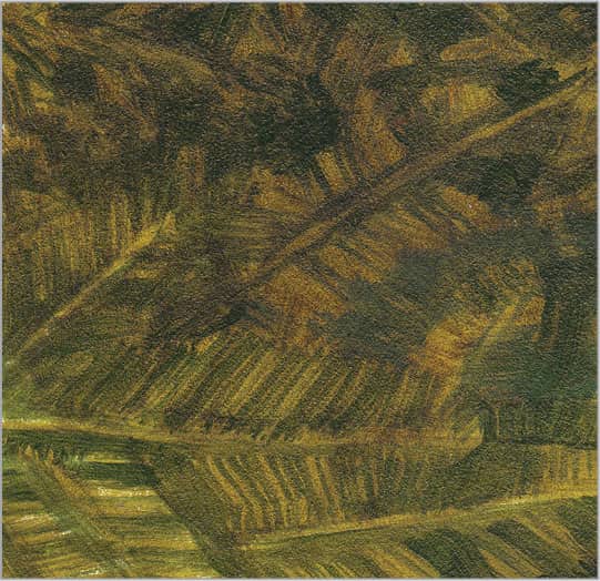
Before you paint the needles, build up shadow details. This will save time and keep your background from appearing complex, which will help it recede. Use the same stiff flat brush and sap green darkened with small amounts of black. Continue stroking in the direction of needle growth.

Once dry, build background details. For the dark, cool green of pine needles, mix sap green with bits of white and black. Use the corner of a flat brush to make rounded strokes that look like bundles of pine needles. For the brown branches, add yellow.

Create a light, cool green with sap green and small amounts of white and black. Using a flat brush, lighten some of the branches in the background to suggest more depth. Add more white to the mix and thin it down; then use a round brush to render individual needles on the foreground branches.
241 | Pine Cone

For the dark, semi-transparent neutral purple in the shadows, mix a semi-glaze of black, alizarin crimson, and a touch of white. Use a flat brush and work from the center of each section toward the triangular knob at the end, keeping your brushstrokes loose and soft. Let the paint dry between layers.

Add color to your shadows with a flat brush. Use purples mixed with ultramarine blue, alizarin crimson, and small amounts of white for the darkest areas along the stalks and under the knobs. Use raw sienna along lighter areas of the stalks and knobs.

Now add the lightest areas to the knobs. Mix equal parts white and yellow ochre plus a small amount of phthalo blue for a slightly green cast. Use a round brush to carefully add this color to the front right side of each knob.
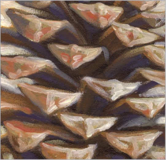
To give your pine cone the depth that makes its shapes so interesting, use a round brush to add the final highlights on the fronts and edges of each knob and stalk. Keep your marks painterly to capture the variations in the surface texture.
242 | Palm Frond

The most interesting aspects of palm fronds are the play of light on the individual leaves and negative spaces that occur between the leaves. It’s important to emphasize both features in your work. Palm fronds have such a distinctive shape that you don’t need to paint every single leaf to capture its character. Start with a thin underpainting of transparent green mixed with sap green and a touch of burnt sienna, which will establish the surrounding vegetation and a base color for brighter greens.

Finish painting your shadows and adding interest to the background with a darker, cooler layer of sap green mixed with small amounts of black. Use a 1/4-inch flat brush as you stroke long lines and fill in larger areas. Retrace your marks to keep the edges flat and soft.

Now you are ready to paint the basic green values of the palm leaves. Add two parts cadmium yellow light to three parts sap green; then use the same 1/4-inch flat brush to work in long, continuous strokes from the ends of the leaves toward the darker center. Decrease pressure and rotate your brush as you near the center to narrow your stroke and blend the color into the shadows.

Finally, it’s time to add the bright yellow greens that give palm fronds their drama. Add more white and yellow to your mixture and thin it for flow. Then use a #2 round brush to add the highlights, working from the tips of the leaves toward the center.
243 | Thatched Roof
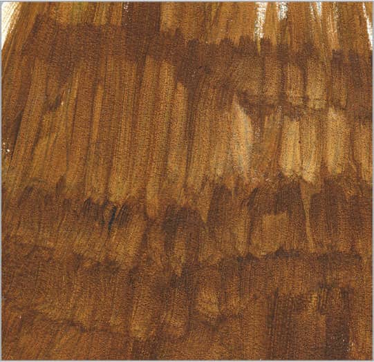
When creating the texture of a thatched roof, it is easiest to start with dark, blurred shadows and build on them with lighter values. Start by mixing burnt sienna with a small amount of sap green. Holding a 1/2-inch flat brush vertically, paint edgewise in loose, vertical strokes. After you have covered the surface, add more sap green to create a darker value and cut in short, vertical shadows that run horizontally across the roof.
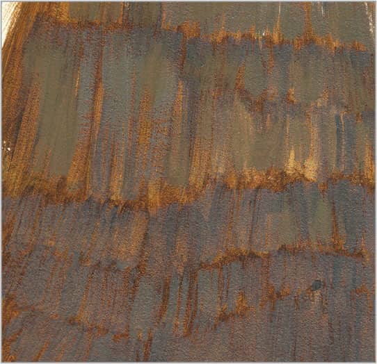
With the warm, dark shadows in place, work on the straw itself. Begin in the shadows by adding cool, grayish golds with a mixture of equal parts yellow ochre, white, and black. Use the corner and width of a 1/4-inch flat brush to paint in vertical sections with various widths, starting from the top and working down toward the end of each section.
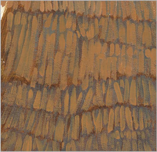
Allow this darker, cooler layer of color to dry. Then switch to a #4 round brush and rotate your support so that you can stroke comfortably from the ends of the straw upward. Create a mixture of equal parts white and yellow ochre plus a small amount of burnt sienna; then thin the mixture to create smooth, clean vertical marks along the layers of thatch.

In this final step, enhance the light on the thatch that is closest to your light source—or simply add light to areas that need more dimension and variety. With a #2 round brush, add thinner lines along the edges these sections with a mix of equal parts white and yellow ochre. Do not overdo this stage, but rather use these highlights sparingly for a realistic look.
244 | Fern
Ferns have busy leaves, so reserve your finest details for a few well-placed ferns in the foreground. Work from back to front so you don’t have to paint around complex shapes. Load a flat brush with a dark, transparent mix of sap green and burnt sienna. Apply short strokes in various directions.
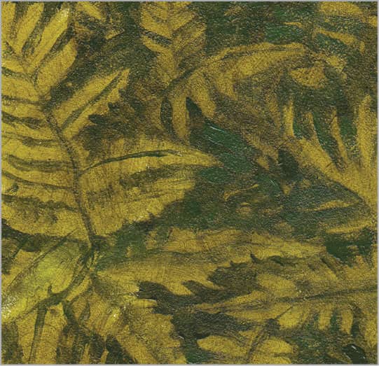
Once dry, switch to a smaller round brush and add dark greens to the shadows behind and between ferns, while building fernlike shapes in the negative spaces. Keep these areas simple so they don’t compete with the more detailed foreground leaves.
Again, once dry, lighten sap green with cadmium yellow light, and apply small strokes that start at the tip of each leaf and end at the stem. Reload the brush frequently. For the foreground ferns, add more yellow and white.
In this final step, simply repeat step three using brighter greens mixed with more yellow and white. You might also switch to a #2 round brush for added control. Begin in the background and brighten your greens as you move forward, working on the closest branch last.
245 | Moss
Work on the moss and the surface beneath at the same time so they integrate well with each other. Paint the rock with a wash of black lightened with white. Use a flat brush to build texture with short strokes or loose stippling. For the warm shadows, dab on sap green and burnt sienna.

After your underpainting dries, build the shadow color of the moss using a mix of sap green and yellow ochre. Experiment with different brushes, but look for one that makes small, organic marks simulating moss texture as you stipple.

Allow your shadow layer to dry. Use the same brush to add lighter middle values of green to the higher parts of the moss with various mixtures of sap green brightened with small amounts of cadmium yellow light and white.

For the final layer, add the lightest sections of the moss where the growth is newer and closer to your light source. Continue to add more yellow and white to your mixture and, for more control, use a #2 round brush to carefully add tiny strokes where needed.
246 | Grass Field

When painting a grassy field, use color temperature and detail to create depth. Mix sap green with burnt sienna, and apply loose, horizontal washes of color. Use lighter, cooler colors and less detail in the distance, and use warmer, darker, and more textured strokes in the foreground.

Switch to an old, stiff brush to add darker details in the shadow areas with a dark, cool green, such as sap green. Apply short grasslike marks made using a light touch. Allow the paint to dry.

Add more specific grass details with a long striper brush. Use cadmium yellow light, white, and sap green for the middle green. Hold the brush at the end of the handle for loose, organic lines that start in the soil and move up and out. The blades of grass should be longest in the foreground.

To add the blades of grass that are hit by the most light, add more white and yellow to the mix and thin it down for better flow. Use the striper brush to paint long, curved blades in the lower half of the painting. Make sure the foreground holds the most detail and contrast for atmospheric perspective.
247 | Bubbles

The key to painting bubbles is to create the illusion of transparency. Lay in your background colors and blend them so they are soft and nondescript—and you will have already done half the work! Use any color combinations, depending on where your bubbles are, and pounce to smooth out all the brushstrokes, leaving subtle gradations of color to build upon. For this background, apply a thin underpainting of sap green.

With the background in place, define some of the bubble edges with semi-transparent layers of the colors you wish to reflect. Begin with a blue-gray mix of ultramarine, white, and black. With a 1/4-inch flat brush, start at the edges of your bubbles and, as the paint diminishes on your brush, blend the color toward the center of the bubble. Avoid covering the entire background to create a sense of transparency.
Once your previous colors dry, create a thin, semi-transparent mix of white and a small amount of phthalo blue. Use a #2 round brush to add the brighter lights circling each bubble. If the marks are too harsh, use your finger or a dry 1/4-inch flat brush to blend the inner edge toward the centers of the bubbles. Add a few smaller solid circles; then gently press your finger into their centers to lift some color and make them appear transparent.

To finish, add bright colors along some of the edges of your bubbles, along with a few highlights with white to give them a more reflective appearance. Integrate the bubbles with the background by adding some bright green highlights using a #2 round brush.
248 | Smoke

Work from dark to light and keep your edges very soft to achieve the curving, intricate patterns made by smoke as it follows the air current. Start the dark background with a thinned mixture of equal parts Payne’s gray, alizarin crimson, and ultramarine blue. Thin this mix and use a 1/2-inch flat brush to stroke in the curves and soft edges of the smoke, retracing your marks until they are blurred sufficiently.

Now focus on creating the more subtle gradations within the background by working wet-into-wet with a soft 1/2-inch flat brush. Variations of black, white, ultramarine blue, and alizarin crimson work well to create the dark purples of smoke as seen in the dark. Retrace your strokes as many times as needed to create very smooth gradations.

After your paint dries, add more white to your color and begin to build the lighter values of the smoke, adding interest and detail as the smoke twists and turns in the air. Keep your color semi-transparent by thinning it and then blending it with a soft, dry brush. This will soften your edges and eliminate brushmarks.
Once the previous layers dry completely, add the brightest whites to represent where the smoke is thickest and where the light hits it most directly. Use a #2 round brush to dab in the white, and then use a soft, dry blending brush to eliminate the brushstrokes.
249 | Flower Petals

Start with an underpainting of sap green warmed with a small amount of burnt sienna; this will serve as the base color for the entire flower and add the illusion of greenery in the background without the need for much time or detail.

Next build the middle values of each area. Use the corner of a 1/4-inch flat brush and short, impressionistic strokes to paint the shadows in the flower centers using cadmium orange darkened with a touch of sap green. For the background, stroke in a loose mix of sap green and cadmium orange, lightened a bit with white. Then mix one part ultramarine blue with three parts white and, using your 1/4-inch flat brush, apply one long stroke from the tip of each individual petal toward the center. As you stroke, slowly reduce the pressure on the brush.

Continue lightening the petals with soft lavenders and pinks. Mix these colors using white tinted with small amounts of alizarin crimson and ultramarine blue. Use a 1/4-inch flat brush and, starting at the tip, pull one clean brushstroke along each petal, lifting it off the support about two-thirds of the way to the center.

Complete the flower by adding one final layer of thick, bright white on the petals where the light hits them most directly. Use a #2 round brush and focus on adding the striations that run the length of each petal. Start at the tip of the petal and let the white fade as you stroke toward the center. Then stipple a few cadmium yellow highlights over the flower centers to bring them to life.
250 | Fall Foliage
You can achieve the colorful texture of fall foliage, as seen from a distance, by applying multiple layers of color. You can use a number of tools for the layering process, but sponges are particularly useful. Begin by painting the background sky using equal parts white and ultramarine blue with a 1/2-inch flat brush. Let this dry before starting the next layer.
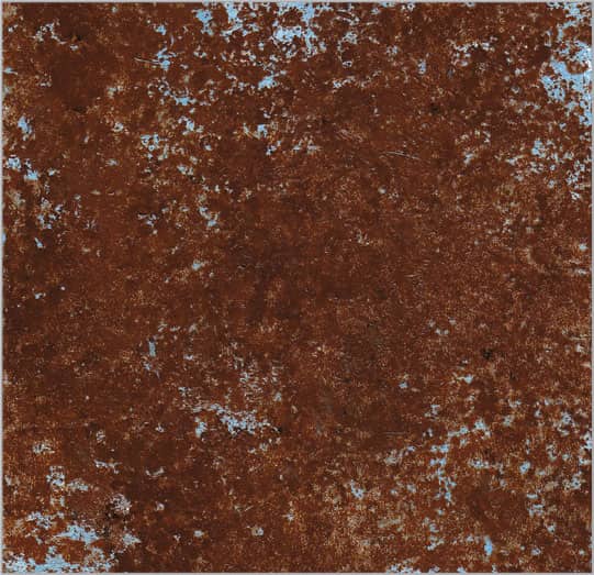
Before you begin isolating specific areas of foliage or individual leaves, first quickly allude to the more distant foliage that will peek through the detailed areas and add depth to your landscape. Wet a natural sea sponge and, after wringing out as much water as possible, dab it into a glaze mixed from Venetian red and ultramarine blue. Dab this onto your support, creating as much density as you desire. Remember to allow the blue of your sky to show through in areas.

Now that your darkest, coolest red foliage is done and dry, use the same sponge to add a warmer, lighter layer of leaves with a mixture of equal parts cadmium yellow and cadmium orange, darkened with small amounts of alizarin crimson. Avoid covering all of the previous layers, as they will add depth to your final painting.

To increase the depth of your foliage, continue using the same sponge to add a final layer of brighter leaves. The dryer the sponge and the more paint it holds, the more dramatic your additions will be. A mixture of equal parts yellow ochre and cadmium orange works well for the top layers, where the light is strongest and the leaves are brightest.
251 | Mountain Rock

When painting mountain rocks, remain loose and avoid over-working the details. Use a flat brush to apply an underpainting of burnt sienna darkened with a bit of black. This establishes the shadows with transparent color, which will recede against subsequent opaque layers.

Once dry, switch to a smaller flat brush to mass in the shadow sides of the rocks and add darker cracks. Use a mix of equal parts yellow ochre and Venetian red, darkened with black. Your marks should follow the grain of the rock surface, which will help describe the form with less detail.

Add contrast and texture on the top surfaces of the rocks in light. Use a flat brush or palette knife for impasto strokes. Mixtures of yellow ochre and Venetian red darkened with black work well for iron-rich rock. Keep your strokes short, following the grain of the rock.
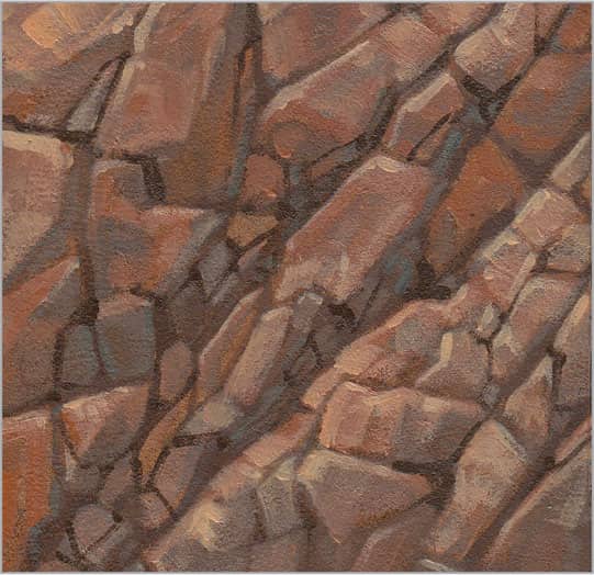
To clean up edges, add more detail, and build a stronger sense of light, mix yellow ochre and burnt sienna with white. Using a round brush, add this light value where the light is strongest on the rocks. To add cracks, use a round brush and a glaze of burnt sienna darkened with black.
252 | Smooth Rock
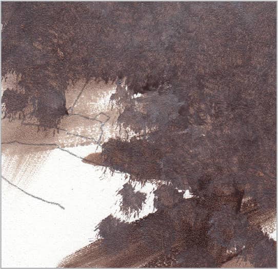
For realistic rock textures, build layers of blended colors followed by cracks and highlights. Paint the soft variations of color, starting with the darkest values. With a thin mix of black and small amounts of white and burnt sienna, use the tip of a flat brush to stipple a layer of mottled color.

For more subtle variations of color, use a smaller brush—such as a 1/4-inch flat—and create less contrast between your color mixes. Work wet-into-wet as you stipple to achieve soft transitions.
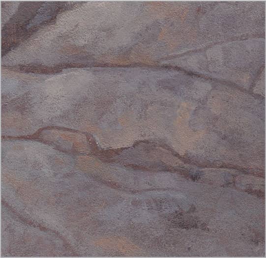
Once dry, add more white and yellow ochre to the mix and build up light areas of stone. Now is a good time to clean up the edges along the cracks or simplify areas that have become too complex or confusing. Drybrush your color onto the surface, allowing the colors beneath to show through.

Finally, using a round brush loaded with a thinned mix of burnt sienna and a bit of black, refine the darks and details of the smaller rocks and cracks. Then switch to white paint and add thin highlights along the top edges of the rocks and cracks, focusing on those that capture the light most directly.
253 | River Pebbles

River pebbles have smooth, rounded edges and glossy, reflective surfaces when wet. Use a flat brush and a glaze of ultramarine neutralized with a bit of burnt sienna. Redraw the stones and fill in shadows, blending the color over the stones.

In this step, use a flat brush to establish the middle tones of the individual stones with yellow ochre, black, white, Venetian red, and ultramarine blue in various combinations. Work your brushmarks in circular movements that describe the roundness of the stones, and smooth out any rough strokes.
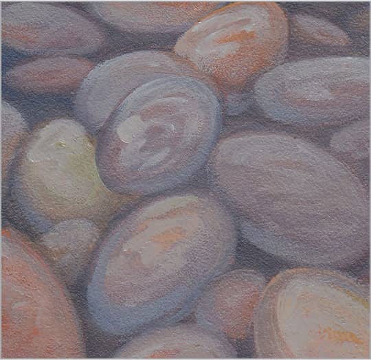
Add small amounts of white to your various colors and thin them down to semi-transparent glazes. Continue adding dimension to your stones with loose brushstrokes on the portions of the pebbles that peek above the water. Keep your marks organic so they look like wet reflections on smooth stones.

In this final step, add light reflections that encircle the tops of the stones as they peek above the water’s surface. Use a #2 round brush and a semi-glaze of white paint to loosely suggest the shapes of surrounding objects, such as trees, on top of each stone.
254 | Sand

There are many ways to create the texture of sand, such as incorporating a textured medium or even using actual fine sand in your paint. However, you can create a convincing texture simply with paint. Start with a base of middle-value brown mixed with three parts ultramarine blue, two parts raw sienna, and one part white. Use a 1/2-inch flat brush in long, curving strokes to create the soft ridges of this sand dune. Keep everything loose and non-committal at this stage so the shadows recede.

Switching to a 1/4-inch flat brush, build up the texture of the sand by using the corner of your brush to stipple in slightly lighter variations of your color mixture. Work along the ridges of the sand and gently blend into the shadows as the paint diminishes on your brush. Let this layer dry before you start another.

To build more texture and light in your image, mix white with small amounts of Venetian red and yellow ochre. Use your 1/4-inch flat brush to brighten the dunes by stippling small dots of color along the ridges; as the paint diminishes on your brush, scumble thin color into the shadows.
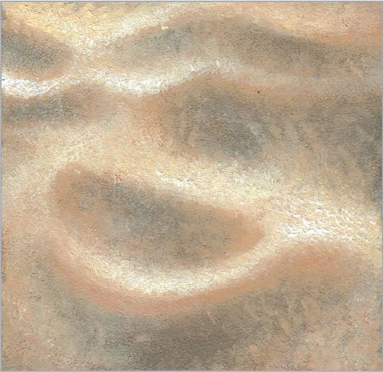
To add the final highlights and add more specific texture to the peaks of the dunes, use an old, stiff #4 round brush. Consider cutting off the pointed tip of the hairs with a utility knife to give it a flat, circular end, which you can use to stipple thicker paint onto your painting. Add more white to your mixture from step three and dab it onto your painting wherever you’d like more light and texture.
255 | Seashell

Seashells come in myriad colors, shapes, and patterns, so use this example as a guide for applying any color combination you wish. Begin the warm undertones of the shell with an underpainting of burnt sienna cooled down with a small amount of sap green. Use the pounce technique to eliminate any brushstrokes. Then pick out color from the lighter areas of the shell to indicate how the light falls across the form.

Next mix three parts Venetian red to one part ultramarine blue, lightened with a small amount of white. After studying the pattern of your shell carefully, establish the darkest parts first using a 1/4-inch flat brush for the widest bands of color and a #4 round for more linear details, paying close attention to how the pattern follows the contours of the shell.
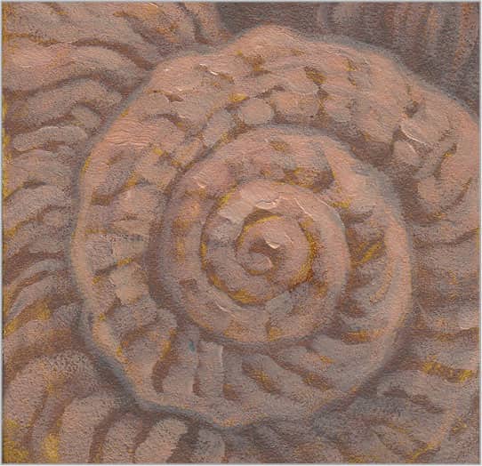
Now it is time to start building the lighter values of the seashell and adding detail to the pattern. With equal parts Venetian red, yellow ochre, and white, use your 1/4-inch flat brush to paint single strokes that follow the contours of the shell, working between the darkest marks you added previously.

To finish, build up the detail and brighten the values where the light is strongest. Add more white and a touch of yellow ochre to your mixture and, using a #4 round brush, work along the length of the shell and across its width to render the raised pattern.
256 | Running River
The surface of water shows interesting patterns as it flows around and moves over rocks, branches, and other objects. To begin establishing these patterns, use a bluish gray mixed with two parts ultramarine blue to one part Payne’s gray. Thin this with water (if using acrylics) or medium (if using oils), and use a 1/2-inch flat brush to loosely paint the shadows of the rocks and water.

To paint the middle values of the rocks and water, mix variations of ultramarine blue and white, darkening with black and warming with raw sienna. These neutral tones give the sense of vegetation and rocks under the surface of the running water. Use a 1/4-inch flat brush to apply long strokes that follow the flow of the water.

Now begin building the bluish-white foam found around the rock, and continue weaving strokes through the water in the direction of flow. Use various mixtures of cobalt blue and white warmed with a touch of raw sienna. A small 1/8-inch flat brush or #2 round brush is a good choice for these long strokes.

Once your previous layers dry, use a #2 round brush to enhance the lights in the water patterns with pure white paint. Hold your brush at the end of the handle to help you create looser, more natural marks that suggest the foam and water.
257 | Ocean
Ocean water features a variety of textures, from thick sea foam swirling along the surface to fine spray shooting off the tops of waves. With a little experimentation, you can learn to create realistic textures that do not appear too contrived. The more relaxed you are with the handling of your brush, the easier these textures will be to create. Build the transparent blues of the water using thinned manganese blue hue and ultramarine blue with a 1/2-inch flat brush. Apply the paint in loose, brushy strokes that follow the contours of the water.

To hint at the sand colors under the shallow layers of water, mix equal parts yellow ochre, Venetian red, and white cooled by a touch of ultramarine blue. Use the tip of a 1/2-inch flat brush to loosely paint bands of color along the shore. Next use the same method to add darker bands of blue glaze mixed from equal parts ultramarine blue and manganese blue hue. Work wet-into-wet, blending the areas of color together as you to create soft transitions within the water.

Having established the darker colors under the surface and in the shadows, it’s time to add the lighter whites of the foam. For the waves, use a 1/4-inch flat brush loaded with a mix of white and a touch of phthalo blue. Work from the back of the wave to the front and follow the flow of the water. Then thin the paint and switch to a #2 round brush to paint the soft pattern of foam as it rolls up onto the sand.
Once your previous layer dries, enhance the brightest whites of the foam in the foreground and within the waves. Load a #2 round brush with white paint thinned for flow, and hold your brush by the end of the handle to loosely add opaque white strokes that add dimension.
258 | Still Lake

The most interesting aspects of a still lake are the reflections that fall on its surface. To create the reflections of the trees and foliage at the lake’s edge, create a thin mix of three parts sap green to one part burnt sienna. Using a 1/2-inch or 1/4-inch flat brush, work over the reflections from top to bottom and stroke in a subtle zigzag pattern to blur the details and create the illusion of water.
Next use a 1/2-inch flat brush to quickly paint the warm tones of the lake bottom with equal parts sap green, burnt sienna, and white. This will show through your subsequent layers and add depth to the water’s surface.

Now that your underpainting is finished, create the whitish reflection of the top surface of the water. Mix a milky semi-glaze with three to four parts white and one part ultramarine blue and alizarin crimson. Use a soft 1/2-inch flat brush to apply a layer over the entire section of water to the right of the tree reflections. You can use a small amount of this color over the tree reflections to soften them if needed. Before the paint gets tacky, use a very soft, dry blending brush to remove all brushmarks.

Once your previous layers dry completely, create a strong sense of atmospheric perspective and enhance the glassy quality of the water. Use a 1/4-inch flat brush to add a layer of white with horizontal strokes, making it thicker and lighter in the distance and thinner and more transparent in the near foreground.
259 | Rippled Lake

When painting rippled water, the reflections from the surrounding environment—such as boats, swimmers, or trees along the water’s edge—merge with the cooler whites and blues of the water itself. It is important to study the curving weblike patterns created by rippling water. Start by laying in the transparent greens of the reflections using a thin mix of sap green warmed with a touch of burnt sienna. Using a 1/4-inch flat brush, work from top to bottom to create a subtle zigzag pattern. Before this dries, knock down any hard edges by sweeping over your strokes with a soft, dry brush.

Once the underpainting is dry, paint your darkest blues using two parts white, one part ultramarine blue, and a small amount of sap green. Thin the paint so it flows smoothly. Use the same zigzag method to suggest horizontal ripples that are thinnest in the distance and fattest near the viewer.
To paint the lighter, bluish white reflections on the water’s surface, mix white with small amounts of ultramarine blue. Use a #4 flat brush (or smaller round brush) to carefully paint horizontal bands that end gradually in the dark shadows of the water. Then apply more of the dark glaze over the shadows to blend and soften the edges of the lighter colors as you trace between them.

Once your paint dries, add the final white highlights on the highest ridges of the ripples. Use a #2 round brush and pure white to add soft, horizontal bands wherever needed.
260 | Clouds

To create the fluffy white clouds you would find in a Maxfield Parrish painting, use a 1/2-inch flat brush to apply a warm gray underpainting with a mixture of three parts ultramarine blue, one part yellow ochre, and one part white. Use the pounce technique to remove the brushstrokes, and use a soft, clean cloth to pick out color where the light is strongest on the clouds. Keep your edges soft and blurred like clouds in nature.

Various shades of ultramarine blue mixed with white are perfect for the fluffy, cool cloud shadows and for the soft edges that blend into the sky. Use a 1/4-inch flat brush and short, impressionistic strokes to start building texture in these areas. Avoid covering all of your underpainting, as its warmth will add depth and variation to your clouds.

After your paint dries, fill in the parts of the clouds that are receiving the most light. Use white warmed with a small amount of yellow ochre for the tops, and use white darkened with a bit of ultramarine blue to enhance the details in the shadows or in the distance.

Once your base dries, add a final layer of pure white on the areas where the light is strongest. Keep your transitions soft, but build up the thickness of your paint in your focal areas and where the light is brightest. Remember that thick paint tends to come forward, whereas thin, transparent color tends to recede.
261 | Frozen Pond

Usually shallow ponds start to freeze over in late fall, right after the leaves have fallen from the trees. Often you can see colorful foliage through the thin layers of ice. Therefore, before you start to paint the ice, first establish the colors of the water and foliage. Use a 1/2-inch flat brush to block in various mixtures of burnt sienna, yellow ochre, sap green, and ultramarine blue. Work from the warmer colors, seen through the smoothest, thinnest ice, toward the cooler, bluer areas where the ice is thicker and more opaque.

Continue building up the colors of the underpainting. Add more blue and white to your mixtures as you move forward in your picture plane (toward the viewer), where you see fewer reflections and more texture. Work wet-into-wet with your 1/2-inch flat brush to keep your edges blended.

With your underpainting complete, add the semi-transparent ice on top. Mix equal parts ultramarine blue and white, and thin it to create a semi-glaze. Using the tip of a 1/4-inch flat brush, create the diagonal lines and striations that form when shallow water freezes over. Start with the primary lines and then fill in the secondary lines to form a complex series of sections that intersect each other, forming a rippled pattern.

The last five percent of work spent on a painting is what makes it come to life. A few well-placed highlights can make all the difference, giving it a sense of place and time through the quality of light. Light glimmers and glints off the surface of ice with diamondlike brilliance, but it is softer and subtler in other areas where it is absorbed by snow or seen through the atmosphere. Use white to apply these final highlights, and stroke in the direction the light falls on the ice—in this case, down and to the left.
262 | Raindrops on a Window

Before you can paint fog and raindrops on a window, begin with a background color you can build on. In this case, use a blue-gray mixed from manganese blue hue, ultramarine blue, and a small amount of white. Apply the paint using a 1/2-inch flat brush or larger, depending on your surface area. Pounce out all the brushmarks to leave a smooth gradation of color.
After the base colors dry, use a 1/4-inch flat brush to scumble white thinly onto the surface of your board, simulating fog or steam on the window. Your base layer should show through but appear blurred. While the scumbling is wet, load a #4 round brush with a very thin version of your background color and press it at points along the top of your painting, letting the liquid drip down your surface. Some of the wet paint beneath should float up and gather in the drips. You can also gently drop bits of thinned color into these drips until you achieve the desired effect.

Continue building texture across the window by scumbling with a 1/4-inch flat brush and a bluish white mix, working around the main streaks. A little stippling with the corner of your brush will look like condensation collecting on the glass.

Now add the final streaks of rain on the window. Hold your support vertically as the thin paint drips down your surface.
263 | Raindrops from the Sky

While painting raindrops, focus on building depth through the subtle contrasts between hard and soft edges. The first layer will be the softest (or blurriest), as if the rain is falling in the distance. To achieve this effect, create thin mixes with varying amounts of sap green and black, lightened with white. Using the edge of a 1/2-inch flat brush, turn your support so you can stroke from side to side in long stripes of various widths. Blur your brushmarks by tracing over them with repetitive strokes.
Once your previous layer dries, define the vertical lines created by falling rain. Turn your painting horizontally so you can more comfortably render straight lines. Use a #2 round brush loaded with a thin mix of white and a small amount of sap green.

To get the whites of the rain to glow, build up the thickness of the paint. Mix a very small amount of green gold with white and use the straight edge of a palette knife to place (or stamp) straight lines of color onto your image. If any line is too thick or messy, use a long striper brush to trace along the edge and pull paint upward, straightening and softening the mark as you move along its edge. Wipe your brush clean often so it readily picks up paint.

To create the impression of a sunny shower, make your whites very bright. Continue using your palette knife to build the thick white paint in areas where the light is strongest. After adding another series of vertical strips of color, refine them with a wet striper brush. (If using oils, wet the brush with medium; if using acrylics, wet the brush with water.) Continue to straighten your lines by pulling out color with the brush and wiping off the paint on a soft cloth.
264 | Snowflakes
To paint snow falling from the sky, first paint the background. In this case, create the illusion of snow at night as seen in the rays of a streetlight or perhaps in the headlights of a car. Start with a dark purple-gray by mixing equal parts black, ultramarine blue, and alizarin crimson, lightened with a touch of white where the sky is lighter between the trees. Use the tip of a 1/4-inch flat brush to dab on small dots of color with very soft, blurred edges.
Using the corner of the same 1/4-inch brush, continue to build up lighter and lighter layers of texture between the trees and in front of them using a various mixtures of white, Payne’s gray, and alizarin crimson. Small, stippled marks work best for falling snow.

With the night scene background in place, you will now need to build a few layers of snowflakes. Add more white to your gray mixture and use a small #2 round brush to dab tiny spots randomly over the entire image. Use pure white for the larger, closer flakes.
For the final touches, use a fine #2 round brush to dab thick spots of pure white over the largest and closest snowflakes.
265 | Snow Powder

To establish the cool purple-grays of the shadows, mix various amounts of ultramarine blue with alizarin crimson, lightened with a small amount of white and thinned for flow. Quickly lay in an even layer of color, pounce out the brushstrokes, and pick out some color from the mounds of snow that will receive the strongest light.
To begin building the texture of the snow, work from the shadows toward the light, gradually shifting from darker, cooler variations of white to warmer, lighter tints. For the purple found in the shadows, mix small amounts of alizarin crimson and ultramarine blue with white. Use the corner of a 1/4-inch flat brush to dab spots of color over the underpainting. Do not cover everything; the darker bits of underpainting serve as the shadows between clumps of snow.

After your paint dries, start building the lighter values of the snow using pure white. Start at the ridges of each section and, as the paint diminishes on your brush, scumble color into the shadows to add detail and brighten where needed.

After your paint dries, add another layer of pure white along the ridges and down the sides of the snow mounds using short, round strokes. Use thicker paint in the foreground, where the added texture will read as detail, and use softer strokes as you move to the more distant surfaces.
FOOD & BEVERAGE
266 | Citrus Fruit Rind
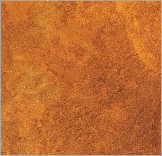
To begin building the dimpled texture of an orange rind, create a thin mixture of equal parts burnt sienna, cadmium red light, and cadmium yellow light. Dab in the color to create an irregular, dappled texture. Add a touch more burnt sienna for the darker areas.
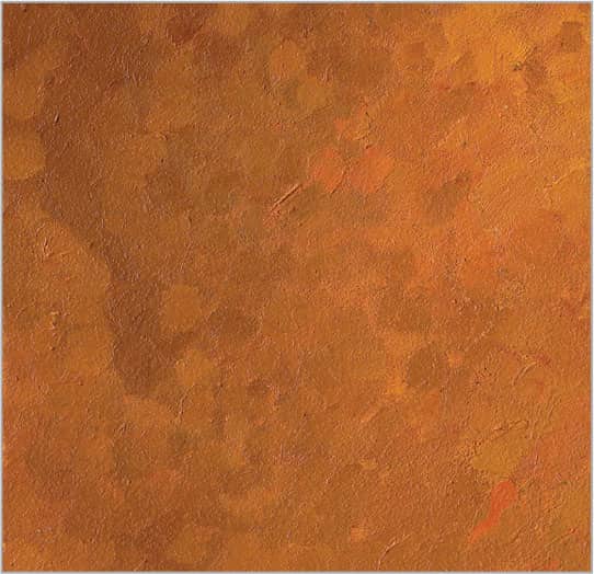
Using various mixtures of cadmium red light and cadmium orange darkened with sap green, apply the basic middle and shadow values of the orange. Use the corner of a flat brush turned on its edge to create short, impressionistic strokes that resemble the mottled texture of an orange rind.
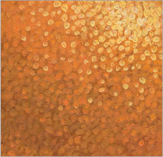
Once dry, switch to a round brush and develop the texture with small dabs of lighter colors, again working from dark to light. Use small amounts of thin cadmium orange and cadmium yellow light for highlights.
267 | Cut Citrus Fruit
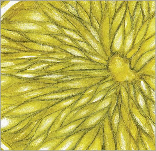
The most interesting parts of an orange slice are the shiny teardrop-shaped pieces that fan out from the center. “Draw” the pattern using a round brush loaded with a thin mix of cadmium orange, cadmium yellow light, and sap green, working from the center out.

Once dry, thin cadmium orange to create a transparent glaze. Layer it over the interior of the orange, blending to remove brushstrokes. Add equal cadmium yellow light and white to the glaze and paint lights over each section. Use thick brushstrokes to catch the light.
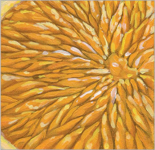
Now add the lightest values and highlights for a juicy appearance. Thin cadmium orange, white, and cadmium yellow light; then use a small round brush to stroke lengthwise over each section. Once dry, add cadmium yellow light to white and dab on highlights.
268 | Apple

To create this luscious red apple, start with an underpainting of the darkest shadow color. Using a 3/4-inch flat brush, apply a solid layer of two parts alizarin crimson to one part black, thinned slightly for flow. Pull out some color in the highlight areas and background to establish the general form.

Next build the middle values with a mix of equal parts Venetian red and cadmium red light. Use a 3/4-inch flat brush to make long strokes, curving downward from the top rim to the lower third of the apple. The curve of these brushstrokes will define the form.

To begin building the lighter red values on the top third of the apple, mix equal parts Venetian red with cadmium red light, adding a bit of white to lighten. Use a 1/4-inch flat brush to work in short, impressionistic strokes from top to bottom, following the contour of the apple.

Apply the lightest colors around the apple’s rim. Stroke down toward the center using short, impressionistic strokes, creating texture and variation without fully covering the base colors. Mix cadmium yellow light, sap green, and white to highlight the stem and add spots on the skin.
269 | Grapes
The most distinguishing characteristics of red grapes are the deep, reddish purples and chalky, bluish whites that cover the surface. To begin, establish the rich red undertones and shadows with a glaze made from a thin mix of equal parts alizarin crimson and dioxazine purple. Use a 1/2-inch flat brush to apply color loosely around the contour of the grapes and into the shadows. Add a little white to your mixture to increase its opacity and cool the purple, creating an effective transition between the deep reds and lighter blues.

After this initial layer dries, continue building the rich red purples of the grapes with a thin mixture of equal parts alizarin crimson and ultramarine blue darkened with small amounts of black. Use the corner of a 1-inch flat brush to stipple on the color and create a spotty texture. Work wet-into-wet for a softer effect.

Let the glazes dry completely. With the transparent layers of the grapes in place, it’s time to start working on the bluer, more opaque areas. For this color, use a mixture of three parts white, one part alizarin crimson, and one part black or ultramarine blue. Load a 1/4-inch flat brush and wipe off the excess paint from your brush, working from the lighter areas and moving toward the shadows as the amount of paint on your brush diminishes. Keep your marks loose and impressionistic rather than smooth and over-rendered, but avoid obvious brushmarks.

To create the bluish-white highlights on the grapes, mix small amounts of ultramarine blue and alizarin crimson with white. Load a 1/4-inch flat brush and wipe off any excess paint, and then add short, impressionistic strokes along the tops and right sides of each grape. As the paint on your brush decreases, lightly work a little color onto the bottom and left shadow sides to create reflective light. This will make your grapes look more three-dimensional.
270 | Coconut

The exterior of a coconut shell features a variety of textures that you can achieve with a very loose approach. Start with a thin underpainting of equal parts burnt sienna and sap green. With a 1/2-inch flat brush, lay in a loose layer of color and let your brushstrokes show. Work from side to side along the natural curve of the coconut.

In the next layer, continue modeling the form of the coconut, making it darker at the bottom and lighter at the top. Use a #6 round brush loaded with equal amounts of burnt sienna and sap green, thinned a bit for flow. Following the contour of the coconut, use loose, squiggly strokes that serve as a great base for the hairy texture you will add in the following steps.
Now create the hairy fibers of the coconut shell. Work from dark to light and mix variations of sap green, cadmium orange, yellow ochre, and white. Use a #4 round brush to dab on thick spots of color in the lighter areas. Use a fine-pointed palette knife to scratch into the paint, spreading and dragging the paint to create hairlike fibers. For this technique, it’s a good idea to experiment first on another painting surface.
After the previous layer dries, add more white and yellow ochre to your mixtures for the lightest details, and use a #4 round brush to loosely lay in the color. Then use your palette knife to scratch into the paint and create the fine strands of the coconut texture.
271 | Peanut Shell

To achieve the warm, golden brown found in the shadows of these peanut shells, create a thin mix of equal parts burnt sienna and green gold. Brushing lengthwise along the peanut forms, build up the shadow areas while keeping your brushmarks soft and noncommittal. This will help your edges recede and suggest more depth in your final image.
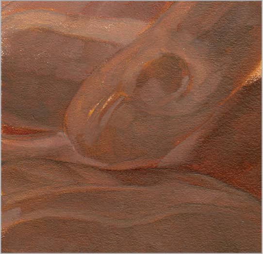
Mass in the middle values of the peanut shell using burnt sienna mixed with small amounts of black for darker areas and white for lighter areas. With a 1/4-inch flat brush, paint short, impressionistic strokes lengthwise along the shell forms, following their natural curves. Allow some of your underpainting to show through.
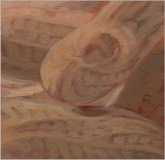
To build the lighter areas and pattern of the shell, add yellow ochre and more white to your mix and carefully highlight the raised parts of the pattern that catch the light. The details do not need to be exact; simply study and capture the curves and character of the ridges. Wipe off the excess paint from your brush to keep the edges of your brushmarks soft, allowing them to blend with the darker values.

In this last stage, render the finest details and add the highlights. Mix one part yellow ochre to two parts white and load a 1/8-inch flat brush. Then use the drybrush technique to highlight the gridlike pattern of the shell. As the paint diminishes on your brush, add softer details to the shadows for interest.
272 | Walnut Shell

To begin building the texture of walnut shells, start with a warm, dark brown made up of one part burnt sienna to two parts sap green. These transparent paint colors are perfect for underpaintings because they allow your drawing to show through. Apply a flat layer of color with a 1/2-inch flat brush and pick out color on the lighter areas with a cotton swab or a soft cloth rolled into a point.

Using a 1/4-inch flat brush, mass in the basic brown values for the walnut shells with a mixture of equal parts burnt sienna and black, adding small amounts of white or yellow ochre as you move onto the lighter areas. Work lengthwise along the shell pattern in short, impressionistic strokes.

After the middle values dry, lighten the mix from step two with a small amount of white. Load a 1/4-inch flat brush or #6 round brush, wipe off the excess paint, and use the drybrush technique to define the lightest sections. The more texture you pick up from the painting surface, the more it will resemble an authentic walnut shell.
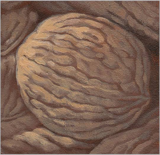
Now it’s time to add highlights to capture the details of your shell. With a mixture of one part raw sienna to two parts white, use a 1/8- or 1/4-inch flat brush to drybrush color onto the raised areas of the shell, carefully avoiding the veinlike lines between them. Study an actual walnut to understand how the various sections of the shell merge in and out of each other.
273 | Black Coffee

Begin building the smooth, dark color using a few layers of a rich, dark brown mixed from one part burnt sienna to three parts black. Use a 1/2-inch flat brush loaded with a generous amount of paint to cover the darkest areas. Blend the edges with a 1/4-inch flat brush before they dry.

Mix equal parts burnt sienna and white, dulling the mixture down with a touch of black. This will create the reddish-gray middle value in the reflection of the black coffee. Paint a smooth layer of color using a 1/4- or 1/2-inch flat brush.

Now add more white to the mixture from step two and apply another layer of opaque light brown to the reflection using your 1/4-inch flat brush. Focus on building up the areas around the bubbles.

The bubbles are really what give the coffee interest and diversity. Mix white with a very small amount of burnt sienna, and use a #2 round brush to refine the white rings of the bubbles, tracing over your lines to soften their edges and blend them into the darker colors beneath.
274 | Dark Chocolate

The browns in a square of dark chocolate vary depending on the angle of the light. However, in general, dark chocolate reflects a cool, blue light that yields warm shadows. Start with a warm, medium-value brown mixed with equal parts of burnt sienna and black. With a 1/2-inch flat brush, cover the chocolate with an even layer of color; then quickly brush over the darker sections with another layer before the first layer gets sticky. Use a soft, dry fan brush to remove all the brushmarks.

Continue painting the middle values of the chocolate with equal parts burnt sienna and black, lightened with varying amounts of white. The different planes of the chocolate reflect the light differently, shifting the values from surface to surface. Depending on the width of the section, use a 1/2-inch or 1/4-inch flat brush in long, smooth strokes. Remove any obvious brushmarks or sharp edges between sections by stroking over your canvas several times, softening the transition between planes.

The lightest areas of dark chocolate tend to be cool, bluish browns that stand in contrast to the dark, rich, warm browns of the shadows. Add more white and black to the mixtures to create cooler browns; use a 1/4-inch flat brush to stroke this color where the light is strongest on the chocolate.

With the dark and middle values of the chocolate in place, paint the light, cool white reflected on the tops and light sides of the squares. Use a mixture of three parts white, one part black, and one part burnt sienna. Depending on the level of detail you want to achieve, alternate between a #4 round and a 1/4-inch flat brush. Consider using a mahlstick (a long stick to steady your hand), or simply rest your forearm on your other hand as you paint.
275 | White Wine

Although white wine is light gold in color, begin by establishing the cooler, neutral pink undertones by mixing equal parts burnt sienna and black with white to brighten. Thin this mixture and use a 1/2-inch flat brush to apply an even layer of color. Then use a soft cloth to pick out color on the glass along the rim (where the primary light hits) and bottom edge (where the reflected light hits).

While it may be a challenge to create the transparent look of liquid with oil or acrylic paint, you can create a convincing representation using glazes and careful transitions of color and temperature. In this step, create a base for applying brighter, more saturated colors later. Using a 1/2-inch flat brush, build on the central shadow with a thin mix of equal parts yellow ochre and raw sienna. Add a touch of white as you move to the lighter left side of the glass, and add ultramarine blue to create the cooler, bluer reflected light along the outer edges of the glass.

After the paint has dried, build up the lighter, warmer areas with a mix of one part raw sienna, one part yellow ochre, and two parts white. Wipe off excess paint from your 1/2-inch flat brush and then drybrush areas of the wine where the light is strongest. Use the corner of your brush to dab on spots of color to create the impression of reflections and condensation on the glass.

Allow the paint to dry and then brighten the light coming through the golden wine with a 1/4-inch flat brush and a mixture of equal parts of white and yellow ochre. Apply small dabs of color between the lights and shadows to suggest more condensation.
276 | Red Wine
The secret to painting red wine—or any liquid—is to build up depth of color through glazes. Apply the glazes in several layers, allowing each to dry before adding the next. To create the base layer for red wine, mix alizarin crimson with small amounts of cadmium red light (for warmth) and black (to darken). Lay in a smooth layer of color and eliminate all brushmarks with a soft, dry brush. Clean your 1/2-inch flat brush and pat it dry on a cloth. Then use this brush to scumble over the lightest areas of your image, loosening up the glaze and removing it with the hairs of the brush. Wipe your brush and continue to pick out color as needed.

After your first layers dry completely, continue to build your dark, rich reds with another layer of glaze mixed from thinned alizarin crimson and a touch of black. Use a 1/4-inch flat brush to trace over your brushmarks, blending and softening transitions. You can also use a separate soft, dry brush to sweep lightly over the glaze.

By adding alizarin crimson and cadmium red light to your mix in small amounts, you can build up the lighter values reflected in the wine and on the glass. Choose your brush size depending on the size of the details you are working on. Blur the transitions between the whites and reds by wiping off your round brush on a cloth and dragging the hairs along the edges of your colors. Repeat as necessary to achieve smooth blends.

In this final stage, brighten the white areas. Add a little cadmium red light to your white and apply the small details along the ridges of the wine. Using a flat brush, drybrush the soft transitions from white into the deeper red wine color at the center of the glass.
277 | French Baguette

The appetizing golden brown and contrasting textures of a baguette make it beautiful and interesting. Mix equal parts burnt sienna and sap green for the middle values, laying down a quick and loose layer with a 1/2-inch flat brush. Add more layers of this transparent mix over the darkest areas to begin modeling the form of the bread.
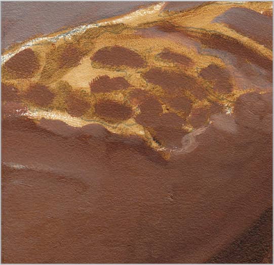
Mix two parts burnt sienna and one part yellow ochre with small amounts of black to darken or white to brighten. Use a 1/2- or 1/4-inch flat brush to add the golden middle values on the sides and in the shadows of the crusty top. Quick, short, painterly brushstrokes will help you loosely suggest the cylindrical form of the baguette.

Continue to build up the middle values, especially on the top and along the main ridge of crust. Use the same colors from step two, but add yellow ochre and white to warm and brighten the mix. You can use the corners and flat edge of a 1/4-inch flat brush to create small, impressionistic marks for the bumpy crust.

The final crust detail gives the baguette its distinctive appearance. With a light mix of white and yellow ochre, use a #4 round or 1/4-inch flat brush to paint the ridges of crust where the bread splits and spreads using loose, organic brushstrokes. Hold your brush at the very end of the handle for more natural and varied gestures.
278 | Frosting

Capturing the look of creamy frosting is all about the curves and lusciousness of your paint. While the initial layers may be thin to establish the transparent shadows, you can build the subsequent layers with a palette knife and impasto strokes—just like frosting a real cake! Begin by laying in the shadows with a mixture of one part alizarin crimson to two parts white, warming up the mix with a touch of yellow ochre. Use a 1/2-inch flat brush to paint the darkest areas with long, curving strokes.

Switch to a 1/4-inch flat brush and add warm purples to the shadows using equal parts alizarin crimson and cadmium red light brightened with a small amount of white. Apply these warmer colors on the shadowed sides of the frosting ridges. To create the cooler bluish purples in the shadows, add ultramarine blue and white and stroke along the ridges.

Continue to build up your values with lighter pinks and purples using your 1/4-inch flat brush. Apply the paint on the sides and over the top plane of the cake using thick, swirling strokes. After these layers dry, use a small round-edged palette knife loaded with three parts white to one part cadmium red light to frost the top of your cake with impasto strokes.