
Section I
GRAPHITE & CHARCOAL
Tools & Materials
Paper
Paper has a tooth, or texture, that holds graphite and charcoal. Papers with more tooth have a rougher texture and hold more graphite or charcoal, which allows you to create darker values. Rough, textured paper is best when working in charcoal. Smoother paper has less tooth and allows you to create much finer detail when working in graphite. Plan ahead when beginning a new piece, and select paper that lends itself to the textures in your drawing subject.
When you try a paper for the first time, practice and experiment on it. Draw, blend, and erase before starting your final work to see how it will perform. Use high-quality paper and buy acid-free for your finished pieces, which will resist yellowing over time. When working in graphite, it is ideal to use an acid-free Bristol smooth paper or a high-quality 100% cotton rag, hot-pressed watercolor paper. When working in charcoal, toned paper is great, as it allows for dramatic highlights.
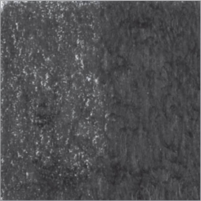
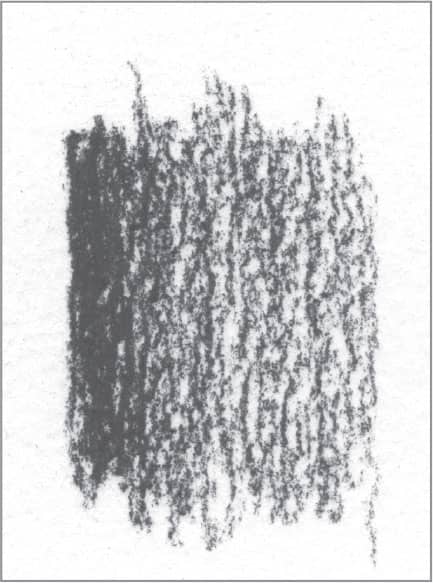
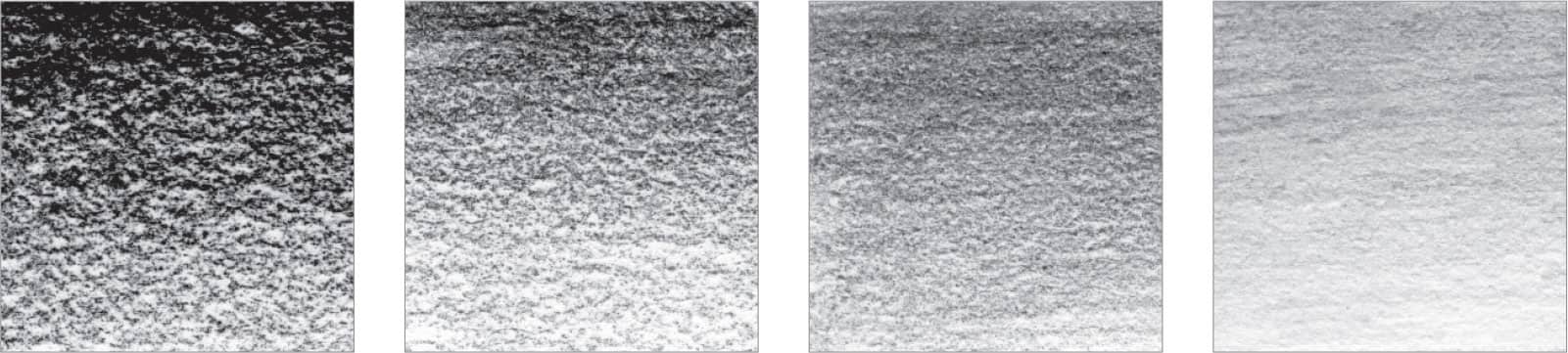
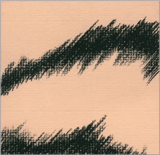
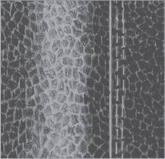
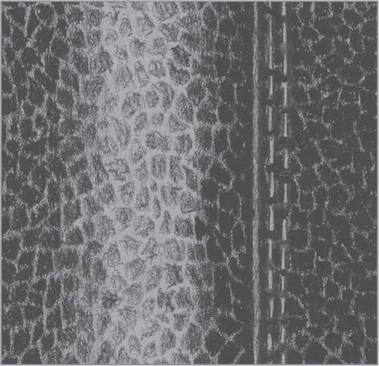
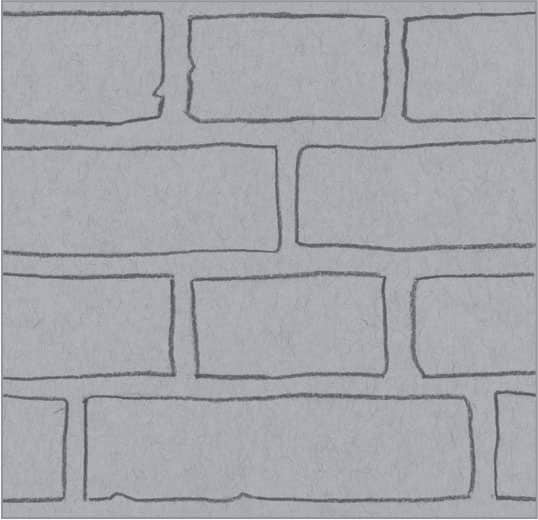
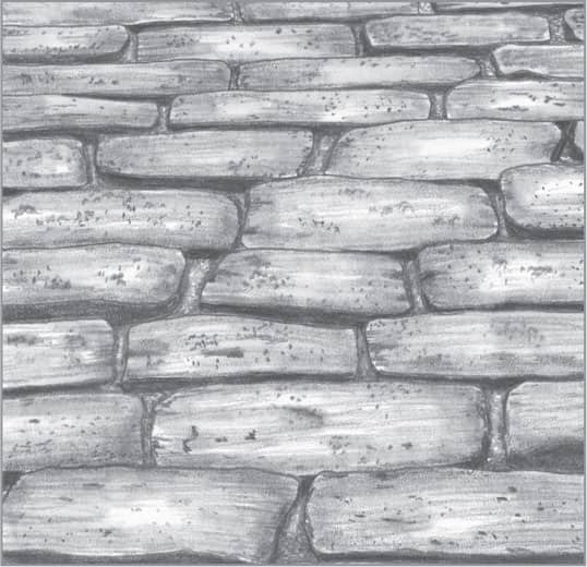
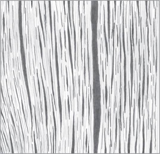
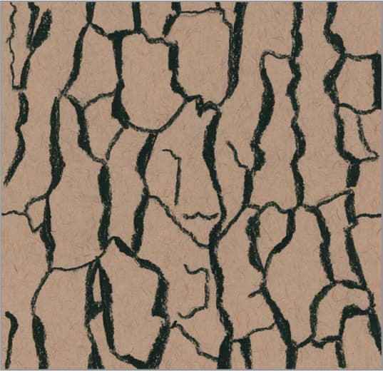
Graphite over rough, toned paper
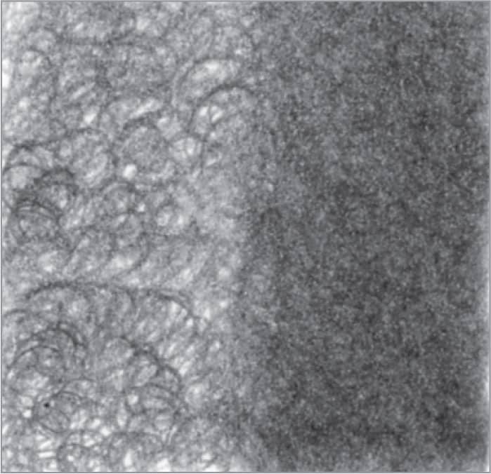
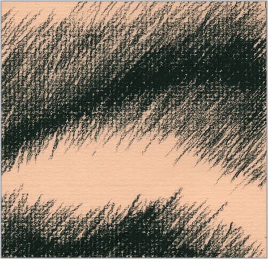
Graphite over smooth drawing paper

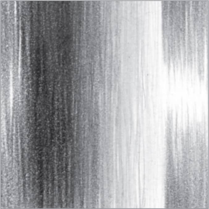
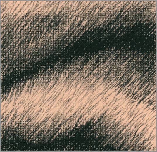
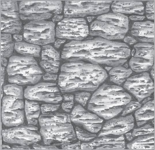
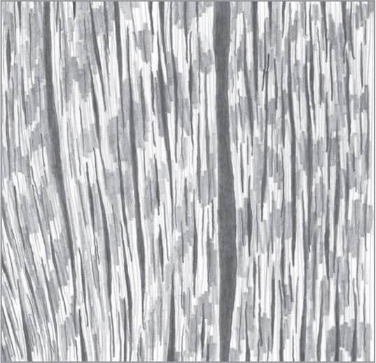
Graphite over medium drawing paper
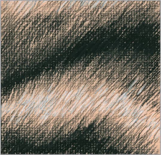
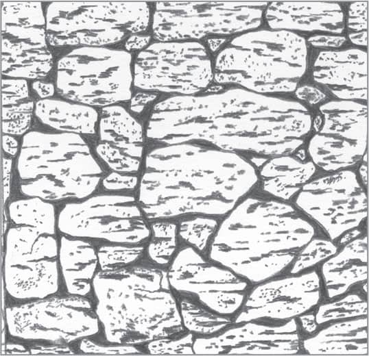
Graphite over rough or cold-pressed paper
Pencils
Graphite drawing pencils come in soft and hard grades. Soft-grade pencils range from B, 2B, 3B, up to 9B and 9XXB—extra soft! Hard-grade pencils range from H, 2H, 3H, up to 9H. The higher the number that accompanies the letter, the softer or harder the lead. Between the two grades is the HB pencil, and between H and HB is the F pencil. Experiment with the different grades to discover which ones you prefer. You will find that you don’t need to work with every grade of soft and hard pencil. You will probably narrow down your set to just a small number for most of your work, but keep the others close by in case you need them. Some artists prefer the mechanical drafting (clutch) 2mm pencil rather than traditional wood-encased pencils. A good-quality clutch pencil will last for years and perform very well. The 2mm graphite refill leads come in all the hard and soft grades. When purchasing clutch pencils, make sure you get the sharpener designed for them; it produces a very sharp point for fine-detailed work. You can even save the graphite shavings for later use!

Erasers
There are many different types of erasers available, including the following:
KNEADED This very versatile eraser can be molded into a fine point, a knife-edge, or a larger flat or rounded surface. It removes graphite gently from the paper, but not as well as vinyl or plastic erasers. Use it in a dabbing motion to pull or lift off graphite from the drawing surface. A kneaded eraser works well for final cleanup.

BLOCK ERASER A plastic block eraser is fairly soft, removes graphite well, and is very easy on your paper. Use it to erase large areas or for the final cleanup of a finished drawing.
STICK ERASER Also called “click pencil erasers,” these handy tools hold a cylindrical eraser inside. You can use them to erase areas where a larger eraser will not work. Using a utility razor blade, you can trim the tip at an angle or cut a fine point to create thin white lines in graphite. It’s like drawing with your eraser! Refills are inexpensive and easy to find.

Blenders
There are many tools available for blending graphite and charcoal. Some you can even find around the house! Never use your finger to blend—it can leave oils on your paper, which will show after applying your medium.
STUMPS These blenders are tightly rolled paper with points on both ends. They come in various sizes and are used to blend large and small areas of graphite, depending on the size of the stump. Keep old, worn stumps for applying light shades of graphite. You can also use stumps dipped in graphite shavings for drawing or shading.
TORTILLONS These tools are rolled more loosely than stumps. They are hollow and have one pointed end. Tortillons also come in various sizes and can be used to blend smaller areas of graphite.

FACIAL TISSUE You can wrap facial tissue around your finger or roll it into a point. Use it when drawing very smooth surfaces or in portraits to achieve soft skin tones. Make sure you use plain facial tissue, without added moisturizer.
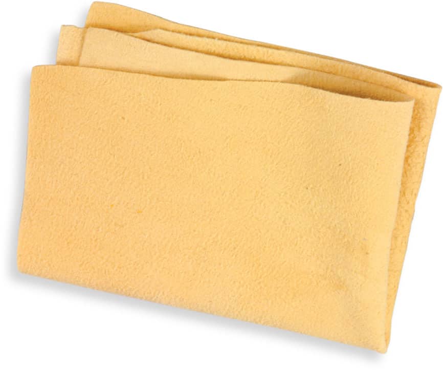
CHAMOIS These cloths are great for blending areas into a soft tone. You can use them for large areas or fold them into a point for smaller areas. A good-quality natural leather chamois is best, but a synthetic leather chamois can also yield good results. Cut them into the size that works best for you. When the chamois becomes embedded with graphite, simply throw it into the washer or wash by hand. Keep one with graphite on it to create large areas of light shading. To create darker areas of shading, add graphite shavings to the chamois.
Charcoal
Charcoal is made up of the carbon remains of burnt wood and can produce a rich black with rough, expressive strokes, making it a dramatic alternative to graphite. However, charcoal can also create subtle, velvety blends and fine detail. This medium works best on rougher paper surfaces with plenty of tooth. It also works best with art gum and kneaded erasers. Because charcoal is dusty and dry by nature, it lifts easily and can sometimes be blown off the paper. Use a spray fixative on your finished drawings to ensure that they last.
Charcoal is available in three basic forms, which feel and look very different from one another. It’s important to experiment and find the one that suits your personal preferences.
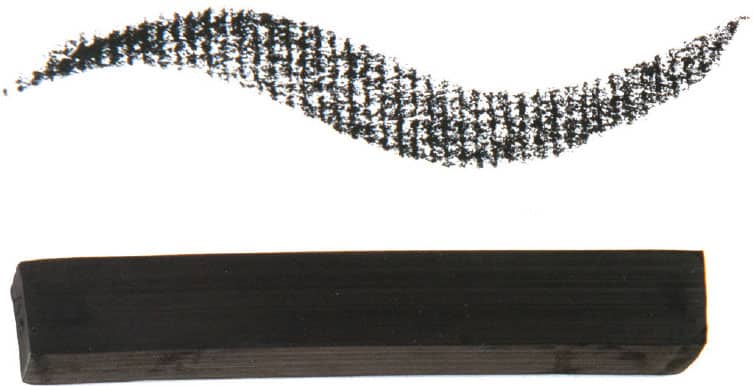
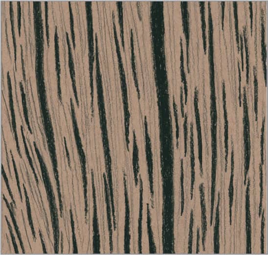
VINE & WILLOW CHARCOAL These lightweight, irregularly shaped rods of charcoal are made of burnt grapevine and willow tree. Vine produces a gray line, whereas willow produces black.

Vine & Willow Charcoal
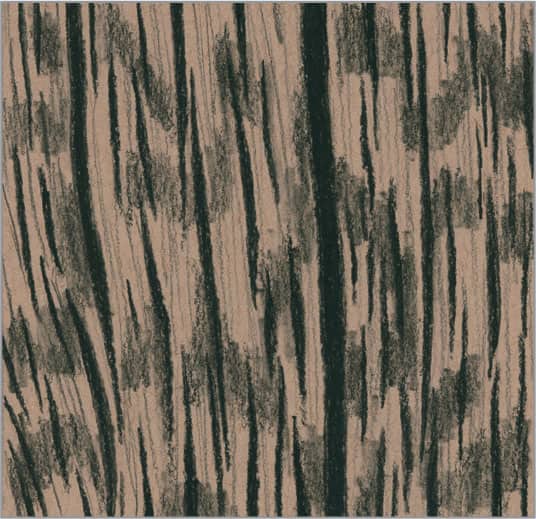
COMPRESSED CHARCOAL STICKS Compressed charcoal is mixed with a binder, such as gum, which makes it adhere more readily to paper and produces creamier strokes than vine or willow charcoal. Compressed charcoal sticks come in a range of hardnesses, including soft, medium, and hard—or they are listed by number and letter, similar to pencil hardness. You can use the broad side of the stick for large areas of tone, or you can use the end (which you can sharpen with a knife) to create more detailed strokes.
Compressed Charcoal Sticks
CHARCOAL PENCIL These compressed charcoal tools in a pencil format offer maximum control, allowing you to create fine, precise strokes. Some are wood-encased, so you can sharpen them as you do graphite pencils. However, some charcoal pencils have tips wrapped in paper. To expose more charcoal, simply pull the string to unwrap the paper. Hone the tips with a sandpaper pad or knife.

Charcoal Pencil
Charcoal pencil sets usually come with a white “charcoal” pencil (which is usually made of chalk and a binder—not actual charcoal). You can use this pencil with your black charcoal pencils to create dramatic highlights on toned paper.
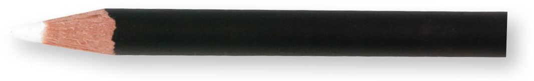
White Charcoal Pencil
Graphite Techniques
Here are some of the basic graphite techniques you can use to create the drawings in this section. Practicing a new technique first will save you from doing a lot of erasing later! There are many more techniques to discover that apply to other styles of drawing, so keep exploring after you have mastered these techniques.
Applying Graphite with a Blender
Using a chamois is a great way to apply graphite to a large area. Wrap it around your finger and dip it in saved graphite shavings to create a dark tone, or use what may be already on the chamois to apply a lighter tone. Stumps are also great for applying graphite. Use an old stump to apply saved graphite shavings to both large and small areas. You can achieve a range of values depending on the amount of graphite on the stump.
Burnishing
When you use a soft pencil, the result may appear grainy depending on the tooth of the paper. In some of your drawings, you may desire this look. However, if the area requires a more solid application, simply use a pencil that is a grade or two harder to push, or “burnish,” the initial layer of graphite deeper into the tooth of the paper.

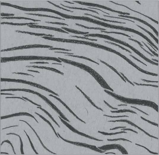
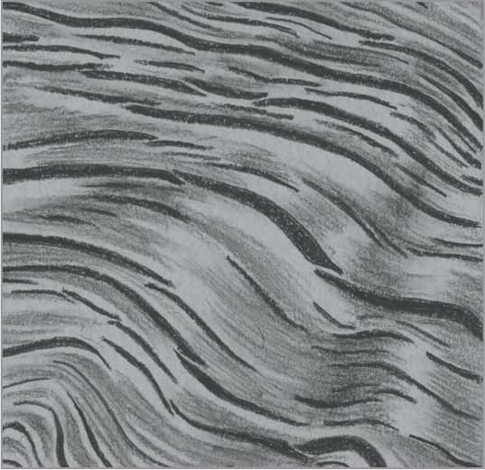
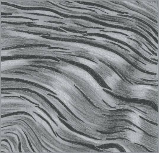
Blending
When you use a blending tool, you move already-applied graphite across the paper, causing the area to appear softer or more solid. Using a circular motion when blending achieves a more even result. Here are two examples of drawing techniques blended with a tortillon. On your practice paper, experiment with the various blending tools mentioned in this book.
Circular Strokes
Simply move the pencil in a continuous, overlapping, and random circular motion. You can use this technique loosely or tightly, as shown in this example. You can leave the circular pattern as is to produce rough textures, or you can blend to create smoother textures.
Erasing
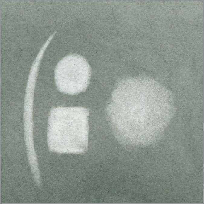
Stick and kneaded erasers are a must. The marks on the left side of this example were created with a stick or click pencil eraser, which can be used for erasing small areas. If you sharpen it, you can “draw” with it. The kneaded eraser is useful for pulling graphite off the paper in a dabbing motion, as shown on the right side.
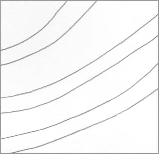
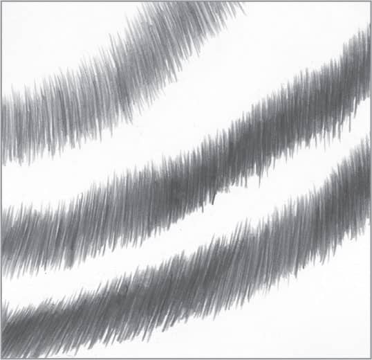
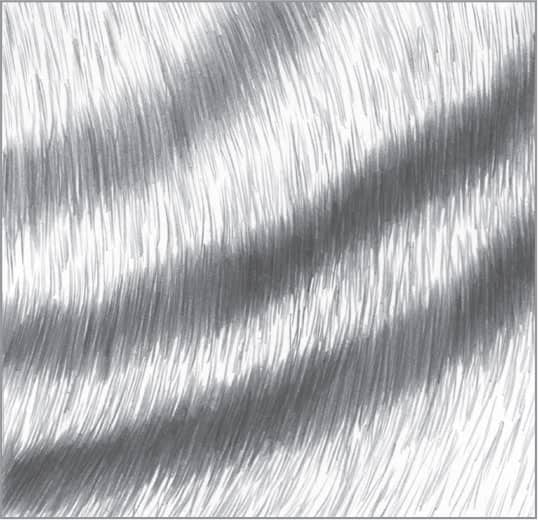
Linear Hatching
In linear hatching, use closely drawn parallel lines for tone or shading. You can gradually make the lines darker or lighter to suggest shadow or light. Draw varying lengths of lines very close and blend for a smooth finish. You can also curve your lines to follow the contour of an object, such as a vase.
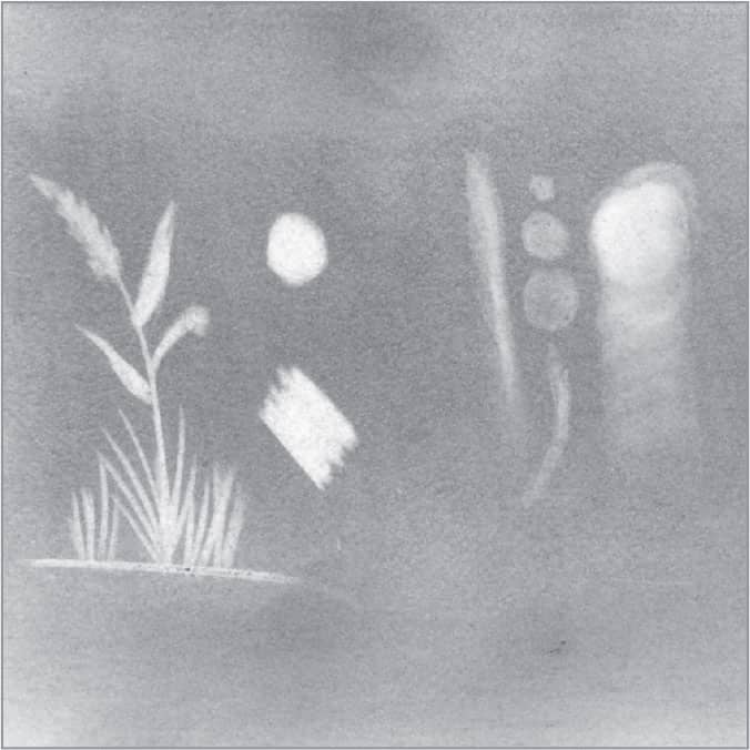
Negative Drawing
Use your pencil to draw in the negative space—the area around the desired shape—to create the object. In this example, graphite is laid down around the vine and leaves, leaving the white of the paper—the positive space—as the desired shapes.

Scribbling
You can use random scribbling, either loose or tight, to create a variety of textures such as old leather, rusty metal, rocks, bricks, and more. You can even use it for rendering the rough skin of some animals, like elephants. Lightly blend the scribbling to produce different effects.

Stippling
Tap the paper with the tip of a sharp pencil for tiny dots or a duller tip for larger dots, depending on the size you need. Change the appearance by grouping the dots loosely or tightly. You can also use the sharp tip of a used stump or tortillon to create dots that are lighter in tone.

Charcoal Techniques
The following two pages feature the basic charcoal techniques you can use to create many different textures. Charcoal requires practice to master, so try out each technique before attempting the step-by-step textures in this section.
Charcoal Grades
As discussed shown here, you can choose from a variety of charcoal forms—from vine charcoal sticks to compressed charcoal pencils. The projects in this section were created with wood-encased charcoal pencils, which are graded according to hardness. Depending on the manufacturer, these pencils may be labeled soft or 4B, medium or 2B, hard or HB, and extra hard or 2H. View the difference in richness between these examples.

4B (soft)

2B (medium)
HB (hard)

2H (extra hard)
Paper Textures
A variety of textured papers can be used for charcoal drawings. The heavily textured paper with a laid finish (left) can be used for more expressive charcoal drawing, and the smoother, less textured paper (right) can be used for drawings that require finer detail. The paper should not be too smooth or glossy; these surfaces will not hold the charcoal properly. To avoid smudges, apply workable fixative during various stages of the drawing and upon finishing.


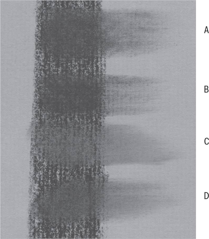
Blending
You can employ a variety of blending tools with charcoal, each yielding its own result as demonstrated in this example. Stumps (A) are made of packed paper and create dark blends because they don’t pick up much charcoal from the paper’s surface; instead, they simply move the charcoal around the paper. A tortillon (B) yields similar results to a stump; but, because it is made of loosely rolled paper, it can have a sharper tip. A chamois (C) is a soft piece of animal skin that produces soft, light tones, as it absorbs some of the charcoal from the paper. Like the chamois, tissue (D) blends softly and lightens the tone as it picks up some of the charcoal off the paper’s surface. You can fold both the chamois and tissue to create a narrow tip for blending small areas.
Linear Hatching
To create linear hatching, draw parallel lines to tone the paper. Draw them closely for a darker value, and draw them farther apart for a lighter value. You can use tapered strokes, such as when drawing hair, to create a highlighted effect. You can blend over the lines to smooth and soften the tone, but it’s generally a good idea to allow at least some of the lines to show through for texture and interest.

Applying Soft Tones
To apply smooth tone of varying value to your paper, you can use a blender (such as a stump or chamois) with graphite already embedded in its surface. If your blender does not contain enough graphite, dab it into charcoal shavings. A chamois is great for smoothly toning large areas, whereas a stump is best for working in small areas.
Negative Drawing
Also called “charcoal reductive” drawing, negative drawing refers to applying charcoal to a portion of the paper and then “drawing” by removing tone. You can remove tone using a kneaded, block, or stick eraser. Apply varying amounts of pressure to achieve different values.
Scribbling
Scribbling, also called “scumbling,” is simply random scribbling applied in either a tight or loose manner. This technique is effective for producing rough textures, such as the look of rusted metal.

Stippling
To create the dots that make up stippling, simply tap the paper with the tip of a charcoal pencil. Use a sharp point for small dots and a dull tip for larger dots. (You can also draw larger dots, if needed.) You can group the dots loosely or tightly, and you can make them light or dark depending on your desired result. Stippling effectively adds character to rock, brick, and wood, among many other drawn textures.

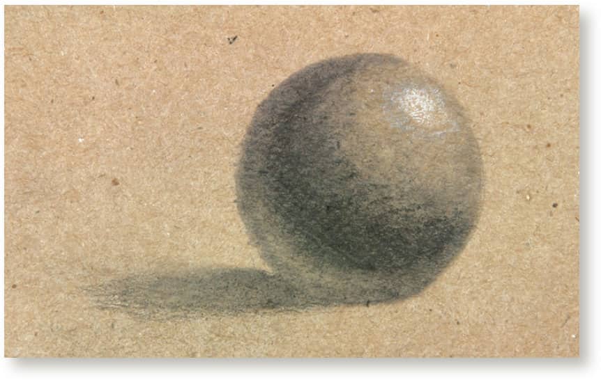
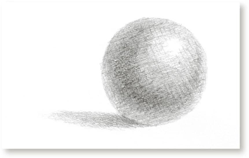
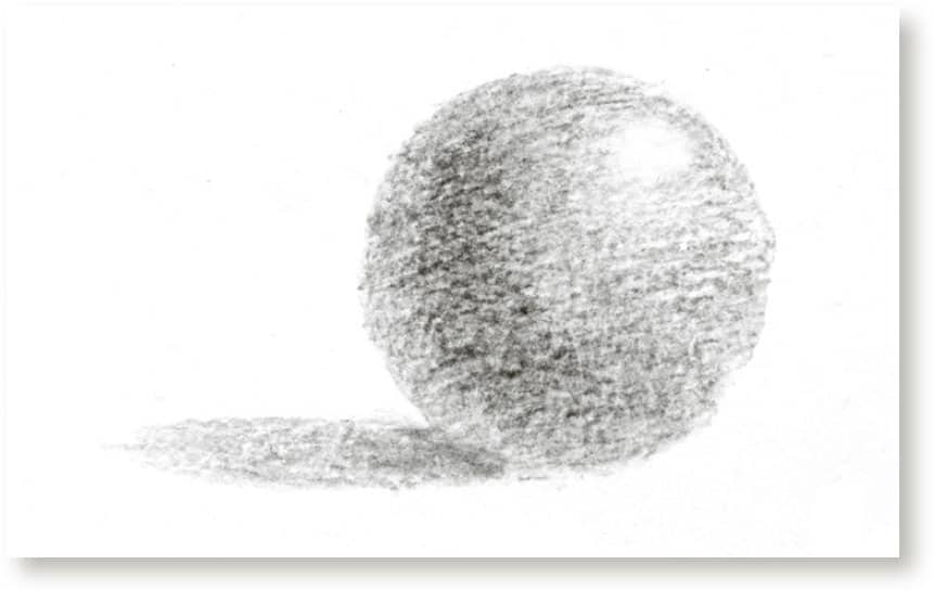
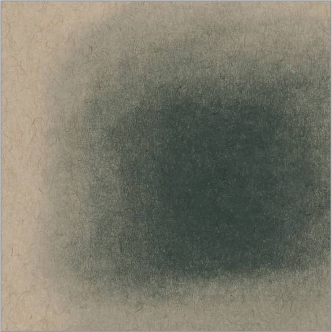
Value
Values are the lights and darks you see in a drawing or photograph. Essentially, values are all the shades, or tones, from black through various shades of gray to white—the paper itself. By using hard and soft pencils, we attempt to create a wide range of these values in our drawing to give depth and an illusion of three-dimensionality to the forms. We use smooth transitions of value from light to dark on curved or round forms like a ball (or the light bulb shown at right), and we use mostly abrupt changes in value on forms such as a cube or pyramid.

Many artists use a value scale (above) to match the values of a subject to the actual drawing. Using your pencils, make your own value scale, starting with white or the color of the paper. Then add nine other values, ending with the darkest square you can make using the softest pencil that you would normally use in your drawings.
Your pencil’s hardness determines the range of values you can produce. Pictured here are gradations of 8B, 4B, HB, and 4H graphite, allowing you to see differences in stroke quality and value.

Remember: Drawing is seeing. Plenty of preparation and thorough study of your subject matter should be done long before you make a mark on the paper. Study your subject and really get a sense of its values. Identify where your darkest and lightest values should be. When using a reference photo, it’s best to convert it to a grayscale image so you can get a better idea of the values you can use.

Shading
When drawing textures, it’s important to understand the basics of what happens when the light source hits your subject matter. You need to identify where the darkest and brightest values are by studying the composition thoroughly before you start drawing. This will help you to be more successful when you transfer what you see onto your drawing paper. Use a wide range of values when you shade objects in your composition; the contrast between lights and darks is what gives your drawing three-dimensionality. Let’s look at the light and shadow elements of a basic form.

HIGHLIGHT This is the light that shines directly on an object and reflects back into our eyes. This will be the lightest value of the drawing—usually the white of the paper.
CORE SHADOW This the darkest value on the object. It is the part, or side, of the object that separates the light from the shadow areas.
HALFTONE Also referred to as “midtone,” this is the area between the highlight and the core shadow. As the shape of the object turns away from the light source, there is a gradation of tones between the highlight and the core shadow.
REFLECTED LIGHT This is light that bounces back onto the shadow area of the object from the surface or other objects in the drawing.
CAST SHADOW This shadow falls from an object onto a nearby surface and away from the light source. Where the object sits or contacts a surface is where the darkest value of the cast shadow is found. As it grows out, the shadow becomes lighter in value.
PEOPLE
1 | Smooth Skin in Graphite

Block in the main areas of the face with light lines. Then establish the darkest values using a 4B for the nostril and crease of the lips, followed by a 2B for the crease of the cheek and folds of the ear.

Using an HB and overlapping circular strokes, create the shaded areas of the nose, crease of the cheek, face, and ear. Using overlapping circular strokes can help you avoid making the skin look too plastic.

Using a 4H and overlapping circular strokes, create the lightly toned areas. Alternatively, you can use graphite shavings and a blending stump to work in a circular motion, also creating smooth skin tones.
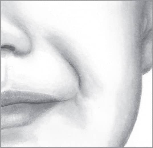
Blend all areas of the face with a stump to create smooth transitions. Use the tip of a folded tissue to further blend the graphite where needed.
2 | Aged Skin in Graphite

Using a 4H pencil, lightly draw the basic outline of the face, including the wrinkles of the skin. Switch to a 4B and draw the darkest values of the deep wrinkles.

Using a 2B and overlapping circular strokes, work from the darkest areas outward to create a gradation along the deep wrinkle shadows. Use the 2B pencil to develop additional wrinkles.
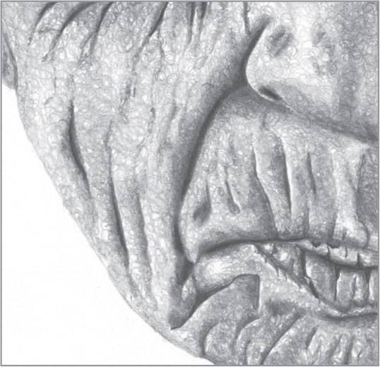
With HB and 2H pencils, continue overlapping circular strokes to create different values. For a more realistic texture, keep the circular strokes loose.
Lightly blend your strokes to smooth the skin, allowing some of the circular strokes to show through the finished drawing.
3 | Facial Hair in Graphite
Lightly outline the face. Using a 4B pencil, build the darkest values, such as the corner of the mouth and jaw line. Include some whiskers, but remember that individual whiskers grow in different directions and do not appear perfectly parallel.
With a 2B and overlapping circular strokes, start in the 4B area and move outward to shade along the jaw line. With an HB and overlapping circular strokes, shade the jaw and neck. Use a 2H or a graphite-coated stump for lighter areas. Very lightly blend all areas.

Add more facial hair to the jaw and neck. When drawing each whisker, start by placing the tip of the pencil on the paper; then stroke and lift the pencil at the end for a tapered finish. To suggest shorter whiskers along the beard’s edge, use stippling.

With a pencil eraser trimmed at a sharp angle, stroke in some highlighted whiskers for a realistic touch.
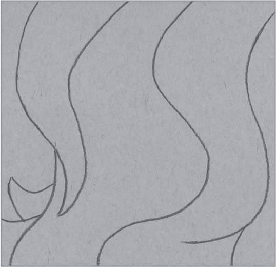
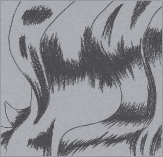
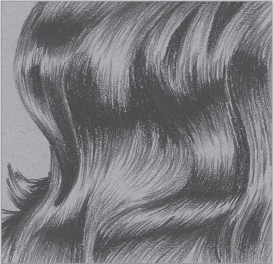
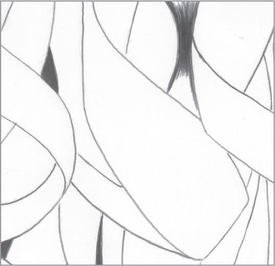
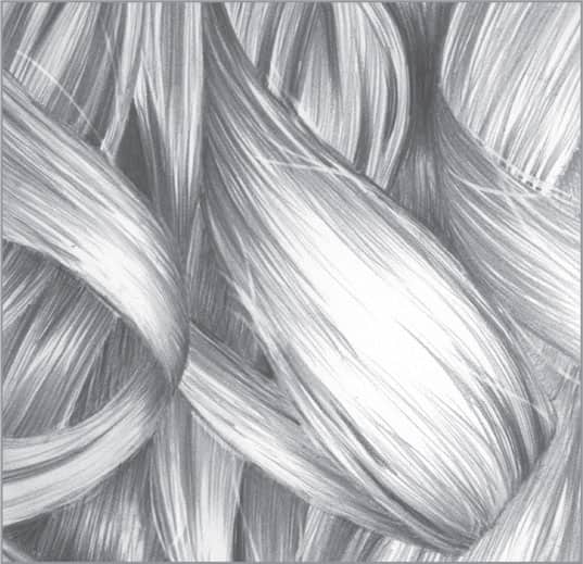
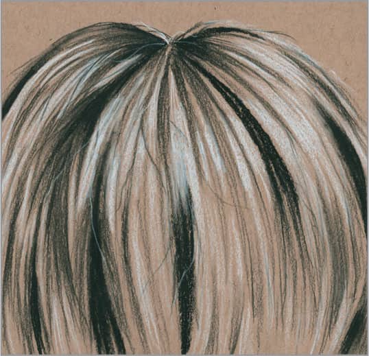
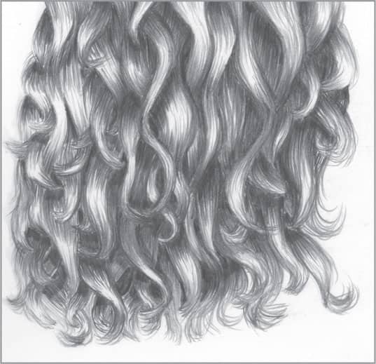
4 | Wavy Hair in Graphite

Draw the hair and determine where the darker areas will be. Use a reference photo of the hair you’re drawing to help you determine the darks, lights, and general flow.

Using a 4B pencil, begin working the darkest areas. Apply overlapping strokes that follow the basic flow. Use light pressure at the start and lift at the end of each stroke to create tapered lines.
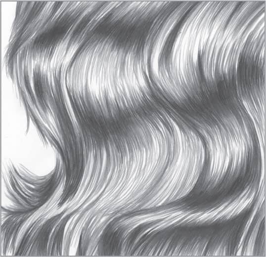
Using 2B and HB pencils, continue applying tapered, overlapping strokes. For the lightest areas, use very few strokes, if any. Notice the contrast in values that occurs within the hair; these differences achieve a realistic, three-dimensional effect.
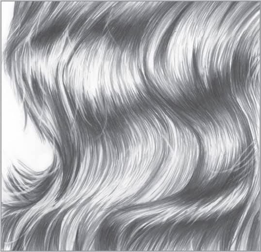
For more realism, use a click pencil eraser that has a trimmed, sharp edge to create some light strands of hair. Using a tortillon or stump, finish with some light blending, especially in the darker areas.
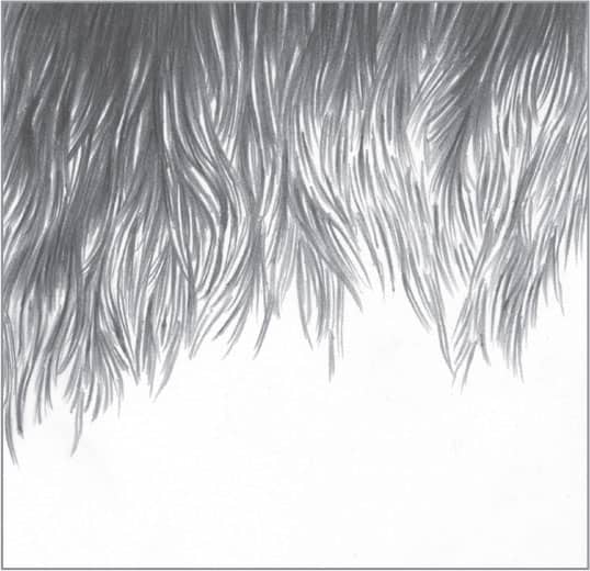
5 | Wavy Hair in Charcoal
Use gray-toned charcoal paper for this drawing, or select a different midtone color per your preference. With an extra-hard or 2H charcoal pencil and light pressure, create guidelines to indicate the basic flow of the wavy hair.
Using a soft charcoal pencil, such as a 3B, build the darkest areas. Apply overlapping strokes that follow the flow of hair. Use light pressure at the start and lift at the end of each stroke for tapered lines that resemble hair.
Using a 2H or extra-hard charcoal pencil and light lines, continue building tapered, overlapping pencil strokes. Begin each stroke in the darkest areas and lift as you finish to taper the end. For the lightest areas, use few strokes.

To create contrast and shine, use a white charcoal pencil to add highlights with long, tapered strokes. Avoid stroking over the dark charcoal as much as possible.
6 | Curly Hair in Graphite
Drawing curly hair can be trickier than wavy or straight hair. The form is similar to a single strand of a curled ribbon. First draw the basic flow of the curly hair, including where the darker areas will be. Use a reference photo to block in the darks, lights, and flow.
Using a soft 4B pencil, identify and build the darkest values first. Use overlapping, tapered strokes that follow the curves of the hair and taper both ends of each stroke. Practice this type of stroke on a separate piece of paper, if necessary.

Using 2B and HB pencils, continue applying tapered, overlapping strokes that follow the flow of the hair. For the lightest areas, use few strokes, if any. Notice the contrast in values within the hair; these differences are needed to achieve a realistic, three-dimensional look.
Use a sharply cut end of a click pencil eraser to “draw” highlighted strands of wayward hair. Lightly blend some areas of hair with a tortillon or stump, particularly the darker areas.
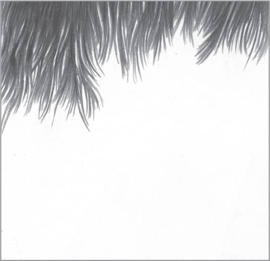
7 | Straight Hair in Graphite
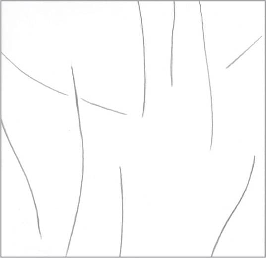
Draw lines showing the basic flow of the straight hair and some of the larger darker areas. (Your lines should be much lighter than the example shown here.) If you’re working closely with a reference photo, use lines to block in the main dark areas.

With a soft pencil, such as a 4B, apply some of the darkest values using a series of overlapping strokes that are tapered on both ends. It’s a good idea to practice this type of stroke on a separate piece of drawing paper.
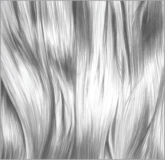
Using a 2B for darker values and an HB for lighter values, apply tapered, overlapping strokes that follow the basic flow of hair. Create the darker and lighter values within the hair, which will give it a three-dimensional feel. Remember that it’s not necessary to draw every strand of hair. For the highlighted areas, simply leave the white of the paper exposed.

For more interest and realism, you can use a click pencil eraser that has a trimmed, sharpened edge to create some wayward light strands of hair. Using a tortillon or stump, finish with some light blending if needed, especially in the darker areas.
8 | Straight Hair in Charcoal

This example uses tan-toned paper, but you can use the paper color of your choice. Toned paper provides a middle value that will help bring out any white charcoal pencil used for lights and highlights. With a soft charcoal pencil, such as a 3B, draw lines to show the flow of the straight hair. The lines shown here indicate where some of the darker areas of value will be.
With the same soft pencil, use tapered strokes and fill in areas to first establish the darkest values of the drawing. Similar to graphite, establishing the darkest values first can help you better see where the other values are needed.

Using a hard-grade charcoal pencil, such as a 2H, use long, tapered strokes to create the strands of hair. Apply more or fewer strokes depending on the darkness, lightness, or thickness of the hair you want to depict.
Using a white charcoal pencil, use tapered strokes to add highlights where needed. Create a few wayward strands of hair using both the 2H charcoal and white charcoal pencils to add more interest. Blend lightly where needed.
9 | Eye in Graphite
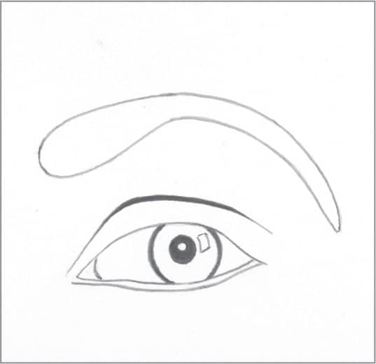
Block in the basic shape of the eye using light lines. Use a 4B pencil to apply the darkest values, such as the eyelid and pupil. Outline white highlights in the pupil and iris, and keep them white as you develop the rest of the eye.

Irises vary from eye to eye. Create a break in the tapered lines between the inner and outer edges. Use HB and 2H pencils to shade the “white” of the eye with small, circular strokes.
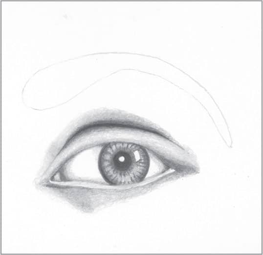
With 2B, HB, and 2H pencils, continue using small, circular strokes to add various values around the eye. Notice the gradation of tones. Using the HB and 2H pencils, create different values within the iris.

Lightly blend the skin, “white” of the eye, and iris. Then use tapered strokes to create the eyelashes and eyebrow. The eyelashes and hairs of the eyebrow differ in length and vary somewhat in their direction of growth.
10 | Nose in Graphite
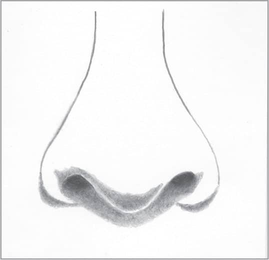
Begin by outlining the nose’s basic shape with very light lines. Using a 4B and overlapping circular strokes, fill in the dark nostrils. Then use a 2B pencil to shade the next darkest areas using small, overlapping circular strokes. Lightly blend your strokes.

Continue using the 2B to develop tone on the nose with small, circular strokes. Leave a thin, light edge under the nose to show reflected light. Always look for reflected light on facial features; these subtle changes in value will help create contrast and depth.
Using an HB pencil, start developing the 2B areas with overlapping circular strokes and move outward to create a gradation for the shadows around the nose. Leave the white of the paper to suggest highlighted areas on the sides and tip of the nose.
To finish, apply some light blending, but avoid blending away all the realistic texture. After blending, recover some of the darkest values using 4B or 2B pencils.
11 | Lips in Graphite
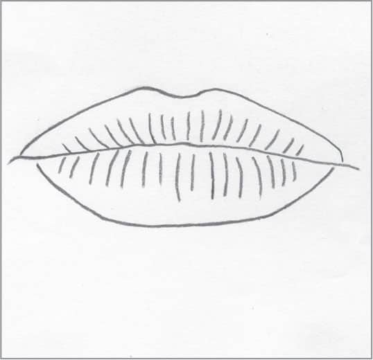
Very lightly draw the basic shape of the lips using a hard-grade pencil, such as a 2H. (The example shown here is drawn darker for demonstration purposes.)

Using a soft-grade pencil, such as a 4B, apply a dark value where the lips come together. Notice how the dark values extend into some of the lines or creases in the upper and lower lips.

Using a 2B and small, overlapping circular strokes, work your way out from the darkest areas to create a gradation, changing to an HB and then a 2H for the lighter areas. Move along the length of the upper and lower lips.

With a click pencil eraser, remove graphite to create highlights on the lower lip and a few subtle highlights on the upper lip. If desired, lightly blend with a stump or tortillon.
ANIMALS
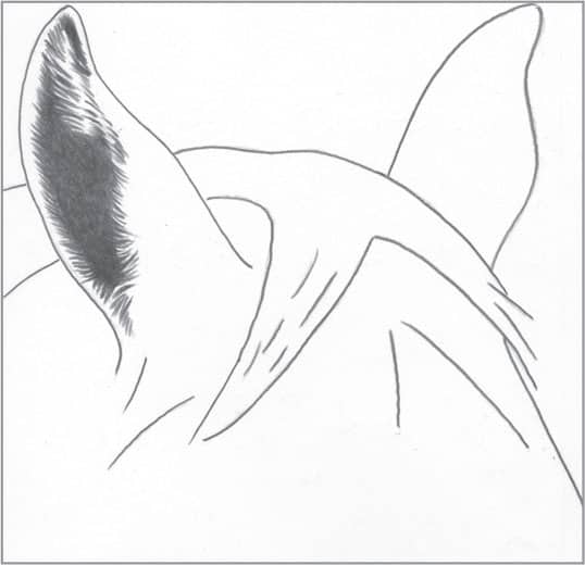
12 | Smooth Canine Fur in Charcoal
This example shows a textured, toned charcoal paper. Using a soft 3B charcoal pencil, establish the darks with short, tapered strokes. A soft charcoal pencil dulls quickly on textured paper; turn the pencil as you work for finer lines.
Using an HB charcoal pencil, begin your strokes in the darkest areas and taper the ends. Vary the direction of some strokes slightly for realism, as fur never grows perfectly parallel.
Continue developing the fur with light, short, and tapered strokes of 2H charcoal pencil.
If desired, you can add tapered strokes of white charcoal pencil to further bring out highlights.
13 | Curly Canine Fur in Graphite

Some dog breeds have curly, human-like hair, so the drawing technique is very similar. This example shows the curly fur of an Irish Water Spaniel. Begin by drawing the basic shapes of the curls using a 4H pencil.

Establish the darkest areas of value using a 4B pencil, stroking in the direction of hair growth.
With 2B and HB pencils, use tapered strokes to create progressively lighter fur. Allow the white of the paper to serve as the highlighted areas of the curls. Remember that you don’t need to draw every strand of fur.

To finish, lightly blend your strokes with a tortillon or small stump. With a click pencil eraser trimmed at sharp angle, pull out some wayward fur and enhance highlights as needed.
14 | Coarse Canine Fur in Graphite
This example shows the coarse fur of a wirehaired dog breed. Use a 4B pencil to boldly build the darkest areas. Leave some white paper exposed to indicate light hairs mixed with dark hairs. Randomly applied strokes will contribute to the wiry texture.
Using a 2B or HB pencil, continue applying the same bold, random strokes as in step one. Within the lighter areas of the coat, allow more of the white paper to come through for realistic highlights. Taper each stroke at the end for a realistic touch.

Switch to a harder, lighter pencil for more highlighted areas as needed. In this example, see how using few strokes (or none at all) allows more of the white of the paper to show through, creating the illusion of highlights.

To finish, use light blending to tone down some of the lighter individual hairs in the darker area. Using a click pencil eraser trimmed at a sharp angle, create additional strands of wayward hairs. You can use a pencil to shade one side of these highlighted hairs for more depth and realism.
15 | Canine Nose in Graphite
Canine noses have a basic shape, but they can vary depending on the dog breed and size. Also, noses can range from very dark to very light in color. To begin, draw the basic shape of the nose lightly with a 2H or 4H pencil.

Now apply the darkest values of the nose using a 4B pencil. Establishing the darkest values first will help you better judge the remaining values.
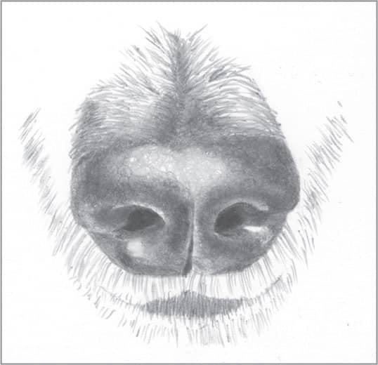
Use a 2B and small, overlapping strokes to build outward from the darkest values of the nose, switching to an HB to create a gradation. Use a 4H for the highlighted areas of the nose. To create the fur around the nose and mouth, use HB and 2H pencils.
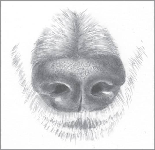
All canine noses share a distinct, bumpy texture. For this nose, use a 2H pencil to draw an irregular pattern in the highlighted area and blend lightly. Use a stick eraser cut at a sharp angle to create lighter whiskers around the mouth.
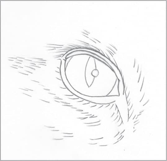
16 | Canine Eye in Graphite

Very lightly draw the outline of the eye and the basic direction of the surrounding fine fur. Delineate the reflection of light so you can keep it free of tone. (Always include a reflection to give the final drawing more depth and realism.) Canine eyes vary depending upon the breed, so it’s a good idea to study a high-quality reference photo as you draw.

Establish your darkest values using a 4B or 6B pencil, which will help you set up a drawing with a good amount of contrast.

The iris is darkest along the outer edge and lightest near the pupil. Replicating this will give the eye depth and dimension. Create the edge using small, overlapping circular strokes and a 2B, switching to HB for the lighter areas and using the white of the paper for the reflection. Shade any “white” of the eye that shows with a 2H, as well as the upper and lower lids. Then build the fur with 2H and 2B pencils.

If desired, lightly blend with a small stump or tortillon. Try not to over-blend, which can soften some of the sharper, finer lines that should remain crisp. Use a stick pencil eraser with the tip trimmed at an angle to create any subtle, fine reflective areas in the eye.
17 | Cat Eye in Graphite
Using very light pressure, outline the structures of the cat eye and sketch in some lines showing the direction of the fur around it. (The lines shown here are dark for demonstration purposes; your lines should be much lighter.)
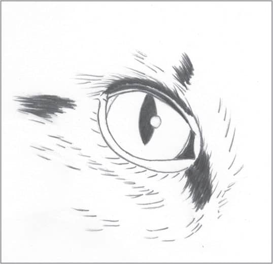
With a 4B pencil, fill in the darkest areas of value. With the darkest value established and the white of the paper as a guide, you’ll have a better sense of where other values belong. Use overlapping, tapered strokes to add fur around the eye.
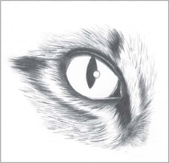
Now use a 2B and an HB to develop the structures around the eye, creating hairs with tapered strokes. Remember that it’s not necessary to draw each strand of hair. Allow the white of the paper to serve as highlights in the fur.

Using 2H and 4H pencils, apply overlapping circular strokes, starting with the darker areas in the iris (2H) and moving to the lighter areas (4H). Lightly blend with a tortillon. Then lightly blend the areas around the eye and fur.
18 | Short Cat Hair in Graphite
In this example of short cat hair, the stripes can help you understand the techniques of creating both light and dark fur. When drawing an animal with stripes, start by lightly outlining the main values, following the curvature of the animal.
As an example of how the stripes can be of different values, two of the stripes are shown as darker in value and the third (top) as lighter. For the darker stripes, use a 4B pencil; for the lighter stripe, use a 2B. Apply overlapping, tapered strokes.
Continue adding tapered strokes between the stripes with a lighter pencil, such as an HB. Make the strokes dense in dark areas and sparse in light areas. Avoiding drawing each individual strand of fur, and vary the direction of some strokes for a more realistic look.

To finish, add random, dark, and thin strokes to the fur for more depth. Very minimally blend with a stump or tortillon. Use your pencil eraser or a kneaded eraser to enhance or create more highlighted areas for more contrast.
19 | Long Cat Hair in Charcoal
Using a soft charcoal pencil, such as a 3B, draw areas of dark value. Long cat hair can appear tangled, so the strokes should not be perfectly parallel. Most of the tapered strokes form a narrow “V” shape, which indicates the deeper areas of shadow within the fur.

Use a hard-grade charcoal pencil (or lighter pressure) to create long, tapered strokes through the dark areas. Curve the strokes for a wavy flow. Avoid drawing individual strands of fur; suggest the appearance of fur using just a few light and dark strokes.
For more contrast and detail, use a white charcoal pencil to fill in areas between some of the strokes, which will lighten and highlight the fur. Again, use strokes that taper at each end.
To finish, return to darken areas with a soft charcoal pencil for more contrast and depth. Using a stump, lightly blend areas that need a softer look, or darken some areas by pushing the charcoal into the tooth of the paper for more contrast.
20 | Horse Coat in Graphite
This texture shows a close-up example of a short, smooth horse coat. Start by outlining the basic structures of the horse’s head with a 2H or 4H pencil. Use tapered strokes as indications of hair in the ear.

Using a 2B pencil, fill in the light values using short, tapered strokes. As you stroke, be sure to follow the curves of the anatomy and note any other ways that fine hair grows on a horse.
Using an HB pencil, complete the lighter values using the same tapered strokes. Keep the strokes sparse in highlights and lighter areas of the horse’s coat.

Using a stump or tortillon, blend your strokes to give the hair a smooth appearance. Then use a click eraser with the tip trimmed at a sharp angle (roughly 45 degrees) to pull out highlights. To finish, darken any areas that lost value when blending.
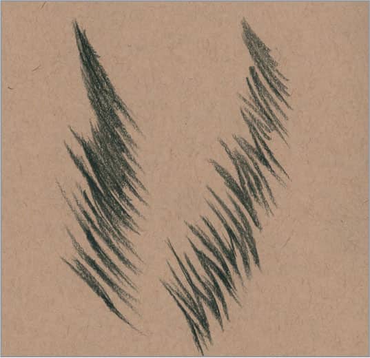
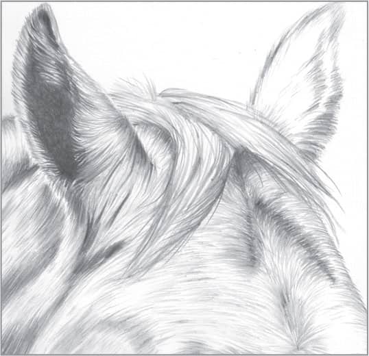
21 | Horse Mane in Graphite

Begin by outlining the horse mane using very light lines. The outline can be a simple, rough indication of the mane’s general shape and location. (The lines shown here are dark for demonstration purposes; your lines should be much lighter.)

With a 4B pencil, apply long, tapering strokes close together to build up the areas of darkest values. Notice that not all of the hair is flowing in the same direction; some strands appear slightly windblown for a realistic touch.
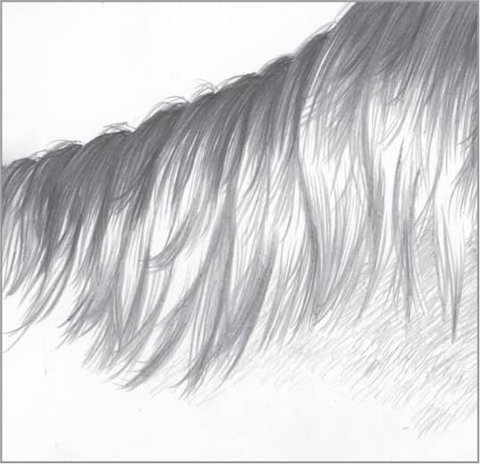
Continue with a lighter (harder) pencil, such as an HB, to draw more of the mane. Use long strokes and tapered ends. Remember not to draw every single hair, and always allow some white of the paper to indicate highlights.

Finish with light blending, and use a trimmed pencil eraser to pull out some final highlights.
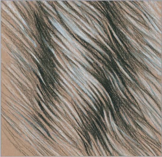
22 | Horse Mane in Charcoal
Begin by lightly outlining the general shape of the horse mane. To create a lighter line than shown here (as you would do for a light-colored mane), use a hard-grade charcoal or even a light graphite pencil for this step.

Horse mane hair is similar to human hair. Using a soft charcoal pencil, such as B or HB, establish the darks. Then use a harder charcoal pencil to create the lighter, finer hairs. Begin your strokes in the dark areas, and taper them at the ends. Use short, light strokes for the horse’s coat.

The texture of charcoal paper can be rough, which causes some of the paper to show through a stroke. To cover these bits of paper, you can blend with a stump. However, sometimes the textured strokes of charcoal paper produce a desirable effect.

At this point, you can use a white charcoal pencil to bring out even more highlights and lighter individual hairs.
23 | Elephant Skin in Graphite
If you have recently visited the elephants at your local zoo, you may have noticed how wrinkled their skin appears. Drawing their skin is similar to drawing wrinkled human skin. Using a 4B pencil, begin by drawing the wrinkles.

Continue using the 4B pencil for the darkest values of the drawing, working with overlapping, circular strokes. Use tapering strokes for more dimension, but feel free to be loose and irregular, which will add to the sense of realism.

Using a 2B pencil, work outward from the darkest areas to create a subtle gradation. As you stroke, use less pencil pressure to create lighter values. Use overlapping circular strokes, and don’t try to be perfect. Then draw additional, lighter wrinkle lines.

Now lightly blend your strokes. Some of the darkest areas may need another layer of graphite after blending to recover the darkest values for good contrast. To finish, use a kneaded eraser to bring out more highlights.
24 | Zebra Coat in Charcoal

The zebra’s very short coat has a striped pattern that is unique to each individual. As with other animals with short coats, the pattern follows the form of the body. Begin by outlining the pattern of stripes using a 2H charcoal pencil.
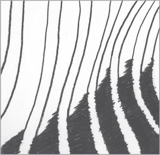
Then use a 3B charcoal pencil to establish the darkest values, using hatch marks to indicate the individual hairs. Having the darks and lights (the white of the paper) in place will help you effectively determine any remaining values.

Use progressively lighter charcoal pencils, such as B to 2H, to gradually lighten the stripes by stroking from the shadow into the highlights. Leave more space between the hatch marks as you move toward the highlights. For more depth, further darken the whites in shadow by lightly hatching hairs.

To finish, lightly blend the stripes, particularly within the areas of shadow.
25 | Leopard Coat in Charcoal

This charcoal example features tan-toned charcoal paper. Begin by lightly outlining the leopard’s spots using a 2H or an extra-hard charcoal pencil. You’ll notice that some of the spots are actually various shapes, with some resembling the letters “C” and “U.”
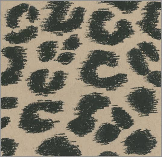
Using a soft 3B charcoal pencil, fill in the spots using strokes that indicate the direction of fur growth. Charcoal paper is generally a rough surface with plenty of “tooth,” so some of the paper will show through the strokes for a broken (but desirable) appearance.

With an HB charcoal pencil, fill in the centers of the spots with tapered strokes so they appear darker than the surrounding fur. With an extra-hard charcoal pencil, create light, tapered strokes to show fur around the spots. You don’t need many strokes; you’ll want plenty of paper to show through.

Next, lightly blend the spots and add some highlights using a white charcoal pencil and tapered strokes. For a realistic look, remember to vary the strokes of fur rather than make them perfectly parallel.
FABRICS & TEXTILES
26 | Burlap in Graphite
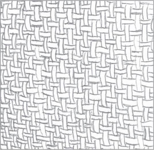
Using a hard-grade pencil, such as a 2B, lightly draw a basket weave pattern. The individual threads of the weave vary in thickness, so there is no need to be perfect.
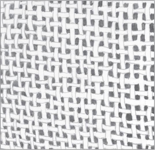
You can leave the background as the white of the paper if desired. In this example, however, a 2B pencil over the background provides more contrast.
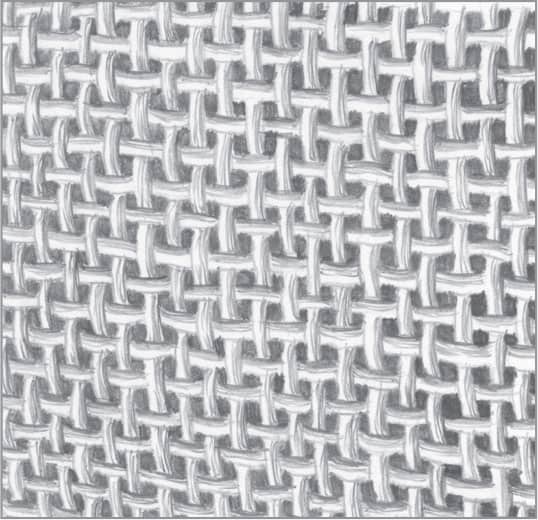
With an HB pencil, apply simple hatch marks to just one side of each horizontal and vertical thread. This gives the appearance of light hitting it from one direction, creating depth.

If desired, lightly blend the threads with a small, fine-tipped tortillon, but avoid blending away the individual hatch marks. For fine details, use an HB pencil to create darker fibers and a stick pencil eraser with a sharply trimmed point to create lighter fibers.
27 | Tweed in Graphite

Tweed is a thick, woven fabric used primarily in suits and coats. This sturdy material is also available in a variety of patterns. This example features a “V” or herringbone pattern. Outline the basic flow of the pattern using light lines.

Using a 2B or 4B pencil, roughly draw the individual “V” pattern to represent the thick, darker woven threads of the fabric. Apply this pattern following the basic curves of the coat.
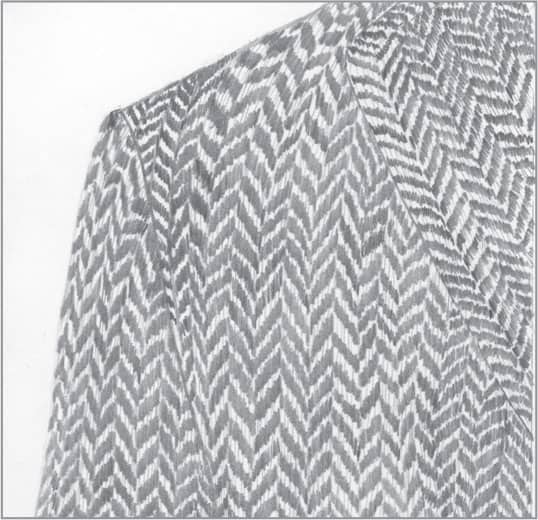
With a lighter 2H pencil, draw a few lines in between the thicker, darker strokes to indicate lighter threads of fabric.
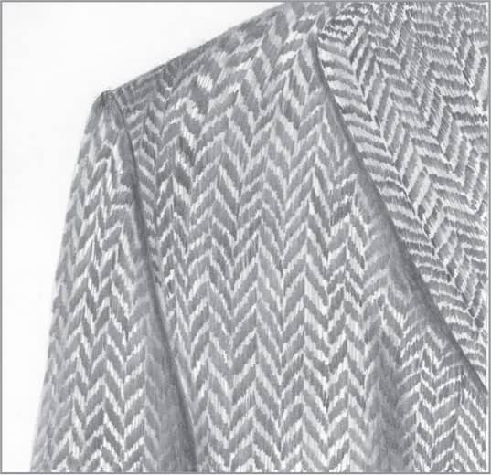
Using a 4B pencil, create the dark areas of shadow around the coat, lapel, and arm. Lightly blend the shadowed areas and the coat’s pattern.
28 | Denim in Graphite
This example shows a fairly simple method for drawing denim fabric with a basic seam. Begin by drawing a light outline of your subject. (The lines shown here are much darker for demonstration purposes.)

Use a 4B to lay in long, tapered strokes following the curve of the seam. Allow white of the paper to show through between strokes, especially in the lightest areas. For the seam, create high (light) and low (dark) spots that occur as a result of the stitching.

There are two ways to create cross-stitching on the denim fabric. You can use perpendicular strokes with a 4B pencil over existing strokes, or (shown here) you can use perpendicular strokes using a click eraser cut at a sharp angle to create thin, light lines that resemble light threads.
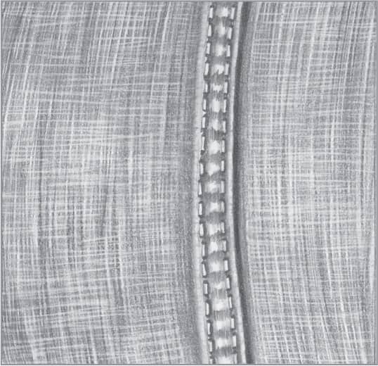
To finish, use a small stump or tortillon to blend along the sides of the seam and stitching, along with the darker areas between the stitching. Use the white of the paper to represent the lightest areas of the seam and fold.
29 | Leather in Graphite

Leather comes in a variety of textures, from smooth to rough. This example of rough leather includes a seam and stitches. Begin by creating an outline with light strokes. (The lines shown here are darker for demonstration purposes.)
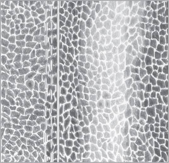
Using different hardnesses of pencil (4B, 2B, and 2H), create small, irregular shapes that resemble puzzle pieces placed closely together. For highlights, use light pressure and a 2H. Use small, overlapping, circular strokes and scribbling for a rough texture.

Use a 4H pencil and light, vertical strokes to coat the drawing, avoiding the stitches and areas of highlight. This will add tone overall and darken the areas between the shapes. Add shadows along the stitches and seam for depth and detail.
Using a stump, lightly blend around the seam and over the leather to even out the tone and smooth out pencil strokes where needed. Also, lightly blend both sides of the highlighted area (down the center) to give it more of a gradual tone.
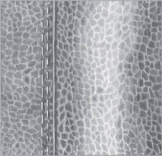
30 | Leather in Charcoal

For this example of rough leather in charcoal, begin with a gray- or brown-toned paper. Use light strokes to outline the seam and stitches. (The lines shown here are darker for demonstration purposes.)
Use B and HB charcoal pencils for the darks, plus an extra-hard charcoal pencil to define the irregular shapes within the highlight down the center. The irregular shapes should resemble puzzle pieces separated by small gaps. Stroke loosely and allow the tooth of the paper show through.
To tone down the spaces between the irregular shapes, use an extra-hard charcoal pencil. Coat the leather with vertical, closely placed strokes, working around the seam, stitches, and highlighted areas.
To finish, use the extra-hard charcoal pencil to shadow the ends of each stitch, and use it to tone the seam. Lightly blend areas with a stump to deepen tone where desired, pushing the charcoal deeper into the tooth of the paper.
31 | Silk in Graphite
Silk has a very smooth texture that reflects light, which makes it important to pay careful attention to highlights and areas of reflected light. Outline the basic shape of the fabric with light lines (much lighter than shown in this example). You can add more guidelines as the drawing progresses.
Now add the darkest values using 6B or 4B pencils. Apply small, light, circular strokes, covering as much of the paper as you can. To soften some of the hard edges, lighten your pencil pressure as you move away.

Using 2B, HB, and 2H pencils, develop folds of silk using values of light and dark, working in small, overlapping, circular strokes. Use the white of the paper to represent highlights on this reflective fabric. For light values, use a harder pencil. Consider testing values on a separate sheet of drawing paper.
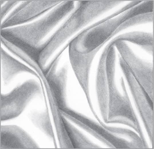
Use a small stump to blend along the reflected light of the folds and a larger stump to blend the shadows. As you move outward, create light shadows using the graphite-coated stump. Create more contrast by touching up with graphite where needed. Use a 4H pencil to create a dark, even tone.
32 | Knitted Yarn in Graphite
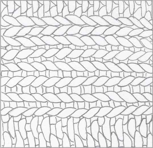
This example of a knitting design shows one of many possible techniques. Begin by outlining the pattern with light strokes; you can always darken the lines as the drawing progresses, if needed.
Using a 4B pencil, fill in the darkest values of the drawing to create a sense of contrast. Use the darks as a gauge for determining subsequent values.

To indicate the fibers of the yarn, use a 2B pencil and short, tapered strokes that follow the curves of the strands. Maintain a sharp pencil point as you apply the strokes, and work around the highlights on each strand.
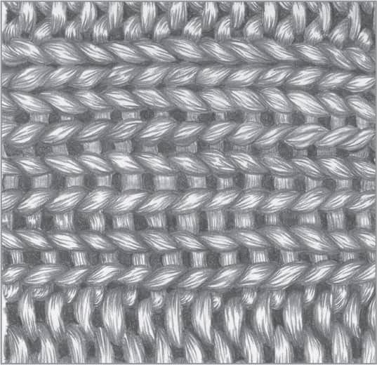
With a small stump or tortillion, lightly blend throughout to give the knitted design a little bit of a smoother look.
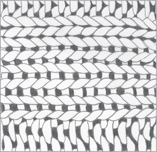
33 | Chunky Wool in Graphite

Begin drawing this thick wool by lightly indicating the pattern of your knitted object. (The lines shown here are dark for demonstration purposes; your lines should be much lighter.)
Using a 4B pencil, fill in the areas of shadow. Switch to a 2B pencil and draw outward from the shadows, creating dark, tapered strands of wool. Follow the curves in the yarn, but avoid being too perfect; chunky wool yard often looks loose and tangled up close.

Using a 2H pencil, create lighter strands in the yarn. Again, start your strokes in the darker areas and work outward, leaving the ends of the shorter strokes tapered. Avoid drawing too many strands in the highlights. Let the white of the paper come through to give depth to the drawing.
Lightly blend with a stump or tortillon, working mainly in the darkest areas to smooth transitions from shadow to light. Use the graphite on the stump or tortillon to add soft, light tone to other areas as needed.
34 | Lace in Graphite

Because this black lace requires a dark tone, use a 4B pencil throughout the drawing. Work out the basic outline on a separate sheet of paper; then transfer it to your drawing paper. For notes on transferring a drawing, see here.

If you look at lace closely, you’ll notice the basic outline is made up of tiny threads woven together. Continuing with the 4B pencil, use very small, circular, overlapping strokes to thicken the lines for a woven look.

To create fine webbing, use a sharp, fine point to apply criss-crossing strokes over areas of the design. In some areas, follow the curves of the design with your strokes. Leave the flower petals free of the criss-crossing pattern for interest. Fill in the dots and small “donuts” of the design.

For more contrast and variety, use a larger criss-cross design in some areas. Keep your strokes clean and avoid blending as you create this fine, delicate subject.
35 | Straw Hat in Charcoal
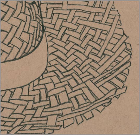
Tan charcoal paper is an ideal choice for this subject. As you begin, note that straw hats are similar in structure to woven baskets (see below). Lightly sketch the outlines with pencil, followed by a hard charcoal pencil, such as a 2H, to create thin, light lines.

Switch to a softer charcoal pencil, such as a 3B, to fill in the shadows around the weaves. Next, with the same pencil, use long strokes to follow the curvature of the hat’s band.
Return to the 2H charcoal pencil to create the grain of the weaves with thin lines. Between each stroke, rotate the tip of the pencil so you are always working with a sharp end.
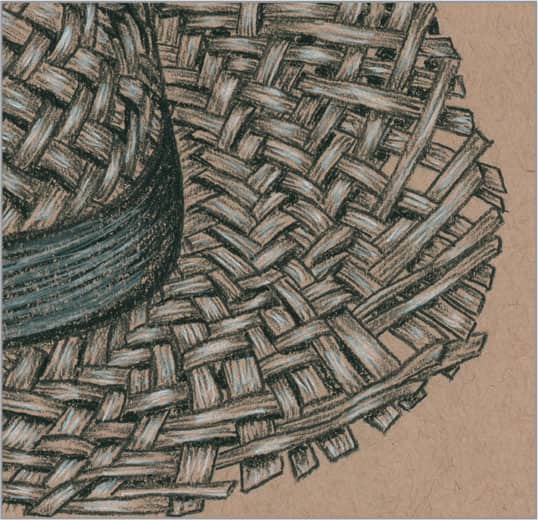
To finish, add some highlights to the drawing by applying strokes of a white charcoal pencil over the raised parts of the weaves and along the band.
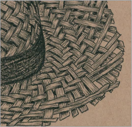
36 | Woven Basket in Graphite
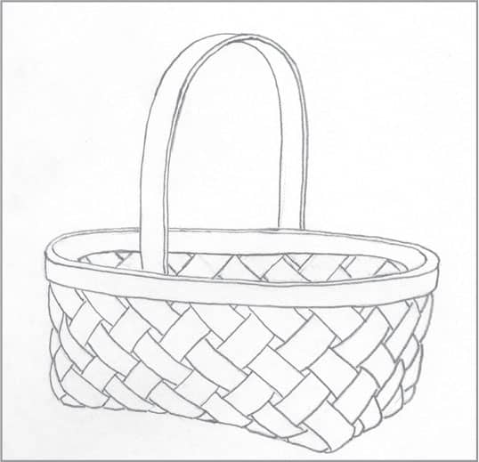
To begin this woven texture, draw the outline of the basket using light strokes. (The lines shown here are darker for demonstration purposes.)
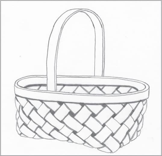
With a 4B pencil, fill in the areas between the weaves. Use a 2B to thicken any lines where the weaves cross over one other, suggesting slight shadows. Also, still using the 2B, draw a thin shadow below the top rim of the basket.

For the basket’s exterior, use an HB pencil to draw tapered strokes coming out from both sides of the weaves, avoiding highlights. For the interior, use a 2B and closely placed hatch marks to push it into shadow. For the rim and handle, apply long strokes that follow the form and simulate the grain.
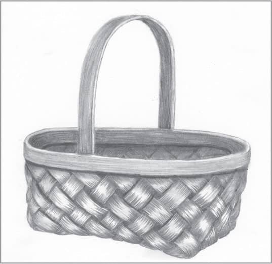
Use a small stump to blend your strokes, focusing on the areas in shadow such as the handle, rim, basket interior, and areas where the weaves intersect. To finish, maintain contrast in the drawing by darkening any areas that have lightened during the blending process.
37 | Cork in Graphite
This example features cork from a wine bottle. Begin by drawing a basic cylinder, making sure the ellipse is symmetrical to represent the cork top viewed from an angle.

Use an HB pencil and overlapping circular strokes to create a shadow along the right side. This will serve as the basis for its three-dimensional appearance.

Some corks are fairly smooth and some have character, such as this one. To create imperfections across the surface, use sharp pencils of various hardnesses to create nicks and cracks. Some of the imperfections may be deep, creating shadows and highlights.

Using graphite already embedded in a small stump, smooth out some areas of the cork and create subtly darker areas across the surface.
HARD SURFACES
38 | Beveled Glass in Graphite
Use a ruler to draw square angles and an oval template (or simply work freehand) to create the center shape. Use very light lines to develop the beveled areas of glass, but switch to a 4B to thicken the lines representing the window’s lead strips.
With a 2B pencil, create the darkest reflections in the window. This will provide a gauge for adding later values. Use overlapping, circular strokes for an even tone. For a realistic look, leave a slightly lighter edge between the glass and lead strips.
Using HB and 2H pencils, create the lightest values within the reflection. Leave some of the paper white to suggest the lightest reflections.
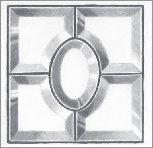
Use a small blending stump to blend as evenly as possible. You may need to reapply graphite to recover any darks that have lightened during blending. You can also create areas of lighter reflections by removing tone with a click pencil eraser.
39 | Clear Glass in Graphite
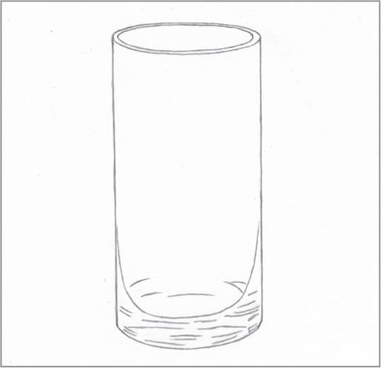
This example features a basic clear drinking glass in simple lighting. Begin by outlining the subject with light strokes, including the various distorted reflections that show through at the base of the glass for a realistic touch.
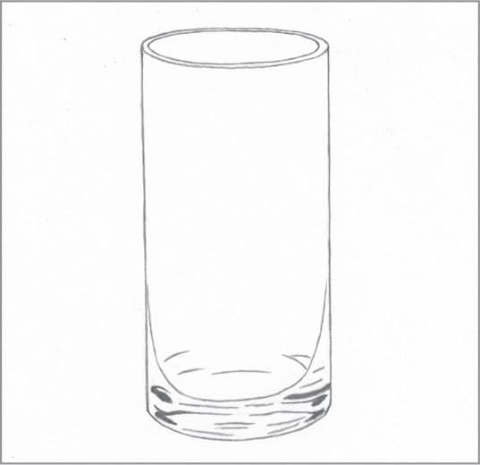
With a 4B pencil, lay in the darkest values found in the distorted reflections at the base of the glass.
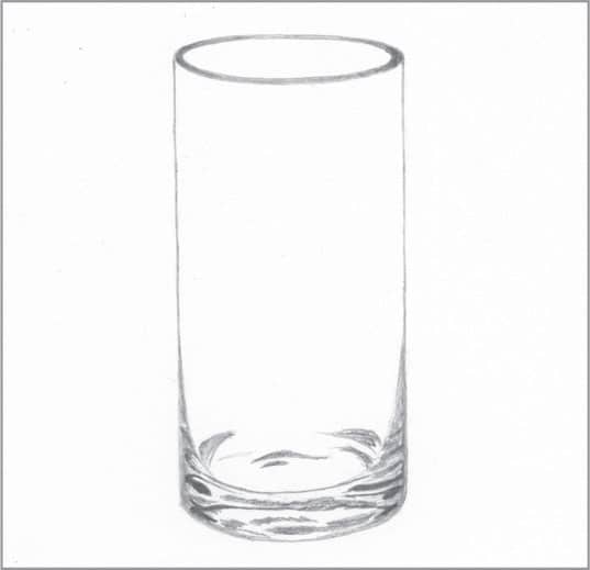
Using HB and 2H pencils, fill in the subtle variations of tone around the base and rim of the glass.

Using a small, sharp-tipped blending stump, blend the base and rim so they appear smooth. In cases where the 2H pencil may be too dark, you can use the tip of the stump to place light tone on the drawing paper.
40 | Porcelain in Graphite
Porcelain is a delicate ceramic baked at a high temperature. This bowl has a smooth, white finish. Start with a light outline. Include outlines of the small reflections with very light, erasable lines, which will later serve as highlights. (The lines shown here are darker than yours should be.)

With an HB pencil and overlapping circular strokes, create a thin line of tone around the rim of the bowl for depth. Also, still using the HB pencil and overlapping circular strokes, create areas of darker shadow on the inside of the bowl, on the outside of the bowl, and on the base of the bowl.
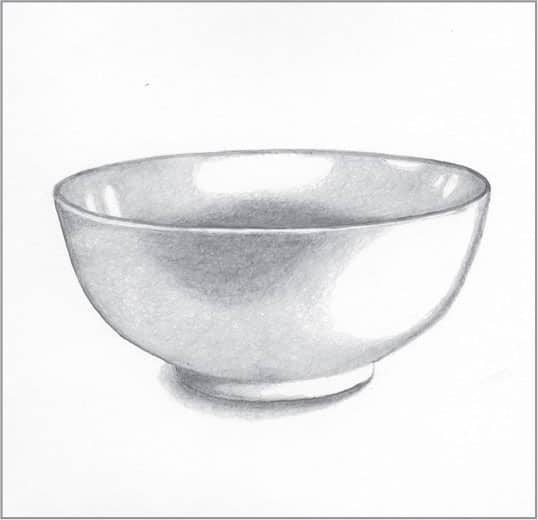
With a 2H pencil and overlapping strokes, work around the small and large highlights on the bowl as you add a middle value. Then create a cast shadow and add some lighter shadows around the base.
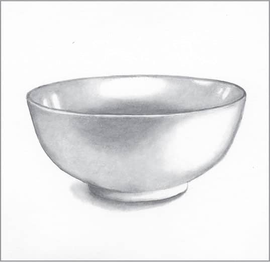
Finish by using a stump to smooth and blend all areas of the bowl. A larger stump with a well-used blunt end works well to create a smooth finish for this subject. Alternatively, you can create ultra-soft blends with the tip of a folded tissue.
41 | Polished Silver in Graphite

A reflective subject like this involves complex shapes with plenty of changes in value. When creating the initial sketch, use very light lines. (The lines shown here are darker for demonstration purposes.)

Using a 4B pencil, apply the darkest values with overlapping circular strokes. Switch to a 2B and apply a lighter value. Again, use overlapping circular strokes, beginning in the 4B areas and working outward to create a gradation.
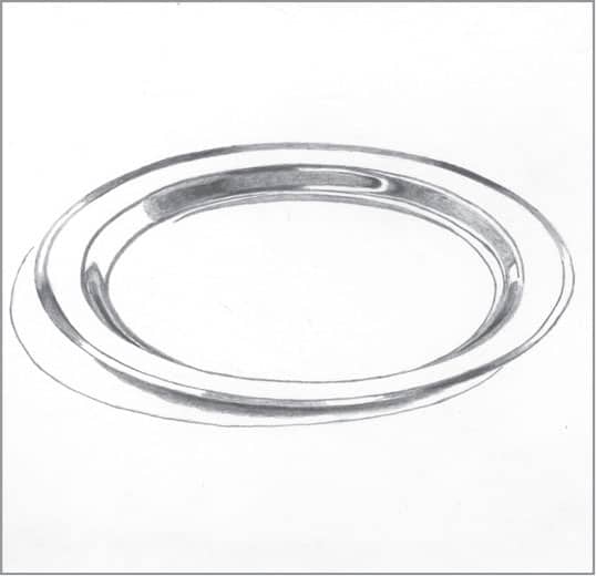
Now use an HB pencil and overlapping circular strokes to add another lighter value, again working outward from the areas of 2B.

With a hard 2H pencil, finish the reflective areas using overlapping circular strokes. Then add the plate’s cast shadow. For this subject, blend with a tortillon everywhere except the plate’s center. For the center, blend with a large stump that is already coated in graphite; then blend with tissue.
42 | Clay Pottery in Graphite
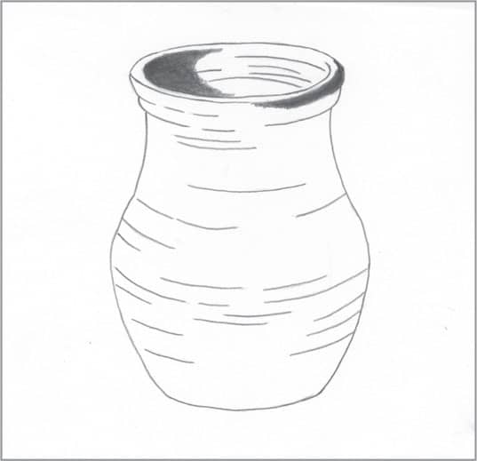
Outline the pottery’s main shapes. The exterior should not be perfectly smooth; reflect this in the outline as you follow the pottery’s curves. Apply the darkest values, which will provide a gauge for applying subsequent values. For this step, use a 4B pencil with overlapping circular strokes.

Switch to a 2B pencil and use overlapping circular strokes to add slightly lighter values, blending out from the areas of 4B to avoid a visible transition. Then darken the lines over the pottery. Working in overlapping circular strokes will help you retain the rough texture of pottery.
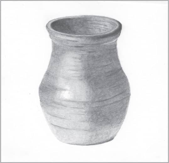
Now switch to an HB to build lighter values, working outward from the areas of 2B for a smooth gradation. Use the HB to thicken the pottery’s lines so they show through subsequent values. Using a 2H and overlapping circular strokes, fill in the light areas, gradating as you move away from the darks.
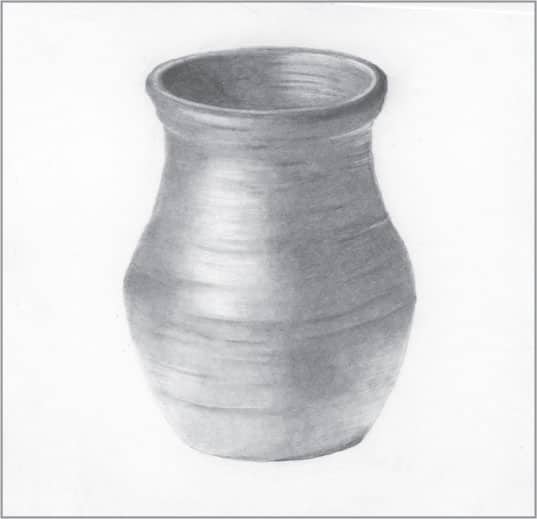
Lightly blend using a large stump, being careful to allow the lines and some texture to show through. Use a kneaded eraser to pull out more highlights for depth, contrast, and a three-dimensional appearance. To bring out highlights around the lip of the pot, use a click pencil eraser.
43 | Rusted Steel in Graphite
Drawing realistic rusted steel is simple, requiring a combination of stippling and scribbling strokes. To begin, draw the outline of your subject with light lines. This example of rusted steel could be part of an old, abandoned ship door held together with rivets.
To establish contrast, use a 4B pencil to create the darkest shadows. Use a thin crescent moon shape to suggest the domed form of each rivet.

To suggest pitting and rust, apply stippling (small dots) and overlap it with small, scribbling strokes. Vary the concentration of your stippling to make some areas lighter and some darker, and vary the lightness and darkness of your patches of scribbling as well for interest and realism.
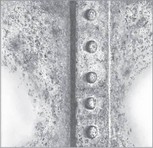
To finish, blend random areas while leaving some as they are for variation and interest. You may need to revisit some areas to create more texture or contrast after blending, as the blending process can lighten the overall tone.
44 | Stucco in Graphite
Stucco is a type of cement that is applied to the exteriors of some houses and buildings. This example features just one style (or finish) of stucco. Begin by drawing different sizes of random forms. Use very light, easily erasable lines.
Choose the side from which the light will shine. Then, with an HB pencil, draw a very thin shadow line on each shape, opposite the side of the incoming light.

Continuing with the HB pencil, stipple in the areas between the main shapes. Make the stippling somewhat random.

Use a sharp-tipped tortillon or stump to lightly blend the thin areas of shadow. To finish, use an older stump or tortillon to “draw” across the stucco, leaving wide, light lines to indicate trowel marks for realism and interest.
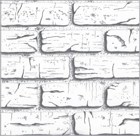
45 | Brick in Charcoal
Working on charcoal paper, draw the outlines of your bricks using light pencil or a 2H charcoal pencil.
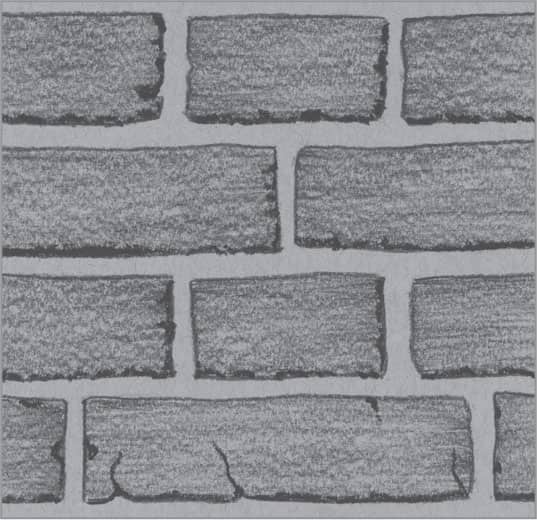
Using the side of a piece of 2H charcoal or the side of the tip of a 2H charcoal pencil, cover the face of each brick. The “tooth” of the paper will give the bricks texture. Using softer charcoal, apply a thin, rough shadow on each side of the brick. Add random cracks in the bricks.
With the 3B charcoal pencil, add some stippling to both the mortar and the faces of the bricks.
Depending upon the tone of your paper, you may want to add light strokes of white charcoal pencil over the mortar for more contrast.
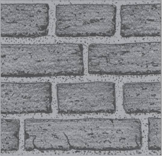
46 | Weathered Brick in Graphite

Start with a lightly drawn outline of a brick wall. (The lines shown here are darker for demonstration purposes.) Because these are old bricks, they have rounded corners that show wear.

Old bricks feature cracks and imperfections. Use a 4B pencil to indicate the shadows of cracks. Still using the 4B, apply the dark shadows of the bricks. Note: The lines indicating the edges of brick not in shadow should be light, increasing contrast and depth in the finished drawing.
With an HB pencil, create more light cracks in a random fashion. Then add pitting and stippling on the faces of the bricks and within the mortar. Use the HB pencil to draw a light, thin edge of shadow coming out of the deeper cracks and along the dark shadows on the brick edges, suggesting depth.
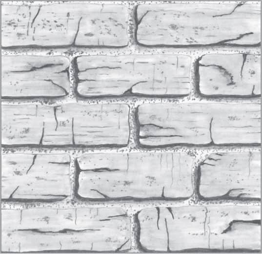
With a small stump, lightly blend the shadows around the brick edges. With an older stump already coated with graphite, lightly blend the face of each brick to smooth the texture and add tone. For a darker value, add graphite powder (saved from pencil shavings) to the end of the stump.
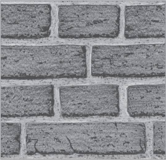
47 | Cobblestone in Graphite
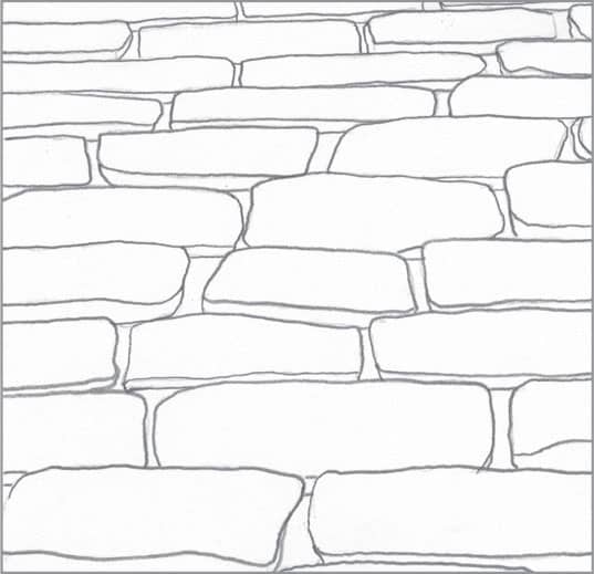
Some cobblestone pathways can appear very old and weathered, full of cracks and rounded corners. To begin, outline the pathway in perspective as it relates to the viewer. Also, think about where the shadows will fall.
Fill in the darkest areas of shadow with a 4B pencil. In the areas between the bricks, suggest mortar and dirt by lightly scribbling with an HB pencil.

With a 2B pencil, create some small cracks, lines, and stippling on the surface of the bricks. Use an HB pencil and long, light, tapered strokes across the surface of the bricks to give them contrast. Leave the centers of some bricks free of tone to suggest depth.
To finish, very lightly blend the bricks. Allow some of the pencil strokes to show through to give the bricks a little surface texture.
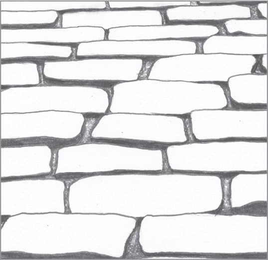
48 | Rock Wall in Graphite

To begin, outline the basic shapes of the rock wall. In drawings like this, you can use a reference photo or rely on your imagination. Note: It’s a good idea to carry a camera often and collect photos of various textures, which you can use as future references.
Using a 4B pencil, fill in the darkest areas of shadow between the individual rocks. Switch to a 2B pencil and create random crack shadows and crevices on the faces of the rocks. Further texture them with some stippling.

With an HB pencil, add lighter shadows to the cracks and crevices, and create shadows around the edges of each rock to suggest depth.
With a small stump, lightly blend the shadows added with the 2B and HB pencils.
49 | Wrought Iron in Graphite

Wrought iron, which is often used in fences and gates, generally comes in black or brown. This example features a simple design in black wrought iron. Begin with a light outline; the lines shown here are darker for demonstration purposes.
Using a 4B, fill in the darkest values first. Add some stippling to suggest small defects and occasional rough areas for interest. For especially weathered and rusty wrought iron, add more imperfections.
Use loose, overlapping strokes (or scribbling) to fill in the wrought iron’s surface. Switch between 2B and HB pencils for varying values. To show the direction of light and suggest depth, allow the white of the paper to serve as the highlight on a few areas.
To finish, use a medium to small stump or tortillon to blend and smooth your strokes. Use less blending to suggest rougher wrought iron. To create more areas of highlight throughout the design, lift graphite with a kneaded eraser, always keeping in mind the direction of light.
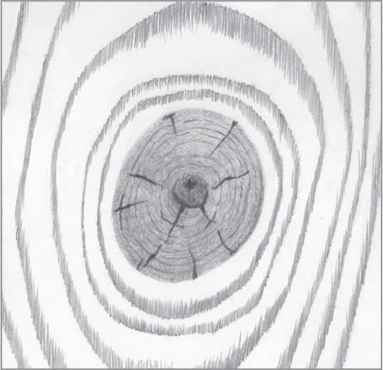
50 | Smooth Wood in Graphite
When cut and sanded, wood can produce a variety of beautiful patterns and textures. To re-create this basic wood texture, begin by outlining the rings with very light lines. (The lines shown here are darker for demonstration purposes.)

Using a 2B pencil, apply closely placed short, vertical strokes that follow the arch of the rings. Notice how the thickness of each arch varies from the sides to the top.

Using an HB pencil, apply more vertical strokes downward from the initial lines created in step two. Vary your stroke length, applying both long and short strokes to create the appearance of a subtle gradation of tone from the top of the each arch.
Finally, blend with a tissue folded to a narrow triangle. Some of the pencil strokes should still show through after blending to retain the realistic look of wood grain.
51 | Aged Wood in Graphite

Begin by drawing the large and small cracks on the surface. Use a soft 4B pencil for this step, as these lines will later be in shadow. Continuing with the 4B pencil, widen some of your lines and fill in the cracks. Leave tapered ends on each crack to indicate the splitting of the wood.
With a 2H pencil, apply long strokes to indicate light wood grain. Note: When creating long strokes, it’s best to keep your wrist steady and move your arm at the elbow.
Using an HB pencil, apply tone to suggest patches of discoloration. When drawing wide strokes such as these, hold the pencil at a steep angle to the paper, working with the side of the graphite rather than the sharp tip.

To finish, lightly blend the patches and some areas of the wood grain.
52 | Aged Wood in Charcoal

Draw the large and small cracks on the surface using an HB charcoal pencil. Continuing with the HB, widen your lines and fill in the cracks. Leave tapered ends to suggest the realistic splitting of old wood.
Switching to a harder 2H charcoal pencil, apply long, thin strokes to create the grain of the wood. Note: Charcoal pencil can dull quickly. Instead of continually sharpening the pencil, simply rotate the pencil between each stroke.
Again utilizing the HB charcoal pencil, use a light touch to create scattered patches of tone on the wood. Very lightly blend the dark patches, leaving the cracks and light wood grain untouched.
For more interest and contrast, use a white charcoal pencil to highlight select areas of the wood. Avoid stroking over the cracks or dark patches as much as possible.
53 | Driftwood in Charcoal
For cool driftwood tones, work on gray paper. Using a B charcoal pencil, create wood grain in a wavy pattern to suggest the warped, uneven surface. Use an HB to thicken some lines and fill in the cracks, leaving the ends tapered to show splitting.

Switch to a 2H pencil to create light strokes that follow the grain. Suggest areas of discoloration by applying loose, uneven tone.
Use a stump to lightly blend the discolored areas, which will give it a smoother appearance.
Create highlights and areas of lighter tone using a white charcoal pencil. This will create more contrast and strengthen the sense of light falling on the wood.
54 | Wood Knot in Graphite

When drawing wood, including a wood knot or two can add interest to the finished work. To begin, outline the shape of the knot along with a few small cracks. Also, outline the wood grain around the knot. Use light lines for this step; the lines shown here are darker for demonstration purposes.

The knot in the wood is often a bit darker than the wood surrounding it. In this case, use an HB pencil with small, overlapping circular strokes. Switch to a 2B when working in the very center. Darken the cracks with a 4B pencil, keeping them tapered at the ends.
With an HB, draw closely placed vertical strokes to represent wood grain around the knot. With a very sharp 2B pencil, create tiny growth rings in the knot itself.

To finish, use a small stump or tortillon to blend around the outside of the knot, softening its edge. Also, blend the grain of the wood around the knot, allowing most of the lines to show through for texture.
55 | Wooden Barrel in Graphite
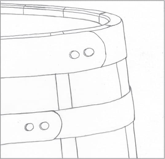
To begin, use light lines to outline the top of the barrel, which must be drawn accurately and symmetrically to suggest realistic perspective. Use a 4B to create the darkest shadows, including on top of the barrel, the lines between the wooden slats, and the rivet shadows.

Use a 2B pencil and short, overlapping hatch strokes to create the grain in the oak slats. Because the light is coming from the right, use fewer hatch strokes on the right side to allow more white paper to show through. You can switch to an HB to create lighter strokes on the lit side of the barrel.
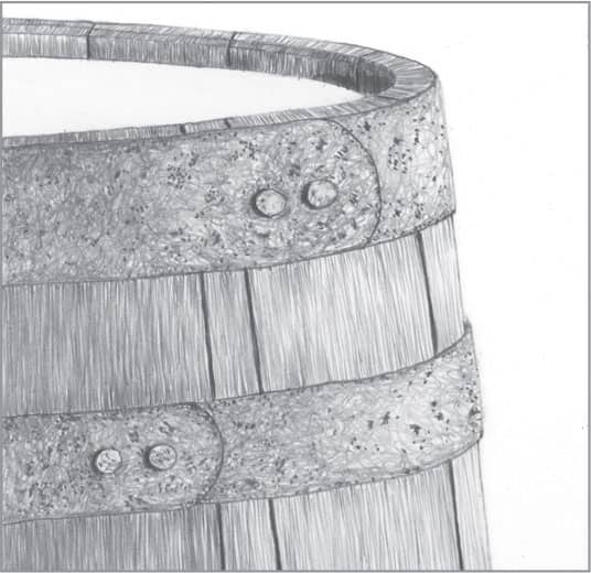
For interest, the metal bands on the barrel can show some rust. To begin, stipple irregularly over the bands with a 4B pencil. Then apply scribbling strokes over the bands. Use lighter coverage on the right side of the bands. Use a 2B for the darker part of the bands and an HB for the lighter side.

On the top lid of the barrel, apply light, long parallel strokes with a 2H to suggest a hint of wood grain. To finish, use a stump to very lightly blend the wood grain of the barrel and lid. Use heavier blending for the metal, but make sure to allow the stippling and scribbling to show through.
NATURE
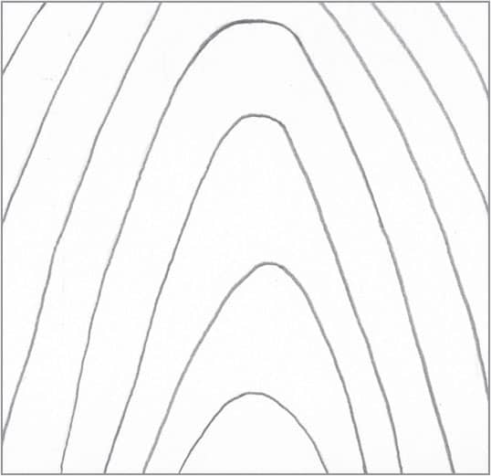
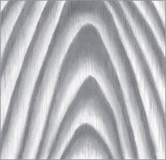
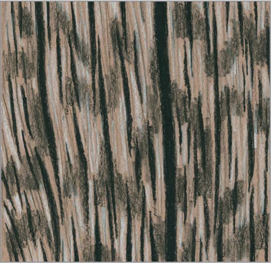
56 | Smooth Bark in Graphite

Begin by drawing two vertical lines for the trunk and a series of horizontal lines to indicate imperfections in the bark. Use light lines for this step; the lines shown here are darker for demonstration purposes.

Using a 2B pencil, thicken and taper the horizontal lines and stipple to represent holes in the lines of the bark.
With an HB pencil and slightly curved horizontal strokes, create the shadowed side of the tree (left). Then, using a 2H pencil, add curved, horizontal strokes for a smooth transition from the HB strokes. Apply strokes along the right edge with a 2H.

To finish, use a stump to blend all areas of the bark, including the imperfections. Then use a click eraser with the tip cut at an angle to pull out some thin highlights above the imperfections, making them appear slightly raised.
57 | Rough Bark in Graphite

To begin, use a 2B pencil to outline the rough bark. In this example, you can use dark outlines because they will serve as shadows in the final drawing.

With a 4B pencil, establish the darkest values of the drawing within the deep, shadowed cracks of the rough bark.
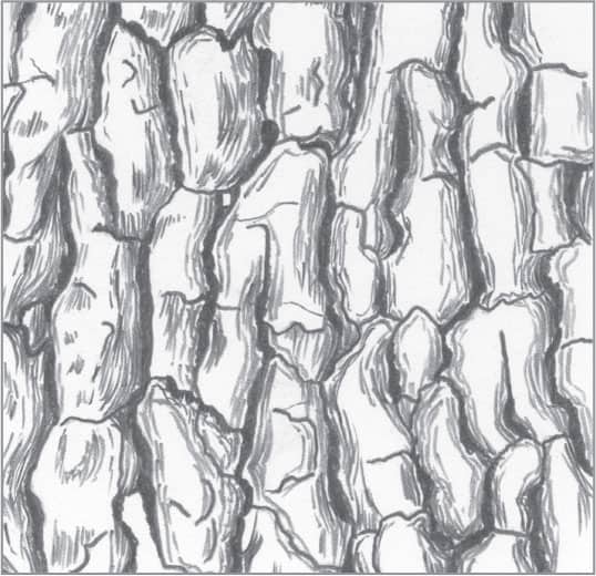
With an HB pencil and rough hatch marks, create lines around the raised areas of bark to suggest layers. This will give the bark a raised appearance.
Use a stump to lightly blend all areas of the bark, leaving the layered lines visible. Then create some darker patches on the bark surface by smudging tone with the graphite already on the stump.
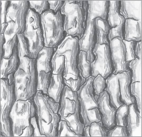
58 | Rough Bark in Charcoal

Use a B charcoal pencil to outline the rough bark. In this example, you can use dark outlines because they will serve as shadows in the final drawing.
With a 3B charcoal pencil, fill in the areas of shadow in the cracks of the bark to establish the darkest value of the drawing. Keep these dark areas irregular in shape.

With a sharp 2H charcoal pencil, use light, rough hatch marks around the raised areas of the bark for a layered appearance.

With a stump, blend lightly to allow the layers to show through. Finish by applying white charcoal pencil to highlight areas of the flat, uppermost surfaces.
59 | Pine Needles in Graphite

Begin by creating an outline, with both branches ending in a terminal bud.
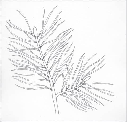
Using a sharp 2H pencil, draw thin needles coming out of the branch. There is a thin, paper-like wrapping at the base where two or more needles sprout outward. Some of the needles are drawn to look as though they are behind some of the others.
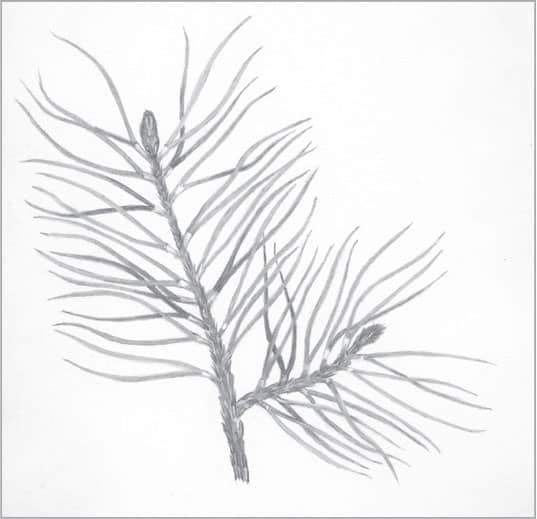
The small branches and terminal buds of a real pine tree appear a bit scaly. To capture this, simply use small groupings of very short hatch marks using a 2B pencil. Now fill in the needles, using HB for distant ones and 2H for closer sunlit ones.
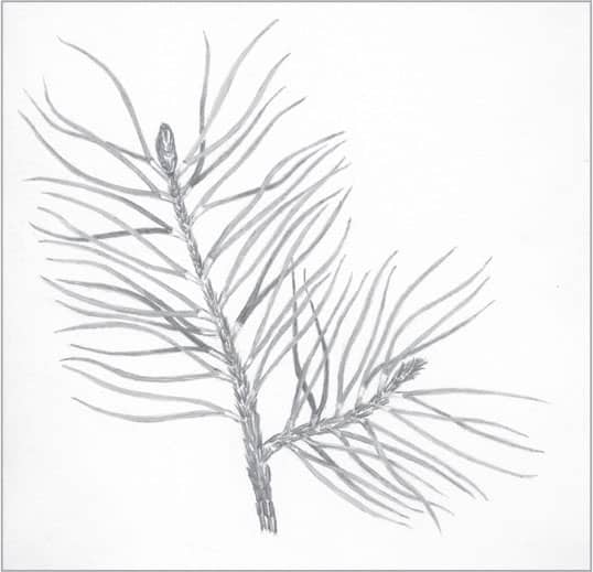
To finish, use a small tortillon with a sharp tip to very lightly blend all areas of the drawing. Too much blending can diminish the much-needed textures of the branches and buds.
60 | Pine Cone in Graphite
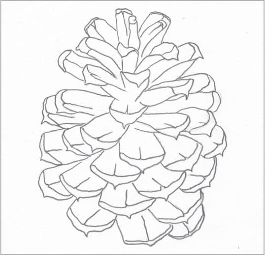
A pine cone is a complex drawing subject, so a good reference photo is important. Use very light strokes to create the outline; the lines shown here are darker for demonstration purposes.

In this example, the darkest shadows will be nearest the core of the pine cone. Use a 4B pencil to stroke outward from the center of the pine cone.

Continue working outward from the 4B areas using an HB pencil. Then use very short strokes to create a line across the end of each pine cone scale. Leave the tips mostly white, toning some areas subtly with a 2H pencil.
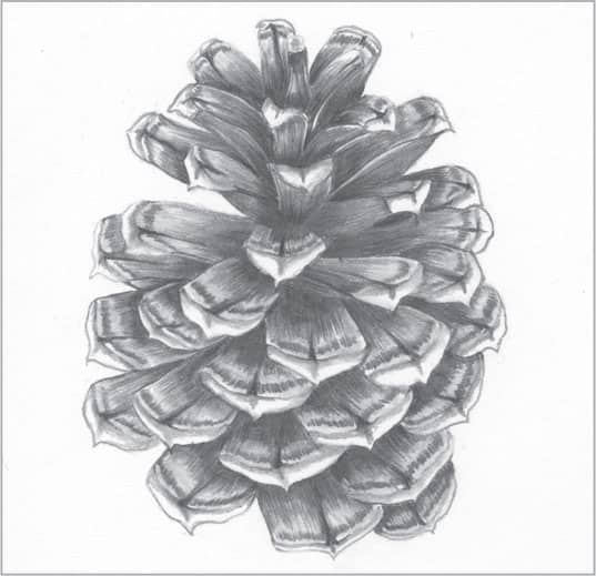
Now apply some light blending throughout to smooth the texture, allowing some of the pencil strokes to show through.
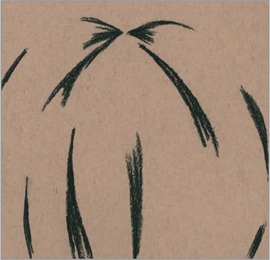
61 | Palm Frond in Graphite

Begin by drawing an outline of the palm frond. Use lines that are much lighter than shown here, which will prevent any hard lines from showing through in the finished drawing.

Identify the darkest value first, which includes the most shadowed areas of the plant. Use a 4B to fill in these areas on each leaf of the frond.

Use an HB for the next darkest value, followed by a 2H for the lightest values on the leaves and stem. Use long, parallel strokes on the leaves to represent the veins.
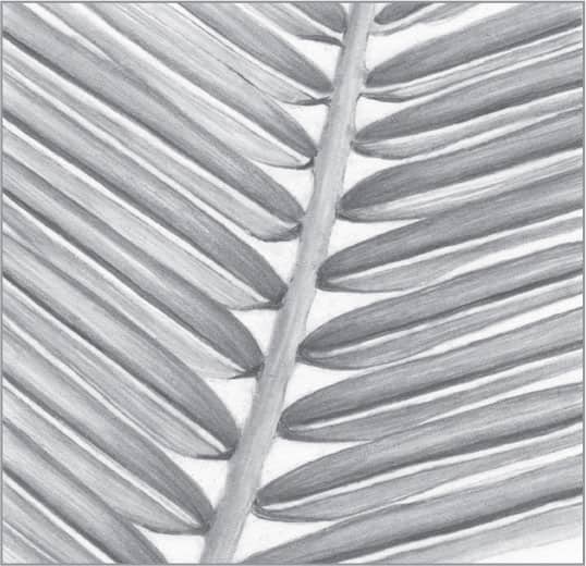
To finish, lightly blend the leaves and stem with a stump or tortillon for a smoother finish.
62 | Fern in Graphite
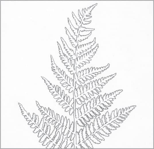
Begin by drawing the basic outline of the fern. Use light strokes for this step; the lines shown here are darker for demonstration purposes.

With a sharp-tipped HB pencil, draw the veins in the small, individual fern leaves, as well as a line representing the main stem. On this type of fern, the main stem is concave and runs down the length of it, which you can represent with a thick line down the center.

With a 2H pencil, fill in around the very edges of the individual leaves, avoiding the previously drawn veins. Fill in the leaves toward the tips of each branch.

To finish, use a fine- or sharp-tipped tortillon or stump to blend around the edges of the leaves (where you applied the 2H). Leave some of the veins and leaf centers light. To finish, lightly blend the stems.
63 | Grass in Graphite

Draw blades of grass with a sharp 4B pencil, stroking upward and tapering the tips. Place clumps of grass randomly, and avoid placing them in a straight line. Curve each blade as you stroke, allow some to cross over each other, and vary the lengths of your strokes.

To give the grass contrast and depth, use sharp HB and 2H pencils to thicken the grass with more tapered strokes throughout. Add light blades above your original strokes to suggest grass that fades into the distance.

With the 4B pencil, create a few seed-tipped stalks of grass and add random longer, darker blades where needed. To create the seed tips, apply very short strokes that angle slightly outward.
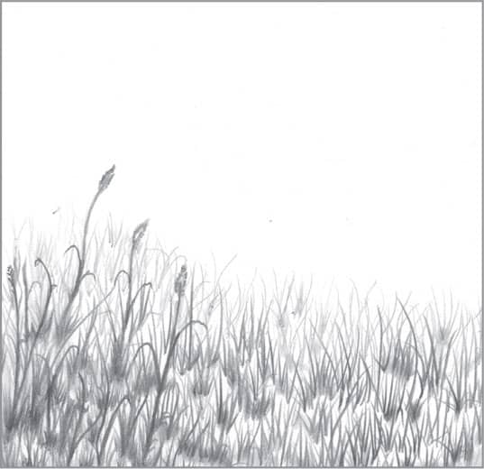
To finish, use a small tortillon to lightly blend the bottom of most of the clumps, giving the drawing even more contrast and depth.
64 | Seashell in Graphite
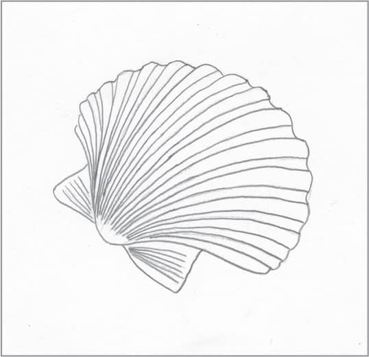
This example shows a common scallop seashell. Begin by creating a light outline of the shell; the lines shown here are darker for demonstration purposes.
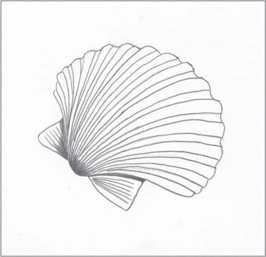
Use a 2B pencil to establish the darkest values within the scene.
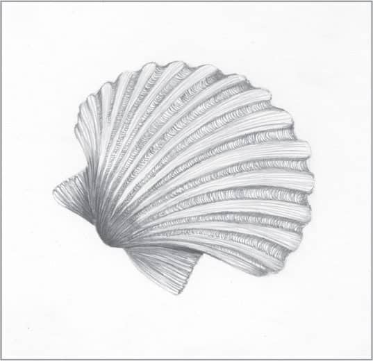
Switch to a 2H pencil to tone the raised ribbed areas using long strokes that follow their natural curves. Between the ribs, draw small, curved lines using an HB pencil, which suggests the concave nature of the structure.

To finish, blend very lightly and be sure to retain some of the lines from step three.
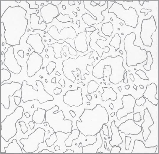
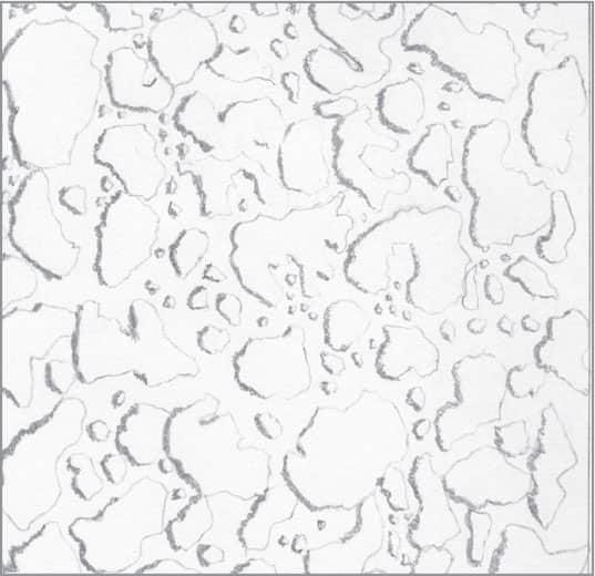
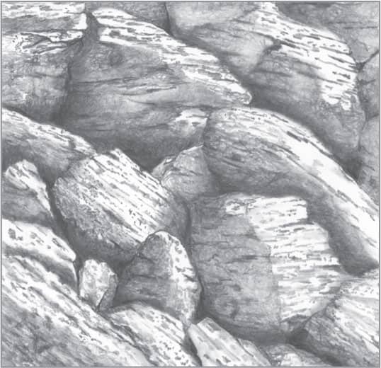
65 | Smooth Rock in Graphite

Drawing smooth rock is a simple process. Begin by drawing a light outline using various oval shapes; the lines shown here are darker for demonstration purposes.

Use a 4B pencil to establish the darkest value first, which is in the deepest areas between the rocks. Then use a 2B and overlapping circular strokes to draw outward from the 4B areas, creating a smooth gradation for a three-dimensional appearance.
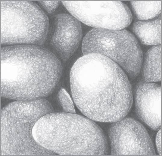
With an HB and looser, overlapping circular strokes, create the next darkest values of the rocks. Then switch to use a 2H to build the lightest areas. These loose, circular strokes will create a realistic texture.

To finish, lightly blend with a stump, allowing some of the strokes to show through for a realistic touch.
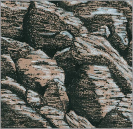
66 | Mountain Rock in Graphite
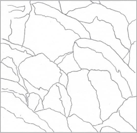
Draw the basic outline of the jagged mountain rock, including the larger shadowed areas. Use light lines for this step; the lines shown here are darker for demonstration purposes.

Use a 4B pencil to fill in the darkest values, which are the small areas of deep shadow between the rocks.
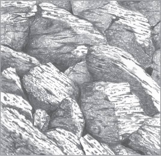
Use 2B and HB pencils to create linear cracks and stippling on the surface of the rocks, including areas in light shadow. With the HB pencil and loose, overlapping circular strokes, create the lightest shadows.
To finish, lightly blend all the areas of shadow. Allow some of the circular strokes to show through to maintain the rough texture. To lighten areas if needed, simply dab away tone with the kneaded eraser.
67 | Mountain Rock in Charcoal
To begin, draw an outline of a hillside of mountain rock using very light lines over toned paper. (The lines shown here are darker for demonstration purposes.) Use a 2H charcoal pencil with light pressure. If needed, outline some areas of light and shadow.
Using a 3B charcoal pencil, create some of the darkest shadows in between the deepest areas of the individual rocks.

Use long strokes and an HB charcoal pencil to create lighter areas of shadow. When applied over charcoal paper, the surface texture adds to the rough look. Add lines and stippling on the highlighted areas of the rocks for more detail.
Lightly blend the areas of shadow. To finish, use a white charcoal pencil to add highlights for depth and contrast.
68 | Running Water in Graphite
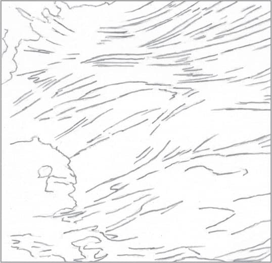
Running water can be difficult to draw due to the variety of shapes and values involved. Simplify your reference photo by converting it to grayscale, removing the distraction of color. Begin by outlining the various shapes that make up the water’s surface.

Use a 4B pencil to add the darkest values first. Like most graphite drawings in this chapter, this example uses 4B, 2B, HB, and 2H pencils. Each pencil grade can yield several different values, depending on the amount of pressure applied.
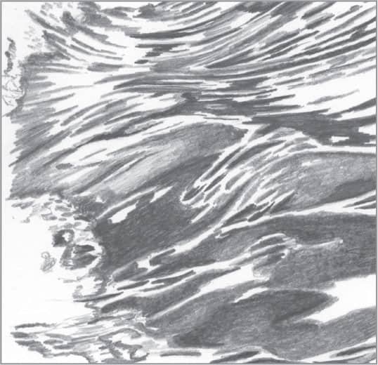
For the remainder of the drawing, use 2B, HB, and 2H pencils to build the various values throughout. Leave some areas of the paper white to represent the lightest reflections.
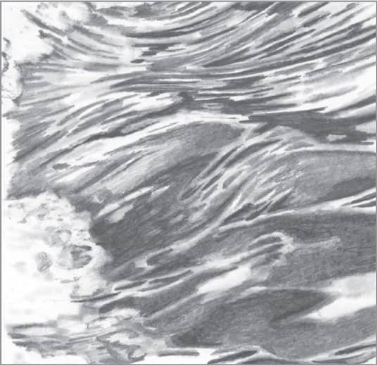
To finish, lightly blend all areas with a tortillon, except for the white of the paper that remains. Add lighter values throughout for more depth and variety by applying tone with the tortillon as you work.
69 | Raindrops on Water in Graphite

When viewed from above, raindrops on water create circles; when viewed from any other angle (such as from the shore), they look elliptical. To begin this subject, draw different sizes of ellipses.
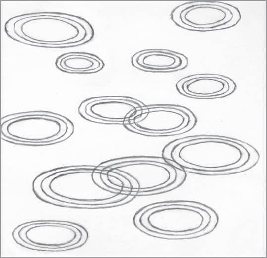
When raindrops hit the water, they create waves that move out from the center. To re-create this example, draw two small ripples around each original ellipse.
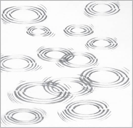
Use a 2B pencil to draw tapered shadows around the waves for depth. The shadows closest to the viewer appear on the outside of the wave, and the shadows farthest away are on the inside. Add smaller waves on the sides of each raindrop.
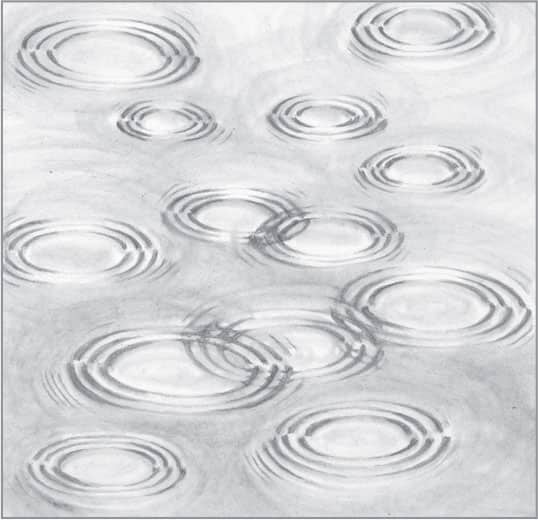
To finish, use a worn stump with a dull tip to apply tone around and inside each raindrop, creating subtle waves and lightly toning the water’s surface. To reload the stump with graphite, simply dip the tip into graphite powder and stroke over a separate sheet of paper until you reach the desired value.
70 | Clouds in Graphite
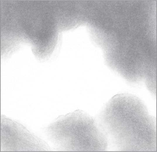
In this method, you will simply use a stump, graphite powder (saved from pencil shavings), tissue, and a click pencil eraser. Begin by dipping a folded tissue into graphite powder and rubbing over the paper. Create a smooth sky on top and darker clouds below.
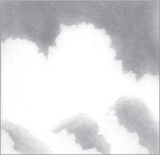
Using the click pencil eraser, create a sharp outline of the edge of the clouds. As you erase, use a circular motion to produce a bumpy appearance.

Next use an old, blunt stump to apply graphite over the cloud shadows. As the shadows lighten, apply increasingly less pressure. Then use the click pencil eraser again to create sharp edges.

Use the stump to reapply graphite to create darker areas of the clouds. Then use the sharply cut tip of a pencil eraser to work around the bright edges, giving the clouds a wispy appearance. Use this eraser to create linear clouds and small puffs.
FOOD & BEVERAGE
71 | Citrus Fruit in Graphite

This can serve as an example of any citrus fruit, such as orange, lemon, or grapefruit. (However, tweak as necessary; for example, the rind of a lime is often thinner.) To begin, draw the outline of the cut citrus fruit using light lines.

Using an HB pencil, thicken the outer edge and add some stippling along the cut rind. Darken the very center to show that it’s in shadow.

Still using the HB, create pointed, tapered shapes to represent the pulp. Fill in the space around the shapes (called “negative drawing”; see here).
To finish, blend lightly around the edge of the cut rind using a small stump. Around the tapered shapes in the fruit, use a small, sharp-pointed tortillon to blend within the smallest areas.
72 | Apple in Graphite
Begin by creating a basic outline with a 2H pencil. You can begin with a simple circle and then refine the sketch to include the bumps and bulges of an apple.
In this drawing, the light is coming from the right. Create the shadowed left side (the darkest value) using a 2B pencil and overlapping circular strokes. Continue using an HB pencil to apply a slightly lighter value to the apple, leaving the oval highlight free of tone.
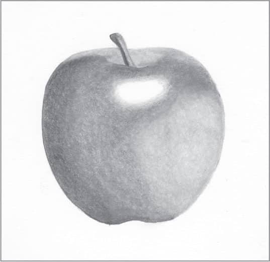
With a lighter 2H pencil and overlapping circular strokes, coat the rest of the apple, still leaving the oval highlighted area free of tone. Using a stump, blend all areas of the apple to a fairly smooth finish.

Using a small-tipped click pencil eraser, create lighter spots and lines around the stem and top of the apple. Also, create some light stippled spots on the skin. Finally, suggest reflected light by removing a thin band of tone along the bottom right edge.
73 | Pear in Graphite

Begin by drawing a light outline of the pear with a 2H pencil. You can begin with a simple circle and then sketch the top of the pear. (Note that the lines shown here are darker for demonstration purposes.)

In this drawing, the light is coming from the right. Begin with the darkest value—a shadow on the left side of the pear and stem. Use loose, overlapping circular strokes that allow a bit of the white paper to show through. Then, using an HB pencil, stipple over the skin for texture.

Switch to a 2H pencil and apply loose, overlapping circular strokes over the pear skin, leaving two areas of highlights: one on the upper portion, and one on the bottom portion.
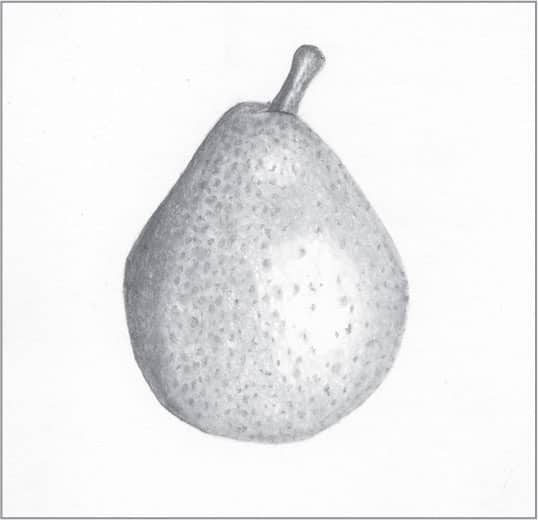
Blend the pear, allowing some of the pencil strokes to show through. Leave the highlighted areas free of tone, including the thin highlight on the stem.
74 | Grapes in Graphite
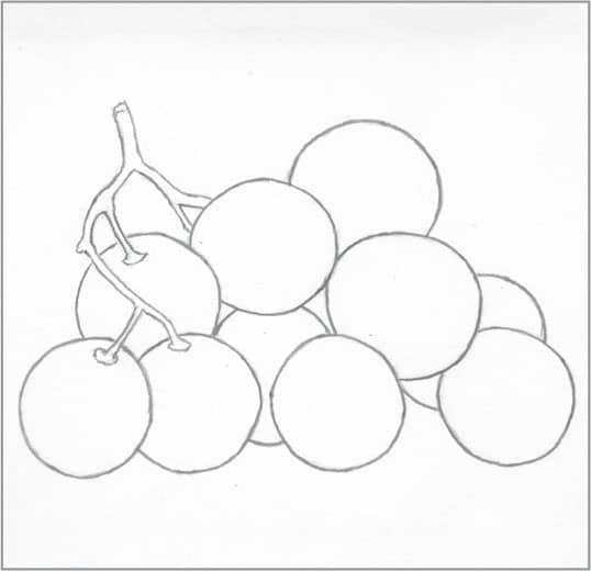
Using simple circles, create a basic outline of the grapes and stems. Use light strokes; the lines shown here are darker for demonstration purposes.
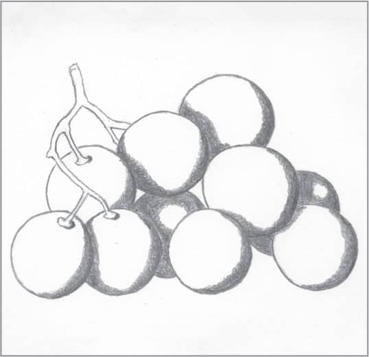
Create the shadows with a 2B pencil. The light is coming from the upper left, so the darkest values will be the shadows at right. Apply tone with small, overlapping circular strokes, which you will later blend to a smooth finish.
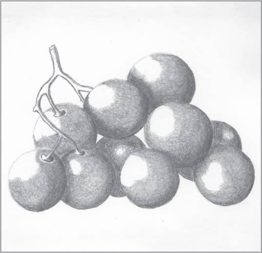
Apply a slightly lighter value of the grapes with an HB pencil, again using small, overlapping circular strokes. Still using the HB pencil, create the shadowed areas on the grape stems.
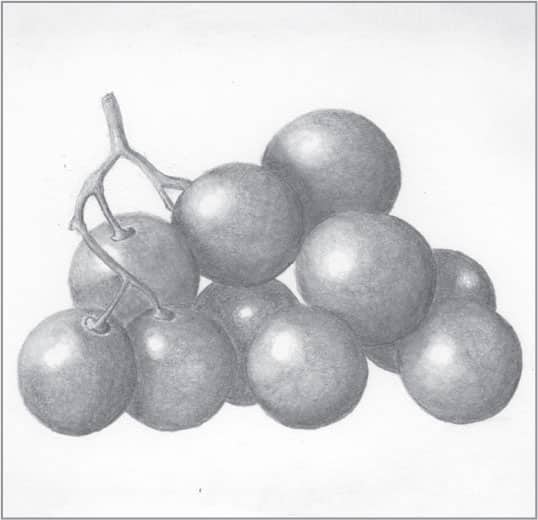
Switch to a 2H and apply small, overlapping strokes, leaving highlights free of tone. Then use the 2H and long hatch marks for the stems. Finish by blending the grapes to a smooth finish with a stump or tortillon. Then lightly blend the stems.
75 | Cherries in Graphite
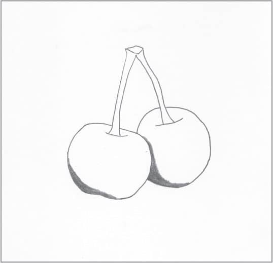
Begin by using a 2H pencil to outline the cherry shapes and stems with very light lines. The darkest value of the drawing (2B) will be the shadows on the lower parts of the cherries. Work in small, overlapping circular strokes, which you will later blend.
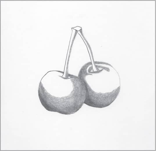
Switch to an HB pencil and apply a lighter value to the cherries using small, overlapping circular strokes. Then tone the stems, working along the sides opposite the light source.
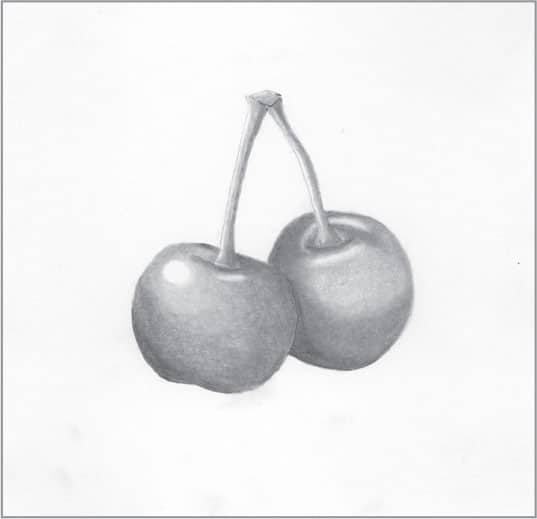
For the lightest values, use a 2H pencil to develop tone. Using a stump or tortillon, blend the cherries and stems to a smooth finish. Allow the highlights to remain the white of the paper.
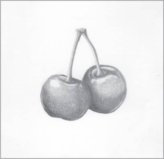
Using a small click pencil eraser, add tiny highlights for more interest and to further suggest the reflective nature of the cherries. Also, use the pencil eraser to create tiny light speckles on the skin.
76 | Strawberry in Graphite

Begin by drawing the simple outline of a strawberry, stem, and sepal with light lines (the lines shown here are darker for demonstration purposes). Then use a 2B pencil with a sharp tip to create teardrop-shaped seeds. Note how the tip of each seed points toward the tip of the strawberry.

Next, using a 2B pencil, create areas of shadow on the leaves, stem, and sides of each seed on the part of the strawberry in shadow. (In this case, the light is coming from the right, putting the left side in shadow.)
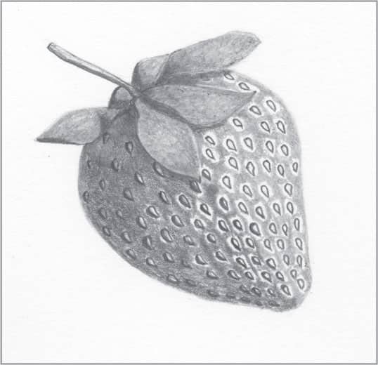
Using a 2B and small, tight, circular strokes, add tone to the dark side of the strawberry (left), leaving a small amount of white around the seeds closest to the center. Switch to an HB and fill in the rest of the berry, leaving highlights around the seeds. Then use the HB to coat the leaves and stem.
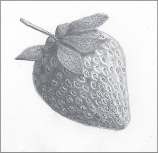
To finish, use a tortillon or small stump to blend all areas of the strawberry, allowing the white of the paper to serve as the highlights. Then use a sharp HB pencil to create veins on the sepals for a realistic touch.
77 | Peanut Shell in Charcoal
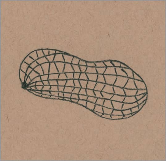
In this example, a tan-colored charcoal paper is a good match for drawing a peanut shell. Begin by drawing a basic outline using a 2H graphite pencil or using a 2H hard charcoal pencil with a light touch. Notice the mixture of recessed square and triangular shapes that make up the surface of the shell.
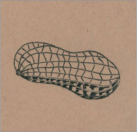
The darkest values will be the shadows along the bottom of the shell. Use a B charcoal pencil to develop the shadows within the small recesses.
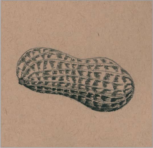
Next use a 2H charcoal pencil to apply the next darkest value near the bottom of the peanut shell. Use this same pencil to apply light shadows to the remaining recessed areas. Notice how the veins along the peanut shell are left as the color of the paper for now.

Finish by simply using a white charcoal pencil to create highlights along the veins and within some of the recessed areas near the light source.
78 | Walnut Shell in Charcoal
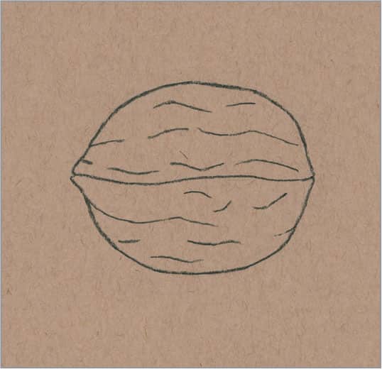
A tan-colored charcoal paper is a good match for drawing a walnut shell in charcoal. Begin by drawing the basic shape of the walnut, indicating the line through the middle and the creases on the shell’s surface.
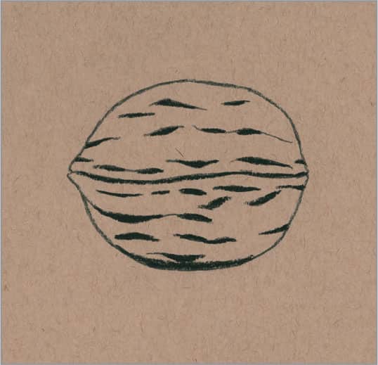
Establish the darkest value of the drawing with a 3B charcoal pencil, filling in the shadows and creases of the walnut shell.
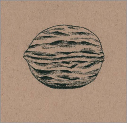
With a harder 2H charcoal pencil, create light shadows moving out from the darker ones to create a gradation, and suggest a few shallow creases on the shell.

To finish, lightly blend the darker and lighter shadowed creases. Then use a sharp 2H charcoal pencil to create thin veins on the shell’s surface. Use a white charcoal pencil to add highlights along the top of the shell.
79 | Pineapple in Graphite
Using light lines, draw the outline of the pineapple, including the crown and the individual hexagonal shapes on the exterior. (The lines shown here are darker for demonstration purposes.)
Use a 4B to establish the darkest values of the drawing. Work in jagged strokes around the hexagonal shapes, and use hatch strokes on the leaves of the crown.

With a 2B pencil, use overlapping circular strokes as you work outward from the jagged strokes to create a slightly lighter value. Also use the 2B and hatch strokes to build tone on the leaves. Switch to a 2H and stroke in the rest of the leaves as you move toward the tips. Then use the 2H and overlapping circular strokes to establish the lighter areas of the hexagonal shapes, leaving some highlights.

To finish, use a stump to lightly blend all areas of the pineapple.
80 | Corn in Graphite
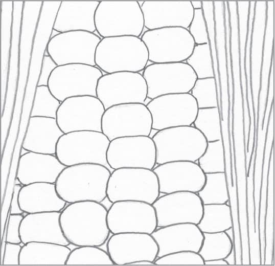
Begin by drawing a basic outline of the ear of corn, which includes the husk for more interest. Use a 2H pencil for this step; the lines shown here are darker for demonstration purposes.
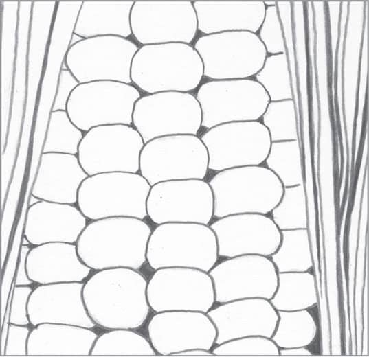
To make sure the finished drawing features adequate contrast, use a 4B to develop the shadows. Apply dark tone between the kernels and along the husk in long strokes.

Using an HB pencil, create more lines along the husk. Then apply tight, overlapping circular strokes around the edges of the kernels, leaving the center of each free of tone to represent highlights.

To finish, lightly blend the lines on the husk with a stump. Then smoothly blend the strokes in each kernel, leaving the white of the paper to serve as a highlight in the center.
81 | Coconut in Graphite

Draw the basic outline of the coconut, which has been broken in half to reveal what’s inside. Use a 2H pencil for a light outline; the lines shown here are darker for demonstration purposes.
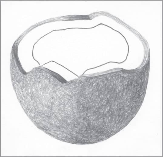
Coconut has a very fibrous exterior. To represent this texture, work in scribbling strokes using a 2B (for the darker right side) and an HB (for the lighter left side). Apply long strokes of the 2B and HB pencils along the cracked edge of the coconut, following the curve of the rim.

With a 2H pencil, create a bit of texture and light shadows on the interior and rim.

Lightly blend the interior, exterior, and cracked rim of the coconut. Then use a click pencil eraser to suggest some thin, random fibers on the surface.
82 | Tomato in Graphite

Begin with an outline of the tomato, stem, and sepals. Use light lines for this step; the lines shown here are darker for demonstration purposes.
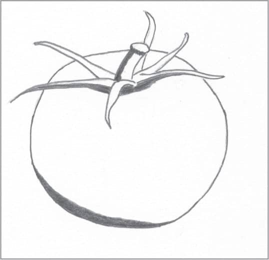
With a 4B pencil, create the darkest values of the drawing. These areas include the shadowed bottom of the tomato, side of the stem, and undersides of the sepal.
With 2B and HB pencils and overlapping circular strokes, create the next darkest values of the tomato. Work around the highlight. Use the 2B to develop shadows cast by the sepal. Use the HB pencil on the surface of the sepal and on the stem, leaving a small, thin highlight.
Use a stump to evenly blend the body of the tomato, and switch to a small tortillon for the stem and sepal.