
Gestures
When designing a Windows Phone app, an important design feature to keep in mind is the use of gestures. A user will mainly interact with his Windows Phone through the device’s touch screen. Through a series of recipes, this chapter will explore the gesture support provided in the Windows Phone SDK, and will help you to design apps that leverage this functionality, by providing the right formula of gesture support for your app.
In this chapter, we will add the following recipes to your developer palate:
- 3-1. Select the Right Action For Your App
- 3-2. Tap, DoubleTap or (Tap-And-)Hold
- 3-3. Don’t Be a Drag, Just Flick It
- 3-4. Pinch to Zoom
- 3-5. Be Generous With Size and Considerate of Space
3-1. Select The Right Action For Your App
Problem
You want to develop an app that allows users to interact with objects on the screen using the touch screen, and you want to know which type of actions the device supports.
How It Works
Within a Windows Phone app, you can allow your users to interact with the app through the touch screen in a variety of ways, through single- or multi-touch gestures. Single-touch gestures include tap, double-tap, tap-and-hold, pan, and flick. Multi-touch gestures include pinch to zoom in and out. Table 3-1 lists the gestures available with a brief description and examples of when to use each gesture.
Table 3-1. Single-Touch Gestures
| Gesture | Description | Usage Examples |
|---|---|---|
| Tap | The user touches the device screen with a single finger and releases. | Used to trigger a button click, select an item in a list, set focus to an input field such as a textbox, check/uncheck a checkbox, etc. |
| Double-Tap | The user touches and releases the device screen two times, in quick succession. | A common use for this action is to magnify content, such as text, images or map locations, on the first double-tap action, then zoom out on the second double-tap action. |
| Tap-And-Hold | The user touches the device screen, and does not release his finger. | A common use for this action is to display a context menu on the item that is the target of the tap-and-hold gesture. |
| Drag or Pan | The user touches the device screen and drags his finger across the screen in any direction without releasing his finger. | Drag an object to a new location on the screen. |
| Flick | The user touches the device screen and drags his finger partially across the screen in any direction and quickly releases his finger. | Make an object disappear off screen, flip a “page”, slide to the view the next item (photo slide show), etc. |
| Pinch | The user touches the device screen with two fingers and moves them either closer together or farther apart. | Zoom in or out of an object on a screen. |
It is important to note that Windows Phone supports up to four simultaneous touch input points. However, when including more than two simultaneous touch input points on a page, there may be a performance cost since this will create an additional load on the device’s processor. This is important to keep in mind when designing your app.
You can employ gesture-based actions in the following ways:
- Events provided in the UIElement class, including mouse-based events, single-touch gesture events (i.e., Tap, DoubleTap, Hold), and multi-touch gesture events (i.e., ManipulationStarted, ManipulationDelta, and ManipulationCompleted). We will explore this approach in Recipe 3-2: Tap, DoubleTap, or (Tap-And-)Hold.
- Touch class, which processes touch input and raises an event, FrameReported. This event returns pertinent information related to the touch action such as the primary touch point and its position, as well as a collection of touch. Each touch point’s x- and y-coordinate position can also be obtained, relative to a UIElement or the full content area. This approach is also discussed in Recipe 3-2: Tap, DoubleTap, or (Tap-And-)Hold.
- Implementing a GestureListener through the GestureService that comes packaged in the Windows Phone Toolkit to attach event listeners to Windows Phone controls, either individually, or at a top-level. We will explore this approach in Recipe 3-3: Flick It.
3-2. Tap, DoubleTap, or (Tap-And-)Hold
Problem
You want to make your app simple, engaging, and interactive for the user by leveraging the touch screen capabilities of the device.
Solution
Include the desired actions on the Windows Phone controls by leveraging the Tap, DoubleTap, and Hold events.
How It Works
In this recipe, we will focus on the tap-specific gestures, since they are the type of gestures that most apps will likely handle at least once. All Windows Phone controls that derive from the UIElement class include the gesture-based events which are listed in Table 3-2. Keep in mind that for this section, we will only be working with the Tap, DoubleTap, and Hold events.
Table 3-2. System.Window.UIElement Events
| Events | Event Arguments | Triggered when . . . |
|---|---|---|
| Tap | GestureEventArgs | The user touches the area on the screen where a UIElement appears and releases the touch immediately. GestureEventArgs provides information on the position where the gestured occurred, either relative to a UIElement or the overall content area. |
| DoubleTap | GestureEventArgs | The user taps the area on the screen where the UIElement is displayed two times, in quick succession. |
| Hold | GestureEventArgs | User touches the area on the screen where a UIElement appears and does not release the touch immediately. |
| ManipulationStarted | ManipulationStartedEventArgs | The user touches the area on the screen where a UIElement is displayed, with one or more fingers. ManipulationStartedEventArgs provides information on the source object that invoked the event, the point that the manipulation originated from, and the container that defines the coordinates for the manipulation. |
| ManipulationDelta | ManipulationDeltaEventArgs | The user continues the manipulation by moving his finger(s) across the screen without releasing. This event is triggered more than once during a manipulation. ManipulationDeltaEventArgs provides information on the current manipulation including accumulated changes, the most recent change, the rate of change (or velocities), and if the change occurred during inertia. |
| ManipulationCompleted | ManipulationCompletedEventArgs | The user releases his finger(s) from the screen to end the manipulation. ManipulationCompletedEventArgs provides information on the total transformation that occurred during manipulation, the total rate of change (or velocities), and if the completed event occurred during inertia. |
To explore the tap gesture events that may be triggered, we will create a new Windows Phone app which will perform the following actions:
- Display a single circle on initial launch.
- Change background color of circle when it is tapped.
- Create a copy of the circle when it is double-tapped.
- Display a context menu when the user taps and holds a single circle.
Although the Windows Phone Toolkit comes packaged with a ContextMenu control, we will create our own custom context menu to demonstrate how to use the Hold event along with how to obtain the current touch input point location that the user’s finger pressed. This is a “bonus” feature you will learn in this recipe!
To start, we will need to create a new Windows Phone project. Launch Visual Studio 2012, and create a new Windows Phone project using the same steps provided in Chapter 1, Recipe 1-2. Name the project “TapIt”. We will be using the WrapPanel control that comes packaged in the Windows Phone Toolkit. Follow the instructions provided in Chapter 2, Recipe 2-5, to add the toolkit into this project using NuGet.
The next step we will take is to set up the objects we will be working with in the MainPage’s XAML markup. We will add a single circle as the initial display object, and place it within a WrapPanel so that as the user adds new objects to the screen, the shapes will automatically wrap around and fill the screen, instead of going off-screen. As we delete objects, we want the existing objects to automatically re-adjust to remove any empty space between objects, which the WrapPanel will handle for us.
To accomplish this, we will need to add the namespace declaration for the Microsoft.Phone.Controls.Toolkit assembly to the PhoneApplicationPage root element in the MainPage.xaml file so that we can add the WrapPanel control to the page:
<phone:PhoneApplicationPage x:Class="TapIt.MainPage"
xmlns:toolkit="clr-namespace:Microsoft.Phone.Controls;assembly=Microsoft.Phone.Controls.Toolkit"
Next, we want to remove the default StackPanels that are added to the LayoutRoot grid by default. We will replace Grid, named ContentPanel, with a WrapPanel instead. This will be the container to which circles are added. Although we could use any type of layout panel to host the shapes, such as a Grid, Canvas, or StackPanel, we will go with the WrapPanel for this example. The reason for this is that the WrapPanel will automatically arrange the shapes as they are added to or deleted from the container. To add the WrapPanel, add the following XAML within the LayoutRoot grid:
<toolkit:WrapPanel Name="ContentPanel" />
We also need to include a popup menu that will serve as a context menu when a Hold event is triggered on a circle. This can be accomplished simply by adding a Popup control, a ListBox control, and the relevant List Items we want to serve as options in the context menu. For this example, let’s create a context menu that allows the user to change color, add a new circle, or delete the current circle. We will add the XAML for the Popup within the LayoutRoot grid.
<Popup Name="menuEllipse">
     <ListBox Name="listMenuItems"
              Background="White"
              Foreground="Black"
              BorderBrush="Gray"
              BorderThickness="5"
              SelectionChanged="listMenuItems_SelectionChanged"
              Width="150"
              Height="150">
         <ListBoxItem Name="itemColorChange" Content="change color" Padding="10" />
         <ListBoxItem Name="itemNew" Content="add circle" Padding="10" />
         <ListBoxItem Name="itemDelete" Content="delete" Padding="10"/>
     </ListBox>
</Popup>
Before we head to the code behind, we need to add an event handler for the PhoneApplicationPage’s Loaded event within the phone:PhoneApplicationPage element:
Loaded="PhoneApplicationPage_Loaded"
Creating Shapes Programmatically
With that, we have our UI in place. Now let’s head to the code behind file to make this application fully functional!
To navigate to the code behind, hit the F7 key, or double-click on the MainPage.xaml.cs file. The first thing you will notice is that the Loaded event we attached to the page from the XAML file has already been added in the code behind. The first thing we want the application to handle on the initial load is displaying the first circle. Since we know this same code will be used from multiple locations, we can place it in its own method. In addition to that, there will be other common methods we will need to create, so we can start off on the right foot and create a separate helper class for these methods.
In Visual Studio, right-click on the project, and select Add > Class... from the menu. Within the Add New Item dialog, set the class name to EllipseManager.cs, and click the Add button.
The type of methods we will create here will be used to add new shapes, as well as change colors of the selected shapes. We can make this a static class, since this will be used to contain helper methods, and separate instances of it are not necessary. To accomplish this, simply include the static keyword in the class declaration:
static class EllipseManager
Next, add the following using directives to the class:
using System.Windows;
using System.Windows.Shapes;
using System.Windows.Media;
Now that we have a shell of our helper class in place, along with the required namespace declarations, let’s create a method that will create a new ellipse, set some defaults on the shape, and return the ellipse to the calling procedure, as shown in Listing 3-1.
Listing 3-1. AddEllipse Method Will Return an Ellipse with a Default Color, Border, and Size
public static Ellipse AddEllipse()
{
    Ellipse newEllipse = new Ellipse();
    newEllipse.Stroke = new SolidColorBrush(Colors.Gray);
    newEllipse.StrokeThickness = 5;
    newEllipse.Height = 200;
    newEllipse.Width = 200;
    newEllipse.Margin = new Thickness(10);
    newEllipse.Fill = new SolidColorBrush(Colors.Purple);
    newEllipse.HorizontalAlignment = HorizontalAlignment.Left;
    newEllipse.VerticalAlignment = VerticalAlignment.Top;

    return newEllipse;
}
Everytime we create a new ellipse, we are setting the default color to the same color each time. This can be quite boring. Let’s spice it up a little and have each new ellipse set to a different fill color. In addition to that, we will also want to change the ellipse’s fill color anytime the user taps the shape.
Let’s create a new method which will return a random color each time it is called. Name the method, GetNextColor, and set its return value to a SolidColorBrush. We will also leverage .NET’s built-in random number generator, System.Random, to generate values for the A, R, G, B properties (i.e., alpha, red, green, and blue channels whose combined values define a color), as shown in Listing 3-2.
Listing 3-2. GetNextColor Will Return a Random Color Each Time it is Called
//random number generator used to generate the RGB values for a color
private static Random _random = new Random();
public static SolidColorBrush GetNextColor()
{
     Color newColor = new Color();
     newColor.A = (byte)255;
     newColor.R = (byte)_random.Next(0, 256);
     newColor.G = (byte)_random.Next(0, 256);
     newColor.B = (byte)_random.Next(0, 256);
     return new SolidColorBrush(newColor);
}
Now it’s time to revisit the MainPage code-behind to work on wiring up the events that are needed so we can manage the user’s gestures accordingly. The events we need to handle on the ellipse are the Tap, DoubleTap, and Hold events. We will create a method, named AttachEventHandlers, that accepts an ellipse as a parameter. We will attach the Tap, DoubleTap, and Hold events to each new ellipse that is created by calling this method, and passing in the shape. For completeness, we should also create a similiar method to detach the event handlers when the ellipse is deleted by the user, as shown in Listing 3-3. Last, but not least, remember to add the using directive for the System.Windows.Shapes namespace to the class, since we will be dealing with the Ellipse object in the code.
Listing 3-3. Register the Gesture-based Event Handlers for Each Ellipse
private void AttachEventHandlers(Ellipse targetEllipse)
{
     targetEllipse.Tap +=
new System.EventHandler<System.Windows.Input.GestureEventArgs>(Ellipse_Tapped);
     targetEllipse.DoubleTap +=
new System.EventHandler<System.Windows.Input.GestureEventArgs>( Ellipse_DoubleTapped);
     targetEllipse.Hold +=
new System.EventHandler<System.Windows.Input.GestureEventArgs>( Ellipse_Held);
}

private void RemoveEventHandlers(Ellipse targetEllipse)
{
    targetEllipse.Tapped -= new System.EventHandler<System.Windows.Input.GestureEventArgs>( Ellipse_Tap);
    targetEllipse.DoubleTapped -= new System.EventHandler<System.Windows.Input.GestureEventArgs>( Ellipse_DoubleTap);
    targetEllipse.Held -= new System.EventHandler<System.Windows.Input.GestureEventArgs>(Ellipse_Hold);
}
Managing Tap-Specific Gestures
Next, we will need to add code to these events, so that when the ellipse receives the respective gesture, something will happen on screen to reflect that action.
Within the Ellipse_Tapped event handler, we will set the Fill property of the tapped ellipse to the newly generated color. We will also check to see if a previous context menu is open from a previous action, and close it accordingly.
Within the Ellipse_DoubleTapped event handler, we will create a new circle with default properties set, attach the gesture event handlers so that the object will do something, and add the circle to the main WrapPanel. We will separate out this code into its own method, because it will also be called from the context menu and during the initial load. The resulting code is shown in Listing 3-4.
Listing 3-4. Handling the Tap and DoubleTap Events on the Ellipse
private void Ellipse_Tapped(object sender, System.Windows.Input.GestureEventArgs e)
{
    if (menuEllipse.IsOpen)
    {
        //if the context menu is open but the user taps
        //outside of the menu, then close it
        menuEllipse.IsOpen = false;
    }

    Ellipse sourceEllipse = (Ellipse)sender;
    sourceEllipse.Fill = EllipseManager.GetNextColor();
}

private void Ellipse_DoubleTapped(object sender, System.Windows.Input.GestureEventArgs e)
{
       Ellipse newEllipse = EllipseManager.AddEllipse();
       AttachEventHandlers(newEllipse);
       ContentPanel.Children.Add(newEllipse);
}

//since this set of actions will be called from multiple
//events, it is ideal to place it in a separate method for reusability
private void AddNewEllipse()
{
        Ellipse newEllipse = EllipseManager.AddEllipse();
        AttachEventHandlers(newEllipse);
        ContentPanel.Children.Add(newEllipse);
}
Finally, we will handle the Ellipse_Held event to display a context menu for the selected object. The desired effect is to have the context menu appear in the area of the selected ellipse. To capture the location of the screen that was touched, we will need to leverage the Touch class in the System.Windows.Input library. The Touch class is a static class that processes touch input that it receives and raises the FrameReported event. We will need to handle this event to obtain the points on the screen the user touched, as shown in Listing 3-5.
Listing 3-5. Use the Touch Class to Capture the Location That Was Touched
using System.Windows.Input;

//variable used to store the touch input point
//that was received in the Touch_FrameReported event
Point lastTouchedPoint = new Point(0,0);
public MainPage()
{
    InitializeComponent();

    Touch.FrameReported += Touch_FrameReported;

}

void Touch_FrameReported(object sender, TouchFrameEventArgs e)
{
    TouchPointCollection touchPoints = e.GetTouchPoints(this);

    if (touchPoints.Count > 0)
    {
        //get the first touch point position from the collection
        lastTouchedPoint = touchPoints[0].Position;
    }

    //Note: if you wanted to track multiple touch input point positions,
    //simply iterate through the touchPoints collection using foreach and
    //handle each touch input point position accordingly
}
When the FrameReported event is triggered, we can obtain the touch points from the TouchFrameEventArgs parameter, by calling its GetTouchPoints method. This method will return a collection of touch points, each one containing a Point value that in turn includes the coordinate values representing the touched location on the device’s screen.
With that in place, we can now include the necessary actions in the Ellipse_Held event handler to display the context menu in a location on-screen relative to the shape the user tapped and held. The resulting code is shown in Listing 3-6.
Listing 3-6. Display the Context Menu When the User Taps and Holds an Ellipse
private void Ellipse_Held(object sender, System.Windows.Input.GestureEventArgs e)
{

    Ellipse sourceEllipse = (Ellipse)sender;

    //if the point touched is near the right edge of the screen, adjust the
    //HorizontalOffset for the context menu to ensure that it is displayed
    //within the bounds of the screen
    if ((lastTouchedPoint.X + listMenuItems.Width) > this.ActualWidth)
        lastTouchedPoint.X = this.ActualWidth - listMenuItems.Width;

    //if the point touched is near the bottom edge of the screen, adjust the
    //VerticalOffset for the context menu to ensure that it is displayed
    //within the bounds of the screen
    if ((lastTouchedPoint.Y + listMenuItems.Height) > this.ActualHeight)
        lastTouchedPoint.Y = this.ActualHeight - listMenuItems.Height;

    menuEllipse.HorizontalOffset = lastTouchedPoint.X;
    menuEllipse.VerticalOffset = lastTouchedPoint.Y;
    menuEllipse.IsOpen = true;

    //set the Tag of the context menu to the selected ellipse
    //so that on menu item selection, the action that is taken
    //against the shape that triggered the event
    menuEllipse.Tag = sourceEllipse;

}
On initial launch of the application, we will need to create the first shape and add it to the screen. To accomplish this task, call the AddNewEllipse() method within the PhoneApplicationPage_Loaded event.
Last but not least, we will need to add code within the SelectionChanged event for the ListBox, to ensure it will take the appropriate action based on the menu item that was selected, as shown in Listing 3-7.
Listing 3-7. Take the Required Action Based on the Menu Item That Was Selected
private void listMenuItems_SelectionChanged(object sender, System.Windows.Controls.SelectionChangedEventArgs e)
{
    if (e.AddedItems.Count == 0)
        return;

    Ellipse sourceEllipse = menuEllipse.Tag as Ellipse;
    menuEllipse.Tag = null;
    menuEllipse.IsOpen = false;

    ListBoxItem item = (ListBoxItem)e.AddedItems[0];
    switch (item.Content.ToString())
    {
        case "add circle":
            AddNewEllipse();
            break;
        case "change color":
            sourceEllipse.Fill = EllipseManager.GetNextColor();
            break;
        case "delete":
            RemoveEventHandlers(sourceEllipse);
            ContentPanel.Children.Remove(sourceEllipse);
            break;

    }

    //reset the state of the listbox so that the selected item
    //no longer appears to be selected on the next display of the menu
    listMenuItems.ClearValue(ListBox.SelectedItemProperty);
}
Now we can build and launch our app either in the emulator or on a device, and take it for a test drive! Hit the F5 key, or click the Start Debugging button in Visual Studio, to launch the app. Figure 3-1 depicts the screen on the initial launch of the application.
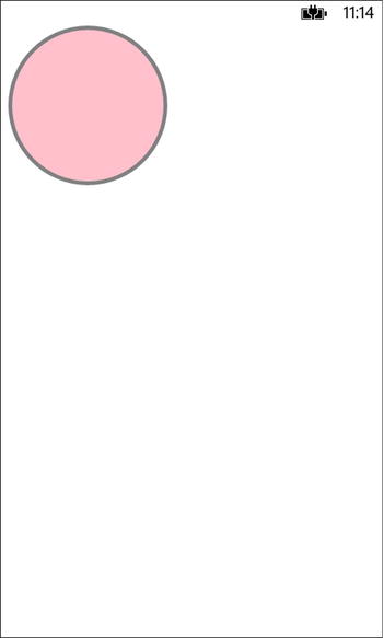
Figure 3-1. TapIt main page on initial launch
Test out the Tap gesture by tapping on the circle, pausing in between taps, to ensure only the Tap event is triggered. Notice that the circle’s Fill color changes with each tap.
Next, try double-tapping on the circle. This should create a copy of the circle and display it directly next to the circle. Continue to test this out until you fill the screen with circles. You should see something similar to what is depicted in Figure 3-2, although the colors will vary.

Figure 3-2. Result after testing out the DoubleTap event
Finally, let’s test the context menu. Tap and hold any of the circles on screen. The context menu should display in the location that you performed the tap and hold action, as shown in Figure 3-3.

Figure 3-3. Context menu is displayed for the shape that was tapped and held
Test out each menu item on the context menu to ensure the actions are working as expected.
To view the full source code for this applicaton, refer to the TapIt project in the Chapter 3TapIt directory.
3-3. Don’t Be A Drag, Just Flick It
Problem
You really like the app you created in Recipe 3-2, but you want to enhance it by allowing the user to drag objects around and remove them from the screen with a simple flick of the finger.
Solution
Leverage the GestureServicethat is packaged in the Windows Phone Toolkit to attach a GestureListener to the page, and include handlers for the DragStarted, DragDelta, DragCompleted, and Flick events.
How It Works
The Windows Phone Toolkit’s GestureListener simplifies the manner in which you can detect touch gestures in your application. It provides you with the ability to attach a listener to a FrameworkElement, and implement handlers for both single and multi-touch gestures. Table 3-3 lists the events that are available in the GestureListener class.
Table 3-3. Event Handlers Available in the Windows Phone Toolkit’s GestureListener Service
| Events | Event Arguments | Contains information about . . . |
|---|---|---|
| GestureBegin, GestureCompleted, Tap, DoubleTap, Hold | GestureEventArgs | The x- and y-coordinates of the position where the gestured occurred, either relative to a UIElement, or the overall content area. |
| DragStarted | DragStartedGestureEventArgs | Same as GestureEventArgs, as well as the direction of the drag (i.e., Horizontal or Vertical). |
| DragDelta | DragDeltaGestureEventArgs | Same as DragStartedGestureEventArgs as well as the distance the gesture has moved horizontally and vertically (HorizontalChange, VerticalChange) |
| DragCompleted | DragCompletedGestureEventArgs | Same as DragDeltaGestureEventArgs |
| Flick | FlickGestureEventArgs | Same as GestureEventArgs, as well as the angle, direction, vertical velocity and horizontal velocity of the gesture. |
| PinchStarted | PinchStartedGestureEventArgs | Same as GestureEventArgs, as well as the angle and direction of the gesture. |
| PinchDelta | PinchGestureEventArgs | Same as GestureEventArgs, as well as the distance ratio to handle scaling and total angle delta to handle rotation. |
| PinchCompleted | PinchGestureEventArgs | Same as above. |
In this recipe, we will build on the project we created in Recipe 3-2 to implement the GestureListener in place of the UIElement event handlers.
Create a new Visual Studio 2012 Windows Phone project, named “FlickIt”. Delete the default MainPage that was created in the new project. We will be adding a copy of the MainPage from the TapIt project, which was created in Recipe 3-2. Before doing so, we need to add the Windows Phone Toolkit into this project, as we will be using controls and classes contained within the toolkit. Follow the instructions provided in Chapter 2, Recipe 2-5, to add the toolkit into this project using NuGet.
Once the Windows Phone Toolkit has been added, right-click on the project name in the Solution Explorer panel, and select Add  Existing Item . . . from the menu. In the File Explorer dialog, browse to the TapIt project folder, select the MainPage XAML file, and click the “Add” button. This action will automatically create a copy of the MainPage.xaml file, and its code-behind file, in the current project directory. You can make changes to this file without it affecting the MainPage in the original TapIt project.
This page will serve as our starting point. The first change we will make is to modify the namespace in MainPage XAML and code behind files to match the namespace of our current project. In the XAML file, modify the x:Class attribute from x:Class="TapIt.MainPage" to x:Class="FlickIt.MainPage".In the code behind file, change the class namespace declaration from TapIt to FlickIt. Add the EllipseManager class from the TapIt project as well using the same approach, and update the class namespace to FlickIt.
The next step is to modify the XAML in MainPage to include the GestureListener within the WrapPanel.
<toolkit:WrapPanel x:Name="ContentPanel"
                   Grid.Row="1"
                   Grid.ColumnSpan="3">
    <toolkit:GestureService.GestureListener>
        <toolkit:GestureListener
        Tap="GestureListener_Tap"
        DoubleTap="GestureListener_DoubleTap"
        Hold="GestureListener_Hold"
        Flick="GestureListener_Flick"
        DragStarted="GestureListener_DragStarted"
        DragDelta="GestureListener_DragDelta"
        DragCompleted="GestureListener_DragCompleted" />
    </toolkit:GestureService.GestureListener>
</toolkit:WrapPanel>
Implementing the GestureListener on the WrapPanel removes the requirement for us to manually attach or detach event handlers to each new ellipse that is created. The listener will now “listen” for events on any UIElement that is added to the WrapPanel. Note that we still can do it in the traditional way, and attach a listener to each ellipse as it is created, but this approach is simple and straightforward. With that being said, we can now delete the AttachEventHandlers and RemoveEventHandlers methods, along with any calls made to those methods in the code behind file.
Managing the GestureListener Events
Next, we need to copy the code from the Ellipse_Tapped, Ellipse_DoubleTapped, and Ellipse_Held methods into the corresponding GestureListener methods: GestureListener_Tap, GestureListener_DoubleTap, and GestureListener_Hold.
Since we have attached the listener to the WrapPanel and not to each individual ellipse, it is a good idea to check that the object that triggered the event is in fact an Ellipse type. At first, you may think that this requires a check against the first parameter named sender. Unfortunately, that will not work, because the sender will not contain the object that triggered the event. The sender will be the object that has the listener attached, which in this case is the WrapPanel.
We need to check the GestureEventArgs class to determine the source object that triggered the event. This class contains a property called OriginalSource, which is an object type and will contain the object that actually triggered the event. So we will need to check OriginalSource to determine whether or not the object is an Ellipse type. If it is, then we can proceed with the desired action in each event. If it isn’t, we simply want to do nothing. So, let’s strap on some conditional checks to make this happen!
Listing 3-8. The GestureListener Events for Tap, DoubleTap, and Hold
private void GestureListener_Tap(object sender, Microsoft.Phone.Controls.GestureEventArgs e)
{
    if (e.OriginalSource.GetType().Equals(typeof(Ellipse)))
    {
        if (menuEllipse.IsOpen)
        {
            //if the context menu is open but the user taps
            //outside of the menu, then close it
            menuEllipse.IsOpen = false;
        }
        Ellipse sourceEllipse = (Ellipse)sender;
        sourceEllipse.Fill = EllipseManager.GetNextColor();
    }
}

private void GestureListener_DoubleTap(object sender, Microsoft.Phone.Controls.GestureEventArgs e)
{
    if (e.OriginalSource.GetType().Equals(typeof(Ellipse)))
    {
        AddNewEllipse();
    }
}

private void GestureListener_Hold(object sender, Microsoft.Phone.Controls.GestureEventArgs e)
{

    if (!ellipseInDragMode && e.OriginalSource.GetType().Equals(typeof(Ellipse)))
    {
        Ellipse sourceEllipse = (Ellipse)sender;

        //if the point touched is near the right edge of the screen, adjust the
        //HorizontalOffset for the context menu to ensure that it is displayed
        //within the bounds of the screen
        if ((lastTouchedPoint.X + listMenuItems.Width) > this.ActualWidth)
            lastTouchedPoint.X = this.ActualWidth - listMenuItems.Width;

        //if the point touched is near the bottom edge of the screen, adjust the
        //VerticalOffset for the context menu to ensure that it is displayed
        //within the bounds of the screen
        if ((lastTouchedPoint.Y + listMenuItems.Height) > this.ActualHeight)
            lastTouchedPoint.Y = this.ActualHeight - listMenuItems.Height;

        menuEllipse.HorizontalOffset = lastTouchedPoint.X;
        menuEllipse.VerticalOffset = lastTouchedPoint.Y;
        menuEllipse.IsOpen = true;

        //set the Tag of the context menu to the selected ellipse
        //so that on menu item selection, the action that is taken
        //against the shape that triggered the event
        menuEllipse.Tag = sourceEllipse;
    }
}
That seems to do the trick, but something is missing. Did you spot the next change that is necessary to ensure our app doesn’t crash and burn on the first touch-based gestured?
If you said that we need to change the line of code that casts the sender to an Ellipse, then you’re right! If you said that we need to throw in some exception handling, you’re also correct!
Change the line in the Tap and Hold events from
Ellipse sourceEllipse = (Ellipse)sender;
to
Ellipse sourceEllipse = (Ellipse)e.OriginalSource;
Go ahead and include exception handling in each event, if you’re feeling up to it. Since this recipe is about gestures rathar than exception handling, I won’t cover it here. If you do not know how to add exception handling in your code, it’s time to visit the Microsoft Developer Network site, http://msdn.microsoft.com, and search for articles on exception handling in C#.
Now that we have our modifications done, feel free to compile and run the app to test it and make sure the Tap, DoubleTap, and Hold gestures still behave as expected.
Next we will provide some code to allow the user to drag any ellipse across the screen. When the user starts to drag an ellipse, we want the border color to change to yellow, so that it is obvious which ellipse is selected for the drag operation. As the user drags a finger across the screen, we want the ellipse to follow the same direction. And finally, when the user stops dragging, we want the ellipse’s border to return to the default gray color. The resulting code is depicted in Listing 3-9.
Listing 3-9. Handling the Drag Gestured-Based Events
private void GestureListener_DragStarted(object sender, Microsoft.Phone.Controls.DragStartedGestureEventArgs e)
{
    if (e.OriginalSource.GetType().Equals(typeof(Ellipse)))
    {
        ellipseInDragMode = true;

        Ellipse targetEllipse = (Ellipse)e.OriginalSource;

        ContentPanel.Children.ToList().ForEach(c => c.SetValue(Canvas.ZIndexProperty, 0));
        targetEllipse.SetValue(Canvas.ZIndexProperty, 1);

        //change the border of the object that is being dragged
        targetEllipse.Stroke = new SolidColorBrush(Colors.Yellow);
    }
}

private void GestureListener_DragDelta(object sender, Microsoft.Phone.Controls.DragDeltaGestureEventArgs e)
{
    if (e.OriginalSource.GetType().Equals(typeof(Ellipse)))
    {
        Ellipse targetEllipse = (Ellipse)e.OriginalSource;

        TranslateTransform transform = targetEllipse.RenderTransform as TranslateTransform;
        transform.X += e.HorizontalChange;
        transform.Y += e.VerticalChange;
    }
}

private void GestureListener_DragCompleted(object sender, Microsoft.Phone.Controls.DragCompletedGestureEventArgs e)
{
    if (e.OriginalSource.GetType().Equals(typeof(Ellipse)))
    {
        ellipseInDragMode = false;

        Ellipse targetEllipse = (Ellipse)e.OriginalSource;

        //reset the border to the default color
        targetEllipse.Stroke = new SolidColorBrush(Colors.Gray);
    }
}
It would also be a nice touch to display the x- and y-coordinates that the user’s finger crosses as the ellipse is dragged across the screen. Let’s go ahead and add a TextBlock below the WrapPanel in the MainPage XAML file. Since the default behavior when adding more than one UIElement to a Grid is to center them so they all appear on top of each other, we need to define rows to ensure the new TextBlock does not overlap with the WrapPanel. We will use the RowDefinitions collection and RowDefinition element on the Grid to explicitly define two rows.
<Grid.RowDefinitions>
    <RowDefinition />
    <RowDefinition Height="Auto" />
</Grid.RowDefinitions>
Notice the Height attributes defined on the second row. A value of Auto simply indicates that the second row will only take up as much space as the elements contained within it require. Without this in place, each row will take up equal parts of the screen, thereby reducing the screen real estate for the WrapPanel, which is not the desired result. We want the WrapPanel to continue to take up the majority of the screen, with just enough room at the bottom left over to display the coordinates.
Now we can add the TextBlock to the Grid, and name it coordinatesText, since we plan on updating it from the code behind file. We also need to specify that the TextBlock is to be displayed in the second row. To accomplish this, we simply set the Grid.Row property on the TextBlock itself. This is called an attached property, because its value is specified on the child element and not the Grid itself.
<TextBlock Name="coordinatesText" Grid.Row="1" />
The default value is zero, which means those elements that do not specify a value for Grid.Row will be placed in the first row. Grid row and column values are zero-based. We do not have to specify a row value for the WrapPanel, so remove it if one is specified. We will need to specify a row value for the TextBlock, which will end up being Grid.Row="1", to ensure it will be displayed in the second row.
With the TextBlock in place, we can now return to the code behind and add some code to the DragDelta event to display the x- and y-coordinates of the user’s finger as it travels across the screen. The DragDeltaGestureEventArgs class contains a method called GetPosition, which returns a Point object. This method allows us to obtain the Point containing the coordinates of the touch action relative to another UIElement. If null is passed into the method, we will receive the screen coordinates. We want to display the screen coordinates, so we will call this method and pass in null. We will then display the result in the TextBlock, as shown in Listing 3-10.
Listing 3-10. GestureListener’s DragDelta Event Modified to Include Displaying Coordinates of Last Touch Point in the UI
private void GestureListener_DragDelta(object sender, Microsoft.Phone.Controls.DragDeltaGestureEventArgs e)
{
    if (e.OriginalSource.GetType().Equals(typeof(Ellipse)))
    {
        Ellipse targetEllipse = (Ellipse)e.OriginalSource;

        TranslateTransform transform = targetEllipse.RenderTransform as TranslateTransform;
        transform.X += e.HorizontalChange;
        transform.Y += e.VerticalChange;

        //display the last touched point's coordinates
        //as the user drags a finger across the screen
        Point lastPosition = e.GetPosition(null);
        coordinatesText.Text = string.Format("X:{0}, Y:{1}",
                                            lastPosition.X,
                                            lastPosition.Y);
    }
}
As a nice finishing touch, let’s add a reset button within the same row as the coordinatesText control:
<Button Name="resetButton"
        Content="reset"
        Grid.Row="1"
        Grid.Column="1"
        Width="200"
        Tap="resetButton_Tap" />
Include the following code in the MainPage code-behind for the reset button’s Tap event:
private void resetButton_Tap(object sender, System.Windows.Input.GestureEventArgs e)
{
    ContentPanel.Children.Clear();
    EllipseManager.ResetCounter();
    AddNewEllipse();

    coordinatesText.Text = "X:0, Y:0";
}
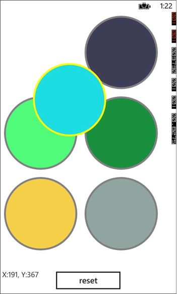
At this point, you can compile and run it again to see the newly wired events in action. Use the context menu or the double-tap action to add some ellipse shapes to the screen. Now select each one and drag it around the screen. Notice the change in the border color of the ellipse that is being dragged as well as the change in coordinates at the bottom of the screen. Pretty exciting stuff, eh?
Let’s wrap it up by going back to the code and adding in some logic for the Flick event to make this a complete recipe. After all, the project is called FlickIt. So let’s make that happen!
In the GestureListener_Flick event, we are going to include checks to determine the direction of the flick, along with the velocity that the flick occurred. For this example, we will delete the ellipse that is flicked only when the flick occurs in an upward direction and with a velocity that ensures that the action was deliberate. We will choose a velocity constant that we can use to compare against. Since we want to only check for flicks in the upward direction, this means the velocity check needs to be a negative number, so we will use the number -3000. This is just an example, and you can check velocity to any value that you deem to make sense in the context of your app. Once we have determined the flick was a deliberate action, we will perform our desired action, as shown in Listing 3-11. In this case, we will delete the ellipse.
Listing 3-11. Delete the Ellipse When the User Flicks it Upward
private void GestureListener_Flick(object sender, Microsoft.Phone.Controls.FlickGestureEventArgs e)
{
     if (e.OriginalSource.GetType().Equals(typeof(Ellipse)) &&
           e.Direction == System.Windows.Controls.Orientation.Vertical &&
           (e.VerticalVelocity < -3000))
     {
          Ellipse targetEllipse = (Ellipse)e.OriginalSource;
          DeleteEllipse(targetEllipse);
     }
}

private void DeleteEllipse(Ellipse deleteEllipse)
{
     //detach the event handlers and remove the selected shape
     ContentPanel.Children.Remove(deleteEllipse);
     EllipseManager.DecrementCounter();
}
As you can see, we are only processing the delete if the flick is in an upwards direction, that is a vertical direction and a negative velocity rate.
Compile the project one more time, and test it either in the emulator or on a device. Add a few ellipse shapes to the screen, then try and “flick” each one off the screen in every possible direction. Verify that the only time the shape is deleted is when the shape is flicked upward.
To view the full source code for this applicaton, refer to the FlickIt project in the Chapter 3FlickIt directory.
Problem
You want your app to load a photo, and allow the user to use pinch gestures to zoom in and out of the photo.
Use the GestureService to attach a GestureListener to the Image element in your Visual Studio project, and include handlers for the PinchStarted, PinchDelta, and PinchCompleted events.
How It Works
As we touched on in Recipe 3-3, Table 3-2, the GestureListener provides event handlers for pinch gestures, including PinchStarted, PinchDelta, and PinchCompleted. We will create a new Windows Phone project which will load a photo, attach a listener to its image element, and zoom in/out of the photo when the user uses two fingers to manipulate the photo.
Create a new Visual Studio 2012 Windows Phone project, and name the project “PinchIt”. As was done in the previous recipes, we need to add the Windows Phone Toolkit into this project to leverage the GestureService to attach a GestureListener to our photo. Follow the instructions provided in Chapter 2, Recipe 2-5, to add the toolkit into this project using NuGet.
In the MainPage markup, add an Image element to the LayoutRoot grid, defining the size of the image that will display on initial load of the application. In this example, I’ve included a photo that I took while on vacation at a cottage in Tobermory. It is packaged in with the source project that is shipped with this book.
We also need to associate a transformation object with the image to simplify the manner in which the image is scaled as the pinch action takes place. For this, we will define a ScaleTransform object to handle the transformation.
<Grid x:Name="LayoutRoot" Background="Transparent">
   <Grid.RowDefinitions>
       <RowDefinition />
       <RowDefinition Height="Auto" />
   </Grid.RowDefinitions>
   <Image Name="myPhoto"
         Source="AssetsMillerLake.png"
         Height="300" Width="400">
       <Image.RenderTransform>
           <ScaleTransform x:Name="photoTransform" />
       </Image.RenderTransform>
   </Image>
   <TextBlock Name="photoScaleText" Grid.Row="1" />
</Grid>
Now, be sure to include a TextBlock in the markup that we will use to display the size of the photo on initial load. We will update the message as the photo is manipulated by the user. In Recipe 3-3, we demonstrated the approach taken to add a GestureListener in XAML.
For this example, we will add the GestureListener programmatically in the code behind, within the Loaded event of the MainPage. This is achieved by calling the GetGestureListener method on the GestureService class, and passing in the Image element. This method will return the listener that is attached to the object, which is passed in as a parameter during the method call. If a listener has not yet been attached to the object, it will create a new listener, attach it to the object, and return it. With a handle to the listener, we can now wire up the events we want to code actions for. For this recipe, we will only handle the three pinch-based events. Finally, we will set the default text to display the initial size of the photo on load, as shown in Listing 3-12.
Listing 3-12. Registering Event Handlers for the Pinch Events
void MainPage_Loaded(object sender, RoutedEventArgs e)
{
    GestureListener listener = GestureService.GetGestureListener(myPhoto);

    listener.PinchStarted += new EventHandler<PinchStartedGestureEventArgs>(GestureListener_PinchStarted);

    listener.PinchDelta += new EventHandler<PinchGestureEventArgs>(GestureListener_PinchDelta);

    listener.PinchCompleted += new EventHandler<PinchGestureEventArgs>(GestureListener_PinchCompleted);

    photoScaleText.Text = string.Format("Size: {0}X{1}",
                                    myPhoto.Width, myPhoto.Height);

}
Managing the GestureListener’s Pinch Events
In the PinchStarted event, we will capture the current scale value of the image, obtain the coordinates of the touch points invoked by the user relative to the photo, and perform a simple calculation to set the center axis of the image’s scale transformation.
As the user conducts the pinch gesture, we will update the horizontal and vertical scale of the image based on the distance ratio obtained from the PinchGestureEventArgs class within the PinchDelta event. We will also update the TextBlock to indicate that a pinch action is in progress and the current scale value.
Finally, for the PinchCompleted event, we don’t really need to do anything except update the TextBlock to reflect that the pinch action has completed and display the current photo scale. The resulting code for these events is shown in Listing 3-13.
Listing 3-13. Using Pinch Events to Scale the Size of an Image
private double imageScale = 1;
void GestureListener_PinchStarted(object sender, PinchStartedGestureEventArgs e)
{
    //get the current photo's scale value
    imageScale = photoTransform.ScaleX;

    //get the two touch points
    Point touchPointA = e.GetPosition(myPhoto, 0);
    Point touchPointB = e.GetPosition(myPhoto, 1);

    //set the photo center x and y axis to the center of the
    //corresponding axis between the two touch points
    photoTransform.CenterX = touchPointA.X + (touchPointB.X - touchPointA.X) / 2;
    photoTransform.CenterY = touchPointA.Y + (touchPointB.Y - touchPointA.Y) / 2;
}

void GestureListener_PinchDelta(object sender, PinchGestureEventArgs e)
{
    //scale the photo as the pinch gesture changes
    photoTransform.ScaleX = imageScale * e.DistanceRatio;
    photoTransform.ScaleY = photoTransform.ScaleX;

    photoScaleText.Text = string.Format("Size: {0}X{1}, Scale:{2} - Pinch In Progress",
        myPhoto.Width, myPhoto.Height, Math.Round(photoTransform.ScaleX, 2));

}
void GestureListener_PinchCompleted(object sender, PinchGestureEventArgs e)
{
    photoScaleText.Text = string.Format("Size: {0}X{1}, Scale:{2} - Pinch Completed",
        myPhoto.Width, myPhoto.Height, Math.Round(photoTransform.ScaleX, 2));

}
Now we can compile this app and run it in the emulator, but we will not be able to test it. The emulator does not support multi-touch gestures. So the most you can do is view the photo, as shown in Figure 3-5.

Figure 3-5. Initial view of the PinchIt app on load
We will need to test this app on an actual device. If you do not know how to unlock your Windows Phone device for testing, revisit Chapter 1, Recipe 1-4, which discusses this topic in detail. Once you have a developer unlocked phone, run and test this app on the device, testing out the gestures to zoom in and out of the photo. Notice that the size of the image remains the same, as indicated in the TextBlock. It is the scale value that changes, in turn causing the photo to zoom in by increasing the image scale or zoom out by decreasing the image scale.
To view the full source code for this applicaton, refer to the PinchIt project in the Chapter 3PinchIt directory.
3-5. Be Generous With Size and Considerate Of Space
Problem
You developed a Windows Phone app, but users are complaining that every time they try to tap the update button, the cancel button is hit instead and they lose their changes!
Solution
Follow the Microsoft Design Guidelines to ensure you are setting your controls to an appropriate size if they are touch targets and to ensure you are providing adequate spacing between controls in the UI.
How It Works
For first-time app developers that are testing in the emulator, the size of the emulator screen on a laptop or regular PC monitor can be deceiving. Text that appears to be large enough to read on a monitor may be barely legible on a device. Buttons that seem large enough to be hit with the tiny little mouse cursor on your screen, may be difficult for a user to accurately hit on an actual device screen.
The same principal applies to spacing considerations. What may look like sufficient spacing on a larger screen may not be adequate on a device, in turn causing headaches for the user. There’s nothing more frustrating than trying to tap one button, but another button receives the event, causing undesirable results.
The main goal when designing an app is to simplify user interaction. Big buttons, larger text, and adequate spacing between controls can make all the difference in your app’s usability. For example, any element that is expected to serve as a touch target should be at least 34 pixels in size, according to Microsoft’s design guidelines. These guidelines also indicate that a minimum space of 8 pixels should be allocated between controls, but I prefer to give a little more space than that if I can afford it on the screen (i.e., at least 10 pixels).
If a target element is expected to receive heavy user interaction, consider making it larger. If you must set the size of a target element to a smaller value than the standard 34 pixel size, you may be able to get away with including an element that is no smaller than 26 pixels. Designing your target elements to be any smaller may result in the user fussing around, and failing miserably, in attempting to hit the target. If the user becomes aggravated when trying to use your app in the first few minutes, the likelihood is greater that your app will be uninstalled. Think of the size difference between the narrow mouse cursor and a rounded fingertip. The odds are higher that the fingertip will miss the intended target and hit another target if both elements are too close together on the screen, and not a proper size (i.e., too small to accurately hit).
Refer to Microsoft’s Design library for Windows Phone which discusses best practices in designing your app, specifically around UI design and interactivity with Windows Phone. These guidelines can be found at the following URL, within the section titled “UI design and touch input”: http://msdn.microsoft.com/en-us/library/windowsphone/develop/jj207076(v=vs.105).aspx
The best way to determine if your app design is simple and easy to use is to test on a device. Once you are satisfied with the interaction on a device, hand it over to a real user and watch his reaction as he learns how to use the app. If the user is able to get in and understand the app’s purpose and is able to use it with ease, then your app is ready to be published to the Windows Phone Store!