
Using Properties in Custom Controls
When you’re writing a custom Silverlight control extension, you can bind the attributes of UI elements to the values that a developer enters in the Visual Studio screen designer (Figure C-1).
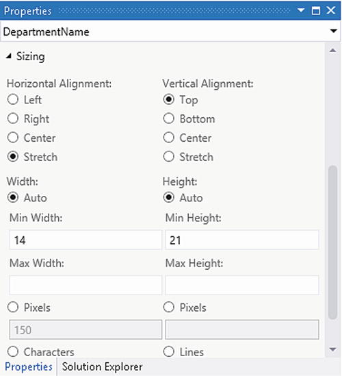
Figure C-1. Property values that developers can modify
Chapter 12 (Listing 12-7) highlights a piece of XAML that includes a custom control that consumes the values from the property sheet. An excerpt of this code is shown in Listing C-1.
Listing C-1. Using Property Names
<StackPanel
   Width="{Binding Properties[Microsoft.LightSwitch:RootControl/Width]}"
   Height="{Binding Properties[Microsoft.LightSwitch:RootControl/Height]}"
   VerticalAlignment ="{Binding
      Properties[Microsoft.LightSwitch:RootControl/VerticalAlignment]}">

   <TextBlock
           Text="{Binding Value, Mode=OneWay,
               Converter={StaticResource formatter}}"
           TextAlignment="{Binding
               Properties[Microsoft.LightSwitch:RootControl/TextAlignment]}">
The data Binding syntax that’s shown here includes the property names Width, Height, TextAlignment, and VerticalAlignment. You can use these property names in your XAML and .NET code, and the purpose of this appendix is to show you a list of property names that you can use.
These appearance properties are examples of “opt-out” properties. These refer to properties that LightSwitch automatically shows in the property sheet:
- AttachedLabelPosition
- HeightSizingMode
- WidthSizingMode
- MinHeight
- MaxHeight
- MinWidth
- MaxWidth
- Height
- Width
- Rows
- Characters
- VerticalAlignment
- HorizontalAlignment
The other group of property names that you can refer to are “opt-in” properties. By default, these properties don’t show up in Visual Studio’s property sheet. To make them appear, you’ll need to set the property’s EditorVisibility value to PropertySheet in your custom control’s LSML file, as shown in Listing C-2. Refer to Chapter 12 (Listing 12-23) to see a full example of a custom control’s LSML file.
Listing C-2. Showing Properties in Visual Studio’s Property Sheet
<Control.PropertyOverrides>
      <!-- Support Show As Link property -->
      <ControlPropertyOverride
        Property=":RootControl/Properties[ShowAsLink]"
        EditorVisibility="PropertySheet"/>
</Control.PropertyOverrides>
The two EditorVisibility values that you can set are
- NotDisplayed
- PropertySheet
Here’s a full list of opt-in properties that you can use:
- ShowAsLink
- FontStyle
- TextAlignment
- BrowseOnly
- Image
To see an example of two of these properties, you can look at the Label control, which is a built-in LightSwitch control that applies the ShowAsLink and FontStyle properties. To see screenshots of these properties, refer to Figure 3-29 and Figure 3-26, respectively.