C H A P T E R 17
PerformancePoint Services
In this chapter, we will discover how PerformancePoint Services allows us to build integrated business intelligence solutions that bring these capabilities together into powerful interactive dashboards.
What Will You Learn in This Chapter?
- Introduction to PerformancePoint Services
- The architecture of PerformancePoint Services
- Setting up PerformancePoint Services
- Authoring and publishing PerformancePoint solutions in SharePoint 2010
- Integrating PerformancePoint dashboards with Visio and Excel Services
- Managing PerformancePoint using PowerShell
Software Prerequisites
- SharePoint Server 2010 Enterprise Edition
- Office Excel 2010
- Office Visio 2010
- SQL Server 2008 R2 / SQL Server 2008
- AdventureWorks Database (SQL Server 2008 R2) downloadable at
http://msftdbprodsamples.codeplex.com/ - SQL Server 2008 R2 Client Tools – downloadable at
http://technet.microsoft.com/en-us/library/ms143219.aspx
Introduction
Though PerformancePoint Services is a new feature in SharePoint Server 2010, it is far from being a new product. Like many Microsoft products, including SharePoint itself, PerformancePoint has a long, and sometimes inglorious, history.
In the early years of this century, the “scorecard” became a popular business metaphor for bringing together related pieces of information from throughout the enterprise to provide decision makers with a high-level view of the business. Special-purpose scorecards like the “Balanced Scorecard” became popular but there were no good tools available to deliver them. After a few attempts at getting Excel and web-based templates deployed, Microsoft published the Office Business Scorecard Manager 2005.
In 2007, Microsoft purchased ProClarity Corporation, thereby acquiring one of the premiere business intelligence software companies. Microsoft immediately began integrating features of ProClarity's rich server- and client-based data analysis tools into its products.
When MS PerformancePoint Server was released in 2007, it contained two major modules: monitoring & analysis (M&A) and planning. The M&A component combined the features of the Business Scorecard Manager product with new capabilities brought in from ProClarity and saw good adoption. Use of the planning module, however, was sparse and in 2009, Microsoft dropped it due to lack of market interest. What remained of PerformancePoint was then rolled into the enterprise license of Microsoft Office SharePoint Server (MOSS) 2007. In fact, at that point, the MS PerformancePoint Server 2007 product could be loaded onto a MOSS server farm (with Enterprise Client Access Licenses, or CALs) without additional licensing.
Now, with the release of SharePoint Server 2010, PerformancePoint has become a fully integrated service within the SharePoint environment. You get all of SharePoint's administration and content management tools along with the analytic abilities of PerformancePoint.
PerformancePoint Services Architecture
PerformancePoint Services is implemented using the new service application framework introduced in SharePoint Server 2010. In the same way that Excel Services and Visio Services run as separate service processes, so does PerformancePoint.
Service Components and Interfaces
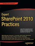
Figure 17–1 shows the primary components that cooperate to provide the business intelligence experience PerformancePoint Services makes possible.
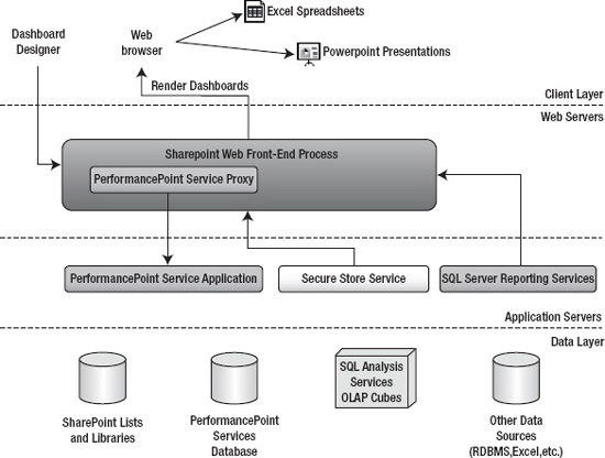
Figure 17–1. PerformancePoint services and related components
The PerformancePoint end-user experience is designed to be very simple. A PerformancePoint dashboard is deployed as nothing more than a folder containing one or more web pages within a SharePoint library. These pages contain all of the user interface elements necessary to perform complex business analysis on the underlying business data. This user interface is designed to require very little specialized training. With some experience, most users find the scorecards, charts, and reports very easy to interpret and manipulate. All of this content is delivered via a web browser, of course, but there are also many opportunities to take data offline into office applications such as Excel for deeper ad hoc analysis.
In order to deliver this sophisticated user interface, the KPIs, scorecards, dashboards, and other BI components must first be defined and deployed to SharePoint. The tool for accomplishing this is the Dashboard Designer, a Windows application for defining BI components and deploying them to SharePoint. This tool does not need to be separately downloaded and installed. It is automatically installed as a “one-click” application when needed. See “Authoring and Publishing PerformancePoint Solutions” later in this chapter for a tour of this tool. Note that this is a development tool and is not designed for use by most end users.
At the application layer, PerformancePoint conforms to the typical design of a SharePoint service. It is made up of a service process and a proxy component. The proxy component provides code running within the IIS application pool process with access to the functionality of the PerformancePoint service application. The service runs as an independent process in the operating system and is often deployed on a separate tier of application servers that sits between the web front-end server and the database servers, as shown in Figure 17–1.
Other application-level services commonly employed as part of a PerformancePoint solution include the Secure Store Service (SSS) and SQL Server Reporting Services (SSRS). SSS provides a location for logon credentials to be securely stored within the SharePoint environment. For more details on the purpose and configuration of the Secure Store Service, see Chapter 5. While not part of SharePoint Server, the SSRS component of SQL Server is frequently leveraged in conjunction with PerformancePoint solutions due to the ease with which it allows complex reports to be created and delivered.
On the database layer of the architecture, there are several data sources you'll have to become familiar with.
SharePoint Content Lists and Libraries
As you are probably aware, SharePoint stores its web site contents in content databases. These databases contain the site collections, sites, lists, libraries, and pages that make up the sites served by SharePoint. In the context of PerformancePoint, most of the business intelligence objects, including the dashboards themselves, are also stored in lists and libraries within SharePoint's content databases.
PerformancePoint Service Databases
Like the other service applications in SharePoint Server 2010, PerformancePoint Services needs to store data that does not fit well into the usual format of lists and libraries in SharePoint. This data is stored in a separate database that's created when a new instance of the PerformancePoint service application is created. The tables in this database, like all SharePoint databases, should never be manipulated directly but only through PerformancePoint Services. These tables contain various parameters used by PPS, as well as dashboard annotations and comments entered by users.
SQL Server Analysis Services (SSAS) Cubes
Because of the types of analysis normally performed with PerformancePoint Services, perhaps the most common data source for Key Performance Indicators (KPIs), scorecards, and dashboards is SQL Server Analysis Services (SSAS). The cubes stored in SSAS contain the raw business information that PPS will “slice and dice” to perform the analysis required by the user. For a full description of using SSAS cubes to store and manipulate multidimensional data, see Chapter 1.
Other Reporting Data Sources
While SQL Analysis Services is the most common source of information for PPS dashboards, it is far from the only option. Any data store from which you can read data is a potential data source for PerformancePoint. Additional data sources supported out of the box include SQL Server relational tables, Excel spreadsheets (either file-based or via Excel Services), and SharePoint lists.
With a little more effort, you can expand the available data sources to include any ODBC-compliant relational database and even data accessed via custom code written and deployed by the user's organization. For details on creating custom data source providers for PerformancePoint Services, see msdn.microsoft.com/en-us/library/bb8317514.aspx. To access other non-Microsoft databases, you can use either Business Connectivity Services (see Chapter 4) to expose the data as a SharePoint list or a SQL linked server to expose the data as a SQL Server table (msdn.microsoft.com/en-us/library/ms188279.aspx).
Securing PerformancePoint Solutions
Much of the security for a PerformancePoint solution is handled by the SharePoint Foundation component. The dashboards exposed by PerformancePoint Services are stored as ASPX pages in a folder within a SharePoint document library. The permissions associated with the libraries, folders, and dashboard pages will control who is allowed to access which pages.
However, the page itself is not usually what is most important. It is the data that we want to protect. Security can become problematic when we have to access data sources outside of SharePoint. PerformancePoint Services provides three authentication methods for accessing backend data sources: per-user identity, an unattended service account (USA), and a custom connection string for SQL Server Analysis Services.
Per-user identity allows a PPS dashboard to impersonate the user's credentials when accessing backend data. This is a very secure way to access data because it provides a second check before allowing the user to access not just the dashboard, but the data underlying the dashboard. However, this form of authentication requires Kerberos delegation to be in place between the PerformancePoint server and the data source, so it's not always possible to use this type of authentication. See “Planning Considerations for Services that Access External Data Sources” at technet.microsoft.com/en-us/library/cc5170988.aspx#ConsiderationsForAccessingExternalData.
The most commonly used form of authentication with PerformancePoint services is the unattended service account. This is an account that is configured in the Secure Store Service and used to access a backend data source. The data source will see only the service account's credentials, so it will not be able to filter the data it returns based on the identity of the user accessing the dashboard. The service account must be given access to all necessary data within all data sources in order for PerformancePoint to function properly. It is a best practice to use a service account with the least permissions that will allow it to access the needed data.
The last option, called “Custom Data,” uses the unattended account but also includes the user's login name on the connection string. This option works only with SQL Server Analysis Services 20017 or later. In SSAS, this is known as “Dynamic Security.” The idea is to allow the SSAS server to filter the query results when full Kerberos delegation is not possible. The user's login can be used in MDX queries and SSAS role assignments to limit the data returned by the cube.
The most important thing to note when choosing among these authentication options is that the choice can now be made for each data source that is configured. In PerformancePoint Server 2007, it was necessary to configure a single authentication mode for the entire server application. It was not possible to configure one data source using per-user identity and another to use an unattended service account. In SharePoint 2010, if multiple types of authentication are required, you don't need to configure multiple PerformancePoint service application instances. Creating separate data sources is sufficient. However, the unattended account is configured for a PPS application instance so all data sources running against the USA in that instance will use the same account. See “Setting up PerformancePoint Services” and “Creating a Data Source” later in this chapter for details.
Business Intelligence Solution Components
A PerformancePoint solution is built by creating a set of business intelligence components that work together to control how business data is aggregated and displayed. This section will introduce the concepts behind these components and how they are deployed to a PerformancePoint service environment. For a step-by-step guide to creating a real-world PPS solution, see “Authoring and Publishing PerformancePoint Solutions” later in this chapter.
BI Component Types
The components that go into a PerformancePoint solution are described at a conceptual level in this section. Later we'll describe how these components are represented and stored in SharePoint.
Dashboards
A dashboard is a set of web pages displayed by SharePoint to allow the user to view and analyze data. Figure 17–2 shows a sample dashboard.
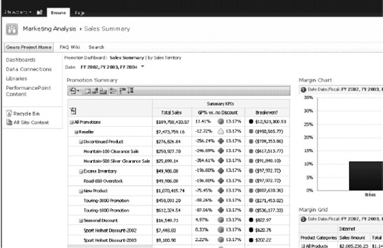
Figure 17–2. A typical PerformancePoint dashboard
A dashboard page consists of several parts. Typically, a page contains a navigation area at the top of the page, as shown in Figure 17–3. In this case, the pages of the dashboard, “Sales Summary” and “by Sales Territory,” are presented as links in the header of the page. Clicking on an active link takes the user to a new page in the dashboard while preserving the filters used on the current page. This allows multiple pages to act as a single dashboard.
Figure 17–3. Dashboard navigation links
The rest of the page is separated into zones, similar to the web part zones used in SharePoint pages. The difference is that dashboard zones can be added, modified, and removed from a dashboard page after it is created. These zones allow dashboard components, including filters, scorecards, and reports, to be stacked and connected in the same way web parts can be manipulated on a web part page. Figure 17–4 highlights the zones and direction (vertical vs. horizontal) of the default dashboard page layout.
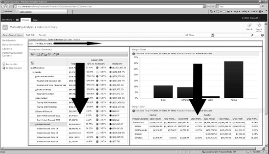
Figure 17–4. Default dashboard zones
The BI components that make up the page are assembled, arranged, and connected using the Dashboard Designer. When the dashboard is deployed to SharePoint, the various object definitions control the page's behavior. A common pattern, as shown in Figure 17–4, is to place visible filters in the header zone of the page and then to fill the other zones with scorecards and reports as needed.
The connections created between components allow them to act together. For example, when the user changes the Date filter on the sample dashboard, each of the scorecards and reports on the page are updated to reflect data only from those periods. When a row is selected in the scorecard shown on the left, the data on the reports in the right column are filtered to match. We will be creating this dashboard and its connections later in this chapter.
Indicators and Key Performance Indicators
A Key Performance Indicator is a definition of business-relevant measurements (or “metrics”) used to display easy-to-understand conditions as shown in Figure 17–5.
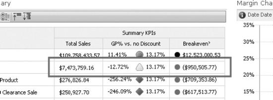
Figure 17–5. A key performance indicator
KPIs are defined in PerformancePoint as a set of metrics that are either “actual” or “Target” metrics. Actual metrics are the values that are calculated from the underlying business data. In the example in Figure 17–5, “Total Sales” is an actual metric. Target metrics, in contrast, define a desired goal for the actual metric, based on some condition or formula specified as part of the KPIs definition. The “GP% vs. no Discount” column is a target metric in this example. Target metrics can be displayed in several ways but include three basic components: the indicator and a value before and/or after the indicator. The meaning of these values can be defined wherever the KPI is displayed. In this case, the highlighted line shows an actual value of “-12.72%”, a yellow triangle indicator, and a target value of “13.17%”.
The definition of the KPI specifies where the actual and target values come from as well as what type of indicator to show. PerformancePoint comes with a large set of indicators to choose from, as Figure 17–6 shows. Through Dashboard Designer you can also create your own custom indicators using custom images.
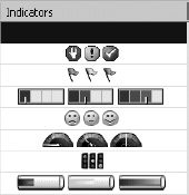
Figure 17–6. Some common indicator types
Data Sources
The first components to be created in a PerformancePoint solution are data sources. These define the locations and parameters to use when accessing the data that will be used by the dashboard. PerformancePoint supports two major categories of data sources: tabular and multidimensional.
Tabular data sources are those that provide PPS with a relational table of data to work with. The most commonly used data sources of this type are SQL Server tables. Other options include cells retrieved from Excel spreadsheets, either through Excel Services or directly from a file, or the items in a SharePoint list. It is also possible to use SharePoint's Business Connectivity Services (BCS) or SQL linked servers to pass data from other RDBMS or line-of-business applications into a PerformancePoint dashboard.
Multidimensional data sources are the most common type used in PerformancePoint solutions. They use SQL Server Analysis Services (SSAS) cubes to furnish and process data. Analysis Services is the only currently supported OLAP data source.
Filters
Filters are components that let users select parts of the data set to examine while excluding the rest. For example, you can use a filter to examine data only for certain time periods, as Figure 17–7 shows.
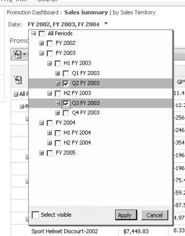
Figure 17–7. A multi-selectable member-selection filter
When creating a filter, there are two primary considerations: the type of filter and the display method to be used.
The types of filters available are:
- Custom Table: This filter connects to a tabular data source to retrieve a list of options from a table.
- MDX Query: This filter evaluates an MDX query against an OLAP data source to produce a set of members to serve as options in the filter control.
- Member Selection: This filter takes its options directly from a dimension in an OLAP data source, which can be either all members or a subset of the members in the dimension.
- Named Set: This filter uses an SSAS Named Set (i.e., an MDX expression) to evaluate which members to include. Note that SQL Server 2008 introduced the concept of “dynamic” named sets that are context-aware, which can make them very powerful in this context. For more information on SSAS Named Sets, see
msdn.microsoft.com/en-us/library/ms11717594.aspx. - Time Intelligence: This filter uses time dimensions in a way that lets users make time-based selections such as “year-to-date,” “last six months,” or “last year”. The developer specifies formulas that select a subset of the time dimension's members to include in the calculation.
- Time Intelligence (Connection Formula): This variation on the Time Intelligence filter allows the user to select a single “current date.” When connected to a dashboard, this date is evaluated against a date formula to create a dynamic time period based on that date. The user can therefore specify, for example, “5/11/2010” and generate a report on the six months of data prior to that date.
Once the type of filter has been selected, it can be displayed in three different ways.
- List: The filter options are presented in a drop-down list control as a flat list from which only one item can be selected.
- Tree: This form displays a hierarchical tree of members from which one option can be selected.
- Multi-Select Tree: This control, shown in Figure 17–7, also displays a tree but allows the user to select an arbitrary set of members from the tree.
When a filter is placed on a dashboard, it is not just a user interface control that controls the data displayed on that page. The selections made are written to PerformancePoint's database for later use. If the user returns to that page days later, that selection will still exist. The number of days the selection is retained can be configured in SharePoint Central Administration. See “Setting up PerformancePoint Services” later in this chapter. Because the filter is part of the dashboard, not just the page, that same filter selection will also be transferred to any other page that is part of the same dashboard. Therefore, if a selection is made on one page and then the user navigates to another page on the same dashboard, all of the filter selections made on the previous page apply to the new page as well.
Scorecards
A PerformancePoint scorecard, shown in Figure 17–8, is used to display a set of key performance indicator metrics. You can configure the KPIs to display differently depending on what you need the scorecard to reflect. For example, the designer may choose to use a background color for a KPI cell instead of displaying the indicator image.
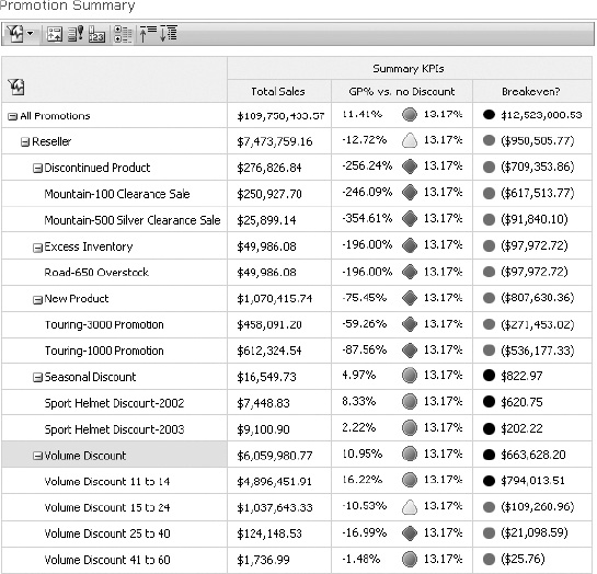
Figure 17–8. A PerformancePoint scorecard
In addition to the KPI metrics, scorecards generally also include one or more sets of dimension attributes that are used to drill down or roll up the KPIs.
Reports
A report in PerformancePoint refers to a component that displays business data other than KPIs. Reports are authored separately and then connected to the filters and scorecards on a dashboard to filter the data returned in the report. Our sample dashboard contains two of the most common reports used in PerformancePoint server: the analytic chart and the analytic graph (Figure 17–9).
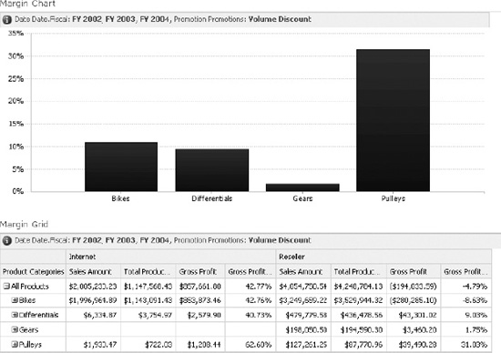
Figure 17–9. Analytic chart and graph reports
PerformancePoint generates some reports entirely within itself but some reports are created in cooperation with other technologies. Here are the report templates supported:
- Analytic Grid: As shown in Figure 17–9, this type of report displays figures as a set of rows and columns. This control is very similar in look and feel to the PivotTable report used in previous versions of PerformancePoint.
- Analytic Chart: As shown in Figure 17–9, this report displays an interactive chart of the specified data. The user can drill into and roll up the data on this type of chart just as with an Analytic Grid.
- Excel Services: An Excel spreadsheet published using Excel Services can be referenced and used to display its data as an integrated part of a dashboard. See Chapter 5 for a full description Excel Services' capabilities.
- KPI Details: This simple report displays all of the properties of a selected KPI metric on a scorecard. This report must be connected to a scorecard in order to display any data.
- ProClarity Analytics Server Page: To support backward compatibility with ProClarity's installed server base, this report will bring in a page defined in that product running separately from the SharePoint server farm.
- Reporting Services: An SSRS report can be connected to a dashboard for rich report rendering.
- Strategy Map: This type of report uses a Visio diagram as a template for displaying KPIs in a graphical format. A typical use of a strategy map report is to display a map color-coded by a KPI's indicators. It is also possible to display numeric and text data on the map.
- Web Page: An ordinary web page can also be used to display data on a dashboard. While this may be as simple as displaying an Internet site within your dashboard, the real purpose of this report type is to act as a jack-of-all-trades for PerformancePoint reporting. When dashboard components, like reports, are connected to other components, like filters and scorecards, the parameters selected in those connections are passed to the connected component in the “Request.Params” collection. This allows a custom ASPX page to be deployed that accepts filter and selection values to display arbitrary data in HTML format.
Each of these reports is rendered on the dashboard page using a web part that manages the connection with other parts of the dashboard.
PerformancePoint SharePoint Components
Now that we're familiar with the basic concepts of a business intelligence solution, let's take a look at how these pieces are put together in a SharePoint site.
PPS Content Types
A content type in SharePoint defines all of the metadata about how a particular type of list item or library document will be handled by SharePoint. This includes a list of the fields associated with the object and any custom actions it may support. In the case of PerformancePoint, the following content types are defined to enable its functionality.
- PerformancePoint Dashboard
- PerformancePoint Data Source
- PerformancePoint Filter
- PerformancePoint Indicator
- PerformancePoint KPI
- PerformancePoint Report
- PerformancePoint Scorecard
With the exception of data sources, all of these content types define items in a SharePoint list. Data sources are stored as documents in a library because they are stored as Office or Universal Data Connection (UDC) files or as PerformancePoint data source files. Bear in mind that these items represent the definition of the object, not an end-user-viewable object. These items can be edited using the Dashboard Designer but don't display any content on their own. Only when a dashboard is “deployed” is it compiled into a set of ASPX pages that can be viewed by users.
A major advantage of PerformancePoint Services over PerformancePoint Server 2007 is the use of content types. With content types, all of the functionality of SharePoint is now available for use with PerformancePoint artifacts. This includes participating in workflows, using information rights management policies, and including PPS objects in any list or library where the PPS features and content types are active. You are no longer constrained to using a special site definition with a predefined structure for your PPS solutions.
List and Library Templates
PerformancePoint defines list and library templates designed to store PerformancePoint artifacts.
List Templates:
- PerformancePoint Content List – Lists based on this template are used to store all of the PPS components listed in “Content Types” above except for Data Sources.
Library Templates:
- Data Connections Library for PerformancePoint – This template is used to store data sources defined by Dashboard Designer or as ODC or UDC files.
- Dashboards Library – This template is designed to store deployed PerformancePoint dashboards. Each dashboard is stored as a set of ASPX pages within a folder.
Web Parts
Dashboard pages are created as ordinary web part pages. The various components of a page are created as connected web parts. The web parts used by PerformancePoint are:
- The Filter Web Part, which displays the list or tree control for a filter component.
- The Scorecard Web Part, which displays the grid associated with a scorecard component.
- The Report View Web Part, which displays a PPS report. Depending on the type of report, this web part may link to other sites or applications.
- The Stack Web Part, which is used as a container for the web parts associated with a zone on a dashboard page.
Business Intelligence Center Site Template
PerformancePoint defines a sample site template to help designers begin using the service (Figure 17–10). This template is nothing more than an ordinary site with some prepopulated content to introduce the user to PerformancePoint features. The content is contained in a Content Editor Web Part and can be deleted when no longer needed. You can also add the PPS lists, libraries, and content types to any existing site instead of using the template. All that's required is for the PPS features to be activated.
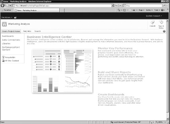
Figure 17–10. The Business Intelligence Center Home Page
In addition to this home page, the site template contains an instance of each of the lists and libraries described in “List and Library Templates” above. This makes the site a good location for one or more complete solutions to be stored. Additional content can be added to the site as needed.
Features
PerformancePoint Services is part of the Enterprise Client Access License (ECAL) for SharePoint Server 2010. In order to use any such features, your SharePoint site collection must have the SharePoint Server Enterprise Site Collection Features feature activated under the Site Collection Features.
The PerformancePoint functionality is enabled using two additional features. The first is the PerformancePoint Services Site Collection Features feature. This feature can also be found under Site Collection Features. The second feature is activated at the site level and is named PerformancePoint Services Site Features. See “Deploy the Business Intelligence Center” later in this chapter for step-by-step instructions for enabling these features.
Setting Up PerformancePoint Services
Like the other services we have examined in this book, PerformancePoint Services are configured using Central Administration or PowerShell commands (cmdlets). Let's take a look at the settings for PerformancePoint Services, along with the procedures for setting up a PPS instance.
The default, wizard-based installation of SharePoint Server 2010 includes an instance of the PerformancePoint Services application, so creating a new instance is not normally necessary. If you do need to create one, however, this can be easily accomplished through SharePoint Central Administration.
- Open the Central Administration web site using the SharePoint 2010 Central Administration link available in the server's Start menu.
- Navigate to the Central Administration
 Application Management Service Applications Manage Service Applications page. Note the default instance of PPS highlighted in Figure 17–11.
Figure 17–11. The Manage Service Applications page
- To create a new PPS instance, select PerformancePoint Service Application from the New section of the ribbon, as shown in Figure 7–11. This brings up the New PerformancePoint Service Application dialog (Figure 7–12).
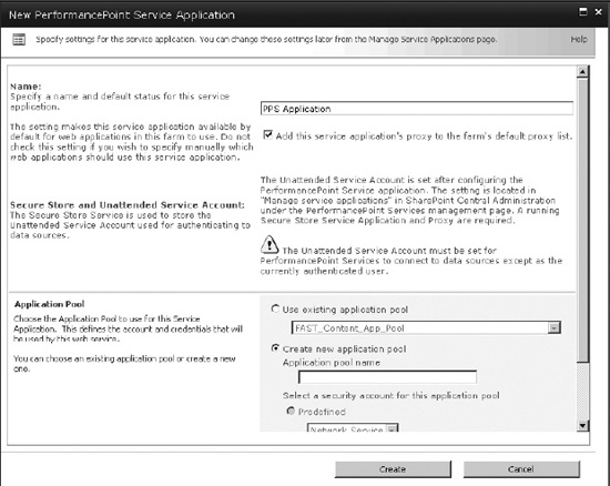
Figure 17–12. New PerformancePoint Service Application dialog
- Set the name and application pool for the new PPS application instance or select an existing one. Use a new application pool when you wish to isolate PPS processing from other components within IIS.
- Click Create.
After a few moments, the Manage Service Applications page will reappear with the new PPS application listed. It is now time to configure the application. If you are working with the default PPS instance, you should review the default settings, paying particular attention to the unattended service account, which should have the minimum privileges. See “Security PerformancePoint Solutions” earlier in this chapter to review why the USA is important.
To begin configuring the service application, click on the name of the service (PPS Application in our case) to be taken to the Manage PerformancePoint Services page as shown in Figure 17–13.
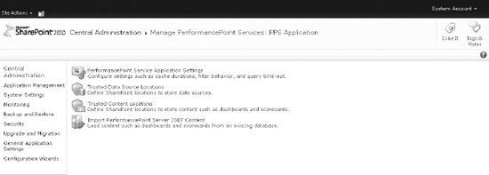
Figure 17–13. Manage PerformancePoint Services page
On the Manage PerformancePoint Service page, there are various settings to configure, which we'll discuss now. While most of the settings can be left to their default values, some need to be configured in order to address specific requirements.
Application Settings
The PerformancePoint Server Application Settings page (Figure 17–14) contains a variety of settings that control the performance and behavior of PPS. These settings apply only to sites associated with this instance of PerformancePoint Services.
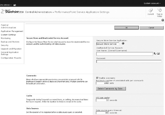
Figure 17–14. PerformancePoint Services Application Settings page
Secure Store and Unattended Service Account
The purpose of this section is to configure the unattended service account. Recall that this is the Active Directory domain account that will be used when accessing data sources without using the user's own identity (Kerberos). The credentials for this account are stored in the Secure Store Service. See “Securing PerformancePoint Solutions” earlier in this chapter.
This section of the page has three entry boxes. The first textbox is used to identify the SSS application to be used for the account's credentials. The second and third boxes allow for the entry of the user name and password of the account, respectively. Remember that this account should have minimal permissions but provide access to all necessary data.
Comments
Each dashboard user can be given permission to add comments to the cells in a PPS scorecard. These comments are then available to other users when they view that scorecard. The comment functionality also uses the term annotation. Technically, a scorecard cell can have one annotation and each annotation can have multiple comments.
This section of the page contains a checkbox that can be used to enable the annotation feature within the PPS instance. There is also a setting that limits the number of annotations that can exist on a single scorecard. The default is 1,000 annotations per scorecard.
There is also a Delete Comments by Date… button that displays the dialog shown in Figure 17–15. This dialog can be used to start a background job that will clean up comments older than a given date, which can use useful if it becomes necessary to reclaim space in the SQL database associated with this PPS instance. The name of this database is based on the name of the PPS application and a unique GUID, like “PPS Application_d17430dcfa17de40817a84dcb1b0c39f78e”.
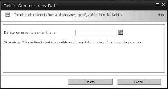
Figure 17–15. The Delete Comments by Date dialog
Cache
The cache section of the page contains a single entry that sets how long (in seconds) the images associated with KPIs should remain in memory before the memory is reclaimed. The default is 10 seconds, which should allow the image to be reused several times during the rendering of a single page. If your site makes heavy use of only a few unique indicators, it may make sense to extend this value to keep from frequently reloading them from disk.
Data Sources
This section allows the administrator to set a standard timeout on a data source, preventing pages from becoming unresponsive when a data source becomes slow or unavailable. The default is 300 seconds, which should be sufficient in most cases. If data access is consistently over 5 minutes, either the data source is not responding properly or the queries being used to access the data should be reconsidered. When data access for a dashboard page takes a very long time, two major problems result.
First, system resources are consumed processing and returning large amounts of data that will, most likely, never be used. The thread, table, memory, and I/O locking and contention created by executing very large queries can quickly drain system performance for all users.
Second, users are not going to wait for several minutes each time they interact with the dashboard. A user viewing a dashboard is trying to avoid information overload, so loading 1,000 or more records defeats this purpose. Long wait times degrade the user experience and lead to dashboards that aren't used.
Filters
Filters are used on dashboards to set how the data is “sliced.” PerformancePoint dashboards have the ability to remember the last filter values used by each user. This is valuable when moving from one dashboard page to another or when returning to a dashboard on a future visit.
To avoid storing this data forever, this configuration section allows the administrator to set a time out (in days) for how long to retain unused filter values.
The maximum number of members that can be loaded into a filter tree (see Figure 17–16) is configured here as well. Each time you use a filter, you are selecting a set of values to apply with the filter. For example, if you select the year 2010 at the Months level of the date hierarchy, you are selecting 12 values that must be stored for the filter. If you are selecting at the Day level, there are 365 values that must be stored. Each of these values is called a member of the filter. This setting prevents very large selection lists from slowing down the server for all users.
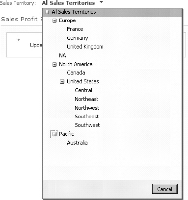
Figure 17–16. Sample filter tree control
Select Measure Control
This setting is similar to the Filters section except that it applies to the selection of measures on a dashboard.
Show Details
The Show Details feature allows an end-user to drill into a value that is derived from Analysis Services. The functionality of the drill-through is controlled by Analysis Services but it is rendered by PerformancePoint Services (see Figure 17–17). These settings limit the performance impact that this feature can have on the server hosting the PPS application.
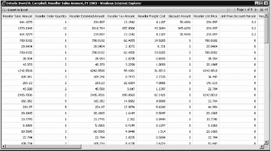
Figure 17–17. Sample Show Details report
The “Initial retrieval limit” limits the number of rows that can be retrieved on the first page of the details report. The default of 1,000 is generally sufficient without creating too great a load on the server. The “Maximum retrieval limit” is used to prevent excessively large datasets from being returned on subsequent pages of the report. You can either choose a fixed number of rows or leave control of this setting with Analysis Services. To reduce page load times and unnecessary server traffic, consider reducing this value to one in line with the expected use of the report.
Decomposition Tree
The Decomposition Tree feature is a very powerful analytical tool, with an interface designed to be simple and intuitive to an untrained user (see Figure 17–18). The Decomposition Tree leverages the dimensions already built into the solution to drive the analysis. It allows users to do complex analysis without involving a developer.
However, because of the large number of members that a dimension might contain, it can become a performance drain on the system.
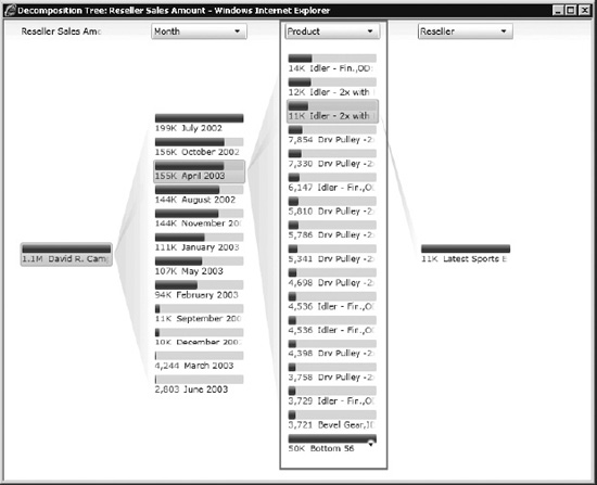
Figure 17–18. Decomposition Tree
Each item listed in a vertical column of the decomposition tree is counted against this limit. Note that this limit applies to only one column of items as highlighted in Figure 17–18. The total number of items in all columns may well exceed this value. This limit should not be set higher than is needed for the users to perform the analysis required.
Trusted Data Source Locations
PerformancePoint Services stores its metadata in SharePoint lists and libraries. These locations must be listed as “trusted” before PPS will consider them valid locations from which to read its objects. By default, all locations within SharePoint are automatically considered trusted, as Figure 17–19 shows.
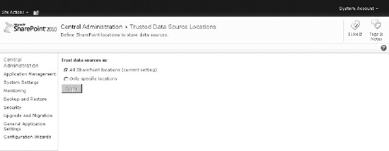
Figure 17–19. Trusted data source locations (default setting)
Note that just because the location is trusted by PerformancePoint, it is not necessarily accessible by any particular user. The SharePoint permissions on those items still control access to them. The fact that they are in a trusted location only allows PPS to use them if the user has access to them.
If there's a need to restrict the locations from which a PPS application can load data sources, switch this setting to “Only specific locations” and click Apply. This will enable a new set of options for adding specific locations, as shown in Figure 17–20.
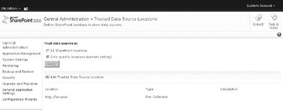
Figure 17–20. Trusted data source locations (specific locations enabled)
To add a location with this dialog box:
6. Click on Add Trusted Data Source Location. The dialog shown in Figure 17–21 will be displayed.
7. Enter the URL of a SharePoint-based site or document library. Only SharePoint locations can be used.
8. Click on the validation button to the right of the URL textbox. If the location is a valid one, the other controls will be enabled.
9. Select the Location Type option to use and enter a description for the trusted location.
10. Click OK to create the trusted location.
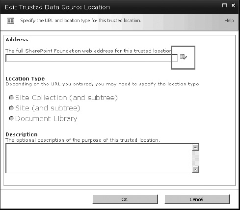
Figure 17–21. Creating a specific trusted data source location
Trusted Content Locations
Trusted Content Locations are configured in the same way as trusted data source locations with the following exception. PPS content items created by the Dashboard Designer application, such as KPIs, Scorecard, Reports, and so on are stored in SharePoint lists instead of in document libraries. Therefore, when selecting trusted locations, the options are Site, Site Collection, or List.
Import PerformancePoint Server 2007 Content
As mentioned in the introduction to this chapter, PerformancePoint was previously a stand-alone server product called Microsoft PerformancePoint Server 2007. The Monitoring module of that product supported many of the same types of objects (including scorecards and dashboards) that PerformancePoint Services now supports. The last option on the Manage PerformancePoint Services page is used to import objects from a PPS 2007 monitoring database into the SharePoint lists and libraries to be used with PerformancePoint Services. A wizard helps with the upgrade process.
The first page of the import wizard (Figure 17–22) contains general information about the import process. Before using the import wizard, you'll want to become familiar with both the PPS 2007 and SharePoint 2010 environments, including security and source and destination locations. Microsoft provides guidance specifically for planning this process, which you'll find at http://technet.microsoft.com/en-us/library/ee74817117.aspx.
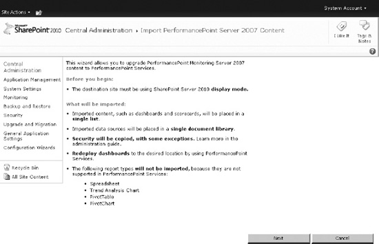
Figure 17–22. The import wizard introduction page
After you click Next on the introduction page, you'll see the page shown in Figure 17–23. This page lets you identify the security mode used by the original PerformancePoint Server 2007 installation. Select the correct mode and click Next.
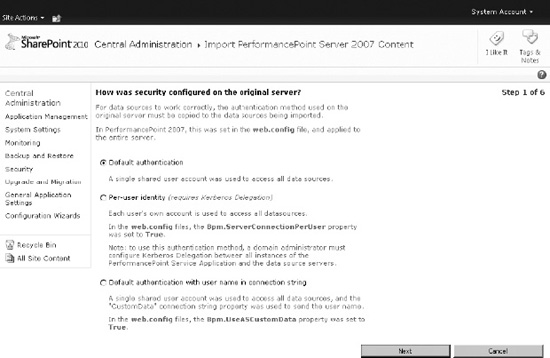
Figure 17–23. Step 1–Identifying the authentication mode
In step 2 of the wizard (Figure 17–24), you enter the database credentials to be used to connect to the PPS 2007 content database. This is the database where the dashboards were stored in the previous installation.
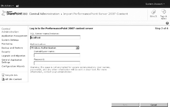
Figure 17–24. Step 2–Entering credentials
The credentials you enter can use either SQL or Windows authentication but they must have access to the PPS 2007 content to be migrated. Click Next when ready.
Step 3 (Figure 17–25) identifies the name of the content database to be accessed. Select the database and click Next.
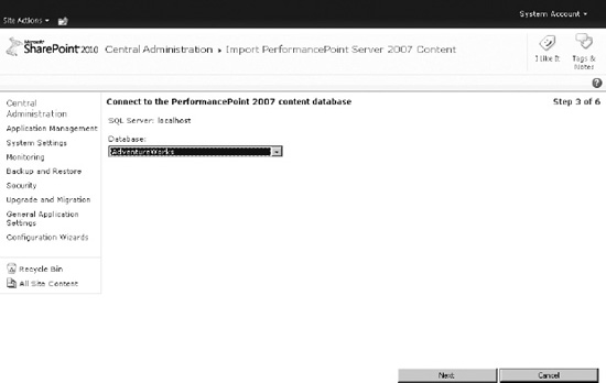
Figure 17–25. Step 3 – Supplying the name of the content database
In the remaining steps, you select the destination list and library that will receive the migrated content items. Once the migration starts, a bar will display showing its progress. When the migration is complete, be sure to review the objects and security permissions to resolve any inconsistencies between the old environment and the new. Remember, some PPS 2007 report types are not supported in SharePoint Server 2010, so it may be necessary to rework and redeploy some of your dashboards.
For a complete discussion of the options for upgrading PerformancePoint 2007 content to SharePoint 2010, take a look at the MSDN blog entry at blogs.msdn.com/b/performancepoint/archive/2010/02/25/upgrading-performancepoint-server-2007-to-pps-2010.aspx.
Managing PerformancePoint with PowerShell
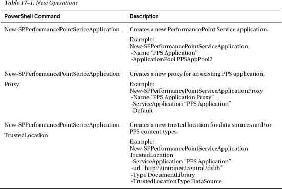
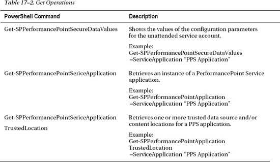
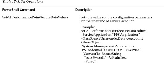
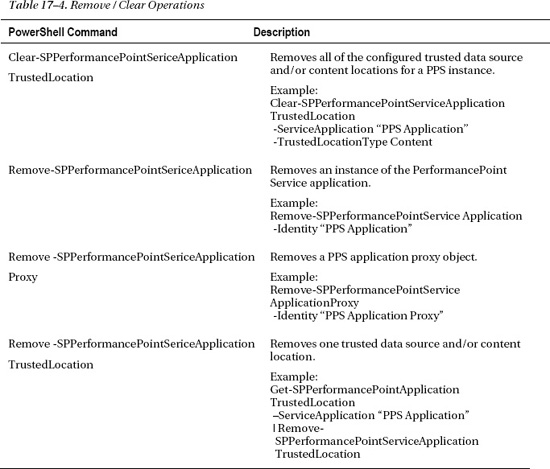
The commands we'll discuss next are the same ones you used in “Setting up PerformancePoint Services,” but now we'll use PowerShell commands. As you can see in Tables 17–1, 17–2, 17–3, and 17–4, there are four basic groups of commands: New operations, Get operations, Set operations and Remove (clear) operations.
![]() Tip To obtain additional details and examples for each of these PowerShell commands, use the following commands from the PowerShell command line.
Tip To obtain additional details and examples for each of these PowerShell commands, use the following commands from the PowerShell command line.
Get-Help <PS Cmdlet> for details and
Get-Help <PS Cmdlet> -examples for samples
Authoring and Publishing PerformancePoint Solutions
In this section, we will create all of the PerformancePoint content objects necessary to implement a typical business intelligence dashboard using data from the AdventureWorks sample database. Our solution will include the KPIs, scorecards, filters, reports, and dashboards necessary to provide the user with a rich data analysis environment. We will deploy this solution to SharePoint and explore the resulting user experience.
In the following section, “Advanced Report Types,” we will then expand on this solution by adding reports to the dashboard based on Excel Services and Strategy Map report types.
![]() Note This tutorial will make extensive use of the AdventureWorks SSAS solution. You can download the Adventure Works database from
Note This tutorial will make extensive use of the AdventureWorks SSAS solution. You can download the Adventure Works database from http://msftdbprodsamples.codeplex.com/. Take a look at Chapter 1 for details about deploying the solution as an SSAS database.
PROBLEM CASE
Deploying the Business Intelligence Center
We will create a work area for our solution by deploying the PerformancePoint Business Intelligence Center site template. First we must verify that the necessary features are activated at the site-collection level. You will need site collection administrator rights in order to enable features and create the site.
- Open the root web site in the site collection to host the solution.
- Select Site Settings from the Site Actions menu.
- Select Site Collection Administration Site Collection Features.
- Activate the SharePoint Server Enterprise Site Collection Features feature if it's not already active (Figure 17–26).
- Activate the PerformancePoint Services Site Collection Features feature if it is not already active(Figure 17–26).
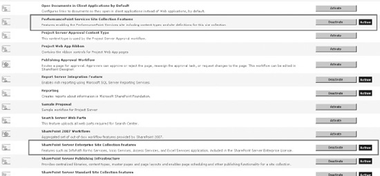
Figure 17–26. Activating SharePoint and PerformancePoint site collection features
- Navigate to the site under which you want to create the BI Center. In the parent site, create the site using the Business Intelligence Center site template (Figure 17–27).
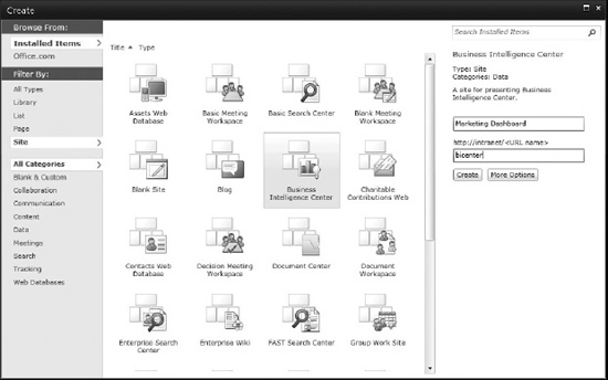
Figure 17–27. Selecting the Business Intelligence Center site template
The site created has all of the lists and libraries needed to deploy a complete PerformancePoint solution. It also contains informational content describing the site's purpose, which you can delete when you no longer need it.
Creating a Dashboard Designer Workspace
All of the objects we create for our solution will be stored in a Dashboard Designer Workspace file, which is stored on your local desktop with a DDWX file extension. This file acts as an offline store for these objects until you are ready to publish them to SharePoint. The workspace file is similar to a Visual Studio solution file in that it allows you to organize, edit, and manage all of the components of your solution in one place.
Because the Dashboard Designer is a one-click Windows application, there is no executable to download and install on the desktop. The easiest way to install it is simply to use it and then save a file. We will do this as part of the next section.
Creating a Data Source
Now let's create a data source from which to retrieve business data for our dashboard.
- Navigate to the BI Center site and click on the Data Connections library link in the Quick menu to the left. This will take you to the data source library for the solution.
- From the ribbon menu at the top of the page, select Library Tools Documents New Document PerformancePoint Data Source (Figure 17–28).
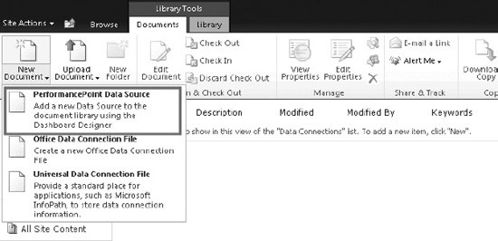
Figure 17–28. Adding a PerformancePoint data source
This will launch the Dashboard Designer. If this is the first time you've used it, you'll see messages and progress bars indicating that it's installing. The Web browser may ask you to authorize the installation. Finally, the designer will be shown with an empty workspace and the Select a Data Source Template dialog displayed, as shown in Figure 17–29.
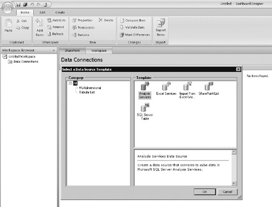
Figure 17–29. Selecting a data source template
- Our data will come from the Adventure Works OLAP database, so select the Analysis Services template and click OK, and you'll see the dialog shown in Figure 17–30.
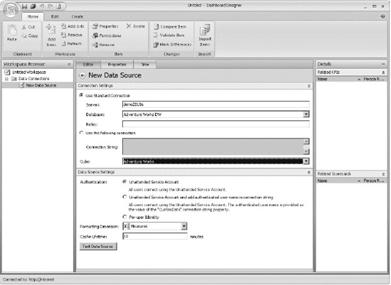
Figure 17–30. The New Data Source screen
Take a moment to find your way around the Dashboard Designer application—you'll spend a lot of time here! At the top is a ribbon menu system that works like any Office 2010 application. The options that appear in the ribbon will change as the context of the central window changes.
On the left side of the window is the Workspace Browser, which is a tree listing the contents of the workspace. Currently, this list shows one workspace file called Untitled Workspace, one SharePoint list called Data Connections, and one item within that list—a data source currently named New Data Source.
The editor for the item selected in the left-hand list is displayed in the center window where changes can be made. This window will have a set of tabs across the top based on the type of object being edited. The Properties tab is common to all objects and is used to name and organize objects within the workspace.
To the right of the center window are panels that list the objects within the workspace that are related to the current item.
- In the center window, under New Data Source Connection Settings Use Standard Connection, enter the name of the SSAS server instance containing the AdventureWorks OLAP cubes in the Server textbox.
- Select the “Adventure Works DW” SSAS database from the Database list.
- At the bottom of Connection Settings, select the Adventure Works cube from the Cube list.
- Note the defaults for the Data Source Settings panel but don't make any changes.
- Switch to the Properties tab in the center window.
- Enter “Adventure Works” for the name of the data source.
- Switch to the Time tab, where you can specify the cube's primary time dimension (Figure 17–31).
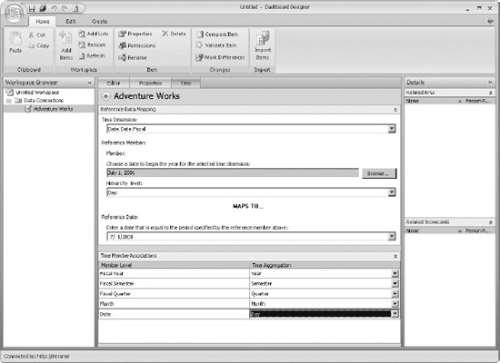
Figure 17–31. Selecting a time dimension
- The Time Dimension drop-down will list all of the hierarchies available in the cube. Select “Date.Date.Fiscal.” This is a fiscal calendar that begins on the first of July of each year.
- Under Reference Member, select a member from the dimension that represents the first day of the fiscal year, such as July 1, 2001.
- For the Reference Date, enter the same date in your regional format. This allows PerformancePoint to understand how years are structured in the date dimension.
![]() Note Depending on when you downloaded the AdventureWorks sample databases, the actual dates available in your cube may be different from those shown. The sample database used here has data from FY 2002 to FY 2005.
Note Depending on when you downloaded the AdventureWorks sample databases, the actual dates available in your cube may be different from those shown. The sample database used here has data from FY 2002 to FY 2005.
- Under Time Member Associations, select the time dimension hierarchy levels as shown in Figure 17–32.
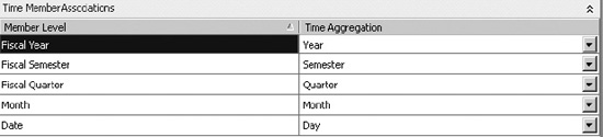
Figure 17–32. The time dimension hierarchy
At first glance, it may seem strange to enter all of this information about the time dimension in the editor you're using to create a data source. The reason for doing this is that it allows the use of Time Intelligence filters. These very powerful tools will help when it comes time to present data to the user. See “Creating Filters” later in this chapter for details. Now that the data source is set up, let's go back and finish setting up the workspace itself.
- Select Untitled Workspace on the Workspace Browser.
- Click the Save icon at the top of the window. This will cause the file save dialog to be displayed (Figure 17–33).
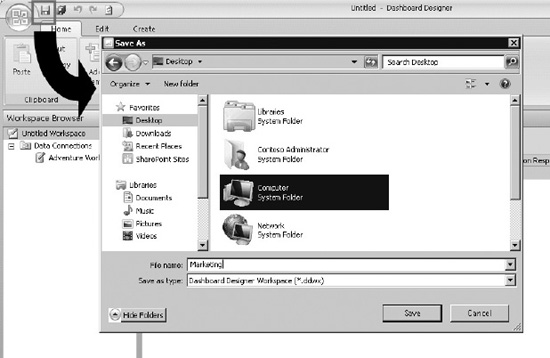
Figure 17–33. Saving the workplace
If you go back to the Data Connections library in your BI Center site, you'll see that there's one data source there. Why is it called New Data Source? The answer is that we haven't yet published the data source we created to SharePoint. We've only saved it to the workspace file.
![]() Hint: You can tell that an item hasn't been published because there is a pencil superimposed on its icon in the Workspace Browser.
Hint: You can tell that an item hasn't been published because there is a pencil superimposed on its icon in the Workspace Browser.
- Select the Adventure Works data source in the Workspace Browser.
- Click the Save icon again. The pencil icon will disappear from the item and the data source should appear correctly in the Data Connections Library (Figure 17–34).
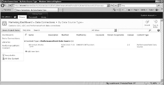
Figure 17–34. Saving the PerformancePoint data source to the Data Connections library
Now that we have set up our data source and started our workspace file, let's get ready to retrieve data for analysis.
Creating Key Performance Indicators
Our dashboard will contain one set of KPIs. We will create a set of actual and target metrics that will allow the marketing department to track the effectiveness of their promotions in terms of their effect on Gross Profit Margin.
Our workspace is currently connected to the Data Connections library, but that area can only be used to store data sources. To create the KPI, we need to connect our workspace to the PerformancePoint Content list in the BI Center site.
- Open the workspace file Marketing.ddwx that you created in the previous section.
- In the Dashboard Designer's ribbon menu, select Home Workspace Add Lists.
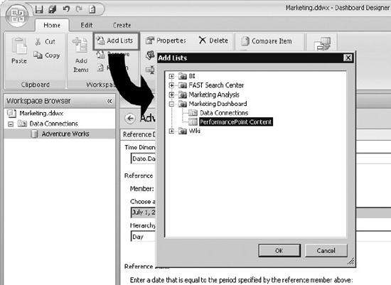
Figure 17–35. Selecting the PerformancePoint content
- Select PerformancePoint Content from the BI Center site you created earlier and click OK (see Figure 17–35). The PerformancePoint Content list now appears in the Workspace Browser.
- Right-click on the PerformancePoint Content list in the Workspace Browser and select New KPI (Figure 17–36).
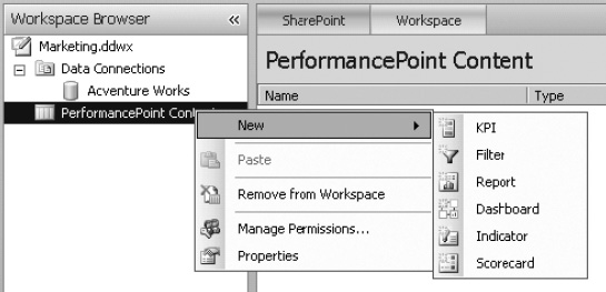
Figure 17–36. Creating a new KPI
- Select Blank KPI from the Select a KPI Template dialog (Figure 17–37) and click OK.
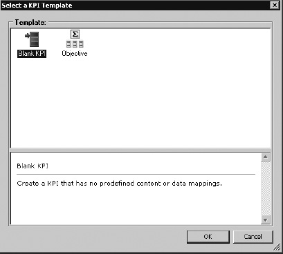
Figure 17–37. Choosing a blank KPI template
- The KPI will be created with the name selected in the Workspace Browser, so you can immediately type a name for the KPI. Enter “Profit Margin KPI” and press Enter.
- Select the Properties tab and set the Display Folder to “KPIs” (Figure 17–38).
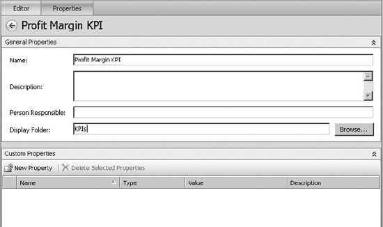
Figure 17–38. Setting the Display Folder;
- Note that the KPI now appears inside a folder in the Workspace Browser (Figure 17–39).
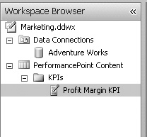
Figure 17–39. The Profit Margin KPI in the Workspace Browser
![]() Note The use of display folders within the Dashboard Designer is entirely optional. Their purpose is only to help keep the solution organized. They have no effect on anything other than how items are displayed in the Workspace Browser. Workspace folders do not get reflected in the folder structure of the content list in PerformancePoint or anywhere else outside of Dashboard Designer. Typically, they are used to separate items by type (KPIs, Filters, Dashboards, etc.) or functionally by the part of the solution with which they are associated. Folders can be nested as needed by separating folder names with a backslash () character. For the rest of this chapter, items will be placed into such folders but the directions won't mention it each time from here on out.
Note The use of display folders within the Dashboard Designer is entirely optional. Their purpose is only to help keep the solution organized. They have no effect on anything other than how items are displayed in the Workspace Browser. Workspace folders do not get reflected in the folder structure of the content list in PerformancePoint or anywhere else outside of Dashboard Designer. Typically, they are used to separate items by type (KPIs, Filters, Dashboards, etc.) or functionally by the part of the solution with which they are associated. Folders can be nested as needed by separating folder names with a backslash () character. For the rest of this chapter, items will be placed into such folders but the directions won't mention it each time from here on out.
- Switch to the Editor tab (Figure 17–40), which displays the actual and target metrics for the KPI along with their various settings. We will customize the two metrics that were created by default and then add some or our own.
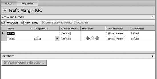
Figure 17–40. Editing the KPI
- Select the Name cell, which currently contains “Actual,” and change the name to “Gross Profit.”
- Click on the cell for the same row under Data Mappings to launch the data mapping dialog. Currently, it is set to return a fixed value of 1. Click the Change Source button to bring up the Select a Data Source dialog (Figure 17–41).
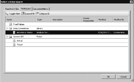
Figure 17–41. Changing the data source
- This dialog allows us to select the data source from which we will retrieve the value of the metric we are creating. In this case, the Gross Profit will come from the cube we've configured as a data source. Select “Adventure Works” and click OK. The Dimensional Data Source Mapping dialog is displayed (Figure 17–42).
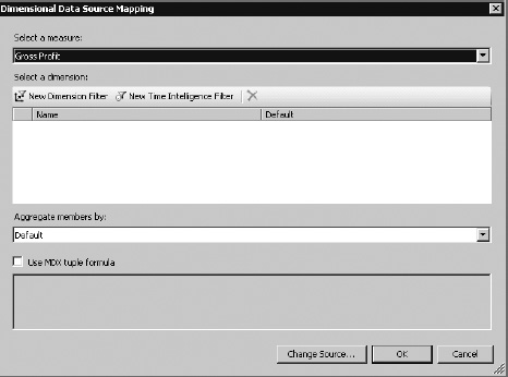
Figure 17–42. Selecting a measure
- This dialog allows the designer to select a measure from the cube and, optionally, perform filtering on it or enter an MDX query expression to retrieve the value. Select “Gross Profit” from the Select a measure drop-down and click OK. The result is shown in Figure 17–43.
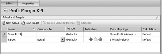
Figure 17–43. Mapping to the Gross Profit measure
- Now we will create a target that indicates that we want to break even (GP >= $0) on each promotion. Set the name of the target metric to “Breakeven.” Then, change the data mapping value to “0” instead of the default of “1”. Notice that the Compare To field points to the Gross Profit actual metric. This indicates that the target value, 0, will be compared to the actual value, which is the Gross Profit measure returned from the cube (Figure 17–44).
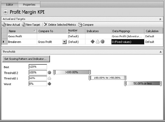
Figure 17–44. Creating a breakeven metric for Gross Profit
- Now that the actual and target values are set, the Thresholds area at the bottom of the window is activated. The indicator type shown by default is not really appropriate so we will customize it. Click on the Set Scoring Pattern and Indicator… button in the Thresholds panel. This displays a three-step wizard we'll use to configure the appearance of this target metric (Figure 17–45).
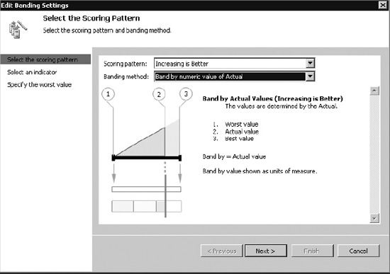
Figure 17–45. Selecting the scoring pattern
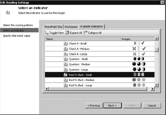
Figure 17–46. Choosing the indicator
- Select “Red to Black – Small” under the Miscellaneous category (Figure 17–46). Click Next.
- In this case, there is no selection to be made on the third step of the wizard, so click Finish.
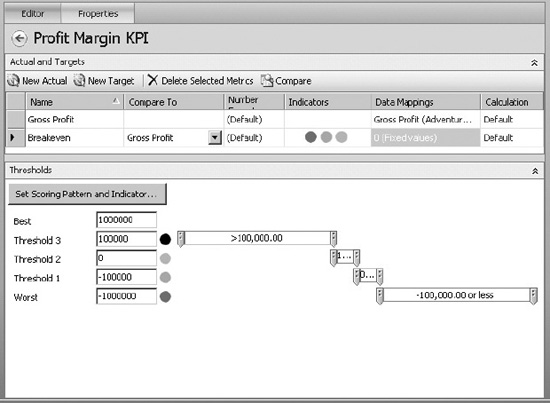
Figure 17–47. Threshold values
- The indicator we selected has four possible statuses: black, grey, light red, and red (Figure 17–47). Thresholds configure the points at which black becomes gray and so on. In this case, set the thresholds to the values shown above. These values will be compared with the Gross Profit amount to show whether or not we are “in the black” or “in the red” for a particular promotion.
- Use the New Actual button to create two more actual metrics named “Total Sales” and “Gross Profit Margin.” Set the data mappings in the same way as for Gross Profit above. Map the new actual metrics to the “Sales Amount” and “Gross Profit Margin” measures, respectively.
- On the Gross Profit Margin row, click on (Default) in the Number Format column. Set the value to be displayed as a Percentage using parentheses for negative numbers and 1 decimal place (Figure 17–48).
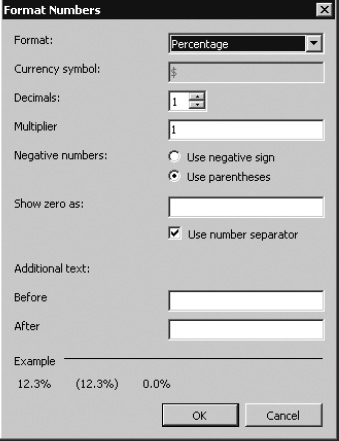
Figure 17–48. Setting the number format
- Click on New Target to create a second target metric. In this case, instead of breaking even, our goal is to do better with a promotion than without one. Therefore, we will compare the gross profit margin obtained with a promotion to the margin obtained when the promotion is “No Discount.”
- Set the name of the new target to “GP% vs. no Discount.”
- Set the Compare to field to “Gross Profit Margin.”
- Click on the link to set the data mapping and select the Gross Profit Margin measure just as you did when setting the actual metric.
- Instead of finishing the dialog, we will add a filter to find the value of the gross profit margin in a specific case. Start by clicking on the New Dimension Filter button under Select a dimension (Figure 17–49).
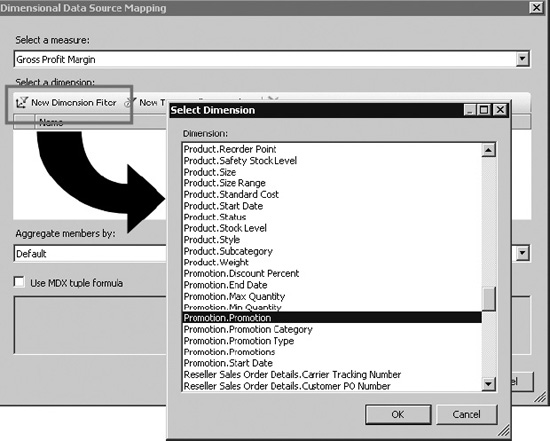
Figure 17–49. Creating a filter
- The Select Dimension dialog is somewhat misnamed. The list under Dimension isn't really a list of dimensions. It is a list of dimension hierarchies that can be used to filter the selected measure. Select “Promotion.Promotion” and click OK.
- Click on the “Default Member (All Promotions)” link (Figure 17–50).
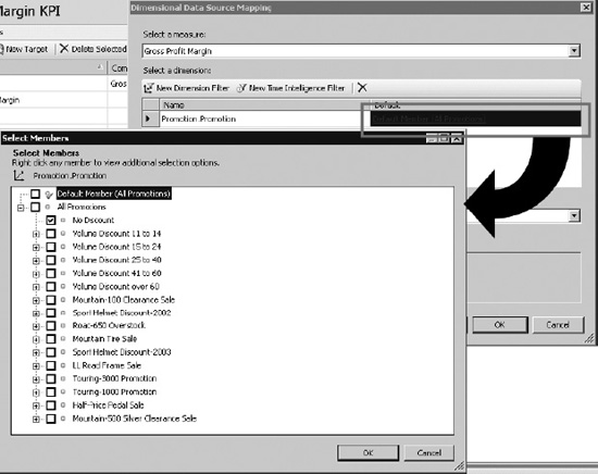
Figure 17–50. Selecting the filter criteria
- In the Select Members dialog, check only the No Discount member. This will cause the target value for this metric to include only data related to the No Discount promotion. Click OK.
- Click on the Set Scoring Pattern and Indicator… button. Review all of the default options but don't change anything. Click Cancel to close the wizard.
- Set the thresholds as shown in Figure 17–51.
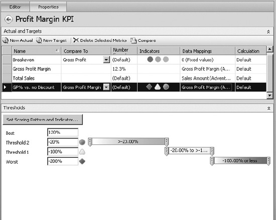
Figure 17–51. Setting the thresholds
- Save the KPI and workspace file.
The thresholds used in the last target created may not seem to make sense at first. The default banding pattern used by PerformancePoint is “Band by normalized value of Actual/Target”. In this mode, a calculation is performed on each actual and target value for the KPI. A percentage is assigned based on the distance the actual and target are from the “worst value” set in step 3 of the scoring pattern wizard. By default, the “worst value” is set to 0. The worst value is somewhat arbitrary since it is quite possible for actual values to be below it. The percentages calculated in that case are simply negative.
In our case, 0% indicates that the gross profit margin for the selected promotion is exactly the same as for the No Discount promotion. If it's lower, the percentage value is negative. If it's better, the value is positive. Adventure Works management has decided that our profitability goal for these promotions is to be within 20 percent of the non-discounted value (green indicator). A value worse than 100 percent below the standard indicates a serious problem, so the indicator turns red. Anywhere between -20 percent and -100 percent, the indicator will show a slight problem or a yellow indicator.
Creating a Scorecard
On our dashboard, we want to display a list of the promotions we've run and the values of our KPIs for each promotion. This is called a scorecard (see Figure 17–52), which we will create as a separate component in our workspace (inserted using text markup feature).
- Open the Marketing.ddwx workspace file.
- Right-click on the PerformancePoint Content list in the Workspace Browser and select New Scorecard.
- Name the scorecard “Promotion Scorecard” (and add it to a display folder if you wish).
Figure 17–52. An empty scorecard
The empty scorecard shown in Figure 17–52 has two main areas. The center window is where you design the scorecard; you will be able to arrange and format items in this window. To the right are panels that provide the elements to go on the scorecard. First, we identify the KPIs to be shown, then we identify the rows and grouping to use in calculating the KPIs.
- In the Details panel, open the KPIs branch of the tree until you reach the Profit Margin KPI (Figure 17–53).
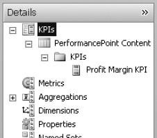
Figure 17–53. The Profit Margin KPI
- Drag the Profit Margin KPI from the Details panel to the header area of the scorecard (Figure 17–54).
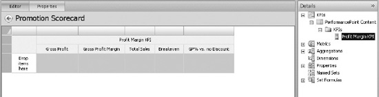
Figure 17–54. Adding the KPI to the scorecard
- Select Adventure Works from the drop-down list under Data Source (Figure 17–55). Note that the Data Source panel is in the bottom right corner of the designer window, under the Details panel.
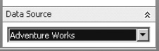
Figure 17–55. Choosing Adventure Works as the data source
- Under Details, select Dimensions Promotion Promotions. This is main hierarchy of promotions that will allow us to roll up or drill down into our KPIs.
- Drag the Promotions hierarchy onto the row area of the scorecard. This displays the Select Members dialog (Figure 17–56).
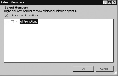
Figure 17–56. The Promotions hierarchy
- Open the All Promotions node.
- Right-click on the Customer node and select Autoselect Members Select All Descendants (Figure 17–57).
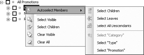
Figure 17–57. Selecting members
- Do the same for the Reseller node.
- Check the All Promotions, Customer, and Reseller nodes, as well as the two All descendants of nodes. Do not check No Discount (Figure 17–58).
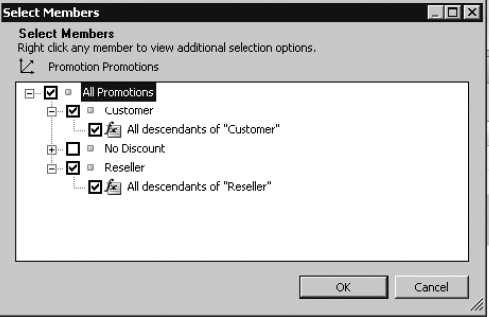
Figure 17–58. Confirming member selection
- Click OK. The scorecard should now look like what's shown in Figure 17–59.
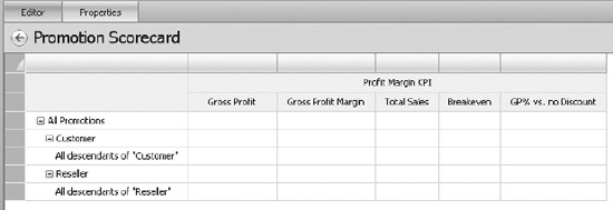
Figure 17–59. The scorecard with added elements
- Right-click on the Gross Profit column header and select Delete.
- Right-click on the Gross Profit Margin column header and select Delete.
- Right-click on the Breakeven column header and select Metric Settings….
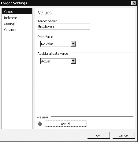
Figure 17–60. Target settings for Breakeven
- Select “No Value” for Data Value and “Actual” for Additional Data Value (Figure 17–60).
- Review the other settings but retain the defaults. Click OK.
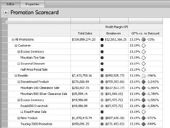
Figure 17–61. The processed scorecard
At this point, the scorecard will automatically be processed. It should look something like the one in Figure 17–61. The rows show the promotion hierarchy, including rolling up to parent levels. The columns show our KPIs as they are currently configured. Notice that rows are appearing for promotions even though there were no sales for those promotions.
- Right-click on the Total Sales column header and select Filter Empty Rows. Note that the rows that should be filtered are now shown with red labels (Figure 17–62). This indicates they will be filtered at runtime.
- Right-click on the GP% vs. no Discount column header and select Metric Settings….
- Select Actual for Data Value and Target for Additional Data Value.
- Click OK.
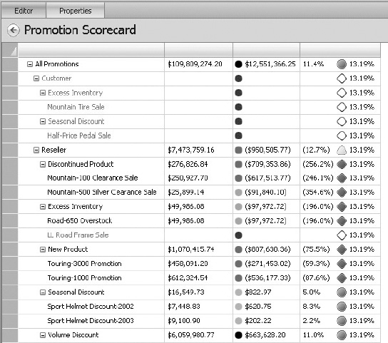
Figure 17–62. Empty rows are red, indicating they will be filtered at runtime.
- Save the scorecard and workspace file.
Creating Filters
Our dashboard will contain two filters. The first filter will control the date range for the figures displayed. The second will allow us to select from among our sales territories.
- Open the Marketing.ddwx file in Dashboard Designer.
- Right-click on the PerformancePoint Content list and select New Filter.
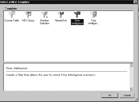
Figure 17–63. Creating a date filter
- Select Time Intelligence from the Select a Filter Template dialog as shown in Figure 17–63. Be careful not to select “Time Intelligence with Connection Filter” by mistake.
- Click OK.
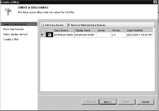
Figure 17–64. Selecting a data source for the filter
- Click Add Data Source and select the Adventure Works data source and click Next (Figure 17–64).
For the “Enter time formula” step, we will define the options the user will have for selecting time periods. The formulas are entered on the left and the name displayed to the user is on the right. The formulas are designed to output a list of members of the cube's time dimension as specified in the data source. For a good overview of these formulas, go to blogs.msdn.com/b/performancepoint/archive/2010/01/21/time-intelligence-formula-quick-reference.aspx.
- Enter the formulas and display names shown in Figure 17–65 and then click Next.
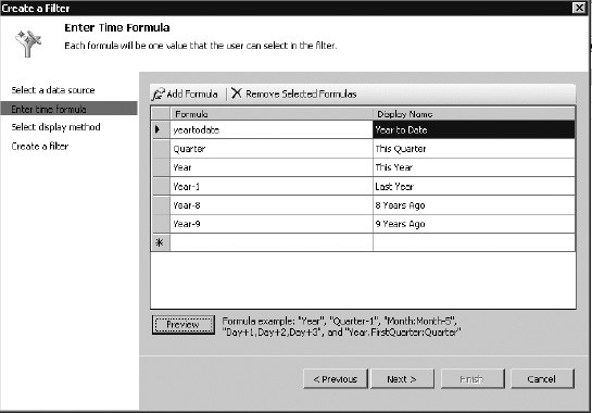
Figure 17–65. Adding date formulas
- Select List for the Display Method and click Finish (Figure 17–66).
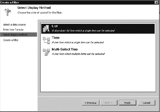
Figure 17–66. Selecting a display method for the date filter
- Set the name of the filter to “Date.”
- Save the filter and workspace.
Now we'll create a filter for selecting from the Sales Territory dimension. This filter will display a tree for the territory hierarchy and allow us to select one territory or higher-level region.
- Right-click on the PerformancePoint Content list and select New Filter.
- Select the Member Selection filter template and click OK.
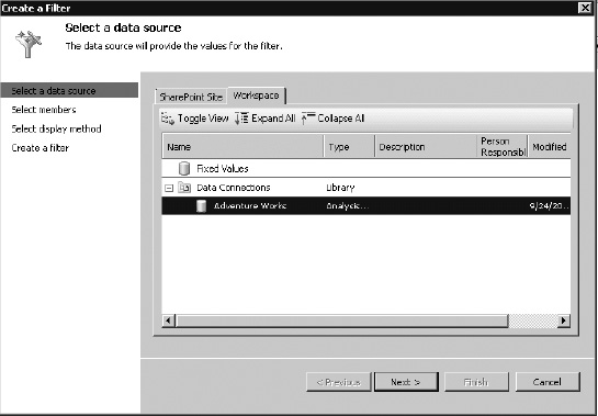
Figure 17–67. Selecting the data source for the filter
- Select the Adventure Works data source and click Next (Figure 17–67).
- This displays the Select Members page of the wizard where we will specify the members to show in the filter (Figure 17–68).
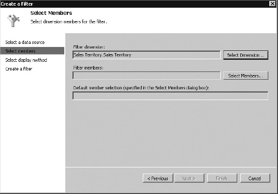
Figure 17–68. Selecting members for the filter
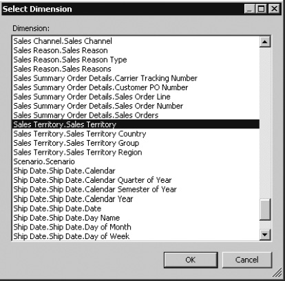
Figure 17–69. Choosing the dimension
- Select Sales Territory.Sales Territory and click OK (Figure 17–69).
- Click the Select Members button.
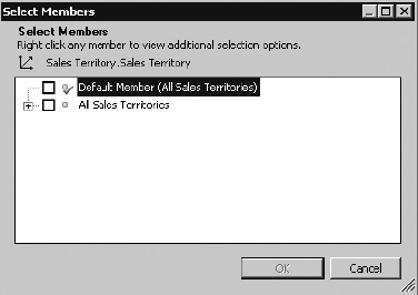
Figure 17–70. Selecting Sales Territory members
- Right-click All Sales Territories (Figure 17–70) and select Autoselect Members Select All Descendants.
- Check both All Sales Territories and All descendants of All Sales Territories (Figure 17–71).
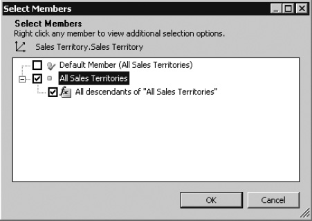
Figure 17–71. Confirming the members
- Click OK.
- Select Tree from the Select Display Method page and click Finish (Figure 17–72).
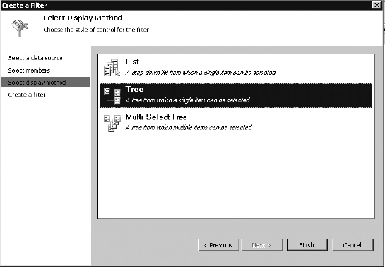
Figure 17–72. Choosing a display method for the Sales Territory filter
- Change the name of the filter to “Sales Territory”.
- Save the filter and workspace file.
Creating Reports
KPIs and scorecards allow us to compare business data against goals. Once we have identified the problem areas in the enterprise, we need to be able to understand the conditions that are causing problems. A “report” in PerformancePoint is a generic term referring to a window of information that has been sorted out based on the filters and scorecard selections made in the dashboard.
The two most common types of reports in PerformancePoint are Analytic Charts and Analytic Grids. We will create one of each for our dashboard.
- Open the Marketing.ddwx file in Dashboard Designer.
- Right-click on the PerformancePoint Content list and select New Report.
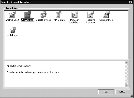
Figure 17–73. Choosing a report template
- Select the Analytic Grid template and click OK (Figure 17–73).
- Select the Adventure Works data source and click Finish (Figure 17–74).
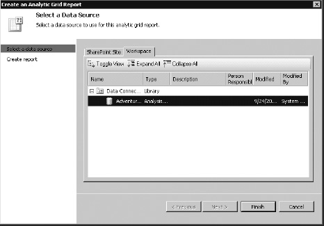
Figure 17–74. Choosing Adventure Works as the data source
- Set the name of the report to “Margin by Sales Channel” (Figure 17–75).
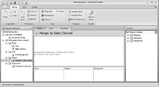
Figure 17–75. The empty Margin by Sales Channel report
The empty grid report window is divided into several areas. The draft view of the report appears in the center window. Beneath the center window are panels labeled Rows, Columns and Background that will be used to specify the contents of the report. In the report designer, “background” refers to the ways in which the data in the report can be filtered.
To the right is a Details tree from which we'll select items to add to the report by dragging them onto one of the panels at the bottom of the window.
- From the Details panel, drag Dimensions Sales Channel and drop it on the Columns panel.
- From the Details panel, drag Measures Sales Amount and drop it on the Columns panel.
- Drag and drop these measures to Columns as well: Total Product Cost, Gross Profit, and Gross Profit Margin.
- From the Details panel, drag Dimensions Product Categories and drop it on the Rows panel.
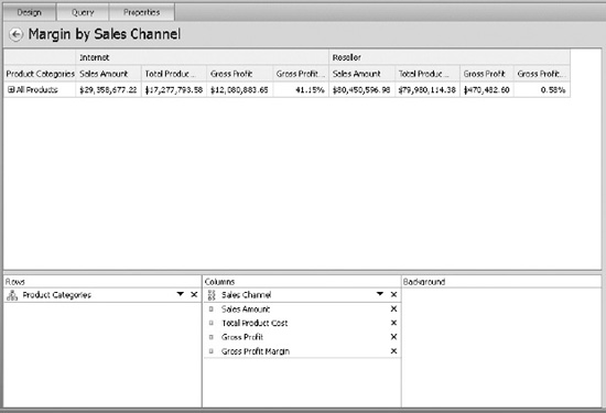
Figure 17–76. Defining the report's rows and columns
Now that we have defined the rows and columns for the report (Figure 17–76) it will automatically display a default view. In our dashboard, we want to see the product categories by default. We also want to be able to filter this report by date, territory, and promotion.
- Right-click on Product Categories in the Rows panel and choose Select Members.
- Right-click on All Products and select Autoselect Members Select Category.
- Ensure that All Products and Category descendants of All Products are checked and click OK (Figure 17–77).
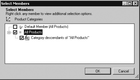
Figure 17–77. Selecting members for the report's default view
- From Details, drag Dimensions Date Fiscal Fiscal to the Background panel (Figure 17–78).
- From Details, drag Dimensions Promotion Promotion to the Background panel.
- From Details, drag Dimensions Sales Territory Sales Territory to the Background panel.
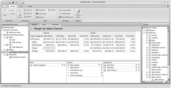
Figure 17–78. Adding dimensions to the report's default view
- Save the report and workspace
Now let's create an Analytic Chart report. This report will compare the gross profit margin across product categories.
- Right-click on the PerformancePoint Content list and select New Report.
- Select the Analytic Chart template and click OK.
- Select the Adventure Works data source and click Finish.
Figure 17–79. The empty analytic chart report
At this point, the chart report looks almost exactly like the grid report. The difference is that the panels across the bottom are Series, Bottom Axis, and Background (see Figure 17–79).
- From the Details panel, drag Measures Gross Profit Margin and drop it on the Series panel.
- From the Details panel, drag Dimensions Product Category and drop it on the Bottom Axis panel.
- From Details, drag Dimensions Date Fiscal Fiscal to the Background panel.
- From Details, drag Dimensions Promotion Promotion to the Background panel.
- From Details, drag Dimensions Sales Territory Sales Territory to the Background panel (Figure 17–80).
Figure 17–80. Adding dimensions to the Background panel
- Right-click anywhere in the center window and select Format Report Don't Show.
- Right-click anywhere in the center window and select Show Information Bar.
Figure 17–81. The Information Bar turned on
The Information Bar is a useful feature on reports. When this is turned on it shows the user exactly how the data in the report is being filtered. In the designer, the bar shows “No background selections exist” because there are no filters applied until the report is embedded into a dashboard (Figure 17–81).
- Set the name of the report to “Margin by Category”.
- Save the report and workspace.
Creating a Dashboard
We have created all of the components for our dashboard. Now we'll put it all together and make it work as an integrated package.
- Open the Marketing.ddwx file in Dashboard Designer.
- Right-click on the PerformancePoint Content list and select New Dashboard.
Figure 17–82. The default page template
- Select the default page template: Header, 2 Columns, as shown in Figure 17–82.
- Click OK.
- Set the name of the dashboard to “Marketing Dashboard”.
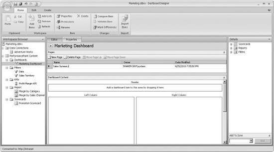
Figure 17–83. The empty dashboard page
This will create an empty dashboard page with three zones (Figure 17–83). At the top of the center window is a list of the pages in the dashboard. Beneath the pages is the Dashboard Content panel. This is where the selected dashboard page will be assembled from the components we've created. At the right, the Details panel contains the components that can be used.
- Set the name of the dashboard's initial page to “Sales Summary” in the Pages panel.
- On the Details panel, open the Filters node until you find Date and Sales Territory filters. Drag and drop both filters onto the Header zone of the page.
- On the Details panel, open the Scorecards node until you find the Promotion Scorecard. Drag and drop it onto the Left Column zone.
- On the Details panel, open the Reports node until you find the “Margin by Category” and “Margin by Sales Channel” reports. Drag and drop both reports onto the Right Column zone.
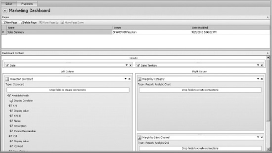
Figure 17–84. The dashboard page with components
The components are now on the page (Figure 17–84), but they are not integrated with one another. By dragging fields from one component to another, data is passed to synchronize or filter data throughout, or between, dashboard pages. The behavior we want is as follows:
- When a date range is selected in the filter, it should be applied to all components.
- When a Sales Territory is selected in the filter, it should be applied to all components.
- When the user clicks on a row or cell in the scorecard on the left, the reports on the right should be filtered to display data only for that promotion.
Now we will create the connections to create this behavior
- Hover over the Date filter. A panel will drop down showing all of the fields that are available from this filter. Drag Member Unique Name and drop it onto the scorecard.
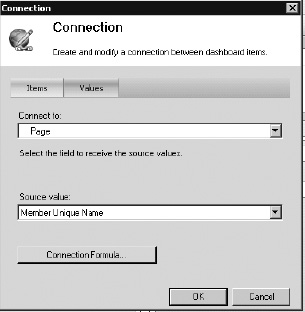
Figure 17–85. Creating connections between dashboard items
- The default connection is to Page, which refers to the scorecard's overall filter (Figure 17–85). Click OK.
- Drag and drop the same field from the Date filter onto the two report components. The reports will default the connection to the Date Fiscal background field that is specified in the reports.
- From the Sales Territory filter, drag the Member Unique Name field to the scorecard. Again, Page is the connection field.
- Drag and drop the same field from the Sales Territory filter onto the two report components. When the connection dialog appears, select Sales Territory for the “Connect to” field (Figure 17–86).
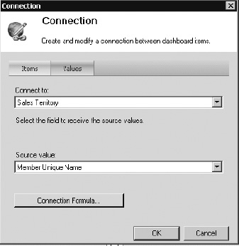
Figure 17–86. Connecting to the Sales Territory filter
- From the Promotion Scorecard, drag Row Member Member Unique Name onto each report. Verify that the connection dialog shows that the field is connected to the Promotion field (Figure 17–87).
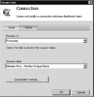
Figure 17–87. Connecting to the Promotion field
- The dashboard is now complete (Figure 17–88). Save the dashboard and the workspace.
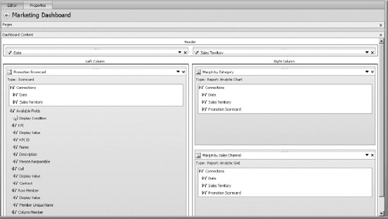
Figure 17–88. The completed dashboard
Deploying the Solution to SharePoint, and Exploring
We are now ready to deploy our dashboard and start analyzing data. Remember that the dashboard we created in the previous section is only the definition for a dashboard. That definition is stored in our PerformancePoint Content list. When we deploy the dashboard, the definition is converted into a folder of ASPX pages that implement our dashboard.
Note that PerformancePoint uses Silverlight controls to render some of the UI controls. Now would be a good time to download and install the latest version of Silverlight from www.microsoft.com/silverlight.
- Open the Marketing.ddwx file in Dashboard Designer.
- Right-click on the Marketing Dashboard item and select Deploy to SharePoint… as shown in Figure 17–89.
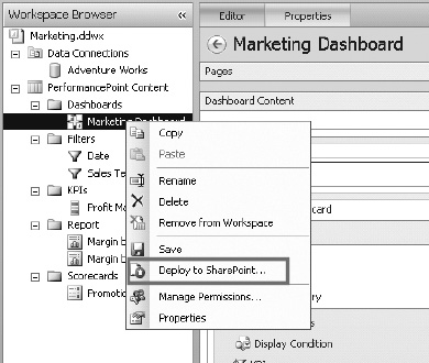
Figure 17–89. Deploying to SharePoint
- Since this is the first time we've deployed the dashboard, Dashboard Designer will prompt for a destination location for the dashboard.
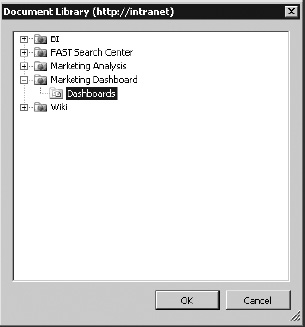
Figure 17–90. Putting the dashboard in the Dashboards library
- Select the Dashboards document library in the BI Center site (Figure 17–90) and click OK.
- After a few seconds, a web browser window will open to the Sales Summary page of the dashboard (Figure 17–91).
- Select a time period in the Date filter that contains data. The scorecard and both reports are filtered accordingly.
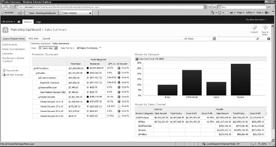
Figure 17–91. The Sales Summary page
- Select a Sales Territory. Notice the text displayed in the Information Window above the “Margin by Category” chart (Figure 17–92).
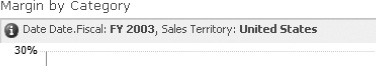
Figure 17–92. Text in the information window
- Close the web browser and open a new window to view the dashboard. Note that the filter values selected in the previous session are remembered (Figure 17–93).
Figure 17–93. Values from the previous session are remembered.
- Click on a row on the scorecard. Note the changes that occur on the reports to the right (Figure 17–94).
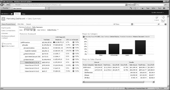
Figure 17–94. Click a row on the scorecard to modify the reports
- Right-click on one of the cells in the Margin by Sales Channel report and select Show Details. A window is displayed containing all of the data that went into that cell. This data can also be exported to Excel for further analysis (Figure 17–95).
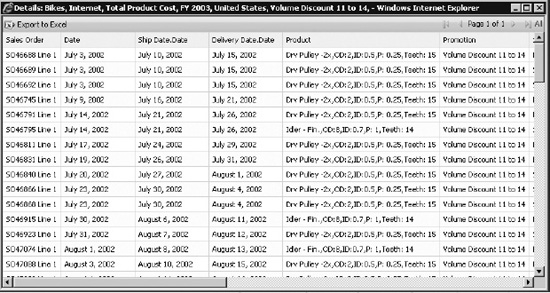
Figure 17–95. Exporting data to Excel
- Right-click on one of the cells in the Margin by Sales Channel report and select Decomposition Tree. A window is displayed that allows the user to decompose the results in the cell in any way needed to discern patterns (Figure 17–96).
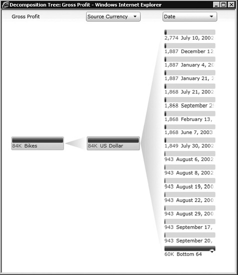
Figure 17–96. Decomposing a cell
Advanced Report Types
Now let's extend our sample dashboard to include data from two external sources: Excel and Visio. The data will be integrated using the Excel Services and Strategy Map report types, respectively.
PROBLEM CASE
Create an Excel Services Report
Microsoft Excel is one of the most widely used packages for doing numerical analysis. As a file-based desktop application, however, it is limited in its ability to reach a large audience and integrate with other solutions. As we saw in Chapter 5, SharePoint Server 2010 incorporates Excel Services to address these issues by creating a server environment for storing, processing, and delivering Excel content. With PerformancePoint Services, we have the opportunity to leverage Excel's analytical abilities and familiar user interface to integrate rich reports into our PPS solutions.
In this section, we will create a simple Excel Services spreadsheet and deploy it to SharePoint. Then, we will integrate the elements of that spreadsheet into our existing dashboard as a pair of new reports on a new page. The new page will allow us to view a grid and a chart with a breakdown of our sales figures by Sales Territory.
- Launch Excel 2010 and create a new blank workbook.
- On the ribbon menu, select Data From Other Sources From Analysis Services.
Figure 17–97. Selecting the database server to connect to
- Enter the name of the SSAS server containing the Adventure Works DW database as shown in Figure 17–97.
- Click Next.
- Select the Adventure Works DW database.
- Select the Adventure Works cube.
- Click Next.
Figure 17–98. Entering a name for the data connection file
- Enter “AWExcel.odc” for the File Name (Figure 17–98).
- Enter “Adventure Works DW – Excel” for the Friendly Name.
- Click Finish.
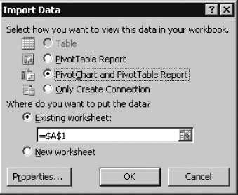
Figure 17–99. Choosing how to view data in the workbook
- Select PivotChart and PivotTable Report (Figure 17–99) and click OK.
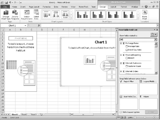
Figure 17–100. The Pivot Table Field List
- From the Pivot Table Field List (Figure 17–100), drag the fields listed in Table 17–5 into the indicated panel at the lower right of the Excel window.
- The spreadsheet should now look like the image in Figure 17–101.
Figure 17–101. The pivot chart
- Right-click on the chart and change the chart type to Pie.
- Right-click on the chart title and select Delete.
- From the ribbon menu, select PivotChart Tools Layout Data Labels Best Fit (Figure 17–102).
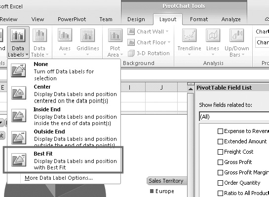
Figure 17–102. Displaying data labels
- From the ribbon menu, select PivotChart Tools Layout Properties. Enter “SalesChart” into the Chart Name box (Figure 17–103).
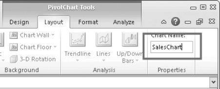
Figure 17–103. Entering the chart name
- Click on one of the cells in the PivotTable.
- From the ribbon menu, select PivotTable Tools Options PivotTable. Enter “SalesTable” into the PivotTable Name box (Figure 17–104).
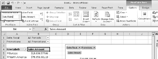
Figure 17–104. Entering the name of the pivot table
- Select the “Sales Amount” column cells on the PivotTable.
- Select Home Styles Conditional Formatting Data Bars and select one of the options shown (Figure 17–105).
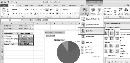
Figure 17–105. Selecting a style for the data bars
- Click on cell B1. This should be the All Periods value for the Date.Fiscal filter. Be sure to select the value cell (B1), not the label cell (A1).
- Type “Date” into the name box and press Enter (Figure 17–106).
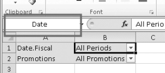
Figure 17–106. Setting up conditional formatting for the Date filter
- Click on cell B2. This should be the All Promotions value for the Promotions filter. Be sure to select the value cell (B2), not the label cell (A2).
- Type Promotions into the name box and press Enter.
The Excel spreadsheet is now ready to be published to SharePoint. For simplicity, we will store it in the Dashboards library in our BI Center site (though it could be stored in any location trusted by Excel Services). First, we'll create a copy of the data connection we're using.
- From the ribbon menu, select Data Connections Properties.
- Select the Definition tab (Figure 17–107).
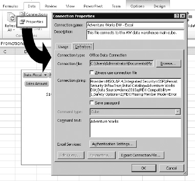
Figure 17–107. Copying the data connection
- Click the Export Connection File… button.
- In the File Save dialog, navigate to the Data Connections library in the BI Center site.
- Set the file name to “AW for Excel” and click Save (Figure 17–108).
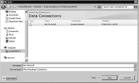
Figure 17–108. Naming the data connection file
- Select Office Data Connection File as the Content Type and click OK (Figure 17–109).
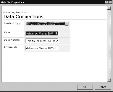
Figure 17–109. Selecting the content type of the data connection file
- Click Cancel to dismiss the Connection Properties dialog.
Before we publish the spreadsheet to SharePoint, we need to identify the objects and parameters to expose to Excel Services. The objects we'll use are the SalesChart and SalesTable objects. We will declare the Date and Promotions cells as parameters, which PerformancePoint will use to pass in dashboard filter selections.
- From the ribbon menu, select File Save & Send Save to SharePoint.
- Click the Publish Options button.
- Select Items in the Workbook from the drop-down list (Figure 17–110).
- Check the SalesChart and SalesTable items.
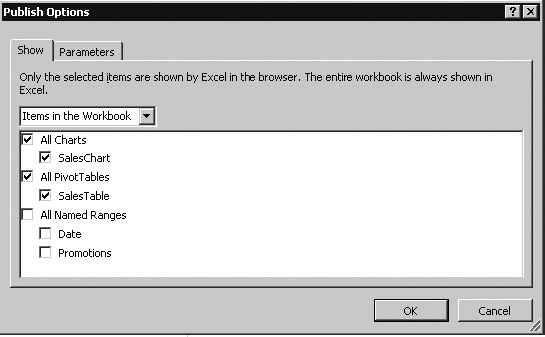
Figure 17–110. Choosing the items that will be displayed in the browser
- Switch to the Parameters tab (Figure 17–111).
- Click the Add button.
- Check both available parameters and click OK.
Figure 17–111. Adding parameters
- Click OK.
- If the Dashboards library is not shown under Locations (Figure 17–112), select Browse for a location to add it.
Figure 17–112. Saving to SharePoint
- Double-click the location to publish the file to SharePoint.
- Enter the file name “AWExcelRpt” in the Save As dialog and click Save.
- Select Document as the content type and click OK.
- The spreadsheet will be displayed in a new browser window.
- Close the new browser window and Excel.
Now that we have a spreadsheet published to SharePoint, we will add the PivotTable and PivotChart as reports in a new page on our dashboard.
- Open the Marketing.ddwx file in Dashboard Designer.
- Right-click on the PerformancePoint Content list and select New Report.
- Select the Excel Services template and click OK.
- Set the name of the report to “Sales Table”.
- Enter the URL for the BI Center site in the “SharePoint site” box on the report editor (Figure 17–113).
- Select the Dashboards library.
- Select “AWExcelRpt.xls” file for the workbook.
- Select “SalesTable” for the item name.
Figure 17–113. Adding a new Sales Table report
- Note that the Dashboard Designer has already identified the Workbook Parameters: Date and Promotions.
- Copy and paste the Sales Table report in the Workspace Browser.
- Rename “Sales Table – Copy” to “Sales Chart.”
- Select SalesChart from the Item name drop-down on the Sales Chart report editor.
- Save both reports and the workspace file.
- Right-click on the PerformancePoint Content list and select New Filter.
- Select the Member Selection filter template and click OK.
- Select Adventure Works for the data source and click Next.
- Press Select Dimension… and choose Promotion.Promotions.
- Click OK.
- Press Select Members… and select All Promotions and all of its descendants (Figure 17–114).
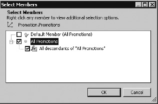
Figure 17–114. Selecting the All Promotions member
- Click OK to move to the next screen (Figure 17–115).
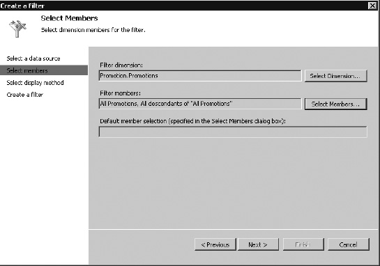
Figure 17–115. Creating a filter
- Click Next.
- Select Tree and click Next.
- Name the new filter Promotion.
We now have the new filter and reports created for our new page. Next we'll create the new dashboard page and deploy the dashboard.
- Select the Marketing Dashboard in the Workspace Browser.
- Click New Page in the dashboard editor and select the default template.
- Name the page “Sales by Promotion”.
- From Details, drag the Date and Promotion filters into the header of the new page.
- From Details, drag the Sales Table report into the left column zone.
- From Details, drag the Sales Chart report into the right column zone.
- Add the connections shown in Table 17–6 to the page.
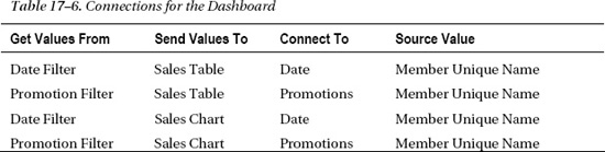
The dashboard page should now resemble the image in Figure 17–116..
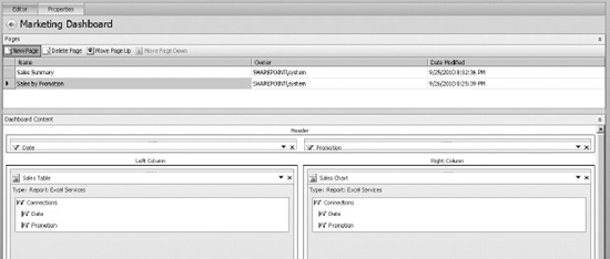
Figure 17–116. The dashboard page
- Right-click the Marketing Dashboard and select Deploy to SharePoint….
- When the browser window opens, click on the Sales by Promotion link.
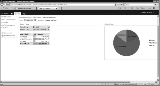
Figure 17–117. Excel reports displayed in the browser
Notice that all of the formatting from Excel is displayed on the dashboard, including the pie chart and data bars (Figure 17–117). Now any changes made to the Excel spreadsheet will automatically be reflected in the dashboard. This allows users who are more comfortable with Excel to author reports that can be integrated with the rest of a PerformancePoint solution.
Create a Strategy Map Report
Microsoft Visio is a powerful desktop visualization tool. As we saw in Chapter 2, the Visio Services component in SharePoint Server 2010 allows Visio diagrams to be brought to life with real data. With PerformancePoint Services, we can take that integration one step further. A Visio diagram can be created that visually represents the KPIs on a scorecard. Those KPIs can then be connected to the Visio diagram to create a graphical representation of the status of the enterprise. In PerformancePoint, this type of report is called a strategy map.
In this section, we will create a simple Visio diagram that we'll deploy to PerformancePoint as a Strategy Map report. The term “strategy map” refers to a particular type of diagram often used in conjunction with the “balanced scorecard” methodology. While this feature in PerformancePoint is ideally suited for implementing that type of map, any Visio diagram can be used as long as it contains only simple shapes that don't involve sets or groupings within Visio.
![]() Note Readers who are not familiar with Visio or Visio Services should review Chapter 2 before proceeding with the rest of this section.
Note Readers who are not familiar with Visio or Visio Services should review Chapter 2 before proceeding with the rest of this section.
- Launch Visio 2010 and create a new blank diagram using the Basic Diagram (US Units) template.
- Create a diagram with a set of simple shapes that looks something like the image in Figure 17–118. The precise details of the diagram are not important.
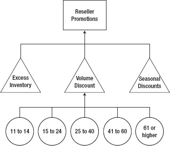
Figure 17–118. A simple Visio diagram
- Save the file with the file name Promotion Tree.vsd anywhere on your local computer.
- Close Visio.
- Open the Marketing.ddwx file in Dashboard Designer.
- Right-click on the PerformancePoint Content list and select New Report.
- Select the Strategy Map template from the Select a Report Template dialog and click OK.
- Select the Promotion Scorecard as the scorecard for the strategy map (Figure 119). The Strategy Map report uses a scorecard as a data source instead of a normal data source object.
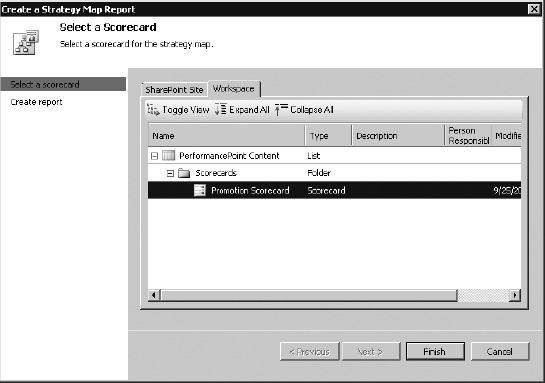
Figure 17–119. Creating a strategy map report using the Promotion Scorecard
- Click Finish.
- Name the new report Promotion Map.
- From the ribbon menu, select Edit Report Editor Edit Strategy Map (Figure 17–120).
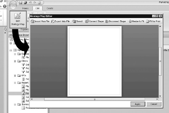
Figure 17–120. The Strategy Map Editor
- Click the Import Visio File button.
- To connect the Reseller Promotions shape to the scorecard, click on the shape and then on the Connect Shape button as shown in Figure 17–121.
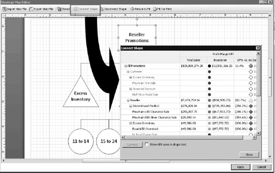
Figure 17–121. Connecting the Reseller Promotions shape to the scorecard
- The Connect Shape dialog shows a view of the underlying scorecard. Select the cell at the intersection of the Reseller row and the GP% vs. no Discount column.
- Ensure that the “Show KPI name in shape text” checkbox is not selected and click the Connect button.
- Click Close and the Reseller Promotions shape will now be colored the same as the KPI.
- Repeat steps 14 though 117 for each of the other shapes on the diagram. When complete, the diagram should look like the image in Figure 17–122. Your colors may vary depending on the filters that are active in your environment. The important thing is to connect the proper shape to the correct KPI.
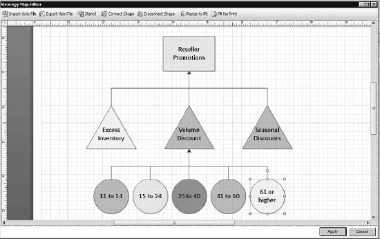
Figure 17–122. The Visio diagram with all shapes connected to the scorecard
- Drag the cursor over the diagram to select all of the shapes.
- Right-click one of the shapes and select Data Edit Data Graphic…
- Click the New Item… button.
- On the New Item dialog, select the options indicated in Table 17–7 and shown in Figure 17–123.
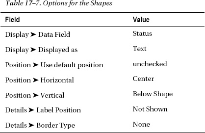
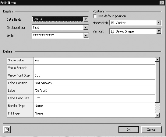
Figure 17–123. Values for the data graphic
- Click OK to create the Data Graphic.
- Click OK to save Data Graphics.
- Answer “Yes” to “Do you want to apply this data graphic to the selected shapes?”
- Now the map should look something like Figure 17–124.
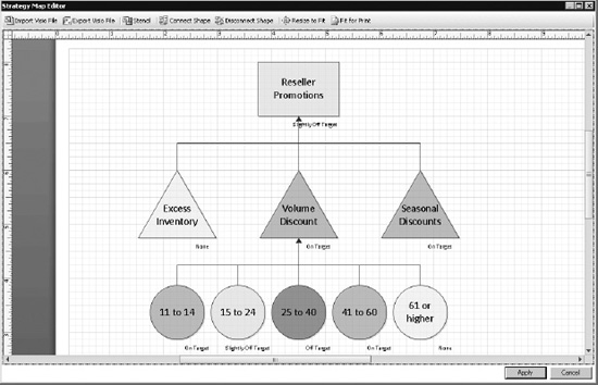
Figure 17–124. The shapes with the data graphic applied
- Click Apply.
- Save the Promotion Map report and the workspace.
- Select the Marketing Dashboard in the Workspace Browser.
- Add a new page to the dashboard with the default template.
- Name the page “Promotion Map.”
- Add the components in Table 17–8 to the zones of the new page.
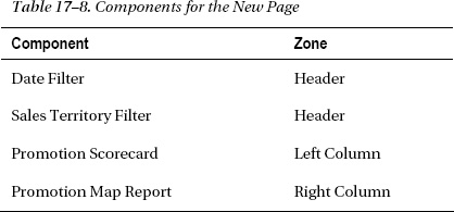
- Create the connections shown in Table 17–9.
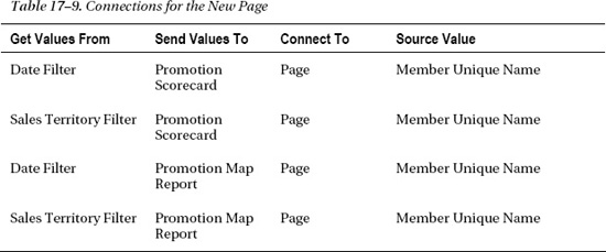
- The dashboard should now look like Figure 17–125.
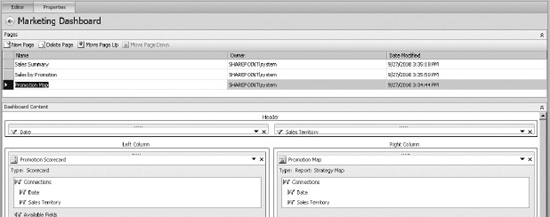
Figure 17–125. The Marketing Dashboard
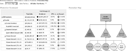
Figure 17–126. Trying out the strategy map
Try selecting different values for the Date and Sales Territory filters (Figure 17–126). Both the scorecard and the map are updated simultaneously. There are several features of the map to note:
- The end user can zoom in and out as desired by right-clicking on the map.
- By holding Ctrl and clicking on a shape, users can select that shape. Right-clicking a selected shape provides the option to view a detailed list of KPI properties.
- While it is common to display the scorecard associated with a strategy map on the same page, it's not required. The scorecard is still an active part of the dashboard even when it's not visible on the current page. Therefore, you could remove the scorecard from this page and the only effect would to be to hide it. The strategy map would still function correctly.
There is an important limitation when using strategy maps that can be handled with a little additional planning. In our example, if we select a different date range and sales territory, we may see rows on the scorecard that don't appear on the map, or we may see rows on the scorecard disappear due to a lack of data. These shapes still appear on the map, but they don't show a color. When we connect shapes to the scorecard, that connection is static. We can't change that association as needed to fit how the scorecard is filtered. We also can't add shapes as new rows appear in the scorecard.
There are different strategies for handling such situations. One way is to include every possible shape on the map. You could also limit the filtering of the page to prevent unwanted rows from appearing in the scorecard. Regardless, the shapes on the map and how they are associated are fixed at runtime.
Strategy maps are a versatile way to add visualization to your solution. They can be used to provide a user-friendly means of interpreting your key performance indicators.
Summary
In this chapter, we have explored PerformancePoint Service as outlined in Figure 17–127, including:
- The components of the PerformancePoint Services architecture.
- How to configure PerformancePoint Services using both Central Administration and PowerShell commands.
- How to enable the features of PerformancePoint Services within a SharePoint site and deploy the Business Intelligence Center.
- How to use Dashboard Designer to author and deploy a dashboard and its supporting components to SharePoint 2010.
- How to integrate PerformancePoint Dashboards with diagrams using Visio Services and spreadsheets using Excel Services.
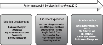
Figure 17–127. PerformancePoint Services Road Map