
CHAPTER 2
WATER COLOR TECHNIQUES
WATER COLOR TECHNIQUES
TOOLS: PAINT
My primary color media for costume sketches is the Pelikan transparent watercolor paint box. I have been using this product for more than 20 years with excellent results. I find the Pelikan watercolors provide fine-grain quality pigments that are easy to dissolve and apply, in addition to being highly lightproof after drying. Watercolor paints come in both transparent and opaque varieties. Transparent watercolors allow light to shine through the pigment, whereas opaque watercolors reflect light entirely off the pigment. The ultimate goal of my renderings is to illustrate a living character. I find that renderings done with transparent pigments appear crisp, glowing, and full of life.

TOOLS: BRUSHES
I work with a wide variety of brushes. For beginners I recommend investing in a 3/4 size filbert brush, round brushes in sizes 6, 8, and 10, and angle brushes in sizes 3/8 and 1/2. I work primarily with good quality synthetic brushes. Synthetic bristle brushes tend to retain their shape better than natural bristle brushes and are more economical. However, natural bristle brushes hold more liquid and release pigment more evenly than synthetic bristle brushes. I find beginners to watercolor painting often struggle with not overloading their brush with water. So, depending on your experience level, you may find synthetic brushes actually help establish control in your brushwork. High quality brushes should be able to maintain a nice precise point and be capable of holding a full load of color.

Round brushes are the most versatile and widely used shape for watercolor painting. The brushes are great for flat washes of color throughout your renderings, as well as for adding soft detail.
Angled brushes are great for texture detail work and adding interest to your brushwork. The sharp edges you can create with this brush are particularly helpful in expressing structure in a garment.


A large filbert head brush allows you to cover a sizeable area of your renderings quickly and in a single stroke. The sloped end of the bristles allows you to finish your brush strokes smoothly and gracefully.

TOOLS: PAPER
Watercolor paper may be purchased by the sheet, roll, or block. I typically work with high quality sheets. The best watercolor papers contain 100 percent cotton fiber and are acid free (having a neutral pH of 7). Acid-free papers resist deterioration and yellowing over time. Watercolor paper is rated according to its weight. A paper’s weight refers to how much a ream of 500 sheets of 22″ × 30″ paper weighs.
A common watercolor paper weight is 90lb. A heavier weight paper absorbs more water without buckling. This allows the student to apply many strokes of water without damaging the paper. I recommend that students practice their renderings and perform study work on 140lb paper. So much of watercolor is about timing and developing a swiftness and precision in your stroke. Once this improves you can begin to use 90lb paper. 90lb paper is what I use for my own rendering and what my students learn to use in their work.

Another advantage to 90lb watercolor paper is that most printers that feature a rear feed readily accept it. This is important because I prefer to scan and print out my pencil drawings prior to painting them. This preserves my original pencil drawing in case I wish to makes changes later. It also allows me the freedom to experiment with various color combinations in my painting, so I can be more responsive and flexible in my artistic process. I also find this practice relieves a great deal of stress for new students of costume design and rendering. Many a young artist labors over their drawings only to freeze with fear at the prospect of “ruining” their work while painting. Knowing that their original is preserved allows my students to be bold with their strokes and to take risks in their painting. If you don’t have access to a scanner and printer that can handle watercolor paper, you can use a light board/light box or carbon paper to transfer your drawing to watercolor paper in order to preserve the original.

TECHNIQUES: PAINTING SKIN
Painting skin can be intimidating because it requires a nuanced understanding of undertones. In the following section I will show you the colors I use when painting a variety of skin tones. Begin by drawing your face. Note the guidelines I used to help align the features on the face. The age and character traits of your model are established here in the drawing and expanded upon in the painting.
I use the same collection of colors to achieve a wide range of skin tones. The key difference is in the proportions in which you mix your colors. Slight changes can make a large difference. Critical observation of your reference model will reveal skin tones with greater quantities of red, yellow, or even blue in them. I typically start with Yellow Ochre and Burnt Sienna. This combination serves as the foundation for most skin tones. I then add any combination of Indian Red, Vandyke Brown, Lamp Black, or Cobalt Blue to achieve exactly the color I need.

Example 1 Mac
For this painting I used Burnt Sienna, Indian Red, and Yellow Ochre from my watercolor palette. I used a fair amount of water to keep the colors translucent and applied the paint in short dabbing strokes.


Lightly sketch out the egg shape and feature-placement lines.
Continue to refine the detail of the face.


I lay my lightest value around the eyes, at the temples, under the hollow of the cheeks, and down one side of the nose depending upon the direction of the light source in the sketch.
I finished the rendering with deeper values on the inside of the eyes, down the shadowed side of the face, and along the hairline.


For the hair, I used Lamp Black and Vandyke Brown, along with some Raw Umber for added warmth. I applied my lightest color first and returned with the deeper colors at the roots and in the shadows.

Example 2 A Rendering from a Production Photo
Quick light strokes begin to define the features of the face. These strokes will continue to be visible in the final painting.

Costume and photo by the author.

This step is focused on revealing the structure of the face through deepening the shadows. This unpainted area is the light falling across the face. The white of the paper remains unpainted.
Because the reference photo has a strong red undertone, I used a little more Indian Red on the cheeks. I used a bit of blue in his hair because it made for a lovely warm/cool contrast.


Example 3 A Rendering Inspired by a Nicolai Fechin Drawing
I begin by finding the shape of the head and the placement line for the features. I continue adding more lines to show age and texture. As my pencil strokes darken they begin to add dimension to the rendering, which helps me plan out where I will place my paint.


I paint with a small dab of Yellow Ochre and Red Ochre watercolor paint. I lay my lightest value skin tone around the eyes, at the temples, and under the hollow of the cheeks.


I continue adding my paint, placing my deepest values at the base of the rendering, around the woman’s chin and under her cheeks. This gives the skin a sense of weight and age; the entire face seems to sag. Small amounts of gray are used on the skin as well as the lightest touches of green from her scarf. Lines are reinforced with pen or pencil, particularly around the eye sockets.


Example 4 Further Example of Painting the Face

Costume and photo by the author.


Example 5 Further Example of Painting the Face

Costume and photo by the author.


Example 6 Further Example of Painting the Face


Example 7 Further Example of Painting the Face

Example 8 Further Example of Painting the Face

Example 9 Bringing It All Together


Here are several basic painting techniques that I have relied on for over 20 years of teaching and designing. Each technique produces a slightly different result in terms of value and texture, and I encourage you to experiment with each to find out which techniques work for you and the desired effects you wish to create in your renderings.
TECHNIQUES: FLAT WASH
A simple wash is the foundation technique in watercolor rendering. The key to this technique is painting with foresight and intention. Begin by identifying the direction of the light in your painting. In the example below the light is coming from the right side of the page, and therefore I will leave the areas on the right side of the figure white to show where the light is falling. The area of the upper arm in Figure 2.18B was painted with a single brushstroke. I began by placing my brush at the top of the shoulder and followed the natural folds of the fabric as I moved down the arm. I did not move my brush in a straight line; instead, I focused on painting the shadows of the figure. If you begin your painting with a good sketch, you will find you do not need spend much time painting to bring it to life. The goal of a simple wash is just to enhance the drawing.


TECHNIQUES: WET-ON-WET
Wet-on-wet is a technique that involves applying pigment to wet paper as opposed to dry paper. I dampen my paper with a wet brush and clean water. I let my paper dry ever so slightly while I set up my paint colors on my palette. Again, begin by putting individual colors on your palette and loading your brush from here, allowing them to mix on your brush. By the time my colors are ready the paper has reached the perfect level of dampness—I apply the paint and allow it to feather out across the page. I used multiple colors in this rendering, allowing them to blend into each other via the water. I was then able to use a dry brush to pick up areas of paint before they dried completely, creating areas of highlight.
This rendering is of a costume built out of weathered leather that will need to be distressed and overdyed. I can give this rendering to the costume shop and they will be able to use it as a reference for the placement and color of their distressing and dye work.


TECHNIQUES: DRY BRUSH
Dry brushing is a way of adding detail and quality to your costume rendering. With this technique you load a brush with pigment but with very little water and drag it over completely dry paper. The resulting effect is a series of crisp, hard-edged marks scattered within the field of the brush. These tend to pop out of your painting and are best utilized in areas of texture and interest.


In order to achieve an appropriately dry brush, you can load your brush with paint as usual and wipe it off onto a towel or spare piece of paper. It is always a wise idea to create a few test strokes on a separate piece of paper to gauge the wetness of your brush.
I am using an angle brush to show how the direction of brush strokes can give form to the rendering. Also, consider the angle of your brush and the pressure you apply to your stroke. Holding the brush perpendicularly to the page and using light pressure will create graining. Holding the brush so that it is almost parallel to the paper will create a sort of stippling. You may find that while applying a simple wash your brush loses liquid and eventually becomes ideal for dry brushing. With some practice you can time your strokes so this moment of drying out works to your advantage.


TECHNIQUES: PAINTING WOOL
Wool is a favorite choice for costume designers because it can display so much texture when it is aged and distressed. I began this rendering with a simple wash applied using a round brush. I have preserved the white of my paper in the areas where light would naturally fall and have indicated shadows on the left with a deeper value of green.

I used an angle brush to add texture and detail to the rendering. In this rendering, I am imagining not only the fabric of the coat but also the level of distressing I desire. This is communicated by the many directions of the brush strokes and the variety of colors concentrated in the shadows.


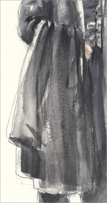
TECHNIQUES: PAINTING BLACK COSTUMES
Painting all-black costumes can be a challenge. Often, new students of watercolor will obliterate a perfectly lovely drawing by applying layers of pitch-black paint. The key to a successful painting of black costumes is a judicious use of highlight and shadow to reveal the structure of the garment. Retaining the highlights throughout the painting is critical, as is placing the deepest shadows, with great precision, in the final stages of the process.

From my experience, it is best to begin by working in the wet-on-wet technique. Place a pale gray in the folds and shadows of the rendering, being mindful to preserve the white of the paper where highlights and shadows would naturally fall.
When the page is half dry, work quickly to add deeper values into the folds of the garment. Let the rendering dry completely before returning to add a few moments of true black using the dry brush technique in the shadow areas of deep folds.
Remember, the key to rendering a black garment is expressing the structure. Carefully selected moments of a true black will reveal this structure, so plan the placement of this value before you begin painting.
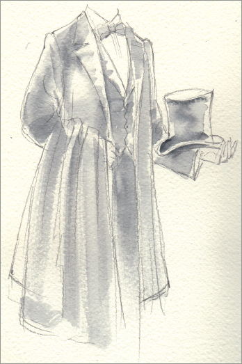

TECHNIQUES: PAINTING WHITE COSTUMES
When painting white fabrics you continue to leave your paper unpainted for the lightest values and focus on painting the shadows. These shadows will not be a hard black or gray. Rather, they will have a slight tint of color. White fabrics reflect the light around them and will take on the color of the nearby world ever so slightly. In this sketch I have used pale blues and grays to paint the shadows.

This costume will be built out of layers of lace and light, crisp cotton. After painting my shadows with a light wash of blue and green, I have gone back with a pencil to illustrate the details of the trim. By keeping my lines light and delicate, I am in turn able to communicate the light and delicate quality of the fabric itself.

There is an aged and ghostly quality to this white costume. I have used earth tones to paint the shadows of this rendering and showcase that quality. There is color variation in all of the paint but the color generally gets more gray-green as you travel down the body.

TECHNIQUES: PAINTING PATTERNS
It may be intimidating to imagine painting patterns, or too time consuming, but I find it doesn’t have to be labored. Patterns feel more natural when approached lightly, and you usually only need the gesture of a pattern to get your idea across. It is a good idea to map patterns out first in your drawing, but think about how they morph with the folds of the fabric and try not to be too specific—particularly with floral patterns, polka dots, or less geometric designs, like lace.
Example 1 Painting Plaid Patterns
Always draw plaid patterns out before painting them. It takes less time than you think and is enormously helpful in maintaining the accuracy of your final pattern. It is critical that the lines follow the cylindrical shape of the human body. The vertical lines quite often appear shifted and broken due to the folds of the fabric. Remember you do not need to paint everything to communicate the pattern.


Example 2 Painting Floral Patterns
When painting floral patterns I use quick, abstract strokes to capture the general proportion of colors in the fabric. I feel no need to duplicate floral prints exactly in my renderings. This is largely because I believe in rendering before I shop for fabric. In my work, I endeavor to paint the feeling of the fabric I will be looking for. In my 20-plus years of experience I have found that 95 percent of the time I can find the fabric I have rendered.


The next three examples will show you how I paint fabric patterns.
Example 3

Example 4

Example 5

WATERCOLOR TECHNIQUES IN PRACTICE
Step-by-Step Example 1
An excellent sketch is the foundation of an excellent watercolor rendering. When your pencil work already communicates depth and dimension, you do not have to work very hard to add color to the image. I always begin with the skin. It is the foundation of the rendering and I find it helpful to “see” the person I am painting appear on the page before I begin working on the clothes. In this step, I add a very light wash to a few key areas of this character’s coat. Using a fully loaded (but not dripping) brush, I begin finding the shadows and contours of the garment while preserving as much white of the paper as I can. Strokes follow the folds of the clothing rather than moving in stiffer motions. The goal is not to fill in the lines but to reveal the play of light across the form.

In this step, I begin adding layers of color using the wet-on-wet technique. This costume will be built of aged leather, and the wet-on-wet technique helps me communicate the soft and supple quality of the material. Because watercolor will dry a few shades lighter than color when wet, I always mix a tad darker than my desired finish color. I am continuing to leave room for the white of the paper to show through.
When working with a muted palette, I use a mix of Warm Sepia, Payne’s Grey, and Burnt Sienna. I often find myself returning to this combination of colors to communicate muted and worn fabrics.


In this final step, I add in my darkest values using a controlled wash, continuing to sense the dimension found in the rendering. I used the dry brush technique to place some of my darkest values. I used this technique in combination with an angled brush to create the angular strokes indicating patches of fabric on the coat.
After the rendering is complete and the paint has dried fully, I scratched the work with an exacto knife. This rendering is of a deeply distressed and tattered garment. These scratches allowed very fine streaks of white and lighter values to come through, giving a deeply worn appearance.


Step-by-Step Example 2
The rendering begins with a pencil sketch. Notice that I have used darker pencil strokes along the center of the figure to help the viewer see the depth of the ruffle detail and to guide the eye down the center of the performer’s body. I have suggested the contours of the lace with my pencil without over-illustrating the specific pattern.
I begin by mixing the skin tone and defining the body within the clothes. Notice that I paint the skin that lives under the lace, since we will be able to see it through the sheer fabric. I have used several tones of blonde to define the hair. I am beginning to find the distinction between light and shadow in this painting.


In this next step I have laid in the colors of the garment itself. This is a very light and airy gown, and leaving a large amount of white on the paper helps me communicate that general sense of delicacy. The floral pattern of the gown’s fabric is suggested by the placement of the paint without becoming overly specific and heavy. There is a greater contrast in the values used in the hair now as well.
I now begin adding deeper values to the painting to give it shape and to define the pattern of the gown itself. Notice that the deeper values are concentrated at the waist and down the center front of the gown. These are places where a natural shadow would occur. Also notice that I do not simply trace the front edge of the gown with my brush, but rather use several short strokes to define the shadows along those edges. This is a much more effective way to use your brush.


The finished version of the rendering has more detail present in the floral pattern of the gown but still communicates an overall sense of airiness by letting those details fade out towards the hem. I have gone back in with my pencil to draw out some of the details that may have been lost during painting. This includes strengthening the lines of the lace at the hem and the lace at the collar, as well as revisiting the details of the face.
