
CHAPTER 3
PUTTING SKILLS INTO PRACTICE
PUTTING SKILLS INTO PRACTICE
DOODLING
Drawing is a method for finding and developing your design. I begin drawing straightaway, working through my ideas on paper. I call this process “doodling”. These are not finished renderings but quick little sketches that help me experiment with different silhouettes and proportions. This “doodling” is a key step in my process. The following example follows the development of my design through “doodling” for Glendower from the 1996 Utah Shakespeare Festival production of Henry IV, Part One.
I began by sketching out some ideas for Glendower. I experimented with the collar style, the shape of the shoulders, and the overall proportions of his costume.

As I continued experimenting with the shoulders, I also tested out different styles of headwear and trim placements.

Next I began to experiment with a longer cape over the shorter garment. This idea was abandoned as I moved forward to the final rendering.

This is what I initially believed to be the final design. However, in conversation with the director, my design began to evolve, and we began to explore longer silhouettes for Glendower.

In this series of sketches, I continued to experiment with a different, longer silhouette and headwear.


I continued to work with my ideas, trying out my ideas through “doodling” until I found my design.


Once I was fully prepared, I began the final sketch.

GESTURAL POSES
When beginning a rendering, I first search for the gestural pose of the character. I consider key scenes in the play, unfolding them in my mind, until I find the defining moment of a character. I then attempt to capture that scene on paper. My figures are not standing still on the page, nor are they composed as if they are modeling the clothes. Rather, I try to create a snapshot of the play as I see it in my mind.


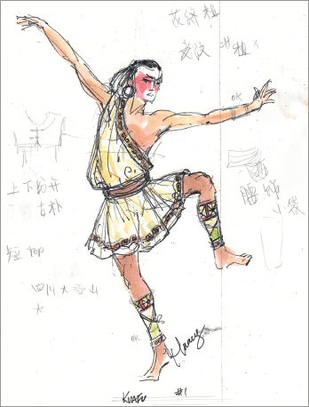
Using gestural poses is particularly helpful in rendering for dance productions. With dance, the way the fabric will move in performance is of particular importance. Not only will rendering the figure in motion will help you communicate this, I find the act of rendering the costume in motion helps me think through the design in full so that I make more informed choices in the realization of the design.
When rendering for dance it is key to know the choreography of the piece or the nature of the movement the performer will engage in. Sometimes I will take photos of the performer as they move through the choreography so that I can refer to them as I work. If this is not possible, I will consult with the choreographer so that I understand the spirit of the dance.


GROUPING
Sometimes it is helpful to capture pairs or groups of characters together in a scene. The defining moment of a character may happen with other characters or in opposition to other characters. In these moments, I can reveal the most information by rendering them together.
In this rendering of Orlando and Rosalind for Shakespeare’s As You Like It, Rosalind is attempting to disguise her identity by dressing as a man. Her pose is full of false bravado while the as-yet-unaware Orlando communicates confusion and even suspicion with his pose. By rendering these 2 characters together in gestural poses I am able to assist my collaborators in creating the fullest vision of the play possible.

Over Hear and Over See are a comedic duo from The Monkey King. By rendering them together I can explore the impact that their matching costumes will have on the production.
This group of Bandits from The Monkey King always functions as a single force. Because of this, I rendered them together—almost as one character. By doing this I can see how the variations in their looks will interact with each other.


This grouping of courtiers from Shakespeare’s A Midsummer Night’s Dream allowed me to communicate what the stage will look like when filled with an ensemble of black and gray costumes. In the production there were more than four courtiers, but by rendering several figures together I created an image that communicated my idea for the whole group.

A group rendering also helps to show the contrast between different characters onstage, such as this image of Bottom with the fairies in A Midsummer Night’s Dream. When rendering, I often try to picture an important scene in my head, and how the characters interact, to help bring the character to life as they will appear on the stage.

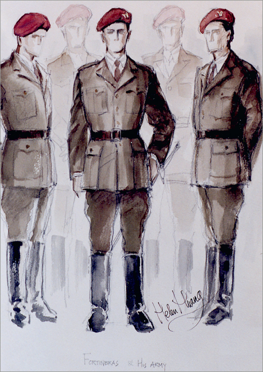
Large ensembles, such as Fortinbras’s army from Hamlet, or villagers from Anna Karenina, are useful to show as a group. This allows me to demonstrate the variations and similarities among the group, and to show the energy of them as a whole, which is more powerful in larger numbers than in stand-alone figures.

INCORPORATING RESEARCH
Research is an important part of the designer’s process in many ways. In addition to informing us about the world of the show, it is often a point of inspiration. There are many techniques to collecting and sorting research, but I would recommend gathering as much visual research as possible before you start rendering. Print it out and keep it nearby as you render to stay focused on what inspired you originally.
Showing Research with the Rendering
I often place key pieces of research or sourcing images directly on my final renderings. Doing this helps to communicate the full picture for both the performer and the director. In this rendering of Neasa for Shining City at Studio Theatre (see facing page), the additional images give an idea of the quality of the individual items that make up the costume. In the rendering for Autolycus in The Winter’s Tale for Oregon Shakespeare Festival (below), you can see how many different elements combined to create the Bohemian character, and how I selected key images to share with the rendering to help convey the design.


Painting on Research
For Measure for Pleasure and Marie Antoinette at Woolly Mammoth Theatre Company, I found my design by painting on top of key pieces of research. These new images let me see how the research could be incorporated into the rest of the design, and I was then able to develop the costume sketch in my usual style. I continued to refer to both images throughout the process because I found the painted research to be so informative.
Example 1 Lady Vanity from Measure for Pleasure


Example 2 Sir Lustforth from Measure for Pleasure


Example 3 Blunt from Measure for Pleasure


Example 4 Marie Antoinette for Woolly Mammoth Theatre Company
Rendering on top of the research provided me with the freedom to blend together both contemporary style and period elements. By painting the period details on top of contemporary figures I was able to quickly access the sort of aggressively anachronistic blend I was searching for. As I have mentioned before in this text, I believe the act of rendering is the act of design and it was through the process of painting that I was able to find this design.


Incorporating Elements in Photoshop
Technology has expanded the costume artist’s capacity to communicate visually. Photoshop and other digital mediums should not be ignored. However, I still find much value in the expressive nature of traditional rendering methods. I’ve found blending the two mediums to be most helpful.
Example 5 Fortinbras from Rosencrantz and Guildenstern Are Dead
For my renderings for this production of Rosencrantz and Guildenstern Are Dead, I used Photoshop to combine research ideas and then hand drew and painted on top of the composite.

Example 6 Chimerica
For Chimerica at Studio Theatre, when designing for the character Joe, I was able to Photoshop both actor Ron Menzel’s headshot and the images of particular costume elements from my research onto the page. Once their features were scaled and inserted into the rendering I went back with my watercolors and pencils to add in the details and shading. This gave my renderings a sense of specificity that was fitting to the style of the production itself.


Example 7 Render for The Whipping Man—Inspired by the Cast
For The Whipping Man at George Street Playhouse, I used Photoshop to incorporate the actors’ headshots into my renderings. This helped to truly realize the characters, and to bring them to life as we would see the production on stage. Actors are excited to get to see themselves in the renderings, and it helps both them and the director to better envision them in the role.


COLOR CONCEPTS
Color is one of the most powerful elements that a designer can harness in their work. A designer should seek to develop an eye that takes in all the variations and nuances of color in the world around them. Being able to accurately see color is paramount. With this skill, a designer can begin to successfully control and direct the use of color in their renderings.
A color concept can be found in many ways. Usually I discover it in the research process; sometimes in the work of other artists, in paintings, or photographs. One or two strong images that combine colors in an interesting way and that resonate with the energy and themes of your production will help you shape how you use the colors throughout your design.
On the following pages you will find examples of how I worked with color in two of my previous designs: The Winter’s Tale and Twelfth Night at Oregon Shakespeare Festival.
Example 1 The Winter’s Tale
For Shakespeare’s The Winter’s Tale, I began by gathering and editing research images to create a tight color palette. The image shown here is an inspiration board that guided my color choices throughout the show. I kept this image with me as I painted, so that the quality of my colors never strayed outside these parameters.


Here you can see how my research and renderings translated into fabric for the realized costumes. The samples in Figure 3.40 show the range of grays that one can find in my renderings and the specific tones of yellow I used. When working in a tight color palette, it helps add dimension and variation to the designs by finding the many diverse shades and values within each color. As you can see, there are many different types of gray fabrics that made up the finished designs.
A tight color palette was particularly successful in The Winter’s Tale, as it created a sense of formality and uniformity that suited the court of Leontes. By keeping things constrained in this way, it added increased contrast to the overly colorful world of Bohemia later in the play.

Example 2 Twelfth Night
For Shakespeare’s Twelfth Night at Oregon Shakespeare Festival I referenced one painting: The Druids Bringing in the Mistletoe by George Henry. As usually happens in my work, I found myself referencing not only the color of this painting in my work but also its general quality and overall mood. Finding a color inspiration that has rich patterns allows you to see how numerous colors can work together, sometimes in unexpected combinations, when used in balance with each other.


