CHAPTER 42
Using UserForm Controls in a Worksheet
Chapter 41, “Creating UserForms,” presented an introduction to UserForms. If you like the idea of using dialog box controls but you don't like the idea of creating a custom dialog box, this chapter is for you. It explains how to enhance your worksheet with a variety of interactive controls, such as buttons, list boxes, and option buttons.
Understanding Why to Use Controls on a Worksheet
The main reason to use controls on a worksheet is to make it easier for the user to provide input. For example, if you create a model that uses one or more input cells, you can create controls to allow the user to select values for the input cells.
Adding controls to a worksheet requires much less effort than creating a dialog box. In addition, you may not have to create any macros because you can link a control to a worksheet cell. For example, if you insert a CheckBox control on a worksheet, you can link it to a particular cell. When the CheckBox is checked, the linked cell displays TRUE. When the CheckBox is not checked, the linked cell displays FALSE.
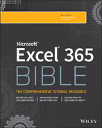
Figure 42.1 shows an example that uses three types of controls: a Checkbox, two sets of OptionButtons, and a ScrollBar. The user's selections are used to display a loan amortization schedule on another worksheet. The workbook is interactive, but it uses no macros.
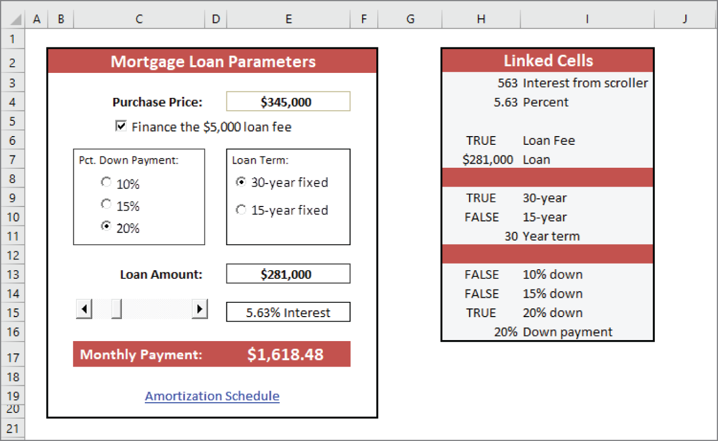
FIGURE 42.1 This worksheet uses UserForm controls.
Adding controls to a worksheet can be a bit confusing because Excel offers two different sets of controls, both of which you access by choosing Developer ➪ Controls ➪ Insert:
- Form controls These controls are unique to Excel.
- ActiveX controls These controls are a subset of those that are available for use on UserForms.
Figure 42.2 shows the controls that appear when you choose Developer ➪ Controls ➪ Insert. When you move your mouse pointer over a control, Excel displays a ScreenTip that identifies the control.
To add to the confusion, many controls are available from both sources. For example, a control named ListBox is listed in both Form controls and ActiveX controls. However, they're two entirely different controls. In general, Form controls are easier to use, but ActiveX controls provide more flexibility.

FIGURE 42.2 Excel's two sets of worksheet controls
Table 42.1 describes the ActiveX controls.
TABLE 42.1 ActiveX Controls
| Button | What It Does |
|---|---|
| Command Button | Inserts a CommandButton control (a clickable button). |
| Combo Box | Inserts a ComboBox control (a drop-down list). |
| Check Box | Inserts a CheckBox control (to control Boolean options). |
| List Box | Inserts a ListBox control (to allow the user to select an item from a list). |
| Text Box | Inserts a TextBox control (to allow the user to type text). |
| Scroll Bar | Inserts a ScrollBar control (to specify a value by dragging a bar). |
| Spin Button | Inserts a SpinButton control (to increment a value by clicking up or down). |
| Option Button | Inserts an OptionButton control (to allow a user to select from multiple options). |
| Label | Inserts a Label control (to display text). |
| Image | Inserts an Image control (to display an image). |
| Toggle Button | Inserts a ToggleButton control (to control Boolean options). |
| More Controls | Displays a list of other ActiveX controls that are installed on your system. Not all of these controls work with Excel. |
Using Controls
Adding ActiveX controls in a worksheet is easy, but you need to learn a few basic facts about how to use them.
Adding a control
To add a control to a worksheet, choose Developer ➪ Controls ➪ Insert. From the Insert drop-down list, click the control you want to use and then drag in the worksheet to create the control. You don't need to be too concerned about the exact size or position of the control because you can modify those properties at any time.
Learning about Design mode
When you add a control to a worksheet, Excel goes into Design mode. In this mode, you can adjust the properties of any controls on your worksheet, add or edit the macro for the control, or change the control's size or position.
When Excel is in Design mode, the controls aren't enabled. To test the controls, you must exit Design mode by clicking the Design Mode button. When you're working with controls, you'll probably need to switch in and out of Design mode frequently.
Adjusting properties
Every control that you add has various properties that determine how it looks and behaves. You can adjust these properties only when Excel is in Design mode. When you add a control to a worksheet, Excel enters Design mode automatically. If you need to change a control after you exit Design mode, click the Design Mode button in the Controls group of the Developer tab.
To change the properties for a control, follow these steps:
- Make sure Excel is in Design mode.
- Click the control to select it.
- If the Properties window isn't visible, click the Properties icon in the Controls group of the Developer tab. The Properties window appears, as shown in Figure 42.3.
- Select the property and make the change.

FIGURE 42.3 Use the Properties window to adjust the properties of a control—in this case, a ComboBox control.
The manner in which you change a property depends on the property. Some properties display a drop-down list from which you can select from a list of options. Others (such as Font) provide a button that displays a dialog box when clicked. Other properties require you to type the property value. When you change a property, the change takes effect immediately.
The Properties window has two tabs. The Alphabetic tab displays the properties in alphabetical order. The Categorized tab displays the properties by category. Both tabs show the same properties; only the order is different.
Using common properties
Each control has its own unique set of properties. However, many controls share properties. This section describes some properties that are common to all or many controls, as set forth in Table 42.2.
TABLE 42.2 Properties Shared by Multiple Controls
| Property | Description |
|---|---|
| AutoSize | If True, the control resizes itself automatically based on the text in its caption. |
| BackColor | The background color of the control. |
| BackStyle | The style of the background (either transparent or opaque). |
| Caption | The text that appears on the control. |
| Left and Top | Values that determine the control's position. |
| LinkedCell | A worksheet cell that contains the current value of a control. |
| ListFillRange | A worksheet range that contains items displayed in a ListBox or ComboBox control. |
| Name | The name of the control. When you add a control, Excel assigns it a name based on the control type. You can change the name to any valid name. However, each control's name must be unique on the worksheet. |
| Picture | Enables you to specify a graphics image to display. |
| Value | The control's value. |
| Visible | If False, the control is hidden. |
| Width and Height | Values that determine the control's size. |
Linking controls to cells
Often, you can use ActiveX controls in a worksheet without using macros. Many controls have a LinkedCell property, which specifies a worksheet cell that is linked to the control.
For example, you may add a SpinButton control and specify cell B1 as its LinkedCell property. After you do so, cell B1 contains the value of the SpinButton, and clicking the SpinButton changes the value in cell B1. You can, of course, use the value contained in the linked cell in your formulas.
Creating macros for controls
To create a macro for a control, you must use the Visual Basic Editor (VBE). The macros are stored in the code module for the sheet that contains the control. For example, if you place an ActiveX control on Sheet2, the VBA code for that control is stored in the Sheet2 code module. Each control can have a macro to handle any of its events. For example, a CommandButton control can have a macro for its Click event, its DblClick event, and various other events.
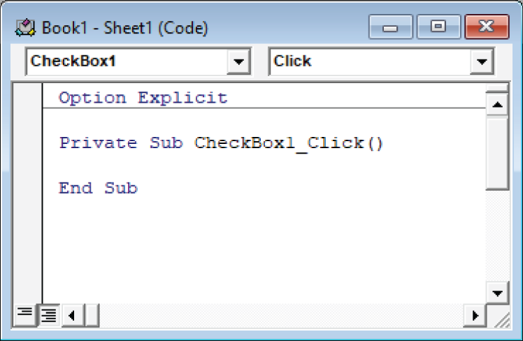
FIGURE 42.4 Double-clicking a control in Design mode activates the VBE and enters an empty event-handler procedure.
The control's name appears in the upper-left portion of the code window, and the event appears in the upper-right area. If you want to create a macro that executes when a different event occurs, select the event from the list in the upper-right area.
The following steps demonstrate how to insert a CommandButton and to create a simple macro that displays a message when the button is clicked:
- Choose Developer ➪ Controls ➪ Insert.
- Click the CommandButton tool in the ActiveX Controls section.
- Click and drag in the worksheet to create the button. Excel automatically enters Design mode.
- Double-click the button. The VBE is activated, and an empty procedure is created for the button's Click event.
- Enter the following VBA statement before the End Sub statement:
MsgBox "Hello, it's " & Time - Press Alt+F11 to return to Excel.
- (Optional) Adjust any other properties for the CommandButton using the Properties window. Choose Developer ➪ Controls ➪ Properties if the Properties window isn't visible.
- Click the Design Mode button in the Developer ➪ Controls group to exit Design mode.
After you perform the preceding steps, when you click the CommandButton, the message box appears and displays the current time.
Reviewing the Available ActiveX Controls
The following sections describe the ActiveX controls that are available for use in your worksheets.
CheckBox
A CheckBox control is useful for getting a binary choice: yes or no, true or false, on or off, and so on. The following is a description of the most useful properties of a CheckBox control:
- Accelerator A letter that enables the user to change the value of the control by using the keyboard. For example, if the accelerator is A, pressing Alt+A changes the value of the CheckBox control. The accelerator letter is underlined in the caption of the control.
- LinkedCell The worksheet cell that's linked to the CheckBox. The cell displays TRUE if the control is checked and FALSE if the control is not checked.
ComboBox
A ComboBox control is a combination of a TextBox and a ListBox. It acts as a TextBox because the user can type in it just like a TextBox, even if what they type isn't on the list. It acts as a ListBox because when you click its drop-down arrow, a list of available items appears.
FIGURE 42.5 A ComboBox control
Figure 42.5 shows a ComboBox control that uses the range D1:D12 for the ListFillRange and cell A1 for the LinkedCell.
The following is a description of the most useful properties of a ComboBox control:
- BoundColumn If the ListFillRange contains multiple columns, this property determines which column contains the returned value.
- ColumnCount This specifies the number of columns to display in the list.
- LinkedCell This specifies the worksheet cell that displays the selected item.
- ListFillRange This specifies the worksheet range that contains the list items.
- ListRows This specifies the number of items to display when the list drops down.
- ListStyle This determines the appearance of the list items.
- Style This determines whether the control acts like a drop-down list or a ComboBox. A drop-down list doesn't allow the user to enter a new value.
CommandButton
A CommandButton control is used to execute a macro. When a CommandButton is clicked, it executes an event procedure with a name that consists of the CommandButton name, an underscore, and the word Click. For example, if a CommandButton is named MyButton, clicking it executes the macro named MyButton_Click. This macro is stored in the code module for the sheet that contains the CommandButton.
Image
An Image control is used to display an image. These are the most useful properties of an Image control:
- AutoSize If this property is TRUE, the Image control is resized automatically to fit the image.
- Picture This is the path to the image file. Click the button in the Properties window, and Excel displays a dialog box so that you can locate the image. Or, copy the image to the Clipboard, select the Picture property in the Properties window, and press Ctrl+V.
- PictureSizeMode This determines how the picture is changed when the container size is different than the picture.
Label
A Label control simply displays text. Like on a UserForm, it's used to describe other controls. You can also use its Click event to activate other controls with an accelerator key.
ListBox
A ListBox control presents a list of items, and the user can select an item (or multiple items). It's similar to a ComboBox. The main difference is that a ListBox doesn't require you to click a drop-down arrow to display more than one item at a time.
The following is a description of the most useful properties of a ListBox control:
- BoundColumn If the list contains multiple columns, this property determines which column contains the returned value.
- ColumnCount This specifies the number of columns to display in the list.
- IntegralHeight This is TRUE if the height of the ListBox adjusts automatically to display full lines of text when the list is scrolled vertically. If this property is FALSE, the ListBox may display partial lines of text when it's scrolled vertically.
- LinkedCell This specifies the worksheet cell that displays the selected item.
- ListFillRange This specifies the worksheet range that contains the list items.
- ListStyle This determines the appearance of the list items.
- MultiSelect This determines whether the user can select multiple items from the list.
OptionButton
OptionButton controls are useful when the user needs to select from a small number of items. OptionButton controls are always used in groups of at least two.
The following are the most useful properties of an OptionButton control:
- Accelerator A letter that lets the user select the option by using the keyboard. For example, if the accelerator for an OptionButton is C, pressing Alt+C selects the control.
- GroupName A name that identifies an OptionButton as being associated with other OptionButtons with the same GroupName property.
- LinkedCell The worksheet cell that's linked to the OptionButton. The cell displays TRUE if the control is selected or FALSE if the control isn't selected.
ScrollBar
A ScrollBar control is useful for specifying a cell value. Figure 42.6 shows a worksheet with three ScrollBar controls. These ScrollBar controls are used to change the color in the rectangle shape. The value of the ScrollBar control determines the red, green, or blue component of the rectangle's color. This example uses a few simple macros to change the colors.
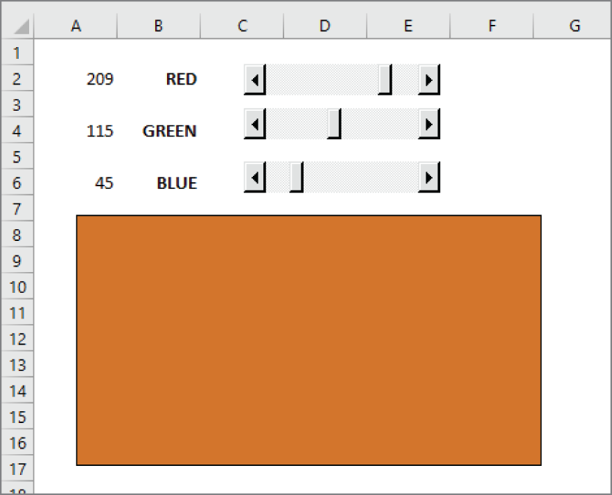
FIGURE 42.6 This worksheet has three ScrollBar controls.
The following are the most useful properties of a ScrollBar control:
- Value The current value of the control
- Min The minimum value for the control
- Max The maximum value for the control
- LinkedCell The worksheet cell that displays the value of the control
- SmallChange The amount that the control's value is changed by clicking the arrows
- LargeChange The amount that the control's value is changed by clicking in the scroll area
The ScrollBar control is most useful for selecting a value that extends across a wide range of possible values.
SpinButton
A SpinButton control lets the user select a value by clicking the control, which has two arrows (one to increase the value and the other to decrease the value). A SpinButton can display either horizontally or vertically.
The following are the most useful properties of a SpinButton control:
- Value The current value of the control.
- Min The minimum value of the control.
- Max The maximum value of the control.
- LinkedCell The worksheet cell that displays the value of the control.
- SmallChange The amount that the control's value is changed by a click. Usually, this property is set to 1, but you can make it any value.
TextBox
On the surface, a TextBox control may not seem useful. After all, it simply contains text—you can usually use worksheet cells to get text input. In fact, TextBox controls are useful not so much for input control as for output control. Because a TextBox can have scrollbars, you can use a TextBox to display a great deal of information in a small area.
Figure 42.7 shows a TextBox control that contains Lincoln's Gettysburg Address. Notice the vertical scrollbar displayed using the ScrollBars property.
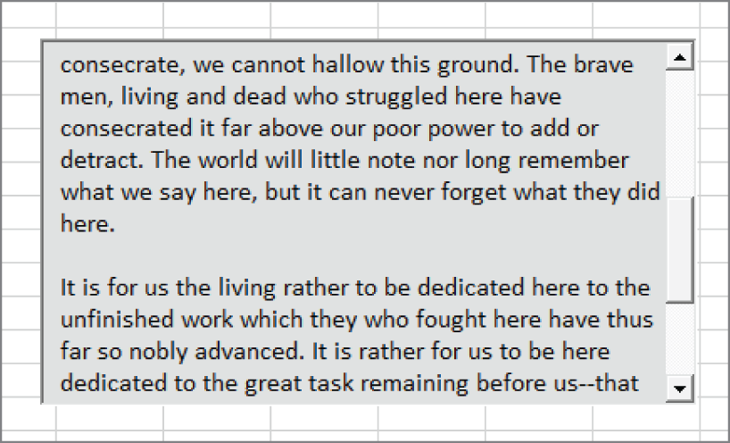
FIGURE 42.7 A TextBox control with a vertical scrollbar
The following are the most useful properties of a TextBox control:
- AutoSize This determines whether the control adjusts its size automatically, based on the amount of text.
- IntegralHeight If TRUE, the height of the TextBox adjusts automatically to display full lines of text when the list is scrolled vertically. If FALSE, the ListBox may display partial lines of text when it's scrolled vertically.
- MaxLength This determines the maximum number of characters allowed in the TextBox. If 0, no limit exists on the number of characters.
- MultiLine If TRUE, the TextBox can display more than one line of text. To create a new line in a MultiLine textbox, press Shift+Enter.
- TextAlign This determines the way the text is aligned in the TextBox.
- WordWrap If TRUE and the MultiLine property is also TRUE, lines that are longer than the width of the control are wrapped to the next line.
- ScrollBars This determines the type of ScrollBars for the control: horizontal, vertical, both, or none.
ToggleButton
A ToggleButton control has two states: on and off. Clicking the button toggles between these two states, and the button changes its appearance to indicate its current state. Its value is either TRUE (pressed) or FALSE (not pressed). You can often use a ToggleButton in place of a CheckBox control.