CHAPTER 21
Visualizing with Custom Number Formats and Shapes
Visualization is the presentation of abstract concepts or data in visual terms through some sort of graphical imagery. A traffic light, for example, is a visualization of the abstract concepts of stop and go.
In the business world, visualizations help us to communicate and process the meaning of data faster than simple tables of numbers. Excel offers a wide array of features that can be used to add visualizations to dashboards and reports.
In this chapter, you explore some of the formatting techniques that you can leverage to add layers of visualizations and turn your data into meaningful views.
Visualizing with Number Formatting
When you enter a number into a cell, you can display that number in a variety of different formats. Excel has quite a few built-in number formats, but sometimes there are none that are exactly what you need.
This chapter describes how to create custom number formats, and it provides many examples that you can use as is or adapt to your needs.
Doing basic number formatting
The Number group on the Home tab of the Ribbon contains several controls for applying common number formats quickly. The Number Format drop-down control gives you quick access to 11 common number formats. In addition, the Number group contains some buttons. When you click one of these buttons, the selected cells take on the specified number format. Table 21.1 summarizes the formats that these buttons perform in the U.S. English version of Excel.
TABLE 21.1 Number-Formatting Buttons on the Ribbon
| Button Name | Formatting Applied |
|---|---|
| Accounting Number Format | Adds a dollar sign to the left, separates thousands with a comma, and displays the value with two digits to the right of the decimal point. This is a drop-down control, so you can select other common currency symbols. |
| Percent Style | Displays the value as a percentage, with no decimal places. This button applies a style to the cell. |
| Comma Style | Separates thousands with a comma and displays the value with two digits to the right of the decimal point. It's like the Accounting Number Format but without the currency symbol. This button applies a style to the cell. |
| Increase Decimal | Increases the number of digits to the right of the decimal point by one. |
| Decrease Decimal | Decreases the number of digits to the right of the decimal point by one. |
Using shortcut keys to format numbers
Another way to apply number formatting is to use shortcut keys. Table 21.2 summarizes the shortcut key combinations that you can use to apply common number formatting to the selected cells or range. Notice that these are the shifted versions of the number keys along the top of a typical keyboard.
TABLE 21.2 Number-Formatting Keyboard Shortcuts
| Key Combination | Formatting Applied |
|---|---|
| Ctrl+Shift+~ | General number format (that is, unformatted values). |
| Ctrl+Shift+! | Two decimal places, thousands separator, and a hyphen for negative values. |
| Ctrl+Shift+@ | Time format with the hour, minute, and AM or PM. |
| Ctrl+Shift+# | Date format with the day, month, and year. |
| Ctrl+Shift+$ | Currency format with two decimal places. (Negative numbers appear in parentheses.) |
| Ctrl+Shift+% | Percentage format with no decimal places. |
| Ctrl+Shift+^ | Scientific notation number format with two decimal places. |
Using the Format Cells dialog box to format numbers
For maximum control of number formatting, you can use the Number tab in the Format Cells dialog box. You can access this dialog box in any of several ways:
- Click the dialog box launcher at the bottom right of the Home ➪ Number group.
- Choose Home ➪ Number ➪ Number Format ➪ More Number Formats.
- Press Ctrl+1.
- Right-click a cell or range and select the Format Cells command.
The Number tab in the Format Cells dialog box contains 12 categories of number formats from which to choose. When you select a category from the list box, the right side of the dialog box changes to display appropriate options.
Here are the number format categories, along with some general comments:
- General The default format displays numbers as integers, as decimals, or in scientific notation if the value is too wide to fit into the cell.
- Number Specify the number of decimal places, whether to use your system's thousands separator (for example, a comma) to separate thousands, and how to display negative numbers.
- Currency Specify the number of decimal places, choose a currency symbol, and display negative numbers. This format always uses the system thousands separator symbol (for example, a comma) to separate thousands.
- Accounting Differs from the Currency format in that the currency symbols always line up vertically, regardless of the number of digits displayed in the value.
- Date Choose from a variety of date formats and select the locale for your date formats.
- Time Choose from a number of time formats and select the locale for your time formats.
- Percentage Choose the number of decimal places; always displays a percent sign.
- Fraction Choose from among nine fraction formats.
- Scientific Displays numbers in exponential notation (with an E):
2.00E+05 = 200,000. You can choose the number of decimal places to display to the left of E. - Text When applied to a value, causes Excel to treat the value as text (even if it looks like a value). This feature is useful for such items as numerical part numbers and credit card numbers.
- Special Contains additional number formats. The list varies, depending on the locale you choose. For the English (United States) locale, the formatting options are ZIP Code, ZIP Code + 4, Phone Number, and Social Security Number.
- Custom Defines custom number formats not included in any of the other categories.
Getting fancy with custom number formatting
When you apply number formatting, you are giving Excel instructions using a format string. A number format string is a code that tells Excel how you want the values in a given range to appear cosmetically.
To see this code, follow these steps to apply basic number formatting:
- Right-click a cell or range and select Format Cells. The Format Cells dialog box appears.
- Click the Number tab; then choose the Number category, select the Use 1000 Separator check box, 0 decimal places, and enclose negative numbers in parentheses.
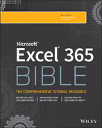
- Click the Custom category as shown in Figure 21.1. Excel takes you to a screen that exposes the syntax that makes up the format you selected.
Number formatting strings consist of different individual number formats separated by semicolons. In this case, you see two different formats: the format to the left of the semicolon and the format to the right of the semicolon.
#,##0_);(#,##0)By default, any formatting to the left of the first semicolon is applied to positive numbers, and any formatting to the right of the first semicolon is applied to negative numbers. So, with this choice, positive numbers will be formatted as a simple number, and negative numbers will be formatted with parentheses, like the following:
1,982(1,890)
You can edit the syntax in the Type input box so that the numbers are formatted differently. For example, try changing the syntax to the following:
+#,##0;-#,##0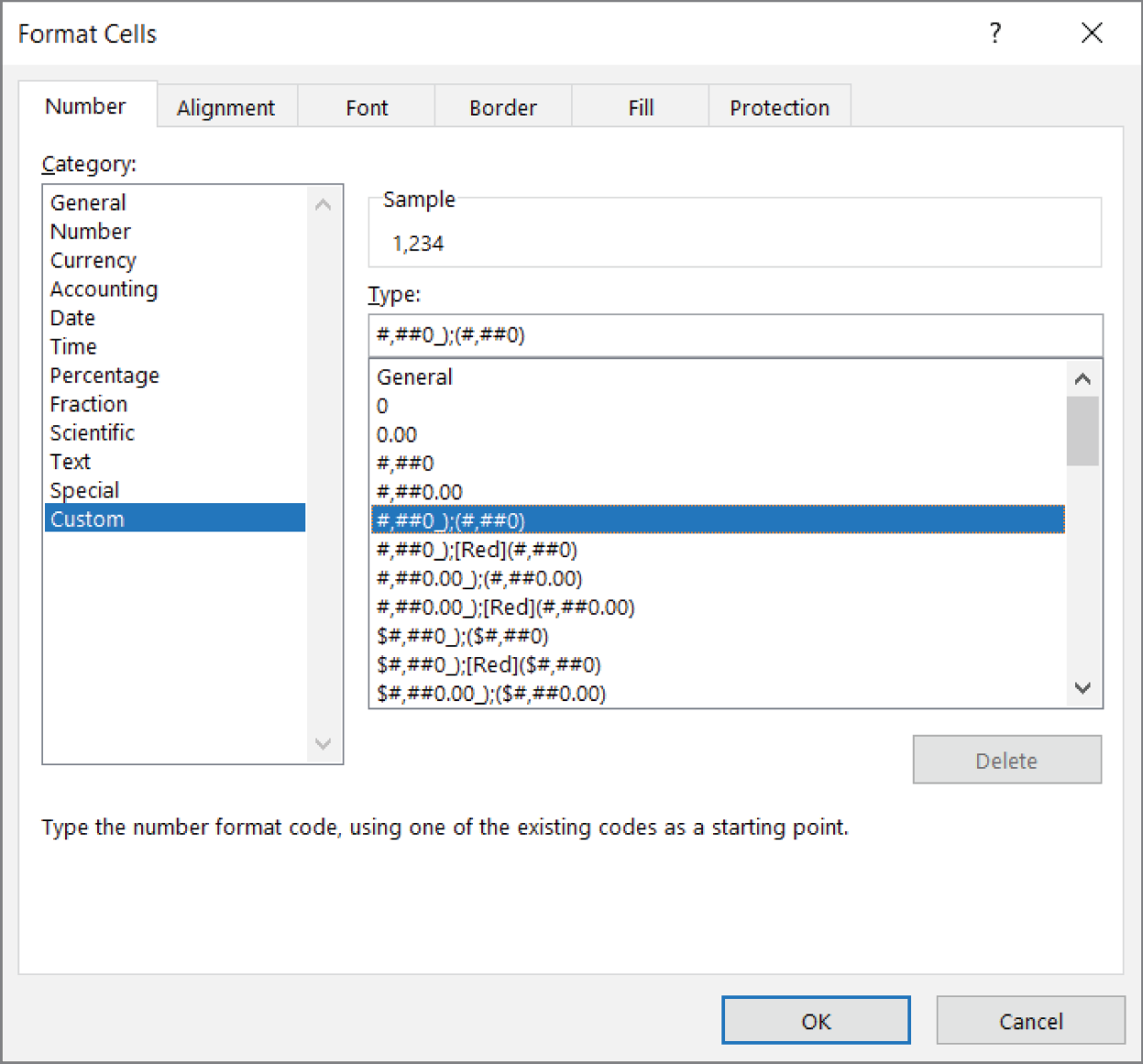
FIGURE 21.1 The Type input box allows you to customize the syntax for the number format.
When this syntax is applied, positive numbers will start with the + symbol, and negative numbers will start with a − symbol, like so:
+1,200-15,000
This comes in handy when formatting percentages. For instance, you can apply a custom percent format by entering the following syntax into the Type input box:
+0%;-0%This syntax gives you percentages that look like the following:
+43%-54%
You can get fancy and wrap your negative percentages with parentheses using the following syntax:
0%_);(0%)This syntax gives you percentages that look like the following:
43%(54%)
Formatting numbers in thousands and millions
Formatting numbers to appear in thousands or millions helps present values without inundating your audience with overlarge numbers. To show your numbers in thousands, highlight them, right-click, and select Format Cells.
After the Format Cells dialog box opens, click the Custom category to get to the screen shown in Figure 21.1. In the Type input box, enter the following syntax:
#,##0,After you confirm your changes, your numbers will automatically appear in the thousands place.
The beautiful thing here is that this technique doesn't change or truncate your numeric values in any way. Excel is simply applying a cosmetic effect to the number. Figure 21.2 illustrates this. Compare the values you see in the formula bar versus what is shown in the cells.
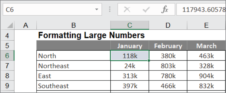
FIGURE 21.2 Formatting numbers applies only a cosmetic look. Look in the formula bar to see the real, unformatted number.
The selected cell has been formatted to show in thousands. You see 118k. But if you look in the formula bar above it, you'll see the real unformatted number (117943.60578). The 118k you are seeing in the cell is a cosmetically formatted version of the real number shown in the formula bar.
If needed, you can indicate that the number is in thousands by adding “k” to the number syntax.
#,##0,"k"This would show your numbers like this:
118k318k
You can use this technique on both positive and negative numbers.
#,##0,"k"; (#,##0,"k")After applying this syntax, your negative numbers also appear in thousands.
118k(318k)
Need to show numbers in millions? Easy. Simply add two commas to the number format syntax in the Type input box.
#,##0.00,, "m"Note the use of the extra decimal places (.00). When converting numbers to millions, it's often useful to show additional precision points, as in the following example:
24.65 mHiding and suppressing zeros
In addition to formatting positive and negative numbers, Excel allows you to provide a format for zeros. You do this by adding another semicolon to your custom number syntax. By default, any format syntax placed after the second semicolon is applied to any number that evaluates to zero.
For example, the following syntax applies a format that shows n/a for any cells that contain zeros:
#,##0_);(#,##0);"n/a"You can also use this to suppress zeros entirely. If you add the second semicolon but don't follow it with any syntax, cells containing zeroes will appear blank.
#,##0_);(#,##0);Again, custom number formatting affects only the cosmetic look of the cell. The actual data in the cell is not affected. Figure 21.3 demonstrates this. The selected cell is formatted so that zeros appear as n/a, but if you look at the Formula bar, you can see the actual unformatted cell contents.
FIGURE 21.3 Custom number formatting that shows zeros as n/a
Applying custom format colors
In addition to controlling the look of your numbers with custom number formatting, you can control their color. For instance, to format percentages so that positive percentages appear blue with a + symbol while negative percentages appear red with a − symbol, enter this syntax in the Type input box:
[Blue]+0%;[Red]-0%Notice that all it takes to apply a color is to enter the color name wrapped in square brackets: [ ].
There are only certain colors (the eight Visual Basic colors) you can call out by name, as shown here. These colors make up the first eight colors of Excel's legacy palette (the standard 56 colors that were the default in versions pre-2007).
-
[Black] -
[Blue] -
[Cyan] -
[Green] -
[Magenta] -
[Red] -
[White] -
[Yellow]
Although you would typically specify a custom color by name, not all the Visual Basic colors are pleasing. Visual Basic Green is notoriously difficult to look at (bright neon green). See for yourself by entering the following code into the Type input box:
[Green]+0%;[Red]-0%The good news is that there are 56 colors defined in the standard color palette by number. Every color in the standard 56-color palette is represented by a number. To call up a color by number, you would use [ColorN], where N represents a number from 1 to 56.
In this example, you can use [Color10] to present a much more acceptable green.
[Color10]+0%;[Red]-0%Formatting dates and times
Custom number formatting isn't just for numbers. You can also format dates and times. As Figure 21.4 illustrates, you use the same dialog box to apply date and time formats using the Type input box.
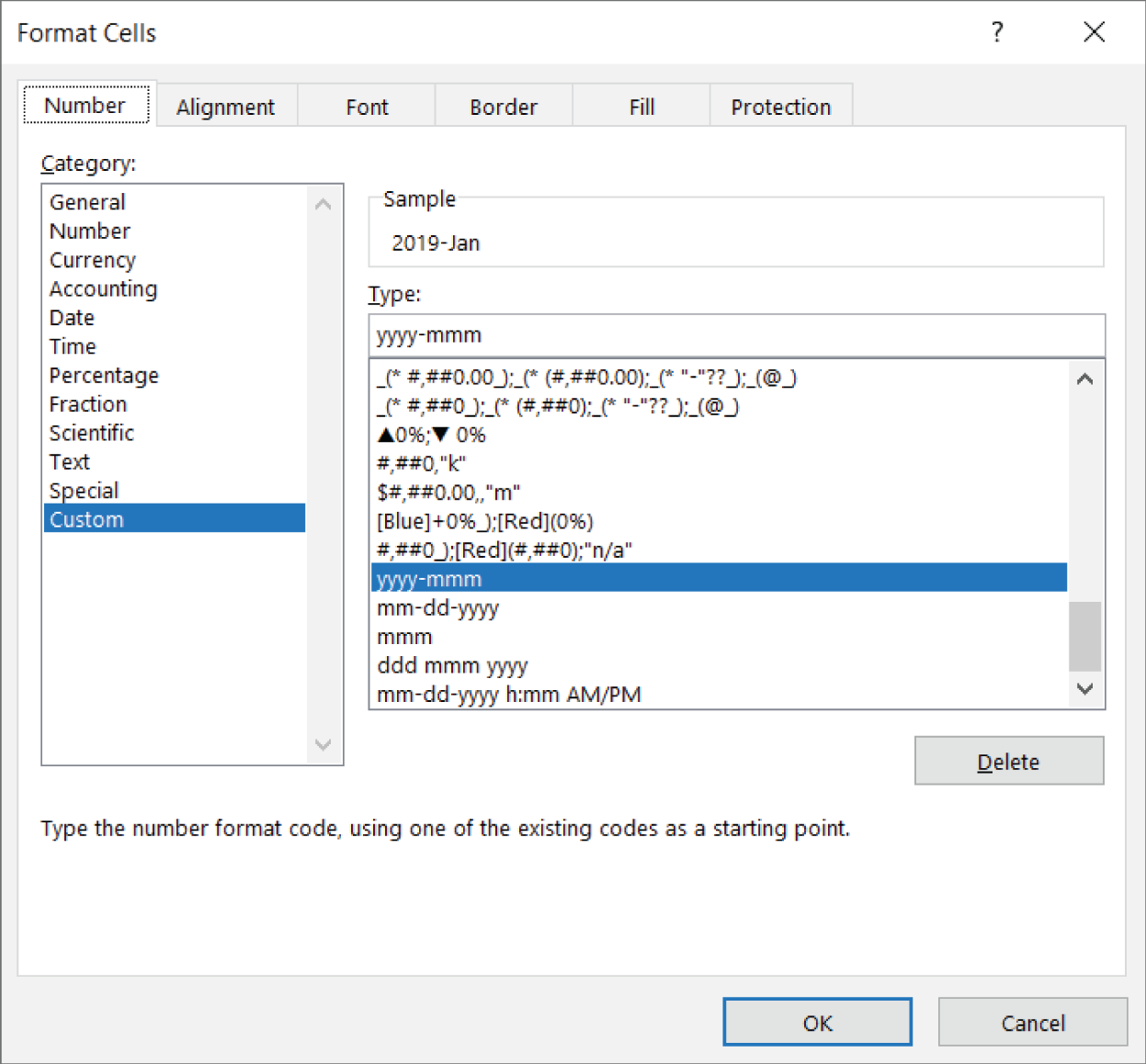
FIGURE 21.4 Dates and times can also be formatted using the Format Cells dialog box.
The code used for date and time formatting is fairly intuitive. For example, ddd is the syntax for the three-letter day, mmm is the syntax for the three-letter month, and yyyy is the syntax for the four-digit year.
There are several variations on the format for days, months, years, hours, and minutes. It's worthwhile to take some time and experiment with different combinations of syntax strings.
Table 21.3 lists some common date and time format codes that you can use as starter syntax for your reports and dashboards.
TABLE 21.3 Common Date and Time Format Codes
| Format Code | 1/31/2022 7:42:53 PM is Displayed As |
|---|---|
| m | 1 |
| mm | 01 |
| mmm | Jan |
| mmmm | January |
| mmmmm | J |
| dd | 31 |
| ddd | Mon |
| dddd | Monday |
| yy | 22 |
| yyyy | 2022 |
| mmm-yy | Jan-22 |
| dd/mm/yyyy | 31/01/2022 |
| dddd mmm yyyy | Monday Jan 2022 |
| mm-dd-yyyy h:mm AM/PM | 01-31-2022 7:42 PM |
| h AM/PM | 7 PM |
| h:mm AM/PM | 7:42 PM |
| h:mm:ss AM/PM | 7:42:53 PM |
Using symbols to enhance reporting
Symbols are essentially tiny graphics, not unlike those you see when you use the Wingdings, Webdings, or other fancy fonts. However, symbols are not really fonts. They're Unicode characters. Unicode characters are a set of industry-standard text elements designed to provide a reliable character set that remains viable on any platform regardless of international font differences.
One example of a commonly used symbol is the copyright symbol (©). This symbol is a Unicode character. You can use this symbol on a Chinese, Turkish, French, or English (United States) PC, and it will reliably be available with no international differences.
In terms of Excel presentations, Unicode characters (or symbols) can be used in places where conditional formatting cannot. For instance, in the chart labels that you see in Figure 21.5, the x-axis shows some trending arrows that allow for an extra layer of analysis. This couldn't be done with conditional formatting.

FIGURE 21.5 Use symbols to add an extra layer of analysis to charts.
Let's take some time to review the steps that led to the chart in Figure 21.5.
Start with the data shown in Figure 21.6. Note that you have a designated cell to hold any symbols that you're going to use (C1 in this case). This cell isn't really all that important. It's just a holding cell for the symbols that you'll insert.
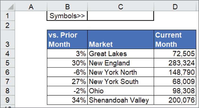
FIGURE 21.6 Our starting data with a holding cell for our symbols
Now, follow these steps:
- Click in C1 and then select Symbols ➪ Symbol on the Insert tab. The Symbol dialog box shown in Figure 21.7 opens. The idea here is to scroll through the symbols to find the one you want. Note that you can use the Font and Subset drop-down selectors at the top of the dialog box to quickly jump to a particular set of symbols (in this case, Ariel and Geometric Shapes).
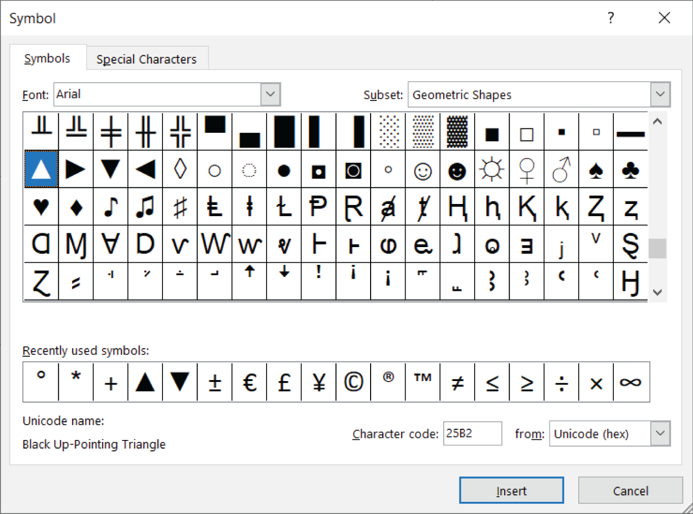
FIGURE 21.7 Use the Symbol dialog box to insert the desired symbols into your holding cell.
- Find and select your desired symbols by clicking the Insert button after each symbol. In this scenario, select the upward-pointing triangle and click Insert. Then click the downward-pointing triangle and click Insert. Close the dialog box when you're done. At this point, you have the up triangle and down triangle symbols in cell C1, as shown in Figure 21.8.
- Click the C1 cell, go to the Formula bar, and copy the two symbols by highlighting them and pressing Ctrl+C on your keyboard.
- Go to your data table, right-click the percentages, and then select Format Cells.
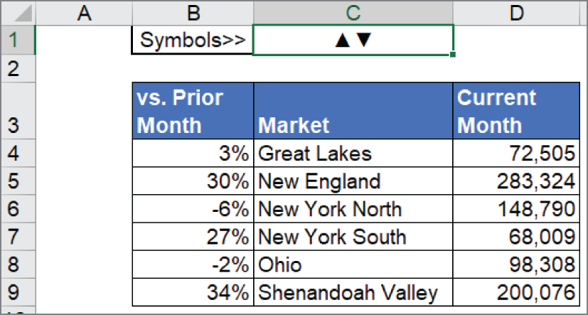
FIGURE 21.8 Copy the newly inserted symbols to the Clipboard.
- In the Format Cells dialog box, create a new custom format by pasting the up- and down-triangle symbols into the appropriate syntax parts (see Figure 21.9). In this case, any positive percentage will be preceded with the up-triangle symbol, and any negative percentage will be preceded with the down-triangle symbol.
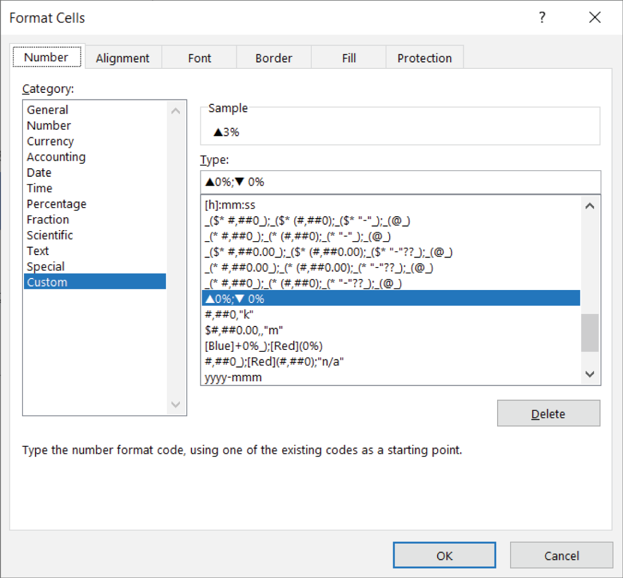
FIGURE 21.9 Create a custom number format using the symbols.
- Click OK. The symbols are now part of your number formatting.
Figure 21.10 illustrates what your percentages look like. Change any number from positive to negative (or vice versa), and Excel automatically applies the appropriate symbol.
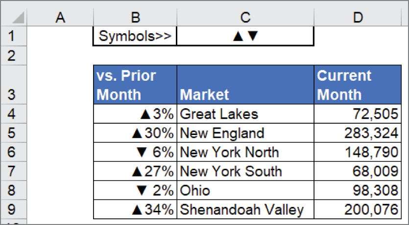
FIGURE 21.10 Your symbols are now part of your number formatting.
Because charts automatically adopt number formatting, a chart created from this data will show the symbols as part of the labels. Simply use this data as the source for the chart.
This is just one way to use symbols in your reporting. With this basic technique, you can insert symbols to add visual appeal to tables, PivotTables, formulas, or any other object you can think of.
Using Shapes and Icons as Visual Elements
Microsoft Office, including Excel, provides access to a variety of customizable graphics images known as shapes. You might want to insert shapes to create simple diagrams, display text, or just add some visual appeal to a worksheet.
Keep in mind that shapes can add unnecessary clutter to a worksheet. Perhaps the best advice is to use shapes sparingly. Ideally, shapes can help draw attention to some aspect of your worksheet. They shouldn't be the main attraction.
Inserting a shape
You can add a shape to a worksheet by choosing Insert ➪ Illustrations ➪ Shapes. The Shapes gallery, shown in Figure 21.11, opens to show you the choices.

FIGURE 21.11 The Shapes gallery
Shapes are organized into categories, and the category at the top displays the shapes that you've used most recently. To insert a shape into a worksheet, you can do one of the following:
- Click the shape in the Shapes gallery and then click in the worksheet. A default-sized shape is added to your worksheet.
- Click the shape and then drag in the worksheet. This allows you to create a larger or a smaller shape or a shape with different proportions than the default.
Here are a few tips to keep in mind when creating shapes:
- Every shape has a descriptive name (for example, Line Arrow). To change the name of a shape, select it, type a new name in the Name box (to the left of the formula bar), and press Enter.
- To select a specific shape on a worksheet, just click it.
- When you create a shape by dragging, hold down the Shift key to maintain the object's default proportions.
- You can control the way objects appear onscreen in the Advanced tab of the Excel Options dialog box. (Choose File ➪ Options.) This setting appears in the Display Options for This Workbook section. Normally, the All option is selected under For Objects Show. You can hide all objects by choosing Nothing (Hide Objects). Hiding objects may speed things up if your worksheet contains complex objects that take a long time to redraw.
Inserting SVG icon graphics
Excel 365 includes an icon library that offers free Scalable Vector Graphics (SVG) icons. SVG graphics can be sized and formatted without losing image quality. These icon graphics are essentially a modern set of graphic files that can be used to add spicy visual elements to your Excel dashboards and infographics.
To add an icon to your worksheet, select Insert ➪ Illustrations ➪ Icons. This activates the dialog box shown in Figure 21.12. Here you can browse by category or search for a topic. When you find the graphic you want, select it and then click Insert. You can also simply double-click the graphic. Excel will insert it into your workbook.
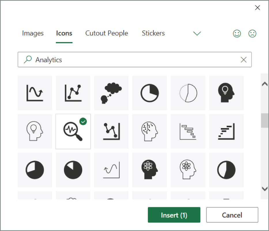
FIGURE 21.12 The Microsoft Office Icons Library
Inserting 3D models
3D models are just what they sound like, graphics that can be dynamically rotated to see them from all sides. To add a 3D model to your worksheet, select Insert ➪ Illustrations ➪ 3D Models.
Just as with the previously mentioned icons, you can use the Online 3D Models dialog box to browse or search for certain objects. When you find the graphic you want, select it, and then click Insert or double-click the graphic. Excel will insert the graphic into your workbook. Figure 21.13 illustrates how a 3D model can be rotated and viewed from all angles.

FIGURE 21.13 A 3D model in action
You'll quickly find that the stock 3D models are frankly underwhelming and irrelevant to most Excel users. However, the real benefit comes to those who regularly use their own 3D models. Excel allows the use of custom 3D model files outside of the stock options provided. You can use any of the following valid file types:
- .3mf - 3D Manufacturing Format
- .fbx - Filmbox Format
- .glb - Binary GL Transmission Format
- .obj - Object Format
- .ply - Polygon Format
- .stl – STereoLithography Format
To insert your own custom 3D model graphics, select Insert ➪ Illustrations and click the drop-down arrow next to the 3D Models command. Select the option labeled This Device. Excel opens a dialog box allowing you to browse your own device for the file you want to insert.
Formatting shapes and icons
Although icons feel and behave like standard shapes, they have different contextual tabs.
When you select a shape, the Shape Format contextual tab is available, with the following groups of commands:
- Insert Shapes Insert new shapes; change a shape to a different shape.
- Shape Styles Change the overall style of a shape; modify the shape's fill, outline, or effects.
- WordArt Styles Modify the appearance of the text within a shape.
- Accessibility Provide alternate text descriptions for the visually impaired.
- Arrange Adjust the “stack order” of shapes, align shapes, group multiple shapes, and rotate shapes.
- Size Change the size of a shape by typing dimensions.
When you select an icon, the Graphics Format contextual tab is available with the following groups of commands:
- Change Graphic Replace an existing graphic with a new graphic from a file, the Microsoft icons gallery, or an online source.
- Graphics Styles Change the overall style of a graphic; modify the graphic's fill, outline, or effects.
- Accessibility Provide alternate text descriptions for the visually impaired.
- Arrange Adjust the “stack order” of graphics, align graphics, group multiple graphics, and rotate graphics.
- Size Change the size of a graphic by typing dimensions.
When you select a 3D model, the 3D Model contextual tab is available with the following groups of commands:
- Play 3D Control the animation of the 3D model.
- Adjust Replace the 3D model with another one or reset the 3D model to its original position.
- 3D Model Views Quickly position the 3D model to preset angles.
- Accessibility Provide alternate text descriptions for the visually impaired.
- Arrange Adjust the “stack order” of 3D models, align 3D models, and group multiple 3D models.
- Size Change the size of a 3D model by typing dimensions; pan and zoom to focus on a specific area of the 3D model.
As an alternative to the Ribbon, you can right-click the shape, icon, or 3D model and choose the Format option. This displays a task pane containing formatting options. Any changes made via the task pane appear immediately, and you can keep the Format task pane open while you work.
You could read 20 pages about formatting shapes, icons, and 3D models, but it wouldn't be a very efficient way of learning. The best way, by far, to learn about formatting shapes, icons, and 3D models is to experiment. The formatting commands are intuitive, and you can always use Undo if a command doesn't do what you expected it to do.
Enhancing Excel reports with shapes
Most of us think of Excel shapes as mildly useful objects that can be added to a worksheet if we need to show a square, some arrows, a circle, and so forth. But if you use your imagination, you can leverage Excel shapes to create stylized interfaces that can really enhance your dashboards. Here are a few examples of how Excel shapes can spice up your dashboards and reports.
Creating visually appealing containers with shapes
A peekaboo tab lets you tag a section of your dashboard with a label that looks like it's wrapping around your dashboard components. In the example illustrated in Figure 21.14, a peekaboo tab is used to label this group of components as belonging to the North region.

FIGURE 21.14 Peekaboo tab
As you can see in Figure 21.15, there is no real magic here. It's just a set of shapes and text boxes that are cleverly arranged to give the impression that a label is wrapping around to show the region name.
Want to draw attention to handful of key metrics? Try wrapping your key metrics with a peekaboo banner. The banner shown in Figure 21.16 goes beyond boring text labels, allowing you to create the feeling that a banner is wrapping around your numbers. Again, this effect is achieved by layering a few Excel shapes so that they fall nicely on top of each other, creating a cohesive effect.
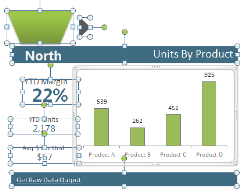
FIGURE 21.15 Deconstructed view of the peekaboo tab
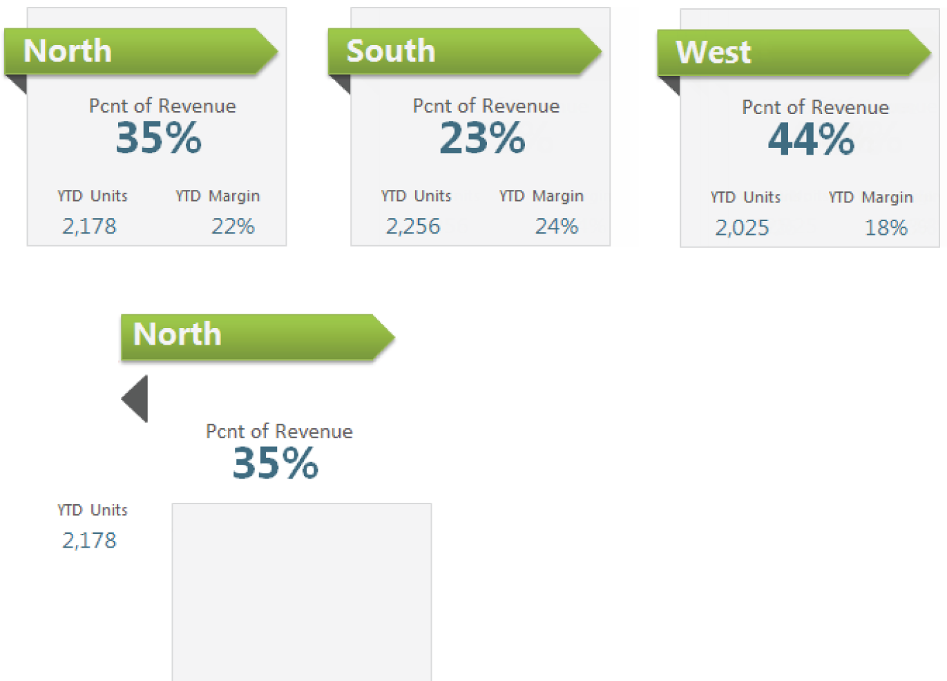
FIGURE 21.16 A visual banner made with shapes
Layering shapes to save space
Here's an idea to get the most out of your dashboard real estate. You can layer pie charts with column charts to create a unique set of views (see Figure 21.17).

FIGURE 21.17 Combine shapes with a chart to save dashboard real estate.
Each pie chart represents the percent of total revenue and a column chart showing some level of detail for the region. Simply layer your pie chart on top of a circle shape and a column chart.
Constructing your own infographic widgets with shapes
Excel offers a way to alter shapes by editing their anchor points. This opens the possibility of creating your own infographic widgets. Right-click a shape and select Edit Points. This places little points all around the shape (see Figure 21.18). You can then drag the points to reconfigure the shape.
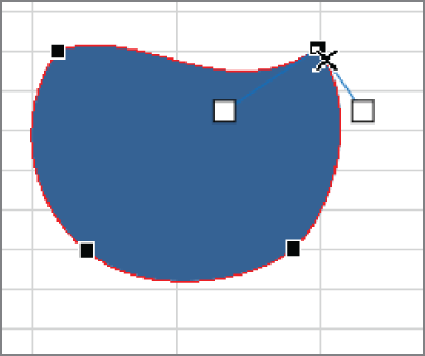
FIGURE 21.18 Use the Edit Points feature to construct your own shape.
Constructed shapes can be combined with other shapes to create interesting infographic elements that can be used in your Excel dashboards. In Figure 21.19, a newly constructed shape is combined with a standard oval and text box to create nifty infographic widgets.

FIGURE 21.19 Using a newly constructed shape to create custom infographic elements
Creating dynamic labels
Dynamic labeling is less a function in Excel than it is a concept. Dynamic labels are labels that change to correspond to the data you're viewing.
Figure 21.20 illustrates one example of this concept. The selected Text Box shape is linked to cell C3 (note the formula in the Formula bar). As the value in cell C3 changes, the text box displays the updated value.
Creating linked pictures
A linked picture is a special kind of shape that displays a live picture of everything in a given range. Think of a linked picture as a camera that monitors a range of cells.
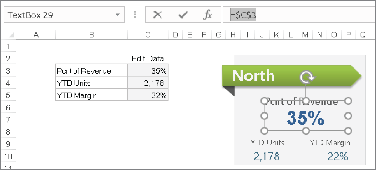
FIGURE 21.20 Text Box shapes can be linked to cells.
To “take a picture” of a range, follow these steps:
- Select the range.
- Press Ctrl+C to copy the range.
- Activate another cell.
- Choose Home ➪ Clipboard ➪ Paste ➪ Linked Picture (see Figure 21.21).
The result is a live picture of the range you selected in step 1.
Linked pictures give you the freedom to test different layouts and chart sizes without the need to work around column widths, hidden rows, or other such nonsense. In addition, linked pictures have access to the Picture Format options. When you click on a linked picture, you can go to the Picture Format contextual tab and play around with the picture styles there.
Figure 21.22 illustrates two linked pictures displaying the contents of the ranges on the left. As those ranges change, the linked pictures on the right will update. These can be moved, resized, and even placed on a completely different sheet.

FIGURE 21.21 Pasting a linked picture
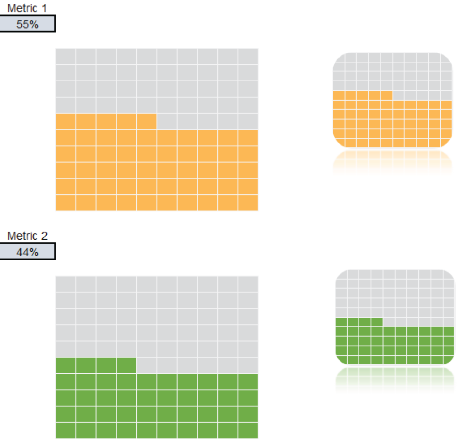
FIGURE 21.22 Using linked pictures to enhance visualizations
Using SmartArt and WordArt
Using SmartArt, you can insert a variety of highly customizable diagrams into a worksheet. This feature is probably most useful in PowerPoint, as diagrams are more conducive to a presentation style. However, Excel offers SmartArt as yet another method of adding visualizations to your reporting solutions.
SmartArt basics
To insert SmartArt into a worksheet, choose the SmartArt command found under Insert ➪ Illustrations. Excel displays the Choose a SmartArt Graphic dialog box shown in Figure 21.23. The diagrams are arranged in categories along the left. When you find one that looks appropriate, click it for a larger view in the panel on the right, which also provides some usage tips. Then click OK to insert the graphic.
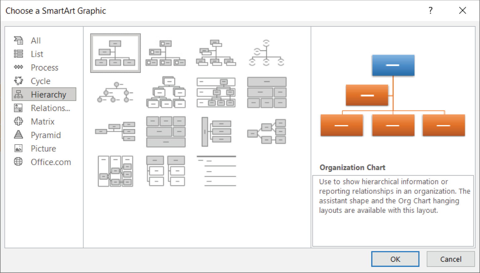
FIGURE 21.23 Inserting a SmartArt graphic
When you insert or select a SmartArt diagram, Excel displays the Text Pane, the Type Your Text Here window that guides you through entering text (see Figure 21.24).

FIGURE 21.24 Entering text for an organizational chart
To add an element to the SmartArt graphic, choose SmartArt Design ➪ Create Graphic ➪ Add Shape.
When working with SmartArt, keep in mind that you can move, resize, or format individually any element within the graphic. Select the element and then use the tools on the Format tab.
You can easily change the layout of a SmartArt diagram. Select the object and then choose SmartArt Design ➪ Layouts. Any text that you've entered remains intact.
After you decide on a layout, you may want to consider other styles or colors available in the SmartArt Design ➪ SmartArt Styles group.
WordArt basics
You can use WordArt to create graphical effects in text.
To insert a WordArt graphic on a worksheet, choose Insert ➪ Text ➪ WordArt and then select a style from the gallery. Excel inserts an object with the placeholder text Your text here. Replace that text with your own, resize it, and apply other formatting if you like.
When you select a WordArt image, Excel displays the Shape Format contextual tab. Use the controls to vary the look of your WordArt.
Working with Other Graphics Types
Excel can import a variety of graphics into a worksheet. You have several choices:
- Inserting an image from your computer If the graphics image that you want to insert is available in a file, you can easily import the file into your worksheet. Choose Insert ➪ Illustrations ➪ Pictures ➪ This Device. The Insert Picture dialog box appears, allowing you to browse for the file. Oddly, you can't drag and drop an image from this dialog box into a worksheet, but you can sometimes drag an image from your web browser and drop it into a worksheet.
- Inserting an image from an online source Choose Insert ➪ Illustrations ➪ Pictures ➪ Online Pictures. The Online Pictures window appears, allowing you to search for an image. The image is inserted on the current worksheet along with a text box denoting the origin of the picture.
- Copying and pasting If an image is on the Windows Clipboard, you can paste it into a worksheet by choosing Home ➪ Clipboard ➪ Paste (or by pressing Ctrl+V).
About graphics files
Graphics files come in two main categories:
- Bitmap Bitmap images are made up of discrete dots. They usually look pretty good at their original size but often lose clarity if you increase the size. Examples of common bitmap file formats include BMP, PNG, JPEG, TIFF, and GIF.
- Vector Vector-based images, on the other hand, are composed of points and paths that are represented by mathematical equations, so they retain their crispness regardless of their size. Examples of common vector file formats include CGM, WMF, and EPS.
When you insert a picture on a worksheet, you can modify the picture in a number of ways from the Picture Format contextual tab, which becomes available when you select a picture object. For example, you can adjust the color, contrast, and brightness. In addition, you can add borders, shadows, reflections, and so on—similar to the operations available for shapes.
In addition, you can right-click and choose Format Picture to use the controls in the Format Picture task pane.
An interesting feature is Artistic Effects. This command can apply a number of Photoshop-like effects to an image. To access this feature, select an image and choose Picture Format ➪ Adjust ➪ Artistic Effects. Each effect is somewhat customizable, so if you're not happy with the default effect, try adjusting some options.
Inserting screenshots
Excel can also capture and insert a screenshot of any program currently running on your computer (including another Excel window). To use the screenshot feature, follow these steps:
- Make sure the window you want to use displays the content you want.
- Choose Insert ➪ Illustrations ➪ Screenshot. You'll see a gallery that contains thumbnails of all windows open on your computer (except the current Excel window).
- Click the image you want. Excel inserts it into your worksheet.
You can use any of the normal picture tools to work with screenshots.
Displaying a worksheet background image
If you want to use a graphics image for a worksheet's background (similar to wallpaper on the Windows Desktop), choose Page Layout ➪ Page Setup ➪ Background and select a graphics file. The selected graphics file is tiled on the worksheet.
Unfortunately, worksheet background images are for onscreen display only. These images do not appear when the worksheet is printed.
Using the Equation Editor
The final section in this chapter deals with the Equation Editor. Use this feature to insert a nicely formatted mathematical equation as a graphics object. Start by choosing Insert ➪ Symbols ➪ Equation. Excel creates a text box and displays the Shape Format and Equation contextual tabs.
As you can see in Figure 21.25, the Equation tab looks complicated, but one quickly gets the hang of it. The idea is to “write” your equation by simply choosing the symbols you need from the options shown in Figure 21.25.
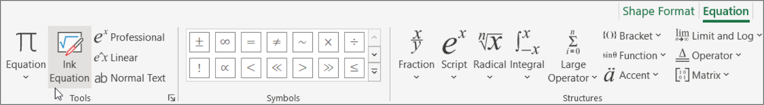
FIGURE 21.25 Use the symbols on the Equation tab to write your equation.
Generally, you add a structure and then edit the various parts by adding text or symbols. You can put structures inside structures, and there is no limit to the complexity of the equations. Because the equation objects you work with are similar to the other shape objects you've covered, it won't take long to get the hang of building your own equations.
If all that seems much too daunting, you can use the nifty Ink Equation feature, which allows you to simply draw your equation. Select Tools ➪ Ink Equation from the Equation tab to display the Math Input Control dialog box (see Figure 21.26). Here, you can draw your equation and have it translated to text. As you can see in Figure 21.26, Excel is quite accepting of even the shabbiest of penmanship.
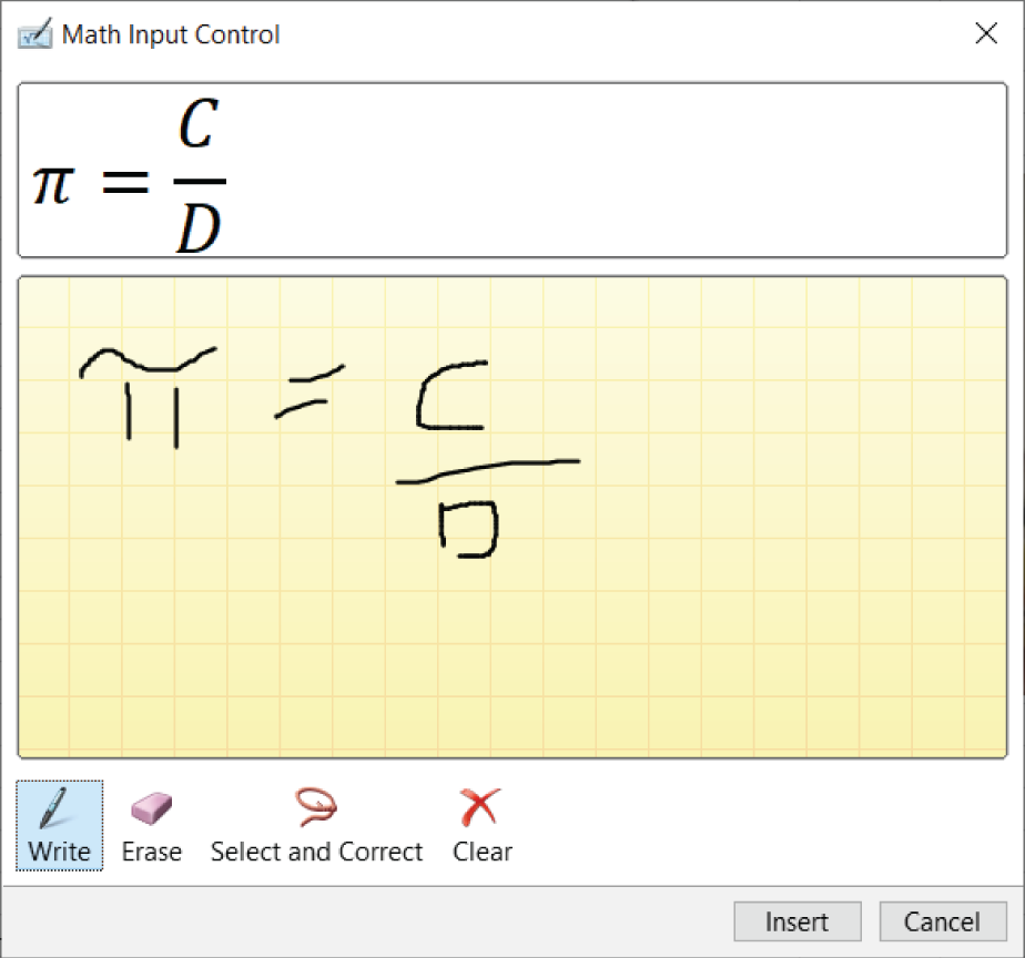
FIGURE 21.26 You can save time and simply draw your equation.