CHAPTER 8
Search for Hidden Groups
“If you mine the data hard enough, you can find messages from God.”
—Dilbert1
Imagine you get a call from a friend. They're looking for help categorizing their music collection—a vintage set of vinyl records. You agree to help.
As you drive to your friend's house, you wonder how you would organize such a collection. You could start with some obvious categories. For instance, music is often organized into genres and subgenres. Or, you could group them by the musical periods in which they came out. This information is readily available on an album cover.
When you arrive at your friend's house, however, you are handed a tall stack of black vinyl records—no album covers to be found.
You learn your friend purchased the stack of records at a yard sale and has no clue which (or how many) genres, artists, or musical periods it contains. Now you must leave your preconceived notions about how to categorize the records at the door—you no longer have predefined groups on the album cover to guide you. The task of categorizing records is suddenly much more difficult than you anticipated.
Determined, you and your friend break out the record player, listen to each album, and start grouping them into categories based on how similar they sound. As you listen to the records, new groups emerge, small groups might combine into one, and occasionally, a record moves from one group to another after a spirited debate about which group it sounds “closest” to.
In the end, the two of you settle on 10 categories and give each a descriptive name.
You and your friend just performed what's known as unsupervised learning. You didn't come in with preconceived notions about the data, but instead let the data organize itself.2
This chapter is all about unsupervised learning: a collection of tools designed to discover hidden patterns and groups in datasets when no predefined groups are available. It's a powerful technique used in a variety of fields, from segmenting customers into different marketing groups, to organizing music on Spotify or Pandora, and organizing the photos on your phone.
UNSUPERVISED LEARNING
At the core of unsupervised learning is the idea that hidden groups are lurking beneath data. There are a lot of ways to twist, turn, and replot this data to identify these interesting patterns and groups—if groups exist. As a Data Head, you must be able to navigate across the many unsupervised learning methods in your search for hidden groups in data.
But how does one even start? The vast amount of unsupervised learning techniques available seems daunting. Luckily for you, you just need a basic understanding of the main activities related to unsupervised learning. So, here we draw on two activities and a foundational technique for each:
- Dimensionality reduction through principal component analysis (PCA)
- Clustering through k-means clustering
In this chapter, we'll go through these techniques, what they mean, and how they achieve their goals of dimensionality reduction and clustering, respectively.
DIMENSIONALITY REDUCTION
Dimensionality reduction is a process you're already familiar with. Photography is an example; it reduces the three-dimensional world down to a flat, two-dimensional photo you can carry in your pocket.
With datasets, we're working with rows and columns: observations and features. The number of columns (features) in a dataset is called the dimension of the data, and the process of condensing many features into new and fewer categories, while retaining information about the dataset, is called dimensionality reduction. Simply speaking, we're looking for hidden groups in the columns of a dataset so that we can combine multiple columns into one.
Let's talk about why this matters. Practically speaking, it's hard to make sense of datasets with many features. They can be slow to load on a computer and a pain to work with. Exploratory data analysis becomes tedious, and in some cases, infeasible. In bioinformatics, for example, the potential dimension of a dataset can be enormous. Researchers may have thousands of gene expressions for each observation, many of which are highly correlated (and thus possibly redundant) with each other.
The desire to speed up computational time, remove redundancies, and improve visualization tells us why dimensionality reduction of data matters. But how can we do it?
Creating Composite Features
One way to reduce the dimension of a dataset is to combine multiple columns into a composite feature. Let's do this by exploring some real-world data on automobiles from a 1974 Motor Trend road test of 32 automobiles and 11 features like miles-per-gallon, horsepower, weight, and other vehicle attributes.3 Our task is to create an “efficiency” metric to rank the cars from most-efficient to least-efficient.
Miles-per-gallon (MPG) seems like an obvious place to start the exploration. This is plotted in the leftmost chart of Figure 8.1. If you look at the distribution in that first chart, you can see some separation with the best MPG car on top and the worst on the bottom, but you also notice many vehicles tend to group around the center. Can we layer in additional information to further separate the data? Let's move to the middle chart. Here we've created a composite feature: a car's MPG minus its weight,4 MPG – Weight. Notice there's much more spread simply by grouping two features into one composite.
Next, let's go a step further and create a third efficiency metric, Efficiency = MPG – (Weight + Horsepower). (An equation like this is called a linear combination.) This combination of columns has separated the data more so than the other features. It gives us more information—more spread—about cars and has uncovered something interesting. You can see the heavy, gas-guzzlers at the bottom and the light, fuel efficient cars on top. We've effectively created a new dimension of the data (efficiency) by combining the original dimensions, and this new dimension lets us ignore the three original dimensions. That's dimensionality reduction.
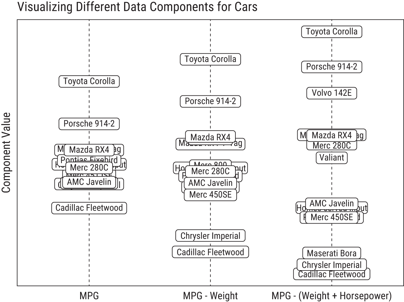
FIGURE 8.1 Sorting cars based on different composite features. Notice how the cars spread out from each other (aka have higher variance) as more features are condensed into a single “efficiency” dimension.
In this example, we had the foresight to know that combining a car's MPG, Weight, and Horsepower into a new composite variable would begin to uncover something interesting in the data. But what if you don't have the luxury of knowing which features to combine or how to combine them? That's indeed the nature of unsupervised learning, and that's where principal component analysis enters the picture.
PRINCIPAL COMPONENT ANALYSIS
Principal component analysis (PCA) is a dimensionality reduction method invented in 1901,5 long before the terms data scientist and machine learning became part of business terminology. It remains a popular—though often misunderstood—technique. We'll attempt to clear up this confusion and set the record straight about what it does and why it's useful.
Unlike our approach in the car example, the PCA algorithm does not know in advance which groups of features to combine into composite features, so it considers all possibilities. Through some clever math, it layers the dimensions in different configurations, looking for which linear combinations of features spreads the data out the most. The best of these composite features are called the principal components. Better yet, the principal components represent new dimensions in the data that are not correlated with each other. If we ran PCA on the cars data, we might not only uncover an “efficiency” dimension, but also a “performance” dimension.
You might wonder how you can tell if PCA can combine a dataset's features into meaningful groups that create principal components. What exactly is PCA looking for?
Let's consider these questions in the next thought experiment. And because your authors know little to nothing about cars, we're going to teach the next lesson with a different (and hypothetical) dataset.
Principal Components in Athletic Ability
Imagine that you work at an athletic performance camp. You have a spreadsheet with hundreds of rows and 30 columns. Each row contains information about an athlete's fitness: the number of push-ups, sit-ups, and deadlifts they can do in one minute; how long it takes them to run 40 meters, 100 meters, 1,600 meters; various vital signs like resting pulse and blood pressure; and several other performance and health metrics. Your boss gave you the vague task to “summarize the data,” but you're bogged down by the sheer number of columns in the spreadsheet. No doubt, there's a wealth of information here, but could you reduce these 30 features into a more reasonable number you could use to summarize and visualize this data?
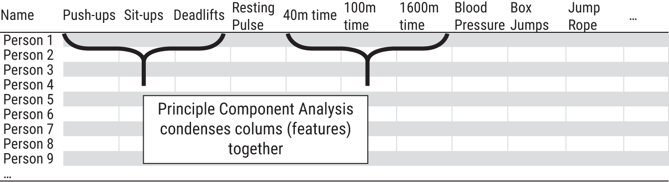
FIGURE 8.2 Principal component analysis groups and condenses the columns of a dataset into new, uncorrelated dimensions.
To start, you spot a few obvious patterns. Athletes who can do the most push-ups generally do the most deadlifts, and those who are sluggish in the 100m dash also struggle in the 40m sprint. It looks like many of the features are indeed correlated with each other because they measure related performance properties. You suspect, since several groups of these features are correlated with each other, there might be a way to condense them into fewer dimensions that are no longer correlated with each other but contain as much information as possible from the original data. This is precisely what PCA does!
See Figure 8.2 for a high-level overview of what you're trying to accomplish. However, you can't easily explore the correlations of 30 variables, even with a computer. (This would require 435 separate scatterplots to view each pair of features.6) So, you run the data through the PCA algorithm to exploit the embedded correlations in the dataset for you. PCA returns two datasets as an output.7
Figure 8.3 shows the first dataset. This table has the athletes' features along the rows of the dataset. The columns show weights of those features and how they roll into a principal component. These weights reflect an important step in PCA creating new dimensions in the data. (Note, weights here refers to a term specifically used in PCA and not lifting weights.) We've taken the liberty of visualizing the weights; however, in numeric terms they are measurements of correlation, with a range of −1 to 1. The closer the numbers are to either extreme, the stronger the correlations, and the more each original feature contributes. So, what you're looking for are interesting patterns in the weights of the principal components (denoted PC in the figure): weights that are far away from the vertical line of zero might tell a story.
In the first column, “Weights for PC 1,” you see high weights for push-ups, sit-ups, deadlifts. These three are positively correlated with each other, as you spotted earlier. PCA automatically detected this, too. You might decide to call this combination of features “Strength” based on its underlying features. As you look at the weights for PC 2, you notice the negative bars are associated with measures of “Speed” (low resting pulse, low 40m times, low 100m times). Similarly, you might name PC 3 “Stamina” and PC 4 “Health.”
Before you had multiple dimensions with correlations. However, these four new dimensions represent four composite features that are uncorrelated with one another. And because they are not correlated, that means each new dimension provides new, nonoverlapping information. These dimensions effectively partition the information in the dataset into distinct dimensions, as shown in the row “% of Information for Each Component.” Using just these 4 new features, we can maintain 91% of the information in the original dataset.
Using the weights from Figure 8.3, each athletes' 30 original measurements can then be transformed into the principal components of “Strength,” “Speed,” “Stamina,” and “Health” using linear combinations. For example, an athlete's strength is calculated by:
Strength = 0.6*(number of push-ups) + 0.5*(number of deadlifts) + 0.4*(number of sit-ups) + (minor contributions from other features)
Again, the numbers (the weights) 0.6, 0.5, and 0.4 are given to you from PCA. (We just chose to visualize these numbers instead.)
Doing this series of calculations for all athletes produces the second output from the PCA algorithm, as shown in Figure 8.4. It's a new dataset, the same size as the original, but as much information as possible has been shifted to the first handful of uncorrelated principal components (aka composite features). Notice how the contribution by latter principal components drops off after the fourth component.

FIGURE 8.3 PCA finds optimal weights that are used to create composite features that are linear combinations of other features. Sometimes, you can give the new composite feature a meaningful name.

FIGURE 8.4 The PCA algorithm creates a new dataset, the same size as the original, where the columns are composite features called principal components.
Consequently, rather than using 30 variables to explain 100% of the information in the original dataset, the dataset in Figure 8.4 can explain 91% of that information in only 4 features. Therefore, we can decide to safely ignore 26 columns. That's dimensionality reduction! Armed with this dataset, you could sort the four columns to find out who is the strongest, who is the fastest, or any combination therein. Visualizations and interpretation are now much easier.
PCA Summary
Let's zoom back out to clarify a few things.
First, for a column in a dataset, a good proxy for information is variance (a measure of spread). Think of it this way. Suppose we add a new column to the athlete dataset in Figure 8.2 called “Favorite Shoe Brand” and every person said “Nike.” There'd be no variation in that column to help differentiate one athlete from another. No variation = no information.
The core idea behind PCA is to take all the variance—all the information—available in a dataset (a high number of columns) and condense as much of that information into as few distinct dimensions as possible (a lower number of columns). It does this by looking at how each original dimension is correlated with another. Many of these dimensions are correlated because they so strongly measure the same underlying thing. In this sense you only have a few true dimensions of data that maintain most of the information in the dataset. The math behind PCA effectively “rotates” the dimensions in such a way that we can look at it in fewer dimensions (the principal components) without losing a lot of information.
This is not unlike taking a picture. For instance, you could take a picture of the Great Pyramids of Egypt from countless angles, but some angles are more descriptive than others. Take a photo overhead with a drone, the pyramids appear as squares. Take a photo directly in front, they look like triangles. Which rotation of the camera would capture the most information to impress your friends when you condense the 3D world in Giza down to a 2D photo on your smart phone? PCA finds the best rotation.
Potential Traps
Now that you are more familiar with PCA, we confess that, in real-world data, there will never be such a clean separation of groups into easily distinguishable principal components like we shared in the fitness example.
Data is messy, so the resulting principal components will often lack clear meaning and may not be able to have descriptive nicknames. In our experience, people try too hard to find catchy titles for principal components to the point where they often create a picture of the data that doesn't exist. As a Data Head, you should not accept immediate definitions for your principal components. When others present already-named components, challenge their definitions by asking to see the equations behind the groupings
Moreover, PCA is not about knocking out variables that aren't important or interesting. We see people make this mistake often. The principal components are generated from all the original features. Nothing has been deleted. In the fitness example, every original feature might be grouped with several others to form the four main principal components: Strength, Speed, Stamina, Health. Remember, the resulting dataset from the PCA calculation is the same size as the original dataset. It's up to the analyst to decide when to drop the uninformative components, and there's no right way to do this. This means, if you see results from PCA, ask how they decided how many components to keep.
Finally, PCA relies on the assumption that high variance is a proxy for something interesting or important within the variables. In some cases, it's not a bad assumption. But it isn't always the case. For instance, a feature can have high variance and still have little practical importance. Imagine, for example, adding a feature to the data with the population of each athlete's hometown. This feature, while highly variable, would be completely unrelated to the athletic performance data. Because PCA is looking for the wide variation, it might mistake this feature as being important when it's not.
CLUSTERING
Groups of features (columns) might tell one story, like with PCA, but groups of observations (rows) might tell a different story. This is where clustering comes in.8
Clustering, in our experience, is the most intuitive data science activity because the name is truly descriptive of the task (unlike the name principal component analysis). If your boss told you to cluster our friendly camp of athletes into groups, you'd understand the task. Some natural questions would arise when you'd look at the data in Figure 8.5: How many groups might exist? How would you categorize the groups? Yet you would be able to get started. Perhaps the stronger and slower athletes form one group, while the weaker and faster form another. You might name the groups “Body Builders” and “Distance Runners.”
Take a minute to think about how you would go about clustering that data and the decisions you'd make along the way. If you were lazy, you could say, “Every person in this sheet is an athlete, so there is just one group: athletes.” Or, if you were even lazier, you could say, “Every person is their own group. There are N groups.” Both are unhelpful. So, at this point, you've established the obvious: you need between 1 and N groups.
Another decision you would have to make, without a clear set of guidelines, is how to tell if one athlete is “similar” or “close” to another. Consider the subset of data in Table 8.1. Which two of these athletes are closest to each other?
You could make an argument for any pairing. It all depends on how you judge “close.” Athletes A and B are close in push-ups and pulse. A and C are close because they're each the best at something, 1,600m time and number of push-ups, respectively. And B and C are close because they run slower. Here, you see what you want to see. It depends on which features matter most to you and your background and how you internally measure the concept of “close.” Unsupervised learning, of course, knows none of that.
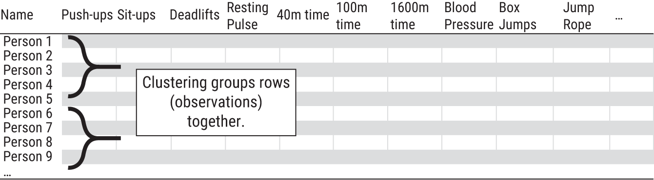
FIGURE 8.5 Clustering is a technique that groups rows of a dataset together. Recall that PCA grouped the columns together.
TABLE 8.1 Which of These Two Athletes are “Closest” to Each Other?
| Athlete | Push-Ups | Resting Pulse | 1600m Time |
|---|---|---|---|
| A | 40 | 50 | 4:30min |
| B | 30 | 55 | 8:00min |
| C | 100 | 65 | 9:00min |
This example demonstrates some important issues in clustering: How many clusters should exist? How can any two observations be considered “close” to each other? And what's the best way to group close observations together?
k-means clustering is a way to start.9
K-MEANS CLUSTERING
k-means is a popular clustering technique among data scientists. With k-means, you tell the algorithm how many clusters you want in your data (the k), and it will group your N rows of data into k distinct clusters. The data points within a cluster are “close” to each other, while the distinct clusters are as “far apart” from each other as possible.
Confused? Let's consider an example.
Clustering Retail Locations
A company wants to assign its 200 retail locations, shown in Figure 8.6, into six regions across the continental United States. They could assign the stores into standard geographic regions (e.g., Midwest, South, Northeast, etc.), but it's unlikely the company's stores will align with those predefined barriers. Instead, they attempt to let the data cluster itself into six regions with k-means. The dataset has 200 rows and two columns: latitude and longitude.10

FIGURE 8.6 The company's 200 locations, before clustering
The goal is to find six new locations on the map, each representing the “center” of the cluster. In numeric terms, this center point is essentially the average of every member in the group (that's the means of k-means). For this example, the centers could represent possible locations for regional offices, and each of the 200 stores would then be assigned to its closest office.
Here's how it works. To start, the algorithm selects six random locations to serve as potential regional offices. Why random? Well, it must start somewhere. Then, using the distance between points on our map (often described as, “as the crow flies”), each of the 200 stores is assigned to a cluster based on which of the six locations it's closest to. This is shown in Round 1 (top left) of Figure 8.7.
Each number represents the starting location and has an associated polygon that creates the border around the cluster. Notice in Round 1, that the “6” group is actually far away from its cluster—at least in this first iteration. Also notice that some of the randomly picked locations place the starting points into the ocean.
At each round of the algorithm, all points within a cluster are averaged together to create a center point (called a “centroid”), and the number moves to this new location. As a result, each of the 200 stores may now be closer to a different office than before. So, each store is reassigned to the regional location it's closest to. The process continues until points stop switching clusters. Figure 8.7 shows the k-means process after successive rounds of clustering.

FIGURE 8.7 k-means in action on retail locations
With this insight, the company has clustered its 200 stores into six regions and identified possible locations within each cluster to serve as regional offices.
In summary, k-means tries to find any natural clusters that exist in the data and gradually pulls the k random starting points toward the clusters' centers like a magnet.
Potential Traps
We used “as the crow flies” distance in the previous example, but there are several types of distance formulas you could use when clustering a non-geographic dataset. It's beyond the scope of this book to identify all of them. Indeed, there is no right formula. However, you should not assume your analytics team used the best distance formula over the easiest. Make sure to ask which formula was used and why it was their best choice.
You also need to consider the scale of your data. You should not blindly trust the results because the math may group two things as “close” if they dominate the scale. For example, take three people at your workplace in Table 8.2. Which two would you say are “closest” to each other?
TABLE 8.2 Clustering Algorithms Get Confused If Your Data Isn't Scaled.
| Person | Age | Kids | Income |
|---|---|---|---|
| A | 36 | 3 | $100,000 |
| B | 37 | 2 | $80,000 |
| C | 22 | 0 | $101,000 |
If the data isn't scaled appropriately, the income variable would dominate most distance formulas, an easy one being the difference (in absolute value) between any two data points. That means the “distance” between persons A and C would be “closer” than A and B based on income. That's even though persons A and B might be a better group reflecting two working parents in their mid-30s, while person C is a hot-shot fresh out of college who landed a lucrative role at the firm.
Finally, remember we are letting a computer help us create groups. That means there is no right answer. All models are wrong. Though, if done well, k-means can be useful.
CHAPTER SUMMARY
In this chapter, you learned about unsupervised learning, casually described as a way of letting data organize itself into groups. If you recall, we used this language to start the chapter but included a footnote saying it's not quite that easy. The ability to discover groups within data is a great power, but, as they say, with great power comes great responsibility. We hope you picked up on this underlying theme.
TABLE 8.3 Summarizing Unsupervised Learning and the Supervision Required
| Unsupervised Learning | Dimensionality Reduction | Clustering |
|---|---|---|
| Example | Principal components analysis | k-means |
| What is it? | Grouping and condensing columns (features) | Grouping rows (observations) |
| What does it do? | Finds a smaller set of new, uncorrelated features that contain most of the information in the dataset | Groups similar observations together to create k meaningful “clusters” in your data |
| Why? | It lets you visualize and explore your data or reduces the dataset size to speed up computational time. PCA is usually an intermediary step in analysis. | It identifies patterns and structure in your data and gives you the ability to act on clusters differently (e.g., different marketing campaigns for different marketing segments). |
| Supervision Required | User must decide how to scale the data, how many principal components to keep, and how to interpret the principal components. | User must decide how to scale the data, what the right “distance” metric should be, and how many clusters to create. |
The ability to group data in any specific way is a product of the algorithm chosen, how it's implemented, the quality of the underlying data, and variation in the data. That means different choices can produce different groups. To put this bluntly, unsupervised learning requires a lot of supervision. It's not just a matter if hitting “go” on a computer and letting data organize itself. You have decisions to make, and we've summarized these for you (as well as the algorithms we discussed) in Table 8.3 for your reference.
To wrap up this chapter, we must reiterate that with unsupervised learning, there are no right groupings or right answers. You may, in fact, consider such exercises as a continuation of your exploratory data analysis journey described in Chapter 5. They help you see different views of the data.
NOTES
- 1 Adams, Scott. Dilbert Cartoon. January 03, 2000.
- 2 Kind of. It's not quite that easy.
- 3 This is the mtcars dataset from the R software. stat.ethz.ch/R-manual/R-devel/library/datasets/html/mtcars.html. For visualization purposes, we are only displaying 15 cars, not all 32.
- 4 Because the features have widely different ranges, they need to be put on a similar numeric scale before being combined.
- 5 Pearson, K. (1901). LIII. On lines and planes of closest fit to systems of points in space. The London, Edinburgh, and Dublin Philosophical Magazine and Journal of Science, 2(11), 559–572.
- 6 30 choose 2 = 30!/((30 − 2)! 2!) = 435
- 7 No software will return PCA results as we're showing them here. We are going to great lengths to avoid equations and numbers and therefore have decided to focus on visualizations.
- 8 For clarity, PCA and clustering are separate objectives. One does not need to be done to use the other.
- 9 Lloyd, S. (1982). Least squares quantization in PCM. IEEE transactions on information theory, 28(2), 129–137.
- 10 We are making many simplifying assumptions in this example. This approach would technically not be correct to group points on a sphere since latitude and longitude coordinates are not in Euclidean space. The distance metric we are using is ignoring the curvature of the Earth, as well as practical constraints, like access to highways.