
Chapter 2
Considering Outrageous Outcomes
IN THIS CHAPTER
![]() Defining when an outcome is outrageous
Defining when an outcome is outrageous
![]() Detecting outliers
Detecting outliers
![]() Using the simple univariate method
Using the simple univariate method
![]() Using the multivariate approach
Using the multivariate approach
If you work with data long enough, you eventually start to gain an appreciation for when the output of an analysis looks right. It may not be the output you expected, but when you start thinking about it, the output is consistent with the data — it makes sense. Unfortunately, the output you receive might not always make sense, and that’s when the output becomes outrageous. You start seeing results like the sun coming out at midnight and the anticipated income from a new store being well into the negative numbers. Of course, recognizing outrageous isn’t always so easy, so the first part of this chapter begins with defining outrageous.
An outlier is data that lies outside the expected range. It’s an indicator that something may be wrong with your data or the method used to analyze it. Outliers can skew the results of an analysis or they can indicate that your original assumptions are incorrect. In some cases, it can simply mean that not everything or everyone fits within the little box you’d like to put them in — an outlier can simply be a serendipitous event. The next section of the chapter looks at outliers and helps you understand what they can mean.
The last parts of the chapter discuss two kinds of statistical analysis: univariate and multivariate. In both cases, you look for patterns in the data to tell you something about that data. The univariate approach uses just one variable, while the multivariate approach uses two or more variables. Some texts include a bivariate approach, which specifically uses two variables, but you won’t find this approach in this book. The goals of performing statistical analysis include understanding the relationship of a variable with the underlying data, understanding the relationships between multiple variables, and simplifying data.
 You don’t have to type the source code for this chapter manually. In fact, using the downloadable source is a lot easier. The source code for this chapter appears in the
 DSPD_0602_Outliers.ipynb source code file for Python and the DSPD_R_0602_Outliers.ipynb source code file for R. See the Introduction for details on how to find these source files.
Deciding What Outrageous Means
An outrageous result is one that doesn't make sense and is at least marginally provable as incorrect. You can have a result that doesn’t match your initial assumptions. Such analysis results occur all of the time. These unexpected results are unanticipated, but they aren’t outrageous. However, a time comes when the result of an analysis simply doesn’t make sense for one of these reasons:
- The result is physically impossible.
- The analysis never focuses in on a single provable result.
- Different data produce widely varying results.
- Variables that must correlate in some manner never do.
- Analysis results never seem to match real-world outcomes.
An important aspect of understanding the term outrageous is to keep an open mind. Data scientists and mathematicians continue to create and refine algorithms because the world is complex and humanity doesn’t truly understand it. The universe is even more complex and the questions that humanity hasn’t answered in even the smallest way would likely fill several libraries.
In addition, sometimes a result runs counter to common wisdom. If you perform an analysis that assumes that everyone in every country in the world reacts the same to a specific food ingredient, you’re likely to find that this assumption is incorrect. For example, most Americans would quickly suffer from high blood pressure from drinking butter tea (https://www.yowangdu.com/tibetan-food/butter-tea.html and https://www.organicfacts.net/health-benefits/animal-product/butter-tea.html), yet this tea is a staple of places like Nepal, where people actually have a lower incidence of high blood pressure than in America.
Oddly enough, you can find papers on all sorts of things that run counter to common wisdom online and on reputable sites, such as the National Center for Biotechnology Information (NCBI) component of the National Institutes of Health (NIH) (https://www.ncbi.nlm.nih.gov/pmc/articles/PMC3880218/). When you determine the result of an analysis before you actually perform the analysis, you likely find that your conclusions are skewed and that it’s the conclusion, not the result, that is outrageous.
Considering the Five Mistruths in Data
Humans are used to seeing data for what it is in many cases: an opinion. In fact, in some cases, people skew data to the point where it becomes useless, a mistruth. A computer can’t tell the difference between truthful and untruthful data; all it sees is data. One of the issues that make it hard, if not impossible, to perform analysis accurately is that humans can work with mistruths and computers can’t. The best you can hope to achieve is to see the errant data as outliers and then filter it out, but that technique doesn’t necessarily solve the problem because a human would still use the data and attempt to determine a truth based on the mistruths that are there.
 A common thought about creating less contaminated datasets is that instead of allowing humans to enter the data, collecting the data through sensors or other means should be possible. Unfortunately, sensors and other mechanical input methodologies reflect the goals of their human inventors and the limits of what the particular technology is able to detect. Consequently, even machine-derived or sensor-derived data is also subject to generating mistruths that are quite difficult for an algorithm used for a task such as AI to detect and overcome.
The following sections use a car accident as the main example to illustrate five types of mistruths that can appear in data. The concepts that the accident is trying to portray may not always appear in data, and they may appear in different ways than discussed. The fact remains that you normally need to deal with these sorts of things when viewing data.
Commission
Mistruths of commission are those that reflect an outright attempt to substitute truthful information for untruthful information. For example, when filling out an accident report, someone could state that the sun momentarily blinded them, making it impossible to see someone they hit. In reality, perhaps the person was distracted by something else or wasn’t actually thinking about driving (possibly considering a nice dinner instead). If no one can disprove this theory, the person might get by with a lesser charge. However, the data would also be contaminated. The effect is that an insurance company would now base premiums on errant data.
Although mistruths of commission might seem to be completely avoidable, often they aren’t. Humans tell “little white lies” to save others embarrassment or to deal with an issue with the least amount of personal effort. Sometimes a mistruth of commission is based on errant input or hearsay. In fact, the sources for errors of commission are so many that it really is hard to come up with a scenario where someone could avoid them entirely. All this said, mistruths of commission are one type of mistruth that someone can avoid more often than not.
Omission
Mistruths of omission occur when a person tells the truth in every stated fact but leaves out an important fact that would change the perception of an incident as a whole. Thinking again about the accident report, say that someone strikes a deer, causing significant damage to the car. The driver truthfully says:
- The road was wet.
- It was near twilight, so the light wasn’t as good as it could be.
- Slow response times delayed pressing on the brake.
- The deer simply ran out from a thicket at the side of the road.
The conclusion would be that the incident is simply an accident. However, the person has left out an important fact by not mentioning an ongoing conversation through texting. If law enforcement knew about the texting, it would change the reason for the accident to inattentive driving. The driver might be fined and the insurance adjuster would use a different reason when entering the incident into the database. As with the mistruth of commission, the resulting errant data would change how the insurance company adjusts premiums.
Completely avoiding mistruths of omission isn’t possible. Yes, someone could purposely leave facts out of a report, but equally likely is that someone will simply forget to include all the facts. After all, most people are quite rattled after an accident, so they easily lose focus and report only those truths that left the most significant impression. Even if a person later remembers additional details and reports them, the database is unlikely to ever contain a full set of truths.
Perspective
Mistruths of perspective occur when multiple parties view an incident from multiple vantage points. For example, in considering an accident involving a struck pedestrian, the person driving the car, the person getting hit by the car, and a bystander who witnessed the event would all have different perspectives. An officer taking reports from each person would understandably get different facts from each one, even assuming that each person tells the truth as each knows it. In fact, experience shows that this is almost always the case, and what the officer submits as a report is the middle ground of what each of those involved states, augmented by personal experience. In other words, the report will be close to the truth, but not close enough for completely successful analysis.
When dealing with perspective, you need to consider vantage point. The driver of the car can see the dashboard and knows the car’s condition at the time of the accident. This is information that the other two parties lack. Likewise, the person getting hit by the car has the best vantage point for seeing the driver’s facial expression (intent). The bystander might be in the best position to see whether the driver made an attempt to stop and to assess issues such as whether the driver tried to swerve. Each party will have to make a report based on seen data without the benefit of hidden data.
Perspective is perhaps the most dangerous of the mistruths because anyone who tries to derive the truth in this scenario will, at best, end up with an average of the various stories, which will never be fully correct. A human viewing the information can rely on intuition and instinct to potentially obtain a better approximation of the truth, but an algorithm will always use just the average, which means that the algorithm is always at a significant disadvantage. Unfortunately, avoiding mistruths of perspective is impossible because no matter how many witnesses you have to the event, the best you can hope to achieve is an approximation of the truth, not the actual truth. You also have another sort of mistruth of perspective to consider. Think about this scenario: You’re a deaf person in 1927. Each week you go to the theater to view a silent film, and for an hour or more, you feel like everyone else. You can see the movie in just the same way as everyone else; differences don’t exist. In October of that year, the deaf person sees a sign saying that the theater is upgrading to support a sound system so that it can display talkies — films with a sound track. The sign says that it’s the best thing ever, and almost everyone seems to agree except for the deaf person, who is now made to feel like a second-class citizen, different from everyone else and even pretty much excluded from the theater. In the deaf person’s eyes, that sign is a mistruth: Adding a sound system is the worst possible thing, not the best possible thing. What seems to be generally true isn’t actually true for everyone. The idea of a general truth — one that is true for everyone — is a myth; it doesn’t exist.
Bias
Mistruths of bias occur when someone is able to see (gather the required input) the truth but, because of personal concerns or beliefs, is unable to actually see (comprehend) it. For example, when thinking about an accident, a driver might focus attention so completely on the middle of the road that the deer at the edge of the road becomes invisible. Consequently, the driver has no time to react when the deer suddenly decides to bolt out into the middle of the road in an effort to cross.
A problem with bias is that it can be incredibly hard to categorize. For example, a driver who fails to see the deer can have a genuine accident, meaning that the deer was hidden from view by shrubbery. However, the driver might also be guilty of inattentive driving because of incorrect focus. The driver might also experience a momentary distraction. In short, the fact that the driver didn’t see the deer isn’t the question; instead, it's a matter of why the driver didn’t see the deer. In many cases, confirming the source of bias becomes important when creating an algorithm designed to avoid a bias source.
Theoretically, avoiding mistruths of bias is always possible. In reality, however, all humans have biases of various types, and those biases will always result in mistruths that skew datasets. Just getting someone to actually look and then see something — to have it register in the person's brain — is a difficult task. Humans rely on filters to avoid information overload, and these filters are also a source of bias because they prevent people from actually seeing things.
Frame-of-reference
Of the five mistruths, frame of reference need not actually be the result of any sort of error, but one of understanding. A frame-of-reference mistruth occurs when one party describes something, such as an event like an accident, and because a second party lacks experience with the event, the details become muddled or completely misunderstood. Comedy routines abound that rely on frame-of-reference errors. One famous example is from Abbott and Costello, Who’s On First?, as shown at https://www.youtube.com/watch?v=kTcRRaXV-fg. Getting one person to understand what a second person is saying can be impossible when the first person lacks experiential knowledge — the frame of reference.
Another frame-of-reference mistruth example occurs when one party can’t possibly understand the other. For example, a sailor experiences a storm at sea. Perhaps it’s a monsoon, but assume for a moment that the storm is substantial, perhaps even life threatening. Even with the use of videos, interviews, and a simulator, the experience of being at sea in a life-threatening storm would be impossible to convey to someone who hasn’t experienced such a storm firsthand; such a person has no frame of reference for it.
The best way to avoid frame-of-reference mistruths is to ensure that all parties involved can develop similar frames of reference. To accomplish this task, the various parties require similar experiential knowledge to ensure the accurate transfer of data from one person to another. However, when working with a dataset, which is necessarily recorded, static data, frame-of-reference errors will still occur when the prospective viewer lacks the required experiential knowledge.
An algorithm will always experience frame-of-reference issues because an algorithm necessarily lacks the ability to create an experience. A databank of acquired knowledge isn’t quite the same thing. The databank would contain facts, but experience is based on not only facts but also conclusions that current technology is unable to duplicate.
Considering Detection of Outliers
As a general definition, outliers are data that differ significantly (they’re distant) from other data in a sample. The reason they’re distant is that one or more values are too high or too low when compared to the majority of the values. They could also display an almost unique combination of values. For instance, if you are analyzing records of students enlisted in a university, students who are too young or too old may catch your attention. Students studying unusual mixes of different subjects would also require scrutiny. The following sections discuss outliers as they pertain to data science.
Understanding outlier basics
Outliers skew your data distributions and affect all your basic central tendency (mean, median, or mode) statistics (see https://statistics.laerd.com/statistical-guides/measures-central-tendency-mean-mode-median.php for details). Means are pushed upward or downward, influencing all other descriptive measures. An outlier will always inflate variance and modify correlations, so you may obtain incorrect assumptions about your data and the relationships between variables.
This simple example can display the effect (on a small scale) of a single outlier with respect to more than 1,000 regular observations:
import matplotlib.pyplot as plt
plt.style.use('seaborn-whitegrid')
%matplotlib inline
import numpy as np
from scipy.stats.stats import pearsonr
np.random.seed(101)
normal = np.random.normal(loc=0.0, scale= 1.0, size=1000)
print('Mean: %0.3f Median: %0.3f Variance: %0.3f' %
(np.mean(normal),
np.median(normal),
np.var(normal)))
Using the NumPy random generator, the example creates the variable named normal, which contains 1,000 observations derived from a standard normal distribution. Basic descriptive statistics (mean, median, variance) do not show anything unexpected. Here are the resulting mean, median, and variance:
Mean: 0.026 Median: 0.032 Variance: 1.109
Now you change a single value by inserting an outlying value:
outlying = normal.copy()
outlying[0] = 50.0
print('Mean: %0.3f Median: %0.3f Variance: %0.3f' %
(np.mean(outlying),
np.median(outlying),
np.var(outlying)))
print('Pearson''s correlation: %0.3f p-value: %0.3f' %
pearsonr(normal,outlying))
You can call this new variable outlying and put an outlier into it (at index 0, you have a positive value of 50.0). Now you obtain more descriptive statistics:
Mean: 0.074 Median: 0.032 Variance: 3.597
Pearsons correlation coefficient: 0.619 p-value: 0.000
Now the statistics show that the mean has a value three times higher than before, and so does the variance. Only the median, which relies on position (it tells you the value occupying the middle position when all the observations are arranged in order), is not affected by the change.
More significantly, the correlation of the original variable and the outlying variable is quite far from being +1.0 (the correlation value of a variable with respect to itself is +1.0, see https://www.kellogg.northwestern.edu/faculty/weber/emp/_session_3/Correlation.htm for details), indicating that the measure of linear relationship between the two variables has been seriously damaged.
Finding more things that can go wrong
Outliers don't simply shift key measures in your explorative statistics; they also change the structure of the relationships between variables in your data. Outliers can affect algorithms in two ways:
- Algorithms based on coefficients may take the wrong coefficient to minimize their inability to understand the outlying cases. Linear models are a clear example (they are sums of coefficients), but they are not the only ones. Outliers can also influence tree-based learners such as Adaboost (see
https://towardsdatascience.com/basic-ensemble-learning-random-forest-adaboost-gradient-boosting-step-by-step-explained-95d49d1e2725for additional information) or Gradient Boosting Machines (seehttps://machinelearningmastery.com/gentle-introduction-gradient-boosting-algorithm-machine-learning/for additional information). Book 4, Chapter 1 provides you with an overview of Adaboost. - Because algorithms learn from data samples, outliers may induce the algorithm to overweight the likelihood of extremely low or high values given a certain variable configuration.
Both situations limit the capacity of a learning algorithm to generalize well to new data. In other words, they make your learning process overfit to the present dataset.
A few remedies exist for outliers, some of which require that you modify your present data and others that you choose a suitable error function for your algorithm. (Some algorithms offer you the possibility of choosing a different error function as a parameter when setting up the learning procedure.)
Most algorithms used for tasks such as machine learning can accept different error functions. The error function is important because it helps the algorithm learn by understanding errors and enforcing adjustments in the learning process. However, some error functions are extremely sensitive to outliers, while others are quite resistant to them. For instance, a squared error measure tends to emphasize outliers because errors deriving from examples with large values are squared, thus becoming even more prominent.
Understanding anomalies and novel data
Because outliers occur as mistakes or anomalies in extremely rare cases, detecting an outlier is never an easy job; it is, however, an important one for obtaining effective results from your data science project. In certain fields, detecting anomalies is itself the purpose of data science: fraud detection in insurance and banking, fault detection in manufacturing, system monitoring in health and other critical applications, and event detection in security systems and for early warning.
An important distinction is when you look for existing outliers in data, or when you check for any new data containing anomalies with respect to existing cases. Maybe you spent a lot of time cleaning your data or you developed a machine learning application based on available data, so it would be critical to figure out whether the new data is similar to the old data and whether the algorithms will continue working well in classification or prediction.
In such cases, data scientists instead talk of novelty detection, because they need to know how well the new data resembles the old. Being exceptionally new is considered an anomaly: Novelty may conceal a significant event or may risk preventing an algorithm from working properly because tasks such as machine learning rely heavily on learning from past examples, and the algorithm may not generalize to completely novel cases. When working with new data, you should retrain the algorithm.
Experience teaches that the world is rarely stable. Sometimes novelties do naturally appear because the world is so mutable. Consequently, your data changes over time in unexpected ways, in both target and predictor variables. This phenomenon is called concept drift. The term concept refers to your target and drift to the source data used to perform a prediction that moves in a slow but uncontrollable way, like a boat drifting because of strong tides. When considering a data science model, you distinguish between different concept drift and novelty situations:
- Physical: Face or voice recognition systems, or even climate models, never really change. Don’t expect novelties, but check for outliers that result from data problems, such as erroneous measurements.
- Political and economic: These models sometimes change, especially in the long run. You have to keep an eye out for long-term effects that start slowly and then propagate and consolidate, rendering your models ineffective.
- Social behavior: Social networks and the language you use every day change over time. Expect novelties to appear, and take precautionary steps; otherwise, your model will suddenly deteriorate and turn unusable.
- Search engine data, banking, and e-commerce fraud schemes: These models change quite often. You need to exercise extra care in checking for the appearance of novelties, telling you to train a new model to maintain accuracy.
- Cyber security threats and advertising trends: These models change continuously. Spotting novelties is the norm, and reusing the same models over a long time is a hazard.
Examining a Simple Univariate Method
When looking for outliers, a good way to start, no matter how many variables you have in your data, is to look at every single variable by itself, using both graphical and statistical inspection. This is the univariate approach, which allows you to spot an outlier given an incongruous value on a variable. The following sections discuss this approach in more detail.
Using the pandas package
The pandas package can make spotting outliers quite easy thanks to
- A straightforward
describemethod that informs you on mean, variance, quartiles, and extremes of your numeric values for each variable - A system of automatic boxplot visualizations
Using both techniques in tandem makes it easy to know when you have outliers and where to look for them. The diabetes dataset, from the Scikit-learn datasets module, is a good example to start with.
from sklearn.datasets import load_diabetes
diabetes = load_diabetes()
X,y = diabetes.data, diabetes.target
After these commands, all the data is contained in the X variable, a NumPy ndarray. The example then transforms it into a pandas DataFrame and asks for some descriptive statistics (see the output in Figure 2-1):
import pandas as pd
pd.options.display.float_format = '{:.2f}'.format
df = pd.DataFrame(X)
df.describe()
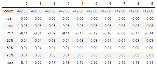
FIGURE 2-1: Descriptive statistics for a DataFrame.
You can spot the problematic variables by looking at the extremities of the distribution (the maximum value of a variable). For example, you must consider whether the minimum and maximum values lie respectively far from the 25th and 75th percentile. As shown in the output, many variables have suspiciously large maximum values. A boxplot analysis will clarify the situation. The following command creates the boxplot of all variables shown in Figure 2-2.
fig, axes = plt.subplots(nrows=1, ncols=1,
figsize=(10, 5))
df.boxplot(ax=axes);

FIGURE 2-2: Boxplots.
Boxplots generated from pandas DataFrame will have whiskers set to plus or minus 1.5 IQR (interquartile range or the distance between the lower and upper quartile) with respect to the upper and lower side of the box (the upper and lower quartiles). This boxplot style is called the Tukey boxplot (from the name of statistician John Tukey, who created and promoted it among statisticians together with other explanatory data techniques) and it allows a visualization of the presence of cases outside the whiskers. (All points outside these whiskers are deemed outliers.)
Leveraging the Gaussian distribution
Another effective check for outliers in your data is accomplished by leveraging the normal distribution. Even if your data isn't normally distributed, standardizing it will allow you to assume certain probabilities of finding anomalous values. For instance, 99.7% of values found in a standardized normal distribution should be inside the range of +3 and –3 standard deviations from the mean, as shown in the following code.
from sklearn.preprocessing import StandardScaler
Xs = StandardScaler().fit_transform(X)
# .any(1) method will avoid duplicating
df[(np.abs(Xs)>3).any(1)]
In Figure 2-3, you see the results depicting the rows in the dataset featuring some possibly outlying values.
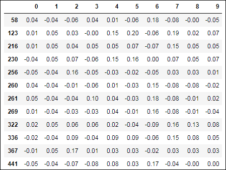
FIGURE 2-3: Reporting possibly outlying examples.
The Scikit-learn module provides an easy way to standardize your data and to record all the transformations for later use on different datasets. This means that all your data, no matter whether it’s for machine learning training or for performance test purposes, is standardized in the same way.
 The 68-95-99.7 rule says that in a standardized normal distribution, 68 percent of values are within one standard deviation, 95 percent are within two standard deviations, and 99.7 percent are within three. When working with skewed data, the 68-95-99.7 rule may not hold true, and in such an occurrence, you may need some more conservative estimate, such as Chebyshev’s inequality. Chebyshev’s inequality relies on a formula that says that for k standard deviations around the mean, no more cases than a percentage of 1/k^2 should be over the mean. Therefore, at seven standard deviations around the mean, your probability of finding a legitimate value is at most 2 percent, no matter what the distribution is. (Two percent is a low probability; your case could be deemed almost certainly an outlier.)
Chebyshev’s inequality is conservative. A high probability of being an outlier corresponds to seven or more standard deviations away from the mean. Use it when it may be costly to deem a value an outlier when it isn’t. For all other applications, the 68-95-99.7 rule will suffice.
Making assumptions and checking out
Having found some possible univariate outliers, you now have to decide how to deal with them. If you completely distrust the outlying cases, under the assumption that they were unfortunate errors or mistakes, you can just delete them. (In Python, you can just deselect them using fancy indexing.)
Modifying the values in your data or deciding to exclude certain values is a decision to make after you understand why you have some outliers in your data. You can rule out unusual values or cases for which you presume that some error in measurement has occurred, in recording or previous handling of the data. If instead you realize that the outlying case is a legitimate, though rare, one, the best approach would be to underweight it (when the learning algorithms uses weight for the observations) or to increase the size of your data sample.
In this case, after deciding to keep the data and standardizing it, you could just cap the outlying values by using a simple multiplier of the standard deviation:
Xs_capped = Xs.copy()
o_idx = np.where(np.abs(Xs)>3)
Xs_capped[o_idx] = np.sign(Xs[o_idx]) * 3
In the proposed code, the sign function from NumPy recovers the sign of the outlying observation (+1 or –1), which is then multiplied by the value of 3 and assigned to the respective data point recovered by a Boolean indexing of the standardized array.
This approach does have a limitation. Because the standard deviation is used both for high and low values, it implies symmetry in your data distribution, an assumption often unverified in real data. As an alternative, you can use a bit more sophisticated approach called winsorizing. When using winsorizing, the values deemed outliers are clipped to the value of specific percentiles that act as value limits (usually the 5th percentile for the lower bound and the 95th for the upper):
from scipy.stats.mstats import winsorize
Xs_winsorized = winsorize(Xs, limits=(0.05, 0.95))
In this way, you create a different hurdle value for larger and smaller values, taking into account any asymmetry in the data distribution. Whatever you choose to use for capping (by standard deviation or by winsorizing), your data is now ready for further processing and analysis.
Finally, an alternative, automatic solution is to let Scikit-learn automatically transform your data and clip outliers by using the RobustScaler, a scaler based on the IQR (as in the boxplot previously discussed in this chapter; refer to Figure 2-2):
from sklearn.preprocessing import RobustScaler
Xs_rescaled = RobustScaler().fit_transform(Xs)
Developing a Multivariate Approach
Working on single variables allows you to spot a large number of outlying observations. However, outliers do not necessarily display values too far from the norm. Sometimes outliers are made of unusual combinations of values in more variables. They are rare, but influential, combinations that can especially trick machine learning algorithms.
In such cases, the precise inspection of every single variable won’t suffice to rule out anomalous cases from your dataset. Only a few selected techniques, taking in consideration more variables at a time, will manage to reveal problems in your data.
The presented techniques approach the problem from different points of view:
- Dimensionality reduction
- Density clustering
- Nonlinear distribution modeling
Using these techniques allows you to compare their results, taking notice of the recurring signals on particular cases — sometimes already located by the univariate exploration, sometimes as yet unknown.
Using principle component analysis
Principal component analysis can completely restructure the data, removing redundancies and ordering newly obtained components according to the amount of the original variance that they express. This type of analysis offers a synthetic and complete view over data distribution, making multivariate outliers particularly evident.
The first two components, being the most informative in term of variance, can depict the general distribution of the data if visualized. The output provides a good hint at possible evident outliers.
The last two components, being the most residual, depict all the information that could not be otherwise fitted by the PCA method. They can also provide a suggestion about possible but less evident outliers.
from sklearn.decomposition import PCA
from sklearn.preprocessing import scale
from pandas.plotting import scatter_matrix
pca = PCA()
Xc = pca.fit_transform(scale(X))
first_2 = sum(pca.explained_variance_ratio_[:2]*100)
last_2 = sum(pca.explained_variance_ratio_[-2:]*100)
print('variance by the components 1&2: %0.1f%%' % first_2)
print('variance by the last components: %0.1f%%' % last_2)
df = pd.DataFrame(Xc, columns=['comp_' + str(j)
for j in range(10)])
fig, axes = plt.subplots(nrows=1, ncols=2,
figsize=(15, 5))
first_two = df.plot.scatter(x='comp_0', y='comp_1',
s=50, grid=True, c='Azure',
edgecolors='DarkBlue',
ax=axes[0])
last_two = df.plot.scatter(x='comp_8', y='comp_9',
s=50, grid=True, c='Azure',
edgecolors='DarkBlue',
ax=axes[1])
plt.show()
Figure 2-4 shows two scatterplots of the first and last components. The output also reports the variance explained by the first two components (half of the informative content of the dataset) of the PCA and by the last two ones:
variance by the components 1&2: 55.2%
variance by the last components: 0.9%
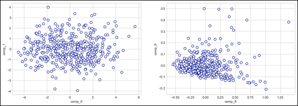
FIGURE 2-4: The first two and last two components from the PCA.
Pay particular attention to the data points along the axis (where the x axis defines the independent variable and the y axis defines the dependent variable). You can see a possible threshold to use for separating regular data from suspect data.
Using the two last components, you can locate a few points to investigate using the threshold of –0.3 for the tenth component and of –1.0 for the ninth. All cases below these values are possible outliers (see Figure 2-5).
outlying = (Xc[:,-1] > 0.3) | (Xc[:,-2] > 1.0)
df[outlying]
Using cluster analysis
Outliers are isolated points in the space of variables, and DBScan is a clustering algorithm that links dense data parts together and marks the too-sparse parts. DBScan is therefore an ideal tool for an automated exploration of your data for possible outliers to verify. Here is an example of how you can use DBScan for outlier detection:
from sklearn.cluster import DBSCAN
DB = DBSCAN(eps=2.5, min_samples=25)
DB.fit(Xc)
from collections import Counter
print(Counter(DB.labels_))
df[DB.labels_==-1]
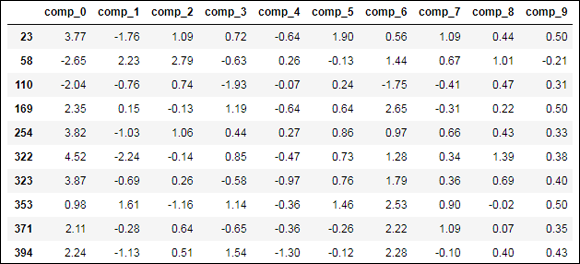
FIGURE 2-5: The possible outlying cases spotted by PCA.
However, DBSCAN requires two parameters, eps and min_samples. These two parameters require multiple tries to locate the right values, which makes using the parameters a little tricky.
Start with a low value of min_samples and try growing the values of eps from 0.1 upward. After every trial with modified parameters, check the situation by counting the number of observations in the class by comparing the attribute labels_, with the value -1, and stop when the number of outliers seems reasonable for a visual inspection.
There will always be points on the fringe of the dense parts' distribution, so it’s hard to provide you with a threshold for the number of cases that might be classified in the –1 class. Normally, outliers should not be more than 5 percent of cases, so use this indication as a generic rule of thumb.
The output from the previous example will report to you how many examples are in the –1 group, which the algorithm considers not part of the main cluster, and the list of the cases that are part of it.
It is less automated, but you can also use the K-means clustering algorithm for outlier detection. You first run a cluster analysis with a reasonable enough number of clusters. (You can try different solutions if you're not sure.) Then you look for clusters featuring just a few examples (or maybe a single one); they are probably outliers because they appear as small, distinct clusters that are separate from the large clusters that contain the majority of examples.
Automating outliers detection with Isolation Forests
Random Forests and Extremely Randomized Trees are powerful machine learning techniques. They work by dividing your dataset into smaller sets based on certain variable values to make it easier to predict the classification or regression on each smaller subset (a divide et impera solution).
IsolationForest is an algorithm that takes advantage of the fact that an outlier is easier to separate from majority cases based on differences between its values or combination of values. The algorithm keeps track of how long it takes to separate a case from the others and get it into its own subset. The less effort it takes to separate it, the more likely the case is an outlier. As a measure of such effort, IsolationForest produces a distance measurement (the shorter the distance, the more likely the case that it's an outlier).
When your machine learning algorithms are in production, a trained IsolationForest can act as a sanity check because many algorithms can’t cope with outlying and novel examples.
To set IsolationForest to catch outliers, all you have to decide is the level of contamination, which is the percentage of cases considered outliers based on the distance measurement. You decide such a percentage based on your experience and expectation of data quality. Executing the following script will create a working IsolationForest:
from sklearn.ensemble import IsolationForest
auto_detection = IsolationForest(max_samples=50,
contamination=0.05,
random_state=0)
auto_detection.fit(Xc)
evaluation = auto_detection.predict(Xc)
df[evaluation==-1]
The output reports the list of the cases suspected of being outliers. In addition, the algorithm is trained to recognize normal dataset examples. When you provide new cases to the dataset and you evaluate them using the trained IsolationForest, you can immediately spot whether something is wrong with your new data.
IsolationForest is a computationally intensive algorithm. Performing an analysis on a large dataset takes a long time and a lot of memory.