
Chapter 6
Developing Impressive Charts and Plots
IN THIS CHAPTER
![]() Starting a basic chart or plot
Starting a basic chart or plot
![]() Augmenting a chart or plot
Augmenting a chart or plot
![]() Developing advanced charts and plots
Developing advanced charts and plots
![]() Working with specialized charts and plots
Working with specialized charts and plots
Many people think that data science is all about data manipulation and analysis; a few add data cleaning and selection into the mix. The idea of being able to see patterns in data that no one else can see is intoxicating — akin to going on a treasure hunt and finding something fabulous. Of course, if you’ve ever watched treasure hunters, you know that they don’t keep their discoveries to themselves. They blast the radio and television waves with their finds, they show up in bookstores, their adventures appear in blogs, and they most definitely talk about them on Facebook and Twitter. After all, what’s the use in finding something amazing and then keeping it to yourself? That’s what this chapter is about: telling others about your data science finds. Most people react more strongly to visual experiences than to text, though, so this chapter talks about graphical communication methods. The goal is to make you look impressive when you present the most dazzling data find ever using a bit of pizzazz.
 You don’t need to be a graphic designer to use graphs, charts, and plots in your notebooks (don’t worry if you don’t know the difference now; you’ll discover the difference between these forms of presentation early in the chapter). In fact, if you follow a simple process of following where your data leads, you’ll likely end up with something usable without a lot of effort. The first part of this chapter discusses how to create a basic presentation without a lot of augmentation so that you can see whether your selection will actually work.
The second section of this chapter discusses various kinds of augmentation you perform to make your presentation eye grabbing and informative. You use graphs, charts, and plots to communicate specific ideas to people who don’t necessarily know (or care) about data science. The graphic nature of the presentation gives up some precision in favor of communicating more clearly.
Some types of graphs, charts, and plots see more use in data science because they communicate big data, statistics, and various kinds of analysis so well. You see some of these presentations in earlier chapters in the book, and you can be sure of seeing more of them later. The third section of the chapter describes these special data science perspectives in more detail so that you know, for example, why a scatterplot often works better for presenting data than a line chart.
The final section of the chapter discusses the presentation of data abstractions used in data science in graphical form. For example, a hierarchy is hard to visualize, even for an experienced data scientist, in some cases. Using the correct directed or undirected graph can make a huge difference in understanding the data you want to analyze.
You don’t have to type the source code for this chapter manually. In fact, using the downloadable source is a lot easier. The source code for this chapter appears in the DSPD_0506_Graphics.ipynb source code file for Python and the DSPD_R_0506_Graphics.ipynb source code file for R. See the Introduction for details on how to find these source files.
Starting a Graph, Chart, or Plot
Graphs, charts, and plots don't suddenly appear in your notebook out of nowhere; you must create them. The problem for many data scientists, who are used to looking at the big picture, is that the task can seem overwhelming. However, every task has a beginning, and by breaking the task down into small enough pieces, you can make it quite doable. The following sections discuss the starting point for any graph, chart, or plot that you need to present your data.
Understanding the differences between graphs, charts, and plots
The terms graph, chart, and plot are used relatively often in the chapter, and you might be confused by their use. The problem is that many people are confused, and this confusion leads to a lack of consensus on precisely what the terms mean. However, before the chapter can proceed, you need to know how the book uses the terms graph, chart, and plot:
- Graph: Used to present data abstractions, such as the output of a mathematical formula or an algorithm, in a continuous form, such as a line graph. In addition, you see graphs used to present abstract data, such as the points in a hierarchy or the connections between nodes in a representation of a complex relationship. A graph is also used as the output for certain kinds of analysis, such as trying to compute the best route from one point to another based on time, distance, fuel use, or some other criterion.
- Chart: Presents data as discrete elements using specialized symbols, such as bars. A chart normally presents discrete real data, as opposed to data abstractions. There is usually some x/y element to the data presentation, such that each data element is compared according to some common constraint. For example, a chart might show the number of passengers who travel by air in a given month, with the chart presenting the number of passengers for each month over a given time frame as individual bars.
- Plot: Presents data in a coordinate system in which both the x and y axis are continuous and two points can occupy the same place at the same time. Plots normally rely on dots or other symbols to display each data element within the coordinate system without any connectivity between each of the data elements. The grouping and clustering of plot points tends to present patterns to the viewer, rather than showing a specific average or other calculated value. Plots often add another dimension to a data display using color for each of the data categories or size for the data values.
Considering the graph, chart, and plot types
This book considers the use of MatPlotLib (https://matplotlib.org/) for drawing in Python because it’s flexible and is found in many source code examples online. However, you can find a long list of graphic packages for Python online, including those found here: https://wiki.python.org/moin/UsefulModules#Plotting. Even if you restrict yourself to MatPlotLib, you still have access to a broad range of graph, chart, and plot types, as described here: https://matplotlib.org/3.1.0/tutorials/introductory/sample_plots.html.
When working with R, the best solution is to rely on built-in functionality for most needs, as described at https://www.statmethods.net/graphs/index.html. However, you also have specialized alternatives, such as ggplot2 (https://ggplot2.tidyverse.org/).
No matter which language you work in, the variety of graph, chart, and plot types can be overwhelming. However, if you limit yourself to these kinds of graphs, charts, and plots at the outset, you find that you can cover the majority of your needs without getting that second degree in graphic design:
- Line graph: This is the standby for every sort of continuous data. The emphasis here is on continuous; you want to have an ongoing relationship between the various data elements. This is why this particular kind of graph works so well for the output of certain kinds of algorithms. You use this graph to smooth differences — that is, to see trends.
- Bar chart: This is the standby for every sort of discrete data, where each value stands on its own. To see how sales increase over time, for example, you must choose a discrete time interval and chart the sales for the interval as a unit, rather than consider the sales from any other interval. You use this chart to amplify differences — to see specifically how things differ.
- Histogram: This is a kind of bar chart that groups data within a range in a practice called binning. For example, you may want to see how many trees fall within specific height ranges, so you group the data elements by height and then display discrete heights on screen. In addition, you may want to have the trees that grow to 10 feet fall into one bin, those that grow to 20 feet fall into a second bin, those that grow to 30 feet into a third bin, and so on.
- Pie chart: This is a special sort of chart for statistical analysis that considers parts of a whole. You often see it used for financial data, but it also has uses for other needs. Because this is a part of a whole chart, the values depicted are percentages, not actual values. (However, you can label each wedge with the specific value for that wedge.) As a result, this is a special kind of analysis chart.
- Scatter plot: This is the standby for discrete data displayed using coordinates. Unlike other display types, this one shows actual data values when compared to some specific criteria. For example, you might use this kind of plot to show the number and size of messages generated by individual users on a particular day. The x-axis might show the number of messages, while the y-axis shows the message size.
Defining the plot
Most libraries use a type of line graph for quick or simple displays. You create two variables to hold the x and y coordinates and then plot them, as shown in the following code:
%matplotlib inline
import matplotlib.pyplot as plt
x = [1, 2, 3, 4, 5, 6]
y = [2, 8, 4, 3, 2, 5]
plt.plot(x, y)
plt.show()
In this particular case, you see the line graph shown in Figure 6-1. There aren't any labels to tell you about the line graph, but you can see the layout of the data. In some cases, this is really all you need to get your point across when the viewer can also see the code.

FIGURE 6-1: The output of a plain line graph.
Drawing multiple lines
Sometimes a single plot will contain multiple datasets. You can to compare the two datasets, so you use a single line for each to make comparison easy. In this case, you plot each of the lines separately, but in the same graph, as shown here:
x = [1, 2, 3, 4, 5, 6]
y1 = [2, 8, 4, 3, 2, 5]
y2 = [1, 3, 9, 2, 4, 6]
plt.plot(x, y1)
plt.plot(x, y2)
plt.show()
Even using the default settings, you see the two lines in different colors or using unique symbols for each of the data points. The lines help you keep the two plots apart, as shown in Figure 6-2.
Drawing multiple plots
You might need to show multiple kinds of subplots as part of the same plot (or figure). Perhaps direct comparison isn’t possible, or you may simply want to use different plot types. The following code shows how to draw multiple subplots in the same plot.
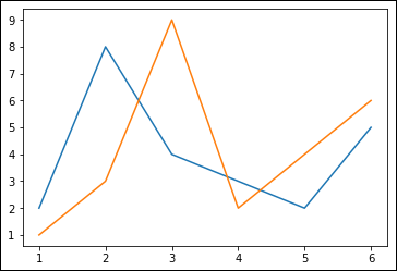
FIGURE 6-2: The output of multiple datasets in a single line graph.
import numpy as np
width = .5
spots = np.arange(len(y1))
x1 = 1 + spots - width / 2
x2 = 1 + spots + width / 2
figure = plt.figure(1)
plt.subplot(1,2,1)
plt.plot(x, y1)
plt.plot(x, y2)
plt.subplot(1,2,2)
plt.bar(x1, y1, width)
plt.bar(x2, y2, width)
plt.show()
This presentation requires a little more explanation. In order to display the bar chart elements side by side, you need to define a new x-axis that provides one set of values for the first set of bars and a second, offset, x-axis that provides a second set of values for the second set of bars. The rather odd-looking code calculates these values. If you were to print x1 and x2 out, you'd see these values:
[0.75 1.75 2.75 3.75 4.75 5.75]
[1.25 2.25 3.25 4.25 5.25 6.25]
To create multiple subplots, you must first define a figure to hold each plot. You then use plt.subplot() to specify the start of each subplot. The three numbers you see define the number of rows and columns for the subplot, along with an index into that subplot series. Consequently, this example has one row and two columns, with the line graph at index 1 and the bar chart at index 2, as shown in Figure 6-3.
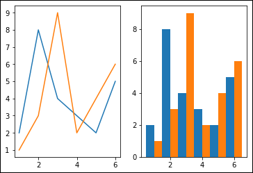
FIGURE 6-3: The output of multiple presentations in a single figure.
Saving your work
Sometimes you want to save just the output of an analysis as a plot to disk. Perhaps you want to put it in a report other than the kind you can create with Notebook.
To save your work, you must have access to a figure. The previous section saves figure number 1 to the variable figure using figure = plt.figure(1). Without this variable, you can't save the plot to disk. The actual act of saving the figure requires just one line of code, as shown here:
figure.savefig('MyFig.png', dpi=300)
The filename extension defines the format of the saved figure. You can also specify the format separately. Defining the dpi value is important because the default setting is None, which can cause some issues when you try to import the figure into certain graphics applications.
Setting the Axis, Ticks, and Grids
Even though a plot will never be quite as accurate for obtaining measurements as actual text, you can still make it possible to perform rough measurement using an axis, ticks, and grids. As with many other aspects of graphic presentations, these three terms can mean different things to different people. Here is how the book uses them:
- Axis: The line used to differentiate data planes within the graphic presentation. The x-axis, which is horizontal, and the y-axis, which is vertical, are the two most common. A three-dimensional graphic presentation will have a z-axis. The axis controls formatting such as the minimum and maximum values, scaling (with linear and logarithmic being common), labeling, and so on.
- Ticks: The placement of markers along the axis to show data measurements. The ticks represent values that the viewer can see and use to determine the value of a data point at a specific place along the line. You can control tick labeling, color, and size, among other things.
- Grids: The addition of lines across the graphic presentation as a whole that usually extend the ticks to make measurement easier. A grid can make data measurements easier but can also obscure some data points, so using a grid carefully is essential. The data grid can include variations in color, thickness, and other formatting elements.
Even though axes is the plural of axis, some graphics libraries make a significant difference between axes and axis. For example, in MatPlotLib, the Axes object contains most of the figure elements, and you use it to set the coordinate system. The Axes object contains Axis, Tick, Line2D, Text, Polygon, and other graphic elements used to define a graphic presentation, so you need to exercise care when using axes as the plural of axis.
Getting the axis
When working with R, you need to perform all the tasks required to create a graphic within a single cell. However, you have the same access to graphing functionality as you do with Python. The example source for the R example in this section shows you some additional details.
When working with Python, you may notice that after you call plt.show() when using the %matplotlib inline magic, you can't get the plot to display again without essentially rebuilding it. The article at https://matplotlib.org/users/artists.html describes the technical details that explain why this inability to display the graphic output again occurs. However, you can present changes to a graph as part of a Notebook by using another technique. It starts by using the %matplotlib notebook magic and figure.canvas.draw() instead, as shown here:
%matplotlib notebook
figure = plt.figure(1)
ax1 = figure.add_subplot(1,2,1)
ax1.plot(x, y1)
ax1.plot(x, y2)
figure.canvas.draw()
The output differs from the previous outputs in this chapter, as shown in Figure 6-4. This form of output presents you with considerable leeway in sizing, printing, and interacting with the figure in other ways. You also see just one image, rather than multiple images, for each step of the modification process.
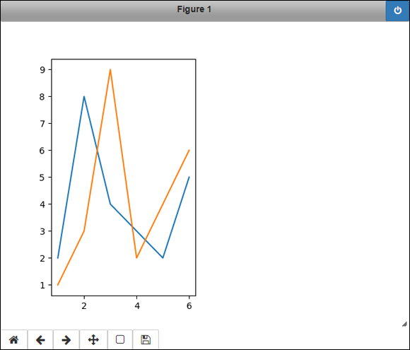
FIGURE 6-4: Allowing multiple revisions to a single output graphic.
This same figure remains in place as you make changes. For example, if you want to change the color used for the graph, you access the patch attribute and set the desired color, as shown here:
ax1.patch.set_facecolor('yellow')
figure.canvas.draw()
When you run this code, you see the background of the original figure change, rather than see a new figure created. The point is that the changes can occur over multiple cells, making this approach more flexible in some respects, even if you can't see an actual progression using multiple figures. You can even add new graphics by using the following code:
width = .5
spots = np.arange(len(y1))
x1 = 1 + spots - width / 2
x2 = 1 + spots + width / 2
ax2 = figure.add_subplot(1,2,2)
ax2.bar(x1, y1, width)
ax2.bar(x2, y2, width)
figure.canvas.draw()
You can also make additions to existing graphics. The following code adds titles to the existing graphics. You can see the output in Figure 6-5.
ax1.set_title("Line Graph")
ax2.set_title("Bar Chart")
figure.canvas.draw()
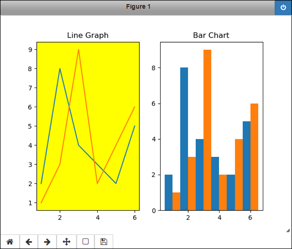
FIGURE 6-5: The original figure changes as needed.
Formatting the ticks
The ticks you use to draw your chart help define how easily someone can use the data. It may seem at first that providing small tick increments and precise measures would provide better information, but sometimes doing so just makes the plot look cramped and hard to read. In addition, when working with ticks, you often find that the labeling is critical in making the data understandable. The following code takes the line shown in Figure 6-2 and augments the ticks to make them easier to see:
figure2 = plt.figure(2)
ax3 = figure2.add_subplot(1,1,1)
ax3.plot(x, y1)
ax3.plot(x, y2)
plt.xticks(np.arange(start=1, stop=7),
('A', 'B', 'C', 'D', 'E', 'F'))
plt.yticks(np.arange(start=1, stop=10, step=2))
plt.tick_params('both', color='red', length=10,
labelcolor='darkgreen', labelsize='large')
figure2.canvas.draw()
Even though you can’t see the colors in Figure 6-6, you can see that the ticks are now larger and wider spaced to make determining the approximate values of each data point easier. The use of letters for the x-axis ticks simply points out that you could use any sort of textual label desired. Notice that you don’t work with the axis variable, ax3, but rather change the plot as a whole. To see more tick manipulation pyplot functions, see the listing that appears at https://matplotlib.org/3.1.0/api/_as_gen/matplotlib.pyplot.html.
Adding grids
Adding grids to a plot is one way to make it easier for the viewer to make more precise data value judgments. The downside of using them, however, is that they can also obscure precise data points. You want to use grids with caution, and the correct configuration can make a significant difference in what the reviewer sees. The following code adds grids to the plot in Figure 6-6:
plt.grid(axis='x', linestyle='-.',
color='lightgray', linewidth=1)
plt.grid(axis='y', linestyle='--',
color='blue', linewidth=2)

FIGURE 6-6: Modifying the plot ticks.
You can choose to create various grid presentations to meet the needs of your audience using separate calls, as shown here. Figure 6-7 doesn’t show the colors, but you can see the effect of the settings quite well. If you don’t provide an axis argument, the grid settings apply to both axes.

FIGURE 6-7: Adding grid lines to make data easier to read.
Defining the Line Appearance
The formatting of lines in your graphics can make a big difference in visibility, ease of understanding, and focus (heavier lines tend to focus the viewers' attention). So far, the various graphics have used solid lines to present relationships between data points as needed. In addition, the examples have used the default line colors and haven’t provided any sort of markers for the individual data points. All these factors are relatively easy to control when you have access to the required line objects, such as Line2D, described at https://matplotlib.org/3.1.0/api/_as_gen/matplotlib.lines.Line2D.html. The following sections show how to work with lines in various ways so that you can change their appearance as needed.
Working with line styles
You can set line styles either as part of creating the plot or afterward. In fact, changing the focus during a presentation is possible by making changes to line style. Some changes are subtle, such as making the line thicker, while others are dramatic, such as changing the line color or style. The following code presents just a few of the changes you can make:
import matplotlib.lines as lines
figure3 = plt.figure(3)
ax4 = figure3.add_subplot(1,1,1)
ax4Lines = ax4.plot(x, y1, '-.b', linewidth=2)
ax4.plot(x, y2)
line1 = ax4Lines[0]
line1.set_drawstyle('steps')
line2 = ax4.get_lines()[1]
line2.set_linestyle(':')
line2.set_linewidth(3)
line2.set_color('green')
figure3.canvas.draw()
The initial plotting process sets the line characteristics for the first line using plot() method arguments. The '-.b' argument is a format string that can contain the marker type, line style, and line color, as described in the plot() methods notes at https://matplotlib.org/3.1.0/api/_as_gen/matplotlib.pyplot.plot.html#matplotlib.pyplot.plot.
 Notice that you can obtain the list of lines in a plot using one of two methods:
- Saving the plot output
- Using the
get_lines()method on the plot
Instead of the 'default' draw style, the first line now uses the 'steps' draw style, which can make seeing data transitions significantly easier. This example obtains the parameters for the second line in the subplot using the get_lines() method. It sets the three properties for the line that the code set as part of the plot for the first line. Figure 6-8 shows how these changes appear in the output.
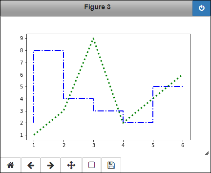
FIGURE 6-8: Making changes to a line as part of the plot or separately.
Adding markers
Markers, like grid lines, can serve to emphasize data. In this case, you emphasize individual data points and sometimes data transitions as well. Like grid lines, the size of the marker can affect the viewer's ability to see precisely where the data point lies, reducing accuracy in the process. Consequently, you must always consider the trade-offs of using certain marker configurations on a plot; that is, you need to consider whether the goal is to emphasize a data point or to make it possible for a viewer to see the data more accurately. The following code adds markers to the plot shown previously in Figure 6-8.
line1.set_marker('s')
line1.set_markerfacecolor('red')
line1.set_markersize(10)
line2.set_marker('8')
line2.set_markerfacecolor('yellow')
line2.set_markeredgecolor('purple')
line2.set_markersize(6)
The kind of marker you choose can affect how easily someone can see the marker and how much it interferes with the data points. In this example, the square used for line1 is definitely more intrusive than the octagon used for line2. MatPlotLib supports a number of different markers that you can see at https://matplotlib.org/3.1.0/api/markers_api.html#module-matplotlib.markers.
The size of the marker also affects how prominent it appears. The various markers have different default sizes, so you definitely want to look at the size when creating a presentation.
The line2 configuration also shows just one of a wide variety of special effects that you can create. In this case, the outside of the octagon is purple, while the inside is yellow. Figure 6-9 shows the results of these changes.

FIGURE 6-9: Adding markers to emphasize the data points.
Using Labels, Annotations, and Legends
A graphic might not tell the story of the data by itself, especially when the graphic is complex or reflects complex data. However, you might not be around to explain the meaning behind the graphic — perhaps you're sending a report to another office. Consequently, you rely on various methods of adding explanations to a graphic so that others can better understand precisely what you mean. The three common approaches to adding explanations appear in the following list:
- Labels: The addition of explanatory text to a particular element, such as the line or bar in a graphic. You can also label individual data points.
- Annotation: The addition of explanatory text in a free-form manner that reflects on one or more graphic elements as a whole, rather than on specific graphic elements.
- Legend: A method of identifying the data elements within a graphic that are normally associated with related data elements, such as all the elements for a particular month of sales.
Some crossover occurs between explanatory methods depending on the language and associated library you use. For example, whether a title is actually a kind of label or a kind of annotation depends on the person you’re talking with. The following sections describe how to use various kinds of explanatory text with your graphics, using the definitions found in the previous list.
Adding labels
Labels enable you to point out specific features of a graphic. In this example, the labels specify the minimum and maximum values for each of the lines. Of course, the text can say anything you want, and you have full formatting capabilities for the text, as shown in the following code:
figure4 = plt.figure(4, figsize=(7.7, 7.0))
ax5 = figure4.add_subplot(1,1,1)
ax5.plot(x, y1, color='red')
ax5.plot(x, y2, color='blue')
plt.text(2.2, 7.5, 'Line 1
Max', color='red')
plt.text(1.2, 2.2, 'Line 1
Min 1', color='red')
plt.text(5.2, 1.6, 'Line 1
Min 2', color='red',
bbox=dict(facecolor='yellow'))
plt.text(3.2, 8.5, 'Line 2
Max', color='blue')
plt.text(1.4, 1.0, 'Line 2
Min', color='blue')
figure4.canvas.draw()
This example begins by creating a new figure, but with a specific size, rather than using the default as usual. The size used will accommodate the various kinds of explanation added to this example. It’s important to remember that figures are configurable when creating reports. You can see all the figure arguments at https://matplotlib.org/3.1.0/api/_as_gen/matplotlib.pyplot.figure.html.
One way to create labels, besides using titles and other direct graphic features, is to use the text() function. You specify where to place the text and the text you want to see. The display text can use escape characters, such as
for a newline. You have access to the same escape characters as those you use in Python. All the text() calls in this example use the color argument to associate the text with a particular line. The second minimum value for line one also uses the bbox (bounding box) argument, which has its own list of arguments as defined for the Rectangle at https://matplotlib.org/3.1.0/api/_as_gen/matplotlib.patches.Rectangle.html#matplotlib.patches.Rectangle. You can find other text() function features described at https://matplotlib.org/3.1.0/api/_as_gen/matplotlib.pyplot.text.html. Figure 6-10 shows how the labeling looks.
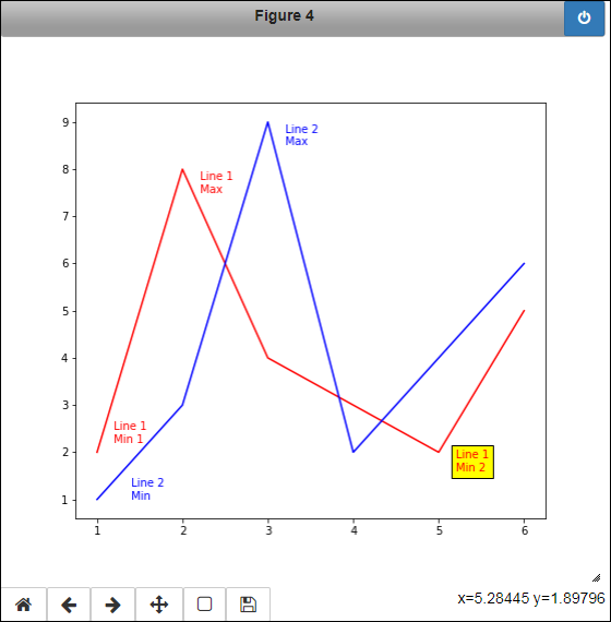
FIGURE 6-10: Labels identify specific graphic elements.
Annotating the chart
At first, some kinds of annotation might look like labeling in disguise. However, annotation takes a somewhat different course in that you use it to point something out. So, for example, annotation can have an arrow, whereas labeling can't, as described at https://matplotlib.org/3.1.0/api/_as_gen/matplotlib.pyplot.annotate.html. The following code adds annotation to the example shown in Figure 6-10.
ax5.annotate('This is some
annotation.', xy=(2.8, 8.0),
xytext=(1.0, 8.5), color='green',
weight='bold', fontsize=14,
arrowprops=dict(facecolor='black'))
As with labels, you can use all the standard escape characters with the annotation text. The xy argument is the starting point for the annotation. It's where the head of the arrow will go should you choose to include one. The xytext argument defaults to the same value as xy, but you need to provide this value when using an arrow or the arrow will simply appear on top of the annotation.
The remaining arguments define formatting. You can define the color, weight, and fontsize of the annotation text using the same approach that you do with labels. The arrowprops argument is a dict containing arguments that define the arrow appearance. Most of the bbox arguments work with an arrow, along with the special arrowprop arguments, such as the kind of arrow to draw. Figure 6-11 shows the example with the annotation added.
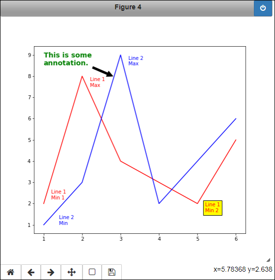
FIGURE 6-11: Annotation provides the means of pointing something out.
Creating a legend
A legend is a box that appears within the graphic identifying grouped data elements, such as the data points used for a line graph or the bars used for a chart. Legends are important because they enable you to differentiate between the grouped elements. The legend depends on the label argument for each of the plots. Given that the example doesn't define this argument during the initial setup, the code begins by adding the labels before displaying the legend in the following code:
lines1 = ax5.get_lines()[0]
lines1.set_label('Line 1')
lines2 = ax5.get_lines()[1]
lines2.set_label('Line 2')
plt.legend()
As with any other sort of explanatory text, legend() provides a wealth of formatting features, as described at https://matplotlib.org/3.1.0/api/_as_gen/matplotlib.pyplot.legend.html. Figure 6-12 shows the final form of this example.

FIGURE 6-12: Legends identify the individual grouped data elements.
Creating Scatterplots
You see scatterplots used a lot in data science because they help people see patterns in seemingly random data. The data points may not form a line or work well as bars because they’re simply coordinates that express something other than precise values, such as the number of sales during December. In fact, you may not know what the data represents until you actually do see the pattern.
Unfortunately, humans can still miss the patterns all those dots in the screen. No matter how hard a person looks, there just doesn’t seem to be anything there worthy of consideration. That’s where certain kinds of augmentation come into play. You can use color, shapes, size, and other methods to emphasize particular data points so that the pattern does become more obvious. The following sections consider some of the augmentations you can perform on a scatterplot to see the patterns.
Depicting groups
Seeing groups in data is critical for data science. Entire books of algorithms exist to find ways to see where groups lie in the data — to make sense of where the data belongs. Without the ability to see groups, it’s often difficult to make any sort of determination of what the data means. Consider the data presented by the following code:
%matplotlib inline
x1 = [2.3, 1.1, 1.5, 2.1, 1.3, 2.2, 1.0]
x2 = [2.6, 3.3, 3.1, 3.5, 3.9, 4.0, 4.1]
y1 = [2.4, 1.0, 2.1, 3.2, 4.3, 2.1, 2.0]
y2 = [2.5, 3.3, 1.9, 3.7, 3.2, 1.4, 4.5]
This data is excessively simple, so you could probably see patterns without doing any analysis at all. However, real datasets aren’t nearly so easy. The following code plots these data points in a generic manner that might match some of the plots you’ve worked with:
plt.scatter([x1, x2], [y1, y2])
plt.show()
The output shown in Figure 6-13 doesn’t tell you anything about the data. All you really see is a random bunch of dots.
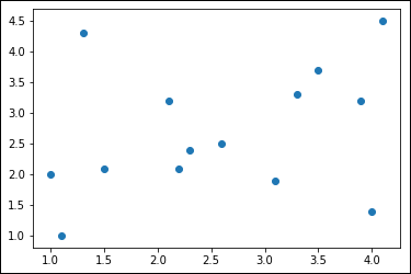
FIGURE 6-13: Some plots really don’t say anything at all.
However, when you plot the same data in a different way, using the following code, you get a completely different result:
s1 = [20*3**n for n in y1]
s2 = [20*3**n for n in y2]
plt.scatter(x1, y1, s=s1, c='red', marker="*")
plt.scatter(x2, y2, s=s2, c='blue', marker="^")
plt.show()
In this case, the code differentiates the two groups within the data using different plots that have different colors and markers. In addition, the size of the dots used within the plot reflect the output of a particular algorithm, which is straightforward in this case. The output of the algorithm depends on the y-axis position of the dot. Figure 6-14 shows the output, which is infinitely easier to interpret. Now you can see the differences between each group.
Showing correlations
Most of this book deals with showing where separations occur between data points in a dataset. Book 3 starts with simple techniques, Book 4 moves on to more advanced methods, and Book 5 uses AI to separate data elements in a smart manner. The analysis of data generally results in data categorization or the prediction of probabilities. A correlation looks at data relationships. The correlation value falls between –1 and 1 where:
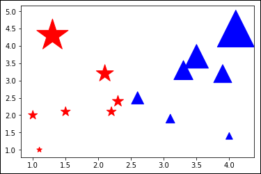
FIGURE 6-14: Differentiation makes the plots easier to interpret.
- Magnitude: Defines the strength of correlation. Values that are closer to –1 or 1 specify a stronger correlation.
- Sign: A positive value defines a positive (or regular) correlation, where a minus value defines an inverse correlation.
To see how correlations can work, consider this example:
x1 = [1.0, 1.5, 2.0, 2.5, 3.0, 3.5, 4.0]
y1 = [4.0, 3.5, 3.0, 2.5, 2.0, 1.5, 1.0]
z1 = np.corrcoef(x1, y1)
print(z1)
s1 = [(20*(n-p))**2 for n,p in zip(x1,y1)]
plt.scatter(x1, y1, s=s1)
plt.show()
In this case, x1 increases as y1 decreases, so there is a negative correlation. The output from z1 demonstrates this fact:
[[ 1. -1.]
[-1. 1.]]
The four matrix output values show the following:
- x1 with x1 = 1
- x1 with y1 = -1
- y1 with x1 = -1
- y1 with y1 = 1
This represents a high degree of negative correlation. If this were a positive correlation, where the values in x1 and y1 were precisely the same, the output matrix would contain all 1 values. Figure 6-15 shows the scatterplot for this example. If this were a regular correlation, the scatterplot would actually be blank because this scatterplot shows increasing levels of difference and there would be no differences if x1 and y1 contain the same values.

FIGURE 6-15: A scatterplot showing a high degree of negative correlation.
Here's another example:
x2 = [2.0, 2.5, 3.0, 3.5, 4.0, 4.0, 4.0]
y2 = [1.0, 1.5, 2.0, 2.5, 3.0, 3.5, 4.0]
z2 = np.corrcoef(x2, y2)
print(z2)
s2 = [(20*(n-p))**2 for n,p in zip(x2,y2)]
plt.scatter(x2, y2, s=s2)
plt.show()
In this case, the correlation is positive. As x2 increases, so does y2. However, the correlation isn't perfect because x2 is a value of 1 above y2 until it plateaus and y2 catches up. The output of this example is
[[1. 0.95346259]
[0.95346259 1. ]]
The correlation is still high, but not as high as the previous example. Figure 6-16 shows the scatterplot of this example. Notice that the angle of the data is in the opposite direction from the example in Figure 6-15 — one is negative (upper left to lower right), while the other is positive (lower left to upper right).

FIGURE 6-16: A scatterplot showing a high degree of positive correlation.
Plotting Time Series
Working with time is an essential part of many analyses. You need to know what happened at a particular time or over a length of time. Reviewing the number of sales in January this year as contrasted to those last year is a common occurrence. The “Processing Time Series” section of Book 5, Chapter 5 discusses how you can use time-related data to perform predictions. In short, many business situations require you to consider how time affects past, present, and future business needs.
The following sections don't do anything too fancy with time with regard to the data. What they focus on is how you can present time-related data so that it makes the most sense to your viewer. Note that these examples rely on the airline-passengers.csv file originally downloaded in the “Defining sequences of events” section of Book 5, Chapter 5.
Representing time on axes
You have multiple options for presenting time on axes. The easiest method to use with most of the data out there is the plot() shown here:
import pandas
apDataset = pandas.read_csv('airline-passengers.csv',
usecols=[1])
xAxis = pandas.read_csv('airline-passengers.csv',
usecols=[0])
years = []
for x in xAxis.values.tolist()[::12]:
years.append(x[0])
figure5 = plt.figure(5)
ax6 = figure5.add_subplot(111, xlabel="Year/Month",
ylabel="Number of Passengers",
title="Airline Passengers")
ax6.plot(apDataset.values)
plt.xticks(np.arange(start=1, stop=len(xAxis), step=12),
years, rotation=90)
plt.grid()
plt.show()
The ticks for the x-axis won't work with all the entries in place. The labeling would be so crowded that it would become useless. With this idea in mind, the example converts the NumPy DataFrame into a simple list containing just the entries needed for labeling. Even with the conversion, you must rotate the labels 90 degrees using the rotation argument of xticks() to make them fit. Compare the output in Figure 6-17 with the similar graphic in Figure 5-1 of Book 5, Chapter 5.
Another method of performing this task is to use plot_date() instead. In this case, you must convert the date strings in the data to actual dates. This approach can require less time and effort than using a standard plot(), as shown here:
from datetime import datetime
yearsAsDate = []
for x in xAxis.values.tolist():
yearsAsDate.append(datetime.strptime(x[0], '%Y-%m'))
figure6 = plt.figure(6)
ax7 = figure6.add_subplot(111, xlabel="Year",
ylabel="Number of Passengers",
title="Airline Passengers")
ax7.plot_date(yearsAsDate, apDataset, fmt='-')
plt.grid()
plt.show()
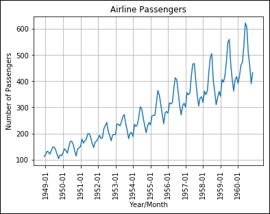
FIGURE 6-17: Using a general plot to display date-oriented data.
Notice that you must provide the correct string format to strptime(), which is just the four-digit year and the month in this case. The function assumes a day value of 1 to create a complete date. For example, even though the date might appear as 1950-02 in the airline-passengers.csv file, the actual date will appear as 01-02-1950 after the conversion. Figure 6-18 shows the output of this example.
Plotting trends over time
In looking at the graphics in Figures 6-17 and 6-18, you can discern that the trend is to generally see more passengers flying to their destination each year. You can't be more specific than to say that there are more, however. To be able to give more information, you need to perform a relatively simple analysis, one that defines how many more passengers, on average, that you can expect to see, as shown in the following example.
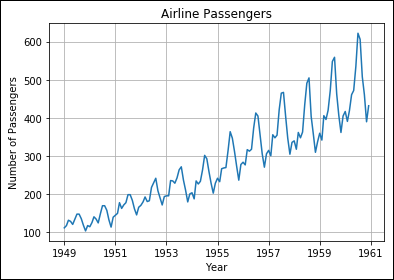
FIGURE 6-18: Using plot_date() to display date-oriented data.
x = range(0, len(apDataset.values))
z = np.polyfit(x, apDataset.values.flatten(), 1)
p = np.poly1d(z)
figure5 = plt.figure(5)
ax6 = figure5.add_subplot(111, xlabel="Year/Month",
ylabel="Number of Passengers",
title="Airline Passengers")
ax6.plot(x, apDataset.values)
zeroPoint = min(apDataset.values)
ax6.plot(apDataset.values-zeroPoint,
p(apDataset.values-zeroPoint), 'm-')
plt.xticks(np.arange(start=1, stop=len(xAxis), step=12),
years, rotation=90)
plt.ylim(0,max(apDataset.values))
plt.xlim(0,len(apDataset.values))
plt.grid()
plt.show()
The code begins by computing the line that defines the data trend. This line goes straight across the graphic to show the actual direction of change. It requires these three steps:
- Define the number of steps to use in presenting the line, which must equal the number of data values used for the computation.
- Perform a least squares linear regression calculation using NumPy
polyfit()(https://docs.scipy.org/doc/numpy/reference/generated/numpy.polyfit.html) to determine the line that will best fit the data points. You can discover more about linear regression in Book 3, Chapter 1. The least squares calculation also appears athttps://www.technologynetworks.com/informatics/articles/calculating-a-least-squares-regression-line-equation-example-explanation-310265. - Use the coefficient calculation results from Step 2 to define a one-dimensional polynomial class (essentially a model for a line) using
poly1d()(https://docs.scipy.org/doc/numpy/reference/generated/numpy.poly1d.html).
After the calculation is finished, the plotting begins. This example uses the plot() technique shown previously in Figure 6-17 to show the original data. Over the original data, you see a line representing the trend. This line is the result of the model created earlier. Figure 6-19 shows the results of this example. Notice how the trend line goes directly through the middle of the data points.

FIGURE 6-19: The results of calculating a trend line for the airline passenger data.
Plotting Geographical Data
The real world is full of contradictions. For example, all the factors might favor placing a store in one location, but the reality is that due to the geography of an area, another location will work better. Unless you plot the various locations on a map, you won’t realize until too late that the prime location really isn’t all that prime. A geographical plot helps you move from planning locations based on data to making a choice based on the real-world environment. The following sections provide an overview of working with geographical data.
Getting the toolkit
You can find a number of mapping packages online, but one of the more common is Basemap (https://matplotlib.org/basemap/). This mapping package supports most of the projections used for mapping, and you can provide detailed drawing instructions with it. To run this example, you need the Basemap package installed on your system. To begin, open the Anaconda Prompt on your system and type the following command:
conda search basemap --info
If the package is installed, you see information about it like this:
basemap 1.2.0 py37hd3253e1_3
----------------------------
file name : basemap-1.2.0-py37hd3253e1_3.tar.bz2
name : basemap
version : 1.2.0
build : py37hd3253e1_3
build number: 3
size : 15.2 MB
license : MIT
subdir : win-64
url : https://conda.anaconda.org/conda-forge/…
3253e1_3.tar.bz2
md5 : 857574e2b82e6ce057c18eabe4cbdba0
timestamp : 2019-05-26 18:25:46 UTC
dependencies:
- geos >=3.7.1,<3.7.2.0a0
- matplotlib-base >=1.0.0
- numpy >=1.14.6,<2.0a0
- pyproj >=1.9.3,<2
- pyshp >=1.2.0
- python >=3.7,<3.8.0a0
- six
- vc >=14,<15.0a0
 Notice that this example uses version 1.2.0; using a different version may produce different results or may not work at all with the example code. Otherwise, you need to type the following command to install it:
conda install -c anaconda basemap
The conda utility will require some time to set things up. In fact, it may very well look stuck, but eventually it will solve the new environment requirements. After it resolves the environment requirements, conda will ask permission to perform the installation, which will take significantly less time than the original setup.
Drawing the map
Working with geographical data begins with the map. You need the right sort of map to present the data or seeing how the data fits the map might be difficult. The following sections discuss a number of map types and presentations, but they don't even start to describe what sorts of things you can do. Experimentation is your best bet in finding precisely what you need.
Starting simply
You can see a number of Basemap projections at https://matplotlib.org/basemap/users/mapsetup.html. Here is an example of an orthographic projection:
from mpl_toolkits.basemap import Basemap
map = Basemap(projection='ortho',
lat_0=41.8781,lon_0=-87.6298,
resolution='l')
map.drawcoastlines(linewidth=0.25)
map.drawcountries(linewidth=0.25)
map.fillcontinents(color='green',lake_color='lightblue')
map.drawmapboundary(fill_color='lightblue')
map.drawmeridians(np.arange(0,360,30))
map.drawparallels(np.arange(-90,90,30))
plt.show()
The process for creating a map generally follows four or five steps:
- Import the required packages, including
Basemap. - Define the kind of projection you want to use, along with the project's parameters (see
https://matplotlib.org/basemap/api/basemap_api.htmlfor details). The parameters normally require these arguments as a minimum:- Projection name
- Latitude and longitude of the map center
- Resolution of the coastal boundaries, with l, low resolution, being the fastest to draw
- Specify the map particulars, such as the thickness of the various lines, whether the map displays country boundaries, and the presence of meridians and parallels. You also define the colors used for various map elements.
- (Optional) Add points of interest to the map. The points of interest need not be cities or structures; you can also draw things like wind flow patterns. The documentation at
https://matplotlib.org/basemap/users/examples.htmltells more about the large number of items you can add to your map. - Specify plotting details and plot the map.
The number of permutations for Basemap are nearly endless. Figure 6-20 shows the orthographic projection defined by the example code.

FIGURE 6-20: An orthographic projection of the world.
Creating a real-world look
Don't get the idea that the maps are only of the colored sort found for presentations. You also have access to realistically colored maps using the bluemarble() and shadedrelief() functions (among others). Here is an example of the shadedrelief() form that includes the terminator between night and day for 6/24/19 at 12:00 noon UTC (the required support is already imported):
map = Basemap(projection='ortho',
lat_0=41.8781,lon_0=-87.6298,
resolution='l')
map.shadedrelief()
date = datetime(2019, 6, 24, 12, 0, 0)
map.nightshade(date)
plt.show()
The output shown in Figure 6-21 looks reasonably like the real world. The bluemarble() output is even more realistic. It's the form that you might see in a NASA photograph. Note that you may get a warning message when using this particular form, but you can safely ignore it.

FIGURE 6-21: Your maps can look quite realistic.
Zooming in
Of course, the maps would be of no use at all if you couldn’t zoom in and show a much smaller portion of the world. You need to use the kind of projection that allows zooming to perform this task. This example relies on a Stereographic Projection:
map = Basemap(projection='stere',
lat_0=41.8781,lon_0=-87.6298,
height=400000, width=400000,
resolution='l')
map.drawcoastlines(linewidth=0.25)
map.drawstates(linewidth=0.25)
map.drawrivers(color='lightblue')
map.fillcontinents(color='green',lake_color='blue')
map.drawmapboundary(fill_color='lightblue')
plt.show()
Notice that you must include some type of limit on the map size when using the Stereographic Projection. This example uses height and width in meters. You can also define the four corners of the bounding box using the upper right and lower left of the longitude and latitude: llcrnrlon, llcrnrlat, urcrnrlon, and urcrnrlat.
The location on this map is of North America, so you have some additional kinds of map items you can include. For example, you can draw lines between the states and add rivers. Some of these features aren't available in other world locations. Figure 6-22 shows how this map appears when drawn.

FIGURE 6-22: Some projections allow for a close look.
Plotting the data
Plotting data precisely as you want it can be a little tricky but doesn’t have to be hard if you follow a few rules. The most important rule is that, even though the documentation at https://matplotlib.org/basemap/users/examples.html shows all kinds of fancy ways of presenting information, using an approach that you already know usually works better. The second rule is that you need to modify your well-known techniques to fit the map. The rules for working with graphics are just a little different when working with Basemap.
You probably noticed that Basemap doesn't provide any sort of means for adding cities to your map. To perform this task, you begin by obtaining the latitude and longitude for each of the cities you want to add. If the longitude appears as so many degrees west, you must add a minus sign to the measurement. Making the measures as accurate as possible is important, especially when working on street-level maps.
When you have the latitude and longitude, you can ask the map to provide x and y coordinates so that you can interact with that location on the map. The following code shows how to use standard pyplot functions to add locations for Milwaukee and Chicago to the map you see in Figure 6-22.
map = Basemap(projection='stere',
lat_0=41.8781,lon_0=-87.6298,
height=400000, width=400000,
resolution='l')
map.drawcoastlines(linewidth=0.25)
map.drawstates(linewidth=0.25)
map.drawrivers(color='lightblue')
map.fillcontinents(color='green',lake_color='blue')
map.drawmapboundary(fill_color='lightblue')
x1, y1 = map(-87.6298, 41.8781)
plt.annotate('Chicago', xy=(x1+5000, y1+5000),
color='white')
plt.plot(x1, y1, '*', markersize=12, color='orange')
x2, y2 = map(-87.9065, 43.0389)
plt.annotate('Milwaukee', xy=(x2+5000, y2+5000),
color='white')
plt.plot(x2, y2, 'o', markersize=6, color='yellow')
plt.show()
The basic map construction is the same as in the previous example. All this example adds are markers and text for the two cities. The call to the map object you create with longitude and latitude produces coordinates you can use for that location on the map.
You need to add offsets for the text or it appears directly on top of the marker, making the marker hard to see. You can make the markers different types, colors, and sizes to indicate preferences, just as you would any other sort of graphic. Figure 6-23 shows the results of this example.

FIGURE 6-23: Adding locations or other information to the map.
Visualizing Graphs
Imagine data points that are connected to other data points, such as how one web page is connected to another web page through hyperlinks. Each of these data points is a node. The nodes connect to each other using links. Not every node links to every other node, so the node connections become important. By analyzing the nodes and their links, you can perform all sorts of interesting tasks in data science, such as define the best way to get from work to your home using streets and highways. The following sections describe how graphs work and how to perform basic tasks with them.
Understanding the adjacency matrix
An adjacency matrix represents the connections between nodes of a graph. When a connection exists between one node and another, the matrix indicates it as a value greater than 0. The precise representation of connections in the matrix depends on whether the graph is directed (where the direction of the connection matters) or undirected.
A problem with many online examples is that the authors keep them simple for explanation purposes. However, real-world graphs are often immense, and they defy easy analysis simply through visualization. Just think about the number of nodes that even a small city would have when considering street intersections (with the links being the streets themselves). Many other graphs are far larger, and simply looking at them will never reveal any interesting patterns. Data scientists call the problem in presenting any complex graph using an adjacency matrix a hairball.
One key to analyzing adjacency matrices is to sort them in specific ways. For example, you might choose to sort the data according to properties other than the actual connections. A graph of street connections might include the date the street was last paved with the data, enabling you to look for patterns to direct someone to a location based on the streets that are in the best repair. In short, making the graph data useful becomes a matter of manipulating the organization of that data in specific ways.
Using NetworkX basics
Working with graphs could become difficult if you had to write all the code from scratch. Fortunately, the NetworkX package for Python makes it easy to create, manipulate, and study the structure, dynamics, and functions of complex networks (or graphs). Even though this book covers only graphs, you can use the package to work with digraphs (or directed graphs, where each of the edges between nodes have a specific direction; see http://mathworld.wolfram.com/DirectedGraph.html as an example) and multigraphs (a kind of graph in which two nodes can have multiple connections; see http://mathworld.wolfram.com/Multigraph.html as an example) as well.
The main emphasis of NetworkX is to avoid the whole issue of hairballs. The use of simple calls hides much of the complexity of working with graphs and adjacency matrices from view. The following example shows how to create a basic adjacency matrix from one of the NetworkX-supplied graphs:
import networkx as nx
G = nx.cycle_graph(10)
A = nx.adjacency_matrix(G)
print(A.todense())
The example begins by importing the required package. It then creates a graph using the cycle_graph() template. The graph contains ten nodes. Calling adjacency_matrix() creates the adjacency matrix from the graph. The final step is to print the output as a matrix, as shown here:
[[0 1 0 0 0 0 0 0 0 1]
[1 0 1 0 0 0 0 0 0 0]
[0 1 0 1 0 0 0 0 0 0]
[0 0 1 0 1 0 0 0 0 0]
[0 0 0 1 0 1 0 0 0 0]
[0 0 0 0 1 0 1 0 0 0]
[0 0 0 0 0 1 0 1 0 0]
[0 0 0 0 0 0 1 0 1 0]
[0 0 0 0 0 0 0 1 0 1]
[1 0 0 0 0 0 0 0 1 0]]
You don't have to build your own graph from scratch for testing purposes. The NetworkX site documents a number of standard graph types that you can use, all of which are available within Notebook. The list appears at https://networkx.github.io/documentation/latest/reference/generators.html.
It’s interesting to see how the graph looks after you generate it. The following code displays the graph for you. Figure 6-24 shows the result of the plot.
nx.draw_networkx(G)
plt.show()

FIGURE 6-24: Plotting the original graph.
The plot shows that you can add an edge between nodes 1 and 5. Here’s the code needed to perform this task using the add_edge() function. Figure 6-25 shows the result.
G.add_edge(1,5)
nx.draw_networkx(G)
plt.show()

FIGURE 6-25: Plotting the graph addition.