
Chapter 1
Working with Linear Regression
IN THIS CHAPTER
![]() Considering the uses for linear regression
Considering the uses for linear regression
![]() Working with variables
Working with variables
![]() Using linear regression for prediction
Using linear regression for prediction
![]() Learning with linear regression
Learning with linear regression
Some people find linear regression a confusing topic, so the first part of this chapter helps you understand it and what makes it special. Instead of assuming that you can simply look at a linear regression and figure it out, the first section gives you a more detailed understanding of both simple and multiple linear regressions.
Data science is based on data, and you store data in variables. A variable is a kind box where you stuff data. The second part of this chapter tells you how variables used for linear regression can vary from other sorts of variables that you might have used in the past. Just as you need the right box to use for a given purpose, so is getting the right variable for your data important.
The third part of this chapter looks at both simple and complex uses of linear regression. You begin by using linear regression to make predictions, which can help you envision the future in many respects. A more complex example discusses a way to use linear regression as a starting point for more complex tasks, such as machine learning.
 You don’t have to type the source code for this chapter manually. In fact, using the downloadable source is a lot easier. The source code for this chapter appears in the
 DSPD_0301_Linear_Regression.ipynb source code file for Python and the DSPD_R_0301_Linear_Regression.ipynb source code file for R. See the Introduction for details on how to find these source files.
Considering the History of Linear Regression
Sometimes data scientists seem to talk in circles or use terms in a way that most people don't. When you think about data, what you’re really thinking about is what the data means; that is, you’re thinking about answers. In other words, having data is like the game show Jeopardy!: You have the answer to a question, but you have to come up with the correct question. A regression defines the question so that you can use it to work with other data. In this case, the question is the same one you answered in math class — the equation you must solve. A regression provides an equation. Now that you have the equation, you can plug other numbers into it.
Now that you know what a regression is, you need to know what sort of equation it provides. A linear regression provides an equation for a straight line. You create an equation that will draw a straight line through a series of data points. By knowing the equation that best suits the data points you have, you can predict other data points along the same line. So, the history of linear regression begins not with an answer, but with the search for a question in the form of an equation.
It may seem odd that the math came before the name, but in this case it did. Carl Friedrich Gauss first discovered the least squares method in 1795 (see https://priceonomics.com/the-discovery-of-statistical-regression/ for details) as a means for improving navigation based on the movement of planets and stars. Given that this was the age of discovery, people in power would pay quite a lot to improve navigation. The use of least squares seemed so obvious to Gauss, however, that he thought someone else must have invented it earlier. That’s why Adrien-Marie Legendre published the first work on least squares in 1805. Gauss would eventually get most of the credit for the work, but only after a long fight.
The least squares technique didn’t actually have a name as a generalized method until 1894, when Sir Francis Galton wrote a paper on the correlation between the size of parent sweet pea seeds and their progeny (see https://www.tandfonline.com/doi/full/10.1080/10691898.2001.11910537 for details). He found that, as generations progressed, the seeds produced by the progeny of parents that produce large seeds tended to get smaller — toward the mean size of the seeds as a whole. The seeds regressed toward the mean rather than continuing to get larger, which is where the name regression comes from.
One of the important things to take away from regression history is that it presents itself as an answer to a practical problem. In every case, the user starts with data, such as the location of planets or the size of sweet pea seeds, and needs to answer a question by using an equation that expresses the correlation between the data. By understanding this correlation, you can make a prediction of how the data will change in the future, which has practical uses in navigation and botany, in these cases.
Combining Variables
The previous section gives you a history of regression that discusses why you want to use it. If you already have data that correlates in some manner, but lack an equation to express it, then you need to use regression. Some data lends itself to expression as an equation of a straight line, which is how you use linear regression in particular. With this in mind, the following sections guide you through a basic examination of linear regression as it applies to specific variable configurations.
Working through simple linear regression
Think about a problem in which two variables correlate, such as the size of parent sweet pea seeds compared to the size of child sweet pea seeds. However, in this case, the problem is something that many people are either experiencing now or have experienced in the past — dealing with grades and studying. Before you move forward, though, you need to consider the following equation model:
y = a + bx
All equations look daunting at first. When thinking about grades, y is the grade.
The grade you expect to get if you don't study at all is a, which is also called the y-intercept (or constant term). Some people actually view this constant in terms of probability. A multiple choice test containing four answers for each question would give you a 25 percent chance of success. So, for the purposes of this example, you use a value for a of 25. None of the y data points will be less than 25 because you should get at least that amount.
Now you have half of the equation, and you don't have to do anything more than consider the probabilities of guessing correctly. The bx part is a little more difficult to determine. The value x defines the number of hours you study. Given that 0 hours of study is the least you can do (there is no anti-study in the universe), the first x value is 0 with a y value of 25. This example is looking at the data simply, so it will express x in whole hours. Say that you have only eight hours of available study time, so x will go from 0 through 8. The x value is called an explanatory or independent variable because it determines the value of y, which is the dependent variable.
The final piece, b, is the slope variable. It determines how much your grade will increase for each hour of study. You have data from previous tests that show how your grade increased for each hour of study. This increase is expressed as b, but you really don't know what it is until you perform analysis on your data. Consequently, this example begins by importing some libraries you need to perform the analysis and defining some data:
%matplotlib inline
import numpy as np
import matplotlib.pyplot as plt
x = range(0,9)
y = (25, 33, 41, 53, 59, 70, 78, 86, 98)
The purpose of the %matplotlib inline line is to allow you to see your data results within your Notebook. This is a magic function and you see a number of them in the book. As previously mentioned, the x values range from 0 through 8 and the y values reflect grades for each additional hour of study. The analysis portion of the code comes next:
plt.scatter(x, y)
z = np.polyfit(x, y, 1)
p = np.poly1d(z)
plt.plot(x, p(x), 'g-')
plt.show()
This example relies on graphics to show you how the data appears, so the first task is to plot the x and y data as a scatterplot so that you can see the individual data points. The analysis comes from the polyfit() function, which fits a linear model, z, to the data points. The poly1d() function call creates the actual function used to display the data points. After you have this function, p, you can use it to plot the regression line onscreen, as shown in Figure 1-1.
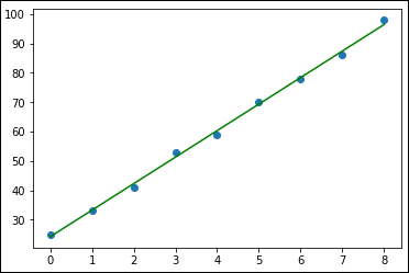
FIGURE 1-1: Drawing a linear regression line through the data points.
Creating a graph of your data and the line that goes through the data points is nice, but it still doesn't provide you with a question. To get the question, which is an equation, you must use this line of code:
print(np.poly1d(p))
This line of code simply extracts the equation from p using poly1d(). The result is shown here:
9.033 x + 24.2
The data suggests that you'll likely not get all of those no-study-time questions correct, but you’ll get a little over 24 percent of them. Then, for each hour of study, you get an additional 9 points. From a practical perspective, say that you want to go to a movie with a friend and it’ll consume 2 of your 8 hours of study time. The grade you can expect is
9.033 * 6 + 24.2 = 78.398
 Of course, you have a computer, so let it do the math for you. This line of code will provide you with the grade you can expect (rounded to one decimal place):
print(np.poly1d(p(6)))
The values for the intercept and the slope are actually decided by the linear regression algorithm in order to create an equation that has specific characteristics. In fact, an equation can fit a cloud of points in infinite ways, but only one whose resulting squared errors are minimal (hence the least squares name). You discover more about this issue later, in the “Defining the family of linear models” section of the chapter.
Advancing to multiple linear regression
Studying seldom happens with the precise level of quietude without interruptions that someone might like. The interruptions cause you to lose points on the test, of course, so having the linear regression you use consider interruptions might be nice. Fortunately, you have the option of performing a multiple linear regression, but the technique used in the previous section won’t quite do the job. You need another method of performing the calculation, which means employing a different package, such as the Scikit-learn LinearRegression function used in this example. The following code performs the required imports and provides another list of values to use in the form of interruptions:
from sklearn.linear_model import LinearRegression
import pandas as pd
i = (0, -1, -3, -4, -5, -7, -8, -9, -11)
The pandas package helps you create a DataFrame to store the two individual independent variables. The equation model found in the previous section now changes to look like this:
y = a + b1x1 + b2x2
The model is also turned on its head a little. The two independent variables now represent the grade obtained for a certain number of hours of study (b1x1) and the points lost on average due to interruptions (b2x2) for each hour of study. If this seems confusing, keep following the example and you'll see how things work out in the end. The following code performs the analysis and displays it onscreen:
studyData = pd.DataFrame({'Grades': y, 'Interrupt': i})
plt.scatter(x, y)
plt.scatter(x, i)
plt.legend(['Grades', 'Interruptions'])
regress = LinearRegression()
model = regress.fit(studyData, x)
studyData_pred = model.predict(studyData)
plt.plot(studyData_pred, studyData, 'g-')
plt.show()
The code begins by creating a DataFrame that contains the grades and the interruptions. The regression comes next. However, this time you’re using a LinearRegression object instead of calling polyfit() as the previous section does. You then fit the model to each of the independent variables and use the resulting model to perform a prediction. Figure 1-2 shows the results so far.
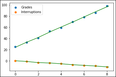
FIGURE 1-2: Developing a multiple regression model.
At this point, you have two sets of data points and two lines going through them, none of which seems particularly useful. However, what you have is actually quite useful. Say that you hope to get a 95, but you think that you might lose up to 7 points because of interruptions. Given what you know, you can plug the numbers into your model to determine how long to study using the following code:
print(model.predict([[95, -7]]).round(2).item(0))
To use the prediction, you must provide a two-dimensional array with the data. The output in this case is
7.47
You must study at least seven and a half hours to achieve your goal. Now you begin to wonder what would happen if you could control the interruptions, but you want to be sure that you get at least a 90. What if you think that the worst-case scenario is losing eight points and the best-case scenario is that you don't lose any as a result of interruptions. The following code shows how to check both values at the same time:
print(model.predict([[90, 0], [98, -8]]).round(2))
This time, you get two responses in an ndarray:
[6.29 7.86]
In the best-case scenario, you can get by with a little over six hours of study, but in the worst-case scenario, you need almost eight hours of study. It’s a good idea to keep those interruptions under control!
Considering which question to ask
The previous two sections show an example of simple linear regression and multiple linear regression for essentially the same problem: determining what is needed to obtain a particular grade from an exam. However, you must consider the orientation of the two sections. In the first section, the linear regression considers the question of what score someone will achieve after a given number of hours of study. The second section considers a different question: how many hours one must study to achieve a certain score given a particular number of interruptions. The approach is different in each case.
You can change the code in the first section so that the question is the same as the one in the second section, but without the capability to factor in interruptions. Essentially, the variables x and y will simply switch roles. Here is the code to use in this situation:
plt.scatter(y, x)
z = np.polyfit(y, x, 1)
p = np.poly1d(z)
plt.plot(y, p(y), 'g-')
plt.show()
print(np.poly1d(p(95)))
Figure 1-3 shows the new graphic for this part of the example. Note that you can now ask the model how many hours of study are needed to achieve a 95, rather than obtain the score for a certain number of hours of study. In this case, you must study 7.828 hours to obtain the 95.
Although you can change the question for a simple linear regression, the same can't be said of the multiple linear regression in the second section. To create a correct model, you must ask the question as shown in the example because the two independent variables require it. Discovering which question to ask is important.
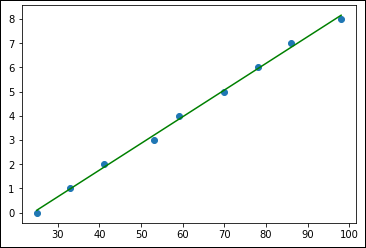
FIGURE 1-3: Changing the simple linear regression question.
Reducing independent variable complexity
In some situations, you must ask a question in a particular way, but the variables seem to get in the way. When that happens, you need to decide whether you can make certain assumptions. For example, you might ask whether the conditions in your dorm are stable enough that you can count on a certain number of lost points for each hour of study. If so, you can reduce the number of independent variables from two to one by combining the grades with the interruptions during your analysis, like this:
plt.scatter(x, y)
plt.scatter(x, i)
plt.legend(['Grades', 'Interruptions'])
y2 = np.array(y) + np.array(i)
print(y2)
z = np.polyfit(x, y2, 1)
p = np.poly1d(z)
plt.plot(x, p(x), 'g-')
plt.show()
This code looks similar to the code used for simple linear regression, but it combines the two independent variables into a single independent variable. When you print y2, you see that the values originally found in y are now reduced by the values originally found in i:
[25 32 38 49 54 63 70 77 87]
The assumption now is that every hour of study will have the same baseline number of lost points due to interruptions; y and i now depend on each other directly. However, the resulting plot shown in Figure 1-4 displays the effect of i on y.

FIGURE 1-4: Seeing the effect of i on y.
You haven't ignored the data; you’ve simplified it by making an assumption that may or may not be correct. (Only time will tell.) The following code performs the same test on the model as before:
print(np.poly1d(p))
print(np.poly1d(p(6)))
Because of the change in the model, the output is different. (Compare this output with the output shown in the “Working through simple linear regression” section, earlier in this chapter.)
7.683 x + 24.27
70.37
Even though the y-intercept hasn’t changed much, the number of points you receive for each hour of study has, which means that you must study harder now to overcome the expected interruptions. The point of this example is that you can reduce complexity as long as you’re willing to live with the consequences of doing so.
Manipulating Categorical Variables
In data science, a categorical variable is one that has a specific value from a limited selection of values. The number of values is usually fixed. Many developers know categorical variables by the moniker enumerations. Each of the potential values that a categorical variable can assume is a level.
To understand how categorical variables work, say that you have a variable expressing the color of an object, such as a car, and that the user can select blue, red, or green. To express the car’s color in a way that computers can represent and effectively compute, an application assigns each color a numeric value, so blue is 1, red is 2, and green is 3. Normally when you print each color, you see the value rather than the color.
If you use pandas.DataFrame (https://pandas.pydata.org/pandas-docs/stable/reference/api/pandas.DataFrame.html), you can still see the symbolic value (blue, red, and green), even though the computer stores it as a numeric value. Sometimes you need to rename and combine these named values to create new symbols. Symbolic variables are just a convenient way of representing and storing qualitative data.
When using categorical variables for data science, you need to consider the algorithm used to manipulate the variables. Some algorithms, such as trees and ensembles of three, can work directly with the numeric variables behind the symbols. Other algorithms, such as linear and logistic regression and SVM, require that you encode the categorical values into binary variables. For example, if you have three levels for a color variable (blue, red, and green), you have to create three binary variables:
- One for blue (1 when the value is blue; 0 when it is not)
- One for red (1 when the value is red; 0 when it is not)
- One for green (1 when the value is green; 0 when it is not)
Creating categorical variables
Categorical variables have a specific number of values, which makes them incredibly valuable in performing a number of data science tasks. For example, imagine trying to find values that are out of range in a huge dataset. In this example, you see one method for creating a categorical variable and then using it to check whether some data falls within the specified limits:
import pandas as pd
car_colors = pd.Series(['Blue', 'Red', 'Green'],
dtype='category')
car_data = pd.Series(
pd.Categorical(
['Yellow', 'Green', 'Red', 'Blue', 'Purple'],
categories=car_colors, ordered=False))
find_entries = pd.isnull(car_data)
print(car_colors)
print()
print(car_data)
print()
print(find_entries[find_entries == True])
The example begins by creating a categorical variable, car_colors. The variable contains the values Blue, Red, and Green as colors that are acceptable for a car. Note that you must specify a dtype property value of category.
The next step is to create another series. This one uses a list of actual car colors, named car_data, as input. Not all the car colors match the predefined acceptable values. When this problem occurs, pandas outputs Not a Number (NaN) instead of the car color.
Of course, you could search the list manually for the nonconforming cars, but the easiest method is to have pandas do the work for you. In this case, you ask pandas which entries are null using isnull() and place them in find_entries. You can then output just those entries that are actually null. Here's the output you see from the example:
0 Blue
1 Red
2 Green
dtype: category
Categories (3, object): [Blue, Green, Red]
0 NaN
1 Green
2 Red
3 Blue
4 NaN
dtype: category
Categories (3, object): [Blue, Green, Red]
0 True
4 True
dtype: bool
Looking at the list of car_data outputs, you can see that entries 0 and 4 equal NaN. The output from find_entries verifies this fact for you. If this were a large dataset, you could quickly locate and correct errant entries in the dataset before performing an analysis on it.
Renaming levels
Sometimes, the naming of the categories you use is inconvenient or otherwise wrong for a particular need. Fortunately, you can rename the categories as needed using the technique shown in the following example:
import pandas as pd
car_colors = pd.Series(['Blue', 'Red', 'Green'],
dtype='category')
car_data = pd.Series(
pd.Categorical(
['Blue', 'Green', 'Red', 'Blue', 'Red'],
categories=car_colors, ordered=False))
car_colors.cat.categories = ["Purple", "Yellow", "Mauve"]
car_data.cat.categories = car_colors
print(car_data)
All you really need to do is set the cat.categories property to a new value, as shown. Here is the output from this example:
0 Purple
1 Yellow
2 Mauve
3 Purple
4 Mauve
dtype: category
Categories (3, object): [Purple, Yellow, Mauve]
Combining levels
A particular categorical level might be too small to offer significant data for analysis. Perhaps only a few of the values exist, which may not be enough to create a statistical difference. In this case, combining several small categories might offer better analysis results. The following example shows how to combine categories:
import pandas as pd
car_colors = pd.Series(['Blue', 'Red', 'Green'],
dtype='category')
car_data = pd.Series(
pd.Categorical(
['Blue', 'Green', 'Red', 'Green', 'Red', 'Green'],
categories=car_colors, ordered=False))
car_data = car_data.cat.set_categories(
["Blue", "Red", "Green", "Blue_Red"])
print(car_data.loc[car_data.isin(['Red'])])
car_data.loc[car_data.isin(['Red'])] = 'Blue_Red'
car_data.loc[car_data.isin(['Blue'])] = 'Blue_Red'
car_data = car_data.cat.set_categories(
["Green", "Blue_Red"])
print()
print(car_data)
What this example shows you is that you have only one Blue item and only two Red items, but you have three Green items, which places Green in the majority. Combining Blue and Red together is a two-step process. First, you add the Blue_Red category to car_data. Then you change the Red and Blue entries to Blue_Red, which creates the combined category. As a final step, you can remove the unneeded categories.
However, before you can change the Red entries to Blue_Red entries, you must find them. This is where a combination of calls to isin(), which locates the Red entries, and loc[], which obtains their index, provides precisely what you need. The first print statement shows the result of using this combination. Here's the output from this example.
2 Red
4 Red
dtype: category
Categories (4, object): [Blue, Red, Green, Blue_Red]
0 Blue_Red
1 Green
2 Blue_Red
3 Green
4 Blue_Red
5 Green
dtype: category
Categories (2, object): [Green, Blue_Red]
Notice that you now have three Blue_Red entries and three Green entries. The Blue and Red categories are no longer in use. The result is that the levels are now combined as expected.
Using Linear Regression to Guess Numbers
Regression has a long history in statistics, from building simple but effective linear models of economic, psychological, social, or political data, to hypothesis testing for understanding group differences, to modeling more complex problems with ordinal values, binary and multiple classes, count data, and hierarchical relationships. It's also a common tool in data science, a Swiss Army knife of machine learning that you can use for every problem. Stripped of most of its statistical properties, data science practitioners perceive linear regression as a simple, understandable, yet effective algorithm for estimations, and, in its logistic regression version, for classification as well.
Defining the family of linear models
As mentioned in the “Working through simple linear regression” section, earlier in this chapter, linear regression is a statistical model that defines the relationship between a target variable and a set of predictive features (the columns in a table that define entries of the same type, such as grades and interruptions in the earlier examples). It does so by using a formula of the following type:
y = a + bx
As shown in earlier examples, a (alpha) and b (beta coefficient) are estimated on the basis of the data, and they are found using the linear regression algorithm so that the difference between all the real y target values and all the y values derived from the linear regression formula are the minimum possible.
You can express this relationship graphically as the sum of the square of all the vertical distances between all the data points and the regression line. Such a sum is always the minimum possible when you calculate the regression line correctly using an estimation called ordinary least squares, which is derived from statistics or the equivalent gradient descent, a machine learning method. The differences between the real y values and the regression line (the predicted y values) are defined as residuals (because they are what are left after a regression: the errors). The following code shows how to display the residuals:
import seaborn
x = range(0,9)
y = (15, 33, 41, 69, 59, 40, 78, 86, 98)
plt.scatter(x, y, color='purple', marker='*')
plt.grid()
z = np.polyfit(x, y, 1)
p = np.poly1d(z)
plt.plot(x, p(x), 'g-')
seaborn.residplot(np.array(x), np.array(y), color='red')
plt.show()
The Seaborn package (https://seaborn.pydata.org/) provides some visualizations not found in other packages, including the ability to calculate and display the residuals. The actual linear regression looks much like the one earlier in the chapter, with just a few changes to the data values to make the errors more prominent. Figure 1-5 shows the output with the original data as purple stars, the regression as a green line, and the residuals as red dots.
Using more variables in a larger dataset
The “Advancing to multiple linear regression” section, earlier in this chapter, provides a simple demonstration of multiple linear regression with an incredibly small dataset. The problem is that if the dataset is as small as that one, the practical value of performing an analysis is extremely limited. This section moves on to a larger dataset, one that still isn't the size of what you see in the real world, but that’s large enough to make analysis worthwhile. The following sections consider issues that the previous parts of the chapter haven’t.
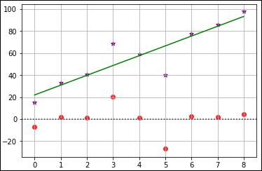
FIGURE 1-5: Using a residual plot to see errant data.
Using the Boston dataset
When you have many variables, their scale isn’t important in creating precise linear regression predictions. But a good habit is to standardize x because the scale of the variables is quite important for some variants of regression (that you see later on) and it’s insightful for your understanding of data to compare coefficients according to their impact on y.
The following example relies on the Boston dataset from Scikit-learn. It tries to guess Boston housing prices using a linear regression. The example also tries to determine which variables influence the result more, so the example standardizes the predictors (the features used to predict a particular outcome).
from sklearn.datasets import load_boston
from sklearn.preprocessing import scale
boston = load_boston()
X = scale(boston.data)
y = boston.target
The regression class in Scikit-learn is part of the linear_model module. To obtain a good regression, you need to make the various variables the same scale so that one independent variable doesn't play a larger role than the others. Having previously scaled the X variable using scale(), you have no other preparations or special parameters to decide when using this algorithm.
from sklearn.linear_model import LinearRegression
regression = LinearRegression(normalize=True)
regression.fit(X, y)
You can find out more detail about the meaning of the variables present in the Boston dataset by issuing the following command: print(boston.DESCR). You see the output of this command in the downloadable source code.
Checking the fit using R2
The previous section contains code that fits a line to the data points. The regression.fit(X, y) call performs this task. The act of fitting creates a line or curve that best matches the data points provided by the data; you fit the line or curve to the data points in order to perform various tasks, such as predictions, based on the trends or patterns produced by the data. The fit of an analysis is important.
- When the line follows the data points too closely, it's overfitted.
- When the line doesn’t follow the data points closely enough, it’s underfitted.
Overfitting and underfitting can cause your model to perform poorly and make inaccurate predictions, so knowing how well the model fits the data points is essential.
Now that the algorithm is fitted, you can use the score method to report the R2 measure, which is a measure that ranges from 0 to 1 and points out how using a particular regression model is better in predicting y than using a simple mean would be. You can also see R2 as being the quantity of target information explained by the model (the same as the squared correlation), so getting near 1 means being able to explain most of the y variable using the model.
print(regression.score(X, y))
Here is the resulting score:
0.740607742865
In this case, R2 on the previously fitted data is about 0.74, a good result for a simple model. You can interpret the R2 score as the percentage of information present in the target variable that has been explained by the model using the predictors. A score of 0.74, therefore, means that the model has fit the larger part of the information you wanted to predict and that only 26 percent of it remains unexplained.
Calculating R2 on the same set of data used for the training is considered reasonable in statistics when using linear models. In data science and machine learning, it's always the correct practice to test scores on data that has not been used for training. Algorithms of greater complexity can memorize the data better than they learn from it, but this statement can be also true sometimes for simpler models, such as linear regression.
Considering the coefficients
To understand what drives the estimates in the multiple regression model, you have to look at the coefficients_ attribute, which is an array containing the regression beta coefficients (the b part of the y = a + bx equation). The coefficients are the numbers estimated by the linear regression model in order to effectively transform the input variables in the formula into the target y prediction. The zip function will generate an iterable of both attributes, and you can print it for reporting:
print([a + ':' + str(round(b, 2)) for a, b in zip(
boston.feature_names, regression.coef_,)])
The reported variables and their rounded coefficients (b values, or slopes, as described in the “Defining the family of linear models” section, earlier in this chapter) are
['CRIM:-0.92', 'ZN:1.08', 'INDUS:0.14', 'CHAS:0.68',
'NOX:-2.06', 'RM:2.67', 'AGE:0.02', 'DIS:-3.1',
'RAD:2.66','TAX:-2.08', 'PTRATIO:-2.06', 'B:0.86',
'LSTAT:-3.75']
DIS is the weighted distances to five employment centers. It shows the major absolute unit change. For example, in real estate, a house that's too far from people’s interests (such as work) lowers the value. As a contrast, AGE and INDUS, with both proportions describing building age and showing whether nonretail activities are available in the area, don't influence the result as much because the absolute value of their beta coefficients is lower than DIS.
Understanding variable transformations
Linear models, such as linear and logistic regression, are actually linear combinations that sum your features (weighted by learned coefficients) and provide a simple but effective model. In most situations, they offer a good approximation of the complex reality they represent. Even though they’re characterized by a high bias (deviations from expected values for any number of reasons), using a large number of observations can improve their coefficients and make them more competitive when compared to complex algorithms.
However, they can perform better when solving certain problems if you pre-analyze the data using the Exploratory Data Analysis (EDA) approach. After performing the analysis, you can transform and enrich the existing features by
- Linearizing the relationships between features and the target variable using transformations that increase their correlation and make their cloud of points in the scatterplot more similar to a line.
- Making variables interact by multiplying them so that you can better represent their conjoint behavior.
- Expanding the existing variables using the polynomial expansion in order to represent relationships more realistically. In a polynomial expansion, you create a more complex equation after multiplying variables together and after raising variables to higher powers. In this way, you can represent more complex curves with your equation, such as ideal point curves, when you have a peak in the variable representing a maximum, akin to a parabola.
Doing variable transformations
An example is the best way to explain the kind of transformations you can successfully apply to data to improve a linear model. This example uses the Boston dataset, which originally had ten variables to explain the different housing prices in Boston during the 1970s. The current dataset has twelve variables, along with a target variable containing the median value of the houses. The following sections use this dataset to demonstrate how to perform certain linear regression-related tasks.
Considering the effect of ordering
The Boston dataset has implicit ordering. Fortunately, order doesn’t influence most algorithms because they learn the data as a whole. When an algorithm learns in a progressive manner, ordering can interfere with effective model building. By using seed (to create a consistent sequence of random numbers) and shuffle from the random package (to shuffle the index), you can reindex the dataset:
from sklearn.datasets import load_boston
import random
from random import shuffle
boston = load_boston()
random.seed(0) # Creates a replicable shuffling
new_index = list(range(boston.data.shape[0]))
shuffle(new_index) # shuffling the index
X, y = boston.data[new_index], boston.target[new_index]
print(X.shape, y.shape, boston.feature_names)
In the code, random.seed(0) creates a replicable shuffling operation, and shuffle(new_index) creates the new shuffled index used to reorder the data. After that, the code prints the X and y shapes as well as the list of dataset variable names:
(506, 13) (506,) ['CRIM' 'ZN' 'INDUS' 'CHAS' 'NOX' 'RM'
'AGE' 'DIS' 'RAD' 'TAX' 'PTRATIO' 'B' 'LSTAT']
Storing the Boston database in a DataFrame
Converting the array of predictors and the target variable into a pandas DataFrame helps support the series of explorations and operations on data. Moreover, although Scikit-learn requires an ndarray as input, it will also accept DataFrame objects:
import pandas as pd
df = pd.DataFrame(X,columns=boston.feature_names)
df['target'] = y
Looking for transformations
The best way to spot possible transformations is by graphical exploration, and using a scatterplot can tell you a lot about two variables. You need to make the relationship between the predictors and the target outcome as linear as possible, so you should try various combinations, such as the following:
ax = df.plot(kind='scatter', x='LSTAT', y='target', c='b')
In Figure 1-6, you see a representation of the resulting scatterplot. Notice that you can approximate the cloud of points by using a curved line rather than a straight line. In particular, when LSTAT is around 5, the target seems to vary between values of 20 to 50. As LSTAT increases, the target decreases to 10, reducing the variation.
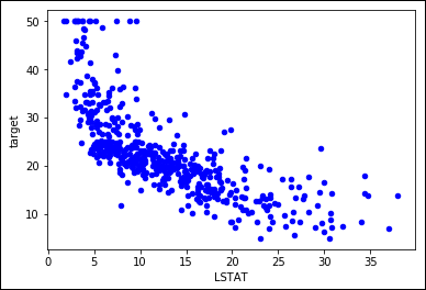
FIGURE 1-6: Nonlinear relationship between variable LSTAT and target prices.
Logarithmic transformation can help in such conditions. However, your values should range from zero to one, such as percentages, as demonstrated in this example. In other cases, other useful transformations for your x variable could include x**2, x**3, 1/x, 1/x**2, 1/x**3, and sqrt(x). The key is to try them and test the result. As for testing, you can use the following script as an example:
import numpy as np
from sklearn.feature_selection import f_regression
single_variable = df['LSTAT'].values.reshape(-1, 1)
F, pval = f_regression(single_variable, y)
print('F score for the original feature %.1f' % F)
F, pval = f_regression(np.log(single_variable),y)
print('F score for the transformed feature %.1f' % F)
The code prints the F score, a measure to evaluate how predictive a feature is in a machine learning problem, both the original and the transformed feature. The score for the transformed feature is a great improvement over the untransformed one:
F score for the original feature 601.6
F score for the transformed feature 1000.2
The F score is useful for variable selection. You can also use it to assess the usefulness of a transformation because both f_regression and f_classif are themselves based on linear models, and are therefore sensitive to every effective transformation used to make variable relationships more linear.
Creating interactions between variables
In a linear combination, the model reacts to how a variable changes in an independent way with respect to changes in the other variables. In statistics, this kind of model is a main effects model.
The Naïve Bayes classifier (discussed in Book 3, Chapter 3) makes a similar assumption for probabilities, and it also works well with complex text problems. The following sections discuss and demonstrate variable interactions.
Understanding the need to see interactions
Even though machine learning works by using approximations, and a set of independent variables can make your predictions work well in most situations, sometimes you may miss an important part of the picture. You can easily catch this problem by depicting the variation in your target associated with the conjoint variation of two or more variables in two simple and straightforward ways:
- Existing domain knowledge of the problem: For instance, in the car market, having a noisy engine is a nuisance in a family car but considered a plus for sports cars (car aficionados want to hear that you have an ultra-cool and expensive car). By knowing a consumer preference, you can model a noise-level variable and a car-type variable together to obtain exact predictions using a predictive analytic model that guesses the car's value based on its features.
- Testing combinations of different variables: By performing group tests, you can see the effect that certain variables have on your target variable. Therefore, even without knowing about noisy engines and sports cars, you can catch a different average of preference level when analyzing your dataset split by type of cars and noise level.
Detecting interactions
The following example shows how to test and detect interactions in the Boston dataset. The first task is to load a few helper classes, as shown here:
from sklearn.linear_model import LinearRegression
from sklearn.model_selection import cross_val_score, KFold
regression = LinearRegression(normalize=True)
crossvalidation = KFold(n_splits=10, shuffle=True,
random_state=1)
The code reinitializes the pandas DataFrame using only the predictor variables. A for loop matches the different predictors and creates a new variable containing each interaction. The mathematical formulation of an interaction is simply a multiplication:
df = pd.DataFrame(X,columns=boston.feature_names)
baseline = np.mean(cross_val_score(regression, df, y,
scoring='r2',
cv=crossvalidation))
interactions = list()
for var_A in boston.feature_names:
for var_B in boston.feature_names:
if var_A > var_B:
df['interaction'] = df[var_A] * df[var_B]
cv = cross_val_score(regression, df, y,
scoring='r2',
cv=crossvalidation)
score = round(np.mean(cv), 3)
if score > baseline:
interactions.append((var_A, var_B, score))
print('Baseline R2: %.3f' % baseline)
print('Top 10 interactions: %s' % sorted(interactions,
key=lambda x :x[2],
reverse=True)[:10])
The code starts by printing the baseline R2 score for the regression; then it reports the top ten interactions whose addition to the mode increase the score:
Baseline R2: 0.716
Top 10 interactions: [('RM', 'LSTAT', 0.79),
('TAX', 'RM', 0.782), ('RM', 'RAD', 0.778),
('RM', 'PTRATIO', 0.766), ('RM', 'INDUS', 0.76),
('RM', 'NOX', 0.747), ('RM', 'AGE', 0.742),
('RM', 'B', 0.738), ('RM', 'DIS', 0.736),
('ZN', 'RM', 0.73)]
The code tests the specific addition of each interaction to the model using a 10 folds cross-validation. The code records the change in the R2 measure into a stack (a simple list) that an application can order and explore later.
The baseline score is 0.699, so a reported improvement of the stack of interactions to 0.782 looks quite impressive. Knowing how this improvement is made possible is important. The two variables involved are RM (the average number of rooms) and LSTAT (the percentage of lower-status population). A plot will disclose the case about these two variables:
colors = ['b' if v > np.mean(y) else 'r' for v in y]
scatter = df.plot(kind='scatter', x='RM', y='LSTAT',
c=colors)
The scatterplot in Figure 1-7 clarifies the improvement. In a portion of houses at the center of the plot, you need to know both LSTAT and RM to correctly separate the high-value houses from the low-value houses; therefore, an interaction is indispensable in this case.
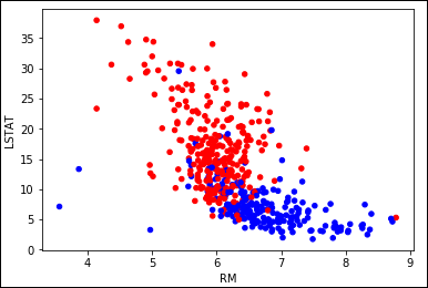
FIGURE 1-7: Combined variables LSTAT and RM help to separate high from low prices.
Putting the interaction data to use
Adding interactions and transformed variables leads to an extended linear regression model, a polynomial regression. Data scientists rely on testing and experimenting to validate an approach to solving a problem, so the following code slightly modifies the previous code to redefine the set of predictors using interactions and quadratic terms by squaring the variables:
polyX = pd.DataFrame(X,columns=boston.feature_names)
cv = cross_val_score(regression, polyX, y,
scoring='neg_mean_squared_error',
cv=crossvalidation)
baseline = np.mean(cv)
improvements = [baseline]
for var_A in boston.feature_names:
polyX[var_A+'^2'] = polyX[var_A]**2
cv = cross_val_score(regression, polyX, y,
scoring='neg_mean_squared_error',
cv=crossvalidation)
improvements.append(np.mean(cv))
for var_B in boston.feature_names:
if var_A > var_B:
poly_var = var_A + '*' + var_B
polyX[poly_var] = polyX[var_A] * polyX[var_B]
cv = cross_val_score(regression, polyX, y,
scoring='neg_mean_squared_error',
cv=crossvalidation)
improvements.append(np.mean(cv))
import matplotlib.pyplot as plt
plt.figure()
plt.plot(range(0,92),np.abs(improvements),'-')
plt.xlabel('Added polynomial features')
plt.ylabel('Mean squared error')
plt.show()
To track improvements as the code adds new, complex terms, the example places values in the improvements list. Figure 1-8 shows a graph of the results that demonstrates that some additions are great because the squared error decreases, and other additions are terrible because they increase the error instead.
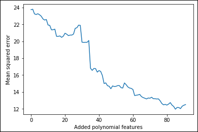
FIGURE 1-8: Adding polynomial features increases the predictive power.
Of course, instead of unconditionally adding all the generated variables, you could perform an ongoing test before deciding to add a quadratic term or an interaction, checking by cross-validation to see whether each addition is really useful for your predictive purposes. This example is a good foundation for checking other ways of controlling the existing complexity of your datasets or the complexity that you have to induce with transformation and feature creation in the course of data exploration efforts. Before moving on, you check both the shape of the actual dataset and its cross-validated mean squared error:
print('New shape of X:', np.shape(polyX))
crossvalidation = KFold(n_splits=10, shuffle=True,
random_state=1)
cv = cross_val_score(regression, polyX, y,
scoring='neg_mean_squared_error',
cv=crossvalidation)
print('Mean squared error: %.3f' % abs(np.mean(cv)))
Even though the mean squared error is good, the ratio between 506 observations and 104 features isn't all that good because the number of observations may not be enough for a correct estimate of the coefficients.
New shape of X: (506, 104)
Mean squared error: 12.514
As a rule of thumb, divide the number of observations by the number of coefficients. The code should have at least 10 to 20 observations for every coefficient you want to estimate in linear models. However, experience shows that having at least 30 of them is better.
Understanding limitations and problems
Although linear regression is a simple yet effective estimation tool, it has quite a few problems. The problems can reduce the benefit of using linear regressions in some cases, but it really depends on the data. You determine whether any problems exist by employing the method and testing its efficacy. Unless you work hard on data, you may encounter these limitations:
- Linear regression can model only quantitative data. When modeling categories as response, you need to modify the data into a logistic regression.
- If data is missing and you don’t deal with it properly, the model stops working. You need to impute the missing values or, using the value of zero for the variable, create an additional binary variable pointing out that a value is missing.
- Outliers are quite disruptive for a linear regression because linear regression tries to minimize the square value of the residuals, and outliers have big residuals, forcing the algorithm to focus more on them than on the mass of regular points.
- The relation between the target and each predictor variable is based on a single coefficient; no automatic way exists to represent complex relations like a parabola (there is a unique value of x maximizing y) or exponential growth. The only way you can manage to model such relations is to use mathematical transformations of x (and sometimes y) or add new variables.
- The greatest limitation is that linear regression provides a summation of terms, which can vary independently of each other. It’s hard to figure out how to represent the effect of certain variables that affect the result in very different ways according to their value. A solution is to create interaction terms, that is, to multiply two or more variables to create a new variable; however, doing so requires that you know what variables to multiply and that you create the new variable before running the linear regression. In short, you can’t easily represent complex situations with your data, just simple ones.
Learning One Example at a Time
Finding the right coefficients for a linear model is just a matter of time and memory. However, sometimes a system won’t have enough memory to store a huge dataset. In this case, you must resort to other means, such as learning from one example at a time rather than having all of them loaded into memory. The following sections demonstrate the one-example-at-a-time approach to learning.
Using Gradient Descent
The gradient descent finds the right way to minimize the cost function one iteration at a time. After each step, it checks all the model’s summed errors and updates the coefficients to make the error even smaller during the next data iteration. The efficiency of this approach derives from considering all the examples in the sample. The drawback of this approach is that you must load all the data into memory.
Unfortunately, you can’t always store all the data in memory because some datasets are huge. In addition, learning using simple learners requires large amounts of data to build effective models (more data helps to correctly disambiguate multicollinearity). Getting and storing chunks of data on your hard disk is always possible, but it’s not feasible because of the need to perform matrix multiplication, which requires data swapping from disk to select rows and columns. Scientists who have worked on the problem have found an effective solution. Instead of learning from all the data after having seen it all (which is called an iteration), the algorithm learns from one example at a time, as picked from storage using sequential access, and then goes on to learn from the next example. When the algorithm has learned all the examples, it starts from the beginning unless it meets some stopping criterion (such as completing a predefined number of iterations).
Implementing Stochastic Gradient Descent
When you have too much data, you can use the Stochastic Gradient Descent Regressor (SGDRegressor) or Stochastic Gradient Descent Classifier (SGDClassifier) as a linear predictor. The only difference with other methods described earlier in the chapter is that they actually optimize their coefficients using only one observation at a time. It therefore takes more iterations before the code reaches comparable results using a simple or multiple regression, but it requires much less memory and time.
The increase in efficiency occurs because both predictors rely on Stochastic Gradient Descent (SGD) optimization — a kind of optimization in which the parameter adjustment occurs after the input of every observation, leading to a longer and a bit more erratic journey toward minimizing the error function. Of course, optimizing based on single observations, and not on huge data matrices, can have a tremendous beneficial impact on the algorithm’s training time and the amount of memory resources.
Using the fit() method
When using SGDs, you’ll always have to deal with chunks of data unless you can stretch all the training data into memory. To make the training effective, you should standardize by having the StandardScaler infer the mean and standard deviation from the first available data. The mean and standard deviation of the entire dataset is most likely different, but the transformation by an initial estimate will suffice to develop a working learning procedure:
from sklearn.linear_model import SGDRegressor
from sklearn.preprocessing import StandardScaler
SGD = SGDRegressor(loss='squared_loss',
penalty='l2',
alpha=0.0001,
l1_ratio=0.15,
max_iter=2000,
random_state=1)
scaling = StandardScaler()
scaling.fit(polyX)
scaled_X = scaling.transform(polyX)
cv = cross_val_score(SGD, scaled_X, y,
scoring='neg_mean_squared_error',
cv=crossvalidation)
score = abs(np.mean(cv))
print('CV MSE: %.3f' % score)
The resulting mean squared error after running the SGDRegressor is
CV MSE: 12.179
Using the partial_fit() method
In the preceding example, you used the fit method, which requires that you preload all the training data into memory. You can train the model in successive steps by using the partial_fit method instead, which runs a single iteration on the provided data and then keeps it in memory and adjusts it when receiving new data. This time, the code uses a higher number of iterations:
from sklearn.metrics import mean_squared_error
from sklearn.model_selection import train_test_split
X_tr, X_t, y_tr, y_t = train_test_split(scaled_X, y,
test_size=0.20,
random_state=2)
SGD = SGDRegressor(loss='squared_loss',
penalty='l2',
alpha=0.0001,
l1_ratio=0.15,
max_iter=2000,
random_state=1)
improvements = list()
for z in range(10000):
SGD.partial_fit(X_tr, y_tr)
score = mean_squared_error(y_t, SGD.predict(X_t))
improvements.append(score)
Having kept track of the algorithm's partial improvements during 10000 iterations over the same data, you can produce a graph and understand how the improvements work, as shown in the following code. Note that you could have used different data at each step.
import matplotlib.pyplot as plt
plt.figure(figsize=(8, 4))
plt.subplot(1,2,1)
range_1 = range(1,101,10)
score_1 = np.abs(improvements[:100:10])
plt.plot(range_1, score_1,'o--')
plt.xlabel('Iterations up to 100')
plt.ylabel('Test mean squared error')
plt.subplot(1,2,2)
range_2 = range(100,10000,500)
score_2 = np.abs(improvements[100:10000:500])
plt.plot(range_2, score_2,'o--')
plt.xlabel('Iterations from 101 to 5000')
plt.show()
As shown in the first of the two panes in Figure 1-9, the algorithm initially starts with a high error rate, but it manages to reduce it in just a few iterations, usually 5–10. After that, the error rate slowly improves by a smaller amount at each iteration. In the second pane, you can see that after 1,500 iterations, the error rate reaches a minimum and starts increasing. At that point, you’re starting to overfit because data already understands the rules and you’re actually forcing the SGD to learn more when nothing is left in the data other than noise. Consequently, it starts learning noise and erratic rules.
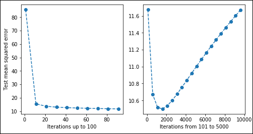
FIGURE 1-9: A slow descent optimizing squared error.
Unless you’re working with all the data in memory, grid-searching and cross-validating the best number of iterations will be difficult. A good trick is to keep a chunk of training data to use for validation apart in memory or storage. By checking your performance on that untouched part, you can see when SGD learning performance starts decreasing. At that point, you can interrupt data iteration (a method known as early stopping).
Considering the effects of regularization
Regularization is the act of applying a penalty to certain coefficients to ensure that they don’t cause overfitting or underfitting. When using the SGDs, apart from different cost functions that you have to test for their performance, you can also try using regularizations like the following to obtain better predictions:
- L1 (Lasso): This form of regularization adds a penalty equal to the sum of the absolute value of the coefficients. This form of regularization can shrink some of the coefficients to zero, which means that they don’t contribute toward the model. Look at this form of regularization as a kind of input data (feature) selection.
- L2 (Ridge): This form of regularization adds a penalty equal to the sum of the squared value of the coefficients. Unlike L1, none of the features will shrink to zero in this case. You use this form of regularization when you want to be sure that all the features play a role in creating the model, but also that all the features have the same opportunity to influence the model.
- Elasticnet: This is a combination of L1 and L2. You use it when you want to ensure that important features have a little more say in the resulting model, but that all the features have at least a little say.
To use these regularizations, you set the penalty parameter and the corresponding controlling alpha and l1_ratio parameters. Some of the SGDs are more resistant to outliers, such as modified_huber for classification or huber for regression.
SGD is sensitive to the scale of variables, and that's not just because of regularization but is also because of the way it works internally. Consequently, you must always standardize your features (for instance, by using StandardScaler) or you force them in the range [0,+1] or [-1,+1]. Failing to do so will lead to poor results.