
CHAPTER 2
Analytical Techniques
INTRODUCTION
Data are everywhere. IBM projects that every day we generate 2.5 quintillion bytes of data. In relative terms, this means 90% of the data in the world has been created in the last two years. These massive amounts of data yield an unprecedented treasure of internal knowledge, ready to be analyzed using state-of-the-art analytical techniques to better understand and exploit behavior about, for example, your customers or employees by identifying new business opportunities together with new strategies. In this chapter, we zoom into analytical techniques. As such, the chapter provides the backbone for all other subsequent chapters. We build on the analytics process model reviewed in the introductory chapter to structure the discussions in this chapter and start by highlighting a number of key activities that take place during data preprocessing. Next, the data analysis stage is elaborated. We turn our attention to predictive analytics and discuss linear regression, logistic regression, decision trees, neural networks, and random forests. A subsequent section elaborates on descriptive analytics such as association rules, sequence rules and clustering. Survival analysis techniques are also discussed, where the aim is to predict the timing of events instead of only event occurrence. The chapter concludes by zooming into social network analytics, where the goal is to incorporate network information into descriptive or predictive analytical models. Throughout the chapter, we discuss standard approaches for evaluating these different types of analytical techniques, as highlighted in the final stage of the analytical process model.
DATA PREPROCESSING
Data are the key ingredient for any analytical exercise. Hence, it is important to thoroughly consider and gather all data sources that are potentially of interest and relevant before starting the analysis. Large experiments as well as a broad experience in different fields indicate that when it comes to data, bigger is better. However, real life data can be (typically are) dirty because of inconsistencies, incompleteness, duplication, merging, and many other problems. Hence, throughout the analytical modeling steps, various data preprocessing checks are applied to clean up and reduce the data to a manageable and relevant size. Worth mentioning here is the garbage in, garbage out (GIGO) principle that essentially states that messy data will yield messy analytical models. Hence, it is of utmost importance that every data preprocessing step is carefully justified, carried out, validated, and documented before proceeding with further analysis. Even the slightest mistake can make the data totally unusable for further analysis, and completely invalidate the results. In what follows, we briefly zoom into some of the most important data preprocessing activities.
Denormalizing Data for Analysis
The application of analytics typically requires or presumes the data to be presented in a single table, containing and representing all the data in some structured way. A structured data table allows straightforward processing and analysis, as briefly discussed in Chapter 1. Typically, the rows of a data table represent the basic entities to which the analysis applies (e.g., customers, transactions, firms, claims, or cases). The rows are also referred to as observations, instances, records, or lines. The columns in the data table contain information about the basic entities. Plenty of synonyms are used to denote the columns of the data table, such as (explanatory or predictor) variables, inputs, fields, characteristics, attributes, indicators, and features, among others. In this book, we will consistently use the terms observation and variable.
Several normalized source data tables have to be merged in order to construct the aggregated, denormalized data table. Merging tables involves selecting information from different tables related to an individual entity, and copying it to the aggregated data table. The individual entity can be recognized and selected in the different tables by making use of (primary) keys, which are attributes that have specifically been included in the table to allow identifying and relating observations from different source tables pertaining to the same entity. Figure 2.1 illustrates the process of merging two tables—that is, transaction data and customer data—into a single, non-normalized data table by making use of the key attribute ID, which allows connecting observations in the transactions table with observations in the customer table. The same approach can be followed to merge as many tables as required, but clearly the more tables are merged, the more duplicate data might be included in the resulting table. It is crucial that no errors are introduced during this process, so some checks should be applied to control the resulting table and to make sure that all information is correctly integrated.

Figure 2.1 Aggregating normalized data tables into a non-normalized data table.
Sampling
The aim of sampling is to take a subset of historical data (e.g., past transactions), and use that to build an analytical model. A first obvious question that comes to mind concerns the need for sampling. Obviously, with the availability of high performance computing facilities (e.g., grid and cloud computing), one could also try to directly analyze the full dataset. However, a key requirement for a good sample is that it should be representative for the future entities on which the analytical model will be run. Hence, the timing aspect becomes important since, for instance, transactions of today are more similar to transactions of tomorrow than they are to transactions of yesterday. Choosing the optimal time window of the sample involves a trade-off between lots of data (and hence a more robust analytical model) and recent data (which may be more representative). The sample should also be taken from an average business period to get as accurate as possible a picture of the target population.
Exploratory Analysis
Exploratory analysis is a very important part of getting to know your data in an “informal” way. It allows gaining some initial insights into the data, which can then be usefully adopted throughout the analytical modeling stage. Different plots/graphs can be useful here such as bar charts, pie charts, and scatter plots, for example. A next step is to summarize the data by using some descriptive statistics, which all summarize or provide information with respect to a particular characteristic of the data. Hence, they should be assessed together (i.e., in support and completion of each other). Basic descriptive statistics are the mean and median values of continuous variables, with the median value less sensitive to extreme values but then, as well, not providing as much information with respect to the full distribution. Complementary to the mean value, the variation or the standard deviation provide insight with respect to how much the data are spread around the mean value. Likewise, percentile values such as the 10th, 25th, 75th, and 90th percentile provide further information with respect to the distribution and as a complement to the median value. For categorical variables, other measures need to be considered such as the mode or most frequently occurring value.
Missing Values
Missing values (see Table 2.1) can occur for various reasons. The information can be nonapplicable—for example, when modeling the amount of fraud, this information is only available for the fraudulent accounts and not for the nonfraudulent accounts since it is not applicable there (Baesens et al. 2015). The information can also be undisclosed. For example, a customer decided not to disclose his or her income because of privacy. Missing data can also originate because of an error during merging (e.g., typos in name or ID). Missing values can be very meaningful from an analytical perspective since they may indicate a particular pattern. As an example, a missing value for income could imply unemployment, which may be related to, for example, default or churn. Some analytical techniques (e.g., decision trees) can directly deal with missing values. Other techniques need some additional preprocessing. Popular missing value handling schemes are removal of the observation or variable, and replacement (e.g., by the mean/median for continuous variables and by the mode for categorical variables).
Table 2.1 Missing Values in a Dataset
| Customer | Age | Income | Gender | Duration | Churn |
| John | 30 | 1,800 | ? | 620 | Yes |
| Sarah | 25 | ? | Female | 12 | No |
| Sophie | 52 | ? | Female | 830 | No |
| David | ? | 2,200 | Male | 90 | Yes |
| Peter | 34 | 2,000 | Male | 270 | No |
| Titus | 44 | ? | ? | 39 | No |
| Josephine | 22 | ? | Female | 5 | No |
| Victor | 26 | 1,500 | Male | 350 | No |
| Hannah | 34 | ? | Female | 159 | Yes |
| Catherine | 50 | 2,100 | Female | 352 | No |
Outlier Detection and Handling
Outliers are extreme observations that are very dissimilar to the rest of the population. Two types of outliers can be considered: valid observations (e.g., salary of boss is €1.000.000) and invalid observations (e.g., age is 300 years). Two important steps in dealing with outliers are detection and treatment. A first obvious check for outliers is to calculate the minimum and maximum values for each of the data elements. Various graphical tools can also be used to detect outliers, such as histograms, box plots, and scatter plots. Some analytical techniques (e.g., decision trees) are fairly robust with respect to outliers. Others (e.g., linear/logistic regression) are more sensitive to them. Various schemes exist to deal with outliers; these are highly dependent on whether the outlier represents a valid or an invalid observation. For invalid observations (e.g., age is 300 years), one could treat the outlier as a missing value by using any of the schemes (i.e., removal or replacement) mentioned in the previous section. For valid observations (e.g., income is €1,000,000), other schemes are needed such as capping whereby lower and upper limits are defined for each data element.
Principal Component Analysis
A popular technique for reducing dimensionality, studying linear correlations, and visualizing complex datasets is principal component analysis (PCA). This technique has been known since the beginning of the last century (Jolliffe 2002), and it is based on the concept of constructing an uncorrelated, orthogonal basis of the original dataset.
Throughout this section, we will assume that the observation matrix X is normalized to zero mean, so that ![]() . We do this so the covariance matrix of X is exactly equal to XTX. In case the matrix is not normalized, then the only consequence is that the calculations have an extra (constant) term, so assuming a centered dataset will simplify the analyses.
. We do this so the covariance matrix of X is exactly equal to XTX. In case the matrix is not normalized, then the only consequence is that the calculations have an extra (constant) term, so assuming a centered dataset will simplify the analyses.
The idea for PCA is simple: is it possible to engulf our data in an ellipsoid? If so, what would that ellipsoid look like? We would like four properties to hold:
- Each principal component should capture as much variance as possible.
- The variance that each principal component captures should decrease in each step.
- The transformation should respect the distances between the observations and the angles that they form (i.e., should be orthogonal).
- The coordinates should not be correlated with each other.
The answer to these questions lies in the eigenvectors and eigenvalues of the data matrix. The orthogonal basis of a matrix is the set of eigenvectors (coordinates) so that each one is orthogonal to each other, or, from a statistical point of view, uncorrelated with each other. The order of the components comes from a property of the covariance matrix XTX: if the eigenvectors are ordered by the eigenvalues of XTX, then the highest eigenvalue will be associated with the coordinate that represents the most variance. Another interesting property of the eigenvalues and the eigenvectors, proven below, is that the eigenvalues of XTX are equal to the square of the eigenvalues of X, and that the eigenvectors of X and XTX are the same. This will simplify our analyses, as finding the orthogonal basis of X will be the same as finding the orthogonal basis of XTX.
The principal component transformation of X will then calculate a new matrix P from the eigenvectors of X (or XTX). If V is the matrix with the eigenvectors of X, then the transformation will calculate a new matrix ![]() . The question is how to calculate this orthogonal basis in an efficient way.
. The question is how to calculate this orthogonal basis in an efficient way.
The singular value decomposition (SVD) of the original dataset X is the most efficient method of obtaining its principal components. The idea of the SVD is to decompose the dataset (matrix) X into a set of three matrices, U, D, and V, such that ![]() , where VT is the transpose of the matrix V1, and U and V are unitary matrices, so
, where VT is the transpose of the matrix V1, and U and V are unitary matrices, so ![]() . The matrix D is a diagonal matrix so that each element di is the singular value of matrix X.
. The matrix D is a diagonal matrix so that each element di is the singular value of matrix X.
Now we can calculate the principal component transformation P of X. If ![]() , then
, then ![]() . But, from
. But, from ![]() we can calculate the expression
we can calculate the expression ![]() , and identifying terms we can see that matrix V is composed by the eigenvectors of XTX, which are equal to the eigenvectors of X, and the eigenvalues of X will be equal to the square root of the eigenvalues of XTX, D2, as we previously stated. Thus,
, and identifying terms we can see that matrix V is composed by the eigenvectors of XTX, which are equal to the eigenvectors of X, and the eigenvalues of X will be equal to the square root of the eigenvalues of XTX, D2, as we previously stated. Thus, ![]() , with D the eigenvalues of X and U the eigenvectors, or left singular vectors, of X.
, with D the eigenvalues of X and U the eigenvectors, or left singular vectors, of X.
Each vector in the matrix U will contain the corresponding weights for each variable in the dataset X, giving an interpretation of its relevance for that particular component. Each eigenvalue dj will give an indication of the total variance explained by that component, so the percentage of explained variance of component j will be equal to ![]() .
.
To show how PCA can help with the analysis of our data, consider a dataset composed of two variables, x and y, as shown in Figure 2.2. This dataset is a simple one showing a 2D ellipsoid, i.e., an ellipse, rotated 45° with respect to the x axis, and with proportion 3:1 between the large and the small axis. We would like to study the correlation between x and y, obtain the uncorrelated components, and calculate how much variance these components can capture.

Figure 2.2 Example dataset showing an ellipse rotated in 45 degrees.
Calculating the PCA of the dataset yields the following results:

These results show that the first component is

and the second one is

As the two variables appear in the first component, there is some correlation between the values of x and y (as it is easily seen in Figure 2.2). The percentage of variance explained for each principal component can be calculated from the singular values: ![]() , so the first component explains 75.82% of the total variance, and the remaining component explains 24.18%. These values are not at all surprising: The data come from a simulation of 1,000 points over the surface of an ellipse with proportion 3:1 between the main axis and the second axis, rotated 45°. This means the rotation has to follow
, so the first component explains 75.82% of the total variance, and the remaining component explains 24.18%. These values are not at all surprising: The data come from a simulation of 1,000 points over the surface of an ellipse with proportion 3:1 between the main axis and the second axis, rotated 45°. This means the rotation has to follow ![]() and that the variance has to follow the 3:1 proportion. We can also visualize the results of the PCA algorithm. We expect uncorrelated values (so no rotation) and scaled components so that the first one is more important (so no ellipse, just a circle). Figure 2.3 shows the resulting rotation.
and that the variance has to follow the 3:1 proportion. We can also visualize the results of the PCA algorithm. We expect uncorrelated values (so no rotation) and scaled components so that the first one is more important (so no ellipse, just a circle). Figure 2.3 shows the resulting rotation.

Figure 2.3 PCA of the simulated data.
Figure 2.3 shows exactly what we expect, and gives an idea of how the algorithm works. We have created an overlay of the original x and y axes as well, which are just rotated 45°. On the book's website, we have provided the code to generate this example and to experiment with different rotations and variance proportions.
PCA is one of the most important techniques for data analysis, and should be in the toolbox of every data scientist. Even though it is a very simple technique dealing only with linear correlations, it helps in getting a quick overview of the data and the most important variables in the dataset. Here are some application areas of PCA:
- Dimensionality reduction: The percentage of variance explained by each PCA component is a way to reduce the dimensions of a dataset. A PCA transform can be calculated from the original dataset, and then the first k components can be used by setting a cutoff T on the variance so that
 . We can then use the reduced dataset as input for further analyses.
 - Input selection: Studying the output of the matrix P can give an idea of which inputs are the more relevant from a variance perspective. If variable j is not part of any of the first components,
 for all
  , with k the component such that the variance explained is considered sufficient, then that variable can be discarded with high certainty. Note that this does not consider nonlinear relationships in the data, though, so it should be used with care.
 - Visualization: One popular application of PCA is to visualize complex datasets. If the first two or three components accurately represent a large part of the variance, then the dataset can be plotted, and thus multivariate relationships can be observed in a 2D or 3D plot. For an example of this, see Chapter 5 on Profit-Driven Analytical Techniques.
- Text mining and information retrieval: An important technique for the analysis of text documents is latent semantic analysis (Landauer 2006). This technique estimates the SVD transform (principal components) of the term-document matrix, a matrix that summarizes the importance of different words across a set of documents, and drops components that are not relevant for their comparison. This way, complex texts with thousands of words are reduced to a much smaller set of important components.
PCA is a powerful tool for the analysis of datasets—in particular for exploratory and descriptive data analysis. The idea of PCA can be extended to non-linear relationships as well. For example, Kernel PCA (Schölkopf et al. 1998) is a procedure that allows transforming complex nonlinear spaces using kernel functions, following a methodology similar to Support Vector Machines. Vidal et al. (2005) also generalized the idea of PCA to multiple space segments, to construct a more complex partition of the data.
TYPES OF ANALYTICS
Once the preprocessing step is finished, we can move on to the next step, which is analytics. Synonyms of analytics are data science, data mining, knowledge discovery, and predictive or descriptive modeling. The aim here is to extract valid and useful business patterns or mathematical decision models from a preprocessed dataset. Depending on the aim of the modeling exercise, various analytical techniques can be used coming from a variety of different background disciplines, such as machine learning and statistics. In what follows, we discuss predictive analytics, descriptive analytics, survival analysis, and social network analytics.
PREDICTIVE ANALYTICS
Introduction
In predictive analytics, the aim is to build an analytical model predicting a target measure of interest (Hastie, Tibshirani et al. 2011). The target is then typically used to steer the learning process during an optimization procedure. Two types of predictive analytics can be distinguished: regression and classification. In regression, the target variable is continuous. Popular examples are predicting customer lifetime value, sales, stock prices, or loss given default. In classification, the target is categorical. Popular examples are predicting churn, response, fraud, and credit default. Different types of predictive analytics techniques have been suggested in the literature. In what follows, we discuss a selection of techniques with a particular focus on the practitioner's perspective.
Linear Regression
Linear regression is undoubtedly the most commonly used technique to model a continuous target variable: for example, in a customer lifetime value (CLV) context, a linear regression model can be defined to model the CLV in terms of the age of the customer, income, gender, etc.:
The general formulation of the linear regression model then becomes:
whereby y represents the target variable, and xi,…xk the explanatory variables. The ![]() parameters measure the impact on the target variable y of each of the individual explanatory variables. Let us now assume we start with a dataset
parameters measure the impact on the target variable y of each of the individual explanatory variables. Let us now assume we start with a dataset ![]() with n observations and k explanatory variables structured as depicted in Table 2.2.
with n observations and k explanatory variables structured as depicted in Table 2.2.
Table 2.2 Dataset for Linear Regression
| Observation | x1 | x2 | … | xk | Y |
| x1 | x1(1) | x1(2) | … | x1(k) | y1 |
| x2 | x2(1) | x2(2) | …. | x2(k) | y2 |
| …. | …. | …. | …. | …. | …. |
| xn | xn(1) | xn(2) | …. | xn(k) | yn |
The β parameters of the linear regression model can then be estimated by minimizing the following squared error function:
whereby yi represents the target value for observation i, ŷi the prediction made by the linear regression model for observation i, and xi the vector with the predictive variables. Graphically, this idea corresponds to minimizing the sum of all error squares as represented in Figure 2.4.

Figure 2.4 OLS regression.
Straightforward mathematical calculus then yields the following closed-form formula for the weight parameter vector ![]() :
:

whereby X represents the matrix with the explanatory variable values augmented with an additional column of ones to account for the intercept term β0, and y represents the target value vector. This model and corresponding parameter optimization procedure are often referred to as ordinary least squares (OLS) regression. A key advantage of OLS regression is that it is simple and thus easy to understand. Once the parameters have been estimated, the model can be evaluated in a straightforward way, hereby contributing to its operational efficiency. Note that more sophisticated variants have been suggested in the literature—for example, ridge regression, lasso regression, time series models (ARIMA, VAR, GARCH), and multivariate adaptive regression splines (MARS). Most of these relax the linearity assumption by introducing additional transformations, albeit at the cost of increased complexity.
Logistic Regression
Basic Concepts
Consider a classification dataset in a response modeling setting, as depicted in Table 2.3.
Table 2.3 Example Classification Dataset
| Customer | Age | Income | Gender | … | Response | y |
| John | 30 | 1,200 | M | …. | No | 0 |
| Sarah | 25 | 800 | F | …. | Yes | 1 |
| Sophie | 52 | 2,200 | F | …. | Yes | 1 |
| David | 48 | 2,000 | M | …. | No | 0 |
| Peter | 34 | 1,800 | M | …. | Yes | 1 |
When modeling the binary response target using linear regression, one gets:
When estimating this using OLS, two key problems arise:
- The errors/target are not normally distributed but follow a Bernoulli distribution with only two values.
- There is no guarantee that the target is between 0 and 1, which would be handy since it can then be interpreted as a probability.
Consider now the following bounding function,
which looks as shown in Figure 2.5. For every possible value of z, the outcome is always between 0 and 1. Hence, by combining the linear regression with the bounding function, we get the following logistic regression model:
The outcome of the above model is always bounded between 0 and 1, no matter which values of age, income, and gender are being used, and can as such be interpreted as a probability.

Figure 2.5 Bounding function for logistic regression.
The general formulation of the logistic regression model then becomes (Allison 2001):
Since ![]() , we have
, we have
Hence, both ![]() and
and ![]() are bounded between 0 and 1. Reformulating in terms of the odds, the model becomes:
are bounded between 0 and 1. Reformulating in terms of the odds, the model becomes:

or in terms of the log odds, also called the logit,

The β parameters of a logistic regression model are then estimated using the idea of maximum likelihood. Maximum likelihood optimization chooses the parameters in such a way so as to maximize the probability of getting the sample at hand. First, the likelihood function is constructed. For observation i, the probability of observing either class equals
whereby yi represents the target value (either 0 or 1) for observation i. The likelihood function across all n observations then becomes
To simplify the optimization, the logarithmic transformation of the likelihood function is taken and the corresponding log-likelihood can then be optimized using, for instance, the iteratively reweighted least squares method (Hastie, Tibshirani et al. 2011).
Logistic Regression Properties
Since logistic regression is linear in the log odds (logit), it basically estimates a linear decision boundary to separate both classes. This is illustrated in Figure 2.6 whereby Y (N) corresponds to ![]() (
(![]() ).
).

Figure 2.6 Linear decision boundary of logistic regression.
To interpret a logistic regression model, one can calculate the odds ratio. Suppose variable xi increases with one unit with all other variables being kept constant (ceteris paribus), then the new logit becomes the old logit increased with βi. Likewise, the new odds become the old odds multiplied by ![]() . The latter represents the odds ratio—that is, the multiplicative increase in the odds when xi increases by 1 (ceteris paribus). Hence,
. The latter represents the odds ratio—that is, the multiplicative increase in the odds when xi increases by 1 (ceteris paribus). Hence,
 implies
  and the odds and probability increase with xi.
 implies
  and the odds and probability decrease with xi.
Another way of interpreting a logistic regression model is by calculating the doubling amount. This represents the amount of change required for doubling the primary outcome odds. It can be easily seen that, for a particular variable xi, the doubling amount equals log(2)/βi.
Variable Selection for Linear and Logistic Regression
Variable selection aims at reducing the number of variables in a model. It will make the model more concise and thus interpretable, faster to evaluate, and more robust or stable by reducing collinearity. Both linear and logistic regressions have built-in procedures to perform variable selection. These are based on statistical hypotheses tests to verify whether the coefficient of a variable i is significantly different from zero:

In linear regression, the test statistic becomes

and follows a Student's t-distribution with ![]() degrees of freedom, whereas in logistic regression, the test statistic is
degrees of freedom, whereas in logistic regression, the test statistic is

and follows a chi-squared distribution with 1 degree of freedom. Note that both test statistics are intuitive in the sense that they will reject the null hypothesis H0 if the estimated coefficient ![]() is high in absolute value compared to its standard error
is high in absolute value compared to its standard error ![]() . The latter can be easily obtained as a byproduct of the optimization procedure. Based on the value of the test statistic, one calculates the p-value, which is the probability of getting a more extreme value than the one observed. This is visualized in Figure 2.7, assuming a value of 3 for the test statistic. Note that since the hypothesis test is two-sided, the p-value adds the areas to the right of 3 and to the left of –3.
. The latter can be easily obtained as a byproduct of the optimization procedure. Based on the value of the test statistic, one calculates the p-value, which is the probability of getting a more extreme value than the one observed. This is visualized in Figure 2.7, assuming a value of 3 for the test statistic. Note that since the hypothesis test is two-sided, the p-value adds the areas to the right of 3 and to the left of –3.

Figure 2.7 Calculating the p-value with a Student's t-distribution.
In other words, a low (high) p-value represents a(n) (in)significant variable. From a practical viewpoint, the p-value can be compared against a significance level. Table 2.4 presents some commonly used values to decide on the degree of variable significance. Various variable selection procedures can now be used based on the p-value. Suppose one has four variables x1, x2, x3, and x4 (e.g., income, age, gender, amount of transaction). The number of optimal variable subsets equals ![]() , or 15, as displayed in Figure 2.8.
, or 15, as displayed in Figure 2.8.
Table 2.4 Reference Values for Variable Significance
| Highly significant | |
| Significant | |
| Weakly significant | |
| Not significant |
When the number of variables is small, an exhaustive search amongst all variable subsets can be performed. However, as the number of variables increases, the search space grows exponentially and heuristic search procedures are needed. Using the p-values, the variable space can be navigated in three possible ways. Forward regression starts from the empty model and always adds variables based on low p-values. Backward regression starts from the full model and always removes variables based on high p-values. Stepwise regression is a combination of both. It starts off like forward regression, but once the second variable has been added, it will always check the other variables in the model and remove them if they turn out to be insignificant according to their p-value. Obviously, all three procedures assume preset significance levels, which should be established by the user before the variable selection procedure starts.

Figure 2.8 Variable subsets for four variables x1, x2, x3, and x4.
In many customer analytics settings, it is very important to be aware that statistical significance is only one evaluation criterion to do variable selection. As mentioned before, interpretability is also an important criterion. In both linear and logistic regression, this can be easily evaluated by inspecting the sign of the regression coefficient. It is hereby highly preferable that a coefficient has the same sign as anticipated by the business expert; otherwise he/she will be reluctant to use the model. Coefficients can have unexpected signs due to multicollinearity issues, noise, or small sample effects. Sign restrictions can be easily enforced in a forward regression set-up by preventing variables with the wrong sign from entering the model. Another criterion for variable selection is operational efficiency. This refers to the amount of resources that are needed for the collection and preprocessing of a variable. As an example, although trend variables are typically very predictive, they require a lot of effort to calculate and may thus not be suitable to be used in an online, real-time scoring environment such as credit-card fraud detection. The same applies to external data, where the latency might hamper a timely decision. Also, the economic cost of variables needs to be considered. Externally obtained variables (e.g., from credit bureaus, data poolers, etc.) can be useful and predictive, but usually come at a price that must be factored in when evaluating the model. When considering both operational efficiency and economic impact, it might sometimes be worthwhile to look for a correlated, less predictive but easier and cheaper-to-collect variable instead. Finally, legal issues also need to be properly taken into account. For example, some variables cannot be used in fraud detection and credit risk applications because of privacy or discrimination concerns.
Decision Trees
Basic Concepts
Decision trees are recursive partitioning algorithms (RPAs) that come up with a tree-like structure representing patterns in an underlying dataset (Duda, Hart et al. 2001). Figure 2.9 provides an example of a decision tree in a response modeling setting.

Figure 2.9 Example decision tree.
The top node is the root node specifying a testing condition of which the outcome corresponds to a branch leading up to an internal node. The terminal nodes of the tree assign the classifications (in our case response labels) and are also referred to as the leaf nodes. Many algorithms have been suggested in the literature to construct decision trees. Among the most popular are C4.5 (See5) (Quinlan 1993), CART (Breiman, Friedman et al. 1984), and CHAID (Hartigan 1975). These algorithms differ in the ways they answer the key decisions to build a tree, which are:
- Splitting decision: Which variable to split at what value (e.g.,
 or not,
  or not, Employed is Yes or No,…).
 - Stopping decision: When should you stop adding nodes to the tree? What is the optimal size of the tree?
- Assignment decision: What class (e.g., response or no response) should be assigned to a leaf node?
Usually, the assignment decision is the most straightforward to make since one typically looks at the majority class within the leaf node to make the decision. This idea is also referred to as winner-take-all learning. Alternatively, one may estimate class membership probabilities in a leaf node equal to the observed fractions of the classes. The other two decisions are less straightforward and are elaborated upon in what follows.
Splitting Decision
In order to answer the splitting decision, one needs to define the concept of impurity or chaos. Consider, for example, the three datasets of Figure 2.10, each containing good customers (e.g., responders, nonchurners, legitimates, etc.) represented by the unfilled circles and bad customers (e.g., nonresponders, churners, fraudsters, etc.) represented by the filled circles.2 Minimal impurity occurs when all customers are either good or bad. Maximal impurity occurs when one has the same number of good and bad customers (i.e., the dataset in the middle).

Figure 2.10 Example datasets for calculating impurity.
Decision trees will now aim at minimizing the impurity in the data. In order to do so appropriately, one needs a measure to quantify impurity. The most popular measures in the literature are as follows:
- Entropy:
 (C4.5/See5)
 - Gini:
 (CART)
 - Chi-squared analysis (CHAID)
with pG(pB) being the proportions of good and bad, respectively. Both measures are depicted in Figure 2.11, where it can be clearly seen that the entropy (Gini) is minimal when all customers are either good or bad, and maximal in case of the same number of good and bad customers.

Figure 2.11 Entropy versus Gini.
In order to answer the splitting decision, various candidate splits are now be evaluated in terms of their decrease in impurity. Consider, for example, a split on age as depicted in Figure 2.12.

Figure 2.12 Calculating the entropy for age split.
The original dataset had maximum entropy since the amounts of goods and bads were the same. The entropy calculations now look like this:
The weighted decrease in entropy, also known as the gain, can then be calculated as follows:
The gain measures the weighted decrease in entropy thanks to the split. It speaks for itself that a higher gain is to be preferred. The decision tree algorithm will now consider different candidate splits for its root node and adopt a greedy strategy by picking the one with the biggest gain. Once the root node has been decided on, the procedure continues in a recursive way, each time adding splits with the biggest gain. In fact, this can be perfectly parallelized and both sides of the tree can grow in parallel, hereby increasing the efficiency of the tree construction algorithm.
Stopping Decision
The third decision relates to the stopping criterion. Obviously, if the tree continues to split, it will become very detailed with leaf nodes containing only a few observations. In the most extreme case, the tree will have one leaf node per observation and as such perfectly fit the data. However, by doing so, the tree will start to fit the specificities or noise in the data, which is also referred to as overfitting. In other words, the tree has become too complex and fails to correctly model the noise-free pattern or trend in the data. As such, it will generalize poorly to new unseen data. In order to avoid this happening, the dataset will be split into a training set and a validation set. The training set will be used to make the splitting decision. The validation set is an independent sample, set aside to monitor the misclassification error (or any other performance metric such as a profit-based measure) as the tree is grown. A commonly used split up is a 70% training set and 30% validation set. One then typically observes a pattern as depicted in Figure 2.13.
The error on the training set keeps on decreasing as the splits become more and more specific and tailored toward it. On the validation set, the error will initially decrease, which indicates that the tree splits generalize well. However, at some point the error will increase since the splits become too specific for the training set as the tree starts to memorize it. Where the validation set curve reaches its minimum, the procedure should be stopped, as otherwise overfitting will occur. Note that, as already mentioned, besides classification error, one might also use accuracy or profit-based measures on the y-axis to make the stopping decision. Also note that sometimes, simplicity is preferred above accuracy, and one can select a tree that does not necessarily have minimum validation set error, but a lower number of nodes or levels.

Figure 2.13 Using a validation set to stop growing a decision tree.
Decision-Tree Properties
In the example of Figure 2.9, every node had only two branches. The advantage of this is that the testing condition can be implemented as a simple yes/no question. Multiway splits allow for more than two branches and can provide trees that are wider but less deep. In a read-once decision tree, a particular attribute can be used only once in a certain tree path. Every tree can also be represented as a rule set since every path from a root note to a leaf node makes up a simple if-then rule. For the tree depicted in Figure 2.9, the corresponding rules are:
- If
 And
And  , Then
- If
 And
And  , Then
- If
 And
And  , Then
- If
 And
And  , Then
These rules can then be easily implemented in all kinds of software packages (e.g., Microsoft Excel). Decision trees essentially model decision boundaries orthogonal to the axes. Figure 2.14 illustrates an example decision tree.

Figure 2.14 Decision boundary of a decision tree.
Regression Trees
Decision trees can also be used to predict continuous targets. Consider the example of Figure 2.15, where a regression tree is used to predict the fraud percentage (FP). The latter can be expressed as the percentage of a predefined limit based on, for example, the maximum transaction amount.

Figure 2.15 Example regression tree for predicting the fraud percentage.
Other criteria now need to be used to make the splitting decision since the impurity will need to be measured in another way. One way to measure impurity in a node is by calculating the mean squared error (MSE) as follows:
whereby n represents the number of observations in a leaf node, yi the value of observation i, and ![]() , the average of all values in the leaf node. Obviously, it is desirable to have a low MSE in a leaf node since this indicates that the node is more homogeneous.
, the average of all values in the leaf node. Obviously, it is desirable to have a low MSE in a leaf node since this indicates that the node is more homogeneous.
Another way to make the splitting decision is by conducting a simple analysis of variance (ANOVA) test and then calculating an F-statistic as follows:
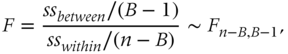
whereby

with B the number of branches of the split, nb the number of observations in branch b, ![]() the average in branch b, ybi the value of observation i in branch b, and
the average in branch b, ybi the value of observation i in branch b, and ![]() the overall average. Good splits favor homogeneity within a node (low SSwithin) and heterogeneity between nodes (high SSbetween). In other words, good splits should have a high F-value, or low corresponding p-value.
the overall average. Good splits favor homogeneity within a node (low SSwithin) and heterogeneity between nodes (high SSbetween). In other words, good splits should have a high F-value, or low corresponding p-value.
The stopping decision can be made in a similar way as for classification trees but using a regression-based performance measure (e.g., mean squared error, mean absolute deviation, coefficient of determination, etc.) on the y-axis. The assignment decision can be made by assigning the mean (or median) to each leaf node. Note that standard deviations and thus confidence intervals may also be computed for each of the leaf nodes.
Neural Networks
Basic Concepts
A first perspective on the origin of neural networks states that they are mathematical representations inspired by the functioning of the human brain. Although this may sound appealing, another more realistic perspective sees neural networks as generalizations of existing statistical models (Zurada 1992; Bishop 1995). Let us take logistic regression as an example:
We could visualize this model as follows:

Figure 2.16 Neural network representation of logistic regression.
The processing element or neuron in the middle basically performs two operations: it takes the inputs and multiplies them with the weights (including the intercept term β0, which is called the bias term in neural networks) and then puts this into a nonlinear transformation function similar to the one we discussed in the section on logistic regression. So logistic regression is a neural network with one neuron. Similarly, we could visualize linear regression as a one neuron neural network with the identity transformation ![]() . We can now generalize the above picture to a multilayer perceptron (MLP) neural network by adding more layers and neurons as follows (Bishop 1995; Zurada, 1992; Bishop 1995).
. We can now generalize the above picture to a multilayer perceptron (MLP) neural network by adding more layers and neurons as follows (Bishop 1995; Zurada, 1992; Bishop 1995).

Figure 2.17 A Multilayer Perceptron (MLP) neural network.
The example in Figure 2.17 is an MLP with one input layer, one hidden layer, and one output layer. The hidden layer essentially works like a feature extractor by combining the inputs into features that are then subsequently offered to the output layer to make the optimal prediction. The hidden layer has a non-linear transformation function f and the output layer a linear transformation function. The most popular transformation functions (also called squashing or activation functions) are:
- Logistic,
 , ranging between 0 and 1
 - Hyperbolic tangent,
 , ranging between
  and
and 
- Linear,
 , ranging between
  and
and 
Although theoretically the activation functions may differ per neuron, they are typically fixed for each layer. For classification (e.g., churn), it is common practice to adopt a logistic transformation in the output layer, since the outputs can then be interpreted as probabilities (Baesens et al. 2002). For regression targets (e.g., CLV), one could use any of the transformation functions listed above. Typically, one will use the hyperbolic tangent activation function in the hidden layer.
In terms of hidden layers, theoretical works have shown that neural networks with one hidden layer are universal approximators, capable of approximating any function to any desired degree of accuracy on a compact interval (Hornik et al., 1989). Only for discontinuous functions (e.g., a saw tooth pattern) or in a deep learning context, it could make sense to try out more hidden layers. Note, however, that these complex patterns rarely occur in practice. In a customer analytics setting, it is recommended to continue the analysis with one hidden layer.
Weight Learning
As discussed earlier, for simple statistical models such as linear regression, there exists a closed-form mathematical formula for the optimal parameter values. However, for neural networks, the optimization is a lot more complex and the weights sitting on the various connections need to be estimated using an iterative algorithm. The objective of the algorithm is to find the weights that optimize a cost function, also called an objective or error function. Similarly to linear regression, when the target variable is continuous, a mean squared error (MSE) cost function will be optimized as follows:
where yi now represents the neural network prediction for observation i. In case of a binary target variable, a likelihood cost function can be optimized as follows:

where ![]() represents the conditional positive class probability prediction for observation i obtained from the neural network.
represents the conditional positive class probability prediction for observation i obtained from the neural network.
The optimization procedure typically starts from a set of random weights (e.g., drawn from a standard normal distribution), which are then iteratively adjusted to the patterns in the data by the optimization algorithm. Popular optimization algorithms for neural network learning are back propagation learning, Conjugate gradient and Levenberg-Marquardt. (See Bishop (1995) for more details.) A key issue to note here is the curvature of the cost function, which is not convex and may be multimodal as illustrated in Figure 2.18. The cost function can thus have multiple local minima but typically only one global minimum. Hence, if the starting weights are chosen in a suboptimal way, one may get stuck in a local minimum, which is clearly undesirable since yielding suboptimal performance. One way to deal with this is to try out different starting weights, start the optimization procedure for a few steps, and then continue with the best intermediate solution. This approach is sometimes referred to as preliminary training. The optimization procedure then continues until the cost function shows no further progress; the weights stop changing substantially; or after a fixed number of optimization steps (also called epochs).

Figure 2.18 Local versus global minima.
Although multiple output neurons could be used (e.g., predicting response and amount simultaneously) it is highly advised to use only one to make sure that the optimization task is well focused. The hidden neurons however should be carefully tuned and depend on the nonlinearity in the data. More complex, nonlinear patterns will require more hidden neurons. Although scientific literature has suggested various procedures (e.g., cascade correlation, genetic algorithms, Bayesian methods) to do this, the most straightforward, yet efficient procedure is as follows (Moody and Utans 1994):
- Split the data into a training, validation, and test sets.
- Vary the number of hidden neurons from 1 to 10 in steps of 1 or more.
- Train a neural network on the training set and measure the performance on the validation set (maybe train multiple neural networks to deal with the local minimum issue).
- Choose the number of hidden neurons with optimal validation set performance.
- Measure the performance on the independent test set.
Note that in many customer analytics settings, the number of hidden neurons typically varies between 6 and 12.
Neural networks can model very complex patterns and decision boundaries in the data and are as such very powerful. Just as with decision trees, they are so powerful that they can even model the noise in the training set, which is something that definitely should be avoided. One way to avoid this overfitting is by using a validation set in a similar way as decision trees. This is illustrated in Figure 2.19. The training set is used here to estimate the weights and the validation set is again an independent dataset used to decide when to stop training.

Figure 2.19 Using a validation set for stopping neural network training.
Another scheme to prevent a neural network from overfitting is weight regularization, whereby the idea is to keep the weights small in the absolute sense since otherwise they may be fitting the noise in the data. This idea is closely related to Lasso regression (Hastie, Tibshirani et al. 2011) and is implemented by adding a weight size term (e.g., Euclidean norm) to the cost function of the neural network (Bartlett, 1997; Baesens et al. 2002). In case of a continuous output (and thus mean squared error), the cost function then becomes
whereby m represents the number of weights in the network and λ a weight decay (also referred to as weight regularization) parameter to weigh the importance of error versus weight minimization. Setting λ too low will cause overfitting, whereas setting it to high will cause underfitting. A practical approach to determine λ is to try out different values on an independent validation set and select the one with the best performance.
ENSEMBLE METHODS
Ensemble methods aim at estimating multiple analytical models instead of using only one. The idea here is that multiple models can cover different parts of the data input space and as such complement each other's deficiencies. In order to successfully accomplish this, the analytical technique needs to be sensitive to changes in the underlying data. This is particularly the case for decision trees and that is why they are commonly used in ensemble methods. In what follows, we discuss bagging, boosting, and random forests.
Bagging
Bagging (bootstrap aggregating) starts by taking B bootstraps from the underlying sample (Breima 1996). Note that a bootstrap is a sample with replacement (see section on evaluating predictive models). The idea is then to build a classifier (e.g., decision tree) for every bootstrap. For classification, a new observation will be classified by letting all B classifiers vote, using for example a majority voting scheme whereby ties are resolved arbitrarily. For regression, the prediction is the average of the outcome of the B models (e.g., regression trees). Note that, here also, a standard error and thus confidence interval can be calculated. The number of bootstraps B can either be fixed (e.g., 30) or tuned via an independent validation dataset.
The key element for bagging to be successful is the instability of the analytical technique. If perturbing the dataset by means of the bootstrapping procedure can alter the model constructed, then bagging will improve the accuracy (Breiman 1996). However, for models that are robust with respect to the underlying dataset, it will not give much added value.
Boosting
Boosting works by estimating multiple models using a weighted sample of the data (Freund and Schapire 1997; 1999). Starting from uniform weights, boosting will iteratively reweight the data according to the classification error whereby misclassified cases get higher weights. The idea here is that difficult observations should get more attention. Either the analytical technique can directly work with weighted observations, or if not, we can just sample a new dataset according to the weight distribution. The final ensemble model is then a weighted combination of all the individual models. A popular implementation of this is the Adaptive Boosting/Adaboost procedure, which works as indicated by Algorithm 2.1.
Note that in Algorithm 2.1, T represents the number of boosting runs, αt measures the importance that is assigned to classifier Ct and increases as εt gets smaller, zt is a normalization factor needed to make sure that the weights in step t make up a distribution and as such sum to 1, and Ct(x) represents the classification of the classifier built in step t for observation x. Multiple loss functions may be used to calculate the error εt although the misclassification rate is undoubtedly the most popular. In substep i of step d, it can be seen that correctly classified observations get lower weights, whereas substep ii assigns higher weights to the incorrectly classified cases. Again, the number of boosting runs T can be fixed or tuned using an independent validation set. Note that different variants of this Adaboost procedure exist, such as Adaboost.M1 and Adaboost.M2 (both for multiclass classification), and Adaboost.R1 and Adaboost.R2 (both for regression). [See Freund and Schapire 1997; 1999 for more details.] A key advantage of boosting is that it is really easy to implement. A potential drawback is that there may be a risk of overfitting to the hard (potentially noisy) examples in the data, which will get higher weights as the algorithm proceeds.
Random Forests
The concept of random forests was first introduced by Breiman (2001). It creates a forest of decision trees as roughly described in Algorithm 2.2.
Common choices for m are 1, 2, or ![]() , which is recommended. Random forests can be used with both classification trees and regression trees. Key in this approach is the dissimilarity amongst the base classifiers (i.e., decision trees), which is obtained by adopting a bootstrapping procedure to select the training sets of the individual base classifiers, the selection of a random subset of attributes at each node, and the strength of the individual base models. As such, the diversity of the base classifiers creates an ensemble that is superior in performance compared to the single models.
, which is recommended. Random forests can be used with both classification trees and regression trees. Key in this approach is the dissimilarity amongst the base classifiers (i.e., decision trees), which is obtained by adopting a bootstrapping procedure to select the training sets of the individual base classifiers, the selection of a random subset of attributes at each node, and the strength of the individual base models. As such, the diversity of the base classifiers creates an ensemble that is superior in performance compared to the single models.
Evaluating Ensemble Methods
Various benchmarking studies have shown that random forests can achieve excellent predictive performance. Actually, they generally rank amongst the best performing models across a wide variety of prediction tasks (Dejaeger et al. 2012). They are also perfectly capable of dealing with datasets that only have a few observations, but lots of variables. They are highly recommended when high performing analytical methods are needed. However, the price that is paid for this is that they are essentially black-box models. Due to the multitude of decision trees that make up the ensemble, it is very hard to see how the final classification is made. One way to shed some light on the internal workings of an ensemble is by calculating the variable importance. A popular procedure to do so is as follows:
- Permute the values of the variable under consideration (e.g., xj) on the validation or test set.
- For each tree, calculate the difference between the error on the original, unpermutated data and the error on the data with xj permutated as follows: whereby ntree represents the number of trees in the ensemble, D the original data, and

 the data with variable xj permutated. In a regression setting, the error can be the mean squared error (MSE), whereas in a classification setting, the error can be the misclassification rate.
 - Order all variables according to their VI value. The variable with the highest VI value is the most important.
EVALUATING PREDICTIVE MODELS
Splitting Up the Dataset
When evaluating predictive models two key decisions need to be made. A first decision concerns the dataset split up, which specifies on what part of the data the performance will be measured. A second decision concerns the performance metric. In what follows, we elaborate on both.
The decision how to split up the dataset for performance measurement depends on its size. In case of large datasets (say more than 1,000 observations), the data can be split up into a training and a test set. The training set (also called development or estimation sample) will be used to build the model whereas the test set (also called the hold out set) will be used to calculate its performance (see Figure 2.20). A commonly applied split up is a 70% training set and a 30% test set. There should be a strict separation between training set and test set. No observation that was used for model development can be used for independent testing. Note that in the case of decision trees or neural networks, the validation set is a separate sample since it is actively being used during model development (i.e., to make the stopping decision). A typical split up in this case is a 40% training set, 30% validation set, and 30% test set.

Figure 2.20 Training and test set split-up for performance estimation.
In the case of small datasets (say less than 1,000 observations) special schemes need to be adopted. A very popular scheme is cross-validation. In cross-validation, the data are split into K folds (e.g., 5 or 10). An analytical model is then trained on ![]() training folds and tested on the remaining validation fold. This is repeated for all possible validation folds resulting in K performance estimates, which can then be averaged. Note that also, a standard deviation and/or confidence interval can be calculated if desired. In its most extreme case, cross-validation becomes leave-one-out cross-validation whereby every observation is left out in turn and a model is estimated on the remaining
training folds and tested on the remaining validation fold. This is repeated for all possible validation folds resulting in K performance estimates, which can then be averaged. Note that also, a standard deviation and/or confidence interval can be calculated if desired. In its most extreme case, cross-validation becomes leave-one-out cross-validation whereby every observation is left out in turn and a model is estimated on the remaining ![]() observations. This gives K analytical models in total.
observations. This gives K analytical models in total.

A key question to answer when doing cross-validation is: What should be the final model that is being outputted from the procedure? Since cross-validation gives multiple models, this is not an obvious question. Of course, one could let all models collaborate in an ensemble set-up by using a (weighted) voting procedure. A more pragmatic answer would be to, for example, do leave-one-out cross-validation and pick one of the models at random. Since the models differ up to one observation only, they will be quite similar anyway. Alternatively, one may also choose to build one final model on all observations but report the performance coming out of the cross-validation procedure as the best independent estimate.
For small datasets, one may also adopt bootstrapping procedures (Efron 1979). In bootstrapping, one takes samples with replacement from a dataset D (see Figure 2.22).

Figure 2.22 Bootstrapping.
The probability that a customer is sampled equals 1/n, with n the number of observations in the dataset. Hence, the probability that a customer is not sampled equals ![]() . Assuming a bootstrap with n sampled observations, the fraction of customers that is not sampled equals
. Assuming a bootstrap with n sampled observations, the fraction of customers that is not sampled equals
We then have:
whereby the approximation already works well for small values of n. So, 0.368 is the probability that a customer does not appear in the sample and 0.632 is the probability that a customer does appear. If we then take the bootstrap sample as the training set, and the test set as all observations in D but not in the bootstrap (e.g., for the first bootstrap of Figure 2.22, the test set consists of C1 and C4), we can approximate the performance as follows:
whereby obviously, a higher weight is being put on the test set performance. As illustrated in Figure 2.22, multiple bootstraps can then be considered to get the distribution of the error estimate.
Performance Measures for Classification Models
Consider, for example, the following churn prediction example for a five-customer dataset. The second column in Table 2.5 depicts the churn status, whereas the third column depicts the churn score as it comes from a logistic regression, decision tree, neural network or other.
Table 2.5 Example Dataset for Performance Calculation
| Customer | Churn | Score | Predicted Class | |
| John | Yes | 0.72 | Yes | |
| Sophie | No | 0.56 | |
Yes |
| David | Yes | 0.44 | → | No |
| Emma | No | 0.18 | No | |
| Bob | No | 0.36 | No |
The scores have then been turned into predicted classes by adopting a default cutoff score of 0.50, as shown in Table 2.5. A confusion matrix can then be calculated as shown in Table 2.6.
Table 2.6 The Confusion Matrix
| Actual Negative (no churn) | Actual Positive (churn) | |
| Predicted Negative (no churn) | True negative (TN) (Emma, Bob) | False negative (TN) (David) |
| Predicted Positive (churn) | False positive (FP) (Sophie) | True positive (TP) (John) |
Based on the confusion matrix, we can now calculate the following performance measures:
The classification accuracy is the percentage of correctly classified observations. The classification error is the complement thereof and also referred to as the misclassification rate. The sensitivity, recall, or hit rate measures how many of the churners are correctly labeled by the model as a churner. The specificity looks at how many of the nonchurners are correctly labeled by the model as nonchurner. The precision indicates how many of the predicted churners are actually churners.
Note that all these classification measures depend on the cutoff. For example: for a cutoff of 0 (1), the classification accuracy becomes 40% (60%), the error 60% (40%), the sensitivity 100% (0), the specificity 0 (100%), the precision 40% (0), and the F-measure 57% (0). Given this dependence, it would be nice to have a performance measure that is independent from the cutoff. We could construct a table with the sensitivity, specificity, and ![]() for various cutoffs as shown in the receiver operating characteristic (ROC) analysis in Table 2.7.
for various cutoffs as shown in the receiver operating characteristic (ROC) analysis in Table 2.7.
Table 2.7 Receiver Operating Characteristic (ROC) Analysis
| Cutoff | Sensitivity | Specificity | 1 – Specificity |
| 0 | 1 | 0 | 1 |
| 0.01 | 0.99 | 0.01 | 0.99 |
| 0.02 | 0.97 | 0.04 | 0.96 |
| …. | …. | …. | …. |
| 0.99 | 0.04 | 0.99 | 0.01 |
| 1 | 0 | 1 | 0 |
The ROC curve then plots the sensitivity versus ![]() , as illustrated in Figure 2.23 (Fawcett 2003).
, as illustrated in Figure 2.23 (Fawcett 2003).

Figure 2.23 Receiver operating characteristic curve.
Note that a perfect model detects all the churners and nonchurners at the same time, which results in a sensitivity of one and a specificity of one, and is thus represented by the upper-left corner. The closer the curve approaches this point, the better the performance. In Figure 2.23, model A has a better performance than model B. A problem, however, arises if the curves intersect. In this case, one can calculate the area under the ROC curve (AUC) as a performance metric. The AUC provides a simple figure-of-merit for the performance of the constructed classifier; the higher the AUC the better the performance. The AUC is always bounded between 0 and 1 and can be interpreted as a probability. In fact, it represents the probability that a randomly chosen churner gets a higher score than a randomly chosen nonchurner (Hanley and McNeil 1982; DeLong, DeLong et al. 1988). Note that the diagonal represents a random scorecard whereby sensitivity equals ![]() for all cutoff points. Hence, a good classifier should have an ROC above the diagonal and AUC bigger than 50%.
for all cutoff points. Hence, a good classifier should have an ROC above the diagonal and AUC bigger than 50%.
A lift curve is another important performance evaluation approach. It starts by sorting the population from high score to low score. Suppose now that in the top 10% highest scores, there are 60% churners, whereas the total population has 10% churners. The lift value in the top decile then becomes 60%/10%, or 6. In other words, the lift curve represents the cumulative percentage of churners per decile, divided by the overall population percentage of churners. Using no model, or a random sorting, the churners would be equally spread across the entire range and the lift value would always equal 1. The lift curve typically exponentially decreases as one cumulatively considers bigger deciles, until it reaches 1. This is illustrated in Figure 2.24. Note that a lift curve can also be expressed in a noncumulative way, and is also often summarized by reporting top decile lift.

Figure 2.24 The lift curve.
The cumulative accuracy profile (CAP), Lorenz, or Power curve is very closely related to the lift curve. It also starts by sorting the population from high score to low score and then measures the cumulative percentage of churners for each decile on the y-axis. The perfect model gives a linearly increasing curve up to the sample churn rate and then flattens out. The diagonal again represents the random model.

The CAP curve can be summarized in an accuracy ratio (AR), as depicted in Figure 2.26.

Figure 2.26 Calculating the accuracy ratio.
The accuracy ratio is defined as the ratio of (1) the area below the power curve for the model minus the area below the power curve of the random model, and (2) the area below the power curve for the perfect model minus the area below the power curve for random model. A perfect model will thus have an AR of 1 and a random model an AR of 0. Note that the accuracy ratio is also often referred to as the Gini coefficient. There is also a linear relation between the AR and the AUC as follows:
As an alternative to these statistical measures, in Chapter 6 profit-driven performance measures will be extensively discussed, which allow us to evaluate a classification model in a cost-sensitive manner.
Performance Measures for Regression Models
A first way to evaluate the predictive performance of a regression model is by visualizing the predicted target against the actual target using a scatter plot (see Figure 2.27). The more the plot approaches a straight line through the origin, the better the performance of the regression model. It can be summarized by calculating the Pearson correlation coefficient as follows:

whereby ![]() represents the predicted value for observation i,
represents the predicted value for observation i, ![]() the average of the predicted values, yi the actual value for observation i, and
the average of the predicted values, yi the actual value for observation i, and ![]() the average of the actual values. The Pearson correlation always varies between
the average of the actual values. The Pearson correlation always varies between ![]() and
and ![]() . Values closer to
. Values closer to ![]() indicate better agreement and thus better fit between the predicted and actual values of the target variable.
indicate better agreement and thus better fit between the predicted and actual values of the target variable.

Figure 2.27 Scatter plot.
Another key performance metric is the coefficient of determination or R2 defined as follows:

The R2 always varies between 0 and 1, and higher values are to be preferred. Basically, this measure tells us how much better we can make predictions by using the analytical model to compute ![]() than by using the mean
than by using the mean ![]() as predictor. To compensate for the variables in the model, an adjusted
as predictor. To compensate for the variables in the model, an adjusted ![]() , has been suggested as follows:
, has been suggested as follows:

whereby k represents the number of variables in the model. Note that although R2 is usually a number between 0 and 1, it can also have negative values for non-OLS models when the model predictions are worse than always using the mean from the training set as the prediction.
Two other popular measures are the mean squared error (MSE) and mean absolute deviation (MAD), defined as follows:

A perfect model would have an MSE and MAD of 0. Higher values for both MSE and MAD indicate less good performance. Note that the MSE is sometimes also reported as the root mean squared error (RMSE), whereby ![]() .
.
Other Performance Measures for Predictive Analytical Models
As already mentioned, statistical performance is just one aspect of model performance. Other important criteria are comprehensibility, justifiability, and operational efficiency. Although comprehensibility is subjective and depends on the background and experience of the business user, linear and logistic regressions as well as decision trees are commonly referred to as white box, comprehensible techniques (Baesens et al. 2003; Verbeke et al. 2011). Neural networks and random forests methods are essentially opaque models and thus much harder to understand (Baesens et al. 2011). However, in settings where statistical performance is superior to interpretability, they are the method of choice. Justifiability goes one step further and verifies to what extent the relationships modeled are in line with prior business knowledge and/or expectations. In a practical setting, this often boils down to verifying the univariate impact of a variable on the model's output.
For example: For a linear/logistic regression model, the signs of the regression coefficients will be verified. Finally, the operational efficiency can also be an important evaluation criterion to consider when selecting the optimal analytical model. Operational efficiency represents the ease with which one can implement, use, and monitor the final model. An example: in a (near) real-time fraud environment, it is important to be able to quickly evaluate the fraud model (Baesens et al. 2015). With regards to implementation, rule-based models excel since implementing rules can be done very easily, even in spreadsheet software. Linear models are also quite easy to implement, whereas nonlinear models are much more difficult to implement, due to the complex transformations that are being used by the model.
DESCRIPTIVE ANALYTICS
Introduction
In descriptive analytics, the aim is to describe patterns of customer behavior. Contrary to predictive analytics, there is no real target variable (e.g., churn, response or fraud indicator) available. Hence, descriptive analytics is often referred to as unsupervised learning, since there is no target variable to steer the learning process. The three most common types of descriptive analytics are association rules, sequence rules, and clustering.
Association Rules
Basic Setting
Association rules typically start from a dataset of transactions D. Each transaction consists of a transaction identifier and a set of items {i1, i2,…} selected from all possible items I. Items can be, for example, products, web pages, or courses. Table 2.8 gives an example of a transaction dataset in a supermarket setting.
Table 2.8 Example Transaction Dataset
| ID | Items |
| T1 | beer, milk, diapers, baby food |
| T2 | coke, beer, diapers |
| T3 | cigarettes, diapers, baby food |
| T4 | chocolates, diapers, milk, apples |
| T5 | tomatoes, water, apples, beer |
| T6 | spaghetti, diapers, baby food, beer |
| T7 | water, beer, baby food |
| T8 | diapers, baby food, spaghetti |
| T9 | baby food, beer, diapers, milk |
| T10 | apples, wine, baby food |
An association rule is then an implication of the form ![]() , whereby
, whereby ![]() and
and ![]() . X is referred to as the rule antecedent whereas Y is referred to as the rule consequent. Examples of association rules are:
. X is referred to as the rule antecedent whereas Y is referred to as the rule consequent. Examples of association rules are:
- If a customer has a car loan and car insurance, then the customer has a checking account in 80% of the cases.
- If a customer buys spaghetti, then the customer buys red wine in 70% of the cases.
- If a customer visits web page A, then the customer will visit web page B in 90% of the cases.
It is hereby important to note that association rules are stochastic in nature; that means they should not be interpreted as a universal truth and are characterized by statistical measures quantifying the strength of the association. Also, the rules measure correlational associations and should not be interpreted in a causal way.
Support, Confidence, and Lift
Support and confidence are two key measures to quantify the strength of an association rule. The support of an item set is defined as the percentage of total transactions in the database that contains the item set. Hence, the rule ![]() has support s if 100s% of the transactions in D contains
has support s if 100s% of the transactions in D contains ![]() . It can be formally defined as follows:
. It can be formally defined as follows:

When considering the transaction database in Table 2.8, the association rule baby food and ![]() has support 3/10, or 30%.
has support 3/10, or 30%.
A frequent item set is an item set for which the support is higher than a threshold (minsup), which is typically specified up front by the business user or data scientist. A lower (higher) support will obviously generate more (less) frequent item sets. The confidence measures the strength of the association and is defined as the conditional probability of the rule consequent, given the rule antecedent. The rule ![]() has confidence c if 100c% of the transactions in D that contain X also contain Y. It can be formally defined as follows:
has confidence c if 100c% of the transactions in D that contain X also contain Y. It can be formally defined as follows:

Again, the data scientist has to specify a minimum confidence (minconf) in order for an association rule to be considered interesting. When considering Table 2.8, the association rule baby food and ![]() has confidence 3/5 or 60%.
has confidence 3/5 or 60%.
Consider now the following example from a supermarket transactions database, as shown in Table 2.9.
Table 2.9 The Lift Measure
| Tea | Not tea | Total | |
| Coffee | 150 | 750 | 900 |
| Not coffee | 50 | 50 | 100 |
| Total | 200 | 800 | 1000 |
Let us now evaluate the association rule ![]() . The support of this rule is 100/1,000, or 10%. The confidence of the rule is 150/200, or 75%. At first sight, this association rule seems very appealing given its high confidence. However, closer inspection reveals that the prior probability of buying coffee equals 900/1000, or 90%. Hence, a customer who buys tea is less likely to buy coffee than a customer about whom we have no information. The lift, also referred to as the interestingness measure, takes this into account by incorporating the prior probability of the rule consequent as follows:
. The support of this rule is 100/1,000, or 10%. The confidence of the rule is 150/200, or 75%. At first sight, this association rule seems very appealing given its high confidence. However, closer inspection reveals that the prior probability of buying coffee equals 900/1000, or 90%. Hence, a customer who buys tea is less likely to buy coffee than a customer about whom we have no information. The lift, also referred to as the interestingness measure, takes this into account by incorporating the prior probability of the rule consequent as follows:

A lift value less (larger) than 1 indicates a negative (positive) dependence or substitution (complementary) effect. In our example, the lift value equals 0.89, which clearly indicates the expected substitution effect between coffee and tea.
Post-Processing Association Rules
Typically, an association rule-mining exercise will yield lots of association rules such that post-processing will become a key activity. Example steps include the following:
- Filter out the trivial rules that contain already known patterns (e.g., buying spaghetti and spaghetti sauce). This should be done in collaboration with a business expert.
- Perform a sensitivity analysis by varying the minsup and minconf values. Particularly for rare but profitable items (e.g., Rolex watches), it could be interesting to lower the minsup value and find the interesting associations.
- Use appropriate visualization facilities (e.g., OLAP-based) to find the unexpected rules that might represent novel and actionable behavior in the data.
- Measure the economic impact (e.g., profit, cost) of the association rules.
Sequence Rules
Given a database D of customer transactions, the problem of mining sequential rules is to find the maximal sequences among all sequences that have certain user-specified minimum support and confidence. An example could be a sequence of web page visits in a Web analytics setting as follows:

It is important to note that a transaction time or sequence field will now be included in the analysis. Whereas association rules are concerned about what items appear together at the same time (intra-transaction patterns), sequence rules are concerned about what items appear at different times (inter-transaction patterns).
Consider the following example of a transactions dataset in a Web analytics setting (see Table 2.10). The letters A, B, C, … refer to web pages. A sequential version can be obtained as shown in Table 2.10.
Table 2.10 Example Transaction Dataset (left) and Sequential Dataset (right) for Sequence Rule Mining
|
|
|
One can now calculate the support in two different ways. Consider, for example, the sequence rule ![]() . A first approach would be to calculate the support whereby the consequent can appear in any subsequent stage of the sequence. In this case, the support becomes 2/5 (40%). Another approach would be to only consider sessions where the consequent appears right after the antecedent. In this case, the support becomes 1/5 (20%). A similar reasoning can now be followed for the confidence, which can then be 2/4 (50%) or 1/4 (25%), respectively.
. A first approach would be to calculate the support whereby the consequent can appear in any subsequent stage of the sequence. In this case, the support becomes 2/5 (40%). Another approach would be to only consider sessions where the consequent appears right after the antecedent. In this case, the support becomes 1/5 (20%). A similar reasoning can now be followed for the confidence, which can then be 2/4 (50%) or 1/4 (25%), respectively.
Remember that the confidence of a rule ![]() is defined as the probability
is defined as the probability ![]() ). For a rule with multiple items,
). For a rule with multiple items, ![]() , the confidence is defined as
, the confidence is defined as ![]() .
.
Clustering
The aim of clustering or segmentation is to split up a set of observations into clusters such that the homogeneity within a cluster is maximized (cohesive), and the heterogeneity between clusters is maximized (separated). Clustering techniques can be categorized as either hierarchical or nonhierarchical (see Figure 2.28).

Figure 2.28 Hierarchical versus nonhierarchical clustering techniques.
Hierarchical Clustering
In what follows, we will first discuss hierarchical clustering. Divisive hierarchical clustering starts from the whole dataset in one cluster, and then breaks this up each time in smaller clusters until one observation per cluster remains (right to left in Figure 2.29). Agglomerative clustering works the other way around, and starts from all observations in one cluster, continues to merge the ones that are most similar until all observations make up one big cluster (left to right in Figure 2.29). The optimal clustering solution then lies somewhere in between the extremes to the left and right, respectively.

Figure 2.29 Divisive versus agglomerative hierarchical clustering.
In order to decide on the merger or splitting, a distance measure is needed. Examples of popular distance measures are the Euclidean distance and Manhattan (City Block) distance. For the example in Figure 2.30 both are calculated as follows:
- Euclidean:

- Manhattan:

It is obvious that the Euclidean distance will always be shorter than the Manhattan distance.

Figure 2.30 Euclidean versus Manhattan distance.
Various schemes can now be adopted to calculate the distance between two clusters (see Figure 2.31). The single linkage method defines the distance between two clusters as the shortest possible distance, or the distance between the two most similar objects. The complete linkage method defines the distance between two clusters as the biggest distance, or the distance between the two most dissimilar objects. The average linkage method calculates the average of all possible distances. The centroid method calculates the distance between the centroids of both clusters.

Figure 2.31 Calculating distances between clusters.
In order to decide on the optimal number of clusters, one could use a dendrogram or scree plot. A dendrogram is a tree-like diagram that records the sequences of merges. The vertical (or horizontal scale) then gives the distance between two amalgamated clusters. One can then cut the dendrogram at the desired level to find the optimal clustering. This is illustrated in Figure 2.32 and Figure 2.33 for a birds clustering example. A scree plot is a plot of the distance at which clusters are merged. The elbow point then indicates the optimal clustering. This is illustrated in Figure 2.34.

Figure 2.32 Example for clustering birds. The numbers indicate the clustering steps.

Figure 2.33 Dendrogram for birds example. The red line indicates the optimal clustering.

Figure 2.34 Scree plot for clustering.
A key advantage of hierarchical clustering is that the number of clusters does not need to be specified prior to the analysis. A disadvantage is that the methods do not scale very well to large datasets. Also, the interpretation of the clusters is often subjective and depends on the business expert and/or data scientist.
K-means Clustering
K-means clustering is a nonhierarchical procedure that works along the following steps:
- Select K observations as initial cluster centroids (seeds).
- Assign each observation to the cluster that has the closest centroid (for example, in Euclidean sense).
- When all observations have been assigned, recalculate the positions of the k centroids.
- Repeat until the cluster centroids no longer change.
A key requirement here is that the number of clusters, K, needs to be specified before the start of the analysis. It is also advised to try out different seeds to verify the stability of the clustering solution. This decision can be made using expert-based input or based on the result of another (e.g., hierarchical) clustering procedure. Typically, multiple values of K are tried out and the resulting clusters evaluated in terms of their statistical characteristics and interpretation. It is also advised to try out different seeds to verify the stability of the clustering solution.
Self-Organizing Maps
A self-organizing map (SOM) is an unsupervised learning algorithm that allows users to visualize and cluster high-dimensional data on a low-dimensional grid of neurons (Kohonen 1982; Huysmans et al. 2006a; Seret et al. 2012). A SOM is a feedforward neural network with two layers. The neurons from the output layer are usually ordered in a two-dimensional rectangular or hexagonal grid. For the former, every neuron has at most eight neighbors, whereas for the latter every neuron has at most six neighbors.

Each input is connected to all neurons in the output layer. In other words, every output neuron has k weights, one for each input. As such, the output neurons can be thought of as prototype observations. All weights of the output neurons are randomly initialized. When a training vector xi is presented, the weight vector ws of each output neuron s is compared to xi, using, for example, the Euclidean distance metric (beware to standardize the data to zero mean and unit standard deviation first!):

The neuron that is most similar to xi in Euclidean sense is called the best matching unit (BMU). The weight vector of each output neuron s is then updated using the following learning rule:
where ![]() represents the training step, ws(t) the weight vector of output neuron s at step t, x(t) the observation considered at step t, and hbs(t) the neighborhood function at step t. The neighborhood function hbs(t) specifies the region of influence and is dependent on the location of the BMU (say neuron b) and the neuron to be updated (i.e., neuron s). It should be a nonincreasing function of time t and the distance from the BMU. Some popular choices are:
represents the training step, ws(t) the weight vector of output neuron s at step t, x(t) the observation considered at step t, and hbs(t) the neighborhood function at step t. The neighborhood function hbs(t) specifies the region of influence and is dependent on the location of the BMU (say neuron b) and the neuron to be updated (i.e., neuron s). It should be a nonincreasing function of time t and the distance from the BMU. Some popular choices are:

whereby rb and rs represent the location of the BMU and neuron s on the map, σ2(t) represents the decreasing radius, and ![]() the learning rate (e.g.,
the learning rate (e.g., ![]() or
or ![]() ). The decreasing learning rate and radius will give a stable map after a certain amount of training. Training is stopped when the BMUs remain stable, or after a fixed number of iterations (e.g., 500 times the number of SOM neurons). The output neurons will then move more and more toward the input observations, and interesting segments will emerge.
). The decreasing learning rate and radius will give a stable map after a certain amount of training. Training is stopped when the BMUs remain stable, or after a fixed number of iterations (e.g., 500 times the number of SOM neurons). The output neurons will then move more and more toward the input observations, and interesting segments will emerge.
SOMs can be visualized by means of a U-matrix or component plane.
- A U (unified distance)-matrix essentially superimposes a height dimension on top of each output neuron, visualizing the average distance between the output neuron and its neighbors, whereby typically dark colors indicate a large distance and can be interpreted as cluster boundaries.
- A component plane visualizes the weights between each specific input neuron and its output neurons, and as such provides a visual overview of the relative contribution of each input to the output neurons.
Figure 2.36 provides an SOM example for clustering countries based on a corruption perception index (CPI) (Huysmans et al. 2006b). This is a score between 0 (highly corrupt) and 10 (highly clean), assigned to each country in the world. The CPI is combined with demographic and macroeconomic information for the years 1996, 2000, and 2004. Upper case countries (e.g., BEL) denote the situation in 2004, lower case (e.g., bel) in 2000, and sentence case (e.g., Bel) in 1996. It can be seen that many of the European countries are situated in the upper-right corner of the map. Figure 2.37 provides the component plane for literacy whereby darker regions score worse on literacy. Figure 2.38 provides the component plane for political rights whereby darker regions correspond to better political rights. It can be seen that many of the European countries score good on both literacy and political rights.

Figure 2.36 Clustering countries using SOMs.

Figure 2.37 Component plane for literacy.

Figure 2.38 Component plane for political rights.
SOMs are a very handy tool for clustering high dimensional datasets because of the visualization facilities. However, since there is no real objective function to minimize, it is harder to compare various SOM solutions against each other. Also, experimental evaluation and expert interpretation is needed to decide on the optimal size of the SOM. Unlike K-means clustering, a SOM does not force the number of clusters to be equal to the number of output neurons.
SURVIVAL ANALYSIS
Introduction
Survival analysis is a set of statistical techniques focusing on the occurrence and timing of events (Cox 1972; Cox and Oakes 1984; Allison 1995). As the name suggests, it originates from a medical context where it was used to study survival times of patients who had received certain treatments. In fact, many classification problems we have discussed before also have a time aspect included, which can be analyzed using survival analysis techniques. Some examples are:
- Predict when customers churn.
- Predict when customers make their next purchase.
- Predict when customers default.
- Predict when customers pay off their loan early.
- Predict when customer will visit a website again.
Two typical problems complicate the usage of classical statistical techniques such as linear regression. A first key problem is censoring. Censoring refers to the fact that the target time variable is not always known since not all customers may have undergone the event yet at the time of the analysis. Consider the example depicted in Figure 2.39. At time T, Laura and John have not churned yet and thus have no value for the target time indicator. The only information available is that they will churn at some later date after T. Note that also Sophie is censored at the time she moved to Australia. In fact, these are all examples of right censoring. An observation on a variable T is right-censored if all you know about T is that it is greater than some value c. Likewise, an observation on a variable T is left-censored if all you know about T is that it is smaller than some value c. An example here could be a study investigating smoking behavior where some participants at age 18 already began smoking but can no longer remember the exact date they started. Interval censoring means the only information available on T is that it belongs to some interval ![]() . Returning to the previous smoking example, one could be more precise and say
. Returning to the previous smoking example, one could be more precise and say ![]() . Censoring occurs because many databases only contain current or rather recent customers for whom the behavior has not yet been completely observed, or because of database errors when, for example, the event dates are missing. Using classical statistical analysis techniques such as linear regression, the censored observations would have to be left out from the analysis, since they have no value for the target time variable. However, with survival analysis, the partial information available for the censored observations giving a lower and/or upper bound on the timing of the event will be included in the estimation.
. Censoring occurs because many databases only contain current or rather recent customers for whom the behavior has not yet been completely observed, or because of database errors when, for example, the event dates are missing. Using classical statistical analysis techniques such as linear regression, the censored observations would have to be left out from the analysis, since they have no value for the target time variable. However, with survival analysis, the partial information available for the censored observations giving a lower and/or upper bound on the timing of the event will be included in the estimation.

Figure 2.39 Example of right censoring for churn prediction.
Time-varying covariates are variables that change value during the course of the study. Examples are account balance, income, and credit scores, among others. Survival analysis techniques will be able to accommodate this in the model formulation, as is discussed in what follows.
Survival Analysis Measurements
A first important concept is the event time distribution defined as a continuous probability distribution, as follows:
The corresponding cumulative event time distribution is then defined as follows:

Closely related is the survival function:

S(t) is a monotonically decreasing function with ![]() and
and ![]() . The following relationships hold:
. The following relationships hold:
Figure 2.40 provides an example of a discrete event time distribution, with the corresponding cumulative event time and survival distribution depicted in Figure 2.41.

Figure 2.40 Example of a discrete event time distribution.

Figure 2.41 Cumulative distribution and survival function for the event time distribution in Figure 2.40.
Another important measure in survival analysis is the hazard function defined as follows:
The hazard function tries to quantify the instantaneous risk that an event will occur at time t, given that the individual has survived up to time t. Hence, it tries to measure the risk of the event occurring at time point t. The hazard function is closely related to the event time distribution up to the conditioning on ![]() . That is why it is often also referred to as a conditional density.
. That is why it is often also referred to as a conditional density.
Figure 2.42 provides some examples of hazard shapes as follows:
- Constant hazard whereby the risk remains the same at all times.
- Increasing hazard reflects an aging effect.
- Decreasing hazard reflects a curing effect.
- A convex bathtub shape is typically the case when studying human mortality, since mortality declines after birth and infancy, remains low for a while, and increases with elder years. It is also a property of some mechanical systems to either fail soon after operation or much later, as the system ages.

Figure 2.42 Sample hazard shapes.
The probability density function f(t), survivor function S(t), and the hazard function h(t) are mathematically equivalent ways of describing a continuous probability distribution with the following relationships:

Kaplan Meier Analysis
A first type of survival analysis is Kaplan Meier (KM) analysis, which is also known as the product limit estimator, or nonparametric maximum likelihood estimator for S(t). If there is no censoring, the KM estimator for t is just the sample proportion with event times greater than t. If there is censoring, the KM estimator starts by ordering the event times in ascending order ![]() . At each time tj, there are nj individuals who are at risk of the event. At risk means that they have not undergone the event, nor have they been censored prior to tj. Let dj be the number of individuals who die (e.g., churn, respond, default) at tj. The KM estimator is then defined as follows:
. At each time tj, there are nj individuals who are at risk of the event. At risk means that they have not undergone the event, nor have they been censored prior to tj. Let dj be the number of individuals who die (e.g., churn, respond, default) at tj. The KM estimator is then defined as follows:

for ![]() . The intuition of the KM estimator is very straightforward, as it basically states that in order to survive time t, one must survive time
. The intuition of the KM estimator is very straightforward, as it basically states that in order to survive time t, one must survive time ![]() and cannot die during time t. Figure 2.43 gives an example of Kaplan Meier analysis for churn prediction.
and cannot die during time t. Figure 2.43 gives an example of Kaplan Meier analysis for churn prediction.

Figure 2.43 Kaplan Meier example.
If there are many unique event times, the KM estimator can be adjusted by using the life-table (also known as actuarial) method to group event times into intervals as follows:

which basically assumes that censoring occurs uniform across the time interval, such that the average number at risk equals ![]() or
or ![]() , with cj the number of censored observations during time interval j.
, with cj the number of censored observations during time interval j.
Kaplan Meier analysis can also be extended with hypothesis testing to see whether the survival curves of different groups (e.g., men versus women, employed versus unemployed) are statistically different. Popular test statistics here are the log-rank test (also known as the Mantel-Haenzel test), the Wilcoxon test, and the likelihood-ratio statistic, which are all readily available in any commercial analytics software.
Kaplan Meier analysis is a good way to start doing some exploratory survival analysis. However, it would be nice to be able to also build predictive survival analysis models that take into account customer heterogeneity by including predictive variables or covariates.
Parametric Survival Analysis
As the name suggests, parametric survival analysis models assume a parametric shape for the event time distribution. A first popular choice is an exponential distribution defined as follows:
Using the relationships defined earlier, the survival function then becomes:
and the hazard rate

It is worth noting that the hazard rate is independent of time such that the risk always remains the same. This is often referred to as the memoryless property of an exponential distribution.

Figure 2.44 Exponential event time distribution, with cumulative distribution and hazard function.
When taking into account covariates, the model becomes:
Remember that β represents the parameter vector and xi the vector of predictor variables. Note that the logarithmic transform is used here to make sure that the hazard rate is always positive.
The Weibull distribution is another popular choice for a parametric survival analysis model. It is defined as follows:
The survival function then becomes:
and the hazard rate becomes

Note that, in this case, the hazard rate does depend on time and can be either increasing or decreasing (depending on κ and ρ). Figure 2.45 illustrates some examples of Weibull distributions. It can be seen that it is a very versatile distribution that can fit various shapes.

Figure 2.45 Weibull distributions.
When including covariates, the model becomes:
Other popular choices for the event time distribution are gamma, log-logistic, and log-normal distributions (Allison, 1995). Parametric survival analysis models are typically estimated using maximum likelihood procedures. In case of no censored observations, the likelihood function becomes:
When censoring is present, the likelihood function becomes:
whereby δi equals 0 if observation i is censored, and 1 if the observation dies at time ti. It is important to note here that the censored observations do enter the likelihood function and, as such, have an impact on the estimates. For example, for the exponential distribution, the likelihood function becomes:
This maximum likelihood function is then typically optimized by further taking the logarithm and then using a Newton Raphson optimization procedure.
A key question concerns the appropriate event time distribution for a given set of survival data. This question can be answered both graphically and statistically. In order to solve it graphically, we can start from the following relationships:
or,

Because of this relationship, the log survivor function is commonly referred to as the cumulative hazard function, denoted as Λ(t). It can be interpreted as the sum of the risks that are faced when going from time 0 to time t. If the survival times are exponentially distributed, then the hazard is constant ![]() , hence
, hence ![]() and a plot of
and a plot of ![]() versus t should yield a straight line through the origin at 0. Similarly, it can be shown that if the survival times are Weibull distributed, then a plot of
versus t should yield a straight line through the origin at 0. Similarly, it can be shown that if the survival times are Weibull distributed, then a plot of ![]() versus log(t) should yield a straight line (not through the origin) with a slope of κ. These plots can typically be asked for in any commercial analytics software implementing survival analysis. Note, however, that this graphical method is not a very precise method, as the lines will never be perfectly linear or go through the origin.
versus log(t) should yield a straight line (not through the origin) with a slope of κ. These plots can typically be asked for in any commercial analytics software implementing survival analysis. Note, however, that this graphical method is not a very precise method, as the lines will never be perfectly linear or go through the origin.
A more precise method for testing the appropriate event time distribution is a likelihood ratio test. In fact the likelihood ratio test can be used to compare models if one model is a special case of another (nested models). Consider the following generalized Gamma distribution:

Let's now use the following short-cut notations: ![]() and
and ![]() , then the Weibull, exponential, standard gamma and log-normal model are all special versions of the generalized gamma model as follows:
, then the Weibull, exponential, standard gamma and log-normal model are all special versions of the generalized gamma model as follows:
 : standard gamma
 : Weibull
 : exponential
 : log normal
Let Lfull now be the likelihood of the full model (e.g., generalized gamma) and Lred be the likelihood of the reduced (specialized) model (e.g., exponential). The likelihood ratio test statistic then becomes:

whereby the degrees of freedom k depends on the number of parameters that need to be set to go from the full model to the reduced model. In other words, it is set as follows:
- Exponential versus Weibull: 1 degree of freedom
- Exponential versus standard gamma: 1 degree of freedom
- Exponential versus generalized gamma: 2 degrees of freedom
- Weibull versus generalized gamma: 1 degree of freedom
- Log-normal versus generalized gamma: 1 degree of freedom
- Standard gamma versus generalized gamma: 1 degree of freedom
The χ2-test statistic can then be calculated together with the corresponding p-value and a decision can be made about what is the most appropriate event time distribution.
Proportional Hazards Regression
The proportional hazards model is formulated as follows:
so the hazard of an individual i with characteristics xi at time t is the product of a baseline hazard function h0(t) and a linear function of a set of fixed covariates, which is exponentiated. In fact, h0(t) can be considered as the hazard for an individual with all covariates equal to zero. Note that if a variable xj increases with one unit and all other variables keep their values (ceteris paribus), then the hazards for all t increase with exp(βj), which is called the hazard ratio (HR). If ![]() , then
, then ![]() then
then ![]() then
then ![]() . This is one of the most popular models for doing survival analysis.
. This is one of the most popular models for doing survival analysis.
The term proportional hazards stems from the fact that the hazard of any individual is a fixed proportion of the hazard of any other individual.

Hence, the subjects most at risk at any one time remain the subjects most at risk at any one other time (see also Figure 2.46).

Figure 2.46 The proportional hazards model.
Taking logarithms from the original proportional hazards model gives:
Note that if one chooses ![]() , one gets the exponential model, whereas if
, one gets the exponential model, whereas if ![]() , the Weibull model is obtained. A nice property of the proportional hazards model is that, using the idea of partial likelihood, the β coefficients can be estimated without having to explicitly specify the baseline hazard function h0(t) (Allison 1995; Cox 1972; Cox and Oakes 1984). This is useful if one is only interested in analyzing the impact of the covariates on the hazard rates and/or survival probabilities. However, if one wants to make predictions with the proportional hazards model, the baseline hazard needs to be explicitly specified.
, the Weibull model is obtained. A nice property of the proportional hazards model is that, using the idea of partial likelihood, the β coefficients can be estimated without having to explicitly specify the baseline hazard function h0(t) (Allison 1995; Cox 1972; Cox and Oakes 1984). This is useful if one is only interested in analyzing the impact of the covariates on the hazard rates and/or survival probabilities. However, if one wants to make predictions with the proportional hazards model, the baseline hazard needs to be explicitly specified.
The survival function that comes with the proportional hazards model looks as follows:

or
With

S0(t) is referred to as the baseline survivor function, that is the survivor function for an individual whose covariates are all zero. Note that if a variable xj increases with one unit (ceteris paribus), the survival probabilities are raised to the power exp(βj), which is the hazard ratio (HR).
Extensions of Survival Analysis Models
A first extension of the models we discussed above is the inclusion of time varying covariates. These are variables that change value throughout the course of the study. The model then becomes:
where xi(t) is the vector of time-dependent covariates for individual i. Note that the proportional hazards assumption here no longer holds because the time-varying covariates may change at different rates for different subjects, so the ratios of their hazards will not remain constant. One could also let the β parameters vary in time as follows:
The partial likelihood estimation method referred to earlier can easily be extended to accommodate these changes in the model formulation, such that the coefficients here can also be estimated without explicitly specifying the baseline hazard h0(t).
Another extension is the idea of competing risks (Crowder 2001). Often, an observation can experience any of k competing events. In medicine, customers may die because of cancer or aging. In a bank setting, a customer can default, pay off early, or churn at any given time. As long as a customer has not undergone any of the events, he/she remains at risk for any event. Once a customer has undergone the event, he/she is no longer included in the population at risk for any of the other risk groups; hence, the customer becomes censored for the other risks.
Although the ideas of time-varying covariates and competing risks seem attractive at first sight, the number of successful business applications of both remains very limited, due to the extra complexity introduced in the model(s).
Evaluating Survival Analysis Models
A survival analysis model can be evaluated by first considering the statistical significance of both the model as a whole, as well as the individual covariates (remember: significant covariates have low p-values). One could also predict the time of the event when the survival curve S(t) drops below 0.50 and compare this with the real event time. Another option is to take a snapshot of the survival probabilities at a specific time t (e.g., 12 months), compare this with the event time indicator, and calculate the corresponding ROC curve and its area beneath. The AUC will then indicate how well the model ranks the observations for a specific timestamp t. Finally, one could also evaluate the interpretability of the survival analysis model by using univariate sign checks on the covariates and seeing whether they correspond to business expert knowledge.
The survival analysis models we have discussed in this chapter are classical statistical models. Hence, some important drawbacks are that the functional relationship remains linear or some mild extension thereof, interaction and nonlinear terms have to be specified ad hoc, extreme hazards may occur for outlying observations, and the assumption of proportional hazards may not always be the case. Other methods have been described in the literature to tackle these shortcomings, based on, for example, splines and neural networks (Baesens et al. 2005).
SOCIAL NETWORK ANALYTICS
Introduction
In the last decades, the use of social media websites in everybody's daily life is booming. People can continue their conversations on online social network sites such as Facebook, Twitter, LinkedIn, ![]() , and Instagram, and share their experiences with their acquaintances, friends, and family. It only takes one click to update your whereabouts to the rest of the world. Plenty of options exist to broadcast your current activities: by picture, video, geo-location, links, or just plain text.
, and Instagram, and share their experiences with their acquaintances, friends, and family. It only takes one click to update your whereabouts to the rest of the world. Plenty of options exist to broadcast your current activities: by picture, video, geo-location, links, or just plain text.
Users of online social network sites explicitly reveal their relationships with other people. As a consequence, social network sites are an (almost) perfect mapping of the relationships that exist in the real world. We know who you are, what your hobbies and interests are, to whom you are married, how many children you have, your buddies with whom you run every week, your friends in the wine club, and more. This whole interconnected network of people knowing each other somehow is an extremely interesting source of information and knowledge. Marketing managers no longer have to guess who might influence whom to create the appropriate campaign. It is all there—and that is exactly the problem. Social network sites acknowledge the richness of the data sources they have, and are not willing to share them as such and free of cost. Moreover, those data are often privatized and regulated, and well-hidden from commercial use. On the other hand, social network sites offer many good built-in facilities to managers and other interested parties to launch and manage their marketing campaigns by exploiting the social network, without publishing the exact network representation.
However, companies often forget that they can reconstruct (a part of) the social network using in-house data. Telecommunication providers, for example, have a massive transactional database where they record call behavior of their customers. Under the assumption that good friends call each other more often, we can recreate the network and indicate the tie strength between people based on the frequency and/or duration of calls. Internet infrastructure providers might map the relationships between people using their customers' IP addresses. IP addresses that frequently communicate are represented by a stronger relationship. In the end, the IP network will envisage the relational structure between people from another point of view, but to a certain extent as observed in reality. Many more examples can be found in the banking, retail, and online gaming industries. In this section, we discuss how social networks can be leveraged for analytics.
Social Network Definitions
A social network consists of both nodes (vertices) and edges. Both need to be clearly defined at the outset of the analysis. A node (vertex) could be defined as a customer (private/professional), household/family, patient, doctor, paper, author, terrorist, or website. An edge can be defined as a friend's relationship, a call, transmission of a disease, or reference. Note that the edges can also be weighted based on interaction frequency, importance of information exchange, intimacy, emotional intensity, and so on. For example: In a churn prediction setting, the edge can be weighted according to the time two customers called each other during a specific period. Social networks can be represented as a sociogram. This is illustrated in Figure 2.47 whereby the color of the nodes corresponds to a specific status (e.g., churner or nonchurner).

Figure 2.47 Sociogram representation of a social network.
Sociograms are useful for representing small-scale networks. For larger-scale networks, the network will typically be represented as a matrix, as illustrated in Table 2.11. These matrices will be symmetrical3 and typically very sparse (with lots of zeros). The matrix can also contain the weights in case of weighted connections.
Table 2.11 Matrix Representation of a Social Network
| C1 | C2 | C3 | C4 | |
| C1 | - | 1 | 1 | 0 |
| C2 | 1 | - | 0 | 1 |
| C3 | 1 | 0 | - | 0 |
| C4 | 0 | 1 | 0 | - |
Social Network Metrics
A social network can be characterized by various social network metrics. The most important centrality measures are depicted in Table 2.12. Assume a network with g nodes ![]() represents the number of geodesics from node Nj to node Nk, whereas gjk(Ni) represents the number of geodesics from node Nj to node Nk, passing through node Ni. The formulas in Table 2.12 each time calculate the metric for node Ni.
represents the number of geodesics from node Nj to node Nk, whereas gjk(Ni) represents the number of geodesics from node Nj to node Nk, passing through node Ni. The formulas in Table 2.12 each time calculate the metric for node Ni.
Table 2.12 Network Centrality Measures
| Geodesic | Shortest path between two nodes in the network. | |
| Degree | Number of connections of a node (in- versus out-degree if the connections are directed). | |
| Closeness | The average distance of a node to all other nodes in the network (reciprocal of farness). |  |
| Betweenness | Counts the number of times a node or connection lies on the shortest path between any two nodes in the network. |  |
| Graph theoretic center | The node with the smallest maximum distance to all other nodes in the network. |
These metrics can now be illustrated for the well-known Kite network toy example depicted in Figure 2.48.

Figure 2.48 The Kite network.
Table 2.13 reports the centrality measures for the Kite network. Based on degree, Diane is most central since she has the most connections. She works as a connector or hub. Note, however, that she only connects those already connected to each other. Fernando and Garth are the closest to all others. They are the best positioned to communicate messages that need to flow quickly through to all other nodes in the network. Heather has the highest betweenness. She sits in between two important communities (Ike and Jane versus the rest). She plays a broker role between both communities but is also a single point of failure. Note that the betweenness measure is often used for community mining. A popular technique here is the Girvan-Newman algorithm, which works as follows (Girvan, Newman, 2002):
- The betweenness of all existing edges in the network is calculated first.
- The edge with the highest betweenness is removed.
- The betweenness of all edges affected by the removal is recalculated.
- Steps 2 and 3 are repeated until no edges remain.
Table 2.13 Centrality measures for the Kite network
| Degree | Closeness | Betweenness | |||
| 6 | Diane | 0.64 | Fernando | 14 | Heather |
| 5 | Fernando | 0.64 | Garth | 8.33 | Fernando |
| 5 | Garth | 0.6 | Diane | 8.33 | Garth |
| 4 | Andre | 0.6 | Heather | 8 | Ike |
| 4 | Beverly | 0.53 | Andre | 3.67 | Diane |
| 3 | Carol | 0.53 | Beverly | 0.83 | Andre |
| 3 | Ed | 0.5 | Carol | 0.83 | Beverly |
| 3 | Heather | 0.5 | Ed | 0 | Carol |
| 2 | Ike | 0.43 | Ike | 0 | Ed |
| 1 | Jane | 0.31 | Jane | 0 | Jane |
The result of this procedure is essentially a dendrogram, which can then be used to decide on the optimal number of communities.
Social Network Learning
In social network learning, the goal is within-network classification to compute the marginal class membership probability of a particular node given the other nodes in the network. Various important challenges arise when learning in social networks. A first key challenge is that the data are not independent and identically distributed (IID), an assumption often made in classical statistical models (e.g., linear and logistic regression). The correlational behavior between nodes implies that the class membership of one node might influence the class membership of a related node. Next, it is not easy to come up with a separation into a training set for model development and a test set for model validation, since the whole network is interconnected and cannot just be cut into two parts. Also, there is a strong need for collective inferencing procedures since inferences about nodes can mutually influence one another. Moreover, many networks are huge in scale (e.g., a call graph from a Telco provider), and efficient computational procedures need to be developed to do the learning (Verbeke, Martens et al., 2013). Finally, one should not forget the traditional way of doing analytics using only node-specific information, since this can still prove to be very valuable information for prediction as well.
Given the above remarks, a social network learner will usually consist of the following components (Macskassy and Provost 2007; Verbeke et al. 2014; Verbraken et al. 2014):
- A local model: This is a model using only node-specific characteristics, typically estimated using a classical predictive analytics model (e.g., logistic regression, decision tree).
- A network model: This is a model that will make use of the connections in the network to do the inferencing.
- A collective inferencing procedure: This is a procedure to determine how the unknown nodes are estimated together, hereby influencing each other.
In order to facilitate the computations, one often makes use of the Markov property, stating that the class of a node in the network only depends on the class of its direct neighbors (and not of the neighbors of the neighbors). Although this assumption may seem limiting at first sight, empirical evaluation has demonstrated that it is a reasonable assumption.
Relational Neighbor Classifier
The relational neighbor classifier is a network model that makes use of the homophily assumption stating that connected nodes have a propensity to belong to the same class. This idea is also referred to as guilt by association. If two nodes are associated, they tend to exhibit similar behavior. The posterior class probability for node N to belong to class c is then calculated as follows:
whereby NeighborhoodN represents the neighborhood of node N, w(N, Nj) the weight of the connection between N and Nj, and z is a normalization factor to make sure all probabilities sum to one.
Consider the example network depicted in Figure 2.49 whereby C and NC represent churner and nonchurner nodes, respectively, and where each relation has weight 1 (i.e., the network is unweighted).

Figure 2.49 Example social network for relational neighbor classifier.
The calculations then become:

Since both probabilities have to sum to 1, z equals 5, so the probabilities become:

Probabilistic Relational Neighbor Classifier
The probabilistic relational neighbor classifier is a straightforward extension of the relational neighbor classifier whereby the posterior class probability for node N to belong to class c is calculated as follows:
Note that the summation now ranges over the entire neighborhood of nodes. The probabilities ![]() can be the result of a local model (e.g., logistic regression), or of a previously applied network model. Consider the network of Figure 2.50.
can be the result of a local model (e.g., logistic regression), or of a previously applied network model. Consider the network of Figure 2.50.

Figure 2.50 Example social network for probabilistic relational neighbor classifier.
The calculations then become:

Since both probabilities have to sum to 1, z equals 5, so the probabilities become:

Relational Logistic Regression
Relational logistic regression was introduced by Lu and Getoor (2003). It basically starts off from a dataset with local node-specific characteristics and adds network characteristics to it as follows:
- Most frequently occurring class of neighbor (mode-link)
- Frequency of the classes of the neighbors (count-link)
- Binary indicators indicating class presence (binary-link)
This is illustrated in Figure 2.51.

Figure 2.51 Relational logistic regression.
A logistic regression model is then estimated using the dataset with both local and network characteristics. Note that there is some correlation between the network characteristics added, which should be filtered out during an input selection procedure (using, for example, stepwise logistic regression). This idea is also referred to as featurization, since the network characteristics are basically added as special features to the dataset. These features can measure the behavior of the neighbors in terms of the target variable (e.g., churn or not) or in terms of the local node-specific characteristics (e.g., age, promotions, RFM, etc.).
Figure 2.52 provides an example whereby features are added describing the target behavior (i.e., churn) of the neighbors. Figure 2.53 provides an example whereby, additionally, features are added describing the local node behavior of the neighbors.

Figure 2.52 Example of featurization with features describing target behavior of neighbors.

Figure 2.53 Example of featurization with features describing local node behavior of neighbors.
Collective Inferencing
Given a network initialized by a local model and a relational model, a collective inference procedure infers a set of class labels/probabilities for the unknown nodes by taking into account the fact that inferences about nodes can mutually affect one another. Following are some popular examples of collective inferencing procedures:
- Gibbs sampling (Geman and Geman 1984)
- Iterative classification (Lu and Getoor 2003)
- Relaxation labeling (Chakrabarti et al. 1998)
- Loopy belief propagation (Pearl 1988)
As an example, Gibbs sampling works as described in Algorithm 2.3.
Note, however, that empirical evidence has shown that collective inferencing usually does not substantially add to the performance of a social network learner.
CONCLUSION
In this chapter, we provided a broad overview of various analytical techniques. We started by zooming in on data preprocessing. This is a very important set of activities, since data are the key ingredient to any analytical model. We then elaborated on predictive analytics where the aim is to predict a categorical or continuous target measure of interest. We reviewed linear regression, logistic regression, decision trees, neural networks, and ensemble methods such as bagging, boosting, and random forests. We extensively discussed how to evaluate predictive models by adopting the right dataset split-up and performance measure. The next topic was descriptive analytics where no target variable is available. We discussed association rules, sequence rules, and clustering. The aim of survival analysis is to predict the timing of events. We discussed Kaplan Meier analysis, parametric survival analysis, and proportional hazards regression. The chapter concluded by zooming into social network analytics. The idea here is to study how relationships between nodes (e.g., customers) can be used for either predictive or descriptive purposes. After having introduced some key definitions and metrics, we elaborated on social network learning, network classifiers, and collective inference. Many of the techniques discussed in this chapter will be used in subsequent chapters in a profit setting.
REVIEW QUESTIONS
Multiple Choice Questions
- Question 1
- Which of the following strategies can be used to deal with missing values?
- Keep
- Delete
- Replace/impute
- All of the above
Question 2- Outlying observations that represent erroneous data are treated using
- missing value procedures
- truncation or capping
Question 3- Clustering, association rules and sequence rules are examples of
- Predictive analytics
- Descriptive analytics
Question 4- Given the following transactions dataset:
ID Items T1 {K, A, D, B} T2 {D, A, C, E, B} T3 {C, A, B, D} T4 {B, A, E} T5 {B, E, D} Consider the association rule R:
 . Which statement is correct?
- The support of R is 100% and the confidence is 75%.
- The support of R is 60% and the confidence is 100%.
- The support of R is 75% and the confidence is 60%.
- The support of R is 60% and the confidence is 75%.
Question 5- The aim of clustering is to come up with clusters such that the
- homogeneity within a cluster is minimized and the heterogeneity between clusters is maximized.
- homogeneity within a cluster is maximized and the heterogeneity between clusters is minimized.
- homogeneity within a cluster is minimized and the heterogeneity between clusters is minimized.
- homogeneity within a cluster is maximized and the heterogeneity between clusters is maximized.
Question 6- Given the following decision tree:

According to the decision tree, an applicant with
 and
and  is classified as:
- good risk
- bad risk
Question 7- Consider a dataset with a multiclass target variable as follows: 25% bad payers, 25% poor payers, 25% medium payers, and 25% good payers. In this case, the entropy will be:
- minimal.
- maximal.
- nonexistent.
- dependent on the number of payers.
Question 8- Which of the following measures cannot be used to make the splitting decision in a regression tree?
- mean squared error (MSE)
- ANOVA/F-test
- entropy
- All of the measures can be used to make the splitting decision.
Question 9- Which of the following statements is true about decisions trees?
- They are stable classifiers.
- They are unstable classifiers.
- They are sensitive to outliers.
- They are recursive patterned algorithms.
Question 10- What is bootstrapping?
- drawing samples with replacement
- drawing samples without replacement
- estimating multiple models using a weighted data sample
- a process for building a replacement sample for random forests
Question 11- Which of the following steps in the random forests algorithm is not correct?
- Step 1: Take a bootstrap sample with n observations.
- Step 2: For each node of a tree, randomly choose m inputs on which to base the splitting decision.
- Step 3: Split on the best of this subset.
- Step 4: Fully grow each tree and prune.
Question 12- Which statement is correct?
- An observation on a variable T is left-censored if all you know about T is that it is greater than some value c.
- An observation on a variable T is right-censored if all you know about T is that it is smaller than some value c.
- An observation on a variable T is interval-censored if all you know about T is that
 .
. - A time-dependent covariate is always censored.
Question 13- Which formula is not correct?
Question 14- Consider the survival data in the table below. Which statement is correct?


Customer Time of Churn or Censoring Churn or Censored C1 3 Churn C2 6 Churn C3 9 Censored C4 12 Churn C5 15 Censored
Question 15- Which statement is correct?
- If the survival times are Weibull-distributed, then the hazard is constant and a plot of
 versus t should yield a straight line through the origin at 0.
 - If the survival times are Weibull-distributed, then a plot of
 versus log(t) is a straight line (not through the origin) with a slope of κ.
 - If the survival times are exponentially distributed, then a plot of
 versus log(t) is a straight line (not through the origin) with a slope of κ.
 - If the survival times are Weibull-distributed, then a plot of
 versus is a straight line (not through the origin) with a slope of κ.
- If the survival times are Weibull-distributed, then the hazard is constant and a plot of
Question 16- The proportional hazards model assumes that
- the subjects most at risk at any one time remain the subjects most at risk at any one other time.
- the subjects most at risk at any one time remain the subjects least at risk at any one other time.
Question 17- What statement about the adjacency matrix representing a social network is not true?
- It is a symmetric matrix.
- It is sparse since it contains a lot of nonzero elements.
- It can include weights.
- It has the same number of rows and columns.
Question 18- Which statement is correct?
- The geodesic represents the longest path between two nodes.
- The betweenness counts the number of the times that a node or edge occurs in the geodesics of the network.
- The graph theoretic center is the node with the highest minimum distance to all other nodes.
- The closeness is always higher than the betweenness.
Question 19- Given the following social network:

According to the probabilistic relational neighbor classifier, the probability that the node in the middle is a churner equals:
- 0.37
- 0.63
- 0.60
- 0.40
Question 20- Featurization refers to
- selecting the most predictive features.
- adding more local features to the dataset.
- making features
 out of the network characteristics.
 - adding more nodes to the network.

Open Questions
- Question 1
- Discuss the key activities when preprocessing data for credit scoring. Remember, credit scoring aims at distinguishing good payers from bad payers using application characteristics such as age, income, and employment status. Why is data preprocessing considered important?
Question 2- What are the key differences between logistic regression and decision trees? Give examples of when to prefer one above the other.
Question 3- Consider the following dataset of predicted scores and actual target values (you can assume higher scores should be assigned to the goods).
Score Actual Score Actual 100 Bad 230 Good 110 Bad 230 Good 120 Good 240 Good 130 Bad 250 Bad 140 Bad 260 Good 150 Good 270 Good 160 Bad 280 Good 170 Good 290 Bad 180 Good 300 Good 190 Bad 310 Bad 200 Good 320 Good 210 Good 330 Good 220 Bad 340 Good - Calculate the classification accuracy, sensitivity, and specificity for a classification cutoff of 205.
- Draw the ROC curve. How would you estimate the area under the ROC curve?
- Draw the CAP curve and estimate the AR.
- Draw the lift curve. What is the top decile lift?
Question 4- Why are random forests called random? Do they usually perform better than decision trees? Why or why not?
Question 5- Discuss how association and sequence rules can be used to build recommender systems such as the ones adopted by Amazon, eBay, and Netflix. How would you evaluate the performance of a recommender system?
Question 6- Explain K-means clustering using a small (artificial) dataset. What is the impact of K? What preprocessing steps are needed?
Question 7- What differentiates survival analysis methods from classical statistical methods such as linear or logistic regression? How can you evaluate the performance of a survival analysis model, and how is this different from classical regression models?
Question 8- Discuss the most important types of social network classifiers using a real-life example.
NOTES
REFERENCES
- Allison, P. D. 2001. Logistic Regression Using the SAS® System: Theory and Application. Hoboken, NJ: Wiley-SAS.
- Allison, P. D. 1995. Survival Analysis Using the SAS System. SAS Institute Inc.
- Baesens, B. 2014. Analytics in a Big Data World. Hoboken, NJ: Wiley.
- Baesens, B., D. Martens, R. Setiono, and J. Zurada. 2011. “White Box Nonlinear Prediction Models,” editorial special issue. IEEE Transactions on Neural Networks 22 (12): 2406–2408.
- Baesens, B., R. Setiono, C. Mues, and J. Vanthienen. 2003. “Using Neural Network Rule Extraction and Decision Tables for Credit-Risk Evaluation.” Management Science 49 (3): 312–329.
- Baesens, B., T. Van Gestel, M. Stepanova, D. Van den Poel, and J. Vanthienen. 2005. “Neural Network Survival Analysis for Personal Loan Data.” Journal of the Operational Research Society, Special Issue on Credit Scoring 59 (9): 1089–1098.
- Baesens, B., W, Verbeke, and V. Van Vlasselaer. 2015. Fraud Analytics Using Descriptive, Predictive, and Social Network Techniques: A Guide to Data Science for Fraud Detection. Hoboken, NJ: John Wiley & Sons.
- Baesens, B., S. Viaene, D. Van den Poel, J. Vanthienen, and G. Dedene. 2002. “Bayesian Neural Network Learning for Repeat Purchase Modelling in Direct Marketing.” European Journal of Operational Research 138 (1): 191–211.
- Bartlett, P. L. 1997. “For Valid Generalization, the Size of the Weights Is More Important than the Size of the Network.” In Mozer, M. C., Jordan, M. I., and Petsche, T. (eds.), Advances in Neural Information Processing Systems 9, Cambridge, MA: the MIT Press, pp. 134–140.
- Bishop, C. M. 1995. Neural Networks for Pattern Recognition. Oxford: Oxford University Press.
- Breiman, L. 1996. “Bagging Predictors.” Machine Learning 24 (2): 123–140.
- Breiman, L., J. H. Friedman, R, A. Olshen, and C. J. Stone.1984. Classification and Regression Trees. Monterey, CA: Wadsworth & Brooks/Cole Advanced Books & Software.
- Breiman, L. 2001. “Random Forests.” Machine Learning 45 (1): 5–32.
- Chakrabarti, S., B. Dom, and P. Indyk.1998, June. “Enhanced Hypertext Categorization Using Hyperlinks.” In ACM SIGMOD Record 27 (2): 307–318. ACM.
- Cox, D. R., and D. Oakes. 1984. Analysis of Survival Data. Chapman and Hall.
- Cox, D. R. 1972. “Regression Models and Life Tables.” Journal of the Royal Statistical Society, Series B.
- Crowder, M. J. 2001. Classical Competing Risks. London: Chapman and Hall.
- Dejaeger, K., W. Verbeke, D. Martens, and B. Baesens. 2012. “Data Mining Techniques for Software Effort Estimation: a Comparative Study.” IEEE Transactions on Software Engineering 38 (2): 375–397.
- DeLong, E. R., D. M. DeLong, and D. L. Clarke-Pearson. 1988. “Comparing the Areas Under Two or More Correlated Receiver Operating Characteristic Curves: A Nonparametric Approach.” Biometrics 44: 837–845.
- Duda, R. O., P. E. Hart, and D. G. Stork. 2001. Pattern Classification. New York: John Wiley & Sons.
- Efron, B. 1979. “Bootstrap Methods: Another Look at the Jackknife.” The Annals of Statistics 7 (1): 1–26.
- Fawcett, T. 2003. “ROC Graphs: Notes and Practical Considerations for Researchers.” HP Labs Tech Report HPL-2003–4.
- Freund, Y., and R. E. Schapire. 1997. “A Decision-Theoretic Generalization of On-Line Learning and an Application to Boosting.” Journal of Computer and System Sciences 55 (1): 119–139, August.
- Freund, Y., and R. E. Schapire. 1999. “A Short Introduction to Boosting.” Journal of Japanese Society for Artificial Intelligence 14 (5): 771–780, September.
- Geman S., and D. Geman. 1984. “Stochastic Relaxation, Gibbs Distributions, and the Bayesian Restoration of Images.” IEEE Transactions on Pattern Analysis and Machine Intelligence 6: 721–741.
- Girvan, M., and M. E. J. Newman. 2002. “Community Structure in Social and Biological Networks.” Proceedings of the National Academy of Sciences, USA 99: 7821–7826.
- Hanley, J. A., and B. J. McNeil. 1982. “The Meaning and Use of Area under the ROC Curve.” Radiology 143: 29–36.
- Hartigan, J. A.1975. Clustering Algorithms. New York: John Wiley & Sons.
- Hastie, T., R. Tibshirani, and J. Friedman. 2011. The Elements of Statistical Learning: Data Mining, Inference, and Prediction, Second Edition (Springer Series in Statistics). New York: Springer.
- Hornik, K., M. Stinchcombe, and H. White. 1989. “Multilayer Feedforward Networks Are Universal Approximators.” Neural Networks 2 (5): 359–366.
- Huysmans, J., B. Baesens, T. Van Gestel, and J. Vanthienen. 2006a. “Using Self Organizing Maps for Credit Scoring.” Expert Systems with Applications, Special Issue on Intelligent Information Systems for Financial Engineering 30 (3): 479–487.
- Huysmans, J., D. Martens, B. Baesens, and J. Vanthienen. 2006a. “Country Corruption Analysis with Self Organizing Maps and Support Vector Machines.” Proceedings of the Tenth Pacific-Asia Conference on Knowledge Discovery and Data Mining (PAKDD 2006), Workshop on Intelligence and Security Informatics (WISI), Lecture Notes in Computer Science 3917: 103–114. Singapore, Springer-Verlag, April 9.
- Jolliffe, I. 2002. Principal Component Analysis. Hoboken, NJ: John Wiley & Sons, Ltd.
- Kohonen, T. 1982. “Self-Organized Formation of Topologically Correct Feature Maps.” Biological Cybernetics 43: 59–69.
- Landauer, T. K. 2006. Latent Semantic Analysis. Hoboken, NJ: John Wiley & Sons, Ltd.
- Lu, Q., and L. Getoor. 2003. “Link-based Classification.” Proceeding of the Twentieth Conference on Machine Learning (ICML-2003), Washington DC.
- Macskassy, S. A., and F. Provost. 2007. “Classification in Networked Data: A Toolkit and a Univariate Case Study.” Journal of Machine Learning Research 8: 935–983.
- Moody, J., and J. Utans. 1994. “Architecture Selection Strategies for Neural Networks: Application to Corporate Bond Rating Prediction.” In Neural Networks in the Capital Markets. New York: John Wiley & Sons.
- Pearl, J. 1988. Probabilistic Reasoning in Intelligent Systems. San Francisco: Morgan Kaufmann Publishers.
- Quinlan, J. R. 1993. C4.5 Programs for Machine Learning. San Francisco: Morgan Kauffman Publishers.
- Schölkopf, B., A. Smola, and K. R. Müller. 1998. “Nonlinear Component Analysis as a Kernel Eigenvalue Problem.” Neural Computation 10 (5): 1299–1319.
- Seret, A., T. Verbraken, S. Versailles, and B. Baesens. 2012. “A New SOM-Based Method for Profile Generation: Theory and an Application in Direct Marketing.” European Journal of Operational Research 220 (1): 199–209.
- Verbeke W., D. Martens, and B. Baesens. 2014. “Social Network Analysis for Customer Churn Prediction.” Applied Soft Computing 14: 341–446.
- Verbeke W., D. Martens, C. Mues, and B. Baesens. 2011. “Building Comprehensible Customer Churn Prediction Models with Advanced Rule Induction Techniques.” Expert Systems with Applications 38: 2354–2364.
- Verbraken, T., Goethals, F., Verbeke, W., & Baesens, B. (2014). Predicting online channel acceptance with social network data. Decision Support Systems, 63, 104–114.
- Vidal, R., Y. Ma, and S. Sastry. 2005. “Generalized Principal Component Analysis (GPCA).” IEEE Transactions on Pattern Analysis and Machine Intelligence 27 (12): 1945–1959.
- Zurada, J. M. 1992. Introduction to Artificial Neural Systems. Boston: PWS Publishing.