
Components are wondrous little widgets that add functionality to your projects with little to no programming required. Used by ActionScript neophytes and veterans alike, their feature sets range from simple to complex. Usually, they contain a graphical front end and integrated code to assist in or complete their purpose. However, code-only components are also sometimes used as ActionScript libraries to expand the capabilities of the language.
Components make it possible to accomplish goals without having to reinvent the wheel. That is, when you need a video player, a component can save you the need to create one on your own. This is especially true of oft-used items such as buttons, scroll bars, menus, and other user interface controls. In this chapter, you will look at all of these kinds of components and more, and you will add some to your portfolio project. Components will enhance the portfolio by giving users the ability to load external content and display details of images too large to fit on the screen. In Chapter 13, you will complete your portfolio project by adding video to the Gallery screen using a video component.
There are, of course, limitations that go along with having these features provided to you in a precreated package. For one thing, because you didn’t create the component yourself, it may not match the look of your project. This is usually not a big problem for applications, but the more unique your project looks, the more components can stick out. To get around this design issue, you will learn later in this chapter how to skin, or change the outward appearance of the components that are shipped with Flash CS4 Professional.
Another drawback is that components contribute to file size. This is not unexpected because they add both code and design elements to your files. However, if you are really concerned about file size—such as when developing small advertising banners—this can be an issue. In that context, the weight a component adds to a FLA can be significant if the design or ActionScript it uses is complex.
In this chapter, you’ll focus primarily on the user interface components that ship with Flash CS4 Professional, each of which adds approximately 15 to 30 KB to your file. As another example, the video component that ships with Flash CS4 adds 50 to 65 KB to your file. In most cases, this is a drop in the bucket when it comes to the overall size of the average SWF. Just keep this in mind if your files are on a diet.
Fortunately, Flash CS4’s user interface components have been optimized to be as slim as possible. Not only are most of them smaller than their counterparts from prior Flash versions, they are often designed so that graphics are external to the component and shared by several components. In fact, in some cases, components use other components for specific functionality. A menu component might use a text label component, for example, to display the text in each menu item. Shared assets that are used by more than one component are not added to your file again. So, with each added component, the contribution to file size diminishes.
Note
There are hundreds of third-party components available. Three good places to start looking are the Adobe Exchange (http://www.adobe.com/exchange), Jumpeye Components (http://www.jumpeyecomponents.com), and Flashloaded (http://www.flashloaded.com).
The first step in using a component is to add it to your file. The easiest way to do this is by dragging a component from the Components panel (Figure 9-1) to the Stage. The component then appears on the Stage and in your Library. Depending on how the component was built, an accompanying folder of assets may also appear in the Library (Figure 9-2). Typically, you won’t have to work with this folder at all. As described earlier, it may contain assets that are shared with other components, or simply external graphics that you can customize through editing.


You can often use the Component Inspector panel (Figure 9-3) to configure a component, thereby controlling its functionality. This panel contains editable text fields, menus, and other user entry controls. You can select from available options, enter text strings (such as button labels or URLs), and even access a file browser to locate external files. Once configured, the component may exhibit an immediate visual change, while other times you will have to test your movie to see the asset in action.

Especially for ActionScript beginners, components are very attractive because some can enhance the functionality of your project without a single line of code. This section shows how easy it can be to produce a scrolling text field—no programming required.
You can add the UIScrollBar component to a simple Dynamic text field to give the field scrolling capabilities. The outcome of this exercise is shown in Figure 9-4.

On the left side of the Stage are a few paragraphs of text. You’ll copy and paste this text in a moment.
On the right side of the stage is a smaller Dynamic text field. You learned in Chapter 2 that Flash Player renders Static text fields as graphics. Dynamic text fields, on the other hand, are optimized for ActionScript control. Using ActionScript behind the scenes, the UIScrollBar component will control your text field for you, so the field type used here must be
Dynamic(you’ll learn about programming text in Chapter 11).Select the field with the Selection tool and look in the Character section of the Properties panel. Choose a type family and size appropriate for scrolling, such as
_sans,Arial, orTimes,12point. The sample file uses_sans, which is the default sans serif typeface used by your computer’s operating system.Note that the Dynamic text field has a width and height of
140and200, respectively. The size really isn’t important, but the field needs to be big enough to accommodate a scroll bar and too small to contain the text you will eventually paste into it.Copy the large block of text into the clipboard. Before pasting the text into the small field you created, select the field and use the Text→Scrollable menu command to make the text scrollable. This will fix the field size at its original dimensions and prevent overflowing text from resizing the field.
Paste the text into this field. If the field changed height to accommodate the pasted text, the field is either not dynamic or is not set to scrolling. Revisit steps 2 and 3 to check your work.
Open the Components panel and locate the UIScrollBar in the User Interface category of components. Drag it to the Stage and place it directly on top of the text field. This may seem odd, but this step automatically associates the scroll bar with the text field so the code inside the component knows which field to control without any additional intervention from you.
Move the scroll bar to the right side of the text field and set its height to
200using the Properties panel.Test your movie and scroll the text. The area used when dragging the scroll bar automatically resizes itself to indicate how much text is scrollable. A very small drag interface element (often called a thumb) means a lot of text is scrollable. Conversely, a very long scroll thumb means there may only be a few additional lines of text eclipsed from view.
Look at Figure 9-3 again, and you will see the UIScrollBar options that you can configure in the Component Inspector panel. When you dropped the scroll bar onto the text field in step 5 of this exercise, the component automatically assigned the field a generic instance name (InstanceName_1, for example). Instead of using this approach, you could manually assign the field an instance name and type that name into the Component Inspector’s scrollTargetName property. You could also make the scroll bar invisible and even choose to orient the scroll bar horizontally instead of vertically.
Some components can behave self-sufficiently to a point, but don’t have enough functionality to be useful without a nudge from ActionScript. The Button component is just such a component. The button will display multiple states upon mouse interaction and allows you to customize its appearance, but it won’t actually trigger any response from your application unless you assign an event listener in ActionScript.
In this exercise, you’ll add a Button component to the Stage, adjust its text label, and add a few simple lines of ActionScript to make it work. When clicked during testing, the button will place text into the Output panel. Figure 9-5 shows the button with its new label in action.
Create a new file using File→New. This file will not be used in the final project, so you don’t need to use the book template and you don’t need to save your work.
Drag the Button component from the Components panel to the stage.
Select the component and, in the Component Inspector, click the label value field and replace the default label with
Trace it!, as shown in Figure 9-6.Test your movie and check to be sure the button displays the correct label and multiple button states based on mouse interaction. Review the previous steps, if needed.

You probably noticed that the button behaved as it should, but didn’t do anything when clicked. For additional functionality you need ActionScript and, as the button label implies, you will write a short script that traces a message to the Output panel.
Select the button and, using the Properties panel, give the button an instance name of
myButton.Open the Actions panel, enter the following script, and test your movie. “Button clicked” should appear in the Output panel.
1 myButton.addEventListener(MouseEvent.CLICK, onClick);
2 function onClick(evt:MouseEvent):void {
3     trace("Button clicked");
4 }
This script adds an event listener to the button and listens for the mouse click event. When the event is received, the listener calls the onClick() listener function and traces the message to the output panel. If desired, you can compare your work to button_01.fla in the companion source files.
Other features that you can configure in the Component Inspector include whether or not the button is visible, enabled (disabled buttons are not interactive and have a muted appearance), emphasized (visually), and initially selected (showing a visual change but not automatically triggering any event listener function). You can also align the label you edited using labelPlacement, and turn the button into a toggle—a button that stays pressed until it is clicked again. This is in contrast to a standard push button, which releases as soon as you let go of the mouse.
So far, the main point of this chapter has been to stress that components can be strong allies to nonprogrammers. That doesn’t mean, however, that their usefulness is limited to this area. The following section will walk you through the creation of a pop-up menu, or ComboBox. You will use increasing quantities of ActionScript until the steps culminate in a code-only solution that adds the menu to an empty Stage.
This exercise will power two menus with which the user can navigate through the timeline shown in Figure 9-7. Briefly, the four frames at 1, 10, 20, and 30 each have a stop() action, content, and corresponding label. The home frame (1) is empty, and the one (10), two (20), and three (30) frames have illustrations of the numbers 1, 2, and 3, respectively.

On the Stage through all the frames (in the navigation layer) are two empty menus. You will populate these menus—using the Component Inspector for one and ActionScript for the other—and then write a script that reacts to a user choice from either menu and sends the playhead to the desired frame.
Open comboBox_01.fla from the companion source files.
Select the top ComboBox menu and, using the Properties panel, give it an instance name of
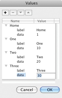
inspectorMenu.Open the Component Inspector panel and double-click the dataProvider value. A dialog called Values will open. If the dialog doesn’t open, click the small magnifying glass icon to open the dialog.
In the upper-left corner of the dialog, click the plus sign. This will add a menu item to the ComboBox that consists of two entries: a text label and a corresponding data value. In the label value, type
Home. This is the text that will appear in the menu for this item. The name of the item will update to reflect this change. In the data value, type1. This corresponds to the frame you want to visit in the Timeline when selecting this menu item. This is a simple example use of the data property. You learned in Chapter 5 that it’s usually better to use frame labels rather than frame numbers for navigation, and you’ll do that, too.Repeat step 4 three more times to create the values shown in Figure 9-8. When you’re finished, click OK and note that the dataProvider value has been populated with the information you just entered (Figure 9-9).
Next, click the prompt value and type
Navigate. This is the word displayed at the top of the menu prior to its first use. Thereafter, the current menu selection will be displayed in this location.Click the rowCount value and type
4. This setting limits the number of rows shown below the menu when the menu is clicked.Test your movie, and you will see that the ComboBox displays menu items as you would expect it to when interacting with the mouse (Figure 9-10), but it requires ActionScript for any navigation to occur.


Other options that you can configure through the Component Inspector panel include whether or not the menu is visible and enabled, whether it is editable (allowing the user to change the text that appears in the menu) and, if so, which characters the restrict property limits the user to when typing a new menu item.
Now it’s time to add ActionScript to the first menu. When you’re finished, test your movie. When picking any frame but Home, you should see an illustration of the corresponding number. When selecting Home from the menu, the playhead will return to the empty first frame:
Select the first frame in the actions layer and open the Actions panel. A
stop()method should already be in the frame script, so add lines 3 through 6 to the script:1 stop(); 2 3 inspectorMenu.addEventListener(Event.CHANGE, onChange); 4 function onChange(evt:Event):void { 5 this.gotoAndStop(evt.target.selectedItem.data); 6 }
This script creates an event listener that will listen for the event fired when the menu is changed (line 3). When this event is received, the main timeline will go to a specified frame and stop (line 5).
Take a close look at how this line works. The navigation code is straightforward. The this identifier references the main timeline because that’s the scope of the script. The gotoAndStop() method moves the playhead. The data property contains the frame number used by the method, but where does this information come from? The data property is pulled from the menu’s selectedItem—the menu item the user selected when last using the menu. Note, however, that the menu is not specified by instance name. Instead, the target of the event is queried. This means the function can work with more than one menu.
Note
If necessary, review Chapter 6 for more information on event listeners.
Now it’s time to build the second menu, this time with ActionScript.
Select the second menu and give it an instance name of
asMenu.Add the following to your script in frame 1:
7 asMenu.prompt = "Navigate";
8 asMenu.addItem({label:"Home", data:1});
9 asMenu.addItem({label:"One", data:10});
10 asMenu.addItem({label:"Two", data:20});
11 asMenu.addItem({label:"Three", data:30});
12 asMenu.addEventListener(Event.CHANGE, onChange);
Notice that you don’t need to use the Component Inspector at all in this stage; the ActionScript replaces that labor. Line 7 of the script creates the menu text visible prior to the menu’s first use, and line 12 adds an event listener, listening for the menu’s change event. Because your prior listener function doesn’t restrict its use to a specific menu, both menus can use the same function. The evt.target property will automatically determine which menu was used.
Lines 8 through 11 replace the work you did in the Values dialog by adding menu items and populating their label and data properties. The syntax used for each menu item is an associative array. Look back over Chapter 6 for a refresher of arrays if this form is not clear.
The final step in this exercise is to rely solely on ActionScript to not only populate the menu, but create it as well. As long as the component is in your library, you can create the menu dynamically the same way you can create a movie clip dynamically.
Without manually adding another menu to the stage, add the following to your script in frame 1.
13 import fl.controls.ComboBox;
14 var dynamicMenu:ComboBox = new ComboBox();
15 this.addChild(dynamicMenu);
16 dynamicMenu.x = 40;
17 dynamicMenu.y = 270;
18 dynamicMenu.prompt = "Navigate";
19 dynamicMenu.addItem({label:"Home", data:1});
20 dynamicMenu.addItem({label:"One", data:10});
21 dynamicMenu.addItem({label:"Two", data:20});
22 dynamicMenu.addItem({label:"Three", data:30});
23 dynamicMenu.addEventListener(Event.CHANGE, onChange);
Focus on the first five lines of this script. Lines 18 through 23 are essentially the same as the last script you added, but they have been included here for clarity because the reference to the menu has changed.
Line 13 includes an import statement, which is an important structure new to your work in ActionScript thus far. Up to this point, you’ve restricted your exercise work to using only ActionScript that the Flash compiler already knows about. When using components, however, you must tell the compiler where to look to find their classes so the compiler can validate and compile your code. Without this import statement pointing the way to the ComboBox classes, your script would generate errors telling you that the compiler doesn’t understand the code.
Line 14 creates a new ComboBox and stores a reference to the menu in the dynamicMenu variable. This reference is akin to a manually created instance name. Line 15 adds the menu to the display list as a child of the main timeline, and lines 16 and 17 set the components position.
Test your work and compare it to comboBox_02.fla.
Depending on the design of a given project, you may not always be satisfied with the appearance of a component. Some components allow you to modify their appearance through ActionScript (a process typically called styling, similar to the way you style text with ActionScript) or by modifying the visual elements used by the component. The latter process is called skinning.
The user interface components you’ve been concentrating on thus far are really easy to skin. All you have to do is double-click a component to edit it, just like you were editing a movie clip that you created yourself. Inside the component, you’ll find a guide layer that contains all the separate movie clip parts the component uses for its various display forms.
Figure 9-11 shows the Button component skin. In this figure you can see the various button states for both normal use and when the button’s selected property is true. You can also edit the art used when the button is emphasized, disabled, or focused (meaning the user is interacting with the button either with the mouse or keyboard).

Each skin element is a movie clip and can be double-clicked for editing. When doing so, remember that you’re editing the symbol. Every instance of the component will be updated and, because some assets are shared between components, more than one component may be updated.

In this chapter, you will add two components to the Gallery page. The first will load a JPG at runtime and the second will display a detail of a large image (allowing the user to scroll the image around to see more). You will add the third component in Chapter 13 when you add video to the project. These components are all very easy to use and require no ActionScript.
The UILoader component is optimized to load external display objects such as bitmaps (JPG, PNG, or GIF) and other SWFs. It will load ActionScript behind the scenes and includes a few nice optional features, such as loading the asset automatically, scaling the content to fit the size of the component, and maintaining aspect ratio during scaling. The component also contains no graphical elements to get in the way of the appearance of the loaded asset. Figure 9-12 shows the component in use.

This is the first time you’re loading external assets in the portfolio project, so it’s a good idea to make sure your relative file locations are consistent. This will eliminate the need to change scripts or component configurations later on. In the same folder as your main portfolio FLA, create a folder called assets. In that folder, place the face.jpg image from the furnished source files.
Open the main portfolio FLA and open the Library panel. Look inside the Gallery Assets folder and double-click the foreground movie clip.
Scroll to the far left of the movie clip so you can see the frame in which the UILoader component will reside. Select the components layer and drag the UILoader component from the Components panel to the frame on the Stage.
Using the Properties panel, set the size of the component to a width and height of
200and200, respectively, and position the component neatly within the frame.With the component selected, open the Component Inspector (Figure 9-13). Click the source value field and enter
assets/face.jpg.Test your movie, go to the Gallery screen, and see if the image loads. If not, review your steps. If you can’t resolve the issue, you can compare your file to the chapter final portfolio file, portfolio_09_final.fla.

On occasion, you may run into scenarios in which you must display an image that is too large to fit on the screen, thereby showing only a detail of the image. A good example of this is showing a large map and displaying only a portion of the map at any one time.
One easy way to handle this is to use the ScrollPane component (Figure 9-14). This component allows you to scroll the detail area vertically and/or horizontally so you can see more of an image when you need to.

Place the words.jpg image from the furnished source files into your assets folder.
If you’re not already there, return to editing the foreground movie clip.
Scroll to the center of the movie clip so you can see the frame in which the ScrollPane component will reside. Select the components layer and drag the ScrollPane component from the Components panel to the frame on the Stage.
Using the Properties panel, set the size of the component to a width and height of
300and200, respectively, and position the component neatly within the frame.With the component selected, open the Component Inspector (Figure 9-15). Click the source value field and enter
assets/words.jpg.Test your movie, go to the Gallery screen, advance to the ScrollPane position using the Next button, and see that the image loads. Use the scroll bars to scroll the image both vertically and horizontally. If the image doesn’t load, review your steps.
Close the SWF to try the optional feature of scrolling the image with your mouse. With the component selected, change the scrollDrag setting to
true.Test your movie again, go back to the Gallery screen, and see that you can now scroll the image with your mouse, as well as the scroll bars. If any problems remain, compare your file to the chapter final portfolio file, portfolio_09_final.fla.
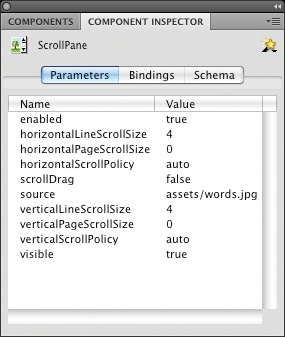
Additional available options include the ability to choose in which directions the user can scroll and how much is scrolled at one time. The scrollable direction is controlled by the horizontalScrollPolicy and verticalScrollPolicy settings, which can each be on, off, or auto (the latter only scrolls when needed). The horizontalLineScrollSize and horizontalPageScrollSize properties, as well as their vertical counterparts, set the size of scrolling. The line values are the amount scrolled when clicking on the scroll bar arrow, and the page values are the amount scrolled when clicking on the scroll track.